
During my first tutorial, we rebuilt a grid experience from a nice website called Palmer, and I wrote that rebuilding existing interactions from scratch is an incredible way to learn. It trains your eye for detail, helps you grasp the underlying logic, and sharpens your creative problem-solving.
Today, we’ll work on rebuilding a smooth scrolling animation from the Telescope website, originally created by Louis Paquet, Kim Levan, Adrien Vanderpotte, and Koki-Kiko. The goal, as always, is to understand how this kind of interaction works under the hood and to code the basics from scratch.
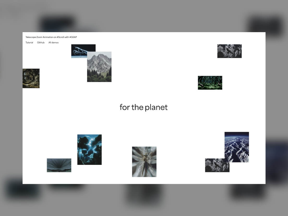
In this tutorial, you’ll learn how to easily create and animate a deconstructed image grid and add a trailing zoom effect on a masked image between split text that moves apart, all based on smooth scrolling. We’ll be doing all this with GSAP, using its ScrollSmoother and ScrollTrigger plugins, which are now freely available to everyone 🎉.
When developing interactive experiences, it helps to break things down into smaller parts. That way, each piece can be handled step by step without feeling overwhelming.
Here’s the structure I followed for this effect:
- Floating image grid
- Main visual and split text
- Layered zoom and depth effect
Let’s get started!

Floating image grid
The Markup
Before starting the animation, we’ll begin with the basics. The layout might look deconstructed, but it needs to stay simple and predictable. For the structure itself, all we need to do is add a few images.
<div class="section">
  <div class="section__images">
    <img src="./img-1.webp" alt="Image" />
    <img src="./img-2.webp" alt="Image" />
    <img src="./img-3.webp" alt="Image" />
    <img src="./img-4.webp" alt="Image" />
    <img src="./img-9.webp" alt="Image" />
    <img src="./img-6.webp" alt="Image" />
    <img src="./img-7.webp" alt="Image" />
    <img src="./img-8.webp" alt="Image" />
    <img src="./img-9.webp" alt="Image" />
    <img src="./img-10.webp" alt="Image" />
  </div>
</div>
The Style
.section__images {
  position: absolute;
  top: 0;
  left: 0;
  width: 100vw;
  height: 100vh;
  perspective: 100vh;

  img {
    position: absolute;
    width: 10vw;

    @media (max-width: 768px) {
      width: 20vw;
    }

    &:nth-of-type(1) {
      top: 15vw;
      left: -3vw;
    }

    &:nth-of-type(2) {
      top: 5vw;
      left: 20vw;
    }

    /* same for all other images */
  }
}
When it comes to styling, there are a few important things to note. We set up a full-screen section that contains all the floating images.
This section uses a perspective value to enable animations along the Z-axis, adding depth to the composition. Inside this section, each image is positioned absolutely to create an organic, scattered arrangement. By assigning their width in viewport units (vw), the images scale proportionally with the browser size, keeping the layout balanced across different screen resolutions.

The Animation
First, we’ll use the ScrollSmoother plugin to introduce a subtle scroll inertia, giving the scrolling experience a smoother and more refined feel. We’ll also enable the normalizeScroll option, since we initially ran into some performance inconsistencies that affected the smoothness of the animation.
const scroller = ScrollSmoother.create({
  wrapper: ".wrapper",
  content: ".content",
  smooth: 1.5,
  effects: true,
  normalizeScroll: true
})
A single GSAP timeline is all we need to handle the entire animation. Let’s start by setting it up with the ScrollTrigger plugin.
this.timeline = gsap.timeline({
  scrollTrigger: {
    trigger: this.dom,
    start: "top top",
    end: "bottom top",
    scrub: true,
    pin: true
  }
})
Next, we’ll animate the smaller images by moving them along the Z-axis. To make the motion feel more dynamic, we’ll add a stagger, introducing a small delay between each image so they don’t all animate at the same time.
this.timeline.to(this.smallImages, {
  z: "100vh",
  duration: 1,
  ease: "power1.inOut",
  stagger: {
    amount: 0.2,
    from: "center"
  }
})
Main visual and split text
Now that we’ve built the floating image grid, it’s time to focus on the centerpiece of the animation — the main image and the text that moves apart to reveal it. This part will bring the composition together and create that smooth, cinematic transition effect.
<div class="section__media">
  <div class="section__media__back">
    <img src="./img-big.jpg" alt="Image" />
  </div>
</div>
Add the large image as a full-size cover using absolute positioning, and define a CSS variable --progress that we’ll use later to control the animation. This variable will make it easier to synchronize the scaling of the image with the motion of the text elements.
--progress: 0;

.section__media {
  position: absolute;
  top: 0;
  left: 0;
  width: 100%;
  height: 100%;
  z-index: -1;

  transform: scale(var(--progress));

  img {
      width: 100%;
      height: 100%;
      object-fit: cover;
  }
}
For the image animation, we’ll take a slightly different approach. Instead of animating the scale property directly with GSAP, we’ll animate a CSS variable called --progress throughout the timeline. This method keeps the code cleaner and allows for smoother synchronization with other visual elements, such as text or overlay effects.
onUpdate: (self) => {
  const easedProgress = gsap.parseEase("power1.inOut")(self.progress)
  this.dom.style.setProperty("--progress", easedProgress)
}
Animating a CSS variable like this gives you more flexibility, since the same variable can influence multiple properties at once. It’s a great technique for keeping complex animations both efficient and easy to tweak later.
Next, we’ll add our text element, which is divided into two parts: one sliding to the left and the other moving to the right.
<h1>
  <span class="left">for the</span>
  <span class="right">planet</span>
</h1>
Now we just need to use the --progress variable in our CSS to animate the two text parts on each side of the image. As the variable updates, both text elements will move apart in sync with the image scaling, creating a smooth and coordinated reveal effect.
.left {
  transform: translate3d(calc(var(--progress) * (-66vw + 100%) - 0.5vw), 0, 0);
}

.right {
  transform: translate3d(calc(var(--progress) * (66vw - 100%)), 0, 0);
}
With this CSS in place, both halves of the text slide away from the center as the scroll progresses, perfectly matching the scaling of the image behind them. The result is a smooth, synchronized motion that feels natural and balanced, reinforcing the sense of depth and focus in the composition.
Layered zoom and depth effect
This effect feels fresh and cleverly designed, creating that nice “wow” moment without being overly complex to build. We’ll start by adding the “front” images to our structure, which are simple duplicates of the background image. These layers will help us create a trailing zoom effect that adds depth and motion to the final scene.
<div class="section__media__front front-1">
  <img src="./img-big.jpg" alt="Image" />
</div>
<div class="section__media__front front-2">
  <img src="./img-big.jpg" alt="Image" />
</div>
<div class="section__media__front front-3">
  <img src="./img-big.jpg" alt="Image" />
</div>
<div class="section__media__front front-4">
  <img src="./img-big.jpg" alt="Image" />
</div>
<div class="section__media__front front-5">
  <img src="./img-big.jpg" alt="Image" />
</div>
<div class="section__media__front front-6">
  <img src="./img-big.jpg" alt="Image" />
</div>
Next, we’ll create and add a mask of the main subject (in this case, a crab) to make it appear as if it’s popping out from the background. This mask will define the visible area of each front image, giving the illusion of depth and motion as the layers scale and blur during the animation.

.section__media__front {
  img {
    mask-image: url(./mask.png);
    mask-position: 50% 50%;
    mask-size: cover;
  }
}
Here we’re scaling each image layer progressively to create a sense of depth.
The first element stays at its original size, while each following layer is slightly smaller to give the impression that they’re moving further into the background.
.front-1 {
  transform: scale(1);
}

.front-2 {
  transform: scale(0.85);
}

.front-3 {
  transform: scale(0.6);
}

.front-4 {
  transform: scale(0.45);
}

.front-5 {
  transform: scale(0.3);
}

.front-6 {
  transform: scale(0.15);
}
And finally, we just need to add one more step to our timeline to bring all the image layers back to their original scale (scale: 1). This final motion completes the trailing effect and smoothly transitions the focus toward the main visual. The scaling animation also helps tie the layered depth back together, making the composition feel cohesive and polished.
this.timeline.to(this.frontImages, {
  scale: 1,
  duration: 1,
  ease: "power1.inOut",
  delay: .1,
}, 0.4)
To make the effect even more refined, we can add a subtle blur to each layer at the start and then animate it away as the timeline plays. This creates a soft, atmospheric look that enhances the perception of motion and depth. As the blur fades, the scene gradually becomes sharper, drawing the viewer’s attention toward the subject in a natural, cinematic way.
.section__media__front {
  filter: blur(2px);
}
this.timeline.to(this.frontImages, {
duration: 1,
filter: "blur(0px)",
ease: "power1.inOut",
delay: .4,
stagger: {
amount: 0.2,
from: "end"
}
}, 0.6)With the scaling and blur animations combined, the layered zoom effect feels rich and immersive. Each layer moves in harmony, giving the animation depth and fluidity while keeping the overall experience smooth and visually balanced.
The result
Here’s the final result in action. The combination of scaling, blur, and smooth scrolling creates a clean, layered motion that feels both natural and visually engaging. The subtle depth shift gives the impression of a 3D scene coming to life as you scroll, all built with just a few well-timed animations.
Final thoughts
I hope you’ve learned a few new things and picked up some useful tricks while following this tutorial. I’m always amazed by how powerful the GSAP library is and how it allows us to create advanced, polished animations with just a few lines of code.
I highly recommend checking out the full Telescope website, which is truly a masterpiece filled with creative and inspiring effects that showcase what’s possible with thoughtful interaction design.
Thanks for reading, and see you around 👋
دیدگاهتان را بنویسید