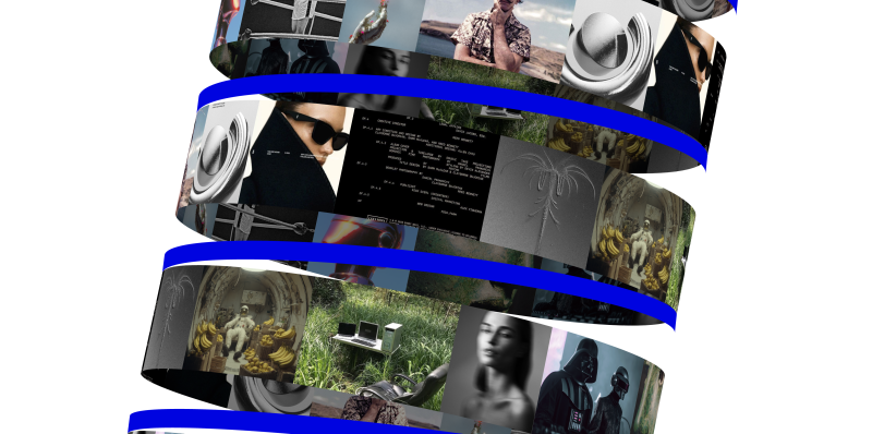

For months, Eduard Bodak has been sharing glimpses of his visually rich new website. Now, he’s pulling back the curtain to walk us through how three of its most striking animations were built. In this behind-the-scenes look, he shares the reasoning, technical decisions, and lessons learned—from performance trade-offs to working with CSS variables and a custom JavaScript architecture.
Overview
In this breakdown, I’ll walk you through three of the core GSAP animations on my site: flipping 3D cards that animate on scroll, an interactive card that reacts to mouse movement on the pricing page, and a circular layout of cards that subtly rotates as you scroll. I’ll share how I built each one, why I made certain decisions, and what I learned along the way.
I’m using Locomotive Scroll V5 in this project to handle scroll progress and viewport detection. Since it already offers built-in progress tracking via data attributes and CSS variables, I chose to use that directly for triggering animations. ScrollTrigger offers a lot of similar functionality in a more integrated way, but for this build, I wanted to keep everything centered around Locomotive’s scroll system to avoid overlap between two scroll-handling libraries.
Personally, I love the simplicity of Locomotive Scroll. You can just add data attributes to specify the trigger offset of the element within the viewport. You can also get a CSS variable --progress on the element through data attributes. This variable represents the current progress of the element and ranges between 0 and 1. This alone can animate a lot with just CSS.
I used this project to shift my focus toward more animations and visual details. It taught me a lot about GSAP, CSS, and how to adjust animations based on what feels right. I’ve always wanted to build sites that spark a little emotion when people visit them.
Note that this setup was tailored to the specific needs of the project, but in cases where scroll behavior, animations, and state management need to be tightly integrated, GSAP’s ScrollTrigger and ScrollSmoother can offer a more unified foundation.
Now, let’s take a closer look at the three animations in action!
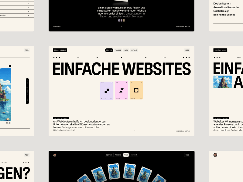
Flipping 3D cards on scroll
I split the animation into two parts. The first is about the cards escaping on scroll. The second is about them coming back and flipping back.
Part 01
We got the three cards inside the hero section.
<section
 data-scroll
 data-scroll-offset="0%, 25%"
 data-scroll-event-progress="progressHero"
 data-hero-animation>
 <div>
  <div class="card" data-hero-animation-card>
   <div class="card_front">...</div>
   <div class="card_back">...</div>
  </div>
  <div class="card" data-hero-animation-card>
   <div class="card_front">...</div>
   <div class="card_back">...</div>
  </div>
  <div class="card" data-hero-animation-card>
   <div class="card_front">...</div>
   <div class="card_back">...</div>
  </div>
 </div>
</section>
While I’m using Locomotive Scroll, I need data-scroll to enable viewport detection on an element. data-scroll-offset specifies the trigger offset of the element within the viewport. It takes two values: one for the offset when the element enters the viewport, and a second for the offset when the element leaves the viewport. The same can be built with GSAP’s ScrollTrigger, just inside the JS.
data-scroll-event-progress="progressHero" will trigger the custom event I defined here. This event allows you to retrieve the current progress of the element, which ranges between 0 and 1.
Inside the JS we can add an EventListener based on the custom event we defined. Getting the progress from it and transfer it to the GSAP timeline.
this.handleProgress = (e) => {
 const { progress } = e.detail;
 this.timeline?.progress(progress);
};

window.addEventListener("progressHero", this.handleProgress);
I’m using JS classes in my project, therefore I’m using this in my context.
Next, we retrieve all the cards.
this.heroCards = this.element.querySelectorAll("[data-hero-animation-card]");this.element is here our section we defined before, so it’s data-hero-animation.
Building now the timeline method inside the class. Getting the current timeline progress. Killing the old timeline and clearing any GSAP-applied inline styles (like transforms, opacity, etc.) to avoid residue.
computeDesktopTimeline() {
 const progress = this.timeline?.progress?.() ?? 0;
 this.timeline?.kill?.();
 this.timeline = null;
 gsap.set(this.heroCards, { clearProps: "all" });
}
Using requestAnimationFrame() to avoid layout thrashing. Initializes a new, paused GSAP timeline. While we are using Locomotive Scroll it’s important that we pause the timeline, so the progress of Locomotive can handle the animation.
computeDesktopTimeline() {
 const progress = this.timeline?.progress?.() ?? 0;
 this.timeline?.kill?.();
 this.timeline = null;
 gsap.set(this.heroCards, { clearProps: "all" });

 requestAnimationFrame(() => {
  this.timeline = gsap.timeline({ paused: true });

  this.timeline.progress(progress);
  this.timeline.paused(true);
 });
}
Figuring out relative positioning per card. targetY moves each card down so it ends near the bottom of the container. yOffsets and rotationZValues give each card a unique vertical offset and rotation.
computeDesktopTimeline() {
 const progress = this.timeline?.progress?.() ?? 0;
 this.timeline?.kill?.();
 this.timeline = null;
 gsap.set(this.heroCards, { clearProps: "all" });

 requestAnimationFrame(() => {
  this.timeline = gsap.timeline({ paused: true });

  this.heroCards.forEach((card, index) => {
   const position = index - 1;
   const elementRect = this.element.getBoundingClientRect();
   const cardRect = this.heroCards[0]?.getBoundingClientRect();
   const targetY = elementRect.height - cardRect.height;
   const yOffsets = [16, 32, 48];
   const rotationZValues = [-12, 0, 12];

   // timeline goes here
  });

  this.timeline.progress(progress);
  this.timeline.paused(true);
 });
}
The actual GSAP timeline. Cards slide left or right based on their index (x). Rotate on Z slightly to look scattered. Slide downward (y) to target position. Shrink and tilt (scale, rotateX) for a 3D feel. index * 0.012: adds a subtle stagger between cards.
computeDesktopTimeline() {
 const progress = this.timeline?.progress?.() ?? 0;
 this.timeline?.kill?.();
 this.timeline = null;
 gsap.set(this.heroCards, { clearProps: "all" });

 requestAnimationFrame(() => {
  this.timeline = gsap.timeline({ paused: true });

  this.heroCards.forEach((card, index) => {
   const position = index - 1;
   const elementRect = this.element.getBoundingClientRect();
   const cardRect = this.heroCards[0]?.getBoundingClientRect();
   const targetY = elementRect.height - cardRect.height;
   const yOffsets = [16, 32, 48];
   const rotationZValues = [-12, 0, 12];

   this.timeline.to(
    card,
     {
      force3D: true,
      keyframes: {
       "75%": {
        x: () => -position * (card.offsetWidth * 0.9),
        rotationZ: rotationZValues[index],
       },
       "100%": {
        y: () => targetY - yOffsets[index],
        scale: 0.85,
        rotateX: -16,
       },
      },
     },
    index * 0.012
   );
  });

  this.timeline.progress(progress);
  this.timeline.paused(true);
 });
}
That’s our timeline for desktop. We can now set up GSAP’s matchMedia() to use it. We can also create different timelines based on the viewport. For example, to adjust the animation on mobile, where such an immersive effect wouldn’t work as well. Even for users who prefer reduced motion, the animation could simply move the cards slightly down and fade them out, as you can see on the live site.
setupBreakpoints() {
 this.mm.add(
  {
   desktop: "(min-width: 768px)",
   mobile: "(max-width: 767px)",
   reducedMotion: "(prefers-reduced-motion: reduce)",
  },
  (context) => {
   this.timeline?.kill?.();

   if (context.conditions.desktop) this.computeDesktopTimeline();

   return () => {
    this.timeline?.kill?.();
   };
  }
 );
}
Add this to our init() method to initialize the class when we call it.
init() {
 this.setupBreakpoints();
}
We can also add a div with a background color on top of the card and animate its opacity on scroll so it smoothly disappears.
When you look closely, the cards are floating a bit. To achieve that, we can add a repeating animation to the cards. It’s important to animate yPercent here, because we already animated y earlier, so there won’t be any conflicts.
gsap.fromTo(
 element,
 {
  yPercent: -3,
 },
 {
  yPercent: 3,
  duration: () => gsap.utils.random(1.5, 2.5),
  ease: "sine.inOut",
  repeat: -1,
  repeatRefresh: true,
  yoyo: true,
 }
);
gsap.utils.random(1.5, 2.5) comes in handy to make each floating animation a bit different, so it looks more natural. repeatRefresh: true lets the duration refresh on every repeat.
Part 02
We basically have the same structure as before. Only now we’re using a sticky container. The service_container has height: 350vh, and the service_sticky has min-height: 100vh. That’s our space to play the animation.
<section
 data-scroll
 data-scroll-offset="5%, 75%"
 data-scroll-event-progress="progressService"
 data-service-animation>
 <div class="service_container">
  <div class="service_sticky">
   <div class="card" data-service-animation-card>
    <div class="card_front">...</div>
    <div class="card_back">...</div>
   </div>
   <div class="card" data-service-animation-card>
    <div class="card_front">...</div>
    <div class="card_back">...</div>
   </div>
   <div class="card" data-service-animation-card>
    <div class="card_front">...</div>
    <div class="card_back">...</div>
   </div>
  </div>
 </div>
</section>
In the JS, we can use the progressService event as before to get our Locomotive Scroll progress. We just have another timeline here. I’m using keyframes to really fine-tune the animation.
this.serviceCards.forEach((card, index) => {
  const position = 2 - index - 1;
  const rotationZValues = [12, 0, -12];
  const rotationZValuesAnimated = [5, 0, -5];

  this.timeline.to(
    card,
    {
      force3D: true,
      keyframes: {
        "0%": {
          y: () => -0.75 * window.innerHeight + 1,
          x: () => -position * (card.offsetWidth * 1.15),
          scale: 0.2,
          rotationZ: rotationZValues[index],
          rotateX: 24,
        },
        "40%": {
          y: "20%",
          scale: 0.8,
          rotationZ: rotationZValuesAnimated[index],
          rotationY: 0,
          rotateX: 0,
        },
        "55%": { rotationY: 0, y: 0, x: () => gsap.getProperty(card, "x") },
        "75%": { x: 0, rotationZ: 0, rotationY: -190, scale: 1 },
        "82%": { rotationY: -180 },
        "100%": { rotationZ: 0 },
      },
    },
    index * 0.012
  );
});
const position = 2 - index - 1 changes the position, so cards start spread out: right, center, left. With that we can use those arrays [12, 0, -12] in the right order.
There’s the same setupBreakpoints() method as before, so we actually just need to change the timeline animation and can use the same setup as before, only in a new JS class.
We can add the same floating animation we used in part 01, and then we have the disappearing/appearing card effect.
Part 2.1
Another micro detail in that animation is the small progress preview of the three cards in the top right.
We add data-scroll-css-progress to the previous section to get a CSS variable --progress ranging from 0 to 1, which can be used for dynamic CSS effects. This data attribute comes from Locomotive Scroll.
<section
data-scroll
data-scroll-offset="5%, 75%"
data-scroll-event-progress="progressService"
data-scroll-css-progress
data-service-animation>
...
<div>
<div class="tiny-card">...</div>
<div class="tiny-card">...</div>
<div class="tiny-card">...</div>
</div>
...
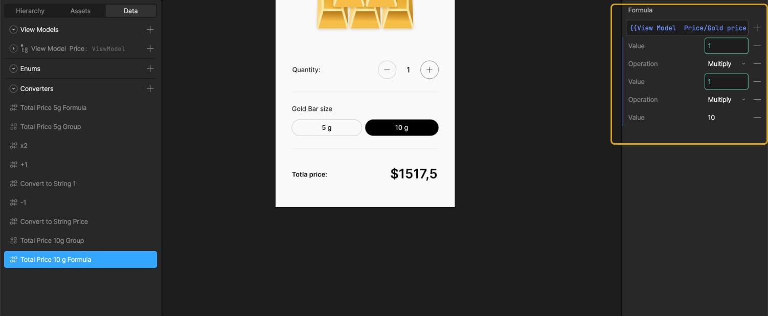
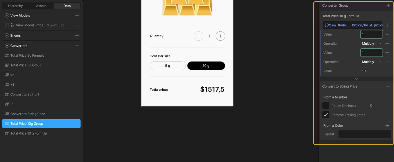
</section>Using CSS calc() with min() and max() to trigger animations at specific progress points. In this case, the first animation starts at 0% and finishes at 33%, the second starts at 33% and finishes at 66%, and the last starts at 66% and finishes at 100%.
.tiny-card {
&:nth-child(1) {
mask-image: linear-gradient(to top, black calc(min(var(--progress), 0.33) * 300%), rgba(0, 0, 0, 0.35) calc(min(var(--progress), 0.33) * 300%));
transform: translate3d(0, calc(rem(4px) * (1 - min(var(--progress) * 3, 1))), 0);
}
&:nth-child(2) {
mask-image: linear-gradient(
to top,
black calc(max(min(var(--progress) - 0.33, 0.33), 0) * 300%),
rgba(0, 0, 0, 0.35) calc(max(min(var(--progress) - 0.33, 0.33), 0) * 300%)
);
transform: translate3d(0, calc(rem(4px) * (1 - min(max((var(--progress) - 0.33) * 3, 0), 1))), 0);
}
&:nth-child(3) {
mask-image: linear-gradient(
to top,
black calc(max(min(var(--progress) - 0.66, 0.34), 0) * 300%),
rgba(0, 0, 0, 0.35) calc(max(min(var(--progress) - 0.66, 0.34), 0) * 300%)
);
transform: translate3d(0, calc(rem(4px) * (1 - min(max((var(--progress) - 0.66) * 3, 0), 1))), 0);
}
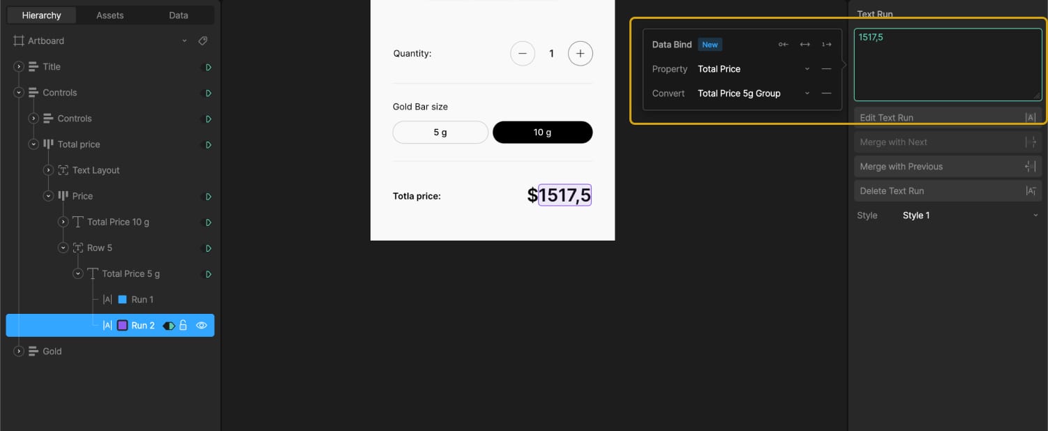
}Card rotating on mouse movement
The card is built like the previous ones. It has a front and a back.
<div class="card" data-price-card>
 <div class="card_front">...</div>
 <div class="card_back">...</div>
</div>
On a closer look, you can see a small slide-in animation of the card before the mouse movement takes effect. This is built in GSAP using the onComplete() callback in the timeline. this.card refers to the element with data-price-card.
this.introTimeline = gsap.timeline();

this.introTimeline.fromTo(
 this.card,
 {
  rotationZ: 0,
  rotationY: -90,
  y: "-4em",
 },
 {
  rotationZ: 6,
  rotationY: 0,
  y: "0em",
  duration: 1,
  ease: "elastic.out(1,0.75)",
  onComplete: () => {
   this.initAnimation();
  },
 }
);
I’m using an elastic easing that I got from GSAPs Ease Visualizer. The timeline plays when the page loads and triggers the mouse movement animation once complete.
In our initAnimation() method, we can use GSAP’s matchMedia() to enable the mouse movement only when hover and mouse input are available.
this.mm = gsap.matchMedia();

initAnimation() {
 this.mm.add("(hover: hover) and (pointer: fine) and (prefers-reduced-motion: no-preference)", () => {
  gsap.ticker.add(this.mouseMovement);

  return () => {
   gsap.ticker.remove(this.mouseMovement);
  };
 });

 this.mm.add("(hover: none) and (pointer: coarse) and (prefers-reduced-motion: no-preference)", () => {
  ...
 });
}
By using the media queries hover: hover and pointer: fine, we target only devices that support a mouse and hover. With prefers-reduced-motion: no-preference, we add this animation only when reduced motion is not enabled, making it more accessible. For touch devices or smartphones, we can use hover: none and pointer: coarse to apply a different animation.
I’m using gsap.ticker to run the method this.mouseMovement, which contains the logic for handling the rotation animation.
I originally started with one of the free resources from Osmo (mouse follower) and built this mouse movement animation on top of it. I simplified it to only use the mouse’s x position, which was all I needed.
constructor() {
  this.rotationFactor = 200;
  this.zRotationFactor = 15;
  this.centerX = window.innerWidth / 2;
  this.centerY = window.innerHeight / 2;

  this.currentMouseX = 0;

  window.addEventListener("mousemove", e => {
    this.currentMouseX = e.clientX;
  });
}

mouseMovement() {
  const mouseX = this.currentMouseX;
  const normalizedX = (mouseX - this.centerX) / this.centerX;
  const rotationY = normalizedX * this.rotationFactor;
  const absRotation = Math.abs(rotationY);
  const rotationProgress = Math.min(absRotation / 180, 1);
  const rotationZ = 6 - rotationProgress * 12;
  const rotationZMirror = -6 + rotationProgress * 12;

  gsap.to(this.card, {
    rotationY: rotationY,
    rotationZ: rotationZ,
    duration: 0.5,
    ease: "power2.out",
  });
}
I also added calculations for how much the card can rotate on the y-axis, and it rotates the z-axis accordingly. That’s how we get this mouse movement animation.
When building these animations, there are always some edge cases I didn’t consider before. For example, what happens when I move my mouse outside the window? Or if I hover over a link or button, should the rotation animation still play?
I added behavior so that when the mouse moves outside, the card rotates back to its original position. The same behavior applies when the mouse leaves the hero section or hovers over navigation elements.
I added a state flag this.isHovering. At the start of mouseMovement(), we check if this.isHovering is false, and if so, return early. The onMouseLeave method rotates the card back to its original position.
mouseMovement() {
  if (!this.card || !this.isHovering) return;

  ...
}

onMouseEnter() {
  this.isHovering = true;
}

onMouseLeave() {
  this.isHovering = false;

  gsap.to(this.card, {
    rotationX: 0,
    rotationY: 0,
    rotationZ: 6,
    duration: 1.5,
    ease: "elastic.out(1,0.75)",
  });
}
Using our initAnimation() method from before, with these adjustments added.
initAnimation() {
 this.mm.add("(hover: hover) and (pointer: fine) and (prefers-reduced-motion: no-preference)", () => {
  this.container.addEventListener("mouseenter", this.onMouseEnter);
  this.container.addEventListener("mouseleave", this.onMouseLeave);
  gsap.ticker.add(this.mouseMovement);

  return () => {
   this.container.removeEventListener("mouseenter", this.onMouseEnter);
   this.container.removeEventListener("mouseleave", this.onMouseLeave);
   gsap.ticker.remove(this.mouseMovement);
  };
 });

 this.mm.add("(hover: none) and (pointer: coarse) and (prefers-reduced-motion: no-preference)", () => {
  ...
 });
}
And here we have the mouse enter/leave behavior.
We can adjust it further by adding another animation for mobile, since there’s no mouse movement there. Or a subtle reflection effect on the card like in the video. This is done by duplicating the card, adding an overlay with a gradient and backdrop-filter, and animating it similarly to the original card, but with opposite values.
Cards in a circular position that slightly rotate on scroll
First, we build the base of the circularly positioned cards in CSS.
<div class="wheel" style="--wheel-angle: 15deg">
 <div class="wheel_items">
  <div class="wheel_item-wrap" style="--wheel-index: 0"><div class="wheel_item">...</div></div>
  <div class="wheel_item-wrap" style="--wheel-index: 1"><div class="wheel_item">...</div></div>
  <div class="wheel_item-wrap" style="--wheel-index: 2"><div class="wheel_item">...</div></div>
  <div class="wheel_item-wrap" style="--wheel-index: 3"><div class="wheel_item">...</div></div>
  <div class="wheel_item-wrap" style="--wheel-index: 4"><div class="wheel_item">...</div></div>
  <div class="wheel_item-wrap" style="--wheel-index: 5"><div class="wheel_item">...</div></div>
  <div class="wheel_item-wrap" style="--wheel-index: 6"><div class="wheel_item">...</div></div>
  <div class="wheel_item-wrap" style="--wheel-index: 7"><div class="wheel_item">...</div></div>
  <div class="wheel_item-wrap" style="--wheel-index: 8"><div class="wheel_item">...</div></div>
  <div class="wheel_item-wrap" style="--wheel-index: 9"><div class="wheel_item">...</div></div>
  <div class="wheel_item-wrap" style="--wheel-index: 10"><div class="wheel_item">...</div></div>
  <div class="wheel_item-wrap" style="--wheel-index: 11"><div class="wheel_item">...</div></div>
  <div class="wheel_item-wrap" style="--wheel-index: 12"><div class="wheel_item">...</div></div>
  <div class="wheel_item-wrap" style="--wheel-index: 13"><div class="wheel_item">...</div></div>
  <div class="wheel_item-wrap" style="--wheel-index: 14"><div class="wheel_item">...</div></div>
  <div class="wheel_item-wrap" style="--wheel-index: 15"><div class="wheel_item">...</div></div>
  <div class="wheel_item-wrap" style="--wheel-index: 16"><div class="wheel_item">...</div></div>
  <div class="wheel_item-wrap" style="--wheel-index: 17"><div class="wheel_item">...</div></div>
  <div class="wheel_item-wrap" style="--wheel-index: 18"><div class="wheel_item">...</div></div>
  <div class="wheel_item-wrap" style="--wheel-index: 19"><div class="wheel_item">...</div></div>
  <div class="wheel_item-wrap" style="--wheel-index: 20"><div class="wheel_item">...</div></div>
  <div class="wheel_item-wrap" style="--wheel-index: 21"><div class="wheel_item">...</div></div>
  <div class="wheel_item-wrap" style="--wheel-index: 22"><div class="wheel_item">...</div></div>
  <div class="wheel_item-wrap" style="--wheel-index: 23"><div class="wheel_item">...</div></div>
 </div>
</div>
At first, we add all 24 cards, then remove the ones we don’t want to show later because we don’t see them. In the CSS, the .wheel uses a grid display, so we apply grid-area: 1 / 1 to stack the cards. We later add an overlay before the wheel with the same grid-area. By using em we can use a fluid font-size to adjust the size pretty smooth on resizing the viewport.
.wheel {
 aspect-ratio: 1;
 pointer-events: none;
 grid-area: 1 / 1;
 place-self: flex-start center;
 width: 70em;
}
We use the same grid stacking technique for the items. On the item wrapper, we apply the CSS variables defined in the HTML to rotate the cards.
.wheel_items {
 width: 100%;
 height: 100%;
 display: grid;
}

.wheel_item-wrap {
 transform: rotate(calc(var(--wheel-angle) * var(--wheel-index)));
 grid-area: 1 / 1;
 justify-self: center;
 height: 100%;
}
Inside the item, there is only an image of the card background. The item uses translateY(-100%) to position the card at the top edge of the item.
.wheel_item {
 transform: translateY(-100%);
 aspect-ratio: 60 / 83;
 width: 7.5em;
}
We can remove the card from 8 to 19 as we don’t see them behind the overlay. It should look like this now.
By adding the data attributes and setup for viewport detection from Locomotive Scroll, which we used in previous modules, we can simply add our GSAP timeline for the rotation animation.
this.timeline = gsap.timeline({ paused: true });

this.timeline.to(this.wheel, {
 rotate: -65,
 duration: 1,
 ease: "linear",
});
We can add a gradient overlay on top of the cards.
.wheel_overlay {
 background-image: linear-gradient(#fff0, #0000003d 9%, #00000080 16%, #000000b8 22%, #000 32%);
 width: 100%;
 height: 100%;
}
And that’s our final effect.
Conclusion
There are probably smarter ways to build these animations than I used. But since this is my first site after changing my direction and GSAP, Locomotive Scroll V5, Swup.js, and CSS animations, I’m pretty happy with the result. This project became a personal playground for learning, it really shows that you learn best by building what you imagine. I don’t know how many times I refactored my code along the way, but it gave me a good understanding of creating accessible animations.
I also did a lot of other animations on the site, mostly using CSS animations combined with JavaScript for the logic behind them.
There are also so many great resources out there to learn GSAP and CSS.
Where I learned the most:
It’s all about how you use it. You can copy and paste, which is fast but doesn’t help you learn much. Or you can build on it your own way and make it yours, that’s at least what helped me learn the most in the end.