Tesla’s European slump worsened in October while the region’s EV market surged
Source link
بلاگ
-
Tesla’s European slump worsened in October while the region’s EV market surged
-
Creating 3D Scroll-Driven Text Animations with CSS and GSAP

In this tutorial, you’ll build three scroll-driven text effects using only CSS, JavaScript, and GSAP. Instead of
relying on a 3D library, you’ll combine CSS transforms with GSAP’s ScrollTrigger plugin to link motion directly to
scroll position, creating smooth, high-performance 3D animations.Initial Setup
The first step is to initialize the project and set up its structure. Nothing fancy—just a simple, organized setup to
keep things clean and easy to follow.We’ll use a class-based model, starting with an
App
class as our main entry point and three separate classes for each animation. The final project will look like this:
At the heart of this setup is GSAP. We’ll register its ScrollTrigger and ScrollSmoother plugins, which handle smooth
scrolling and scroll-based animations throughout all three effects. ScrollSmoother ensures consistent, GPU-accelerated
scrolling, while ScrollTrigger ties our animations directly to scroll progress — the two plugins work together to keep
the motion perfectly synced and stutter-free.The main entry point will be the
main.ts
file, which currently looks like this:import { gsap } from "gsap"; import { ScrollTrigger } from "gsap/ScrollTrigger"; import { ScrollSmoother } from "gsap/ScrollSmoother"; class App { smoother!: ScrollSmoother; constructor() { gsap.registerPlugin(ScrollTrigger, ScrollSmoother); this.init(); this.addEventListeners(); } init(): void { this.setupScrollSmoother(); } // optional setupScrollSmoother(): void { this.smoother = ScrollSmoother.create({ smooth: 1, effects: true, }); } addEventListeners(): void { window.addEventListener("resize", () => { console.log("resize"); }); } } new App();Our examples use the TypeScript syntax (for type safety and better editor support), but you can write it identically in plain JavaScript. Simply remove the type annotations (like
: voidor!:) and it will work the same way.Creating Our First Effect: Cylinder
For our first effect, we’ll position text around an invisible cylinder that reveals itself as you scroll—without
relying on a 3D library like Three.js. You can see similar examples on
BPCO
and
Sturdy
, so shout-out to those creators for the inspiration.Building the Structure with HTML & CSS
<section class="cylinder__wrapper">
  <p class="cylinder__title">keep scrolling to see the animation</p>
  <ul class="cylinder__text__wrapper">
    <li class="cylinder__text__item">design</li>
    <li class="cylinder__text__item">development</li>
    <li class="cylinder__text__item">branding</li>
    <li class="cylinder__text__item">marketing</li>
    <li class="cylinder__text__item">copywriting</li>
    <li class="cylinder__text__item">content</li>
    <li class="cylinder__text__item">illustration</li>
    <li class="cylinder__text__item">video</li>
    <li class="cylinder__text__item">photography</li>
    <li class="cylinder__text__item">3d graphic</li>
    <li class="cylinder__text__item">scroll</li>
    <li class="cylinder__text__item">animation</li>
  </ul>
</section>
.cylinder__wrapper { width: 100%; height: 100svh; position: relative; perspective: 70vw; overflow: hidden; @media screen and (max-width: 768px) { perspective: 400px; } display: flex; flex-direction: column; justify-content: center; align-items: center; gap: 10rem; } .cylinder__text__wrapper { position: absolute; font-size: 5vw; line-height: 5vw; width: 100%; height: 100%; transform-style: preserve-3d; transform-origin: center center; font-weight: 600; text-align: center; @media screen and (min-width: 2560px) { font-size: 132px; line-height: 132px; } @media screen and (max-width: 768px) { font-size: 1.6rem; line-height: 1.6rem; } } .cylinder__text__item { position: absolute; left: 50; top: 50%; width: 100%; backface-visibility: hidden; }The key property that gives our layout a 3D look is
perspective: 70vwon the.cylinder__wrapper, which adds depth to the entire effect.The
transform-style: preserve-3d
property allows us to position child elements in 3D space using CSS.We’ll also use the
backface-visibility
property—but more on that later.For now, we should have something that looks like this:

We’re not quite there yet—the text is currently collapsing on top of itself because every item shares the same
position, and everything is aligned to the right side of the viewport. We’ll handle all of this with JavaScript. While
we could define positions directly in CSS, we want the effect to work seamlessly across all screen sizes, so we’ll
calculate positions dynamically instead.Bringing It to Life with JavaScript
We’ll create a new folder named
cylinder
for this effect and define our
Cylinder
class.
First, we need to initialize the DOM elements required for this animation:-
Wrapper:
Keeps the user focused on this section while scrolling. -
Text items:
Each word or phrase positioned around an invisible cylinder. -
Text wrapper:
Rotates to create the 3D cylindrical effect. -
Title:
Triggers the animation when it enters the viewport.
import { gsap } from 'gsap';
import { ScrollTrigger } from 'gsap/ScrollTrigger';

export class Cylinder {

    title: HTMLElement;
    textWrapper: HTMLElement;
    textItems: NodeListOf<HTMLElement>;
    wrapper: HTMLElement;

    constructor() {
        this.title = document.querySelector('.cylinder__title') as HTMLElement;
        this.textWrapper = document.querySelector('.cylinder__text__wrapper') as HTMLElement;
        this.textItems = document.querySelectorAll('.cylinder__text__item') as NodeListOf<HTMLElement>;
        this.wrapper = document.querySelector('.cylinder__wrapper') as HTMLElement;
        this.init();
    }

    init() {
        console.log("init cylinder");
    }
}
Once we have all the necessary DOM elements, we can initialize our
Cylinder
class in the
main.ts
file. From there, we’re ready to position the text in 3D space by creating a
calculatePositions()
function, which looks like this:calculatePositions(): void { const offset = 0.4; const radius = Math.min(window.innerWidth, window.innerHeight) * offset; const spacing = 180 / this.textItems.length; this.textItems.forEach((item, index) => { const angle = (index * spacing * Math.PI) / 180; const rotationAngle = index * -spacing; const x = 0; const y = Math.sin(angle) * radius; const z = Math.cos(angle) * radius; item.style.transform = `translate3d(-50%, -50%, 0) translate3d(${x}px, ${y}px, ${z}px) rotateX(${rotationAngle}deg)`; }); }This gives us the following result:

It’s looking better — we can start to see the final effect taking shape. But before moving on, let’s go over what’s
actually happening.Understanding the Position Calculations
The
calculatePositions()
method is where the magic happens. Let’s break down how we arrange the text items around an invisible cylinder.Defining the Cylinder Dimensions
First, we define an
offset
value of
0.4
(feel free to experiment with this!). This controls how “tight” or “wide” the cylinder appears. We then calculate the
cylinder’s
radius
by multiplying the smaller of the viewport’s width or height by the
offset
value. This approach ensures the effect scales smoothly across all screen sizes.const offset = 0.4; const radius = Math.min(window.innerWidth, window.innerHeight) * offset;Evenly Distributing the Text Items
Next, we determine the spacing between each text item by dividing
180
degrees by the total number of items. This ensures that the text elements are evenly distributed along the visible
half of the cylinder.const spacing = 180 / this.textItems.length;Calculating Each Item’s 3D Position
Next, we calculate each text item’s position in 3D space using a bit of trigonometry. By determining the
x
,
y
, and
z
coordinates, we can position every item evenly along the cylinder’s surface:-
x
remains
0
— this keeps each item horizontally centered. -
y
(vertical position) is calculated using
Math.sin()
to create the curved layout. -
z
(depth) is determined using
Math.cos()
, pushing items forward or backward to form the 3D shape.
const angle = (index * spacing * Math.PI) / 180;
const rotationAngle = index * -spacing; const x = 0;
const y = Math.sin(angle) * radius;
const z = Math.cos(angle) * radius;
Finally, we apply these calculations using CSS 3D transforms, positioning and rotating each item to form the
cylindrical layout.angle
: Converts each item’s index and spacing into radians (the unit used by JavaScript’s Math functions).rotationAngle
: Defines how much each item should rotate so that it faces outward from the cylinder.Bringing the Cylinder to Life with ScrollTrigger
Now that we’ve positioned our text, we’ll create a new function called
createScrollTrigger()
to connect the animation to the user’s scroll position and bring the cylinder to life.Setting Up ScrollTrigger
This is where GSAP’s ScrollTrigger plugin really shines — it lets us link the 3D rotation of our text cylinder
directly to scroll progress. Without GSAP, synchronizing this kind of 3D motion to scroll position would require a lot
of manual math and event handling.We’ll use GSAP’s
ScrollTrigger.create()
method to define when and how the animation should behave:ScrollTrigger.create({ trigger: this.title, start: "center center", end: "+=2000svh", pin: this.wrapper, scrub: 2, animation: gsap.fromTo( this.textWrapper, { rotateX: -80 }, { rotateX: 270, ease: "none" } ), });GSAP handles the entire timing and rendering of the rotation internally. Thanks to ScrollTrigger, the animation stays
perfectly in sync with scrolling and performs smoothly across devices.Under the hood,
ScrollTrigger
continuously maps scroll distance to the animation’s progress value (0–1). That means you don’t need to manually
calculate scroll offsets or handle momentum — GSAP does the pixel-to-progress conversion and updates transforms in
sync with the browser’s repaint cycle.And with that, we finally have our result:
Breaking Down the Configuration
-
trigger:
The element that activates the animation (in this case, the title element). -
start:
"center center"
means the animation begins when the trigger’s center reaches the center of the viewport. You can adjust this to
fine-tune when the animation starts. -
end:
"+=2000svh"
extends the animation duration to 2000% of the viewport height, creating a long, smooth scroll experience. Modify
this value to speed up or slow down the rotation. -
pin:
Keeps the wrapper element fixed in place while the animation plays, preventing it from scrolling away. -
scrub:
Set to
2
, this adds a smooth two-second lag between the scroll position and the animation, giving it a more natural, fluid
feel. Try experimenting with different values to adjust the responsiveness. -
animation:
Defines the actual rotation effect:-
Starts at
rotateX: -80
degrees (the cylinder is tilted slightly backward). -
Ends at
rotateX: 270
degrees (the cylinder completes almost a full rotation). -
ease: "none"
ensures a linear progression that directly matches the scroll position.
-
Starts at
As users scroll, the cylinder smoothly rotates, revealing each text item in sequence. The extended scroll duration (
2000svh
) gives viewers time to fully appreciate the 3D effect at their own pace.If you ever need to tweak how the animation feels, focus on the
scrub
and
end
values — they directly control how
ScrollTrigger
interpolates scroll velocity into animation time.Side Note: Understanding Backface Visibility
We mentioned it earlier, but
backface-visibility
plays a crucial role in our cylindrical animation..cylinder__text__item { position: absolute; top: 50%; left: 50%; width: 100%; backface-visibility: hidden; }This property hides text items when they rotate away from the viewer—when their “back” side is visible. Without it,
you’d see mirrored, reversed text as items rotate past 90 degrees, breaking the illusion of depth. By setting
backface-visibility: hidden;
, only the front-facing text is displayed, creating a clean and convincing 3D rotation.Without this property, you might end up with something like this:

Handling Responsive Behavior
Because the cylinder’s dimensions are based on the viewport size, we need to recalculate their positions whenever the
window is resized. The
resize()
method takes care of this:resize(): void { this.calculatePositions(); }This method is called from the main
App
class, which listens for window resize events:// src/main.ts addEventListeners(): void { window.addEventListener("resize", () => { this.cylinder.resize(); }); }This ensures that when users rotate their device, resize their browser, or switch between portrait and landscape
modes, the cylinder maintains its correct proportions and positioning. The effect stays visually consistent and
preserves the 3D illusion across all screen sizes.The Second Effect: Circle
The double circle effect is a personal favorite — it shows how we can achieve elegant, dynamic animations using just a
few clever combinations of CSS and JavaScript.HTML Structure
The circle effect uses a dual-column layout with two separate lists of text items positioned on opposite sides of the
viewport.<section class="circle__wrapper"> <ul class="circle__text__wrapper__left"> <li class="circle__text__left__item">design</li> <li class="circle__text__left__item">development</li> <li class="circle__text__left__item">branding</li> <!-- 24 items total --> </ul> <ul class="circle__text__wrapper__right"> <li class="circle__text__right__item">design</li> <li class="circle__text__right__item">development</li> <li class="circle__text__right__item">branding</li> <!-- 24 items total --> </ul> </section>We use two unordered lists (
<ul>
) to create independent text columns. Each list contains 24 identical items that will be arranged along circular paths
during the scroll animation. The left and right wrappers enable mirrored circular motion on opposite sides of the
screen, adding symmetry to the overall effect.CSS Foundation
The
.circle__wrapper
class defines our main animation container:.circle__wrapper { position: relative; width: 100%; height: 100svh; }Unlike the cylindrical effect, we don’t need
perspective
or
transform-style: preserve-3d
here, since this effect relies on 2D circular motion rather than true 3D depth. Each wrapper simply fills the viewport
height, forming a clean, full-screen scroll section.Positioning the Text Columns
The left column is positioned about 30% from the left edge of the screen:
.circle__text__wrapper__left {
  position: absolute;
  top: 50%;
  left: 30%;
  translate: -100% -50%;
}
The right column is placed at 70% from the left edge, mirroring the left column’s position:
.circle__text__wrapper__right {
  position: absolute;
  top: 50%;
  left: 70%;
  translate: 0 -50%;
  text-align: right;
}
Both wrappers are vertically centered using
top: 50%
and
translate: ... -50%
. The key difference lies in their horizontal alignment: the left wrapper uses
-100%
to shift it fully to the left, while the right wrapper uses
0
along with
text-align: right
to align its text to the right side.Positioning Individual Text Items
Each text item is absolutely positioned and centered within its respective wrapper:
.circle__text__left__item,
.circle__text__right__item {
  position: absolute;
  font-size: 3rem;
  font-weight: 700;
  text-transform: uppercase;
  transform: translate(-50%, -50%);
}
The
transform: translate(-50%, -50%)
rule centers each item at its transform origin. At this point, all text elements are stacked on top of each other in
the middle of their respective wrappers. This is intentional — we’ll use JavaScript next to calculate each item’s
position along a circular path, creating the orbital motion effect.For now, your layout should look something like this:

We’re not quite there yet — the text items are still stacked on top of each other because they all share the same
position. To fix this, we’ll handle the circular positioning with JavaScript, calculating each item’s coordinates
along a circular path. While we could hardcode these positions in CSS, using JavaScript allows the layout to
dynamically adapt to any screen size or number of items.Bringing the Circle Effect to Life with JavaScript
We’ll start by creating a new folder named
circle
for this effect and defining a
Circle
class to handle all its functionality.First, we’ll define a configuration interface and initialize the necessary DOM elements for both circles:
interface CircleConfig {
  wrapper: HTMLElement;
  items: NodeListOf<HTMLElement>;
  radius: number;
  direction: number;
}

export class Circle {
  leftConfig: CircleConfig;
  rightConfig: CircleConfig;
  centerX!: number;
  centerY!: number;

  constructor() {
    this.leftConfig = {
      wrapper: document.querySelector(".circle__text__wrapper__left") as HTMLElement,
      items: document.querySelectorAll(".circle__text__left__item"),
      radius: 0,
      direction: 1,
    };

    this.rightConfig = {
      wrapper: document.querySelector(".circle__text__wrapper__right") as HTMLElement,
      items: document.querySelectorAll(".circle__text__right__item"),
      radius: 0,
      direction: -1,
    };

    this.updateDimensions();
    this.init();
  }
}
We use a
CircleConfig
interface to store configuration data for each circle. It contains the following properties:-
wrapper
: The container element that holds each list of text items. -
items
: All individual text elements within that list. -
radius
: The circle’s radius, calculated dynamically based on the wrapper’s width. -
direction
: Determines the rotation direction —
1
for clockwise and
-1
for counterclockwise.
Notice that the left circle has
direction: 1
, while the right circle uses
direction: -1
. This setup creates perfectly mirrored motion between the two sides.Calculating Dimensions
Before positioning any text items, we need to calculate the center point of the viewport and determine each circle’s
radius. These values will serve as the foundation for positioning every item along the circular paths.updateDimensions(): void { this.centerX = window.innerWidth / 2; this.centerY = window.innerHeight / 2; this.leftConfig.radius = this.leftConfig.wrapper.offsetWidth / 2; this.rightConfig.radius = this.rightConfig.wrapper.offsetWidth / 2; }The center coordinates (
centerX
and
centerY
) define the point around which our circles orbit. Each circle’s radius is calculated as half the width of its
wrapper, ensuring the circular path scales proportionally with the container size.Once we’ve determined these dimensions, we can initialize both circles and begin positioning the text items around
their respective paths:init(): void { this.calculateInitialPositions(); } calculateInitialPositions(): void { this.updateItemsPosition(this.leftConfig, 0); this.updateItemsPosition(this.rightConfig, 0); }We call
updateItemsPosition()
for both configurations, using
scrollY: 0
as the initial value. The
scrollY
parameter will come into play later when we add scroll-triggered animation—more on that soon.Understanding the Position Calculations
The
updateItemsPosition()
method is where the real magic happens. Let’s break down how it arranges the text items evenly around the invisible
circular paths:updateItemsPosition(config: CircleConfig, scrollY: number): void { const { items, radius, direction } = config; const totalItems = items.length; const spacing = Math.PI / totalItems; items.forEach((item, index) => { const angle = index * spacing - scrollY * direction * Math.PI * 2; const x = this.centerX + Math.cos(angle) * radius; const y = this.centerY + Math.sin(angle) * radius; const rotation = (angle * 180) / Math.PI; gsap.set(item, { x, y, rotation, transformOrigin: "center center", }); }); }Distributing items evenly
To ensure even spacing, we calculate the distance between each text item by dividing π (180 degrees in radians) by the
total number of items. This evenly distributes the text across half of the circle’s circumference:const spacing = Math.PI / totalItems;Calculating each item’s position
Next, we use basic trigonometry to calculate the position of each text item along the circular path:
const angle = index * spacing - scrollY * direction * Math.PI * 2; const x = this.centerX + Math.cos(angle) * radius; const y = this.centerY + Math.sin(angle) * radius; const rotation = (angle * 180) / Math.PI;-
angle
: Calculates the current angle in radians. The
scrollY * direction * Math.PI * 2
part will later control rotation based on scroll position. -
x
(horizontal position): Uses
Math.cos(angle) * radius
to determine the horizontal coordinate relative to the circle’s center. -
y
(vertical position): Uses
Math.sin(angle) * radius
to calculate the vertical coordinate, positioning items along the circular path. -
rotation
: Converts the angle back into degrees and rotates each item so that it naturally follows the curve of the circle.
Finally, we use GSAP’s
gsap.set()
method to apply these calculated positions and rotations to each text item:gsap.set(item, { x, y, rotation, transformOrigin: "center center", });Using
gsap.set()
instead of manually updating styles ensures GSAP keeps track of all transforms it applies. If you later add tweens or
timelines on the same elements, GSAP will reuse its internal state rather than overwriting CSS directly.This produces the following visual result:

It’s looking much better! Both circles are now visible and forming nicely, but there’s one issue — the text on the
right side is upside down and hard to read. To fix this, we’ll need to adjust the rotation so that all text remains
upright as it moves along the circle.Keeping the Text Readable
To maintain readability, we’ll add a conditional rotation offset based on each circle’s direction. This ensures the
text on both sides always faces the correct way:const rotationOffset = direction === -1 ? 180 : 0; const rotation = (angle * 180) / Math.PI + rotationOffset;When
direction === -1
(the right circle), we add 180 degrees to flip the text so it appears right-side up. When
direction === 1
(the left circle), we keep it at 0 degrees, preserving the default orientation. This adjustment ensures that all text
remains readable as it moves along its circular path.With that small tweak, our circles now look like this:

Perfect! Both circles are now fully readable and ready for scroll-triggered animation.
Animating with ScrollTrigger
Now that we’ve positioned our text along circular paths, let’s create a new function called
createScrollAnimations()
to bring them to life by linking their motion to the user’s scroll position.Setting Up ScrollTrigger
We’ll use GSAP’s
ScrollTrigger.create()
method to define when and how our animation behaves as users scroll through the section:createScrollAnimations(): void { ScrollTrigger.create({ trigger: ".circle__wrapper", start: "top bottom", end: "bottom top", scrub: 1, onUpdate: (self) => { const scrollY = self.progress * 0.5; this.updateItemsPosition(this.leftConfig, scrollY); this.updateItemsPosition(this.rightConfig, scrollY); }, }); }And here’s our final result in action:
Breaking Down the Configuration
trigger:
The element that initiates the animation — in this case,
.circle__wrapper
. When this section enters the viewport, the animation begins.start:
The value
"top bottom"
means the animation starts when the top of the trigger reaches the bottom of the viewport. In other words, the
rotation begins as soon as the circle section comes into view.end:
The value
"bottom top"
indicates the animation completes when the bottom of the trigger reaches the top of the viewport. This creates a
smooth, extended scroll duration where the circles continue rotating throughout the section’s visibility.scrub:
Setting
scrub: 1
adds a one-second delay between scroll movement and animation updates, giving the motion a smooth, natural feel. You
can tweak this value — higher numbers create a softer easing effect, while lower numbers make the animation respond
more immediately.onUpdate:
This callback runs continuously as the user scrolls through the section. It’s responsible for linking the scroll
progress to the circular rotation of our text items:onUpdate: (self) => { const scrollY = self.progress * 0.5; this.updateItemsPosition(this.leftConfig, scrollY); this.updateItemsPosition(this.rightConfig, scrollY); }-
self.progress
returns a value between 0 and 1, representing how far the user has scrolled through the animation. -
We multiply this value by
0.5
to control the rotation speed. This means the circles will complete half a rotation during a full scroll through the
section. You can tweak this multiplier to make the circles spin faster or slower. -
Finally, we call
updateItemsPosition()
for both circles, passing in the calculated
scrollY
value to update their positions in real time.
The
onUpdate
callback runs every animation frame while scrolling, giving you direct access to live scroll progress. This pattern is
ideal when you’re mixing custom math-based transforms with GSAP as you still get precise, throttled frame updates
without handling
requestAnimationFrame
yourself.Remember the
scrollY * direction * Math.PI * 2
formula inside our
updateItemsPosition()
method? This is where it comes into play. As the user scrolls:-
The left circle (
direction: 1
) rotates clockwise. -
The right circle (
direction: -1
) rotates counterclockwise. - Both circles move in perfect synchronization with the scroll position, creating a balanced mirrored motion.
The result is a beautiful dual-circle animation where text items orbit smoothly as users scroll, adding a dynamic and
visually engaging motion to your layout.The Third Effect: Tube
The third effect introduces a “tube” or “tunnel” animation, where text items are stacked along the depth axis,
creating a sense of 3D motion as users scroll forward through the scene.HTML Structure
<section class="tube__wrapper">
  <ul class="tube__text__wrapper">
    <li class="tube__text__item">design</li>
    <li class="tube__text__item">development</li>
    <li class="tube__text__item">branding</li>
    <li class="tube__text__item">marketing</li>
    <li class="tube__text__item">copywriting</li>
    <li class="tube__text__item">content</li>
    <li class="tube__text__item">illustration</li>
    <li class="tube__text__item">video</li>
  </ul>
</section>
Unlike the Circle effect, which uses two opposing columns, the Tube effect uses a single list where each item is
positioned along the Z-axis. This creates the illusion of depth, as if the text is receding into or emerging from a 3D
tunnel.CSS Foundation
.tube__wrapper {
  width: 100%;
  height: 100svh;
  position: relative;
  perspective: 70vw;
  overflow: hidden;
}
We’re back to using
perspective: 70vw
, just like in the Cylinder effect. This property creates the sense of depth needed for our 3D tunnel illusion. The
overflow: hidden
rule ensures that text elements don’t appear outside the visible bounds as they move through the tunnel..tube__text__wrapper { width: 100%; height: 100%; position: relative; transform-style: preserve-3d; transform-origin: center center; }The
transform-style: preserve-3d
property allows child elements to maintain their 3D positioning within the scene — a crucial step in creating the
tunnel depth effect that makes this animation feel immersive..tube__text__item { position: absolute; top: 50%; width: 100%; }Each text item is vertically centered and stretches across the full width of the container. At this point, all items
are stacked on top of one another in the same position. In the next step, we’ll use JavaScript to distribute them
along the Z-axis, giving the illusion of text emerging from or receding into a tunnel as the user scrolls.Adding Motion with JavaScript
Just like with the Cylinder effect, we’ll create a
Tube
class to manage our 3D tunnel animation — handling initialization, positioning, and scroll-based transformations.Initialization
export class Tube {
  private items: NodeListOf<HTMLElement>;
  private textWrapper: HTMLElement;
  private wrapper: HTMLElement;

  constructor() {
    this.wrapper = document.querySelector(".tube__wrapper") as HTMLElement;
    this.textWrapper = document.querySelector(".tube__text__wrapper") as HTMLElement;
    this.items = document.querySelectorAll(".tube__text__item");

    this.init();
  }

  private init(): void {
    this.calculatePositions();
  }
}
Here, we initialize the same core DOM elements used in the Cylinder effect: the wrapper (which we’ll later pin during
scrolling), the text wrapper (which we’ll rotate), and the individual text items (which we’ll position in 3D space).Position Calculation
The
calculatePositions()
method works much like the one used in the Cylinder effect, with one key difference — instead of a vertical rotation,
this time we’re building a horizontal cylinder, giving the illusion of moving through a tunnel.private calculatePositions(): void { const offset = 0.4; const radius = Math.min(window.innerWidth, window.innerHeight) * offset; const spacing = 360 / this.items.length; this.items.forEach((item, index) => { const angle = (index * spacing * Math.PI) / 180; const x = Math.sin(angle) * radius; const y = 0; const z = Math.cos(angle) * radius; const rotationY = index * spacing; item.style.transform = `translate3d(${x}px, ${y}px, ${z}px) rotateY(${rotationY}deg)`; }); }The underlying math is almost identical to the Cylinder effect — we still calculate a radius, distribute items evenly
across 360 degrees, and use trigonometric functions to determine each item’s position. The key differences come from
how we map these calculations to the axes:-
X-axis (horizontal):
Uses
Math.sin(angle) * radius
to create horizontal spacing between items. -
Y-axis (vertical):
Set to
0
to keep all text items perfectly centered vertically. -
Rotation:
Uses
rotateY()
instead of
rotateX()
, rotating each item around the vertical axis to create a convincing tunnel-like perspective.
This setup forms a horizontal tube that extends into the screen’s depth — ideal for creating a smooth, scroll-driven
tunnel animation.The structure is in place, but it still feels static — let’s bring it to life with animation!

ScrollTrigger Animation
Just like in the Cylinder effect, we’ll use
ScrollTrigger.create()
to synchronize our tube’s rotation with the user’s scroll position:private createScrollTrigger(): void { ScrollTrigger.create({ trigger: ".tube__title", start: "center center", end: "+=2000svh", pin: this.wrapper, scrub: 2, animation: gsap.fromTo( this.textWrapper, { rotateY: 0 }, { rotateY: 360, ease: "none" } ), }); }The configuration closely mirrors the Cylinder setup, with just one major difference — the axis of rotation:
-
trigger:
Activates when the
.tube__title
element enters the viewport. -
start / end:
Defines a long
2000svh
scroll distance for a smooth, continuous animation. -
pin:
Keeps the entire tube section fixed in place while the animation plays. -
scrub:
Adds a two-second delay for smooth, scroll-synced motion. -
animation:
The key change — using
rotateY
instead of
rotateX
to spin the tunnel around its vertical axis.
While the Cylinder effect rotates around the horizontal axis (like a Ferris wheel), the Tube effect spins around the
vertical axis — more like a tunnel spinning toward the viewer. This creates a dynamic illusion of depth, making it
feel as if you’re traveling through 3D space as you scroll.Reusing the same
ScrollTrigger
setup between different effects is a good pattern because it keeps scroll-linked motion consistent across your site.
You can swap axes, durations, or easing without rewriting your scroll logic.The final result is a hypnotic tunnel animation where text items appear to rush toward and past the viewer, delivering
a true sense of motion through a cylindrical world.Conclusion
Thank you for following along with this tutorial! We’ve explored three unique 3D text scroll effects — the Cylinder,
Circle, and Tube animations — each demonstrating a different approach to building immersive scroll-driven experiences
using GSAP, ScrollTrigger, and creative 3D CSS transforms.When tuning typography and colors, you can create all kinds of mesmerizing looks for these effects! Check out the final demos:
Demo 1: Cylinder Text Demo 2: Double Circle Demo 3: Tube I can’t wait to see what you come up with using these techniques! Feel free to tweak the parameters, mix the effects, or create entirely new variations of your own. If you build something awesome, I’d love to check it out — share your work with me on LinkedIn, Instagram, or X (Twitter).
-
Wrapper:
-
Sam Altman Shuts Down Investor Concerns Over OpenAI's $1.4 Trillion Spending Bet
Sam Altman Shuts Down Investor Concerns Over OpenAI's $1.4 Trillion Spending Bet
Source link -
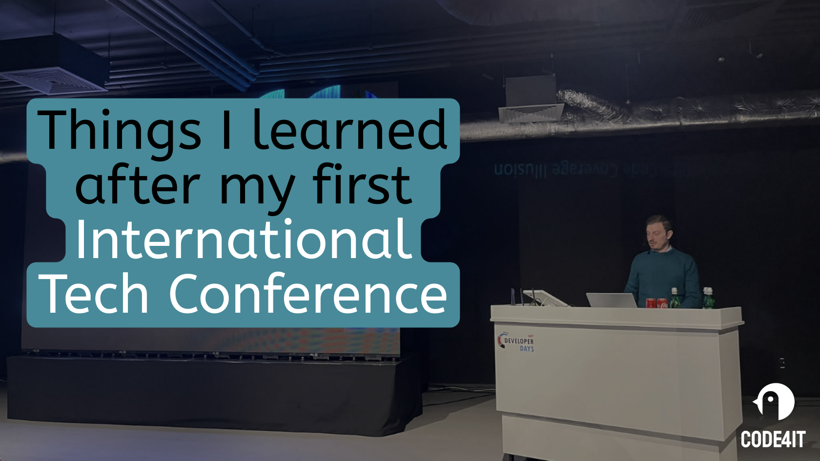
Things I learned after speaking at my first Big International Conference | Code4IT
It’s easy to say ‘Public Speaking’. But there are lots of factors that you can (and should) consider when talking to an international audience, especially if English is not your first language.
Table of Contents
Just a second! 🫷
If you are here, it means that you are a software developer.
So, you know that storage, networking, and domain management have a cost .If you want to support this blog, please ensure that you have disabled the adblocker for this site.
I configured Google AdSense to show as few ADS as possible – I don’t want to bother you with lots of ads, but I still need to add some to pay for the resources for my site.Thank you for your understanding.
– DavideIn October 2025, I talked for the first time at a big international conference: Dotnet Developer Days 2025 in Warsaw, Poland.
It went quite well – not perfectly, though. But I learned a couple of things that are worth mentioning and can be interesting, first of all for “future me” and then also for everyone who’s going to talk at an international conference in a foreign country (especially if English is not your first language, or something you are fluent with).
Clearly, some of my learnings can also be applied to talks in your native country.
Check video and electricity plug adapters
First and foremost, tip: always check once, twice, and then many other times that you have with you at the conference both the adapter for the laptop charger and the adapter for the video output.
I forgot the adapter for the laptop charger at the hotel, and I started panicking because the laptop was running out of battery.
Luckily, another speaker – Johan – got me covered: he lent me his cable, which, by chance, was compatible with mine.
Considering I had to deliver two talks on the same day, if my laptop had run out of battery, it would have ruined my whole conference experience.
Lesson learned!
Adjust screen, presentation and IDE’s luminosity according to the room structure
Depending on the venue, a conference can have one or more rooms available. And each room can have a different luminosity.
One of the sessions before mine used a light theme for both the slides and the code, but the session took place in a dark room with a very powerful screen.
The result? Everybody got blind!
I was using the light theme for Visual Studio, so I changed it in a couple of seconds.
But I also had to rework a bit the images of my slides, using darker background images.
Here are examples of the changes I made:
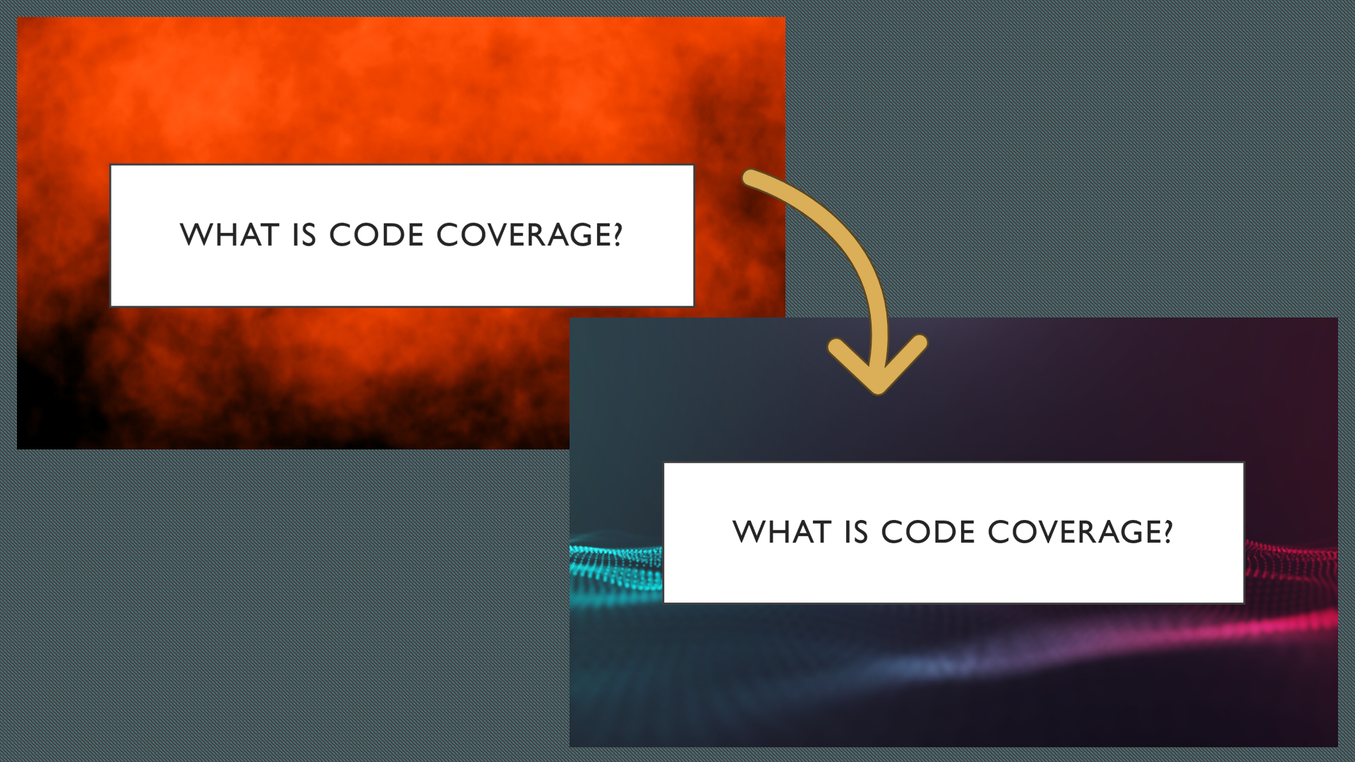
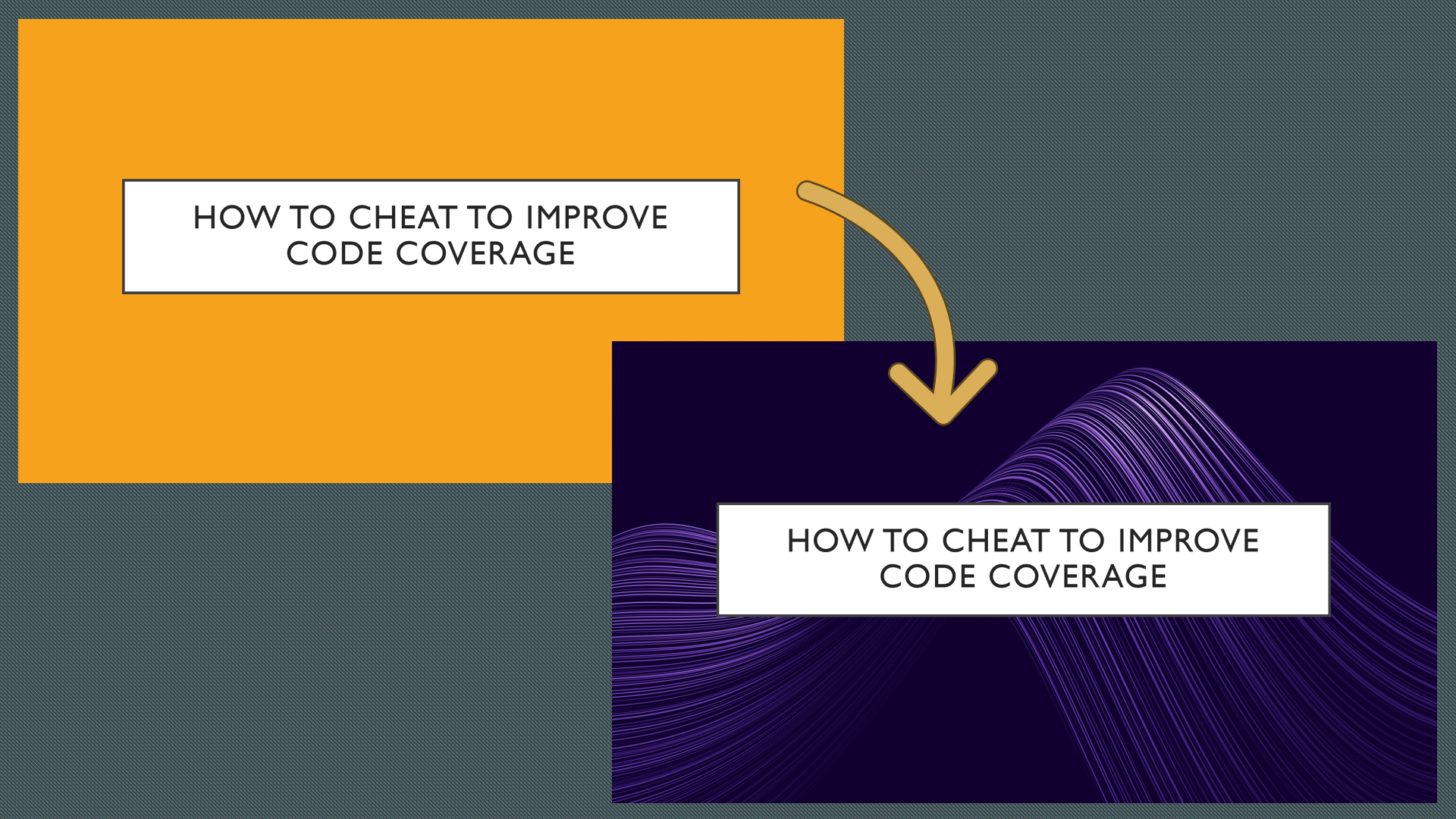
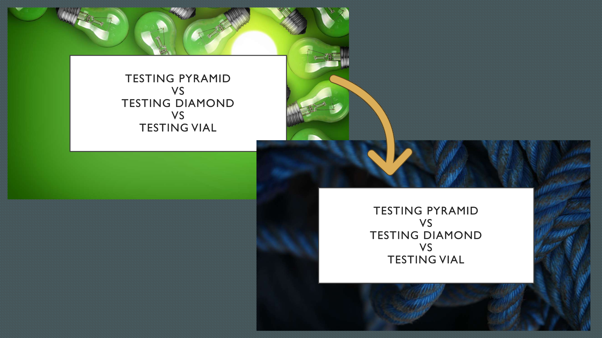
Imagine being in a dark room and suddenly seeing that bright, green image! I can hear the audience scream at you!
The lesson here is: take care of your audience by choosing the right colours (and the font size as well, obviously!)
Adjust your session based on the time and the audience count
I was happy with how the session about Code Coverage and the Testing Vial went: the audience appreciated it and asked a couple of interesting questions.
Hey! You’ve never heard of the Testing Vial?? Check it out here! 🧪🧪
But I can’t say the same for the session about what was released in .NET from version 5 to 9.
In this session, I briefly describe a ton of small things that have been released in recent years, such as new data types and syntax formats. So, except for the initial introduction, I generally talk about each topic for a minute or two – how much time should I spend to say «now we have DateOnly, that can replace DateTime if you don’t care about the Time part»?
I delivered it many times during these years, but this is the first time I’m totally unsatisfied with the result.
Why?
Two main factors impacted the delivery:
- It was the last session of the last day: the audience was already tired after two full days of sessions, so the attention span was incredibly low. I can understand them – I was exhausted too.
- There were many more people than the other times I delivered the same session: other times, I used to interact more with the crowd, asking them to join me on stage and run some experiments together, instead of just looking at me jumping from one topic to another. This session used to be much more interactive. But when the crowd gets bigger, nobody wants to be under the spotlight in front of that many people.
So, even if the topic was valuable, the format was not the best for this occasion. I will have to transform it into something different.
But, at least, the idea of creating a poll for the audience to pick the topics we would discuss was appreciated. It sort of kept them awake, but most probably it was not enough.
The lesson here is: tailor your session based on the hour and the expected audience.
Help your brain adapt to the language switch
As you know, I’m Italian. I’ve always lived here, and my company is Italian, with most of my colleagues being Italian too.
It means I don’t have many opportunities to brush up my English skills – and if it weren’t for this blog, it would be even worse.
So, speaking in English is a huge mental effort for me. It’s not something I do every day (well, except for the Daily meeting, so.. 10 minutes every day? surely, not enough).
But, in general, my English skills are not that terrible. At least, not considering my background.
During this trip, I was completely alone, and, even better, there were no Italians among the other conference speakers.
This simple fact forced me to switch my mind to English mode: it was my only way to communicate with others.
But changing such an essential aspect of life – your language – is not immediate. It takes time for the brain to switch and adapt. And I noticed it a lot: the first two days, I could barely join the conversations. But, after 2 or 3 days, my talking looked more fluent.
And I was lucky that both my sessions were on the third day: this way, I had time to let my brain adapt to the new city and the new country. If they were on the second day, my English would’ve been way worse.
On the contrary, in the last couple of days of my stay in Warsaw, even my internal thoughts switched to English – and, as a consequence, when I had to send voice messages to family and friends, it took me a couple of seconds to remember that I should have switched to Italian.
So, the lesson is: if you don’t speak English every day, give your brain some time to adapt by going to the venue city a couple of days before your talks.
Ask the organisers if you can stay a few more days in the city
The world is vast and amazing, and is worth a visit.
If it’s your first time in the venue city and the conference covers your travel and accommodation, ask if you can stay a couple of days longer.
Staying in the city more gives you some benefits, like:
- set your brain to English mode, as described before;
- visit the city: unless you are a very famous and/or talented conference speaker, it is implausible that you will be called again for the same conference (organisers want to have, every year, a different group of speakers). So, get the best out of the travel;
- if the additional days are after the conference, you can get to know the other speakers better. You may end up having dinner, having guided tours of the city, or visiting museums and parks together.
So, just ask. The worst that can happen is that the organiser cannot accommodate your request!
Further readings
It’s been a few years since I’ve been involved in public speaking. I think I learned a couple of things.
I still remember the first time I presented a talk in front of other people: it did not go well. But I learned something:
🔗 Thoughts after my very first public speech | Code4IT
The more I practiced, the more I learned from the experience. Here’s a list of 13 tips for your talks, whether in person or remote:
🔗 13 tips for delivering better tech talks | Code4IT
This article first appeared on Code4IT 🐧
Also, if you are into virtual conferences, you may be interested in this article:
🔗 10 underestimated tasks to do before your next virtual presentation | Code4IT
Wrapping up
Public speaking is a fantastic activity: it’s challenging, but definitely rewarding.
It’s not something like “go on stage and just talk”. It requires effort, a lot of rehearsals, tons of alternative plans in case something goes wrong, and a good balance between ego («hey, I’m on stage!») and humility («hey, I’m on stage FOR YOU»).
Maybe, you can give it a try too!
I hope you enjoyed this article! Let’s keep in touch on LinkedIn, Twitter or BlueSky! 🤜🤛
Happy coding!
🐧
-

In the Foundry of Imagination: The Forged Studio Story

Forged is a creative studio based in Orange County, California, built at the intersection of art, code, and AI.
We craft immersive digital experiences that blend cinematic design, real-time rendering, and emerging technology from interactive websites and installations to generative storytelling, AR, and VR.
At the center of everything we make is a custom WebGPU engine, designed for high-end rendering, AI integration, and seamless cross-platform interactivity.
Whether the project lives in a browser, a physical space, or a multiplayer world, the same framework powers it; keeping creative intent perfectly aligned from concept to execution.
Our Journey
Forged was founded by Michael Modena, an industry veteran who set out to build a studio that could move as fast as technology itself.
What started as a six-week experiment quickly became a new model for how a creative team could operate: small, adaptable, and obsessed with precision.
The goal wasn’t to rebuild what already existed, but to rethink it: What would a future-facing studio look like if we built it from scratch today?
The early days were defined by rhythm, mornings spent building the technical foundation, afternoons spent creating. That balance between engineering and artistry became our DNA.
The first major milestone was the creation of our own WebGPU renderer, capable of delivering film-quality lighting inside a browser. From there, Forged grew into a creative engine that now powers projects across web, physical, and immersive spaces.
Showcase
Hall of Flowers: Collective Bloom
For Hall of Flowers 2025, we created The Collective Bloom, an interactive installation powered by over 4.5 million real-time particles rendered in WebGPU. Attendees used their phones to place digital flowers into a living sculpture inspired by the Statue of Liberty, each bloom joining a growing field of color that evolved over the two-day event. What started as a simple gesture became a massive, ever-changing artwork; a collective expression of creativity brought to life through cutting-edge graphics and shared participation.


NEFT: Frozen Barrel AR
At Formula D, NEFT’s drift car giveaway became a small piece of theater: we turned their signature barrel into an AR activation. Fans entered to win, then scanned the real barrel to watch it ice over in real time and were invited to break the ice for a shot at bonus prizes. A simple giveaway transformed into a shareable, story-driven brand moment that felt as satisfying as cracking open the win.


Aura Vinyl: Color Explorer
The Aura Color Explorer reimagines how people shop for vinyl wrap. Built with real-time 3D rendering, it lets users rotate, light, and explore over a dozen vehicle models to see how each film behaves under true-to-life lighting. It’s Need for Speed in your browser. It’s become the centerpiece of Aura’s online experience, helping shoppers spend more time exploring and making confident, inspired choices.


The Trevor Project: What Hope Looks Like
What Hope Looks Like is an AI-guided meditation on hope and resilience. Led by Sol, a calm, reflective AI presence, users are invited into a short conversation that turns their words into living watercolor art, painted in real time by Google’s Imagen model. Built with custom watercolor shaders and particle systems, the experience blurs the line between human emotion and machine expression; culminating in a shared gallery of glowing lanterns, each carrying someone’s personal reflection. Created in support of The Trevor Project, it transforms a moment of introspection into a collective act of hope.


Culture & Team
Forged is intentionally small: a workshop, not a factory. Everyone is a maker. We value taste, precision, and originality over scale.
Our culture runs on rhythm and trust. AI plays a role in nearly everything we do, but never replaces the human hand. We work remotely, but share one philosophy: Everything should feel crafted not manufactured.
The name Forged isn’t metaphorical. It’s our process. We heat, hammer, and shape every idea until it’s perfect.
-
YouTube Removes Windows 11 Installation Guides, Calling Them 'Harmful'
YouTube Removes Windows 11 Installation Guides, Calling Them 'Harmful'
Source link -
Linux Gaming on Steam Just Hit a Historic 3% Milestone, and the Momentum Is Real
Linux Gaming on Steam Just Hit a Historic 3% Milestone, and the Momentum Is Real
Source link -
Palantir Recruits High School Graduates Directly, Challenging the College Path
Palantir Recruits High School Graduates Directly, Challenging the College Path
Source link
