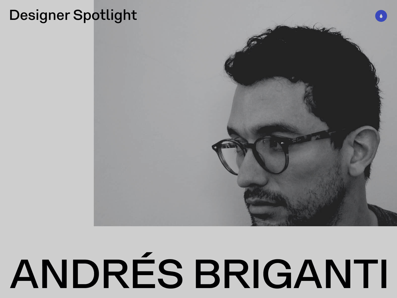
My name is Andrés Briganti, and I’m an independent graphic designer based in Buenos Aires, Argentina. I collaborate with brands, institutions, and individuals from around the world.
While my focus is on visual identity, my work spans over various fields of design visual communication, from physical to digital, from posters to wristwatches. My approach is refined and intentional, with the goal to distill abstract or complex ideas into distinctive visual forms.
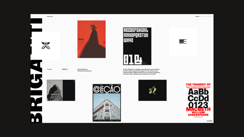
Selected Projects
Personal Site
My most recent, and most visible, digital project is my portfolio website. After years of iterations and a stalled launch, the concept matured into a more cohesive direction. Earlier this year, I teamed up with Joyco Studio to bring it to life. The result has been well received and earned an FWA Site of the Day.
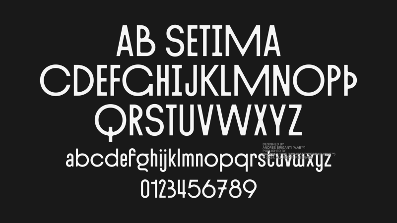
AB Setima
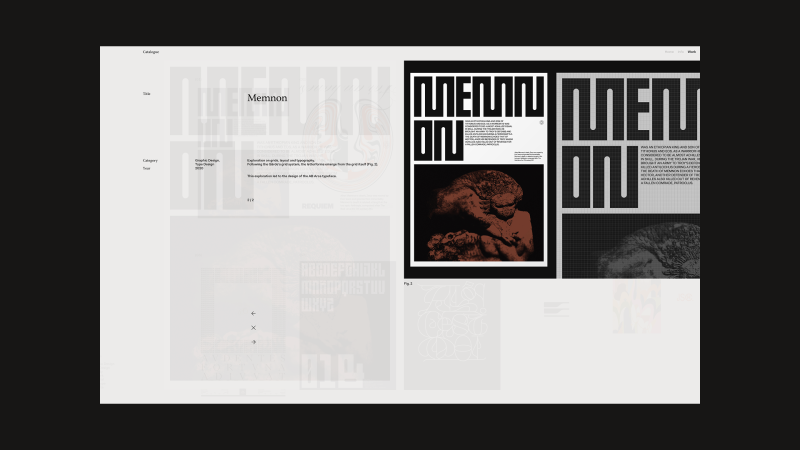
A few years ago, I began taking my interest in type design more seriously. I was even part of the team that designed the Geist typeface for Vercel while working at basement.studio.
My latest exploration in this field is AB Setima, a sans-serif display typeface that blends Art Deco geometry with a modern sensibility. It has refined proportions and tapered inner angles in contrast with sharp outer ones. The typeface includes variants and discretionary ligatures, offering some flexibility in composition.
Designed with restaurant identities, hotel graphics, and event communications in mind, AB Setima delivers a sense of distinction with some edge to it.
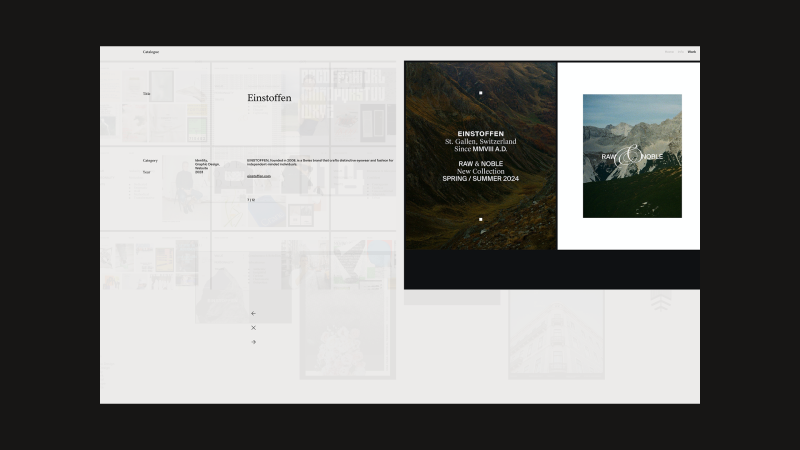
Einstoffen
During 2023, I led the rebrand and visual language refinement for Einstoffen, a Swiss brand founded in 2008 that creates distinctive eyewear and fashion for independent-minded individuals. The project focused on sharpening the brand’s visual identity to better reflect its bold, self-assured spirit and evolving product offering.
Various Identities
A selection of brand visual identities I’ve created over the years.
Previously, I’ve worked as Lead Brand Designer for digital studios and as Design Director for fashion and lifestyle brands. Today, I split my time between my independent practice, where I focus on visual exploration, and Rampant Studio, a collaborative creative bureau I’m building as Creative Director.
Design Philisophy
I believe in design that is both conceptually grounded and thoughtfully constructed, work that distills complex ideas into clear, enduring visual forms. My process balances strategic thinking with formal expression, creating identities and systems that are purposeful, distinctive, and built to last. I aim for clarity over noise, and visual languages that reflect the true character of the brands they serve.
Final Thoughts
I believe a designer’s greatest asset is the ability to connect the dots across the span of human experience and culture. A lack of interest in history, culture, and seemingly unrelated subjects leads to work that is shallow and short-lived. It’s curiosity – not specific skills or tools – that truly sets us apart.
Contact
I’m always happy to connect, share ideas, and explore new projects. Drop me a line anytime.
I’m a 32-year-old freelance developer based in Antwerp, Belgium, with a degree in Multimedia Technology and over a decade of experience crafting digital experiences. Early in my career, I took a bold step and moved to New York City to join the creative agency Your Majesty as a front-end developer — a launchpad that allowed me to work on high-profile projects for global brands like BMW and Spotify.
After a year in the U.S., I returned home to be closer to family and friends and continued refining my skills with renowned agencies such as Build in Amsterdam, Hello Monday, Watson DG, Exo Ape, and Studio 28K. Over the years, I’ve had the privilege of collaborating with top-tier creative teams on projects for clients including Amazon, Apple, Disney+, Mammut, Sony, WeTransfer, and more.
Today, as an independent developer, I partner with agencies around the world to deliver design and motion-driven digital experiences. Outside of work, you’ll often find me trail running, playing golf, or exploring the outdoors through my passion for landscape and nature photography.
WRK Timepieces is renowned for its commitment to crafting luxury timepieces. Their artisans craft each piece with exceptional care, combining traditional craftsmanship with cutting-edge innovation. Utilizing premium materials such as titanium and DLC (Diamond-Like Carbon), WRK Timepieces produces watches that embody precision engineering and timeless elegance. For their website, I worked with 28K Studio and their amazing team of designers.
I developed a product page for WRK’s latest timepiece, using immersive 3D scroll-triggered animations to reveal features like the precision-engineered movement, Flying Tourbillon, and Double-wishbone System. The fluid, interactive sequences let users explore the watch in rich detail from every angle, while a seamless scrolling flow highlights its design, materials, and craftsmanship in a premium, minimalist style true to the WRK brand.
Built with Vue/Nuxt, SCSS, TypeScript, GSAP, Storyblok for content, and Vercel for fast, reliable hosting.
Mammut is a Swiss premium outdoor brand known for its high-performance gear and apparel, combining innovative design with over 160 years of alpine heritage to equip adventurers for the most demanding environments.
From concept to launch, Build in Amsterdam collaborated closely with Mammut to create their new digital flagship store, united by a shared vision for quality. We set a fresh creative direction for lifestyle and product photography, shifting toward a more emotional shopping experience.
The mobile-first design system meets WCAG 2.1 accessibility standards, ensuring usability for all. To highlight the story behind every product, we designed editorial modules that encourage deeper exploration without overshadowing commerce.
Built with Next.js for responsive, high-performance interfaces, the platform integrates Contentful as a headless CMS, Algolia for lightning-fast search, and a custom PIM for real-time product data.
Exo Ape is a digital design studio that plants the flag at the intersection of technology, digital branding and content creation. For over a decade their team has had the privilege of working with global brands and inspiring startups to tell brand-led stories and shape digital identities.
I’ve collaborated with the Exo Ape team on numerous projects and had the privilege of contributing to their new studio website. Their focus consistently lies in strong design and bringing sites to life through engaging motion design. Working closely with Rob Smittenaar, I developed a robust foundation using Vue/Nuxt and created a backend-for-frontend API layer that streamlined data usage within the frontend app.
The project uses Vue/Nuxt for a dynamic frontend, SCSS for modular styling, and GSAP for smooth animations and transitions. Content is managed with Storyblok, and the site is hosted on Vercel for fast, reliable delivery.
Celebrating a century of cinema – In honor of Columbia Pictures’ 100th anniversary, I worked with Sony Pictures, Exo Ape and Watson DG to create a century-filled digital experience and quiz. Through this, we took visitors on a journey, not only through entertainment history, but also through a personalized path of self-discovery helping fans uncover the films and television shows that have shaped them the most.
In order to create a uniquely individual experience, we implemented a strategic backend development to keep the journey original, dynamic, and varied for every user – no matter how many times they return. This, along with a diverse mix of visuals and questions, created a fresh and engaging experience for everyone. The assets and questions are sourced from an extensive database of films, TV shows, and actors.
Each run through the quiz presents the visitor with eight interactive questions that gradually change based on their responses. The creative team developed a design system featuring five interactive mechanics — Circles, This or That, Slider, Rotator, and Drag and Drop — to present quiz questions in an engaging way, encouraging users to select answers through fun, dynamic interactions.
With titles, genres, and visuals from a hundred years of film and television, we were able to tailor the experience around each answer. For example, if the quiz finds that the user leans toward horror, more questions will be horror-themed. If they lean toward 80s films, more options will tap into nostalgia.
After diving into Columbia’s 100 years and completing the quiz, visitors were presented with a personalized shareable through an automated asset generator. This asset — accompanied with a range of social sharing options — played an important role in maintaining engagement and enthusiasm throughout the campaign and beyond.
The project’s frontend was built with Vue/Nuxt, SCSS, and GSAP for dynamic interfaces, modular styling, and smooth animations. The backend uses Node, Express, and Canvas to generate the shareable asset.
Every two years, General Electric surveys the world’s leading innovators to explore the future of innovation. The findings are presented in the Global Innovation Barometer, a biannual campaign created in collaboration with Little Red Robot.
The creative team developed a futuristic visual system for the campaign, based on a modern abstract 3D design style. Photography and live-action video were combined with 3D animations and illustrations to create a rich visual experience.
The project was built using Vue for a reactive and component-driven frontend, combined with Stylus for efficient and scalable styling. For smooth, performant animations, GSAP was integrated to handle complex transitions and scroll-triggered effects, enhancing the overall user experience.
Extra: Photography Portfolio 2.0 sneak peek
I’m excited to share that I’m currently collaborating with Barend Eijkenduijn and Clay Boan on the next version of my photography portfolio. This upcoming Version 2.0 will be more than just a refreshed collection of my work — it will also include a fully integrated print shop. Through this new platform, you’ll be able to browse my photographs, select your favorites, and customize your prints with a range of options, including various sizes, paper types, and framing styles. Our goal is to create a seamless and enjoyable experience, making it easier than ever to bring a piece of my photography into your home or workspace. We’re working towards an official launch by the end of this year, and I can’t wait to share it with you.
Final Thoughts
As a developer, I believe that curiosity and consistency are essential to growing in this field — but so is making time to explore, experiment, and create personal passion projects. Sharing that work can open unexpected doors.
Many thanks to Codrops and Manoela for this opportunity — it’s a real honor. Codrops has long been one of my favorite resources, and it’s played a big role in my own learning journey.
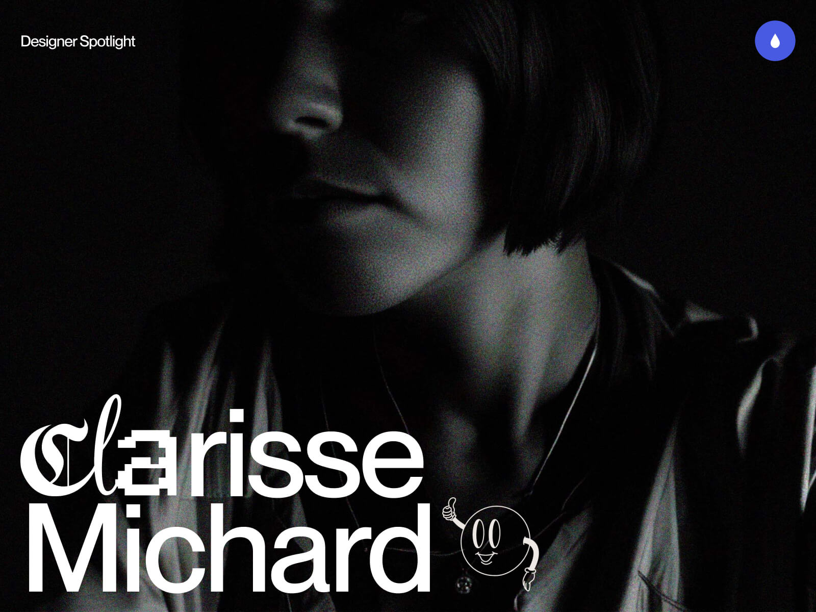
Hi! My name is Clarisse and I’m a freelance web designer at Okey Studio, currently based in Toulouse, France. Together with Adrien Quéchon, a web developer, we co-founded Okey Studio in 2021 — an independent digital studio specializing in the creation of unique, fully custom websites. We particularly love creating creative and original sites where we can play with ideas, interactions, and visuals, while still meeting our clients’ goals. We put a lot of heart into crafting personalized user experiences, always aligned with the needs and vision of those we work with.
What I especially enjoy is the diversity of sectors we collaborate with: it pushes us to stay curious, constantly test new visual languages, explore unexpected ideas, and challenge our habits.
This is the promotional website for Cyclops Club, a New York-based studio offering video production and editing services to optimize your multimedia content. Created within Okey Studio, the site immerses visitors in a quirky, dynamic, and fun universe.
Challenges: We wanted to incorporate nods to the video world (timelines, icons, progress bars, time indicators, REC mode…), as well as GIFs and Easter eggs. The challenge was to maintain a professional tone while keeping it fun — so we had to find the right balance between all these elements.
Personal note: This was one of those projects where you really feel creative freedom, and above all, where we genuinely had fun. Marvin trusted us 200%, which allowed us to push the graphic boundaries quite far while staying consistent with the brand image and goals. We enjoyed hiding little easter eggs and GIFs throughout the site. The nicest was embracing this funny tone while maintaining a professional and controlled foundation.
Virtual Gallery is a personal project we created internally at Okey Studio. The site honors photographers who generously share their photos online. It celebrates their talent through a small virtual photo gallery — like an exhibition space, but in a digital form. We wanted to create a smooth and enjoyable browsing experience through a selection of stunning photos, featuring carefully crafted scrolling and an immersive feel.
Challenges: The biggest challenge was probably selecting the photos. I sorted the images by colors and moods to maintain a consistent aesthetic throughout the site.
Personal notes: Since this is a personal project, it was naturally harder to set boundaries. No client, no deadline… so you want to keep going, keep testing, keep redoing. You have to learn to set limits for yourself and accept that it’s “finished” at some point. But it was also a true creative bubble, a playground and experimental space — the kind of project that reconnects you to the simple joy of designing without constraints.
This is the showcase website for Inertia Studios, a London-based creative studio pushing the boundaries of CGI, design, and futuristic aesthetics. Their ambition: create visual experiences that grab you, stop you, and make you feel something real.
Created within Okey Studio, the site adopts a rather sober aesthetic: micro-interactions, smooth transitions, subtle hover effects, large capitals, and solid and well-paced typographic blocks, for a sharp and impactful look — without feeling cold. A true balance between rigor, minimalism, and boldness. I really love the work of Inertia Studios — collaborating on their website redesign was a pure pleasure.
Challenges: Inertia has a strong brand image and an international client portfolio, so it was essential to remain highly professional and perfectly legible. The main challenge was to maintain a “classic” structure in terms of usability (clear information, intuitive navigation) while avoiding boredom by injecting modernity and visual tension.
Karo is an art and clothing brand based in New York, founded by Anya Karolyn. The studio defines itself as: non-traditional, a unification of artwork, fashion, music and video. Anya reached out to Okey Studio to redesign her e-commerce website. I imagined a more artistic, unconventional, and bold version, fully rooted in her aesthetic. The design adopts a brutalist approach, featuring chrome elements — a color and material that Anya particularly loves — as well as touches of electric blue; both emblematic of her visual identity. We loved transcribing the world of Studio Karo through interactive web animations where users become part of the experience.
Challenges: The challenge was definitely to find the right balance between an artistic, highly personal design — with a strong visual aesthetic — and a smooth, intuitive e-commerce experience. The site needed to both reflect Karo’s unique world while allowing users to navigate easily and shop without any friction.
Personal note: I loved working on this project — Anya and I were truly on the same wavelength from the start. She gave me complete trust, and we immediately understood each other about her desires, her objectives, and the creative direction to take. It was a super creative project where I could bring some different, sometimes bolder ideas — and she absolutely loved it. A smooth, inspiring, and freeing collaboration!
Henri Heymans
Henri is a web developer who contacted me to work on the web design for his first portfolio. His goal was clear: to stand out from other developers and try to win a Site of the Day (SOTD) on Awwwards. The site, now updated (2025), is unfortunately no longer online — but I kept a video and visual captures of it.
It featured a brutalist style on a black background. The design played with very large typographic compositions, scale variations, and a horizontal scroll that paced the navigation. The central element of the site was a 3D liquid metal sphere in negative, located on the homepage. It responded to cursor movements, creating a hypnotic effect that anchored the experience in a living material.
Personal note: This was a project where I could explore a bold design with a strong graphic stance. Henri wanted a site that grabs attention — and we had fun creating a showcase unlike any other.
This is my personal website, designed as a creative showcase that reflects both my style and personality. I wanted it to be minimalist in structure, yet fun and human, giving a more intimate glimpse of who I am.
In the loader, Adrien had fun animating the logo with a pixel effect we love — we especially enjoy these kinds of little details. When you arrive on the page, the central feature is a distortion effect applied to the main text, creating a lively and interactive texture.
Since I get bored quickly and like almost every color, I added a “Change the mood” button that lets you modify both the page’s color palette and the welcome GIF in the Hero section. This gives the site an evolving vibe and highlights visual diversity, while adding a playful touch.
It’s not a classic portfolio: no detailed project pages, but rather a personal space where I can present my work in a way that suits me, test ideas, and evolve the site as I please.
Challenges: The real challenge was setting boundaries for myself. When you create for yourself, anything is possible, and I tend to like and try many things. I had to decide: “Okay, this is the direction I choose,” and stick to it until the end.
Thanks to Cédric, videographer, for his awesome work on the video for my showreel.
Background
I studied graphic design in Toulouse, with a final year specializing in web design. I quickly developed a taste for web design and interactive experiences. Right after graduating, I had the opportunity to work directly on web projects as a freelancer — and I decided to fully embark on this adventure.
In 2021, together with Adrien Quéchon, we founded Okey Studio to offer a complete service: custom design and development, hand in hand.
One of the highlights was our very first Site of the Day on Awwwards: after spending my student years admiring other designers’ work on that site, seeing our own work featured there was a true achievement.
Design Philosophy
For me, creating a website means telling a visual story that reflects a brand’s personality. I believe in custom-made solutions, the importance of details, and the idea that a site must be beautiful, functional, high-performing, and designed to stand out, regardless of its complexity.
Tools and Techniques
I use Figma for design and conception, and I love working closely with Adrien on the development side to enhance interactions and brainstorm animation ideas together. I do a lot of creative research and exploration before each project. It’s also essential for me to fully immerse myself in the world of the client or brand I’m working with.
Inspiration
Online, I like to browse sites like Awwwards, CSS Design Awards, FWA, Dribbble, Pinterest, etc. (nothing very original). But I also draw a lot of inspiration from real life: through travel, as well as music, books, and films.
Future Goals
I’d like to keep creating websites that are both creative and tailor-made, with more projects where I have true artistic freedom, or at least plenty of space to propose original ideas. I really enjoy having fun in what I do! And I want to continue refining my work and improving.
Together with Adrien, we would also like to start working on the Okey Studio website — a site that truly reflects who we are and showcases our work and projects. It’s an exciting challenge, but we’ll need to find the time, as projects like this can quickly become a real playground!
Final Thoughts
It’s always a bit tricky to give advice or share a personal message, but I’d simply say: enjoy what you do, have fun, and put your heart into it — it usually comes across in the project 🫶
Thank you so much for reading, and a big thanks to Codrops and Manoela for inviting me to share a glimpse of my world and work.
You can find my contact info on my website clarissemichard.com I also share all my latest projects on social media:
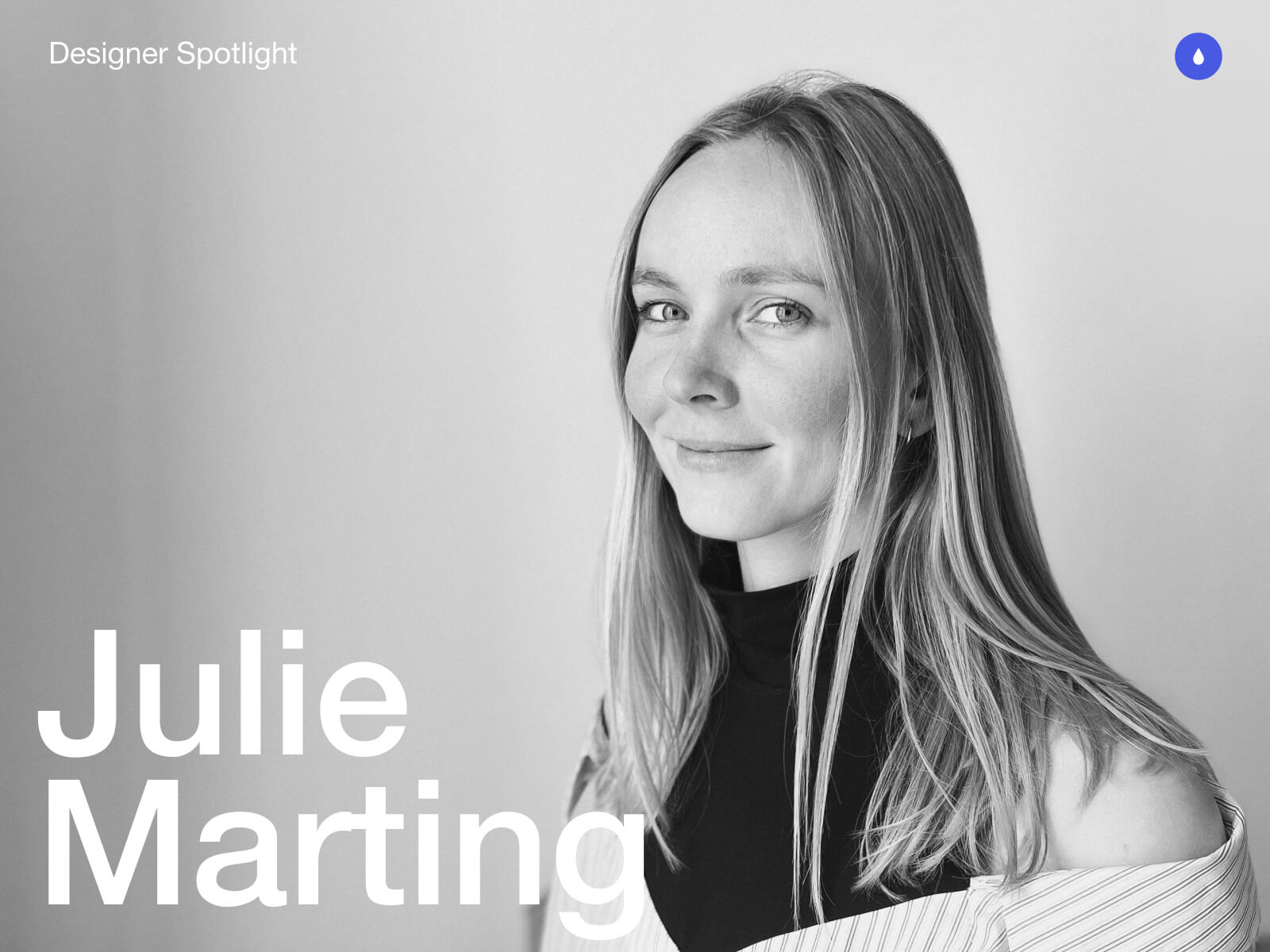
Hey there. My name is Julie Marting, and I’m a Paris-based designer. Focusing on concept, interactivity, and 3D, I’ve been working on these subjects at Hervé Studio for a few years now, with occasional freelance projects when something cool comes my way.
The types of projects I work on revolve around interactive and immersive experiences. From a landing page with interactive elements to a virtual immersive exhibition, or interactive user journeys within applications, my goal is to enhance the user experience by evoking emotions that encourage them to explore or use a service.
Featured work
Madbox
Madbox is a mobile game publisher creating fun, small games with simple gameplay that anyone can enjoy. Our mission was to create a website that reflected their image: playful, innovative, full of references and surprises that delight users, and also one that would make people want to join their team. (And obviously, with a mobile first approach.)
If you are curious, you will be intrigued by the hot-air balloon traveling through the hero section: it takes you on a test to see if you would be a good fit to join the Madbox team.
Personal Notes
This was the first project I worked on when I joined Hervé in 2021, and it’s still one of my favorites. We had so much fun coming up with concepts, interactions, animations, and easter eggs to add to this joyful design. It was a pleasure working with the clients, and a great collaboration with the developers, who were very proactive in making the experience as good as possible.
Fruitz is a French dating app that uses fruits to categorize what you’re looking for: one-night stands, casual matches, serious relationships… While the service is only available through the app, the clients still wanted a playful and interactive landing page for curious visitors. That’s where our adventure began!
To echo the tags and labels used on dating apps, we chose to explore an artistic direction centered around stickers. This also allowed us to highlight the puns that Fruitz loves to use in its communication campaigns.
Personal Notes
This project was a great opportunity to develop a new style for Fruitz’s communication, based on their brand guidelines but with some freedom to explore playful new visuals. It’s also always interesting to come up with a concept for a simple landing page with limited content. It has to catch the eye and delight users, without being “too much”.
For the Vivatech event, the LVMH group needed to create a virtual showcase of its brands’ latest innovations. On this occasion, I teamed up with Cosmic Shelter to create “The Showroom”, an immersive experience where you can discover the stories and the technological advances of the best Maisons, through an imaginary world.
Personal Notes
Aside from the art direction, which I really enjoyed, I found it very interesting to work as a freelancer for another digital agency. Although we share similar processes and methods, everyone works differently, so it’s always instructive to exchange ideas. Working as a freelancer on a specific part of a project (in this case, 3D art direction) and working as a designer within a studio with multiple roles on the same project are two very different experiences, both of which are incredibly enriching to explore.
365, A Year Of Cartier
Every year, Cartier publishes a magazine showcasing their key actions over the past 12 months. For two years in a row, they asked us at Hervé Studio to create a digital version of the magazine.
The goal was to bring together 29 articles across 6 chapters around a central navigation system, ensuring that users wouldn’t miss anything, and especially the 6 immersive articles we developed further.
Personal Notes
The challenge on this project was the tight deadline in relation to the complexity of the experiments and the creative intentions we wanted to bring to them. We were a small team, so we had to stay organized and work quickly, but in the end it was a real pleasure to see all these experiments come to life.
For the end-of-year celebrations, Lacoste wanted to promote the customization feature of their polo shirts. We were asked at Hervé Studio to design a short video highlighting this feature and its various possibilities.
Personal notes
This really cool project, despite its short deadline, was a great opportunity to explore the physics effects in Cinema 4D, which I wasn’t very familiar with. It was important to develop a storytelling approach around the creation of a unique polo, and I’m proud of the result we managed to achieve for this two-week project.
Background & Career highlights
As interactive design is a recent and niche field, I began my studies in graphic design without knowing it even existed. It was at Gobelins that I discovered and fell in love with this specialty, and I went on to enroll in a master’s degree in interactive design. The main strength of this school was the sandwich course, which allowed me to start my first job at a very young age. After working for a bespoke industrial design studio, a ready-to-wear brand, and a digital agency, I finally joined Hervé Studio over four years ago.
We were a small team with a human spirit, which gave me the opportunity to quickly take on responsibilities for projects of various sizes.
We’ve grown and evolved, winning over new clients and new types of projects. We were eventually invited to give a talk at the Paris Design Meetup organized by Algolia and Jitter, and later at the OFFF Vienna festival. There, we shared our experience on the following topic: “WebGL for Interactivity: From Concept to Production”. The idea was to demystify the use of this technology, highlight the possibilities it opens up for designers, and explain our workflow and collaboration with developers to move forward together on a shared project.
Talk at the OFFF Vienna Festival with the co-founders of Hervé Studio: Romain Briaux and Vincent Jouty
Design Philosophy
I am convinced that in this overwhelming world, design can bring us meaning and calm. In my approach, I see it as a way to transport people into a world beyond the ordinary. Immersing users, capturing their attention, and offering them a moment of escape while conveying a message is what I aspire to.
Injecting meaning into projects is a leitmotif. It’s obviously not enough to create something beautiful; it’s about creating something tailor-made that holds meaning for users, clients, and ourselves.
Interactive design enables us to place the user at the center of the experience, making them an active participant rather than just a reader of information or a potential consumer. Moreover, interactive design can sometimes evoke emotions and create lasting memories. For these reasons, this specialty feels like a powerful medium for expression and exchange, because that’s what it’s all about.
Tools & Technics
A pencil and some paper: inherent to creation
Figma: to gather and create
Cinema 4D + Octane render: to let the magic happen
But I would say the best tool is communication, within the team and with developers, to understand how we can work better together, which techniques to use, and how to achieve a smoother workflow and a stunning result.
Inspiration
We’re lucky to have many platforms to find inspiration today, but I would say my main source of inspiration comes from life itself, everything that crosses our path at any given moment. Staying open to what surrounds us, observing, and focusing our attention on things that catch our eye or raise questions. It can be visual (static or moving), a sensation, a feeling, a moment, an action, a concept, a sentence, an idea, anything we’re sensitive to.
And if we get inspired by something and need to take some notes or sketch it, no matter how accurate the result is, the important thing is to catch the inspiration and explore all around. This is why I like to do some photography in my spare time, or other accessible crafts like painting on objects, nude drawing sessions, or creating little jewels out of nowhere. These activities are very invigorating and allow us to take a break from our hectic lives.
Future goals
My main goal is to finally start working on my portfolio. Like many designers, I’ve always postponed this moment, relying on platforms like Behance to showcase my projects. But there comes a time when it’s important to have an online presence, a professional storefront that evolves with us over time.
Final Thoughts
Don’t pay too much attention to negative minds. Believe in yourself, stick to what you like, explore and try without worrying about rules or expectations. Make mistakes and don’t blame yourself for them. On the contrary, failures can sometimes lead to good surprises, or at least valuable lessons. Above all, listen to yourself and find the right balance between creating and taking time to breathe. Enjoying yourself is essential.
Contact
Thank you very much for your reading, and feel free to reach out if interested in anything, I would be happy to discuss!
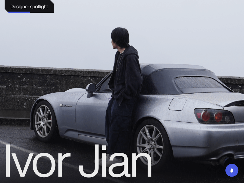
Hi! I’m Ivor Jian, a multidisciplinary designer and creative developer from Washington, USA. I create websites that blend Swiss-inspired precision with a clean, utilitarian style. My goal is to craft projects that evoke emotion through quality and tasteful animation.
As my design career continues to develop, I’m constantly learning and expanding my horizons. Below are some projects I’m proud to share from the early stages of my creative journey.
Featured projects
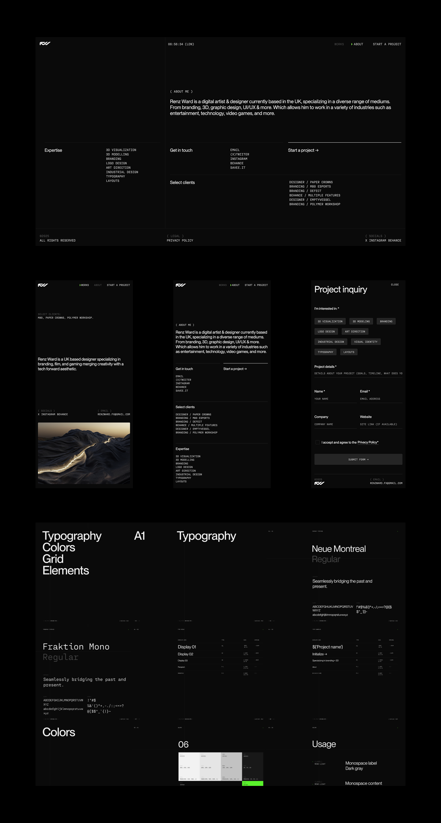
Renz Ward
A portfolio website for a UK-based designer who specializes in a technically forward aesthetic. From concept to completion, we collaborated on the visual direction, motion design, and intricate site details. The site features a grid-focused layout and animations that align with the designer’s visual identity.
The biggest challenge was syncing the dial animation with the project scroll and indicator. I’m not ashamed to say I relied heavily on Perplexity to help with this interaction. The result is a technical yet sophisticated website that I’m proud to share. The site currently has limited content, as Renz is still wrapping up projects. I plan to submit it to CSSDA and Awwwards once it’s complete.
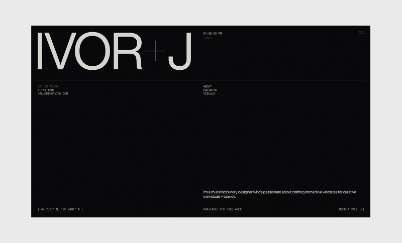
My portfolio website is always a work in progress, but I’m happy to share its current iteration. I wanted the details and typography to reflect who I am, both personally and as a designer. This includes the typography, animations, and fine details throughout the site.
This is my first passion project, and it received an honorable mention on CSSDA. As a fan of interior design and architecture, I wanted to create a minimal and experimental website to explore interactions and showcase AI-generated architecture. My focus was to deliver a clear and refined experience with clean micro-interactions and smooth page transitions. The images were generated in Midjourney.
I originally wanted to use real publications but was concerned about legal issues. The biggest challenge was making the individual showcases cohesive, as there is a lot of variation in the generated images. To achieve the best results, I used real publication images as references.
A redesign concept of the Polestar brand. Their design language was right up my alley, so I took on the challenge of creating a bespoke web experience while staying aligned with their core visual identity.
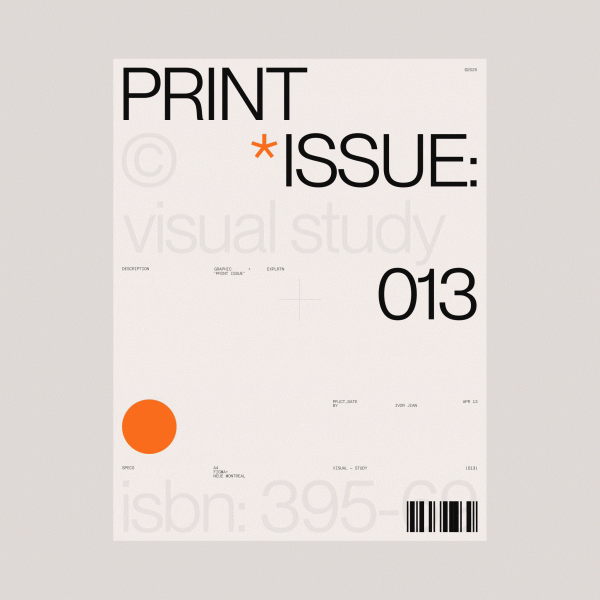
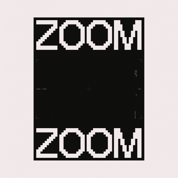
Visual explorations
I enjoy exploring and creating random designs just for the sake of it. This helps me expand my horizons as a designer and can potentially lead to new opportunities.
About me
I’m a 22-year-old self-taught freelance designer and developer. I started doing graphic design at 13, which I believe gave me a strong foundation when I fully shifted to web design about two years ago. Without a formal education in building websites, I’ve had the freedom to explore ideas and learn by doing. This has helped me discover the kind of work I want to pursue and shape my design style. I started gaining some traction on X/Twitter after consistently posting my designs at the start of 2025, and I’ve met so many talented and wonderful people since beginning my journey there.
My approach to design
I don’t follow a strict set of principles or a fixed approach to design. I usually start by looking for inspiration before diving into a project. That said, I tend to favor a 12-column grid and clean, modern Swiss typefaces. I always iterate, exploring as many options as possible before choosing one direction to refine.
Favorite tools
My favorite tools are Webflow for development, GSAP for web animations, Perplexity for brainstorming and problem-solving, and Figma for design. This tool stack covers everything I need at the moment.
Inspiration
I love browsing beautiful visuals and websites to continually refine my taste. For design inspiration, my favorite resources are Savee and Searchsystem for their curated aesthetics of clean and technical design. When it comes to websites, I look to Awwwards and various agency sites with distinct, well-crafted brand identities. I also have favorite designers and developers whose work I admire and learn from by studying their craft; among them are Dennis Snellenberg, Ilja Van Eck, Oliver Larose, and Niklas Rosen.
Future goals
I want to keep learning and creating meaningful projects by collaborating with creative individuals and brands that align with my style of websites. I focus on combining clean typography with interactions that make a site shine with a modern and technical touch. I plan to become an award-winning designer and developer through persistence and a genuine love for great design.
Final thoughts
Thank you so much for reading about my thoughts and latest projects! I’m by no means a top-notch designer or developer yet, but I hope you enjoyed the visuals and got to know a bit about me. Consistently share your work—it might just change your life.
Keep learning, exploring, and iterating. Feel free to reach out to me on X/Twitter if you want to chat or have a project in mind. ♥️
Hi, I’m Ivan—a Dubai-based designer focused on fintech products and branding. I run Moonsight, where we craft thoughtful digital experiences and sharp visual identities for financial companies around the world.
Background
My path into design wasn’t a childhood calling—I wasn’t drawing wireframes at age ten or dreaming of Helvetica (can you imagine XD). I just knew I didn’t want the typical office life. I wanted freedom, movement, and a way to create things that felt useful. Design turned out to be the sweet spot between independence and impact.
So I studied design at university by day, and took on agency work by night—what you might call the full-stack student hustle. That rhythm—study, work, repeat—taught me discipline. I also kept learning on the side, exploring tools, trends, and techniques to sharpen my craft.
Eventually, I found myself gravitating toward fintech.
Why fintech? Because it’s real. It’s personal. Everyone interacts with money. And when you build something that helps them feel more in control of it—you’re not just improving UX, you’re improving lives.
You’re designing trust. That’s a responsibility I take seriously.
From there, I explored both sides of the industry: in-house roles at product companies, and fast-paced agency work. Later, I shifted into consultancy—partnering with fintechs across Europe, the Gulf, and Asia. That chapter taught me a lot—not just about design, but about people, culture, and how different teams think about trust and money.
All of that led me to start Moonsight—a space where I could bring all those experiences together. Today, we partner with fintechs and financial companies to create sharp, useful, brand-led digital experiences. And while I still stay hands-on, I’m also building a team that’s just as obsessed with clarity, thoughtfulness, and execution as I am.
Featured Work
Monetto
A game-changer in the world of freelancing. Designed to simplify and elevate the financial journey for freelancers, Monetto is more than just an app – it’s a holistic solution that empowers creatives like me to manage their finances with confidence.
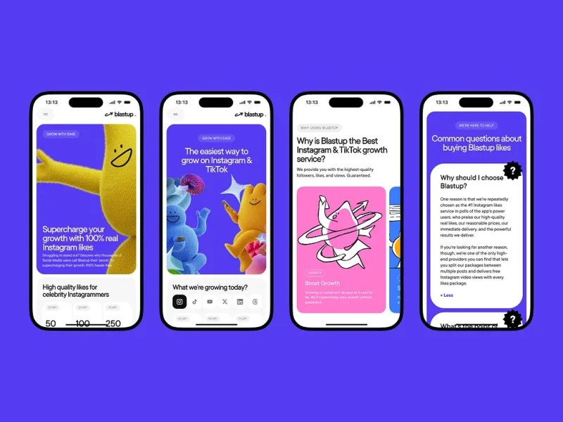
BlastUp
Blastup’s mission is simple—help users grow their social media presence, fast. We crafted a bold, dynamic identity that reflects Blastup’s energetic and friendly personality as well is their website.
Alinma Bank
This project for Alinma Bank involved a comprehensive redesign across all brand touchpoints: the logo, physical cards, website, and mobile app. The goal was to modernize and streamline the visual identity while maintaining the bank’s core values.
Coinly
Coinly is more than just a banking app — it’s a full-fledged financial literacy ecosystem for kids, designed to empower the next generation with money skills that grow with them. Built around an engaging coin mascot and a colorful 3D world, Coinly blends gamification, interactive storytelling, and real financial tools.
Design Philosophy
Design should be highly functional and intuitive, solving both business and user problems while delivering an engaging experience that users want to return to.
Design is clarity. And clarity builds trust.
Especially in fintech—where most of my projects happen—you don’t have the luxury of vague. Your design has to work, first and foremost. It has to feel smart, trustworthy, smooth. When people trust your interface, they trust your product. And when they trust your product, they’re more likely to use it again. That’s where design really proves its value.
My job is to make things useful first, beautiful second. But ideally, both at once.
The way I approach projects is structured but adaptable.
I start with full immersion—understanding the business, the audience, and the problem we’re solving. From there, I look for a unique angle, something that gives the product or brand a distinct voice. Then I push that idea as far as I can—visually, functionally, and emotionally.
And no, I don’t believe in reinventing everything 🙂
Use the patterns that work. But when something feels off or underwhelming, be bold enough to rethink it. That’s where the real creative work lives—not in chaos, but in considered evolution.
I don’t want to be known for a style. I want to be known for range.
For every project, I try to find a distinct visual language. That means experimenting—pulling in 3D, motion, illustration—whatever it takes to bring the concept to life.
And I rarely do it alone.
I collaborate closely with animators, developers, motion designers, illustrators—the kind of people who not only support the vision, but expand it. When everyone brings their strengths to the table, the result is always richer, sharper, more memorable.
What matters most is that the end result has presence. That it feels alive, intentional, and built with care.
And I care deeply about how work is presented. Every project—client or personal—is framed with context, rationale, and craft. Because good design solves problems, but great design tells a story.
Process In Bits
My process is structured, but not rigid. Usually, it looks something like this:
Polish and present Clear storytelling. Clean handoff. Confident rationale.
Understand the business What’s broken? What’s needed? What are we really solving?
Understand the user What do they expect? What’s familiar to them? What do they fear?
Build and iterate Fast feedback loops with clients and the team
One benchmark I use: if I don’t understand what I designed, how can I expect a user to?
For me, good design starts with intention. Every screen, every button, every microinteraction—there should be a reason it exists. So when a feature’s built, I walk through it in my head as if I’ve never seen it before. What would I click? What would I expect next? Can I explain what each part does without second-guessing?
After working on financial interfaces for so long, you start to internalize these flows—you almost know them by muscle memory. But that doesn’t mean you skip the test. You still go through each stage. You still assume nothing.
Sometimes, the best insights come from a teammate asking, “Wait, what does this do?” That’s your cue to look closer.
And when it comes to working with clients?
I walk clients through every stage—from moodboards to microinteractions—so there are no surprises and no last-minute pivots.
It’s about mutual trust: they trust my process, and I trust their vision.
This structure helps me manage expectations, prevent scope drift, and deliver thoughtful work—on time, without the drama.
What keeps me inspired? Looking outside the bubble.
I don’t have a list of designers I religiously follow. What inspires me is great work—wherever it lives. Sometimes it’s a slick piece of web design, sometimes a brutalist poster on the street, art style from a video game, or the typography on a jazz record sleeve.
Music plays a huge role in my creative life—I sing a bit, and I think that kind of rhythm and structure naturally finds its way into how I build interfaces.
I’m also a huge gamer, and I’m fascinated by how game mechanics influence user behavior. There’s a lot designers can learn from how games guide, reward, and surprise users.
Sometimes I’ll see a cool effect, a character design, or even just a motion detail and immediately think:
That could be the anchor for a whole experience
Not necessarily for the project I’m working on in the moment, but something I’d love to build around later. So I sort, I collect, I sketch.
I’m often looking for inspiration for one project, but bookmarking ideas for two or three others. It’s not just moodboarding—it’s pattern recognition, and planting seeds for future concepts.
Inspiration can come from anywhere—but only if you keep your eyes open.
What’s Next
Right now, I’m fully focused on building Moonsight into a studio known for bold, strategic fintech design—especially across the MENA region.
On my personal radar:
Master 3D
Launch my own product
Speak at more design events
Make Moonsight’s design Conference in Dubai happen
Join awwwards jury panel
Do more meaningful work
Mostly? Just grow. As a designer, a founder, and a creative
Parting Thoughts
If I could give one piece of advice to younger designers, it would be this:
Find what excites you. Stay obsessed with it. And don’t waste time comparing yourself to others.
We’re overexposed to each other’s work these days. It’s easy to feel behind.
But your only competition is yourself a year ago. That’s where growth lives.
This industry moves fast. But if you move with intent, your work will always find its place.
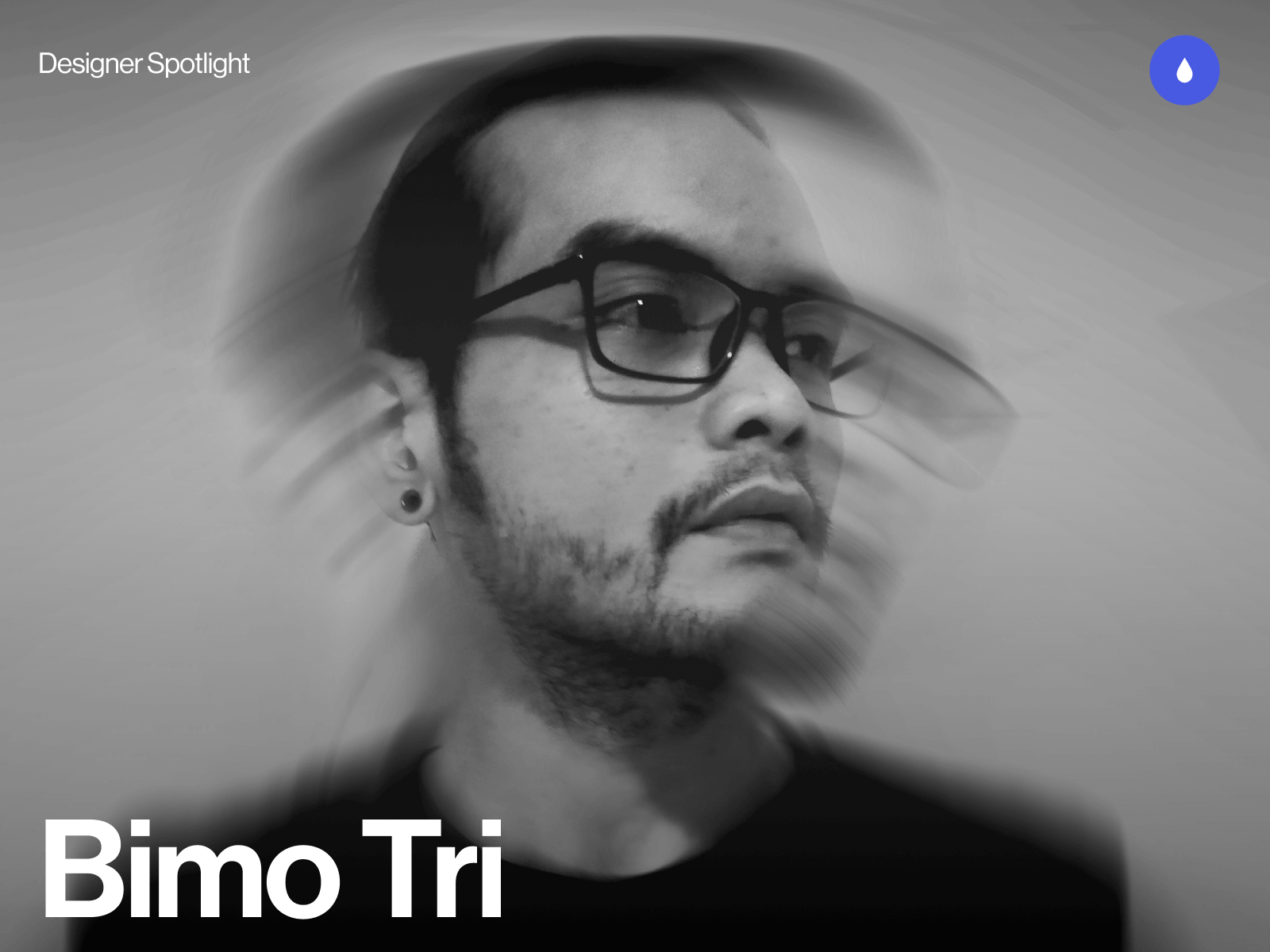
I’m Bimo Tri, a multidisciplinary designer and creative developer based in Indonesia. I run a small independent studio called Studio•Bämo.J®, working between Jakarta and Bali — or pretty much anywhere I can find a fast internet connection.
My focus is on building expressive digital experiences, mostly portfolio sites and brand platforms for creatives, studios, and design-forward brands. With roots in both design and development, I enjoy blending visual precision with motion and interactivity to create work that feels both thoughtful and visceral. I care deeply about craft, story, and making things that resonate beyond just visuals.
Saisei is a visionary architecture firm based in Tokyo, Japan, focused on sustainability, culture, and timeless design. I designed and developed the site to reflect their philosophy merging traditional Japanese aesthetics with clean, contemporary digital design.
Achievements
This project was a major milestone in my career. It brought home my first Awwwards Site of the Day and earned recognition from several other platforms. The positive feedback from the design community affirmed my approach to cultural storytelling through digital mediums.
Personal notes
Saisei remains one of my favorite works. I’ve always been drawn to the tension between heritage and modernity, and this project gave me the space to explore that deeply. The recognition it received made the process even more meaningful.
Nagara is a concept project developed in collaboration with my buddy Felixander Yuan, created as part of the #DareToShare24 design challenge by @bentenwordring.
It reimagines a luxury watch brand that fuses the precision of Swiss watchmaking with the cultural depth of the Majapahit Empire. Each timepiece acts as a tribute not just to technical craftsmanship, but to historical richness and aesthetic symbolism rooted in Indonesian heritage.
Challenges
One of the biggest hurdles was exploring AI-generated imagery and motion assets. Using tools like Midjourney and Kling, it took numerous iterations to dial in a visual direction that felt both on-brand and high-end. Getting the product visuals — especially the watches — to look authentic and aligned with the brand’s narrative was far more challenging than anticipated.
Achievements
The final result was a fully animated concept site that we were genuinely proud of. Yuan did an amazing job bringing the dev and motion to life. Beyond that, the project ended up winning the monthly challenge, earning recognition and some cool prizes — a nice bonus on top of the creative satisfaction.
Personal notes
This one felt personal. The month’s theme was “Luxury” — a space I naturally gravitate toward — and we were allowed to team up for the final challenge. I chose to work with Yuan, someone I’ve respected and known for a while. The entire process felt like a return to roots — storytelling, culture, and collaboration — wrapped inside a luxury narrative.
Horizon Studio is a conceptual architecture firm based in Los Angeles, created to explore the intersection of art, design, and technology. Inspired by my love for architecture and interior design, the site showcases sleek, avant-garde visuals with a focus on sustainability. I used Midjourney for the visual assets and GPT to shape the narrative, crafting an experience that feels modern and immersive.
Achievements
The site received an Honorable Mention from Awwwards — a validating moment for me as it was one of my earliest forays into the architecture space. The feedback highlighted the strength of the design direction and the site’s overall atmosphere.
Personal notes
This was the first project where I went all in with generative AI — every asset was made using prompts, and honestly, it was pretty sloppy at first. But through experimentation, I managed to create a cohesive visual style that looked like it came from one photographer. It reminded me how fun it is to dive into the unknown and just explore.
REZN-8 is a typographic and layout exploration rooted in Swiss design principles. It started as a poster experiment and evolved into a full website — my first time building a motion-heavy site entirely with code. It was all about translating static design into something dynamic, expressive, and functional in a digital format.
Challenges
Turning the poster into a functional site was already a challenge, but learning JavaScript on the fly to bring motion into the experience pushed me even further.
The biggest challenge, though, was researching and presenting accurate information about the legendary designers featured. Some had very little online presence, so I had to dive deep into design history to get the details right.
Personal notes
REZN-8 holds a special place in my heart. It completely changed how I see layout, grids, and type — it was the project that shifted my design brain forever. Shoutout to Chris Do and TheFutur’s Typography 01 course, which sparked the whole thing.
I didn’t start out as a designer, at least not in the traditional sense. My early work was in a marketing agency where I handled everything from FB ad graphics to SEO landing pages and WordPress articles. It wasn’t glamorous, but it gave me a foundation in how digital systems work.
Then I stumbled across Webflow — and everything changed. I got completely hooked on web design, especially sites with rich motion and interaction.
That moment pushed me to quit the agency world and start my own studio. Since then, I’ve been building expressive, story-driven websites for creatives and design-forward brands, blending design, motion, and development into something that feels personal and intentional.
Design Philosophy
I’ve always leaned toward minimal design paired with bold, heavy type. To me, you don’t need a lot to make something striking, just the right balance of restraint and intention. If the typography is solid and the layout is thoughtful, even the simplest design can carry emotional weight. I focus on clarity, rhythm, and a strong visual pulse — letting motion, space, and type do the heavy lifting.
Tools and Techniques
Figma for most of the design work
Webflow for front-end development and CMS integration
GSAP for all things motion and interaction
Cursor for dev support (because I wouldn’t call myself a “real dev,” but I make it work)
Inspiration
I pull inspiration from a lot of places — music, films, anime — especially the ones that are crafted with insane attention to detail. I’ve always admired how much intention goes into those worlds. There’s so much to steal from them — not just visually, but conceptually and emotionally. I’m also inspired by work that feels personal, raw, and beautifully uncompromising.
Future Goals
My main goal is to keep attracting work that aligns with the way I see and do things. I’m not chasing volume — I just want to keep collaborating with people who value design, story, and craft as much as I do. I’m also interested in exploring more personal projects, maybe even merging design with philosophy, fitness, or writing — things that feel more like extensions of who I am, not just what I do.
Final Thoughts
Learn from the past, embrace the present moment, and look into the future. You only live once, do what makes you happy and what feels right for you.
Contact Info
I’m mostly active on LinkedIn, X (Twitter), and occasionally Instagram.
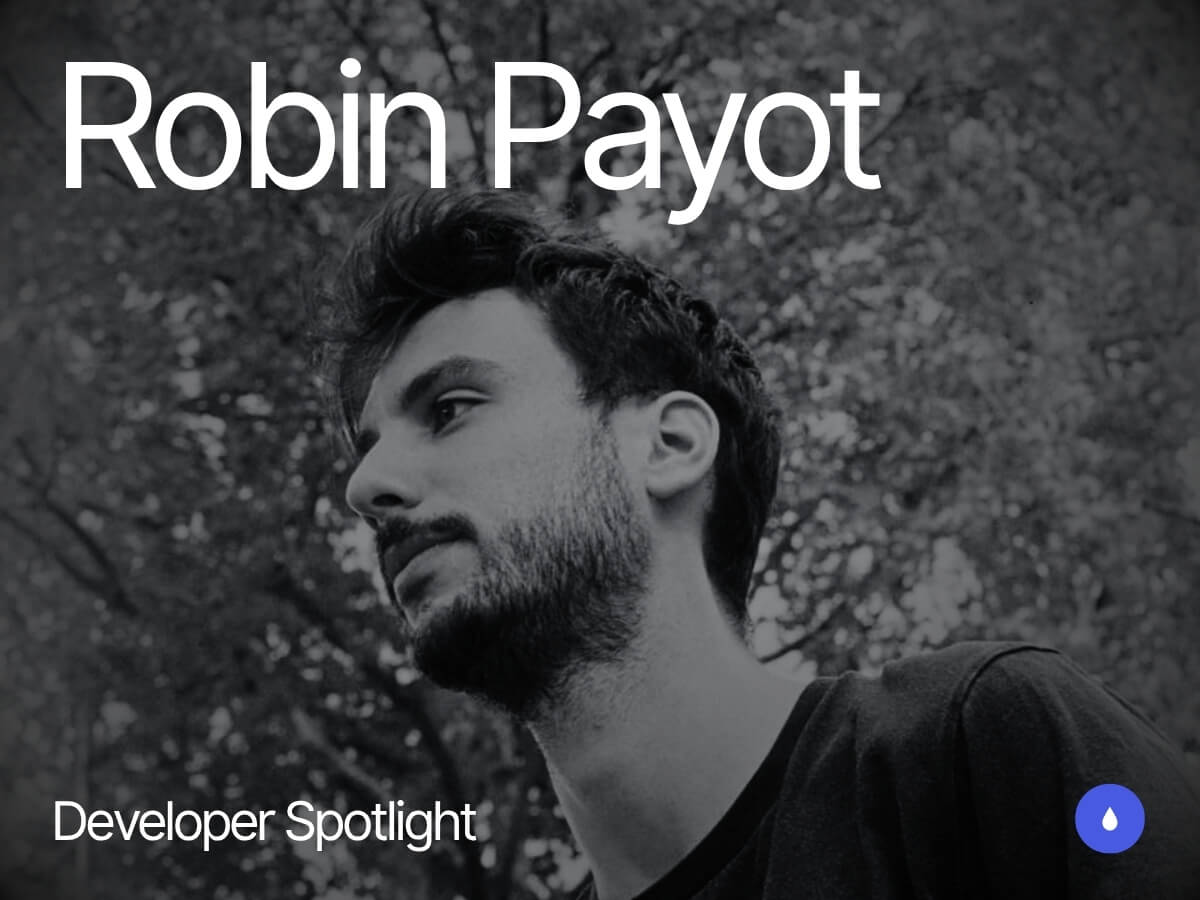
Hey, I’m Robin, a Creative Developer since 2015, based in Paris and a former HETIC student.
I’ve worked at agencies like 84.Paris and Upperquad, and I’ve also freelanced with many others, picking up a few web awards along the way. I created Wind Waker.js and started a YouTube channel where I teach WebGL tutorials.
What really excites me about development is having an idea in mind and being able to see it come to life visually, tweaking it again and again until I find the right solution to achieve the result I want.
When I was a kid, I was a huge fan of a GameCube video game called Zelda: The Wind Waker. It was a vibrant, colorful game where you sailed a boat to explore the world, with a really cool pirate vibe! I wanted to challenge myself, so I decided to try recreating it in Three.js to see how far I could go.
Luckily for me, a brilliant creative coder named Nathan Gordon had already written an article back in 2016 about recreating the game’s water. That gave me a solid foundation to start from.
After a lot of effort, I managed to create something I was really proud of, including six islands with LOD (Level of Detail) logic, dynamic day/night and weather cycles, fake physics with objects floating on water, a mini-game similar to Temple Run, and a treasure hunt where you search for the Triforce.
I faced many challenges along the way, and if you’re curious about how I tackled them, I made two videos explaining everything:
The project received a lot of positive feedback, and I’m truly grateful I got the chance to pay tribute to this incredible Nintendo game.
McDonald’s Switzerland – The Golden Slide Game
Last December, I had the opportunity to create a mobile video game for McDonald’s Switzerland with the Swipe Back team.
The 3D designer provided us with some really fun, toon-style assets, which made the game look both playful and professional—especially exciting for me, as it was my first time working on a real game project.
I worked alongside David Ronai, just the two of us as developers, and it was quite a challenge! The game featured weekly quests, unlockable cosmetics, real-world rewards for top players, and a full server-side backend (which David handled).
David also had this wild idea: to build the game using TSL, a new language in the Three.js ecosystem that automatically converts your JS shaders to WebGPU. I learned it during the project and used it to create the 3D game. At the time, documentation was sparse and the tech was very fresh, but it promised much better performance than WebGL. Despite the challenge, we made it work, and the result was amazing—WebGPU ran incredibly smoothly on Android.
With all the 3D assets we had, we needed to optimize carefully. One of the key techniques we used was Batched Mesh, combining all obstacles into a single mesh, which didn’t require TSL but helped a lot with performance.
The website is no longer available since it was part of a Christmas event, but I captured a video of the project that you can check out here.
Last year, I worked on a 3D project where users could create their own salt crystal using different ingredients, all as part of a campaign for a new Issey Miyake perfume. It was a really fun experience, and the main technical challenge was achieving a beautiful refraction shader effect.
I handled the front-end development alone and used React Three Fiber for the first time, a WebGL framework based on Three.js that lets you build 3D scenes using React-style components.
The library was super helpful for setting things up quickly. As I got deeper into the project, however, I ran into a few minor issues, but I managed to solve them with some custom code. I’d definitely recommend React Three Fiber if you already know a lot about WebGL/Three.js and enjoy working in the React ecosystem.
This project was awarded Site of the Day (SOTD) on FWA.
I’ve included my portfolio as the final case study. Even though it’s an older project and not always up to date, it still means a lot to me.
I started working on it during a break right after the pandemic. I had a very vague idea at first, so I began designing and programming at the same time. It was a curious way of working because I was never quite sure how it would turn out. With lots of back and forth, trial and error, and restarts, I really enjoyed that creative, spontaneous process—and I’d definitely recommend it if you’re working on a personal project!
This project received a Site of the Day (SOTD) award on both Awwwards and FWA.
About me
I’m a Creative Web Developer with 10 years of experience, based in Paris.
I studied at a French school called HETIC, where I learned a wide range of web-related skills including design, project management, marketing, and programming. In 2015, I had the chance to do a six-month internship at UNIT9. This is where I discovered WebGL for the first time, and I immediately fell in love with it.
My very first project involved building a VR version of a horror movie on the web using Three.js, and I found it absolutely fascinating.
After that, I worked at several agencies: first at 84.Paris in France, then for a year and a half at Upperquad in San Francisco. At these agencies, I learned a lot from other developers about creative development, clean code architecture, and fine-tuning animations. I contributed to multiple award-winning websites (Awwwards, FWA), and in 2021, I finally decided to start freelancing.
I won my first award solo with my portfolio, and since then I’ve worked with clients around the world, occasionally winning more awards along the way.
As a front-end developer, I’ve always enjoyed pushing the limits of web animation. I love experimenting with different effects and sharing them with the team to inspire new ideas. I don’t have a specific workflow, because I work with many agencies all over the world and always have to adapt to new frameworks, workflows, and structures. So I wouldn’t recommend any specific workflow—just try different ones and pick the one that fits best for your project!
Current learning & challenges
Currently, I’m learning TSL, a Three.js-based approach that compiles your Three.js code to WebGPU (with a WebGL fallback) for even better performance! For my current and future challenges, I would love to create a 3D web development course!
Final Thoughts
Thank you Codrops for inviting me, I’ve always been a fan of the amazing web animation tutorials.
If you have a project in mind, don’t give up on it! Try to find some free time to at least give it a shot. Stay creative!
🎨✨💻 Stay ahead of the curve with handpicked, high-quality frontend development and design news, picked freshly every single day. No fluff, no filler—just the most relevant insights, inspiring reads, and updates to keep you in the know.
Prefer a weekly digest in your inbox? No problem, we got you covered. Just subscribe here.