برچسب: Creating

  • Creating an Immersive 3D Weather Visualization with React Three Fiber

    Creating an Immersive 3D Weather Visualization with React Three Fiber


    I’ve always been interested in data visualization using Three.js / R3F, and I thought a weather web app would be the perfect place to start. One of my favorite open-source libraries, @react-three/drei, already has a bunch of great tools like clouds, sky, and stars that fit perfectly into visualizing the weather in 3D.

    This tutorial explores how to transform API data into a 3D experience, where we add a little flair and fun to weather visualization.

    The Technology Stack

    Our weather world is built on a foundation of some of my favorite technologies:

    Weather Components

    The heart of our visualization lies in conditionally showing a realistic sun, moon, and/or clouds based on the weather
    results from your city or a city you search for, particles that simulate rain or snow, day/night logic, and some fun
    lighting effects during a thunderstorm. We’ll start by building these weather components and then move on to displaying
    them based on the results of the WeatherAPI call.

    Sun + Moon Implementation

    Let’s start simple: we’ll create a sun and moon component that’s just a sphere with a realistic texture wrapped
    around it. We’ll also give it a little rotation and some lighting.

    // Sun.js and Moon.js Component, a texture wrapped sphere
    import React, { useRef } from 'react';
    import { useFrame, useLoader } from '@react-three/fiber';
    import { Sphere } from '@react-three/drei';
    import * as THREE from 'three';
    
    const Sun = () => {
      const sunRef = useRef();
      
      const sunTexture = useLoader(THREE.TextureLoader, '/textures/sun_2k.jpg');
      
      useFrame((state) => {
        if (sunRef.current) {
          sunRef.current.rotation.y = state.clock.getElapsedTime() * 0.1;
        }
      });
    
      const sunMaterial = new THREE.MeshBasicMaterial({
        map: sunTexture,
      });
    
      return (
        <group position={[0, 4.5, 0]}>
          <Sphere ref={sunRef} args={[2, 32, 32]} material={sunMaterial} />
          
          {/* Sun lighting */}
          <pointLight position={[0, 0, 0]} intensity={2.5} color="#FFD700" distance={25} />
        </group>
      );
    };
    
    export default Sun;

    I grabbed the CC0 texture from here. The moon component is essentially the same; I used this image. The pointLight intensity is low because most of our lighting will come from the sky.

    Rain: Instanced Cylinders

    Next, let’s create a rain particle effect. To keep things performant, we’re going to use instancedMesh instead of creating a separate mesh component for each rain particle. We’ll render a single geometry (<cylinderGeometry>) multiple times with different transformations (position, rotation, scale). Also, instead of creating a new THREE.Object3D for each particle in every frame, we’ll reuse a single dummy object. This saves memory and prevents the overhead of creating and garbage-collecting a large number of temporary objects within the animation loop. We’ll also use the useMemo hook to create and initialize the particles array only once when the component mounts.

    // Rain.js - instanced rendering
    const Rain = ({ count = 1000 }) => {
      const meshRef = useRef();
      const dummy = useMemo(() => new THREE.Object3D(), []);
    
      const particles = useMemo(() => {
        const temp = [];
        for (let i = 0; i < count; i++) {
          temp.push({
            x: (Math.random() - 0.5) * 20,
            y: Math.random() * 20 + 10,
            z: (Math.random() - 0.5) * 20,
            speed: Math.random() * 0.1 + 0.05,
          });
        }
        return temp;
      }, [count]);
    
      useFrame(() => {
        particles.forEach((particle, i) => {
          particle.y -= particle.speed;
          if (particle.y < -1) {
            particle.y = 20; // Reset to top
          }
    
          dummy.position.set(particle.x, particle.y, particle.z);
          dummy.updateMatrix();
          meshRef.current.setMatrixAt(i, dummy.matrix);
        });
        meshRef.current.instanceMatrix.needsUpdate = true;
      });
    
      return (
        <instancedMesh ref={meshRef} args={[null, null, count]}>
          <cylinderGeometry args={[0.01, 0.01, 0.5, 8]} />
          <meshBasicMaterial color="#87CEEB" transparent opacity={0.6} />
        </instancedMesh>
      );
    };

    When a particle reaches a negative Y-axis level, it’s immediately recycled to the top of the scene with a new random horizontal position, creating the illusion of continuous rainfall without constantly creating new objects.

    Snow: Physics-Based Tumbling

    We’ll use the same basic template for the snow effect, but instead of the particles falling straight down, we’ll give them some drift.

    // Snow.js - Realistic drift and tumbling with time-based rotation
    useFrame((state) => {
      particles.forEach((particle, i) => {
        particle.y -= particle.speed;
        particle.x += Math.sin(state.clock.elapsedTime + i) * particle.drift;
        
        if (particle.y < -1) {
          particle.y = 20;
          particle.x = (Math.random() - 0.5) * 20;
        }
    
        dummy.position.set(particle.x, particle.y, particle.z);
        // Time-based tumbling rotation for natural snowflake movement
        dummy.rotation.x = state.clock.elapsedTime * 2;
        dummy.rotation.y = state.clock.elapsedTime * 3;
        dummy.updateMatrix();
        meshRef.current.setMatrixAt(i, dummy.matrix);
      });
      meshRef.current.instanceMatrix.needsUpdate = true;
    });

    The horizontal drift uses Math.sin(state.clock.elapsedTime + i), where state.clock.elapsedTime provides a continuously increasing time value and i offsets each particle’s timing. This creates a natural swaying motion in which each snowflake follows its own path. The rotation updates apply small increments to both the X and Y axes, creating the tumbling effect.

    Storm System: Multi-Component Weather Events

    When a storm rolls in, I wanted to simulate dark, brooding clouds and flashes of lightning. This effect requires combining multiple weather effects simultaneously. We’ll import our rain component, add some clouds, and implement a lightning effect with a pointLight that simulates flashes of lightning coming from inside the clouds.

    // Storm.js
    const Storm = () => {
      const cloudsRef = useRef();
      const lightningLightRef = useRef();
      const lightningActive = useRef(false);
    
      useFrame((state) => {
        // Lightning flash with ambient light
        if (Math.random() < 0.003 && !lightningActive.current) {
          lightningActive.current = true;
          
          if (lightningLightRef.current) {
            // Random X position for each flash
            const randomX = (Math.random() - 0.5) * 10; // Range: -5 to 5
            lightningLightRef.current.position.x = randomX;
            
            // Single bright flash
            lightningLightRef.current.intensity = 90;
            
            setTimeout(() => {
              if (lightningLightRef.current) lightningLightRef.current.intensity = 0;
              lightningActive.current = false;
            }, 400);
          }
        }
      });
    
     return (
        <group>
          <group ref={cloudsRef}>
            <DreiClouds material={THREE.MeshLambertMaterial}>
              <Cloud
                segments={60}
                bounds={[12, 3, 3]}
                volume={10}
                color="#8A8A8A"
                fade={100}
                speed={0.2}
                opacity={0.8}
                position={[-3, 4, -2]}
              />
            {/* Additional cloud configurations... */}
          </DreiClouds>
          
          {/* Heavy rain - 1500 particles */}
          <Rain count={1500} />
          
          <pointLight 
            ref={lightningLightRef}
            position={[0, 6, -5.5]}
            intensity={0}
            color="#e6d8b3"
            distance={30}
            decay={0.8}
            castShadow
          />
        </group>
      );
    };

    The lightning system uses a simple ref-based cooldown mechanism to prevent constant flashing. When lightning triggers, it creates a single bright flash with random positioning. The system uses setTimeout to reset the light intensity after 400ms, creating a realistic lightning effect without complex multi-stage sequences.

    Clouds: Drei Cloud

    For weather types like cloudy, partly cloudy, overcast, foggy, rainy, snowy, and misty, we’ll pull in our clouds component. I wanted the storm component to have its own clouds because storms should have darker clouds than the conditions above. The clouds component will simply display Drei clouds, and we’ll pull it all together with the sun or moon component in the next section.

    const Clouds = ({ intensity = 0.7, speed = 0.1 }) => {
      // Determine cloud colors based on weather condition
      const getCloudColors = () => {
          return {
            primary: '#FFFFFF',
            secondary: '#F8F8F8',
            tertiary: '#F0F0F0',
            light: '#FAFAFA',
            intensity: intensity
          };
      };
    
      const colors = getCloudColors();
      return (
        <group>
          <DreiClouds material={THREE.MeshLambertMaterial}>
            {/* Large fluffy cloud cluster */}
            <Cloud
              segments={80}
              bounds={[12, 4, 4]}
              volume={15}
              color={colors.primary}
              fade={50}
              speed={speed}
              opacity={colors.intensity}
              position={[-5, 4, -2]}
            />
            {/* Additional clouds... */}
          </DreiClouds>
        </group>
      );
    };

    API-Driven Logic: Putting It All Together

    Now that we’ve built our weather components, we need a system to decide which ones to display based on real weather data. The WeatherAPI.com service provides detailed current conditions that we’ll transform into our 3D scene parameters. The API gives us condition text like “Partly cloudy,” “Thunderstorm,” or “Light snow,” but we need to convert these into our component types.

    // weatherService.js - Fetching real weather data
    const response = await axios.get(
      `${WEATHER_API_BASE}/forecast.json?key=${API_KEY}&q=${location}&days=3&aqi=no&alerts=no&tz=${Intl.DateTimeFormat().resolvedOptions().timeZone}`,
      { timeout: 10000 }
    );

    The API request includes time zone information so we can accurately determine day or night for our Sun/Moon system. The days=3 parameter grabs forecast data for our portal feature, while aqi=no&alerts=no keeps the payload lean by excluding data we don’t need.

    Converting API Conditions to Component Types

    The heart of our system is a simple parsing function that maps hundreds of possible weather descriptions to our manageable set of visual components:

    // weatherService.js - Converting weather text to renderable types
    export const getWeatherConditionType = (condition) => {
      const conditionLower = condition.toLowerCase();
    
      if (conditionLower.includes('sunny') || conditionLower.includes('clear')) {
        return 'sunny';
      }
      if (conditionLower.includes('thunder') || conditionLower.includes('storm')) {
        return 'stormy';
      }
      if (conditionLower.includes('cloud') || conditionLower.includes('overcast')) {
        return 'cloudy';
      }
      if (conditionLower.includes('rain') || conditionLower.includes('drizzle')) {
        return 'rainy';
      }
      if (conditionLower.includes('snow') || conditionLower.includes('blizzard')) {
        return 'snowy';
      }
      // ... additional fog and mist conditions
      return 'cloudy';
    };

    This string-matching approach handles edge cases gracefully—whether the API returns “Light rain,” “Heavy rain,” or “Patchy light drizzle,” they all map to our rainy type and trigger the appropriate 3D effects. This way, we can reuse our main components without needing a separate component for each weather condition.

    Conditional Component Rendering

    The magic happens in our WeatherVisualization component, where the parsed weather type determines exactly which 3D components to render:

    // WeatherVisualization.js - Bringing weather data to life
    const renderWeatherEffect = () => {
      if (weatherType === 'sunny') {
        if (partlyCloudy) {
          return (
            <>
              {isNight ? <Moon /> : <Sun />}
              <Clouds intensity={0.5} speed={0.1} />
            </>
          );
        }
        return isNight ? <Moon /> : <Sun />;
      } else if (weatherType === 'rainy') {
        return (
          <>
            <Clouds intensity={0.8} speed={0.15} />
            <Rain count={800} />
          </>
        );
      } else if (weatherType === 'stormy') {
        return <Storm />; // Includes its own clouds, rain, and lightning
      }
      // ... additional weather types
    };

    This conditional system ensures we only load the particle systems we actually need. A sunny day renders just our Sun component, while a storm loads our complete Storm system with heavy rain, dark clouds, and lightning effects. Each weather type gets its own combination of the components we built earlier, creating distinct visual experiences that match the real weather conditions.

    Dynamic Time-of-Day System

    Weather isn’t just about conditions—it’s also about timing. Our weather components need to know whether to show the sun or moon, and we need to configure Drei’s Sky component to render the appropriate atmospheric colors for the current time of day. Fortunately, our WeatherAPI response already includes the local time for any location, so we can extract that to drive our day/night logic.

    The API provides local time in a simple format that we can parse to determine the current period:

    // Scene3D.js - Parsing time from weather API data
    const getTimeOfDay = () => {
      if (!weatherData?.location?.localtime) return 'day';
      const localTime = weatherData.location.localtime;
      const currentHour = new Date(localTime).getHours();
    
      if (currentHour >= 19 || currentHour <= 6) return 'night';
      if (currentHour >= 6 && currentHour < 8) return 'dawn';
      if (currentHour >= 17 && currentHour < 19) return 'dusk';
      return 'day';
    };

    This gives us four distinct time periods, each with different lighting and sky configurations. Now we can use these periods to configure Drei’s Sky component, which handles atmospheric scattering and generates realistic sky colors.

    Dynamic Sky Configuration

    Drei’s Sky component is fantastic because it simulates actual atmospheric physics—we just need to adjust atmospheric parameters for each time period:

    // Scene3D.js - Time-responsive Sky configuration
    {timeOfDay !== 'night' && (
      <Sky
        sunPosition={(() => {
          if (timeOfDay === 'dawn') {
            return [100, -5, 100]; // Sun below horizon for darker dawn colors
          } else if (timeOfDay === 'dusk') {
            return [-100, -5, 100]; // Sun below horizon for sunset colors
          } else { // day
            return [100, 20, 100]; // High sun position for bright daylight
          }
        })()}
        inclination={(() => {
          if (timeOfDay === 'dawn' || timeOfDay === 'dusk') {
            return 0.6; // Medium inclination for transitional periods
          } else { // day
            return 0.9; // High inclination for clear daytime sky
          }
        })()}
        turbidity={(() => {
          if (timeOfDay === 'dawn' || timeOfDay === 'dusk') {
            return 8; // Higher turbidity creates warm sunrise/sunset colors
          } else { // day
            return 2; // Lower turbidity for clear blue sky
          }
        })()}
      />
    )}

    The magic happens in the positioning. During dawn and dusk, we place the sun just below the horizon (-5 Y position) so Drei’s Sky component generates those warm orange and pink colors we associate with sunrise and sunset. The turbidity parameter controls atmospheric scattering, with higher values creating more dramatic color effects during transitional periods.

    Nighttime: Simple Black Background + Stars

    For nighttime, I made a deliberate choice to skip Drei’s Sky component entirely and use a simple black background instead. The Sky component can be computationally expensive, and for nighttime scenes, a pure black backdrop actually looks better and performs significantly faster. We complement this with Drei’s Stars component for that authentic nighttime atmosphere:

    // Scene3D.js - Efficient nighttime rendering
    {!portalMode && isNight && <SceneBackground backgroundColor={'#000000'} />}
    
    {/* Stars create the nighttime atmosphere */}
    {isNight && (
      <Stars
        radius={100}
        depth={50}
        count={5000}
        factor={4}
        saturation={0}
        fade
        speed={1}
      />
    )}

    Drei’s Stars component creates 5,000 individual stars scattered across a 100-unit sphere with realistic depth variation. The saturation={0} keeps them properly desaturated for authentic nighttime visibility, while the gentle speed={1} creates subtle movement that simulates the natural motion of celestial bodies. Stars only appear during nighttime hours (7 PM to 6 AM) and automatically disappear at dawn, creating a smooth transition back to Drei’s daytime Sky component.

    This approach gives us four distinct atmospheric moods—bright daylight, warm dawn colors, golden dusk tones, and star-filled nights—all driven automatically by the real local time from our weather data.

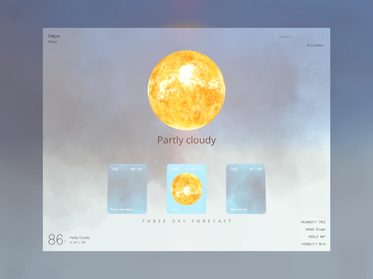
    Forecast Portals: Windows Into Tomorrow’s Weather

    Like any good weather app, we don’t want to just show current conditions but also what’s coming next. Our API returns a three-day forecast that we transform into three interactive portals hovering in the 3D scene, each one showing a preview of that day’s weather conditions. Click on a portal and you’re transported into that day’s atmospheric environment.

    Building Portals with MeshPortalMaterial

    The portals use Drei’s MeshPortalMaterial, which renders a complete 3D scene to a texture that gets mapped onto a plane. Each portal becomes a window into its own weather world:

    // ForecastPortals.js - Creating interactive weather portals
    const ForecastPortal = ({ position, dayData, index, onEnter }) => {
      const materialRef = useRef();
    
      // Transform forecast API data into our weather component format
      const portalWeatherData = useMemo(() => ({
        current: {
          temp_f: dayData.day.maxtemp_f,
          condition: dayData.day.condition,
          is_day: 1, // Force daytime for consistent portal lighting
          humidity: dayData.day.avghumidity,
          wind_mph: dayData.day.maxwind_mph,
        },
        location: {
          localtime: dayData.date + 'T12:00' // Set to noon for optimal lighting
        }
      }), [dayData]);
    
      return (
        <group position={position}>
          <mesh onClick={onEnter}>
            <roundedPlaneGeometry args={[2, 2.5, 0.15]} />
            <MeshPortalMaterial
              ref={materialRef}
              blur={0}
              resolution={256}
              worldUnits={false}
            >
              {/* Each portal renders a complete weather scene */}
              <color attach="background" args={['#87CEEB']} />
              <ambientLight intensity={0.4} />
              <directionalLight position={[10, 10, 5]} intensity={1} />
              <WeatherVisualization
                weatherData={portalWeatherData}
                isLoading={false}
                portalMode={true}
              />
            </MeshPortalMaterial>
          </mesh>
    
          {/* Weather info overlay */}
          <Text position={[-0.8, 1.0, 0.1]} fontSize={0.18} color="#FFFFFF">
            {formatDay(dayData.date, index)}
          </Text>
          <Text position={[0.8, 1.0, 0.1]} fontSize={0.15} color="#FFFFFF">
            {Math.round(dayData.day.maxtemp_f)}° / {Math.round(dayData.day.mintemp_f)}°
          </Text>
          <Text position={[-0.8, -1.0, 0.1]} fontSize={0.13} color="#FFFFFF">
            {dayData.day.condition.text}
          </Text>
        </group>
      );
    };

    The roundedPlaneGeometry from the maath library gives our portals those smooth, organic edges instead of sharp rectangles. The [2, 2.5, 0.15] parameters create a 2×2.5 unit portal with 0.15 radius corners, providing enough rounding to look visually appealing.

    Interactive States and Animations

    Portals respond to user interaction with smooth state transitions. The system tracks two primary states: inactive and fullscreen:

    // ForecastPortals.js - State management and blend animations
    const ForecastPortal = ({ position, dayData, isActive, isFullscreen, onEnter }) => {
      const materialRef = useRef();
    
      useFrame(() => {
        if (materialRef.current) {
          // Smooth blend animation - only inactive (0) or fullscreen (1)
          const targetBlend = isFullscreen ? 1 : 0;
          materialRef.current.blend = THREE.MathUtils.lerp(
            materialRef.current.blend || 0,
            targetBlend,
            0.1
          );
        }
      });
    
      // Portal content and UI elements hidden in fullscreen mode
      return (
        <group position={position}>
          <mesh onClick={onEnter}>
            <roundedPlaneGeometry args={[2, 2.5, 0.15]} />
            <MeshPortalMaterial ref={materialRef}>
              <PortalScene />
            </MeshPortalMaterial>
          </mesh>
    
          {!isFullscreen && (
            <>
              {/* Temperature and condition text only show in preview mode */}
              <Text position={[-0.8, 1.0, 0.1]} fontSize={0.18} color="#FFFFFF">
                {formatDay(dayData.date, index)}
              </Text>
            </>
          )}
        </group>
      );
    };

    The blend property controls how much the portal takes over your view. At 0 (inactive), you see the portal as a framed window into the weather scene. At 1 (fullscreen), you’re completely transported inside that day’s weather environment. The THREE.MathUtils.lerp function creates smooth transitions between these two states when clicking in and out of portals.

    Fullscreen Portal Experience

    When you click a portal, it fills your entire view with that day’s weather. Instead of looking at tomorrow’s weather through a window, you’re standing inside it:

    // Scene3D.js - Fullscreen portal handling
    const handlePortalStateChange = (isPortalActive, dayData) => {
      setPortalMode(isPortalActive);
      if (isPortalActive && dayData) {
        // Create immersive weather environment for the selected day
        const portalData = {
          current: {
            temp_f: dayData.day.maxtemp_f,
            condition: dayData.day.condition,
            is_day: 1,
            humidity: dayData.day.avghumidity,
          },
          location: { localtime: dayData.date + 'T12:00' }
        };
        setPortalWeatherData(portalData);
      }
    };

    In fullscreen mode, the portal weather data drives the entire scene: the Sky component, lighting, and all weather effects now represent that forecasted day. You can orbit around inside tomorrow’s storm or bask in the gentle sunlight of the day after. When you exit (click outside the portal), the system smoothly transitions back to the current weather conditions.

    The key insight is that each portal runs our same WeatherVisualization component but with forecast data instead of current conditions. The portalMode={true} prop optimizes the components for smaller render targets—fewer particles, simpler clouds, but the same conditional logic we built earlier.

    Now that we’ve introduced portals, we need to update our weather components to support this optimization. Going back to our conditional rendering examples, we add the portalMode prop:

    // WeatherVisualization.js - Updated with portal support
    if (weatherType === 'rainy') {
      return (
        <>
          <Clouds intensity={0.8} speed={0.15} portalMode={portalMode} />
          <Rain count={portalMode ? 100 : 800} />
        </>
      );
    } else if (weatherType === 'snowy') {
      return (
        <>
          <Clouds intensity={0.6} speed={0.05} portalMode={portalMode} />
          <Snow count={portalMode ? 50 : 400} />
        </>
      );
    }

    And our Clouds component is updated to render fewer, simpler clouds in portal mode:

    // Clouds.js - Portal optimization
    const Clouds = ({ intensity = 0.7, speed = 0.1, portalMode = false }) => {
      if (portalMode) {
        return (
          <DreiClouds material={THREE.MeshLambertMaterial}>
            {/* Only 2 centered clouds for portal preview */}
            <Cloud segments={40} bounds={[8, 3, 3]} volume={8} position={[0, 4, -2]} />
            <Cloud segments={35} bounds={[6, 2.5, 2.5]} volume={6} position={[2, 3, -3]} />
          </DreiClouds>
        );
      }
      // Full cloud system for main scene (6+ detailed clouds)
      return <group>{/* ... full cloud configuration ... */}</group>;
    };

    This dramatically reduces both particle counts (87.5% fewer rain particles) and cloud complexity (a 67% reduction from 6 detailed clouds to 2 centered clouds), ensuring smooth performance when multiple portals show weather effects simultaneously.

    Integration with Scene3D

    The portals are positioned and managed in our main Scene3D component, where they complement the current weather visualization:

    // Scene3D.js - Portal integration
    <>
      {/* Current weather in the main scene */}
      <WeatherVisualization
        weatherData={weatherData}
        isLoading={isLoading}
      />
    
      {/* Three-day forecast portals */}
      <ForecastPortals
        weatherData={weatherData}
        isLoading={isLoading}
        onPortalStateChange={handlePortalStateChange}
      />
    </>

    When you click a portal, the entire scene transitions to fullscreen mode, showing that day’s weather in complete detail. The portal system tracks active states and handles smooth transitions between preview and immersive modes, creating a seamless way to explore future weather conditions alongside the current atmospheric environment.

    The portals transform static forecast numbers into explorable 3D environments. Instead of reading “Tomorrow: 75°, Partly Cloudy,” you see and feel the gentle drift of cumulus clouds with warm sunlight filtering through.

    Adding Cinematic Lens Flares

    Our Sun component looks great, but to really make it feel cinematic, I wanted to implement a subtle lens flare effect. For this, I’m using the R3F-Ultimate-Lens-Flare library (shoutout to Anderson Mancini), which I installed manually by following the repository’s instructions. While lens flares typically work best with distant sun objects rather than our close-up approach, I still think it adds a nice cinematic touch to the scene.

    The lens flare system needs to be smart about when to appear. Just like our weather components, it should only show when it makes meteorological sense:

    // Scene3D.js - Conditional lens flare rendering
    const PostProcessingEffects = ({ showLensFlare }) => {
      if (!showLensFlare) return null;
    
      return (
        <EffectComposer>
          <UltimateLensFlare
            position={[0, 5, 0]} // Positioned near our Sun component at [0, 4.5, 0]
            opacity={1.00}
            glareSize={1.68}
            starPoints={2}
            animated={false}
            flareShape={0.81}
            flareSize={1.68}
            secondaryGhosts={true}
            ghostScale={0.03}
            aditionalStreaks={true}
            haloScale={3.88}
          />
          <Bloom intensity={0.3} threshold={0.9} />
        </EffectComposer>
      );
    };

    The key parameters create a realistic lens flare effect: glareSize and flareSize both at 1.68 give prominent but not overwhelming flares, while ghostScale={0.03} adds subtle lens reflection artifacts. The haloScale={3.88} creates that large atmospheric glow around the sun.

    The lens flare connects to our weather system through a visibility function that determines when the sun should be visible:

    // weatherService.js - When should we show lens flares?
    export const shouldShowSun = (weatherData) => {
      if (!weatherData?.current?.condition) return true;
      const condition = weatherData.current.condition.text.toLowerCase();
    
      // Hide lens flare when weather obscures the sun
      if (condition.includes('overcast') ||
          condition.includes('rain') ||
          condition.includes('storm') ||
          condition.includes('snow')) {
        return false;
      }
    
      return true; // Show for clear, sunny, partly cloudy conditions
    };
    
    // Scene3D.js - Combining weather and time conditions
    const showLensFlare = useMemo(() => {
      if (isNight || !weatherData) return false;
      return shouldShowSun(weatherData);
    }, [isNight, weatherData]);

    This creates realistic behavior where lens flares only appear during daytime clear weather. During storms, the sun (and its lens flare) is hidden by clouds, just like in real life.

    Performance Optimizations

    Since we’re rendering thousands of particles, multiple cloud systems, and interactive portals—sometimes simultaneously—it can get expensive. As mentioned above, all our particle systems use instanced rendering to draw thousands of raindrops or snowflakes in single GPU calls. Conditional rendering ensures we only load the weather effects we actually need: no rain particles during sunny weather, no lens flares during storms. However, there’s still a lot of room for optimization. The most significant improvement comes from our portal system’s adaptive rendering. We already discussed decreasing the number of clouds in portals above, but when multiple forecast portals show precipitation simultaneously, we dramatically reduce particle counts.

    // WeatherVisualization.js - Smart particle scaling
    {weatherType === 'rainy' && <Rain count={portalMode ? 100 : 800} />}
    {weatherType === 'snowy' && <Snow count={portalMode ? 50 : 400} />}

    This prevents the less-than-ideal scenario of rendering 4 × 800 = 3,200 rain particles when all portals show rain. Instead, we get 800 + (3 × 100) = 1,100 total particles while maintaining the visual effect.

    API Reliability and Caching

    Beyond 3D performance, we need the app to work reliably even when the weather API is slow, down, or rate-limited. The system implements smart caching and graceful degradation to keep the experience smooth.

    Intelligent Caching

    Rather than hitting the API for every request, we cache weather responses for 10 minutes:

    // api/weather.js - Simple but effective caching
    const cache = new Map();
    const CACHE_DURATION = 10 * 60 * 1000; // 10 minutes
    
    const cacheKey = `weather:${location.toLowerCase()}`;
    const cachedData = cache.get(cacheKey);
    
    if (cachedData && Date.now() - cachedData.timestamp < CACHE_DURATION) {
      return res.json({ ...cachedData.data, cached: true });
    }

    This gives users instant responses for recently searched locations and keeps the app responsive during API slowdowns.

    Rate Limiting and Fallback

    When users exceed our 15 requests per hour limit, the system smoothly switches to demo data instead of showing errors:

    // weatherService.js - Graceful degradation
    if (error.response?.status === 429) {
      console.log('Too many requests');
      return getDemoWeatherData(location);
    }

    The demo data includes time-aware day/night detection, so even the fallback experience shows proper lighting and sky colors based on the user’s local time.

    Future Enhancements

    There’s plenty of room to expand this weather world. Adding accurate moon phases would bring another layer of realism to nighttime scenes—right now our moon is perpetually full. Wind effects could animate vegetation or create drifting fog patterns, using the wind speed data we’re already fetching but not yet visualizing. Performance-wise, the current optimizations handle most scenarios well, but there’s still room for improvement, especially when all forecast portals show precipitation simultaneously.

    Conclusion

    Building this 3D weather visualization combined React Three Fiber with real-time meteorological data to create something beyond a traditional weather app. By leveraging Drei’s ready-made components alongside custom particle systems, we’ve transformed API responses into explorable atmospheric environments.

    The technical foundation combines several key approaches:

    • Instanced rendering for particle systems that maintain 60fps while simulating thousands of raindrops
    • Conditional component loading that only renders the weather effects currently needed
    • Portal-based scene composition using MeshPortalMaterial for forecast previews
    • Time-aware atmospheric rendering with Drei’s Sky component responding to local sunrise and sunset
    • Smart caching and fallback systems that keep the experience responsive during API limitations

    This was something I always wanted to build, and I had a ton of fun bringing it to life!


    Source link

  • Making Animations Smarter with Data Binding: Creating a Dynamic Gold Calculator in Rive

    Making Animations Smarter with Data Binding: Creating a Dynamic Gold Calculator in Rive


    Designing visuals that respond to real-time data or user input usually means switching between multiple tools — one for animation, another for logic, and yet another for implementation. This back-and-forth can slow down iteration, make small changes cumbersome, and create a disconnect between design and behavior.

    If you’ve spent any time with Rive, you know it’s built to close that gap. It lets you design, animate, and add interaction all in one place — and with features like state machines and data binding, you can make your animations respond directly to variables and user actions.

    To demonstrate how we use data binding in Rive, we built a small interactive project — a gold calculator. The task was simple: calculate the price of 5g and 10g gold bars, from 1 to 6 bars, using external data for the current gold price per gram. The gold price can be dynamic, typically coming from market data, but in this case we used a manually set value.

    Let’s break down how the calculator is built, step by step, starting with the layout and structure of the file.

    1. File Structure

    The layout is built for mobile, using a 440×900 px artboard. It’s structured around three layout groups:

    1. Title with gold price per gram
    2. Controls for choosing gold bar amount and weight
    3. Gold bar illustration

    The title section includes a text layout made of two text runs: one holds static text like the label, while the other is dynamic and connected to external data using data binding. This allows the gold price to update in real time when the data changes.

    In the controls section, we added plus and minus buttons to set the number of gold bars. These are simple layouts with icons inside. Below them, there are two buttons to switch between 5g and 10g options. They’re styled as rounded layouts with text inside.

    In the state machine, two timelines define the tab states: one for when the 10g button is active, using a solid black background and white text, and another for 5g, with reversed styles. Switching between these two updates the active tab visually.

    The total price section also uses two text runs — one for the currency icon and one for the total value. This value changes based on the selected weight and quantity, and is driven by data binding.

    2. Gold Bar Illustration

    The illustration is built using a nested artboard with a single vector gold bar. Inside the calculator layout, we duplicated this artboard to show anywhere from 1 to 6 bars depending on the user’s selection.

    Since there are two weight options, we made the gold bar resize visually — wider for 10g and narrower for 5g. To do that, we used N-Slices so that the edges stay intact and only the middle stretches. The sliced group sits inside a fixed-size layout, and the artboard is set to Hug its contents, which lets it resize automatically.

    Created two timelines to control bar size: one where the width is 88px for 10g, and another at 74px for 5g. The switch between them is controlled by a number variable called Size-gram gold, where 5g is represented by 0 and 10g by 1 with 1 set as the default value.

    In the state machine, we connected this variable to the two timelines (the 10g timeline set as the default)— when it’s set to 0, the layout switches to 5g; when it’s 1, it switches to 10g. This makes the size update based on user selection without any manual switching. To keep the transition smooth, a 150ms animation duration is added.

    3. Visualizing 1–6 Gold Bars

    To show different quantities of gold bars in the main calculator layout, we created a tiered structure using three stacked layout groups with a vertical gap -137. Each tier is offset vertically to form a simple pyramid arrangement, with everything positioned in the bottom-left corner of the screen.

    The first tier contains three duplicated nested artboards of a single gold bar. Each of these is wrapped in a Hug layout, which allows them to resize correctly based on the weight. The second tier includes two gold bars and an empty layout. This empty layout is used for spacing — it creates a visual shift when we need to display exactly four bars. The top tier has just one gold bar centered.

    All three tiers are bottom-centered, which keeps the pyramid shape consistent as bars are added or removed.

    To control how many bars are visible, we created 6 timelines in Animate mode — one for each quantity from 1 to 6. To hide or show each gold bar, two techniques are used: adjusting the opacity of the nested artboard (100% to show, 0% to hide) and modifying the layout that wraps it. When a bar is hidden, the layout is set to a fixed width of 0px; when visible, it uses Hug settings to restore its size automatically.

    Each timeline has its own combination of these settings depending on which bars should appear. For example, in the timeline with 4 bars, we needed to prevent the fourth bar from jumping to the center of the row. To keep it properly spaced, we assigned a fixed width of 80px to the empty layout used for shifting. On the other timelines, that same layout is hidden by setting its width to 0px.

    This system makes it easy to switch between quantities while preserving the visual structure.

    4. State Machine and Data Binding Setup

    With the visuals and layouts ready, we moved on to setting up the logic with data binding and state transitions.

    4.1 External Gold Price

    First, we created a number variable called Gold price gram. This value can be updated externally — for example, connected to a trading database — so the calculator always shows the current market price of gold. In our case, we used a static value of 151.75, which can also be updated manually by the user.

    To display this in the UI, we bound Text Run 2 in the title layout to this variable. A converter in the Strings tab called “Convert to String Price” is then created and applied to that text run. This converter formats the number correctly for display and will be reused later.

    4.2 Gold Bar Size Control

    We already had a number variable called Size-gram gold, which controls the weight of the gold bar used in the nested artboard illustration.

    In the Listeners panel, two listeners are created. The first is set to target the 5g tab, uses a Pointer Down action, and assigns Size-gram gold = 0. The second targets the 10g tab, also with a Pointer Down action, and assigns Size-gram gold = 1.

    Next, two timelines (one for each tab state) are brought into the state machine. The 10g timeline is used as the default state, with transitions added: one from 10g to 5g when Size-gram gold = 0, and one back to 10g when Size-gram gold = 1. Each transition has a duration of 100ms to keep the switching smooth.

    4.3 Gold Bar Quantity

    Next, added another number variable, Quantity-gold, to track the number of selected bars. The default value is set to 1. In the Converters under Numeric, two “Calculate” converters are created — one that adds “+1” and one that subtracts “-1”.

    In the Listeners panel, the plus button is assigned an action: Quantity-gold = Quantity-gold, using the “+1” converter. This way, clicking the plus button increases the count by 1. The same is done for the minus button, assigning Quantity-gold = Quantity-gold and attaching the “-1” converter. Clicking the minus button decreases the count by 1.

    Inside the state machine, six timelines are connected to represent bar counts from 1 to 6. Each transition uses the Quantity-gold value to trigger the correct timeline.

    By default, the plus button would keep increasing the value endlessly, but the goal is to limit the max to six bars. On the timeline where six gold bars are active, the plus button is disabled by setting its click area scale to 0 and lowering its opacity to create a “disabled” visual state. On all other timelines, those properties are returned to their active values.

    The same logic is applied to the minus button to prevent values lower than one. On the timeline with one bar, the button is disabled, and on all others, it returns to its active state.

    Almost there!

    4.4 Total Price Logic

    For the 5g bar price, we calculated it using this formula:

    Total Price = Gold price gram + Quantity-gold * 5

    In Converters → Numeric, a Formula converter was created and named Total Price 5g Formula to calculate the total price. In the example, it looked like:

    {{View Model Price/Gold price gram}}*{{View Model Price/Quanity-gold}}*5.0

    Since we needed to display this number as text, the Total Price number variable was also converted into a string. For that, we used an existing converter called “Convert to String Price.”

    To use both converters together, a Group of converters was created and named Total Price 5g Group, which included the Total Price 5g Formula converter followed by the Convert to String Price converter.

    Then, the text for the price variable was data bound by adding the Total Price variable in the Property field and selecting Total Price 5g Group in the Convert field.

    To handle the 10g case, which is double the price, two options are explored — either creating a new converter that multiplies by 10 or multiplying the existing result by 2.

    Eventually, a second text element is added along with a new group of converters specifically for 10g. This includes a new formula:

    Total Price = Gold price gram + Quantity-gold * 10

    A formula converter and a group with both that formula and the string converter are created and named “Total Price 10g Group.”

    Using timelines where the 5g and 10g buttons are in their active states, we adjusted the transparency of the text elements. This way, the total price connected to the 5g converters group is visible when the 5g button is selected, and the price from the 10g converters group appears when the 10g button is selected.

    It works perfectly.

    After this setup, the Gold price gram variable can be connected to live external data, allowing the gold price in the calculator to reflect the current market value in real time.

    Wrapping Up

    This gold calculator project is a simple example, but it shows how data binding in Rive can be used to connect visual design with real-time logic — without needing to jump between separate tools or write custom code. By combining state machines, variables, and converters, you can build interfaces that are not only animated but also smart and responsive.

    Whether you’re working on a product UI, a prototype, or a standalone interactive graphic, Rive gives you a way to bring together motion and behavior in a single space. If you’re already experimenting with Rive, data binding opens up a whole new layer of possibilities to explore.


    Source link

  • Elastic Grid Scroll: Creating Lag-Based Layout Animations with GSAP ScrollSmoother

    Elastic Grid Scroll: Creating Lag-Based Layout Animations with GSAP ScrollSmoother


    You’ve probably seen this kind of scroll effect before, even if it doesn’t have a name yet. (Honestly, we need a dictionary for all these weird and wonderful web interactions. If you’ve got a talent for naming things…do it. Seriously. The internet is waiting.)

    Imagine a grid of images. As you scroll, the columns don’t move uniformly but instead, the center columns react faster, while those on the edges trail behind slightly. It feels soft, elastic, and physical, almost like scrolling with weight, or elasticity.

    You can see this amazing effect on sites like yzavoku.com (and I’m sure there’s a lot more!).

    So what better excuse to use the now-free GSAP ScrollSmoother? We can recreate it easily, with great performance and full control. Let’s have a look!

    What We’re Building

    We’ll take CSS grid based layout and add some magic:

    • Inertia-based scrolling using ScrollSmoother
    • Per-column lag, calculated dynamically based on distance from the center
    • A layout that adapts to column changes

    HTML Structure

    Let’s set up the markup with figures in a grid:

    <div class="grid">
      <figure class="grid__item">
        <div class="grid__item-img" style="background-image: url(assets/1.webp)"></div>
        <figcaption class="grid__item-caption">Zorith - L91</figcaption>
      </figure>
      <!-- Repeat for more items -->
    </div>

    Inside the grid, we have many .grid__item figures, each with a background image and a label. These will be dynamically grouped into columns by JavaScript, based on how many columns CSS defines.

    CSS Grid Setup

    .grid {
      display: grid;
      grid-template-columns: repeat(var(--column-count), minmax(var(--column-size), 1fr));
      grid-column-gap: var(--c-gap);
      grid-row-gap: var(--r-gap);
    }
    
    .grid__column {
      display: flex;
      flex-direction: column;
      gap: var(--c-gap);
    }

    We define all the variables in our root.

    In our JavaScript then, we’ll change the DOM structure by inserting .grid__column wrappers around groups of items, one per colum, so we can control their motion individually. Why are we doing this? It’s a bit lighter to move columns rather then each individual item.

    JavaScript + GSAP ScrollSmoother

    Let’s walk through the logic step-by-step.

    1. Enable Smooth Scrolling and Lag Effects

    gsap.registerPlugin(ScrollTrigger, ScrollSmoother);
    
    const smoother = ScrollSmoother.create({
      smooth: 1, // Inertia intensity
      effects: true, // Enable per-element scroll lag
      normalizeScroll: true, // Fixes mobile inconsistencies
    });

    This activates GSAP’s smooth scroll layer. The effects: true flag lets us animate elements with lag, no scroll listeners needed.

    2. Group Items Into Columns Based on CSS

    const groupItemsByColumn = () => {
      const gridStyles = window.getComputedStyle(grid);
      const columnsRaw = gridStyles.getPropertyValue('grid-template-columns');
    
      const numColumns = columnsRaw.split(' ').filter(Boolean).length;
    
      const columns = Array.from({ length: numColumns }, () => []); // Initialize column arrays
    
      // Distribute grid items into column buckets
      grid.querySelectorAll('.grid__item').forEach((item, index) => {
        columns[index % numColumns].push(item);
      });
    
      return { columns, numColumns };
    };

    This method groups your grid items into arrays, one for each visual column, using the actual number of columns calculated from the CSS.

    3. Create Column Wrappers and Assign Lag

    const buildGrid = (columns, numColumns) => {
    
      const fragment = document.createDocumentFragment(); // Efficient DOM batch insertion
      const mid = (numColumns - 1) / 2; // Center index (can be fractional)
      const columnContainers = [];
    
      // Loop over each column
      columns.forEach((column, i) => {
        const distance = Math.abs(i - mid); // Distance from center column
        const lag = baseLag + distance * lagScale; // Lag based on distance from center
    
        const columnContainer = document.createElement('div'); // New column wrapper
        columnContainer.className = 'grid__column';
    
        // Append items to column container
        column.forEach((item) => columnContainer.appendChild(item));
    
        fragment.appendChild(columnContainer); // Add to fragment
        columnContainers.push({ element: columnContainer, lag }); // Save for lag effect setup
      });
    
      grid.appendChild(fragment); // Add all columns to DOM at once
      return columnContainers;
    };

    The lag value increases the further a column is from the center, creating that elastic “catch up” feel during scroll.

    4. Apply Lag Effects to Each Column

    const applyLagEffects = (columnContainers) => {
      columnContainers.forEach(({ element, lag }) => {
        smoother.effects(element, { speed: 1, lag }); // Apply individual lag per column
      });
    };

    ScrollSmoother handles all the heavy lifting, we just pass the desired lag.

    5. Handle Layout on Resize

    // Rebuild the layout only if the number of columns has changed on window resize
    window.addEventListener('resize', () => {
      const newColumnCount = getColumnCount();
      if (newColumnCount !== currentColumnCount) {
        init();
      }
    });

    This ensures our layout stays correct across breakpoints and column count changes (handled via CSS).

    And that’s it!

    Extend This Further

    Now, there’s lots of ways to build upon this and add more jazz!

    For example, you could:

    • add scroll-triggered opacity or scale animations
    • use scroll velocity to control effects (see demo 2)
    • adapt this pattern for horizontal scroll layouts

    Exploring Variations

    Once you have the core concept in place, there are four demo variations you can explore. Each one shows how different lag values and scroll-based interactions can influence the experience.

    You can adjust which columns respond faster, or play with subtle scaling and transforms based on scroll velocity. Even small changes can shift the rhythm and tone of the layout in interesting ways. And don’t forget: changing the look of the grid itself, like the image ratio or gaps, will give this a whole different feel!

    Now it’s your turn. Tweak it, break it, rebuild it, and make something cool.

    I really hope you enjoy this effect! Thanks for checking by 🙂


    Source link

  • Creating Social Media Buzz Around a New Holistic Healthcare Clinic


    A robust social media presence is instrumental for any business, including holistic healthcare clinics, to thrive. Effective use of social media can significantly enhance a clinic’s visibility and build a respected reputation. By tapping into the vast online audience, clinics can connect with potential clients, offering educational content and showcasing their unique services in holistic healthcare.

    How to Develop an Engaging Content Strategy

    An engaging content strategy is vital in capturing the audience’s attention and establishing a meaningful connection. With over 60 to 70 million Americans suffering from gastrointestinal diseases, there is a substantial audience seeking alternative health solutions. By tailoring content to address these concerns, clinics can position themselves as valuable resources, providing knowledge and insights into holistic approaches.

    In developing content, quality should always take precedence over quantity. Educating the audience about how holistic methods can aid in alleviating symptoms related to GI disorders can be highly effective. Sharing success stories, informative articles, and expert opinions not only engages but also builds trust, positioning the clinic as an authority in the holistic healthcare space.

    By consistently providing useful, relatable content, clinics can cultivate a loyal following who value their expertise. Utilizing stories of triumph and improvement can humanize the clinic’s brand and foster a community of healing. A well-thought-out content strategy is essential in creating a strong, engaging online presence.

    What Platforms Are Most Effective for Healthcare Promotion?

    The choice of social media platforms can significantly influence the reach and impact of healthcare promotion. Each platform serves different demographics and types of content, making it crucial for clinics to select the most appropriate channels. Facebook, Instagram, and LinkedIn are among the top platforms where healthcare content is highly effective due to their vast and varied audiences.

    Facebook allows clinics to connect with their audience through educational posts, live Q&A sessions, and community-building groups. For example, your practice could use Facebook to promote a free flu vaccine clinic, as it is among the top three most common routine vaccines. Additionally, Instagram is perfect for visual storytelling, showcasing the clinic’s environment, patient testimonials, and holistic lifestyle tips. Meanwhile, LinkedIn can be used to network with other healthcare professionals and share research and professional insights.

    Selecting the right platform enables clinics to engage effectively with their target audience, increasing visibility and interaction. A strategic, multi-platform approach can maximize reach, as different segments of the audience can be engaged through their preferred social media channels. Ultimately, the goal is to build an interconnected online presence that enhances the clinic’s reputation and accessibility.

    How to Measure the Success of Social Media Campaigns

    Measuring the success of social media campaigns requires a strategic approach. Key performance indicators (KPIs) such as engagement rates, reach, and conversion metrics provide insights into the effectiveness of content. Regularly monitoring these metrics helps refine strategies and ensures the clinic remains aligned with its business goals.

    Analytical tools, native to platforms like Facebook and Instagram, offer valuable data on audience interactions and content performance. This data-driven approach enables holistic healthcare clinics to understand what resonates with their audience and adjust their strategies accordingly. A successful campaign enhances audience engagement, boosts brand awareness, and ultimately drives patient appointments.

    Beyond quantitative metrics, social media success is also reflected in qualitative aspects such as brand perception and audience loyalty. Building an online community centered around support and education leads to stronger patient relationships. In essence, the success of social media campaigns is multifaceted, encompassing both measurable outcomes and more intangible benefits such as increased trust and brand credibility.

    How Can Partnerships Amplify Your Reach?

    Forming strategic partnerships is a powerful way to extend a clinic’s reach and impact. Collaborations with wellness influencers, other healthcare providers, or businesses in related fields can amplify messages and broaden audiences. Early on, nearly one million people live with significant mental health disorders, presenting an opportunity for partnerships linking mental health with holistic care.

    By partnering with influencers in the health and wellness space, clinics can tap into established communities that align with their values. These collaborations bring authenticity and credibility, as trusted voices within the community vouch for the clinic’s services. Simultaneously, partnerships with companies offering complementary services facilitate a seamless integration of holistic solutions for clients.

    Successful partnerships are built on shared goals and a mutual understanding of audience needs. They can result in joint content creation, shared events, and cross-promotional strategies that greatly increase the clinic’s business visibility. These partnerships not only expand reach but also enhance the clinic’s reputation as a collaborative and holistic health provider.

    What Role Does Authenticity Play in Creating Trust?

    Authenticity is a cornerstone of building trust with an online audience. Patients are more likely to engage with clinics that present themselves transparently and genuinely. Sharing real stories, challenges, and successes in holistic care creates a relatable narrative that resonates with the audience.

    Authentic content, such as patient testimonials and behind-the-scenes looks at clinic operations, helps potential clients understand and trust the clinic’s mission and values. An honest portrayal of how holistic methods improve patient well-being strengthens the bond between the clinic and its community. This connection fosters a sense of belonging, encouraging patients to choose holistic healthcare for their needs.

    A clinic that consistently demonstrates authenticity is likely to cultivate a loyal following. This leads to positive word-of-mouth recommendations, further solidifying the clinic’s standing in the holistic healthcare business. Ultimately, by prioritizing authenticity, clinics can build lasting relationships with patients and sustain a thriving online presence.

    Crafting an effective social media strategy is essential for holistic healthcare clinics aiming to foster community engagement and elevate their visibility. These insights provide a roadmap for clinics to enhance their online presence, building a trusted and esteemed reputation that resonates with their audience’s needs and values.


    Source link