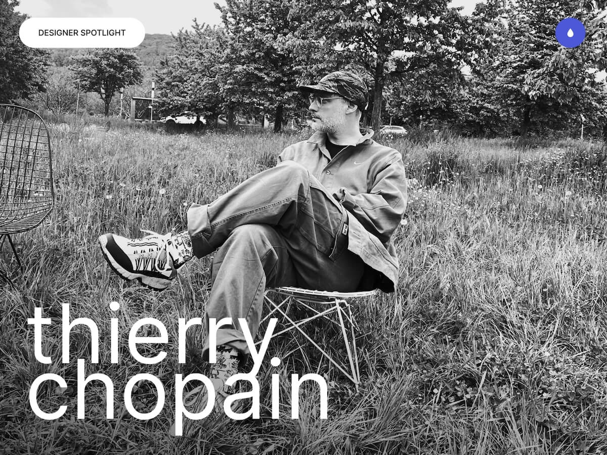
Hello I’m Thierry Chopain, a freelance interactive art director, co-founder of type8 studio and a UX/UI design instructor at SUP de PUB (Lyon).
Based near Saint-Étienne, I cultivate a balance between creative ambition and local grounding, between high-level design and a more human pace of life. I work remotely with a close-knit team spread between Lyon, Montpellier, and Paris, where we design custom projects that blend strategy, brand identity, and digital experience.
My approach is deeply collaborative. I believe in lasting relationships built on trust, mutual listening, and the value of each perspective. Beyond aesthetics, my role is to bring clarity, meaning, and visual consistency to every project. Alongside my design practice, I teach at SUP de PUB, where I support students not only in mastering UX/UI concepts, but also in shaping their path as independent designers. Sharing what I’ve learned on the ground the wins, the struggles, and the lessons is a mission that matters deeply to me.
My day-to-day life is a mix of slow living and agility. This hybrid rhythm allows me to stay true to my values while continuing to grow in a demanding and inspiring industry. I collaborate with a trusted network of creatives including Jeremy Fagis, Marine Ferrari ,Thomas Aufresne, Jordan Thiervoz, Alexandre Avram, Benoit Drigny and Olivier Marmillon to enrich every project with a shared, high-level creative vision.
It’s an investment fund built around a strong promise: to invest disruptively in the most valuable assets of our time. Type8 studio partnered collaboration with DEPARTMENT Maison de Création and Paul Barbinto design a fully reimagined website that lives up to its bold vision and distinctive positioning. Site structure, visual direction, tone of voice, and user experience were all redefined to reflect the strategic precision, elegance, and forward-thinking nature of the fund.
The goal of this project: Position OVA as a benchmark combining financial performance, innovation, and rarity, through refined design, a seamless interface, and custom development, in order to strengthen its credibility with a discerning audience and strategic partners.
Hocus Pocus is a Lyon based animation studio specialized in creation of CGI and visual effects for television, cinema and video game industry. The studio offer the best quality services with an always higher technical and artistic level of requirement. I worked on this project in collaboration with the Lyon-based studio AKARU which specializes in tailored and meticulously crafted projects.
The goal of this project: Develop a coherent and professional digital brand image that highlights visual effects, while boosting visibility and online presence to attract and inspire trust in customers.
21 TSI isn’t your typical sports holding company. Overseeing a portfolio of brands in the sports equipment space the team set out to break from the mold of the standard corporate website. Instead, they envisioned a digital experience that would reflect their DNA where innovation, design, and technology converge into a rich, immersive journey. We collaborated with DEPARTMENT Maison de Création and Paul Barbin to create something truly unique.
The goal of this project: A website that embodies the DNA of 21TSI: innovation, technology, minimalism. An immersive and aesthetic experience, a clean design, and an approach that explores new ways of engaging with sport through AI.
TERIA is a system that provides real-time centimeter-level positioning. It is an innovative tool that allows the localization and georeferencing. We set out to create an intuitive and innovative experience that perfectly reflects Teria’s precision and forward-thinking vision. A major part of the work focused on a clean, minimalist design that allows for smooth navigation making space to highlight the incredible work of Alexandre Avram, showcasing the products through Spline and 3D motion design.
The goal of this project: Develop a clear and professional digital brand that reflects the brand’s identity and values, showcases product innovation, and boosts visibility to build trust and attract customers.
In a dense and ever-evolving music scene, standing out requires more than just great sound it also takes a strong and cohesive visual presence. Whether it’s the cinematic intensity of Lecomte de Brégeot, the raw emotion of Élimane my approach remains the same: to craft a visual universe that extends and enhances the essence of each artist, regardless of the medium.
Lecomte de Brégeot – French electronic music producerVisual recap – Cover design for “Sequences” (Lecomte de Brégeot)Case study – Création de la cover “fragment” (Lecomte de Brégeot)Élimane – Weaver of Sounds, Sculptor of Emotions.
I’m design visual identities, websites, and digital assets that combine bold aesthetics with clarity. The goal is to give each artist a unique space where their music, vision, and personality can fully come to life both visually and emotionally.
A Defining Moment in My Career
A turning point in my journey was the transition from working as an independent designer to founding a structured creative studio, type8 Studio. For more than ten years, I worked solo or within informal networks, juggling projects, constantly adapting, and learning how to shape my own freedom. That period gave me a lot—not only in terms of experience, but also in understanding what I truly wanted… and what I no longer wanted.
Creating a studio was never a predefined goal. It came together progressively, through encounters, shared values, and the growing need to give form to something more collective and sustainable. Type8 was born from this shared intention: bringing together skills and creative ambitions while preserving individual freedom.
This change was not a rupture but a natural evolution. I didn’t abandon my three identities—independent designer, studio art director, and educator. On the contrary, I integrated them into a more fluid and conscious ecosystem. Today, I can choose the most relevant role depending on the project: sometimes the studio takes the lead, sometimes it’s the freelance spirit that fits best, and at other times, it’s the educator in me who comes forward.
This hybrid model, which some might see as unstable, is for me a tailor-made balance, deeply aligned with how I envision work: adaptive, intentional, and guided by respect for the project’s purpose and values.
My Design Philosophy
I see design as a tool serving meaning, people, and impact beyond mere aesthetics. It’s about creating connection, clarity, and relevance between intention and users. This approach was shaped through my collaboration with my wife, an expert in digital accessibility, who raised my awareness of inclusion and real user needs often overlooked.
Today, I bring ethics, care, and respect into every project, focusing on accessible design and core human values: kindness, clarity, usefulness, and respecting user constraints. I prioritize human collaboration, tailoring each solution to the client’s context and values, even if it means going against trends. My design blends strategic thinking, creativity, and personal commitment to create enriching and socially valuable experiences.
Tools and Techniques
Figma: To design, create, and gather ideas collaboratively.
Jitter: For crafting smooth and engaging motion designs.
Loom: To exchange feedback efficiently with clients.
Tools evolve but they’re just means to an end. What really matters is your ability to think and create. If you’re a good designer, you’ll know how to adapt, no matter the tool.
My Inspirations
My imagination was shaped somewhere between a game screen, a sketchbook. Among all my influences, narrative video games hold a special place. Titles like “The Last of Us” have had a deep impact on me not just for their striking art direction, but for their ability to tell a story in an immersive, emotional, and sensory way. What inspires me in these universes isn’t just the gameplay, but how they create atmosphere, build meaningful moments, and evoke emotion without words. Motion design, sound, typography, lighting all of it is composed like a language. And that’s exactly how I approach interactive design: orchestrating visual and experiential elements to convey a message, an intention, or a feeling.
But my inspirations go beyond the digital world. They lie at the intersection of street art, furniture design, and sneakers. My personal environment also plays a crucial role in fueling my creativity. Living in a small village close to nature, surrounded by calm and serenity, gives me the mental space I need to create. It’s often in these quiet moments, a walk through the woods, a shared silence, the way light plays on a path that my strongest ideas emerge.
I’m a creative who exists at the crossroads: between storytelling and interaction, between city and nature, between aesthetics and purpose. That’s where my work finds its balance.
Final Thoughts
For me, design has always been more than a craft it’s a way to connect ideas, people, and emotions. Every project is an opportunity to tell a story, to create something that feels both meaningful and timeless. Stay curious, stay human, and don’t be afraid to push boundaries. Because the most memorable work is born when passion meets purpose.
“Turning ideas into timeless experiences.”
Contact
Thanks for taking the time to read this article.
If you’re a brand, studio, or institution looking for a strong and distinctive digital identity. I’d be happy to talk whether it’s about a project, a potential collaboration, or just sharing a few ideas.
Today we’re going to go over some of my favorite GSAP techniques that can bring you great results with just a little code.
Although the GSAP documentation is among the best, I find that developers often overlook some of GSAP’s greatest features or perhaps struggle with finding their practical application.
The techniques presented here will be helpful to GSAP beginners and seasoned pros. It is recommended that you understand the basics of loading GSAP and working with tweens, timelines and SplitText. My free beginner’s course GSAP Express will guide you through everything you need for a firm foundation.
If you prefer a video version of this tutorial, you can watch it here:
GSAP’s SplitText just went through a major overhaul. It has 14 new features and weighs in at roughly 7kb.
SplitText allows you to split HTML text into characters, lines, and words. It has powerful features to support screen-readers, responsive layouts, nested elements, foreign characters, emoji and more.
My favorite feature is its built-in support for masking (available in SplitText version 3.13+).
Prior to this version of SplitText you would have to manually nest your animated text in parent divs that have overflow set to hidden or clip in the css.
SplitText now does this for you by creating “wrapper divs” around the elements that we apply masking to.
Basic Implementation
The code below will split the h1 tag into chars and also apply a mask effect, which means the characters will not be visible when they are outside their bounding box.
See the Pen
Codrops Tip 1: Split Text Masking – Basic by Snorkl.tv (@snorkltv)
on CodePen.
This simple implementation works great and is totally fine.
However, if you inspect the DOM you will see that 2 new <div> elements are created for each character:
an outer div with overflow:clip
an inner div with text
With 17 characters to split this creates 34 divs as shown in the simplified DOM structure below
<h1>SplitText Masking
	<div> <!-- char wrapper with overflow:clip -->
		<div>S</div>
	</div>
	<div> <!-- char wrapper with overflow:clip -->
		<div>p</div>
	</div>
	<div> <!-- char wrapper with overflow:clip -->
		<div>l</div>
	</div>
	<div> <!-- char wrapper with overflow:clip -->
		<div>i</div>
	</div>
	<div> <!-- char wrapper with overflow:clip -->
		<div>t</div>
	</div>
	...
</h1>
The More Efficient Approach
If you want to minimize the amount of DOM elements created you can split your text into characters and lines. Then you can just set the masking on the lines element like so:
Demo: Split Text Masking (Better with chars and lines)
See the Pen
Codrops Tip 1: Split Text Masking – Better with chars and lines by Snorkl.tv (@snorkltv)
on CodePen.
Now if you inspect the DOM you will see that there is
1 line wrapper div with overflow:clip
1 line div
1 div per character
With 17 to characters to split this creates only 19 divs in total:
<h1>SplitText Masking
	<div> <!-- line wrapper with overflow:clip -->
		<div> <!-- line -->
			<div>S</div>
			<div>p</div>
			<div>l</div>
			<div>i</div>
			<div>t</div>
			...
		</div>
	</div>
</h1>
Tip 2: Setting the Stagger Direction
From my experience 99% of stagger animations go from left to right. Perhaps that’s just because it’s the standard flow of written text.
However, GSAP makes it super simple to add some animation pizzazz to your staggers.
To change the direction from which staggered animations start you need to use the object-syntax for the stagger value
Normal Stagger
Typically the stagger value is a single number which specifies the amount of time between the start of each target element’s animation.
gsap.to(targets, {x:100, stagger:0.2}) // 0.2 seconds between the start of each animation
Stagger Object
By using the stagger object we can specify multiple parameters to fine-tune our staggers such as each, amount, from, ease, grid and repeat. See the GSAP Stagger Docs for more details. Our focus today will be on the from property which allows us to specify from which direction our staggers should start.
gsap.to(targets, {x:100,
   stagger: {
     each:0.2, // amount of time between the start of each animation
     from:”center” // animate from center of the targets array
}
The from property in the stagger object can be any one of these string values
“start” (default)
“center”
“end”
“edges”
“random”
Demo: Stagger Direction Timeline
In this demo the characters animate in from center and then out from the edges.
See the Pen
Codrops Tip 2: Stagger Direction Timeline by Snorkl.tv (@snorkltv)
on CodePen.
Demo: Stagger Direction Visualizer
See the Pen
Codrops Tip 2: Stagger Direction Visualizer by Snorkl.tv (@snorkltv)
on CodePen.
Tip 3: Wrapping Array Values
The gsap.utils.wrap() function allows you to pull values from an array and apply them to multiple targets. This is great for allowing elements to animate in from opposite directions (like a zipper), assigning a set of colors to multiple objects and many more creative applications.
Setting Colors From an Array
I love using gsap.utils.wrap() with a set() to instantly manipulate a group of elements.
// split the header
const split = SplitText.create("h1", {
	type:"chars"
})

//create an array of colors
const colors = ["lime", "yellow", "pink", "skyblue"]

// set each character to a color from the colors array
gsap.set(split.chars, {color:gsap.utils.wrap(colors)})
When the last color in the array (skyblue) is chosen GSAP will wrap back to the beginning of the array and apply lime to the next element.
Animating from Alternating Directions
In the code below each target will animate in from alternating y values of -50 and 50.
Notice that you can define the array directly inside of the wrap() function.
See the Pen
Codrops Tip 3: Basic Wrap by Snorkl.tv (@snorkltv)
on CodePen.
Demo: Fancy Wrap
In the demo below there is a timeline that creates a sequence of animations that combine stagger direction and wrap. Isn’t it amazing what GSAP allows you to do with just a few simple shapes and a few lines of code?
See the Pen
Codrops Tip 3: Fancy Wrap by Snorkl.tv (@snorkltv)
on CodePen.
As you watch the animation be sure to go through the GSAP code to see which tween is running each effect.
I strongly recommend editing the animation values and experimenting.
Tip 4: Easy Randomization with the “random()” String Function
GSAP has its own random utility function gsap.utils.random() that lets you tap into convenient randomization features anywhere in your JavaScript code.
// generate a random number between 0 and 450
const randomNumber = gsap.utils.random(0, 450)
To randomize values in animations we can use the random string shortcut which saves us some typing.
//animate each target to a random x value between 0 and 450
gsap.to(targets, {x:"random(0, 450)"})

//the third parameter sets the value to snap to
gsap.to(targets, {x:"random(0, 450, 50)"}) // random number will be an increment of 50

//pick a random value from an array for each target
gsap.to(targets, fill:"random([pink, yellow, orange, salmon])"
Demo: Random String
See the Pen
Codrops Tip 4: Random String by Snorkl.tv (@snorkltv)
on CodePen.
TIP 5: repeatRefresh:true
This next tip appears to be pure magic as it allows our animations to produce new results each time they repeat.
GSAP internally stores the start and end values of an animation the first time it runs. This is a performance optimization so that each time it repeats there is no additional work to do. By default repeating tweens always produce the exact same results (which is a good thing).
When dealing with dynamic or function-based values such as those generated with the random string syntax “random(0, 100)” we can tell GSAP to record new values on repeat by setting repeatRefresh:true.
You can set repeatRefresh:true in the config object of a single tween OR on a timeline.
//use on a tween
gsap.to(target, {x:”random(50, 100”, repeat:10, repeatRefresh:true})

//use on a timeline
const tl = gsap.timeline({repeat:10, repeatRefresh:true})
Demo: repeatRefresh Particles
The demo below contains a single timeline with repeatRefresh:true.
Each time it repeats the circles get assigned a new random scale and a new random x destination.
Be sure to study the JS code in the demo. Feel free to fork it and modify the values.
See the Pen
Codrops Tip 5: repeatRefresh Particles by Snorkl.tv (@snorkltv)
on CodePen.
TIP 6: Tween The TimeScale() of an Animation
GSAP animations have getter / setter values that allow you to get and set properties of an animation.
Common Getter / Setter methods:
paused() gets or sets the paused state
duration() gets or sets the duration
reversed() gets or sets the reversed state
progress() gets or sets the progress
timeScale() gets or sets the timeScale
Getter Setter Methods in Usage
animation.paused(true) // sets the paused state to true
console.log(animation.paused()) // gets the paused state
console.log(!animation.paused()) // gets the inverse of the paused state
See it in Action
In the demo from the previous tip there is code that toggles the paused state of the particle effect.
//click to pause
document.addEventListener("click", function(){
	tl.paused(!tl.paused())
})
This code means “every time the document is clicked the timeline’s paused state will change to the inverse (or opposite) of what it currently is”.
If the animation is paused, it will become “unpaused” and vice-versa.
This works great, but I’d like to show you trick for making it less abrupt and smoothing it out.
Tweening Numeric Getter/Setter Values
We can’t tween the paused() state as it is either true or false.
Where things get interesting is that we can tween numeric getter / setter properties of animations like progress() and timeScale().
timeScale() represents a factor of an animation’s playback speed.
timeScale(1): playback at normal speed
timeScale(0.5) playback at half speed
timeScale(2) playback at double speed
Setting timeScale()
//create an animation with a duration of 5 seconds
const animation = gsap.to(box, {x:500, duration:5})

//playback at half-speed making it take 10 seconds to play
animation.timeScale(0.5)
Tweening timeScale()
const animation = gsap.to(box, {x:500, duration:5}) // create a basic tween

// Over the course of 1 second reduce the timeScale of the animation to 0.5
gsap.to(animation, {timeScale:0.5, duration:1})
Dynamically Tweening timeScale() for smooth pause and un-pause
Instead of abruptly changing the paused state of animation as the particle demo above does we are now going to tween the timeScale() for a MUCH smoother effect.
Demo: Particles with timeScale() Tween
See the Pen
Codrops Tip 6: Particles with timeScale() Tween by Snorkl.tv (@snorkltv)
on CodePen.
Click anywhere in the demo above to see the particles smoothly slow down and speed up on each click.
The code below basically says “if the animation is currently playing then we will slow it down or else we will speed it up”. Every time a click happens the isPlaying value toggles between true and false so that it can be updated for the next click.
Tip 7: GSDevTools Markers and Animation IDs
Most of the demos in this article have used GSDevTools to help us control our animations. When building animations I just love being able to scrub at my own pace and study the sequencing of all the moving parts.
However, there is more to this powerful tool than just scrubbing, playing and pausing.
Markers
The in and out markers allow us to loop ANY section of an animation. As an added bonus GSDevTools remembers the previous position of the markers so that each time we reload our animation it will start and end at the same time.
This makes it very easy to loop a particular section and study it.
Important: The markers are only available on screens wider than 600px. On small screens the UI is minimized to only show basic controls.
Setting IDs for the Animation Menu
The animation menu allows us to navigate to different sections of our animation based on an animation id. When dealing with long-form animations this feature is an absolute life saver.
Since GSAP’s syntax makes creating complex sequences a breeze, it is not un-common to find yourself working on animations that are beyond 10, 20 or even 60 seconds!
To set an animation id:
const tl = gsap.timeline({id:"fancy"})

//Add the animation to GSDevTools based on variable reference
GSDevTools.create({animation:tl})

//OR add the animation GSDevTools based on id
GSDevTools.create({animation:"fancy"})
With the code above the name “fancy” will display in GSDevTools.
Although you can use the id with a single timeline, this feature is most helpful when working with nested timelines as discussed below.
Demo: GSAP for Everyone
See the Pen
Codrops Tip 7: Markers and Animation Menu by Snorkl.tv (@snorkltv)
on CodePen.
This demo is 26 seconds long and has 7 child timelines. Study the code to see how each timeline has a unique id that is displayed in the animation menu.
Use the animation menuto navigate to and explore each section.
Important: The animation menu is only available on screens wider than 600px.
Hopefully you can see how useful markers and animation ids can be when working with these long-form, hand-coded animations!
Want to Learn More About GSAP?
I’m here to help.
I’ve spent nearly 5 years archiving everything I know about GSAP in video format spanning 5 courses and nearly 300 lessons at creativeCodingClub.com.
I spent many years “back in the day” using GreenSock’s ActionScript tools as a Flash developer and this experience lead to me being hired at GreenSock when they switched to JavaScript. My time at GreenSock had me creating countless demos, videos and learning resources.
Spending years answering literally thousands of questions in the support forums has left me with a unique ability to help developers of all skill levels avoid common pitfalls and get the most out of this powerful animation library.
It’s my mission to help developers from all over the world discover the joy of animating with code through affordable, world-class training.
Every six months, Shopify releases a new Edition: a broad showcase of tools, updates, and ideas that reflect both the current state of ecommerce and where the platform is headed. But these Editions aren’t just product announcements. They serve as both roadmap and creative statement.
Back in December, we explored the Winter ’25 Edition, which focused on refining the core. With over 150+ updates and a playfully minimalist interface, it was a celebration of the work that often goes unnoticed—performance, reliability, and seamless workflows. “Boring,” but intentionally so, and surprisingly delightful.
The new Summer ’25 Edition takes a different approach. This time, the spotlight is on design: expressive, visual, and accessible to everyone. At the center of it is Horizon, a brand-new first-party theme that reimagines what it means to build a storefront on Shopify.
Horizon offers merchants total creative control without technical barriers. It combines a modular design system with AI-assisted customization, giving anyone the power to create a polished, high-performing store in just a few clicks.
To understand how this theme came to life—and why Shopify sees it as such a turning point—we had the chance to speak with Vanessa Lee, Shopify’s Vice President of Product. What emerged was a clear picture of where store design is heading: more flexible, more intuitive, and more creatively empowering than ever before.
“Design has never mattered more,” Lee told us. “Great design isn’t just about how things look—it’s how you tell your story and build lasting brand loyalty. Horizon democratizes advanced design capabilities so anyone can build a store.”
A Theme That Feels Like a Design System
Horizon isn’t a single template. It’s a foundation for a family of 10 thoughtfully designed presets, each ready to be tailored to a brand’s unique personality. What makes Horizon stand out is not just the aesthetics but the structure that powers it.
Built on Shopify’s new Theme Blocks, Horizon is the first public theme to fully embrace this modular approach. Blocks can be grouped, repositioned, and arranged freely along both vertical and horizontal axes. All of this happens within a visual editor, no code required.
“The biggest frustration was the gap between intention and implementation,” Lee explains. “Merchants had clear visions but often had to compromise due to technical complexity. Horizon changes that by offering true design freedom—no code required.”
AI as a Creative Partner
AI has become a regular presence in creative tools, but Shopify has taken a more collaborative approach. Horizon’s AI features are designed to support creativity, not take it over. They help with layout suggestions, content generation, and even the creation of custom theme blocks based on natural language prompts.
Describe something as simple as “a banner with text and typing animation,” and Horizon can generate a functional block to match your vision. You can also share an inspirational image, and the system will create matching layout elements or content.
What’s important is that merchants retain full editorial control.
“AI should enhance human creativity,” Lee says. “Our tools are collaborative—you stay in control. Whether you’re editing a product description or generating a layout, it’s always your voice guiding the result.”
This mindset is reflected in tools like AI Block Generation and Sidekick, Shopify’s AI assistant that helps merchants shape messaging, refine layout, and bring content ideas to life without friction.
UX Shifts That Change the Game
Alongside its larger innovations, Horizon also delivers a series of small but highly impactful improvements to the store editing experience:
Copy and Paste for Theme Blocks allows merchants to reuse blocks across different sections, saving time and effort.
Block Previews in the Picker let users see what a block will look like before adding it, reducing trial and error.
Drag and Drop Functionality now includes full block groups, nested components, and intuitive repositioning, with settings preserved automatically.
These updates may seem modest, but they target the exact kinds of pain points that slow down design workflows.
“We pay close attention to small moments that add up to big frustrations,” Lee says. “Features like copy/paste or previews seem small—but they transform how merchants work.”
Built with the Community
Horizon is not a top-down product. It was shaped through collaboration with both merchants and developers over the past year. According to Lee, the feedback was clear and consistent. Everyone wanted more flexibility, but not at the cost of simplicity.
“Both merchants and developers want flexibility without complexity,” Lee recalls. “That shaped Theme Blocks—and Horizon wouldn’t exist without that ongoing dialogue.”
The result is a system that feels both sophisticated and intuitive. Developers can work with structure and control, while merchants can express their brand with clarity and ease.
More Than a Theme, a Signal
Each Shopify Edition carries a message. The Winter release was about stability, performance, and quiet confidence. This Summer’s Edition speaks to something more expressive. It’s about unlocking design as a form of commerce strategy.
Horizon sits at the heart of that shift. But it’s just one part of a broader push across Shopify. The Edition also includes updates to Sidekick, the Shop app, POS, payments, and more—each designed to remove barriers and support better brand-building.
“We’re evolving from being a commerce platform to being a creative partner,” Lee says. “With Horizon, we’re helping merchants turn their ideas into reality—without the tech getting in the way.”
Looking ahead, Shopify sees enormous opportunity in using AI not just for store creation, but for proactive optimization, personalization, and guidance that adapts to each merchant’s needs.
“The most exciting breakthroughs happen where AI and human creativity meet,” Lee says. “We’ve only scratched the surface—and that’s incredibly motivating.”
Final Thoughts
Horizon isn’t just a new Shopify theme. It’s a new baseline for what creative freedom should feel like in commerce. It invites anyone—regardless of technical skill—to build a store that feels uniquely theirs.
For those who’ve felt boxed in by rigid templates, or overwhelmed by the need to code, Horizon offers something different. It removes the friction, keeps the power, and brings the joy back into building for the web.
We assume that by now you’ve all read the wonderful news about GSAP now becoming 100% free, for everyone. Thanks to Webflow’s support, all of the previously paid plugins in GSAP are now accessible to everyone. That’s why today, Osmo, Codrops and GSAP are teaming up to bring you 5 demos, available both as a Webflow cloneable and CodePen. We hope these will provide a fun intro to some cool plugins and spark a few ideas!
What you’ll learn:
SplitText basics: Break text into lines, words, or letters—with the new automatic resizing and built-in masking options!
DrawSVG scribbles: Add a playful, randomized underline to links (or anything) on hover using DrawSVG.
Physics2D text smash: Combine SplitText + Physics2D so your headline shatters into letters that tumble off the top of the viewport like a roof.
Inertia dot grid: Create an interactive, glowing dot matrix that springs and flows with your cursor for a dynamic background effect.
MorphSVG toggle: Build a seamless play/pause button that morphs one SVG into another in a single tween.
Before we dive in, let’s make sure you have the GSAP core included in your project. I will let you know the exact plugins you need per demo! You can use the official GSAP Install Helper if you need the correct npm commands or CDN links. If you’re following this as a Webflow user and you want to build from scratch, Webflow has made it super easy to integrate GSAP into your project. If you want, you can read more here. When using this approach, just make sure to add your custom code somewhere in the before </body> section of the page or project settings.
Perfect, with that set, let’s start building an interactive SplitText demo!
Interactive SplitText Demo
Before we dive into code, a couple notes:
Plugins needed: GSAP core, SplitText, and (optionally) CustomEase.
The CustomEase plugin isn’t required—feel free to swap in any ease or omit it entirely—but we’ll use it here to give our animation a distinctive feel.
Demo purpose: We’re building an interactive demo here, with buttons to trigger different reveal styles. If you just want a one-off split-text reveal (e.g. on scroll or on load), you can skip the buttons and wire your tween directly into ScrollTrigger, Click handlers, etc.
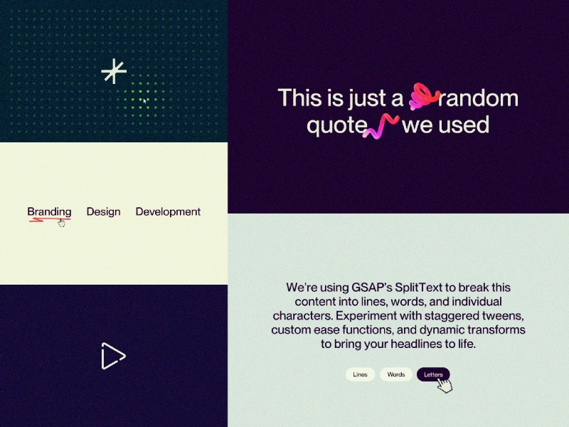
HTML and CSS Setup
<div class="text-demo-wrap">
  <h1 data-split="heading" class="text-demo-h">
    We’re using GSAP’s SplitText to break this content into lines, words, and individual characters. Experiment with staggered tweens, custom ease functions, and dynamic transforms to bring your headlines to life.
  </h1>
  <div class="text-demo-buttons">
    <button data-split="button" data-split-type="lines" class="text-demo-button"><span>Lines</span></button>
    <button data-split="button" data-split-type="words" class="text-demo-button"><span>Words</span></button>
    <button data-split="button" data-split-type="letters" class="text-demo-button"><span>Letters</span></button>
  </div>
</div>
This single call does the heavy lifting: it splits your <h1> into three levels of granularity, wraps each line in a masked container, and keeps everything in sync on resize.
const heading = document.querySelector('[data-split="heading"]');

SplitText.create(heading, {
  type: "lines, words, chars", // split by lines, words & characters
  mask: "lines", // optional: wraps each line in an overflow-clip <div> for a mask effect later
  linesClass: "line",
  wordsClass: "word",
  charsClass: "letter"
});
mask: "lines" wraps each line in its own container so you can do masked reveals without extra markup.
3. Hook up the buttons
Since this is a showcase, we’ve added three buttons. One each for “Lines”, “Words” and “Letters”—to let users trigger each style on demand. In a real project you might fire these tweens on scroll, on page load, or when another interaction occurs.
To keep our code a bit cleaner, we define a config object that maps each split type to its ideal duration and stagger. Because lines, words, and letters have vastly different counts, matching your timing to the number of elements ensures each animation feels tight and responsive.
If you used the same stagger for letters as you do for lines, animating dozens (or hundreds) of chars would take forever. Tailoring the stagger to the element count keeps the reveal snappy.
function animate(type) {
  // 1) Clean up any running tween so clicks “restart” cleanly
  if (currentTween) {
    currentTween.kill();
    gsap.set(currentTargets, { yPercent: 0 });
  }

  // 2) Pull the right timing from our config
  const { duration, stagger } = config[type];

  // 3) Match the button’s data-split-type to the CSS class
  // Our SplitText call used linesClass="line", wordsClass="word", charsClass="letter"
  const selector = type === "lines" ? ".line"
                 : type === "words" ? ".word"
                                    : ".letter";

  // 4) Query the correct elements and animate
  currentTargets = heading.querySelectorAll(selector);
  currentTween = gsap.fromTo(
    currentTargets,
    { yPercent: 110 },
    { yPercent: 0, duration, stagger, ease: "osmo-ease" }
  );
}
Notice how type (the button’s data-split-type) directly aligns with our config keys and the class names we set on each slice. This tidy mapping means you can add new types (or swap class names) without rewriting your logic—just update config (and your SplitText options) and the function auto-adapts.
Finally, tie it all together with event listeners:
Let’s put all of our JS together in one neat function, and call it as soon as our fonts are loaded. This way we avoid splitting text while a fallback font is visible, and with that, we avoid any unexpected line breaks.
Give it a spin yourself! Find this demo on CodePen and grab the Webflow cloneable below. For a deep dive into every available option, check out the official SplitText docs, and head over to the CustomEase documentation to learn how to craft your own easing curves.
We’ll continue next with the Physics2D Text Smash demo—combining SplitText with another GSAP plugin for a totally different effect.
Physics2D Text Smash Demo
If you weren’t aware already, with the recent Webflow × GSAP announcements, SplitText received a major overhaul—packed with powerful new options, accessibility improvements, and a dramatically smaller bundle size. Check out the SplitText docs for all the details.
Unlike our previous demo (which was more of an interactive playground with buttons), this effect is a lot closer to a real-world application; as you scroll, each heading “breaks” into characters and falls off of your viewport like it’s hit a roof—thanks to ScrollTrigger and Physics2DPlugin.
Before we dive into code, a couple notes:
Plugins needed: GSAP core, SplitText, ScrollTrigger, and Physics2DPlugin.
Assets used: We’re using some squiggly, fun, 3D objects from a free pack on wannathis.one. Definitely check out their stuff, they have more fun things!
Demo purpose: We’re combining SplitText + Physics2D on scroll so your headings shatter into characters and “fall” off the top of the viewport, as if they hit a ‘roof’.
HTML & CSS Setup
  <div class="drop-wrapper">
    <div class="drop-section">
      <h1 data-drop-text="" class="drop-heading">
        This is just a
        <span data-drop-img="" class="drop-heading-img is--first"><img loading="lazy" src="https://cdn.prod.website-files.com/681a615bf5a0f1ba3cb1ca38/681a62d0bb34b74d3514ecab_shape-squigle-1.png" alt=""></span>
        random quote
        <span data-drop-img="" class="drop-heading-img is--second"><img loading="lazy" src="https://cdn.prod.website-files.com/681a615bf5a0f1ba3cb1ca38/681a62d0bb34b74d3514ecad_shape-squigle-2.png" alt=""></span>
        we used
      </h1>
    </div>
    <div class="drop-section">
      <h1 data-drop-text="" class="drop-heading">
        See how our window acts like
        <span data-drop-img="" class="drop-heading-img is--third"><img loading="lazy" src="https://cdn.prod.website-files.com/681a615bf5a0f1ba3cb1ca38/681a62d0bb34b74d3514ecaf_shape-squigle-3.png" alt=""></span>
        a roof?
      </h1>
    </div>
    <div class="drop-section">
      <h1 data-drop-text="" class="drop-heading">So much fun!</h1>
    </div>
  </div>
We’re using aria: true here to automatically add an aria-label on the wrapper and hide split spans from screen readers. Since the latest update, aria: true is the default, so you don’t necessarily have to add it here—but we’re highlighting it for the article.
We split the text as soon as the code runs, so that we can attach a callback to the new onSplit function, but more on that in step 3.
new SplitText("[data-drop-text]", {
  type: "lines, chars",
  autoSplit: true,  // re-split if the element resizes and it's split by lines
  aria: true, // default now, but worth highlighting!
  linesClass: "line",
});
With the recent SplitText update, there’s also a new option called autoSplit—which takes care of resize events, and re-splitting your text.
An important caveat for the autoSplit option; you should always create your animations in the (also new!) onSplit() callback so that if your text re-splits (when the container resizes or a font loads in), the resulting animations affect the freshly-created line/word/character elements instead of the ones from the previous split. If you’re planning on using a non-responsive font-size or just want to learn more about this (awesome) new feature that takes care of responsive line splitting, check out the documentation here.
3. Trigger on scroll
In our onSplit callback, we loop over each line in the heading, inside of a context. This context, which we return at the end, makes sure GSAP can clean up this animation whenever the text re-splits.
In our loop, we create a ScrollTrigger for each line, and we set once: true, so our animation only fires once. In step 4 we’ll add our animation!
It’s worth playing around with the start values to really nail the moment where your text visually ‘touches’ the top of the window. For our font, size, and line-height combo, an offset of 10px worked great.
new SplitText("[data-drop-text]", {
  type: "lines, chars",
  autoSplit: true,
  aria: true,
  linesClass: "line",
  onSplit(self) {
    // use a context to collect up all the animations
    let ctx = gsap.context(() => {
      self.lines.forEach((line) => { // loop around the lines
        gsap.timeline({
          scrollTrigger: {
            once: true, // only fire once
            trigger: line, // use the line as a trigger
            start: "top top-=10" // adjust the trigger point to your liking
          }
        })
      });
    });

    return ctx; // return our animations so GSAP can clean them up when onSplit fires
  }
});
4. Drop the letters with Physics2D
Now, let’s add 2 tweens to our timeline. The first one, using the Physics2D plugin, sends each child element of the line, flying straight down with randomized velocity, angle, and gravity. A second tween makes sure the elements are faded out towards the end.
new SplitText("[data-drop-text]", {
  type: "lines, chars",
  autoSplit: true,
  aria: true,
  linesClass: "line",
  onSplit(self) {
    // use a context to collect up all the animations
    let ctx = gsap.context(() => {
      self.lines.forEach((line) => { // loop around the lines
        gsap.timeline({
          scrollTrigger: {
            once: true, // only fire once
            trigger: line, // use the line as a trigger
            start: "top top-=10" // adjust the trigger point to your liking
          }
        })
        .to(line.children, { // target the children
          duration: "random(1.5, 3)", // Use randomized values for a more dynamic animation
          physics2D: {
            velocity: "random(500, 1000)",
            angle: 90,
            gravity: 3000
          },
          rotation: "random(-90, 90)",
          ease: "none"
        })
        .to(line.children,{ // Start fading them out
          autoAlpha: 0,
          duration: 0.2
         }, "-=.2");
      });
    });

    return ctx; // return our animations so GSAP can clean them up when onSplit fires
  }
});
Tip: use gsap.utils.random()! Giving each char and image a slightly different speed and spin creates a joyful, and more natural feeling to it all.
5. Putting it all together
gsap.registerPlugin(ScrollTrigger, SplitText, Physics2DPlugin);

function initDroppingText() {
  new SplitText("[data-drop-text]", {
    type: "lines, chars",
    autoSplit: true,
    aria: true,
    linesClass: "line",
    onSplit(self) {
      // use a context to collect up all the animations
      let ctx = gsap.context(() => {
        self.lines.forEach((line) => {
          gsap
            .timeline({
              scrollTrigger: {
                once: true,
                trigger: line,
                start: "top top-=10"
              }
            })
            .to(line.children, { // target the children
              duration: "random(1.5, 3)", // Use randomized values for a more dynamic animation
              physics2D: {
                velocity: "random(500, 1000)",
                angle: 90,
                gravity: 3000
              },
              rotation: "random(-90, 90)",
              ease: "none"
            })
            .to(
              line.children,
              {
                autoAlpha: 0,
                duration: 0.2
              },
              "-=.2"
            );
        });
      });

      return ctx; // return our animations so GSAP can clean them up when onSplit fires
    }
  });
}

document.addEventListener("DOMContentLoaded", initDroppingText);
Next up: an interactive Inertia Dot Grid that springs and flows with your cursor!
Glowing Interactive Dot Grid
InertiaPlugin (formerly ThrowPropsPlugin) allows you to smoothly glide any property to a stop, honoring an initial velocity as well as applying optional restrictions on the end value. It brings real-world momentum to your elements, letting them move with an initial velocity and smoothly slow under configurable resistance. You simply specify a starting velocity and resistance value, and the plugin handles the physics.
In this demo, we’re using a quick-to-prototype grid of <div> dots that glow as your cursor approaches, spring away on rapid mouse movements, and ripple outward on clicks. While a Canvas or WebGL approach would scale more efficiently for thousands of particles and deliver higher frame-rates, our div-based solution keeps the code simple and accessible—perfect for spotlighting InertiaPlugin’s capabilities.
Before we dive in:
Plugins needed: GSAP core and InertiaPlugin.
Demo purpose: Build a responsive grid of dots that glow with proximity and spring away on fast mouse moves or clicks—showcasing how the InertiaPlugin can add playful, physics-based reactions to a layout.
First, wrap everything in an initGlowingInteractiveDotsGrid() function and declare your tweakable parameters—colors, glow distance, speed thresholds, shockwave settings, max pointer speed, and whether to carve out a center hole for a logo. We also set up two arrays, dots and dotCenters, to track the elements and their positions.
With those in place, buildGrid() figures out how many columns and rows fit based on your container’s em sizing, then optionally carves out a perfectly centered block of 4 or 5 columns/rows (depending on whether the grid dimensions are even or odd) if centerHole is true. That hole gives space for your logo; set centerHole = false to fill every cell.
Inside buildGrid(), we:
Clear out any existing dots and reset our arrays.
Read the container’s fontSize to get dotPx (in px) and derive gapPx.
Calculate how many columns and rows fit, plus the total cells.
Compute a centered “hole” of 4 or 5 columns/rows if centerHole is true, so you can place a logo or focal element.
Now loop over every cell index. Inside that loop, we hide any dot in the hole region and initialize the visible ones with GSAP’s set(). Each dot is appended to the container and pushed into our dots array for tracking.
For each dot:
If it falls in the hole region, we hide it.
Otherwise, we position it at { x: 0, y: 0 } with the base color and mark it as not yet sprung.
Append it to the container and track it in dots.
// ... add this to the buildGrid() function

for (let i = 0; i < total; i++) {
  const row = Math.floor(i / cols);
  const col = i % cols;
  const isHole =
    centerHole &&
    row >= startRow &&
    row < startRow + holeRows &&
    col >= startCol &&
    col < startCol + holeCols;

  const d = document.createElement("div");
  d.classList.add("dot");

  if (isHole) {
    d.style.visibility = "hidden";
    d._isHole = true;
  } else {
    gsap.set(d, { x: 0, y: 0, backgroundColor: colors.base });
    d._inertiaApplied = false;
  }

  container.appendChild(d);
  dots.push(d);
}

// ... more code added below
Finally, once the DOM is updated, measure each visible dot’s center coordinate—including any scroll offset—so we can calculate distances later. Wrapping in requestAnimationFrame ensures the layout is settled.
// ... add this to the buildGrid() function

requestAnimationFrame(() => {
  dotCenters = dots
    .filter(d => !d._isHole)
    .map(d => {
      const r = d.getBoundingClientRect();
      return {
        el: d,
        x: r.left + window.scrollX + r.width / 2,
        y: r.top + window.scrollY + r.height / 2
      };
    });
});

// this is the end of the buildGrid() function
By now, the complete buildGrid() function will look like the following:
As the user moves their cursor, we calculate its velocity by comparing the current e.pageX/e.pageY to the last recorded position over time (dt). We clamp that speed to maxSpeed to avoid runaway values. Then, on the next animation frame, we loop through each dot’s center:
Compute its distance to the cursor and derive t = Math.max(0, 1 - dist / threshold).
Interpolate its color from colors.base to colors.active.
If speed > speedThreshold and the dot is within threshold, mark it _inertiaApplied and fire an inertia tween to push it away before it springs back.
All this still goes inside of our initGlowingInteractiveDotsGrid() function:
let lastTime = 0
let lastX = 0
let lastY = 0

window.addEventListener("mousemove", e => {
  const now = performance.now()
  const dt = now - lastTime || 16
  let dx = e.pageX - lastX
  let dy = e.pageY - lastY
  let vx = (dx / dt) * 1000
  let vy = (dy / dt) * 1000
  let speed = Math.hypot(vx, vy)

  if (speed > maxSpeed) {
    const scale = maxSpeed / speed
    vx = vx * scale
    vy = vy * scale
    speed = maxSpeed
  }

  lastTime = now
  lastX = e.pageX
  lastY = e.pageY

  requestAnimationFrame(() => {
    dotCenters.forEach(({ el, x, y }) => {
      const dist = Math.hypot(x - e.pageX, y - e.pageY)
      const t = Math.max(0, 1 - dist / threshold)
      const col = gsap.utils.interpolate(colors.base, colors.active, t)
      gsap.set(el, { backgroundColor: col })

      if (speed > speedThreshold && dist < threshold && !el._inertiaApplied) {
        el._inertiaApplied = true
        const pushX = (x - e.pageX) + vx * 0.005
        const pushY = (y - e.pageY) + vy * 0.005

        gsap.to(el, {
          inertia: { x: pushX, y: pushY, resistance: 750 },
          onComplete() {
            gsap.to(el, {
              x: 0,
              y: 0,
              duration: 1.5,
              ease: "elastic.out(1, 0.75)"
            })
            el._inertiaApplied = false
          }
        })
      }
    })
  })
})
4. Handle click ‘shockwave’ effect
On each click, we send a radial ‘shockwave’ through the grid. We reuse the same inertia + elastic return logic, but scale the push by a distance-based falloff so that dots closer to the click move further, then all spring back in unison.
Next up: DrawSVG Scribbles Demo — let’s draw some playful, randomized underlines on hover!
DrawSVG Scribbles Demo
GSAP’s DrawSVGPlugin animates the stroke of an SVG path by tweening its stroke-dasharray and stroke-dashoffset, creating a ‘drawing’ effect. You can control start/end percentages, duration, easing, and even stagger multiple paths. In this demo, we’ll attach a randomized scribble underline to each link on hover—perfect for adding a playful touch to your navigation or call-to-actions.
We define an array of exact SVG scribbles. Each string is a standalone <svg> with its <path>. When we inject it, we run decorateSVG() to ensure it scales to its container and uses currentColor for theming.
We’ve drawn these scribbles ourselves in figma using the pencil. We recommend drawing (and thus creating the path coordinates) in the order of which you want to draw them.
Wrap the above setup in your initDrawRandomUnderline() function and call it once the DOM is ready:
function initDrawRandomUnderline() {
  // svgVariants, decorateSVG, and all event listeners…
}

document.addEventListener('DOMContentLoaded', initDrawRandomUnderline);
And now on to the final demo: MorphSVG Toggle Demo—see how to morph one icon into another in a single tween!
MorphSVG Toggle Demo
MorphSVGPlugin lets you fluidly morph one SVG shape into another—even when they have different numbers of points—by intelligently mapping anchor points. You can choose the morphing algorithm (size, position or complexity), control easing, duration, and even add rotation to make the transition feel extra smooth. In this demo, we’re toggling between a play ► and pause ❚❚ icon on button click, then flipping back. Perfect for video players, music apps, or any interactive control.
We highly recommend diving into the docs for this plugin, as there are a whole bunch of options and possibilities.
Plugins needed: GSAP core and MorphSVGPlugin
Demo purpose: Build a play/pause button that seamlessly morphs its SVG path on each click.
We store two path definitions: playPath and pausePath, then grab our button and the <path> element inside it. A simple isPlaying boolean tracks state. On each click, we call gsap.to() on the SVG path, passing morphSVG options:
type: “rotational” to smoothly rotate points into place
map: “complexity” to match by number of anchors for speed
shape set to the opposite icon’s path
Finally, we flip isPlaying so the next click morphs back.
Thank you for making it this far down the page! We know it’s a rather long read, so we hope there’s some inspiring stuff in here for you. Both Dennis and I are super stoked with all the GSAP Plugins being free now, and can’t wait to create more resources with them.
As a note, we’re fully aware that all the HTML and markup in the article is rather concise, and definitely not up to standard with all best practices for accessibility. To make these resources production-ready, definitely look for guidance on the standards at w3.org! Think of the above ones as your launch-pad. Ready to tweak and make your own.
Have a lovely rest of your day, or night, wherever you are. Happy animating!
Access a growing library of resources
Built by two award-winning creative developers Dennis Snellenberg and Ilja van Eck, our vault gives you access to the techniques, components, code, and tools behind our projects. All neatly packed in a custom-built dashboard. Build, tweak, and make them your own—for Webflow and non-Webflow users.
Become a member today to unlock our growing set of components and join a community of more than 850 creative developers worldwide!