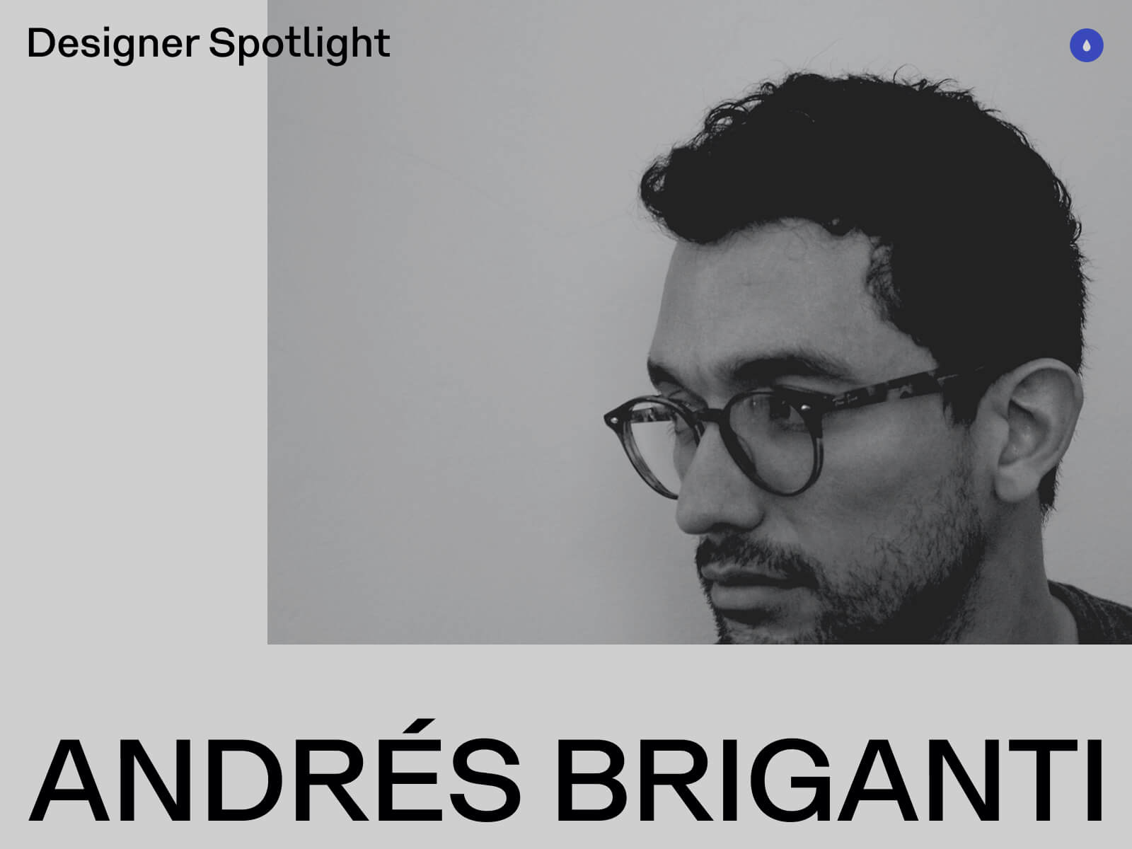
My name is Andrés Briganti, and I’m an independent graphic designer based in Buenos Aires, Argentina. I collaborate with brands, institutions, and individuals from around the world.
While my focus is on visual identity, my work spans over various fields of design visual communication, from physical to digital, from posters to wristwatches. My approach is refined and intentional, with the goal to distill abstract or complex ideas into distinctive visual forms.
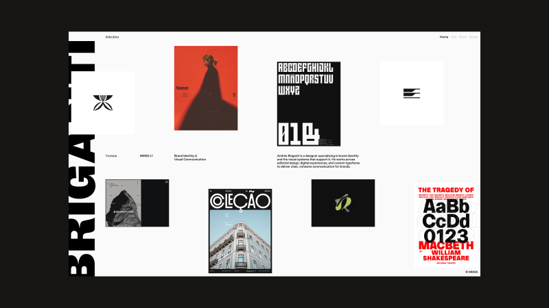
Selected Projects
Personal Site
My most recent, and most visible, digital project is my portfolio website. After years of iterations and a stalled launch, the concept matured into a more cohesive direction. Earlier this year, I teamed up with Joyco Studio to bring it to life. The result has been well received and earned an FWA Site of the Day.
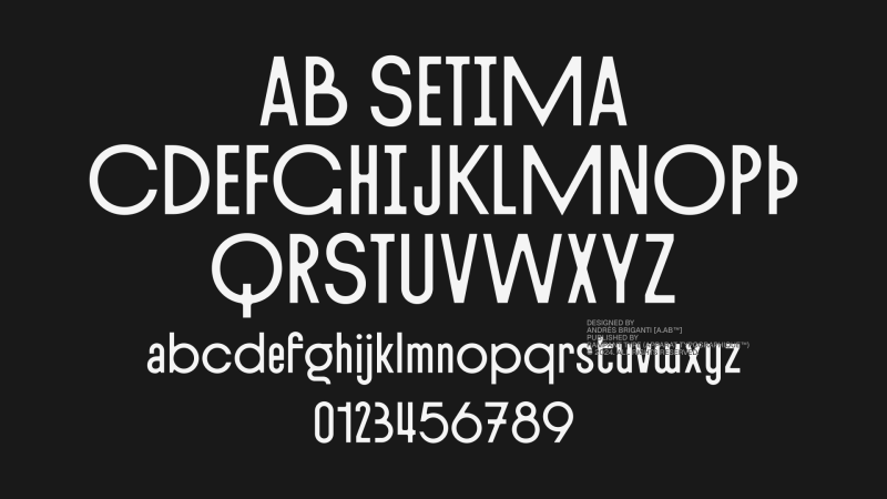
AB Setima
A few years ago, I began taking my interest in type design more seriously. I was even part of the team that designed the Geist typeface for Vercel while working at basement.studio.
My latest exploration in this field is AB Setima, a sans-serif display typeface that blends Art Deco geometry with a modern sensibility. It has refined proportions and tapered inner angles in contrast with sharp outer ones. The typeface includes variants and discretionary ligatures, offering some flexibility in composition.
Designed with restaurant identities, hotel graphics, and event communications in mind, AB Setima delivers a sense of distinction with some edge to it.
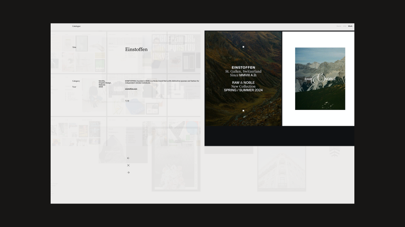
Einstoffen
During 2023, I led the rebrand and visual language refinement for Einstoffen, a Swiss brand founded in 2008 that creates distinctive eyewear and fashion for independent-minded individuals. The project focused on sharpening the brand’s visual identity to better reflect its bold, self-assured spirit and evolving product offering.
Various Identities
A selection of brand visual identities I’ve created over the years.
Previously, I’ve worked as Lead Brand Designer for digital studios and as Design Director for fashion and lifestyle brands. Today, I split my time between my independent practice, where I focus on visual exploration, and Rampant Studio, a collaborative creative bureau I’m building as Creative Director.
Design Philisophy
I believe in design that is both conceptually grounded and thoughtfully constructed, work that distills complex ideas into clear, enduring visual forms. My process balances strategic thinking with formal expression, creating identities and systems that are purposeful, distinctive, and built to last. I aim for clarity over noise, and visual languages that reflect the true character of the brands they serve.
Final Thoughts
I believe a designer’s greatest asset is the ability to connect the dots across the span of human experience and culture. A lack of interest in history, culture, and seemingly unrelated subjects leads to work that is shallow and short-lived. It’s curiosity – not specific skills or tools – that truly sets us apart.
Contact
I’m always happy to connect, share ideas, and explore new projects. Drop me a line anytime.
Hi! My name is Clarisse and I’m a freelance web designer at Okey Studio, currently based in Toulouse, France. Together with Adrien Quéchon, a web developer, we co-founded Okey Studio in 2021 — an independent digital studio specializing in the creation of unique, fully custom websites. We particularly love creating creative and original sites where we can play with ideas, interactions, and visuals, while still meeting our clients’ goals. We put a lot of heart into crafting personalized user experiences, always aligned with the needs and vision of those we work with.
What I especially enjoy is the diversity of sectors we collaborate with: it pushes us to stay curious, constantly test new visual languages, explore unexpected ideas, and challenge our habits.
This is the promotional website for Cyclops Club, a New York-based studio offering video production and editing services to optimize your multimedia content. Created within Okey Studio, the site immerses visitors in a quirky, dynamic, and fun universe.
Challenges: We wanted to incorporate nods to the video world (timelines, icons, progress bars, time indicators, REC mode…), as well as GIFs and Easter eggs. The challenge was to maintain a professional tone while keeping it fun — so we had to find the right balance between all these elements.
Personal note: This was one of those projects where you really feel creative freedom, and above all, where we genuinely had fun. Marvin trusted us 200%, which allowed us to push the graphic boundaries quite far while staying consistent with the brand image and goals. We enjoyed hiding little easter eggs and GIFs throughout the site. The nicest was embracing this funny tone while maintaining a professional and controlled foundation.
Virtual Gallery is a personal project we created internally at Okey Studio. The site honors photographers who generously share their photos online. It celebrates their talent through a small virtual photo gallery — like an exhibition space, but in a digital form. We wanted to create a smooth and enjoyable browsing experience through a selection of stunning photos, featuring carefully crafted scrolling and an immersive feel.
Challenges: The biggest challenge was probably selecting the photos. I sorted the images by colors and moods to maintain a consistent aesthetic throughout the site.
Personal notes: Since this is a personal project, it was naturally harder to set boundaries. No client, no deadline… so you want to keep going, keep testing, keep redoing. You have to learn to set limits for yourself and accept that it’s “finished” at some point. But it was also a true creative bubble, a playground and experimental space — the kind of project that reconnects you to the simple joy of designing without constraints.
This is the showcase website for Inertia Studios, a London-based creative studio pushing the boundaries of CGI, design, and futuristic aesthetics. Their ambition: create visual experiences that grab you, stop you, and make you feel something real.
Created within Okey Studio, the site adopts a rather sober aesthetic: micro-interactions, smooth transitions, subtle hover effects, large capitals, and solid and well-paced typographic blocks, for a sharp and impactful look — without feeling cold. A true balance between rigor, minimalism, and boldness. I really love the work of Inertia Studios — collaborating on their website redesign was a pure pleasure.
Challenges: Inertia has a strong brand image and an international client portfolio, so it was essential to remain highly professional and perfectly legible. The main challenge was to maintain a “classic” structure in terms of usability (clear information, intuitive navigation) while avoiding boredom by injecting modernity and visual tension.
Karo is an art and clothing brand based in New York, founded by Anya Karolyn. The studio defines itself as: non-traditional, a unification of artwork, fashion, music and video. Anya reached out to Okey Studio to redesign her e-commerce website. I imagined a more artistic, unconventional, and bold version, fully rooted in her aesthetic. The design adopts a brutalist approach, featuring chrome elements — a color and material that Anya particularly loves — as well as touches of electric blue; both emblematic of her visual identity. We loved transcribing the world of Studio Karo through interactive web animations where users become part of the experience.
Challenges: The challenge was definitely to find the right balance between an artistic, highly personal design — with a strong visual aesthetic — and a smooth, intuitive e-commerce experience. The site needed to both reflect Karo’s unique world while allowing users to navigate easily and shop without any friction.
Personal note: I loved working on this project — Anya and I were truly on the same wavelength from the start. She gave me complete trust, and we immediately understood each other about her desires, her objectives, and the creative direction to take. It was a super creative project where I could bring some different, sometimes bolder ideas — and she absolutely loved it. A smooth, inspiring, and freeing collaboration!
Henri Heymans
Henri is a web developer who contacted me to work on the web design for his first portfolio. His goal was clear: to stand out from other developers and try to win a Site of the Day (SOTD) on Awwwards. The site, now updated (2025), is unfortunately no longer online — but I kept a video and visual captures of it.
It featured a brutalist style on a black background. The design played with very large typographic compositions, scale variations, and a horizontal scroll that paced the navigation. The central element of the site was a 3D liquid metal sphere in negative, located on the homepage. It responded to cursor movements, creating a hypnotic effect that anchored the experience in a living material.
Personal note: This was a project where I could explore a bold design with a strong graphic stance. Henri wanted a site that grabs attention — and we had fun creating a showcase unlike any other.
This is my personal website, designed as a creative showcase that reflects both my style and personality. I wanted it to be minimalist in structure, yet fun and human, giving a more intimate glimpse of who I am.
In the loader, Adrien had fun animating the logo with a pixel effect we love — we especially enjoy these kinds of little details. When you arrive on the page, the central feature is a distortion effect applied to the main text, creating a lively and interactive texture.
Since I get bored quickly and like almost every color, I added a “Change the mood” button that lets you modify both the page’s color palette and the welcome GIF in the Hero section. This gives the site an evolving vibe and highlights visual diversity, while adding a playful touch.
It’s not a classic portfolio: no detailed project pages, but rather a personal space where I can present my work in a way that suits me, test ideas, and evolve the site as I please.
Challenges: The real challenge was setting boundaries for myself. When you create for yourself, anything is possible, and I tend to like and try many things. I had to decide: “Okay, this is the direction I choose,” and stick to it until the end.
Thanks to Cédric, videographer, for his awesome work on the video for my showreel.
Background
I studied graphic design in Toulouse, with a final year specializing in web design. I quickly developed a taste for web design and interactive experiences. Right after graduating, I had the opportunity to work directly on web projects as a freelancer — and I decided to fully embark on this adventure.
In 2021, together with Adrien Quéchon, we founded Okey Studio to offer a complete service: custom design and development, hand in hand.
One of the highlights was our very first Site of the Day on Awwwards: after spending my student years admiring other designers’ work on that site, seeing our own work featured there was a true achievement.
Design Philosophy
For me, creating a website means telling a visual story that reflects a brand’s personality. I believe in custom-made solutions, the importance of details, and the idea that a site must be beautiful, functional, high-performing, and designed to stand out, regardless of its complexity.
Tools and Techniques
I use Figma for design and conception, and I love working closely with Adrien on the development side to enhance interactions and brainstorm animation ideas together. I do a lot of creative research and exploration before each project. It’s also essential for me to fully immerse myself in the world of the client or brand I’m working with.
Inspiration
Online, I like to browse sites like Awwwards, CSS Design Awards, FWA, Dribbble, Pinterest, etc. (nothing very original). But I also draw a lot of inspiration from real life: through travel, as well as music, books, and films.
Future Goals
I’d like to keep creating websites that are both creative and tailor-made, with more projects where I have true artistic freedom, or at least plenty of space to propose original ideas. I really enjoy having fun in what I do! And I want to continue refining my work and improving.
Together with Adrien, we would also like to start working on the Okey Studio website — a site that truly reflects who we are and showcases our work and projects. It’s an exciting challenge, but we’ll need to find the time, as projects like this can quickly become a real playground!
Final Thoughts
It’s always a bit tricky to give advice or share a personal message, but I’d simply say: enjoy what you do, have fun, and put your heart into it — it usually comes across in the project 🫶
Thank you so much for reading, and a big thanks to Codrops and Manoela for inviting me to share a glimpse of my world and work.
You can find my contact info on my website clarissemichard.com I also share all my latest projects on social media:
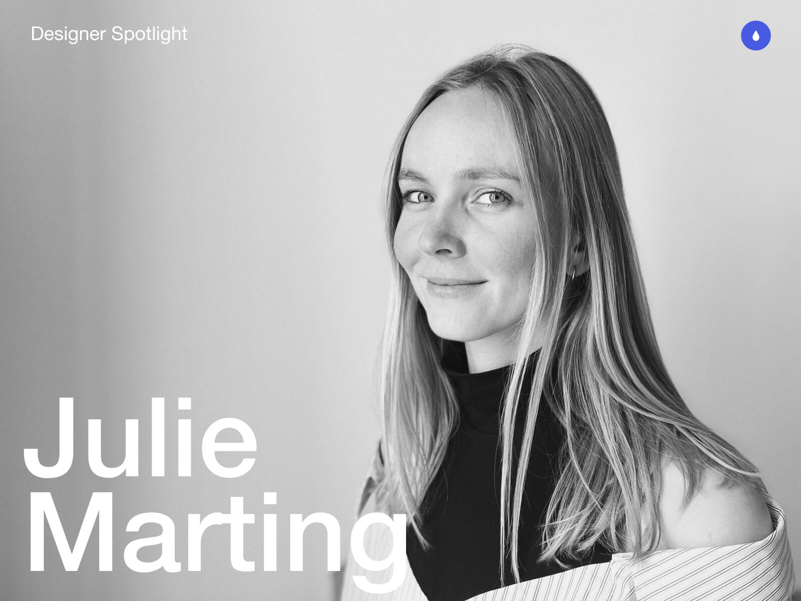
Hey there. My name is Julie Marting, and I’m a Paris-based designer. Focusing on concept, interactivity, and 3D, I’ve been working on these subjects at Hervé Studio for a few years now, with occasional freelance projects when something cool comes my way.
The types of projects I work on revolve around interactive and immersive experiences. From a landing page with interactive elements to a virtual immersive exhibition, or interactive user journeys within applications, my goal is to enhance the user experience by evoking emotions that encourage them to explore or use a service.
Featured work
Madbox
Madbox is a mobile game publisher creating fun, small games with simple gameplay that anyone can enjoy. Our mission was to create a website that reflected their image: playful, innovative, full of references and surprises that delight users, and also one that would make people want to join their team. (And obviously, with a mobile first approach.)
If you are curious, you will be intrigued by the hot-air balloon traveling through the hero section: it takes you on a test to see if you would be a good fit to join the Madbox team.
Personal Notes
This was the first project I worked on when I joined Hervé in 2021, and it’s still one of my favorites. We had so much fun coming up with concepts, interactions, animations, and easter eggs to add to this joyful design. It was a pleasure working with the clients, and a great collaboration with the developers, who were very proactive in making the experience as good as possible.
Fruitz is a French dating app that uses fruits to categorize what you’re looking for: one-night stands, casual matches, serious relationships… While the service is only available through the app, the clients still wanted a playful and interactive landing page for curious visitors. That’s where our adventure began!
To echo the tags and labels used on dating apps, we chose to explore an artistic direction centered around stickers. This also allowed us to highlight the puns that Fruitz loves to use in its communication campaigns.
Personal Notes
This project was a great opportunity to develop a new style for Fruitz’s communication, based on their brand guidelines but with some freedom to explore playful new visuals. It’s also always interesting to come up with a concept for a simple landing page with limited content. It has to catch the eye and delight users, without being “too much”.
For the Vivatech event, the LVMH group needed to create a virtual showcase of its brands’ latest innovations. On this occasion, I teamed up with Cosmic Shelter to create “The Showroom”, an immersive experience where you can discover the stories and the technological advances of the best Maisons, through an imaginary world.
Personal Notes
Aside from the art direction, which I really enjoyed, I found it very interesting to work as a freelancer for another digital agency. Although we share similar processes and methods, everyone works differently, so it’s always instructive to exchange ideas. Working as a freelancer on a specific part of a project (in this case, 3D art direction) and working as a designer within a studio with multiple roles on the same project are two very different experiences, both of which are incredibly enriching to explore.
365, A Year Of Cartier
Every year, Cartier publishes a magazine showcasing their key actions over the past 12 months. For two years in a row, they asked us at Hervé Studio to create a digital version of the magazine.
The goal was to bring together 29 articles across 6 chapters around a central navigation system, ensuring that users wouldn’t miss anything, and especially the 6 immersive articles we developed further.
Personal Notes
The challenge on this project was the tight deadline in relation to the complexity of the experiments and the creative intentions we wanted to bring to them. We were a small team, so we had to stay organized and work quickly, but in the end it was a real pleasure to see all these experiments come to life.
For the end-of-year celebrations, Lacoste wanted to promote the customization feature of their polo shirts. We were asked at Hervé Studio to design a short video highlighting this feature and its various possibilities.
Personal notes
This really cool project, despite its short deadline, was a great opportunity to explore the physics effects in Cinema 4D, which I wasn’t very familiar with. It was important to develop a storytelling approach around the creation of a unique polo, and I’m proud of the result we managed to achieve for this two-week project.
Background & Career highlights
As interactive design is a recent and niche field, I began my studies in graphic design without knowing it even existed. It was at Gobelins that I discovered and fell in love with this specialty, and I went on to enroll in a master’s degree in interactive design. The main strength of this school was the sandwich course, which allowed me to start my first job at a very young age. After working for a bespoke industrial design studio, a ready-to-wear brand, and a digital agency, I finally joined Hervé Studio over four years ago.
We were a small team with a human spirit, which gave me the opportunity to quickly take on responsibilities for projects of various sizes.
We’ve grown and evolved, winning over new clients and new types of projects. We were eventually invited to give a talk at the Paris Design Meetup organized by Algolia and Jitter, and later at the OFFF Vienna festival. There, we shared our experience on the following topic: “WebGL for Interactivity: From Concept to Production”. The idea was to demystify the use of this technology, highlight the possibilities it opens up for designers, and explain our workflow and collaboration with developers to move forward together on a shared project.
Talk at the OFFF Vienna Festival with the co-founders of Hervé Studio: Romain Briaux and Vincent Jouty
Design Philosophy
I am convinced that in this overwhelming world, design can bring us meaning and calm. In my approach, I see it as a way to transport people into a world beyond the ordinary. Immersing users, capturing their attention, and offering them a moment of escape while conveying a message is what I aspire to.
Injecting meaning into projects is a leitmotif. It’s obviously not enough to create something beautiful; it’s about creating something tailor-made that holds meaning for users, clients, and ourselves.
Interactive design enables us to place the user at the center of the experience, making them an active participant rather than just a reader of information or a potential consumer. Moreover, interactive design can sometimes evoke emotions and create lasting memories. For these reasons, this specialty feels like a powerful medium for expression and exchange, because that’s what it’s all about.
Tools & Technics
A pencil and some paper: inherent to creation
Figma: to gather and create
Cinema 4D + Octane render: to let the magic happen
But I would say the best tool is communication, within the team and with developers, to understand how we can work better together, which techniques to use, and how to achieve a smoother workflow and a stunning result.
Inspiration
We’re lucky to have many platforms to find inspiration today, but I would say my main source of inspiration comes from life itself, everything that crosses our path at any given moment. Staying open to what surrounds us, observing, and focusing our attention on things that catch our eye or raise questions. It can be visual (static or moving), a sensation, a feeling, a moment, an action, a concept, a sentence, an idea, anything we’re sensitive to.
And if we get inspired by something and need to take some notes or sketch it, no matter how accurate the result is, the important thing is to catch the inspiration and explore all around. This is why I like to do some photography in my spare time, or other accessible crafts like painting on objects, nude drawing sessions, or creating little jewels out of nowhere. These activities are very invigorating and allow us to take a break from our hectic lives.
Future goals
My main goal is to finally start working on my portfolio. Like many designers, I’ve always postponed this moment, relying on platforms like Behance to showcase my projects. But there comes a time when it’s important to have an online presence, a professional storefront that evolves with us over time.
Final Thoughts
Don’t pay too much attention to negative minds. Believe in yourself, stick to what you like, explore and try without worrying about rules or expectations. Make mistakes and don’t blame yourself for them. On the contrary, failures can sometimes lead to good surprises, or at least valuable lessons. Above all, listen to yourself and find the right balance between creating and taking time to breathe. Enjoying yourself is essential.
Contact
Thank you very much for your reading, and feel free to reach out if interested in anything, I would be happy to discuss!
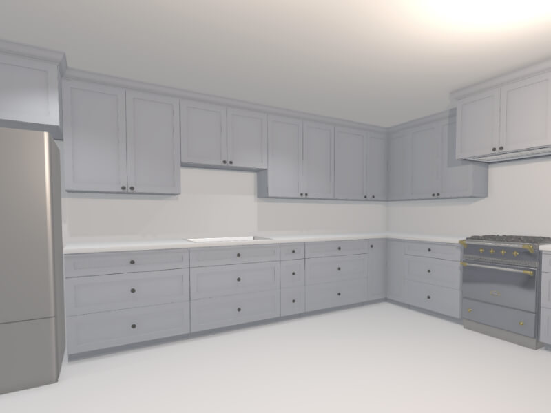
Back in November 2024, I shared a post on X about a tool I was building to help visualize kitchen remodels. The response from the Three.js community was overwhelmingly positive. The demo showed how procedural rendering techniques—often used in games—can be applied to real-world use cases like designing and rendering an entire kitchen in under 60 seconds.
In this article, I’ll walk through the process and thinking behind building this kind of procedural 3D kitchen design tool using vanilla Three.js and TypeScript—from drawing walls and defining cabinet segments to auto-generating full kitchen layouts. Along the way, I’ll share key technical choices, lessons learned, and ideas for where this could evolve next.
Have been wanting to redesign my parents’ kitchen for a while now
…so I built them a little 3D kitchen design-tool with @threejs, so they can quickly prototype floorplans/ideas
Here’s me designing a full kitchen remodel in ~60s 🙂
You can try out an interactive demo of the latest version here: https://kitchen-designer-demo.vercel.app/. (Tip: Press the “/” key to toggle between 2D and 3D views.)
Designing Room Layouts with Walls
Example of user drawing a simple room shape using the built-in wall module.
To initiate our project, we begin with the wall drawing module. At a high level, this is akin to Figma’s pen tool, where the user can add one line segment at a time until a closed—or open-ended—polygon is complete on an infinite 2D canvas. In our build, each line segment represents a single wall as a 2D plane from coordinate A to coordinate B, while the complete polygon outlines the perimeter envelope of a room.
We begin by capturing the [X, Z] coordinates (with Y oriented upwards) of the user’s initial click on the infinite floor plane. This 2D point is obtained via Three.js’s built-in raycaster for intersection detection, establishing Point A.
As the user hovers the cursor over a new spot on the floor, we apply the same intersection logic to determine a temporary Point B. During this movement, a preview line segment appears, connecting the fixed Point A to the dynamic Point B for visual feedback.
Upon the user’s second click to confirm Point B, we append the line segment (defined by Points A and B) to an array of segments. The former Point B instantly becomes the new Point A, allowing us to continue the drawing process with additional line segments.
Here is a simplified code snippet demonstrating a basic 2D pen-draw tool using Three.js:
import * as THREE from 'three';

const scene = new THREE.Scene();
const camera = new THREE.PerspectiveCamera(75, window.innerWidth / window.innerHeight, 0.1, 1000);
camera.position.set(0, 5, 10); // Position camera above the floor looking down
camera.lookAt(0, 0, 0);

const renderer = new THREE.WebGLRenderer();
renderer.setSize(window.innerWidth, window.innerHeight);
document.body.appendChild(renderer.domElement);

// Create an infinite floor plane for raycasting
const floorGeometry = new THREE.PlaneGeometry(100, 100);
const floorMaterial = new THREE.MeshBasicMaterial({ color: 0xcccccc, side: THREE.DoubleSide });
const floor = new THREE.Mesh(floorGeometry, floorMaterial);
floor.rotation.x = -Math.PI / 2; // Lay flat on XZ plane
scene.add(floor);

const raycaster = new THREE.Raycaster();
const mouse = new THREE.Vector2();
let points: THREE.Vector3[] = []; // i.e. wall endpoints
let tempLine: THREE.Line | null = null;
const walls: THREE.Line[] = [];

function getFloorIntersection(event: MouseEvent): THREE.Vector3 | null {
  mouse.x = (event.clientX / window.innerWidth) * 2 - 1;
  mouse.y = -(event.clientY / window.innerHeight) * 2 + 1;
  raycaster.setFromCamera(mouse, camera);
  const intersects = raycaster.intersectObject(floor);
  if (intersects.length > 0) {
    // Round to simplify coordinates (optional for cleaner drawing)
    const point = intersects[0].point;
    point.x = Math.round(point.x);
    point.z = Math.round(point.z);
    point.y = 0; // Ensure on floor plane
    return point;
  }
  return null;
}

// Update temporary line preview
function onMouseMove(event: MouseEvent) {
  const point = getFloorIntersection(event);
  if (point && points.length > 0) {
    // Remove old temp line if exists
    if (tempLine) {
      scene.remove(tempLine);
      tempLine = null;
    }
    // Create new temp line from last point to current hover
    const geometry = new THREE.BufferGeometry().setFromPoints([points[points.length - 1], point]);
    const material = new THREE.LineBasicMaterial({ color: 0x0000ff }); // Blue for temp
    tempLine = new THREE.Line(geometry, material);
    scene.add(tempLine);
  }
}

// Add a new point and draw permanent wall segment
function onMouseDown(event: MouseEvent) {
  if (event.button !== 0) return; // Left click only
  const point = getFloorIntersection(event);
  if (point) {
    points.push(point);
    if (points.length > 1) {
      // Draw permanent wall line from previous to current point
      const geometry = new THREE.BufferGeometry().setFromPoints([points[points.length - 2], points[points.length - 1]]);
      const material = new THREE.LineBasicMaterial({ color: 0xff0000 }); // Red for permanent
      const wall = new THREE.Line(geometry, material);
      scene.add(wall);
      walls.push(wall);
    }
    // Remove temp line after click
    if (tempLine) {
      scene.remove(tempLine);
      tempLine = null;
    }
  }
}

// Add event listeners
window.addEventListener('mousemove', onMouseMove);
window.addEventListener('mousedown', onMouseDown);

// Animation loop
function animate() {
  requestAnimationFrame(animate);
  renderer.render(scene, camera);
}
animate();
The above code snippet is a very basic 2D pen tool, and yet this information is enough to generate an entire room instance. For reference: not only does each line segment represent a wall (2D plane), but the set of accumulated points can also be used to auto-generate the room’s floor mesh, and likewise the ceiling mesh (the inverse of the floor mesh).
In order to view the planes representing the walls in 3D, one can transform each THREE.Line into a custom Wall class object, which contains both a line (for orthogonal 2D “floor plan” view) and a 2D inward-facing plane (for perspective 3D “room” view). To build this class:
class Wall extends THREE.Group {
  constructor(length: number, height: number = 96, thickness: number = 4) {
    super();

    // 2D line for top view, along the x-axis
    const lineGeometry = new THREE.BufferGeometry().setFromPoints([
      new THREE.Vector3(0, 0, 0),
      new THREE.Vector3(length, 0, 0),
    ]);
    const lineMaterial = new THREE.LineBasicMaterial({ color: 0xff0000 });
    const line = new THREE.Line(lineGeometry, lineMaterial);
    this.add(line);

    // 3D wall as a box for thickness
    const wallGeometry = new THREE.BoxGeometry(length, height, thickness);
    const wallMaterial = new THREE.MeshBasicMaterial({ color: 0xaaaaaa, side: THREE.DoubleSide });
    const wall = new THREE.Mesh(wallGeometry, wallMaterial);
    wall.position.set(length / 2, height / 2, 0);
    this.add(wall);
  }
}
We can now update the wall draw module to utilize this newly created Wall object:
// Update our variables
let tempWall: Wall | null = null;
const walls: Wall[] = [];

// Replace line creation in onMouseDown with
if (points.length > 1) {
  const start = points[points.length - 2];
  const end = points[points.length - 1];
  const direction = end.clone().sub(start);
  const length = direction.length();
  const wall = new Wall(length);
  wall.position.copy(start);
  wall.rotation.y = Math.atan2(direction.z, direction.x); // Align along direction (assuming CCW for inward facing)
  scene.add(wall);
  walls.push(wall);
}
Upon adding the floor and ceiling meshes, we can further transform our wall module into a room generation module. To recap what we have just created: by adding walls one by one, we have given the user the ability to create full rooms with walls, floors, and ceilings—all of which can be adjusted later in the scene.
User dragging out the wall in 3D perspective camera-view.
Generating Cabinets with Procedural Modeling
Our cabinet-related logic can consist of countertops, base cabinets, and wall cabinets.
Rather than taking several minutes to add the cabinets on a case-by-case basis—for example, like with IKEA’s 3D kitchen builder—it’s possible to add all the cabinets at once via a single user action. One method to employ here is to allow the user to draw high-level cabinet line segments, in the same manner as the wall draw module.
In this module, each cabinet segment will transform into a linear row of base and wall cabinets, along with a parametrically generated countertop mesh on top of the base cabinets. As the user creates the segments, we can automatically populate this line segment with pre-made 3D cabinet meshes in meshing software like Blender. Ultimately, each cabinet’s width, depth, and height parameters will be fixed, while the width of the last cabinet can be dynamic to fill the remaining space. We use a cabinet filler piece mesh here—a regular plank, with its scale-X parameter stretched or compressed as needed.
Creating the Cabinet Line Segments
User can make a half-peninsula shape by dragging the cabinetry line segments alongside the walls, then in free-space.
Here we will construct a dedicated cabinet module, with the aforementioned cabinet line segment logic. This process is very similar to the wall drawing mechanism, where users can draw straight lines on the floor plane using mouse clicks to define both start and end points. Unlike walls, which can be represented by simple thin lines, cabinet line segments need to account for a standard depth of 24 inches to represent the base cabinets’ footprint. These segments do not require closing-polygon logic, as they can be standalone rows or L-shapes, as is common in most kitchen layouts.
We can further improve the user experience by incorporating snapping functionality, where the endpoints of a cabinet line segment automatically align to nearby wall endpoints or wall intersections, if within a certain threshold (e.g., 4 inches). This ensures cabinets fit snugly against walls without requiring manual precision. For simplicity, we’ll outline the snapping logic in code but focus on the core drawing functionality.
We can start by defining the CabinetSegment class. Like the walls, this should be its own class, as we will later add the auto-populating 3D cabinet models.
class CabinetSegment extends THREE.Group {
  public length: number;

  constructor(length: number, height: number = 96, depth: number = 24, color: number = 0xff0000) {
    super();
    this.length = length;
    const geometry = new THREE.BoxGeometry(length, height, depth);
    const material = new THREE.MeshBasicMaterial({ color, wireframe: true });
    const box = new THREE.Mesh(geometry, material);
    box.position.set(length / 2, height / 2, depth / 2); // Shift so depth spans 0 to depth (inward)
    this.add(box);
  }
}
Once we have the cabinet segment, we can use it in a manner very similar to the wall line segments:
let cabinetPoints: THREE.Vector3[] = [];
let tempCabinet: CabinetSegment | null = null;
const cabinetSegments: CabinetSegment[] = [];
const CABINET_DEPTH = 24; // everything in inches
const CABINET_SEGMENT_HEIGHT = 96; // i.e. both wall & base cabinets -> group should extend to ceiling
const SNAPPING_DISTANCE = 4;

function getSnappedPoint(point: THREE.Vector3): THREE.Vector3 {
  // Simple snapping: check against existing wall points (wallPoints array from wall module)
  for (const wallPoint of wallPoints) {
    if (point.distanceTo(wallPoint) < SNAPPING_DISTANCE) return wallPoint;
  }
  return point;
}

// Update temporary cabinet preview
function onMouseMoveCabinet(event: MouseEvent) {
  const point = getFloorIntersection(event);
  if (point && cabinetPoints.length > 0) {
    const snappedPoint = getSnappedPoint(point);
    if (tempCabinet) {
      scene.remove(tempCabinet);
      tempCabinet = null;
    }
    const start = cabinetPoints[cabinetPoints.length - 1];
    const direction = snappedPoint.clone().sub(start);
    const length = direction.length();
    if (length > 0) {
      tempCabinet = new CabinetSegment(length, CABINET_SEGMENT_HEIGHT, CABINET_DEPTH, 0x0000ff); // Blue for temp
      tempCabinet.position.copy(start);
      tempCabinet.rotation.y = Math.atan2(direction.z, direction.x);
      scene.add(tempCabinet);
    }
  }
}

// Add a new point and draw permanent cabinet segment
function onMouseDownCabinet(event: MouseEvent) {
  if (event.button !== 0) return;
  const point = getFloorIntersection(event);
  if (point) {
    const snappedPoint = getSnappedPoint(point);
    cabinetPoints.push(snappedPoint);
    if (cabinetPoints.length > 1) {
      const start = cabinetPoints[cabinetPoints.length - 2];
      const end = cabinetPoints[cabinetPoints.length - 1];
      const direction = end.clone().sub(start);
      const length = direction.length();
      if (length > 0) {
        const segment = new CabinetSegment(length, CABINET_SEGMENT_HEIGHT, CABINET_DEPTH, 0xff0000); // Red for permanent
        segment.position.copy(start);
        segment.rotation.y = Math.atan2(direction.z, direction.x);
        scene.add(segment);
        cabinetSegments.push(segment);
      }
    }
    if (tempCabinet) {
      scene.remove(tempCabinet);
      tempCabinet = null;
    }
  }
}

// Add separate event listeners for cabinet mode (e.g., toggled via UI button)
window.addEventListener('mousemove', onMouseMoveCabinet);
window.addEventListener('mousedown', onMouseDownCabinet);
Auto-Populating the Line Segments with Live Cabinet Models
Here we fill 2 line-segments with 3D cabinet models (base & wall), and countertop meshes.
Once the cabinet line segments are defined, we can procedurally populate them with detailed components. This involves dividing each segment vertically into three layers: base cabinets at the bottom, countertops in the middle, and wall cabinets above. For the base and wall cabinets, we’ll use an optimization function to divide the segment’s length into standard widths (preferring 30-inch cabinets), with any remainder filled using the filler piece mentioned above. Countertops are even simpler—they form a single continuous slab stretching the full length of the segment.
The base cabinets are set to 24 inches deep and 34.5 inches high. Countertops add 1.5 inches in height and extend to 25.5 inches deep (including a 1.5-inch overhang). Wall cabinets start at 54 inches high (18 inches above the countertop), measure 12 inches deep, and are 30 inches tall. After generating these placeholder bounding boxes, we can replace them with preloaded 3D models from Blender using a loading function (e.g., via GLTFLoader).
To handle individual cabinets, we’ll create a simple Cabinet class that manages the placeholder and model loading.
import { GLTFLoader } from 'three/examples/jsm/loaders/GLTFLoader.js';

const loader = new GLTFLoader();

class Cabinet extends THREE.Group {
  constructor(width: number, height: number, depth: number, modelPath: string, color: number) {
    super();

    // Placeholder box
    const geometry = new THREE.BoxGeometry(width, height, depth);
    const material = new THREE.MeshBasicMaterial({ color });
    const placeholder = new THREE.Mesh(geometry, material);
    this.add(placeholder);


    // Load and replace with model async

    // Case: Non-standard width -> use filler piece
    if (width < DEFAULT_MODEL_WIDTH) {
      loader.load(FILLER_PIECE_FALLBACK_PATH, (gltf) => {
        const model = gltf.scene;
        model.scale.set(
          width / FILLER_PIECE_WIDTH,
          height / FILLER_PIECE_HEIGHT,
          depth / FILLER_PIECE_DEPTH,
        );
        this.add(model);
        this.remove(placeholder);
      });
    }

    loader.load(modelPath, (gltf) => {
      const model = gltf.scene;
      model.scale.set(width / DEFAULT_MODEL_WIDTH, 1, 1); // Scale width
      this.add(model);
      this.remove(placeholder);
    });
  }
}
Then, we can add a populate method to the existing CabinetSegment class:
function splitIntoCabinets(width: number): number[] {
  const cabinets = [];
  // Preferred width
  while (width >= DEFAULT_MODEL_WIDTH) {
    cabinets.push(DEFAULT_MODEL_WIDTH);
    width -= DEFAULT_MODEL_WIDTH;
  }
  if (width > 0) {
    cabinets.push(width); // Custom empty slot
  }
  return cabinets;
}

class CabinetSegment extends THREE.Group {
  // ... (existing constructor and properties)

  populate() {
    // Remove placeholder line and box
    while (this.children.length > 0) {
      this.remove(this.children[0]);
    }

    let offset = 0;
    const widths = splitIntoCabinets(this.length);

    // Base cabinets
    widths.forEach((width) => {
      const baseCab = new Cabinet(width, BASE_HEIGHT, BASE_DEPTH, 'models/base_cabinet.glb', 0x8b4513);
      baseCab.position.set(offset + width / 2, BASE_HEIGHT / 2, BASE_DEPTH / 2);
      this.add(baseCab);
      offset += width;
    });

    // Countertop (single slab, no model)
    const counterGeometry = new THREE.BoxGeometry(this.length, COUNTER_HEIGHT, COUNTER_DEPTH);
    const counterMaterial = new THREE.MeshBasicMaterial({ color: 0xa9a9a9 });
    const counter = new THREE.Mesh(counterGeometry, counterMaterial);
    counter.position.set(this.length / 2, BASE_HEIGHT + COUNTER_HEIGHT / 2, COUNTER_DEPTH / 2);
    this.add(counter);

    // Wall cabinets
    offset = 0;
    widths.forEach((width) => {
      const wallCab = new Cabinet(width, WALL_HEIGHT, WALL_DEPTH, 'models/wall_cabinet.glb', 0x4b0082);
      wallCab.position.set(offset + width / 2, WALL_START_Y + WALL_HEIGHT / 2, WALL_DEPTH / 2);
      this.add(wallCab);
      offset += width;
    });
  }
}

// Call for each cabinetSegment after drawing
cabinetSegments.forEach((segment) => segment.populate());
Further Improvements & Optimizations
We can further improve the scene with appliances, varying-height cabinets, crown molding, etc.
At this point, we should have the foundational elements of room and cabinet creation logic fully in place. In order to take this project from a rudimentary segment-drawing app into the practical realm—along with dynamic cabinets, multiple realistic material options, and varying real appliance meshes—we can further enhance the user experience through several targeted refinements:
We can implement a detection mechanism to determine if a cabinet line segment is in contact with a wall line segment.
For cabinet rows that run parallel to walls, we can automatically incorporate a backsplash in the space between the wall cabinets and the countertop surface.
For cabinet segments not adjacent to walls, we can remove the upper wall cabinets and extend the countertop by an additional 15 inches, aligning with standard practices for kitchen islands or peninsulas.
We can introduce drag-and-drop functionality for appliances, each with predefined widths, allowing users to position them along the line segment. This integration will instruct our cabinet-splitting algorithm to exclude those areas from dynamic cabinet generation.
Additionally, we can give users more flexibility by enabling the swapping of one appliance with another, applying different textures to our 3D models, and adjusting default dimensions—such as wall cabinet depth or countertop overhang—to suit specific preferences.
All these core components lead us to a comprehensive, interactive application that enables the rapid rendering of a complete kitchen: cabinets, countertops, and appliances, in a fully interactive, user-driven experience.
The aim of this project is to demonstrate that complex 3D tasks can be distilled down to simple user actions. It is fully possible to take the high-dimensional complexity of 3D tooling—with seemingly limitless controls—and encode these complexities into low-dimensional, easily adjustable parameters. Whether the developer chooses to expose these parameters to the user or an LLM, the end result is that historically complicated 3D processes can become simple, and thus the entire contents of a 3D scene can be fully transformed with only a few parameters.
If you find this type of development interesting, have any great ideas, or would love to contribute to the evolution of this product, I strongly welcome you to reach out to me via email. I firmly believe that only recently has it become possible to build home design software that is so wickedly fast and intuitive that any person—regardless of architectural merit—will be able to design their own single-family home in less than 5 minutes via a web app, while fully adhering to local zoning, architectural, and design requirements. All the infrastructure necessary to accomplish this already exists; all it takes is a team of crazy, ambitious developers looking to change the standard of architectural home design.
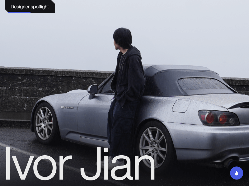
Hi! I’m Ivor Jian, a multidisciplinary designer and creative developer from Washington, USA. I create websites that blend Swiss-inspired precision with a clean, utilitarian style. My goal is to craft projects that evoke emotion through quality and tasteful animation.
As my design career continues to develop, I’m constantly learning and expanding my horizons. Below are some projects I’m proud to share from the early stages of my creative journey.
Featured projects
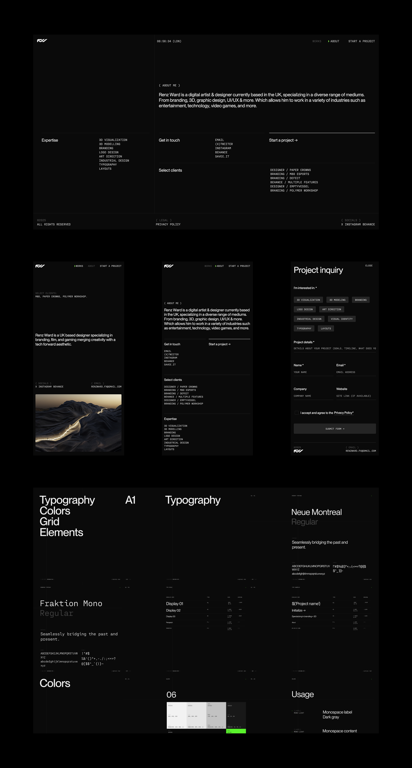
Renz Ward
A portfolio website for a UK-based designer who specializes in a technically forward aesthetic. From concept to completion, we collaborated on the visual direction, motion design, and intricate site details. The site features a grid-focused layout and animations that align with the designer’s visual identity.
The biggest challenge was syncing the dial animation with the project scroll and indicator. I’m not ashamed to say I relied heavily on Perplexity to help with this interaction. The result is a technical yet sophisticated website that I’m proud to share. The site currently has limited content, as Renz is still wrapping up projects. I plan to submit it to CSSDA and Awwwards once it’s complete.
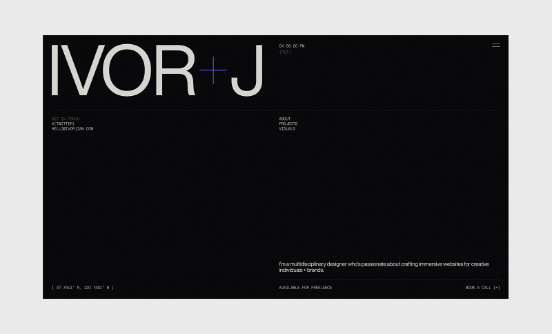
My portfolio website is always a work in progress, but I’m happy to share its current iteration. I wanted the details and typography to reflect who I am, both personally and as a designer. This includes the typography, animations, and fine details throughout the site.
This is my first passion project, and it received an honorable mention on CSSDA. As a fan of interior design and architecture, I wanted to create a minimal and experimental website to explore interactions and showcase AI-generated architecture. My focus was to deliver a clear and refined experience with clean micro-interactions and smooth page transitions. The images were generated in Midjourney.
I originally wanted to use real publications but was concerned about legal issues. The biggest challenge was making the individual showcases cohesive, as there is a lot of variation in the generated images. To achieve the best results, I used real publication images as references.
A redesign concept of the Polestar brand. Their design language was right up my alley, so I took on the challenge of creating a bespoke web experience while staying aligned with their core visual identity.
Visual explorations
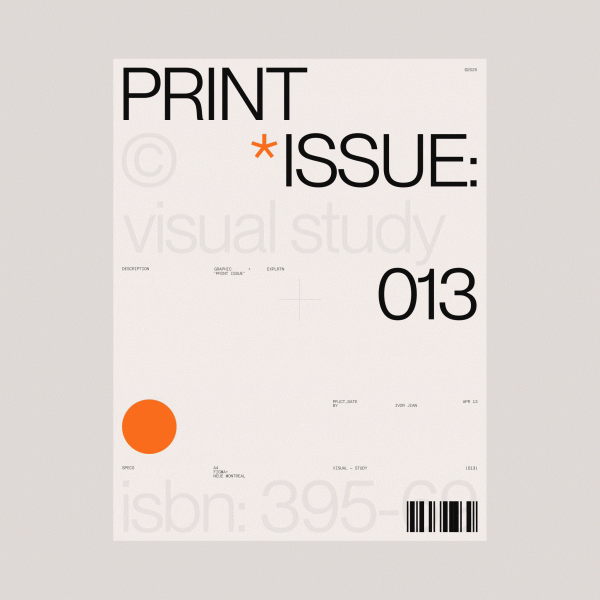
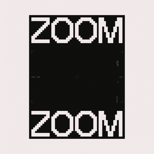
I enjoy exploring and creating random designs just for the sake of it. This helps me expand my horizons as a designer and can potentially lead to new opportunities.
About me
I’m a 22-year-old self-taught freelance designer and developer. I started doing graphic design at 13, which I believe gave me a strong foundation when I fully shifted to web design about two years ago. Without a formal education in building websites, I’ve had the freedom to explore ideas and learn by doing. This has helped me discover the kind of work I want to pursue and shape my design style. I started gaining some traction on X/Twitter after consistently posting my designs at the start of 2025, and I’ve met so many talented and wonderful people since beginning my journey there.
My approach to design
I don’t follow a strict set of principles or a fixed approach to design. I usually start by looking for inspiration before diving into a project. That said, I tend to favor a 12-column grid and clean, modern Swiss typefaces. I always iterate, exploring as many options as possible before choosing one direction to refine.
Favorite tools
My favorite tools are Webflow for development, GSAP for web animations, Perplexity for brainstorming and problem-solving, and Figma for design. This tool stack covers everything I need at the moment.
Inspiration
I love browsing beautiful visuals and websites to continually refine my taste. For design inspiration, my favorite resources are Savee and Searchsystem for their curated aesthetics of clean and technical design. When it comes to websites, I look to Awwwards and various agency sites with distinct, well-crafted brand identities. I also have favorite designers and developers whose work I admire and learn from by studying their craft; among them are Dennis Snellenberg, Ilja Van Eck, Oliver Larose, and Niklas Rosen.
Future goals
I want to keep learning and creating meaningful projects by collaborating with creative individuals and brands that align with my style of websites. I focus on combining clean typography with interactions that make a site shine with a modern and technical touch. I plan to become an award-winning designer and developer through persistence and a genuine love for great design.
Final thoughts
Thank you so much for reading about my thoughts and latest projects! I’m by no means a top-notch designer or developer yet, but I hope you enjoyed the visuals and got to know a bit about me. Consistently share your work—it might just change your life.
Keep learning, exploring, and iterating. Feel free to reach out to me on X/Twitter if you want to chat or have a project in mind. ♥️
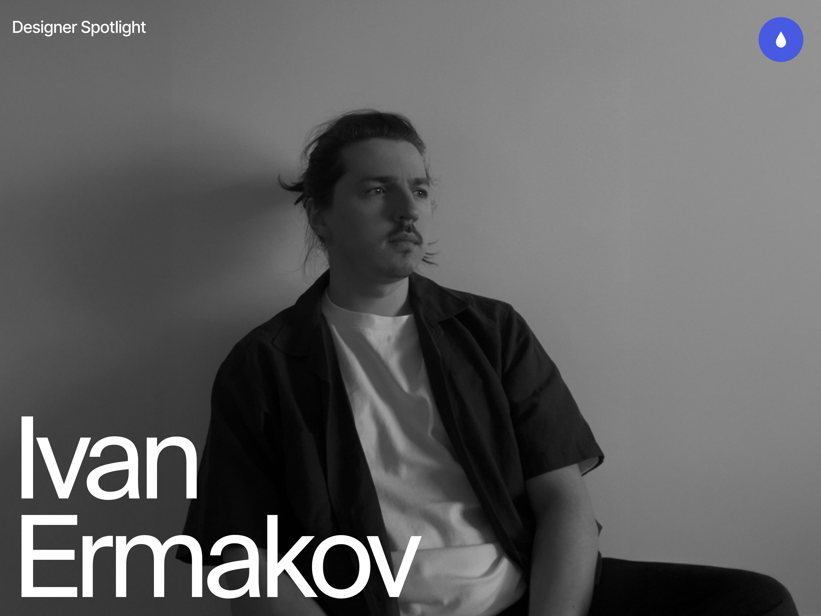
Hi, I’m Ivan—a Dubai-based designer focused on fintech products and branding. I run Moonsight, where we craft thoughtful digital experiences and sharp visual identities for financial companies around the world.
Background
My path into design wasn’t a childhood calling—I wasn’t drawing wireframes at age ten or dreaming of Helvetica (can you imagine XD). I just knew I didn’t want the typical office life. I wanted freedom, movement, and a way to create things that felt useful. Design turned out to be the sweet spot between independence and impact.
So I studied design at university by day, and took on agency work by night—what you might call the full-stack student hustle. That rhythm—study, work, repeat—taught me discipline. I also kept learning on the side, exploring tools, trends, and techniques to sharpen my craft.
Eventually, I found myself gravitating toward fintech.
Why fintech? Because it’s real. It’s personal. Everyone interacts with money. And when you build something that helps them feel more in control of it—you’re not just improving UX, you’re improving lives.
You’re designing trust. That’s a responsibility I take seriously.
From there, I explored both sides of the industry: in-house roles at product companies, and fast-paced agency work. Later, I shifted into consultancy—partnering with fintechs across Europe, the Gulf, and Asia. That chapter taught me a lot—not just about design, but about people, culture, and how different teams think about trust and money.
All of that led me to start Moonsight—a space where I could bring all those experiences together. Today, we partner with fintechs and financial companies to create sharp, useful, brand-led digital experiences. And while I still stay hands-on, I’m also building a team that’s just as obsessed with clarity, thoughtfulness, and execution as I am.
Featured Work
Monetto
A game-changer in the world of freelancing. Designed to simplify and elevate the financial journey for freelancers, Monetto is more than just an app – it’s a holistic solution that empowers creatives like me to manage their finances with confidence.
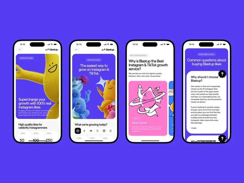
BlastUp
Blastup’s mission is simple—help users grow their social media presence, fast. We crafted a bold, dynamic identity that reflects Blastup’s energetic and friendly personality as well is their website.
Alinma Bank
This project for Alinma Bank involved a comprehensive redesign across all brand touchpoints: the logo, physical cards, website, and mobile app. The goal was to modernize and streamline the visual identity while maintaining the bank’s core values.
Coinly
Coinly is more than just a banking app — it’s a full-fledged financial literacy ecosystem for kids, designed to empower the next generation with money skills that grow with them. Built around an engaging coin mascot and a colorful 3D world, Coinly blends gamification, interactive storytelling, and real financial tools.
Design Philosophy
Design should be highly functional and intuitive, solving both business and user problems while delivering an engaging experience that users want to return to.
Design is clarity. And clarity builds trust.
Especially in fintech—where most of my projects happen—you don’t have the luxury of vague. Your design has to work, first and foremost. It has to feel smart, trustworthy, smooth. When people trust your interface, they trust your product. And when they trust your product, they’re more likely to use it again. That’s where design really proves its value.
My job is to make things useful first, beautiful second. But ideally, both at once.
The way I approach projects is structured but adaptable.
I start with full immersion—understanding the business, the audience, and the problem we’re solving. From there, I look for a unique angle, something that gives the product or brand a distinct voice. Then I push that idea as far as I can—visually, functionally, and emotionally.
And no, I don’t believe in reinventing everything 🙂
Use the patterns that work. But when something feels off or underwhelming, be bold enough to rethink it. That’s where the real creative work lives—not in chaos, but in considered evolution.
I don’t want to be known for a style. I want to be known for range.
For every project, I try to find a distinct visual language. That means experimenting—pulling in 3D, motion, illustration—whatever it takes to bring the concept to life.
And I rarely do it alone.
I collaborate closely with animators, developers, motion designers, illustrators—the kind of people who not only support the vision, but expand it. When everyone brings their strengths to the table, the result is always richer, sharper, more memorable.
What matters most is that the end result has presence. That it feels alive, intentional, and built with care.
And I care deeply about how work is presented. Every project—client or personal—is framed with context, rationale, and craft. Because good design solves problems, but great design tells a story.
Process In Bits
My process is structured, but not rigid. Usually, it looks something like this:
Polish and present Clear storytelling. Clean handoff. Confident rationale.
Understand the business What’s broken? What’s needed? What are we really solving?
Understand the user What do they expect? What’s familiar to them? What do they fear?
Build and iterate Fast feedback loops with clients and the team
One benchmark I use: if I don’t understand what I designed, how can I expect a user to?
For me, good design starts with intention. Every screen, every button, every microinteraction—there should be a reason it exists. So when a feature’s built, I walk through it in my head as if I’ve never seen it before. What would I click? What would I expect next? Can I explain what each part does without second-guessing?
After working on financial interfaces for so long, you start to internalize these flows—you almost know them by muscle memory. But that doesn’t mean you skip the test. You still go through each stage. You still assume nothing.
Sometimes, the best insights come from a teammate asking, “Wait, what does this do?” That’s your cue to look closer.
And when it comes to working with clients?
I walk clients through every stage—from moodboards to microinteractions—so there are no surprises and no last-minute pivots.
It’s about mutual trust: they trust my process, and I trust their vision.
This structure helps me manage expectations, prevent scope drift, and deliver thoughtful work—on time, without the drama.
What keeps me inspired? Looking outside the bubble.
I don’t have a list of designers I religiously follow. What inspires me is great work—wherever it lives. Sometimes it’s a slick piece of web design, sometimes a brutalist poster on the street, art style from a video game, or the typography on a jazz record sleeve.
Music plays a huge role in my creative life—I sing a bit, and I think that kind of rhythm and structure naturally finds its way into how I build interfaces.
I’m also a huge gamer, and I’m fascinated by how game mechanics influence user behavior. There’s a lot designers can learn from how games guide, reward, and surprise users.
Sometimes I’ll see a cool effect, a character design, or even just a motion detail and immediately think:
That could be the anchor for a whole experience
Not necessarily for the project I’m working on in the moment, but something I’d love to build around later. So I sort, I collect, I sketch.
I’m often looking for inspiration for one project, but bookmarking ideas for two or three others. It’s not just moodboarding—it’s pattern recognition, and planting seeds for future concepts.
Inspiration can come from anywhere—but only if you keep your eyes open.
What’s Next
Right now, I’m fully focused on building Moonsight into a studio known for bold, strategic fintech design—especially across the MENA region.
On my personal radar:
Master 3D
Launch my own product
Speak at more design events
Make Moonsight’s design Conference in Dubai happen
Join awwwards jury panel
Do more meaningful work
Mostly? Just grow. As a designer, a founder, and a creative
Parting Thoughts
If I could give one piece of advice to younger designers, it would be this:
Find what excites you. Stay obsessed with it. And don’t waste time comparing yourself to others.
We’re overexposed to each other’s work these days. It’s easy to feel behind.
But your only competition is yourself a year ago. That’s where growth lives.
This industry moves fast. But if you move with intent, your work will always find its place.
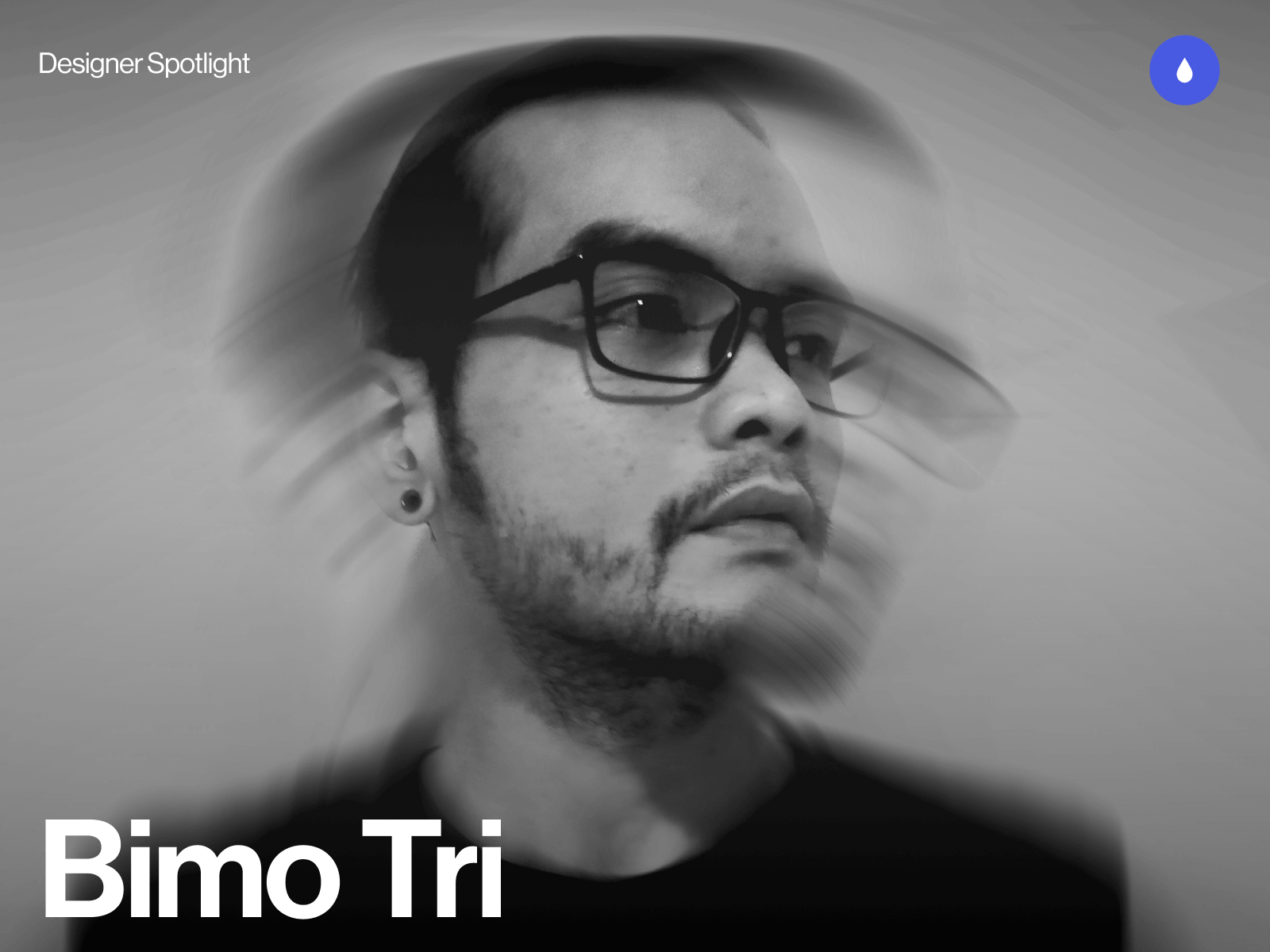
I’m Bimo Tri, a multidisciplinary designer and creative developer based in Indonesia. I run a small independent studio called Studio•Bämo.J®, working between Jakarta and Bali — or pretty much anywhere I can find a fast internet connection.
My focus is on building expressive digital experiences, mostly portfolio sites and brand platforms for creatives, studios, and design-forward brands. With roots in both design and development, I enjoy blending visual precision with motion and interactivity to create work that feels both thoughtful and visceral. I care deeply about craft, story, and making things that resonate beyond just visuals.
Saisei is a visionary architecture firm based in Tokyo, Japan, focused on sustainability, culture, and timeless design. I designed and developed the site to reflect their philosophy merging traditional Japanese aesthetics with clean, contemporary digital design.
Achievements
This project was a major milestone in my career. It brought home my first Awwwards Site of the Day and earned recognition from several other platforms. The positive feedback from the design community affirmed my approach to cultural storytelling through digital mediums.
Personal notes
Saisei remains one of my favorite works. I’ve always been drawn to the tension between heritage and modernity, and this project gave me the space to explore that deeply. The recognition it received made the process even more meaningful.
Nagara is a concept project developed in collaboration with my buddy Felixander Yuan, created as part of the #DareToShare24 design challenge by @bentenwordring.
It reimagines a luxury watch brand that fuses the precision of Swiss watchmaking with the cultural depth of the Majapahit Empire. Each timepiece acts as a tribute not just to technical craftsmanship, but to historical richness and aesthetic symbolism rooted in Indonesian heritage.
Challenges
One of the biggest hurdles was exploring AI-generated imagery and motion assets. Using tools like Midjourney and Kling, it took numerous iterations to dial in a visual direction that felt both on-brand and high-end. Getting the product visuals — especially the watches — to look authentic and aligned with the brand’s narrative was far more challenging than anticipated.
Achievements
The final result was a fully animated concept site that we were genuinely proud of. Yuan did an amazing job bringing the dev and motion to life. Beyond that, the project ended up winning the monthly challenge, earning recognition and some cool prizes — a nice bonus on top of the creative satisfaction.
Personal notes
This one felt personal. The month’s theme was “Luxury” — a space I naturally gravitate toward — and we were allowed to team up for the final challenge. I chose to work with Yuan, someone I’ve respected and known for a while. The entire process felt like a return to roots — storytelling, culture, and collaboration — wrapped inside a luxury narrative.
Horizon Studio is a conceptual architecture firm based in Los Angeles, created to explore the intersection of art, design, and technology. Inspired by my love for architecture and interior design, the site showcases sleek, avant-garde visuals with a focus on sustainability. I used Midjourney for the visual assets and GPT to shape the narrative, crafting an experience that feels modern and immersive.
Achievements
The site received an Honorable Mention from Awwwards — a validating moment for me as it was one of my earliest forays into the architecture space. The feedback highlighted the strength of the design direction and the site’s overall atmosphere.
Personal notes
This was the first project where I went all in with generative AI — every asset was made using prompts, and honestly, it was pretty sloppy at first. But through experimentation, I managed to create a cohesive visual style that looked like it came from one photographer. It reminded me how fun it is to dive into the unknown and just explore.
REZN-8 is a typographic and layout exploration rooted in Swiss design principles. It started as a poster experiment and evolved into a full website — my first time building a motion-heavy site entirely with code. It was all about translating static design into something dynamic, expressive, and functional in a digital format.
Challenges
Turning the poster into a functional site was already a challenge, but learning JavaScript on the fly to bring motion into the experience pushed me even further.
The biggest challenge, though, was researching and presenting accurate information about the legendary designers featured. Some had very little online presence, so I had to dive deep into design history to get the details right.
Personal notes
REZN-8 holds a special place in my heart. It completely changed how I see layout, grids, and type — it was the project that shifted my design brain forever. Shoutout to Chris Do and TheFutur’s Typography 01 course, which sparked the whole thing.
I didn’t start out as a designer, at least not in the traditional sense. My early work was in a marketing agency where I handled everything from FB ad graphics to SEO landing pages and WordPress articles. It wasn’t glamorous, but it gave me a foundation in how digital systems work.
Then I stumbled across Webflow — and everything changed. I got completely hooked on web design, especially sites with rich motion and interaction.
That moment pushed me to quit the agency world and start my own studio. Since then, I’ve been building expressive, story-driven websites for creatives and design-forward brands, blending design, motion, and development into something that feels personal and intentional.
Design Philosophy
I’ve always leaned toward minimal design paired with bold, heavy type. To me, you don’t need a lot to make something striking, just the right balance of restraint and intention. If the typography is solid and the layout is thoughtful, even the simplest design can carry emotional weight. I focus on clarity, rhythm, and a strong visual pulse — letting motion, space, and type do the heavy lifting.
Tools and Techniques
Figma for most of the design work
Webflow for front-end development and CMS integration
GSAP for all things motion and interaction
Cursor for dev support (because I wouldn’t call myself a “real dev,” but I make it work)
Inspiration
I pull inspiration from a lot of places — music, films, anime — especially the ones that are crafted with insane attention to detail. I’ve always admired how much intention goes into those worlds. There’s so much to steal from them — not just visually, but conceptually and emotionally. I’m also inspired by work that feels personal, raw, and beautifully uncompromising.
Future Goals
My main goal is to keep attracting work that aligns with the way I see and do things. I’m not chasing volume — I just want to keep collaborating with people who value design, story, and craft as much as I do. I’m also interested in exploring more personal projects, maybe even merging design with philosophy, fitness, or writing — things that feel more like extensions of who I am, not just what I do.
Final Thoughts
Learn from the past, embrace the present moment, and look into the future. You only live once, do what makes you happy and what feels right for you.
Contact Info
I’m mostly active on LinkedIn, X (Twitter), and occasionally Instagram.
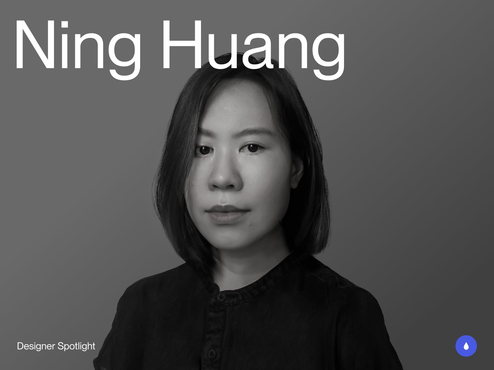
Hi! I’m Ning, a Digital Designer based in Taipei, Taiwan. I’m currently working at Block Studio, where I focus on web and motion design. I’m no expert in code, but thanks to AI tools, I’ve been able to bring my interactive ideas to life—especially in personal projects, where I love stretching the limits of motion and visual storytelling on the web.
AI has made it possible for m to build things I wouldn’t be able to code on my own—especially when it comes to motion-heavy, visually expressive sites. This approach lets me stay hands-on with both design and development, even as a solo creator.
Feature Work
Since my studio work is still under wraps, I’m sharing personal projects that have been key to my creative growth. These are where I get to play, test ideas, and keep the spark alive.
A vibrant mini-guide to vegetarian spots in Taipei—my hometown and a surprisingly veggie-friendly city. This project recently received an Honorable Mention from Awwwards. I created it to share my personal recommendations and spark curiosity among international visitors.
The site features a playful and energetic identity paired with a clean, modern visual style. I brought in playful motion details to give the site a lively and memorable rhythm—from animated stickers and rhythmic scroll-based animations to a custom “reset” effect inspired by the bubbling fizz of a drink. I wanted the stickers to reset with a sense of drama and fun, and this bubbly motion gave the interaction a unique, fluid quality that I was especially proud of.
I used Bricks Builder, a WordPress-based No-code platform, for layout, and Claude AI/Cursor to generate custom code. In the past, I’d search for websites with similar motions to guide engineers. Now, with AI, I can just describe what I imagine and shape it bit by bit—no more being stuck hunting for the perfect reference.
Rather than replacing creativity, I see AI as a way to amplify it—like having a lens that helps me bring emotions to the screen. This workflow has enabled me to complete projects independently, break creative constraints, and explore more freely. It’s also deepened my understanding of development, making it an invaluable learning experience. All my personal projects follow this approach.
Generated Art Gallery is a minimalist photography gallery showcasing images I created with Midjourney. The visual tone is hazy and poetic, with a subtle undercurrent of unease—reflecting my complex feelings toward AI technology: beautiful, surreal, yet not entirely comforting.
AI lets me build entire projects on my own, which feels incredibly rewarding—but also strangely lonely at times. In this journey, I often find myself creating everything alone, a quiet act of creation that resonates with both achievement and isolation.
The design itself features clean, restrained typography, with cursor interactions and scroll animations using distorted shader effects to evoke a dreamlike, otherworldly atmosphere. Each generated landscape tells a story of beauty intertwined with a sense of solitude and quiet tension, as if the world is both vast and silently distant.
My first fully self-developed and designed website—this portfolio marks where it all began. Clean layouts, bold entry animations, and Flip-style transitions give the site a distinct cadence and clarity. It laid the foundation for my approach to motion-driven structure in digital design, a core element of my work that continues to shape how I create engaging, dynamic experiences today.
Concepts and explorations
Thanks to my background in industrial design, I’ve had the chance to explore more 3D resources early on. Outside of personal projects, I often tinker with experimental concepts using tools like Spline and Cinema 4D—just to see what happens. I’d love to bring more of these playful explorations into the web one day.
Background
After graduating with a degree in Industrial Design, I started my career at a digital product company. But it didn’t take long for me to feel restless—I craved work that was visually bold, creative, and full of impact. I decided to change my path and focus on web design. Last year, I joined Block Studio, which is one of Taiwan’s leading creative studios. I’m lucky to work alongside an amazing team of designers, which has pushed me to grow quickly. In a short time, I’ve had the chance to lead exciting projects and confirm what I had only suspected before: this is where my passion and strength truly lie.
Design Philosophy
I don’t believe in rigid design rules. To me, design is a language—and having something you genuinely want to say is essential. Growing up in Asia, where children are often taught to be obedient and quiet, I wasn’t naturally outspoken either. Design became my voice. Through visuals and motion, I can say things that feel bold, loud, and clear—even if I can’t always find the right words.
Tools and Techniques
I like to think of myself as a mad scientist when it comes to tools. One of my favorite hobbies is finding ways to boost efficiency—whether it’s speeding up workflows or making the tedious parts of design feel fun. This gives me more space to focus on the creative side of things. I use Vibe Coding to build websites, and I also write custom Figma plugins to automate UI kit creation and manage Variables more easily.
Inspiration
A lot of my inspiration comes from literature and music. There’s something about the way words and sounds create atmosphere that really fires up my imagination. When I work, I like to listen to music that matches the vibe of the design—it helps me stay in the zone and lets the visual tone flow more instinctively.
Future Goals
As a digital designer still early in my journey, my main goal is to keep learning and evolving. At the same time, I’m eager to channel my creative energy into more non-commercial collaborations, working alongside other designers and developers to explore new ideas without boundaries.
Final Thoughts
I hope you enjoyed the work I shared! For me, the best part of this journey has been chasing what truly excites me—and having the guts to just go for it. I’m a big believer in sharing and connecting as ways to stay creatively charged, so if you ever want to collab, swap ideas, or simply say hi, find me on Instagram!
Big love and thanks to Codrops and Manoela for having me—it’s such a joy to be part of a platform that’s bursting with creativity and good energy. I’ve been endlessly inspired by the work shared here, and it means a lot to contribute my little piece to it.
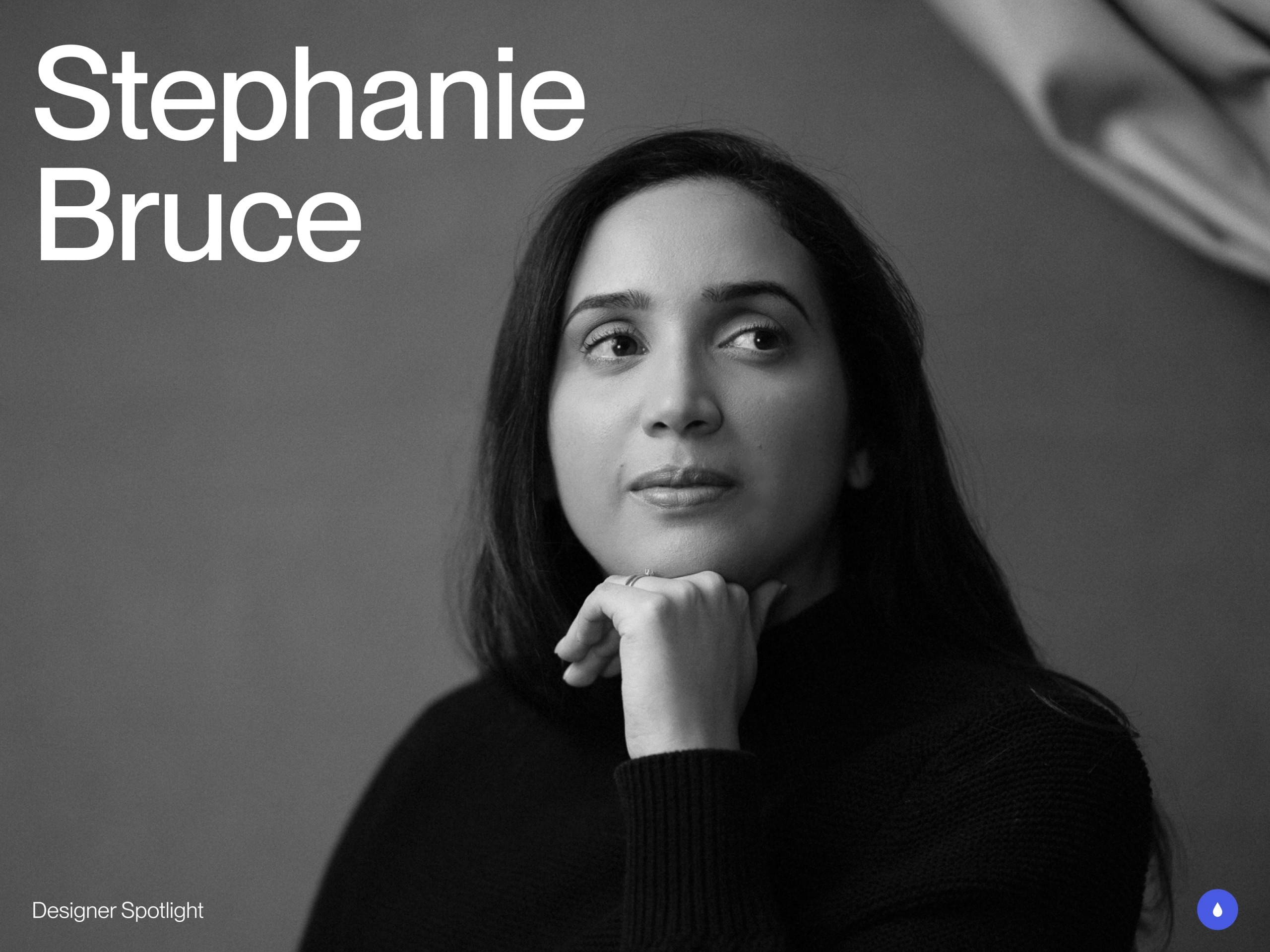
Meet Stephanie Bruce, an Independent Designer and Webflow Developer based in London, UK. She has been designing for over 2 years, previously working in Finance.
She loves editorial layouts, photography and visually creative web designs. She works closely with agencies and clients worldwide.
In this spotlight, Stephanie shares a selection of her favorite projects — a window into her creative process, inspirations, and evolution as a designer.
Featured work
Valentine
This is my latest project where I did the art direction, photography direction, web design and development for Freewrite Valentine. The main purpose of the website is to promote their latest Freewrite Valentine, playing tribute to the original Olivetti Valentine typewriter.
I used retro ads and posters as the main inspiration for the web design and photography direction. We decided to go with a bold red colour throughout the website to emphasise the retro red vibes. I had a two weeks deadline to design and build, as well as photography direction.
MOD Agency Collab
A web design project I did at MOD agency, with creative director Matt Jumper. My role was to design the website and create data visuals. It was my first time designing data visuals and I was pretty happy with how fun they turned out. Huge thanks to Mod agency for bringing me along for this project.
SP28K
SP28K was an exploration website I did on the Flow Party On Demand course. For this design I decided to explore brutalist design with a touch of editorial layout. This project challenged me to go for a bold approach using expressive typography and high-contrast fonts. Photoshoot of the speaker was done in Spline.
Concepts and explorations
Outside of client work, I love spending time creating my own concepts and web design explorations. By creating concept work, I learnt how much I love editorial, photography based websites and how I hope to attract similar work in the near future.
Especially being a relatively new designer, these concepts have helped me get noticed on social media and led to many opportunities.
Brief biography and career highlights
I switched careers from Finance to Design over two years ago. I wanted to find a job that I loved, and once I discovered the world of Digital Design, I became pretty obsessed. I feel like I found my calling.
When I worked in Finance, I spent a lot of my spare time immersed in the creative world. I would go to exhibitions, galleries, theatre plays, etc. I also studied Photography, which helped me develop an eye for detail and composition. I feel that the combination of my exposure to the arts and my photography skills has played a big role in developing a strong visual eye for design.
Since changing careers, I’ve had some amazing opportunities to work with leading designers and agencies — from a six-month internship with Fons Mans to collaborations with designers like Dann Petty and Benten Woodring.
I’ve been freelancing since the beginning of my design career and am very grateful that my work and network have led to multiple collaborations with international clients and agencies.
Inspiration
I find that most of my inspiration comes from looking at design outside of web design. I often look at magazine layouts, prints/posters, and branding assets. Exploring these areas challenges me to create things you don’t typically see on websites.
I also draw a lot of inspiration from visiting art galleries and exhibitions around London, as well as from films and video games like Firewatch and Before Your Eyes.
Future Goals
Currently, I’m focused on working with agencies, as I enjoy collaborating and learning as much as possible from them.
In the near future, I’d love to work with lifestyle and e-commerce clients, and maybe team up with someone to create a purposely small, boutique agency.
Message to Readers
Put in the time to practice design, and get comfortable with sharing your work online and networking — it can lead to so many opportunities and collaborations.
I’d also say it’s totally fine to explore different skills at the beginning, but I recommend committing to mastering one or two that truly excite you. Stay open to learning and keep pushing yourself to improve, no matter how many years of experience you have.
Feel free to reach out to me on Twitter or Instagram — whether you have a project in mind or just want to grab a coffee, in person or online!