It would be great if we could break the debugging flow if a condition is (not) met. Can we? Of course!
Table of Contents
Just a second! 🫷 If you are here, it means that you are a software developer.
So, you know that storage, networking, and domain management have a cost .
If you want to support this blog, please ensure that you have disabled the adblocker for this site. I configured Google AdSense to show as few ADS as possible – I don’t want to bother you with lots of ads, but I still need to add some to pay for the resources for my site.
Thank you for your understanding. – Davide
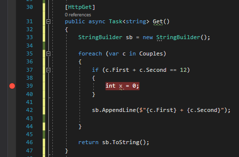
Sometimes, while debugging, you want to check if the state of your code is still valid, or, at least, it corresponds to some expectations.
A simple approach to this problem is to add an if statement with the condition you need to check and place a dummy instruction just to be marked with a breakpoint.
[HttpGet]publicasync Task<string> Get()
{
StringBuilder sb = new StringBuilder();
foreach (var c in Couples)
{
if(c.First + c.Second == 12)
{
int x = 0;
// just to put here the debugger// or place a Console.WriteLine,// which in most of the cases// is not available }
sb.AppendLine($"{c.First} + {c.Second}");
}
return sb.ToString();
}
Which is fine, but it clutters your code.
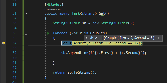
Instead of placing breakpoints all over your code to manually check the application state (or use conditional breakpoints), you can create assertions that break your code only if launched in Debug mode.
[HttpGet]publicasync Task<string> Get()
{
StringBuilder sb = new StringBuilder();
foreach (var c in Couples)
{
Debug.Assert(c.First + c.Second == 12);
sb.AppendLine($"{c.First} + {c.Second}");
}
return sb.ToString();
}
⚠ Note: Debug, not Debugger!
With Debug.Assert can define a custom condition to be evaluated. If the check fails, the debugger automatically stops there to allow you to check the locals.
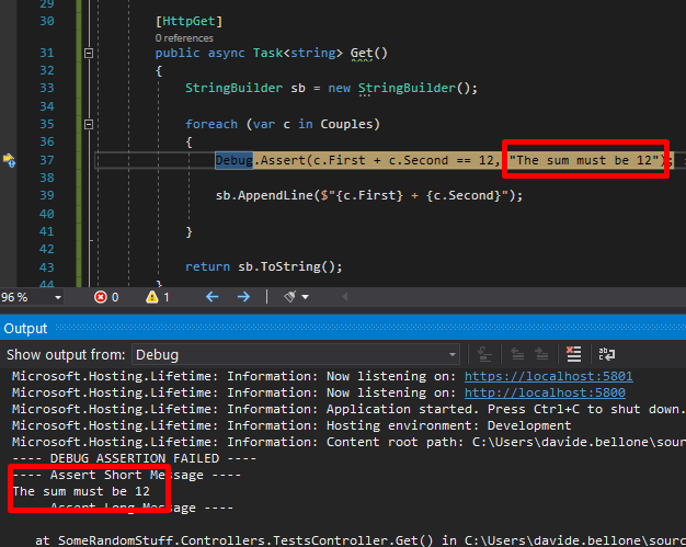
You can also add a message that can help you understand why the check fails:
foreach (var c in Couples)
{
    Debug.Assert(c.First + c.Second == 12, "The sum must be 12");

    sb.AppendLine($"{c.First} + {c.Second}");
}
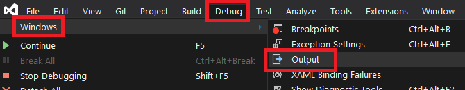
To see the error message, you have to navigate to Debug > Windows > Output
where you can see the message you’ve defined before.
Note: the messages are sent to the System.Diagnostics.Trace.Listeners collection. If you have another listener, you can use it to intercept those messages.
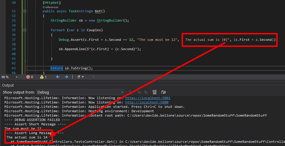
Then you can add more details to that message, and you can also more info to the detailed message by adding additional parameters to it as if you were using String.Format.
foreach (var c in Couples)
{
    Debug.Assert(c.First + c.Second == 12, "The sum must be 12", " The actual sum is {0}", (c.First + c.Second));

    sb.AppendLine($"{c.First} + {c.Second}");
}
Again, run the application and have a look at the Output folder:
Debug.Assert works only in DEBUG mode – or, at least, when the DEBUG variable is defined. Otherwise, all those checks will simply get removed from the build result, so they will not impact your application when running in RELEASE mode.
You know what they say about playing sounds on a website: don’t. Autoplaying audio is often considered intrusive and disruptive, which is why modern web practices discourage it. However, sound design, when used thoughtfully, can enhance the user experience and reinforce a brand’s identity. So when Arts Corporation approached me to redesign their website with a request to integrate audio, I saw an opportunity to create an immersive experience that complemented their artistic vision.
To ensure the sound experience was as seamless as possible, I started thinking about ways to refine it, such as muting audio when the tab is inactive or when a video is playing. That focus on detail made me wonder: what are some other UX improvements that are often overlooked but could make a significant difference? That question set the foundation for a broader exploration of how subtle refinements in animation and interaction design could improve the overall user experience.
When an Idea is Good on Paper
The client came in with sketches and a strong vision for the website, including a key feature: “construction lines” overlaid across the design.
These lines had to move individually, as though being “pushed” by the moving cursor. While this looked great in concept, it introduced a challenge: ensuring that users wouldn’t become frustrated when trying to interact with elements positioned behind the lines.
After some testing and trying to find ways to keep the interaction, I realized a compromise was necessary. Using GSAP ScrollTrigger, I made sure that when sections including buttons and links became visible, the interactive lines would be disabled. In the end, the interaction remained only in a few places, but the concept wasn’t worth the frustration.
Splitting Text Like There’s No Tomorrow
Another challenge in balancing animation and usability was ensuring that text remained readable and accessible. Splitting text has become a standard effect in the industry, but not everyone takes the extra step to prevent issues for users relying on screen readers. The best solution in my case was to simply revert to the original text once the animation was completed. Another solution, for those who need the text to remain split, would be using aria-label and aria-hidden.
This way the user hears only the content of the aria-label attribute, not the text within the element.
Scroll-Based Disorientation
Another crucial consideration was scroll-based animations. While they add depth and interactivity, they can also create confusion if users stop mid-scroll and elements appear frozen in unexpected positions.
Example of a scroll-based animation stopped between two states
To counter this, I used GSAP ScrollTrigger’s snap feature. This ensured that when users stopped scrolling, the page would snap to the nearest section naturally, maintaining a seamless experience.
Arrays Start at 5?
Autoplaying sliders can be an effective way to signal interactivity, drawing users into the content rather than letting them assume it’s static. However, they can also create confusion if not implemented thoughtfully. While integrating the site, I realized that because some slides were numbered, users might land on the page and find themselves on the fifth slide instead of the first, disrupting their sense of flow.
To address this, I set sliders to autoplay only when they entered the viewport, ensuring that users always started at the first slide. This not only maintained consistency but also reinforced a structured and intuitive browsing experience. By making autoplay purposeful rather than arbitrary, we guide users through the content without causing unnecessary distractions.
Transition Confusion
Page transitions play a crucial role in maintaining a smooth, immersive experience, but if not handled carefully, they can lead to momentary confusion. One challenge I encountered was the risk of the transition overlay blending with the footer, since both were black in my design. Users would not perceive a transition at all, making navigation feel disjointed.
Example of a low contrast transition overlay
To solve this, I ensured that transition overlays had a distinct contrast by adding a different shade of black, preventing any ambiguity when users navigate between pages. I also optimized transition timing, making sure animations were fast enough to keep interactions snappy but smooth enough to avoid feeling abrupt. This balance created a browsing experience where users always had a clear sense of movement and direction within the site.
Example of a good contrast transition overlay
I Can Feel a Shift
A common issue in web development that often gets overlooked is the mobile resize trigger that occurs when scrolling, particularly when the browser’s address bar appears or disappears on some devices. This resize event can disrupt the smoothness of animations, causing sudden visual jumps or inconsistencies as the page shifts.
To tackle this, I made sure that ScrollTrigger wouldn’t refresh or re-trigger its animations unnecessarily when this resize event occurred by turning on ignoreMobileResize:
I also ensured that any CSS or JavaScript based on viewport height would not be recalculated on a vertical resize on mobile. Here’s a utility function I use to handle resize as an example:
/**
 * Attaches a resize event listener to the window and executes a callback when the conditions are met.
 *
 * @param {Function} callback - The function to execute when the resize condition is met.
 * @param {number} [debounceTime=200] - Time in milliseconds to debounce the resize event.
 */
function onResize(callback, debounceTime = 200) {
  let oldVh = window.innerHeight;
  let oldVw = window.innerWidth;
  const isTouchDevice = 'maxTouchPoints' in navigator && navigator.maxTouchPoints > 0;

  // Define the resize handler with debounce to limit function execution frequency
  const resizeHandler = $.debounce(() => {
    const newVh = window.innerHeight;
    const newVw = window.innerWidth;

    /**
     * Condition:
     *  - If the device is touch and the viewport height has changed significantly (≥ 25%).
     *  - OR if the viewport width has changed at all.
     * If either condition is met, execute the callback and update old dimensions.
     */
    if ((isTouchDevice && Math.abs(newVh - oldVh) / oldVh >= 0.25) || newVw !== oldVw) {
      callback();
      oldVh = newVh;
      oldVw = newVw;
    }
  }, debounceTime);

  // Attach the resize handler to the window resize event
  $(window).on('resize', resizeHandler);
}
Copy That! Rethinking Contact Links
It was the client’s request to have a simple contact link with a “mailto” instead of a full contact page. While this seemed like a straightforward approach, it quickly became clear that mailto links come with usability issues. Clicking one automatically opens the default email app, which isn’t always the one the user actually wants to use. Many people rely on webmail services like Gmail or Outlook in their browser, meaning a forced mail client launch can create unnecessary friction. Worse, if the user is on a shared or public computer, the mail app might not even be configured, leading to confusion or an error message.
To improve this experience, I opted for a more user-friendly approach: mailto links would simply copy the email to the clipboard and display a confirmation message.
The Takeaway
This project reinforced the importance of balancing creativity with usability. While bold ideas can drive engagement, the best experiences come from refining details users may not even notice. Whether it’s preventing unnecessary animations, ensuring smooth scrolling, or rethinking how users interact with contact links, these small decisions make a significant impact. In the end, great web design isn’t just about visuals, it’s about crafting an experience that feels effortless for the user.