
The Reset
I hadn’t planned on creating a fashion interface. I just needed a reboot. At the time, I was leading art direction at the studio, juggling multiple projects, and emotionally, I was simply exhausted. I joined an Awwwards Masterclass to rediscover the joy of playing with design. I wanted to learn Webflow. I wanted to explore GSAP. But more than that, I wanted to create something unapologetically weird and beautiful.
That seed grew into DICH™, Design Independent Creative House. What started as a design playground became a statement.
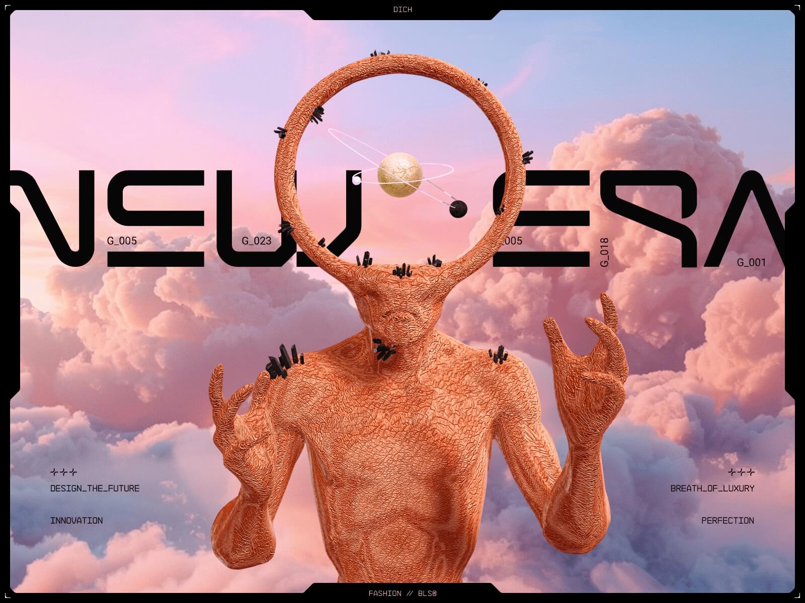
Designing the Unfuturistic Future
We made a conscious decision: no dark mode. No glitch filters. Most futuristic UIs feel cold. We wanted warmth, softness, a vision of the future that is poetic, not synthetic.
Each section had its own visual temperature. Soft gradients, air, pastel dust. Typography was crucial. The T-12 font had those strange numeric ligatures that felt alien but elegant. Video, color, typography — all speaking the same language.
We built moodboards, UX pillars, and rhythm plans. That process, taught in the Masterclass, changed how we approached layout. It wasn’t about grids. It was about flow.
Building the Entry Ritual (Preloader)
The preloader wasn’t just an aesthetic flex. It solved three key problems:
- Our media-heavy site needed time to load
- Browsers block autoplaying audio without user interaction
- We wanted to introduce mood and rhythm before the scroll even began
It was animated in After Effects and exported to Lottie, then embedded into Webflow and animated using GSAP.
The Enter button also triggered sound. It was our “permission point” for browser playback.
// Fade out overlay
gsap.to(preloaderBlack, {
  opacity: 0,
  duration: 0.25,
  onComplete: () => preloaderBlack.style.display = "none"
});

// Animate entry lines
gsap.fromTo(line, { width: 0 }, {
  width: '100%',
  duration: 1.25,
  delay: 1,
  ease: 'power2.out'
});

// Show enter button
gsap.delayedCall(5.25, () => {
  preloaderEnterButton.classList.add('is-active');
});
Section-Aware Navigation
We wanted the navigation to feel alive, to reflect where you were on the page.
So we built a scroll-aware section indicator that updated with a scramble effect. It changed dynamically using this script:
const updateIndicator = (newTitle) => {
  if (newTitle !== currentSection) {
    currentSection = newTitle;
    indicator.setAttribute('data-text', newTitle);
    scrambleAnimate(indicator, newTitle, false);
  }
};
The Monster That Followed You
We modeled a monster in Blender, with arms, eyes, and floaty weirdness, then exported it to Spline. We wanted it to follow the user’s cursor.
At first, we used .fbx.
Huge mistake. The file was massive. FPS dropped. Memory exploded. We tried simplifying textures, removing light bounces, optimizing geometry — no dice.
Then someone on the team said, “What if it’s the format?”
We re-exported in .gbl and instantly it worked. Light. Fast. Fluid.
Frame That Doesn’t Break
One big challenge: a decorative frame that scales on every screen without distortion. SVG alone stretched in weird ways.
Our solution:
- Split each edge into its own div or SVG
- Use
absolutepositioning - Use
vw/vhfor SVG scaling,emfor div spacing
@media (min-width: 992px) {
  .marquee-css {
    display: flex;
    overflow: hidden;
  }
  .marquee_element {
    white-space: nowrap;
    animation: marquee-horizontal 40s linear infinite;
  }
  @keyframes marquee-horizontal {
    0% {
      transform: translateX(0);
    }
    100% {
      transform: translateX(-100%);
    }
  }
}
Cursor Coordinates
Live coordinate HUD under the cursor — perfectly suited to our site’s theme, so we decided to include it.
document.addEventListener('DOMContentLoaded', function () {
  if (window.innerWidth <= 768) return;
  const xCoord = document.getElementById('x-coordinate');
  const yCoord = document.getElementById('y-coordinate');
  let mouseX = 0;
  let mouseY = 0;
  let lastX = -1;
  let lastY = -1;
  let ticking = false;
  function formatNumber(num) {
    return num.toString().padStart(4, '0');
  }
  function updateCoordinates() {
    if (mouseX !== lastX || mouseY !== lastY) {
      xCoord.textContent = formatNumber(mouseX % 10000);
      yCoord.textContent = formatNumber(mouseY % 10000);
      lastX = mouseX;
      lastY = mouseY;
    }
    ticking = false;
  }
  document.addEventListener('mousemove', (event) => {
    mouseX = event.clientX;
    mouseY = event.clientY;
    if (!ticking) {
      ticking = true;
      requestAnimationFrame(updateCoordinates);
    }
  });
});
Stones That Scroll
We placed a 3D stone (also from Blender) into Spline, gave it orbital motion, and connected it to scroll using Webflow Interactions.
It felt like motion with gravity — guided, yet organic.
Pixel Tracer
With coordinate tracking already in place, we easily applied it to our section and later enhanced it with a pixel tracer inspired by Jean Mazouni’s displacement effect.
Unicorn Everywhere
The cursor wasn’t just a pointer, it became a vibe.
We used Unicorn Studio to create custom cursor trails and animations that followed the user like echoes of intent. Three variations in total:
- One for the landing screen — minimal, hypnotic.
- One for the project case study — denser, electric.
- One for transitions — barely-there glimmer, like a memory.
Each version added tension and curiosity. It wasn’t flashy for the sake of it — it gave rhythm to hovering, a pulse to the interaction. Suddenly, the cursor wasn’t just a tool. It was part of the interface’s voice.
Footer Letters with Physics
Our footer was a personal moment. We wanted the word “DICH” to be hidden inside animated lines and revealed on hover using canvas and brightness sampling.
This one took the longest. We tried Perlin noise, sine curves, and springs, but none worked as we’d hoped or produced results that were sufficiently readable — until we found an old Domestika course that showed getImageData() logic.
const typeData = typeContext.getImageData(0, 0, typeCanvasWidth, typeCanvasHeight).data;For the smoothness of the lines we gave up straight cuts and switched to quadratic curves:
context.quadraticCurveTo(prev.x, prev.y, (prev.x+curr.x)/2, (prev.y+curr.y)/2);Lazy Load + Safari Nightmares
We had to optimize. Hard.
- Every visual block was lazy-loaded using
IntersectionObserver - Safari compatibility issues — reworked unsupported animations for Safari and added fallbacks for AVIF images (even lighter than WebP) to maximize optimization.
- Heavy sections only rendered after the preloader finished
const io = new IntersectionObserver((entries) => {
  entries.forEach((entry) => {
    if (entry.isIntersecting) {
      const el = entry.target;
      el.classList.add('active');
      const images = el.querySelectorAll('img[data-src]');
      images.forEach((img) => (img.src = img.dataset.src));
      observer.unobserve(el);
    }
  });
});
404, But Make It Fashion
Most 404 pages apologize. Ours seduced.
We treated the error page like a runway — not a dead-end, but an invitation. Instead of a sad emoji or a bland “page not found,” you get a full-screen glitch-dream: warped typography, soft scans, and a single message that flickers like a memory.
Technically, it was simple — a standalone Webflow page. But visually, it extended the DICH world: same typographic tension, same surreal softness. We even debated adding background audio, but silence won — it made the page feel like a moment suspended in time.
What We Learned
- File formats matter more than you think
- Glitches aren’t as magical as thoughtful motion
- GSAP is our best friend
- Webflow is powerful when paired with code
- You don’t need a big plan to make something that matters
Closing
I almost gave up. More than once. But every time the team cracked a bug, designed a transition, or made a visual more strange — it reminded me why we build.
DICH™ was a challenge, a love letter, and a reset. And now it’s yours to explore.
Credits
Creation Direction: BL/S®
Art / Creative Director: Serhii Polyvanyi
Webflow Designer: Ihor Romankov
Support Developer: Kirill Trachuk
PM: Julia Nikitenko
Designed and built with Webflow, GSAP, Spline, AE, and possibly too much coffee.