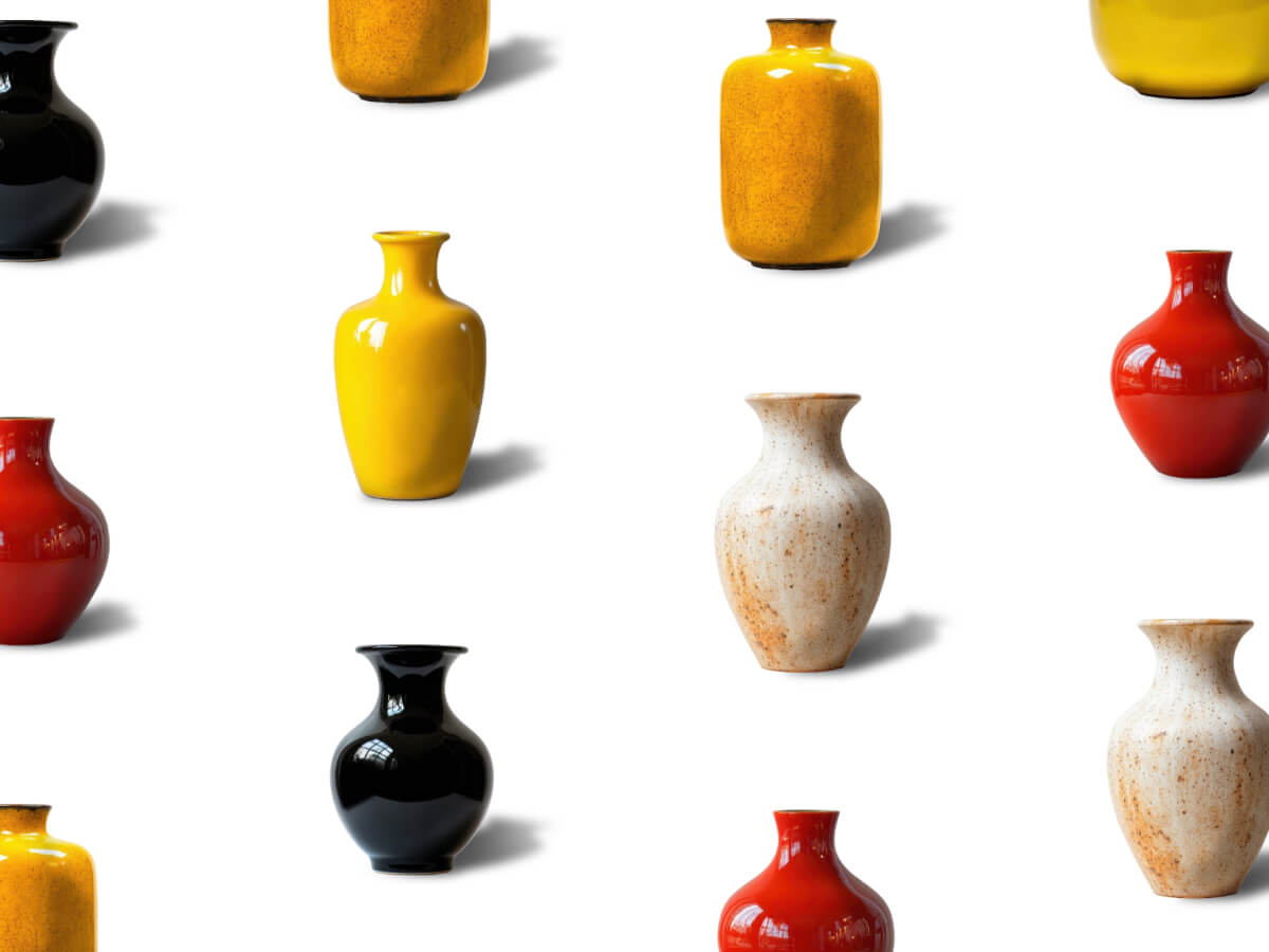
One of the best ways to learn is by recreating an interaction you’ve seen out in the wild and building it from scratch. It pushes you to notice the small details, understand the logic behind the animation, and strengthen your problem-solving skills along the way.
So today we’ll dive into rebuilding the smooth, draggable product grid from the Palmer website, originally crafted by Uncommon with Kevin Masselink, Alexis Sejourné, and Dylan Brouwer. The goal is to understand how this kind of interaction works under the hood and code the basics from scratch.
Along the way, you’ll learn how to structure a flexible grid, implement draggable navigation, and add smooth scroll-based movement. We’ll also explore how to animate products as they enter or leave the viewport, and finish with a polished product detail transition using Flip and SplitText for dynamic text reveals.
Let’s get started!
Grid Setup
The Markup
Let’s not try to be original and, as always, start with the basics. Before we get into the animations, we need a clear structure to work with — something simple, predictable, and easy to build upon.
What we have here is a .container that fills the viewport, inside of which sits a .grid divided into vertical columns. Each column stacks multiple .product elements, and every product wraps around an image. It’s a minimal setup, but it lays the foundation for the draggable, animated experience we’re about to create.
The Style
Now that we’ve got the structure, let’s add some styling to make the grid usable. We’ll keep things straightforward and use Flexbox instead of CSS Grid, since Flexbox makes it easier to handle vertical offsets for alternating columns. This approach keeps the layout flexible and ready for animation.
Okay, setup’s out of the way — now let’s jump into the fun part.
When developing interactive experiences, it helps to break things down into smaller parts. That way, each piece can be handled step by step without feeling overwhelming.
First, the grid isn’t centered by default, so we’ll fix that with a small utility function. This makes sure the grid always sits neatly in the middle of the screen, no matter the viewport size.
In the original Palmer reference, the experience starts with products appearing one by one in a slightly random order. After that reveal, the whole grid smoothly zooms into place.
To keep things simple, we’ll start with both the container and the products scaled down to 0.5 and the products fully transparent. Then we animate them back to full size and opacity, adding a random stagger so the images pop in at slightly different times.
The result is a dynamic but lightweight introduction that sets the tone for the rest of the interaction.
When you click on a product, an overlay opens and displays the product’s details. During this transition, the product’s image animates smoothly from its position in the grid to its position inside the overlay.
We build a simple overlay with minimal structure and styling and add an empty <div> that will contain the product image.
To achieve this effect, we use GSAP’s Flip plugin. This plugin makes it easy to animate elements between two states by calculating the differences in position, size, scale, and other properties, then animating them seamlessly.
We capture the state of the product image, move it into the details thumbnail container, and then animate the transition from the captured state to its new position and size.
I hope you enjoyed following along and picked up some useful techniques. Of course, there’s always room for further refinement—like experimenting with different easing functions or timing—but the core ideas are all here.
With this approach, you now have a handy toolkit for building smooth, draggable product grids or even simple image galleries. It’s something you can adapt and reuse in your own projects, and a good reminder of how much can be achieved with GSAP and its plugins when used thoughtfully.
A huge thanks to Codrops and to Manoela for giving me the opportunity to share this first article here 🙏 I’m really looking forward to hearing your feedback and thoughts!
From the outset, we knew we wanted something that subverted any conventional agency website formulas. Instead,
inspired by the unseen energy that drives creativity, connection and transformation, we arrived at the idea of invisible forces
. Could we take the powerful yet intangible elements that shape our world—motion, emotion, intuition, and
inspiration—and manifest them in a digital space?
We were excited about creating something that included many custom interactions and a very experiential feel. However,
our concern was picking a set of tools that would allow most of our developers to contribute to and maintain the site
after launch.
We chose to start from a Next / React base, as we often do at Phantom. React also has the advantage of being
compatible with the excellent React Three Fiber library, which we used to seamlessly bridge the gap between our DOM
components and the WebGL contexts used across the site. For styles, we are using our very own CSS components
as well as SASS.
For interactive behaviours and animation, we chose to use GSAP for two main reasons. Firstly, it contains a lot of
plugins we know and love, such as SplitText, CustomEase and ScrollTrigger. Secondly, GSAP allows us to use a single
animation framework across DOM and WebGL components.
We could go on and on talking about the details behind every single animation and micro-interaction on the site, but
for this piece we have chosen to focus our attention on two of the most unique components of our site: the homepage
grid and the scrollable employee face particle carousel.
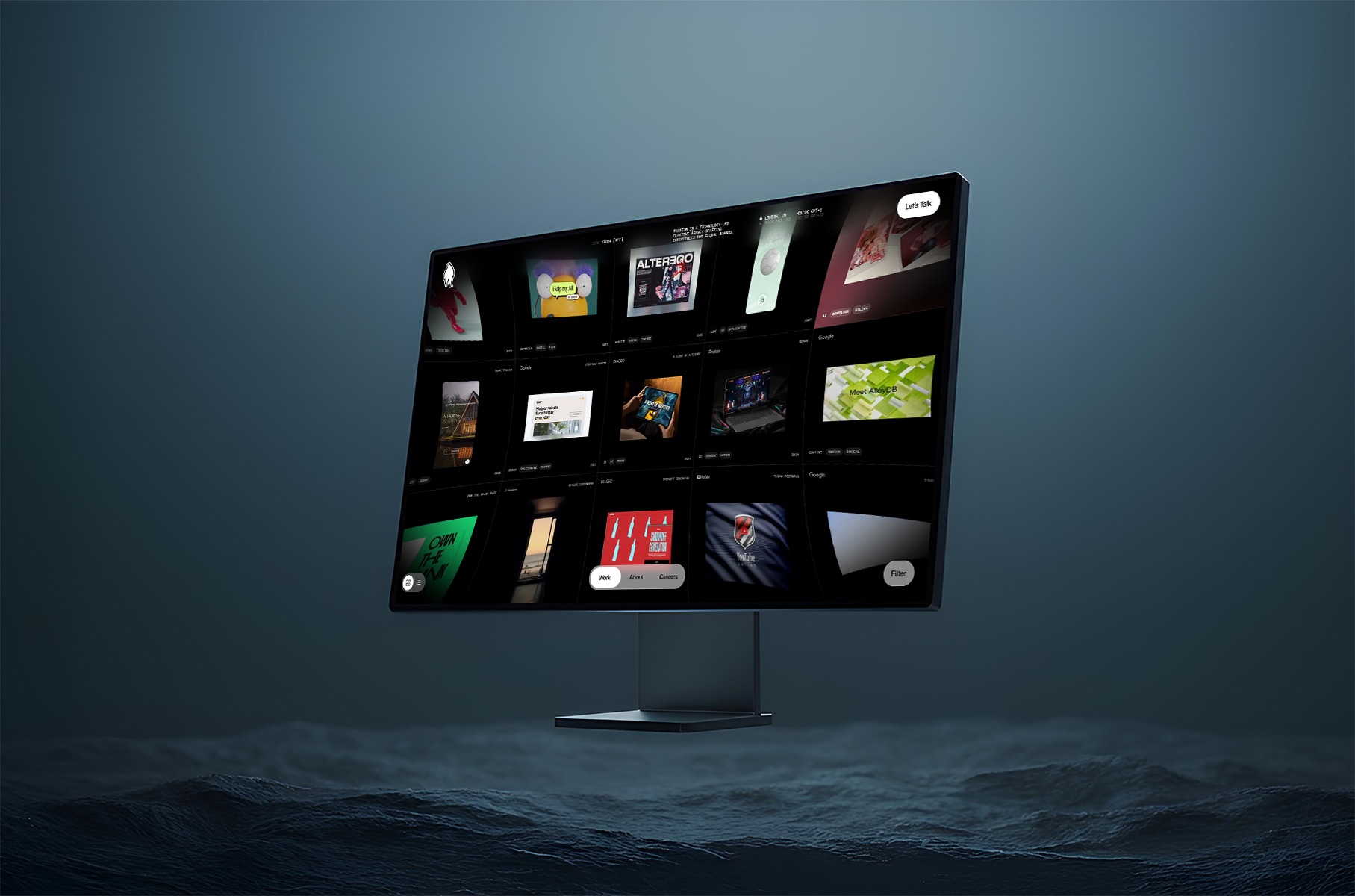
The Homepage Grid
It took us a very long time to get this view to perform and feel just how we wanted it to. In this article, we will focus on the interactive part. For more info on how we made things performant, head to our previous article: Welcome back to Phantomland
Grid View
The project’s grid view is integrated into the homepage by incorporating a primitive Three.js object into a React
Three Fiber scene.
We initially wanted to write all the code for the grid using React Three Fiber but realised that, due to the
complexity of our grid component, a vanilla Three.js
class would be easier to maintain.
One of the key elements that gives our grid its iconic feel is our post-processing distortion effect. We implemented
this feature by creating a custom shader pass within our post-processing pipeline:
When the grid transitions in and out on the site, the distortion intensity changes to make the transition feel
natural. This animation is done through a simple tween in our DistortionShader
class:
We also added a vignette effect to our post-processing shader to darken the corners of the viewport, focusing the
user’s attention toward the center of the screen.
In order to make our home view as smooth as possible, we also spent a fair amount of time crafting the
micro-interactions and transitions of the grid.
Ambient mouse offset
When the user moves their cursor around the grid, the grid moves slightly in the opposite direction, creating a very
subtle ambient floating effect. This was simply achieved by calculating the mouse position on the grid and moving the
grid mesh accordingly:
getAmbientCursorOffset() {
  // Get the pointer coordinates in UV space ( 0 - 1 ) range
  const uv = this.navigation.pointerUv;
  const offset = uv.subScalar(0.5).multiplyScalar(0.2);
  return offset;
}

update() {
  ...
  // Apply cursor offset to grid position
  const cursorOffset = getAmbientCursorOffset();
  this.mesh.position.x += cursorOffset.x;
  this.mesh.position.y += cursorOffset.y;
}
Drag Zoom
When the grid is dragged around, a zoom-out effect occurs and the camera seems to pan away from the grid. We created
this effect by detecting when the user starts and stops dragging their cursor, then using that to trigger a GSAP
animation with a custom ease for extra control.
Last but not least, when the user drags across the grid and releases their cursor, the grid slides through with a
certain amount of inertia.
drag(offset: Vector2) {
  this.dragAction = offset;

  // Gradually increase velocity with drag time and distance
  this.velocity.lerp(offset, 0.8);
}

// Every frame
update() {
  // positionOffset is later used to move the grid mesh
  if(this.isDragAction) {
    // if the user is dragging their cursor, add the drag value to offset
    this.positionOffset.add(this.dragAction.clone());
  } else {
    // if the user is not dragging, add the velocity to the offset
    this.positionOffset.add(this.velocity);
  }

  this.dragAction.set(0, 0);
  // Attenuate velocity with time
  this.velocity.lerp(new Vector2(), 0.1);
}
Face Particles
The second major component we want to highlight is our employee face carousel, which presents team members through a
dynamic 3D particle system. Built with React Three Fiber’s BufferGeometry
and custom GLSL shaders, this implementation leverages custom shader materials for lightweight performance and
flexibility, allowing us to generate entire 3D face representations using only a 2D colour photograph and its
corresponding depth map—no 3D models required.
Core Concept: Depth-Driven Particle Generation
The foundation of our face particle system lies in converting 2D imagery into volumetric 3D representations. We’ve
kept things efficient, with each face using only two optimized 256×256 WebP images (under 15KB each).
To capture the images, each member of the Phantom team was 3D scanned using RealityScan
from Unreal Engine on iPhone, creating a 3D model of their face.
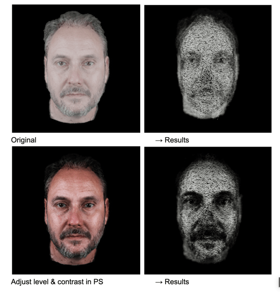
These scans were cleaned up and then rendered from Cinema4D with a position and colour pass.
The position pass was converted into a greyscale depth map in Photoshop, and this—along with the colour pass—was
retouched where needed, cropped, and then exported from Photoshop to share with the dev team.
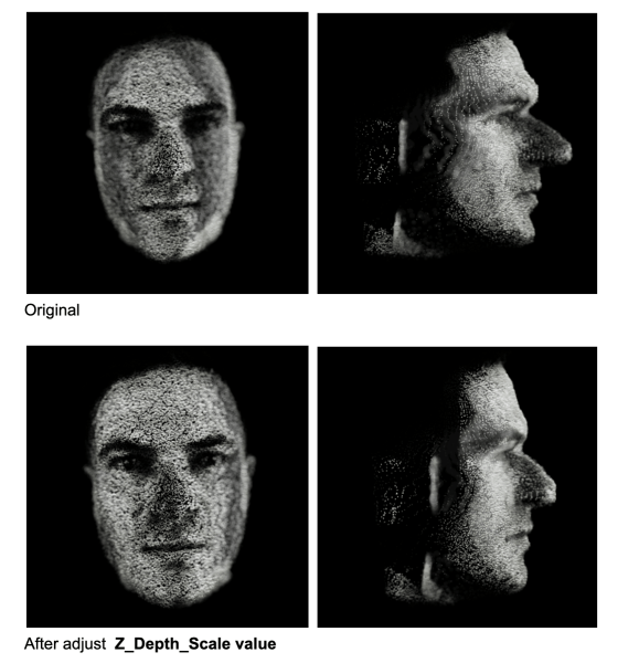
Each face is constructed from approximately 78,400 particles (280×280 grid), where each particle’s position and
appearance is determined by sampling data from our two source textures.
The depth map provides normalized values (0–1) that directly translate to Z-depth positioning. A value of 0 represents
the furthest point (background), while 1 represents the closest point (typically the nose tip).
/* vertex shader */

// sample depth and color data for each particle
vec3 depthTexture1 = texture2D(depthMap1, vIndex.xy).xyz;

// convert depth to Z-position
float zDepth = (1. - depthValue.z);
pos.z = (zDepth * 2.0 - 1.0) * zScale;
Dynamic Particle Scaling Through Colour Analysis
One of the key methods that brings our faces to life is utilizing colour data to influence particle scale. In our
vertex shader, rather than using uniform particle sizes, we analyze the colour density of each pixel so that brighter,
more colourful areas of the face (like eyes, lips, or well-lit cheeks) generate larger, more prominent particles,
while darker areas (shadows, hair) create smaller, subtler particles. The result is a more organic, lifelike
representation that emphasizes facial features naturally.
/* vertex shader */

vec3 colorTexture1 = texture2D(colorMap1, vIndex.xy).xyz;

// calculate color density
float density = (mainColorTexture.x + mainColorTexture.y + mainColorTexture.z) / 3.;

// map density to particle scale
float pScale = mix(pScaleMin, pScaleMax, density);
The calibration below demonstrates the influence of colour (contrast, brightness, etc.) on the final 3D particle formation.
Ambient Noise Animation
To prevent static appearances and maintain visual interest, we apply continuous noise-based animation to all
particles. This ambient animation system uses curl noise to create subtle, flowing movement across the entire
face structure.
To add visual interest during transitions, we further inject additional noise that’s strongest at the midpoint of the
transition. This creates a subtle “disturbance” effect where particles temporarily deviate from their target
positions, making transitions feel more dynamic and organic.
To enhance the three-dimensional perception, we implemented a custom depth of field effect directly in our shader
material. It calculates view-space distance for each particle and modulates both opacity and size based on proximity
to a configurable focus plane.
One of the challenges we faced was achieving visual consistency across different team members’ photos. Each photograph
was captured under slightly different conditions—varying lighting, camera distances, and facial proportions.
Therefore, we went through each face to calibrate multiple scaling factors:
Depth scale calibration
to ensure no nose protrudes too aggressively
Colour density balancing
to maintain consistent particle size relationships
Focus plane optimization
to prevent excessive blur on any individual face
Our face particle system demonstrates how simple yet careful technical implementation can create fun visual
experiences from minimal assets. By combining lightweight WebP textures, custom shader materials, and animations,
we’ve created a system that transforms simple 2D portraits into interactive 3D figures.
Hey! Jorge Toloza again, Co-Founder and Creative Director at DDS Studio. In this tutorial, we’re going to build a visually rich, infinitely scrolling grid where images move with a parallax effect based on scroll and drag interactions.
We’ll use GSAP for buttery-smooth animations, add a sprinkle of math to achieve infinite tiling, and bring it all together with dynamic visibility animations and a staggered intro reveal.
Let’s get started!
Setting Up the HTML Container
To start, we only need a single container to hold all the tiled image elements. Since we’ll be generating and positioning each tile dynamically with JavaScript, there’s no need for any static markup inside. This keeps our HTML clean and scalable as we duplicate tiles for infinite scrolling.
<div id="images"></div>
Basic Styling for the Grid Items
Now that we have our container, let’s give it the foundational styles it needs to hold and animate a large set of tiles.
We’ll use absolute positioning for each tile so we can freely place them anywhere in the grid. The outer container (#images) is set to relative so that all child .item elements are positioned correctly inside it. Each image fills its tile, and we’ll use will-change: transform to optimize animation performance.
To control the visual layout of our grid, we’ll use design data exported directly from Figma. This gives us pixel-perfect placement while keeping layout logic separate from our code.
I created a quick layout in Figma using rectangles to represent tile positions and dimensions. Then I exported that data into a JSON file, giving us a simple array of objects containing x, y, w, and h values for each tile.
With the layout data defined, the next step is to dynamically generate our tile grid in the DOM and enable it to scroll infinitely in both directions.
This involves three main steps:
Compute the scaled tile dimensions based on the viewport and the original Figma layout’s aspect ratio.
Duplicate the grid in both the X and Y axes so that as one tile set moves out of view, another seamlessly takes its place.
Store metadata for each tile, such as its original position and a random easing value, which we’ll use to vary the parallax animation slightly for a more organic effect.
The infinite scroll illusion is achieved by duplicating the entire tile set horizontally and vertically. This 2×2 tiling approach ensures there’s always a full set of tiles ready to slide into view as the user scrolls or drags.
onResize() {
  // Get current viewport dimensions
  this.winW = window.innerWidth;
  this.winH = window.innerHeight;

  // Scale tile size to match viewport width while keeping original aspect ratio
  this.tileSize = {
    w: this.winW,
    h: this.winW * (this.originalSize.h / this.originalSize.w),
  };

  // Reset scroll state
  this.scroll.current = { x: 0, y: 0 };
  this.scroll.target = { x: 0, y: 0 };
  this.scroll.last = { x: 0, y: 0 };

  // Clear existing tiles from container
  this.$container.innerHTML = '';

  // Scale item positions and sizes based on new tile size
  const baseItems = this.data.map((d, i) => {
    const scaleX = this.tileSize.w / this.originalSize.w;
    const scaleY = this.tileSize.h / this.originalSize.h;
    const source = this.sources[i % this.sources.length];
    return {
      src: source.src,
      caption: source.caption,
      x: d.x * scaleX,
      y: d.y * scaleY,
      w: d.w * scaleX,
      h: d.h * scaleY,
    };
  });

  this.items = [];

  // Offsets to duplicate the grid in X and Y for seamless looping (2x2 tiling)
  const repsX = [0, this.tileSize.w];
  const repsY = [0, this.tileSize.h];

  baseItems.forEach((base) => {
    repsX.forEach((offsetX) => {
      repsY.forEach((offsetY) => {
        // Create item DOM structure
        const el = document.createElement('div');
        el.classList.add('item');
        el.style.width = `${base.w}px`;

        const wrapper = document.createElement('div');
        wrapper.classList.add('item-wrapper');
        el.appendChild(wrapper);

        const itemImage = document.createElement('div');
        itemImage.classList.add('item-image');
        itemImage.style.width = `${base.w}px`;
        itemImage.style.height = `${base.h}px`;
        wrapper.appendChild(itemImage);

        const img = new Image();
        img.src = `./img/${base.src}`;
        itemImage.appendChild(img);

        const caption = document.createElement('small');
        caption.innerHTML = base.caption;

        // Split caption into lines for staggered animation
        const split = new SplitText(caption, {
          type: 'lines',
          mask: 'lines',
          linesClass: 'line'
        });
        split.lines.forEach((line, i) => {
          line.style.transitionDelay = `${i * 0.15}s`;
          line.parentElement.style.transitionDelay = `${i * 0.15}s`;
        });

        wrapper.appendChild(caption);
        this.$container.appendChild(el);

        // Observe caption visibility for animation triggering
        this.observer.observe(caption);

        // Store item metadata including offset, easing, and bounding box
        this.items.push({
          el,
          container: itemImage,
          wrapper,
          img,
          x: base.x + offsetX,
          y: base.y + offsetY,
          w: base.w,
          h: base.h,
          extraX: 0,
          extraY: 0,
          rect: el.getBoundingClientRect(),
          ease: Math.random() * 0.5 + 0.5, // Random parallax easing for organic movement
        });
      });
    });
  });

  // Double the tile area to account for 2x2 duplication
  this.tileSize.w *= 2;
  this.tileSize.h *= 2;

  // Set initial scroll position slightly off-center for visual balance
  this.scroll.current.x = this.scroll.target.x = this.scroll.last.x = -this.winW * 0.1;
  this.scroll.current.y = this.scroll.target.y = this.scroll.last.y = -this.winH * 0.1;
}
Key Concepts
Scaling the layout ensures that your Figma-defined design adapts to any screen size without distortion.
2×2 duplication ensures seamless continuity when the user scrolls in any direction.
Random easing values create slight variation in tile movement, making the parallax effect feel more natural.
extraX and extraY values will later be used to shift tiles back into view once they scroll offscreen.
SplitText animation is used to break each caption (<small>) into individual lines, enabling line-by-line animation.
Adding Interactive Scroll and Drag Events
To bring the infinite grid to life, we need to connect it to user input. This includes:
Scrolling with the mouse wheel or trackpad
Dragging with a pointer (mouse or touch)
Smooth motion between input updates using linear interpolation (lerp)
Rather than instantly snapping to new positions, we interpolate between the current and target scroll values, which creates fluid, natural transitions.
Scroll and Drag Tracking
We capture two types of user interaction:
1) Wheel Events Wheel input updates a target scroll position. We multiply the deltas by a damping factor to control sensitivity.
In the render loop, we interpolate between the current and target scroll values using a lerp function. This creates smooth, decaying motion rather than abrupt changes.
The scroll.ease value controls how fast the scroll position catches up to the target—smaller values result in slower, smoother motion.
Animating Item Visibility with IntersectionObserver
To enhance the visual hierarchy and focus, we’ll highlight only the tiles that are currently within the viewport. This creates a dynamic effect where captions appear and styling changes as tiles enter view.
We’ll use the IntersectionObserver API to detect when each tile becomes visible and toggle a CSS class accordingly.
this.observer = new IntersectionObserver(entries => {
  entries.forEach(entry => {
    entry.target.classList.toggle('visible', entry.isIntersecting);
  });
});
// …and after appending each wrapper:
this.observer.observe(wrapper);
Creating an Intro Animation with GSAP
To finish the experience with a strong visual entry, we’ll animate all currently visible tiles from the center of the screen into their natural grid positions. This creates a polished, attention-grabbing introduction and adds a sense of depth and intentionality to the layout.
We’ll use GSAP for this animation, utilizing gsap.set() to position elements instantly, and gsap.to() with staggered timing to animate them into place.
Selecting Visible Tiles for Animation
First, we filter all tile elements to include only those currently visible in the viewport. This avoids animating offscreen elements and keeps the intro lightweight and focused:
x: 0, y: 0 restores the original position set via CSS transforms.
expo.inOut provides a dramatic but smooth easing curve.
stagger creates a cascading effect, enhancing visual rhythm
Wrapping Up
What we’ve built is a scrollable, draggable image grid with a parallax effect, visibility animations, and a smooth GSAP-powered intro. It’s a flexible base you can adapt for creative galleries, interactive backgrounds, or experimental interfaces.
You’ve probably seen this kind of scroll effect before, even if it doesn’t have a name yet. (Honestly, we need a dictionary for all these weird and wonderful web interactions. If you’ve got a talent for naming things…do it. Seriously. The internet is waiting.)
Imagine a grid of images. As you scroll, the columns don’t move uniformly but instead, the center columns react faster, while those on the edges trail behind slightly. It feels soft, elastic, and physical, almost like scrolling with weight, or elasticity.
You can see this amazing effect on sites like yzavoku.com (and I’m sure there’s a lot more!).
So what better excuse to use the now-free GSAP ScrollSmoother? We can recreate it easily, with great performance and full control. Let’s have a look!
What We’re Building
We’ll take CSS grid based layout and add some magic:
Inertia-based scrolling using ScrollSmoother
Per-column lag, calculated dynamically based on distance from the center
A layout that adapts to column changes
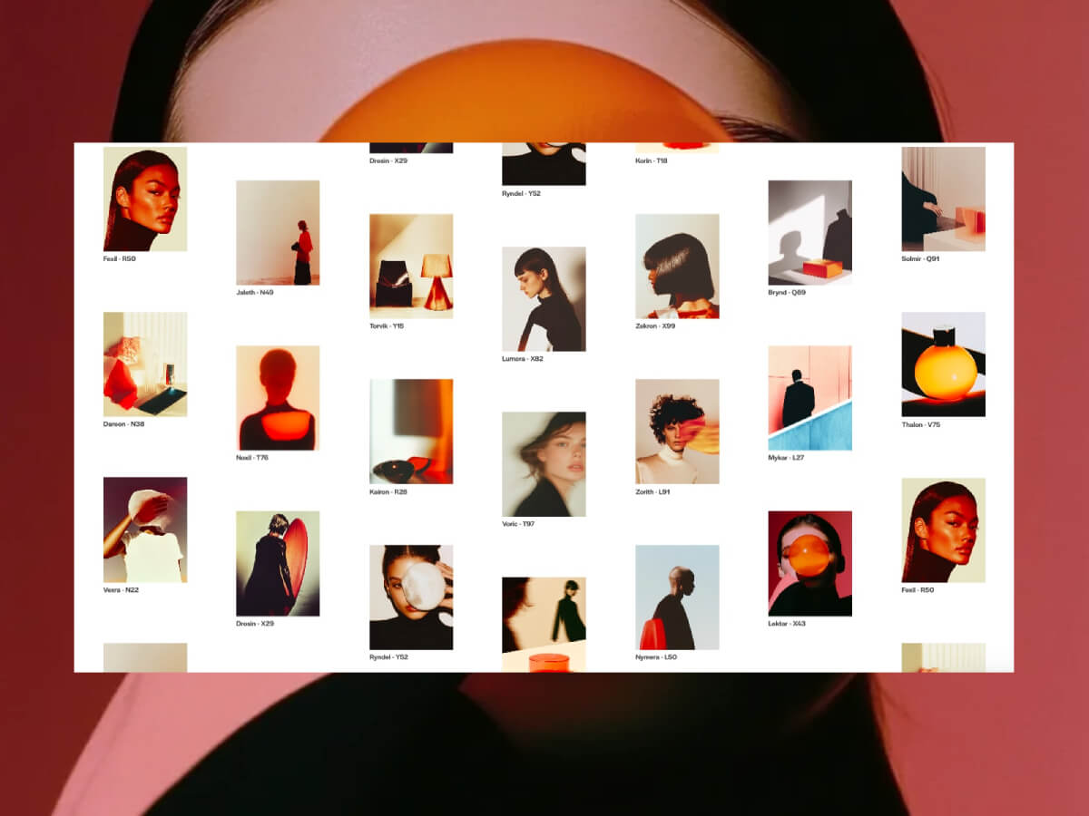
HTML Structure
Let’s set up the markup with figures in a grid:
<div class="grid">
  <figure class="grid__item">
    <div class="grid__item-img" style="background-image: url(assets/1.webp)"></div>
    <figcaption class="grid__item-caption">Zorith - L91</figcaption>
  </figure>
  <!-- Repeat for more items -->
</div>
Inside the grid, we have many .grid__item figures, each with a background image and a label. These will be dynamically grouped into columns by JavaScript, based on how many columns CSS defines.
In our JavaScript then, we’ll change the DOM structure by inserting .grid__column wrappers around groups of items, one per colum, so we can control their motion individually. Why are we doing this? It’s a bit lighter to move columns rather then each individual item.
This method groups your grid items into arrays, one for each visual column, using the actual number of columns calculated from the CSS.
3. Create Column Wrappers and Assign Lag
const buildGrid = (columns, numColumns) => {

  const fragment = document.createDocumentFragment(); // Efficient DOM batch insertion
  const mid = (numColumns - 1) / 2; // Center index (can be fractional)
  const columnContainers = [];

  // Loop over each column
  columns.forEach((column, i) => {
    const distance = Math.abs(i - mid); // Distance from center column
    const lag = baseLag + distance * lagScale; // Lag based on distance from center

    const columnContainer = document.createElement('div'); // New column wrapper
    columnContainer.className = 'grid__column';

    // Append items to column container
    column.forEach((item) => columnContainer.appendChild(item));

    fragment.appendChild(columnContainer); // Add to fragment
    columnContainers.push({ element: columnContainer, lag }); // Save for lag effect setup
  });

  grid.appendChild(fragment); // Add all columns to DOM at once
  return columnContainers;
};
The lag value increases the further a column is from the center, creating that elastic “catch up” feel during scroll.
4. Apply Lag Effects to Each Column
const applyLagEffects = (columnContainers) => {
  columnContainers.forEach(({ element, lag }) => {
    smoother.effects(element, { speed: 1, lag }); // Apply individual lag per column
  });
};
ScrollSmoother handles all the heavy lifting, we just pass the desired lag.
5. Handle Layout on Resize
// Rebuild the layout only if the number of columns has changed on window resize
window.addEventListener('resize', () => {
  const newColumnCount = getColumnCount();
  if (newColumnCount !== currentColumnCount) {
    init();
  }
});
This ensures our layout stays correct across breakpoints and column count changes (handled via CSS).
Now, there’s lots of ways to build upon this and add more jazz!
For example, you could:
add scroll-triggered opacity or scale animations
use scroll velocity to control effects (see demo 2)
adapt this pattern for horizontal scroll layouts
Exploring Variations
Once you have the core concept in place, there are four demo variations you can explore. Each one shows how different lag values and scroll-based interactions can influence the experience.
You can adjust which columns respond faster, or play with subtle scaling and transforms based on scroll velocity. Even small changes can shift the rhythm and tone of the layout in interesting ways. And don’t forget: changing the look of the grid itself, like the image ratio or gaps, will give this a whole different feel!
Now it’s your turn. Tweak it, break it, rebuild it, and make something cool.
I really hope you enjoy this effect! Thanks for checking by 🙂
My (design) partner, Gaetan Ferhah, likes to send me his design and motion experiments throughout the week. It’s always fun to see what he’s working on, and it often sparks ideas for my own projects. One day, he sent over a quick concept for making a product grid feel a bit more creative and interactive. 💬 The idea for this tutorial came from that message.
We’ll explore a “grid to preview” hover interaction that transforms product cards into a full preview. As with many animations and interactions, there are usually several ways to approach the implementation—ranging in complexity. It can feel intimidating (or almost impossible) to recreate a designer’s vision from scratch. But I’m a huge fan of simplifying wherever possible and leaning on optical illusions (✨ fake it ’til you make it ✨).
All images are generated with DALL-E (sad, I know.. I wanted everything to be real too 💔)
For this tutorial, I knew I wanted to keep things straightforward and recreate the effect of puzzle pieces shifting into place using a combination of clip-path animation and an image overlay.
Let’s break it down in a few steps:
Layout and Overlay (HTML, CSS)Set up the initial layout and carefully match the position of the preview overlay to the grid.
Build JavaScript structure (JavaScript)Creating some classes to keep us organised, add some interactivity (event listeners).
Clip-Path Creationand Animation (CSS, JS, GSAP)Adding and animating the clip-path, including some calculations on resize—this forms a key part of the puzzle effect.
Moving Product Cards (JS, GSAP)Set up animations to move the product cards towards each other on hover.
Preview Image Scaling (JS, GSAP)Slightly scaling down the preview overlay in response to the inward movement of the other elements.
Adding Images (HTML, JS, GSAP)Enough with the solid colours, let’s add some images and a gallery animation.
Debouncingevents (JS)Debouncing the mouse-enter event to prevent excessive triggering and reduce jitter.
Final tweaks Crossed the t’s and dotted the i’s—small clean-ups and improvements.
Layout and Overlay
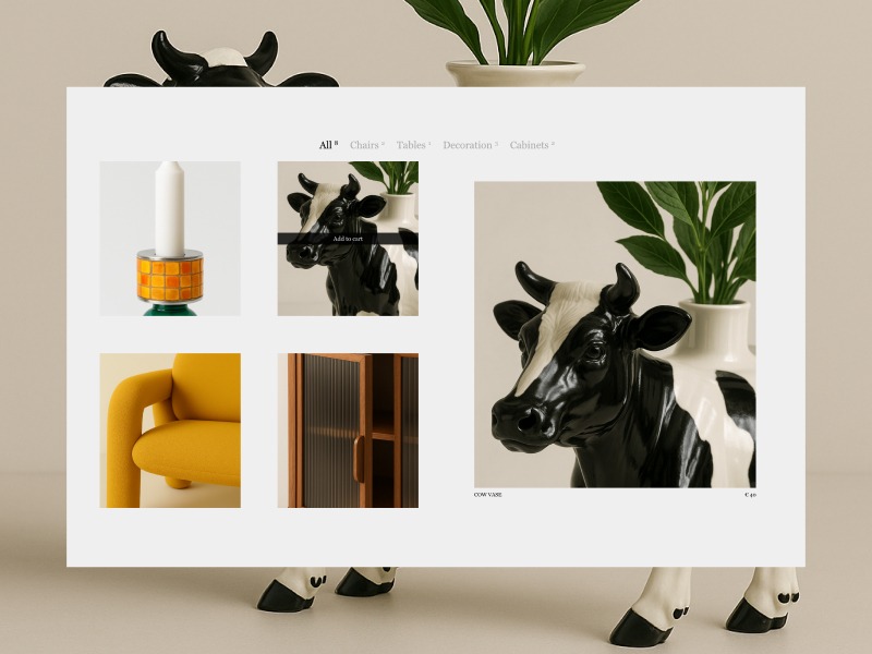
At the foundation of every good tutorial is a solid HTML structure. In this step, we’ll create two key elements: the product grid and the overlay for the preview cards. Since both need a similar layout, we’ll place them inside the same container (.products).
Our grid will consist of 8 products (4 columns by 2 rows) with a gutter of 5vw. To keep things simple, I’m only adding the corresponding li elements for the products, but not yet adding any other elements. In the HTML, you’ll notice there are two preview containers: one for the left side and one for the right. If you want to see the preview overlays right away, head to the CodePen and set the opacity of .product-preview to 1.
Why I Opted for Two Containers
At first, I planned to use just one preview container and move it to the opposite side of the hovered card by updating the grid-column-start. That approach worked fine—until I got to testing.
When I hovered over a product card on the left and quickly switched to one on the right, I realised the problem: with only one container, I also had just one timeline controlling everything inside it. That made it basically impossible to manage the “in/out” transition between sides smoothly.
So, I decided to go with two containers—one for the left side and one for the right. This way, I could animate both sides independently and avoid timeline conflicts when switching between them.
See the Pen
Untitled by Gwen Bogaert (@gwen-bo)
on CodePen.
JavaScript Set-up
In this step, we’ll add some classes to keep things structured before adding our event listeners and initiating our timelines. To keep things organised, let’s split it into two classes: ProductGrid and ProductPreview.
ProductGrid will be fairly basic, responsible for handling the split between left and right, and managing top-level event listeners (such as mouseenter and mouseleave on the product cards, and a general resize).
ProductPreview is where the magic happens. ✨ This is where we’ll control everything that happens once a mouse event is triggered (enter or leave). To pass the ‘active’ product, we’ll define a setProduct method, which, in later steps, will act as the starting point for controlling our GSAP animation(s).
Splitting Products (Left – Right)
In the ProductGrid class, we will split all the products into left and right groups. We have 8 products arranged in 4 columns, with each row containing 4 items. We are splitting the product cards into left and right groups based on their column position.
this.ui.products.filter((_, i) => i % 4 === 2 || i % 4 === 3)
The logic relies on the modulo or remainder operator. The line above groups the product cards on the right. We use the index (i) to check if it’s in the 3rd (i % 4 === 2) or 4th (i % 4 === 3) position of the row (remember, indexing starts at 0). The remaining products (with i % 4 === 0 or i % 4 === 1) will be grouped on the left.
Now that we know which products belong to the left and right sides, we will initiate a ProductPreview for both sides and pass along the products array. This will allow us to define productPreviewRight and productPreviewLeft.
To finalize this step, we will define event listeners. For each product, we’ll listen for mouseenter and mouseleave events, and either set or unset the active product (both internally and in the corresponding ProductPreview class). Additionally, we’ll add a resize event listener, which is currently unused but will be set up for future use.
This is where we’re at so far (only changes in JavaScript):
See the Pen
Tutorial – step 2 (JavaScript structure) by Gwen Bogaert (@gwen-bo)
on CodePen.
Clip-path
At the base of our effect lies the clip-path property and the ability to animate it with GSAP. If you’re not familiar with using clip-path to clip content, I highly recommend this article by Sarah Soueidan.
Even though I’ve used clip-path in many of my projects, I often struggle to remember exactly how to define the shape I’m looking for. As before, I’ve once again turned to the wonderful tool Clippy, to get a head start on defining (or exploring) clip-path shapes. For me, it helps demystify which value influences which part of the shape.
Let’s start with the cross (from Clippy) and modify the points to create a more mathematical-looking cross (✚) instead of the religious version (✟).
Feel free to experiment with some of the values, and soon you’ll notice that with small adjustments, we can get much closer to the desired shape! For example, by stretching the horizontal arms completely to the sides (set to 10% and 90% before) and shifting everything more equally towards the center (with a 10% difference from the center — so either 40% or 60%).
And bada bing, bada boom! This clip-path almost immediately creates the illusion that our single preview container is split into four parts — exactly the effect we want to achieve! Now, let’s move on to animating the clip-path to get one step closer to our final result:
Animating Clip-paths
The concept of animating clip-paths is relatively simple, but there are a few key things to keep in mind to ensure a smooth transition. One important consideration is that it’s best to define an equal number of points for both the start and end shapes.
The idea is fairly straightforward: we begin with the clipped parts hidden, and by the end of the animation, we want the clip-path to disappear, revealing the entire preview container (by making the arms of the cross so thin that they’re barely visible or not visible at all). This can be achieved easily with a fromTo animation in GSAP (though it’s also supported in CSS animations).
The Catch
You might think, “That’s it, we’re done!” — but alas, there’s a catch when it comes to using this as our puzzle effect. To make it look realistic, we need to ensure that the shape of the cross aligns with the underlying product grid. And that’s where a bit of JavaScript comes in!
We need to factor in the gutter of our grid (5vw) to calculate the width of the arms of our cross shape. It could’ve been as simple as adding or subtracting (half!) of the gutter to/from the 50%, but… there’s a catch in the catch!
We’re not working with a square, but with a rectangle. Since our values are percentages, subtracting 2.5vw (half of the gutter) from the center wouldn’t give us equal-sized arms. This is because there would still be a difference between the x and y dimensions, even when using the same percentage value. So, let’s take a look at how to fix that:
In the code above (triggered on each resize), we get the width and height of the preview container (which spans 4 product cards — 2 columns and 2 rows). We then calculate what percentage 5vw would be, relative to both the width and height.
To conclude this step, we would have something like:
See the Pen
Tutorial – step 3 (clip path) by Gwen Bogaert (@gwen-bo)
on CodePen.
Moving Product Cards
Another step in the puzzle effect is moving the visible product cards together so they appear to form one piece. This step is fairly simple — we already know how much they need to move (again, gutter divided by 2 = 2.5vw). The only thing we need to figure out is whether a card needs to move up, down, left, or right. And that’s where GSAP comes to the rescue!
We need to define both the vertical (y) and horizontal (x) movement for each element based on its index in the list. Since we only have 4 items, and they need to move inward, we can check whether the index is odd or even to determine the desired value for the horizontal movement. For vertical movement, we can decide whether it should move to the top or bottom depending on the position (top or bottom).
In GSAP, many properties (like x, y, scale, etc.) can accept a function instead of a fixed value. When you pass a function, GSAP calls it for each target element individually.
Horizontal (x): cards with an even index (0, 2) get shifted right by 2.5vw, the other (two) move to the left. Vertical (y): cards with an index lower than 2 (0,1) are located at the top, so need to move down, the other (two) move up.
See the Pen
Tutorial – step 3 (clip path) by Gwen Bogaert (@gwen-bo)
on CodePen.
Preview Image (Scaling)
Cool, we’re slowly getting there! We have our clip-path animating in and out on hover, and the cards are moving inward as well. However, you might notice that the cards and the image no longer have an exact overlap once the cards have been moved. To fix that and make everything more seamless, we’ll apply a slight scale to the preview container.
This is where a bit of extra calculation comes in, because we want it to scale relative to the gutter. So we take into account the height and width of the container.
This calculation determines a scale factor to shrink our preview container inward, matching the cards coming together. First, the rectangle’s width/height (in pixels) is converted into viewport width units (vw) by dividing it by the pixel value of 1vw. Next, the shrink amount (5vw) is subtracted from that width/height. Finally, the result is divided by the original width in vw to calculate the scale factor (which will be slightly below 1). Since we’re working with a rectangle, the scale factor for the x and y axes will be slightly different.
In the codepen below, you’ll see the puzzle effect coming along nicely on each container. Pink are the product cards (not moving), red and blue are the preview containers.
See the Pen
Tutorial – step 4 (moving cards) by Gwen Bogaert (@gwen-bo)
on CodePen.
Adding Pictures
Let’s make our grid a little more fun to look at!
In this step, we’re going to add the product images to our grid, and the product preview images inside the preview container. Once that’s done, we’ll start our image gallery on hover.
The HTML changes are relatively simple. We’ll add an image to each product li element and… not do anything with it. We’ll just leave the image as is.
The rest of the magic will happen inside the preview container. Each container will hold the preview images of the products from the other side (those that will be visible). So, the left container will contain the images of the 4 products on the right, and the right container will contain the images of the 4 products on the left. Here’s an example of one of these:
Once that’s done, we can initialise by querying those images in the constructor of the ProductPreview, sorting them by their dataset.id. This will allow us to easily access the images later via the data-index attribute that each product has. To sum up, at the end of our animate-in timeline, we can call startPreviewGallery, which will handle our gallery effect.
startPreviewGallery(id) {
  const images = this.ui.previewImagesPerID[id]
  const timeline = gsap.timeline({ repeat: -1 })

  // first image is already visible (do not hide)
  gsap.set([...images].slice(1), { opacity: 0 })

  images.forEach((image) => {
    timeline
      .set(images, { opacity: 0 }) // Hide all images
      .set(image, { opacity: 1 }) // Show only this one
      .to(image, { duration: 0, opacity: 1 }, '+=0.5')
  })

  this.galleryTimeline = timeline
}
Debouncing
One thing I’d like to do is debounce hover effects, especially if they are more complex or take longer to complete. To achieve this, we’ll use a simple (and vanilla) JavaScript approach with setTimeout. Each time a hover event is triggered, we’ll set a very short timer that acts as a debouncer, preventing the effect from firing if someone is just “passing by” on their way to the product card on the other side of the grid.
I ended up using a 100ms “cooldown” before triggering the animation, which helped reduce unnecessary animation starts and minimise jitter when interacting with the cards.
productMouseEnter(product, preview) {
  // If another timer (aka hover) was running, cancel it
  if (this.hoverDelay) {
    clearTimeout(this.hoverDelay)
    this.hoverDelay = null
  }

  // Start a new timer
  this.hoverDelay = setTimeout(() => {
    this.activeProduct = product
    preview.setProduct(product)
    this.hoverDelay = null // clear reference
  }, 100)
}

productMouseLeave() {
  // If user leaves before debounce completes
  if (this.hoverDelay) {
    clearTimeout(this.hoverDelay)
    this.hoverDelay = null
  }

  if (this.activeProduct) {
    const preview = this.getProductSide(this.activeProduct)
    preview.setProduct(null)
    this.activeProduct = null
  }
}
Final Tweaks
I can’t believe we’re almost there! Next up, it’s time to piece everything together and add some small tweaks, like experimenting with easings, etc. The final timeline I ended up with (which plays or reverses depending on mouseenter or mouseleave) is:
While this interaction may look cool and visually engaging, it’s important to be mindful of usability and accessibility. In its current form, this effect relies quite heavily on motion and hover interactions, which may not be ideal for all users. Here are a few things that should be considered if you’d be planning on implementing a similar effect:
Motion sensitivity: Be sure to respect the user’s prefers-reduced-motion setting. You can easily check this with a media query and provide a simplified or static alternative for users who prefer minimal motion.
Keyboard navigation: Since this interaction is hover-based, it’s not currently accessible via keyboard. If you’d like to make it more inclusive, consider adding support for focus events and ensuring that all interactive elements can be reached and triggered using a keyboard.
Think of this as a playful, exploratory layer — not a foundation. Use it thoughtfully, and prioritise accessibility where it counts. 💛
Acknowledgements
I am aware that this tutorial assumes an ideal scenario of only 8 products, because what happens if you have more? I didn’t test it out myself, but the important part is that the preview containers feel like an exact overlay of the product grid. If more cards are present, you could try ‘mapping’ the coordinates of the preview container to the 8 products that are completely in view. Or.. go crazy with your own approach if you had another idea. That’s the beauty of it, there’s always many approaches that would lead to the same (visual) outcome. 🪄
Thank you so much for following along! A big thanks to Codrops for giving me the opportunity to contribute. I’m excited to see what you’ll create when inspired by this tutorial! If you have any questions, feel free to drop me a line!