برچسب: GSAP

  • Creating 3D Scroll-Driven Text Animations with CSS and GSAP

    Creating 3D Scroll-Driven Text Animations with CSS and GSAP


    In this tutorial, you’ll build three scroll-driven text effects using only CSS, JavaScript, and GSAP. Instead of
    relying on a 3D library, you’ll combine CSS transforms with GSAP’s ScrollTrigger plugin to link motion directly to
    scroll position, creating smooth, high-performance 3D animations.


    Free GSAP 3 Express Course


    Learn modern web animation using GSAP 3 with 34 hands-on video lessons and practical projects — perfect for all skill levels.


    Check it out

    Initial Setup

    The first step is to initialize the project and set up its structure. Nothing fancy—just a simple, organized setup to
    keep things clean and easy to follow.

    We’ll use a class-based model, starting with an
    App
    class as our main entry point and three separate classes for each animation. The final project will look like this:

    At the heart of this setup is GSAP. We’ll register its ScrollTrigger and ScrollSmoother plugins, which handle smooth
    scrolling and scroll-based animations throughout all three effects. ScrollSmoother ensures consistent, GPU-accelerated
    scrolling, while ScrollTrigger ties our animations directly to scroll progress — the two plugins work together to keep
    the motion perfectly synced and stutter-free.

    The main entry point will be the
    main.ts
    file, which currently looks like this:

    import { gsap } from "gsap";
    import { ScrollTrigger } from "gsap/ScrollTrigger";
    import { ScrollSmoother } from "gsap/ScrollSmoother";
    
    class App {
      smoother!: ScrollSmoother;
      constructor() {
        gsap.registerPlugin(ScrollTrigger, ScrollSmoother);
    
        this.init();
        this.addEventListeners();
      }
    
      init(): void {
        this.setupScrollSmoother();
      }
    
      // optional
      setupScrollSmoother(): void {
        this.smoother = ScrollSmoother.create({
          smooth: 1,
          effects: true,
        });
      }
    
      addEventListeners(): void {
        window.addEventListener("resize", () => {
          console.log("resize");
        });
      }
    }
    
    new App();

    Our examples use the TypeScript syntax (for type safety and better editor support), but you can write it identically in plain JavaScript. Simply remove the type annotations (like : void or !:) and it will work the same way.

    Creating Our First Effect: Cylinder

    For our first effect, we’ll position text around an invisible cylinder that reveals itself as you scroll—without
    relying on a 3D library like Three.js. You can see similar examples on
    BPCO
    and
    Sturdy
    , so shout-out to those creators for the inspiration.

    Building the Structure with HTML & CSS

    <section class="cylinder__wrapper">
      <p class="cylinder__title">keep scrolling to see the animation</p>
      <ul class="cylinder__text__wrapper">
        <li class="cylinder__text__item">design</li>
        <li class="cylinder__text__item">development</li>
        <li class="cylinder__text__item">branding</li>
        <li class="cylinder__text__item">marketing</li>
        <li class="cylinder__text__item">copywriting</li>
        <li class="cylinder__text__item">content</li>
        <li class="cylinder__text__item">illustration</li>
        <li class="cylinder__text__item">video</li>
        <li class="cylinder__text__item">photography</li>
        <li class="cylinder__text__item">3d graphic</li>
        <li class="cylinder__text__item">scroll</li>
        <li class="cylinder__text__item">animation</li>
      </ul>
    </section>
    .cylinder__wrapper {
      width: 100%;
      height: 100svh;
      position: relative;
      perspective: 70vw;
      overflow: hidden;
    
      @media screen and (max-width: 768px) {
        perspective: 400px;
      }
    
      display: flex;
      flex-direction: column;
      justify-content: center;
      align-items: center;
      gap: 10rem;
    }
    
    .cylinder__text__wrapper {
      position: absolute;
      font-size: 5vw;
      line-height: 5vw;
      width: 100%;
      height: 100%;
      transform-style: preserve-3d;
      transform-origin: center center;
      font-weight: 600;
      text-align: center;
    
      @media screen and (min-width: 2560px) {
        font-size: 132px;
        line-height: 132px;
      }
    
      @media screen and (max-width: 768px) {
        font-size: 1.6rem;
        line-height: 1.6rem;
      }
    }
    
    .cylinder__text__item {
      position: absolute;
      left: 50;
      top: 50%;
      width: 100%;
      backface-visibility: hidden;
    }
    

    The key property that gives our layout a 3D look is perspective: 70vw on the .cylinder__wrapper , which adds depth to the entire effect.

    The
    transform-style: preserve-3d
    property allows us to position child elements in 3D space using CSS.

    We’ll also use the
    backface-visibility
    property—but more on that later.

    For now, we should have something that looks like this:

    We’re not quite there yet—the text is currently collapsing on top of itself because every item shares the same
    position, and everything is aligned to the right side of the viewport. We’ll handle all of this with JavaScript. While
    we could define positions directly in CSS, we want the effect to work seamlessly across all screen sizes, so we’ll
    calculate positions dynamically instead.

    Bringing It to Life with JavaScript

    We’ll create a new folder named
    cylinder
    for this effect and define our
    Cylinder
    class.

    First, we need to initialize the DOM elements required for this animation:

    • Wrapper:
      Keeps the user focused on this section while scrolling.
    • Text items:
      Each word or phrase positioned around an invisible cylinder.
    • Text wrapper:
      Rotates to create the 3D cylindrical effect.
    • Title:
      Triggers the animation when it enters the viewport.
    import { gsap } from 'gsap';
    import { ScrollTrigger } from 'gsap/ScrollTrigger';
    
    export class Cylinder {
    
        title: HTMLElement;
        textWrapper: HTMLElement;
        textItems: NodeListOf<HTMLElement>;
        wrapper: HTMLElement;
    
        constructor() {
            this.title = document.querySelector('.cylinder__title') as HTMLElement;
            this.textWrapper = document.querySelector('.cylinder__text__wrapper') as HTMLElement;
            this.textItems = document.querySelectorAll('.cylinder__text__item') as NodeListOf<HTMLElement>;
            this.wrapper = document.querySelector('.cylinder__wrapper') as HTMLElement;
            this.init();
        }
    
        init() {
            console.log("init cylinder");
        }
    }

    Once we have all the necessary DOM elements, we can initialize our
    Cylinder
    class in the
    main.ts
    file. From there, we’re ready to position the text in 3D space by creating a
    calculatePositions()
    function, which looks like this:

    calculatePositions(): void {
        const offset = 0.4;
        const radius = Math.min(window.innerWidth, window.innerHeight) * offset;
        const spacing = 180 / this.textItems.length;
    
        this.textItems.forEach((item, index) => {
          const angle = (index * spacing * Math.PI) / 180;
          const rotationAngle = index * -spacing;
    
          const x = 0;
          const y = Math.sin(angle) * radius;
          const z = Math.cos(angle) * radius;
    
          item.style.transform = `translate3d(-50%, -50%, 0) translate3d(${x}px, ${y}px, ${z}px) rotateX(${rotationAngle}deg)`;
        });
      }

    This gives us the following result:

    It’s looking better — we can start to see the final effect taking shape. But before moving on, let’s go over what’s
    actually happening.

    Understanding the Position Calculations

    The
    calculatePositions()
    method is where the magic happens. Let’s break down how we arrange the text items around an invisible cylinder.

    Defining the Cylinder Dimensions

    First, we define an
    offset
    value of
    0.4
    (feel free to experiment with this!). This controls how “tight” or “wide” the cylinder appears. We then calculate the
    cylinder’s
    radius
    by multiplying the smaller of the viewport’s width or height by the
    offset
    value. This approach ensures the effect scales smoothly across all screen sizes.

    const offset = 0.4;
    const radius = Math.min(window.innerWidth, window.innerHeight) * offset;

    Evenly Distributing the Text Items

    Next, we determine the spacing between each text item by dividing
    180
    degrees by the total number of items. This ensures that the text elements are evenly distributed along the visible
    half of the cylinder.

    const spacing = 180 / this.textItems.length;

    Calculating Each Item’s 3D Position

    Next, we calculate each text item’s position in 3D space using a bit of trigonometry. By determining the
    x
    ,
    y
    , and
    z
    coordinates, we can position every item evenly along the cylinder’s surface:

    • x
      remains
      0
      — this keeps each item horizontally centered.
    • y
      (vertical position) is calculated using
      Math.sin()
      to create the curved layout.
    • z
      (depth) is determined using
      Math.cos()
      , pushing items forward or backward to form the 3D shape.
    const angle = (index * spacing * Math.PI) / 180;
    const rotationAngle = index * -spacing; const x = 0;
    const y = Math.sin(angle) * radius;
    const z = Math.cos(angle) * radius; 

    Finally, we apply these calculations using CSS 3D transforms, positioning and rotating each item to form the
    cylindrical layout.

    angle
    : Converts each item’s index and spacing into radians (the unit used by JavaScript’s Math functions).

    rotationAngle
    : Defines how much each item should rotate so that it faces outward from the cylinder.

    Bringing the Cylinder to Life with ScrollTrigger

    Now that we’ve positioned our text, we’ll create a new function called
    createScrollTrigger()
    to connect the animation to the user’s scroll position and bring the cylinder to life.

    Setting Up ScrollTrigger

    This is where GSAP’s ScrollTrigger plugin really shines — it lets us link the 3D rotation of our text cylinder
    directly to scroll progress. Without GSAP, synchronizing this kind of 3D motion to scroll position would require a lot
    of manual math and event handling.

    We’ll use GSAP’s
    ScrollTrigger.create()
    method to define when and how the animation should behave:

    ScrollTrigger.create({
        trigger: this.title,
        start: "center center",
        end: "+=2000svh",
        pin: this.wrapper,
        scrub: 2,
        animation: gsap.fromTo(
          this.textWrapper,
          { rotateX: -80 },
          { rotateX: 270, ease: "none" }
        ),
      });

    GSAP handles the entire timing and rendering of the rotation internally. Thanks to ScrollTrigger, the animation stays
    perfectly in sync with scrolling and performs smoothly across devices.

    Under the hood,
    ScrollTrigger
    continuously maps scroll distance to the animation’s progress value (0–1). That means you don’t need to manually
    calculate scroll offsets or handle momentum — GSAP does the pixel-to-progress conversion and updates transforms in
    sync with the browser’s repaint cycle.

    And with that, we finally have our result:

    Breaking Down the Configuration

    • trigger:
      The element that activates the animation (in this case, the title element).
    • start:
      "center center"
      means the animation begins when the trigger’s center reaches the center of the viewport. You can adjust this to
      fine-tune when the animation starts.
    • end:
      "+=2000svh"
      extends the animation duration to 2000% of the viewport height, creating a long, smooth scroll experience. Modify
      this value to speed up or slow down the rotation.
    • pin:
      Keeps the wrapper element fixed in place while the animation plays, preventing it from scrolling away.
    • scrub:
      Set to
      2
      , this adds a smooth two-second lag between the scroll position and the animation, giving it a more natural, fluid
      feel. Try experimenting with different values to adjust the responsiveness.
    • animation:
      Defines the actual rotation effect:

      • Starts at
        rotateX: -80
        degrees (the cylinder is tilted slightly backward).
      • Ends at
        rotateX: 270
        degrees (the cylinder completes almost a full rotation).
      • ease: "none"
        ensures a linear progression that directly matches the scroll position.

    As users scroll, the cylinder smoothly rotates, revealing each text item in sequence. The extended scroll duration (
    2000svh
    ) gives viewers time to fully appreciate the 3D effect at their own pace.

    If you ever need to tweak how the animation feels, focus on the
    scrub
    and
    end
    values — they directly control how
    ScrollTrigger
    interpolates scroll velocity into animation time.

    Side Note: Understanding Backface Visibility

    We mentioned it earlier, but
    backface-visibility
    plays a crucial role in our cylindrical animation.

    .cylinder__text__item {
      position: absolute;
      top: 50%;
      left: 50%;
      width: 100%;
      backface-visibility: hidden;
    }

    This property hides text items when they rotate away from the viewer—when their “back” side is visible. Without it,
    you’d see mirrored, reversed text as items rotate past 90 degrees, breaking the illusion of depth. By setting
    backface-visibility: hidden;
    , only the front-facing text is displayed, creating a clean and convincing 3D rotation.

    Without this property, you might end up with something like this:

    Handling Responsive Behavior

    Because the cylinder’s dimensions are based on the viewport size, we need to recalculate their positions whenever the
    window is resized. The
    resize()
    method takes care of this:

    resize(): void {
      this.calculatePositions();
    }

    This method is called from the main
    App
    class, which listens for window resize events:

    // src/main.ts
    
    addEventListeners(): void {
      window.addEventListener("resize", () => {
        this.cylinder.resize();
      });
    }
    

    This ensures that when users rotate their device, resize their browser, or switch between portrait and landscape
    modes, the cylinder maintains its correct proportions and positioning. The effect stays visually consistent and
    preserves the 3D illusion across all screen sizes.

    The Second Effect: Circle

    The double circle effect is a personal favorite — it shows how we can achieve elegant, dynamic animations using just a
    few clever combinations of CSS and JavaScript.

    HTML Structure

    The circle effect uses a dual-column layout with two separate lists of text items positioned on opposite sides of the
    viewport.

    <section class="circle__wrapper">
      <ul class="circle__text__wrapper__left">
        <li class="circle__text__left__item">design</li>
        <li class="circle__text__left__item">development</li>
        <li class="circle__text__left__item">branding</li>
        <!-- 24 items total -->
      </ul>
      <ul class="circle__text__wrapper__right">
        <li class="circle__text__right__item">design</li>
        <li class="circle__text__right__item">development</li>
        <li class="circle__text__right__item">branding</li>
        <!-- 24 items total -->
      </ul>
    </section>

    We use two unordered lists (
    <ul>
    ) to create independent text columns. Each list contains 24 identical items that will be arranged along circular paths
    during the scroll animation. The left and right wrappers enable mirrored circular motion on opposite sides of the
    screen, adding symmetry to the overall effect.

    CSS Foundation

    The
    .circle__wrapper
    class defines our main animation container:

    .circle__wrapper {
      position: relative;
      width: 100%;
      height: 100svh;
    }

    Unlike the cylindrical effect, we don’t need
    perspective
    or
    transform-style: preserve-3d
    here, since this effect relies on 2D circular motion rather than true 3D depth. Each wrapper simply fills the viewport
    height, forming a clean, full-screen scroll section.

    Positioning the Text Columns

    The left column is positioned about 30% from the left edge of the screen:

    .circle__text__wrapper__left {
      position: absolute;
      top: 50%;
      left: 30%;
      translate: -100% -50%;
    }

    The right column is placed at 70% from the left edge, mirroring the left column’s position:

    .circle__text__wrapper__right {
      position: absolute;
      top: 50%;
      left: 70%;
      translate: 0 -50%;
      text-align: right;
    }

    Both wrappers are vertically centered using
    top: 50%
    and
    translate: ... -50%
    . The key difference lies in their horizontal alignment: the left wrapper uses
    -100%
    to shift it fully to the left, while the right wrapper uses
    0
    along with
    text-align: right
    to align its text to the right side.

    Positioning Individual Text Items

    Each text item is absolutely positioned and centered within its respective wrapper:

    .circle__text__left__item,
    .circle__text__right__item {
      position: absolute;
      font-size: 3rem;
      font-weight: 700;
      text-transform: uppercase;
      transform: translate(-50%, -50%);
    }

    The
    transform: translate(-50%, -50%)
    rule centers each item at its transform origin. At this point, all text elements are stacked on top of each other in
    the middle of their respective wrappers. This is intentional — we’ll use JavaScript next to calculate each item’s
    position along a circular path, creating the orbital motion effect.

    For now, your layout should look something like this:

    We’re not quite there yet — the text items are still stacked on top of each other because they all share the same
    position. To fix this, we’ll handle the circular positioning with JavaScript, calculating each item’s coordinates
    along a circular path. While we could hardcode these positions in CSS, using JavaScript allows the layout to
    dynamically adapt to any screen size or number of items.

    Bringing the Circle Effect to Life with JavaScript

    We’ll start by creating a new folder named
    circle
    for this effect and defining a
    Circle
    class to handle all its functionality.

    First, we’ll define a configuration interface and initialize the necessary DOM elements for both circles:

    interface CircleConfig {
      wrapper: HTMLElement;
      items: NodeListOf<HTMLElement>;
      radius: number;
      direction: number;
    }
    
    export class Circle {
      leftConfig: CircleConfig;
      rightConfig: CircleConfig;
      centerX!: number;
      centerY!: number;
    
      constructor() {
        this.leftConfig = {
          wrapper: document.querySelector(".circle__text__wrapper__left") as HTMLElement,
          items: document.querySelectorAll(".circle__text__left__item"),
          radius: 0,
          direction: 1,
        };
    
        this.rightConfig = {
          wrapper: document.querySelector(".circle__text__wrapper__right") as HTMLElement,
          items: document.querySelectorAll(".circle__text__right__item"),
          radius: 0,
          direction: -1,
        };
    
        this.updateDimensions();
        this.init();
      }
    }

    We use a
    CircleConfig
    interface to store configuration data for each circle. It contains the following properties:

    • wrapper
      : The container element that holds each list of text items.
    • items
      : All individual text elements within that list.
    • radius
      : The circle’s radius, calculated dynamically based on the wrapper’s width.
    • direction
      : Determines the rotation direction —
      1
      for clockwise and
      -1
      for counterclockwise.

    Notice that the left circle has
    direction: 1
    , while the right circle uses
    direction: -1
    . This setup creates perfectly mirrored motion between the two sides.

    Calculating Dimensions

    Before positioning any text items, we need to calculate the center point of the viewport and determine each circle’s
    radius. These values will serve as the foundation for positioning every item along the circular paths.

    updateDimensions(): void {
      this.centerX = window.innerWidth / 2;
      this.centerY = window.innerHeight / 2;
      this.leftConfig.radius = this.leftConfig.wrapper.offsetWidth / 2;
      this.rightConfig.radius = this.rightConfig.wrapper.offsetWidth / 2;
    }

    The center coordinates (
    centerX
    and
    centerY
    ) define the point around which our circles orbit. Each circle’s radius is calculated as half the width of its
    wrapper, ensuring the circular path scales proportionally with the container size.

    Once we’ve determined these dimensions, we can initialize both circles and begin positioning the text items around
    their respective paths:

    init(): void {
      this.calculateInitialPositions();
    }
    
    calculateInitialPositions(): void {
      this.updateItemsPosition(this.leftConfig, 0);
      this.updateItemsPosition(this.rightConfig, 0);
    }

    We call
    updateItemsPosition()
    for both configurations, using
    scrollY: 0
    as the initial value. The
    scrollY
    parameter will come into play later when we add scroll-triggered animation—more on that soon.

    Understanding the Position Calculations

    The
    updateItemsPosition()
    method is where the real magic happens. Let’s break down how it arranges the text items evenly around the invisible
    circular paths:

    updateItemsPosition(config: CircleConfig, scrollY: number): void {
      const { items, radius, direction } = config;
      const totalItems = items.length;
      const spacing = Math.PI / totalItems;
    
      items.forEach((item, index) => {
        const angle = index * spacing - scrollY * direction * Math.PI * 2;
        const x = this.centerX + Math.cos(angle) * radius;
        const y = this.centerY + Math.sin(angle) * radius;
    
        const rotation = (angle * 180) / Math.PI;
    
        gsap.set(item, {
          x,
          y,
          rotation,
          transformOrigin: "center center",
        });
      });
    }

    Distributing items evenly

    To ensure even spacing, we calculate the distance between each text item by dividing π (180 degrees in radians) by the
    total number of items. This evenly distributes the text across half of the circle’s circumference:

    const spacing = Math.PI / totalItems;

    Calculating each item’s position

    Next, we use basic trigonometry to calculate the position of each text item along the circular path:

    const angle = index * spacing - scrollY * direction * Math.PI * 2;
    const x = this.centerX + Math.cos(angle) * radius;
    const y = this.centerY + Math.sin(angle) * radius;
    const rotation = (angle * 180) / Math.PI;
    • angle
      : Calculates the current angle in radians. The
      scrollY * direction * Math.PI * 2
      part will later control rotation based on scroll position.
    • x
      (horizontal position): Uses
      Math.cos(angle) * radius
      to determine the horizontal coordinate relative to the circle’s center.
    • y
      (vertical position): Uses
      Math.sin(angle) * radius
      to calculate the vertical coordinate, positioning items along the circular path.
    • rotation
      : Converts the angle back into degrees and rotates each item so that it naturally follows the curve of the circle.

    Finally, we use GSAP’s
    gsap.set()
    method to apply these calculated positions and rotations to each text item:

    gsap.set(item, {
      x,
      y,
      rotation,
      transformOrigin: "center center",
    });

    Using
    gsap.set()
    instead of manually updating styles ensures GSAP keeps track of all transforms it applies. If you later add tweens or
    timelines on the same elements, GSAP will reuse its internal state rather than overwriting CSS directly.

    This produces the following visual result:

    It’s looking much better! Both circles are now visible and forming nicely, but there’s one issue — the text on the
    right side is upside down and hard to read. To fix this, we’ll need to adjust the rotation so that all text remains
    upright as it moves along the circle.

    Keeping the Text Readable

    To maintain readability, we’ll add a conditional rotation offset based on each circle’s direction. This ensures the
    text on both sides always faces the correct way:

    const rotationOffset = direction === -1 ? 180 : 0;
    const rotation = (angle * 180) / Math.PI + rotationOffset;

    When
    direction === -1
    (the right circle), we add 180 degrees to flip the text so it appears right-side up. When
    direction === 1
    (the left circle), we keep it at 0 degrees, preserving the default orientation. This adjustment ensures that all text
    remains readable as it moves along its circular path.

    With that small tweak, our circles now look like this:

    Perfect! Both circles are now fully readable and ready for scroll-triggered animation.

    Animating with ScrollTrigger

    Now that we’ve positioned our text along circular paths, let’s create a new function called
    createScrollAnimations()
    to bring them to life by linking their motion to the user’s scroll position.

    Setting Up ScrollTrigger

    We’ll use GSAP’s
    ScrollTrigger.create()
    method to define when and how our animation behaves as users scroll through the section:

    createScrollAnimations(): void {
      ScrollTrigger.create({
        trigger: ".circle__wrapper",
        start: "top bottom",
        end: "bottom top",
        scrub: 1,
        onUpdate: (self) => {
          const scrollY = self.progress * 0.5;
          this.updateItemsPosition(this.leftConfig, scrollY);
          this.updateItemsPosition(this.rightConfig, scrollY);
        },
      });
    }

    And here’s our final result in action:

    Breaking Down the Configuration

    trigger:
    The element that initiates the animation — in this case,
    .circle__wrapper
    . When this section enters the viewport, the animation begins.

    start:
    The value
    "top bottom"
    means the animation starts when the top of the trigger reaches the bottom of the viewport. In other words, the
    rotation begins as soon as the circle section comes into view.

    end:
    The value
    "bottom top"
    indicates the animation completes when the bottom of the trigger reaches the top of the viewport. This creates a
    smooth, extended scroll duration where the circles continue rotating throughout the section’s visibility.

    scrub:
    Setting
    scrub: 1
    adds a one-second delay between scroll movement and animation updates, giving the motion a smooth, natural feel. You
    can tweak this value — higher numbers create a softer easing effect, while lower numbers make the animation respond
    more immediately.

    onUpdate:
    This callback runs continuously as the user scrolls through the section. It’s responsible for linking the scroll
    progress to the circular rotation of our text items:

    onUpdate: (self) => {
      const scrollY = self.progress * 0.5;
      this.updateItemsPosition(this.leftConfig, scrollY);
      this.updateItemsPosition(this.rightConfig, scrollY);
    }
    • self.progress
      returns a value between 0 and 1, representing how far the user has scrolled through the animation.
    • We multiply this value by
      0.5
      to control the rotation speed. This means the circles will complete half a rotation during a full scroll through the
      section. You can tweak this multiplier to make the circles spin faster or slower.
    • Finally, we call
      updateItemsPosition()
      for both circles, passing in the calculated
      scrollY
      value to update their positions in real time.

    The
    onUpdate
    callback runs every animation frame while scrolling, giving you direct access to live scroll progress. This pattern is
    ideal when you’re mixing custom math-based transforms with GSAP as you still get precise, throttled frame updates
    without handling
    requestAnimationFrame
    yourself.

    Remember the
    scrollY * direction * Math.PI * 2
    formula inside our
    updateItemsPosition()
    method? This is where it comes into play. As the user scrolls:

    • The left circle (
      direction: 1
      ) rotates clockwise.
    • The right circle (
      direction: -1
      ) rotates counterclockwise.
    • Both circles move in perfect synchronization with the scroll position, creating a balanced mirrored motion.

    The result is a beautiful dual-circle animation where text items orbit smoothly as users scroll, adding a dynamic and
    visually engaging motion to your layout.

    The Third Effect: Tube

    The third effect introduces a “tube” or “tunnel” animation, where text items are stacked along the depth axis,
    creating a sense of 3D motion as users scroll forward through the scene.

    HTML Structure

    <section class="tube__wrapper">
      <ul class="tube__text__wrapper">
        <li class="tube__text__item">design</li>
        <li class="tube__text__item">development</li>
        <li class="tube__text__item">branding</li>
        <li class="tube__text__item">marketing</li>
        <li class="tube__text__item">copywriting</li>
        <li class="tube__text__item">content</li>
        <li class="tube__text__item">illustration</li>
        <li class="tube__text__item">video</li>
      </ul>
    </section>

    Unlike the Circle effect, which uses two opposing columns, the Tube effect uses a single list where each item is
    positioned along the Z-axis. This creates the illusion of depth, as if the text is receding into or emerging from a 3D
    tunnel.

    CSS Foundation

    .tube__wrapper {
      width: 100%;
      height: 100svh;
      position: relative;
      perspective: 70vw;
      overflow: hidden;
    }

    We’re back to using
    perspective: 70vw
    , just like in the Cylinder effect. This property creates the sense of depth needed for our 3D tunnel illusion. The
    overflow: hidden
    rule ensures that text elements don’t appear outside the visible bounds as they move through the tunnel.

    .tube__text__wrapper {
      width: 100%;
      height: 100%;
      position: relative;
      transform-style: preserve-3d;
      transform-origin: center center;
    }

    The
    transform-style: preserve-3d
    property allows child elements to maintain their 3D positioning within the scene — a crucial step in creating the
    tunnel depth effect that makes this animation feel immersive.

    .tube__text__item {
      position: absolute;
      top: 50%;
      width: 100%;
    }

    Each text item is vertically centered and stretches across the full width of the container. At this point, all items
    are stacked on top of one another in the same position. In the next step, we’ll use JavaScript to distribute them
    along the Z-axis, giving the illusion of text emerging from or receding into a tunnel as the user scrolls.

    Adding Motion with JavaScript

    Just like with the Cylinder effect, we’ll create a
    Tube
    class to manage our 3D tunnel animation — handling initialization, positioning, and scroll-based transformations.

    Initialization

    export class Tube {
      private items: NodeListOf<HTMLElement>;
      private textWrapper: HTMLElement;
      private wrapper: HTMLElement;
    
      constructor() {
        this.wrapper = document.querySelector(".tube__wrapper") as HTMLElement;
        this.textWrapper = document.querySelector(".tube__text__wrapper") as HTMLElement;
        this.items = document.querySelectorAll(".tube__text__item");
    
        this.init();
      }
    
      private init(): void {
        this.calculatePositions();
      }
    }

    Here, we initialize the same core DOM elements used in the Cylinder effect: the wrapper (which we’ll later pin during
    scrolling), the text wrapper (which we’ll rotate), and the individual text items (which we’ll position in 3D space).

    Position Calculation

    The
    calculatePositions()
    method works much like the one used in the Cylinder effect, with one key difference — instead of a vertical rotation,
    this time we’re building a horizontal cylinder, giving the illusion of moving through a tunnel.

    private calculatePositions(): void {
      const offset = 0.4;
      const radius = Math.min(window.innerWidth, window.innerHeight) * offset;
      const spacing = 360 / this.items.length;
    
      this.items.forEach((item, index) => {
        const angle = (index * spacing * Math.PI) / 180;
    
        const x = Math.sin(angle) * radius;
        const y = 0;
        const z = Math.cos(angle) * radius;
        const rotationY = index * spacing;
    
        item.style.transform = `translate3d(${x}px, ${y}px, ${z}px) rotateY(${rotationY}deg)`;
      });
    }

    The underlying math is almost identical to the Cylinder effect — we still calculate a radius, distribute items evenly
    across 360 degrees, and use trigonometric functions to determine each item’s position. The key differences come from
    how we map these calculations to the axes:

    • X-axis (horizontal):
      Uses
      Math.sin(angle) * radius
      to create horizontal spacing between items.
    • Y-axis (vertical):
      Set to
      0
      to keep all text items perfectly centered vertically.
    • Rotation:
      Uses
      rotateY()
      instead of
      rotateX()
      , rotating each item around the vertical axis to create a convincing tunnel-like perspective.

    This setup forms a horizontal tube that extends into the screen’s depth — ideal for creating a smooth, scroll-driven
    tunnel animation.

    The structure is in place, but it still feels static — let’s bring it to life with animation!

    ScrollTrigger Animation

    Just like in the Cylinder effect, we’ll use
    ScrollTrigger.create()
    to synchronize our tube’s rotation with the user’s scroll position:

    private createScrollTrigger(): void {
      ScrollTrigger.create({
        trigger: ".tube__title",
        start: "center center",
        end: "+=2000svh",
        pin: this.wrapper,
        scrub: 2,
        animation: gsap.fromTo(
          this.textWrapper,
          { rotateY: 0 },
          { rotateY: 360, ease: "none" }
        ),
      });
    }

    The configuration closely mirrors the Cylinder setup, with just one major difference — the axis of rotation:

    • trigger:
      Activates when the
      .tube__title
      element enters the viewport.
    • start / end:
      Defines a long
      2000svh
      scroll distance for a smooth, continuous animation.
    • pin:
      Keeps the entire tube section fixed in place while the animation plays.
    • scrub:
      Adds a two-second delay for smooth, scroll-synced motion.
    • animation:
      The key change — using
      rotateY
      instead of
      rotateX
      to spin the tunnel around its vertical axis.

    While the Cylinder effect rotates around the horizontal axis (like a Ferris wheel), the Tube effect spins around the
    vertical axis — more like a tunnel spinning toward the viewer. This creates a dynamic illusion of depth, making it
    feel as if you’re traveling through 3D space as you scroll.

    Reusing the same
    ScrollTrigger
    setup between different effects is a good pattern because it keeps scroll-linked motion consistent across your site.
    You can swap axes, durations, or easing without rewriting your scroll logic.

    The final result is a hypnotic tunnel animation where text items appear to rush toward and past the viewer, delivering
    a true sense of motion through a cylindrical world.

    Conclusion

    Thank you for following along with this tutorial! We’ve explored three unique 3D text scroll effects — the Cylinder,
    Circle, and Tube animations — each demonstrating a different approach to building immersive scroll-driven experiences
    using GSAP, ScrollTrigger, and creative 3D CSS transforms.

    When tuning typography and colors, you can create all kinds of mesmerizing looks for these effects! Check out the final demos:

    I can’t wait to see what you come up with using these techniques! Feel free to tweak the parameters, mix the effects, or create entirely new variations of your own. If you build something awesome, I’d love to check it out — share your work with me on LinkedIn, Instagram, or X (Twitter).


    Source link

  • Building a Layered Zoom Scroll Effect with GSAP ScrollSmoother and ScrollTrigger

    Building a Layered Zoom Scroll Effect with GSAP ScrollSmoother and ScrollTrigger


    During my first tutorial, we rebuilt a grid experience from a nice website called Palmer, and I wrote that rebuilding existing interactions from scratch is an incredible way to learn. It trains your eye for detail, helps you grasp the underlying logic, and sharpens your creative problem-solving.

    Today, we’ll work on rebuilding a smooth scrolling animation from the Telescope website, originally created by Louis Paquet, Kim Levan, Adrien Vanderpotte, and Koki-Kiko. The goal, as always, is to understand how this kind of interaction works under the hood and to code the basics from scratch.

    In this tutorial, you’ll learn how to easily create and animate a deconstructed image grid and add a trailing zoom effect on a masked image between split text that moves apart, all based on smooth scrolling. We’ll be doing all this with GSAP, using its ScrollSmoother and ScrollTrigger plugins, which are now freely available to everyone 🎉.

    When developing interactive experiences, it helps to break things down into smaller parts. That way, each piece can be handled step by step without feeling overwhelming.

    Here’s the structure I followed for this effect:

    1. Floating image grid
    2. Main visual and split text
    3. Layered zoom and depth effect

    Let’s get started!


    Free GSAP 3 Express Course


    Learn modern web animation using GSAP 3 with 34 hands-on video lessons and practical projects — perfect for all skill levels.


    Check it out

    Floating image grid

    The Markup

    Before starting the animation, we’ll begin with the basics. The layout might look deconstructed, but it needs to stay simple and predictable. For the structure itself, all we need to do is add a few images.

    <div class="section">
      <div class="section__images">
        <img src="./img-1.webp" alt="Image" />
        <img src="./img-2.webp" alt="Image" />
        <img src="./img-3.webp" alt="Image" />
        <img src="./img-4.webp" alt="Image" />
        <img src="./img-9.webp" alt="Image" />
        <img src="./img-6.webp" alt="Image" />
        <img src="./img-7.webp" alt="Image" />
        <img src="./img-8.webp" alt="Image" />
        <img src="./img-9.webp" alt="Image" />
        <img src="./img-10.webp" alt="Image" />
      </div>
    </div>

    The Style

    .section__images {
      position: absolute;
      top: 0;
      left: 0;
      width: 100vw;
      height: 100vh;
      perspective: 100vh;
    
      img {
        position: absolute;
        width: 10vw;
    
        @media (max-width: 768px) {
          width: 20vw;
        }
    
        &:nth-of-type(1) {
          top: 15vw;
          left: -3vw;
        }
    
        &:nth-of-type(2) {
          top: 5vw;
          left: 20vw;
        }
        
        /* same for all other images */
      }
    }

    When it comes to styling, there are a few important things to note. We set up a full-screen section that contains all the floating images.

    This section uses a perspective value to enable animations along the Z-axis, adding depth to the composition. Inside this section, each image is positioned absolutely to create an organic, scattered arrangement. By assigning their width in viewport units (vw), the images scale proportionally with the browser size, keeping the layout balanced across different screen resolutions.

    The Animation

    First, we’ll use the ScrollSmoother plugin to introduce a subtle scroll inertia, giving the scrolling experience a smoother and more refined feel. We’ll also enable the normalizeScroll option, since we initially ran into some performance inconsistencies that affected the smoothness of the animation.

    const scroller = ScrollSmoother.create({
      wrapper: ".wrapper",
      content: ".content",
      smooth: 1.5,
      effects: true,
      normalizeScroll: true
    })

    A single GSAP timeline is all we need to handle the entire animation. Let’s start by setting it up with the ScrollTrigger plugin.

    this.timeline = gsap.timeline({
      scrollTrigger: {
        trigger: this.dom,
        start: "top top",
        end: "bottom top",
        scrub: true,
        pin: true
      }
    })

    Next, we’ll animate the smaller images by moving them along the Z-axis. To make the motion feel more dynamic, we’ll add a stagger, introducing a small delay between each image so they don’t all animate at the same time.

    this.timeline.to(this.smallImages, {
      z: "100vh",
      duration: 1,
      ease: "power1.inOut",
      stagger: {
        amount: 0.2,
        from: "center"
      }
    })

    Main visual and split text

    Now that we’ve built the floating image grid, it’s time to focus on the centerpiece of the animation — the main image and the text that moves apart to reveal it. This part will bring the composition together and create that smooth, cinematic transition effect.

    <div class="section__media">
      <div class="section__media__back">
        <img src="./img-big.jpg" alt="Image" />
      </div>
    </div>

    Add the large image as a full-size cover using absolute positioning, and define a CSS variable --progress that we’ll use later to control the animation. This variable will make it easier to synchronize the scaling of the image with the motion of the text elements.

    --progress: 0;
    
    .section__media {
      position: absolute;
      top: 0;
      left: 0;
      width: 100%;
      height: 100%;
      z-index: -1;
    
      transform: scale(var(--progress));
    
      img {
          width: 100%;
          height: 100%;
          object-fit: cover;
      }
    }

    For the image animation, we’ll take a slightly different approach. Instead of animating the scale property directly with GSAP, we’ll animate a CSS variable called --progress throughout the timeline. This method keeps the code cleaner and allows for smoother synchronization with other visual elements, such as text or overlay effects.

    onUpdate: (self) => {
      const easedProgress = gsap.parseEase("power1.inOut")(self.progress)
      this.dom.style.setProperty("--progress", easedProgress)
    }

    Animating a CSS variable like this gives you more flexibility, since the same variable can influence multiple properties at once. It’s a great technique for keeping complex animations both efficient and easy to tweak later.

    Next, we’ll add our text element, which is divided into two parts: one sliding to the left and the other moving to the right.

    <h1>
      <span class="left">for the</span>
      <span class="right">planet</span>
    </h1>

    Now we just need to use the --progress variable in our CSS to animate the two text parts on each side of the image. As the variable updates, both text elements will move apart in sync with the image scaling, creating a smooth and coordinated reveal effect.

    .left {
      transform: translate3d(calc(var(--progress) * (-66vw + 100%) - 0.5vw), 0, 0);
    }
    
    .right {
      transform: translate3d(calc(var(--progress) * (66vw - 100%)), 0, 0);
    }

    With this CSS in place, both halves of the text slide away from the center as the scroll progresses, perfectly matching the scaling of the image behind them. The result is a smooth, synchronized motion that feels natural and balanced, reinforcing the sense of depth and focus in the composition.

    Layered zoom and depth effect

    This effect feels fresh and cleverly designed, creating that nice “wow” moment without being overly complex to build. We’ll start by adding the “front” images to our structure, which are simple duplicates of the background image. These layers will help us create a trailing zoom effect that adds depth and motion to the final scene.

    <div class="section__media__front front-1">
      <img src="./img-big.jpg" alt="Image" />
    </div>
    <div class="section__media__front front-2">
      <img src="./img-big.jpg" alt="Image" />
    </div>
    <div class="section__media__front front-3">
      <img src="./img-big.jpg" alt="Image" />
    </div>
    <div class="section__media__front front-4">
      <img src="./img-big.jpg" alt="Image" />
    </div>
    <div class="section__media__front front-5">
      <img src="./img-big.jpg" alt="Image" />
    </div>
    <div class="section__media__front front-6">
      <img src="./img-big.jpg" alt="Image" />
    </div>

    Next, we’ll create and add a mask of the main subject (in this case, a crab) to make it appear as if it’s popping out from the background. This mask will define the visible area of each front image, giving the illusion of depth and motion as the layers scale and blur during the animation.

    .section__media__front {          
      img {
        mask-image: url(./mask.png);
        mask-position: 50% 50%;
        mask-size: cover;
      }
    }

    Here we’re scaling each image layer progressively to create a sense of depth.
    The first element stays at its original size, while each following layer is slightly smaller to give the impression that they’re moving further into the background.

    .front-1 {
      transform: scale(1);
    }
    
    .front-2 {
      transform: scale(0.85);
    }
    
    .front-3 {
      transform: scale(0.6);
    }
    
    .front-4 {
      transform: scale(0.45);
    }
    
    .front-5 {
      transform: scale(0.3);
    }
    
    .front-6 {
      transform: scale(0.15);
    }

    And finally, we just need to add one more step to our timeline to bring all the image layers back to their original scale (scale: 1). This final motion completes the trailing effect and smoothly transitions the focus toward the main visual. The scaling animation also helps tie the layered depth back together, making the composition feel cohesive and polished.

    this.timeline.to(this.frontImages, {
      scale: 1,
      duration: 1,
      ease: "power1.inOut",
      delay: .1,
    }, 0.4)

    To make the effect even more refined, we can add a subtle blur to each layer at the start and then animate it away as the timeline plays. This creates a soft, atmospheric look that enhances the perception of motion and depth. As the blur fades, the scene gradually becomes sharper, drawing the viewer’s attention toward the subject in a natural, cinematic way.

    .section__media__front {   
      filter: blur(2px);
    }
    this.timeline.to(this.frontImages, {
      duration: 1,
      filter: "blur(0px)",
      ease: "power1.inOut",
      delay: .4,
      stagger: {
        amount: 0.2,
        from: "end"
      }
    }, 0.6)

    With the scaling and blur animations combined, the layered zoom effect feels rich and immersive. Each layer moves in harmony, giving the animation depth and fluidity while keeping the overall experience smooth and visually balanced.

    The result

    Here’s the final result in action. The combination of scaling, blur, and smooth scrolling creates a clean, layered motion that feels both natural and visually engaging. The subtle depth shift gives the impression of a 3D scene coming to life as you scroll, all built with just a few well-timed animations.

    Final thoughts

    I hope you’ve learned a few new things and picked up some useful tricks while following this tutorial. I’m always amazed by how powerful the GSAP library is and how it allows us to create advanced, polished animations with just a few lines of code.

    I highly recommend checking out the full Telescope website, which is truly a masterpiece filled with creative and inspiring effects that showcase what’s possible with thoughtful interaction design.

    Thanks for reading, and see you around 👋


    Source link

  • From Blank Canvas to Mayhem: Eloy Benoffi’s Brutalist, Glitchy Portfolio Built with Webflow and GSAP

    From Blank Canvas to Mayhem: Eloy Benoffi’s Brutalist, Glitchy Portfolio Built with Webflow and GSAP


    Hello World, Eloy Benoffi here (also known as ē𝔩๏ȳ̶̮̰̈́b) from Mar del Plata, Argentina — currently based in Madrid, Spain. I’m an Experimental UI Designer, Webflow Developer, and sometimes I like to call myself a Glitch Artist. In this case study, I will walk you through the vision and implementation behind my 2025 Portfolio Site.

    It all began with one prompt: “I really, really need to update my portfolio.”

    As some of you will know, this might be one of the hardest tasks to land on a creative’s desk. I’d had the same very simple minimalist site online since 2022 which, to be honest, really helped people find me, but no longer represented my vibes or the type of creative work I aim for. So I asked myself: how can I build something that not only showcases my projects and serves as a connector with potential clients, but also truly translates my ideas of pushing boundaries, opposing the norm, and having fun while doing it?

    The answer didn’t come easily; I went through 16 iterations in Figma, experimenting non-stop for almost a year until I found the biggest piece of inspo within my own previous work. This ultimately helped shape the whole visual universe of my new site.

    An Unapologetically Glitchy Web Experience

    Experimenting and discarding ideas wasn’t in vain; some of them were not that good, some of them were lost gems, and a bunch of them found new life and got reworked into the final design. In retrospect, I now see clearly how each trial and error helped me refine the three key ideas behind my choices for this project:

    Maximalism: More is more. I decided I wouldn’t back down, I wouldn’t scale down features or details for clarity, and I wouldn’t let austerity enter this project unless absolutely needed.

    Brutalism: Things will be what they will be, and they don’t need to be perfect or subtle. I will allow each element to be bold, rough, and in your face. Shapes can be sharp, glitches can be glitchy, and everything should try to be brutally honest.

    Fun: We should never forget to have fun in our personal projects. I internalized this like a mantra: “This is for you — you can do anything you want with it. The only constraints are your own whims; try to release expectations on how it’ll be perceived by your peers, and just build what you want to build. If potential clients don’t get it, then they’re probably not a match for you; the ones who get it will bring projects where you can feel authentic in your work.”

    I tried to keep these notions in mind while designing the final iteration of the site, which was the one I felt happiest about.

    A Tech Stack for Creating Mayhem

    Once the design was ready, I had to bring it to life.

    As a Webflow Certified Partner, I knew from the start that this would be the natural choice to build the site, as it allows me to put together complex HTML and CSS layouts in an easy and comprehensive way.

    I love this platform because it helps to build better and faster, but doesn’t get in the way if you want to mess with custom code, and it’s great at allowing you to take things a step further beyond its core capabilities.

    I knew that motion would be a key element — not just as decoration, but as a way to guide attention, create rhythm, and reinforce the three ideas behind the visuals. GSAP was the clear choice for me to animate. Its flexibility allowed me to experiment freely, from creating micro-interactions to large transitions and complex timelines. GSAP Plugins aided every step of the way, and thanks to them releasing all their premium plugins for free, I was able to use quite a few of them:

    I’ll be sharing some code snippets below so you can take a peek at how I built my animations.

    Wow at First Sight: The Loading Animation into the Hero Section

    I based the design on my piece Nature is Watching, reusing the eye-flower assets and ASCII versions of them as decoration. I wanted the intro section to feel like an animated expansion of this piece, while also including relevant information about me, what I do, where I come from, and how to contact me.

    The idea behind the loader animation was to start with a stripped-down version of the full visuals and then add elements as the container expands. The whole section is scaled down while a loading bar grows, which later becomes the navbar.

    Location Easter Egg

    Once the content is loaded, there’s a tiny easter egg in the location element (bottom left). I wanted to include both my current location (Madrid) and my birthplace (Mar del Plata), so when you hover over it, the text switches between these location names, time zones, and coordinates.

    This was done with very straightforward JavaScript. First, I created a function to change the Madrid location’s text to Mar del Plata’s, which contains a GSAP timeline and uses the Text Plugin to handle the text content changes. Secondly, I added an event listener that triggers the function on mouseenter:

    function setLocationMardel() {
      let LocationToMardel = gsap.timeline();
        
      LocationToMardel.fromTo(
        "[location-type-01][type-txt]",
        {
          text: {
            value: ">>>based in madrid, spain",
          },
        },
        {
          text: {
            value: ">>>born in mar del plata, arg",
            speed: 1,
            preserveSpaces: true,
            padSpace: true,
            type: "diff",
          },
          duration: 0.3,
          ease: "none",
        },
        0
      )
      .fromTo(
        "[location-type-02][type-txt]",
        {
          text: {
            value: "[timezone:gmt+2]",
          },
        },
        {
          text: {
            value: "[timezone:gmt-3]",
            speed: 1,
            preserveSpaces: true,
            padSpace: true,
            type: "diff",
          },
          duration: 0.3,
          ease: "none",
        },
        0
      )
      .fromTo(
        "[location-type-03][type-txt]",
        {
          text: {
            value: "40.416775 // -3.703790",
          },
        },
        {
          text: {
            value: "-37.979858 // -57.589794",
            preserveSpaces: true,
            padSpace: true,
            speed: 1,
            type: "diff",
          },
          duration: 0.3,
          ease: "none",
        },
        0
      );
    }
    const heroMeta = document.querySelector(".hero-meta");
    
    heroMeta.addEventListener("mouseenter", () => {
      setLocationMardel();
    });

    Plucking an SVG Flower

    As you leave the hero by scrolling down, the backdrop ASCII flower starts losing its characters. This was made possible thanks to SVG and GSAP ScrollTrigger. I targeted the individual paths inside the SVG graphic and then staggered them out as you scroll through the container:

    let tlHeroSVG = gsap.timeline({
      scrollTrigger: {
        trigger: '.hero-section',
        start: 'top bottom',
        end: 'bottom-=50% top',
        scrub: 8,
      },
    });
    
    tlHeroSVG.to('.hero-flower_03 path', {
      stagger: {
        each: 0.1,
        from: 'random',
      },
      opacity: 0,
      duration: 2,
      ease: 'bounce.inOut',
    });
    

    Here, Look at My Work

    After the complexity of the Hero section, one might be tempted to chill out and let the user relax — but that would go against my more is more anthem. When reaching the Work section, you’ll see that it might be the most minimalist section of the site, in the sense that there are fewer elements. However, I tried to make them stand out through movement. I used two main animations to keep up the attention:

    Creating a Mesmerizing Title

    The heading of this section serves both as a title reading “Selected Work” and as a transition between the chaos of the hero and the work content. To craft this animation, I set up several rows of divs with overflow: hidden at three different heights. Inside each one, there are at least three copies of the “Selected Work” text stacked vertically. I created a simple GSAP timeline with ScrollTrigger and staggers to move their yPercent with different easings while scrolling down, creating this fluid effect.

    let tlWorkScroll = gsap.timeline({
      scrollTrigger: {
        trigger: '.work-section',
        start: 'top bottom',
        end: 'bottom-=60% top',
        scrub: 0.6,
      },
    });
    
    tlWorkScroll.fromTo(
      '.work-header .title-row_33 .title-txt',
      {
        yPercent: 0,
      },
      {
        yPercent: -300,
        ease: 'power3.in',
        duration: 2,
        stagger: {
          amount: 2,
          from: 'start',
        },
      },
      0
    );
    tlWorkScroll.fromTo(
      '.work-header .title-row_66 .title-txt',
      {
        yPercent: 0,
      },
      {
        yPercent: -300,
        ease: 'power2.in',
        duration: 2,
        stagger: {
          amount: 2,
          from: 'start',
        },
      },
      0
    );
    tlWorkScroll.fromTo(
      '.work-header .title-row_main .title-txt',
      {
        yPercent: 0,
      },
      {
        yPercent: -300,
        ease: 'power1.in',
        duration: 2,
        stagger: {
          amount: 2,
          from: 'start',
        },
      },
      0
    );
    

    A Rude Introduction to My Work

    My selected projects are laid out in horizontal sliders made with the Draggable and Inertia plugins. I wanted something out of the ordinary to reveal their content, so I created a four-step timeline that sets the scale of each visible graphic randomly through these scale values: 1.75 → 1.5 → 1.25 → 1, with a tiny 0.15s delay between steps.

    To add more chaos to it, I set the transform-origin of each graphic to different positions so the scaling effect wouldn’t be homogeneous.

    tlWorkCardReveal.fromTo(
      wCardItems,
      {
        scale: 1.75,
      },
      {
        scale: 1.5,
        duration: 0.25,
        ease: 'power3.in',
        stagger: {
          amount: 0.2,
          from: 'random',
          ease: 'power1.out',
        },
      },
      0
    );
    tlWorkCardReveal.fromTo(
      wCardItems,
      {
        scale: 1.5,
      },
      {
        scale: 1.25,
        duration: 0.2,
        ease: 'power3.inOut',
        stagger: {
          amount: 0.15,
          from: 'random',
          ease: 'power1.inOut',
        },
      },
      '>=-0.15'
    );
    tlWorkCardReveal.fromTo(
      wCardItems,
      {
        scale: 1.25,
      },
      {
        scale: 1,
        duration: 0.15,
        ease: 'power3.out',
        stagger: {
          amount: 0.1,
          from: 'random',
          ease: 'power1.out',
        },
      },
      '>=-0.15'
    );
    

    Ending with a Critical Error

    After these intense animations, I couldn’t just finish the site with a simple footer. Instead, I brought back the ASCII decorations, forced the menu to open, and implemented a cloning machine linked to the mouse movement.

    There’s just one button element — a very simple div with a background color and the text “CLICK TO CONNECT” inside it. Using JavaScript, I created a function that duplicates the element twice each time the mouse moves 200px in any direction, up to a limit of 200 copies, and positions the clones in random absolute places. The button div has a CSS blending-mode set to “difference” to make the overlap more visually interesting when the colors collide. Then, when the mouse leaves the footer element, all copies are removed.

    Each new batch of copies enters and leaves with a staggered GSAP animation and custom backIn easing:

    gsap.to(generatedCopies, {
      opacity: 0,
      scale: 0.6,
      duration: 0.2,
      ease: 'back.in(1.7)',
      stagger: {
        amount: 0.4,
        from: 'random',
        ease: 'power1.out',
      },
    });

    Some Final Thoughts

    Though I tried to release external expectations with this experiment, I couldn’t help but be a bit scared of how it would be received. It sparked some conversations on social media about marketing vs. art, minimalism vs. maximalism, and where the line is drawn on usability. There were a few detractors who were very concerned with conversion, and also a few people who totally got it.

    The truth is that building this portfolio was less about shipping a polished marketing shopfront and more about creating a space for me to use as a playground — a place where my design style, coding skills, and idiosyncrasy could collide into the kind of extra and glitchy site I wanted to see on the web. Bugs or accidental mistakes became features, animations ran a little too wild, and I did my best to take everything one step beyond. It was fun!

    After launching, my site was recognized with an Awwwards Honorable Mention, GSAP Site of the Day, and CSSDA Best UI, Best UX, Best Innovation, and Special Kudos.

    Ending on a personal note, I feel that in this new era of AI-generated content and sales-optimized templates, we should provide space for human authenticity, intentionality, and even errors — qualities that will likely be more relevant than ever moving forward.

    Thanks for reading about my process. If you leave my site with a spark of intrigue, a smile at the chaos, or the urge to break a few rules in your own work, then my mission was accomplished — and you already know you can always Click to Connect.


    Source link

  • The Underdog’s Crown: Clay Boan’s 3D Playground of Design, Motion, and GSAP Magic

    The Underdog’s Crown: Clay Boan’s 3D Playground of Design, Motion, and GSAP Magic


    How it all started

    It really started a few years ago when I got some time to look back at all the work I’d been doing over the past few years. I’ve been very busy since the last time I updated my portfolio. In these years, I’ve been so proud of the talented people from all over the world I’ve got to jam/collab with and the projects I’ve had the amazing opportunity to work on. I wanted to get this out to show what I’ve been up to but there is more than just the work.

    I’ve been working/helping design students and junior designers lately on real projects and their portfolios. So, they got me hyped to do my own, haha! I also wanted to collaborate with some new dope 3D + Motion Designers and Developers. This all really inspired me to bark up that tree of making a new portfolio.

    Direction + Design

    Inspiration

    Ok, now that everyone has inspired me to start this thing, it is now time to inspire them back. This wasn’t only just about the people/brands I’ve collaborated with, projects I’ve worked on and awards we’ve won, etc. I wanted to have some fun, show some personality a little more, get back to some of my roots and some things that inspire me. I wanted to learn some new things and overcome some new challenges. I wanted to show and prove what I’ve been helping junior designers with. Everything in my portfolio is sentimental and has some kind of meaning to my journey/experience.

    Clay Material

    The material is not just clay because of my name, haha. Ceramics were my favorite back in school. It’s fun and therapeutic for me now, as well. I love getting my hands dirty with the work and the process of shaping the form to create beautiful things. The models are not polished, as you can see the marks/cuts/indentations to symbolize that I’m not finished with my body of work. It also shows that I love those moments of experimenting/playing/imperfections when creating. It was so sick working with Théo Favereau and Anoukia Perrey and watching them bring ideas to life.

    Doberman Pinscher (Ruby Roux)

    For people that know me, they know my dog is everything to me. I got her in the beginning of the pandemic (2020). She helped me a lot when we transitioned from the office to remote. But “dog” has more meaning for me as well. I’ve always been considered an underdog. If you ask some people that know me, they might tell ya that Clay has that dog in him (their words). They might tell you Clay always has your back (protect the pack) no matter what. My Roux is by my side 24/7 and definitely that CD always looking over my shoulder, haha!

    ✌️with the Oura Ring

    I have been freelancing/contracting my whole career but it wasn’t until my time with Oura that I really felt like I got this freelancing/contracting thing. From there, I went on to work with so many amazing talented people from all over the world.

    Freelance/contract only: AKQA, Apple, Barbarian, Beats by Dre, Cricut, Exo Ape, Flagship, Gucci, IBM, Nike, Oddcommon, R/GA, Rally, Red Antler, Samsung, Vimeo and so many more.

    Crown

    The crown has always been a part of me coming from the Queen City (Charlotte). But that crown was there for me no matter where I went next. It was there when I moved to the Bay and again when I arrived at Crown Heights in Brooklyn. It’s a symbol of where I’m from and where I’m going.

    Boanyard

    Jane, a design friend back in school said one day “you should use Boanyard” haha. Whatever you want to call it (Archive, grave, sandbox, playground, etc), my Boanyard is a space for me to play/experiment/fail/succeed/learn/grow. It could be a collection of work that might not make the cut for the client, work that was for a pitch or client work that doesn’t get a case study, things that helped me grow that never saw the light or it could be a space where ideas get resurrected to something new. Boanyard isn’t just a play off my name but it’s also a space of memories, fun, and growth.

    Blackletter + Calligraphy

    My father would write me these beautiful messages in Vietnamese script and calligraphy in English a lot of mornings when I was a child. Seeing these marks with ink and paper stuck with me and has a special place in my heart. Music has always inspired me and it’s very special to me, from making music myself to creating art for it. So, seeing Blackletter in music has always inspired me. I love calligraphy and hand-lettering. I suck at it haha but I love to do it anyway.

    Frontend

    by Rob Smittenaar

    Calligraphic Type Animation

    The Emeritus font is a blackletter typeface inspired by traditional Blackletter and Fraktur designs. Its calligraphic forms served as the foundation for a subtle yet expressive animation concept. We began by deconstructing each letter into its core shapes, carefully stripping the terminals to create clean, animatable forms.

    Next, each shape is animated individually with subtle rotations and scaling. Using GSAP’s drawSVG, we animate the mask paths connected to the letter’s terminal paths, revealing them in an organic way. The result is a playful yet elegant animation of the header and footer copy, adding a dynamic rhythm to the home and about pages while complementing the surrounding WebGL elements.

    <!--
    SVG Letter: B
    -->
    
    <path class="shape" d="M60.53 322.049H61.74H61.7L118.48 261.769V119.439H117.31L66.37 173.489V258.269C66.37 286.269 66.37 315.439 60.54 322.049H60.53Z" fill="currentcolor"/>
    <path class="shape" d="M243.31 350.969C243.31 259.199 191.69 237.099 127.53 237.099V236.319C147.6 234.429 177.64 214.459 189.61 204.439H192.23C243.56 204.989 287.36 251.419 287.36 304.379L243.31 350.969Z" fill="currentcolor"/>
    
    <g class="shape">
      <path d="M155.01 336.939C116.14 329.889 76.63 322.729 62.26 322.439H60.8L16.86 369.879C9.30999 378.039 3.64999 388.779 1.48999 399.009H3.41999C7.83999 383.959 23.12 369.879 46.81 369.869C59.45 369.869 91.43 376.579 123.42 383.289C155.41 389.999 187.39 396.709 200.03 396.709L243.47 350.749C231.14 350.749 193.38 343.899 155 336.939H155.01Z" fill="currentcolor"/>
      <!-- terminal 1 -->
      <path mask="url(#bay-mask-1)" d="M0.530029 407.6C0.530029 421.21 7.53003 433.27 25.42 438.71L25.81 437.93C9.87003 432.88 2.09003 423.16 2.09003 407.99C2.09003 405.03 2.55003 402 3.43003 399.01H1.50003C0.880029 401.94 0.540029 404.83 0.540029 407.6H0.530029Z" fill="currentcolor"/>
      <!-- mask 1 -->
      <mask class="mask" id="bay-mask-1"><path d="M2.51998 397.76C-1.28002 416.46 5.32998 432.74 26.05 438.47" stroke="white" stroke-width="3" stroke-miterlimit="10"/></mask>
    </g>
    
    <g class="shape">
      <path d="M248.58 123.829C248.59 81.0495 212.03 68.2195 166.14 67.4395H75.92L27.7 119.549C19.33 128.579 14.15 138.769 12.86 149.349H14.6C17.36 133.939 31.56 120.189 55.92 119.569L56 119.549H128.36L128.55 119.569C193.89 120.079 214.36 132.149 214.36 156.499C214.36 176.329 206.58 189.169 190.25 203.169C189.96 203.419 189.65 203.679 189.33 203.949H191.07L191.03 203.939C222.92 182.549 248.58 154.159 248.58 123.829Z" fill="currentcolor"/>
      <!-- terminal 2 -->
      <path class="mask" mask="url(#bay-mask-2)" d="M12.53 154.55C12.53 168.16 19.53 180.22 37.42 185.66L37.81 184.88C21.87 179.82 14.09 170.1 14.09 154.94C14.09 153.07 14.27 151.2 14.6 149.35H12.86C12.65 151.07 12.53 152.81 12.53 154.55Z" fill="currentcolor"/>
      <!-- mask 2 -->
      <mask id="bay-mask-2"><path d="M13.58 148.609C11.49 166.979 19.44 179.679 37.81 185.359" stroke="white" stroke-width="3" stroke-miterlimit="10"/></mask>
    </g>
    /**
     * Calligraphy animations
     */
    
    calligraphyTl
      // reveal shapes
      .fromTo(shape, {
        scale: 0,
        rotate: -20,
        transformOrigin: 'center',
      }, {
        scale: 1,
        rotate: 0,
        ease: 'expo.out',
      })
      // draw mask lines
      .fromTo(mask, {
        drawSVG: '0% 0%',
      }, {
        duration: 4,
        drawSVG: '0% 100%',
        ease: 'none',
      }, '-=2')
      // hide shapes
      .to(shape, {
        scale: 0,
        rotate: 20,
        ease: 'expo.in',
      });

    Clip Path Animations

    Diamond-shaped motifs create a consistent visual thread across the site. You’ll see them in diagonal cuts, page transitions, buttons and subtle interactive touches. Brought to life with SVG clip paths, these geometric forms provide a simple but effective way to layer content and tie the whole design together.

    Scroll-based Timeline Animations 

    The remaining pages were brought to life using GSAP timeline animations, intricately tied to ScrollTrigger for smooth, scroll-synced playback. SplitText animations added dynamic typographic motion, while sticky elements and subtle parallax (mouse) effects introduced depth and layering.

    WebGL

    by Thomas Van Glabeke

    Setup & System

    Every WebGL scene runs on one single canvas that we move across sections using observers. Instead of creating a new renderer for every scene, this approach keeps things lightweight and seamless.

    The stack was straightforward: Three.js for the core, pmndrs/postprocessing for post processing, and n8ao for the ambient occlusion pass.

    On top of that, detect-gpu to adjust the rendering based on the user’s device, so the experience is performant on low-performance devices while still looking even better on a high-end machine

    Rendering & Visual Direction

    For once, I didn’t write any custom shaders 😄. Everything is using Three.js’ awesome physical material. The challenge was to get as close as possible to the Octane renders we had from the 3D designers as reference, and then I tried to get as close as possible directly inside WebGL.

    No baking here — the whole idea was to keep it real-time and dynamic so we could adjust lights on the fly. We used lights in the scene to shape the mood, and then added an environment map to bring in those realistic reflections and soft lighting you’d normally expect from a static render. This way everything stayed flexible, and we could tweak things live instead of being locked into baked textures.

    Collaboration & Iteration

    Because each scene needed its own mood, we used the Tweakpane GUI so the design team could tweak things live. Everything was adjustable, colors, lights, materials, transforms, etc. And since configs could be exported and imported, we could pass presets back and forth without touching code. It turned into a really nice workflow. Faster iteration, way more creative control, and no back and forth.

    Backend for frontend

    by Ruud Luijten

    We built a robust foundation using Vue/Nuxt and created a backend-for-frontend API layer that streamlined data usage within the frontend app. The BFF API layer acted as an intermediary between external services and the frontend, aggregating and normalizing data before it reached the client components. This approach reduced complexity in the UI, minimized redundant requests, and ensured a more consistent data flow across different pages, ultimately resulting in a smoother user experience and a cleaner, more scalable codebase.

    Content Management

    For content management, we implemented Storyblok, a headless CMS that empowered non-technical team members to manage and update content without touching the codebase. Storyblok’s visual editor and component-based structure worked perfectly with our Vue/Nuxt setup, enabling dynamic content delivery and rapid iteration while maintaining a clean separation between development and content operations.

    Hosting

    We hosted the site on Vercel, taking advantage of its seamless integration with modern frontend frameworks and its fast global CDN to deliver assets efficiently. This hosting choice allowed for automated deployments, preview environments, and instant rollbacks, which streamlined our release process and improved reliability.

    Collaboration

    by Clay Boan

    Now back to wanting to collaborate with some new awesome 3D + Motion Designers and Developers. This project was a true collaboration from day one and even now as we speak. I always wanted everyone to do their thing on the project and have some fun with it. I loved how everyone brought ideas, and to see them work their magic was so awesome. Sure we had some challenges with everyone being very busy with client work but we found a way to make it happen. I’m so thankful for everyone on this amazing team and helping me bring my portfolio to life.

    When you get a minute, please show some love to Ruud Luijten, Théo Favereau, Rob Smittenaar, Anoukia Perrey, Thomas Van Glabeke.


    Source link

  • How to Animate WebGL Shaders with GSAP: Ripples, Reveals, and Dynamic Blur Effects

    How to Animate WebGL Shaders with GSAP: Ripples, Reveals, and Dynamic Blur Effects


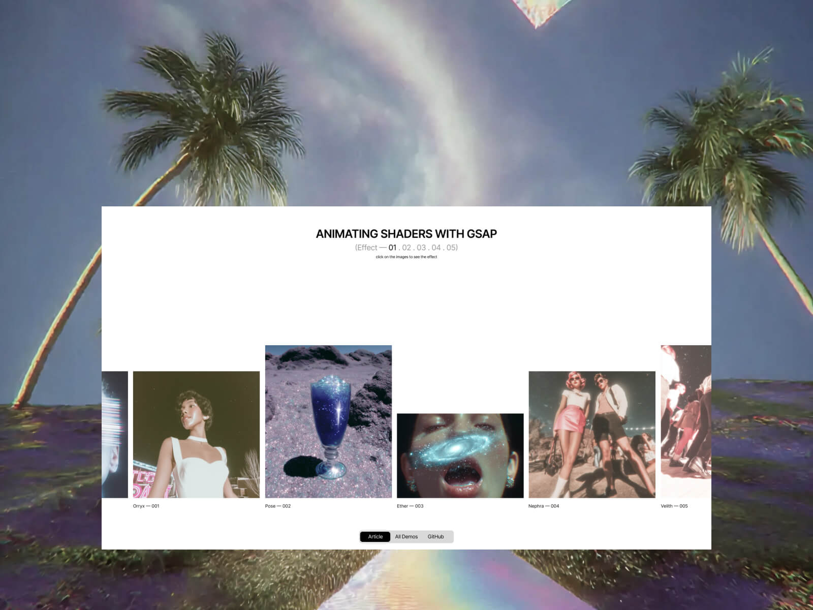
    In this tutorial, we’ll explore how to bring motion and interactivity to your WebGL projects by combining GSAP with custom shaders. Working with the Dev team at Adoratorio Studio, I’ll guide you through four GPU-powered effects, from ripples that react to clicks to dynamic blurs that respond to scroll and drag.

    We’ll start by setting up a simple WebGL scene and syncing it with our HTML layout. From there, we’ll move step by step through more advanced interactions, animating shader uniforms, blending textures, and revealing images through masks, until we turn everything into a scrollable, animated carousel.

    By the end, you’ll understand how to connect GSAP timelines with shader parameters to create fluid, expressive visuals that react in real time and form the foundation for your own immersive web experiences.

    Creating the HTML structure

    As a first step, we will set up the page using HTML.

    We will create a container without specifying its dimensions, allowing it to extend beyond the page width. Then, we will set the main container’s overflow property to hidden, as the page will be later made interactive through the GSAP Draggable and ScrollTrigger functionalities.

    <main>
      <section class="content">
        <div class="content__carousel">
          <div class="content__carousel-inner-static">
            <div class="content__carousel-image">
              <img src="/images/01.webp" alt="" role="presentation">
              <span>Lorem — 001</span>
            </div>
            <div class="content__carousel-image">
              <img src="/images/04.webp" alt="" role="presentation">
              <span>Ipsum — 002</span>
            </div>
            <div class="content__carousel-image">
              <img src="/images/02.webp" alt="" role="presentation">
              <span>Dolor — 003</span>
            </div>
            ...
          </div>
        </div>
      </section>
    </main>

    We’ll style all this and then move on to the next step.

    Sync between HTML and Canvas

    We can now begin integrating Three.js into our project by creating a Stage class responsible for managing all 3D engine logic. Initially, this class will set up a renderer, a scene, and a camera.

    We will pass an HTML node as the first parameter, which will act as the container for our canvas.
    Next, we will update the CSS and the main script to create a full-screen canvas that resizes responsively and renders on every GSAP frame.

    export default class Stage {
      constructor(container) {
        this.container = container;
    
        this.DOMElements = [...this.container.querySelectorAll('img')];
    
        this.renderer = new WebGLRenderer({
          powerPreference: 'high-performance',
          antialias: true,
          alpha: true,
        });
        this.renderer.setPixelRatio(Math.min(1.5, window.devicePixelRatio));
        this.renderer.setSize(window.innerWidth, window.innerHeight);
        this.renderer.domElement.classList.add('content__canvas');
    
        this.container.appendChild(this.renderer.domElement);
    
        this.scene = new Scene();
    
        const { innerWidth: width, innerHeight: height } = window;
        this.camera = new OrthographicCamera(-width / 2, width / 2, height / 2, -height / 2, -1000, 1000);
        this.camera.position.z = 10;
      }
    
      resize() {
        // Update camera props to fit the canvas size
        const { innerWidth: screenWidth, innerHeight: screenHeight } = window;
    
        this.camera.left = -screenWidth / 2;
        this.camera.right = screenWidth / 2;
        this.camera.top = screenHeight / 2;
        this.camera.bottom = -screenHeight / 2;
        this.camera.updateProjectionMatrix();
    
        // Update also planes sizes
        this.DOMElements.forEach((image, index) => {
          const { width: imageWidth, height: imageHeight } = image.getBoundingClientRect();
          this.scene.children[index].scale.set(imageWidth, imageHeight, 1);
        });
    
        // Update the render using the window sizes
        this.renderer.setSize(screenWidth, screenHeight);
      }
    
      render() {
        this.renderer.render(this.scene, this.camera);
      }
    }

    Back in our main.js file, we’ll first handle the stage’s resize event. After that, we’ll synchronize the renderer’s requestAnimationFrame (RAF) with GSAP by using gsap.ticker.add, passing the stage’s render function as the callback.

    // Update resize with the stage resize
    function resize() {
      ...
      stage.resize();
    }
    
    // Add render cycle to gsap ticker
    gsap.ticker.add(stage.render.bind(stage));
    
    <style>
    .content__canvas {
      position: absolute;
      top: 0;
      left: 0;
      width: 100vw;
      height: 100svh;
    
      z-index: 2;
      pointer-events: none;
    }
    </style>

    It’s now time to load all the images included in the HTML. For each image, we will create a plane and add it to the scene. To achieve this, we’ll update the class by adding two new methods:

    setUpPlanes() {
      this.DOMElements.forEach((image) => {
        this.scene.add(this.generatePlane(image));
      });
    }
    
    generatePlane(image, ) {
      const loader = new TextureLoader();
      const texture = loader.load(image.src);
    
      texture.colorSpace = SRGBColorSpace;
      const plane = new Mesh(
        new PlaneGeometry(1, 1),
        new MeshStandardMaterial(),
      );
    
      return plane;
    }

    We can then call setUpPlanes() within the constructor of our Stage class.
    The result should resemble the following, depending on the camera’s z-position or the planes’ placement—both of which can be adjusted to fit our specific needs.

    The next step is to position the planes precisely to correspond with the location of their associated images and update their positions on each frame. To achieve this, we will implement a utility function that converts screen space (CSS pixels) into world space, leveraging the Orthographic Camera, which is already aligned with the screen.

    const getWorldPositionFromDOM = (element, camera) => {
      const rect = element.getBoundingClientRect();
    
      const xNDC = (rect.left + rect.width / 2) / window.innerWidth * 2 - 1;
      const yNDC = -((rect.top + rect.height / 2) / window.innerHeight * 2 - 1);
    
      const xWorld = xNDC * (camera.right - camera.left) / 2;
      const yWorld = yNDC * (camera.top - camera.bottom) / 2;
    
      return new Vector3(xWorld, yWorld, 0);
    };
    render() {
      this.renderer.render(this.scene, this.camera);
    
      // For each plane and each image update the position of the plane to match the DOM element position on page
      this.DOMElements.forEach((image, index) => {
         this.scene.children[index].position.copy(getWorldPositionFromDOM(image, this.camera, this.renderer));
      });
    }

    By hiding the original DOM carousel, we can now display only the images as planes within the canvas. Create a simple class extending ShaderMaterial and use it in place of MeshStandardMaterial for the planes.

    const plane = new Mesh(
      new PlaneGeometry(1, 1),
      new PlanesMaterial(),
    );
    ...
    
    import { ShaderMaterial } from 'three';
    import baseVertex from './base.vert?raw';
    import baseFragment from './base.frag?raw';
    
    export default class PlanesMaterial extends ShaderMaterial {
      constructor() {
        super({
          vertexShader: baseVertex,
          fragmentShader: baseFragment,
        });
      }
    }
    
    // base.vert
    varying vec2 vUv;
    
    void main() {
      gl_Position = projectionMatrix * modelViewMatrix * vec4(position, 1.0);
      vUv = uv;
    }
    
    // base.frag
    varying vec2 vUv;
    
    void main() {
      gl_FragColor = vec4(vUv.x, vUv.y, 0.0, 1.0);
    }

    We can then replace the shader output with texture sampling based on the UV coordinates, passing the texture to the material and shaders as a uniform.

    ...
    const plane = new Mesh(
      new PlaneGeometry(1, 1),
      new PlanesMaterial(texture),
    );
    ...
    
    export default class PlanesMaterial extends ShaderMaterial {
      constructor(texture) {
        super({
          vertexShader: baseVertex,
          fragmentShader: baseFragment,
          uniforms: {
            uTexture: { value: texture },
          },
        });
      }
    }
    
    // base.frag
    varying vec2 vUv;
    
    uniform sampler2D uTexture;
    
    void main() {
      vec4 diffuse = texture2D(uTexture, vUv);
      gl_FragColor = diffuse;
    }

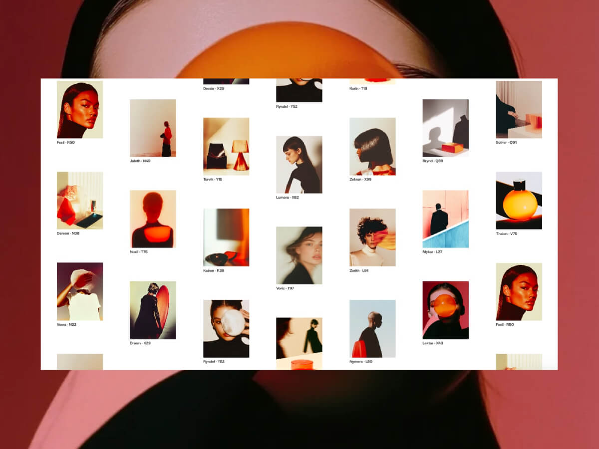
    Click on the images for a ripple and coloring effect

    This steps breaks down the creation of an interactive grayscale transition effect, emphasizing the relationship between JavaScript (using GSAP) and GLSL shaders.

    Step 1: Instant Color/Grayscale Toggle

    Let’s start with the simplest version: clicking the image makes it instantly switch between color and grayscale.

    The JavaScript (GSAP)

    At this stage, GSAP’s role is to act as a simple “on/off” switch so let’s create a GSAP Observer to monitor the mouse click interaction:

    this.observer = Observer.create({
      target: document.querySelector('.content__carousel'),
      type: 'touch,pointer',
      onClick: e => this.onClick(e),
    });

    And here come the following steps:

    • Click Detection: We use an Observer to detect a click on our plane.
    • State Management: A boolean flag, isBw (is Black and White), is toggled on each click.
    • Shader Update: We use gsap.set() to instantly change a uniform in our shader. We’ll call it uGrayscaleProgress.
      • If isBw is trueuGrayscaleProgress becomes 1.0.
      • If isBw is falseuGrayscaleProgress becomes 0.0.
    onClick(e) {
      if (intersection) {
        const { material, userData } = intersection.object;
    
        userData.isBw = !userData.isBw;
    
        gsap.set(material.uniforms.uGrayscaleProgress, {
          value: userData.isBw ? 1.0 : 0.0
        });
      }
    }

    The Shader (GLSL)

    The fragment shader is very simple. It receives uGrayscaleProgress and uses it as a switch.

    uniform sampler2D uTexture;
    uniform float uGrayscaleProgress; // Our "switch" (0.0 or 1.0)
    varying vec2 vUv;
    
    vec3 toGrayscale(vec3 color) {
      float gray = dot(color, vec3(0.299, 0.587, 0.114));
      return vec3(gray);
    }
    
    void main() {
      vec3 originalColor = texture2D(uTexture, vUv).rgb;
      vec3 grayscaleColor = toGrayscale(originalColor);
      
       vec3 finalColor = mix(originalColor, grayscaleColor, uGrayscaleProgress);
       gl_FragColor = vec4(finalColor, 1.0);
    }

    Step 2: Animated Circular Reveal

    An instant switch is boring. Let’s make the transition a smooth, circular reveal that expands from the center.

    The JavaScript (GSAP)

    GSAP’s role now changes from a switch to an animator.
    Instead of gsap.set(), we use gsap.to() to animate uGrayscaleProgress from 0 to 1 (or 1 to 0) over a set duration. This sends a continuous stream of values (0.0, 0.01, 0.02, …) to the shader.

    gsap.to(material.uniforms.uGrayscaleProgress, {
      value: userData.isBw ? 1 : 0,
      duration: 1.5,
      ease: 'power2.inOut'
    });

    The Shader (GLSL)

    The shader now uses the animated uGrayscaleProgress to define the radius of a circle.

    void main() {
      float dist = distance(vUv, vec2(0.5));
      
      // 2. Create a circular mask.
      float mask = smoothstep(uGrayscaleProgress - 0.1, uGrayscaleProgress, dist);
    
      // 3. Mix the colors based on the mask's value for each pixel.
      vec3 finalColor = mix(originalColor, grayscaleColor, mask);
      gl_FragColor = vec4(finalColor, 1.0);
    }

    How smoothstep works here: Pixels where dist is less than uGrayscaleProgress – 0.1 get a mask value of 0. Pixels where dist is greater than uGrayscaleProgress get a value of 1. In between, it’s a smooth transition, creating the soft edge.

    Step 3: Originating from the Mouse Click

    The effect is much more engaging if it starts from the exact point of the click.

    The JavaScript (GSAP)

    We need to tell the shader where the click happened.

    • Raycasting: We use a Raycaster to find the precise (u, v) texture coordinate of the click on the mesh.
    • uMouse Uniform: We add a uniform vec2 uMouse to our material.
    • GSAP Timeline: Before the animation starts, we use .set() on our GSAP timeline to update the uMouse uniform with the intersection.uv coordinates.
    if (intersection) {
      const { material, userData } = intersection.object;
    
      material.uniforms.uMouse.value = intersection.uv;
    
      gsap.to(material.uniforms.uGrayscaleProgress, {
          value: userData.isBw ? 1 : 0
      });
    }

    The Shader (GLSL)

    We simply replace the hardcoded center with our new uMouse uniform.

    ...
    uniform vec2 uMouse; // The (u,v) coordinates from the click
    ...
    
    void main() {
    ...
    
    // 1. Calculate distance from the MOUSE CLICK, not the center.
    float dist = distance(vUv, uMouse);
    }

    Important Detail: To ensure the circular reveal always covers the entire plane, even when clicking in a corner, we calculate the maximum possible distance from the click point to any of the four corners (getMaxDistFromCorners) and normalize our dist value with it: dist / maxDist.

    This guarantees the animation completes fully.

    Step 4: Adding the Final Ripple Effect

    The last step is to add the 3D ripple effect that deforms the plane. This requires modifying the vertex shader.

    The JavaScript (GSAP)

    We need one more animated uniform to control the ripple’s lifecycle.

    1. uRippleProgress Uniform: We add a uniform float uRippleProgress.
    2. GSAP Keyframes: In the same timeline, we animate uRippleProgress from 0 to 1 and back to 0. This makes the wave rise up and then settle back down.
    gsap.timeline({ defaults: { duration: 1.5, ease: 'power3.inOut' } })
      .set(material.uniforms.uMouse, { value: intersection.uv }, 0)
      .to(material.uniforms.uGrayscaleProgress, { value: 1 }, 0)
      .to(material.uniforms.uRippleProgress, {
          keyframes: { value: [0, 1, 0] } // Rise and fall
      }, 0)

    The Shaders (GLSL)

    High-Poly Geometry: To see a smooth deformation, the PlaneGeometry in Three.js must be created with many segments (e.g., new PlaneGeometry(1, 1, 50, 50)). This gives the vertex shader more points to manipulate.

    generatePlane(image, ) {
      ...
      const plane = new Mesh(
        new PlaneGeometry(1, 1, 50, 50),
        new PlanesMaterial(texture),
      );
    
      return plane;
    }

    Vertex Shader: This shader now calculates the wave and moves the vertices.

    uniform float uRippleProgress;
    uniform vec2 uMouse;
    varying float vRipple; // Pass the ripple intensity to the fragment shader
    
    void main() {
      vec3 pos = position;
      float dist = distance(uv, uMouse);
    
      float ripple = sin(-PI * 10.0 * (dist - uTime * 0.1));
      ripple *= uRippleProgress;
    
      pos.y += ripple * 0.1;
    
      vRipple = ripple;
      gl_Position = projectionMatrix * modelViewMatrix * vec4(pos, 1.0);
    }

    Fragment Shader: We can use the ripple intensity to add a final touch, like making the wave crests brighter.

    varying float vRipple; // Received from vertex shader
    
    void main() {
      // ... (all the color and mask logic from before)
      vec3 color = mix(color1, color2, mask);
    
      // Add a highlight based on the wave's height
      color += vRipple * 2.0;
    
      gl_FragColor = vec4(color, diffuse.a);
    }

    By layering these techniques, we create a rich, interactive effect where JavaScript and GSAP act as the puppet master, telling the shaders what to do, while the shaders handle the heavy lifting of drawing it beautifully and efficiently on the GPU.

    Step 5: Reverse effect on previous tile

    As a final step, we set up a reverse animation of the current tile when a new tile is clicked. Let’s start by creating the reset animation that reverses the animation of the uniforms:

    resetMaterial(object) {
      // Reset all shader uniforms to default values
      gsap.timeline({
        defaults: { duration: 1, ease: 'power2.out' },
    
        onUpdate() {
          object.material.uniforms.uTime.value += 0.1;
        },
        onComplete() {       
          object.userData.isBw = false;
        }
      })
      .set(object.material.uniforms.uMouse, { value: { x: 0.5, y: 0.5} }, 0)
      .set(object.material.uniforms.uDirection, { value: 1.0 }, 0)
      .fromTo(object.material.uniforms.uGrayscaleProgress, { value: 1 }, { value: 0 }, 0)
      .to(object.material.uniforms.uRippleProgress, { keyframes: { value: [0, 1, 0] } }, 0);
    }

    Now, at each click, we need to set the current tile so that it’s saved in the constructor, allowing us to pass the current material to the reset animation. Let’s modify the onClick function like this and analyze it step by step:

    if (this.activeObject && intersection.object !== this.activeObject && this.activeObject.userData.isBw) {
      this.resetMaterial(this.activeObject)
      
      // Stops timeline if active
      if (this.activeObject.userData.tl?.isActive()) this.activeObject.userData.tl.kill();
      
      // Cleans timeline
      this.activeObject.userData.tl = null;
    }
    
    // Setup active object
    this.activeObject = intersection.object;
    • If this.activeObject exists (initially set to null in the constructor), we proceed to reset it to its initial black and white state
    • If there’s a current animation on the active tile, we use GSAP’s kill method to avoid conflicts and overlapping animations
    • We reset userData.tl to null (it will be assigned a new timeline value if the tile is clicked again)
    • We then set the value of this.activeObject to the object selected via the Raycaster

    In this way, we’ll have a double ripple animation: one on the clicked tile, which will be colored, and one on the previously active tile, which will be reset to its original black and white state.

    Texture reveal mask effect

    In this tutorial, we will create an interactive effect that blends two images on a plane when the user hovers or touches it.

    Step 1: Setting Up the Planes

    Unlike the previous examples, in this case we need different uniforms for the planes, as we are going to create a mix between a visible front texture and another texture that will be revealed through a mask that “cuts through” the first texture.

    Let’s start by modifying the index.html file, adding a data attribute to all images where we’ll specify the underlying texture:

    <img src="/images/front-texture.webp" alt="" role="presentation" data-back="/images/back-texture.webp">

    Then, inside our Stage.js, we’ll modify the generatePlane method, which is used to create the planes in WebGL. We’ll start by retrieving the second texture to load via the data attribute, and we’ll pass the plane material the parameters with both textures and the aspect ratio of the images:

    generatePlane(image) {
      const loader = new TextureLoader();
      const texture = loader.load(image.src);
      const textureBack = loader.load(image.dataset.back);
    
      texture.colorSpace = SRGBColorSpace;
      textureBack.colorSpace = SRGBColorSpace;
    
      const { width, height } = image.getBoundingClientRect();
    
      const plane = new Mesh(
        new PlaneGeometry(1, 1),
        new PlanesMaterial(texture, textureBack, height / width),
      );
    
      return plane;
    }
    

    Step 2: Material Setup

    import { ShaderMaterial, Vector2 } from 'three';
    import baseVertex from './base.vert?raw';
    import baseFragment from './base.frag?raw';
    
    export default class PlanesMaterial extends ShaderMaterial {
      constructor(texture, textureBack, imageRatio) {
        super({
          vertexShader: baseVertex,
          fragmentShader: baseFragment,
          uniforms: {
            uTexture: { value: texture },
            uTextureBack: { value: textureBack },
            uMixFactor: { value: 0.0 },
            uAspect: { value: imageRatio },
            uMouse: { value: new Vector2(0.5, 0.5) },
          },
        });
      }
    }
    

    Let’s quickly analyze the uniforms passed to the material:

    • uTexture and uTextureBack are the two textures shown on the front and through the mask
    • uMixFactor represents the blending value between the two textures inside the mask
    • uAspect is the aspect ratio of the images used to calculate a circular mask
    • uMouse represents the mouse coordinates, updated to move the mask within the plane

    Step 3: The Javascript (GSAP)

    this.observer = Observer.create({
      target: document.querySelector('.content__carousel'),
      type: 'touch,pointer',
      onMove: e => this.onMove(e),
      onHoverEnd: () => this.hoverOut(),
    });

    Quickly, let’s create a GSAP Observer to monitor the mouse movement, passing two functions:

    • onMove checks, using the Raycaster, whether a plane is being hit in order to manage the opening of the reveal mask
    • onHoverEnd is triggered when the cursor leaves the target area, so we’ll use this method to reset the reveal mask’s expansion uniform value back to 0.0

    Let’s go into more detail on the onMove function to explain how it works:

    onMove(e) {
      const normCoords = {
        x: (e.x / window.innerWidth) * 2 - 1,
        y: -(e.y / window.innerHeight) * 2 + 1,
      };
    
      this.raycaster.setFromCamera(normCoords, this.camera);
    
      const [intersection] = this.raycaster.intersectObjects(this.scene.children);
    
      if (intersection) {
        this.intersected = intersection.object;
        const { material } = intersection.object;
    
        gsap.timeline()
          .set(material.uniforms.uMouse, { value: intersection.uv }, 0)
          .to(material.uniforms.uMixFactor, { value: 1.0, duration: 3, ease: 'power3.out' }, 0);
      } else {
        this.hoverOut();
      }
    }

    In the onMove method, the first step is to normalize the mouse coordinates from -1 to 1 to allow the Raycaster to work with the correct coordinates.

    On each frame, the Raycaster is then updated to check if any object in the scene is intersected. If there is an intersection, the code saves the hit object in a variable.

    When an intersection occurs, we proceed to work on the animation of the shader uniforms.

    Specifically, we use GSAP’s set method to update the mouse position in uMouse, and then animate the uMixFactor variable from 0.0 to 1.0 to open the reveal mask and show the underlying texture.

    If the Raycaster doesn’t find any object under the pointer, the hoverOut method is called.

    hoverOut() {
        if (!this.intersected) return;
    
        // Stop any running tweens on the uMixFactor uniform
        gsap.killTweensOf(this.intersected.material.uniforms.uMixFactor);
    
        // Animate uMixFactor back to 0 smoothly
        gsap.to(this.intersected.material.uniforms.uMixFactor, { value: 0.0, duration: 0.5, ease: 'power3.out });
    
        // Clear the intersected reference
        this.intersected = null;
      }

    This method handles closing the reveal mask once the cursor leaves the plane.

    First, we rely on the killAllTweensOf method to prevent conflicts or overlaps between the mask’s opening and closing animations by stopping all ongoing animations on the uMixFactor .

    Then, we animate the mask’s closing by setting the uMixFactor uniform back to 0.0 and reset the variable that was tracking the currently highlighted object.

    Step 4: The Shader (GLSL)

    uniform sampler2D uTexture;
    uniform sampler2D uTextureBack;
    uniform float uMixFactor;
    uniform vec2 uMouse;
    uniform float uAspect;
    
    varying vec2 vUv;
    
    void main() {
        vec2 correctedUv = vec2(vUv.x, (vUv.y - 0.5) * uAspect + 0.5);
        vec2 correctedMouse = vec2(uMouse.x, (uMouse.y - 0.5) * uAspect + 0.5);
        
        float distance = length(correctedUv - correctedMouse);
        float influence = 1.0 - smoothstep(0.0, 0.5, distance);
    
        float finalMix = uMixFactor * influence;
    
        vec4 textureFront = texture2D(uTexture, vUv);
        vec4 textureBack = texture2D(uTextureBack, vUv);
    
        vec4 finalColor = mix(textureFront, textureBack, finalMix);
    
        gl_FragColor = finalColor;
    }

    Inside the main() function, it starts by normalizing the UV coordinates and the mouse position relative to the image’s aspect ratio. This correction is applied because we are using non-square images, so the vertical coordinates must be adjusted to keep the mask’s proportions correct and ensure it remains circular. Therefore, the vUv.y and uMouse.y coordinates are modified so they are “scaled” vertically according to the aspect ratio.

    At this point, the distance is calculated between the current pixel (correctedUv) and the mouse position (correctedMouse). This distance is a numeric value that indicates how close or far the pixel is from the mouse center on the surface.

    We then move on to the actual creation of the mask. The uniform influence must vary from 1 at the cursor’s center to 0 as it moves away from the center. We use the smoothstep function to recreate this effect and obtain a soft, gradual transition between two values, so the effect naturally fades.

    The final value for the mix between the two textures, that is the finalMix uniform, is given by the product of the global factor uMixFactor (which is a static numeric value passed to the shader) and this local influence value. So the closer a pixel is to the mouse position, the more its color will be influenced by the second texture, uTextureBack.

    The last part is the actual blending: the two colors are mixed using the mix() function, which creates a linear interpolation between the two textures based on the value of finalMix. When finalMix is 0, only the front texture is visible.

    When it is 1, only the background texture is visible. Intermediate values create a gradual blend between the two textures.

    Click & Hold mask reveal effect

    This document breaks down the creation of an interactive effect that transitions an image from color to grayscale. The effect starts from the user’s click, expanding outwards with a ripple distortion.

    Step 1: The “Move” (Hover) Effect

    In this step, we’ll create an effect where an image transitions to another as the user hovers their mouse over it. The transition will originate from the pointer’s position and expand outwards.

    The JavaScript (GSAP Observer for onMove)

    GSAP’s Observer plugin is the perfect tool for tracking pointer movements without the boilerplate of traditional event listeners.

    • Setup Observer: We create an Observer instance that targets our main container and listens for touch and pointer events. We only need the onMove and onHoverEnd callbacks.
    • onMove(e) Logic:
      When the pointer moves, we use a Raycaster to determine if it’s over one of our interactive images.
      • If an object is intersected, we store it in this.intersected.
      • We then use a GSAP Timeline to animate the shader’s uniforms.
      • uMouse: We instantly set this vec2 uniform to the pointer’s UV coordinate on the image. This tells the shader where the effect should originate.
      • uMixFactor: We animate this float uniform from 0 to 1. This uniform will control the blend between the two textures in the shader.
    • onHoverEnd() Logic:
      • When the pointer leaves the object, Observer calls this function.
      • We kill any ongoing animations on uMixFactor to prevent conflicts.
      • We animate uMixFactor back to 0, reversing the effect.

    Code Example: the “Move” effect

    This code shows how Observer is configured to handle the hover interaction.

    import { gsap } from 'gsap';
    import { Observer } from 'gsap/Observer';
    import { Raycaster } from 'three';
    
    gsap.registerPlugin(Observer);
    
    export default class Effect {
      constructor(scene, camera) {
        this.scene = scene;
        this.camera = camera;
        this.intersected = null;
        this.raycaster = new Raycaster();
    
    	// 1. Create the Observer
    	this.observer = Observer.create({
          target: document.querySelector('.content__carousel'),
          type: 'touch,pointer',
          onMove: e => this.onMove(e),
          onHoverEnd: () => this.hoverOut(), // Called when the pointer leaves the target
        });
      }
    
      hoverOut() {
        if (!this.intersected) return;
    
    	// 3. Animate the effect out
        gsap.killTweensOf(this.intersected.material.uniforms.uMixFactor);
        gsap.to(this.intersected.material.uniforms.uMixFactor, {
          value: 0.0,
          duration: 0.5,
          ease: 'power3.out'
        });
    
        this.intersected = null;
      }
    
      onMove(e) {
    	// ... (Raycaster logic to find intersection)
    	const [intersection] = this.raycaster.intersectObjects(this.scene.children);
    
        if (intersection) {
          this.intersected = intersection.object;
          const { material } = intersection.object;
    
    	  // 2. Animate the uniforms on hover
          gsap.timeline()
            .set(material.uniforms.uMouse, { value: intersection.uv }, 0) // Set origin point
            .to(material.uniforms.uMixFactor, { // Animate the blendvalue: 1.0,
              duration: 3,
              ease: 'power3.out'
            }, 0);
        } else {
          this.hoverOut(); // Reset if not hovering over anything
        }
      }
    }

    The Shader (GLSL)

    The fragment shader receives the uniforms animated by GSAP and uses them to draw the effect.

    • uMouse: Used to calculate the distance of each pixel from the pointer.
    • uMixFactor: Used as the interpolation value in a mix() function. As it animates from 0 to 1, the shader smoothly blends from textureFront to textureBack.
    • smoothstep(): We use this function to create a circular mask that expands from the uMouse position. The radius of this circle is controlled by uMixFactor.
    uniform sampler2D uTexture; // Front image
    uniform sampler2D uTextureBack; // Back image
    uniform float uMixFactor; // Animated by GSAP (0 to 1)
    uniform vec2 uMouse; // Set by GSAP on move
    
    // ...
    
    void main() {
      // ... (code to correct for aspect ratio)
    
      // 1. Calculate distance of the current pixel from the mouse
      float distance = length(correctedUv - correctedMouse);
    
      // 2. Create a circular mask that expands as uMixFactor increases
      float influence = 1.0 - smoothstep(0.0, 0.5, distance);
      float finalMix = uMixFactor * influence;
    
      // 3. Read colors from both textures
      vec4 textureFront = texture2D(uTexture, vUv);
      vec4 textureBack = texture2D(uTextureBack, vUv);
    
      // 4. Mix the two textures based on the animated value
      vec4 finalColor = mix(textureFront, textureBack, finalMix);
    	
      gl_FragColor = finalColor;
    }

    Step 2: The “Click & Hold” Effect

    Now, let’s build a more engaging interaction. The effect will start when the user presses down, “charge up” while they hold, and either complete or reverse when they release.

    The JavaScript (GSAP)

    Observer makes this complex interaction straightforward by providing clear callbacks for each state.

    • Setup Observer: This time, we configure Observer to use onPressonMove, and onRelease.
    • onPress(e):
      • When the user presses down, we find the intersected object and store it in this.active.
      • We then call onActiveEnter(), which starts a GSAP timeline for the “charging” animation.
    • onActiveEnter():
      • This function defines the multi-stage animation. We use await with a GSAP tween to create a sequence.
      • First, it animates uGrayscaleProgress to a midpoint (e.g., 0.35) and holds it. This is the “hold” part of the interaction.
      • If the user continues to hold, a second tween completes the animation, transitioning uGrayscaleProgress to 1.0.
      • An onComplete callback then resets the state, preparing for the next interaction.
    • onRelease():
      • If the user releases the pointer before the animation completes, this function is called.
      • It calls onActiveLeve(), which kills the “charging” animation and animates uGrayscaleProgress back to 0, effectively reversing the effect.
    • onMove(e):
      • This is still used to continuously update the uMouse uniform, so the shader’s noise effect tracks the pointer even during the hold.
      • Crucially, if the pointer moves off the object, we call onRelease() to cancel the interaction.

    Code Example: Click & Hold

    This code demonstrates the press, hold, and release logic managed by Observer.

    import { gsap } from 'gsap';
    import { Observer } from 'gsap/Observer';
    
    // ...
    
    export default class Effect {
      constructor(scene, camera) {
    	// ...
    		
        this.active = null; // Currently active (pressed) object
    	this.raycaster = new Raycaster();
    	
    	// 1. Create the Observer for press, move, and release
    	this.observer = Observer.create({
    	  target: document.querySelector('.content__carousel'),
    	  type: 'touch,pointer',
          onPress: e => this.onPress(e),
          onMove: e => this.onMove(e),
    	  onRelease: () => this.onRelease(),
    	});
    	
    	// Continuously update uTime for the procedural effect
    	gsap.ticker.add(() => {
    	  if (this.active) {
    	    this.active.material.uniforms.uTime.value += 0.1;
    	  }
    	});
      }
    
      // 3. The "charging" animation
      async onActiveEnter() {
        gsap.killTweensOf(this.active.material.uniforms.uGrayscaleProgress);
    
        // First part of the animation (the "hold" phase)
    	await gsap.to(this.active.material.uniforms.uGrayscaleProgress, {
          value: 0.35,
          duration: 0.5,
        });
    
    	// Second part, completes after the hold
        gsap.to(this.active.material.uniforms.uGrayscaleProgress, {
          value: 1,
          duration: 0.5,
          delay: 0.12,
          ease: 'power2.in',
          onComplete: () => {/* ... reset state ... */ },
        });
      }
    
      // 4. Reverses the animation on early release
      onActiveLeve(mesh) {
        gsap.killTweensOf(mesh.material.uniforms.uGrayscaleProgress);
        gsap.to(mesh.material.uniforms.uGrayscaleProgress, {
          value: 0,
          onUpdate: () => {
            mesh.material.uniforms.uTime.value += 0.1;
          },
        });
      }
    
      // ... (getIntersection logic) ...
    	
      // 2. Handle the initial press
      onPress(e) {
        const intersection = this.getIntersection(e);
    
        if (intersection) {
          this.active = intersection.object;
          this.onActiveEnter(this.active); // Start the animation
        }
      }
    
      onRelease() {
        if (this.active) {
          const prevActive = this.active;
          this.active = null;
          this.onActiveLeve(prevActive); // Reverse the animation
        }
      }
    
      onMove(e) {
    	// ... (getIntersection logic) ...
    		
    	if (intersection) {
    	  // 5. Keep uMouse updated while holding
    	  const { material } = intersection.object;
          gsap.set(material.uniforms.uMouse, { value: intersection.uv });
        } else {
          this.onRelease(); // Cancel if pointer leaves
        }
      }
    }

    The Shader (GLSL)

    The fragment shader for this effect is more complex. It uses the animated uniforms to create a distorted, noisy reveal.

    • uGrayscaleProgress: This is the main driver, animated by GSAP. It controls both the radius of the circular mask and the strength of a “liquid” distortion effect.
    • uTime: This is continuously updated by gsap.ticker as long as the user is pressing. It’s used to add movement to the noise, making the effect feel alive and dynamic.
    • noise() function: A standard GLSL noise function generates procedural, organic patterns. We use this to distort both the shape of the circular mask and the image texture coordinates (UVs).
    // ... (uniforms and helper functions)
    
    void main() {
      // 1. Generate a noise value that changes over time
      float noisy = (noise(vUv * 25.0 + uTime * 0.5) - 0.5) * 0.05;
    
      // 2. Create a distortion that pulses using the main progress animation
      float distortionStrength = sin(uGrayscaleProgress * PI) * 0.5;
      vec2 distortedUv = vUv + vec2(noisy) * distortionStrength;
    
      // 3. Read the texture using the distorted coordinates for a liquid effect
      vec4 diffuse = texture2D(uTexture, distortedUv);
      // ... (grayscale logic)
    	
      // 4. Calculate distance from the mouse, but add noise to it
      float dist = distance(vUv, uMouse);
      float distortedDist = dist + noisy;
    
      // 5. Create the circular mask using the distorted distance and progress
      float maxDist = getMaxDistFromCorners(uMouse);
      float mask = smoothstep(uGrayscaleProgress - 0.1, uGrayscaleProgress, distortedDist / maxDist);
    
      // 6. Mix between the original and grayscale colors
      vec3 color = mix(color1, color2, mask);
    
      gl_FragColor = vec4(color, diffuse.a);
    }

    This shader combines noise-based distortion, smooth circular masking, and real-time uniform updates to create a liquid, organic transition that radiates from the click position. As GSAP animates the shader’s progress and time values, the effect feels alive and tactile — a perfect example of how animation logic in JavaScript can drive complex visual behavior directly on the GPU.

    Dynamic blur effect carousel

    Step 1: Create the carousel

    In this final demo, we will create an additional implementation, turning the image grid into a scrollable carousel that can be navigated both by dragging and scrolling.

    First we will implement the Draggable plugin by registering it and targeting the appropriate <div>
    with the desired configuration. Make sure to handle boundary constraints and update them accordingly when the window is resized.

    const carouselInnerRef = document.querySelector('.content__carousel-inner');
    const draggable = new Draggable(carouselInnerRef, {
      type: 'x',
      inertia: true,
      dragResistance: 0.5,
      edgeResistance: 0.5,
      throwResistance: 0.5,
      throwProps: true,
    });
    
    function resize() {
      const innerWidth = carouselInnerRef.scrollWidth;
      const viewportWidth = window.innerWidth;
      maxScroll = Math.abs(Math.min(0, viewportWidth - innerWidth));
    
      draggable.applyBounds({ minX: -maxScroll, maxX: 0 });
    }
    
    window.addEventListener('resize', debounce(resize));

    We ill also link GSAP Draggable to the scroll functionality using the GSAP ScrollTrigger plugin, allowing us to synchronize both scroll and drag behavior within the same container. Let’s explore this in more detail:

    let maxScroll = Math.abs(Math.min(0, window.innerWidth - carouselInnerRef.scrollWidth));
    
    const scrollTriggerInstance = ScrollTrigger.create({
      trigger: carouselWrapper,
      start: 'top top',
      end: `+=${2.5 * maxScroll}`,
      pin: true,
      scrub: 0.05,
      anticipatePin: 1,
      invalidateOnRefresh: true,
    });
    
    ...
    
    resize() {
      ...
      scrollTriggerInstance.refresh();
    }

    Now that ScrollTrigger is configured on the same container, we can focus on synchronizing the scroll position between both plugins, starting from the ScrollTrigger instance:

    onUpdate(e) {
      const x = -maxScroll * e.progress;
    
      gsap.set(carouselInnerRef, { x });
      draggable.x = x;
      draggable.update();
    }

    We then move on to the Draggable instance, which will be updated within both its onDrag and onThrowUpdate callbacks using the scrollPos variable. This variable will serve as the final scroll position for both the window and the ScrollTrigger instance.

    onDragStart() {},
    onDrag() {
      const progress = gsap.utils.normalize(draggable.maxX, draggable.minX, draggable.x);
      scrollPos = scrollTriggerInstance.start + (scrollTriggerInstance.end - scrollTriggerInstance.start) * progress;
      window.scrollTo({ top: scrollPos, behavior: 'instant' });
    
      scrollTriggerInstance.scroll(scrollPos);
    },
    onThrowUpdate() {
      const progress = gsap.utils.normalize(draggable.maxX, draggable.minX, draggable.x);
      scrollPos = scrollTriggerInstance.start + (scrollTriggerInstance.end - scrollTriggerInstance.start) * progress;
      window.scrollTo({ top: scrollPos, behavior: 'instant' });
    },
    onThrowComplete() {
      scrollTriggerInstance.scroll(scrollPos);
    }

    Step 2: Material setup

    export default class PlanesMaterial extends ShaderMaterial {
      constructor(texture) {
        super({
          vertexShader: baseVertex,
          fragmentShader: baseFragment,
          uniforms: {
            uTexture: { value: texture },
            uBlurAmount: { value: 0 },
          },
        });
      }
    }

    Let’s quickly analyze the uniforms passed to the material:

    • uTexture is the base texture rendered on the plane
    • uBlurAmount represents the blur strength based on the distance from the window center

    Step 3: The JavaScript (GSAP)

    constructor(scene, camera) {
      ...
      this.callback = this.scrollUpdateCallback;
      this.centerX = window.innerWidth / 2
      ...
    }

    In the constructor we set up two pieces we’ll use to drive the dynamic blur effect:

    • <strong>this.callback</strong> references the function used inside ScrollTrigger’s onUpdate to refresh the blur amount
    • this.centerX represents the window center on X axes and is updated on each window resize

    Let’s dive into the callback passed to ScrollTrigger:

    scrollUpdateCallback() {
      this.tiles.forEach(tile => {
        const worldPosition = tile.getWorldPosition(new Vector3());
        const vector = worldPosition.clone().project(this.camera);
    
        const screenX = (vector.x * 0.5 + 0.5) * window.innerWidth;
    
        const distance = Math.abs(screenX - this.centerX);
        const maxDistance = window.innerWidth / 2;
    
        const blurAmount = MathUtils.clamp(distance / maxDistance * 5, 0.0, 5.0);
    
        gsap.to(tile.material.uniforms.uBlurAmount, {
          value: Math.round(blurAmount / 2) * 2,
          duration: 1.5,
          ease: 'power3.out'
        });
      });
    }
    

    Let’s dive deeper into this:

    • Vector projects each plane’s 3D position into normalized device coordinates; .project(this.camera) converts to the -1..1 range, then it’s scaled to real screen pixel coordinates.
    • screenX are the 2D screen-space coordinates.
    • distance measures how far the plane is from the screen center.
    • maxDistance is the maximum possible distance from center to corner.
    • blurAmount computes blur strength based on distance from the center; it’s clamped between 0.0 and 5.0 to avoid extreme values that would harm visual quality or shader performance.
    • The <strong>uBlurAmount</strong> uniform is animated toward the computed blurAmount. Rounding to the nearest even number (Math.round(blurAmount / 2) * 2) helps avoid overly frequent tiny changes that could cause visually unstable blur.

    Step 4: The Shader (GLSL)

    uniform sampler2D uTexture;
    uniform float uBlurAmount;
    
    varying vec2 vUv;
    
    vec4 kawaseBlur(sampler2D tex, vec2 uv, float offset) {
      vec2 texelSize = vec2(1.0) / vec2(textureSize(tex, 0));
      
      vec4 color = vec4(0.0);
      
      color += texture2D(tex, uv + vec2(offset, offset) * texelSize);
      color += texture2D(tex, uv + vec2(-offset, offset) * texelSize);
      color += texture2D(tex, uv + vec2(offset, -offset) * texelSize);
      color += texture2D(tex, uv + vec2(-offset, -offset) * texelSize);
      
      return color * 0.25;
    }
    
    vec4 multiPassKawaseBlur(sampler2D tex, vec2 uv, float blurStrength) {
      vec4 baseTexture = texture2D(tex, uv);
      
      vec4 blur1 = kawaseBlur(tex, uv, 1.0 + blurStrength * 1.5);
      vec4 blur2 = kawaseBlur(tex, uv, 2.0 + blurStrength);
      vec4 blur3 = kawaseBlur(tex, uv, 3.0 + blurStrength * 2.5);
      
      float t1 = smoothstep(0.0, 3.0, blurStrength);
      float t2 = smoothstep(3.0, 7.0, blurStrength);
      
      vec4 blurredTexture = mix(blur1, blur2, t1);
      blurredTexture = mix(blurredTexture, blur3, t2);
      
      float mixFactor = smoothstep(0.0, 1.0, blurStrength);
      
      return mix(baseTexture, blurredTexture, mixFactor);
    }
    
    void main() {
      vec4 color = multiPassKawaseBlur(uTexture, vUv, uBlurAmount);
      gl_FragColor = color;
    }
    

    This GLSL fragment receives a texture (uTexture) and a dynamic value (uBlurAmount) indicating how much the plane should be blurred. Based on this value, the shader applies a multi-pass Kawase blur, an efficient technique that simulates a soft, pleasing blur while staying performant.

    Let’s examine the kawaseBlur function, which applies a light blur by sampling 4 points around the current pixel (uv), each offset positively or negatively.

    • texelSize computes the size of one pixel in UV coordinates so offsets refer to “pixel amounts” regardless of texture resolution.
    • Four samples are taken in a diagonal cross pattern around uv.
    • The four colors are averaged (multiplied by 0.25) to return a balanced result.

    This function is a light single pass. To achieve a stronger effect, we apply it multiple times.

    The multiPassKawaseBlur function does exactly that, progressively increasing blur and then blending the passes:

    vec4 blur1 = kawaseBlur(tex, uv, 1.0 + blurStrength * 1.5);
    vec4 blur2 = kawaseBlur(tex, uv, 2.0 + blurStrength);
    vec4 blur3 = kawaseBlur(tex, uv, 3.0 + blurStrength * 2.5);

    This produces a progressive, visually smooth result.

    Next, we blend the different blur levels using two separate smoothsteps:

    float t1 = smoothstep(0.0, 3.0, blurStrength);
    float t2 = smoothstep(3.0, 7.0, blurStrength);
      
    vec4 finalBlur = mix(blur1, blur2, t1);
    finalBlur = mix(finalBlur, blur3, t2);

    The first mix blends blur1 and blur2, while the second blends that result with blur3. The resulting finalBlur represents the Kawase-blurred texture, which we finally mix with the base texture passed via the uniform.

    Finally, we mix the blurred texture with the original texture based on blurStrength, using another smoothstep from 0 to 1:

    float mixFactor = smoothstep(0.0, 1.0, blurStrength);
    return mix(baseTexture, finalBlur, mixFactor);

    Final Words

    Bringing together GSAP’s animation power and the creative freedom of GLSL shaders opens up a whole new layer of interactivity for the web. By animating shader uniforms directly with GSAP, we’re able to blend smooth motion design principles with the raw flexibility of GPU rendering — crafting experiences that feel alive, fluid, and tactile.

    From simple grayscale transitions to ripple-based deformations and dynamic blur effects, every step in this tutorial demonstrates how motion and graphics can respond naturally to user input, creating interfaces that invite exploration rather than just observation.

    While these techniques push the boundaries of front-end development, they also highlight a growing trend: the convergence of design, code, and real-time rendering.

    So, take these examples, remix them, and make them your own — because the most exciting part of working with GSAP and shaders is that the canvas is quite literally infinite.


    Source link

  • Ponpon Mania: How WebGL and GSAP Bring a Comic Sheep’s Dream to Life

    Ponpon Mania: How WebGL and GSAP Bring a Comic Sheep’s Dream to Life


    Ponpon Mania is an animated comic featuring Ponpon, a megalomaniac sheep dreaming of becoming a DJ. We wanted to explore storytelling beyond traditional comics by combining playful interactions, smooth GSAP-powered motion, and dynamic visuals. The goal was to create a comic that feels alive, where readers engage directly with Ponpon’s world while following the narrative. The project evolved over several months, moving from early sketches to interactive prototypes.

    About us

    We are Justine Soulié (Art Director & Illustrator) and Patrick Heng (Creative Developer), a creative duo passionate about storytelling through visuals and interaction. Justine brings expertise in illustration, art direction, and design, while Patrick focuses on creative development and interactive experiences. Together, we explore ways to make stories more playful, immersive, and engaging.

    Art Direction

    Our visual direction emphasizes clean layouts, bold colors, and playful details. From the start, we wanted the comic to feel vibrant and approachable while using design to support the story. On the homepage, we aimed to create a simple, welcoming scene that immediately draws the user in, offering many interactive elements to explore and encouraging engagement from the very first moment.

    The comic is mostly black and white, providing a simple and striking visual base. Color appears selectively, especially when Ponpon dreams of being a DJ and is fully immersed in his imagined world, highlighting these key moments and guiding the reader’s attention. Scroll-triggered animations naturally direct focus, while hover effects and clickable elements invite exploration without interrupting the narrative flow.

    To reinforce Ponpon’s connection to music, we designed the navigation to resemble a music player. Readers move through chapters as if they were albums, with each panel functioning like a song. This structure reflects Ponpon’s DJ aspirations, making the reading experience intuitive, dynamic, and closely tied to the story.

    Technical Approach

    Our main goal was to reduce technical friction so we could dedicate our energy to refining the artistic direction, motion design, and animation of the website.

    We used WebGL because it gave us full creative freedom over rendering. Even though the comic has a mostly 2D look, we wanted the flexibility to add depth and apply shader-based effects.

    Starting from Justine’s illustrator files, every layer and visual element from each panel was exported as an individual image. These assets were then packed into optimized texture atlases using Free TexturePacker.

    Atlas example

    Once exported, the images were further compressed into GPU-friendly formats to reduce memory usage. Using the data generated by the packer, we reconstructed each scene in WebGL by generating planes at the correct size. Finally, everything was placed in a 3D scene where we applied the necessary shaders and animations to achieve the desired visual effects.

    Tech Stack & Tools

    Design

    • Adobe Photoshop & Illustrator – illustration and asset preparation
    • Figma – layout and interface design

    Development

    • ogl – WebGL framework for rendering
    • Nuxt.js – frontend framework for structure and routing
    • GSAP – animation library for smooth and precise motion
    • Matter.js – physics engine used on the About page
    • Free TexturePacker – for creating optimized texture atlases from exported assets
    • Tweakpane – GUI tool for real-time debugging and fine-tuning parameters

    Animating using GSAP

    GSAP makes it easy to animate both DOM elements and WebGL objects with a unified syntax. Its timeline system brought structure to complex sequences, while combining it with ScrollTrigger streamlined scroll-based animations. We also used SplitText to handle text animations.

    Home page

    For the homepage, we wanted the very first thing users see to feel playful and full of life. It introduces the three main characters, all animated, and sets the tone for the rest of the experience. Every element reacts subtly to the mouse: the Ponpon mask deforms slightly, balloons collide softly, and clouds drift away in gentle repulsion. These micro-interactions make the scene feel tangible and invite visitors to explore the world of Ponpon Mania with curiosity and delight. We used GSAP timeline to choreograph the intro animation, allowing us to trigger each element in sequence for a smooth and cohesive reveal.

    // Simple repulsion we used for the clouds in our render function
    const dx = baseX - mouse.x;
    const dy = baseY - mouse.y;
    const dist = Math.sqrt(dx * dx + dy * dy);
    
    // Repel the cloud if the mouse is near
    const radius = 2; // interaction radius
    const strength = 1.5; // repulsion force
    const repulsion = Math.max(0, 1 - dist / radius) * strength;
    
    // Apply the repulsion with smooth spring motion
    const targetX = basePosX + dx * repulsion;
    const targetY = basePosY - Math.abs(dy * repulsion) / 2;
    
    velocity.x += (targetX - position.x) * springStrength * deltaTime;
    velocity.y += (targetY - position.y) * springStrength * deltaTime;
    
    position.x += velocity.x;
    position.y += velocity.y;

    Chapter Selection

    For the chapter selection, we wanted something simple yet evocative of Ponpon musical universe. Each chapter is presented as an album cover, inviting users to browse through them as if flipping through a record collection. We try to have a smooth and intuitive navigation, users can drag, scroll, or click to explore and each chapter snaps into place for an easy and satisfying selection experience.

    Panel Animation

    For the panel animations, we wanted each panel to feel alive bringing Justine’s illustrations to life through motion. We spent a lot of time refining every detail so that each scene feels expressive and unique. Using GSAP timelines made it easy to structure and synchronize the different animations, keeping them flexible and reusable. Here’s an example of a GSAP timeline animating a panel, showing how sequences can be chained together smoothly.

    // Animate ponpons in sequence with GSAP timelines
    const timeline = gsap.timeline({ repeat: -1, repeatDelay: 0.7 });
    const uFlash = { value: 0 };
    const flashTimeline = gsap.timeline({ paused: true });
    
    function togglePonponGroup(index) {
      ponponsGroups.forEach((g, i) => (g.mesh.visible = i === index));
    }
    
    function triggerFlash() {
      const flashes = Math.floor(Math.random() * 2) + 1; // 1–2 flashes
      const duration = 0.4 / flashes;
    
      flashTimeline.clear();
    
      for (let i = 0; i < flashes; i++) {
        flashTimeline
          .set(uFlash, { value: 0.6 }, i * duration) // bright flash
          .to(uFlash, { value: 0, duration: duration * 0.9 }, i * duration + duration * 0.1); // fade out
      }
    
      flashTimeline.play();
    }
    
    ponponMeshes.forEach((ponpon, i) => {
      timeline.fromTo(
        ponpon.position,
        { y: ponpon.initialY - 0.2 },  // start slightly below
        {
          y: ponpon.initialY,          // bounce up
          duration: 1,
          ease: "elastic.out",
          onStart: () => {
            togglePonponGroup(i);      // show active group
            triggerFlash();            // trigger flash
          }
        },
        i * 1.6 // stagger delay between ponpons
      );
    });

    About Page

    On the About page, GSAP ScrollTrigger tracks the scroll progress of each section. These values drive the WebGL scenes, controlling rendering, transitions, and camera movement. This ensures the visuals stay perfectly synchronized with the user’s scrolling.

    const sectionUniform = { progress: { value: 0 } };
    
    // create a ScrollTrigger for one section
    const sectionTrigger = ScrollTrigger.create({
      trigger: ".about-section",
      start: "top bottom",
      end: "bottom top",
      onUpdate: (self) => {
        sectionUniform.progress.value = self.progress; // update uniform
      }
    });
    
    // update scene each frame using trigger values
    function updateScene() {
      const progress = sectionTrigger.progress;  
      const velocity = sectionTrigger.getVelocity(); 
    
      // drive camera movement with scroll progress
      camera.position.y = map(progress, 0.75, 1, -0.4, 3.4);
      camera.position.z =
        5 + map(progress, 0, 0.3, -4, 0) +
            map(progress, 0.75, 1, 0, 2) + velocity * 0.01;
    
      // subtle velocity feedback on ponpon and camera
      ponpon.position.y = ponpon.initialY + velocity * 0.01;
    }

    Thanks to the SplitText plugin, we can animate each section title line by line as it comes into view while scrolling.

    // Split the text into lines for staggered animation
    const split = new SplitText(titleDomElement, { type: "lines" });
    const lines = split.lines;
    
    // Create a timeline for the text animation
    const tl = gsap.timeline({ paused: true });
    
    tl.from(lines, {
      x: "100%",
      skewX: () => Math.random() * 50 - 25,
      rotation: 5,
      opacity: 0,
      duration: 1,
      stagger: 0.06,
      ease: "elastic.out(0.7, 0.7)"
    });
    
    // Trigger the timeline when scrolling the section into view
    ScrollTrigger.create({
      trigger: ".about-section",
      start: "top 60%",
      end: "bottom top",
      onEnter: () => tl.play(),
      onLeaveBack: () => tl.reverse()
    });

    Page transitions

    For the page transitions, we wanted them to add a sense of playfulness to the experience while keeping navigation snappy and fluid. Each transition was designed to fit the mood of the page so rather than using a single generic effect, we built variations that keep the journey fresh.

    Technically, the transitions blend two WebGL scenes together using a custom shader, where the previous and next pages are rendered and mixed in real time. The animation of the blend is driven by GSAP tweens, which lets us precisely control the timing and progress of the shader for smooth, responsive transitions.

    Designing Playful Experiences

    Ponpon Mania pushed us to think beyond traditional storytelling. It was a joy to work on the narrative and micro-interactions that add playfulness and energy to the comic.

    Looking ahead, we plan to create new chapters, expand Ponpon’s story, and introduce small games and interactive experiences within the universe we’ve built. We’re excited to keep exploring Ponpon’s world and share more surprises with readers along the way.

    Thank you for reading! We hope you enjoyed discovering the creative journey behind Ponpon Mania and the techniques we used to bring Ponpon’s world to life.

    If you want to follow Ponpon, check us out on TikTok or Instagram.

    You can also support us on Tipeee!

    Justine Soulié & Patrick Heng


    Source link

  • 7 Must-Know GSAP Animation Tips for Creative Developers

    7 Must-Know GSAP Animation Tips for Creative Developers


    Today we’re going to go over some of my favorite GSAP techniques that can bring you great results with just a little code.

    Although the GSAP documentation is among the best, I find that developers often overlook some of GSAP’s greatest features or perhaps struggle with finding their practical application. 

    The techniques presented here will be helpful to GSAP beginners and seasoned pros. It is recommended that you understand the basics of loading GSAP and working with tweens, timelines and SplitText. My free beginner’s course GSAP Express will guide you through everything you need for a firm foundation.

    If you prefer a video version of this tutorial, you can watch it here:

    https://www.youtube.com/watch?v=EKjYspj9MaM

    Tip 1: SplitText Masking

    GSAP’s SplitText just went through a major overhaul. It has 14 new features and weighs in at roughly 7kb.

    SplitText allows you to split HTML text into characters, lines, and words. It has powerful features to support screen-readers, responsive layouts, nested elements, foreign characters, emoji and more.

    My favorite feature is its built-in support for masking (available in SplitText version 3.13+).

    Prior to this version of SplitText you would have to manually nest your animated text in parent divs that have overflow set to hidden or clip in the css.

    SplitText now does this for you by creating “wrapper divs” around the elements that we apply masking to.

    Basic Implementation

    The code below will split the h1 tag into chars and also apply a mask effect, which means the characters will not be visible when they are outside their bounding box.

    const split = SplitText.create("h1", {
    	type:"chars",
    	mask:"chars"
    })

    Demo: Split Text Masking (Basic)

    See the Pen
    Codrops Tip 1: Split Text Masking – Basic by Snorkl.tv (@snorkltv)
    on CodePen.

    This simple implementation works great and is totally fine.

    However, if you inspect the DOM you will see that 2 new <div> elements are created for each character:

    • an outer div with overflow:clip
    • an inner div with text 

    With 17 characters to split this creates 34 divs as shown in the simplified DOM structure below

    <h1>SplitText Masking
    	<div> <!-- char wrapper with overflow:clip -->
    		<div>S</div>
    	</div>
    	<div> <!-- char wrapper with overflow:clip -->
    		<div>p</div>
    	</div>
    	<div> <!-- char wrapper with overflow:clip -->
    		<div>l</div>
    	</div>
    	<div> <!-- char wrapper with overflow:clip -->
    		<div>i</div>
    	</div>
    	<div> <!-- char wrapper with overflow:clip -->
    		<div>t</div>
    	</div>	
    	...
    </h1>

    The More Efficient Approach

    If you want to minimize the amount of DOM elements created you can split your text into characters and lines. Then you can just set the masking on the lines element like so:

    const split = SplitText.create("h1", {
    	type:"chars, lines",
    	mask:"lines"
    })

    Demo: Split Text Masking (Better with chars and lines)

    See the Pen
    Codrops Tip 1: Split Text Masking – Better with chars and lines by Snorkl.tv (@snorkltv)
    on CodePen.

    Now if you inspect the DOM you will see that there is

    • 1 line wrapper div with overflow:clip
    • 1 line div
    • 1 div per character 

    With 17 to characters to split this creates only 19 divs in total:

    <h1>SplitText Masking
    	<div> <!-- line wrapper with overflow:clip -->
    		<div> <!-- line -->
    			<div>S</div>
    			<div>p</div>
    			<div>l</div>
    			<div>i</div>
    			<div>t</div>
    			...
    		</div> 
    	</div> 
    </h1>

    Tip 2: Setting the Stagger Direction

    From my experience 99% of stagger animations go from left to right. Perhaps that’s just because it’s the standard flow of written text.

    However, GSAP makes it super simple to add some animation pizzazz to your staggers.

    To change the direction from which staggered animations start you need to use the object-syntax for the stagger value

    Normal Stagger

    Typically the stagger value is a single number which specifies the amount of time between the start of each target element’s animation.

    gsap.to(targets, {x:100, stagger:0.2}) // 0.2 seconds between the start of each animation

    Stagger Object

    By using the stagger object we can specify multiple parameters to fine-tune our staggers such as each, amount, from, ease, grid and repeat. See the GSAP Stagger Docs for more details.
    Our focus today will be on the from property which allows us to specify from which direction our staggers should start.

    gsap.to(targets, {x:100,
       stagger: {
         each:0.2, // amount of time between the start of each animation
         from:”center” // animate from center of the targets array   
    }

    The from property in the stagger object can be any one of these string values

    • “start” (default)
    • “center”
    • “end”
    • “edges”
    • “random”

    Demo: Stagger Direction Timeline

    In this demo the characters animate in from center and then out from the edges.

    See the Pen
    Codrops Tip 2: Stagger Direction Timeline by Snorkl.tv (@snorkltv)
    on CodePen.

    Demo: Stagger Direction Visualizer

    See the Pen
    Codrops Tip 2: Stagger Direction Visualizer by Snorkl.tv (@snorkltv)
    on CodePen.

    Tip 3: Wrapping Array Values

    The gsap.utils.wrap() function allows you to pull values from an array and apply them to multiple targets. This is great for allowing elements to animate in from opposite directions (like a zipper), assigning a set of colors to multiple objects and many more creative applications.

    Setting Colors From an Array

    I love using gsap.utils.wrap() with a set() to instantly manipulate a group of elements.

    // split the header
    const split = SplitText.create("h1", {
    	type:"chars"
    })
    
    //create an array of colors
    const colors = ["lime", "yellow", "pink", "skyblue"]
    
    // set each character to a color from the colors array
    gsap.set(split.chars, {color:gsap.utils.wrap(colors)})

    When the last color in the array (skyblue) is chosen GSAP will wrap back to the beginning of the array and apply lime to the next element.

    Animating from Alternating Directions

    In the code below each target will animate in from alternating y values of -50 and 50. 

    Notice that you can define the array directly inside of the wrap() function.

    const tween = gsap.from(split.chars, {
    	y:gsap.utils.wrap([-50, 50]),
    	opacity:0,
    	stagger:0.1
    }) 

    Demo: Basic Wrap

    See the Pen
    Codrops Tip 3: Basic Wrap by Snorkl.tv (@snorkltv)
    on CodePen.

    Demo: Fancy Wrap

    In the demo below there is a timeline that creates a sequence of animations that combine stagger direction and wrap. Isn’t it amazing what GSAP allows you to do with just a few simple shapes and a few lines of code?

    See the Pen
    Codrops Tip 3: Fancy Wrap by Snorkl.tv (@snorkltv)
    on CodePen.

    As you watch the animation be sure to go through the GSAP code to see which tween is running each effect. 

    I strongly recommend editing the animation values and experimenting.

    Tip 4: Easy Randomization with the “random()” String Function

    GSAP has its own random utility function gsap.utils.random() that lets you tap into convenient randomization features anywhere in your JavaScript code.

    // generate a random number between 0 and 450
    const randomNumber = gsap.utils.random(0, 450)

    To randomize values in animations we can use the random string shortcut which saves us some typing.

    //animate each target to a random x value between 0 and 450
    gsap.to(targets, {x:"random(0, 450)"})
    
    //the third parameter sets the value to snap to
    gsap.to(targets, {x:"random(0, 450, 50)"}) // random number will be an increment of 50
    
    //pick a random value from an array for each target
    gsap.to(targets, fill:"random([pink, yellow, orange, salmon])" 

    Demo: Random String

    See the Pen
    Codrops Tip 4: Random String by Snorkl.tv (@snorkltv)
    on CodePen.

    TIP 5: repeatRefresh:true

    This next tip appears to be pure magic as it allows our animations to produce new results each time they repeat.

    GSAP internally stores the start and end values of an animation the first time it runs. This is a performance optimization so that each time it repeats there is no additional work to do. By default repeating tweens always produce the exact same results (which is a good thing).

    When dealing with dynamic or function-based values such as those generated with the random string syntax “random(0, 100)” we can tell GSAP to record new values on repeat by setting repeatRefresh:true

    You can set repeatRefresh:true in the config object of a single tween OR on a timeline.

    //use on a tween
    gsap.to(target, {x:”random(50, 100”, repeat:10, repeatRefresh:true})
    
    //use on a timeline
    const tl = gsap.timeline({repeat:10, repeatRefresh:true})

    Demo: repeatRefresh Particles

    The demo below contains a single timeline with repeatRefresh:true.

    Each time it repeats the circles get assigned a new random scale and a new random x destination.

    Be sure to study the JS code in the demo. Feel free to fork it and modify the values.

    See the Pen
    Codrops Tip 5: repeatRefresh Particles by Snorkl.tv (@snorkltv)
    on CodePen.

    TIP 6: Tween The TimeScale() of an Animation

    GSAP animations have getter / setter values that allow you to get and set properties of an animation.

    Common Getter / Setter methods:

    • paused() gets or sets the paused state
    • duration() gets or sets the duration
    • reversed() gets or sets the reversed state
    • progress() gets or sets the progress
    • timeScale() gets or sets the timeScale

    Getter Setter Methods in Usage

    animation.paused(true) // sets the paused state to true
    console.log(animation.paused()) // gets the paused state
    console.log(!animation.paused()) // gets the inverse of the paused state

    See it in Action

    In the demo from the previous tip there is code that toggles the paused state of the particle effect.

    //click to pause
    document.addEventListener("click", function(){
    	tl.paused(!tl.paused()) 
    })

    This code means “every time the document is clicked the timeline’s paused state will change to the inverse (or opposite) of what it currently is”.

    If the animation is paused, it will become “unpaused” and vice-versa.

    This works great, but I’d like to show you trick for making it less abrupt and smoothing it out.

    Tweening Numeric Getter/Setter Values

    We can’t tween the paused() state as it is either true or false.

    Where things get interesting is that we can tween numeric getter / setter properties of animations like progress() and timeScale().

    timeScale() represents a factor of an animation’s playback speed.

    • timeScale(1): playback at normal speed
    • timeScale(0.5) playback at half speed
    • timeScale(2) playback at double speed

    Setting timeScale()

    //create an animation with a duration of 5 seconds
    const animation = gsap.to(box, {x:500, duration:5})
    
    //playback at half-speed making it take 10 seconds to play
    animation.timeScale(0.5)

    Tweening timeScale()

    const animation = gsap.to(box, {x:500, duration:5}) // create a basic tween
    
    // Over the course of 1 second reduce the timeScale of the animation to 0.5
    gsap.to(animation, {timeScale:0.5, duration:1})

    Dynamically Tweening timeScale() for smooth pause and un-pause

    Instead of abruptly changing the paused state of animation as the particle demo above does we are now going to tween the timeScale() for a MUCH smoother effect.

    Demo: Particles with timeScale() Tween

    See the Pen
    Codrops Tip 6: Particles with timeScale() Tween by Snorkl.tv (@snorkltv)
    on CodePen.

    Click anywhere in the demo above to see the particles smoothly slow down and speed up on each click.

    The code below basically says “if the animation is currently playing then we will slow it down or else we will speed it up”. Every time a click happens the isPlaying value toggles between true and false so that it can be updated for the next click.

    Tip 7: GSDevTools Markers and Animation IDs

    Most of the demos in this article have used GSDevTools to help us control our animations. When building animations I just love being able to scrub at my own pace and study the sequencing of all the moving parts.

    However, there is more to this powerful tool than just scrubbing, playing and pausing.

    Markers

    The in and out markers allow us to loop ANY section of an animation. As an added bonus GSDevTools remembers the previous position of the markers so that each time we reload our animation it will start  and end at the same time.

    This makes it very easy to loop a particular section and study it.

    Image from GSDevTools Docs

    Markers are a huge advantage when building animations longer than 3 seconds.

    To explore, open The Fancy Wrap() demo in a new window, move the markers and reload.

    Important: The markers are only available on screens wider than 600px. On small screens the UI is minimized to only show basic controls.

    Setting IDs for the Animation Menu

    The animation menu allows us to navigate to different sections of our animation based on an animation id. When dealing with long-form animations this feature is an absolute life saver.

    Since GSAP’s syntax makes creating complex sequences a breeze, it is not un-common to find yourself working on animations that are beyond 10, 20 or even 60 seconds!

    To set an animation id:

    const tl = gsap.timeline({id:"fancy"})
    
    //Add the animation to GSDevTools based on variable reference
    GSDevTools.create({animation:tl})
    
    //OR add the animation GSDevTools based on id
    GSDevTools.create({animation:"fancy"})

    With the code above the name “fancy” will display in GSDevTools.

    Although you can use the id with a single timeline, this feature is most helpful when working with nested timelines as discussed below.

    Demo: GSAP for Everyone

    See the Pen
    Codrops Tip 7: Markers and Animation Menu by Snorkl.tv (@snorkltv)
    on CodePen.

    This demo is 26 seconds long and has 7 child timelines. Study the code to see how each timeline has a unique id that is displayed in the animation menu.

    Use the animation menu to navigate to and explore each section.

    Important: The animation menu is only available on screens wider than 600px.

    Hopefully you can see how useful markers and animation ids can be when working with these long-form, hand-coded animations!

    Want to Learn More About GSAP?

    I’m here to help. 

    I’ve spent nearly 5 years archiving everything I know about GSAP in video format spanning 5 courses and nearly 300 lessons at creativeCodingClub.com.

    I spent many years “back in the day” using GreenSock’s ActionScript tools as a Flash developer and this experience lead to me being hired at GreenSock when they switched to JavaScript. My time at GreenSock had me creating countless demos, videos and learning resources.

    Spending years answering literally thousands of questions in the support forums has left me with a unique ability to help developers of all skill levels avoid common pitfalls and get the most out of this powerful animation library.

    It’s my mission to help developers from all over the world discover the joy of animating with code through affordable, world-class training.

    Visit Creative Coding Club to learn more.


    Source link

  • Recreating Palmer’s Draggable Product Grid with GSAP

    Recreating Palmer’s Draggable Product Grid with GSAP


    One of the best ways to learn is by recreating an interaction you’ve seen out in the wild and building it from scratch. It pushes you to notice the small details, understand the logic behind the animation, and strengthen your problem-solving skills along the way.

    So today we’ll dive into rebuilding the smooth, draggable product grid from the Palmer website, originally crafted by Uncommon with Kevin Masselink, Alexis Sejourné, and Dylan Brouwer. The goal is to understand how this kind of interaction works under the hood and code the basics from scratch.

    Along the way, you’ll learn how to structure a flexible grid, implement draggable navigation, and add smooth scroll-based movement. We’ll also explore how to animate products as they enter or leave the viewport, and finish with a polished product detail transition using Flip and SplitText for dynamic text reveals.

    Let’s get started!

    Grid Setup

    The Markup

    Let’s not try to be original and, as always, start with the basics. Before we get into the animations, we need a clear structure to work with — something simple, predictable, and easy to build upon.

    <div class="container">
      <div class="grid">
        <div class="column">
          <div class="product">
            <div><img src="./public/img-3.png" /></div>
          </div>
          <div class="product">
            <div><img src="./public/img-7.png" /></div>
          </div>
          <!-- repeat -->
        </div>
        <!-- repeat -->
      </div>
    </div>

    What we have here is a .container that fills the viewport, inside of which sits a .grid divided into vertical columns. Each column stacks multiple .product elements, and every product wraps around an image. It’s a minimal setup, but it lays the foundation for the draggable, animated experience we’re about to create.

    The Style

    Now that we’ve got the structure, let’s add some styling to make the grid usable. We’ll keep things straightforward and use Flexbox instead of CSS Grid, since Flexbox makes it easier to handle vertical offsets for alternating columns. This approach keeps the layout flexible and ready for animation.

    .container {
      position: fixed;
      width: 100vw;
      height: 100vh;
      top: 0;
      left: 0;
    }
    
    .grid {
      position: absolute;
      display: flex;
      gap: 5vw;
      cursor: grab;
    }
    
    .column {
      display: flex;
      flex-direction: column;
      gap: 5vw;
    }
    
    .column:nth-child(even) {
      margin-top: 10vw;  
    }
    
    .product {
      position: relative;
      width: 18.5vw;
      aspect-ratio: 1 / 1;
    
      div {
        width: 18.5vw;
        aspect-ratio: 1 / 1;
      }
    
      img {
        position: absolute;
        width: 100%;
        height: 100%;
        object-fit: contain;
      }
    }

    Animation

    Okay, setup’s out of the way — now let’s jump into the fun part.

    When developing interactive experiences, it helps to break things down into smaller parts. That way, each piece can be handled step by step without feeling overwhelming.

    Here’s the structure I followed for this project:

    1 – Introduction / Preloader
    2 – Grid Navigation
    3 – Product’s detail view transition

    Introduction / Preloader

    First, the grid isn’t centered by default, so we’ll fix that with a small utility function. This makes sure the grid always sits neatly in the middle of the screen, no matter the viewport size.

    centerGrid() {
      const gridWidth = this.grid.offsetWidth
      const gridHeight = this.grid.offsetHeight
      const windowWidth = window.innerWidth
      const windowHeight = window.innerHeight
    
      const centerX = (windowWidth - gridWidth) / 2
      const centerY = (windowHeight - gridHeight) / 2
    
      gsap.set(this.grid, {
        x: centerX,
        y: centerY
      })
    }

    In the original Palmer reference, the experience starts with products appearing one by one in a slightly random order. After that reveal, the whole grid smoothly zooms into place.

    To keep things simple, we’ll start with both the container and the products scaled down to 0.5 and the products fully transparent. Then we animate them back to full size and opacity, adding a random stagger so the images pop in at slightly different times.

    The result is a dynamic but lightweight introduction that sets the tone for the rest of the interaction.

    intro() {
      this.centerGrid()
    
      const timeline = gsap.timeline()
    
      timeline.set(this.dom, { scale: .5 })
      timeline.set(this.products, {
        scale: 0.5,
        opacity: 0,
      })
    
      timeline.to(this.products, {
        scale: 1,
        opacity: 1,
        duration: 0.6,
        ease: "power3.out",
        stagger: { amount: 1.2, from: "random" }
      })
      timeline.to(this.dom, {
        scale: 1,
        duration: 1.2,
        ease: "power3.inOut"
      })
    }

    Grid Navigation

    The grid looks good. Next, we need a way to navigate it: GSAP’s Draggable plugin is just what we need.

    setupDraggable() {
      this.draggable = Draggable.create(this.grid, {
        type: "x,y",
        bounds: {
          minX: -(this.grid.offsetWidth - window.innerWidth) - 200,
          maxX: 200,
          minY: -(this.grid.offsetHeight - window.innerHeight) - 100,
          maxY: 100
        },
        inertia: true,
        allowEventDefault: true,
        edgeResistance: 0.9,
      })[0]
    }

    It would be great if we could add scrolling too.

    window.addEventListener("wheel", (e) => {
      e.preventDefault()
    
      const deltaX = -e.deltaX * 7
      const deltaY = -e.deltaY * 7
    
      const currentX = gsap.getProperty(this.grid, "x")
      const currentY = gsap.getProperty(this.grid, "y")
    
      const newX = currentX + deltaX
      const newY = currentY + deltaY
    
      const bounds = this.draggable.vars.bounds
      const clampedX = Math.max(bounds.minX, Math.min(bounds.maxX, newX))
      const clampedY = Math.max(bounds.minY, Math.min(bounds.maxY, newY))
    
      gsap.to(this.grid, {
        x: clampedX,
        y: clampedY,
        duration: 0.3,
        ease: "power3.out"
      })
    }, { passive: false })

    We can also make the products appear as we move around the grid.

    const observer = new IntersectionObserver((entries) => {
      entries.forEach((entry) => {
        if (entry.target === this.currentProduct) return
        if (entry.isIntersecting) {
          gsap.to(entry.target, {
            scale: 1,
            opacity: 1,
            duration: 0.5,
            ease: "power2.out"
          })
        } else {
          gsap.to(entry.target, {
            opacity: 0,
            scale: 0.5,
            duration: 0.5,
            ease: "power2.in"
          })
        }
      })
    }, { root: null, threshold: 0.1 })

    Product’s detail view transition

    When you click on a product, an overlay opens and displays the product’s details.
    During this transition, the product’s image animates smoothly from its position in the grid to its position inside the overlay.

    We build a simple overlay with minimal structure and styling and add an empty <div> that will contain the product image.

    <div class="details">
      <div class="details__title">
        <p>The title</p>
      </div>
      <div class="details__body">
        <div class="details__thumb"></div>
        <div class="details__texts">
          <p>Lorem ipsum dolor, sit amet consectetur adipisicing elit...</p>
        </div>
      </div>
    </div>
    .details {
      position: absolute;
      top: 0;
      left: 0;
      width: 50vw;
      height: 100vh;
      padding: 4vw 2vw;
      background-color: #FFF;
    
      transform: translate3d(50vw, 0, 0);
    }
    
    .details__thumb {
      position: relative;
      width: 25vw;
      aspect-ratio: 1 / 1;
      z-index: 3;
      will-change: transform;
    }
    
    /* etc */

    To achieve this effect, we use GSAP’s Flip plugin. This plugin makes it easy to animate elements between two states by calculating the differences in position, size, scale, and other properties, then animating them seamlessly.

    We capture the state of the product image, move it into the details thumbnail container, and then animate the transition from the captured state to its new position and size.

    showDetails(product) {
      gsap.to(this.dom, {
        x: "50vw",
        duration: 1.2,
        ease: "power3.inOut",
      })
    
      gsap.to(this.details, {
        x: 0,
        duration: 1.2,
        ease: "power3.inOut",
      })
    
      this.flipProduct(product)
    }
    
    flipProduct(product) {
      this.currentProduct = product
      this.originalParent = product.parentNode
    
      if (this.observer) {
        this.observer.unobserve(product)
      }
    
      const state = Flip.getState(product)
      this.detailsThumb.appendChild(product)
    
      Flip.from(state, {
        absolute: true,
        duration: 1.2,
        ease: "power3.inOut",
      });
    }

    We can add different text-reveal animations when a product’s details are shown, using the SplitText plugin.

    const splitTitles = new SplitText(this.titles, {
      type: "lines, chars",
      mask: "lines",
      charsClass: "char"
    })
    
    const splitTexts = new SplitText(this.texts, {
      type: "lines",
      mask: "lines",
      linesClass: "line"
    })
    
    gsap.to(splitTitles.chars, {
      y: 0,
      duration: 1.1,
      delay: 0.4,
      ease: "power3.inOut",
      stagger: 0.025
    });
    
    gsap.to(splitTexts.lines, {
      y: 0,
      duration: 1.1,
      delay: 0.4,
      ease: "power3.inOut",
      stagger: 0.05
    });

    Final thoughts

    I hope you enjoyed following along and picked up some useful techniques. Of course, there’s always room for further refinement—like experimenting with different easing functions or timing—but the core ideas are all here.

    With this approach, you now have a handy toolkit for building smooth, draggable product grids or even simple image galleries. It’s something you can adapt and reuse in your own projects, and a good reminder of how much can be achieved with GSAP and its plugins when used thoughtfully.

    A huge thanks to Codrops and to Manoela for giving me the opportunity to share this first article here 🙏 I’m really looking forward to hearing your feedback and thoughts!

    See you around 👋


    Source link

  • Coding a 3D Audio Visualizer with Three.js, GSAP & Web Audio API

    Coding a 3D Audio Visualizer with Three.js, GSAP & Web Audio API


    Sound is vibration, vision is vibration you can see. I’m always chasing the moment those waves overlap. For a recent Webflow & GSAP community challenge focusing on GSAP Draggable and Inertia Plugin, I decided to push the idea further by building a futuristic audio-reactive visualizer. The concept was to create a sci-fi “anomaly detector” interface that reacts to music in real time, blending moody visuals with sound.

    The concept began with a simple image in my mind: a glowing orange-to-white sphere sitting alone in a dark void, the core that would later pulse with the music. To solidify the idea, I ran this prompt through Midjourney: “Glowing orange and white gradient sphere, soft blurry layers, smooth distortion, dark black background, subtle film-grain, retro-analog vibe, cinematic lighting.” After a few iterations I picked the frame that felt right, gave it a quick color pass in Photoshop, and used that clean, luminous orb as the visual foundation for the entire audio-reactive build.

    Midjourney explorations

    The project was originally built as an entry for the Webflow × GSAP Community Challenge (Week 2: “Draggable & Inertia”), which encouraged the use of GSAP’s dragging and inertia capabilities. This context influenced the features: I made the on-screen control panels draggable with momentum, and even gave the 3D orb a subtle inertia-driven movement when “flung”. In this article, I’ll walk you through the entire process – from setting up the Three.js scene and analyzing audio with the Web Audio API, to creating custom shaders and adding GSAP animations and interactivity. By the end, you’ll see how code, visuals, and sound come together to create an immersive audio visualizer.

    Setting Up the Three.js Scene

    To build the 3D portion, I used Three.js to create a scene containing a dynamic sphere (the “anomaly”) and other visual elements. 

    We start with the usual Three.js setup: a scene, a camera, and a renderer. I went with a perspective camera to get a nice 3D view of our orb and placed it a bit back so the object is fully in frame. 

    An OrbitControls is used to allow basic click-and-drag orbiting around the object (with some damping for smoothness). Here’s a simplified snippet of the initial setup:

    // Initialize Three.js scene, camera, renderer
    const scene = new THREE.Scene();
    const camera = new THREE.PerspectiveCamera(75, window.innerWidth/window.innerHeight, 0.1, 100);
    camera.position.set(0, 0, 10);  // camera back a bit from origin
    
    const renderer = new THREE.WebGLRenderer({ antialias: true });
    renderer.setSize(window.innerWidth, window.innerHeight);
    document.body.appendChild(renderer.domElement);
    
    // Add OrbitControls for camera rotation
    const controls = new THREE.OrbitControls(camera, renderer.domElement);
    controls.enableDamping = true;
    controls.dampingFactor = 0.1;
    controls.rotateSpeed = 0.5;
    controls.enableZoom = false; // lock zoom for a more fixed view

    Next, I created the anomaly object. This is the main feature: a spiky wireframe sphere that reacts to audio. Three.js provides shapes like SphereGeometry or IcosahedronGeometry that we can use for a sphere. I chose an icosahedron geometry because it gives an interesting multi sided look and allows easy control of detail (via a subdivision level). The anomaly is actually composed of two overlapping parts:

    • Outer wireframe sphere: An IcosahedronGeometry with a custom ShaderMaterial that draws it as a glowing wireframe. This part will distort based on music (imagine it “vibrating” and morphing with the beat).
    • Inner glow sphere: A slightly larger SphereGeometry drawn with a semi-transparent, emissive shader (using the backside of the geometry) to create a halo or aura around the wireframe. This gives the orb a warm glow effect, like an energy field.

    I also added in some extra visuals: a field of tiny particles floating in the background (for a depth effect, like dust or sparks) and a subtle grid overlay in the UI (more on the UI later). The scene’s background is set to a dark color, and I layered a background image (the edited Midjourney visual) behind the canvas to create the mysterious-alien landscape horizon. This combination of 3D objects and 2D backdrop creates the illusion of a holographic display over a planetary surface.

    Integrating the Web Audio API for Music Analysis

    With the 3D scene in place, the next step was making it respond to music. This is where the Web Audio API comes in. I allowed the user to either upload an audio file or pick one of the four provided tracks. When the audio plays, we tap into the audio stream and analyze its frequencies in real-time using an AnalyserNode. The AnalyserNode gives us access to frequency data. This is a snapshot of the audio spectrum (bass, mids, treble levels, etc.) at any given moment, which we can use to drive animations.

    To set this up, I created an AudioContext and an AnalyserNode, and connected an audio source to it. If you’re using an <audio> element for playback, you can create a MediaElementSource from it and pipe that into the analyser. For example:

    // Create AudioContext and Analyser
    const audioContext = new (window.AudioContext || window.webkitAudioContext)();
    const analyser = audioContext.createAnalyser();
    analyser.fftSize = 2048;                  // Use an FFT size of 2048 for analysis
    analyser.smoothingTimeConstant = 0.8;     // Smooth out the frequencies a bit
    
    // Connect an audio element source to the analyser
    const audioElement = document.getElementById('audio-player');  // <audio> element
    const source = audioContext.createMediaElementSource(audioElement);
    source.connect(analyser);
    analyser.connect(audioContext.destination);  // connect to output so sound plays

    Here we set fftSize to 2048, which means the analyser will break the audio into 1024 frequency bins (frequencyBinCount is half of fftSize). We also set a smoothingTimeConstant to make the data less jumpy frame-to-frame. Now, as the audio plays, we can repeatedly query the analyser for data. The method analyser.getByteFrequencyData(array) fills an array with the current frequency magnitudes (0–255) across the spectrum. Similarly, getByteTimeDomainData gives waveform amplitude data. In our animation loop, I call analyser.getByteFrequencyData() on each frame to get fresh data:

    const frequencyData = new Uint8Array(analyser.frequencyBinCount);
    
    function animate() {
      requestAnimationFrame(animate);
    
      // ... update Three.js controls, etc.
      if (analyser) {
        analyser.getByteFrequencyData(frequencyData);
        // Compute an average volume level from frequency data
        let sum = 0;
        for (let i = 0; i < frequencyData.length; i++) {
          sum += frequencyData[i];
        }
        const average = sum / frequencyData.length;
        let audioLevel = average / 255;  // normalize to 0.0–1.0
        // Apply a sensitivity scaling (from a UI slider) 
        audioLevel *= (sensitivity / 5.0);
        // Now audioLevel represents the intensity of the music (0 = silence, ~1 = very loud)
      }
    
      // ... (use audioLevel to update visuals)
      renderer.render(scene, camera);
    }

    In my case, I also identified a “peak frequency” (the frequency bin with the highest amplitude at a given moment) and some other metrics just for fun, which I display on the UI (e.g. showing the dominant frequency in Hz, amplitude, etc., as “Anomaly Metrics”). But the key takeaway is the audioLevel – a value representing overall music intensity – which we’ll use to drive the 3D visual changes.

    Syncing Audio with Visuals: Once we have audioLevel, we can inject it into our Three.js world. I passed this value into the shaders as a uniform every frame, and also used it to tweak some high-level motion (like rotation speed). Additionally, GSAP animations were triggered by play/pause events (for example, a slight camera zoom when music starts, which we’ll cover next). The result is that the visuals move in time with the music: louder or more intense moments in the audio make the anomaly glow brighter and distort more, while quiet moments cause it to settle down.

    Creating the Audio-Reactive Shaders

    To achieve the dynamic look for the anomaly, I used custom GLSL shaders in the material. Three.js lets us write our own shaders via THREE.ShaderMaterial, which is perfect for this because it gives fine-grained control over vertex positions and fragment colors. This might sound difficult if you’re new to shaders, but conceptually we did two major things in the shader:

    1. Vertex Distortion with Noise: We displace the vertices of the sphere mesh over time to make it wobble and spike. I included a 3D noise function (Simplex noise) in the vertex shader – it produces a smooth pseudo-random value for any 3D coordinate. For each vertex, I calculate a noise value based on its position (plus a time factor to animate it). Then I move the vertex along its normal by an amount proportional to that noise. We also multiply this by our audioLevel and a user-controlled distortion factor. Essentially, when the music is intense (high audioLevel), the sphere gets spikier and more chaotic; when the music is soft or paused, the sphere is almost smooth.
    2. Fresnel Glow in Fragment Shader: To make the wireframe edges glow and fade realistically, I used a fresnel effect in the fragment shader. This effect makes surfaces more luminous at glancing angles. We calculate it by taking the dot product of the view direction and the vertex normal – it results in a value that’s small on edges (grazing angles) and larger on faces directly facing the camera. By inverting and exponentiating this, we get a nice glow on the outline of the sphere that intensifies at the edges. I modulated the fresnel intensity with the audioLevel as well, so the glow pulsates with the beat.

    Let’s look at a simplified version of the shader code for the outer wireframe sphere material:

    const outerMaterial = new THREE.ShaderMaterial({
      uniforms: {
        time:      { value: 0 },
        audioLevel:{ value: 0 },            // this will be updated each frame
        distortion:{ value: 1.0 },
        color:     { value: new THREE.Color(0xff4e42) }  // a reddish-orange base color
      },
      wireframe: true,
      transparent: true,
      vertexShader: `
        uniform float time;
        uniform float audioLevel;
        uniform float distortion;
        // (noise function omitted for brevity)
    
        void main() {
          // Start with the original position
          vec3 pos = position;
          // Calculate procedural noise value for this vertex (using its position and time)
          float noise = snoise(pos * 0.5 + vec3(0.0, 0.0, time * 0.3));
          // Displace vertex along its normal
          pos += normal * noise * distortion * (1.0 + audioLevel);
          // Standard transformation
          gl_Position = projectionMatrix * modelViewMatrix * vec4(pos, 1.0);
        }
      `,
      fragmentShader: `
        uniform vec3 color;
        uniform float audioLevel;
        varying vec3 vNormal;
        varying vec3 vPosition;
        
        void main() {
          // Calculate fresnel (view-angle dependent) term
          vec3 viewDir = normalize(cameraPosition - vPosition);
          float fresnel = 1.0 - max(0.0, dot(viewDir, vNormal));
          fresnel = pow(fresnel, 2.0 + audioLevel * 2.0);
          // Make the fragment color brighter on edges (fresnel) and pulse it slightly with time
          float pulse = 0.8 + 0.2 * sin(time * 2.0);
          vec3 emissiveColor = color * fresnel * pulse * (1.0 + audioLevel * 0.8);
          // Alpha fade out a bit when audio is high (to make spikes more ethereal)
          float alpha = fresnel * (0.7 - audioLevel * 0.3);
          gl_FragColor = vec4(emissiveColor, alpha);
        }
      `
    });

    In this shader, snoise is a Simplex noise function (not shown above) producing values ~-1 to 1. The vertex shader uses it to offset each vertex (pos += normal * noise * …). We multiply the noise by (1.0 + audioLevel) so that when audioLevel rises, the displacement increases. The distortion uniform is controlled by a slider in the UI, so the user can manually dial the overall spikiness. The fragment shader calculates a fresnel factor to make the wireframe edges glow. Notice how audioLevel factors into the power and into the final color intensity – louder audio makes the fresnel exponent higher (sharper glow) and also increases brightness a bit. We also included a gentle pulsing (sin(time)) independent of audio, just to give a constant breathing motion.

    For the inner glow sphere, we used a separate ShaderMaterial: it’s basically a sphere drawn with side: THREE.BackSide (so we see the inner surface) and Additive Blending to give a blooming halo. Its fragment shader also uses a fresnel term, but with a much lower alpha so it appears as a soft haze around the orb. The inner sphere’s size is slightly larger (I used about 1.2× the radius of the outer sphere) so that the glow extends beyond the wireframe. When combined, the outer and inner shaders create the effect of a translucent, energy-filled orb whose surface ripples with music.

    To tie it all together, every frame in the render loop I update the shader uniforms with the current time and audio level:

    // in the animation loop:
    outerMaterial.uniforms.time.value = elapsedTime;
    outerMaterial.uniforms.audioLevel.value = audioLevel;
    outerMaterial.uniforms.distortion.value = currentDistortion; 
    glowMaterial.uniforms.time.value = elapsedTime;
    glowMaterial.uniforms.audioLevel.value = audioLevel;

    The result is a 3D object that truly feels alive with the music, it oscillates, pulses, and glows in sync with whatever track is playing. Even the one you add.

    Animations and Interactions with GSAP

    With the visuals reacting to sound, I added GSAP to handle smooth animations and user interactions. GSAP is great for creating timeline sequences and tweening properties with easing, and it also comes with plugins that were perfect for this project: Draggable for click-and-drag UI, and InertiaPlugin for momentum. Best of all, every GSAP plugin is now completely free to use. Below are the key ways I used GSAP in the project:

    Intro Animation & Camera Movement: When the user selects a track and hits play, I trigger a brief “activation” sequence. This involves some text appearing in the “terminal” and a slight camera zoom-in toward the orb to signal that the system is online. The camera movement was done with a simple GSAP tween of the camera’s position. For example, I defined a default camera position and a slightly closer “zoomed” position. On play, I use gsap.to() to interpolate the camera position to the zoomed-in coordinates, and on pause/stop I tween it back out. GSAP makes this kind of 3D property animation straightforward:

    const defaultCameraPos = { x: 0, y: 0, z: 10 };
    const zoomedCameraPos = { x: 0, y: 0, z: 7 }; // move camera closer on zoom
    
    function zoomCameraForAudio(zoomIn) {
      const target = zoomIn ? zoomedCameraPos : defaultCameraPos;
      gsap.to(camera.position, {
        x: target.x,
        y: target.y,
        z: target.z,
        duration: 1.5,
        ease: "power2.inOut"
      });
    }
    
    // When audio starts:
    zoomCameraForAudio(true);
    // When audio ends or is stopped:
    zoomCameraForAudio(false);

    This smooth zoom adds drama when the music kicks in, drawing the viewer into the scene. The power2.inOut easing gives it a nice gentle start and stop. I also used GSAP timelines for any other scripted sequences (like fading out the “Analyzing…” overlay text after a few seconds, etc.), since GSAP’s timeline control is very handy for orchestrating arranging multiple animations in order.

    Draggable UI Panels: The interface has a few UI components overlaying the 3D canvas – e.g. an “Anomaly Controls” panel (with sliders for rotation speed, distortion amount, etc.), an “Audio Spectrum Analyzer” panel (showing a bar graph of frequencies and track selection buttons), and a “System Terminal” readout (displaying log messages like a console). To make the experience playful, I made these panels draggable. Using GSAP’s Draggable plugin, I simply turned each .panel element into a draggable object:

    Draggable.create(".panel", {
      type: "x,y",
      bounds: "body",         // confine dragging within the viewport
      inertia: true,          // enable momentum after release
      edgeResistance: 0.65,   // a bit of resistance at the edges
      onDragStart: () => { /* bring panel to front, etc. */ },
      onDragEnd: function() {
        // Optionally, log the velocity or other info for fun
        console.log("Panel thrown with velocity:", this.getVelocity());
      }
    });

    Setting inertia: true means when the user releases a panel, it will continue moving in the direction they tossed it, gradually slowing to a stop (thanks to InertiaPlugin). This little touch makes the UI feel more tactile and real – you can flick the panels around and they slide with some “weight.” According to GSAP’s docs, Draggable will automatically handle the physics when inertia is enabled , so it was plug-and-play. I also constrained dragging within the body bounds so panels don’t get lost off-screen. Each panel has a clickable header (a drag handle area), set via the handle option, to restrict where a user can grab it. Under the hood, InertiaPlugin calculates the velocity of the drag and creates a tween that smoothly decelerates the element after you let go, mimicking friction.

    Interactive Orb Drag (Bonus): As a creative experiment, I even made the 3D anomaly orb itself draggable. This was a bit more involved since it’s not a DOM element, but I implemented it by raycasting for clicks on the 3D object and then rotating the object based on mouse movement. I applied a similar inertia effect manually: when you “throw” the orb, it keeps spinning and slowly comes to rest. This wasn’t using GSAP’s Draggable directly (since that works in screen space), but I did use the InertiaPlugin concept by capturing the drag velocity and then using an inertial decay on that velocity each frame. It added a fun way to interact with the visualizer – you can nudge the orb and see it respond physically. For example, if you drag and release quickly, the orb will continue rotating with momentum. This kind of custom 3D dragging is outside the scope of a basic tutorial, but it shows how you can combine your own logic with GSAP’s physics concepts to enrich interactions.

    GSAP Draggable and Inertia in action

    In summary, GSAP handles all the non-audio animations: the camera moves, panel drags, and little transitions in the UI. The combination of sound-reactive shader animations (running every frame based on audio data) and event-based GSAP tweens (triggered on user actions or certain times) gives a layered result where everything feels responsive and alive.

    UI and Atmosphere

    Finally, a few words about the surrounding UI/atmosphere which glue the experience together. The visualizer’s style was inspired by sci-fi control panels, so I leaned into that:

    Control Panels and Readouts: I built the overlay UI with HTML/CSS, keeping it minimalistic (just semi-transparent dark panels with light text and a few sliders/buttons). Key controls include rotation speed (how fast the orb spins), resolution (tessellation level of the icosahedron mesh), distortion amount, audio reactivity (scaling of audio impact), and sensitivity (which adjusts how the audio’s volume is interpreted). Changing these in real-time immediately affects the Three.js scene – for example, dragging the “Resolution” slider rebuilds the icosahedron geometry with more or fewer triangles, which is a cool way to see the orb go from coarse to finely subdivided. The “Audio Spectrum Analyzer” panel displays a classic bar graph of frequencies (drawn on a canvas using the analyser data) so you have a 2D visualization accompanying the 3D one. There’s also a console-style terminal readout that logs events (like “AUDIO ANALYSIS SYSTEM INITIALIZED” or the velocity of drags in a playful GSAP log format) to reinforce the concept of a high-tech system at work.

    Design elements: To boost the sci-fi feel, I added a subtle grid overlay across the whole screen. This was done with pure CSS – a pair of repeating linear gradients forming horizontal and vertical lines (1px thin, very transparent) over a transparent background . It’s barely noticeable but gives a technical texture, especially against the glow of the orb. I also added some drifting ambient particles (tiny dots) floating slowly in the background, implemented as simple divs animated with JavaScript. They move in pseudo-random orbits.

    Soundtrack: I curated three atmospheric and moody tracks, along with one of my own unreleased tracks, under my music alias LXSTNGHT. The track was produced in Ableton, and it’s unfinished. The end result is an experience where design, code, and music production collide in real time.

    Bringing all these elements together, the final result is an interactive art piece: you load a track, the “Audio ARK” system comes online with a flurry of text feedback, the ambient music starts playing, and the orb begins to pulse and mutate in sync with the sound. You can tweak controls or toss around panels (or the orb itself) to explore different visuals.

    Final result

    The combination of Three.js (for rendering and shader effects), Web Audio API (for sound analysis), and GSAP (for polished interactions) showcases how creative coding tools can merge to produce an immersive experience that engages multiple senses.

    And that’s a wrap, thanks for following along!


    Source link

  • Building an Infinite Parallax Grid with GSAP and Seamless Tiling

    Building an Infinite Parallax Grid with GSAP and Seamless Tiling


    Hey! Jorge Toloza again, Co-Founder and Creative Director at DDS Studio. In this tutorial, we’re going to build a visually rich, infinitely scrolling grid where images move with a parallax effect based on scroll and drag interactions.

    We’ll use GSAP for buttery-smooth animations, add a sprinkle of math to achieve infinite tiling, and bring it all together with dynamic visibility animations and a staggered intro reveal.

    Let’s get started!

    Setting Up the HTML Container

    To start, we only need a single container to hold all the tiled image elements. Since we’ll be generating and positioning each tile dynamically with JavaScript, there’s no need for any static markup inside. This keeps our HTML clean and scalable as we duplicate tiles for infinite scrolling.

    <div id="images"></div>

    Basic Styling for the Grid Items

    Now that we have our container, let’s give it the foundational styles it needs to hold and animate a large set of tiles.

    We’ll use absolute positioning for each tile so we can freely place them anywhere in the grid. The outer container (#images) is set to relative so that all child .item elements are positioned correctly inside it. Each image fills its tile, and we’ll use will-change: transform to optimize animation performance.

    #images {
      width: 100%;
      height: 100%;
      display: inline-block;
      white-space: nowrap;
      position: relative;
      .item {
        position: absolute;
        top: 0;
        left: 0;
        will-change: transform;
        white-space: normal;
        .item-wrapper {
          will-change: transform;
        }
        .item-image {
          overflow: hidden;
          img {
            width: 100%;
            height: 100%;
            object-fit: cover;
            will-change: transform;
          }
        }
        small {
          width: 100%;
          display: block;
          font-size: 8rem;
          line-height: 1.25;
          margin-top: 12rem;
        }
      }
    }

    Defining Item Positions with JSON from Figma

    To control the visual layout of our grid, we’ll use design data exported directly from Figma. This gives us pixel-perfect placement while keeping layout logic separate from our code.

    I created a quick layout in Figma using rectangles to represent tile positions and dimensions. Then I exported that data into a JSON file, giving us a simple array of objects containing x, y, w, and h values for each tile.

    [
          {x: 71, y: 58, w: 400, h: 270},
          {x: 211, y: 255, w: 540, h: 360},
          {x: 631, y: 158, w: 400, h: 270},
          {x: 1191, y: 245, w: 260, h: 195},
          {x: 351, y: 687, w: 260, h: 290},
          {x: 751, y: 824, w: 205, h: 154},
          {x: 911, y: 540, w: 260, h: 350},
          {x: 1051, y: 803, w: 400, h: 300},
          {x: 71, y: 922, w: 350, h: 260},
    ]

    Generating an Infinite Grid with JavaScript

    With the layout data defined, the next step is to dynamically generate our tile grid in the DOM and enable it to scroll infinitely in both directions.

    This involves three main steps:

    1. Compute the scaled tile dimensions based on the viewport and the original Figma layout’s aspect ratio.
    2. Duplicate the grid in both the X and Y axes so that as one tile set moves out of view, another seamlessly takes its place.
    3. Store metadata for each tile, such as its original position and a random easing value, which we’ll use to vary the parallax animation slightly for a more organic effect.

    The infinite scroll illusion is achieved by duplicating the entire tile set horizontally and vertically. This 2×2 tiling approach ensures there’s always a full set of tiles ready to slide into view as the user scrolls or drags.

    onResize() {
      // Get current viewport dimensions
      this.winW = window.innerWidth;
      this.winH = window.innerHeight;
    
      // Scale tile size to match viewport width while keeping original aspect ratio
      this.tileSize = {
        w: this.winW,
        h: this.winW * (this.originalSize.h / this.originalSize.w),
      };
    
      // Reset scroll state
      this.scroll.current = { x: 0, y: 0 };
      this.scroll.target = { x: 0, y: 0 };
      this.scroll.last = { x: 0, y: 0 };
    
      // Clear existing tiles from container
      this.$container.innerHTML = '';
    
      // Scale item positions and sizes based on new tile size
      const baseItems = this.data.map((d, i) => {
        const scaleX = this.tileSize.w / this.originalSize.w;
        const scaleY = this.tileSize.h / this.originalSize.h;
        const source = this.sources[i % this.sources.length];
        return {
          src: source.src,
          caption: source.caption,
          x: d.x * scaleX,
          y: d.y * scaleY,
          w: d.w * scaleX,
          h: d.h * scaleY,
        };
      });
    
      this.items = [];
    
      // Offsets to duplicate the grid in X and Y for seamless looping (2x2 tiling)
      const repsX = [0, this.tileSize.w];
      const repsY = [0, this.tileSize.h];
    
      baseItems.forEach((base) => {
        repsX.forEach((offsetX) => {
          repsY.forEach((offsetY) => {
            // Create item DOM structure
            const el = document.createElement('div');
            el.classList.add('item');
            el.style.width = `${base.w}px`;
    
            const wrapper = document.createElement('div');
            wrapper.classList.add('item-wrapper');
            el.appendChild(wrapper);
    
            const itemImage = document.createElement('div');
            itemImage.classList.add('item-image');
            itemImage.style.width = `${base.w}px`;
            itemImage.style.height = `${base.h}px`;
            wrapper.appendChild(itemImage);
    
            const img = new Image();
            img.src = `./img/${base.src}`;
            itemImage.appendChild(img);
    
            const caption = document.createElement('small');
            caption.innerHTML = base.caption;
    
            // Split caption into lines for staggered animation
            const split = new SplitText(caption, {
              type: 'lines',
              mask: 'lines',
              linesClass: 'line'
            });
            split.lines.forEach((line, i) => {
              line.style.transitionDelay = `${i * 0.15}s`;
              line.parentElement.style.transitionDelay = `${i * 0.15}s`;
            });
    
            wrapper.appendChild(caption);
            this.$container.appendChild(el);
    
            // Observe caption visibility for animation triggering
            this.observer.observe(caption);
    
            // Store item metadata including offset, easing, and bounding box
            this.items.push({
              el,
              container: itemImage,
              wrapper,
              img,
              x: base.x + offsetX,
              y: base.y + offsetY,
              w: base.w,
              h: base.h,
              extraX: 0,
              extraY: 0,
              rect: el.getBoundingClientRect(),
              ease: Math.random() * 0.5 + 0.5, // Random parallax easing for organic movement
            });
          });
        });
      });
    
      // Double the tile area to account for 2x2 duplication
      this.tileSize.w *= 2;
      this.tileSize.h *= 2;
    
      // Set initial scroll position slightly off-center for visual balance
      this.scroll.current.x = this.scroll.target.x = this.scroll.last.x = -this.winW * 0.1;
      this.scroll.current.y = this.scroll.target.y = this.scroll.last.y = -this.winH * 0.1;
    }
    

    Key Concepts

    • Scaling the layout ensures that your Figma-defined design adapts to any screen size without distortion.
    • 2×2 duplication ensures seamless continuity when the user scrolls in any direction.
    • Random easing values create slight variation in tile movement, making the parallax effect feel more natural.
    • extraX and extraY values will later be used to shift tiles back into view once they scroll offscreen.
    • SplitText animation is used to break each caption (<small>) into individual lines, enabling line-by-line animation.

    Adding Interactive Scroll and Drag Events

    To bring the infinite grid to life, we need to connect it to user input. This includes:

    • Scrolling with the mouse wheel or trackpad
    • Dragging with a pointer (mouse or touch)
    • Smooth motion between input updates using linear interpolation (lerp)

    Rather than instantly snapping to new positions, we interpolate between the current and target scroll values, which creates fluid, natural transitions.

    Scroll and Drag Tracking

    We capture two types of user interaction:

    1) Wheel Events
    Wheel input updates a target scroll position. We multiply the deltas by a damping factor to control sensitivity.

    onWheel(e) {
      e.preventDefault();
      const factor = 0.4;
      this.scroll.target.x -= e.deltaX * factor;
      this.scroll.target.y -= e.deltaY * factor;
    }

    2) Pointer Dragging
    On mouse or touch input, we track when the drag starts, then update scroll targets based on the pointer’s movement.

    onMouseDown(e) {
      e.preventDefault();
      this.isDragging = true;
      document.documentElement.classList.add('dragging');
      this.mouse.press.t = 1;
      this.drag.startX = e.clientX;
      this.drag.startY = e.clientY;
      this.drag.scrollX = this.scroll.target.x;
      this.drag.scrollY = this.scroll.target.y;
    }
    
    onMouseUp() {
      this.isDragging = false;
      document.documentElement.classList.remove('dragging');
      this.mouse.press.t = 0;
    }
    
    onMouseMove(e) {
      this.mouse.x.t = e.clientX / this.winW;
      this.mouse.y.t = e.clientY / this.winH;
    
      if (this.isDragging) {
        const dx = e.clientX - this.drag.startX;
        const dy = e.clientY - this.drag.startY;
        this.scroll.target.x = this.drag.scrollX + dx;
        this.scroll.target.y = this.drag.scrollY + dy;
      }
    }

    Smoothing Motion with Lerp

    In the render loop, we interpolate between the current and target scroll values using a lerp function. This creates smooth, decaying motion rather than abrupt changes.

    render() {
      // Smooth current → target
      this.scroll.current.x += (this.scroll.target.x - this.scroll.current.x) * this.scroll.ease;
      this.scroll.current.y += (this.scroll.target.y - this.scroll.current.y) * this.scroll.ease;
    
      // Calculate delta for parallax
      const dx = this.scroll.current.x - this.scroll.last.x;
      const dy = this.scroll.current.y - this.scroll.last.y;
    
      // Update each tile
      this.items.forEach(item => {
        const parX = 5 * dx * item.ease + (this.mouse.x.c - 0.5) * item.rect.width * 0.6;
        const parY = 5 * dy * item.ease + (this.mouse.y.c - 0.5) * item.rect.height * 0.6;
    
        // Infinite wrapping
        const posX = item.x + this.scroll.current.x + item.extraX + parX;
        if (posX > this.winW)  item.extraX -= this.tileSize.w;
        if (posX + item.rect.width < 0) item.extraX += this.tileSize.w;
    
        const posY = item.y + this.scroll.current.y + item.extraY + parY;
        if (posY > this.winH)  item.extraY -= this.tileSize.h;
        if (posY + item.rect.height < 0) item.extraY += this.tileSize.h;
    
        item.el.style.transform = `translate(${posX}px, ${posY}px)`;
      });
    
      this.scroll.last.x = this.scroll.current.x;
      this.scroll.last.y = this.scroll.current.y;
    
      requestAnimationFrame(this.render);
    }

    The scroll.ease value controls how fast the scroll position catches up to the target—smaller values result in slower, smoother motion.

    Animating Item Visibility with IntersectionObserver

    To enhance the visual hierarchy and focus, we’ll highlight only the tiles that are currently within the viewport. This creates a dynamic effect where captions appear and styling changes as tiles enter view.

    We’ll use the IntersectionObserver API to detect when each tile becomes visible and toggle a CSS class accordingly.

    this.observer = new IntersectionObserver(entries => {
      entries.forEach(entry => {
        entry.target.classList.toggle('visible', entry.isIntersecting);
      });
    });
    // …and after appending each wrapper:
    this.observer.observe(wrapper);

    Creating an Intro Animation with GSAP

    To finish the experience with a strong visual entry, we’ll animate all currently visible tiles from the center of the screen into their natural grid positions. This creates a polished, attention-grabbing introduction and adds a sense of depth and intentionality to the layout.

    We’ll use GSAP for this animation, utilizing gsap.set() to position elements instantly, and gsap.to() with staggered timing to animate them into place.

    Selecting Visible Tiles for Animation

    First, we filter all tile elements to include only those currently visible in the viewport. This avoids animating offscreen elements and keeps the intro lightweight and focused:

    import gsap from 'gsap';
    initIntro() {
      this.introItems = [...this.$container.querySelectorAll('.item-wrapper')].filter((item) => {
        const rect = item.getBoundingClientRect();
        return (
          rect.x > -rect.width &&
          rect.x < window.innerWidth + rect.width &&
          rect.y > -rect.height &&
          rect.y < window.innerHeight + rect.height
        );
      });
      this.introItems.forEach((item) => {
        const rect = item.getBoundingClientRect();
        const x = -rect.x + window.innerWidth * 0.5 - rect.width * 0.5;
        const y = -rect.y + window.innerHeight * 0.5 - rect.height * 0.5;
        gsap.set(item, { x, y });
      });
    }

    Animating to Final Positions

    Once the tiles are centered, we animate them outward to their natural positions using a smooth easing curve and staggered timing:

    intro() {
      gsap.to(this.introItems.reverse(), {
        duration: 2,
        ease: 'expo.inOut',
        x: 0,
        y: 0,
        stagger: 0.05,
      });
    }
    • x: 0, y: 0 restores the original position set via CSS transforms.
    • expo.inOut provides a dramatic but smooth easing curve.
    • stagger creates a cascading effect, enhancing visual rhythm

    Wrapping Up

    What we’ve built is a scrollable, draggable image grid with a parallax effect, visibility animations, and a smooth GSAP-powered intro. It’s a flexible base you can adapt for creative galleries, interactive backgrounds, or experimental interfaces.


    Source link