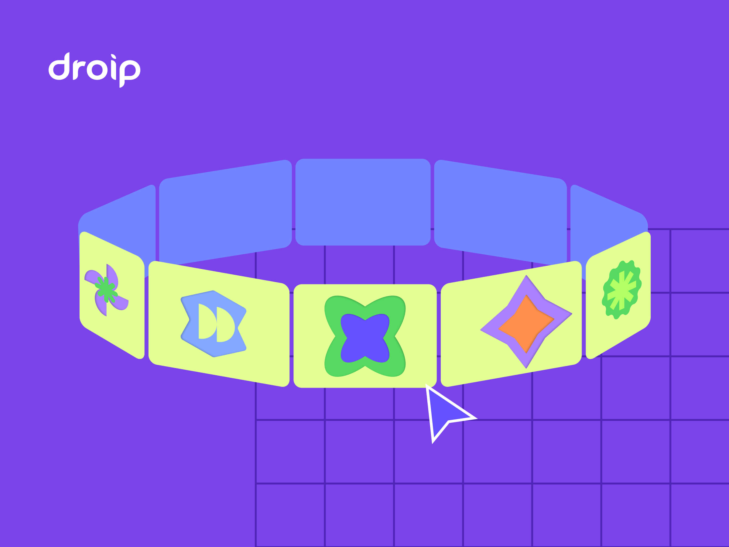
But what if your cards could float in 3D space and orbit around like planets on your WordPress site?
You read that right. Droip, the modern no-code website builder, now makes it possible to design immersive 3D interactions in WordPress without any third-party plugins or coding.
In this tutorial, you’ll build a 3D circular marquee (a rotating ring of cards that tilt, orbit, and feel alive), all inside Droip’s visual editor.
What We’re Building
Imagine a hula hoop standing upright in front of you.
Now, place 12 cards evenly around that hoop. As the hoop spins, cards travel around, some face you, some tilt away, and the one at the back hides in perspective.
This is the illusion we’ll create. A dynamic 3D ring of cards with Droip’s advanced transform and animation tools. See it live and get a feel for what you’ll be building.
You can use this 3D Marquee to showcase portfolios, products, or creative content as an example of the advanced interactions now possible in WordPress with a modern WordPress website builder.
Part 1: Planning The Key Pieces
Before we start creating, let’s plan out what we’ll need to make the 3D circular marquee work:
Stage (the hoop): A parent element that spins, carrying all the cards.
Cards (the orbiting items): Each card sits at a fixed angle around the circle.
Perspective: A visual depth setting that makes near cards appear closer and far ones smaller.
Tilt: A subtle rotation that gives realism to the motion.
Animation: The continuous rotation that makes the ring orbit infinitely.
Spacing Cards Around the Circle
We’ll have 12 cards around a 360° ring, meaning each card sits 30° apart. Think of it like clock positions:
Card 0: 0° (front)
Card 3: 90° (right side)
Card 6: 180° (back)
Card 9: 270° (left side)
Each card will be rotated by its angle and pushed outward to form the circular ring.
The 3D Transforms
Every card uses a combination of transforms to position correctly:
rotateY(angle), moveZ(radius)
Here’s what happens:
rotateY(angle): turns the card to its position around the circle.
moveZ(radius): moves it outward from the center onto the ring.
That’s all you need to place the cards evenly in a circle.
Why rotate, then move?
If you move Z first and then rotate Y, the translation happens in the element’s original space; rotating afterward will spin that translated offset around the origin and do something different.
The rotateY(angle) followed by moveZ(radius) means “turn the element to the angle, then push it out along its forward direction,” which places it on the circumference.
Part 2: Building the 3D Circular Marquee in the Droip Visual Editor
Now that you know how the structure works, let’s start building everything visually inside Droip.
Step 1: Create the Wrapper and base layout
Add a Div and rename it to Wrapper.
Set Width: 100%, Height: 100vh, and choose a nice background (solid or gradient).
Inside it, add two children:
Custom Cursor (Optional)
Banner (the section that holds our 3D Marquee)
Step 2: Create the custom cursor (Optional)
Next, we’ll add a custom cursor. Totally optional, but it gives your build that extra touch of uniqueness and polish.
Inside the Wrapper, add a Div and rename it Cursor.
Size: 32×32px, position it to absolute, top: 0, left: 0, z-index: 100.
Add a Shape element (your cursor visual) inside the Cursor div. Resize the shape element to 32×32px. You can add your preferred cursor shape by simply replacing the SVG.
For interactions (making this custom shape act like a cursor): Select the Cursor div and click on interaction:
Trigger: Scroll into view.
Animation: Cursor Trail.
Scope: Viewport.
Smoothing: 75%.
Now your cursor will smoothly follow your movement in preview mode.
Step 3: Create the Banner (base for marquee)
Inside the Wrapper, add another Div and rename it Banner.
Set up the following properties:
Width: 100vw
Height: 100vh
Position: relative
Z-index: 1
This Banner will serve as the main stage for your 3D Marquee. Later in the tutorial, we’ll add an interaction here for the click-to-scale zoom effect.
Step 4: Create the Container & 3D Transform wrapper
Now it’s time to set up the structure that will hold and control our 3D elements.
Inside the Banner, add a Div and rename it Container. This will act as the main layout holder for the 3D stage.
Configure the Container:
Width: 100%
Max-width: 800px
Margin: auto (to center it on the page)
Position: relative
Z-index: 2
Next, inside the Container, add another Div and rename it 3D Transform. This element will define the 3D space where all your cards will orbit.
Set the following properties:
Width/Height: 100%
Position: absolute; top: 0; left: 0
Z-index: 100
Now, in the Effects > Transform panel:
Enable Preserve 3D: this ensures all child elements (like your cards) exist in a true 3D environment.
Set Child Perspective to 9000px: this gives the illusion of depth, where closer objects appear larger and farther ones appear smaller.
Optionally, apply Scale X/Y: 0.8 if you want to reduce the overall stage size slightly.
In short, this step creates the 3D “space” your rotating cards will live in — like setting up the stage before the show begins.
Step 5: Create the 3D Marquee (Orbit Center)
Now we’ll create the core of the carousel, the rotating stage that all your cards will attach to.
Inside the 3D Transform, add a Div and rename it 3D Marquee. This element acts as the orbit center. When it spins, all the cards will revolve around it.
Set up the 3D Marquee as follows:
Width: 435px. This will be the size of the card
Height: auto
Position: relative
Enable Preserve 3D (so its child elements, the cards, maintain their depth in 3D space).
Rotate X: -10° – this slightly tilts the ring backward, giving a more natural perspective when viewed from the front.
Scale: X: 1, Y: 1
In simple terms: this is your spinning hub. When the animation runs, this element will rotate continuously, carrying all the cards with it to create that smooth, orbiting 3D effect.
Step 6: Create the Card Template (One Card Structure)
Next, we’ll build a single card that will serve as the template. Once complete, we’ll duplicate it 11 more times to complete the ring.
1. Create the Front Card
Inside 3D Marquee, add a Div and rename it Front Card.
Configure it:
Width/Height: 100% (the final position will be controlled via transforms)
Border-radius: 20px
Position: absolute
Enable Preserve 3D in the transforms panel
Note: This is the element where you’ll later apply rotateY(…) translateZ(orbitZ) to position it around the circle.
2. Add the 3D Container
Inside Front Card, add another Div and rename it to Card-3D. This acts as a 3D wrapper so we can rotate and position the card in space without affecting its internal layout.
Settings:
Width/Height: 100%
Position: relative
Z-index: 3
Enable Preserve 3D
3. Add the Popup (Visible Front Face)
Inside Card-3D, add a Div and rename it Popup. This holds the main content, the image or design that users interact with.
Settings:
Width/Height: 100%
Background: White
Border-radius: 20px
Inside Popup, add an Image element:
Width/Height: 100%
Border-radius: 12px
4. Add the Backface
Inside the Popup, add another Div and rename it Backface.
Settings:
Padding: 12px
Width/Height: 100%
Background: #FEDEFF
Border-radius: 20px
Position: absolute; top: 0; left: 0; z-index: 1 Transforms: Rotate Y = 180° (so it appears when the card flips)
Disable showing the real backside by toggling backface-visibility
Now you have a complete single card ready to be duplicated and positioned around the orbit. Each card will inherit the 3D rotation and spacing we’ll set in the next step.
Step 7: Duplicate Cards and Position Them Around the Orbit
Now that we have a single card ready, we’ll create all 12 cards for the carousel and place them evenly around the circular orbit.
Duplicate the Card-Template
Right-click on your Front Card and select Duplicate. This creates a new card that copies all the styles of the original card.
Duplicate the class holding the transform styles. This gives the new card its own separate class for rotation/position.
Do this 11 times so you have Card-1 through Card-12. Rename the cards
💡 Tip: Duplicating the card class is important so each card’s transform is independent.
Set Each Card’s Position with 3D Transforms
For each card, set the Transform fields (Rotate Y + Move Z). Use these exact values:
Front Card: rotateY(0deg), MoveZ(850px)
Card 1: rotateY( 30deg), MoveZ(850px)
Card 2: rotateY( 60deg), MoveZ(850px)
Card 3: rotateY( 90deg), MoveZ(850px)
Card 4: rotateY(120deg), MoveZ(850px)
Card 5: rotateY(150deg), MoveZ(850px)
Card 6: rotateY(180deg), MoveZ(850px)
Card 7: rotateY(-150deg), MoveZ(850px)
Card 8: rotateY(-120deg), MoveZ(850px)
Card 9: rotateY(-90deg), MoveZ(850px)
Card 10: rotateY(-60deg), MoveZ(850px)
Card 11: rotateY(-30deg), MoveZ(850px)
At this point, if Preserve 3D and Perspective are correctly set, you should see a ring of cards in 3D space.
Step 8: Animate the Orbit (Rotate the 3D Marquee)
Now that your cards are all in place, let’s bring the marquee to life by making it spin.
In the Layers panel, select Page, then go to Interactions and select Page Load.
Choose the 3D Marquee div as your animation target — this is the parent element that holds all the cards.
Add a Rotate action and set these values:
Duration: 30s (or any speed you like)
X: -10°
Y: 360°
Loop: Infinite
Hit Preview, and you’ll see your entire 3D ring smoothly spinning in space — just like a rotating carousel!
💡 Tip: The -10° tilt keeps the spin looking natural and adds depth to the orbit, rather than a flat, top-down rotation.
Step 9: Add Click-to-Scale Interaction on the Banner (Zoom Toggle)
Let’s make your 3D Marquee more fun to play with by adding a click-to-zoom effect, so users can zoom in and out of the carousel with a single click.
Select the Banner. This is the background container holding your 3D Marquee.
Go to Interactions and create a new one with:
Trigger: Mouse Click (Tap)
Target: 3D Transform
The Banner acts as the clickable area. When you click it, the animation targets the 3D Transform div (which contains everything inside the 3D scene).
Now we’ll set up a two-step toggle animation:
Step 1: First Click
Create two responses and name them:
We’re creating both Zoom In/Out and Zoom In/Out (Tab) because desktop and tablet screens behave differently. A zoom value that looks perfect on a wide desktop might push the 3D ring out of view or look oversized on a smaller tablet screen.
So by having two versions, Droip automatically applies the right animation depending on the device, keeping the zoom effect centered and balanced across all viewports.
Zoom In:
Scale X: 2, Y: 2
Move Y: -250
Zoom In (Tab):
Scale X: 1, Y: 1
Move Y: 0
Step 2: Second Click (Zoom Out)
Duplicate the first set and rename them:
Zoom Out:
Scale X: 0.8, Y: 0.8
Move Y: 0
Zoom Out (Tab):
Scale X: 0.4, Y: 0.4
Move Y: 0
Now, when you click anywhere on the Banner, the whole 3D scene smoothly zooms in and out, making it feel alive and responsive.
💡 Tip: Adjust the scale and movement values to find your perfect zoom balance for desktop and tablet views.
Final Preview
That’s it! You’ve just built a fully interactive 3D circular marquee inside Droip with no code, no plugins.
It might seem like a lot at first, but once you get the hang of it, you’ll realize how much power Droip gives you.
With this modern WordPress website builder, almost any advanced web interactions are now possible in WordPress, all visually.
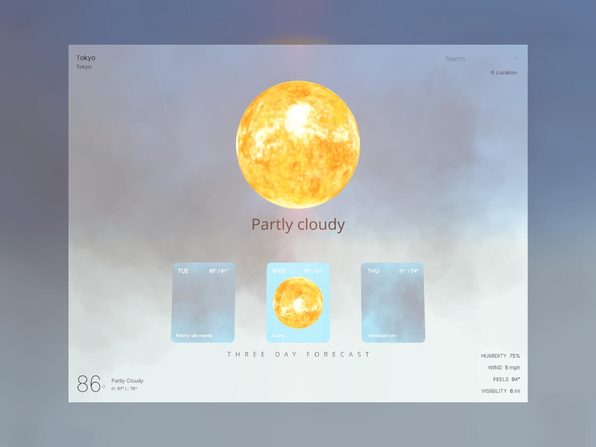
I’ve always been interested in data visualization using Three.js / R3F, and I thought a weather web app would be the perfect place to start. One of my favorite open-source libraries, @react-three/drei, already has a bunch of great tools like clouds, sky, and stars that fit perfectly into visualizing the weather in 3D.
This tutorial explores how to transform API data into a 3D experience, where we add a little flair and fun to weather visualization.
The Technology Stack
Our weather world is built on a foundation of some of my favorite technologies:
Weather Components
The heart of our visualization lies in conditionally showing a realistic sun, moon, and/or clouds based on the weather
results from your city or a city you search for, particles that simulate rain or snow, day/night logic, and some fun
lighting effects during a thunderstorm. We’ll start by building these weather components and then move on to displaying
them based on the results of the WeatherAPI call.
Sun + Moon Implementation
Let’s start simple: we’ll create a sun and moon component that’s just a sphere with a realistic texture wrapped
around it. We’ll also give it a little rotation and some lighting.
// Sun.js and Moon.js Component, a texture wrapped sphere
import React, { useRef } from 'react';
import { useFrame, useLoader } from '@react-three/fiber';
import { Sphere } from '@react-three/drei';
import * as THREE from 'three';

const Sun = () => {
  const sunRef = useRef();

  const sunTexture = useLoader(THREE.TextureLoader, '/textures/sun_2k.jpg');

  useFrame((state) => {
    if (sunRef.current) {
      sunRef.current.rotation.y = state.clock.getElapsedTime() * 0.1;
    }
  });

  const sunMaterial = new THREE.MeshBasicMaterial({
    map: sunTexture,
  });

  return (
    <group position={[0, 4.5, 0]}>
      <Sphere ref={sunRef} args={[2, 32, 32]} material={sunMaterial} />

      {/* Sun lighting */}
      <pointLight position={[0, 0, 0]} intensity={2.5} color="#FFD700" distance={25} />
    </group>
  );
};

export default Sun;
I grabbed the CC0 texture from here. The moon component is essentially the same; I used this image. The pointLight intensity is low because most of our lighting will come from the sky.
Rain: Instanced Cylinders
Next, let’s create a rain particle effect. To keep things performant, we’re going to use instancedMesh instead of creating a separate mesh component for each rain particle. We’ll render a single geometry (<cylinderGeometry>) multiple times with different transformations (position, rotation, scale). Also, instead of creating a new THREE.Object3D for each particle in every frame, we’ll reuse a single dummy object. This saves memory and prevents the overhead of creating and garbage-collecting a large number of temporary objects within the animation loop. We’ll also use the useMemo hook to create and initialize the particles array only once when the component mounts.
When a particle reaches a negative Y-axis level, it’s immediately recycled to the top of the scene with a new random horizontal position, creating the illusion of continuous rainfall without constantly creating new objects.
Snow: Physics-Based Tumbling
We’ll use the same basic template for the snow effect, but instead of the particles falling straight down, we’ll give them some drift.
The horizontal drift uses Math.sin(state.clock.elapsedTime + i), where state.clock.elapsedTime provides a continuously increasing time value and i offsets each particle’s timing. This creates a natural swaying motion in which each snowflake follows its own path. The rotation updates apply small increments to both the X and Y axes, creating the tumbling effect.
Storm System: Multi-Component Weather Events
When a storm rolls in, I wanted to simulate dark, brooding clouds and flashes of lightning. This effect requires combining multiple weather effects simultaneously. We’ll import our rain component, add some clouds, and implement a lightning effect with a pointLight that simulates flashes of lightning coming from inside the clouds.
The lightning system uses a simple ref-based cooldown mechanism to prevent constant flashing. When lightning triggers, it creates a single bright flash with random positioning. The system uses setTimeout to reset the light intensity after 400ms, creating a realistic lightning effect without complex multi-stage sequences.
Clouds: Drei Cloud
For weather types like cloudy, partly cloudy, overcast, foggy, rainy, snowy, and misty, we’ll pull in our clouds component. I wanted the storm component to have its own clouds because storms should have darker clouds than the conditions above. The clouds component will simply display Drei clouds, and we’ll pull it all together with the sun or moon component in the next section.
Now that we’ve built our weather components, we need a system to decide which ones to display based on real weather data. The WeatherAPI.com service provides detailed current conditions that we’ll transform into our 3D scene parameters. The API gives us condition text like “Partly cloudy,” “Thunderstorm,” or “Light snow,” but we need to convert these into our component types.
// weatherService.js - Fetching real weather data
const response = await axios.get(
  `${WEATHER_API_BASE}/forecast.json?key=${API_KEY}&q=${location}&days=3&aqi=no&alerts=no&tz=${Intl.DateTimeFormat().resolvedOptions().timeZone}`,
  { timeout: 10000 }
);
The API request includes time zone information so we can accurately determine day or night for our Sun/Moon system. The days=3 parameter grabs forecast data for our portal feature, while aqi=no&alerts=no keeps the payload lean by excluding data we don’t need.
Converting API Conditions to Component Types
The heart of our system is a simple parsing function that maps hundreds of possible weather descriptions to our manageable set of visual components:
// weatherService.js - Converting weather text to renderable types
export const getWeatherConditionType = (condition) => {
  const conditionLower = condition.toLowerCase();

  if (conditionLower.includes('sunny') || conditionLower.includes('clear')) {
    return 'sunny';
  }
  if (conditionLower.includes('thunder') || conditionLower.includes('storm')) {
    return 'stormy';
  }
  if (conditionLower.includes('cloud') || conditionLower.includes('overcast')) {
    return 'cloudy';
  }
  if (conditionLower.includes('rain') || conditionLower.includes('drizzle')) {
    return 'rainy';
  }
  if (conditionLower.includes('snow') || conditionLower.includes('blizzard')) {
    return 'snowy';
  }
  // ... additional fog and mist conditions
  return 'cloudy';
};
This string-matching approach handles edge cases gracefully—whether the API returns “Light rain,” “Heavy rain,” or “Patchy light drizzle,” they all map to our rainy type and trigger the appropriate 3D effects. This way, we can reuse our main components without needing a separate component for each weather condition.
Conditional Component Rendering
The magic happens in our WeatherVisualization component, where the parsed weather type determines exactly which 3D components to render:
// WeatherVisualization.js - Bringing weather data to life
const renderWeatherEffect = () => {
  if (weatherType === 'sunny') {
    if (partlyCloudy) {
      return (
        <>
          {isNight ? <Moon /> : <Sun />}
          <Clouds intensity={0.5} speed={0.1} />
        </>
      );
    }
    return isNight ? <Moon /> : <Sun />;
  } else if (weatherType === 'rainy') {
    return (
      <>
        <Clouds intensity={0.8} speed={0.15} />
        <Rain count={800} />
      </>
    );
  } else if (weatherType === 'stormy') {
    return <Storm />; // Includes its own clouds, rain, and lightning
  }
  // ... additional weather types
};
This conditional system ensures we only load the particle systems we actually need. A sunny day renders just our Sun component, while a storm loads our complete Storm system with heavy rain, dark clouds, and lightning effects. Each weather type gets its own combination of the components we built earlier, creating distinct visual experiences that match the real weather conditions.
Dynamic Time-of-Day System
Weather isn’t just about conditions—it’s also about timing. Our weather components need to know whether to show the sun or moon, and we need to configure Drei’s Sky component to render the appropriate atmospheric colors for the current time of day. Fortunately, our WeatherAPI response already includes the local time for any location, so we can extract that to drive our day/night logic.
The API provides local time in a simple format that we can parse to determine the current period:
// Scene3D.js - Parsing time from weather API data
const getTimeOfDay = () => {
  if (!weatherData?.location?.localtime) return 'day';
  const localTime = weatherData.location.localtime;
  const currentHour = new Date(localTime).getHours();

  if (currentHour >= 19 || currentHour <= 6) return 'night';
  if (currentHour >= 6 && currentHour < 8) return 'dawn';
  if (currentHour >= 17 && currentHour < 19) return 'dusk';
  return 'day';
};
This gives us four distinct time periods, each with different lighting and sky configurations. Now we can use these periods to configure Drei’s Sky component, which handles atmospheric scattering and generates realistic sky colors.
Dynamic Sky Configuration
Drei’s Sky component is fantastic because it simulates actual atmospheric physics—we just need to adjust atmospheric parameters for each time period:
// Scene3D.js - Time-responsive Sky configuration
{timeOfDay !== 'night' && (
  <Sky
    sunPosition={(() => {
      if (timeOfDay === 'dawn') {
        return [100, -5, 100]; // Sun below horizon for darker dawn colors
      } else if (timeOfDay === 'dusk') {
        return [-100, -5, 100]; // Sun below horizon for sunset colors
      } else { // day
        return [100, 20, 100]; // High sun position for bright daylight
      }
    })()}
    inclination={(() => {
      if (timeOfDay === 'dawn' || timeOfDay === 'dusk') {
        return 0.6; // Medium inclination for transitional periods
      } else { // day
        return 0.9; // High inclination for clear daytime sky
      }
    })()}
    turbidity={(() => {
      if (timeOfDay === 'dawn' || timeOfDay === 'dusk') {
        return 8; // Higher turbidity creates warm sunrise/sunset colors
      } else { // day
        return 2; // Lower turbidity for clear blue sky
      }
    })()}
  />
)}
The magic happens in the positioning. During dawn and dusk, we place the sun just below the horizon (-5 Y position) so Drei’s Sky component generates those warm orange and pink colors we associate with sunrise and sunset. The turbidity parameter controls atmospheric scattering, with higher values creating more dramatic color effects during transitional periods.
Nighttime: Simple Black Background + Stars
For nighttime, I made a deliberate choice to skip Drei’s Sky component entirely and use a simple black background instead. The Sky component can be computationally expensive, and for nighttime scenes, a pure black backdrop actually looks better and performs significantly faster. We complement this with Drei’s Stars component for that authentic nighttime atmosphere:
Drei’s Stars component creates 5,000 individual stars scattered across a 100-unit sphere with realistic depth variation. The saturation={0} keeps them properly desaturated for authentic nighttime visibility, while the gentle speed={1} creates subtle movement that simulates the natural motion of celestial bodies. Stars only appear during nighttime hours (7 PM to 6 AM) and automatically disappear at dawn, creating a smooth transition back to Drei’s daytime Sky component.
This approach gives us four distinct atmospheric moods—bright daylight, warm dawn colors, golden dusk tones, and star-filled nights—all driven automatically by the real local time from our weather data.
Forecast Portals: Windows Into Tomorrow’s Weather
Like any good weather app, we don’t want to just show current conditions but also what’s coming next. Our API returns a three-day forecast that we transform into three interactive portals hovering in the 3D scene, each one showing a preview of that day’s weather conditions. Click on a portal and you’re transported into that day’s atmospheric environment.
Building Portals with MeshPortalMaterial
The portals use Drei’s MeshPortalMaterial, which renders a complete 3D scene to a texture that gets mapped onto a plane. Each portal becomes a window into its own weather world:
The roundedPlaneGeometry from the maath library gives our portals those smooth, organic edges instead of sharp rectangles. The [2, 2.5, 0.15] parameters create a 2×2.5 unit portal with 0.15 radius corners, providing enough rounding to look visually appealing.
Interactive States and Animations
Portals respond to user interaction with smooth state transitions. The system tracks two primary states: inactive and fullscreen:
// ForecastPortals.js - State management and blend animations
const ForecastPortal = ({ position, dayData, isActive, isFullscreen, onEnter }) => {
  const materialRef = useRef();

  useFrame(() => {
    if (materialRef.current) {
      // Smooth blend animation - only inactive (0) or fullscreen (1)
      const targetBlend = isFullscreen ? 1 : 0;
      materialRef.current.blend = THREE.MathUtils.lerp(
        materialRef.current.blend || 0,
        targetBlend,
        0.1
      );
    }
  });

  // Portal content and UI elements hidden in fullscreen mode
  return (
    <group position={position}>
      <mesh onClick={onEnter}>
        <roundedPlaneGeometry args={[2, 2.5, 0.15]} />
        <MeshPortalMaterial ref={materialRef}>
          <PortalScene />
        </MeshPortalMaterial>
      </mesh>

      {!isFullscreen && (
        <>
          {/* Temperature and condition text only show in preview mode */}
          <Text position={[-0.8, 1.0, 0.1]} fontSize={0.18} color="#FFFFFF">
            {formatDay(dayData.date, index)}
          </Text>
        </>
      )}
    </group>
  );
};
The blend property controls how much the portal takes over your view. At 0 (inactive), you see the portal as a framed window into the weather scene. At 1 (fullscreen), you’re completely transported inside that day’s weather environment. The THREE.MathUtils.lerp function creates smooth transitions between these two states when clicking in and out of portals.
Fullscreen Portal Experience
When you click a portal, it fills your entire view with that day’s weather. Instead of looking at tomorrow’s weather through a window, you’re standing inside it:
In fullscreen mode, the portal weather data drives the entire scene: the Sky component, lighting, and all weather effects now represent that forecasted day. You can orbit around inside tomorrow’s storm or bask in the gentle sunlight of the day after. When you exit (click outside the portal), the system smoothly transitions back to the current weather conditions.
The key insight is that each portal runs our same WeatherVisualization component but with forecast data instead of current conditions. The portalMode={true} prop optimizes the components for smaller render targets—fewer particles, simpler clouds, but the same conditional logic we built earlier.
Now that we’ve introduced portals, we need to update our weather components to support this optimization. Going back to our conditional rendering examples, we add the portalMode prop:
And our Clouds component is updated to render fewer, simpler clouds in portal mode:
// Clouds.js - Portal optimization
const Clouds = ({ intensity = 0.7, speed = 0.1, portalMode = false }) => {
  if (portalMode) {
    return (
      <DreiClouds material={THREE.MeshLambertMaterial}>
        {/* Only 2 centered clouds for portal preview */}
        <Cloud segments={40} bounds={[8, 3, 3]} volume={8} position={[0, 4, -2]} />
        <Cloud segments={35} bounds={[6, 2.5, 2.5]} volume={6} position={[2, 3, -3]} />
      </DreiClouds>
    );
  }
  // Full cloud system for main scene (6+ detailed clouds)
  return <group>{/* ... full cloud configuration ... */}</group>;
};
This dramatically reduces both particle counts (87.5% fewer rain particles) and cloud complexity (a 67% reduction from 6 detailed clouds to 2 centered clouds), ensuring smooth performance when multiple portals show weather effects simultaneously.
Integration with Scene3D
The portals are positioned and managed in our main Scene3D component, where they complement the current weather visualization:
// Scene3D.js - Portal integration
<>
  {/* Current weather in the main scene */}
  <WeatherVisualization
    weatherData={weatherData}
    isLoading={isLoading}
  />

  {/* Three-day forecast portals */}
  <ForecastPortals
    weatherData={weatherData}
    isLoading={isLoading}
    onPortalStateChange={handlePortalStateChange}
  />
</>
When you click a portal, the entire scene transitions to fullscreen mode, showing that day’s weather in complete detail. The portal system tracks active states and handles smooth transitions between preview and immersive modes, creating a seamless way to explore future weather conditions alongside the current atmospheric environment.
The portals transform static forecast numbers into explorable 3D environments. Instead of reading “Tomorrow: 75°, Partly Cloudy,” you see and feel the gentle drift of cumulus clouds with warm sunlight filtering through.
Adding Cinematic Lens Flares
Our Sun component looks great, but to really make it feel cinematic, I wanted to implement a subtle lens flare effect. For this, I’m using the R3F-Ultimate-Lens-Flare library (shoutout to Anderson Mancini), which I installed manually by following the repository’s instructions. While lens flares typically work best with distant sun objects rather than our close-up approach, I still think it adds a nice cinematic touch to the scene.
The lens flare system needs to be smart about when to appear. Just like our weather components, it should only show when it makes meteorological sense:
The key parameters create a realistic lens flare effect: glareSize and flareSize both at 1.68 give prominent but not overwhelming flares, while ghostScale={0.03} adds subtle lens reflection artifacts. The haloScale={3.88} creates that large atmospheric glow around the sun.
The lens flare connects to our weather system through a visibility function that determines when the sun should be visible:
// weatherService.js - When should we show lens flares?
export const shouldShowSun = (weatherData) => {
  if (!weatherData?.current?.condition) return true;
  const condition = weatherData.current.condition.text.toLowerCase();

  // Hide lens flare when weather obscures the sun
  if (condition.includes('overcast') ||
      condition.includes('rain') ||
      condition.includes('storm') ||
      condition.includes('snow')) {
    return false;
  }

  return true; // Show for clear, sunny, partly cloudy conditions
};

// Scene3D.js - Combining weather and time conditions
const showLensFlare = useMemo(() => {
  if (isNight || !weatherData) return false;
  return shouldShowSun(weatherData);
}, [isNight, weatherData]);
This creates realistic behavior where lens flares only appear during daytime clear weather. During storms, the sun (and its lens flare) is hidden by clouds, just like in real life.
Performance Optimizations
Since we’re rendering thousands of particles, multiple cloud systems, and interactive portals—sometimes simultaneously—it can get expensive. As mentioned above, all our particle systems use instanced rendering to draw thousands of raindrops or snowflakes in single GPU calls. Conditional rendering ensures we only load the weather effects we actually need: no rain particles during sunny weather, no lens flares during storms. However, there’s still a lot of room for optimization. The most significant improvement comes from our portal system’s adaptive rendering. We already discussed decreasing the number of clouds in portals above, but when multiple forecast portals show precipitation simultaneously, we dramatically reduce particle counts.
This prevents the less-than-ideal scenario of rendering 4 × 800 = 3,200 rain particles when all portals show rain. Instead, we get 800 + (3 × 100) = 1,100 total particles while maintaining the visual effect.
API Reliability and Caching
Beyond 3D performance, we need the app to work reliably even when the weather API is slow, down, or rate-limited. The system implements smart caching and graceful degradation to keep the experience smooth.
Intelligent Caching
Rather than hitting the API for every request, we cache weather responses for 10 minutes:
This gives users instant responses for recently searched locations and keeps the app responsive during API slowdowns.
Rate Limiting and Fallback
When users exceed our 15 requests per hour limit, the system smoothly switches to demo data instead of showing errors:
// weatherService.js - Graceful degradation
if (error.response?.status === 429) {
  console.log('Too many requests');
  return getDemoWeatherData(location);
}
The demo data includes time-aware day/night detection, so even the fallback experience shows proper lighting and sky colors based on the user’s local time.
Future Enhancements
There’s plenty of room to expand this weather world. Adding accurate moon phases would bring another layer of realism to nighttime scenes—right now our moon is perpetually full. Wind effects could animate vegetation or create drifting fog patterns, using the wind speed data we’re already fetching but not yet visualizing. Performance-wise, the current optimizations handle most scenarios well, but there’s still room for improvement, especially when all forecast portals show precipitation simultaneously.
Conclusion
Building this 3D weather visualization combined React Three Fiber with real-time meteorological data to create something beyond a traditional weather app. By leveraging Drei’s ready-made components alongside custom particle systems, we’ve transformed API responses into explorable atmospheric environments.
The technical foundation combines several key approaches:
Instanced rendering for particle systems that maintain 60fps while simulating thousands of raindrops
Conditional component loading that only renders the weather effects currently needed
Portal-based scene composition using MeshPortalMaterial for forecast previews
Time-aware atmospheric rendering with Drei’s Sky component responding to local sunrise and sunset
Smart caching and fallback systems that keep the experience responsive during API limitations
This was something I always wanted to build, and I had a ton of fun bringing it to life!
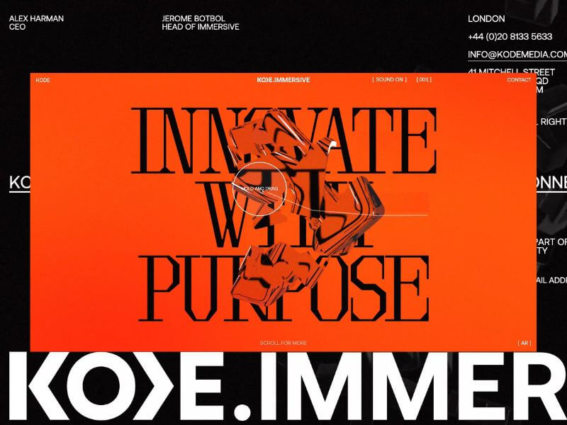
KODE Immersive fuses AR, VR, real-time 3D, and spatial computing to craft high-impact, interactive experiences. It’s not just a platform – it’s a portal. Designed to ignite emotion, shatter expectations, and redefine digital engagement.
Our challenge? To bring this pioneering vision to life, not just by explaining what KODE Immersive is, but by making visitors experience what it’s like to be inside it.
Background
Our relationship with KODE began in 2022 when we extended their brand identity and reimagined their digital home. What started as a brand refresh quickly evolved into a creative partnership rooted in shared values and a mutual obsession with crafted brand experience and beautiful design.
In late 2024, KODE approached us with a new venture. This time, they were diving headfirst into emerging technologies (AI, WebXR, and real-time 3D) to expand their service offering. We knew immediately, this was the kind of project you dream about. It was a timely opportunity and got us excited to push boundaries.
The Brief
The brief was as open as it gets. Beyond a few core objectives (namely, budget and timeline), there were no strict constraints. We received a three-slide deck: a name, a positioning statement, three brand pillars (CREATE, IDEATE, DELIVER), and a few straplines.
No case studies. No visual identity. Just a bold vision.
And that freedom became our greatest asset. We built everything from scratch, visual language, tone, interactions, while staying mindful of budget and speed. Our approach: move fast, iterate often, and push boundaries.
To pull it off, we adopted a phased R&D process. We teamed up with the brilliant Francesco Michelini (who previously helped build the Malvah website). Francesco lives and breathes WebGL. He once spent a week refining a mechanic we had already agreed to abandon, just because he couldn’t accept defeat. That kind of drive made him the perfect collaborator.
Our Process
We used KODE Immersive as a live testing ground for our refined four-phase process, aimed at delivering the best creative solutions while avoiding unnecessary feedback loops. Here’s how it shaped the final outcome.
01 Discover
We kicked things off with an in-depth strategy session where we unpacked the brief, explored concepts, discussed competitors, and mapped out technical possibilities. Style tiles helped form the foundation of our visual language.
Typography was the key differentiator. We knew the right typeface would communicate innovation and intent. After multiple rounds, we landed on Brut by Off-Type – an unconventional mono-inspired form that struck just the right balance of structure and tension.
Colour took cues from the parent brand, but we flipped the hierarchy. Orange became the dominant tone, with bold black moments layered throughout. Familiar, yet distinctive.
Iconography evolved from KODE’s chevron mark. We repurposed it as a modular, dynamic system to guide interactions and reflect the brand’s three core pillars.
02 Create
This phase became interesting, since the experience would rely heavily on user interaction, this phase was driven more by prototyping than traditional design. We worked in tight, iterative loops with the client, across design, 3D, and development to test feasibility early and often. It became an it was extremely organic process and ideal to reach the deadline while stretching limitations.
From the start, we knew we didn’t just want users to interact—we wanted them to feel immersed. To lose track of time by being emotionally and mentally engaged.
We developed a range of 3D concepts in Cinema 4D and funnelled them through R&D cycles. The process required a lot of iterating and relooking creative solutions, but was always collaborative – and ultimately, essential for innovation.
03 Craft
This is where the magic happens.
Our craft is what we consider our special sauce at Malvah – this is where we like to push, refine, and design with intent and clarity. It’s hard not to get lost in the sauce. Massive respect for Francesco during this phase as it is the most intense in terms of iterations, from shader logic to ambient lighting to the haptic quality of cursor interactions, and every component was built to feel immersive yet effortless. Luckily, Francesco is an actual living wizard and provided us with testing environments where we could craft all these elements seamlessly.
Still, something was missing! The high-fidelity 3D was clashing with the flat backgrounds. The fix? A subtle layer of pixel distortion and soft noise texture. Minimal, but transformative. Suddenly, the whole experience felt unified – like everything belonged as one unified, harmonious experience.
04 Deliver
By final QA, most of the heavy lifting was done. We stress-tested performance across browsers, devices, and connection speeds. We refined micro-interactions and polished details based on early user feedback.
Tech Stack
Nerd stuff alert.
From the outset, this was always going to be a Three.js and WebGL project – not for the novelty, but for the storytelling power. Real-time 3D let us turn a static brand into a living, breathing experience. We used Cinema 4D for concepting and prototyping, from early ideation through to final modelling and meta-cap creation.
One of the most impactful performance optimisations came through the use of BatchedMesh, which enabled us to draw multiple meshes sharing the same material in a single draw call. Since draw calls are among the most expensive operations in WebGL, this dramatically improved efficiency, reducing calls from 40 or 50 down to just one. You’ll see this in action in both the hero section and the footer, where we also implemented the Rapier physics engine for dynamic interaction.
The real breakthrough, however, was moving the rendering of our most resource-intensive canvases to an OffscreenCanvas, with all related logic handled inside a WebWorker. This shift happened later in the project and required significant reworking, but the gains in performance and responsiveness were undeniable. It was a technically ambitious move, but one that paid off.
Features
The site follows a continuous scroll narrative—a careful dance between interactivity, emotion, and information. With the primary goal to provoke curiosity and invite deep engagement, rom top to bottom, here’s a rundown of our favourite features.
Chevron
We land on the hero of the brand, the logo-mark. The chevron is the anchor, both literally and metaphorically. The driving force behind the iconography that would funnel through the experience. We wanted the entry point to set the tone, bold, dynamic, and intuitive for the user to explore.
Shifting Text
One of those happy accidents. Inspired by a line that didn’t make the final copy, we developed a mechanic where text splits and shifts as the cursor moves. A metaphor for deconstruction and reformation – fluid, dynamic, alive.
Icons
A playful space to explore, discover, and interact. Designed to echo the brand’s chevron and embody its core pillars.
Menu
One of our favourite elements. It subverts the typical UX pattern by growing from the base and transforming into the footer as users scroll; a small disruption that makes a big impact.
SFX
Sound is often the unsung hero. We follow the 80/20 rule here, also known as the Pareto Principle —just the right amount to amplify emotion without overwhelming the experience. From section transitions to hover feedback, the layered soundscape adds depth and atmosphere. The transition from the landing section to the services has the user feeling as if they are entering a new realm.
We worked with Martin Leitner from Sounds Good to curate the sound elements in aiding the experience and bringing the interaction with the 3D elements to life. This was such a great experience, and Martin’s enthusiasm helped drive the process and the team’s excitement.
Easter Egg
We always planned for an easter egg, we just didn’t know what it was until it revealed itself.
A sketch mechanic, pulled from KODE’s visual identity, was integrated into the cursor. Users can draw on the screen to reveal a hidden layer; a playful nod to the analogue-digital duality of the brand.
Early testers were missing it entirely. So we added a subtle auto-activation trigger at just the right moment. Problem solved.
Reflections
This project reminded us that the best results often emerge from ambiguity. No case studies. No visual assets. No roadmap. Just vision and trust.
While we’re proud of what we’ve delivered, we’ve only scratched the surface. Phase Two will introduce interactive case studies and deeper storytelling. We’re especially excited to explore a z-axis scroll journey through each service, bringing dimension and discovery to the next level.For now, KODE Immersive is live.


