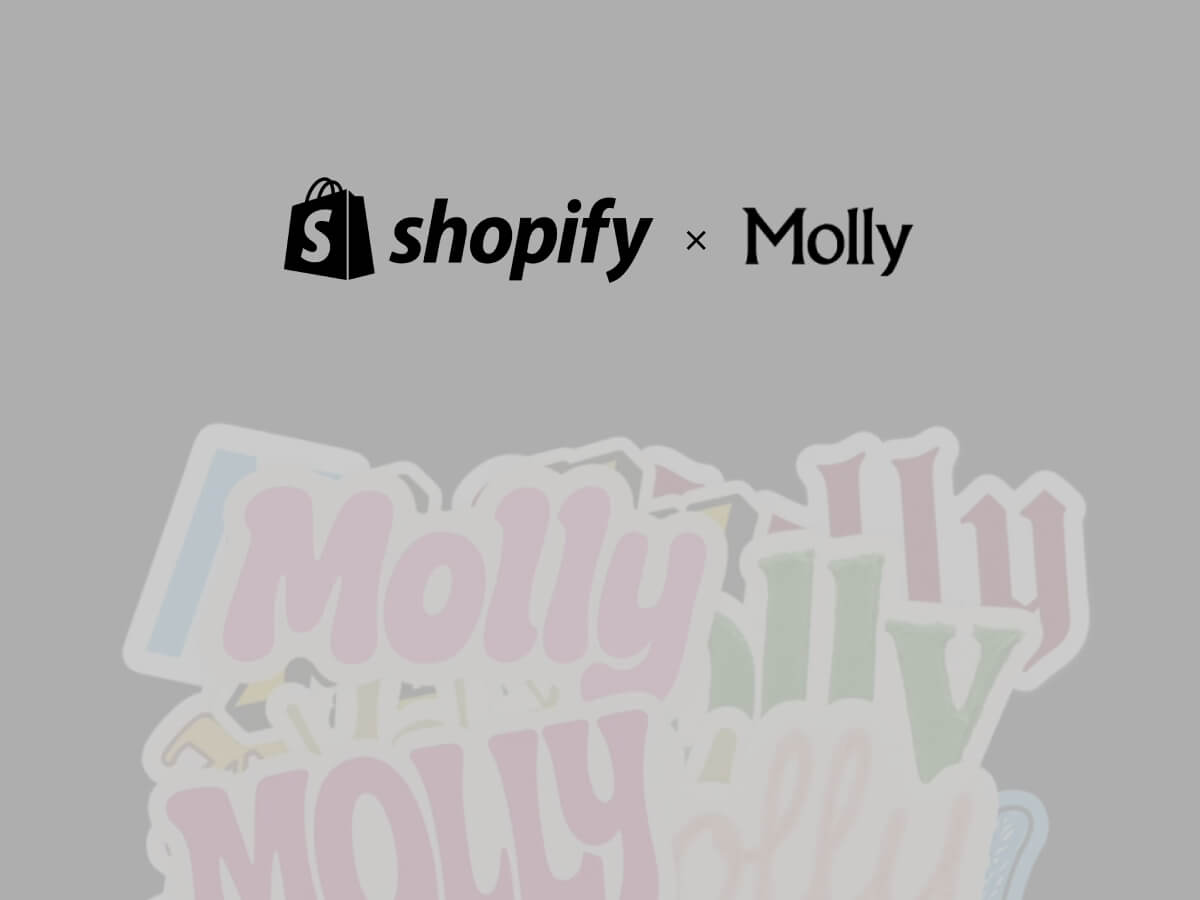
When the conversation turns to artificial intelligence, many assume that design is one of the professions most at risk of automation. But Shopify’s latest move sends a very different message. The e-commerce giant has revived the role of Chief Design Officer earlier this year and acquired Brooklyn-based creative studio Molly — signaling that, far from being diminished, design will sit at the center of its AI strategy.
At the helm is Carl Rivera, Shopify’s Chief Design Officer, who believes this moment is an inflection point not just for the company, but for the design industry as a whole.
Big news! Shopify has acquired https://t.co/ZeDYX1vHqm, to launch Shopify Product Design Studio. Their mission is simple: work together with our teams to deliver 10/10 product experiences. Thread (1/6)
“At a time when the market is saying maybe you don’t need designers anymore,” Rivera told me, “we’re saying the opposite. They’ve never been more important than they are right now.”
A Statement of Intent
Shopify has a long history of treating design as a strategic advantage. In its early days, co-founder Daniel Weinand held the title of Chief Design Officer and helped shape Shopify’s user-first approach. But when Weinand left the company, the role disappeared — until now.
Bringing it back, Rivera argues, is both symbolic and practical. “It’s really interesting to consider that the moment Shopify decides to reinstate the Chief Design Officer role is at the dawn of AI,” he said. “That’s not a coincidence.”
For Rivera, design is the best tool for navigating uncertainty. “When you face ambiguity and don’t know where the world is going, there’s no better way to imagine that future than through design,” he explained. “Design turns abstract ideas into something you can hold and touch, so everyone can align on the same vision.”
Why Molly?
Central to Shopify’s announcement is the acquisition of Molly, the Brooklyn-based design studio co-founded by Jaytel and Marvin Schwaibold. Known for their experimental but disciplined approach, Molly has collaborated with Shopify in the past.
Rivera recalled how the deal came together almost organically. “I was having dinner with Marvin, and we were talking about the future I wanted to build at Shopify. The alignment was immediate. It was like — of course we should do this together. We could go faster, go further, and it would be more fun.”
The studio will operate as an internal agency, but Rivera is careful to stress that Molly won’t exist in isolation. “What attracted me to Molly is not just their output, but their culture,” he said. “That culture is exactly the one we want to spread across Shopify. They’ll be a cultural pillar that helps manifest the ways of working we want everyone to embrace.”
Importantly, the internal agency won’t replace Shopify’s existing design teams. Instead, it will augment them in moments that call for speed, experimentation, or tackling problems shaped by AI. “If something changes in the market and we need to respond quickly, Molly can embed with a team for a few months, supercharging their generative process,” Rivera explained.
Redefining AI + Design
Rivera is energized by the possibilities of AI and how it can transform the way people interact with technology. While today’s implementations often serve as early steps in that journey, he believes the real opportunity lies in what comes next.
He acknowledges that many current products still treat AI as an add-on. “You have the product, which looks the same as it has for ten years, and then a little panel next to it that says AI. That can’t be the future,” Rivera said.
For him, these early patterns are just the beginning — a foundation to build on. He envisions AI woven deeply into user experiences, reshaping interaction patterns themselves. “If AI had existed ten years ago, I don’t believe products would look the way they do today. We need to move beyond chat as the default interface and create experiences where AI feels native, invisible, and context-aware.”
That, he argues, is where design proves indispensable. “It’s designers who will define the interaction patterns of AI in commerce. This is our role: to make the abstract real, to imagine the future, and to bring it into the present.”
Measuring Success: Subjective by Design
In a world obsessed with metrics, Rivera offers a refreshingly contrarian view of how design success should be measured.
“Designers have often felt insecure, so they chase numbers to prove their value,” he said. “But to me, the most important measure isn’t a KPI. It’s whether the work feels right. Are we proud of it? Did it accelerate our vision? Does it make the product more delightful? I’m comfortable leaning on instinct.”
That doesn’t mean ignoring business outcomes. But Rivera wants his teams to be guided first by craft, ambition, and impact on user experience — not by dashboards.
Advice for Designers in an AI Era
For independent designers and studio owners — many of whom worry that AI might disrupt their livelihoods — Rivera offers encouragement.
He believes the most valuable skill today is adaptability: “The best trait a designer can have right now is the ability to quickly learn a new problem and generate many different options. That’s what the agency world trains you to do, and it’s exactly what big companies like Shopify need.”
In fact, Rivera sees agency and freelance experience as increasingly attractive in large-scale design hiring. “People who have jumped between many problems quickly bring a unique skill set. That adaptability is crucial when technology and user expectations are changing so fast.”
The Ambition at Shopify
Rivera is clear about his mandate. He sums it up in three goals:
Build the place where the world’s best designers choose to work.
Enable them to do the best work of their careers.
Define the future interaction patterns of AI in commerce.
It’s an ambitious vision, but one he believes is within reach. “Ambition begets ambition,” he told his team in a recent message. “By raising expectations for ourselves and each other, we’ll attract people who want that environment, and they’ll keep raising the bar.”
For Shopify, investing in design now goes beyond aesthetics. It is about shaping the future of commerce itself. As Rivera put it:
“We don’t need to dream up sci-fi scenarios. The future is already here — just unevenly distributed. Our job is to bring it into the hands of entrepreneurs and make it usable for everyone.”
Borrowing from William Gibson’s famous line, Rivera frames Shopify’s bet on Molly and design as a way of redistributing that future, through creativity, craft, and culture.
When two creatives collaborate, the design process becomes a shared stage — each bringing their own strengths, perspectives, and instincts. This project united designer/art director Artem Shcherban and 3D/motion designer Andrew Moskvin to help New York–based scenographer and costume designer Christian Fleming completely reimagine how his work is presented.
What began as a portfolio refresh evolved into a cohesive visual system: a rigorously minimal print catalog, a single-page website concept, and a cinematic 3D visualization. Together, Artem and Andrew shaped an experience that distilled Christian’s theatrical sensibility into clear, atmospheric design across both physical and digital formats.
From here, Artem picks up the story, walking us through how he approached the portfolio’s structure, the visual rules it would live by, and the thinking that shaped both its print and on-screen presence.
Starting the Design Conversation
Christian Fleming is a prominent designer and director based in New York City who works with theaters around the world creating visual spaces for performances. He approached me with a challenge: to update and rethink his portfolio, to make it easy to send out to theater directors and curators. Specifically the print format.
Christian had a pretty clear understanding of what he wanted to show and how it should look: rigid Scandinavian minimalism, extreme clarity of composition, a minimum of elements and a presentation that would be understandable to absolutely anyone – regardless of age, profession or context.
It was important to create a system that would:
be updated regularly (approximately every 3 weeks),
adapt to new projects,
and at the same time remain visually and semantically stable.
There also needed to be an “About Christian” section in the structure, but this too had to fit within a strict framework of visual language.
Designing a Flexible Visual System
I started by carefully analyzing how Christian works. His primary language is visual. He thinks in images, light, texture and composition. So it was important to retain a sense of air and rhythm, but build a clear modular structure that he could confidently work with on his own.
We came up with a simple adaptive system:
it easily adapts to images of different formats,
scalable for everything from PDFs to presentations,
and can be used both digitally and offline.
In the first stages, we tried several structures. However, Christian still felt that there was something missing in the layout – the visuals and logic were in conflict. We discussed which designs he wanted to show openly and which he didn’t. Some works had global reviews and important weight, but could not be shown in all details.
The solution was to divide them into two meaningful blocks:
“Selected Projects”, with full submission, and “Archival Projects”, with a focus on awards, reviews, and context. This approach preserved both structure and tone. The layout became balanced – and Christian immediately responded to this.
After gathering the structure and understanding how it would work, we began creating the design itself and populating it with content. It was important from the start to train Kristan to add content on his own, as there was a lot of project and they change quite often.
One of the key pluses of our work is versatility. Not only could the final file be emailed, but it could also be used as a print publication. This gave Christian the opportunity to give physical copies at meetings, premieres and professional events where tactility and attention to detail are important.
Christian liked the first result, both in the way the system was laid out and the way I approached the task. Then I suggested: let’s update the website as well.
Translating the Portfolio to a Single-Page Site
This phase proved to be the most interesting, and the most challenging.
Although the website looks simple, it took almost 3 months to build. From the very beginning, Christian and I tried to understand why he needed to update the site and how it should work together with the already established portfolio system.
The main challenge was to show the visual side of his projects. Not just text or logos, but the atmosphere, the light, the costumes, the feeling of the scene.
One of the restrictions that Christian set was the requirement to make the site as concise as possible, without a large number of pages, or better to limit it to one, and without unnecessary transitions. It had to be simple, clear and intuitive, but still user-friendly and quite informative. This was a real challenge, given the amount of content that needed to be posted.
Designing with Stage Logic
One of the key constraints that started the work on the site was Christian’s wish: no multiple pages. Everything had to be compact, coherent, clear and yet rich. This posed a special challenge. It was necessary to accommodate a fairly large amount of information without overloading the perception.
I proposed a solution built on a theatrical metaphor: as in a stage blackout, the screen darkens and a new space appears. Each project becomes its own scene, with the user as a spectator — never leaving their seat, never clicking through menus. Navigation flows in smooth, seamless transitions, keeping attention focused and the emotional rhythm intact.
Christian liked the idea, but immediately faced a new challenge: how to fit everything important on one screen:
a short text about him,
social media links and a resume,
the job title and description,
and, if necessary, reviews.
At the same time, the main visual content – photos and videos – had to remain in the center of attention and not overlap with the interface.
Solving the Composition Puzzle
We explored several layouts — from centered titles and multi-level disclosures to diagonal structures and thumbnail navigation. Some looked promising, but they lacked the sense of theatrical rhythm we wanted. The layouts felt crowded, with too much design and not enough air.
The breakthrough came when we shifted focus from pure visuals to structural logic. We reduced each project view to four key elements: minimal information about Christian, the production title with the director’s name, a review (when available), and a button to select the project. Giving each element its own space created a layout that was both clear and flexible, without overloading the screen.
Refining Through Iteration
As with the book, the site went through several iterations:
In the first prototype, the central layout quickly proved unworkable – long play titles and director names didn’t fit on the screen, especially in the mobile version. We were losing scalability and not using all the available space.
In the second version, we moved the information blocks upwards – this gave us a logical hierarchy and allowed us not to burden the center of the screen. The visual focus remained on the photos, and the text did not interfere with the perception of the scenography.
In the third round, the idea of “titles” appeared – a clear typographic structure, where titles are highlighted only by boldness, without changing the lettering. This was in keeping with the overall minimalist aesthetic, and Christian specifically mentioned that he didn’t want to use more than one font or style unless necessary.
We also decided to stylistically separate the reviews from the main description. We italicized them and put them just below. This made it clear what belonged to the author and what was a response to the author’s work.
Bringing Theatrical Flow to Navigation
The last open issue was navigation between projects. I proposed two scenarios:
Navigating with arrows, as if the viewer were leafing through the play scene by scene.
A clickable menu with a list of works for those who want to go directly.
Christian was concerned about the question: wouldn’t the user lose their bearings if they didn’t see the list all the time? We discussed this and came to the conclusion that most visitors don’t come to the site to “look for the right job”. They come to feel the atmosphere and “experience” its theater. So the basic scenario is a consistent browsing experience, like moving through a play. The menu is available, but not in the way – it should not break the effect of involvement.
What We Learned About Theatrical Design
We didn’t build just a website. We built an experience. It is not a digital storefront, but a space that reflects the way Christian works. He is an artist who thinks in the rhythm of the stage, and it was essential not to break that rhythm.
The result is a place where the viewer isn’t distracted; they inhabit it. Navigation, structure, and interface quietly support this experience. Much of that comes from Christian’s clear and thoughtful feedback, which shaped the process at every step. This project is a reminder that even work which appears simple is defined by countless small decisions, each influencing not only how it functions but also the mood it creates from the very beginning.
Extending the Design from Screen to Print
Once the site was complete, a new question emerged: how should this work be presented in the most meaningful way?
The digital format was only part of the answer. We also envisioned a printed edition — something that could be mailed or handed over in person as a physical object. In the theater world, where visual presence and tactility carry as much weight as the idea itself, this felt essential.
We developed a set of layouts, but bringing the catalog to life as intended proved slow. Christian’s schedule with his theater work left little time to finalize the print production. We needed an alternative that could convey not only the design but also the atmosphere and weight of the finished book.
Turning the Book into a Cinematic Object
At this stage, 3D and motion designer Andrew Moskvin joined the project. We shared the brief with him — not just to present the catalog, but to embed it within the theatrical aesthetic, preserving the play of light, texture, air, and mood that defined the website.
Andrew was immediately enthusiastic. After a quick call, he dove into the process. I assembled all the pages of the print version we had, and together we discussed storyboards, perspectives, atmosphere, possible scenes, and materials that could deepen the experience. The goal was more than simply showing the layout — we wanted cinematic shots where every fold of fabric and every spot of light served a single dramaturgy.
The result exceeded expectations. Andrew didn’t just recreate the printed version; he brought it to life. His work was subtle and precise, with a deep respect for context. He captured not only the mood but also the intent behind each spread, giving the book weight, materiality, and presence — the kind we imagined holding in our hands and leafing through in person.
Andrew will share his development process below.
Breaking Down the 3D Process
The Concept
At the very start, I wanted my work to blend fluently in the ideas that were already made. Christian Fleming is a scenographer and costume designer, so the visual system needed to reflect his world. Since the project was deeply rooted in the theatrical aesthetic, my 3D work had to naturally blend into that atmosphere. Artem’s direction played a key role in shaping the unique look envisioned by Christian Fleming — rich with stage-like presence, bold compositions, and intentional use of space. My task was to ensure that the 3D elements not only supported this world, but also felt like an organic extension of it — capturing the same mood, lighting nuances, and visual rhythm that define a theatrical setting.
The Tools
For the entire 3D pipeline, I worked in:
Cinema 4D for modeling and scene setup
Redshift for rendering
After Effects for compositing
Photoshop for color correcting static images
Modeling the Book
The book was modeled entirely from scratch. Me and Artem discussed the form and proportions, and after several iterations, we finalized the design direction. I focused on the small details that bring realism: the curvature of the hardcover spine, beveled edges, the separation between the cover and pages, and the layered structure of the paper block. I also modeled the cloth texture wrapping the spine, giving the book a tactile, fabric-like look. The geometry was built to hold up in close-up shots and fit the theatrical lighting.
Lighting with a Theatrical Eye
Lighting was one of the most important parts of this process. I wanted the scenes to feel theatrical — as if the objects were placed on a stage under carefully controlled spotlights. Using a combination of area lights and spotlights in Redshift, I shaped the lighting to create soft gradients and shadows on the surfaces. The setup was designed to emphasize the geometry without flattening it, always preserving depth and direction. A subtle backlight highlight played a key role in defining the edges and enhancing the overall form.
I think I spent more time on lighting than on modeling, since lighting has always been more experimental for me — even in product scenes.
One small but impactful trick I always use is setting up a separate HDRI map just for reflections. I disable its contribution to diffuse lighting by setting the diffuse value to 0, while keeping reflections at 1. This allows the reflections to pop more without affecting the overall lighting of the scene. It’s a simple setup, but it gives you way more control over how materials respond — especially in stylized or highly art-directed environments.
Building the Materials
When I was creating the materials, I noticed that Artem had used a checkerboard texture for the cover. So I thought — why not take that idea further and implement it directly into the material? I added a subtle bump using a checker texture on the sides and front part of the book.
I also experimented quite a bit with displacement. Initially, I had the idea to make the title metallic, but it felt too predictable. So instead, I went with a white title featuring embossed details, while keeping the checker bump texture underneath.
This actually ties back to the modeling process — for the displacement to work properly, the geometry had to be evenly dense and ready for subdivision.
I created a mask in Photoshop and applied a procedural Gaussian blur using a Smart Object. Without the blur, the displacement looked harsh and unrefined — even a slight blur made a noticeable difference.
The main challenge with using white, as always, was avoiding blown-out highlights. I had to carefully balance the lighting and tweak the material settings to make the title clean and visible without overexposing it.
One of the more unusual challenges in this project was animating the page slide and making the pages differ. I didn’t want the pages to feel too repetitive, but I also didn’t want to create dozens of individual materials for each page. To find a balance, I created two different materials for two pages and made them random inside of the cloner. It was a bit of a workaround — mostly due to limitations inside the Shader switch node — but it worked well enough to create the illusion of variety without significantly increasing the complexity of the setup.
There’s a really useful node in Redshift called Color User Data — especially when working with the MoGraph system to trigger object index values. One of the strangest (and probably least intuitive) things I did in this setup was using a Change Range node to remap those index values properly according to the number of textures I had. With that in place, I built a system that used an index to mix between all the textures inside a Shader Switch node. This allowed me to get true variation across the pages without manually assigning materials to each one.
You might’ve noticed that the pages look a bit too bright for a real-world scenario — and that was actually a deliberate choice. I often use a trick that helps me art-direct material brightness independently of the scene’s lighting. The key node here is Color Correct Node.
Inside it, there’s a parameter called Level. If you set it higher than 1, it increases the overall brightness of the texture output — without affecting shadows or highlights too aggressively. This also works in reverse: if your texture has areas that are too bright (like pure white), lowering the Level value below 1 will tone it down without needing to modify the source texture.
It’s a simple trick, but incredibly useful when you want fine control over how materials react in stylized or theatrical lighting setups.
The red cloth material I used throughout the scene is another interesting part of the project. I wanted it to have a strong tactile feel — something that looks thick, textured, and physically present. To achieve that, I relied heavily on geometry. I used a Redshift Object Tag with Subdivision (under the Geometry tab) enabled to add more detail where it was needed. This helped the cloth catch light properly and hold up in close-up shots.
For the translucent look, I originally experimented with Subsurface Scattering, but it didn’t give me the control I wanted. So instead, I used an Opacity setup driven by a Ramp and Change Range nodes. That gave me just enough falloff and variation to fake the look of light passing through thinner areas of the fabric — and in the end, it worked surprisingly well.
Animating the Pages
This was by far the most experimental part of the project for me. The amount of improvisation — and the complete lack of confidence in what the next frame would be — made the process both fun and flexible.
What you’re about to see might look a bit chaotic, so let me quickly walk you through how it all started.
The simulation started with a subject — in our case, a page. It had to have the proper form, and by that I mean the right typology. Specifically, it needed to consist only of horizontal segments; otherwise, it would bend unevenly under the forces present in the scene. (And yes, I did try versions with even polygons — it got messy.)
I set up all the pages in a Cloner so I could easily adjust any parameters I needed, and added a bit of randomness using a Random Effector.
In the video, you can see a plane on the side that connects to the pages — that was actually the first idea I had when thinking about how to run the simulation. The plane has a Connect tag that links all the pages to it, so when it rotates, they all follow along.
I won’t go into all the force settings — most of them were experimental, and animations like this always require a bit of creative adjustment.
The main force was wind. The pages did want to slide just from the plane with the Connect tag, but I needed to give them an extra push from underneath — that’s where wind came in handy.
I also used a Field Force to move the pages mid-air, from the center outward to the other side.
Probably the most important part was how I triggered the “Mix Animation.” I used a Vertex Map tag on the Cloner to paint a map using a Field, which then drove the Mix Animation parameter in the Cloth tag. This setup made the pages activate one by one, creating a natural, finger-like sliding motion as seen in Video.
Postprocessing
I didn’t go too heavy on post-processing, but there’s one plugin I have to mention — Deep Glow. It gives amazing results. By tweaking the threshold, you can make it react only to the brightest areas, which creates a super clean, glowing effect.
The Final Theatrical Ecosystem
In the end, Christian was delighted with the outcome. Together we had built more than a portfolio — we had created a cohesive theatrical ecosystem. It moved fluidly from digital performance to printed object, from live stage to interface, and from emotion to technology.
The experience is pared back to its essence: no superfluous effects, no unnecessary clicks, nothing to pull focus. What remains is what matters most — the work itself, framed in a way that stays quietly behind the scenes yet comes fully alive in the viewer’s hands and on their screen.
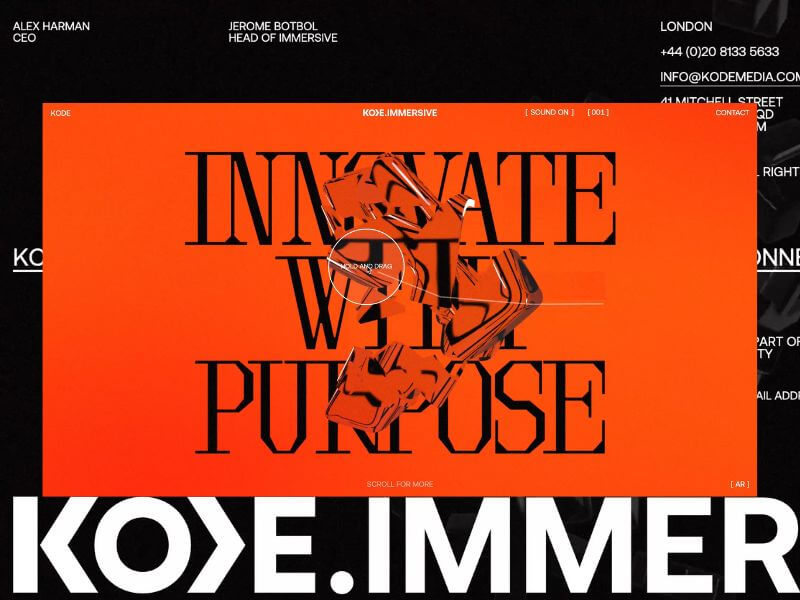
KODE Immersive fuses AR, VR, real-time 3D, and spatial computing to craft high-impact, interactive experiences. It’s not just a platform – it’s a portal. Designed to ignite emotion, shatter expectations, and redefine digital engagement.
Our challenge? To bring this pioneering vision to life, not just by explaining what KODE Immersive is, but by making visitors experience what it’s like to be inside it.
Background
Our relationship with KODE began in 2022 when we extended their brand identity and reimagined their digital home. What started as a brand refresh quickly evolved into a creative partnership rooted in shared values and a mutual obsession with crafted brand experience and beautiful design.
In late 2024, KODE approached us with a new venture. This time, they were diving headfirst into emerging technologies (AI, WebXR, and real-time 3D) to expand their service offering. We knew immediately, this was the kind of project you dream about. It was a timely opportunity and got us excited to push boundaries.
The Brief
The brief was as open as it gets. Beyond a few core objectives (namely, budget and timeline), there were no strict constraints. We received a three-slide deck: a name, a positioning statement, three brand pillars (CREATE, IDEATE, DELIVER), and a few straplines.
No case studies. No visual identity. Just a bold vision.
And that freedom became our greatest asset. We built everything from scratch, visual language, tone, interactions, while staying mindful of budget and speed. Our approach: move fast, iterate often, and push boundaries.
To pull it off, we adopted a phased R&D process. We teamed up with the brilliant Francesco Michelini (who previously helped build the Malvah website). Francesco lives and breathes WebGL. He once spent a week refining a mechanic we had already agreed to abandon, just because he couldn’t accept defeat. That kind of drive made him the perfect collaborator.
Our Process
We used KODE Immersive as a live testing ground for our refined four-phase process, aimed at delivering the best creative solutions while avoiding unnecessary feedback loops. Here’s how it shaped the final outcome.
01 Discover
We kicked things off with an in-depth strategy session where we unpacked the brief, explored concepts, discussed competitors, and mapped out technical possibilities. Style tiles helped form the foundation of our visual language.
Typography was the key differentiator. We knew the right typeface would communicate innovation and intent. After multiple rounds, we landed on Brut by Off-Type – an unconventional mono-inspired form that struck just the right balance of structure and tension.
Colour took cues from the parent brand, but we flipped the hierarchy. Orange became the dominant tone, with bold black moments layered throughout. Familiar, yet distinctive.
Iconography evolved from KODE’s chevron mark. We repurposed it as a modular, dynamic system to guide interactions and reflect the brand’s three core pillars.
02 Create
This phase became interesting, since the experience would rely heavily on user interaction, this phase was driven more by prototyping than traditional design. We worked in tight, iterative loops with the client, across design, 3D, and development to test feasibility early and often. It became an it was extremely organic process and ideal to reach the deadline while stretching limitations.
From the start, we knew we didn’t just want users to interact—we wanted them to feel immersed. To lose track of time by being emotionally and mentally engaged.
We developed a range of 3D concepts in Cinema 4D and funnelled them through R&D cycles. The process required a lot of iterating and relooking creative solutions, but was always collaborative – and ultimately, essential for innovation.
03 Craft
This is where the magic happens.
Our craft is what we consider our special sauce at Malvah – this is where we like to push, refine, and design with intent and clarity. It’s hard not to get lost in the sauce. Massive respect for Francesco during this phase as it is the most intense in terms of iterations, from shader logic to ambient lighting to the haptic quality of cursor interactions, and every component was built to feel immersive yet effortless. Luckily, Francesco is an actual living wizard and provided us with testing environments where we could craft all these elements seamlessly.
Still, something was missing! The high-fidelity 3D was clashing with the flat backgrounds. The fix? A subtle layer of pixel distortion and soft noise texture. Minimal, but transformative. Suddenly, the whole experience felt unified – like everything belonged as one unified, harmonious experience.
04 Deliver
By final QA, most of the heavy lifting was done. We stress-tested performance across browsers, devices, and connection speeds. We refined micro-interactions and polished details based on early user feedback.
Tech Stack
Nerd stuff alert.
From the outset, this was always going to be a Three.js and WebGL project – not for the novelty, but for the storytelling power. Real-time 3D let us turn a static brand into a living, breathing experience. We used Cinema 4D for concepting and prototyping, from early ideation through to final modelling and meta-cap creation.
One of the most impactful performance optimisations came through the use of BatchedMesh, which enabled us to draw multiple meshes sharing the same material in a single draw call. Since draw calls are among the most expensive operations in WebGL, this dramatically improved efficiency, reducing calls from 40 or 50 down to just one. You’ll see this in action in both the hero section and the footer, where we also implemented the Rapier physics engine for dynamic interaction.
The real breakthrough, however, was moving the rendering of our most resource-intensive canvases to an OffscreenCanvas, with all related logic handled inside a WebWorker. This shift happened later in the project and required significant reworking, but the gains in performance and responsiveness were undeniable. It was a technically ambitious move, but one that paid off.
Features
The site follows a continuous scroll narrative—a careful dance between interactivity, emotion, and information. With the primary goal to provoke curiosity and invite deep engagement, rom top to bottom, here’s a rundown of our favourite features.
Chevron
We land on the hero of the brand, the logo-mark. The chevron is the anchor, both literally and metaphorically. The driving force behind the iconography that would funnel through the experience. We wanted the entry point to set the tone, bold, dynamic, and intuitive for the user to explore.
Shifting Text
One of those happy accidents. Inspired by a line that didn’t make the final copy, we developed a mechanic where text splits and shifts as the cursor moves. A metaphor for deconstruction and reformation – fluid, dynamic, alive.
Icons
A playful space to explore, discover, and interact. Designed to echo the brand’s chevron and embody its core pillars.
Menu
One of our favourite elements. It subverts the typical UX pattern by growing from the base and transforming into the footer as users scroll; a small disruption that makes a big impact.
SFX
Sound is often the unsung hero. We follow the 80/20 rule here, also known as the Pareto Principle —just the right amount to amplify emotion without overwhelming the experience. From section transitions to hover feedback, the layered soundscape adds depth and atmosphere. The transition from the landing section to the services has the user feeling as if they are entering a new realm.
We worked with Martin Leitner from Sounds Good to curate the sound elements in aiding the experience and bringing the interaction with the 3D elements to life. This was such a great experience, and Martin’s enthusiasm helped drive the process and the team’s excitement.
Easter Egg
We always planned for an easter egg, we just didn’t know what it was until it revealed itself.
A sketch mechanic, pulled from KODE’s visual identity, was integrated into the cursor. Users can draw on the screen to reveal a hidden layer; a playful nod to the analogue-digital duality of the brand.
Early testers were missing it entirely. So we added a subtle auto-activation trigger at just the right moment. Problem solved.
Reflections
This project reminded us that the best results often emerge from ambiguity. No case studies. No visual assets. No roadmap. Just vision and trust.
While we’re proud of what we’ve delivered, we’ve only scratched the surface. Phase Two will introduce interactive case studies and deeper storytelling. We’re especially excited to explore a z-axis scroll journey through each service, bringing dimension and discovery to the next level.For now, KODE Immersive is live.