
Readymag is a design tool for creating websites on a blank canvas. Grids and templates remain useful, but Readymag also makes room for another approach, one where designers can experiment more freely with composition, storytelling, and visual rhythm. As the web evolves, the free layout model feels increasingly relevant beyond art or experimental work.
Between structure and freedom
Design history often swings between order and freedom. Some seek clarity and repetition, while others chase the chance to break rules for expression and surprise. Web design reflects this tension, shaped from the start by both technical limits and visual experimentation.
Printing technology once dictated strict, grid-based layouts, later formalized by the Swiss school of graphic design. Early web technologies echoed this logic, making grids the default structure for clarity and usability. Yet many have pushed against it. Avant-garde and postmodern designers experimented with chaotic compositions, and on the web, Flash-era sites turned pages into performances.
Today, grid and freedom approaches coexist. Tools like Readymag make it possible to borrow from both as needed, sometimes emphasizing structure, sometimes prioritizing expressiveness through typography, imagery, and motion.
The philosophy and psychology of freedom
If the grid in design symbolizes order, free layout is its breakaway gesture. Beyond altering page composition, it reflects deeper psychological and philosophical drives: the urge to experiment, assert individuality, and search for new meanings. Printing presses produce flawless, identical letters. A handwritten mark is always unique. Free layout works the same way: it allows designers to create something unique and memorable.
Working without the grid means inviting randomness, juxtaposing the incompatible, chasing unexpected solutions. Not all experiments yield finished products, but they often shape new languages. In this sense, free layout isn’t chaos for chaos’s sake—it’s a laboratory where future standards are born.
Freedom also changes the user’s experience. While grids reduce cognitive load, free composition is useful in creating emphasis and rhythm. Psychologists note that attention sharpens when expectations are disrupted. The most engaging designs often draw on both approaches, balancing clarity with moments of surprise.
How does it work in practice
While the philosophy of free layout may sound abstract, tools make it tangible. Each editor or builder imposes its own logic: some enforce rigid structures, others allow almost unlimited freedom. Comparing them shows how this philosophy plays out in practice.
Classic digital design tools like Photoshop were built as a blank canvas: the designer chooses whether or not to use a grid. Interface tools like Figma also offer both modes—you can stick to columns and auto-layout, or position elements freely and experiment with composition.
By contrast, pure web builders follow code logic. They work with containers, sections, and grids. Here the designer acts like an architect, assembling a structure that will display consistently across devices, support responsiveness, and guarantee predictability. Freedom is limited in favor of stability and usability.
Readymag stands apart. Its philosophy is closer to InDesign than to HTML: a blank canvas where elements can be placed however the designer wishes. The power of this approach is in prioritizing storytelling, impression, and experimentation.
Storytelling and creativity
Free layout gives the author a key tool: to direct attention the way a filmmaker frames a shot. Magazine longreads, promo pages, art projects—all of these rely on narrative. The reader needs to be guided through the story, tension built, emphasis placed. A strict grid often hinders this: it imposes uniform rhythm, equalizes blocks, and drains momentum. Free layout, by contrast, enables visual drama—a headline slicing into a photo, text running diagonally, an illustration spilling past the frame. Reading turns into an experience.
The best websites of recent years show this in practice. They use deliberately broken grids: elements that float, shift, and create the sense of a living space. The unconventional arrangement itself becomes part of the story. Users don’t just read or look; they walk through the composition. Chaotic typography or abrupt animation goes beyond simple illustration and becomes a metaphor.
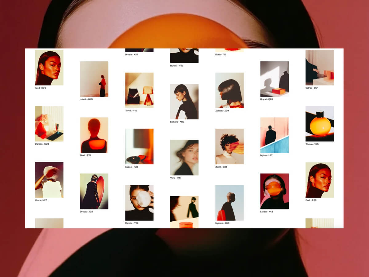
Let’s explore a few examples of how this works in practice (all the websites below were made by Readymag users).
This multimedia longread on the Nagorno-Karabakh conflict traces its history and recent escalation through text and imagery. The design relies on bold typography, layered photographs, and shifting compositions that alternate between grid-like order and free placement. Scrolling becomes a narrative device: sections unfold with rhythm and contrast, guiding the reader while leaving space for visual tension and moments of surprise. The result is a reading experience that balances structure with expressiveness, reflecting the gravity of the subject through form as well as content.
On this website a collection of P.Y.E. sunglasses is presented through an immersive layout. Scrolling triggers rotations, shifts, and lens-like distortions, turning the screen into an expressive, almost performative space. Here, free composition sets the mood and builds a narrative around the product. Yet when it comes to the catalog itself, the design switches back to a clear grid, allowing for easy comparison of models and prices.
Everything.can.be.scanned collects ordinary objects—tickets, pill packs, toys, scraps—and presents them as digital scans. The interface abandons order: items float in cluttered compositions, and the user is invited to drag them around, building their own arrangements. Texts and playful interactions, like catching disappearing shadows, add layers of exploration. Here, free layout is not just an aesthetic choice but the core mechanic, turning randomness into a way of seeing.
Hayal & Hakikat recounts the story of Ottoman-era convicts through archival portraits that appear in sequence as the user scrolls. The repetition of images creates a grid-like rhythm, while interruptions like shifts in placement and sudden pauses break the order and add dramatic tension. The balance of structure and disruption mirrors the subject itself, turning the act of looking into part of the narrative.
The analogy with film and theater is clear. Editing isn’t built from uniform shots: directors speed or slow the rhythm, insert sharp cuts, break continuity for dramatic effect. Theater works the same way—through pauses, sudden light changes, an actor stepping into the audience. On the web, free layout plays that role. It can disrupt the scrolling rhythm, halt attention, force the user to reset expectations. It is a language of emotion rather than information. More than a compositional device, it becomes a narrative tool—shaping story dynamics, heightening drama, setting rhythm. Where the goal is to engage, surprise, and immerse, it often proves stronger than the traditional grid.
The future
Today, freeform layout on the web is still often seen as a niche tool used in art projects and experimental media. But as technology evolves, it’s becoming clear that its philosophy can move beyond experimentation and grow into one of the fundamental languages of the future internet.
A similar shift once happened in print. The transition from letterpress to phototypesetting and then to modern printing technologies expanded what was possible on the page and gave designers more freedom with layouts. The web is going through the same process: early constraints shaped a grid-based logic, but new technologies and tools like Readymag make it much simpler to experiment with custom arrangements when the project calls for it.
User expectations are also changing. A generation raised on games, TikTok, and memes is attuned not to linear order but to flow, interplay, unpredictability. For them, strict grids may feel corporate, even dull. This suggests that in the future, grid-based and freeform layouts will continue to coexist, each used where it works best, and often together in the same design.