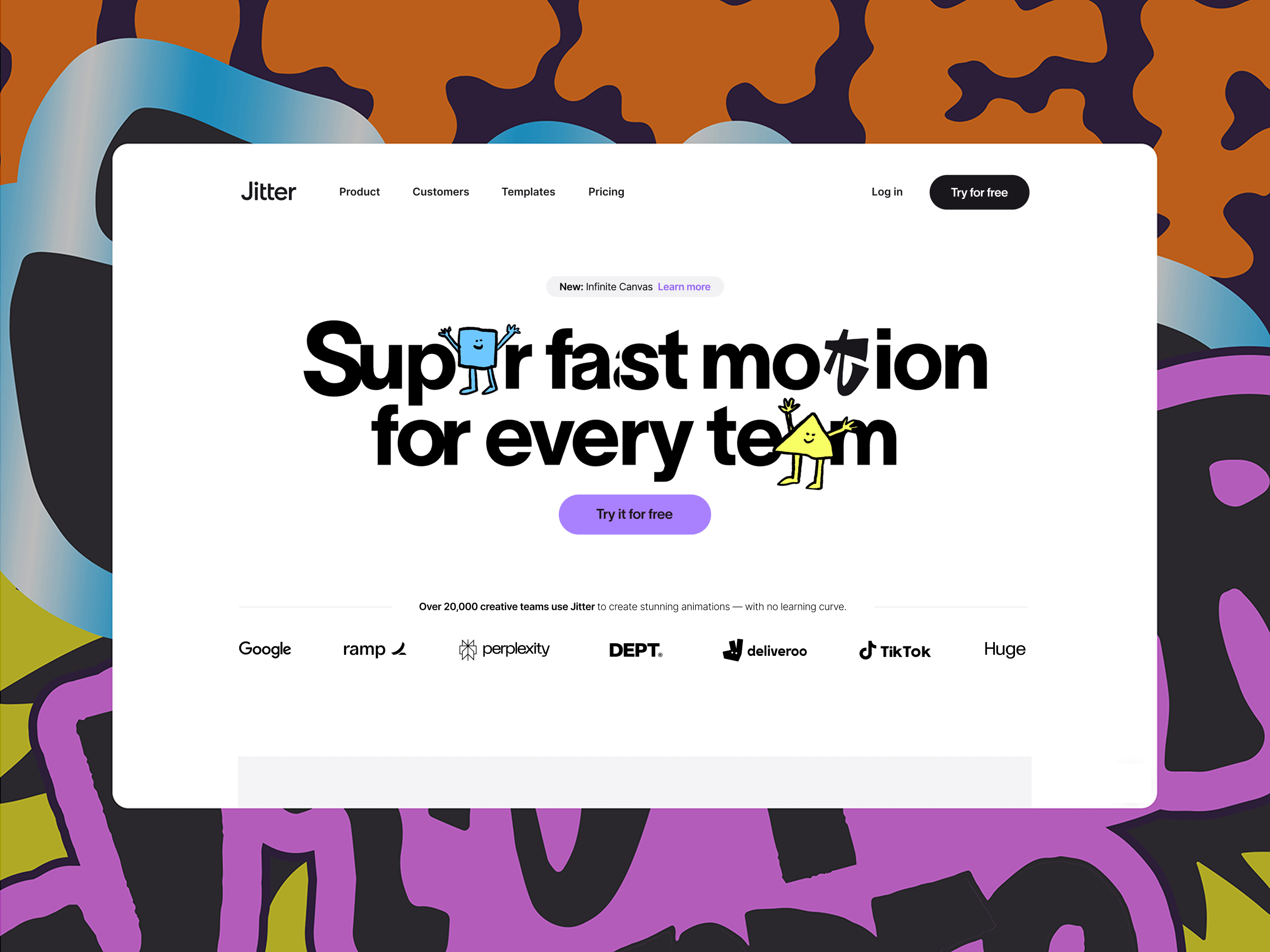
If Jitter isn’t on your radar yet, it’s a motion design tool for creative teams that makes creating animated content, from social media assets and ads to product animations and interface mockups, easy and fun.
Think of it as Figma meets After Effects: intuitive, collaborative, and built for designers who want to bring motion into their workflows without the steep learning curve of traditional tools.
Why We Redesigned Our Website
Our previous site had served us well, but it also remained mostly unchanged since we launched Jitter nearly two years ago. The old website focused heavily on the product’s features, but didn’t really communicate its value and use cases. In 2025, we decided it was time for a full refresh.
The main goal? Not just to highlight what Jitter does, but articulate why it changes the game for motion design.
We’ve had hundreds of conversations with creative professionals, from freelancers and brand designers to agencies and startups, and heard four key benefits mentioned consistently:
Ease of use
Creativity
Speed
Collaboration
These became the pillars of the new site experience.
We also wanted to make room for growth: a more cohesive brand, better storytelling, real-world customer examples, and educational content to help teams get the most out of Jitter.
Another major shift was in our audience. The first version of the website was speaking to every designer, highlighting simplicity and familiarity. But as the product evolved, it became clear that Jitter shines the most when used collaboratively across teams. The new website reflects that focus.
Shaping Our Positioning
We didn’t define our “how, what, and why” in isolation. Throughout 2024, we spoke to dozens of creative teams, studios, and design leaders, and listened closely.
We used this ongoing feedback to shape the way we talk about Jitter ourselves: which problems it solves, where it fits in the design workflow, and why teams love it. The new website is a direct result of that research.
At the same time, we didn’t want Jitter to feel too serious or corporate. Even though it’s built for teams, we aimed to keep the brand light, fun, and relatable. Motion design should be exciting, not intimidating, and we wanted that to come through in the way Jitter sounds and feels.
Designing With Jitter
We also walked the talk, using Jitter to design all animations and prototype every interaction across the new site.
From menu transitions to the way cards animate on scroll, all micro-interactions were designed in Jitter. It gave us speed, clarity, and a single source of truth, and eliminated a lot of the back-and-forth in the handoff process.
Our development partners at Antinomy Studio and Ingamana used Jitter too. They prototyped transitions and UI motion directly in the tool to validate ideas and communicate back to our team. It was great to see developers using motion as a shared language, not a handoff artifact.
Building Together with Antinomy Studio
The development of the new site was handled in collaboration with the talented team at Antinomy Studio.
The biggest technical challenge was the large horizontal scroll experience on the homepage. It needed to feel natural, responsive, and smooth across devices, and maintain high performance without compromising on the visuals.
The site was built using React and GSAP for complex, timeline-based animations and transitions.
“The large horizontal scroll was particularly complicated and required significant responsive changes. Instead of defining overly complex timelines where screen width values would change the logic of the animation in JavaScript, we used progress values as CSS variables. This allowed us to use calc() functions to translate and scale elements, while the GSAP timeline only updates values from 0 to 1. So easy to understand and maintain!”
— Baptiste Briel, Antinomy
We’ve promoted the use of CSS as much as possible for high performances hover effects and transitions. We’ve even used the new linear() easing functions to bring a bouncy feeling to our CSS animations.
There’s a great tool created by Jake Archibald on generating spring-like CSS easing functions that you can paste as CSS variables. It’s so much fun to play with, and it’s also something that the Jitter team has implemented in their software, so it was super easy to review and tweak for both design and engineering teams.
Jitter animations were exported as Lottie files and integrated directly, making the experience dynamic and lightweight. It’s a modern stack that supports our need for speed and flexibility, both in the frontend and behind the scenes.
— Baptiste Briel, Antinomy
What We Learned
This redesign taught us a few valuable lessons:
Start with benefits, not features. Users don’t care what your product does until they understand how it can help them.
Design with your real audience in mind. Jitter for solo designers and Jitter for teams are two different stories. Clarifying our audience helped us craft a stronger, clearer narrative.
Prototyping with Jitter helped us move faster, iterate more confidently, and keep design and development in sync.
We’ve already seen an impact: a sharper brand perception, higher engagement and conversion across all pages, and a new wave of qualified inbound leads from the best brands in the world, including Microsoft, Dropbox, Anthropic, Lyft, Workday, United Airlines, and more. And this is just the beginning.
What’s Next?
We see our new website as a constantly evolving platform. In the coming months, we’ll be adding more:
Case studies and customer stories
Use case pages
Learning resources and motion design tutorials
Playful experiments and interactive demos
Our mission remains the same: to make motion design accessible, collaborative, and fun. Our website is now better equipped to carry that message forward.
Let us know what you think, and if there’s anything you’d love to see next.
Thanks for reading, and stay in motion 🚀
Give Jitter a Try
Get started with Jitter for free and explore 300+ free templates to jumpstart your next project. Once you’re ready to upgrade, get 25% off the first year of paid annual plans with JITTERCODROPS25.
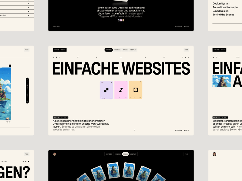
For months, Eduard Bodak has been sharing glimpses of his visually rich new website. Now, he’s pulling back the curtain to walk us through how three of its most striking animations were built. In this behind-the-scenes look, he shares the reasoning, technical decisions, and lessons learned—from performance trade-offs to working with CSS variables and a custom JavaScript architecture.
Overview
In this breakdown, I’ll walk you through three of the core GSAP animations on my site: flipping 3D cards that animate on scroll, an interactive card that reacts to mouse movement on the pricing page, and a circular layout of cards that subtly rotates as you scroll. I’ll share how I built each one, why I made certain decisions, and what I learned along the way.
Overview of the animations we’re handling here
I’m using Locomotive Scroll V5 in this project to handle scroll progress and viewport detection. Since it already offers built-in progress tracking via data attributes and CSS variables, I chose to use that directly for triggering animations. ScrollTrigger offers a lot of similar functionality in a more integrated way, but for this build, I wanted to keep everything centered around Locomotive’s scroll system to avoid overlap between two scroll-handling libraries.
Personally, I love the simplicity of Locomotive Scroll. You can just add data attributes to specify the trigger offset of the element within the viewport. You can also get a CSS variable --progress on the element through data attributes. This variable represents the current progress of the element and ranges between 0 and 1. This alone can animate a lot with just CSS.
I used this project to shift my focus toward more animations and visual details. It taught me a lot about GSAP, CSS, and how to adjust animations based on what feels right. I’ve always wanted to build sites that spark a little emotion when people visit them.
Note that this setup was tailored to the specific needs of the project, but in cases where scroll behavior, animations, and state management need to be tightly integrated, GSAP’s ScrollTrigger and ScrollSmoother can offer a more unified foundation.
Now, let’s take a closer look at the three animations in action!
Flipping 3D cards on scroll
I split the animation into two parts. The first is about the cards escaping on scroll. The second is about them coming back and flipping back.
While I’m using Locomotive Scroll, I need data-scroll to enable viewport detection on an element. data-scroll-offset specifies the trigger offset of the element within the viewport. It takes two values: one for the offset when the element enters the viewport, and a second for the offset when the element leaves the viewport. The same can be built with GSAP’s ScrollTrigger, just inside the JS.
data-scroll-event-progress="progressHero" will trigger the custom event I defined here. This event allows you to retrieve the current progress of the element, which ranges between 0 and 1.
Inside the JS we can add an EventListener based on the custom event we defined. Getting the progress from it and transfer it to the GSAP timeline.
this.element is here our section we defined before, so it’s data-hero-animation.
Building now the timeline method inside the class. Getting the current timeline progress. Killing the old timeline and clearing any GSAP-applied inline styles (like transforms, opacity, etc.) to avoid residue.
Using requestAnimationFrame() to avoid layout thrashing. Initializes a new, paused GSAP timeline. While we are using Locomotive Scroll it’s important that we pause the timeline, so the progress of Locomotive can handle the animation.
Figuring out relative positioning per card. targetY moves each card down so it ends near the bottom of the container. yOffsets and rotationZValues give each card a unique vertical offset and rotation.
The actual GSAP timeline. Cards slide left or right based on their index (x). Rotate on Z slightly to look scattered. Slide downward (y) to target position. Shrink and tilt (scale, rotateX) for a 3D feel. index * 0.012: adds a subtle stagger between cards.
That’s our timeline for desktop. We can now set up GSAP’s matchMedia() to use it. We can also create different timelines based on the viewport. For example, to adjust the animation on mobile, where such an immersive effect wouldn’t work as well. Even for users who prefer reduced motion, the animation could simply move the cards slightly down and fade them out, as you can see on the live site.
Add this to our init() method to initialize the class when we call it.
init() {
 this.setupBreakpoints();
}
We can also add a div with a background color on top of the card and animate its opacity on scroll so it smoothly disappears.
When you look closely, the cards are floating a bit. To achieve that, we can add a repeating animation to the cards. It’s important to animate yPercent here, because we already animated y earlier, so there won’t be any conflicts.
gsap.utils.random(1.5, 2.5) comes in handy to make each floating animation a bit different, so it looks more natural. repeatRefresh: true lets the duration refresh on every repeat.
Part 02
We basically have the same structure as before. Only now we’re using a sticky container. The service_container has height: 350vh, and the service_sticky has min-height: 100vh. That’s our space to play the animation.
In the JS, we can use the progressService event as before to get our Locomotive Scroll progress. We just have another timeline here. I’m using keyframes to really fine-tune the animation.
const position = 2 - index - 1 changes the position, so cards start spread out: right, center, left. With that we can use those arrays [12, 0, -12] in the right order.
There’s the same setupBreakpoints() method as before, so we actually just need to change the timeline animation and can use the same setup as before, only in a new JS class.
We can add the same floating animation we used in part 01, and then we have the disappearing/appearing card effect.
Part 2.1
Another micro detail in that animation is the small progress preview of the three cards in the top right.
We add data-scroll-css-progress to the previous section to get a CSS variable --progress ranging from 0 to 1, which can be used for dynamic CSS effects. This data attribute comes from Locomotive Scroll.
Using CSS calc() with min() and max() to trigger animations at specific progress points. In this case, the first animation starts at 0% and finishes at 33%, the second starts at 33% and finishes at 66%, and the last starts at 66% and finishes at 100%.
On a closer look, you can see a small slide-in animation of the card before the mouse movement takes effect. This is built in GSAP using the onComplete() callback in the timeline. this.card refers to the element with data-price-card.
I’m using an elastic easing that I got from GSAPs Ease Visualizer. The timeline plays when the page loads and triggers the mouse movement animation once complete.
In our initAnimation() method, we can use GSAP’s matchMedia() to enable the mouse movement only when hover and mouse input are available.
this.mm = gsap.matchMedia();

initAnimation() {
 this.mm.add("(hover: hover) and (pointer: fine) and (prefers-reduced-motion: no-preference)", () => {
  gsap.ticker.add(this.mouseMovement);

  return () => {
   gsap.ticker.remove(this.mouseMovement);
  };
 });

 this.mm.add("(hover: none) and (pointer: coarse) and (prefers-reduced-motion: no-preference)", () => {
  ...
 });
}
By using the media queries hover: hover and pointer: fine, we target only devices that support a mouse and hover. With prefers-reduced-motion: no-preference, we add this animation only when reduced motion is not enabled, making it more accessible. For touch devices or smartphones, we can use hover: none and pointer: coarse to apply a different animation.
I’m using gsap.ticker to run the method this.mouseMovement, which contains the logic for handling the rotation animation.
I originally started with one of the free resources from Osmo (mouse follower) and built this mouse movement animation on top of it. I simplified it to only use the mouse’s x position, which was all I needed.
I also added calculations for how much the card can rotate on the y-axis, and it rotates the z-axis accordingly. That’s how we get this mouse movement animation.
When building these animations, there are always some edge cases I didn’t consider before. For example, what happens when I move my mouse outside the window? Or if I hover over a link or button, should the rotation animation still play?
I added behavior so that when the mouse moves outside, the card rotates back to its original position. The same behavior applies when the mouse leaves the hero section or hovers over navigation elements.
I added a state flag this.isHovering. At the start of mouseMovement(), we check if this.isHovering is false, and if so, return early. The onMouseLeave method rotates the card back to its original position.
We can adjust it further by adding another animation for mobile, since there’s no mouse movement there. Or a subtle reflection effect on the card like in the video. This is done by duplicating the card, adding an overlay with a gradient and backdrop-filter, and animating it similarly to the original card, but with opposite values.
Cards in a circular position that slightly rotate on scroll
First, we build the base of the circularly positioned cards in CSS.
At first, we add all 24 cards, then remove the ones we don’t want to show later because we don’t see them. In the CSS, the .wheel uses a grid display, so we apply grid-area: 1 / 1 to stack the cards. We later add an overlay before the wheel with the same grid-area. By using em we can use a fluid font-size to adjust the size pretty smooth on resizing the viewport.
We can remove the card from 8 to 19 as we don’t see them behind the overlay. It should look like this now.
By adding the data attributes and setup for viewport detection from Locomotive Scroll, which we used in previous modules, we can simply add our GSAP timeline for the rotation animation.
There are probably smarter ways to build these animations than I used. But since this is my first site after changing my direction and GSAP, Locomotive Scroll V5, Swup.js, and CSS animations, I’m pretty happy with the result. This project became a personal playground for learning, it really shows that you learn best by building what you imagine. I don’t know how many times I refactored my code along the way, but it gave me a good understanding of creating accessible animations.
I also did a lot of other animations on the site, mostly using CSS animations combined with JavaScript for the logic behind them.
There are also so many great resources out there to learn GSAP and CSS.
Where I learned the most:
It’s all about how you use it. You can copy and paste, which is fast but doesn’t help you learn much. Or you can build on it your own way and make it yours, that’s at least what helped me learn the most in the end.
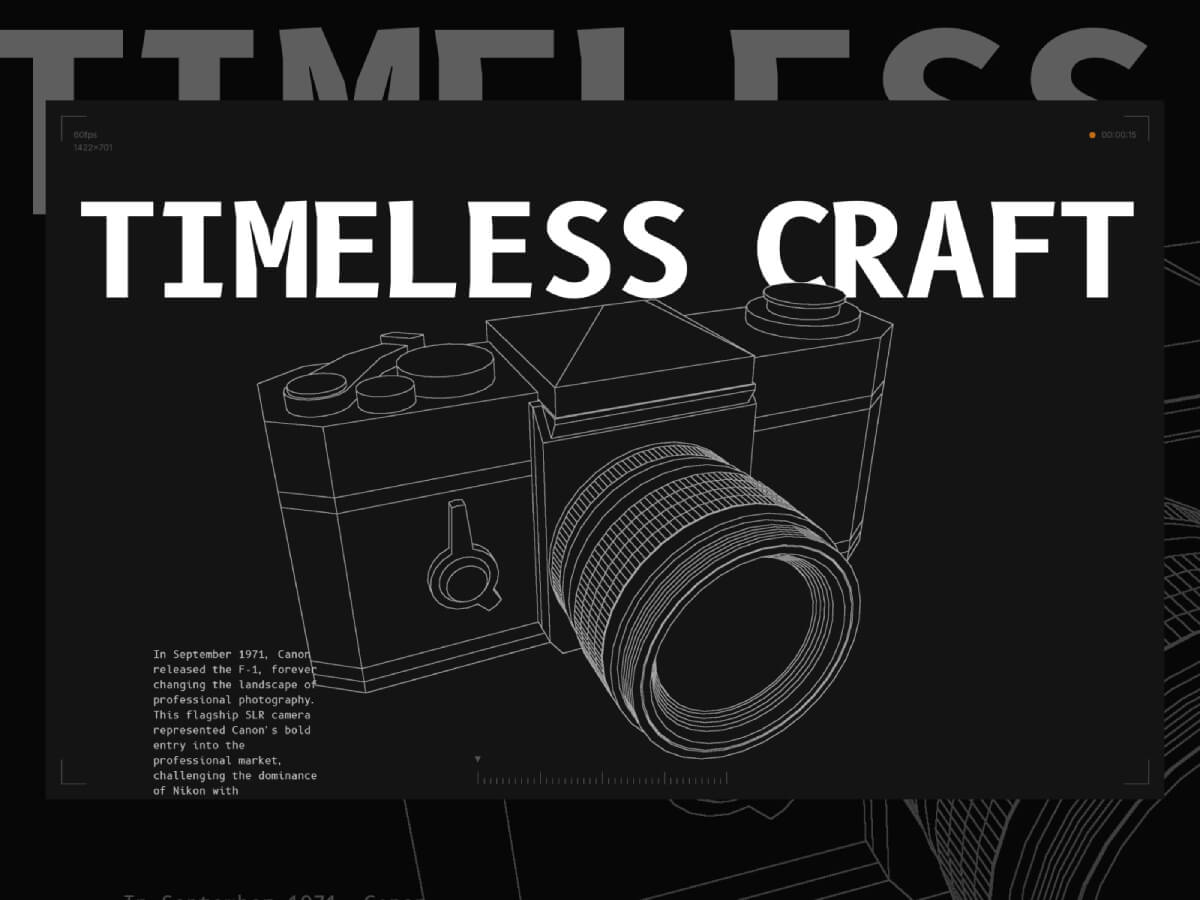
This project primarily serves as a technical demo and learning material. It began when I decided to start learning Blender. I followed a few tutorials, then decided to do a small project using it—so I chose to create the Canon F-1 camera!
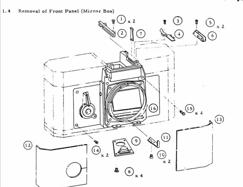
After that, I decided to export the project to Three.js to add some cool post-processing shader effects. I wanted to create a sketch effect similar to what I had seen in some repair guides.
After spending a few hours experimenting with it, I decided to integrate it into a fully functional website featuring some cool shaders and 3D effects!
In this article, I’m going to walk through some of the key features of the site and provide a technical breakdown, assuming you already have a basic or beginner-level understanding of Three.js and shaders.
1. The Edge Detection Shader
Three.js includes a built-in edge detection shader called SobelOperatorShader. Basically, it detects edges based on color contrast—it draws a line between two areas with a strong enough difference in color.
To make my effect work the way I want, I need to assign a unique color to each area I want to highlight on my model. This way, Three.js will draw a line around those areas.
Here’s my model with all the materials applied:
This way, Three.js can accurately detect each area I want to highlight!
As you can see, the lines are not all the same intensity—some are white, while others are light gray. This is because, by default, line intensity depends on contrast: edges with lower contrast appear with lighter lines. To fix this, I manually modified the post-processing shader to make all lines fully white, regardless of contrast.
What I’m doing here is moving all the edge detection logic into the Sobel function. Then, I pass the tDiffuse texture—which is the composer’s render—to this function.
This way, I can modify the output of the edge detection shader before passing it back to the composer:
float G = sobel(t,texel);
G= G > 0.001 ? 1. : 0.;
G represents the intensity of the edge detection. It’s a single value because the lines are monochrome. G ranges from 0 to 1, where 0 means full black (no edge detected) and 1 means full white (strong contrast detected).
As mentioned earlier, this value depends on the contrast. What I’m doing in the second line is forcing G to be 1 if it’s above a certain threshold (I chose 0.001, but you could pick a smaller value if you want).
This way I can get all the edges to have the same intensity.
Here’s how I’m applying the custom fragment shader to the Sobel Operator shader pass:
Next, let’s take a look at the lens parts section.
This is mainly achieved using a Three.js utility called RenderTarget.
A render target is a buffer where the GPU draws pixels for a scene being rendered off-screen. It’s commonly used in effects like post-processing, where the rendered image is processed before being displayed on the screen.
Basically, this allows me to render my scene twice per frame: once with only the highlighted mesh, and once without it.
In the onSelectMesh method, I set the value of this.selectedMeshName to the name of the mesh group that contains the target mesh from the Raycaster (I’m using names to refer to groups of meshes).
This way, in my render loop, I can create two distinct renders:
One render (renderTargetA) with all the meshes except the hovered mesh
Another render (renderTargetB) with only the hovered mesh
As you can see, I’m sending both renders as texture uniforms to the effectSobel shader. The post-processing shader then “merges” these two renders into a single output.
At this point, we have two renders of the scene, and the post-processing shader needs to decide which one to display. Initially, I thought of simply combining them by adding the two textures together, but that didn’t produce the correct result:
What I needed was a way to hide the pixels of one render when they are “covered” by pixels from another render.
To achieve this, I used the distance of each vertex from the camera. This meant I had to go through all the meshes in the model and modify their materials. However, since the mesh colors are important for the edge detection effect, I couldn’t change their colors.
Instead, I used the alpha channel of each individual vertex to set the distance from the camera.
First, the luminance function is a built-in Three.js shader utility imported from the <common> module. It’s recommended to use this function with the Sobel effect to improve edge detection results.
The uColor value represents the initial color of the mesh.
The dist value calculates the distance between the vertex position (passed from the vertex shader via a varying) and the camera, using the built-in cameraPosition variable in Three.js shaders.
Finally, I pass this distance through the alpha channel. Since the alpha value can’t exceed 1, I use a normalized version of the distance.
And here is the updated logic for the postprocessing shader:
Now that the alpha channel of the textures contains the distance to the camera, I can simply compare them and display the render that have the closer vertices to the camera.
3. The Film Roll Effect
Next is this film roll component that moves and twist on scroll.
This effect is achieved using only shaders, the component is a single plane component with a shader material.
All the data is sent to the shader through uniforms:
export default class Film {
  constructor() {
    //...code
  }

  createGeometry() {
    this.geometry = new THREE.PlaneGeometry(
      60,
      2,
      100,
      10
    )
  }

  createMaterial() {
    this.material = new THREE.ShaderMaterial({
      vertexShader,
      fragmentShader,
      side: THREE.DoubleSide,
      transparent: true,
      depthWrite: false,
      blending: THREE.CustomBlending,
      blendEquation: THREE.MaxEquation,
      blendSrc: THREE.SrcAlphaFactor,
      blendDst: THREE.OneMinusSrcAlphaFactor,
      uniforms: {
        uPlaneWidth: new THREE.Uniform(this.geometry.parameters.width),
        uRadius: new THREE.Uniform(2),
        uXZfreq: new THREE.Uniform(3.525),
        uYfreq: new THREE.Uniform(2.155),
        uOffset: new THREE.Uniform(0),
        uAlphaMap: new THREE.Uniform(
          window.preloader.loadTexture(
            "./alpha-map.jpg",
            "film-alpha-map",
            (texture) => {
              texture.wrapS = THREE.RepeatWrapping
              const { width, height } = texture.image
              this.material.uniforms.uAlphaMapResolution.value =
                new THREE.Vector2(width, height)
            }
          )
        ),
        //uImages: new THREE.Uniform(new THREE.Vector4()),
        uImages: new THREE.Uniform(
          window.preloader.loadTexture(
            "/film-texture.png",
            "film-image-texture",
            (tex) => {
              tex.wrapS = THREE.RepeatWrapping
            }
          )
        ),
        uRepeatFactor: new THREE.Uniform(this.repeatFactor),
        uImagesCount: new THREE.Uniform(this.images.length * this.repeatFactor),
        uAlphaMapResolution: new THREE.Uniform(new THREE.Vector2()),
        uFilmColor: new THREE.Uniform(window.colors.orange1),
      },
    })
  }

  createMesh() {
    this.mesh = new THREE.Mesh(this.geometry, this.material)
    this.scene.add(this.mesh)
  }
}
The main vertex shader uniforms are:
uRadius is the radius of the cylinder shape
uXZfreq is the frequency of the twists on the (X,Z) plane
uYfreq is a cylinder height factor
uOffset is the vertical offset of the roll when you scroll up and down
As you can see they are used to modify the initial position attribute to give it the shape of a cylinder. the modified position’s X Y and Z factors are using uOffset in their frequency. this uniform is linked to a Scrolltrigger timeline that will give the twist on scroll effect.
That’s it for the most part! Don’t feel frustrated if you don’t understand everything right away—I often got stuck for days on certain parts and didn’t know every technical detail before I started building.
I learned so much from this project, and I hope you’ll find it just as useful!
Thank you for reading, and thanks to Codrops for featuring me again!
Let’s dive deep into the CallerMemberName attribute and explore its usage from multiple angles. We’ll see various methods of invoking it, shedding light on how it is defined at compile time.
Table of Contents
Just a second! 🫷 If you are here, it means that you are a software developer.
So, you know that storage, networking, and domain management have a cost .
If you want to support this blog, please ensure that you have disabled the adblocker for this site. I configured Google AdSense to show as few ADS as possible – I don’t want to bother you with lots of ads, but I still need to add some to pay for the resources for my site.
Thank you for your understanding. – Davide
Method names change. And, if you are using method names in some places specifying them manually, you’ll spend a lot of time updating them.
Luckily for us, in C#, we can use an attribute named CallerMemberName.
This attribute can be applied to a parameter in the method signature so that its runtime value is the caller method’s name.
publicvoid SayMyName([CallerMemberName] string? methodName = null) =>
Console.WriteLine($"The method name is {methodName ?? "NULL"}!");
It’s important to note that the parameter must be a nullable string: this way if the caller sets its value, the actual value is set. Otherwise, the name of the caller method is used. Well, if the caller method has a name! 👀
Getting the caller method’s name via direct execution
Direct call with overridden name:
The method name is Walter White!
It’s important to note that the compiler sets the methodName parameter only if it is not otherwise specified.
This means that if you call SayMyName(null), the value will be null – because you explicitly declared the value.
privatevoid DirectCallWithNullName()
{
Console.WriteLine("Direct call with null name:");
SayMyName(null);
}
The printed text is then:
Direct call with null name:
The method name is NULL!
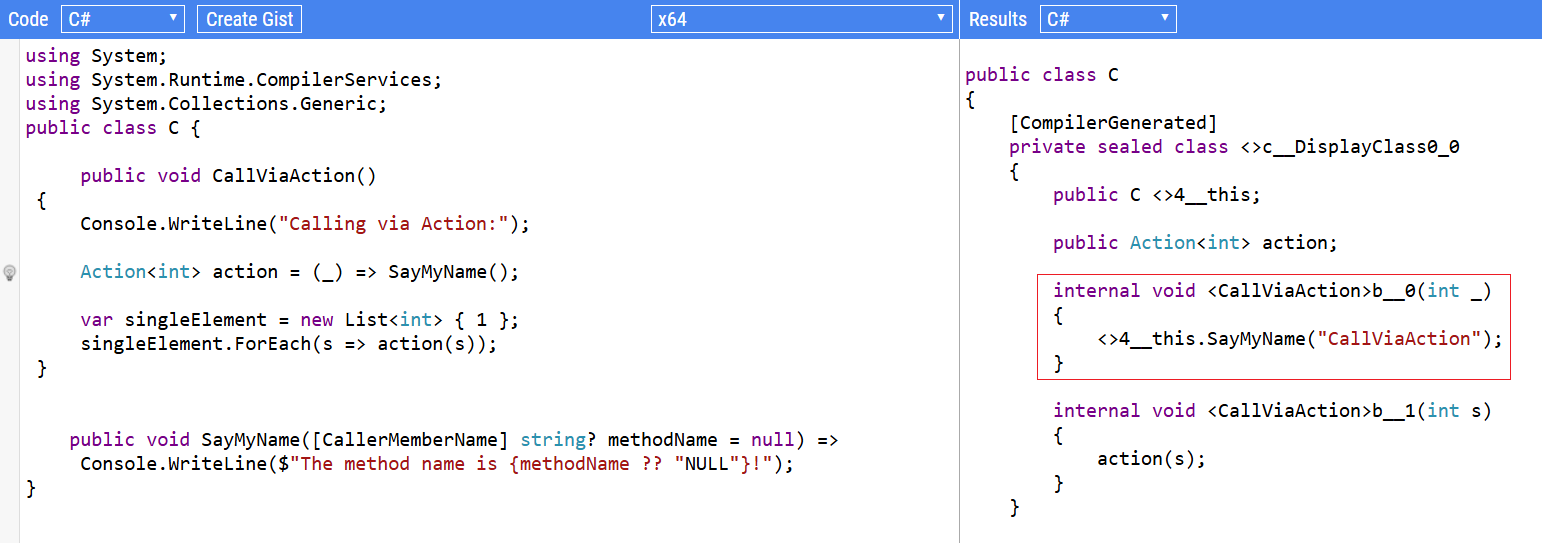
CallerMemberName when the method is called via an Action
Let’s see what happens when calling it via an Action:
publicvoid CallViaAction()
{
Console.WriteLine("Calling via Action:");
Action<int> action = (_) => SayMyName();
var singleElement = new List<int> { 1 };
singleElement.ForEach(s => action(s));
}
This method prints this text:
Calling via Action:
The method name is CallViaAction!
Now, things get interesting: the CallerMemberName attribute recognizes the method’s name that contains the overall expression, not just the actual caller.
We can see that, syntactically, the caller is the ForEach method (which is a method of the List<T> class). But, in the final result, the ForEach method is ignored, as the method is actually called by the CallViaAction method.
This can be verified by accessing the compiler-generated code, for example by using Sharplab.
At compile time, since no value is passed to the SayMyName method, it gets autopopulated with the parent method name. Then, the ForEach method calls SayMyName, but the methodName is already defined at compiled time.
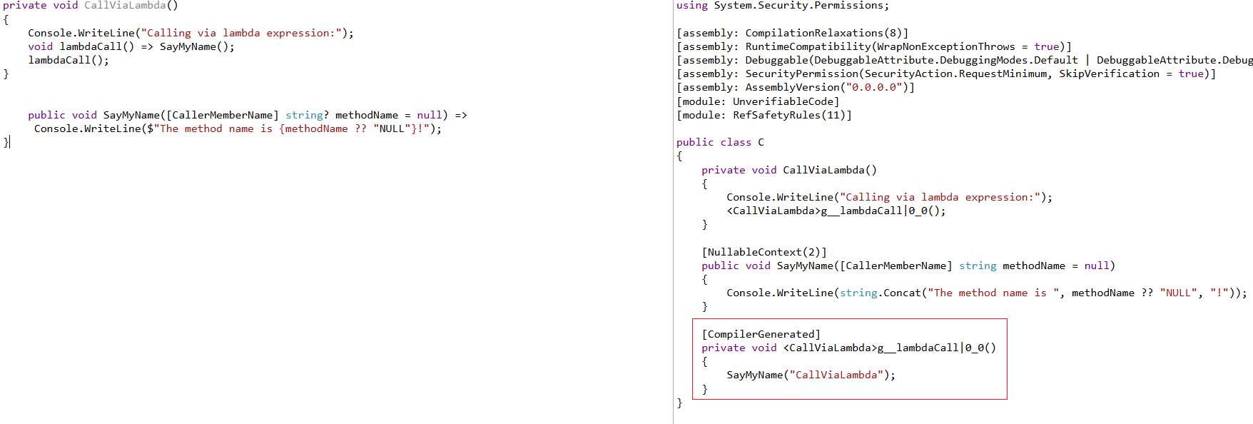
Lambda executions and the CallerMemberName attribute
What if we try to execute the SayMyName method by accessing the root class (in this case, CallerMemberNameTests) as a dynamic type?
privatevoid CallViaDynamicInvocation()
{
Console.WriteLine("Calling via dynamic invocation:");
dynamic dynamicInstance = new CallerMemberNameTests(null);
dynamicInstance.SayMyName();
}
Oddly enough, the attribute does not work as could have expected, but it prints NULL:
Calling via dynamic invocation:
The method name is NULL!
This happens because, at compile time, there is no reference to the caller method.
privatevoid CallViaDynamicInvocation()
{
Console.WriteLine("Calling via dynamic invocation:");
object arg = new C();
if (<>o__0.<>p__0 == null)
{
Type typeFromHandle = typeof(C);
CSharpArgumentInfo[] array = new CSharpArgumentInfo[1];
array[0] = CSharpArgumentInfo.Create(CSharpArgumentInfoFlags.None, null);
<>o__0.<>p__0 = CallSite<Action<CallSite, object>>.Create(Microsoft.CSharp.RuntimeBinder.Binder.InvokeMember(CSharpBinderFlags.ResultDiscarded, "SayMyName", null, typeFromHandle, array));
}
<>o__0.<>p__0.Target(<>o__0.<>p__0, arg);
}
I have to admit that I don’t understand why this happens: if you want, drop a comment to explain to us what is going on, I’d love to learn more about it! 📩
Event handlers can get the method name
Then, we have custom events.
We define events in one place, but they are executed indirectly.
privatevoid CallViaEventHandler()
{
Console.WriteLine("Calling via events:");
var eventSource = new MyEventClass();
eventSource.MyEvent += (sender, e) => SayMyName();
eventSource.TriggerEvent();
}
publicclassMyEventClass{
publicevent EventHandler MyEvent;
publicvoid TriggerEvent() =>
// Raises an event which in our case calls SayMyName via subscribing lambda method MyEvent?.Invoke(this, EventArgs.Empty);
}
So, what will the result be? “Who” is the caller of this method?
Calling via events:
The method name is CallViaEventHandler!
Again, it all boils down to how the method is generated at compile time: even if the actual execution is performed “asynchronously” – I know, it’s not the most obvious word for this case – at compile time the method is declared by the CallViaEventHandler method.
CallerMemberName from the Class constructor
Lastly, what happens when we call it from the constructor?
public CallerMemberNameTests(IOutput output) : base(output)
{
 Console.WriteLine("Calling from the constructor");
 SayMyName();
}
We can consider constructors to be a special kind of method, but what’s in their names? What can we find?
Calling from the constructor
The method name is .ctor!
Yes, the actual method name is .ctor! Regardless of the class name, the constructor is considered to be a method with that specific internal name.
Wrapping up
In this article, we started from a “simple” topic but learned a few things about how code is compiled and the differences between runtime and compile time.