
This summer I created my Personal Project Platform. It wasn’t exactly intentional. When I realised where my process was going, I was already some way along.
Speaking of process, I’m a big fan. When you’re ready to surrender, you’ll find yourself in places you wouldn’t expect. Anyway, two paths came together when I discovered I was working on my Personal Project Platform. Let’s talk about the first one.
Path 1: A Necessary Happy Place
As a designer, or as a human being for that matter, not every day is full of inspiration. Especially when the design-and-AI landscape changes as fast as it does now, it’s sometimes hard to see the big picture.
As a remedy, I started building a moodboard that would serve as my Happy Place. Whenever I came across a reference that made me smile, I put it there. It had sections for my dream office; quotes and thoughts that resonated with me; and random image fragments that, together, felt like me ~ or at least a designer version of me. I started adding my own scribbles, notes and thoughts about purpose: why am I still doing this? What am I looking for as a designer?

Path 2: Instagram Experiments
One evening in December 2022, I had a drink with a designer friend. We were making random things just for fun. At work, I had shifted into more of a managerial role, and I missed designing.
Then I thought: why not throw it online? So I created an Instagram account and posted my first Processing sketch.
The more I made, the more I wanted to make. Over time, this habit became part of me. Sketches became interactive, but it bothered me they only ran locally ~ I was the only one who could interact with them. I also started sharing quick tutorials, and was amazed by how many positive responses I got from people who felt inspired to make something of their own.
Where the Two Paths Meet
Meanwhile, my “Happy Place” notes grew longer and more intentional. I wanted more people to interact with my sketches. Since I was doing it all for fun, why not share the source code? Why not collect my resources for others to use?
Slowly it became an idea for a platform: one where the intentional and the unexpected coexist, showing new designers ~ especially with AI replacing all the fun ~ that learning a craft, practising, and training your creative muscle still matter.
Now I just had to build it.

Building the Platform
Since we’re on Codrops, let’s talk code. I have a background in PHP and JavaScript ~ old-school, before ES6 or TypeScript, let alone Vue or React. I wanted to use this project to learn something new.
After some research, I decided on Nuxt.js. From what I read, it’s easier to set up than Next.js. And since my platform isn’t likely to scale any time soon, I think it does the job. I had also played with Prismic CMS a few years back. Lightweight, not too many features, but fine for me. So I watched some Nuxt.js+Prismic tutorials, and off I went.
The Hero
I knew I wanted interactive components. Something that gave visitors an immediate sense of my work. Let’s start with the hero.
With your mouse you draw objects onto the canvas, plain and simple. I wanted the objects to have a link with nature ~ something that grows, can flourish ~ as you would do when you take on lots of personal projects.
In my first sketch the flowers scaled from small to big, literally growing. But then I thought: how many times had I got stuck on a sketch, frustrated over an idea that just wouldn’t work out? So I decided linear growth wouldn’t be honest. Most of the time when I work on my projects my head is all over the place. Things should scale randomly, they don’t even need to match in width and height. I like it like this, it mirrors the tension between control and chaos in my work. Below you’ll find the bit where this is happening.
/**
 * Get a portion of the next image
 */
 public getPortion(): p5.Image {
   // Fetch original
   const original = this.getNext();
   if (! original) return null;

   // Source
   const ow = original.width;
   const oh = original.height;
   const sx = Math.random() * ow;
   const sy = Math.random() * oh;

   // Remaining part
   const loW = ow - sx;
   const loH = oh - sy;

   let sw = Math.round(loW * Math.random()) + 10;
   let sh = Math.round(loH * Math.random()) + 10;

   // Destination
   const dx = 0;
   const dy = 0;
   const dw = sw;
   const dh = sh;

   // Create new image
   const copy = this.p.createImage(dw, dh);
   copy.copy(original, sx, sy, sw, sh, dx, dy, dw, dh);

   return copy;
 }

 public getRandomSizedPortion(): p5.Image {
   // Get portion
   const img = this.getPortion();
   if (! img) return null;

   // Random size
   const maxSize = this.p.width * .1;
   img.resize(this.p.random(10,maxSize), this.p.random(10,maxSize));

   return img;
 }
The Footer
To balance the hero, I also made the footer interactive. I used an older sketch as a base, adding depth and texture to make it feel a little like an abstract ocean.
For me, it brings a sense of calm and focus ~ with subtle vertical movement and a tone that changes as you move the mouse along the x-axis. The snippet below should give you an idea of how it works, but the original sketch is available to download on the platform. So if you’re curious, go ahead and play.
/**
 * Calculate all data
 */
 public update() {

   // Animation settings
   let duration: number = 128;
   let progress: number = this.p.frameCount % duration;
   if(progress == 0) this.iteration++;

   // Rows and height
   let numRowsDrawn: number = this.numRows + 1 + this.iteration;
   let colW: number = this.p.width / this.numCols;
   let rowH: number = this.p.height / this.numRows;

   let count = 0;
   // Loop through rows
   for (let y: number = this.iteration; y<numRowsDrawn; y++) {

     // Calculate y position (start at the bottom)
     let targetY: number = this.p.height - (y+1) * rowH + this.iteration * rowH;

     // Where are we in the progress
     let posY: number = this.p.map(progress, 0, duration, targetY, targetY+rowH);
     // Mouse influence
     const smoothing = 0.06;
     this.currentMouseX += (this.p.mouseX - this.currentMouseX) * smoothing;
     const mouseInfluence: number = this.p.map(this.currentMouseX, 0, this.p.width, .8, -.3);

     // What is the influence based on the y position
     let yInfluence: number = this.p.map(posY / this.numRows, 0, rowH, 1, this.numRows+1) * mouseInfluence;
     // Double columns each row
     let extraCols: number = Math.exp(yInfluence * Math.LN2);
     // Size and position
     let currentW: number = colW + extraCols * colW;

     // Loop through columns
     for (let x:number = 0; x<this.numCols; x++) {
       // Calculate x position
       let posX: number = x * currentW - (extraCols * yInfluence + 1) * colW;

       // Don't draw things out of screen x-axis
       if(posX > this.p.width) continue;
       if(posX + currentW < 0) continue;

       // Draw
       this.display(x, y, posX, posY, currentW, rowH);
       count++;
      }
    }
  }
The Masonry Grid
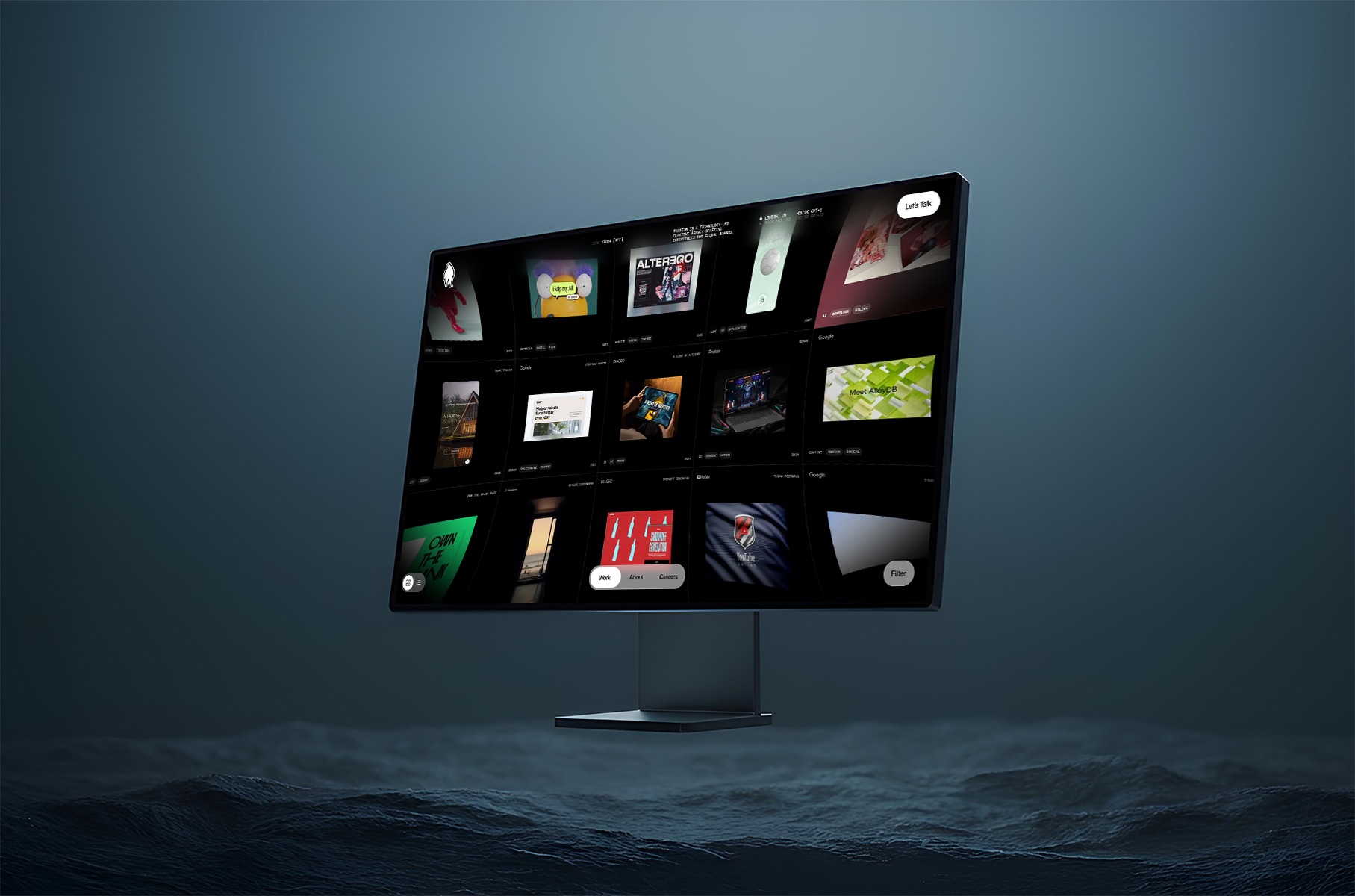
I’ve always liked inspiration websites where a lot is going on. You get all sorts of images and videos that are strong on their own, but gain new purpose in a different context. That’s what I wanted for my case overview.
Since I don’t aim for any particular graphical style, I like that it feels more like a collection of references. This is why I decided to go for a masonry grid. I didn’t want to use a plugin, so I built this little CSS/JavaScript thingy where I use CSS Grid rows to distribute the images, and JavaScript to calculate how many rows it should span, depending on the aspect ratio that is set in the CMS. I think there is still room for improvement, but to be honest, I ran low on patience on this one. I decided it does the job for now. Maybe I will get back to it someday to refactor. Below is the snippet where most of the work happens.
function applyMasonry() {
   // Fetch grid and items
   const grid = document.querySelector('.masonry-grid');
   const items = grid?.querySelectorAll('.masonry-item');

   // Make sure they’re both loaded
   if (!grid || !items) return

   // Get properties from CSS
   const rowHeight = parseInt(getComputedStyle(grid).getPropertyValue('grid-auto-rows'))
   const gap = parseInt(getComputedStyle(grid).getPropertyValue('gap') || 0)

   items.forEach(item => {

     // Fetch media and info container separately
     const media = item.querySelector('.masonry-item__image-container')
     const info = item.querySelector('.masonry-item__info-container')

     if (!media || !info) return

     // Combine them to item height
     const mediaHeight = media.getBoundingClientRect().height
     const infoHeight = info.getBoundingClientRect().height
     const itemHeight = mediaHeight + infoHeight

     // Calculate how many rows to span
     const rowSpan = Math.ceil((itemHeight + gap) / (rowHeight + gap))

     // Apply row span
     item.style.gridRowEnd = `span ${rowSpan}`;
     item.style.opacity = 1;
   })
 }
Resources & Code
Since I truly want to encourage people to start their own journey with personal projects, I want to share resources and code examples to get them started.

Of course with the launch of this platform I had to do this retrospectively for more than 20 projects, so in future I’ll probably share more process and behind-the-scenes. Who knows. Anyway, this component gives me a space for anything that might be useful to people who are interested.
Two Weeks Without a Laptop
Then the summer holiday arrived. France. Four days of Disneyland chaos, followed by some peace near the ocean. Days were simple: beach, pool, playgrounds. In between, I picked up a Bon Iver notebook I’d bought back home.
At the time, the platform had a temporary wordmark with my initials “mvds”. But I felt I could spend a little more time and attention crafting something beautiful. So every day I doodled my initials in all sorts of forms. By the end of the holiday I had a pretty good idea of what my logomark should become. Back home, with two more weeks before I needed to get back to work, I started digitising my sketches and tweaking anchor points until I got it right. (Then tweaked a little more, you know how it goes.) This resulted in a logomark I’m quite proud of. So I figured it needed a place on the platform.
P5.js vs Three.js
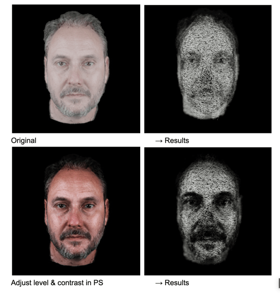
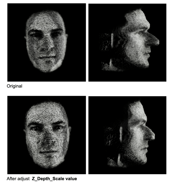
For the launch of my logomark on Instagram, I created a Processing sketch that placed the logo in a pixelated 3D scene, rotating. I liked that it almost became a sculpture or building of sorts. Now I only needed to build a web version.
Because my Hero and Footer components were both p5.js, this was my first choice. But it was slow ~ I mean like really slow. No matter how I tried to optimise it, the 3D workload killed the performance. I had only worked with Three.js once a few years back, but I remembered it handled 3D pretty well. Not sure you’re going to have the best performing website by using multiple libraries, but since it’s all just for fun, I decided to give it a go. With the Three.js version I could add far more detail to the structure, and it still performed flawlessly compared to the p5.js version. Below you’ll see me looping through all the voxels.
let instanceId: number = 0;

// Loop using voxel resolution (detail), not image resolution
for (let z: number = 0; z < detail; z++) {
  for (let y: number = 0; y < detail; y++) {
    const flippedY: number = detail - 1 - y;

    for (let x: number = 0; x < detail; x++) {
      // Sample image using normalized coordinates
      const sampleX: number = Math.floor((x / detail) * imgDetail);
      const sampleY: number = Math.floor((flippedY / detail) * imgDetail);
      const sampleZ: number = Math.floor((z / detail) * imgDetail);

      const brightness1: number = getBrightnessAt(imgData, imgDetail, sampleX, sampleY);
      const brightness2: number = getBrightnessAt(imgData, imgDetail, sampleZ, sampleY);

      if (brightness1 < 100 && brightness2 < 100 && instanceId < maxInstances) {
        dummy.position.set(
          x * cellSize - (detail * cellSize) / 2,
          y * cellSize - (detail * cellSize) / 2,
          z * cellSize - (detail * cellSize) / 2
          );
        dummy.updateMatrix();
        mesh.setMatrixAt(instanceId, dummy.matrix);
        instanceId++;
      }
    }
  }
}
Wrapping Up
This platform isn’t finished ~ that’s the point. It’s a space to interact with my coded tools, for sketches to be shared for further exploration and for process itself to stay visible. If you’re a designer or coder, I hope it nudges you to start or continue your own side projects. That’s how creativity stays alive. Thank you for reading.