
In this article, we’ll explore the behind-the-scenes process of how Waaark brought 24/7 Artists’ new product launch landing page to life. See how creative vision, design, and development came together to shape the final result.
Brief
24/7 Artists reached out after discovering our work on AW Portfolio. They came to us with a clear challenge: help them break through a creative deadlock and redesign their site to support an upcoming product launch—on a tight deadline.
At Waaark, having time to think, breathe, and work at our own pace is key. We typically avoid last-minute projects, but this one felt like a puzzle worth solving. We saw a narrow but feasible path forward and accepted the challenge.
Creative research
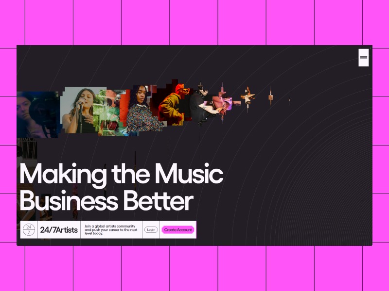
We kicked off the project by exploring ways to visually represent music. After some wandering sessions on platforms like Pinterest and Behance, we narrowed our direction toward visualiser aesthetics—particularly the use of lines to suggest sound waves.
The client also emphasised their desire to introduce depth and dimensionality into the site. We collected inspiration reflecting this concept and organised everything into a Milanote moodboard, including ideas around color, typography, layout, and impactful hero sections to set a clear creative direction.
Given the time constraints, it was important to focus on bold, achievable visuals—techniques we had already mastered.
Design
Story board
For a storytelling-focused, long-scrolling landing page like this, we replaced our typical UI wireframes with a full storyboard. This storyboard mapped out each step of the user journey, along with transitions between sections.
Our goal was twofold: to provide the client with a clear visual direction and to start shaping the flow and pacing on our end.
Creative Direction
With both the moodboard and storyboard approved, we began merging them to define the site’s visual language.
Right from the hero section, we wanted the message to be loud and clear: music meets tech. We envisioned a dark, immersive intro with circular lines evoking vinyl records or sound waves. Layered on top: a bold sans-serif headline and a ticket-style navigation bar to reinforce the music industry vibe.

To instantly capture user attention, we imagined a mouse-trail animation where artist photos appear in an equalizer-style movement.
To contrast the dark intro, we introduced a more colorful palette throughout the rest of the site, showcasing the diversity of music and the artists’ unique sensibilities.

Implementation
Tech stack
We used our go-to stack, which the client was already familiar with: WordPress. It provided a solid foundation—easy to manage, flexible for the frontend, and scalable.
For the front-end experience, we integrated a few select libraries:
- GSAP for fluid, expressive animations
- Luge to manage the overall page lifecycle
- Lenis for smooth scrolling
We aimed to minimise external dependencies, instead relying on native CSS 3D transformations and lightweight JS/Canvas-based animations—especially for effects mimicking depth.
Animation
To save time, all the animations were directly coded based on what we had envisioned and mapped out in the storyboard. Some of them worked exactly as imagined from the start, while others needed a bit of fine-tuning to integrate fully into the overall experience.
Scroll Animations
To keep users engaged while presenting 24/7 Artists’ vision and offering, we crafted a sequence of scroll-driven animations—alternating between smooth flows and unexpected reveals.
Micro-Interactions
On a product launch page, micro-interactions are key. They spark curiosity, highlight key elements, and subtly guide the user toward action.
For the main call to action, we designed a distinctive interaction using the same equalizer-like shape seen in the photo animations. On hover, it animates like a music player—both playful and thematic.
Tile Grid Setup
We began by constructing a grid made of 1×1 and 2×2 tiles.

Z-Axis Scroll Effect
Since we weren’t using true 3D, we faked depth using scale transforms. We calculated the scale needed to have the grid’s central hole (where content would go) expand to fill the viewport. Then, we transitioned each tile from its original size and position to the final state using GSAP.
Playing with GSAP staggered animation adds more depth to the motion.
Simulated Cube Depth
To simulate 3D cubes, we calculated the back-face vertices based on a smaller grid to keep the illusion of perspective. We then drew side faces accordingly, making sure to hide vertices behind the front face.
Canvas-Based Content Reveal
To finish the effect, we redrew the 2×2 tiles’ content in Canvas and added a cover layer that scrolls at a faster rate, revealing the content below.
Conclusion
The 24/7 Artists landing page was a bold and fast-paced project that pushed us to distill ideas quickly and trust our creative instincts.
Through strong visual metaphors, smooth storytelling, and carefully crafted motion, we built a launchpad that sets the tone for the brand’s next chapter.
This first release is just the beginning. The site was designed with scalability in mind, and additional sections and pages are already being added to support future growth and evolving needs.
When the vision is clear and the momentum is right, great things can happen—fast.