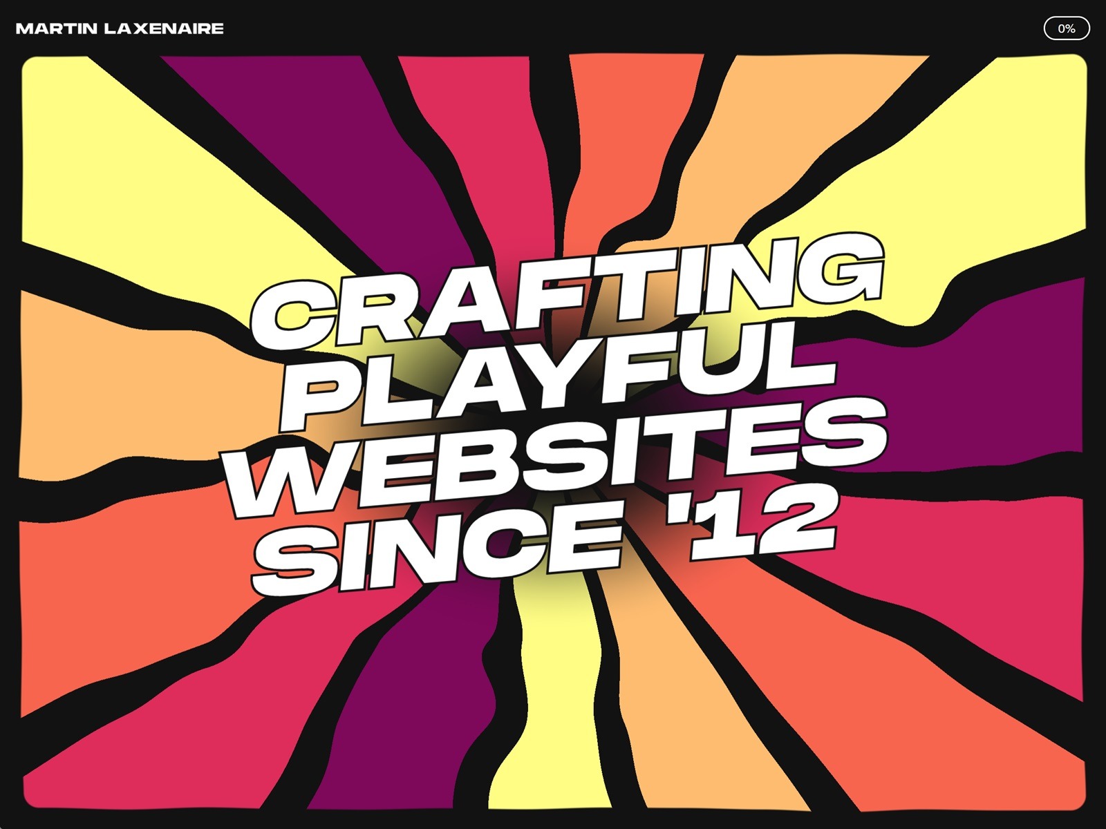
Hello World, Eloy Benoffi here (also known as ē𝔩๏ȳ̶̮̰̈́b) from Mar del Plata, Argentina — currently based in Madrid, Spain. I’m an Experimental UI Designer, Webflow Developer, and sometimes I like to call myself a Glitch Artist. In this case study, I will walk you through the vision and implementation behind my 2025 Portfolio Site.
It all began with one prompt: “I really, really need to update my portfolio.”
As some of you will know, this might be one of the hardest tasks to land on a creative’s desk. I’d had the same very simple minimalist site online since 2022 which, to be honest, really helped people find me, but no longer represented my vibes or the type of creative work I aim for. So I asked myself: how can I build something that not only showcases my projects and serves as a connector with potential clients, but also truly translates my ideas of pushing boundaries, opposing the norm, and having fun while doing it?
The answer didn’t come easily; I went through 16 iterations in Figma, experimenting non-stop for almost a year until I found the biggest piece of inspo within my own previous work. This ultimately helped shape the whole visual universe of my new site.
An Unapologetically Glitchy Web Experience
Experimenting and discarding ideas wasn’t in vain; some of them were not that good, some of them were lost gems, and a bunch of them found new life and got reworked into the final design. In retrospect, I now see clearly how each trial and error helped me refine the three key ideas behind my choices for this project:
Maximalism: More is more. I decided I wouldn’t back down, I wouldn’t scale down features or details for clarity, and I wouldn’t let austerity enter this project unless absolutely needed.
Brutalism: Things will be what they will be, and they don’t need to be perfect or subtle. I will allow each element to be bold, rough, and in your face. Shapes can be sharp, glitches can be glitchy, and everything should try to be brutally honest.
Fun: We should never forget to have fun in our personal projects. I internalized this like a mantra: “This is for you — you can do anything you want with it. The only constraints are your own whims; try to release expectations on how it’ll be perceived by your peers, and just build what you want to build. If potential clients don’t get it, then they’re probably not a match for you; the ones who get it will bring projects where you can feel authentic in your work.”
I tried to keep these notions in mind while designing the final iteration of the site, which was the one I felt happiest about.
A Tech Stack for Creating Mayhem
Once the design was ready, I had to bring it to life.
As a Webflow Certified Partner, I knew from the start that this would be the natural choice to build the site, as it allows me to put together complex HTML and CSS layouts in an easy and comprehensive way.
I love this platform because it helps to build better and faster, but doesn’t get in the way if you want to mess with custom code, and it’s great at allowing you to take things a step further beyond its core capabilities.
I knew that motion would be a key element — not just as decoration, but as a way to guide attention, create rhythm, and reinforce the three ideas behind the visuals. GSAP was the clear choice for me to animate. Its flexibility allowed me to experiment freely, from creating micro-interactions to large transitions and complex timelines. GSAP Plugins aided every step of the way, and thanks to them releasing all their premium plugins for free, I was able to use quite a few of them:
I’ll be sharing some code snippets below so you can take a peek at how I built my animations.
Wow at First Sight: The Loading Animation into the Hero Section
When you’re greeted on the page, you’re presented with the most detail-oriented part of the site: the Hero section.
I based the design on my piece Nature is Watching, reusing the eye-flower assets and ASCII versions of them as decoration. I wanted the intro section to feel like an animated expansion of this piece, while also including relevant information about me, what I do, where I come from, and how to contact me.
The idea behind the loader animation was to start with a stripped-down version of the full visuals and then add elements as the container expands. The whole section is scaled down while a loading bar grows, which later becomes the navbar.
Location Easter Egg
Once the content is loaded, there’s a tiny easter egg in the location element (bottom left). I wanted to include both my current location (Madrid) and my birthplace (Mar del Plata), so when you hover over it, the text switches between these location names, time zones, and coordinates.
This was done with very straightforward JavaScript. First, I created a function to change the Madrid location’s text to Mar del Plata’s, which contains a GSAP timeline and uses the Text Plugin to handle the text content changes. Secondly, I added an event listener that triggers the function on mouseenter:
As you leave the hero by scrolling down, the backdrop ASCII flower starts losing its characters. This was made possible thanks to SVG and GSAP ScrollTrigger. I targeted the individual paths inside the SVG graphic and then staggered them out as you scroll through the container:
After the complexity of the Hero section, one might be tempted to chill out and let the user relax — but that would go against my more is more anthem. When reaching the Work section, you’ll see that it might be the most minimalist section of the site, in the sense that there are fewer elements. However, I tried to make them stand out through movement. I used two main animations to keep up the attention:
Creating a Mesmerizing Title
The heading of this section serves both as a title reading “Selected Work” and as a transition between the chaos of the hero and the work content. To craft this animation, I set up several rows of divs with overflow: hidden at three different heights. Inside each one, there are at least three copies of the “Selected Work” text stacked vertically. I created a simple GSAP timeline with ScrollTrigger and staggers to move their yPercent with different easings while scrolling down, creating this fluid effect.
My selected projects are laid out in horizontal sliders made with the Draggable and Inertia plugins. I wanted something out of the ordinary to reveal their content, so I created a four-step timeline that sets the scale of each visible graphic randomly through these scale values: 1.75 → 1.5 → 1.25 → 1, with a tiny 0.15s delay between steps.
To add more chaos to it, I set the transform-origin of each graphic to different positions so the scaling effect wouldn’t be homogeneous.
After these intense animations, I couldn’t just finish the site with a simple footer. Instead, I brought back the ASCII decorations, forced the menu to open, and implemented a cloning machine linked to the mouse movement.
There’s just one button element — a very simple div with a background color and the text “CLICK TO CONNECT” inside it. Using JavaScript, I created a function that duplicates the element twice each time the mouse moves 200px in any direction, up to a limit of 200 copies, and positions the clones in random absolute places. The button div has a CSS blending-mode set to “difference” to make the overlap more visually interesting when the colors collide. Then, when the mouse leaves the footer element, all copies are removed.
Each new batch of copies enters and leaves with a staggered GSAP animation and custom backIn easing:
Though I tried to release external expectations with this experiment, I couldn’t help but be a bit scared of how it would be received. It sparked some conversations on social media about marketing vs. art, minimalism vs. maximalism, and where the line is drawn on usability. There were a few detractors who were very concerned with conversion, and also a few people who totally got it.
The truth is that building this portfolio was less about shipping a polished marketing shopfront and more about creating a space for me to use as a playground — a place where my design style, coding skills, and idiosyncrasy could collide into the kind of extra and glitchy site I wanted to see on the web. Bugs or accidental mistakes became features, animations ran a little too wild, and I did my best to take everything one step beyond. It was fun!
Ending on a personal note, I feel that in this new era of AI-generated content and sales-optimized templates, we should provide space for human authenticity, intentionality, and even errors — qualities that will likely be more relevant than ever moving forward.
Thanks for reading about my process. If you leave my site with a spark of intrigue, a smile at the chaos, or the urge to break a few rules in your own work, then my mission was accomplished — and you already know you can always Click to Connect.
At the beginning of 2025, I finally decided to build myself a new portfolio. I still pretty much liked the one I made back in 2021, but I felt the need to put to good use all the cool stuff I’ve learned these past couple years working with WebGPU. And, besides, half of the projects featured in my case studies had been put offline anyway, so it was about time.
I didn’t really know where I was going at this point, except that:
It would, of course, feature multiple procedurally generated WebGPU scenes. I already had a few concepts to explore in mind, like particles or boids simulation.
I wanted to take care of the design myself. It may seem weird, especially since I was very happy with what Gilles came up designing for my last portfolio, and also because I do suck at design. But this would give me more freedom, and I’ve also always liked building things from scratch on my own.
Last but not least, it had to be fun!
1. The journey
The (tough) design and content process
Don’t do this!
At first, I had no idea what to do design wise. Fonts, colors: there are so many things that could go wrong.
I started with simple light and dark colors, kept the fonts Gilles had chosen for my previous portfolio and started to copy/paste its old text content. It didn’t feel that great, and it wasn’t fun for sure.
The very first design iterations… Still a long way to go!
I definitely needed colors. I could have wasted a few hours (or days) choosing the right pairing, but instead I decided this could be the right opportunity to use this random color palette generator utility I’ve coded a few years ago. I cleaned the code a bit, created a repo, published it to npm and added it to my project. I also slightly changed the tone of the copywriting, and that led me to something still not that great, but a bit more fun.
Slowly getting there
I let it site for a while and started working on other parts of the site, such as integrating the CMS or experimenting with the WebGPU scenes. It’s only after a long iteration process that I’ve finally set up my mind on this kind of old school video games retro vibe mixed with a more cheerful, cartoonish aesthetic, almost Candy Crush-esque. Impactful headings, popping animations, banded gradients… you name it.
Of course, I’ve never gone as far as creating a Figma project (I did select a few reference images as a moodboard though) and just tested a ton of stuff directly with code until I felt it wasn’t that bad anymore. All in all, it was a very long and painful process, and I guess every designer would agree at this point: don’t do this!
A few images from my final moodboard – all credits go to their respective authors.
Do you actually read portfolios content?
Another painful point was to settle on the actual content and overall structure of the site. Do I need detailed case studies pages? Do I need pages at all? Will the users even read all those long blocks of text I will struggle to write?
In the end, I chose to drop the case studies pages. I had a couple of reasons to do so:
Often times the project ends up being put offline for various reasons, and you end up showcasing something the user cannot visit anymore. This is exactly what happened on my previous portfolio.
Most of the client work I’ve been doing those past years has been for agencies, and I’m not always allowed to publicly share them. I have no problem with that, but it slightly reduced the number of projects I could highlight.
From there on, it was a quick decision to just go with a single landing page. I’d put direct links to the projects I could highlight and small videos of all the other projects or personal works I could feature. On top of that, I’d add a few “about” sections mixed with my WebGPU scenes, and that’d be the gist of it.
Speaking of the WebGPU scenes, I really wanted them to be meaningful, not just a technical demonstration of what I could do. But we’ll get to that later.
The final UX twist
After a few months, I felt like I was entering the final stage of development. The page structure was mostly done, all my various sections were there and I was working on the final animations and micro-interactions tweakings.
So I took a step back, and looked back at my initial expectations. I had my WebGPU scenes showcasing my various technical skills. I had handled the design myself, and it wasn’t that bad. But were the flashy colors and animations enough to make it a really fun experience overall?
I think you already know the answer. Something was missing. Except for the random color palette switcher, the UX basically consisted of scroll-driven animations. Most of the 3D scenes interactions were rudimentary. I needed an idea.
The design already had this video game cheerful look. So… What if I turned my whole portfolio into a game? Once again, I started writing down my ideas:
The user would need to interact with the different UI elements to unlock the theme switcher and color palette generator buttons.
Each WebGPU scene could serve as a way to unlock the following content, acting as a very basic “puzzle” game.
Keep track of the user overall progress.
Allow the user to skip the whole game process if they want to.
This means most of the users wouldn’t ever make it to the footer, or use this random palette generator tool I’ve struggled to implement. This might very well be the most riskiest, stupidest decision I’ve made so far. But it would give my portfolio this unique and fun touch I was looking for in the first place, so I went all in.
Of course, it goes without saying it implied a major refactoring of the whole code and I needed to come up with original interaction ideas for the WebGPU scenes, but I like to think it was worth it.
Gamification mechanisms: unlocking content and rewarding message
Are you one of the few that unlocked the color palette generator button?
2. Technical study
Now that you know all the whys, let’s have a look at the hows!
Tech stack
I’ve decided to try Sanity Studio as I’ve never worked with it before and as I knew it would be a relatively small project, it’d be a perfect fit to start using it. Even though I felt like I just scratched its surface, I liked the overall developer experience it provided. On the other hand, I already had a good experience working with Nuxt3 so this was an easy choice.
No need to mention why I chose GSAP and Lenis — everyone knows those are great tools to deliver smooth animated websites.
Of course, the WebGPU scenes had to be done with gpu-curtains, the 3D engine I spent so much time working on these past two years. It was a great way to test it in a real-life scenario and gave me the opportunity to fix a few bugs or add a couple features along the way.
And since I wanted the whole process to be as transparent as possible, I’ve published the whole source code as a monorepo on GitHub.
Animations
I won’t go too deep into how I handled the various animations, simply because I’ve essentially used CSS and a bit of GSAP here and there, mostly for canvas animations, SplitText effects or the videos carousel using ScrollTrigger observer.
The basic scenes
There are a lot of components on the website that needed to draw something onto a <canvas> and react to the theme and/or color palette changes.
Since switching theme from light to dark (or vice versa) also updates the color palette by tweaking the HSV value component of the colors a bit, I’ve just put a setColors() method in there to handle these changes.
The progress handling here is actually a remain of when the WebGPU scenes animations were mostly scroll-driven (before I introduced the game mechanisms), but since a few scenes still used it, I kept it in there.
All the 2D canvas scenes extend that class, including the WebGPU fallback scenes, the theme switcher button or the dynamic favicon generator (did you notice that?).
The WebGPU scenes
One of the very cool features introduced by WebGPU is that you can render to multiple <canvas> elements using only one WebGPU device. I used this to build 4 different scenes (we’ll take a closer look at each of them below), that all extend a WebGPUScene.ts class:
In the real version, this class also handles the creation of a Tweakpane GUI folder (useful for debugging or tweaking values), but for the sake of clarity I removed the related code here.
As you can see, each of these scenes closely monitors its own performance using a custom QualityManager class. We’ll talk about that later, in the performance section.
Okay, now that we have the basic architecture in mind, let’s break down each of the WebGPU scenes!
Since WebGPU is not fully supported yet, I’ve created fallback versions using the 2D canvas API and the Scene class we’ve seen above for each of the following scenes.
Hero scene
The scenes featured in the portfolio somehow respect a kind of complexity order, meaning the more you advance in the portfolio, the more technically involved the scenes become.
In that way, the hero scene is by far the most simple technically speaking, but it had to look particularly striking and engaging to immediately capture the user’s attention. It was thought as some sort of mobile puzzle game splash screen.
Let’s go!
It’s made of a basic, single fullscreen quad. The idea here is to first rotate its UV components each frame, map them to polar coordinates and use that to create colored triangles segments.
// Center UVs at (0.5, 0.5)
var centeredUV = uv - vec2f(0.5);

// Apply rotation using a 2D rotation matrix
let angleOffset = params.time * params.speed; // Rotation angle in radians
let cosA = cos(angleOffset);
let sinA = sin(angleOffset);

// Rotate the centered UVs
centeredUV = vec2<f32>(
  cosA * centeredUV.x - sinA * centeredUV.y,
  sinA * centeredUV.x + cosA * centeredUV.y
);

// Convert to polar coordinates
let angle = atan2(centeredUV.y, centeredUV.x); // Angle in radians
let radius = length(centeredUV);

// Map angle to triangle index
let totalSegments  = params.numTriangles * f32(params.nbColors) * params.fillColorRatio;
let normalizedAngle = (angle + PI) / (2.0 * PI); // Normalize to [0,1]
let triIndex = floor(normalizedAngle * totalSegments); // Get triangle index

// Compute fractional part for blending
let segmentFraction = fract(normalizedAngle * totalSegments); // Value in [0,1] within segment

let isEmpty = (i32(triIndex) % i32(params.fillColorRatio)) == i32(params.fillColorRatio - 1.0);
let colorIndex = i32(triIndex / params.fillColorRatio) % params.nbColors; // Use half as many color indices

let color = select(vec4(params.colors[colorIndex], 1.0), vec4f(0.0), isEmpty);
There’s actually a wavy noise applied to the UV beforehand using concentric circles, but you get the idea.
Interestingly enough, the most difficult part was to achieve the rounded rectangle entering animation while preserving the correct aspect ratio. This was done using this function:
fn roundedRectSDF(uv: vec2f, resolution: vec2f, radiusPx: f32) -> f32 {
    let aspect = resolution.x / resolution.y;

    // Convert pixel values to normalized UV space
    let marginUV = vec2f(radiusPx) / resolution;
    let radiusUV = vec2f(radiusPx) / resolution;

    // Adjust radius X for aspect ratio
    let radius = vec2f(radiusUV.x * aspect, radiusUV.y);

    // Center UV around (0,0) and apply scale (progress)
    var p = uv * 2.0 - 1.0;       // [0,1] → [-1,1]
    p.x *= aspect;                // fix aspect
    p /= max(0.0001, params.showProgress); // apply scaling
    p = abs(p);

    // Half size of the rounded rect
    let halfSize = vec2f(1.0) - marginUV * 2.0 - radiusUV * 2.0;
    let halfSizeScaled = vec2f(halfSize.x * aspect, halfSize.y);

    let d = p - halfSizeScaled;
    let outside = max(d, vec2f(0.0));
    let dist = length(outside) + min(max(d.x, d.y), 0.0) - radius.x * 2.0;

    return dist;
}
Highlighted videos slider scene
Next up is the highlighted videos slider. The original idea came from an old WebGL prototype I had built a few years ago and never used.
Do you spot any similarities?
The idea is to displace the planes vertices to wrap them around a cylinder.
var position: vec3f = attributes.position;

// curve
let angle: f32 = 1.0 / curve.nbItems;

let cosAngle = cos(position.x * PI * angle);
let sinAngle = sin(position.x * PI * angle);

position.z = cosAngle * curve.itemWidth;
position.x = sinAngle;
I obviously used this for the years titles, whereas the videos and trail effects behind them are distorted using a post-processing pass.
While this was originally tied to the vertical scroll values (and I really liked the feeling it produced), I had to update its behavior when I switched to the whole gamification idea, making it an horizontal carousel.
Going at the speed of light!
Thanks to gpu-curtains DOM to WebGPU syncing capabilities, it was relatively easy to set up the videos grid prototype using the Plane class.
The trail effect is done using a compute shader writing to a storage texture. The compute shader only runs when necessary, which means when the slider is moving. I’m sure it could have been done in a thousands different ways, but it was a good excuse to play with compute shaders and storage textures. Here’s the compute shader involved:
I thought I was done here, but while running production build tests I stumbled upon an issue. Unfortunately, preloading all those videos to use as WebGPU textures resulted in a huge initial payload and also significantly affected the CPU load. To mitigate that, I’ve implemented a sequential video preloading where I’d have to wait for each video to have enough data before loading the next one. This gave a huge boost regarding initial load time and CPU overhead.
Sequential videos loading waterfall
Invoices scene
The third WebGPU scene was initially supposed to constitute my own take at 3D boids simulations, using instancing and a compute shader. After a bit of work, I had a bunch of instances that were following my mouse, but the end result was not living up to my expectations. The spheres were sometimes overlapping each other, or disappearing behind the edges of the screen. I kept improving it, adding self-collision, edge detections and attraction/repulsion mechanisms until I was happy enough with the result.
I like to call it the “invoices” scene, because the sphere instances here actually represent all the invoices I actually issued during my freelance career, scaled based on the amounts. Since I’m using google sheets to handle most of my accounting, I’ve made a little script that gathers all my invoices amount in a single, separate private sheet each time I’m updating my accounting sheets. I then fetch and parse that sheet to create the instances. It was a fun little side exercise and turns this scene into an ironically meaningful experiment: each time you click and hold, you kind of help me collect my money.
Give me my money!
The compute shader uses a buffer ping-pong technique: you start with two identically filled buffers (e.g. packed raw data) then at each compute dispatch call, you read the data from the first buffer and update the second one accordingly. Once done, you swap the two buffers before the next call and repeat the process. If you’re familiar with WebGL, this is often done with textures. WebGPU and compute shaders allow us to do so with buffers, which is way more powerful. Here is the complete compute shader code:
struct ParticleB {
  position: vec4f,
  velocity: vec4f,
  rotation: vec4f,
  angularVelocity: vec4f,
  data: vec4f
};

struct ParticleA {
  position: vec4f,
  velocity: vec4f,
  rotation: vec4f,
  angularVelocity: vec4f,
  data: vec4f
};

struct SimParams {
  deltaT: f32,
  mousePosition: vec3f,
  mouseAttraction: f32,
  spheresRepulsion: f32,
  boxReboundFactor: f32,
  boxPlanes: array<vec4f, 6>
};

@group(0) @binding(0) var<uniform> params: SimParams;
@group(0) @binding(1) var<storage, read> particlesA: array<ParticleA>;
@group(0) @binding(2) var<storage, read_write> particlesB: array<ParticleB>;


fn constrainToFrustum(pos: vec3<f32>, ptr_velocity: ptr<function, vec3<f32>>, radius: f32) -> vec3<f32> {
    var correctedPos = pos;

    for (var i = 0u; i < 6u; i++) { // Loop through 6 frustum planes
        let plane = params.boxPlanes[i];
        let dist = dot(plane.xyz, correctedPos) + plane.w;

        if (dist < radius) { // If inside the plane boundary (radius = 1)
            // Move the point inside the frustum
            let correction = plane.xyz * (-dist + radius); // Push inside the frustum

            // Apply the position correction
            correctedPos += correction;

            // Reflect velocity with damping
            let normal = plane.xyz;
            let velocityAlongNormal = dot(*(ptr_velocity), normal);

            if (velocityAlongNormal < 0.0) { // Ensure we only reflect if moving towards the plane
                *(ptr_velocity) -= (1.0 + params.boxReboundFactor) * velocityAlongNormal * normal;
            }
        }
    }
    return correctedPos;
}

fn quaternionFromAngularVelocity(omega: vec3f, dt: f32) -> vec4f {
    let theta = length(omega) * dt;
    if (theta < 1e-5) {
        return vec4(0.0, 0.0, 0.0, 1.0);
    }
    let axis = normalize(omega);
    let halfTheta = 0.5 * theta;
    let sinHalf = sin(halfTheta);
    return vec4(axis * sinHalf, cos(halfTheta));
}

fn quaternionMul(a: vec4f, b: vec4f) -> vec4f {
    return vec4(
        a.w * b.xyz + b.w * a.xyz + cross(a.xyz, b.xyz),
        a.w * b.w - dot(a.xyz, b.xyz)
    );
}

fn integrateQuaternion(q: vec4f, angularVel: vec3f, dt: f32) -> vec4f {
    let omega = vec4(angularVel, 0.0);
    let dq = 0.5 * quaternionMul(q, omega);
    return normalize(q + dq * dt);
}

@compute @workgroup_size(64) fn main(
    @builtin(global_invocation_id) GlobalInvocationID: vec3<u32>
) {
    var index = GlobalInvocationID.x;

    var vPos = particlesA[index].position.xyz;

    var vVel = particlesA[index].velocity.xyz;
    var collision = particlesA[index].velocity.w;

    var vQuat = particlesA[index].rotation;
    var angularVelocity = particlesA[index].angularVelocity.xyz;

    var vData = particlesA[index].data;

    let sphereRadius = vData.x;
    var newCollision = vData.y;


    collision += (newCollision - collision) * 0.2;
    collision = smoothstep(0.0, 1.0, collision);
    newCollision = max(0.0, newCollision - 0.0325);

    let mousePosition: vec3f = params.mousePosition;
    let minDistance: f32 = sphereRadius; // Minimum allowed distance between spheres

    // Compute attraction towards sphere 0
    var directionToCenter = mousePosition - vPos;
    let distanceToCenter = length(directionToCenter);

    // Slow down when close to the attractor
    var dampingFactor = smoothstep(0.0, minDistance, distanceToCenter);

    if (distanceToCenter > minDistance && params.mouseAttraction > 0.0) { // Only attract if outside the minimum distance
        vVel += normalize(directionToCenter) * params.mouseAttraction * dampingFactor;
        vVel *= 0.95;
    }

    // Collision Handling: Packing spheres instead of pushing them away
    var particlesArrayLength = arrayLength(&particlesA);

    for (var i = 0u; i < particlesArrayLength; i++) {
        if (i == index) {
            continue;
        }

        let otherPos = particlesA[i].position.xyz;
        let otherRadius = particlesA[i].data.x;
        let collisionMinDist = sphereRadius + otherRadius;
        let toOther = otherPos - vPos;
        let dist = length(toOther);

        if (dist < collisionMinDist) {
            let pushDir = normalize(toOther);
            let overlap = collisionMinDist - dist;
            let pushStrength = otherRadius / sphereRadius; // radius

            // Push away proportionally to overlap
            vVel -= pushDir * (overlap * params.spheresRepulsion) * pushStrength;
            newCollision = min(1.0, pushStrength * 1.5);

            let r = normalize(cross(pushDir, vVel));
            angularVelocity += r * length(vVel) * 0.1 * pushStrength;
        }
    }

    let projectedVelocity = dot(vVel, directionToCenter); // Velocity component towards mouse

    let mainSphereRadius = 1.0;

    if(distanceToCenter <= (mainSphereRadius + minDistance)) {
        let pushDir = normalize(directionToCenter);
        let overlap = (mainSphereRadius + minDistance) - distanceToCenter;

        // Push away proportionally to overlap
        vVel -= pushDir * (overlap * params.spheresRepulsion) * (2.0 + params.mouseAttraction);

        newCollision = 1.0;

        if(params.mouseAttraction > 0.0) {
            vPos -= pushDir * overlap;
        }

        let r = normalize(cross(pushDir, vVel));
        angularVelocity += r * length(vVel) * 0.05;
    }

    vPos = constrainToFrustum(vPos, &vVel, sphereRadius);

    // Apply velocity update
    vPos += vVel * params.deltaT;

    angularVelocity *= 0.98;
    let updatedQuat = integrateQuaternion(vQuat, angularVelocity, params.deltaT);

    // Write back
    particlesB[index].position = vec4(vPos, 0.0);
    particlesB[index].velocity = vec4(vVel, collision);
    particlesB[index].data = vec4(vData.x, newCollision, vData.z, vData.w);
    particlesB[index].rotation = updatedQuat;
    particlesB[index].angularVelocity = vec4(angularVelocity, 1.0);
}
One of my main inspirations for this scene was this awesome demo by Patrick Schroen. I spent a lot of time looking for the right rendering tricks to use and finally set up my mind on volumetric lighting. The implementation is quite similar to what Maxime Heckel explained in this excellent breakdown article. Funnily enough, I was already deep into my own implementation when he released that piece, and I owe him the idea of using a blue noise texture.
Volumetric lighting debugging
As a side note, during the development phase this was the first scene that required an actual user interaction and it played a pivotal role in my decision to turn my folio into a game.
Open source scene
For the last scene, I wanted to experiment a bit more with particles and curl noise because I’ve always liked how organic and beautiful it can get. I had already published an article using these concepts, so I had to come up with something different. Jaume Sanchez’ Polygon Shredder definitely was a major inspiration here.
Since this experiment was part of my open source commitment section, I had the idea to use my GitHub statistics as a data source for the particles. Each statistic (number of commits, followers, issues closed and so on) is assigned to a color and turned into a bunch of particles. You can even toggle them on and off using the filters in the information pop-up. Once again, this changed a rather technical demo into something more meaningful.
Curl noise and particles are always a good match
While working on the portfolio, I was also exploring new rendering techniques with gpu-curtains such as planar reflections. Traditionally used for mirror effects or floor reflections, it consists of rendering a part of your scene a second time but from a different camera angle and projecting it onto a plane. Having nailed this, I thought it would be a perfect match there and added it to the scene.
Last but not least, and as a reminder of the retro video games vibe, I wanted to add a pixelated mouse trail post-processing effect. I soon realized it would be way too much though, and ended up showing it only when the user is actually drawing a line, making it more subtle.
Using the filters can actually help you unlock features!
Performance and accessibility
On such highly interactive and immersive pages, performance is key. Here are a few tricks I’ve used to try to maintain the most fluid experience across all devices.
Dynamic imports
I’ve used Nuxt dynamic imported components and lazy hydration for almost every non critical components of the page. In the same way, all WebGPU scenes are dynamically loaded only if WebGPU is supported. This significantly decreased the initial page load time.
// pseudo code
import type { WebGPUHeroScene } from "~/scenes/hero/WebGPUHeroScene";
import { CanvasHeroScene } from "~/scenes/hero/CanvasHeroScene";

let scene: WebGPUHeroScene | CanvasHeroScene | null;
const canvas = useTemplateRef("canvas");

const { colors } = usePaletteGenerator();

onMounted(async () => {
  const { $gpuCurtains, $hasWebGPU, $isReducedMotion } = useNuxtApp();

  if ($hasWebGPU && canvas.value) {
    const { WebGPUHeroScene } = await import("~/scenes/hero/WebGPUHeroScene");

    scene = new WebGPUHeroScene({
      gpuCurtains: $gpuCurtains,
      container: canvas.value,
      colors: colors.value,
    });
  } else if (canvas.value) {
    scene = new CanvasHeroScene({
      container: canvas.value,
      isReducedMotion: $isReducedMotion,
      colors: colors.value,
    });
  }
});
I’m not particularly fond of Lighthouse reports but as you can see the test result is quite good (note that it’s running without WebGPU though).
PageSpeed Insights report
Monitoring WebGPU performance in real time
I’ve briefly mentionned it earlier, but each WebGPU scene actually monitors its own performance by keeping track of its FPS rate in real time. To do so, I’ve written 2 separate classes: FPSWatcher, that records the average FPS over a given period of time, and QualityManager, that uses a FPSWatcher to set a current quality rating on a 0 to 10 scale based on the average FPS.
It’s very basic: I just record the elapsed time between two render calls, put that into an array and run a callback every updateDelay milliseconds with the latest FPS average value. It is then used by the QualityManager class, that does all the heavy lifting to assign an accurate current quality score:
import type { FPSWatcherParams } from "./FPSWatcher";
import FPSWatcher from "./FPSWatcher";

export interface QualityManagerParams {
  label?: string;
  updateDelay?: FPSWatcherParams["updateDelay"];
  targetFPS?: number;
  onQualityChange?: (newQuality: number) => void;
}

export class QualityManager {
  label: string;
  fpsWatcher: FPSWatcher;
  targetFPS: number;
  #lastFPS: number | null;
  #active: boolean;
  onQualityChange: (newQuality: number) => void;

  quality: {
    current: number;
    min: number;
    max: number;
  };

  constructor({
    label = "Quality manager",
    updateDelay = 1000,
    targetFPS = 60,
    onQualityChange = (newQuality) => {},
  }: QualityManagerParams = {}) {
    this.label = label;
    this.onQualityChange = onQualityChange;

    this.quality = {
      min: 0,
      max: 10,
      current: 7,
    };

    this.#active = true;

    this.targetFPS = targetFPS;
    this.#lastFPS = null;

    this.fpsWatcher = new FPSWatcher({
      updateDelay,
      onWatch: (averageFPS) => this.onFPSWatcherUpdate(averageFPS),
    });
  }

  get active() {
    return this.#active;
  }

  set active(value: boolean) {
    if (!this.active && value) {
      this.fpsWatcher.restart();
    }

    this.#active = value;
  }

  onFPSWatcherUpdate(averageFPS = 0) {
    const lastFpsRatio = this.#lastFPS
      ? Math.round(averageFPS / this.#lastFPS)
      : 1;
    const fpsRatio = (averageFPS + lastFpsRatio) / this.targetFPS;

    // if fps ratio is over 0.95, we should increase
    // else we decrease
    const boostedFpsRatio = fpsRatio / 0.95;

    // smooth change multiplier avoid huge changes in quality
    // except if we've seen a big change from last FPS values
    const smoothChangeMultiplier = 0.5 * lastFpsRatio;

    // quality difference that should be applied (number with 2 decimals)
    const qualityDiff =
      Math.round((boostedFpsRatio - 1) * 100) * 0.1 * smoothChangeMultiplier;

    if (Math.abs(qualityDiff) > 0.25) {
      const newQuality = Math.min(
        Math.max(
          this.quality.current + Math.round(qualityDiff),
          this.quality.min
        ),
        this.quality.max
      );

      this.setCurrentQuality(newQuality);
    }

    this.#lastFPS = averageFPS;
  }

  setCurrentQuality(newQuality: number) {
    this.quality.current = newQuality;
    this.onQualityChange(this.quality.current);
  }

  update() {
    if (this.active) {
      this.fpsWatcher.update();
    }
  }
}
The most difficult part here is to smoothly handle the quality changes to avoid huge drops or gains in quality. You also don’t want to fall in a loop where for example:
The average FPS are poor, so you degrade your current quality.
You detect a quality loss and therefore decide to switch off an important feature, such as shadow mapping.
Removing the shadow mapping gives you a FPS boost and after the expected delay the current quality is upgraded.
You detect a quality gain, decide to re-enable shadow mapping and soon enough, you’re back to step 1.
Typically, the quality rating is used to update things such as the current pixel ratio of the scene, frame buffers resolutions, number of shadow maps PCF samples, volumetric raymarching steps and so on. In worst case scenarios, it can even disable shadow mapping or post processing effects.
Accessibility
Finally, the site had to respect at least the basic accessibility standards. I’m not an accessibility expert and I may have made a few mistakes here and there, but the key points are that the HTML is semantically correct, it is possible to navigate using the keyboard and the prefers-reduced-motion preference is respected. I achieved that by disabling entirely the gamification concept for these users, removing every CSS and JavaScript animations, and made the scenes fall back to their 2D canvas versions, without being animated at all.
Conclusion
Well, it was a long journey, wasn’t it?
Working on my portfolio these past 6 months has been a truly demanding task, technically but also emotionally. I’m still having a lot of self doubts about the overall design, key UX choices or level of creativity. I also do think that it kind of honestly sums up who I am as a developer but also as a person. In the end, it’s probably what matters most.
I hope that you’ve learnt a few things reading this case study, whether it’d be about technical stuff or my own creative process. Thank you all, and remember: stay fun!
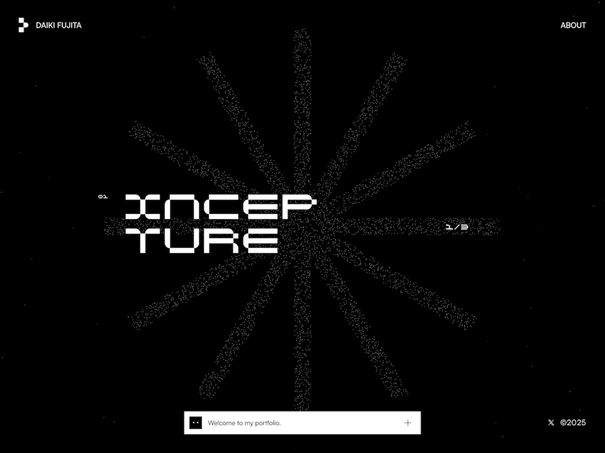
Hi, I’m Daiki Fujita, a designer based in Tokyo, Japan. In this case study, I’ll walk you through the making of my 2025 portfolio.
Background
This project began with two motivations: reaching my 10-year milestone as a designer, and wanting to create a platform to showcase my work more openly.
When I thought about my roots as a designer, I looked back to my childhood. My family ran a small electronics shop, and I was given a PC at an early age. I remember spending hours drawing with the Paint tool on Windows 95. That sense of joy and excitement—being able to make pictures on a computer—stayed with me. For this site, I wanted to capture that feeling and connect it to the concept of “Abstract & Concrete.”
Overview
In today’s world, where digital technology evolves so quickly and information is consumed in an instant, I wanted to focus on communicating only the essentials. That became the axis of the concept: balancing abstraction and concreteness.
To embody this visually, I kept the design minimal: only two colors, and elements based on points and planes. These became the foundation for three expressive styles—particles, pixel art, and mosaic art—unifying the atmosphere of the site and creating an immersive experience.
For this site, I decided to experiment with Framer, which I had been curious about for some time. The effects and animations were developed as original code components in React.
Design Approach
Particle
To express the idea of “seeing, touching, and feeling” each project, I used particle-based interactions. For every work, I created a key object and transformed it into particles.
These particle elements were built with an originally developed code component. Attributes such as particle count, size, color, position, and the degree and range of mouse pointer interaction can all be adjusted—and many other properties as well—through the GUI. Adding or updating works is designed to be simple—just upload an SVG.
This site is my personal portfolio, and each project featured here is a crystallization of my own work, expressed through the morphing of key objects. In addition, I enhanced the sense of immersion by adding a background effect where a particle-constructed space seems to warp dimensions as you scroll.
2D Graphic Effects
To reinforce the visual identity, I incorporated graphical effects made of planes. These appear during page landings and transitions, giving the site a consistent atmosphere.
Mosaic Effects
For project content, I used a pixel-reveal effect. By gradually visualizing the work, it sparks curiosity and invites viewers to stop and engage more deeply.
Subliminal Elements
The elements that flash randomly for a split second are inorganic in shape. They don’t carry meaning on their own, but they’re meant to raise a question: “In an age where information disappears in an instant, are we really grasping its essence?”
Hidden Details
I didn’t want the site to just feel sleek and stylish. So I added playful touches—like eyes that follow the cursor, or elements that fall asleep if left idle. I’m always sleepy.
The Tech Stack
Frontend: Framer, React
CMS: Framer CMS
Design: Figma, Framer
Closing
Thanks so much for reading!
Creating this portfolio allowed me to reconnect with the same joy and excitement I felt as a kid, drawing on a computer for the first time. I poured that feeling into the site, and if visitors can feel even a little of that joy through this website, I would be truly happy!
This summer I created my Personal Project Platform. It wasn’t exactly intentional. When I realised where my process was going, I was already some way along.
Speaking of process, I’m a big fan. When you’re ready to surrender, you’ll find yourself in places you wouldn’t expect. Anyway, two paths came together when I discovered I was working on my Personal Project Platform. Let’s talk about the first one.
Path 1: A Necessary Happy Place
As a designer, or as a human being for that matter, not every day is full of inspiration. Especially when the design-and-AI landscape changes as fast as it does now, it’s sometimes hard to see the big picture.
As a remedy, I started building a moodboard that would serve as my Happy Place. Whenever I came across a reference that made me smile, I put it there. It had sections for my dream office; quotes and thoughts that resonated with me; and random image fragments that, together, felt like me ~ or at least a designer version of me. I started adding my own scribbles, notes and thoughts about purpose: why am I still doing this? What am I looking for as a designer?
One evening in December 2022, I had a drink with a designer friend. We were making random things just for fun. At work, I had shifted into more of a managerial role, and I missed designing.
Then I thought: why not throw it online? So I created an Instagram account and posted my first Processing sketch.
The more I made, the more I wanted to make. Over time, this habit became part of me. Sketches became interactive, but it bothered me they only ran locally ~ I was the only one who could interact with them. I also started sharing quick tutorials, and was amazed by how many positive responses I got from people who felt inspired to make something of their own.
Where the Two Paths Meet
Meanwhile, my “Happy Place” notes grew longer and more intentional. I wanted more people to interact with my sketches. Since I was doing it all for fun, why not share the source code? Why not collect my resources for others to use?
Slowly it became an idea for a platform: one where the intentional and the unexpected coexist, showing new designers ~ especially with AI replacing all the fun ~ that learning a craft, practising, and training your creative muscle still matter.
Now I just had to build it.
I started with just a few basic components in Figma.
Building the Platform
Since we’re on Codrops, let’s talk code. I have a background in PHP and JavaScript ~ old-school, before ES6 or TypeScript, let alone Vue or React. I wanted to use this project to learn something new.
After some research, I decided on Nuxt.js. From what I read, it’s easier to set up than Next.js. And since my platform isn’t likely to scale any time soon, I think it does the job. I had also played with Prismic CMS a few years back. Lightweight, not too many features, but fine for me. So I watched some Nuxt.js+Prismic tutorials, and off I went.
The Hero
I knew I wanted interactive components. Something that gave visitors an immediate sense of my work. Let’s start with the hero.
Finding beauty in friction
With your mouse you draw objects onto the canvas, plain and simple. I wanted the objects to have a link with nature ~ something that grows, can flourish ~ as you would do when you take on lots of personal projects.
In my first sketch the flowers scaled from small to big, literally growing. But then I thought: how many times had I got stuck on a sketch, frustrated over an idea that just wouldn’t work out? So I decided linear growth wouldn’t be honest. Most of the time when I work on my projects my head is all over the place. Things should scale randomly, they don’t even need to match in width and height. I like it like this, it mirrors the tension between control and chaos in my work. Below you’ll find the bit where this is happening.
/**
 * Get a portion of the next image
 */
 public getPortion(): p5.Image {
   // Fetch original
   const original = this.getNext();
   if (! original) return null;

   // Source
   const ow = original.width;
   const oh = original.height;
   const sx = Math.random() * ow;
   const sy = Math.random() * oh;

   // Remaining part
   const loW = ow - sx;
   const loH = oh - sy;

   let sw = Math.round(loW * Math.random()) + 10;
   let sh = Math.round(loH * Math.random()) + 10;

   // Destination
   const dx = 0;
   const dy = 0;
   const dw = sw;
   const dh = sh;

   // Create new image
   const copy = this.p.createImage(dw, dh);
   copy.copy(original, sx, sy, sw, sh, dx, dy, dw, dh);

   return copy;
 }

 public getRandomSizedPortion(): p5.Image {
   // Get portion
   const img = this.getPortion();
   if (! img) return null;

   // Random size
   const maxSize = this.p.width * .1;
   img.resize(this.p.random(10,maxSize), this.p.random(10,maxSize));

   return img;
 }
The Footer
To balance the hero, I also made the footer interactive. I used an older sketch as a base, adding depth and texture to make it feel a little like an abstract ocean.
For me, it brings a sense of calm and focus ~ with subtle vertical movement and a tone that changes as you move the mouse along the x-axis. The snippet below should give you an idea of how it works, but the original sketch is available to download on the platform. So if you’re curious, go ahead and play.
/**
 * Calculate all data
 */
 public update() {

   // Animation settings
   let duration: number = 128;
   let progress: number = this.p.frameCount % duration;
   if(progress == 0) this.iteration++;

   // Rows and height
   let numRowsDrawn: number = this.numRows + 1 + this.iteration;
   let colW: number = this.p.width / this.numCols;
   let rowH: number = this.p.height / this.numRows;

   let count = 0;
   // Loop through rows
   for (let y: number = this.iteration; y<numRowsDrawn; y++) {

     // Calculate y position (start at the bottom)
     let targetY: number = this.p.height - (y+1) * rowH + this.iteration * rowH;

     // Where are we in the progress
     let posY: number = this.p.map(progress, 0, duration, targetY, targetY+rowH);
     // Mouse influence
     const smoothing = 0.06;
     this.currentMouseX += (this.p.mouseX - this.currentMouseX) * smoothing;
     const mouseInfluence: number = this.p.map(this.currentMouseX, 0, this.p.width, .8, -.3);

     // What is the influence based on the y position
     let yInfluence: number = this.p.map(posY / this.numRows, 0, rowH, 1, this.numRows+1) * mouseInfluence;
     // Double columns each row
     let extraCols: number = Math.exp(yInfluence * Math.LN2);
     // Size and position
     let currentW: number = colW + extraCols * colW;

     // Loop through columns
     for (let x:number = 0; x<this.numCols; x++) {
       // Calculate x position
       let posX: number = x * currentW - (extraCols * yInfluence + 1) * colW;

       // Don't draw things out of screen x-axis
       if(posX > this.p.width) continue;
       if(posX + currentW < 0) continue;

       // Draw
       this.display(x, y, posX, posY, currentW, rowH);
       count++;
      }
    }
  }
The Masonry Grid
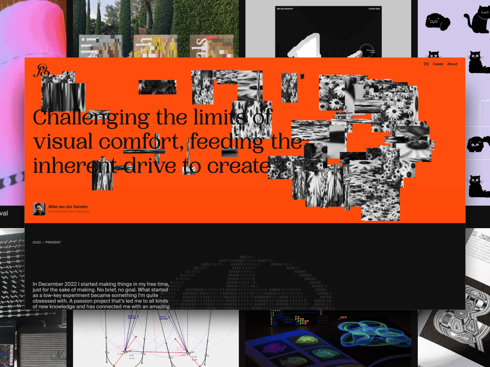
I’ve always liked inspiration websites where a lot is going on. You get all sorts of images and videos that are strong on their own, but gain new purpose in a different context. That’s what I wanted for my case overview.
Since I don’t aim for any particular graphical style, I like that it feels more like a collection of references. This is why I decided to go for a masonry grid. I didn’t want to use a plugin, so I built this little CSS/JavaScript thingy where I use CSS Grid rows to distribute the images, and JavaScript to calculate how many rows it should span, depending on the aspect ratio that is set in the CMS. I think there is still room for improvement, but to be honest, I ran low on patience on this one. I decided it does the job for now. Maybe I will get back to it someday to refactor. Below is the snippet where most of the work happens.
function applyMasonry() {
   // Fetch grid and items
   const grid = document.querySelector('.masonry-grid');
   const items = grid?.querySelectorAll('.masonry-item');

   // Make sure they’re both loaded
   if (!grid || !items) return

   // Get properties from CSS
   const rowHeight = parseInt(getComputedStyle(grid).getPropertyValue('grid-auto-rows'))
   const gap = parseInt(getComputedStyle(grid).getPropertyValue('gap') || 0)

   items.forEach(item => {

     // Fetch media and info container separately
     const media = item.querySelector('.masonry-item__image-container')
     const info = item.querySelector('.masonry-item__info-container')

     if (!media || !info) return

     // Combine them to item height
     const mediaHeight = media.getBoundingClientRect().height
     const infoHeight = info.getBoundingClientRect().height
     const itemHeight = mediaHeight + infoHeight

     // Calculate how many rows to span
     const rowSpan = Math.ceil((itemHeight + gap) / (rowHeight + gap))

     // Apply row span
     item.style.gridRowEnd = `span ${rowSpan}`;
     item.style.opacity = 1;
   })
 }
Resources & Code
Since I truly want to encourage people to start their own journey with personal projects, I want to share resources and code examples to get them started.
Of course with the launch of this platform I had to do this retrospectively for more than 20 projects, so in future I’ll probably share more process and behind-the-scenes. Who knows. Anyway, this component gives me a space for anything that might be useful to people who are interested.
Two Weeks Without a Laptop
Then the summer holiday arrived. France. Four days of Disneyland chaos, followed by some peace near the ocean. Days were simple: beach, pool, playgrounds. In between, I picked up a Bon Iver notebook I’d bought back home.
At the time, the platform had a temporary wordmark with my initials “mvds”. But I felt I could spend a little more time and attention crafting something beautiful. So every day I doodled my initials in all sorts of forms. By the end of the holiday I had a pretty good idea of what my logomark should become. Back home, with two more weeks before I needed to get back to work, I started digitising my sketches and tweaking anchor points until I got it right. (Then tweaked a little more, you know how it goes.) This resulted in a logomark I’m quite proud of. So I figured it needed a place on the platform.
P5.js vs Three.js
For the launch of my logomark on Instagram, I created a Processing sketch that placed the logo in a pixelated 3D scene, rotating. I liked that it almost became a sculpture or building of sorts. Now I only needed to build a web version.
Because my Hero and Footer components were both p5.js, this was my first choice. But it was slow ~ I mean like really slow. No matter how I tried to optimise it, the 3D workload killed the performance. I had only worked with Three.js once a few years back, but I remembered it handled 3D pretty well. Not sure you’re going to have the best performing website by using multiple libraries, but since it’s all just for fun, I decided to give it a go. With the Three.js version I could add far more detail to the structure, and it still performed flawlessly compared to the p5.js version. Below you’ll see me looping through all the voxels.
let instanceId: number = 0;

// Loop using voxel resolution (detail), not image resolution
for (let z: number = 0; z < detail; z++) {
  for (let y: number = 0; y < detail; y++) {
    const flippedY: number = detail - 1 - y;

    for (let x: number = 0; x < detail; x++) {
      // Sample image using normalized coordinates
      const sampleX: number = Math.floor((x / detail) * imgDetail);
      const sampleY: number = Math.floor((flippedY / detail) * imgDetail);
      const sampleZ: number = Math.floor((z / detail) * imgDetail);

      const brightness1: number = getBrightnessAt(imgData, imgDetail, sampleX, sampleY);
      const brightness2: number = getBrightnessAt(imgData, imgDetail, sampleZ, sampleY);

      if (brightness1 < 100 && brightness2 < 100 && instanceId < maxInstances) {
        dummy.position.set(
          x * cellSize - (detail * cellSize) / 2,
          y * cellSize - (detail * cellSize) / 2,
          z * cellSize - (detail * cellSize) / 2
          );
        dummy.updateMatrix();
        mesh.setMatrixAt(instanceId, dummy.matrix);
        instanceId++;
      }
    }
  }
}
Wrapping Up
This platform isn’t finished ~ that’s the point. It’s a space to interact with my coded tools, for sketches to be shared for further exploration and for process itself to stay visible. If you’re a designer or coder, I hope it nudges you to start or continue your own side projects. That’s how creativity stays alive. Thank you for reading.
For months, Eduard Bodak has been sharing glimpses of his visually rich new website. Now, he’s pulling back the curtain to walk us through how three of its most striking animations were built. In this behind-the-scenes look, he shares the reasoning, technical decisions, and lessons learned—from performance trade-offs to working with CSS variables and a custom JavaScript architecture.
Overview
In this breakdown, I’ll walk you through three of the core GSAP animations on my site: flipping 3D cards that animate on scroll, an interactive card that reacts to mouse movement on the pricing page, and a circular layout of cards that subtly rotates as you scroll. I’ll share how I built each one, why I made certain decisions, and what I learned along the way.
Overview of the animations we’re handling here
I’m using Locomotive Scroll V5 in this project to handle scroll progress and viewport detection. Since it already offers built-in progress tracking via data attributes and CSS variables, I chose to use that directly for triggering animations. ScrollTrigger offers a lot of similar functionality in a more integrated way, but for this build, I wanted to keep everything centered around Locomotive’s scroll system to avoid overlap between two scroll-handling libraries.
Personally, I love the simplicity of Locomotive Scroll. You can just add data attributes to specify the trigger offset of the element within the viewport. You can also get a CSS variable --progress on the element through data attributes. This variable represents the current progress of the element and ranges between 0 and 1. This alone can animate a lot with just CSS.
I used this project to shift my focus toward more animations and visual details. It taught me a lot about GSAP, CSS, and how to adjust animations based on what feels right. I’ve always wanted to build sites that spark a little emotion when people visit them.
Note that this setup was tailored to the specific needs of the project, but in cases where scroll behavior, animations, and state management need to be tightly integrated, GSAP’s ScrollTrigger and ScrollSmoother can offer a more unified foundation.
Now, let’s take a closer look at the three animations in action!
Flipping 3D cards on scroll
I split the animation into two parts. The first is about the cards escaping on scroll. The second is about them coming back and flipping back.
While I’m using Locomotive Scroll, I need data-scroll to enable viewport detection on an element. data-scroll-offset specifies the trigger offset of the element within the viewport. It takes two values: one for the offset when the element enters the viewport, and a second for the offset when the element leaves the viewport. The same can be built with GSAP’s ScrollTrigger, just inside the JS.
data-scroll-event-progress="progressHero" will trigger the custom event I defined here. This event allows you to retrieve the current progress of the element, which ranges between 0 and 1.
Inside the JS we can add an EventListener based on the custom event we defined. Getting the progress from it and transfer it to the GSAP timeline.
this.element is here our section we defined before, so it’s data-hero-animation.
Building now the timeline method inside the class. Getting the current timeline progress. Killing the old timeline and clearing any GSAP-applied inline styles (like transforms, opacity, etc.) to avoid residue.
Using requestAnimationFrame() to avoid layout thrashing. Initializes a new, paused GSAP timeline. While we are using Locomotive Scroll it’s important that we pause the timeline, so the progress of Locomotive can handle the animation.
Figuring out relative positioning per card. targetY moves each card down so it ends near the bottom of the container. yOffsets and rotationZValues give each card a unique vertical offset and rotation.
The actual GSAP timeline. Cards slide left or right based on their index (x). Rotate on Z slightly to look scattered. Slide downward (y) to target position. Shrink and tilt (scale, rotateX) for a 3D feel. index * 0.012: adds a subtle stagger between cards.
That’s our timeline for desktop. We can now set up GSAP’s matchMedia() to use it. We can also create different timelines based on the viewport. For example, to adjust the animation on mobile, where such an immersive effect wouldn’t work as well. Even for users who prefer reduced motion, the animation could simply move the cards slightly down and fade them out, as you can see on the live site.
Add this to our init() method to initialize the class when we call it.
init() {
 this.setupBreakpoints();
}
We can also add a div with a background color on top of the card and animate its opacity on scroll so it smoothly disappears.
When you look closely, the cards are floating a bit. To achieve that, we can add a repeating animation to the cards. It’s important to animate yPercent here, because we already animated y earlier, so there won’t be any conflicts.
gsap.utils.random(1.5, 2.5) comes in handy to make each floating animation a bit different, so it looks more natural. repeatRefresh: true lets the duration refresh on every repeat.
Part 02
We basically have the same structure as before. Only now we’re using a sticky container. The service_container has height: 350vh, and the service_sticky has min-height: 100vh. That’s our space to play the animation.
In the JS, we can use the progressService event as before to get our Locomotive Scroll progress. We just have another timeline here. I’m using keyframes to really fine-tune the animation.
const position = 2 - index - 1 changes the position, so cards start spread out: right, center, left. With that we can use those arrays [12, 0, -12] in the right order.
There’s the same setupBreakpoints() method as before, so we actually just need to change the timeline animation and can use the same setup as before, only in a new JS class.
We can add the same floating animation we used in part 01, and then we have the disappearing/appearing card effect.
Part 2.1
Another micro detail in that animation is the small progress preview of the three cards in the top right.
We add data-scroll-css-progress to the previous section to get a CSS variable --progress ranging from 0 to 1, which can be used for dynamic CSS effects. This data attribute comes from Locomotive Scroll.
Using CSS calc() with min() and max() to trigger animations at specific progress points. In this case, the first animation starts at 0% and finishes at 33%, the second starts at 33% and finishes at 66%, and the last starts at 66% and finishes at 100%.
On a closer look, you can see a small slide-in animation of the card before the mouse movement takes effect. This is built in GSAP using the onComplete() callback in the timeline. this.card refers to the element with data-price-card.
I’m using an elastic easing that I got from GSAPs Ease Visualizer. The timeline plays when the page loads and triggers the mouse movement animation once complete.
In our initAnimation() method, we can use GSAP’s matchMedia() to enable the mouse movement only when hover and mouse input are available.
this.mm = gsap.matchMedia();

initAnimation() {
 this.mm.add("(hover: hover) and (pointer: fine) and (prefers-reduced-motion: no-preference)", () => {
  gsap.ticker.add(this.mouseMovement);

  return () => {
   gsap.ticker.remove(this.mouseMovement);
  };
 });

 this.mm.add("(hover: none) and (pointer: coarse) and (prefers-reduced-motion: no-preference)", () => {
  ...
 });
}
By using the media queries hover: hover and pointer: fine, we target only devices that support a mouse and hover. With prefers-reduced-motion: no-preference, we add this animation only when reduced motion is not enabled, making it more accessible. For touch devices or smartphones, we can use hover: none and pointer: coarse to apply a different animation.
I’m using gsap.ticker to run the method this.mouseMovement, which contains the logic for handling the rotation animation.
I originally started with one of the free resources from Osmo (mouse follower) and built this mouse movement animation on top of it. I simplified it to only use the mouse’s x position, which was all I needed.
I also added calculations for how much the card can rotate on the y-axis, and it rotates the z-axis accordingly. That’s how we get this mouse movement animation.
When building these animations, there are always some edge cases I didn’t consider before. For example, what happens when I move my mouse outside the window? Or if I hover over a link or button, should the rotation animation still play?
I added behavior so that when the mouse moves outside, the card rotates back to its original position. The same behavior applies when the mouse leaves the hero section or hovers over navigation elements.
I added a state flag this.isHovering. At the start of mouseMovement(), we check if this.isHovering is false, and if so, return early. The onMouseLeave method rotates the card back to its original position.
We can adjust it further by adding another animation for mobile, since there’s no mouse movement there. Or a subtle reflection effect on the card like in the video. This is done by duplicating the card, adding an overlay with a gradient and backdrop-filter, and animating it similarly to the original card, but with opposite values.
Cards in a circular position that slightly rotate on scroll
First, we build the base of the circularly positioned cards in CSS.
At first, we add all 24 cards, then remove the ones we don’t want to show later because we don’t see them. In the CSS, the .wheel uses a grid display, so we apply grid-area: 1 / 1 to stack the cards. We later add an overlay before the wheel with the same grid-area. By using em we can use a fluid font-size to adjust the size pretty smooth on resizing the viewport.
We can remove the card from 8 to 19 as we don’t see them behind the overlay. It should look like this now.
By adding the data attributes and setup for viewport detection from Locomotive Scroll, which we used in previous modules, we can simply add our GSAP timeline for the rotation animation.
There are probably smarter ways to build these animations than I used. But since this is my first site after changing my direction and GSAP, Locomotive Scroll V5, Swup.js, and CSS animations, I’m pretty happy with the result. This project became a personal playground for learning, it really shows that you learn best by building what you imagine. I don’t know how many times I refactored my code along the way, but it gave me a good understanding of creating accessible animations.
I also did a lot of other animations on the site, mostly using CSS animations combined with JavaScript for the logic behind them.
There are also so many great resources out there to learn GSAP and CSS.
Where I learned the most:
It’s all about how you use it. You can copy and paste, which is fast but doesn’t help you learn much. Or you can build on it your own way and make it yours, that’s at least what helped me learn the most in the end.