برچسب: realtime

  • Inside the Frontier of AI, WebXR & Real-Time 3D: Crafting KODE Immersive

    Inside the Frontier of AI, WebXR & Real-Time 3D: Crafting KODE Immersive


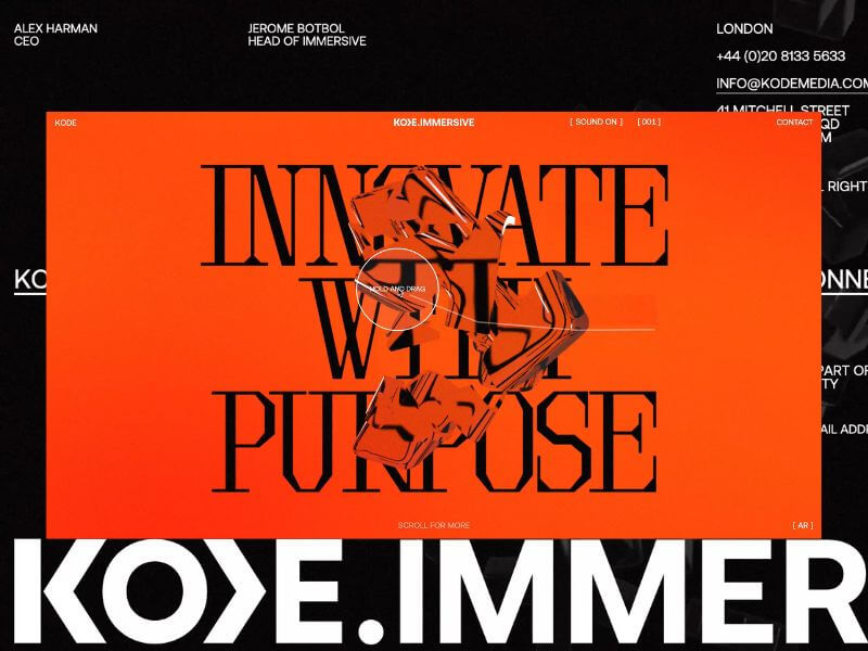
    KODE Immersive fuses AR, VR, real-time 3D, and spatial computing to craft high-impact, interactive experiences. It’s not just a platform – it’s a portal. Designed to ignite emotion, shatter expectations, and redefine digital engagement.

    Our challenge? To bring this pioneering vision to life, not just by explaining what KODE Immersive is, but by making visitors experience what it’s like to be inside it.

    Background

    Our relationship with KODE began in 2022 when we extended their brand identity and reimagined their digital home. What started as a brand refresh quickly evolved into a creative partnership rooted in shared values and a mutual obsession with crafted brand experience and beautiful design.

    In late 2024, KODE approached us with a new venture. This time, they were diving headfirst into emerging technologies (AI, WebXR, and real-time 3D) to expand their service offering. We knew immediately, this was the kind of project you dream about. It was a timely opportunity and got us excited to push boundaries.

    The Brief

    The brief was as open as it gets. Beyond a few core objectives (namely, budget and timeline), there were no strict constraints. We received a three-slide deck: a name, a positioning statement, three brand pillars (CREATE, IDEATE, DELIVER), and a few straplines.

    No case studies. No visual identity. Just a bold vision.

    And that freedom became our greatest asset. We built everything from scratch, visual language, tone, interactions, while staying mindful of budget and speed. Our approach:  move fast, iterate often, and push boundaries.

    To pull it off, we adopted a phased R&D process. We teamed up with the brilliant Francesco Michelini (who previously helped build the Malvah website). Francesco lives and breathes WebGL. He once spent a week refining a mechanic we had already agreed to abandon, just because he couldn’t accept defeat. That kind of drive made him the perfect collaborator.

    Our Process

    We used KODE Immersive as a live testing ground for our refined four-phase process, aimed at delivering the best creative solutions while avoiding unnecessary feedback loops. Here’s how it shaped the final outcome.

    01 Discover

    We kicked things off with an in-depth strategy session where we unpacked the brief, explored concepts, discussed competitors, and mapped out technical possibilities. Style tiles helped form the foundation of our visual language.

    Typography was the key differentiator. We knew the right typeface would communicate innovation and intent. After multiple rounds, we landed on Brut by Off-Type – an unconventional mono-inspired form that struck just the right balance of structure and tension.

    Colour took cues from the parent brand, but we flipped the hierarchy. Orange became the dominant tone, with bold black moments layered throughout. Familiar, yet distinctive.

    Iconography evolved from KODE’s chevron mark. We repurposed it as a modular, dynamic system to guide interactions and reflect the brand’s three core pillars.

    02 Create

    This phase became interesting, since the experience would rely heavily on user interaction, this phase was driven more by prototyping than traditional design. We worked in tight, iterative loops with the client, across design, 3D, and development to test feasibility early and often. It became an it was extremely organic process and ideal to reach the deadline while stretching limitations.

    From the start, we knew we didn’t just want users to interact—we wanted them to feel immersed. To lose track of time by being emotionally and mentally engaged. 

    We developed a range of 3D concepts in Cinema 4D and funnelled them through R&D cycles. The process required a lot of iterating and relooking creative solutions, but was always collaborative – and ultimately, essential for innovation.

    03 Craft

    This is where the magic happens. 

    Our craft is what we consider our special sauce at Malvah – this is where we like to push, refine, and design with intent and clarity. It’s hard not to get lost in the sauce. Massive respect for Francesco during this phase as it is the most intense in terms of iterations, from shader logic to ambient lighting to the haptic quality of cursor interactions, and every component was built to feel immersive yet effortless. Luckily, Francesco is an actual living wizard and provided us with testing environments where we could craft all these elements seamlessly. 

    Still, something was missing! The high-fidelity 3D was clashing with the flat backgrounds. The fix? A subtle layer of pixel distortion and soft noise texture. Minimal, but transformative. Suddenly, the whole experience felt unified – like everything belonged as one unified, harmonious experience.

    04 Deliver

    By final QA, most of the heavy lifting was done. We stress-tested performance across browsers, devices, and connection speeds. We refined micro-interactions and polished details based on early user feedback.

    Tech Stack

    Nerd stuff alert.

    From the outset, this was always going to be a Three.js and WebGL project – not for the novelty, but for the storytelling power. Real-time 3D let us turn a static brand into a living, breathing experience. We used Cinema 4D for concepting and prototyping, from early ideation through to final modelling and meta-cap creation.

    One of the most impactful performance optimisations came through the use of BatchedMesh, which enabled us to draw multiple meshes sharing the same material in a single draw call. Since draw calls are among the most expensive operations in WebGL, this dramatically improved efficiency, reducing calls from 40 or 50 down to just one. You’ll see this in action in both the hero section and the footer, where we also implemented the Rapier physics engine for dynamic interaction.

    The real breakthrough, however, was moving the rendering of our most resource-intensive canvases to an OffscreenCanvas, with all related logic handled inside a WebWorker. This shift happened later in the project and required significant reworking, but the gains in performance and responsiveness were undeniable. It was a technically ambitious move, but one that paid off. 

    Features

    The site follows a continuous scroll narrative—a careful dance between interactivity, emotion, and information. With the primary goal to provoke curiosity and invite deep engagement, rom top to bottom, here’s a rundown of our favourite features.

    Chevron

    We land on the hero of the brand, the logo-mark. The chevron is the anchor,  both literally and metaphorically. The driving force behind the iconography that would funnel through the experience. We wanted the entry point to set the tone, bold, dynamic, and intuitive for the user to explore. 

    Shifting Text

    One of those happy accidents. Inspired by a line that didn’t make the final copy, we developed a mechanic where text splits and shifts as the cursor moves. A metaphor for deconstruction and reformation – fluid, dynamic, alive.

    Icons

    A playful space to explore, discover, and interact. Designed to echo the brand’s chevron and embody its core pillars.

    Menu

    One of our favourite elements. It subverts the typical UX pattern by growing from the base and transforming into the footer as users scroll; a small disruption that makes a big impact.

    SFX

    Sound is often the unsung hero. We follow the 80/20 rule here, also known as the Pareto Principle —just the right amount to amplify emotion without overwhelming the experience. From section transitions to hover feedback, the layered soundscape adds depth and atmosphere. The transition from the landing section to the services has the user feeling as if they are entering a new realm.

    We worked with Martin Leitner from Sounds Good to curate the sound elements in aiding the experience and bringing the interaction with the 3D elements to life. This was such a great experience, and Martin’s enthusiasm helped drive the process and the team’s excitement. 

    Easter Egg

    We always planned for an easter egg, we just didn’t know what it was until it revealed itself.

    A sketch mechanic, pulled from KODE’s visual identity, was integrated into the cursor. Users can draw on the screen to reveal a hidden layer; a playful nod to the analogue-digital duality of the brand.

    Early testers were missing it entirely. So we added a subtle auto-activation trigger at just the right moment. Problem solved.

    Reflections

    This project reminded us that the best results often emerge from ambiguity. No case studies. No visual assets. No roadmap. Just vision and trust.

    While we’re proud of what we’ve delivered, we’ve only scratched the surface. Phase Two will introduce interactive case studies and deeper storytelling. We’re especially excited to explore a z-axis scroll journey through each service, bringing dimension and discovery to the next level.For now, KODE Immersive is live.

    And it’s only getting started.


    Source link

  • Building a Real-Time Dithering Shader

    Building a Real-Time Dithering Shader


    In this post, we’ll take a closer look at the dithering-shader project: a minimal, real-time ordered dithering effect built using GLSL and the Post Processing library.

    Rather than just creating a one-off visual effect, the goal was to build something clean, composable, and extendable: a drop-in shader pass that brings pixel-based texture into modern WebGL pipelines.

    What It Does

    This shader applies ordered dithering as a postprocessing effect. It transforms smooth gradients into stylized, binary (or quantized) pixel patterns, simulating the visual language of early bitmap displays, dot matrix printers, and 8-bit games.

    It supports:

    • Dynamic resolution via pixelSize
    • Optional grayscale mode
    • Composability with bloom, blur, or other passes
    • Easy integration via postprocessing‘s Effect class

    Fragment Shader

    Our dithering shader implementation consists of two main components:

    1. The Core Shader

    The heart of the effect lies in the GLSL fragment shader that implements ordered dithering:

    bool getValue(float brightness, vec2 pos) {
    
    // Early return for extreme values
    if (brightness > 16.0 / 17.0) return false;
    if (brightness < 1.0 / 17.0) return true;
    
    // Calculate position in 4x4 dither matrix
    vec2 pixel = floor(mod(pos.xy / gridSize, 4.0));
    int x = int(pixel.x);
    int y = int(pixel.y);
    
    // 4x4 Bayer matrix threshold map
    // ... threshold comparisons based on matrix position
    
    }

    The getValue function is the core of the dithering algorithm. It:

    • Takes brightness and position: Uses the pixel’s luminance value and screen position
    • Maps to dither matrix: Calculates which cell of the 4×4 Bayer matrix the pixel belongs to
    • Applies threshold: Compares the brightness against a predetermined threshold for that matrix position
    • Returns binary decision: Whether the pixel should be black or colored

    Key Shader Features

    • gridSize: Controls the size of the dithering pattern
    • pixelSizeRatio: Adds pixelation effect for enhanced retro feel
    • grayscaleOnly: Converts the image to grayscale before dithering
    • invertColor: Inverts the final colors for different aesthetic effects

    2. Pixelation Integration

    float pixelSize = gridSize * pixelSizeRatio;
    vec2 pixelatedUV = floor(fragCoord / pixelSize) * pixelSize / resolution;
    baseColor = texture2D(inputBuffer, pixelatedUV).rgb;

    The shader combines dithering with optional pixelation, creating a compound retro effect that’s perfect for game-like visuals.

    Creating a Custom Postprocessing Effect

    The shader is wrapped using the Effect base class from the postprocessing library. This abstracts away the boilerplate of managing framebuffers and passes, allowing the shader to be dropped into a scene with minimal setup.

    export class DitheringEffect extends Effect {
      uniforms: Map<string, THREE.Uniform<number | THREE.Vector2>>;
    
      constructor({
        time = 0,
        resolution = new THREE.Vector2(1, 1),
        gridSize = 4.0,
        luminanceMethod = 0,
        invertColor = false,
        pixelSizeRatio = 1,
        grayscaleOnly = false
      }: DitheringEffectOptions = {}) {
        const uniforms = new Map<string, THREE.Uniform<number | THREE.Vector2>>([
          ["time", new THREE.Uniform(time)],
          ["resolution", new THREE.Uniform(resolution)],
          ["gridSize", new THREE.Uniform(gridSize)],
          ["luminanceMethod", new THREE.Uniform(luminanceMethod)],
          ["invertColor", new THREE.Uniform(invertColor ? 1 : 0)],
          ["ditheringEnabled", new THREE.Uniform(1)],
          ["pixelSizeRatio", new THREE.Uniform(pixelSizeRatio)],
          ["grayscaleOnly", new THREE.Uniform(grayscaleOnly ? 1 : 0)]
        ]);
    
        super("DitheringEffect", ditheringShader, { uniforms });
        this.uniforms = uniforms;
      }
    
     ...
    
    }

    Optional: Integrating with React Three Fiber

    Once defined, the effect is registered and applied using @react-three/postprocessing. Here’s a minimal usage example with bloom and dithering:

    <Canvas>
      {/* ... your scene ... */}
      <EffectComposer>
        <Bloom intensity={0.5} />
        <Dithering pixelSize={2} grayscale />
      </EffectComposer>
    </Canvas>

    You can also tweak pixelSize dynamically to scale the effect with resolution, or toggle grayscale mode based on UI controls or scene context.

    Extending the Shader

    This shader is intentionally kept simple, a foundation rather than a full system. It’s easy to customize or extend. Here are some ideas you can try:

    • Add color quantization: convert color.rgb to indexed palettes
    • Pack depth-based dither layers for fake shadows
    • Animate the pattern for VHS-like shimmer
    • Interactive pixelation: use mouse proximity to affect u_pixelSize

    Why Not Use a Texture?

    Some dithering shaders rely on threshold maps or pre-baked noise textures. This one doesn’t. The matrix pattern is deterministic and screen-space based, which means:

    • No texture loading required
    • Fully procedural
    • Clean pixel alignment

    It’s not meant for photorealism. It’s for styling and flattening. Think more zine than render farm.

    Final Thoughts

    This project started as a side experiment to explore what it would look like to bring tactile, stylized “non-photorealism” back into postprocessing workflows. But I found it had broader use cases, especially in cases where design direction favors abstraction or controlled distortion.

    If you’re building UIs, games, or interactive 3D scenes where “perfect” isn’t the goal, maybe a little pixel grit is exactly what you need.


    Source link

  • A Nightscout Segment for OhMyPosh shows my realtime Blood Sugar readings in my Git Prompt

    A Nightscout Segment for OhMyPosh shows my realtime Blood Sugar readings in my Git Prompt


    I’ve talked about how I love a nice pretty prompt in my Windows Terminal and made videos showing in detail how to do it. I’ve also worked with my buddy TooTallNate to put my real-time blood sugar into a bash or PowerShell prompt, but this was back in 2017.

    Now that I’m “Team OhMyPosh” I have been meaning to write a Nightscout “segment” for my prompt. Nightscout is an open source self-hosted (there are commercial hosts also like T1Pal) website and API for remote display of real-time and near-real-time glucose readings for Diabetics like myself.

    Since my body has an active REST API where I can just do an HTTP GET (via curl or whatever) and see my blood sugar, it clearly belongs in a place of honor, just like my current Git Branch!

    My blood sugar in my Prompt!

    Oh My Posh supports configurable “segments” and now there’s a beta (still needs mmol and stale readings support) Nightscout segment that you can setup in just a few minutes!

    This prompt works in ANY shell on ANY os! You can do this in zsh, PowerShell, Bash, whatever makes you happy.

    Here is a YouTube of Jan from OhMyPosh and I coding the segment LIVE in Go.

    https://www.youtube.com/watch?v=_meKUIm9NwA

    If you have an existing OhMyPosh json config, you can just add another segment like this. Make sure your Nightscout URL includes a secure Token or is public (up to you). Note also that I setup “if/then” rules in my background_templates. These are optional and up to you to change to your taste. I set my background colors to red, yellow, green depending on sugar numbers. I also have a foreground template that is not really used, as you can see it always evaluates to black #000, but it shows you how you could set it to white text on a darker background if you wanted.

    {
    "type": "nightscout",
    "style": "diamond",
    "foreground": "#ffffff",
    "background": "#ff0000",
    "background_templates": [
    "{{ if gt .Sgv 150 }}#FFFF00{{ end }}",
    "{{ if lt .Sgv 60 }}#FF0000{{ end }}",
    "#00FF00"
    ],
    "foreground_templates": [
    "{{ if gt .Sgv 150 }}#000000{{ end }}",
    "{{ if lt .Sgv 60 }}#000000{{ end }}",
    "#000000"
    ],

    "leading_diamond": "",
    "trailing_diamond": "\uE0B0",
    "properties": {
    "url": "https://YOURNIGHTSCOUTAPP.herokuapp.com/api/v1/entries.json?count=1&token=APITOKENFROMYOURADMIN",
    "http_timeout": 1500,
    "template": " {{.Sgv}}{{.TrendIcon}}"
    }
    },

    By default we will only go out and hit your Nightscout instance every 5 min, only when the prompt is repainted, and we’ll only wait 1500ms before giving up. You can set that “http_timeout” (how long before we give up) if you feel this slows you down. It’ll be cached for 5 min so it’s unlikely  to b something you’ll notice. The benefit of this new OhMyPosh segment over the previous solution is that it requires no additional services/chron jobs and can be setup extremely quickly. Note also that you can customize your template with NerdFonts. I’ve included a tiny syringe!

    What a lovely prompt with Blood Sugar!

    Next I’ll hope to improve the segment with mmol support as well as strikeout style for “stale” (over 15 min old) results. You’re also welcome to help out by watching our YouTube and submitting a PR!


    Sponsor: Make login Auth0’s problem. Not yours. Provide the convenient login features your customers want, like social login, multi-factor authentication, single sign-on, passwordless, and more. Get started for free.


    About Scott

    Scott Hanselman is a former professor, former Chief Architect in finance, now speaker, consultant, father, diabetic, and Microsoft employee. He is a failed stand-up comic, a cornrower, and a book author.

    facebook
    bluesky
    subscribe
    About   Newsletter

    Hosting By
    Hosted on Linux using .NET in an Azure App Service


    Source link