برچسب: Refined

  • Bloom Paris TV: Where Refined Art Direction Meets World-Class Production

    Bloom Paris TV: Where Refined Art Direction Meets World-Class Production


    In today’s oversaturated landscape of production service companies vying for attention, Bloom Paris TV approached our studio with an extraordinarily bold ambition: to distinguish themselves through an uncompromising combination of refined style and substantive expertise. Strategically positioned in the cultural and creative heart of Paris, Bloom offers international productions comprehensive and seamless on-the-ground support throughout France — meticulously handling everything from complex technical logistics to complex administrative workflows and regulatory requirements.

    But what truly sets Bloom apart is that they don’t merely facilitate shoots — they orchestrate them with exceptional precision, artistic vision, and unwavering reliability. In an industry where every minute counts, their discerning clients demand speed without sacrificing quality, complete trust in execution, and uncompromising excellence at every touchpoint. Bloom consistently delivers all three elements — seemingly effortlessly and with characteristic French sophistication.

    Our mission became crystal clear: design and develop a digital experience that authentically reflects the remarkable sharpness of their creative eye, the methodical structure of their production process, and the sophisticated elegance of their flawless execution across every project they undertake.

    The Concept

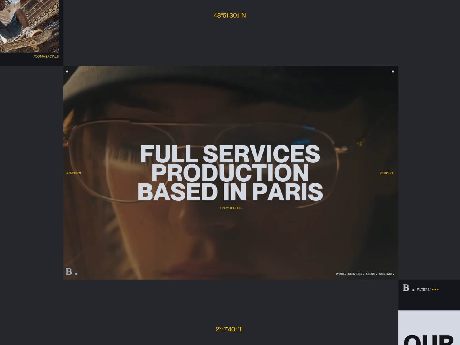
    We approached the website design with one unambiguous and defining intention: make an immediate, memorable impact upon first impression.

    Operating in a fast-paced industry where critical decisions are often made in mere seconds, we recognized that the digital experience needed to be simultaneously bold, fluid, and instantaneously engaging. Our strategic approach centered on minimalism with deliberate intent — methodically stripping away all superfluous elements while preserving only the absolute essentials, then thoughtfully amplifying Bloom’s distinctive core identity throughout the interface.

    At the conceptual heart of Bloom’s sophisticated logo lies a deceptively simple dot — subtle in appearance yet powerful in significance. We strategically extended this symbolic element across the entire user interface: integrating it within interactive buttons, intuitive navigation elements, typographic superscripts, and responsive interaction states. This visual motif evolved into the unifying thread throughout the experience, functioning as a recurring punctuation mark that guides users through a clean, cinematic narrative journey.

    Typography & Color System

    After careful consideration, we selected a commanding, contemporary sans-serif typeface specifically chosen to convey professional confidence and exceptional clarity. This distinctive font effectively anchors the entire site within a precisely calibrated, almost editorial layout structure — creating a harmonious balance between the dynamically asymmetric grid system and the meticulously structured, authoritative tone of voice that characterizes Bloom’s communication style.

    The carefully curated color palette features a sophisticated high-contrast dialogue between rich soft black and warm, inviting light grey, consciously avoiding the harshness of traditional monochrome combinations. A strategically placed vibrant yellow accent punctuates key interactive elements throughout the interface — subtly referencing cinematic film titles and professional cue markers, while simultaneously introducing a welcome sense of warmth, energy and approachability to the otherwise restrained interface design.

    Technology Stack

    Beneath the visually striking surface, the site is meticulously constructed with a powerful combination of technologies:

    • WordPress implemented as a robust, infinitely customizable content management system, providing Bloom with comprehensive control over their content strategy and presentation
    • GSAP for implementing buttery-smooth, cinematically-inspired animations and seamless page transitions throughout the experience
    • Custom-developed SVG masking techniques meticulously crafted to achieve elegantly seamless panel-based transitions between content sections
    • A fully responsive, thoroughly performance-optimized front-end architecture that ensures consistent excellence across all devices and connection speeds

    Loader & Page Transitions

    From the earliest conceptual discussions, we were determined to ensure that every transition moment within the experience would feel authentically cinematic and emotionally resonant.

    Each individual page opens with a dynamically animated panel that dramatically reveals the upcoming section title with a sweeping, theatrical gesture. This carefully choreographed visual sequence not only significantly enhances user orientation within the site architecture, but deliberately sets the sophisticated tone for a fluid, immersive journey through Bloom’s professional world.

    The distinctive homepage loader was specifically designed to create instant emotional resonance and connection: a fullscreen mask elegantly opens to dramatically reveal Bloom’s captivating showreel — creating an unforgettable first impression that immediately communicates their production capabilities. Thoughtfully combined with an interactive progress indicator, this element transforms into an engaging interactive curtain, gracefully inviting users to step into Bloom’s compelling narrative universe.

    Project Grid & Hover States

    Throughout the portfolio section, Bloom’s impressive projects are presented within a sophisticated asymmetric editorial grid structure, deliberately breaking the predictable monotony of conventional layouts while thoughtfully echoing the dynamic rhythm of visual storytelling. Individual content sizes and positions shift intuitively throughout the composition, creating intentional moments of both contemplative pause and energetic flow.

    During user interaction, the signature dot elegantly reappears as an intuitive focus indicator, while a smoothly animated marquee title gracefully glides over the preview image — simultaneously drawing attention and adding perceptual depth to the experience. This carefully considered combination creates a remarkably tactile, multi-layered effect that meaningfully rewards user interaction without overwhelming the visual hierarchy or distracting from the exceptional quality of Bloom’s project portfolio.

    Footer

    Thoughtfully designed as a final memorable touchpoint rather than an afterthought, the site’s footer functions as much more than a mere sign-off — it serves as an compelling invitation to further engagement.

    The footer section artfully reprises elements from the initial showreel presentation, elegantly contained within a precisely masked frame that maintains consistent visual language throughout the experience. Both functionally informative and poetically expressive, this distinctive footer ensures that Bloom’s powerful brand experience lingers in the user’s memory — even long after the final scroll action concludes their immediate journey.

    Who We Are

    We proudly define ourselves as a specialized digital design studio operating at the fascinating intersection of compelling narrative, intuitive interaction design, and cutting-edge technology implementation. We fundamentally believe in the transformative power of crafting digital interfaces that move with deliberate intention and purpose, thoughtfully combining minimalist aesthetic principles with boldly distinctive creative identity expressions.

    With each project we undertake, we consistently strive to create memorable digital experiences that communicate with exceptional clarity, move with captivating beauty, and feel genuinely alive and responsive to human interaction.


    Source link

  • Designing for Flow, Not Frustration: The Transformation of Arts Corporation Through Refined Animation

    Designing for Flow, Not Frustration: The Transformation of Arts Corporation Through Refined Animation


    You know what they say about playing sounds on a website: don’t. Autoplaying audio is often considered intrusive and disruptive, which is why modern web practices discourage it. However, sound design, when used thoughtfully, can enhance the user experience and reinforce a brand’s identity. So when Arts Corporation approached me to redesign their website with a request to integrate audio, I saw an opportunity to create an immersive experience that complemented their artistic vision.

    To ensure the sound experience was as seamless as possible, I started thinking about ways to refine it, such as muting audio when the tab is inactive or when a video is playing. That focus on detail made me wonder: what are some other UX improvements that are often overlooked but could make a significant difference? That question set the foundation for a broader exploration of how subtle refinements in animation and interaction design could improve the overall user experience.

    When an Idea is Good on Paper

    The client came in with sketches and a strong vision for the website, including a key feature: “construction lines” overlaid across the design.

    These lines had to move individually, as though being “pushed” by the moving cursor. While this looked great in concept, it introduced a challenge: ensuring that users wouldn’t become frustrated when trying to interact with elements positioned behind the lines. 

    After some testing and trying to find ways to keep the interaction, I realized a compromise was necessary. Using GSAP ScrollTrigger, I made sure that when sections including buttons and links became visible, the interactive lines would be disabled. In the end, the interaction remained only in a few places, but the concept wasn’t worth the frustration.

    Splitting Text Like There’s No Tomorrow

    Another challenge in balancing animation and usability was ensuring that text remained readable and accessible. Splitting text has become a standard effect in the industry, but not everyone takes the extra step to prevent issues for users relying on screen readers. The best solution in my case was to simply revert to the original text once the animation was completed. Another solution, for those who need the text to remain split, would be using aria-label and aria-hidden.

    <h1 aria-label="Hello world">
      <span aria-hidden="true">
        <span>H</span>
        <span>e</span>
        <span>l</span>
        <span>l</span>
        <span>o</span>
      </span>
      <span aria-hidden="true">
        <span>W</span>
        <span>o</span>
        <span>r</span>
        <span>l</span>
        <span>d</span>
      </span>
    </h1>

    This way the user hears only the content of the aria-label attribute, not the text within the element.

    Scroll-Based Disorientation

    Another crucial consideration was scroll-based animations. While they add depth and interactivity, they can also create confusion if users stop mid-scroll and elements appear frozen in unexpected positions.

    Example of scroll-based animation stopped between two states
    Example of a scroll-based animation stopped between two states

    To counter this, I used GSAP ScrollTrigger’s snap feature. This ensured that when users stopped scrolling, the page would snap to the nearest section naturally, maintaining a seamless experience.

    Arrays Start at 5?

    Autoplaying sliders can be an effective way to signal interactivity, drawing users into the content rather than letting them assume it’s static. However, they can also create confusion if not implemented thoughtfully. While integrating the site, I realized that because some slides were numbered, users might land on the page and find themselves on the fifth slide instead of the first, disrupting their sense of flow.

    To address this, I set sliders to autoplay only when they entered the viewport, ensuring that users always started at the first slide. This not only maintained consistency but also reinforced a structured and intuitive browsing experience. By making autoplay purposeful rather than arbitrary, we guide users through the content without causing unnecessary distractions.

    Transition Confusion

    Page transitions play a crucial role in maintaining a smooth, immersive experience, but if not handled carefully, they can lead to momentary confusion. One challenge I encountered was the risk of the transition overlay blending with the footer, since both were black in my design. Users would not perceive a transition at all, making navigation feel disjointed.

    To solve this, I ensured that transition overlays had a distinct contrast by adding a different shade of black, preventing any ambiguity when users navigate between pages. I also optimized transition timing, making sure animations were fast enough to keep interactions snappy but smooth enough to avoid feeling abrupt. This balance created a browsing experience where users always had a clear sense of movement and direction within the site.

    I Can Feel a Shift

    A common issue in web development that often gets overlooked is the mobile resize trigger that occurs when scrolling, particularly when the browser’s address bar appears or disappears on some devices. This resize event can disrupt the smoothness of animations, causing sudden visual jumps or inconsistencies as the page shifts.

    To tackle this, I made sure that ScrollTrigger wouldn’t refresh or re-trigger its animations unnecessarily when this resize event occurred by turning on ignoreMobileResize:

    ScrollTrigger.config({
       ignoreMobileResize: true
     });

    I also ensured that any CSS or JavaScript based on viewport height would not be recalculated on a vertical resize on mobile. Here’s a utility function I use to handle resize as an example: 

    /**
     * Attaches a resize event listener to the window and executes a callback when the conditions are met.
     * 
     * @param {Function} callback - The function to execute when the resize condition is met.
     * @param {number} [debounceTime=200] - Time in milliseconds to debounce the resize event.
     */
    function onResize(callback, debounceTime = 200) {
      let oldVh = window.innerHeight;
      let oldVw = window.innerWidth;
      const isTouchDevice = 'maxTouchPoints' in navigator && navigator.maxTouchPoints > 0;
    
      // Define the resize handler with debounce to limit function execution frequency
      const resizeHandler = $.debounce(() => {
        const newVh = window.innerHeight;
        const newVw = window.innerWidth;
    
        /**
         * Condition:
         *  - If the device is touch and the viewport height has changed significantly (≥ 25%).
         *  - OR if the viewport width has changed at all.
         * If either condition is met, execute the callback and update old dimensions.
         */
        if ((isTouchDevice && Math.abs(newVh - oldVh) / oldVh >= 0.25) || newVw !== oldVw) {
          callback();
          oldVh = newVh;
          oldVw = newVw;
        }
      }, debounceTime);
    
      // Attach the resize handler to the window resize event
      $(window).on('resize', resizeHandler);
    }

    Copy That! Rethinking Contact Links

    It was the client’s request to have a simple contact link with a “mailto” instead of a full contact page. While this seemed like a straightforward approach, it quickly became clear that mailto links come with usability issues. Clicking one automatically opens the default email app, which isn’t always the one the user actually wants to use. Many people rely on webmail services like Gmail or Outlook in their browser, meaning a forced mail client launch can create unnecessary friction. Worse, if the user is on a shared or public computer, the mail app might not even be configured, leading to confusion or an error message.

    To improve this experience, I opted for a more user-friendly approach: mailto links would simply copy the email to the clipboard and display a confirmation message. 

    The Takeaway

    This project reinforced the importance of balancing creativity with usability. While bold ideas can drive engagement, the best experiences come from refining details users may not even notice. Whether it’s preventing unnecessary animations, ensuring smooth scrolling, or rethinking how users interact with contact links, these small decisions make a significant impact. In the end, great web design isn’t just about visuals, it’s about crafting an experience that feels effortless for the user.


    Source link