برچسب: Story

  • Craft, Clarity, and Care: The Story and Work of Mengchu Yao

    Craft, Clarity, and Care: The Story and Work of Mengchu Yao


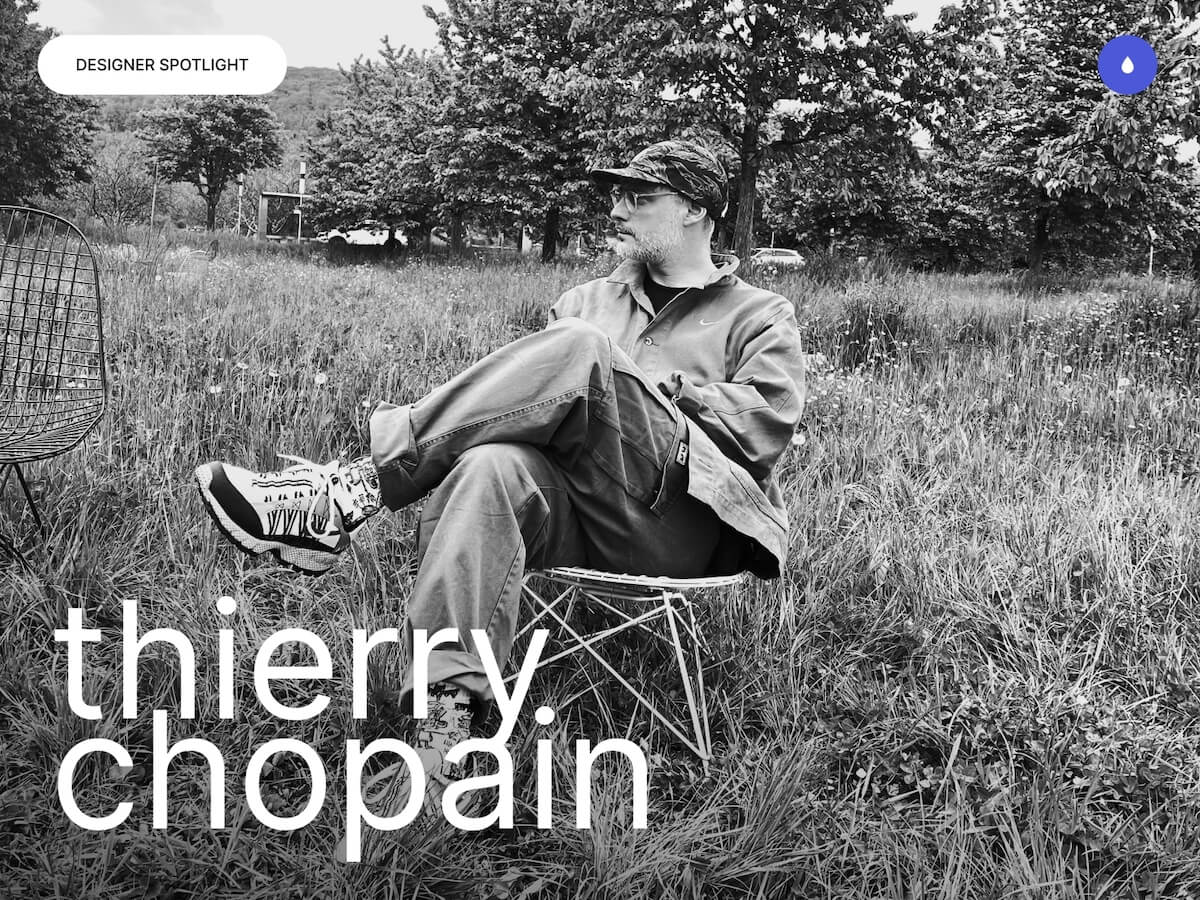
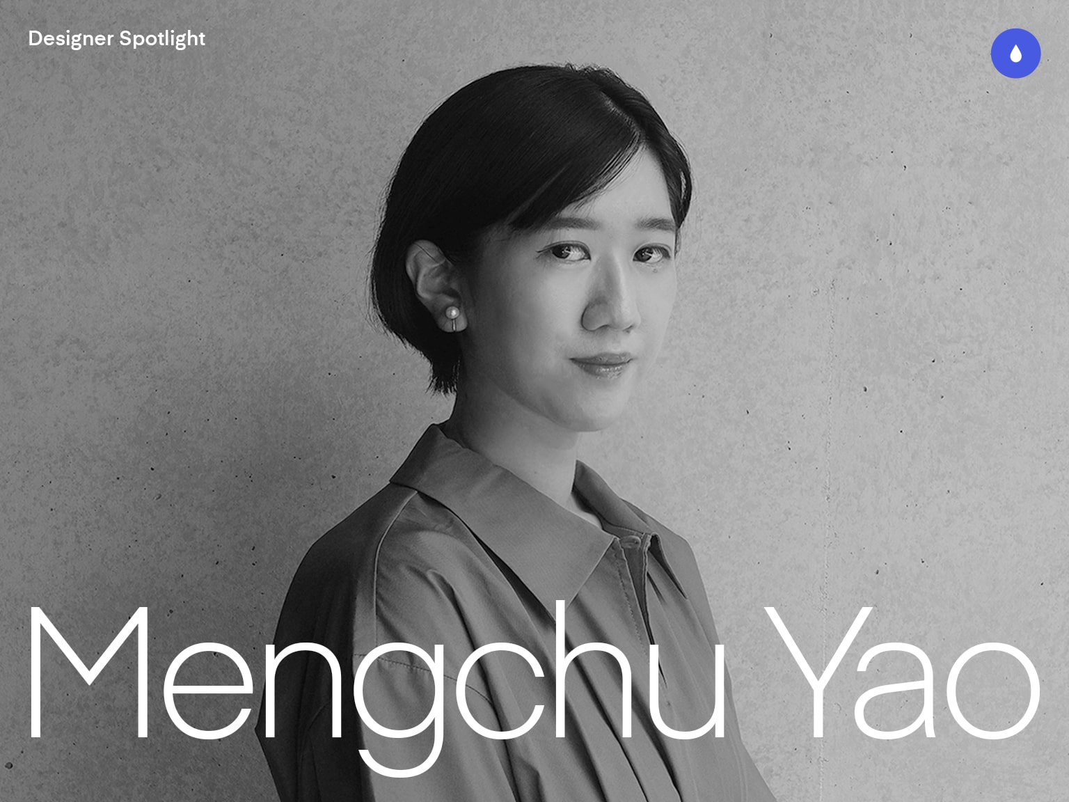
    Hi, I’m Mengchu Yao from Taiwan, and I am currently based in Tokyo, Japan, where I work as a web designer at baqemono.inc.

    I’m truly grateful to be able to pursue my design career in a cross-cultural environment. The life here allows me to appreciate small things and encourages me to stay curious and open minded.

    Featured Work

    Movie × AI model

    We created the website for AI model Inc., a company that leverages AI models and virtual personalities to offer digital transformation (DX) services. The site was created to showcase their AI video generation solutions.

    Personal notes

    This website design is centered around the concept of “natural and elegant AI-generated visuals”. One of the key challenges was to present a large number of dynamic, immersive visual elements and interactions within a single-page layout. We spent a lot of time finding the right balance between animation and delivering messages, ensuring that every motion looks beautiful and meaningful at the same time

    This was also time that I sketched the animation for almost every section myself, working closely with developers to fine-tune the motion expressions. The process was both challenging and fascinating, which is why it was rewarding and significant for my growth.

    Vlag yokohama

    We created the official website for “Vlag yokohama,” a new members-only creative lounge and workspace located on the top (42nd) floor of the THE YOKOHAMA FRONT at Yokohama Station.

    Personal notes

    This project was a rare opportunity that allowed me to explore and be creative while using the brand guidelines as a foundation, in response to the request “to use the Yokohama cityscape as the backbone of visuals while incorporating elements that evoke the feeling of wind and motion.”

    One thoughtful touch was the main visual on the homepage. It automatically changes during the time of day: morning, afternoon, and evening, which represents Yokohama’s ambiances and gives a subtle delight to the browsing experience.

    ANGELUX

    We created a brand-new corporate website for Angelux Co., Ltd., a company founded in 1987 that specializes in beauty salons and spas operations, with product development and sales in cosmetics.

    Personal notes

    This project began with the client’s request to clearly distinguish between the service website and the corporate site, and to position the latter as a recruitment platform that authentically reflects the people behind the brand.

    To embody Angelux’s strong emphasis on craftsmanship, we featured actual treatment scenes in the main visual. The overall design blends a sense of classic professionalism with a soft modern aesthetic, creating a calm and reassuring atmosphere. This approach not only helps build trust in the company but also effectively appeals to potential talent interested in joining Angelux.

    The visual design incorporated elements reminiscent of high-quality cosmetics that conveys the clean beauty and clarity of skincare.

    infordio

    We redesigned the official website for Infodio Inc., a company that specializes in advanced technologies such as AI-OCR and Natural Language Processing (NLP), and offers high-speed, automated transcription products and services.

    Personal notes

    The original website failed to effectively communicate “AI as core”, and often mislead the client’s applicants. To resolve the issue, our strategy was to emphesize the products. The revamp successfully gives the true essence of the brand and attracts the right potential talents with clear messaging.

    For the visuals, we started from scratch. It was challenging but also the most fun part. As the products were the focal point of the design, the key was to show both the authenticity and visual appeal.

    Background

    After getting my master’s degree in Information Design, I joined the Tokyo-based digital design studio, baqemono.inc., I have had the opportunity to lead several challenging and creatively fulfilling projects from the early stages of my career.

    These experiences have shaped me tremendously and deepened my passion for this field. Throughout this journey, the studio’s founder has remained the designer I admire the most — a constant source of inspiration whose presence reminds me to approach every project with both respect and enthusiasm.

    Design Philosophy

    A strong concept is your north star

    I believe every design should be built upon a clear and compelling core idea. Whenever I begin a project, I always ask myself: “What am I designing for?”

    Structure comes first

    Before diving into visuals, I make sure I spend enough time on wireframes and the overall structure.
If the content and hierarchy aren’t clearly defined at the start, the rest of the bits and pieces become noises that cloud judgment. A solid framework helps me stay focused and gives me room to refine the details.

    Listen to the discomfort in your gut

    Whenever I feel that something’s “not quite right”, I always know I’d have to come back to take another look because these subtle feelings often point to something important.
 I believe that as designers we should be honest with ourselves, take a pause to examine, and revise. Each small tweak is a step closer to your truth.

    You have to genuinely love it

    I also believe that every designer should love his/her own work so the work will bring its impact.
This isn’t just about aesthetics — it’s about fully owning the concept, the details, and the final outcome.

    Teamwork is everything

    No project is ever completed by me alone — it’s always the result of a team effort.
 I deeply respect every member involved, and I constantly ask myself: “What can I do to make the collaboration smoother for everyone?”

    Tools and Techniques

    • Photoshop
    • Figma
    • After Effects
    • Eagle

    Future goals

    My main goal for the year is to start building my portfolio website. I’ve been mainly sharing my work on social media, but as I’ve gained more hands-on experience and creative outputs over time, I realized that it’s important to have a dedicated space that fully reflects who I am as a designer today.

    Recently, I started to make some changes in my daily routine, such as better sleeping hours and becoming a morning person to be more focused and productive for my work. My mind is clearer, and my body feels great, just as if I’m preparing myself for the next chapter of my creative journey.

    Final Thoughts

    Giving someone advice is always a little tricky for me, but one phrase that has resonated deeply with me throughout my journey is: “Go slow to go fast”. Finding your own balance between creating and resting while continuing to stay passionate about life is, to me, the most important thing of all.

    Thank you so much for taking the time to read this. I hope you enjoyed the works and thoughts I’ve shared!

    A heartfelt thanks as well to Codrops and Manoela for inviting me to be part of this Designer Spotlight. Ever since I stepped into the world of web design, Codrops has been a constant source of inspiration, showing me so many amazing works and creators. I’m truly honored and grateful to be featured among them.

    Contact

    I’m always excited to connect with people to share ideas and explore new opportunities together.
If anything here speaks to you, feel free to reach out — I’d love to chat more and hear your thoughts!
    I also share updates on my latest projects from time to time on social media, so feel free to drop by and say hi 😊


    Source link

  • Between Strategy and Story: Thierry Chopain’s Creative Path

    Between Strategy and Story: Thierry Chopain’s Creative Path


    Hello I’m Thierry Chopain, a freelance interactive art director, co-founder of type8 studio and a UX/UI design instructor at SUP de PUB (Lyon).

    Based near Saint-Étienne, I cultivate a balance between creative ambition and local grounding, between high-level design and a more human pace of life. I work remotely with a close-knit team spread between Lyon, Montpellier, and Paris, where we design custom projects that blend strategy, brand identity, and digital experience.

    My approach is deeply collaborative. I believe in lasting relationships built on trust, mutual listening, and the value of each perspective. Beyond aesthetics, my role is to bring clarity, meaning, and visual consistency to every project. Alongside my design practice, I teach at SUP de PUB, where I support students not only in mastering UX/UI concepts, but also in shaping their path as independent designers. Sharing what I’ve learned on the ground the wins, the struggles, and the lessons is a mission that matters deeply to me.

    My day-to-day life is a mix of slow living and agility. This hybrid rhythm allows me to stay true to my values while continuing to grow in a demanding and inspiring industry. I collaborate with a trusted network of creatives including Jeremy Fagis, Marine Ferrari ,Thomas Aufresne, Jordan Thiervoz, Alexandre Avram, Benoit Drigny and Olivier Marmillon to enrich every project with a shared, high-level creative vision.

    Featured Projects

    OVA INVESTMENT

    It’s an investment fund built around a strong promise: to invest disruptively in the most valuable assets of our time. Type8 studio partnered collaboration with DEPARTMENT Maison de Création and Paul Barbin to design a fully reimagined website that lives up to its bold vision and distinctive positioning. Site structure, visual direction, tone of voice, and user experience were all redefined to reflect the strategic precision, elegance, and forward-thinking nature of the fund.

    The goal of this project: Position OVA as a benchmark combining financial performance, innovation, and rarity, through refined design, a seamless interface, and custom development, in order to strengthen its credibility with a discerning audience and strategic partners.

    Discover the website

    Hocus Pocus Studio

    Hocus Pocus is a Lyon based animation studio specialized in creation of CGI and visual effects for television, cinema and video game industry. The studio offer the best quality services with an always higher technical and artistic level of requirement. I worked on this project in collaboration with the Lyon-based studio AKARU which specializes in tailored and meticulously crafted projects.

    Instagram post HP

    The goal of this project: Develop a coherent and professional digital brand image that highlights visual effects, while boosting visibility and online presence to attract and inspire trust in customers.

    Discover the website

    21 TSI

    21 TSI isn’t your typical sports holding company. Overseeing a portfolio of brands in the sports equipment space the team set out to break from the mold of the standard corporate website. Instead, they envisioned a digital experience that would reflect their DNA where innovation, design, and technology converge into a rich, immersive journey. We collaborated with DEPARTMENT Maison de Création and Paul Barbin to create something truly unique.

    The goal of this project: A website that embodies the DNA of 21TSI: innovation, technology, minimalism. An immersive and aesthetic experience, a clean design, and an approach that explores new ways of engaging with sport through AI.

    Discover the website

    Teria

    TERIA is a system that provides real-time centimeter-level positioning. It is an innovative tool that allows the localization and georeferencing. We set out to create an intuitive and innovative experience that perfectly reflects Teria’s precision and forward-thinking vision. A major part of the work focused on a clean, minimalist design that allows for smooth navigation making space to highlight the incredible work of Alexandre Avram, showcasing the products through Spline and 3D motion design.

    The goal of this project: Develop a clear and professional digital brand that reflects the brand’s identity and values, showcases product innovation, and boosts visibility to build trust and attract customers.

    Discover the website

    Creating visual identities for musical artists

    In a dense and ever-evolving music scene, standing out requires more than just great sound it also takes a strong and cohesive visual presence. Whether it’s the cinematic intensity of Lecomte de Brégeot, the raw emotion of Élimane my approach remains the same: to craft a visual universe that extends and enhances the essence of each artist, regardless of the medium.

    AFFICHE POST SQ
    Visual recap – Cover design for “Sequences” (Lecomte de Brégeot)
    Élimane – Weaver of Sounds, Sculptor of Emotions.

    A Defining Moment in My Career

    A turning point in my journey was the transition from working as an independent designer to founding a structured creative studio, type8 Studio. For more than ten years, I worked solo or within informal networks, juggling projects, constantly adapting, and learning how to shape my own freedom. That period gave me a lot—not only in terms of experience, but also in understanding what I truly wanted… and what I no longer wanted.

    Creating a studio was never a predefined goal. It came together progressively, through encounters, shared values, and the growing need to give form to something more collective and sustainable. Type8 was born from this shared intention: bringing together skills and creative ambitions while preserving individual freedom.

    This change was not a rupture but a natural evolution. I didn’t abandon my three identities—independent designer, studio art director, and educator. On the contrary, I integrated them into a more fluid and conscious ecosystem. Today, I can choose the most relevant role depending on the project: sometimes the studio takes the lead, sometimes it’s the freelance spirit that fits best, and at other times, it’s the educator in me who comes forward.

    This hybrid model, which some might see as unstable, is for me a tailor-made balance, deeply aligned with how I envision work: adaptive, intentional, and guided by respect for the project’s purpose and values.

    My Design Philosophy

    I see design as a tool serving meaning, people, and impact beyond mere aesthetics. It’s about creating connection, clarity, and relevance between intention and users. This approach was shaped through my collaboration with my wife, an expert in digital accessibility, who raised my awareness of inclusion and real user needs often overlooked.

    Today, I bring ethics, care, and respect into every project, focusing on accessible design and core human values: kindness, clarity, usefulness, and respecting user constraints. I prioritize human collaboration, tailoring each solution to the client’s context and values, even if it means going against trends. My design blends strategic thinking, creativity, and personal commitment to create enriching and socially valuable experiences.

    Tools and Techniques

    • Figma: To design, create, and gather ideas collaboratively.
    • Jitter: For crafting smooth and engaging motion designs.
    • Loom: To exchange feedback efficiently with clients.

    Tools evolve but they’re just means to an end. What really matters is your ability to think and create. If you’re a good designer, you’ll know how to adapt, no matter the tool.

    My Inspirations

    My imagination was shaped somewhere between a game screen, a sketchbook. Among all my influences, narrative video games hold a special place. Titles like “The Last of Us” have had a deep impact on me not just for their striking art direction, but for their ability to tell a story in an immersive, emotional, and sensory way. What inspires me in these universes isn’t just the gameplay, but how they create atmosphere, build meaningful moments, and evoke emotion without words. Motion design, sound, typography, lighting all of it is composed like a language. And that’s exactly how I approach interactive design: orchestrating visual and experiential elements to convey a message, an intention, or a feeling.

    But my inspirations go beyond the digital world. They lie at the intersection of street art, furniture design, and sneakers. My personal environment also plays a crucial role in fueling my creativity. Living in a small village close to nature, surrounded by calm and serenity, gives me the mental space I need to create. It’s often in these quiet moments, a walk through the woods, a shared silence, the way light plays on a path that my strongest ideas emerge.

    INSPIRATIONS

    I’m a creative who exists at the crossroads: between storytelling and interaction, between city and nature, between aesthetics and purpose. That’s where my work finds its balance.

    Final Thoughts

    For me, design has always been more than a craft it’s a way to connect ideas, people, and emotions. Every project is an opportunity to tell a story, to create something that feels both meaningful and timeless. Stay curious, stay human, and don’t be afraid to push boundaries. Because the most memorable work is born when passion meets purpose.

    Contact

    Thanks for taking the time to read this article.

    If you’re a brand, studio, or institution looking for a strong and distinctive digital identity. I’d be happy to talk whether it’s about a project, a potential collaboration, or just sharing a few ideas.


    Source link

  • Designing Momentum: The Story Behind Meet Your Legend

    Designing Momentum: The Story Behind Meet Your Legend


    We partnered with Meet Your Legend to bring their groundbreaking vision to life — a mentorship platform that seamlessly blends branding, UI/UX, full-stack development, and immersive digital animation.

    Meet Your Legend isn’t just another online learning platform. It’s a bridge between generations of creatives. Focused on VFX, animation, and video game production, it connects aspiring talent — whether students, freelancers, or in-house studio professionals — with the industry’s most accomplished mentors. These are the legends behind the scenes: lead animators, FX supervisors, creative directors, and technical wizards who’ve shaped some of the biggest productions in modern entertainment.

    Our goal? To create a vivid digital identity and interactive platform that captures three core qualities:

    • The energy of creativity
    • The precision of industry-level expertise
    • The dynamism of motion graphics and storytelling

    At the heart of everything was a single driving idea: movement. Not just visual movement — but career momentum, the transfer of knowledge, and the emotional propulsion behind creativity itself.

    We built the brand identity around the letter “M” — stylized with an elongated tail that represents momentum, legacy, and forward motion. This tail forms a graphic throughline across the platform. Mentor names, modules, and animations plug into it, creating a modular and adaptable system that evolves with the content and contributors.

    From the visual system to the narrative structure, we wanted every interaction to feel alive — dynamic, immersive, and unapologetically aspirational.

    The Concept

    The site’s architecture is built around a narrative arc, not just a navigation system.

    Users aren’t dropped into a menu or a generic homepage. Instead, they’re invited into a story. From the moment the site loads, there’s a sense of atmosphere and anticipation — an introduction to the platform’s mission, mood, and voice before unveiling the core offering: the mentors themselves, or as the platform calls them, “The Legends.”

    Each element of the experience is structured with intention. We carefully designed the content flow to evoke a sense of reverence, curiosity, and inspiration. Think of it as a cinematic trailer for a mentorship journey.

    We weren’t just explaining the brand — we were immersing visitors in it.

    Typography & Color System

    The typography system plays a crucial role in reinforcing the platform’s dual personality: technical sophistication meets expressive creativity.

    We paired two distinct sans-serif fonts:

    – A light-weight, technical font to convey structure, clarity, and approachability — ideal for body text and interface elements

    – A bold, expressive typeface that commands attention — perfect for mentor names, quotes, calls to action, and narrative highlights

    The contrast between these two fonts helps create rhythm, pacing, and emotional depth across the experience.

    The color palette is deliberately cinematic and memorable:

    • Flash orange signals energy, creative fire, and boldness. It’s the spark — the invitation to engage.
    • A range of neutrals — beige, brown, and warm grays — offer a sense of balance, maturity, and professionalism. These tones ground the experience and create contrast for vibrant elements.

    Together, the system is both modern and timeless — a tribute to craft, not trend.

    Technology Stack

    We brought the platform to life with a modern and modular tech stack designed for both performance and storytelling:

    • WordPress (headless CMS) for scalable, easy-to-manage content that supports a dynamic editorial workflow
    • GSAP (GreenSock Animation Platform) for fluid, timeline-based animations across scroll and interactions
    • Three.js / WebGL for high-performance visual effects, shaders, and real-time graphical experiences
    • Custom booking system powered by Make, Google Calendar, Whereby, and Stripe — enabling seamless scheduling, video sessions, and payments

    This stack allowed us to deliver a responsive, cinematic experience without compromising speed or maintainability.

    Loader Experience

    Even the loading screen is part of the story.

    We designed a cinematic prelude using the “M” tail as a narrative element. This loader animation doesn’t just fill time — it sets the stage. Meanwhile, key phrases from the creative world — terms like motion 2D & 3D, vfx, cgi, and motion capture — animate in and out of view, building excitement and immersing users in the language of the craft.

    It’s a sensory preview of what’s to come, priming the visitor for an experience rooted in industry and artistry.

    Title Reveal Effects

    Typography becomes motion.

    To bring the brand’s kinetic DNA to life, we implemented a custom mask-reveal effect for major headlines. Each title glides into view with trailing motion, echoing the flowing “M” mark. This creates a feeling of elegance, control, and continuity — like a shot dissolving in a film edit.

    These transitions do more than delight — they reinforce the platform’s identity, delivering brand through movement.

    Menu Interaction

    We didn’t want the menu to feel like a utility. We wanted it to feel like a scene transition.

    The menu unfolds within the iconic M-shape — its structure serving as both interface and metaphor. As users open it, they reveal layers: content categories, mentor profiles, and stories. Every motion is deliberate, reminiscent of opening a timeline in an editing suite or peeling back layers in a 3D model.

    It’s tactile, immersive, and true to the world the platform celebrates.

    Gradient & WebGL Shader

    A major visual motif was the idea of “burning film” — inspired by analog processes but expressed through modern code.

    To bring this to life, we created a custom WebGL shader, incorporating a reactive orange gradient from the brand palette. As users move their mouse or scroll, the shader responds in real-time, adding a subtle but powerful VFX-style distortion to the screen.

    This isn’t just decoration. It’s a living texture — a symbol of the heat, friction, and passion that fuel creative careers.

    Scroll-Based Storytelling

    The homepage isn’t static. It’s a stage for narrative progression.

    We designed the flow as a scroll-driven experience where content and story unfold in sync. From an opening slider that introduces the brand, to immersive sections that highlight individual mentors and their work, each moment is carefully choreographed.

    Users aren’t just reading — they’re experiencing a sequence, like scenes in a movie or levels in a game. It’s structured, emotional, and deeply human.

    Who We Are

    We are a digital studio at the intersection of design, storytelling, and interaction. Our approach is rooted in concept and craft. We build digital experiences that are not only visually compelling but emotionally resonant.

    From bold brands to immersive websites, we design with movement in mind — movement of pixels, of emotion, and of purpose.

    Because we believe great design doesn’t just look good — it moves you.


    Source link