برچسب: Through

  • Designing TrueKind: A Skincare Brand’s Journey Through Moodboards, Motion, and Meaning

    Designing TrueKind: A Skincare Brand’s Journey Through Moodboards, Motion, and Meaning


    Project Backstory

    TrueKind approached us with a clear but ambitious goal: they wanted a skincare website that stood out—not just in the Indian skincare space, but globally.

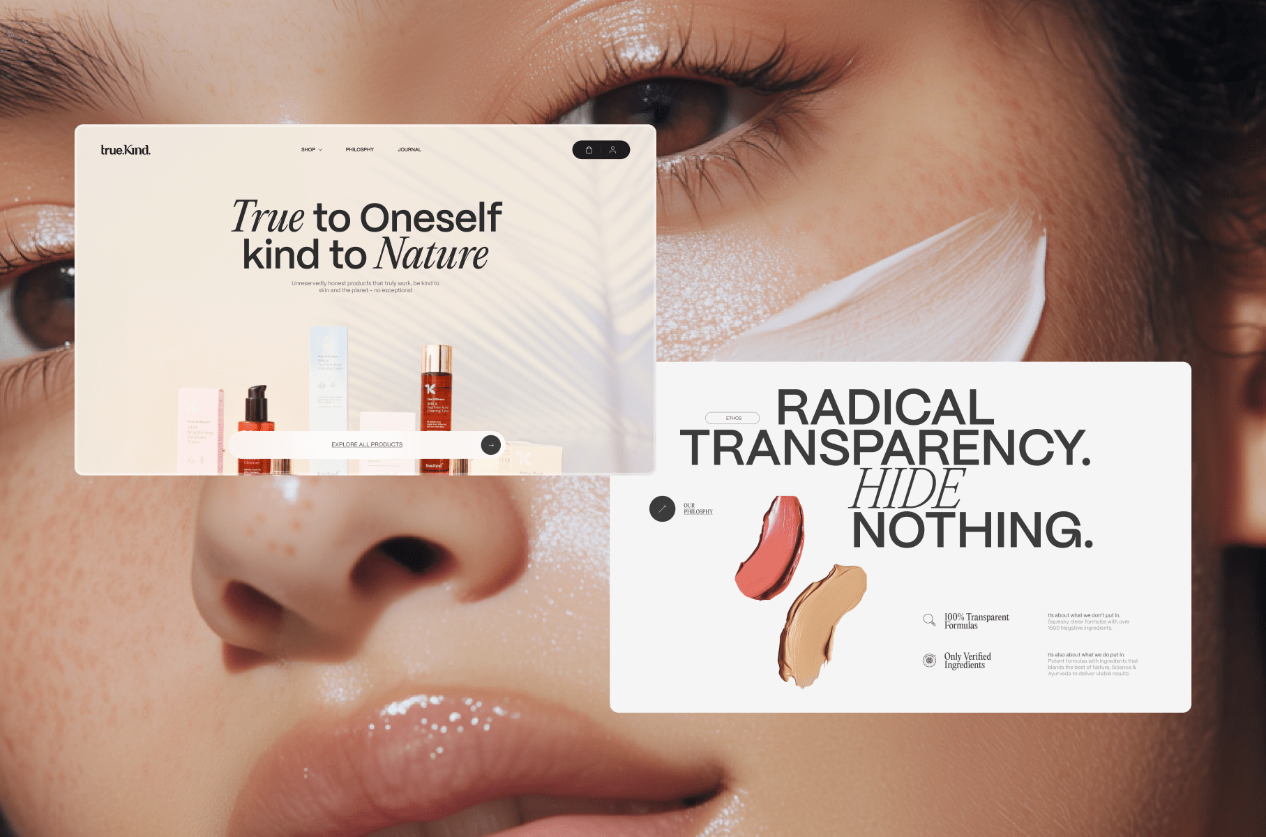
    The challenge? Most skincare websites (especially local ones) lean heavily commercial. They emphasize offers, discounts, and aggressive product pushes. But TrueKind wanted something gentler, more thoughtful, and centered on one message: honest skincare.

    From the very first conversation, I knew this would require a delicate balance. We wanted to create a site that was visually fresh and a little unconventional, but not so experimental that it alienated everyday customers.

    We set aside around 1–2 months for the design phase, allowing time for multiple iterations and careful refinement. One of the best parts of this project was the incredibly trusting, supportive client team—working with people who are genuinely open to creativity makes all the difference.

    Crafting the Visual Direction

    Every project I work on begins with listening. Before touching any design tools, I immersed myself in the client’s vision, mood, and tone.

    I created a moodboard to align with their aesthetic, making sure the images I pulled weren’t just random “nice” visuals. This is something I see many younger designers overlook: it’s not just about curating pretty pictures; it’s about curating pictures that match the brand’s energy, saturation, color language, and atmosphere.

    🌟 When building moodboards, don’t be afraid to tweak image properties. Adjust exposure, warmth, contrast, and saturation until they feel cohesive. You’re not just grabbing references—you’re crafting a controlled atmosphere.

    For the typefaces, I leaned on my go-to foundry, Pangram Pangram. Their fonts are beautifully made and (for personal projects) wonderfully accessible. For TrueKind, we selected PP Mori (for a modern, clean backbone) and Editorial Neue (to bring in an elegant, editorial touch).

    Even though the client wanted something unconventional, I knew we had to keep the animation and interaction design balanced. Too much movement can be overwhelming. So, we built the visual experience primarily around typography—letting type choices and layouts carry the creative weight.

    On Working Before AI Image Tools

    This project dates back to around 2021, before the surge of AI image generation tools. So when it came to placeholders and visual exploration, I often turned to Behance or similar platforms to source reference imagery that fit the vibe.

    Of course, for the final launch, we didn’t want any copyright issues—so we conducted a professional photoshoot in Worli, Mumbai, capturing clean, fresh product imagery. For the Awwwards showcase, we’ve swapped in AI-generated images purely for display purposes.

    Iteration and Evolution

    Here’s a personal moment of honesty: The first version I designed? I wasn’t thrilled with it.

    It lacked the polish, elegance, and depth I knew the brand deserved. But instead of settling, I went back, refined, iterated, and kept pushing. That’s something I’d tell any designer reading this:

    🌟 Don’t be afraid to walk away from your early drafts. You can feel when something’s not hitting the mark—trust that instinct, and give yourself room to improve.

    Animation & Interaction Design

    I’m a sucker for scroll-based animations. Smooth scrolling, layered reveals, subtle movement—these elements can elevate a static design a hundredfold if used thoughtfully.

    For TrueKind, I didn’t want unnecessary flash. The scroll interactions enhance the content flow without overpowering it. The text reveals, section transitions, and layered elements were designed to add just enough dynamism to keep the user engaged while still respecting the calm, honest tone of the brand.

    Bringing in Reksa: Development Insights

    At a certain point, I knew I needed help to fully do justice to the design. That’s when I reached out to Reksa—a developer I deeply admire, not just for his technical skill but for his meticulous creative eye.

    Handing over a design like this isn’t always easy. But with Reksa, it felt seamless. He understood the nuances, respected the design intention, and delivered 1000%.

    In the dev section below, Reksa will walk you through the stack, architecture, key challenges, and how he brought the design to life with care and precision.

    Tech Stack & Challenges

    Nuxt.js 3 for the frontend: This project was built with Nuxt.js 3 as the frontend framework. It’s my main tech stack and a powerful choice, especially for creative websites. I find Nuxt.js offers far more flexibility than other frameworks.

    SCSS for styling: While many developers prefer CSS frameworks, I lean toward vanilla CSS as my primary approach. SCSS is used here mainly for class scoping and maintainability, but the overall syntax remains vanilla. Writing custom CSS makes the most sense for my needs—especially in creative development, where unique layouts and their connection to animation/motion often demand full styling control.

    Vercel for hosting: It provides a simple, plug-and-play experience for hosting Nuxt.js 3 projects.

    Prismic as CMS: I use Prismic as the headless CMS. It’s my go-to for most projects—straightforward and well-suited to this project’s needs.

    GSAP for animations: For smooth motion experiences, GSAP is unmatched. Its exceptional plugins—like SplitText and DrawSVG—allow me to craft fantastic animations that elevate the design.

    Lenis for smooth scrolling: To enhance the motion and animation quality, implementing smooth scroll is a must. It ensures that animations flow beautifully in sync with the scroll timeline.

    The key challenges for this project were implementing the “floating” layout and ensuring it remained responsive across all screen sizes. Abhishek’s design was beautifully unique, though that uniqueness also posed its own set of difficulties. To bring it to life, I had to carefully apply techniques like position: absolute in CSS to achieve the right structure and layering.

    My favorite part of developing this project was the page transitions and micro-interactions.

    The page transition to the product view uses a solid color from the product background, expands it to full screen, and then switches the page seamlessly. Meanwhile, micro-interactions—like SVG draw motions, button hovers, and click animations—add small but impactful details. These make the site feel more alive and engaging for users.

    Awards & Recognition

    We’re incredibly happy that the project received such a positive response. Some of the awards and recognitions include:

    • Awwwards – Site of the Day & Developer Award
    • Awwwards – E-commerce Honors (Nominee)
    • FWA – FWA of the Day
    • CSSDA – Website of the Day
    • GSAP – Site of the Day
    • Muz.li – Picks Honor
    • Made With GSAP – Showcase Feature

    Reflections

    This project was a joy. Not just because of the outcome, but because of the process: working with thoughtful clients, collaborating with talented partners, and building something that felt true to its mission.

    There was, however, an interesting twist. While the final site looked and felt fresh and unconventional, over time, the client gradually shifted toward simpler, more familiar designs—closer to what everyday users are used to.

    And here’s a reflection for all creatives:

    🌟 Creative websites are a feast for the eyes, but they don’t always convert perfectly. As designers, we thrive on bold, experimental ideas. But businesses often need to balance creativity with practicality. And that’s okay.

    This project left a lasting impression—not just on the client, but on us as creators. It reminded me why we do this work: not just to make things look good, but to tell stories, evoke feelings, and bring meaningful ideas into the world.

    Final Thoughts

    If you’re a young creative reading this: Keep learning, keep experimenting, and keep collaborating. It’s not about chasing perfection—it’s about chasing truth in your work.

    And when you find a team that shares that vision? That’s where the magic happens.

    Thank you for reading.


    Source link

  • Designing for Flow, Not Frustration: The Transformation of Arts Corporation Through Refined Animation

    Designing for Flow, Not Frustration: The Transformation of Arts Corporation Through Refined Animation


    You know what they say about playing sounds on a website: don’t. Autoplaying audio is often considered intrusive and disruptive, which is why modern web practices discourage it. However, sound design, when used thoughtfully, can enhance the user experience and reinforce a brand’s identity. So when Arts Corporation approached me to redesign their website with a request to integrate audio, I saw an opportunity to create an immersive experience that complemented their artistic vision.

    To ensure the sound experience was as seamless as possible, I started thinking about ways to refine it, such as muting audio when the tab is inactive or when a video is playing. That focus on detail made me wonder: what are some other UX improvements that are often overlooked but could make a significant difference? That question set the foundation for a broader exploration of how subtle refinements in animation and interaction design could improve the overall user experience.

    When an Idea is Good on Paper

    The client came in with sketches and a strong vision for the website, including a key feature: “construction lines” overlaid across the design.

    These lines had to move individually, as though being “pushed” by the moving cursor. While this looked great in concept, it introduced a challenge: ensuring that users wouldn’t become frustrated when trying to interact with elements positioned behind the lines. 

    After some testing and trying to find ways to keep the interaction, I realized a compromise was necessary. Using GSAP ScrollTrigger, I made sure that when sections including buttons and links became visible, the interactive lines would be disabled. In the end, the interaction remained only in a few places, but the concept wasn’t worth the frustration.

    Splitting Text Like There’s No Tomorrow

    Another challenge in balancing animation and usability was ensuring that text remained readable and accessible. Splitting text has become a standard effect in the industry, but not everyone takes the extra step to prevent issues for users relying on screen readers. The best solution in my case was to simply revert to the original text once the animation was completed. Another solution, for those who need the text to remain split, would be using aria-label and aria-hidden.

    <h1 aria-label="Hello world">
      <span aria-hidden="true">
        <span>H</span>
        <span>e</span>
        <span>l</span>
        <span>l</span>
        <span>o</span>
      </span>
      <span aria-hidden="true">
        <span>W</span>
        <span>o</span>
        <span>r</span>
        <span>l</span>
        <span>d</span>
      </span>
    </h1>

    This way the user hears only the content of the aria-label attribute, not the text within the element.

    Scroll-Based Disorientation

    Another crucial consideration was scroll-based animations. While they add depth and interactivity, they can also create confusion if users stop mid-scroll and elements appear frozen in unexpected positions.

    Example of scroll-based animation stopped between two states
    Example of a scroll-based animation stopped between two states

    To counter this, I used GSAP ScrollTrigger’s snap feature. This ensured that when users stopped scrolling, the page would snap to the nearest section naturally, maintaining a seamless experience.

    Arrays Start at 5?

    Autoplaying sliders can be an effective way to signal interactivity, drawing users into the content rather than letting them assume it’s static. However, they can also create confusion if not implemented thoughtfully. While integrating the site, I realized that because some slides were numbered, users might land on the page and find themselves on the fifth slide instead of the first, disrupting their sense of flow.

    To address this, I set sliders to autoplay only when they entered the viewport, ensuring that users always started at the first slide. This not only maintained consistency but also reinforced a structured and intuitive browsing experience. By making autoplay purposeful rather than arbitrary, we guide users through the content without causing unnecessary distractions.

    Transition Confusion

    Page transitions play a crucial role in maintaining a smooth, immersive experience, but if not handled carefully, they can lead to momentary confusion. One challenge I encountered was the risk of the transition overlay blending with the footer, since both were black in my design. Users would not perceive a transition at all, making navigation feel disjointed.

    To solve this, I ensured that transition overlays had a distinct contrast by adding a different shade of black, preventing any ambiguity when users navigate between pages. I also optimized transition timing, making sure animations were fast enough to keep interactions snappy but smooth enough to avoid feeling abrupt. This balance created a browsing experience where users always had a clear sense of movement and direction within the site.

    I Can Feel a Shift

    A common issue in web development that often gets overlooked is the mobile resize trigger that occurs when scrolling, particularly when the browser’s address bar appears or disappears on some devices. This resize event can disrupt the smoothness of animations, causing sudden visual jumps or inconsistencies as the page shifts.

    To tackle this, I made sure that ScrollTrigger wouldn’t refresh or re-trigger its animations unnecessarily when this resize event occurred by turning on ignoreMobileResize:

    ScrollTrigger.config({
       ignoreMobileResize: true
     });

    I also ensured that any CSS or JavaScript based on viewport height would not be recalculated on a vertical resize on mobile. Here’s a utility function I use to handle resize as an example: 

    /**
     * Attaches a resize event listener to the window and executes a callback when the conditions are met.
     * 
     * @param {Function} callback - The function to execute when the resize condition is met.
     * @param {number} [debounceTime=200] - Time in milliseconds to debounce the resize event.
     */
    function onResize(callback, debounceTime = 200) {
      let oldVh = window.innerHeight;
      let oldVw = window.innerWidth;
      const isTouchDevice = 'maxTouchPoints' in navigator && navigator.maxTouchPoints > 0;
    
      // Define the resize handler with debounce to limit function execution frequency
      const resizeHandler = $.debounce(() => {
        const newVh = window.innerHeight;
        const newVw = window.innerWidth;
    
        /**
         * Condition:
         *  - If the device is touch and the viewport height has changed significantly (≥ 25%).
         *  - OR if the viewport width has changed at all.
         * If either condition is met, execute the callback and update old dimensions.
         */
        if ((isTouchDevice && Math.abs(newVh - oldVh) / oldVh >= 0.25) || newVw !== oldVw) {
          callback();
          oldVh = newVh;
          oldVw = newVw;
        }
      }, debounceTime);
    
      // Attach the resize handler to the window resize event
      $(window).on('resize', resizeHandler);
    }

    Copy That! Rethinking Contact Links

    It was the client’s request to have a simple contact link with a “mailto” instead of a full contact page. While this seemed like a straightforward approach, it quickly became clear that mailto links come with usability issues. Clicking one automatically opens the default email app, which isn’t always the one the user actually wants to use. Many people rely on webmail services like Gmail or Outlook in their browser, meaning a forced mail client launch can create unnecessary friction. Worse, if the user is on a shared or public computer, the mail app might not even be configured, leading to confusion or an error message.

    To improve this experience, I opted for a more user-friendly approach: mailto links would simply copy the email to the clipboard and display a confirmation message. 

    The Takeaway

    This project reinforced the importance of balancing creativity with usability. While bold ideas can drive engagement, the best experiences come from refining details users may not even notice. Whether it’s preventing unnecessary animations, ensuring smooth scrolling, or rethinking how users interact with contact links, these small decisions make a significant impact. In the end, great web design isn’t just about visuals, it’s about crafting an experience that feels effortless for the user.


    Source link