Readymag is a design tool for creating websites on a blank canvas. Grids and templates remain useful, but Readymag also makes room for another approach, one where designers can experiment more freely with composition, storytelling, and visual rhythm. As the web evolves, the free layout model feels increasingly relevant beyond art or experimental work.
Between structure and freedom
Design history often swings between order and freedom. Some seek clarity and repetition, while others chase the chance to break rules for expression and surprise. Web design reflects this tension, shaped from the start by both technical limits and visual experimentation.
Printing technology once dictated strict, grid-based layouts, later formalized by the Swiss school of graphic design. Early web technologies echoed this logic, making grids the default structure for clarity and usability. Yet many have pushed against it. Avant-garde and postmodern designers experimented with chaotic compositions, and on the web, Flash-era sites turned pages into performances.
Today, grid and freedom approaches coexist. Tools like Readymag make it possible to borrow from both as needed, sometimes emphasizing structure, sometimes prioritizing expressiveness through typography, imagery, and motion.
The philosophy and psychology of freedom
If the grid in design symbolizes order, free layout is its breakaway gesture. Beyond altering page composition, it reflects deeper psychological and philosophical drives: the urge to experiment, assert individuality, and search for new meanings. Printing presses produce flawless, identical letters. A handwritten mark is always unique. Free layout works the same way: it allows designers to create something unique and memorable.
Working without the grid means inviting randomness, juxtaposing the incompatible, chasing unexpected solutions. Not all experiments yield finished products, but they often shape new languages. In this sense, free layout isn’t chaos for chaos’s sake—it’s a laboratory where future standards are born.
Freedom also changes the user’s experience. While grids reduce cognitive load, free composition is useful in creating emphasis and rhythm. Psychologists note that attention sharpens when expectations are disrupted. The most engaging designs often draw on both approaches, balancing clarity with moments of surprise.
How does it work in practice
While the philosophy of free layout may sound abstract, tools make it tangible. Each editor or builder imposes its own logic: some enforce rigid structures, others allow almost unlimited freedom. Comparing them shows how this philosophy plays out in practice.
Classic digital design tools like Photoshop were built as a blank canvas: the designer chooses whether or not to use a grid. Interface tools like Figma also offer both modes—you can stick to columns and auto-layout, or position elements freely and experiment with composition.
By contrast, pure web builders follow code logic. They work with containers, sections, and grids. Here the designer acts like an architect, assembling a structure that will display consistently across devices, support responsiveness, and guarantee predictability. Freedom is limited in favor of stability and usability.
Readymag stands apart. Its philosophy is closer to InDesign than to HTML: a blank canvas where elements can be placed however the designer wishes. The power of this approach is in prioritizing storytelling, impression, and experimentation.
Storytelling and creativity
Free layout gives the author a key tool: to direct attention the way a filmmaker frames a shot. Magazine longreads, promo pages, art projects—all of these rely on narrative. The reader needs to be guided through the story, tension built, emphasis placed. A strict grid often hinders this: it imposes uniform rhythm, equalizes blocks, and drains momentum. Free layout, by contrast, enables visual drama—a headline slicing into a photo, text running diagonally, an illustration spilling past the frame. Reading turns into an experience.
The best websites of recent years show this in practice. They use deliberately broken grids: elements that float, shift, and create the sense of a living space. The unconventional arrangement itself becomes part of the story. Users don’t just read or look; they walk through the composition. Chaotic typography or abrupt animation goes beyond simple illustration and becomes a metaphor.
Let’s explore a few examples of how this works in practice (all the websites below were made by Readymag users).
This multimedia longread on the Nagorno-Karabakh conflict traces its history and recent escalation through text and imagery. The design relies on bold typography, layered photographs, and shifting compositions that alternate between grid-like order and free placement. Scrolling becomes a narrative device: sections unfold with rhythm and contrast, guiding the reader while leaving space for visual tension and moments of surprise. The result is a reading experience that balances structure with expressiveness, reflecting the gravity of the subject through form as well as content.
On this website a collection of P.Y.E. sunglasses is presented through an immersive layout. Scrolling triggers rotations, shifts, and lens-like distortions, turning the screen into an expressive, almost performative space. Here, free composition sets the mood and builds a narrative around the product. Yet when it comes to the catalog itself, the design switches back to a clear grid, allowing for easy comparison of models and prices.
Everything.can.be.scanned collects ordinary objects—tickets, pill packs, toys, scraps—and presents them as digital scans. The interface abandons order: items float in cluttered compositions, and the user is invited to drag them around, building their own arrangements. Texts and playful interactions, like catching disappearing shadows, add layers of exploration. Here, free layout is not just an aesthetic choice but the core mechanic, turning randomness into a way of seeing.
Hayal & Hakikat recounts the story of Ottoman-era convicts through archival portraits that appear in sequence as the user scrolls. The repetition of images creates a grid-like rhythm, while interruptions like shifts in placement and sudden pauses break the order and add dramatic tension. The balance of structure and disruption mirrors the subject itself, turning the act of looking into part of the narrative.
The analogy with film and theater is clear. Editing isn’t built from uniform shots: directors speed or slow the rhythm, insert sharp cuts, break continuity for dramatic effect. Theater works the same way—through pauses, sudden light changes, an actor stepping into the audience. On the web, free layout plays that role. It can disrupt the scrolling rhythm, halt attention, force the user to reset expectations. It is a language of emotion rather than information. More than a compositional device, it becomes a narrative tool—shaping story dynamics, heightening drama, setting rhythm. Where the goal is to engage, surprise, and immerse, it often proves stronger than the traditional grid.
The future
Today, freeform layout on the web is still often seen as a niche tool used in art projects and experimental media. But as technology evolves, it’s becoming clear that its philosophy can move beyond experimentation and grow into one of the fundamental languages of the future internet.
A similar shift once happened in print. The transition from letterpress to phototypesetting and then to modern printing technologies expanded what was possible on the page and gave designers more freedom with layouts. The web is going through the same process: early constraints shaped a grid-based logic, but new technologies and tools like Readymag make it much simpler to experiment with custom arrangements when the project calls for it.
User expectations are also changing. A generation raised on games, TikTok, and memes is attuned not to linear order but to flow, interplay, unpredictability. For them, strict grids may feel corporate, even dull. This suggests that in the future, grid-based and freeform layouts will continue to coexist, each used where it works best, and often together in the same design.
Have you ever landed on a website and thought, “Wow, this is absolutely beautiful”? You know that feeling when every little animation flows perfectly, when clicking a button feels satisfying, when the whole experience just feels premium.
That’s exactly what happened to me a few years ago, and it changed everything.
The Moment Everything Clicked
I was browsing the web when I stumbled across one of those websites. You know the type where every micro-animation has been crafted with care, where every transition feels intentional. It wasn’t just pretty; it made me feel something.
That’s when I got hooked on web design.
But here’s the thing: I wanted to create websites like that too. I wanted to capture that same magic, those same emotions. So I started doing what any curious designer does. I began collecting inspiration.
Spotting a Gap
At first, I used the usual inspiration websites. They’re fantastic for discovering beautiful sites and getting that creative spark. But I noticed something: they showed you the whole website, which is great for overall inspiration.
The thing is, sometimes I’d get obsessed with just one specific detail. Maybe it was a button animation, or how an accordion opened, or a really smooth page transition. I’d bookmark the entire site, but then later I’d spend ages trying to find that one perfect element again.
I started thinking there might be room for something more specific. Something where you could find inspiration at the component level, not just the full-site level.
Starting Small
So I started building my own library. Whenever I saw something cool (a smooth page transition, an elegant pricing section, a cool navigation animation) I’d record it and save it with really specific tags like “card,” “hero section,” or “page transition.”
Early versions of my local library I had on Eagle
Real, useful categories that actually helped me find what I needed later. I did this for years. It became my secret weapon for client projects and personal work.
From Personal Tool to Public Resource
After a few years of building this personal collection, I had a thought: “If this helps me so much, maybe other designers and developers could use it too.”
That’s when I decided I should share this with the world. But I didn’t want to just dump my library online and call it a day. It was really important to me that people could filter stuff easily, that it would be intuitive, and that it would work well on both mobile and desktop. I wanted it to look good and actually be useful.
Early version of inspo.page, filters where not sticky at the bottom
The idea behind inspo.page is simple: instead of broad categories, I built three specific filter systems:
What – All the different components and layouts. Looking for card designs? Different types of lists? Different types of modals? It’s all here.
Where – Sections of websites. Need inspiration for a hero section? A pricing page? Social proof section? Filter by where it appears on a website.
Motion – Everything related to movement. Page transitions, parallax effects, hover animations.
Demo using the filters
The magic happens when you combine these filters. Want to see card animations specifically for pricing sections? Or parallax effects used for presenting services? Just stack the filters and get exactly what you’re looking for.
The Technical Side
On the technical side, I’m using Astro and Sanity. Because I’m sometimes lazy and I really wanted a project that’s future-proof, I wanted to make it as simple as possible for me to curate inspiration.
That’s why I came up with this automation system where I just hit record and that’s it. It automatically grabs the URL, creates different video versions, compresses everything, hosts it to Bunny.net, and then sends it to the CMS so I just have to tag it and publish.
Tagging system inside Sanity
I really wanted to find a system that makes it as easy as possible for me to do what I want to do because I knew if there was too much resistance, I’d eventually stop doing it.
The Hardest Part
You’d probably think the hardest part was all the technical stuff like setting up automations and managing video uploads. But honestly, that was the easy part.
The real challenge was figuring out how to organize everything so people could actually find what they’re looking for.
I must have redesigned the entire tagging system at least 10 times. Every time I thought I had it figured out, I’d realize it was either way too complicated or way too vague. Too many specific tags and people get overwhelmed scrolling through endless options. Too few broad categories and everything just gets lumped together uselessly.
It’s this weird balancing act. You need enough categories to be helpful, but not so many that people give up before they even start filtering. And the categories have to make sense to everyone, not just me.
I think I’ve got a system now that works pretty well, but it might change in the future. If users tell me there’s a better way to organize things, I’m really all ears because honestly, it’s a difficult problem to solve. Even though I have something that seems to work now, there might be a much better approach out there.
The Human Touch in an AI World
Here’s something I think about a lot: AI can build a decent-looking website in minutes now. Seriously, it’s pretty impressive.
But there’s still something missing. AI can handle layouts and basic styling, but it can’t nail the human stuff yet. Things like the timing of a hover effect, the weight of a transition, or knowing exactly how a micro-interaction should feel. That’s pure taste and intuition.
Those tiny details are what make websites feel alive instead of just functional. And in a world where anyone can generate a website in 5 minutes, those details are becoming more valuable than ever.
That’s exactly where inspo.page comes in. It helps you find inspiration for the things that separate good websites from unforgettable ones.
What’s Next
Every week, I’m adding more inspiration to the platform. I’m not trying to build the biggest collection out there, just something genuinely useful. If I can help a few designers and developers find that perfect animation a little bit faster, then I’m happy.
Want to check it out? Head over to inspo.page and see if you can find your next favorite interaction. You can filter by specific components (like cards, buttons, modals, etc.), website sections (hero, pricing, etc.), or motion patterns (parallax, page transitions, you name it).
And if you stumble across a website with some really nice animations or micro-interactions, feel free to share it using the feedback button (top right) on the site. I’m always on the lookout for inspiration pieces that have that special touch. Can’t promise I’ll add everything, but I definitely check out what people send.
Hope you find something that sparks your next great design!
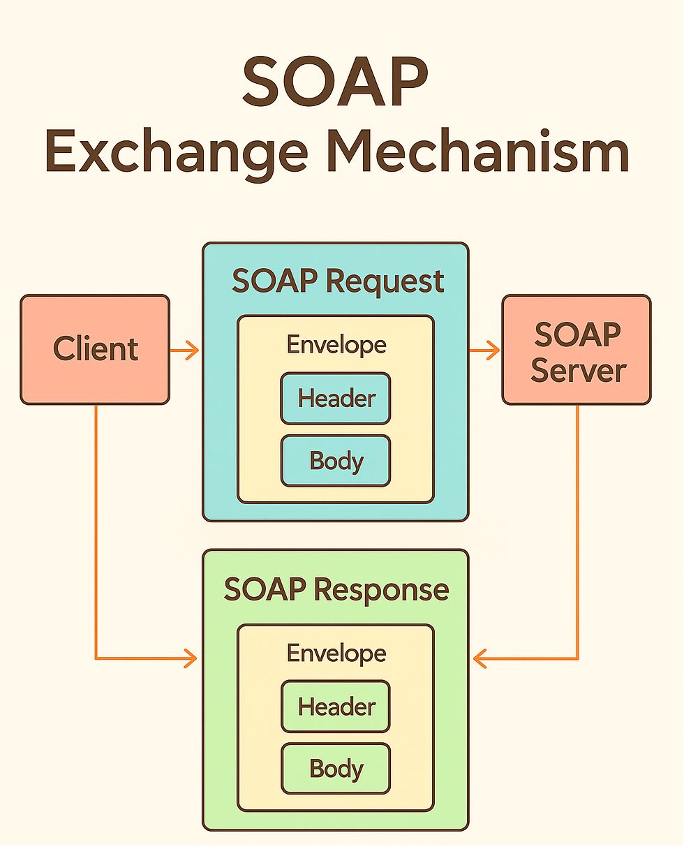
SOAP (Simple Object Access Protocol) might sound intimidating (or funny) but it is actually a straightforward way for systems to exchange structured messages using XML. In this article, I am introducing SOAP through YouTube video, where it is explored through 2 different angles – first in the Chrome browser console, then with Python and Jupyter Notebook.
The SOAP Exchange Mechanism uses requests and response.
Part 1 – Soap in the Chrome Browser Console
We start by sending SOAP requests directly from the browser’s JS console. This is a quick way to see the raw XML
<soap> envelopes in action. Using a public integer calculator web service, we perform basic operations – additions, subtraction, multiplication, division – and observe how the requests and responses happen in real time!
For the browser, the entire SOAP journey looks like that:
Chrome Browser -> HTTP POST -> SOAP XML -> Server (http://www.dneonline.com/calculator.asmx?WSDL) -> SOAP XML -> Chrome Browser
Here we jump into Python. With the help of libaries, we load the the WSDL (Web Services Description Language) file, inspect the available operations, and call the same calculator service programmatically.
When two creatives collaborate, the design process becomes a shared stage — each bringing their own strengths, perspectives, and instincts. This project united designer/art director Artem Shcherban and 3D/motion designer Andrew Moskvin to help New York–based scenographer and costume designer Christian Fleming completely reimagine how his work is presented.
What began as a portfolio refresh evolved into a cohesive visual system: a rigorously minimal print catalog, a single-page website concept, and a cinematic 3D visualization. Together, Artem and Andrew shaped an experience that distilled Christian’s theatrical sensibility into clear, atmospheric design across both physical and digital formats.
From here, Artem picks up the story, walking us through how he approached the portfolio’s structure, the visual rules it would live by, and the thinking that shaped both its print and on-screen presence.
Starting the Design Conversation
Christian Fleming is a prominent designer and director based in New York City who works with theaters around the world creating visual spaces for performances. He approached me with a challenge: to update and rethink his portfolio, to make it easy to send out to theater directors and curators. Specifically the print format.
Christian had a pretty clear understanding of what he wanted to show and how it should look: rigid Scandinavian minimalism, extreme clarity of composition, a minimum of elements and a presentation that would be understandable to absolutely anyone – regardless of age, profession or context.
It was important to create a system that would:
be updated regularly (approximately every 3 weeks),
adapt to new projects,
and at the same time remain visually and semantically stable.
There also needed to be an “About Christian” section in the structure, but this too had to fit within a strict framework of visual language.
Designing a Flexible Visual System
I started by carefully analyzing how Christian works. His primary language is visual. He thinks in images, light, texture and composition. So it was important to retain a sense of air and rhythm, but build a clear modular structure that he could confidently work with on his own.
We came up with a simple adaptive system:
it easily adapts to images of different formats,
scalable for everything from PDFs to presentations,
and can be used both digitally and offline.
In the first stages, we tried several structures. However, Christian still felt that there was something missing in the layout – the visuals and logic were in conflict. We discussed which designs he wanted to show openly and which he didn’t. Some works had global reviews and important weight, but could not be shown in all details.
The solution was to divide them into two meaningful blocks:
“Selected Projects”, with full submission, and “Archival Projects”, with a focus on awards, reviews, and context. This approach preserved both structure and tone. The layout became balanced – and Christian immediately responded to this.
After gathering the structure and understanding how it would work, we began creating the design itself and populating it with content. It was important from the start to train Kristan to add content on his own, as there was a lot of project and they change quite often.
One of the key pluses of our work is versatility. Not only could the final file be emailed, but it could also be used as a print publication. This gave Christian the opportunity to give physical copies at meetings, premieres and professional events where tactility and attention to detail are important.
Christian liked the first result, both in the way the system was laid out and the way I approached the task. Then I suggested: let’s update the website as well.
Translating the Portfolio to a Single-Page Site
This phase proved to be the most interesting, and the most challenging.
Although the website looks simple, it took almost 3 months to build. From the very beginning, Christian and I tried to understand why he needed to update the site and how it should work together with the already established portfolio system.
The main challenge was to show the visual side of his projects. Not just text or logos, but the atmosphere, the light, the costumes, the feeling of the scene.
One of the restrictions that Christian set was the requirement to make the site as concise as possible, without a large number of pages, or better to limit it to one, and without unnecessary transitions. It had to be simple, clear and intuitive, but still user-friendly and quite informative. This was a real challenge, given the amount of content that needed to be posted.
Designing with Stage Logic
One of the key constraints that started the work on the site was Christian’s wish: no multiple pages. Everything had to be compact, coherent, clear and yet rich. This posed a special challenge. It was necessary to accommodate a fairly large amount of information without overloading the perception.
I proposed a solution built on a theatrical metaphor: as in a stage blackout, the screen darkens and a new space appears. Each project becomes its own scene, with the user as a spectator — never leaving their seat, never clicking through menus. Navigation flows in smooth, seamless transitions, keeping attention focused and the emotional rhythm intact.
Christian liked the idea, but immediately faced a new challenge: how to fit everything important on one screen:
a short text about him,
social media links and a resume,
the job title and description,
and, if necessary, reviews.
At the same time, the main visual content – photos and videos – had to remain in the center of attention and not overlap with the interface.
Solving the Composition Puzzle
We explored several layouts — from centered titles and multi-level disclosures to diagonal structures and thumbnail navigation. Some looked promising, but they lacked the sense of theatrical rhythm we wanted. The layouts felt crowded, with too much design and not enough air.
The breakthrough came when we shifted focus from pure visuals to structural logic. We reduced each project view to four key elements: minimal information about Christian, the production title with the director’s name, a review (when available), and a button to select the project. Giving each element its own space created a layout that was both clear and flexible, without overloading the screen.
Refining Through Iteration
As with the book, the site went through several iterations:
In the first prototype, the central layout quickly proved unworkable – long play titles and director names didn’t fit on the screen, especially in the mobile version. We were losing scalability and not using all the available space.
In the second version, we moved the information blocks upwards – this gave us a logical hierarchy and allowed us not to burden the center of the screen. The visual focus remained on the photos, and the text did not interfere with the perception of the scenography.
In the third round, the idea of “titles” appeared – a clear typographic structure, where titles are highlighted only by boldness, without changing the lettering. This was in keeping with the overall minimalist aesthetic, and Christian specifically mentioned that he didn’t want to use more than one font or style unless necessary.
We also decided to stylistically separate the reviews from the main description. We italicized them and put them just below. This made it clear what belonged to the author and what was a response to the author’s work.
Bringing Theatrical Flow to Navigation
The last open issue was navigation between projects. I proposed two scenarios:
Navigating with arrows, as if the viewer were leafing through the play scene by scene.
A clickable menu with a list of works for those who want to go directly.
Christian was concerned about the question: wouldn’t the user lose their bearings if they didn’t see the list all the time? We discussed this and came to the conclusion that most visitors don’t come to the site to “look for the right job”. They come to feel the atmosphere and “experience” its theater. So the basic scenario is a consistent browsing experience, like moving through a play. The menu is available, but not in the way – it should not break the effect of involvement.
What We Learned About Theatrical Design
We didn’t build just a website. We built an experience. It is not a digital storefront, but a space that reflects the way Christian works. He is an artist who thinks in the rhythm of the stage, and it was essential not to break that rhythm.
The result is a place where the viewer isn’t distracted; they inhabit it. Navigation, structure, and interface quietly support this experience. Much of that comes from Christian’s clear and thoughtful feedback, which shaped the process at every step. This project is a reminder that even work which appears simple is defined by countless small decisions, each influencing not only how it functions but also the mood it creates from the very beginning.
Extending the Design from Screen to Print
Once the site was complete, a new question emerged: how should this work be presented in the most meaningful way?
The digital format was only part of the answer. We also envisioned a printed edition — something that could be mailed or handed over in person as a physical object. In the theater world, where visual presence and tactility carry as much weight as the idea itself, this felt essential.
We developed a set of layouts, but bringing the catalog to life as intended proved slow. Christian’s schedule with his theater work left little time to finalize the print production. We needed an alternative that could convey not only the design but also the atmosphere and weight of the finished book.
Turning the Book into a Cinematic Object
At this stage, 3D and motion designer Andrew Moskvin joined the project. We shared the brief with him — not just to present the catalog, but to embed it within the theatrical aesthetic, preserving the play of light, texture, air, and mood that defined the website.
Andrew was immediately enthusiastic. After a quick call, he dove into the process. I assembled all the pages of the print version we had, and together we discussed storyboards, perspectives, atmosphere, possible scenes, and materials that could deepen the experience. The goal was more than simply showing the layout — we wanted cinematic shots where every fold of fabric and every spot of light served a single dramaturgy.
The result exceeded expectations. Andrew didn’t just recreate the printed version; he brought it to life. His work was subtle and precise, with a deep respect for context. He captured not only the mood but also the intent behind each spread, giving the book weight, materiality, and presence — the kind we imagined holding in our hands and leafing through in person.
Andrew will share his development process below.
Breaking Down the 3D Process
The Concept
At the very start, I wanted my work to blend fluently in the ideas that were already made. Christian Fleming is a scenographer and costume designer, so the visual system needed to reflect his world. Since the project was deeply rooted in the theatrical aesthetic, my 3D work had to naturally blend into that atmosphere. Artem’s direction played a key role in shaping the unique look envisioned by Christian Fleming — rich with stage-like presence, bold compositions, and intentional use of space. My task was to ensure that the 3D elements not only supported this world, but also felt like an organic extension of it — capturing the same mood, lighting nuances, and visual rhythm that define a theatrical setting.
The Tools
For the entire 3D pipeline, I worked in:
Cinema 4D for modeling and scene setup
Redshift for rendering
After Effects for compositing
Photoshop for color correcting static images
Modeling the Book
The book was modeled entirely from scratch. Me and Artem discussed the form and proportions, and after several iterations, we finalized the design direction. I focused on the small details that bring realism: the curvature of the hardcover spine, beveled edges, the separation between the cover and pages, and the layered structure of the paper block. I also modeled the cloth texture wrapping the spine, giving the book a tactile, fabric-like look. The geometry was built to hold up in close-up shots and fit the theatrical lighting.
Lighting with a Theatrical Eye
Lighting was one of the most important parts of this process. I wanted the scenes to feel theatrical — as if the objects were placed on a stage under carefully controlled spotlights. Using a combination of area lights and spotlights in Redshift, I shaped the lighting to create soft gradients and shadows on the surfaces. The setup was designed to emphasize the geometry without flattening it, always preserving depth and direction. A subtle backlight highlight played a key role in defining the edges and enhancing the overall form.
I think I spent more time on lighting than on modeling, since lighting has always been more experimental for me — even in product scenes.
One small but impactful trick I always use is setting up a separate HDRI map just for reflections. I disable its contribution to diffuse lighting by setting the diffuse value to 0, while keeping reflections at 1. This allows the reflections to pop more without affecting the overall lighting of the scene. It’s a simple setup, but it gives you way more control over how materials respond — especially in stylized or highly art-directed environments.
Building the Materials
When I was creating the materials, I noticed that Artem had used a checkerboard texture for the cover. So I thought — why not take that idea further and implement it directly into the material? I added a subtle bump using a checker texture on the sides and front part of the book.
I also experimented quite a bit with displacement. Initially, I had the idea to make the title metallic, but it felt too predictable. So instead, I went with a white title featuring embossed details, while keeping the checker bump texture underneath.
This actually ties back to the modeling process — for the displacement to work properly, the geometry had to be evenly dense and ready for subdivision.
I created a mask in Photoshop and applied a procedural Gaussian blur using a Smart Object. Without the blur, the displacement looked harsh and unrefined — even a slight blur made a noticeable difference.
The main challenge with using white, as always, was avoiding blown-out highlights. I had to carefully balance the lighting and tweak the material settings to make the title clean and visible without overexposing it.
One of the more unusual challenges in this project was animating the page slide and making the pages differ. I didn’t want the pages to feel too repetitive, but I also didn’t want to create dozens of individual materials for each page. To find a balance, I created two different materials for two pages and made them random inside of the cloner. It was a bit of a workaround — mostly due to limitations inside the Shader switch node — but it worked well enough to create the illusion of variety without significantly increasing the complexity of the setup.
There’s a really useful node in Redshift called Color User Data — especially when working with the MoGraph system to trigger object index values. One of the strangest (and probably least intuitive) things I did in this setup was using a Change Range node to remap those index values properly according to the number of textures I had. With that in place, I built a system that used an index to mix between all the textures inside a Shader Switch node. This allowed me to get true variation across the pages without manually assigning materials to each one.
You might’ve noticed that the pages look a bit too bright for a real-world scenario — and that was actually a deliberate choice. I often use a trick that helps me art-direct material brightness independently of the scene’s lighting. The key node here is Color Correct Node.
Inside it, there’s a parameter called Level. If you set it higher than 1, it increases the overall brightness of the texture output — without affecting shadows or highlights too aggressively. This also works in reverse: if your texture has areas that are too bright (like pure white), lowering the Level value below 1 will tone it down without needing to modify the source texture.
It’s a simple trick, but incredibly useful when you want fine control over how materials react in stylized or theatrical lighting setups.
The red cloth material I used throughout the scene is another interesting part of the project. I wanted it to have a strong tactile feel — something that looks thick, textured, and physically present. To achieve that, I relied heavily on geometry. I used a Redshift Object Tag with Subdivision (under the Geometry tab) enabled to add more detail where it was needed. This helped the cloth catch light properly and hold up in close-up shots.
For the translucent look, I originally experimented with Subsurface Scattering, but it didn’t give me the control I wanted. So instead, I used an Opacity setup driven by a Ramp and Change Range nodes. That gave me just enough falloff and variation to fake the look of light passing through thinner areas of the fabric — and in the end, it worked surprisingly well.
Animating the Pages
This was by far the most experimental part of the project for me. The amount of improvisation — and the complete lack of confidence in what the next frame would be — made the process both fun and flexible.
What you’re about to see might look a bit chaotic, so let me quickly walk you through how it all started.
The simulation started with a subject — in our case, a page. It had to have the proper form, and by that I mean the right typology. Specifically, it needed to consist only of horizontal segments; otherwise, it would bend unevenly under the forces present in the scene. (And yes, I did try versions with even polygons — it got messy.)
I set up all the pages in a Cloner so I could easily adjust any parameters I needed, and added a bit of randomness using a Random Effector.
In the video, you can see a plane on the side that connects to the pages — that was actually the first idea I had when thinking about how to run the simulation. The plane has a Connect tag that links all the pages to it, so when it rotates, they all follow along.
I won’t go into all the force settings — most of them were experimental, and animations like this always require a bit of creative adjustment.
The main force was wind. The pages did want to slide just from the plane with the Connect tag, but I needed to give them an extra push from underneath — that’s where wind came in handy.
I also used a Field Force to move the pages mid-air, from the center outward to the other side.
Probably the most important part was how I triggered the “Mix Animation.” I used a Vertex Map tag on the Cloner to paint a map using a Field, which then drove the Mix Animation parameter in the Cloth tag. This setup made the pages activate one by one, creating a natural, finger-like sliding motion as seen in Video.
Postprocessing
I didn’t go too heavy on post-processing, but there’s one plugin I have to mention — Deep Glow. It gives amazing results. By tweaking the threshold, you can make it react only to the brightest areas, which creates a super clean, glowing effect.
The Final Theatrical Ecosystem
In the end, Christian was delighted with the outcome. Together we had built more than a portfolio — we had created a cohesive theatrical ecosystem. It moved fluidly from digital performance to printed object, from live stage to interface, and from emotion to technology.
The experience is pared back to its essence: no superfluous effects, no unnecessary clicks, nothing to pull focus. What remains is what matters most — the work itself, framed in a way that stays quietly behind the scenes yet comes fully alive in the viewer’s hands and on their screen.
Interactive web animations have become essential for modern websites, but choosing the right implementation approach can be challenging. CSS, Video and JavaScript are the familiar methods and each certainly has its place in a developer’s toolkit. When you need your site to have unique custom interactions (while remaining light and performant, of course), that’s where Rive shines.
Rive animations, whether vector or raster, look crisp at any size, are lightweight (often smaller than equivalent Lottie files), and can respond to user interactions and real-time data through a straightforward JavaScript API.
This tutorial will walk you through Rive’s workflow and implementation process using three practical examples. We’ll build them step-by-step using a fictional smart plant care company called “TapRoot” as our case study, so you can see exactly how Rive fits into a real development process and decide if it’s right for your next project.
There are countless ways to use Rive, but we’ll focus on these three patterns:
Animated Hero Images create an immediate emotional connection and brand personality
Interactive CTAs increase conversion rates by providing clear, satisfying feedback
Flexible Layouts combine elements into an experience that works at any size
Each pattern builds on the previous one, teaching you progressively more sophisticated Rive techniques while solving real-world UX challenges.
Pattern 1: The Living Hero Image
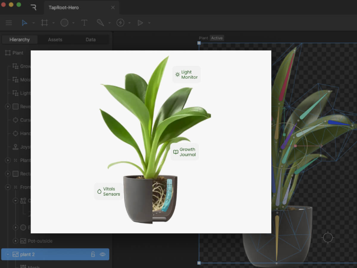
The Static Starting Point
A static hero section for TapRoot could feature a photo of their smart plant pot with overlay text. It show’s the product, but we can do better.
Creating the Rive Animation
Let’s create an animated version that transforms this simple scene into a revealing experience that literally shows what makes TapRoot “smarter than it looks.” The animation features:
Gently swaying leaves: Constant, subtle motion brings a sense of life to the page.
Interior-reveal effect: Hovering over the pot reveals the hidden root system and embedded sensors
Product Feature Callouts: Key features are highlighted with interactive callouts
Although Rive is vector-based, you can also import JPG, PNG, and PSD files. With an embedded image, a mesh can be constructed and a series of bones can be bound to it. Animating the bones gives the subtle motion of the leaves moving. We’ll loop it at a slow speed so the motion is noticeable, but not distracting.
Adding Interactivity
Next we’ll add a hover animation that reveals the inside of the pot. By clipping the image of the front of the pot to a rectangle, we can resize the shape to reveal the layers underneath. Using a joystick allows us to have an animation follow the cursor when it’s in within the hit area of the pot and snap back to normal when the cursor leaves the area.
Feature Callouts
With a nested artboard, it is easy to build a single layout to create multiple versions of an element. In this case, a feature callout has an updated icon, title, and short description for three separate features.
The Result
What was once a simple product photo is now an interactive revelation of TapRoot’s hidden intelligence. The animation embodies the brand message—”smarter than it looks”—by literally revealing the sophisticated technology beneath a beautifully minimal exterior.
Pattern 2: The Conversion-Boosting Interactive CTA
Beyond the Basic Button
Most CTAs are afterthoughts—a colored rectangle with text. But your CTA is often the most important element on your page. Let’s make it irresistible.
Idle State: Clean, minimal button with an occasional “shine” animation
Hover State: Fingerprint icon begins to follow the cursor
Click State: An animated “tap” of the button
Pattern 3: Flexible Layout
Next we can combine the elements into a responsive animated layout that works on any device size. Rive’s layout features familiar row and column arrangements and lets you determine how your animated elements fit within areas as they resize.
The web is becoming more interactive and alive. By understanding how to implement Rive animations—from X-ray reveals to root network interactions—you’re adding tools that create experiences users remember and share.
The difference between a good website and a great one often comes down to these subtle details: the satisfying feedback of a button click, the smooth transition between themes, the curiosity sparked by hidden technology. These micro-interactions connect with users on an emotional level while providing genuine functional value.
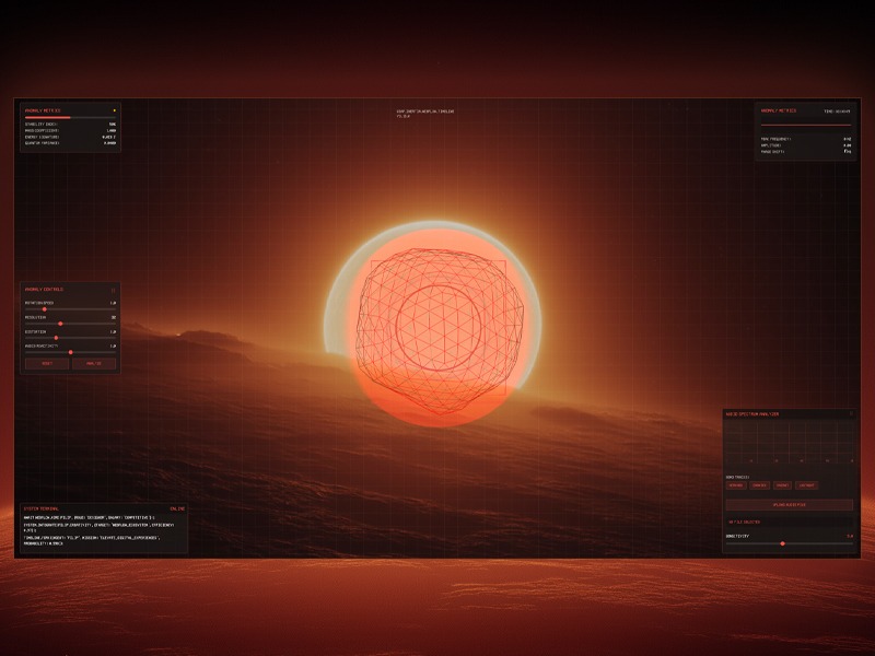
Sound is vibration, vision is vibration you can see. I’m always chasing the moment those waves overlap. For a recent Webflow & GSAP community challenge focusing on GSAP Draggable and Inertia Plugin, I decided to push the idea further by building a futuristic audio-reactive visualizer. The concept was to create a sci-fi “anomaly detector” interface that reacts to music in real time, blending moody visuals with sound.
The concept began with a simple image in my mind: a glowing orange-to-white sphere sitting alone in a dark void, the core that would later pulse with the music. To solidify the idea, I ran this prompt through Midjourney: “Glowing orange and white gradient sphere, soft blurry layers, smooth distortion, dark black background, subtle film-grain, retro-analog vibe, cinematic lighting.” After a few iterations I picked the frame that felt right, gave it a quick color pass in Photoshop, and used that clean, luminous orb as the visual foundation for the entire audio-reactive build.
Midjourney explorations
The project was originally built as an entry for the Webflow × GSAP Community Challenge (Week 2: “Draggable & Inertia”), which encouraged the use of GSAP’s dragging and inertia capabilities. This context influenced the features: I made the on-screen control panels draggable with momentum, and even gave the 3D orb a subtle inertia-driven movement when “flung”. In this article, I’ll walk you through the entire process – from setting up the Three.js scene and analyzing audio with the Web Audio API, to creating custom shaders and adding GSAP animations and interactivity. By the end, you’ll see how code, visuals, and sound come together to create an immersive audio visualizer.
Setting Up the Three.js Scene
To build the 3D portion, I used Three.js to create a scene containing a dynamic sphere (the “anomaly”) and other visual elements.
We start with the usual Three.js setup: a scene, a camera, and a renderer. I went with a perspective camera to get a nice 3D view of our orb and placed it a bit back so the object is fully in frame.
An OrbitControls is used to allow basic click-and-drag orbiting around the object (with some damping for smoothness). Here’s a simplified snippet of the initial setup:
// Initialize Three.js scene, camera, renderer
const scene = new THREE.Scene();
const camera = new THREE.PerspectiveCamera(75, window.innerWidth/window.innerHeight, 0.1, 100);
camera.position.set(0, 0, 10);  // camera back a bit from origin

const renderer = new THREE.WebGLRenderer({ antialias: true });
renderer.setSize(window.innerWidth, window.innerHeight);
document.body.appendChild(renderer.domElement);

// Add OrbitControls for camera rotation
const controls = new THREE.OrbitControls(camera, renderer.domElement);
controls.enableDamping = true;
controls.dampingFactor = 0.1;
controls.rotateSpeed = 0.5;
controls.enableZoom = false; // lock zoom for a more fixed view
Next, I created the anomaly object. This is the main feature: a spiky wireframe sphere that reacts to audio. Three.js provides shapes like SphereGeometry or IcosahedronGeometry that we can use for a sphere. I chose an icosahedron geometry because it gives an interesting multi sided look and allows easy control of detail (via a subdivision level). The anomaly is actually composed of two overlapping parts:
Outer wireframe sphere: An IcosahedronGeometry with a custom ShaderMaterial that draws it as a glowing wireframe. This part will distort based on music (imagine it “vibrating” and morphing with the beat).
Inner glow sphere: A slightly larger SphereGeometry drawn with a semi-transparent, emissive shader (using the backside of the geometry) to create a halo or aura around the wireframe. This gives the orb a warm glow effect, like an energy field.
I also added in some extra visuals: a field of tiny particles floating in the background (for a depth effect, like dust or sparks) and a subtle grid overlay in the UI (more on the UI later). The scene’s background is set to a dark color, and I layered a background image (the edited Midjourney visual) behind the canvas to create the mysterious-alien landscape horizon. This combination of 3D objects and 2D backdrop creates the illusion of a holographic display over a planetary surface.
Integrating the Web Audio API for Music Analysis
With the 3D scene in place, the next step was making it respond to music. This is where the Web Audio API comes in. I allowed the user to either upload an audio file or pick one of the four provided tracks. When the audio plays, we tap into the audio stream and analyze its frequencies in real-time using an AnalyserNode. The AnalyserNode gives us access to frequency data. This is a snapshot of the audio spectrum (bass, mids, treble levels, etc.) at any given moment, which we can use to drive animations.
To set this up, I created an AudioContext and an AnalyserNode, and connected an audio source to it. If you’re using an <audio> element for playback, you can create a MediaElementSource from it and pipe that into the analyser. For example:
// Create AudioContext and Analyser
const audioContext = new (window.AudioContext || window.webkitAudioContext)();
const analyser = audioContext.createAnalyser();
analyser.fftSize = 2048;                  // Use an FFT size of 2048 for analysis
analyser.smoothingTimeConstant = 0.8;     // Smooth out the frequencies a bit

// Connect an audio element source to the analyser
const audioElement = document.getElementById('audio-player');  // <audio> element
const source = audioContext.createMediaElementSource(audioElement);
source.connect(analyser);
analyser.connect(audioContext.destination);  // connect to output so sound plays
Here we set fftSize to 2048, which means the analyser will break the audio into 1024 frequency bins (frequencyBinCount is half of fftSize). We also set a smoothingTimeConstant to make the data less jumpy frame-to-frame. Now, as the audio plays, we can repeatedly query the analyser for data. The method analyser.getByteFrequencyData(array) fills an array with the current frequency magnitudes (0–255) across the spectrum. Similarly, getByteTimeDomainData gives waveform amplitude data. In our animation loop, I call analyser.getByteFrequencyData() on each frame to get fresh data:
const frequencyData = new Uint8Array(analyser.frequencyBinCount);

function animate() {
  requestAnimationFrame(animate);

  // ... update Three.js controls, etc.
  if (analyser) {
    analyser.getByteFrequencyData(frequencyData);
    // Compute an average volume level from frequency data
    let sum = 0;
    for (let i = 0; i < frequencyData.length; i++) {
      sum += frequencyData[i];
    }
    const average = sum / frequencyData.length;
    let audioLevel = average / 255;  // normalize to 0.0–1.0
    // Apply a sensitivity scaling (from a UI slider)
    audioLevel *= (sensitivity / 5.0);
    // Now audioLevel represents the intensity of the music (0 = silence, ~1 = very loud)
  }

  // ... (use audioLevel to update visuals)
  renderer.render(scene, camera);
}
In my case, I also identified a “peak frequency” (the frequency bin with the highest amplitude at a given moment) and some other metrics just for fun, which I display on the UI (e.g. showing the dominant frequency in Hz, amplitude, etc., as “Anomaly Metrics”). But the key takeaway is the audioLevel – a value representing overall music intensity – which we’ll use to drive the 3D visual changes.
Syncing Audio with Visuals: Once we have audioLevel, we can inject it into our Three.js world. I passed this value into the shaders as a uniform every frame, and also used it to tweak some high-level motion (like rotation speed). Additionally, GSAP animations were triggered by play/pause events (for example, a slight camera zoom when music starts, which we’ll cover next). The result is that the visuals move in time with the music:louder or more intense moments in the audio make the anomaly glow brighter and distort more, while quiet moments cause it to settle down.
Creating the Audio-Reactive Shaders
To achieve the dynamic look for the anomaly, I used custom GLSL shaders in the material. Three.js lets us write our own shaders via THREE.ShaderMaterial, which is perfect for this because it gives fine-grained control over vertex positions and fragment colors. This might sound difficult if you’re new to shaders, but conceptually we did two major things in the shader:
Vertex Distortion with Noise: We displace the vertices of the sphere mesh over time to make it wobble and spike. I included a 3D noise function (Simplex noise) in the vertex shader – it produces a smooth pseudo-random value for any 3D coordinate. For each vertex, I calculate a noise value based on its position (plus a time factor to animate it). Then I move the vertex along its normal by an amount proportional to that noise. We also multiply this by our audioLevel and a user-controlled distortion factor. Essentially, when the music is intense (high audioLevel), the sphere gets spikier and more chaotic; when the music is soft or paused, the sphere is almost smooth.
Fresnel Glow in Fragment Shader: To make the wireframe edges glow and fade realistically, I used a fresnel effect in the fragment shader. This effect makes surfaces more luminous at glancing angles. We calculate it by taking the dot product of the view direction and the vertex normal – it results in a value that’s small on edges (grazing angles) and larger on faces directly facing the camera. By inverting and exponentiating this, we get a nice glow on the outline of the sphere that intensifies at the edges. I modulated the fresnel intensity with the audioLevel as well, so the glow pulsates with the beat.
Let’s look at a simplified version of the shader code for the outer wireframe sphere material:
const outerMaterial = new THREE.ShaderMaterial({
  uniforms: {
    time:      { value: 0 },
    audioLevel:{ value: 0 },            // this will be updated each frame
    distortion:{ value: 1.0 },
    color:     { value: new THREE.Color(0xff4e42) }  // a reddish-orange base color
  },
  wireframe: true,
  transparent: true,
  vertexShader: `
    uniform float time;
    uniform float audioLevel;
    uniform float distortion;
    // (noise function omitted for brevity)

    void main() {
      // Start with the original position
      vec3 pos = position;
      // Calculate procedural noise value for this vertex (using its position and time)
      float noise = snoise(pos * 0.5 + vec3(0.0, 0.0, time * 0.3));
      // Displace vertex along its normal
      pos += normal * noise * distortion * (1.0 + audioLevel);
      // Standard transformation
      gl_Position = projectionMatrix * modelViewMatrix * vec4(pos, 1.0);
    }
  `,
  fragmentShader: `
    uniform vec3 color;
    uniform float audioLevel;
    varying vec3 vNormal;
    varying vec3 vPosition;

    void main() {
      // Calculate fresnel (view-angle dependent) term
      vec3 viewDir = normalize(cameraPosition - vPosition);
      float fresnel = 1.0 - max(0.0, dot(viewDir, vNormal));
      fresnel = pow(fresnel, 2.0 + audioLevel * 2.0);
      // Make the fragment color brighter on edges (fresnel) and pulse it slightly with time
      float pulse = 0.8 + 0.2 * sin(time * 2.0);
      vec3 emissiveColor = color * fresnel * pulse * (1.0 + audioLevel * 0.8);
      // Alpha fade out a bit when audio is high (to make spikes more ethereal)
      float alpha = fresnel * (0.7 - audioLevel * 0.3);
      gl_FragColor = vec4(emissiveColor, alpha);
    }
  `
});
In this shader, snoise is a Simplex noise function (not shown above) producing values ~-1 to 1. The vertex shader uses it to offset each vertex (pos += normal * noise * …). We multiply the noise by (1.0 + audioLevel) so that when audioLevel rises, the displacement increases. The distortion uniform is controlled by a slider in the UI, so the user can manually dial the overall spikiness. The fragment shader calculates a fresnel factor to make the wireframe edges glow. Notice how audioLevel factors into the power and into the final color intensity – louder audio makes the fresnel exponent higher (sharper glow) and also increases brightness a bit. We also included a gentle pulsing (sin(time)) independent of audio, just to give a constant breathing motion.
For the inner glow sphere, we used a separate ShaderMaterial: it’s basically a sphere drawn with side: THREE.BackSide (so we see the inner surface) and Additive Blending to give a blooming halo. Its fragment shader also uses a fresnel term, but with a much lower alpha so it appears as a soft haze around the orb. The inner sphere’s size is slightly larger (I used about 1.2× the radius of the outer sphere) so that the glow extends beyond the wireframe. When combined, the outer and inner shaders create the effect of a translucent, energy-filled orb whose surface ripples with music.
To tie it all together, every frame in the render loop I update the shader uniforms with the current time and audio level:
// in the animation loop:
outerMaterial.uniforms.time.value = elapsedTime;
outerMaterial.uniforms.audioLevel.value = audioLevel;
outerMaterial.uniforms.distortion.value = currentDistortion;
glowMaterial.uniforms.time.value = elapsedTime;
glowMaterial.uniforms.audioLevel.value = audioLevel;
The result is a 3D object that truly feels alive with the music, it oscillates, pulses, and glows in sync with whatever track is playing. Even the one you add.
Animations and Interactions with GSAP
With the visuals reacting to sound, I added GSAP to handle smooth animations and user interactions. GSAP is great for creating timeline sequences and tweening properties with easing, and it also comes with plugins that were perfect for this project: Draggable for click-and-drag UI, and InertiaPlugin for momentum. Best of all, every GSAP plugin is now completely free to use. Below are the key ways I used GSAP in the project:
Intro Animation & Camera Movement: When the user selects a track and hits play, I trigger a brief “activation” sequence. This involves some text appearing in the “terminal” and a slight camera zoom-in toward the orb to signal that the system is online. The camera movement was done with a simple GSAP tween of the camera’s position. For example, I defined a default camera position and a slightly closer “zoomed” position. On play, I use gsap.to() to interpolate the camera position to the zoomed-in coordinates, and on pause/stop I tween it back out. GSAP makes this kind of 3D property animation straightforward:
const defaultCameraPos = { x: 0, y: 0, z: 10 };
const zoomedCameraPos = { x: 0, y: 0, z: 7 }; // move camera closer on zoom

function zoomCameraForAudio(zoomIn) {
  const target = zoomIn ? zoomedCameraPos : defaultCameraPos;
  gsap.to(camera.position, {
    x: target.x,
    y: target.y,
    z: target.z,
    duration: 1.5,
    ease: "power2.inOut"
  });
}

// When audio starts:
zoomCameraForAudio(true);
// When audio ends or is stopped:
zoomCameraForAudio(false);
This smooth zoom adds drama when the music kicks in, drawing the viewer into the scene. The power2.inOut easing gives it a nice gentle start and stop. I also used GSAP timelines for any other scripted sequences (like fading out the “Analyzing…” overlay text after a few seconds, etc.), since GSAP’s timeline control is very handy for orchestrating arranging multiple animations in order.
Draggable UI Panels: The interface has a few UI components overlaying the 3D canvas – e.g. an “Anomaly Controls” panel (with sliders for rotation speed, distortion amount, etc.), an “Audio Spectrum Analyzer” panel (showing a bar graph of frequencies and track selection buttons), and a “System Terminal” readout (displaying log messages like a console). To make the experience playful, I made these panels draggable. Using GSAP’s Draggable plugin, I simply turned each .panel element into a draggable object:
Draggable.create(".panel", {
  type: "x,y",
  bounds: "body",         // confine dragging within the viewport
  inertia: true,          // enable momentum after release
  edgeResistance: 0.65,   // a bit of resistance at the edges
  onDragStart: () => { /* bring panel to front, etc. */ },
  onDragEnd: function() {
    // Optionally, log the velocity or other info for fun
    console.log("Panel thrown with velocity:", this.getVelocity());
  }
});
Setting inertia: true means when the user releases a panel, it will continue moving in the direction they tossed it, gradually slowing to a stop (thanks to InertiaPlugin). This little touch makes the UI feel more tactile and real – you can flick the panels around and they slide with some “weight.” According to GSAP’s docs, Draggable will automatically handle the physics when inertia is enabled , so it was plug-and-play. I also constrained dragging within the body bounds so panels don’t get lost off-screen. Each panel has a clickable header (a drag handle area), set via the handle option, to restrict where a user can grab it. Under the hood, InertiaPlugin calculates the velocity of the drag and creates a tween that smoothly decelerates the element after you let go, mimicking friction.
Interactive Orb Drag (Bonus): As a creative experiment, I even made the 3D anomaly orb itself draggable. This was a bit more involved since it’s not a DOM element, but I implemented it by raycasting for clicks on the 3D object and then rotating the object based on mouse movement. I applied a similar inertia effect manually: when you “throw” the orb, it keeps spinning and slowly comes to rest. This wasn’t using GSAP’s Draggable directly (since that works in screen space), but I did use the InertiaPlugin concept by capturing the drag velocity and then using an inertial decay on that velocity each frame. It added a fun way to interact with the visualizer – you can nudge the orb and see it respond physically. For example, if you drag and release quickly, the orb will continue rotating with momentum. This kind of custom 3D dragging is outside the scope of a basic tutorial, but it shows how you can combine your own logic with GSAP’s physics concepts to enrich interactions.
GSAP Draggable and Inertia in action
In summary, GSAP handles all the non-audio animations: the camera moves, panel drags, and little transitions in the UI. The combination of sound-reactive shader animations (running every frame based on audio data) and event-based GSAP tweens (triggered on user actions or certain times) gives a layered result where everything feels responsive and alive.
UI and Atmosphere
Finally, a few words about the surrounding UI/atmosphere which glue the experience together. The visualizer’s style was inspired by sci-fi control panels, so I leaned into that:
Control Panels and Readouts: I built the overlay UI with HTML/CSS, keeping it minimalistic (just semi-transparent dark panels with light text and a few sliders/buttons). Key controls include rotation speed (how fast the orb spins), resolution (tessellation level of the icosahedron mesh), distortion amount, audio reactivity (scaling of audio impact), and sensitivity (which adjusts how the audio’s volume is interpreted). Changing these in real-time immediately affects the Three.js scene – for example, dragging the “Resolution” slider rebuilds the icosahedron geometry with more or fewer triangles, which is a cool way to see the orb go from coarse to finely subdivided. The “Audio Spectrum Analyzer” panel displays a classic bar graph of frequencies (drawn on a canvas using the analyser data) so you have a 2D visualization accompanying the 3D one. There’s also a console-style terminal readout that logs events (like “AUDIO ANALYSIS SYSTEM INITIALIZED” or the velocity of drags in a playful GSAP log format) to reinforce the concept of a high-tech system at work.
Design elements: To boost the sci-fi feel, I added a subtle grid overlay across the whole screen. This was done with pure CSS – a pair of repeating linear gradients forming horizontal and vertical lines (1px thin, very transparent) over a transparent background . It’s barely noticeable but gives a technical texture, especially against the glow of the orb. I also added some drifting ambient particles (tiny dots) floating slowly in the background, implemented as simple divs animated with JavaScript. They move in pseudo-random orbits.
Soundtrack: I curated three atmospheric and moody tracks, along with one of my own unreleased tracks, under my music alias LXSTNGHT. The track was produced in Ableton, and it’s unfinished. The end result is an experience where design, code, and music production collide in real time.
Bringing all these elements together, the final result is an interactive art piece: you load a track, the “Audio ARK” system comes online with a flurry of text feedback, the ambient music starts playing, and the orb begins to pulse and mutate in sync with the sound. You can tweak controls or toss around panels (or the orb itself) to explore different visuals.
The combination of Three.js (for rendering and shader effects), Web Audio API (for sound analysis), and GSAP (for polished interactions) showcases how creative coding tools can merge to produce an immersive experience that engages multiple senses.
Bolt.new is a browser-based AI web development agent focused on speed and simplicity. It lets anyone prototype, test, and publish web apps instantly—without any dev experience required.
Designed for anyone with an idea, Bolt empowers users to create fully functional websites and apps using just plain language. No coding experience? No problem. By combining real-time feedback with prompt-based development, Bolt turns your words into working code right in the browser. Whether you’re a designer, marketer, educator, or curious first-timer, Bolt.new offers an intuitive, AI-assisted playground where you can build, iterate, and launch at the speed of thought.
Core Features:
Instantly live: Bolt creates your code as you type—no server setup needed.
Web-native: Write in HTML, CSS, and JavaScript; no frameworks required.
Live preview: Real-time output without reloads or delays.
One-click sharing: Publish your project with a single URL.
A Lean Coding Playground
Bolt is a lightweight workspace that allows anyone to become an engineer without knowing how to code. Bolt presents users with a simple, chat-based environment in which you can prompt your agent to create anything you can imagine. Features include:
Split view: Code editor and preview side by side.
Multiple files: Organize HTML, CSS, and JS independently.
ES module support: Structure your scripts cleanly and modularly.
Live interaction testing: Great for animations and frontend logic.
Beyond the Frontend
With integrated AI and full-stack support via WebContainers (from StackBlitz), Bolt.new can handle backend tasks right in the browser.
Full-stack ready: Run Node.js servers, install npm packages, and test APIs—all in-browser.
AI-assisted dev: Use natural-language prompts for setup and changes.
Quick deployment: Push to production with a single click, directly from the editor.
Design-to-Code with Figma
For designers, Bolt.new is more than a dev tool, it’s a creative enabler. By eliminating the need to write code, it opens the door to hands-on prototyping, faster iteration, and tighter collaboration. With just a prompt, designers can bring interfaces to life, experiment with interactivity, and see their ideas in action – without leaving the browser. Whether you’re translating a Figma file into responsive HTML or testing a new UX flow, Bolt gives you the freedom to move from concept to clickable with zero friction.
Key Features:
Bolt.new connects directly with Figma, translating design components into working web code ideal for fast iteration and developer-designer collaboration.
Enable real-time collaboration between teams.
Use it for prototyping, handoff, or production-ready builds.
Trying it Out
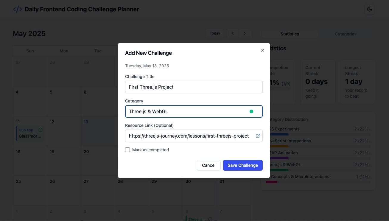
To put Bolt.new to the test, we set out to build a Daily Coding Challenge Planner. Here’s the prompt we used:
Web App Request: Daily Frontend Coding Challenge Planner
I’d like a web app that helps me plan and keep track of one coding challenge each day. The main part of the app should be a calendar that shows the whole month. I want to be able to click on a day and add a challenge to it — only one challenge per day.
Each challenge should have:
A title (what the challenge is)
A category (like “CSS”, “JavaScript”, “React”, etc.)
A way to mark it as “completed” once I finish it
Optionally, a link to a tutorial or resource I’m using
I want to be able to:
Move challenges from one day to another by dragging and dropping them
Add new categories or rename existing ones
Easily delete or edit a challenge if I need to
There should also be a side panel or settings area to manage my list of categories.
The app should:
Look clean and modern
Work well on both computer and mobile
Offer light/dark mode switch
Automatically save data—no login required
This is a tool to help me stay consistent with daily practice and see my progress over time.
Building with Bolt.new
We handed the prompt to Bolt.new and watched it go to work.
Visual feedback while the app was being generated.
The initial result included key features: adding, editing, deleting challenges, and drag-and-drop.
Prompts like “fix dark mode switch” and “add category colors” helped refine the UI.
Integrated shadcn/ui components gave the interface a polished finish.
Screenshots
The Daily Frontend Coding Challenge Planner app, built using just a few promptsAdding a new challenge to the planner
With everything in place, we deployed the app in one click.
We were genuinely impressed by how quickly Bolt.new generated a working app from just a prompt. Minor tweaks were easy, and even a small bug resolved itself with minimal guidance.
Try it yourself—you might be surprised by how much you can build with so little effort.
The future of the web feels more accessible, creative, and immediate—and tools like Bolt.new are helping shape it. In a landscape full of complex tooling and steep learning curves, Bolt.new offers a refreshing alternative: an intelligent, intuitive space where ideas take form instantly.
Bolt lowers the barrier to building for the web. Its prompt-based interface, real-time feedback, and seamless deployment turn what used to be hours of setup into minutes of creativity. With support for full-stack workflows, Figma integration, and AI-assisted editing, Bolt.new isn’t just another code editor, it’s a glimpse into a more accessible, collaborative, and accelerated future for web creation.
Unlock the potential of your web applications with our comprehensive guide to implementing a dynamic column chooser. This blog post dives into the step-by-step process of building an interactive column selector using HTML, CSS, and JavaScript. Whether you’re looking to enhance the user experience by providing customizable table views or streamlining data presentation, our tutorial covers everything you need to know.
Explore the intricacies of:
Setting up a flexible and responsive HTML table structure.
Styling your table and column chooser for a clean, user-friendly interface.
Adding JavaScript functionality to toggle column visibility seamlessly.
With practical code examples and detailed explanations, you’ll be able to integrate a column chooser into your projects effortlessly. Perfect for web developers aiming to create user-centric solutions that cater to diverse needs and preferences. Elevate your web development skills and improve your application’s usability with this essential feature!
A div with the class column-chooser contains checkboxes for each column.
A table is defined with thead and tbody sections.
Each column and cell have a class corresponding to the column name (name, age, email).
CSS:
Basic styling is applied to the table and its elements for readability.
JavaScript:
Adds an event listener to each checkbox in the column chooser.
When a checkbox is toggled, the corresponding column cells are shown or hidden by changing their display style.
This example provides a simple, interactive way for users to choose which columns they want to display in a table. You can expand this by adding more functionality or integrating it into a larger application as needed.
Let’s dive a bit deeper into the heart of our WebAssembly integration by exploring the key segments of our Go-based WASM code.
involves preparing and specifying our Go code to be compiled for a WebAssembly runtime.
// go:build wasm
// +build wasm
These lines serve as directives to the Go compiler, signaling that the following code is designated for a WebAssembly runtime environment. Specifically:
//go:build wasm: A build constraint ensuring the code is compiled only for WASM targets, adhering to modern syntax.
// +build wasm: An analogous constraint, utilizing older syntax for compatibility with prior Go versions.
In essence, these directives guide the compiler to include this code segment only when compiling for a WebAssembly architecture, ensuring an appropriate setup and function within this specific runtime.
package main
import ( "context" "encoding/json" "syscall/js"
"google.golang.org/protobuf/encoding/protojson"
"github.com/Permify/permify/pkg/development" )
var dev *development.Development
func run() js.Func { // The `run` function returns a new JavaScript function // that wraps the Go function. return js.FuncOf(func(this js.Value, args []js.Value) interface{} {
// t will be used to store the unmarshaled JSON data. // The use of an empty interface{} type means it can hold any type of value. var t interface{}
// Unmarshal JSON from JavaScript function argument (args[0]) to Go's data structure (map). // args[0].String() gets the JSON string from the JavaScript argument, // which is then converted to bytes and unmarshaled (parsed) into the map `t`. err := json.Unmarshal([]byte(args[0].String()), &t)
// If an error occurs during unmarshaling (parsing) the JSON, // it returns an array with the error message "invalid JSON" to JavaScript. if err != nil { return js.ValueOf([]interface{}{"invalid JSON"}) }
// Attempt to assert that the parsed JSON (`t`) is a map with string keys. // This step ensures that the unmarshaled JSON is of the expected type (map). input, ok := t.(map[string]interface{})
// If the assertion is false (`ok` is false), // it returns an array with the error message "invalid JSON" to JavaScript. if !ok { return js.ValueOf([]interface{}{"invalid JSON"}) }
// Run the main logic of the application with the parsed input. // It’s assumed that `dev.Run` processes `input` in some way and returns any errors encountered during that process. errors := dev.Run(context.Background(), input)
// If no errors are present (the length of the `errors` slice is 0), // return an empty array to JavaScript to indicate success with no errors. if len(errors) == 0 { return js.ValueOf([]interface{}{}) }
// If there are errors, each error in the `errors` slice is marshaled (converted) to a JSON string. // `vs` is a slice that will store each of these JSON error strings. vs := make([]interface{}, 0, len(errors))
// Iterate through each error in the `errors` slice. for _, r := range errors { // Convert the error `r` to a JSON string and store it in `result`. // If an error occurs during this marshaling, it returns an array with that error message to JavaScript. result, err := json.Marshal(r) if err != nil { return js.ValueOf([]interface{}{err.Error()}) } // Add the JSON error string to the `vs` slice. vs = append(vs, string(result)) }
// Return the `vs` slice (containing all JSON error strings) to JavaScript. return js.ValueOf(vs) }) }
Within the realm of Permify, the run function stands as a cornerstone, executing a crucial bridging operation between JavaScript inputs and Go’s processing capabilities. It orchestrates real-time data interchange in JSON format, safeguarding that Permify’s core functionalities are smoothly and instantaneously accessible via a browser interface.
Digging into run:
JSON Data Interchange: Translating JavaScript inputs into a format utilizable by Go, the function unmarshals JSON, transferring data between JS and Go, assuring that the robust processing capabilities of Go can seamlessly manipulate browser-sourced inputs.
Error Handling: Ensuring clarity and user-awareness, it conducts meticulous error-checking during data parsing and processing, returning relevant error messages back to the JavaScript environment to ensure user-friendly interactions.
Contextual Processing: By employing dev.Run, it processes the parsed input within a certain context, managing application logic while handling potential errors to assure steady data management and user feedback.
Bidirectional Communication: As errors are marshaled back into JSON format and returned to JavaScript, the function ensures a two-way data flow, keeping both environments in synchronized harmony.
Thus, through adeptly managing data, error-handling, and ensuring a fluid two-way communication channel, run serves as an integral bridge, linking JavaScript and Go to ensure the smooth, real-time operation of Permify within a browser interface. This facilitation of interaction not only heightens user experience but also leverages the respective strengths of JavaScript and Go within the Permify environment.
// Continuing from the previously discussed code...
func main() { // Instantiate a channel, 'ch', with no buffer, acting as a synchronization point for the goroutine. ch := make(chan struct{}, 0)
// Create a new instance of 'Container' from the 'development' package and assign it to the global variable 'dev'. dev = development.NewContainer()
// Attach the previously defined 'run' function to the global JavaScript object, // making it callable from the JavaScript environment. js.Global().Set("run", run())
// Utilize a channel receive expression to halt the 'main' goroutine, preventing the program from terminating. <-ch }
ch := make(chan struct{}, 0): A synchronization channel is created to coordinate the activity of goroutines (concurrent threads in Go).
dev = development.NewContainer(): Initializes a new container instance from the development package and assigns it to dev.
js.Global().Set("run", run()): Exposes the Go run function to the global JavaScript context, enabling JavaScript to call Go functions.
<-ch: Halts the main goroutine indefinitely, ensuring that the Go WebAssembly module remains active in the JavaScript environment.
In summary, the code establishes a Go environment running within WebAssembly that exposes specific functionality (run function) to the JavaScript side and keeps itself active and available for function calls from JavaScript.
Before we delve into Permify’s rich functionalities, it’s paramount to elucidate the steps of converting our Go code into a WASM module, priming it for browser execution.
For enthusiasts eager to delve deep into the complete Go codebase, don’t hesitate to browse our GitHub repository: Permify Wasm Code.
Kickstart the transformation of our Go application into a WASM binary with this command:
GOOS=js GOARCH=wasm go build -o permify.wasm main.go
This directive cues the Go compiler to churn out a .wasm binary attuned for JavaScript environments, with main.go as the source. The output, permify.wasm, is a concise rendition of our Go capabilities, primed for web deployment.
In conjunction with the WASM binary, the Go ecosystem offers an indispensable JavaScript piece named wasm_exec.js. It’s pivotal for initializing and facilitating our WASM module within a browser setting. You can typically locate this essential script inside the Go installation, under misc/wasm.
However, to streamline your journey, we’ve hosted wasm_exec.js right here for direct access: wasm_exec.
cp "$(go env GOROOT)/misc/wasm/wasm_exec.js" .
Equipped with these pivotal assets — the WASM binary and its companion JavaScript — the stage is set for its amalgamation into our frontend.
To kick things off, ensure you have a directory structure that clearly separates your WebAssembly-related code from the rest of your application. Based on your given structure, the loadWasm folder seems to be where all the magic happens:
loadWasm/
│
├── index.tsx            // Your main React component that integrates WASM.
├── wasm_exec.js         // Provided by Go, bridges the gap between Go's WASM and JS.
└── wasmTypes.d.ts       // TypeScript type declarations for WebAssembly.
To view the complete structure and delve into the specifics of each file, refer to the Permify Playground on GitHub.
Inside the wasmTypes.d.ts, global type declarations are made which expand upon the Window interface to acknowledge the new methods brought in by Go’s WebAssembly:
WebAssembly Initialization: The asynchronous function loadWasm takes care of the entire process:
async function loadWasm(): Promise<void> {
const goWasm = new window.Go();
const result = await WebAssembly.instantiateStreaming(
fetch("play.wasm"),
goWasm.importObject
);
goWasm.run(result.instance);
}
Here, new window.Go() initializes the Go WASM environment. WebAssembly.instantiateStreaming fetches the WASM module, compiles it, and creates an instance. Finally, goWasm.run activates the WASM module.
React Component with Loader UI: The LoadWasm component uses the useEffect hook to asynchronously load the WebAssembly when the component mounts:
While loading, SVG rocket is displayed to indicate that initialization is ongoing. This feedback is crucial as users might otherwise be uncertain about what’s transpiring behind the scenes. Once loading completes, children components or content will render.
Given your Go WASM exposes a method named run, you can invoke it as follows:
function Run(shape) {
return new Promise((resolve) => {
let res = window.run(shape);
resolve(res);
});
}
This function essentially acts as a bridge, allowing the React frontend to communicate with the Go backend logic encapsulated in the WASM.
To integrate a button that triggers the WebAssembly function when clicked, follow these steps:
Creating the Button Component
First, we’ll create a simple React component with a button:
In the code above, the RunButton component accepts two props:
shape: The shape argument to pass to the WebAssembly run function.
onResult: A callback function that receives the result of the WebAssembly function and can be used to update the state or display the result in the UI.
Integrating the Button in the Main Component
Now, in your main component (or wherever you’d like to place the button), integrate the RunButton:
import React, { useState } from "react"; import RunButton from "./path_to_RunButton_component"; // Replace with the actual path
function App() { const [result, setResult] = useState<any[]>([]);
// Define the shape content const shapeContent = { schema: `|- entity user {}
In this example, App is a component that contains the RunButton. When the button is clicked, the result from the WebAssembly function is displayed in a list below the button.
Throughout this exploration, the integration of WebAssembly with Go was unfolded, illuminating the pathway toward enhanced web development and optimal user interactions within browsers.
The journey involved setting up the Go environment, converting Go code to WebAssembly, and executing it within a web context, ultimately giving life to the interactive platform showcased at play.permify.co.
This platform stands not only as an example but also as a beacon, illustrating the concrete and potent capabilities achievable when intertwining these technological domains.
Let’s be real—building a WordPress site with traditional page builders can feel like assembling IKEA furniture with missing pieces.
You install a page builder only to find out it doesn’t do half the things you need. So you pile on plugins to fill the gaps, and they end up conflicting with one another.
Your site slows down, SEO takes a hit, and suddenly, you’re knee-deep in subscription fees, support tickets, and messy workarounds.
It’s 2025. We deserve better.
That era of outdated page builders and plugin-heavy setups is over.
Today’s web demands speed, flexibility, and full creative control—minus the bloat and the added costs. That’s where Droip comes in. A new kind of builder made for modern creators.
But what makes it unique? Let’s break it down.
All-in-One Web Building Ecosystem
Droip is a full-fledged, no-code ecosystem that lets you build smarter.
Whether it’s SEO, forms, popups, dynamic content, or even image editing, Droip handles it natively.
Because it’s all native, your site stays lean, fast, and conflict-free. Oh, and your wallet? It stays happy too.
What that means for you:
No surprise costs or upgrade traps.
Faster load times and better performance.
One support team, one solution.
Scales with your business—whether you’re a solo creator or running a full agency.
Pricing: It’s transparent, with no hidden upsells. Check the Pricing page for the details.
To learn how Droip works, watch a quick video overview of Droip in action.
Modern UI With Maximum Control
Let’s start with the UI.
The moment you open the editor, everything feels intuitive.
It’s sleek. It’s modern. It’s not that stiff, clunky layout you’ve seen in other WordPress builders.
Instead, the editor gives you an interface that feels familiar, like the modern major web builders you already know, but packs the kind of power only Droip can deliver.
Everything’s exactly where you expect it to be.
The menu panels are clean and concise. Element settings are instantly accessible.
The UX flows effortlessly from dragging elements to switching panels, it’s all frictionless.
And yes, it also has both dark and light modes for your comfort.
Overall, it provides a clean, smooth workspace designed to help you move fast and build without barriers.
Design Freedom For Everyone
When it comes to design, Droip hands you the keys to total design freedom.
Whether you’re starting from scratch or using predesigned layouts, you have all the flexibility and options.
A Growing Collection of Stunning Templates
Start with Droip’s growing collection of stunning templates, from sleek portfolios to bold business sites. They’re professionally designed, fully customizable, and included in your subscription (no sneaky extra fees)!
Pre-Made Sections, Pages, and Components
Mix and match ready-made sections, pages, and components like contact forms, testimonials, cards, and more. It’s like having a design toolkit at your fingertips. Just drag, drop, customize if needed, and you’re all set.
Turn Figma Designs into Fully Editable Pages—In Seconds
Imagine dragging in your Figma mockup and watching it become a live, editable page in seconds. If you have got your site designed in Figma, you can just copy and paste it into Droip—yes, literally.
The builder instantly converts it into a fully editable, auto-responsive page with a single click. And the best part? It automatically adapts to all breakpoints, including any custom ones you define.
Want to Start from Scratch? Go for It!
If you’re the “I want full control” type, Droip’s intuitive drag-and-drop canvas is all yours. Build pixel-perfect layouts, experiment, and make it yours.
Droip was built with the atomic approach to give you granular control over every aspect of your website. With deep element editing, you can adjust every detail, from typography to layouts, to fit your exact vision.
Native Dynamic Content. No ACF Required.
Managing dynamic content in WordPress usually means extra plugins like ACF. Not anymore.
Droip lets you create, manage, and style dynamic content like listings, directories, and portfolios right out of the box.
Connect your content, customize it visually, and even set dynamic SEO for every item’s detail page. All built-in and all visual.
A Smarter Media Manager That Works Like a Design Tool
Droip’s media manager is not just for organizing images.
You can crop, resize, add filters, or create custom text paths all inside Droip’s powerful native media manager.
Image Editing Tools
One of the standout features of Droip’s media manager is its advanced image editing capabilities.
Edit your images directly within Droip, from basic cropping and resizing to applying advanced filters, without relying on third-party tools.
Text Path Creation
Another innovative feature is the ability to create text paths. This allows you to design text that follows any path or shape for that extra creative edge.
Extensive Icons & Shapes library
Droip has an extensive library of shapes so you can do more than ever.
You can leverage an array of distinctive shapes, customize them to create unique visuals, and effortlessly add them to any part of your website.
Plus, it also houses a vast collection of high-quality icons, all ready to be refined to perfection.
Instant Global Styling Sync with Variables
Most builders make global styling difficult with scattered controls. But this WordPress builder has a dedicated feature called Variables that allows you to save and apply reusable styles across your entire site.
The system is centralized and features a real-time preview, meaning you can update your design in seconds. Say you want to tweak your brand’s primary color. Change it once, and Droip updates every button, heading, and section styled with that variable instantly.
You can also create multiple styling modes, such as light and dark themes, and switch between them with a single click—perfect for seasonal refreshers or theme updates.
Reusable Components with Symbols
Droip also comes with a feature called Symbols, which lets you turn any element along with all of its nested children into a reusable component.
That means if you build something once like a button, a pricing card, or even an entire section, you can reuse it throughout the site
You can even set your global header and footer as Symbols, which makes keeping everything consistent across your site way easier.
Immersive Interactions and Animations
If you have been settling for basic motion, a few hover effects, maybe a fade-in or two, it’s time to achieve more.
Droip has rich interactions and animation capabilities. You can create immersive, responsive experiences that feel polished and purposeful—not just flashy. From hover effects to scroll-based reveals, you’re free to build any web interactions.
And when you’re ready to go beyond simple effects, it has an interaction timeline that gives you a visual playground to choreograph complex, multi-step animations with ease. Paired with the custom timing editor, you can shape how your animation flows down to the finest detail.
Text Animations
It also approaches Text Animations with the same depth and flexibility. You can choose your trigger, select transition styles, and animate at the character, word, or element level.
You can fine-tune every movement, like speed, direction, intensity, delay, and duration, until it’s just right.
Multiple Backgrounds & Effects
Droip offers robust options for layering multiple backgrounds and shadow effects.
You can layer multiple backgrounds from solid colors to gradients (linear, radial, conic) or images for dynamic, vibrant designs.
Combine that with shadow effects for added depth and dimension, and you can create a truly unique visual experience without being limited by pre-set templates.
Droip Apps for Seamless Integrations
Droip has a convenient approach when it comes to connecting integrations.
You can directly install and connect third-party integrations without leaving the builder and automate workflows by integrating essential tools like analytics, email marketing, and customer support.
Native Pop-up Builder
The built-in popup builder also checks all the right boxes, giving you full control over both design and behavior.
Design your pop-ups visually, set visibility conditions, and choose custom triggers, whether it’s a click, scroll, or exit intent. You can position them exactly where you want on the screen.
But that’s not all. You can also customize the appearance with smooth transitions, whether it’s a subtle notification or a full-screen takeover.
Form Builder with Built-in Form Data Manager
Creating forms elsewhere can be a hassle, requiring multiple tools to manage both form design and data collection.
But with this no-code website builder, you can practically design any web form and then access and manage form data with the built-in Form Data Manager.
Whether you’re collecting leads, registrations, or feedback, Droip combines form creation and data management in one place.
Unlimited Breakpoints for Responsiveness
Many builders limit your ability to adjust responsiveness across devices, leaving you with only a few pre-set breakpoints.
Here, however, you can define unlimited breakpoints and fine-tune responsiveness for every screen size, ensuring your design adapts perfectly.
AI-Powered Website Creation
Droip also has AI features to assist and accelerate your entire workflow.
You can instantly generate page structures and layouts, all with a single prompt. It intelligently understands your content and automatically creates optimal layouts, which are neatly structured and easily accessible in the Layers Panel.
And if you need help crafting the perfect copy, it can do that too. It even generates meta titles and descriptions, saving you time while ensuring your site stays optimized for search engines.
Role Manager
Another essential feature for managing your website is the Role Manager.
With the Role Manager in Droip, you can control what users can access and edit within the Droip Editor.
Whether you’re working solo or collaborating with a team, Droip lets you customize who has access to what in a pretty straightforward way.
Accessibility Built-in
Accessibility is often left to external plugins in other platforms. But Droip bakes it right into the experience.
From increasing text size and reducing motion to enabling larger cursors and magnifying content, the builder offers a wide range of built-in tools to offer an inclusive website creation experience. It also includes support for various visual impairments, like color blindness.
It also has a built-in color contrast checker to ensure that your text is readable and your color choices meet accessibility standards.
Dynamic and AI-Powered SEO
For SEO, you get the basics: meta titles, descriptions, and Open Graph tags, all easily editable for every page. Even better, you can generate SEO metadata automatically with AI, saving you time.
But when working with dynamic content, Droip takes SEO a step further.
You can set dynamic SEO, so you don’t have to write SEO data for every single dynamic detail page. Whether it’s a product catalog or course listings, dynamic SEO optimizes the individual detail pages automatically, saving you from manual updates.
No Performance Compromise
With so many powerful features built into the platform, you might wonder if performance takes a hit.
But no.
While other traditional WordPress page builders produce bloated code or excessive scripts, Droip delivers clean, minimal markup so even the most complex site loads fast and smooth.
Automatic Page Audit for Quality Control
Most platforms leave quality control up to you.
But Droip has a Page Audit feature that automatically catches issues before they become problems.
Whether it’s missing alt text, links, or class names, you’ll get a clear report so you can publish with confidence.
Final Verdict
With its packed feature set, slick UI, and native performance, it’s clear that Droip is a complete powerhouse solution at an unbeatable price.
It’s sleek, it’s powerful, and it’s exactly what WordPress has been waiting for.
Where other builders hit their limits, Droip puts you in the driver’s seat, giving you the freedom and tools to craft extraordinary websites.
So, if you’re still patching plugins together and wasting your money, it’s time to try Droip to feel the difference.