In this article, we will explore how to analyze stocks using Python and Excel. We will fetch historical data for three popular stocks—Realty Income (O), McDonald’s (MCD), and Johnson & Johnson (JNJ) — calculate returns, factor in dividends, and visualize…
برچسب: yfinance
-
Automate Stock Analysis with Python and Yfinance: Generate Excel Reports
-
Python – Simple Stock Analysis with yfinance – Useful code
Sometimes, the graphs of stocks are useful. Sometimes these are not. In general, do your own research, none of this is financial advice.
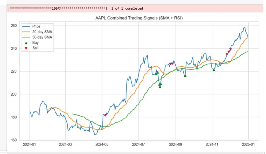
And while doing that, if you want to analyze stocks with just a few lines of python, this article might help? This simple yet powerful script helps you spot potential buy and sell opportunities for Apple (AAPL) using two classic technical indicators: moving averages and RSI.
Understanding the Strategy
1. SMA Crossover: The Trend Following Signal
The script first calculates two Simple Moving Averages (SMA):
The crossover strategy is simple:
This works because moving averages smooth out price noise, helping identify the overall trend direction.
2. RSI: The Overbought/Oversold Indicator
The Relative Strength Index (RSI) measures whether a stock is overbought or oversold:
By combining SMA crossovers (trend confirmation) and RSI extremes (timing), we get stronger signals.

This plot is generated with less than 40 lines of python code
The code looks like that:
1
2
3
4
5
6
7
8
9
10
11
12
13
14
15
16
17
18
19
20
21
22
23
24
25
26
27
28
29
30
31
32
33
34
import yfinance as yf
import matplotlib.pyplot as plt
import seaborn as sns
# Get data
ticker = “AAPL”
df = yf.download(ticker, start=“2024-01-01”, end=“2025-01-01”)
sns.set_style(“whitegrid”)
# Moving Averages
df[‘SMA_20’] = df[‘Close’].rolling(20).mean()
df[‘SMA_50’] = df[‘Close’].rolling(50).mean()
# RSI Calculation
delta = df[‘Close’].diff(1)
gain = delta.clip(lower=0)
loss = –delta.clip(upper=0)
rs = gain.rolling(14).mean() / loss.rolling(14).mean()
df[‘RSI’] = 100 – (100 / (1 + rs))
# Signals
df[‘Buy’] = (df[‘SMA_20’] > df[‘SMA_50’]) & (df[‘RSI’] < 30)
df[‘Sell’] = (df[‘SMA_20’] < df[‘SMA_50’]) & (df[‘RSI’] > 70)
# Plot
plt.figure(figsize=(12,6))
plt.plot(df[‘Close’], label=‘Price’)
plt.plot(df[‘SMA_20’], label=’20-day SMA’)
plt.plot(df[‘SMA_50’], label=’50-day SMA’)
plt.scatter(df.index[df[‘Buy’]], df[‘Close’][df[‘Buy’]], color=‘green’, marker=‘^’, label=‘Buy’)
plt.scatter(df.index[df[‘Sell’]], df[‘Close’][df[‘Sell’]], color=‘red’, marker=‘v’, label=‘Sell’)
plt.title(f‘{ticker} Combined Trading Signals (SMA + RSI)’)
plt.legend()
plt.show()
The code above, but in way more details is explained in the YT video below: