Cyberattacks aren’t slowing down—they’re getting bolder and smarter. From phishing scams to ransomware outbreaks, the number of incidents has doubled or even tripled year over year. In today’s hybrid, multi-vendor IT landscape, protecting your organization’s digital assets requires choosing the top XDR vendor that can see and stop threats across every possible entry point.
Over the last five years, XDR (Extended Detection and Response) has emerged as one of the most promising cybersecurity innovations. Leading IT analysts agree: XDR solutions will play a central role in the future of cyber defense. But not all XDR platforms are created equal. Success depends on how well an XDR vendor integrates Endpoint Protection Platforms (EPP) and Endpoint Detection and Response (EDR) to detect, analyze, and neutralize threats in real time.
This guide will explain what makes a great XDR vendor and how Seqrite XDR compares to industry benchmarks. It also includes a practical checklist for confidently evaluating your next security investment.
Why Choosing the Right XDR Vendor Matters
Your XDR platform isn’t just another security tool; it’s the nerve center of your threat detection and response strategy. The best solutions act as a central brain, collecting security telemetry from:
Endpoints
Networks
Firewalls
Email
Identity systems
DNS
They don’t just collect this data, they correlate it intelligently, filter out the noise, and give your security team actionable insights to respond faster.
According to industry reports, over 80% of IT and cybersecurity professionals are increasing budgets for threat detection and response. If you choose the wrong vendor, you risk fragmented visibility, alert fatigue, and missed attacks.
Key Capabilities Every Top XDR Vendor Should Offer
When shortlisting top XDR vendors, here’s what to look for:
Advanced Threat Detection – Identify sophisticated, multi-layer attack patterns that bypass traditional tools.
Risk-Based Prioritization – Assign scores (1–1000) so you know which threats truly matter.
Unified Visibility – A centralized console to eliminate security silos.
Integration Flexibility – Native and third-party integrations to protect existing investments.
Automation & Orchestration – Automate repetitive workflows to respond in seconds, not hours.
MITRE ATT&CK Mapping – Know exactly which attacker tactics and techniques you can detect.
Remember, it’s the integration of EPP and EDR that makes or breaks an XDR solution’s effectiveness.
Your Unified Detection & Response Checklist
Use this checklist to compare vendors on a like-for-like basis:
Full telemetry coverage: Endpoints, networks, firewalls, email, identity, and DNS.
Native integration strength: Smooth backend-to-frontend integration for consistent coverage.
Real-time threat correlation: Remove false positives, detect real attacks faster.
Proactive security posture: Shift from reactive to predictive threat hunting.
MITRE ATT&CK alignment: Validate protection capabilities against industry-recognized standards.
Why Automation Is the Game-Changer
The top XDR vendors go beyond detection, they optimize your entire security operation. Automated playbooks can instantly execute containment actions when a threat is detected. Intelligent alert grouping cuts down on noise, preventing analyst burnout.
Automation isn’t just about speed; it’s about cost savings. A report by IBM Security shows that organizations with full automation save over ₹31 crore annually and detect/respond to breaches much faster than those relying on manual processes.
The Seqrite XDR Advantage
Seqrite XDR combines advanced detection, rich telemetry, and AI-driven automation into a single, unified platform. It offers:
Seamless integration with Seqrite Endpoint Protection (EPP) and Seqrite Endpoint Detection & Response (EDR) and third party telemetry sources.
MITRE ATT&CK-aligned visibility to stay ahead of attackers.
Automated playbooks to slash response times and reduce manual workload.
Unified console for complete visibility across your IT ecosystem.
GenAI-powered SIA (Seqrite Intelligent Assistant) – Your AI-Powered Virtual Security Analyst. SIA offers predefined prompts and conversational access to incident and alert data, streamlining investigations and making it faster for analysts to understand, prioritize, and respond to threats.
In a market crowded with XDR solutions, Seqrite delivers a future-ready, AI-augmented platform designed for today’s threats and tomorrow’s unknowns.
If you’re evaluating your next security investment, start with a vendor who understands the evolving threat landscape and backs it up with a platform built for speed, intelligence, and resilience.
LINQPad is one of the tools I use daily. But still, I haven’t used it at its full power. And you?
Table of Contents
Just a second! 🫷 If you are here, it means that you are a software developer.
So, you know that storage, networking, and domain management have a cost .
If you want to support this blog, please ensure that you have disabled the adblocker for this site. I configured Google AdSense to show as few ADS as possible – I don’t want to bother you with lots of ads, but I still need to add some to pay for the resources for my site.
Thank you for your understanding. – Davide
LINQPad is one of my best friends: I use it daily, and it helps me A LOT when I need to run some throwaway code.
There are many other tools out there, but I think that LINQPad (well, the full version!) is one of the best tools on the market.
But still, many C# developers only use just a few of its functionalities! In this article, I will show you my top 5 functionalities you should know.
Advanced Dump()
As many of you already know, to print stuff on the console you don’t have to call Console.WriteLine(something), but you can use something.Dump();
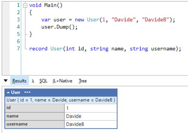
void Main()
{
    var user = new User(1, "Davide", "DavideB");
    user.Dump();
}
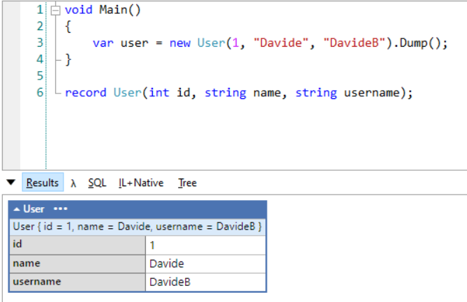
You can simplify it by avoiding calling the Dump operation in a separate step: Dump can print the content and return it at the same time:
var user = new User(1, "Davide", "DavideB").Dump();
For sure, this simple trick makes your code easier to read!
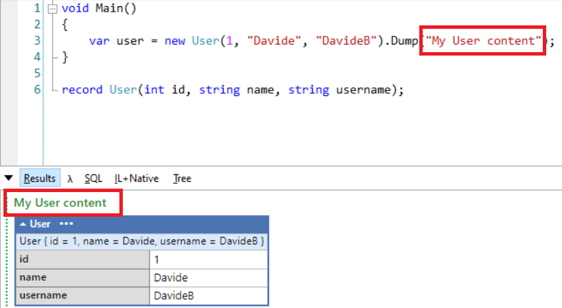
Ok, what if you have too many Dump calls and you don’t know which operation prints which log? Lucky for us, the Dump method accepts a string as a Title: that text will be displayed in the output panel.
var user = new User(1, "Davide", "DavideB").Dump("My User content");
You can now see the “My User content” header right above the log of the user:
Dump containers
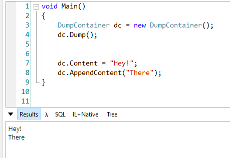
We can do a step further and introduce Dump containers.
Dump Containers are some sort of sink for your logs (we’ve already talked about sinks, do you remember?). Once you’ve instantiated a DumpContainer object, you can perform some operations such as AppendContent to append some content at the end of the logs, ClearContent to clear the content (obviously!), and Dump to display the content of the Container in the Results panel.
DumpContainer dc = new DumpContainer();

dc.Content = "Hey!";
dc.AppendContent("There");

dc.Dump();
Note: you don’t need to place the Dump() instruction at the end of the script: you can put it at the beginning and you’ll see the content as soon as it gets added. Otherwise, you will build the internal list of content and display it only at the end.
So, this is perfectly valid:
DumpContainer dc = new DumpContainer();
dc.Dump();


dc.Content = "Hey!";
dc.AppendContent("There");
You can even explicitly set the content of the Container: setting it will replace everything else.
Here you can see what happens when we override the content:
Why should we even care? 🤔
My dear friend, it’s easy! Because we can create more Containers to log different things!
Take this example: we want to loop over a list of items and use one Container to display the item itself, and another Container to list what happens when we perform some operations on each item. Yeeees, I know, it’s hard to understand in this way: let me show you an example!
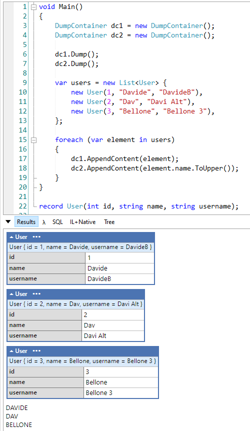
DumpContainer dc1 = new DumpContainer();
DumpContainer dc2 = new DumpContainer();

dc1.Dump();
dc2.Dump();

var users = new List<User> {
    new User(1, "Davide", "DavideB"),
    new User(2, "Dav", "Davi Alt"),
    new User(3, "Bellone", "Bellone 3"),
};

foreach (var element in users)
{
    dc1.AppendContent(element);
    dc2.AppendContent(element.name.ToUpper());
}
Here we’re using two different containers, each of them lives its own life.
In this example I used AppendContent, but of course, you can replace the full content of a Container to analyze one item at a time.
I can hear you: there’s another question in your mind:
How can we differentiate those containers?
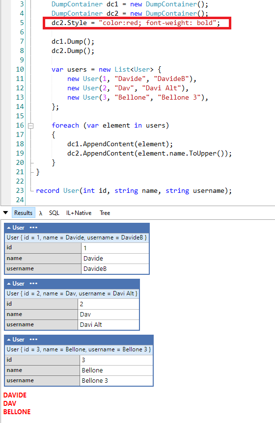
You can use the Style property of the DumpContainer class to style the output, using CSS-like properties:
DumpContainer dc2 = new DumpContainer();
dc2.Style = "color:red; font-weight: bold";
Now all the content stored in the dc2 container will be printed in red:
Great stuff 🤩
Read text from input
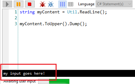
Incredibly useful, but often overlooked, is the ability to provide inputs to our scripts.
To do that, you can rely on the Util.ReadLine method already included in LINQPad:
string myContent = Util.ReadLine();
When running the application, you will see a black box at the bottom of the window that allows you to write (or paste) some text. That text will then be assigned to the myContent variable.
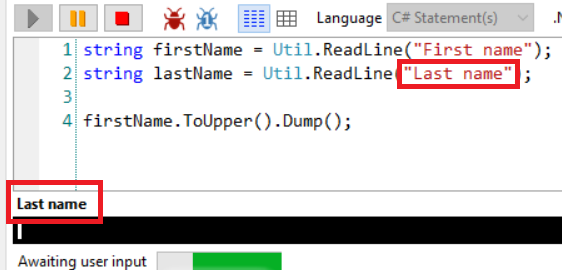
There’s a nice overload that allows you to specify a sort of title to the text box, to let you know which is the current step:
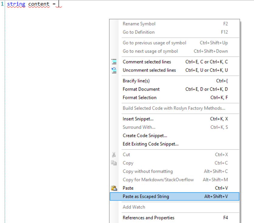
Paste as escaped string
This is one of my favorite functionalities: many times I have to escape text that contains quotes, copied from somewhere else to assign it to a string variable; I used to lose time escaping those values manually (well, using other tools that still are slower than this one).
Assigning it manually to a string becomes a mess. Lucky for us, we can copy it, get back on LINQPad, right-click, choose “Paste as escaped string” (or, if you prefer, use Alt+Shift+V) and have it already escaped and ready to be used:
We’ve seen 5 amazing tricks to get the best out of LINQPad. In my opinion, every C# developer that uses this tool should know those tricks, they can really boost your productivity.
Did you already know all of them? Which are your favorites? Drop a message in the comments section or on Twitter 📧
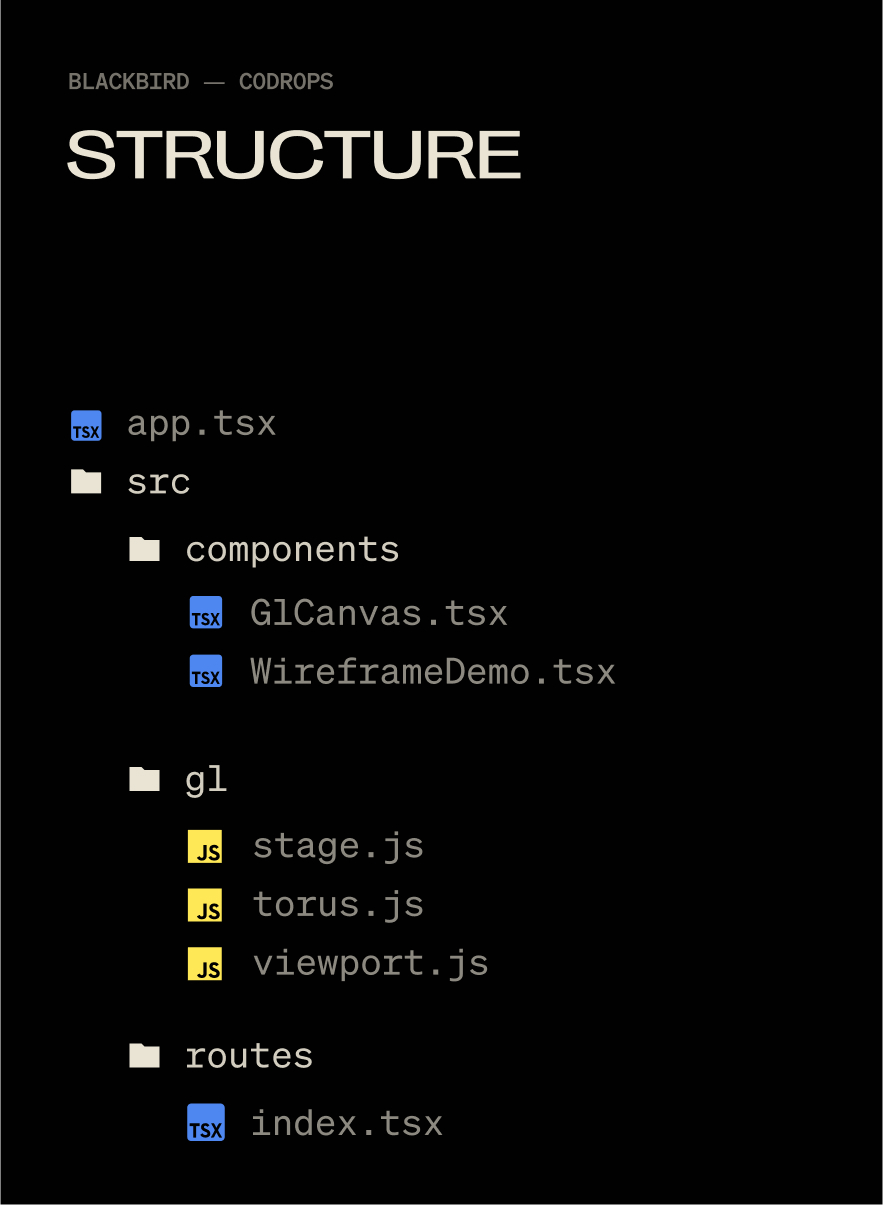
Blackbird was a fun, experimental site that I used as a way to get familiar with WebGL inside of Solid.js. It went through the story of how the SR-71 was built in super technical detail. The wireframe effect covered here helped visualize the technology beneath the surface of the SR-71 while keeping the polished metal exterior visible that matched the sites aesthetic.
Here is how the effect looks like on the Blackbird site:
In this tutorial, we’ll rebuild that effect from scratch: rendering a model twice, once as a solid and once as a wireframe, then blending the two together in a shader for a smooth, animated transition. The end result is a flexible technique you can use for technical reveals, holograms, or any moment where you want to show both the structure and the surface of a 3D object.
There are three things at work here: material properties, render targets, and a black-to-white shader gradient. Let’s get into it!
But First, a Little About Solid.js
Solid.js isn’t a framework name you hear often, I’ve switched my personal work to it for the ridiculously minimal developer experience and because JSX remains the greatest thing since sliced bread. You absolutely don’t need to use the Solid.js part of this demo, you could strip it out and use vanilla JS all the same. But who knows, you may enjoy it 🙂
TLDR: Full-stack JSX without all of the opinions of Next and Nuxt, plus it’s like 8kb gzipped, wild.
The technical version: Written in JSX, but doesn’t use a virtual DOM, so a “reactive” (think useState()) doesn’t re-render an entire component, just one DOM node. Also runs isomorphically, so "use client" is a thing of the past.
Setting Up Our Scene
We don’t need anything wild for the effect: a Mesh, Camera, Renderer, and Scene will do. I use a base Stage class (for theatrical-ish naming) to control when things get initialized.
A Global Object for Tracking Window Dimensions
window.innerWidth and window.innerHeight trigger document reflow when you use them (more about document reflow here). So I keep them in one object, only updating it when necessary and reading from the object, instead of using window and causing reflow. Notice these are all set to 0 and not actual values by default. window gets evaluated as undefined when using SSR, so we want to wait to set this until our app is mounted, GL class is initialized, and window is defined to avoid everybody’s favorite error: Cannot read properties of undefined (reading ‘window’).
Before we can render anything, we need a small framework to handle our scene setup, rendering loop, and resizing logic. Instead of scattering this across multiple files, we’ll wrap it in a Stage class that initializes the camera, renderer, and scene in one place. This makes it easier to keep our WebGL lifecycle organized, especially once we start adding more complex objects and effects.
// src/gl/stage.js

import { WebGLRenderer, Scene, PerspectiveCamera } from 'three';
import { viewport, resizeViewport } from './viewport';

class Stage {
  init(element) {
    resizeViewport() // Set the initial viewport dimensions, helps to avoid using window inside of viewport.js for SSR-friendliness

    this.camera = new PerspectiveCamera(45, viewport.aspectRatio, 0.1, 1000);
    this.camera.position.set(0, 0, 2); // back the camera up 2 units so it isn't on top of the meshes we make later, you won't see them otherwise.

    this.renderer = new WebGLRenderer();
    this.renderer.setSize(viewport.width, viewport.height);
    element.appendChild(this.renderer.domElement); // attach the renderer to the dom so our canvas shows up

    this.renderer.setPixelRatio(viewport.devicePixelRatio); // Renders higher pixel ratios for screens that require it.

    this.scene = new Scene();
  }

  render() {
    this.renderer.render(this.scene, this.camera);
    requestAnimationFrame(this.render.bind(this));
// All of the scenes child classes with a render method will have it called automatically
    this.scene.children.forEach((child) => {
      if (child.render && typeof child.render === 'function') {
        child.render();
      }
    });
  }

  resize() {
    this.renderer.setSize(viewport.width, viewport.height);
    this.camera.aspect = viewport.aspectRatio;
    this.camera.updateProjectionMatrix();

// All of the scenes child classes with a resize method will have it called automatically
    this.scene.children.forEach((child) => {
      if (child.resize && typeof child.resize === 'function') {
        child.resize();
      }
    });
  }
}

export default new Stage();
And a Fancy Mesh to Go With It
With our stage ready, we can give it something interesting to render. A torus knot is perfect for this: it has plenty of curves and detail to show off both the wireframe and solid passes. We’ll start with a simple MeshNormalMaterial in wireframe mode so we can clearly see its structure before moving on to the blended shader version.
// src/gl/torus.js

import { Mesh, MeshBasicMaterial, TorusKnotGeometry } from 'three';

export default class Torus extends Mesh {
  constructor() {
    super();

    this.geometry = new TorusKnotGeometry(1, 0.285, 300, 26);
    this.material = new MeshNormalMaterial({
      color: 0xffff00,
      wireframe: true,
    });

    this.position.set(0, 0, -8); // Back up the mesh from the camera so its visible
  }
}
A quick note on lights
For simplicity we’re using MeshNormalMaterial so we don’t have to mess with lights. The original effect on Blackbird had six lights, waaay too many. The GPU on my M1 Max was choked to 30fps trying to render the complex models and realtime six-point lighting. But reducing this to just 2 lights (which visually looked identical) ran at 120fps no problem. Three.js isn’t like Blender where you can plop in 14 lights and torture your beefy computer with the render for 12 hours while you sleep. The lights in WebGL have consequences 🫠
Now, the Solid JSX Components to House It All
// src/components/GlCanvas.tsx

import { onMount, onCleanup } from 'solid-js';
import Stage from '~/gl/stage';

export default function GlCanvas() {
// let is used instead of refs, these aren't reactive
  let el;
  let gl;
  let observer;

  onMount(() => {
    if(!el) return
    gl = Stage;

    gl.init(el);
    gl.render();


    observer = new ResizeObserver((entry) => gl.resize());
    observer.observe(el); // use ResizeObserver instead of the window resize event.
    // It is debounced AND fires once when initialized, no need to call resize() onMount
  });

  onCleanup(() => {
    if (observer) {
      observer.disconnect();
    }
  });


  return (
    <div
      ref={el}
      style={{
        position: 'fixed',
        inset: 0,
        height: '100lvh',
        width: '100vw',
      }}

    />
  );
}
let is used to declare a ref, there is no formal useRef() function in Solid. Signals are the only reactive method. Read more on refs in Solid.
Then slap that component into app.tsx:
// src/app.tsx

import { Router } from '@solidjs/router';
import { FileRoutes } from '@solidjs/start/router';
import { Suspense } from 'solid-js';
import GlCanvas from './components/GlCanvas';

export default function App() {
  return (
    <Router
      root={(props) => (
        <Suspense>
          {props.children}
          <GlCanvas />
        </Suspense>
      )}
    >
      <FileRoutes />
    </Router>
  );
}
Each 3D piece I use is tied to a specific element on the page (usually for timeline and scrolling), so I create an individual component to control each class. This helps me keep organized when I have 5 or 6 WebGL moments on one page.
// src/components/WireframeDemo.tsx

import { createEffect, createSignal, onMount } from 'solid-js'
import Stage from '~/gl/stage';
import Torus from '~/gl/torus';

export default function WireframeDemo() {
  let el;
  const [element, setElement] = createSignal(null);
  const [actor, setActor] = createSignal(null);

  createEffect(() => {
    setElement(el);
    if (!element()) return;

    setActor(new Torus()); // Stage is initialized when the page initially mounts,
    // so it's not available until the next tick.
    // A signal forces this update to the next tick,
    // after Stage is available.

    Stage.scene.add(actor());
  });

  return <div ref={el} />;
}
createEffect() instead of onMount(): this automatically tracks dependencies (element, and actor in this case) and fires the function when they change, no more useEffect() with dependency arrays 🙃. Read more on createEffect in Solid.
Then a minimal route to put the component on:
// src/routes/index.tsx

import WireframeDemo from '~/components/WiframeDemo';

export default function Home() {
  return (
    <main>
      <WireframeDemo />
    </main>
  );
}
Now you’ll see this:
Switching a Material to Wireframe
I loved wireframe styling for the Blackbird site! It fit the prototype feel of the story, fully textured models felt too clean, wireframes are a bit “dirtier” and unpolished. You can wireframe just about any material in Three.js with this:
But we want to do this dynamically on only part of our model, not on the entire thing.
Enter render targets.
The Fun Part: Render Targets
Render Targets are a super deep topic but they boil down to this: Whatever you see on screen is a frame for your GPU to render, in WebGL you can export that frame and re-use it as a texture on another mesh, you are creating a “target” for your rendered output, a render target.
Since we’re going to need two of these targets, we can make a single class and re-use it.
// src/gl/render-target.js

import { WebGLRenderTarget } from 'three';
import { viewport } from '../viewport';
import Torus from '../torus';
import Stage from '../stage';

export default class RenderTarget extends WebGLRenderTarget {
  constructor() {
    super();

    this.width = viewport.width * viewport.devicePixelRatio;
    this.height = viewport.height * viewport.devicePixelRatio;
  }

  resize() {
    const w = viewport.width * viewport.devicePixelRatio;
    const h = viewport.height * viewport.devicePixelRatio;

    this.setSize(w, h)
  }
}
This is just an output for a texture, nothing more.
Now we can make the class that will consume these outputs. It’s a lot of classes, I know, but splitting up individual units like this helps me keep track of where stuff happens. 800 line spaghetti mega-classes are the stuff of nightmares when debugging WebGL.
// src/gl/targeted-torus.js

import {
  Mesh,
  MeshNormalMaterial,
  PerspectiveCamera,
  PlaneGeometry,
} from 'three';
import Torus from './torus';
import { viewport } from './viewport';
import RenderTarget from './render-target';
import Stage from './stage';

export default class TargetedTorus extends Mesh {
  targetSolid = new RenderTarget();
  targetWireframe = new RenderTarget();

  scene = new Torus(); // The shape we created earlier
  camera = new PerspectiveCamera(45, viewport.aspectRatio, 0.1, 1000);

  constructor() {
    super();

    this.geometry = new PlaneGeometry(1, 1);
    this.material = new MeshNormalMaterial();
  }

  resize() {
    this.targetSolid.resize();
    this.targetWireframe.resize();

    this.camera.aspect = viewport.aspectRatio;
    this.camera.updateProjectionMatrix();
  }
}
Now, switch our WireframeDemo.tsx component to use the TargetedTorus class, instead of Torus:
// src/components/WireframeDemo.tsx

import { createEffect, createSignal, onMount } from 'solid-js';
import Stage from '~/gl/stage';
import TargetedTorus from '~/gl/targeted-torus';

export default function WireframeDemo() {
  let el;
  const [element, setElement] = createSignal(null);
  const [actor, setActor] = createSignal(null);

  createEffect(() => {
    setElement(el);
    if (!element()) return;

    setActor(new TargetedTorus()); // << change me

    Stage.scene.add(actor());
  });

  return <div ref={el} data-gl="wireframe" />;
}
“Now all I see is a blue square Nathan, it feel like we’re going backwards, show me the cool shape again”.
Shhhhh, It’s by design I swear!
From MeshNormalMaterial to ShaderMaterial
We can now take our Torus rendered output and smack it onto the blue plane as a texture using ShaderMaterial. MeshNormalMaterial doesn’t let us use a texture, and we’ll need shaders soon anyway. Inside of targeted-torus.js remove the MeshNormalMaterial and switch this in:
THE TORUS IS BACK. We’ve passed our image texture into the shader and its outputting our original render.
Mixing Wireframe and Solid Materials with Shaders
Shaders were black magic to me before this project. It was my first time using them in production and I’m used to frontend where you think in boxes. Shaders are coordinates 0 to 1, which I find far harder to understand. But, I’d used Photoshop and After Effects with layers plenty of times. These applications do a lot of the same work shaders can: GPU computing. This made it far easier. Starting out by picturing or drawing what I wanted, thinking how I might do it in Photoshop, then asking myself how I could do it with shaders. Photoshop or AE into shaders is far less mentally taxing when you don’t have a deep foundation in shaders.
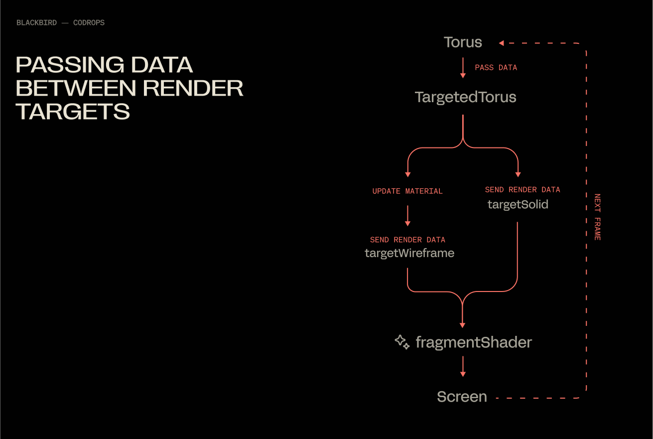
Populating Both Render Targets
At the moment, we are only saving data to the solidTarget render target via normals. We will update our render loop, so that our shader has them both this and wireframeTarget available simultaneously.
With this, you end up with a flow that under the hood looks like this:
Fading Between Two Textures
Our fragment shader will get a little update, 2 additions:
smoothstep creates a linear ramp between 2 values. UVs only go from 0 to 1, so in this case we use .15 and .65 as the limits (they look make the effect more obvious than 0 and 1). Then we use the x value of the uvs to define which value gets fed into smoothstep.
vec4 mixed = mix(wireframe_texture, solid_texture, blend); mix does exactly what it says, mixes 2 values together at a ratio determined by blend. .5 being a perfectly even split.
Congratulations, you’ve officially spent a measurable portion of your day blending two materials together. It was worth it though, wasn’t it? At the very least, I hope this saved you some of the mental gymnastics orchestrating a pair of render targets.
Good unit tests have some properties in common: they are Fast, Independent, Repeatable, Self-validating, and Thorough. In a word: FIRST!
Table of Contents
Just a second! 🫷 If you are here, it means that you are a software developer.
So, you know that storage, networking, and domain management have a cost .
If you want to support this blog, please ensure that you have disabled the adblocker for this site. I configured Google AdSense to show as few ADS as possible – I don’t want to bother you with lots of ads, but I still need to add some to pay for the resources for my site.
Thank you for your understanding. – Davide
FIRST is an acronym that you should always remember if you want to write clean and extensible tests.
This acronym tells us that Unit Tests should be Fast, Independent, Repeatable, Self-validating, and Thorough.
Fast
You should not create tests that require a long time for setup and start-up: ideally, you should be able to run the whole test suite in under a minute.
If your unit tests are taking too much time for running, there must be something wrong with it; there are many possibilities:
You’re trying to access remote sources (such as real APIs, Databases, and so on): you should mock those dependencies to make tests faster and to avoid accessing real resources. If you need real data, consider creating integration/e2e tests instead.
Your system under test is too complex to build: too many dependencies? DIT value too high?
The method under test does too many things. You should consider splitting it into separate, independent methods, and let the caller orchestrate the method invocations as necessary.
Independent (or Isolated)
Test methods should be independent of one another.
Here, to have Test2 working correctly, Test1 must run before it, otherwise myObj would be null. There’s a dependency between Test1 and Test2.
How to avoid it? Create new instances for every test! May it be with some custom methods or in the StartUp phase. And remember to reset the mocks as well.
Repeatable
Unit Tests should be repeatable. This means that wherever and whenever you run them, they should behave correctly.
So you should remove any dependency on the file system, current date, and so on.
This test is strictly bound to the current date. So, if I’ll run this test again in a month, it will fail.
We should instead remove that dependency and use dummy values or mock.
[Fact]void TestDate_DoIt()
{
DateTime d = new DateTime(2022,7,19);
string dateAsString = d.ToString("yyyy-MM-dd");
Assert.Equal("2022-07-19", dateAsString);
}
There are many ways to inject DateTime (and other similar dependencies) with .NET. I’ve listed some of them in this article: “3 ways to inject DateTime and test it”.
Self-validating
Self-validating means that a test should perform operations and programmatically check for the result.
For instance, if you’re testing that you’ve written something on a file, the test itself is in charge of checking that it worked correctly. No manual operations should be done.
Also, tests should provide explicit feedback: a test either passes or fails; no in-between.
Thorough
Unit Tests should be thorough in that they must validate both the happy paths and the failing paths.
So you should test your functions with valid inputs and with invalid inputs.
You should also validate what happens if an exception is thrown while executing the path: are you handling errors correctly?
Have a look at this class, with a single, simple, method:
publicclassItemsService{
readonly IItemsRepository _itemsRepo;
public ItemsService(IItemsRepository itemsRepo)
{
_itemsRepo = itemsRepo;
}
public IEnumerable<Item> GetItemsByCategory(string category, int maxItems)
{
var allItems = _itemsRepo.GetItems();
return allItems
.Where(i => i.Category == category)
.Take(maxItems);
}
}
Which tests should you write for GetItemsByCategory?
I can think of these:
what if category is null or empty?
what if maxItems is less than 0?
what if allItems is null?
what if one of the items inside allItems is null?
what if _itemsRepo.GetItems() throws an exception?
what if _itemsRepo is null?
As you can see, even for a trivial method like this you should write a lot of tests, to ensure that you haven’t missed anything.
Conclusion
F.I.R.S.T. is a good way to way to remember the properties of a good unit test suite.
Propagating HTTP Headers can be useful, especially when dealing with Correlation IDs. It’s time to customize our HttpClients!
Table of Contents
Just a second! 🫷 If you are here, it means that you are a software developer.
So, you know that storage, networking, and domain management have a cost .
If you want to support this blog, please ensure that you have disabled the adblocker for this site. I configured Google AdSense to show as few ADS as possible – I don’t want to bother you with lots of ads, but I still need to add some to pay for the resources for my site.
Thank you for your understanding. – Davide
Imagine this: you have a system made up of different applications that communicate via HTTP. There’s some sort of entry point, exposed to the clients, that orchestrates the calls to the other applications. How do you correlate those requests?
A good idea is to use a Correlation ID: one common approach for HTTP-based systems is passing a value to the “public” endpoint using HTTP headers; that value will be passed to all the other systems involved in that operation to say that “hey, these incoming requests in the internal systems happened because of THAT SPECIFIC request in the public endpoint”. Of course, it’s more complex than this, but you got the idea.
Now. How can we propagate an HTTP Header in .NET? I found this solution on GitHub, provided by no less than David Fowler. In this article, I’m gonna dissect his code to see how he built this solution.
Important update: there’s a NuGet package that implements these functionalities: Microsoft.AspNetCore.HeaderPropagation. Consider this article as an excuse to understand what happens behind the scenes of an HTTP call, and use it to learn how to customize and extend those functionalities. Here’s how to integrate that package.
Just interested in the C# methods?
As I said, I’m not reinventing anything new: the source code I’m using for this article is available on GitHub (see link above), but still, I’ll paste the code here, for simplicity.
First of all, we have two extension methods that add some custom functionalities to the IServiceCollection.
It’s quite easy: if you want to propagate the my-correlation-id header for all the HttpClients created in your application, you just have to add this line to your Startup method.
This class lies in the middle of the HTTP Request pipeline. It can extend the functionalities of HTTP Clients because it inherits from System.Net.Http.DelegatingHandler.
If you recall from a previous article, the SendAsync method is the real core of any HTTP call performed using .NET’s HttpClients, and here we’re enriching that method by propagating some HTTP headers.
protectedoverride Task<HttpResponseMessage> SendAsync(HttpRequestMessage request, System.Threading.CancellationToken cancellationToken)
{
if (_contextAccessor.HttpContext != null)
{
foreach (var headerName in _options.HeaderNames)
{
// Get the incoming header valuevar headerValue = _contextAccessor.HttpContext.Request.Headers[headerName];
if (StringValues.IsNullOrEmpty(headerValue))
{
continue;
}
request.Headers.TryAddWithoutValidation(headerName, (string[])headerValue);
}
}
returnbase.SendAsync(request, cancellationToken);
}
By using _contextAccessor we can access the current HTTP Context. From there, we retrieve the current HTTP headers, check if one of them must be propagated (by looking up _options.HeaderNames), and finally, we add the header to the outgoing HTTP call by using TryAddWithoutValidation.
Notice that we’ve used `TryAddWithoutValidation` instead of `Add`: in this way, we can use whichever HTTP header key we want without worrying about invalid names (such as the ones with a new line in it). Invalid header names will simply be ignored, as opposed to the Add method that will throw an exception.
Finally, we continue with the HTTP call by executing `base.SendAsync`, passing the `HttpRequestMessage` object now enriched with additional headers.
Using HttpMessageHandlerBuilder to configure how HttpClients must be built
The Microsoft.Extensions.Http.IHttpMessageHandlerBuilderFilter interface allows you to apply some custom configurations to the HttpMessageHandlerBuilder right before the HttpMessageHandler object is built.
The Configure method allows you to customize how the HttpMessageHandler will be built: we are adding a new instance of the HeaderPropagationMessageHandler class we’ve seen before to the current HttpMessageHandlerBuilder’s AdditionalHandlers collection. All the handlers registered in the list will then be used to build the HttpMessageHandler object we’ll use to send and receive requests.
Here, we’re gonna extend the IServiceCollection with those functionalities. At first, we’re adding AddHttpContextAccessor, which allows us to access the current HTTP Context (the one we’ve used in the HeaderPropagationMessageHandler class).
Then, services.ConfigureAll(configure) registers an HeaderPropagationOptions that will be used by HeaderPropagationMessageHandlerBuilderFilter. Without that line, we won’t be able to specify the names of the headers to be propagated.
Honestly, I haven’t understood it thoroughly: I thought that it allows us to use more than one class implementing IHttpMessageHandlerBuilderFilter, but apparently if we create a sibling class and add them both using Add, everything works the same. If you know what this line means, drop a comment below! 👇
Wherever you access the ServiceCollection object (may it be in the Startup or in the Program class), you can propagate HTTP headers for every HttpClient by using
Yes, AddHeaderPropagation is the method we’ve seen in the previous paragraph!
Seeing it in action
Now we have all the pieces in place.
It’s time to run it 😎
To fully understand it, I strongly suggest forking this repository I’ve created and running it locally, placing some breakpoints here and there.
As a recap: in the Program class, I’ve added these lines to create a named HttpClient specifying its BaseAddress property. Then I’ve added the HeaderPropagation as we’ve seen before.
There’s also a simple Controller that acts as an entry point and that, using an HttpClient, sends data to another endpoint (the one defined in the previous snippet).
[HttpPost]publicasync Task<IActionResult> PostAsync([FromQuery] stringvalue)
{
var item = new Item(value);
var httpClient = _httpClientFactory.CreateClient("items");
await httpClient.PostAsJsonAsync("/", item);
return NoContent();
}
What happens at start-up time
When a .NET application starts up, the Main method in the Program class acts as an entry point and registers all the dependencies and configurations required.
We will then call builder.Services.AddHeaderPropagation, which is the method present in the HeaderPropagationExtensions class.
All the configurations are then set, but no actual operations are being executed.
The application then starts normally, waiting for incoming requests.
What happens at runtime
Now, when we call the PostAsync method by passing an HTTP header such as my-correlation-id:123, things get interesting.
The first operation is
var httpClient = _httpClientFactory.CreateClient("items");
While creating the HttpClient, the engine is calling all the registered IHttpMessageHandlerBuilderFilter and calling their Configure method. So, you’ll see the execution moving to HeaderPropagationMessageHandlerBuilderFilter’s Configure.
Of course, you’re also executing the HeaderPropagationMessageHandler constructor.
The HttpClient is now ready: when we call httpClient.PostAsJsonAsync("/", item) we’re also executing all the registered DelegatingHandler instances, such as our HeaderPropagationMessageHandler. In particular, we’re executing the SendAsync method and adding the required HTTP Headers to the outgoing HTTP calls.
We will then see the same HTTP Header on the destination endpoint.
If you’re not sure about what are extension methods (and you cannot respond to this question: How does inheritance work with extension methods?), then you can have a look at this article:
In a significant move to bolster cybersecurity in India’s financial ecosystem, the Reserve Bank of India (RBI) has underscored the urgent need for regulated entities—especially banks—to adopt Zero Trust approaches as part of a broader strategy to curb cyber fraud. In its latest Financial Stability Report (June 2025), RBI highlighted Zero Trust as a foundational pillar for risk-based supervision, AI-aware defenses, and proactive cyber risk management.
The directive comes amid growing concerns about the digital attack surface, vendor lock-in risks, and the systemic threats posed by overreliance on a few IT infrastructure providers. RBI has clarified that traditional perimeter-based security is no longer enough, and financial institutions must transition to continuous verification models where no user or device is inherently trusted.
What is Zero Trust?
Zero Trust is a modern security framework built on the principle: “Never trust, always verify.”
Unlike legacy models that grant broad access to anyone inside the network, Zero Trust requires every user, device, and application to be verified continuously, regardless of location—inside or outside the organization’s perimeter.
Key principles of Zero Trust include:
Least-privilege access: Users only get access to what they need—nothing more.
Micro-segmentation: Breaking down networks and applications into smaller zones to isolate threats.
Continuous verification: Access is granted based on multiple dynamic factors, including identity, device posture, location, time, and behavior.
Assume breach: Security models assume threats are already inside the network and act accordingly.
In short, Zero Trust ensures that access is never implicit, and every request is assessed with context and caution.
Seqrite ZTNA: Zero Trust in Action for Indian Banking
To help banks and financial institutions meet RBI’s Zero Trust directive, Seqrite ZTNA (Zero Trust Network Access) offers a modern, scalable, and India-ready solution that aligns seamlessly with RBI’s vision.
Key Capabilities of Seqrite ZTNA
Granular access control It allows access only to specific applications based on role, user identity, device health, and risk level, eliminating broad network exposure.
Continuous risk-based verification Each access request is evaluated in real time using contextual signals like location, device posture, login time, and behavior.
No VPN dependency Removes the risks of traditional VPNs that grant excessive access. Seqrite ZTNA gives just-in-time access to authorized resources.
Built-in analytics and audit readiness Detailed logs of every session help organizations meet RBI’s incident reporting and risk-based supervision requirements.
Easy integration with identity systems Works seamlessly with Azure AD, Google Workspace, and other Identity Providers to enforce secure authentication.
Supports hybrid and remote workforces Agent-based or agent-less deployment suits internal employees, third-party vendors, and remote users.
How Seqrite ZTNA Supports RBI’s Zero Trust Mandate
RBI’s recommendations aren’t just about better firewalls but about shifting the cybersecurity posture entirely. Seqrite ZTNA helps financial institutions adopt this shift with:
Risk-Based Supervision Alignment
Policies can be tailored based on user risk, job function, device posture, or geography.
Enables graded monitoring, as RBI emphasizes, with intelligent access decisions based on risk level.
CART and AI-Aware Defenses
Behavior analytics and real-time monitoring help institutions detect anomalies and conduct Continuous Assessment-Based Red Teaming (CART) simulations.
Uniform Incident Reporting
Seqrite’s detailed session logs and access histories simplify compliance with RBI’s call for standardized incident reporting frameworks.
Vendor Lock-In Mitigation
Unlike global cloud-only vendors, Seqrite ZTNA is designed with data sovereignty and local compliance in mind, offering full control to Indian enterprises.
Sample Use Case: A Mid-Sized Regional Bank
Challenge: The bank must secure access to its core banking applications for remote employees and third-party vendors without relying on VPNs.
With Seqrite ZTNA:
Users access only assigned applications, not the entire network.
Device posture is verified before every session.
Behavior is monitored continuously to detect anomalies.
Detailed logs assist compliance with RBI audits.
Risk-based policies automatically adjust based on context (e.g., denying access from unknown locations or outdated devices).
Result: A Zero Trust-aligned access model with reduced attack surface, better visibility, and continuous compliance readiness.
Conclusion: Future-Proofing Banking Security with Zero Trust
RBI’s directive isn’t just another compliance checklist, it’s a wake-up call. As India’s financial institutions expand digitally, adopting Zero Trust is essential for staying resilient, secure, and compliant.
Seqrite ZTNA empowers banks to implement Zero Trust in a practical, scalable way aligned with national cybersecurity priorities. With granular access control, continuous monitoring, and compliance-ready visibility, Seqrite ZTNA is the right step forward in securing India’s digital financial infrastructure.
Just a second! 🫷 If you are here, it means that you are a software developer.
So, you know that storage, networking, and domain management have a cost .
If you want to support this blog, please ensure that you have disabled the adblocker for this site. I configured Google AdSense to show as few ADS as possible – I don’t want to bother you with lots of ads, but I still need to add some to pay for the resources for my site.
Thank you for your understanding. – Davide
Do you need to tune up the performance of your code? You can create some StopWatch objects and store the execution times or rely on external libraries like MiniProfiler.
Note: of course, we’re just talking about time duration, and not about memory usage!
How to profile code using Stopwatch
A Stopwatch object acts as a (guess what?) stopwatch.
You can manually make it start and stop, and keep track of the elapsed time:
It’s useful, but you have to do it manually. There’s a better choice.
How to profile code using MiniProfiler
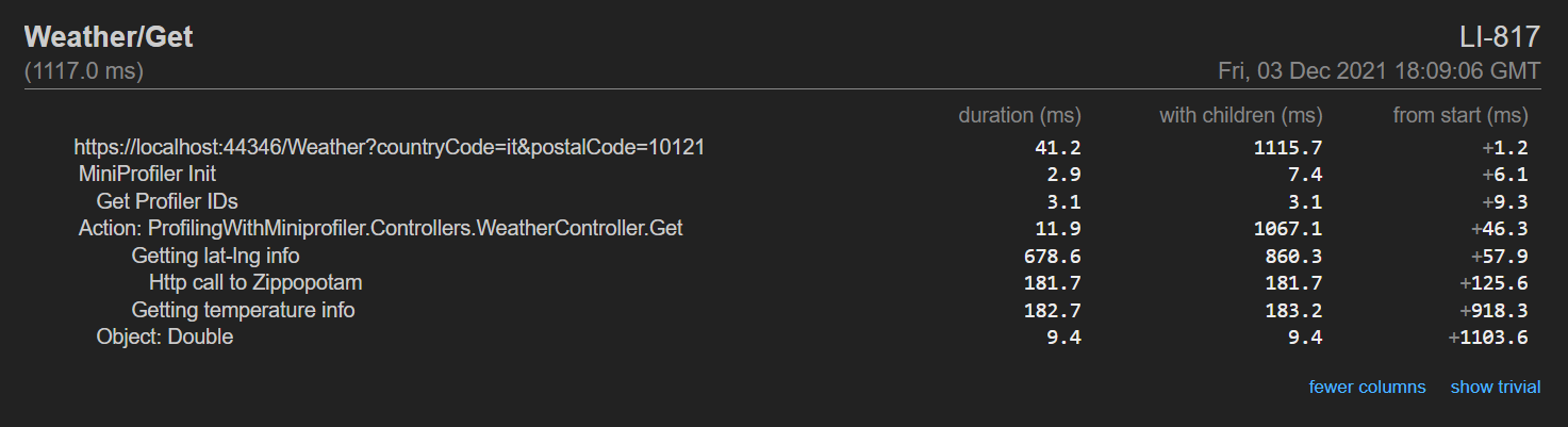
A good alternative is MiniProfiler: you can create a MiniProfiler object that holds all the info related to the current code execution. You then can add some Steps, which can have a name, and even nest them.
Finally, you can print the result using RenderPlainText.
MiniProfiler profiler = MiniProfiler.StartNew();

using (profiler.Step("With 100"))
{
    DoSomeOperations(100);
}


using (profiler.Step("With 2000"))
{
    DoSomeOperations(2000);
}

Console.WriteLine(profiler.RenderPlainText());
You won’t anymore stop and start any StopWatch instance.
You can even use inline steps, to profile method execution and store its return value:
Here I decided to print the result on the Console. You can even create HTML reports, which are quite useful when profiling websites. You can read more here, where I experimented with MiniProfiler in a .NET API project.
Here’s an example of what you can get:
Further readings
We’ve actually already talked about MiniProfiler in an in-depth article you can find here:
APIs often call other APIs to perform operations. If an error occurs in one of them, how can you understand the context that caused that error? You can use Correlation IDs in your logs!
Table of Contents
Just a second! 🫷 If you are here, it means that you are a software developer.
So, you know that storage, networking, and domain management have a cost .
If you want to support this blog, please ensure that you have disabled the adblocker for this site. I configured Google AdSense to show as few ADS as possible – I don’t want to bother you with lots of ads, but I still need to add some to pay for the resources for my site.
Thank you for your understanding. – Davide
Correlation IDs are values that are passed across different systems to correlate the operations performed during a “macro” operation.
Most of the time they are passed as HTTP Headers – of course in systems that communicate via HTTP.
In this article, we will learn how to log those Correlation IDs using Serilog, a popular library that helps handle logs in .NET applications.
Setting up the demo dotNET project
This article is heavily code-oriented. So, let me first describe the demo project.
Overview of the project
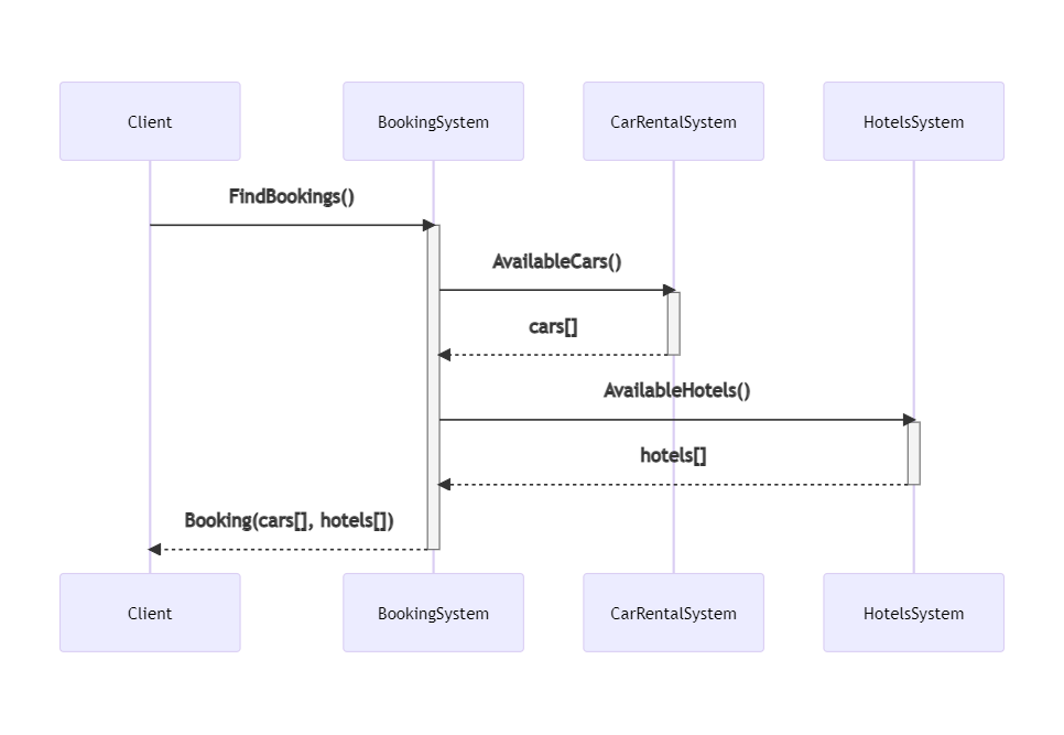
To demonstrate how to log Correlation IDs and how to correlate logs generated by different systems, I’ve created a simple solution that handles bookings for a trip.
The “main” project, BookingSystem, fetches data from external systems by calling some HTTP endpoints; it then manipulates the data and returns an aggregate object to the caller.
BookingSystem depends on two projects, placed within the same solution: CarRentalSystem, which returns data about the available cars in a specified date range, and HotelsSystem, which does the same for hotels.
So, this is the data flow:
If an error occurs in any of those systems, can we understand the full story of the failed request? No. Unless we use Correlation IDs!
Let’s see how to add them and how to log them.
We need to propagate HTTP Headers. You could implement it from scratch, as we’ve seen in a previous article. Or we could use a native library that does it all for us.
Of course, let’s go with the second approach.
For every project that will propagate HTTP headers, we have to follow these steps.
First, we need to install Microsoft.AspNetCore.HeaderPropagation: this NuGet package allows us to add the .NET classes needed to propagate HTTP headers.
Next, we have to update the part of the project that we use to configure our application. For .NET projects with Minimal APIs, it’s the Program class.
Here we need to add the capability to read the HTTP Context, by using
builder.Services.AddHttpContextAccessor();
As you can imagine, this is needed because, to propagate HTTP Headers, we need to know which are the incoming HTTP Headers. And they can be read from the HttpContext object.
Next, we need to specify, as a generic behavior, which headers must be propagated. For instance, to propagate the “my-custom-correlation-id” header, you must add
Since you probably know what’s going on, let me go straight to the point.
Install Serilog Enricher for Correlation IDs
We’re gonna use a specific library to log HTTP Headers treating them as Correlation IDs. To use it, you have to install the Serilog.Enrichers.CorrelationId package available on NuGet.
Therefore, you can simply run
dotnet add Serilog.Enrichers.CorrelationId
to every .NET project that will use this functionality.
Once we have that NuGet package ready, we can add its functionality to our logger by adding this line:
This simple line tells dotnet that, when we see an HTTP Header named “my-custom-correlation-id”, we should log it as a Correlation ID.
Run it all together
Now we have everything in place – it’s time to run it!
We have to run all the 3 services at the same time (you can do it with VisualStudio or you can run them separately using a CMD), and we need to have Seq installed on our local machine.
You will see 3 instances of Swagger, and each instance is running under a different port.
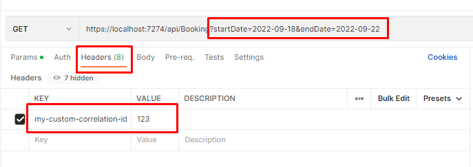
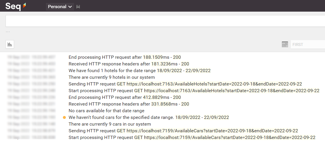
Once we have all the 3 applications up and running, we can call the /Bookings endpoint passing it a date range and an HTTP Header with key “my-custom-correlation-id” and value = “123” (or whatever we want).
If everything worked as expected, we can open Seq and see all the logs we’ve written in our applications:
Open one of them and have a look at the attributes of the logs: you will see a CorrelationId field with the value set to “123”.
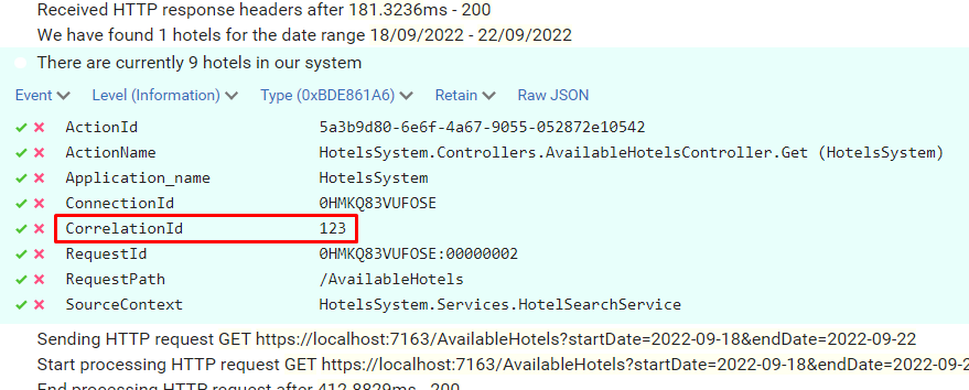
Now, to better demonstrate how it works, call the endpoint again, but this time set “789” as my-custom-correlation-id, and specify a different date range. You should be able to see another set of logs generated by this second call.
You can now apply filters to see which logs are related to a specific Correlation ID: open one log, click on the tick button and select “Find”.
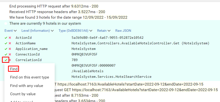
You will then see all and only logs that were generated during the call with header my-custom-correlation-id set to “789”.
Further readings
That’s it. With just a few lines of code, you can dramatically improve your logging strategy.
For this article, we’ve used the Microsoft.AspNetCore.HeaderPropagation package, which is ready to use. Are you interested in building your own solution – or, at least, learning how you can do that?
This article concludes a sort of imaginary path that taught us how to use Serilog, how to correlate different logs within the same application using Scopes, and how to correlate logs from different services using Correlation IDs.
Using these capabilities, you will be able to write logs that can help you understand the context in which a specific log occurred, thus helping you fix errors more efficiently.
In case of unmanageable error, should you return null or throw exceptions?
Table of Contents
Just a second! 🫷 If you are here, it means that you are a software developer.
So, you know that storage, networking, and domain management have a cost .
If you want to support this blog, please ensure that you have disabled the adblocker for this site. I configured Google AdSense to show as few ADS as possible – I don’t want to bother you with lots of ads, but I still need to add some to pay for the resources for my site.
Thank you for your understanding. – Davide
When you don’t have any fallback operation to manage null values (eg: retry pattern), you should throw an exception instead of returning null.
You will clean up your code and make sure that, if something cannot be fixed, it gets caught as soon as possible.
Don’t return null or false
Returning nulls impacts the readability of your code. The same happens for boolean results for operations. And you still have to catch other exceptions.
Take this example:
bool SaveOnFileSystem(ApiItem item)
{
// save on file systemreturnfalse;
}
ApiItem GetItemFromAPI(string apiId)
{
var httpResponse = GetItem(apiId);
if (httpResponse.StatusCode == 200)
{
return httpResponse.Content;
}
else {
returnnull;
}
}
DbItem GetItemFromDB()
{
// returns the item or nullreturnnull;
}
If all those methods complete successfully, they return an object (DbItem, ApiItem, or true); if they fail, they return null or false.
How can you consume those methods?
void Main()
{
    var itemFromDB = GetItemFromDB();
    if (itemFromDB != null)
    {
        var itemFromAPI = GetItemFromAPI(itemFromDB.ApiId);

        if (itemFromAPI != null)
        {
            bool successfullySaved = SaveOnFileSystem(itemFromAPI);.

            if (successfullySaved)
                Console.WriteLine("Saved");
        }
    }
    Console.WriteLine("Cannot save the item");
}
Note that there is nothing we can do in case something fails. So, do we really need all that nesting? We can do better!
Throw Exceptions instead
Let’s throw exceptions instead:
void SaveOnFileSystem(ApiItem item)
{
// save on file systemthrownew FileSystemException("Cannot save item on file system");
}
ApiItem GetItemFromAPI(string apiId)
{
var httpResponse = GetItem(apiId);
if (httpResponse.StatusCode == 200)
{
return httpResponse.Content;
}
else {
thrownew ApiException("Cannot download item");
}
}
DbItem GetItemFromDB()
{
// returns the item or throws an exceptionthrownew DbException("item not found");
}
Here, each method can complete in two statuses: it either completes successfully or it throws an exception of a type that tells us about the operation that failed.
We can then consume the methods in this way:
void Main()
{
    try
    {
        var itemFromDB = GetItemFromDB();
        var itemFromAPI = GetItemFromAPI(itemFromDB.ApiId);
        SaveOnFileSystem(itemFromAPI);
        Console.WriteLine("Saved");
    }
    catch(Exception ex)
    {
        Console.WriteLine("Cannot save the item");
    }

}
Now the reader does not have to spend time reading the nested operations, it’s all more linear and immediate.
Conclusion
Remember, this way of writing code should be used only when you cannot do anything if an operation failed. You should use exceptions carefully!
Now, a question for you: if you need more statuses as a return type of those methods (so, not only “success” and “fail”, but also some other status like “partially succeeded”), how would you transform that code?
In this article, I will show you two simple tricks that help me understand the deployment status of my .NET APIs
Table of Contents
Just a second! 🫷 If you are here, it means that you are a software developer.
So, you know that storage, networking, and domain management have a cost .
If you want to support this blog, please ensure that you have disabled the adblocker for this site. I configured Google AdSense to show as few ADS as possible – I don’t want to bother you with lots of ads, but I still need to add some to pay for the resources for my site.
Thank you for your understanding. – Davide
When I create Web APIs with .NET I usually add two “secret” endpoints that I can use to double-check the status of the deployment.
I generally expose two endpoints: one that shows me some info about the current environment, and another one that lists all the application settings defined after the deployment.
In this article, we will see how to create those two endpoints, how to update the values when building the application, and how to hide those endpoints.
Project setup
For this article, I will use a simple .NET 6 API project. We will use Minimal APIs, and we will use the appsettings.json file to load the application’s configuration values.
Since we are using Minimal APIs, you will have the endpoints defined in the Main method within the Program class.
To expose an endpoint that accepts the GET HTTP method, you can write
That’s all you need to know about .NET Minimal APIs for the sake of this article. Let’s move to the main topics ⏩
How to show environment info in .NET APIs
Let’s say that your code execution depends on the current Environment definition. Typical examples are that, if you’re running on production you may want to hide some endpoints otherwise visible in the other environments, or that you will use a different error page when an unhandled exception is thrown.
Once the application has been deployed, how can you retrieve the info about the running environment?
Here we go:
app.MapGet("/env", async context =>
{
    IWebHostEnvironment? hostEnvironment = context.RequestServices.GetRequiredService<IWebHostEnvironment>();
    var thisEnv = new
    {
        ApplicationName = hostEnvironment.ApplicationName,
        Environment = hostEnvironment.EnvironmentName,
    };

    var jsonSerializerOptions = new JsonSerializerOptions { WriteIndented = true };
    await context.Response.WriteAsJsonAsync(thisEnv, jsonSerializerOptions);
});
This endpoint is quite simple.
The context variable, which is of type HttpContext, exposes some properties. Among them, the RequestServices property allows us to retrieve the services that have been injected when starting up the application. We can then use GetRequiredService to get a service by its type and store it into a variable.
💡 GetRequiredService throws an exception if the service cannot be found. On the contrary, GetService returns null. I usually prefer GetRequiredService, but, as always, it depends on what you’re using it.
Then, we create an anonymous object with the information of our interest and finally return them as an indented JSON.
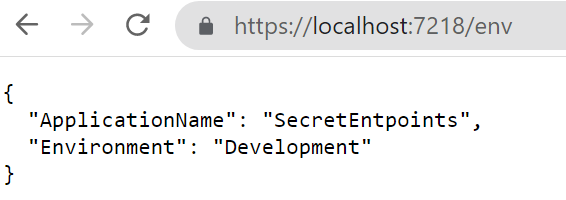
It’s time to run it! Open a terminal, navigate to the API project folder (in my case, SecretEndpoint), and run dotnet run. The application will compile and start; you can then navigate to /env and see the default result:
How to change the Environment value
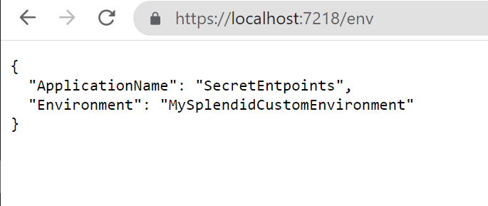
While the applicationName does not change – it is the name of the running assembly, so any other value will make stop your application from running – you can (and, maybe, want to) change the Environment value.
When running the application using the command line, you can use the --environment flag to specify the Environment value.
So, running
dotnet run --environment MySplendidCustomEnvironment
will produce this result:
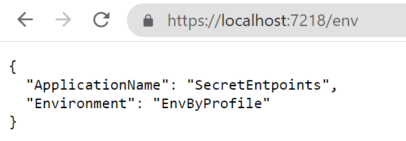
There’s another way to set the environment: update the launchSettings.json and run the application using Visual Studio.
To do that, open the launchSettings.json file and update the profile you are using by specifying the Environment name. In my case, the current profile section will be something like this:
As you can see, the ASPNETCORE_ENVIRONMENT variable is set to EnvByProfile.
If you run the application using Visual Studio using that profile you will see the following result:
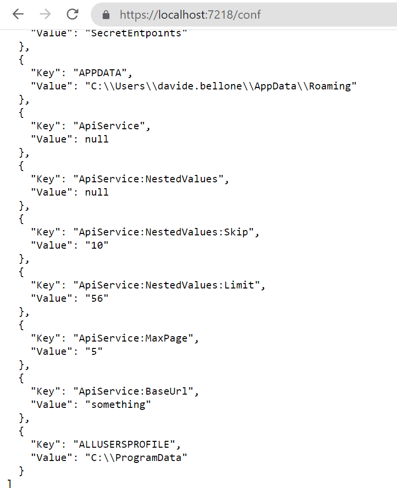
How to list all the configurations in .NET APIs
In my current company, we deploy applications using CI/CD pipelines.
This means that final variables definition comes from the sum of 3 sources:
the project’s appsettings file
the release pipeline
the deployment environment
You can easily understand how difficult it is to debug those applications without knowing the exact values for the configurations. That’s why I came up with these endpoints.
To print all the configurations, we’re gonna use an approach similar to the one we’ve used in the previous example.
What’s going on? We are retrieving the IConfiguration object, which contains all the configurations loaded at startup; then, we’re listing all the configurations as key-value pairs, and finally, we’re returning the list to the client.
As an example, here’s my current appsettings.json file:
That endpoint shows a lot more than you can imagine: take some time to have a look at those configurations – you’ll thank me later!
How to change the value of a variable
There are many ways to set the value of your variables.
The most common one is by creating an environment-specific appsettings file that overrides some values.
So, if your environment is called “EnvByProfile”, as we’ve defined in the previous example, the file will be named appsettings.EnvByProfile.json.
There are actually some other ways to override application variables: we will learn them in the next article, so stay tuned! 😎
3 ways to hide your endpoints from malicious eyes
Ok then, we have our endpoints up and running, but they are visible to anyone who correctly guesses their addresses. And you don’t want to expose such sensitive info to malicious eyes, right?
There are, at least, 3 simple values to hide those endpoints:
Use a non-guessable endpoint: you can use an existing word, such as “housekeeper”, use random letters, such as “lkfrmlvkpeo”, or use a Guid, such as “E8E9F141-6458-416E-8412-BCC1B43CCB24”;
Specify a key on query string: if that key is not found or it has an invalid value, return a 404-not found result
Use an HTTP header, and, again, return 404 if it is not valid.
Both query strings and HTTP headers are available in the HttpContext object injected in the route definition.
Now it’s your turn to find an appropriate way to hide these endpoints. How would you do that? Drop a comment below 📩
✒ Edit 2022-10-10: I thought it was quite obvious, but apparently it is not: these endpoints expose critical information about your applications and your infrastructure, so you should not expose them unless it is strictly necessary! If you have strong authentication in place, use it to secure those endpoints. If you don’t, hide those endpoints the best you can, and show only necessary data, and not everything. Strip out sensitive content. And, as soon as you don’t need that info anymore, remove those endpoints (comment them out or generate them only if a particular flag is set at compilation time). Another possible way is by using feature flags. In the end, take that example with a grain of salt: learn that you can expose them, but keep in mind that you should not expose them.
Further readings
We’ve used a quite new way to build and develop APIs with .NET, called “Minimal APIs”. You can read more here:
If you are not using Minimal APIs, you still might want to create such endpoints. We’ve talked about accessing the HttpContext to get info about the HTTP headers and query string. When using Controllers, accessing the HttpContext requires some more steps. Here’s an article that you may find interesting: