برچسب: From

  • Generating Your Website from Scratch for Remixing and Exploration

    Generating Your Website from Scratch for Remixing and Exploration


    Codrops’ “design” has been long overdue for a refresh. I’ve had ideas for a new look floating around for ages, but actually making time to bring them to life has been tough. It’s the classic shoemaker’s shoes problem: I spend my days answering emails, editing articles and (mostly) managing Codrops and the amazing contributions from the community, while the site itself quietly gathers dust 😂

    Still, the thought of reimagining Codrops has been sitting in the back of my mind. I’d already been eyeing Anima as a tool that could make the process faster, so I reached out to their team. They were kind enough to support us with this review (thank you so much!) and it’s a true win-win: I get to finally test my idea for Codrops, and you get a good look at how the tool holds up in practice 🤜🤛

    So, Anima is a platform made to bridge the gap between design and development. It allows you to take an existing website, either one of your own projects or something live on the web, and bring it into a workspace where the layout and elements can be inspected, edited, and reworked. From there, you can export the result as clean, production-ready code in React, HTML/CSS, or Tailwind. In practice, this means you can quickly prototype new directions, remix existing layouts, or test ideas without starting completely from scratch.

    Obviously, you should not use this to copy other people’s work, but rather to prototype your own ideas and remix your projects!

    Let me take you along on a little experiment I ran with it.

    Getting started

    Screenshot of Anima Playground interface

    Anima Link to Code was introduced in July this year and promises to take any design or web page and transform it into live editable code. You can generate, preview, and export production ready code in React, TypeScript, Tailwind CSS, or plain HTML and CSS. That means you can start with a familiar environment, test an idea, and immediately see how it holds up in real code rather than staying stuck in the design stage. It also means you can poke around, break things, and try different directions without manually rebuilding the scaffolding each time. That kind of speed is what usually makes or breaks whether I stick with an experiment or abandon it halfway through.

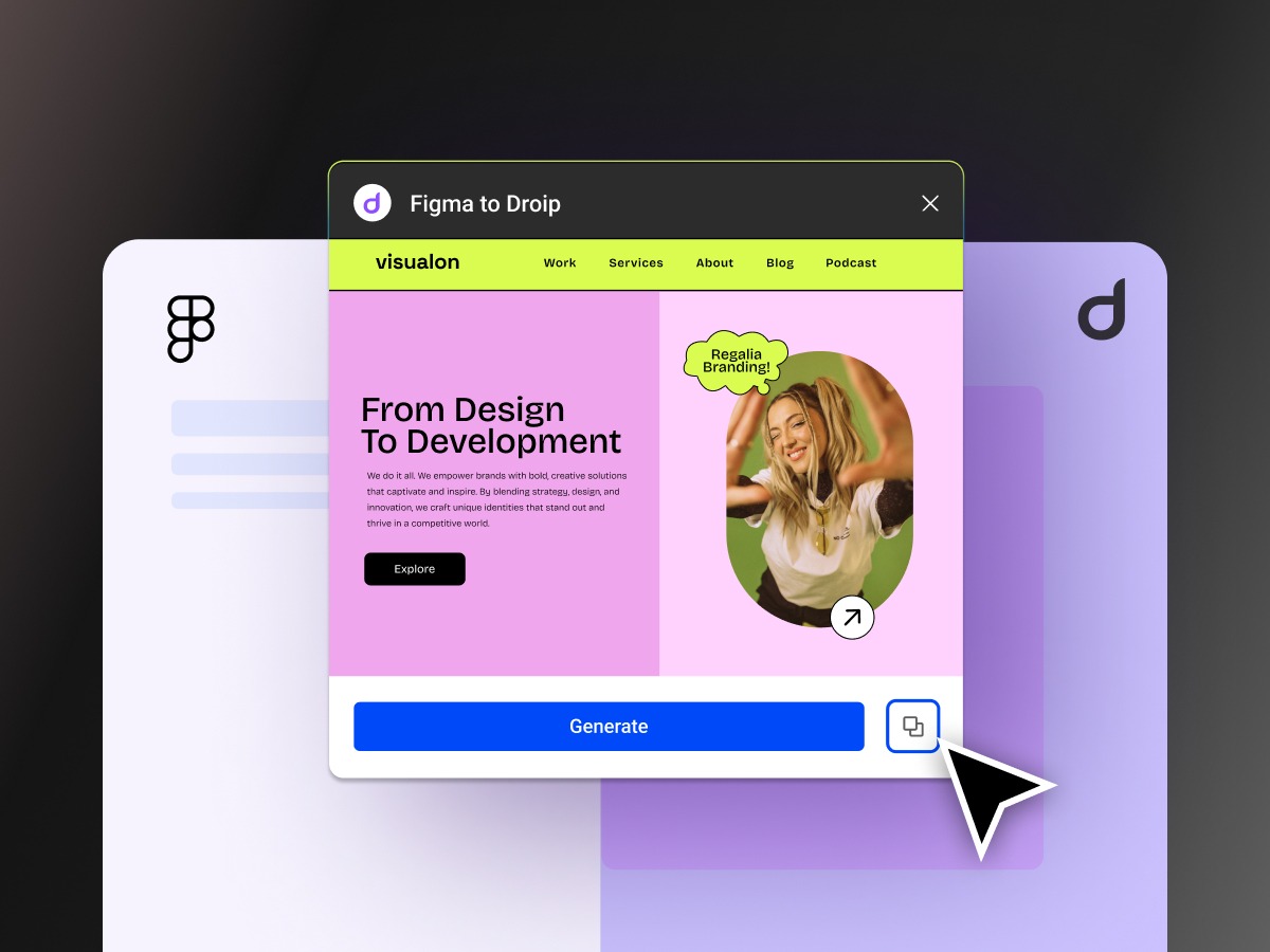
    To begin, I decided to use the Codrops homepage as my guinea pig. I have always wondered how it would feel reimagined as a bento style grid. Normally, if I wanted to try that, I would either spend hours rewriting markup and CSS by hand or rely on an AI prompt that would often spiral into unrelated layouts and syntax errors. It would be already a great help if I could envision my idea and play with it bit!

    After pasting in the Codrops URL, this is what came out. A React project was generated in seconds.

    Generated Codrops homepage project

    The first impression was surprisingly positive. The homepage looked recognizable and the layout did not completely collapse. Yes, there was a small glitch where the Webzibition box background was not sized correctly, but overall it was close enough that I felt comfortable moving on. That is already more than I can say for many auto generation tools where the output is so mangled that you do not even know where to start.

    Experimenting with a bento grid

    Now for the fun part. I typed a simple prompt that said, “Make a bento grid of all these items.” Almost immediately I hit an error. My usual instinct in this situation is to give up since vibe coding often collapses the moment an error shows up, and then it becomes a spiral of debugging someone else’s half generated mess. But let’s try this instead of quitting right away 🙂 The fix worked and I got a quirky but functioning bento grid layout:

    First attempt at bento grid

    The result was not exactly what I had in mind. Some elements felt off balance and the spacing was not ideal. Still, I had something on screen to iterate on, which is already a win compared to starting from scratch. So I pushed further. Could I bring the Creative Hub and Webzibition modules into this grid? A natural language prompt like “Place the Creative Hub box into the bento style container of the articles” felt like a good test.

    And yes, it actually worked. The Creative Hub box slipped into the grid container:

    Creative Hub moved into container

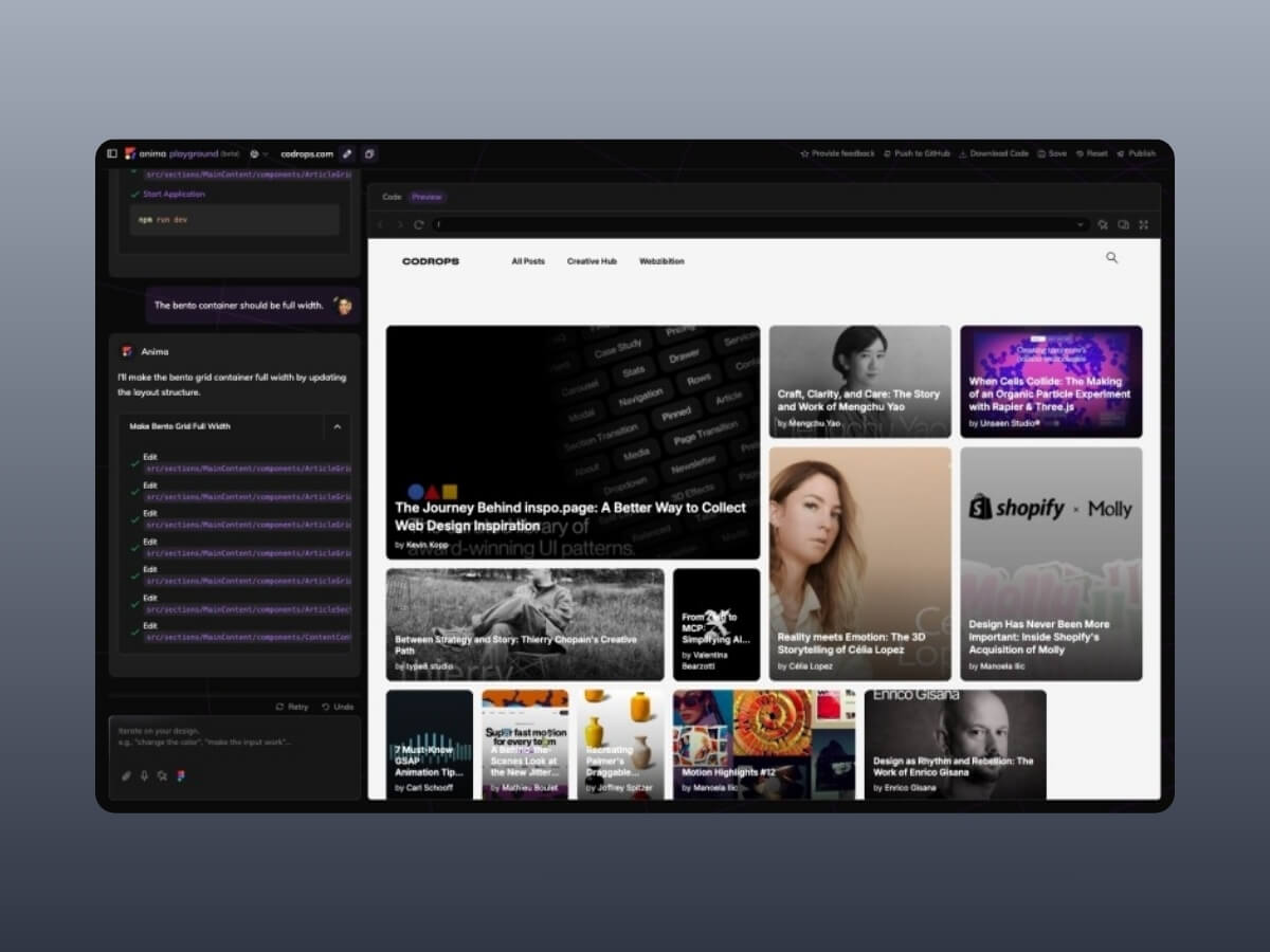
    The layout was starting to look cramped, so I tried another prompt. I asked Anima to also move the Webzibition box into the same container and to make it span full width. The generation was quick with barely a pause, and suddenly the page turns into this:

    Webzibition added to full width

    This really showed me what it’s good at: iteration is fast. You don’t have to stop, rethink the grid, or rewrite CSS by hand. You just throw an idea in, see what comes back, and keep moving. It feels more like sketching in a notebook than carefully planning a layout. For prototyping, that rhythm is exactly what I want. Really into this type of layout for Codrops!

    Looking under the hood

    Visuals are only half the story. The bigger question is what kind of code Anima actually produces. I opened the generated React and Tailwind output, fully expecting a sea of meaningless divs and tangled class names.

    To my surprise, the code was clean. Semantic elements were present, the structure was logical, and everything was just readable. There was no obvious divitis, and the markup did not feel like something I would want to burn and rewrite from scratch. It even got me thinking about how much simpler maintaining Codrops might be if it were a lean React app with Tailwind instead of living inside the layers of WordPress 😂

    There is also a Chrome extension called Web to Code, which lets you capture any page you are browsing and instantly get editable code. With this it’s easy to capture and generate inner pages like dashboards, login screens, or even private areas of a site you are working on could be pulled into a sandbox and played with directly.

    Anima Web to Code Chrome extension

    Pros and cons

    • Pros: Fast iteration, surprisingly clean code, easy setup, beginner-friendly, genuinely fun to experiment with.
    • Cons: Occasional glitches, exported code still needs cleanup, limited customization, not fully production-ready.

    Final thoughts

    Anima is not magic and it is not perfect. It will not replace deliberate coding, and it should not. But as a tool for quick prototyping, remixing existing designs, or exploring how a site might feel with a new structure, it is genuinely fun and surprisingly capable. The real highlight for me is the speed of iteration: you try an idea, see the result instantly, and either refine it or move on. That rhythm is addictive for creative developers who like to sketch in code rather than commit to heavy rebuilds from scratch.

    Verdict: Anima shines as a playground for experimentation and learning. If you’re a designer or developer who enjoys fast iteration, you’ll likely find it inspiring. If you need production-ready results for client work, you’ll still want to polish the output or stick with more mature frameworks. But for curiosity, prototyping, and a spark of creative joy, Anima is worth your time and you might be surprised at how much fun it is to remix the web this way.


    Source link

  • Countdown to DPDP Rules: What to Expect from the Final DPDP Rules

    Countdown to DPDP Rules: What to Expect from the Final DPDP Rules


    The wait is almost over. The final Digital Personal Data Protection (DPDP) Rules are just days away, marking the next big step after the enactment of the DPDPA in 2023. With only a few days left, organizations must gear up to align with new obligations on data protection, governance, and accountability.

    Are you prepared to meet the requirements and avoid costly penalties? These rules will act as the operational backbone of the law, providing clarity on implementation, enforcement, and compliance.

    With businesses, regulators, and citizens alike watching closely, the release of these rules will reshape India’s digital economy and data protection landscape. Here’s what to expect as the countdown begins.

    Why the DPDP Rules Matter

    While the DPDPA, 2023 laid down the broad principles of personal data protection—such as consent, purpose limitation, and user rights—the rules will answer the “how” questions:

    • How should organizations obtain and manage consent?
    • How will data principals exercise their rights?
    • What will compliance look like for startups vs. large enterprises?
    • How will penalties be calculated and enforced?

    In short, the rules will turn principles into practice.

    Key Areas to Watch in the Final Rules

    1. Consent & Notice Requirements

    Expect detailed procedures for how organisations must obtain consent, including the form, language, and accessibility of consent notices. The government may also clarify rules around “deemed consent”, which has raised debate among privacy experts.

    1. Data Principal Rights

    The rules will operationalise rights like data access, correction, erasure, and grievance redressal. Clear timelines for fulfilling these requests will likely be specified, adding compliance pressure on businesses.

    1. Obligations for Data Fiduciaries

    Significant data fiduciaries (LDFs) will have enhanced responsibilities—such as mandatory Data Protection Officers (DPOs), regular audits, and risk assessments. The criteria for what qualifies as an LDF will be closely watched.

    1. Cross-Border Data Transfer

    The government may publish its “whitelist” of countries where Indian personal data can be transferred. This will be crucial for IT/ITES, cloud, and fintech industries that rely heavily on global operations.

    1. Children’s Data Protection

    Rules around parental consent, restrictions on profiling, and targeted advertising for children may tighten, impacting edtech, gaming, and social platforms.

    1. Enforcement & Penalties

    The rules are expected to detail the functioning of the Data Protection Board of India (DPBI), including hearings, fines, and appeals procedures. This will define how strictly the law is enforced.

    1. Transition & Implementation Timelines

    Perhaps most critical will be the phased rollout plan. Businesses anxiously await to know how much time they will get to comply, and whether specific provisions will be delayed for startups and SMEs.

    What Businesses Should Do Now

    Even before the DPDP rules are published, organizations should start preparing:

    • Map personal data flows across systems and vendors.
    • Review consent management practices and plan for user-friendly updates.
    • Establish governance frameworks—DPO roles, audit readiness, and escalation processes.
    • Evaluate cross-border dependencies to anticipate transfer restrictions.
    • Train employees in privacy responsibilities and incident handling.

    Early movers will reduce compliance risks and gain customer trust in an era when data is a competitive differentiator.

    The Bigger Picture

    The DPDP Rules will set the tone for India’s privacy-first digital future. For businesses, this is more than just a compliance exercise—it’s a chance to demonstrate accountability, build trust, and strengthen their brand in a data-conscious marketplace.

    As the countdown begins, one thing is clear: organisations that prepare proactively will be better positioned to adapt, comply, and thrive in the new regulatory environment.

    Stay ahead of DPDP compliance with Seqrite. Prepare your organization now with Seqrite’s end-to-end data privacy and compliance solutions.

    Talk to a Seqrite Compliance Expert


    Source link

  • Why Regional & Cooperative Banks Must Move from Legacy VPNs to ZTNA — Seqrite

    Why Regional & Cooperative Banks Must Move from Legacy VPNs to ZTNA — Seqrite


    Virtual Private Networks (VPNs) have been the go-to solution for securing remote access to banking systems for decades. They created encrypted tunnels for employees, vendors, and auditors to connect with core banking applications. But as cyber threats become more sophisticated, regulatory bodies tighten their grip, and branch operations spread into rural areas, it becomes increasingly clear that VPNs are no longer sufficient for regional and cooperative banks in India.

    The Cybersecurity Reality for Banks

    The numbers speak for themselves:

    • In just 10 months of 2023, Indian banks faced 13 lakh cyberattacks, averaging 4,400 daily.
    • Over the last five years, banks reported 248 successful data breaches.
    • In the first half of 2025 alone, the RBI imposed ₹15.63 crore in penalties on cooperative banks for compliance failures, many linked to weak cybersecurity practices.

    The most concerning factor is that most of these incidents were linked to unauthorized access. With their flat network access model, traditional VPNs make banks highly vulnerable when even one compromised credential slips into the wrong hands.

    Why VPNs Are No Longer Enough

    1. Over-Privileged Access

    VPNs were built to provide broad network connectivity. Once logged in, users often gain excessive access to applications and systems beyond their role. This “all-or-nothing” model increases the risk of insider threats and lateral movement by attackers.

    VPNs were built to provide broad network connectivity. Once logged in, users often gain excessive access to applications and systems beyond their roles.

    1. Lack of Granularity

    Banks require strict control over who accesses what. VPNs cannot enforce role-based or context-aware access controls. For example, an external auditor should only be able to view specific reports, not navigate through the entire network.

    1. Operational Complexity

    VPN infrastructure is cumbersome to deploy and maintain across hundreds of branches. The overhead of managing configurations, licenses, and updates adds strain to already stretched IT teams in regional banks.

    1. Poor Fit for Hybrid and Remote Work

    Banking operations are no longer confined to branch premises. Remote staff, vendors, and regulators need secure but seamless access. VPNs slow down connectivity, especially in rural low-bandwidth areas, hampering productivity.

    1. Audit and Compliance Gaps

    VPNs don’t inherently provide built-in audit logs, geo-restriction policies, or continuous verification—making compliance audits more painful and penalties more likely.

    The Rise of Zero Trust Network Access (ZTNA)

    Zero Trust Network Access (ZTNA) addresses the shortcomings of VPNs by adopting a “never trust, always verify” mindset. Every user, device, and context is continuously authenticated before and during access. Instead of broad tunnels, ZTNA grants access only to the specific application or service a user is authorized for—nothing more.

    For regional and cooperative banks, this shift is a game-changer:

    • Least-Privilege Access ensures employees, vendors, and auditors only see what they can.
    • Built-in Audit Trails support RBI inspections without manual effort.
    • Agentless Options allow quick deployment across diverse user groups.
    • Resilience in Low-Bandwidth Environments ensures rural branches stay secure without connectivity struggles.

    Seqrite ZTNA: Tailored for Banks

    Unlike generic ZTNA solutions, Seqrite ZTNA has been designed with India’s banking landscape in mind. It supports various applications, including core banking systems, RDP, SSH, ERP, and CRM, while seamlessly integrating with existing IT infrastructure.

    Key differentiators include:

    • Support for Thick Clients, such as core banking and ERP systems, is critical for cooperative banks.
    • Out-of-the-Box SaaS Support for modern banking applications.
    • Centralized Policy Control to simplify access across branches, vendors, and staff.

    In fact, a cooperative bank in Western Maharashtra replaced its legacy VPN with Seqrite ZTNA and immediately reduced its security risks. By implementing granular, identity-based access policies, the bank achieved secure branch connectivity, simplified audits, and stronger resilience against unauthorized access.

    The Way Forward

    The RBI has already stated that cybersecurity resilience will depend on zero-trust approaches. Cooperative and regional banks that continue to rely on legacy VPNs are exposing themselves to cyber risks, regulatory penalties, and operational inefficiencies.

    By moving from VPNs to ZTNA, banks can protect their sensitive data, secure their branches and remote workforce, and stay one step ahead of attackers—all while ensuring compliance.

    Legacy VPNs are relics of the past. The future of secure banking access is Zero Trust.

    Secure your bank’s core systems with Seqrite ZTNA, which is built for India’s cooperative and regional banks to replace risky VPNs with identity-based, least-privilege access. Stay compliant, simplify audits, and secure every branch with Zero Trust.


    Source link

  • XGBoost for beginners – from CSV to Trustworthy Model – Useful code


    import numpy as np

    import pandas as pd

    import xgboost as xgb


    from sklearn.model_selection import train_test_split

    from sklearn.metrics import (

        confusion_matrix, precision_score, recall_score,

        roc_auc_score, average_precision_score, precision_recall_curve

    )


    # 1) Load a tiny cusomer churn CSV called churn.csv 

    df = pd.read_csv(“churn.csv”)


    # 2) Do quick, safe checks – missing values and class balance.

    missing_share = df.isna().mean().sort_values(ascending=False)

    class_share = df[“churn”].value_counts(normalize=True).rename(“share”)

    print(“Missing share (top 5):\n”, missing_share.head(5), “\n”)

    print(“Class share:\n”, class_share, “\n”)


    # 3) Split data into train, validation, test – 60-20-20.

    X = df.drop(columns=[“churn”]); y = df[“churn”]

    X_tr, X_te, y_tr, y_te = train_test_split(X, y, test_size=0.20, stratify=y, random_state=13)

    X_tr, X_va, y_tr, y_va = train_test_split(X_tr, y_tr, test_size=0.25, stratify=y_tr, random_state=13)

    neg, pos = int((y_tr==0).sum()), int((y_tr==1).sum())

    spw = neg / max(pos, 1)

    print(f“Shapes -> train {X_tr.shape}, val {X_va.shape}, test {X_te.shape}”)

    print(f“Class balance in train -> neg {neg}, pos {pos}, scale_pos_weight {spw:.2f}\n”)


    # Wrap as DMatrix (fast internal format)

    feat_names = list(X.columns)

    dtr = xgb.DMatrix(X_tr, label=y_tr, feature_names=feat_names)

    dva = xgb.DMatrix(X_va, label=y_va, feature_names=feat_names)

    dte = xgb.DMatrix(X_te, label=y_te, feature_names=feat_names)


    # 4) Train XGBoost with early stopping using the Booster API.

    params = dict(

        objective=“binary:logistic”,

        eval_metric=“aucpr”,

        tree_method=“hist”,

        max_depth=5,

        eta=0.03,

        subsample=0.8,

        colsample_bytree=0.8,

        reg_lambda=1.0,

        scale_pos_weight=spw

    )

    bst = xgb.train(params, dtr, num_boost_round=4000, evals=[(dva, “val”)],

                    early_stopping_rounds=200, verbose_eval=False)

    print(“Best trees (baseline):”, bst.best_iteration)


    # 6) Choose a practical decision treshold from validation – “a line in the sand”.

    p_va = bst.predict(dva, iteration_range=(0, bst.best_iteration + 1))

    pre, rec, thr = precision_recall_curve(y_va, p_va)

    f1 = 2 * pre * rec / np.clip(pre + rec, 1e9, None)

    t_best = float(thr[np.argmax(f1[:1])])

    print(“Chosen threshold t_best (validation F1):”, round(t_best, 3), “\n”)


    # 7) Explain results on the test set in plain terms – confusion matrix, precision, recall, ROC AUC, PR AUC

    p_te = bst.predict(dte, iteration_range=(0, bst.best_iteration + 1))

    pred = (p_te >= t_best).astype(int)

    cm = confusion_matrix(y_te, pred)

    print(“Confusion matrix:\n”, cm)

    print(“Precision:”, round(precision_score(y_te, pred), 3))

    print(“Recall   :”, round(recall_score(y_te, pred), 3))

    print(“ROC AUC  :”, round(roc_auc_score(y_te, p_te), 3))

    print(“PR  AUC  :”, round(average_precision_score(y_te, p_te), 3), “\n”)


    # 8) See which column mattered most

    # (a hint – if people start calling the call centre a lot, most probably there is a problem and they will quit using your service)

    imp = pd.Series(bst.get_score(importance_type=“gain”)).sort_values(ascending=False)

    print(“Top features by importance (gain):\n”, imp.head(10), “\n”)


    # 9) Add two business rules with monotonic constraints

    cons = [0]*len(feat_names)

    if “debt_ratio” in feat_names: cons[feat_names.index(“debt_ratio”)] = 1     # non-decreasing

    if “tenure_months” in feat_names: cons[feat_names.index(“tenure_months”)] = 1  # non-increasing

    mono = “(“ + “,”.join(map(str, cons)) + “)”


    params_cons = params.copy()

    params_cons.update({“monotone_constraints”: mono, “max_bin”: 512})


    bst_cons = xgb.train(params_cons, dtr, num_boost_round=4000, evals=[(dva, “val”)],

                         early_stopping_rounds=200, verbose_eval=False)

    print(“Best trees (constrained):”, bst_cons.best_iteration)


    # 10) Compare the quality of bst_cons and bst with a few lines.

    p_cons = bst_cons.predict(dte, iteration_range=(0, bst_cons.best_iteration + 1))

    print(“PR AUC  baseline vs constrained:”, round(average_precision_score(y_te, p_te), 3),

          “vs”, round(average_precision_score(y_te, p_cons), 3))

    print(“ROC AUC baseline vs constrained:”, round(roc_auc_score(y_te, p_te), 3),

          “vs”, round(roc_auc_score(y_te, p_cons), 3), “\n”)


    # 11) Save both models

    bst.save_model(“easy_xgb_base.ubj”)

    bst_cons.save_model(“easy_xgb_cons.ubj”)

    print(“Saved models: easy_xgb_base.ubj, easy_xgb_cons.ubj”)


    Source link

  • From Figma to WordPress in Minutes with Droip

    From Figma to WordPress in Minutes with Droip


    When the team at Droip first introduced their amazing builder, we received an overwhelming amount of positive feedback from our readers and community. That’s why we’re especially excited to welcome the Droip team back—this time to walk us through how to actually use their tool and bring Figma designs to life in WordPress.

    Even though WordPress has powered the web for years, turning a modern Figma design into a WordPress site still feels like a struggle. 

    Outdated page builders, rigid layouts, and endless back-and-forth with developers, only to end up with a site that never quite matches the design.

    That gap is exactly what Droip is here to close.

    Droip is a no-code website builder that takes a fresh approach to WordPress building, giving you full creative control without all the usual roadblocks.

    What makes it especially exciting for Figma users is the instant Figma-to-Droip handoff. Instead of handing off your design for a rebuild, you can literally copy from Figma and paste it into Droip. Your structure, layers, and layout come through intact, ready to be edited, extended, and published.

    In this guide, I’ll show you exactly how to prep your Figma file and go from a static mockup to a live WordPress site in minutes using a powerful no-code WordPress Builder.

    What is Droip?

    Making quite a buzz already for bringing the design freedom of Figma and the power of true no-code in WordPress, Droip is a relatively new, no-code WordPress website builder. 

    It’s not another rigid page builder that forces you into pre-made blocks or bloated layouts. Instead, Droip gives you full visual control over your site, from pixel-perfect spacing to responsive breakpoints, interactions, and dynamic content.

    Here’s what makes it different:

    • Designer-first approach: Work visually like you do in Figma or Webflow.
    • Seamless Figma integration: Copy your layout from Figma and paste it directly into Droip. Your structure, layers, and hierarchy carry over intact.
    • Scalable design system: Use global style variables for fonts, colors, and spacing, so your site remains consistent and easy to update.
    • Dynamic content management: Droip’s Content Manager lets you create custom content types and bind repeated content (like recipes, products, or portfolios) directly to your design.
    • Lightweight & clean code output: Unlike traditional builders, Droip produces clean code, keeping your WordPress site performant and SEO-friendly.

    In short, Droip lets you design a site that works exactly how you envisioned it, without relying on developers or pre-made templates.

    Part 1: Prep Your Figma File

    Good imports start with good Figma files. 

    Think of this step like designing with a builder in mind. You’ll thank yourself later.

    Step 1: Use Auto Layout Frames for Everything

    Don’t just drop elements freely on the canvas; wrap them in Frames with Auto Layout. Auto Layout helps Droip understand how your elements are structured. It improves spacing, alignment, and responsiveness.

    So the better your hierarchy, the cleaner your import. 

    • Wrap pages in a frame, set the max width (1320px is my go-to).
    • Place all design elements inside this Frame.
    • If you’re using grids, make sure they’re real grids, not just eyeballed. Set proper dimensions in Figma.

    Step 2: Containers with Min/Max Constraints

    When needed, give Frames min/max width and height constraints. This makes responsive scaling inside Droip way more predictable.

    Step 3: Use Proper Elements Nesting & Naming 

    Droip reads your file hierarchically, so how you nest and name elements in Figma directly affects how your layout behaves once imported.

    I recommend using Auto Layout Frames for all structural elements and naming the frames properly. 

    • Buttons with icons: Wrap the button and its icon inside an Auto Layout Frame and name it Button.
    • Form fields with labels: Wrap each label and input combo in an Auto Layout Frame and name it ‘Input’.
    • Sections with content: Wrap headings, text, and images inside an Auto Layout Frame, and give it a clear name like Section_Hero or Section_Features.

    Pro tip: Never leave elements floating outside frames. This ensures spacing, alignment, and responsiveness are preserved, and Droip can interpret your layout accurately.

    Step 4: Use Supported Element Names

    Droip reads your Figma layers and tries to understand what’s what, and naming plays a big role here. 

    If you use certain keywords, Droip will instantly recognize elements like buttons, forms, or inputs and map them correctly during import.

    For example: name a button layer “Button” (or “button” / “BUTTON”), and Droip knows to treat it as an actual button element rather than just a styled rectangle. The same goes for inputs, textareas, sections, and containers.

    Here are the supported names you can use:

    • Button: Button, button, BUTTON
    • Form: Form, form, FORM
    • Input: Input, input, INPUT
    • Textarea: Textarea, textarea, TEXTAREA
    • Section: Section, section, SECTION
    • Container: Container, container, CONTAINER

    Step 5: Flatten Decorative Elements

    Icons, illustrations, or complex vector shapes can get messy when imported as-is. To avoid errors, right-click and Flatten them in Figma. This keeps your file lightweight and makes the import into Droip cleaner and faster.

    Step 6: Final Clean-Up

    Before you hit export, give your file one last polish:

    • Delete any empty or hidden layers.
    • Double-check spacing and alignment.
    • Make sure everything lives inside a neat Auto Layout Frame.

    A little housekeeping here saves a lot of time later. Once your file is tidy, you’re all set to import it into Droip.

    Prepping Droip Before You Import

    So you’ve cleaned up your Figma file, nested your elements properly, and named things clearly. 

    But before you hit copy–paste, there are a few things to set up in Droip that will save you a ton of time later. Think of this as laying the groundwork for a scalable, maintainable design system inside your site.

    Install the Fonts You Used in Figma

    If your design relies on a specific font, you’ll want Droip to have it too.

    • Google Fonts: These are easy, just select from Droip’s font library.
    • Custom Fonts: If you used a custom font, upload and install it in Droip before importing. Otherwise, your site may fall back to a default font, and all that careful typography work will go to waste.

    Create Global Style Variables (Fonts, Sizes, Colors)

    Droip gives you a Variables system (like tokens in design systems) that makes your site easier to scale.

    • Set up font variables (Heading, Body, Caption).
    • Define color variables for your brand palette (Primary, Secondary, Accent, Background, Text).
    • Add spacing and sizing variables if your design uses consistent paddings or margins.

    When you paste your design into Droip, link your imported elements to these variables. This way, if your brand color ever changes, you update it once in variables and everything updates across the site.

    Prepare for Dynamic Content

    If your design includes repeated content like recipes, team members, or product cards, you don’t want to hard-code those. Droip’s Content Manager lets you create Collections that act like databases for your dynamic data.

    Here’s the flow:

    • In Droip, create a Collection (e.g., “Recipes” with fields like Title, Date, Image, Ingredients, Description, etc.).
    • Once your design is imported, bind the elements (like the recipe card in your design) to those fields.

    Part 2: Importing Your Figma Design into Droip

    Okay, so your Figma file is clean, your fonts and variables are set up in Droip, and you’re ready to bring your design to life. The import process is actually surprisingly simple, but there are a few details you’ll want to pay attention to along the way.

    If you don’t have a design ready, no worries. I’ve prepared a sample Figma file that you can import into Droip. Grab the Sample Figma File and follow along as we go from design to live WordPress site.

    Step 1: Install the Figma to Droip Plugin

    First things first, you’ll need the Figma to Droip plugin that makes this whole workflow possible.

    • Open Figma
    • Head to the Resources tab in the top toolbar
    • Search for “Figma to Droip”
    • Click Install

    That’s it, you’ll now see it in your Plugins list, ready to use whenever you need it.

    Step 2: Select and Generate Your Design

    Now let’s get your layout ready for the jump.

    • In Figma, select the Frame you want to export.
    • Right-click > Plugins > Figma to Droip.
    • The plugin panel will open, and click Generate.
    • Once it’s done processing, hit Copy.

    Make sure you’re selecting a final, polished version of your frame. Clean Auto Layout, proper nesting, and consistent naming will all pay off here.

    Step 3: Paste into Droip

    Here’s where the magic happens.

    • Open Droip and create a new page.
    • Click anywhere on the canvas or workspace.
    • Paste (Cmd + V on Mac, Ctrl + V on Windows).

    Droip will instantly import your design, keeping the layout structure, spacing, styles, groupings, and hierarchy from Figma. 

    Not only that, Droip automatically converts your Figma layout into a responsive structure. That means your design isn’t just pasted in as a static frame, it adapts across breakpoints right away, even the custom ones. 

    Best of all, Droip outputs clean, lightweight code under the hood, so your WordPress site stays fast, secure, and SEO-friendly as well.

    And just like that, your static design is now editable in WordPress.

    Step 4: Refine Inside Droip

    The foundation is there, now all you need to do is just add the finishing touches. 

    After pasting, you’ll want to refine your site and hook it into Droip’s powerful features:

    • Link to variables: Assign your imported fonts, colors, and sizes to the global style variables you created earlier. This makes your site scalable and future-proof.
    • Dynamic content: Replace static sections with collections from the Content Manager (think recipes, portfolios, products).
    • Interactions & animations: Add hover effects, transitions, and scroll-based behaviors, the kind of micro-interactions that bring your design to life.
    • Media: Swap out placeholder assets for final images, videos, or icons.

    Step 5: Set Global Header & Footer 

    After import, you’ll want your header and footer to stay consistent across every page. The easiest way is to turn them into Global Components.

    • Select your header in the Layers panel > Right-click > Create Symbol.
    • Open the Insert Panel > Go to Symbols > Assign it as your Global Header.
    • Repeat the same steps for your footer.

    Now, whenever you edit your header or footer, those changes will automatically sync across your entire site.

    Step 6: Preview & Publish

    Almost there.

    • Hit Preview to test responsiveness, check spacing, and see your interactions in action.
    • When everything feels right, click Publish, and your page is live.

    And that’s it. In just a few steps, your Figma design moves from a static mockup to a living, breathing WordPress site.

    Wrapping Up: From Figma to WordPress Instantly

    What used to take weeks of handoff, revisions, and compromises can now happen in minutes. You still keep all the freedom to refine, extend, and scale, but without the friction of developer bottlenecks or outdated page builders.

    So if you’ve ever wanted to skip the “translation gap” between design and development, this is your fastest way to turn Figma designs into live WordPress websites using a no-code WordPress Builder.

    Get started with Droip and try it yourself!


    Source link

  • From Zero to MCP: Simplifying AI Integrations with xmcp

    From Zero to MCP: Simplifying AI Integrations with xmcp


    The AI ecosystem is evolving rapidly, and Anthropic releasing the Model Context Protocol on November 25th, 2024 has certainly shaped how LLM’s connect with data. No more building custom integrations for every data source: MCP provides one protocol to connect them all. But here’s the challenge: building MCP servers from scratch can be complex.

    TL;DR: What is MCP?

    Think of MCP like a USB-C port for AI applications. Just as USB-C provides a standardized way to connect devices to various peripherals, MCP provides a standardized way to connect AI models to different data sources, tools, and services. It’s an open protocol that enables AI applications to safely and efficiently access external context – whether that’s your company’s database, file systems, APIs, or custom business logic.

    Source: https://modelcontextprotocol.io/docs/getting-started/intro

    In practice, this means you can hook LLMs into the things you already work with every day. To name a few examples, you could query databases to visualize trends, pull and resolve issues from GitHub, fetch or update content to a CMS, and so on. Beyond development, the same applies to broader workflows: customer support agents can look up and resolve tickets, enterprise search can fetch and read content scattered across wikis and docs, operations can monitor infrastructure or control devices.

    But there’s more to it, and that’s when you really unlock the power of MCP. It’s not just about single tasks, but rethinking entire workflows. Suddenly, we’re shaping our way to interact with products and even our own computers: instead of adapting ourselves to the limitations of software, we can shape the experience around our own needs.

    That’s where xmcp comes in: a TypeScript framework designed with DX in mind, for developers who want to build and ship MCP servers without the usual friction. It removes the complexity and gets you up and running in a matter of minutes.

    A little backstory

    xmcp was born out of necessity at Basement Studio, where we needed to build internal tools for our development processes. As we dove deeper into the protocol, we quickly discovered how fragmented the tooling landscape was and how much time we were spending on setup, configuration, and deployment rather than actually building the tools our team needed.

    That’s when we decided to consolidate everything we’d learned into a framework. The philosophy was simple: developers shouldn’t have to become experts just to build AI tools. The focus should be on creating valuable functionality, not wrestling with boilerplate code and all sorts of complexities.

    Key features & capabilities

    xmcp shines in its simplicity. With just one command, you can scaffold a complete MCP server:

    npx create-xmcp-app@latest

    The framework automatically discovers and registers tools. No extra setup needed.

    All you need is tools/

    xmcp abstracts the original tool syntax from the TypeScript SDK and follows a SOC principle, following a simple three-exports structure:

    • Implementation: The actual tool logic.
    • Schema: Define input parameters using Zod schemas with automatic validation
    • Metadata: Specify tool identity and behavior hints for AI models
    // src/tools/greet.ts
    import { z } from "zod";
    import { type InferSchema } from "xmcp";
    
    // Define the schema for tool parameters
    export const schema = {
      name: z.string().describe("The name of the user to greet"),
    };
    
    // Define tool metadata
    export const metadata = {
      name: "greet",
      description: "Greet the user",
      annotations: {
        title: "Greet the user",
        readOnlyHint: true,
        destructiveHint: false,
        idempotentHint: true,
      },
    };
    
    // Tool implementation
    export default async function greet({ name }: InferSchema<typeof schema>) {
      return `Hello, ${name}!`;
    }

    Transport Options

    • HTTP: Perfect for server deployments, enabling tools that fetch data from databases or external APIs
    • STDIO: Ideal for local operations, allowing LLMs to perform tasks directly on your machine

    You can tweak the configuration to your needs by modifying the xmcp.config.ts file in the root directory. Among the options you can find the transport type, CORS setup, experimental features, tools directory, and even the webpack config. Learn more about this file here.

    const config: XmcpConfig = {
      http: {
        port: 3000,
        // The endpoint where the MCP server will be available
        endpoint: "/my-custom-endpoint",
        bodySizeLimit: 10 * 1024 * 1024,
        cors: {
          origin: "*",
          methods: ["GET", "POST"],
          allowedHeaders: ["Content-Type"],
          credentials: true,
          exposedHeaders: ["Content-Type"],
          maxAge: 600,
        },
      },
    
      webpack: (config) => {
        // Add raw loader for images to get them as base64
        config.module?.rules?.push({
          test: /\.(png|jpe?g|gif|svg|webp)$/i,
          type: "asset/inline",
        });
    
        return config;
      },
    };
    

    Built-in Middleware & Authentication

    For HTTP servers, xmcp provides native solutions to add Authentication (JWT, API Key, OAuth). You can always leverage your application by adding custom middlewares, which can even be an array.

    import { type Middleware } from 'xmcp';
    
    const middleware: Middleware = async (req, res, next) => {
      // Custom processing
      next();
    };
    
    export default middleware;
    

    Integrations

    While you can bootstrap an application from scratch, xmcp can also work on top of your existing Next.js or Express project. To get started, run the following command:

    npx init-xmcp@latest

    on your initialized application, and you are good to go! You’ll find a tools directory with the same discovery capabilities. If you’re using Next.js the handler is set up automatically. If you’re using Express, you’ll have to configure it manually.

    From zero to prod

    Let’s see this in action by building and deploying an MCP server. We’ll create a Linear integration that fetches issues from your backlog and calculates completion rates, perfect for generating project analytics and visualizations.

    For this walkthrough, we’ll use Cursor as our MCP client to interact with the server.

    Setting up the project

    The fastest way to get started is by deploying the xmcp template directly from Vercel. This automatically initializes the project and creates an HTTP server deployment in one click.

    Alternative setup: If you prefer a different platform or transport method, scaffold locally with npx create-xmcp-app@latest

    Once deployed, you’ll see this project structure:

    Building our main tool

    Our tool will accept three parameters: team name, start date, and end date. It’ll then calculate the completion rate for issues within that timeframe.

    Head to the tools directory, create a file called get-completion-rate.ts and export the three main elements that construct the syntax:

    import { z } from "zod";
    import { type InferSchema, type ToolMetadata } from "xmcp";
    
    export const schema = {
      team: z
        .string()
        .min(1, "Team name is required")
        .describe("The team to get completion rate for"),
      startDate: z
        .string()
        .min(1, "Start date is required")
        .describe("Start date for the analysis period (YYYY-MM-DD)"),
      endDate: z
        .string()
        .min(1, "End date is required")
        .describe("End date for the analysis period (YYYY-MM-DD)"),
    };
    
    export const metadata: ToolMetadata = {
      name: "get-completion-rate",
      description: "Get completion rate analytics for a specific team over a date range",
    };
    
    export default async function getCompletionRate({
      team,
      startDate,
      endDate,
    }: InferSchema<typeof schema>) {
    // tool implementation we'll cover in the next step
    };

    Our basic structure is set. We now have to add the client functionality to actually communicate with Linear and get the data we need.

    We’ll be using Linear’s personal API Key, so we’ll need to instantiate the client using @linear/sdk . We’ll focus on the tool implementation now:

    export default async function getCompletionRate({
      team,
      startDate,
      endDate,
    }: InferSchema<typeof schema>) {
    
        const linear = new LinearClient({
            apiKey: // our api key
        });
    
    };

    Instead of hardcoding API keys, we’ll use the native headers utilities to accept the Linear API key securely from each request:

    export default async function getCompletionRate({
      team,
      startDate,
      endDate,
    }: InferSchema<typeof schema>) {
    
        // API Key from headers
        const apiKey = headers()["linear-api-key"] as string;
    
        if (!apiKey) {
            return "No linear-api-key header provided";
        }
    
        const linear = new LinearClient({
            apiKey: apiKey,
        });
        
        // rest of the implementation
    }

    This approach allows multiple users to connect with their own credentials. Your MCP configuration will look like:

    "xmcp-local": {
      "url": "http://127.0.0.1:3001/mcp",
      "headers": {
        "linear-api-key": "your api key"
      }
    }

    Moving forward with the implementation, this is what our complete tool file will look like:

    import { z } from "zod";
    import { type InferSchema, type ToolMetadata } from "xmcp";
    import { headers } from "xmcp/dist/runtime/headers";
    import { LinearClient } from "@linear/sdk";
    
    export const schema = {
      team: z
        .string()
        .min(1, "Team name is required")
        .describe("The team to get completion rate for"),
      startDate: z
        .string()
        .min(1, "Start date is required")
        .describe("Start date for the analysis period (YYYY-MM-DD)"),
      endDate: z
        .string()
        .min(1, "End date is required")
        .describe("End date for the analysis period (YYYY-MM-DD)"),
    };
    
    export const metadata: ToolMetadata = {
      name: "get-completion-rate",
      description: "Get completion rate analytics for a specific team over a date range",
    };
    
    export default async function getCompletionRate({
      team,
      startDate,
      endDate,
    }: InferSchema<typeof schema>) {
    
        // API Key from headers
        const apiKey = headers()["linear-api-key"] as string;
    
        if (!apiKey) {
            return "No linear-api-key header provided";
        }
    
        const linear = new LinearClient({
            apiKey: apiKey,
        });
    
        // Get the team by name
        const teams = await linear.teams();
        const targetTeam = teams.nodes.find(t => t.name.toLowerCase().includes(team.toLowerCase()));
    
        if (!targetTeam) {
            return `Team "${team}" not found`
        }
    
        // Get issues created in the date range for the team
        const createdIssues = await linear.issues({
            filter: {
                team: { id: { eq: targetTeam.id } },
                createdAt: {
                    gte: startDate,
                    lte: endDate,
                },
            },
        });
    
        // Get issues completed in the date range for the team (for reporting purposes)
        const completedIssues = await linear.issues({
            filter: {
                team: { id: { eq: targetTeam.id } },
                completedAt: {
                    gte: startDate,
                    lte: endDate,
                },
            },
        });
    
        // Calculate completion rate: percentage of created issues that were completed
        const totalCreated = createdIssues.nodes.length;
        const createdAndCompleted = createdIssues.nodes.filter(issue => 
            issue.completedAt !== undefined && 
            issue.completedAt >= new Date(startDate) && 
            issue.completedAt <= new Date(endDate)
        ).length;
        const completionRate = totalCreated > 0 ? (createdAndCompleted / totalCreated * 100).toFixed(1) : "0.0";
    
        // Structure data for the response
        const analytics = {
            team: targetTeam.name,
            period: `${startDate} to ${endDate}`,
            totalCreated,
            totalCompletedFromCreated: createdAndCompleted,
            completionRate: `${completionRate}%`,
            createdIssues: createdIssues.nodes.map(issue => ({
                title: issue.title,
                createdAt: issue.createdAt,
                priority: issue.priority,
                completed: issue.completedAt !== null,
                completedAt: issue.completedAt,
            })),
            allCompletedInPeriod: completedIssues.nodes.map(issue => ({
                title: issue.title,
                completedAt: issue.completedAt,
                priority: issue.priority,
            })),
        };
    
        return JSON.stringify(analytics, null, 2);
    }

    Let’s test it out!

    Start your development server by running pnpm dev (or the package manager you’ve set up)

    The server will automatically restart whenever you make changes to your tools, giving you instant feedback during development. Then, head to Cursor Settings → Tools & Integrations and toggle the server on. You should see it’s discovering one tool file, which is our only file in the directory.

    Let’s now use the tool by querying to “Get the completion rate of the xmcp project between August 1st 2025 and August 20th 2025”.

    Let’s try using this tool in a more comprehensive way: we want to understand the project’s completion rate in three separate months, June, July and August, and visualize the tendency. So we will ask Cursor to retrieve the information for these months, and generate a tendency chart and a monthly issue overview:

    Once we’re happy with the implementation, we’ll push our changes and deploy a new version of our server.

    Pro tip: use Vercel’s branch deployments to test new tools safely before merging to production.

    Next steps

    Nice! We’ve built the foundation, but there’s so much more you can do with it.

    • Expand your MCP toolkit with a complete workflow automation. Take this MCP server as a starting point and add tools that generate weekly sprint reports and automatically save them to Notion, or build integrations that connect multiple project management platforms.
    • Leverage the application by adding authentication. You can use the OAuth native provider to add Linear’s authentication instead of using API Keys, or use the Better Auth integration to handle custom authentication paths that fit your organization’s security requirements.
    • For production workloads, you may need to add custom middlewares, like rate limiting, request logging, and error tracking. This can be easily set up by creating a middleware.ts file in the source directory. You can learn more about middlewares here.

    Final thoughts

    The best part of what you’ve built here is that xmcp handled all the protocol complexity for you. You didn’t have to learn the intricacies of the Model Context Protocol specification or figure out transport layers: you just focused on solving your actual business problem. That’s exactly how it should be.

    Looking ahead, xmcp’s roadmap includes full MCP specification compliance, bringing support for resources, prompts and elicitation. More importantly, the framework is evolving to bridge the gap between prototype and production, with enterprise-grade features for authentication, monitoring, and scalability.

    If you wish to learn more about the framework, visit xmcp.dev, read the documentation and check out the examples!


    Source link

  • Exporting a Cloth Simulation from Blender to an Interactive Three.js Scene

    Exporting a Cloth Simulation from Blender to an Interactive Three.js Scene


    This tutorial walks through creating an interactive animation: starting in Blender by designing a button and simulating a cloth-like object that drops onto a surface and settles with a soft bounce.

    After baking the cloth simulation, the animation is exported and brought into a Three.js project, where it becomes an interactive scene that can be replayed on click.

    By the end, you’ll have a user-triggered animation that blends Blender’s physics simulations with Three.js rendering and interactivity.

    Let’s dive in!

    Step 1: Create a Cube and Add Subdivisions

    1. Start a New Project: Open Blender and delete the default cube (select it and press X, then confirm).
    2. Add a Cube: Press Shift + A > Mesh > Cube to create a new cube.
    3. Enter Edit Mode: Select the cube, then press Tab to switch to Edit Mode.
    4. Subdivide the Cube: Press Ctrl + R to add a loop cut, hover over the cube, and scroll your mouse wheel to increase the number of cuts.
    5. Apply Subdivision: With the cube still selected in Object Mode, go to the Modifiers panel (wrench icon), and click Add Modifier > Subdivision Surface. Set the Levels to 2 or 3 for a smoother result, then click Apply.

    Step 2: Add Cloth Physics and Adjust Settings

    1. Select the Cube: Ensure your subdivided cube is selected in Object Mode.
    2. Add Cloth Physics: Go to the Physics tab in the Properties panel. Click Cloth to enable cloth simulation.
    3. Pin the Edges (Optional): If you want parts of the cube to stay fixed (e.g., the top), switch to Edit Mode, select the vertices you want to pin, go back to the Physics tab, and under Cloth > Shape, click Pin to assign those vertices to a vertex group.
    4. Adjust Key Parameters:
      • Quality Steps: Set to 10-15 for smoother simulation (higher values increase accuracy but slow down computation).
      • Mass: Set to around 0.2-0.5 kg for a lighter, more flexible cloth.
      • Pressure: Under Cloth > Pressure, enable it and set a positive value (e.g., 2-5) to simulate inflation. This will make the cloth expand as if air is pushing it outward.
      • Stiffness: Adjust Tension and Compression (e.g., 10-15) to control how stiff or loose the cloth feels.
    5. Test the Simulation: Press the Spacebar to play the animation and see the cloth inflate. Tweak settings as needed.

    Step 3: Add a Ground Plane with a Collision

    1. Create a Ground Plane: Press Shift + A > Mesh > Plane. Scale it up by pressing S and dragging (e.g., scale it to 5-10x) so it’s large enough for the cloth to interact with.
    2. Position the Plane: Move the plane below the cube by pressing G > Z > -5 (or adjust as needed).
    3. Enable Collision: Select the plane, go to the Physics tab, and click Collision. Leave the default settings.
    4. Run the Simulation: Press the Spacebar again to see the cloth inflate and settle onto the ground plane.

    Step 4: Adjust Materials and Textures

    1. Select the Cube: In Object Mode, select the cloth (cube) object.
    2. Add a Material: Go to the Material tab, click New to create a material, and name it.
    3. Set Base Color/UV Map: In the Base Color slot, choose a fabric-like color (e.g., red or blue) or connect an image texture by clicking the yellow dot next to Base Color and selecting Image Texture. Load a texture file if you have one.
    4. Adjust Roughness and Specular: Set Roughness to 0.1-0.3 for a soft fabric look.
    5. Apply to Ground (Optional): Repeat the process for the plane, using a simple gray or textured material for contrast.

    Step 5: Export as MDD and Generate Shape Keys for Three.js

    To use the cloth animation in a Three.js project, we’ll export the physics simulation as an MDD file using the NewTek MDD plugin, then re-import it to create Shape Keys. Follow these steps:

    1. Enable the NewTek MDD Plugin:
      1. Go to Edit > Preferences > Add-ons.
      2. Search for “NewTek” or “MDD” and enable the “Import-Export: NewTek MDD format” add-on by checking the box. Close the Preferences window.
    2. Apply All Modifiers and All Transform:
      1. In Object Mode, select the cloth object.
      2. Go to the Modifiers panel (wrench icon). For each modifier (e.g., Subdivision Surface, Cloth), click the dropdown and select Apply. This “freezes” the mesh with its current shape and physics data.
      3. Ensure no unapplied deformations (e.g., scale) remain: Press Ctrl + A > All Transforms to apply location, rotation, and scale.
    3. Export as MDD:
      1. With the cloth object selected, go to File > Export > Lightwave Point Cache (.mdd).
      2. In the export settings (bottom left):
        • Set FPS (frames per second) to match your project (e.g., 24, 30, or 60).
        • Set the Start/End Frame of your animation.
      3. Choose a save location (e.g., “inflation.mdd”) and click Export MDD.
    4. Import the MDD:
      1. Go to File > Import > Lightwave Point Cache (.mdd), and load the “inflation.mdd” file.
      2. In the Physics and Modifiers panel, remove any cloth simulation-related options, as we now have shape keys.

    Step 6: Export the Cloth Simulation Object as GLB

    After importing the MDD, select the cube with the animation data.

    1. Export as glTF 2.0 (.glb/.gltf): Go to File > Export > glTF 2.0 (.glb/.gltf).
    2. Check Shape Keys and Animation
      1. Under the Data section, check Shape Keys to include the morph targets generated from the animation.
      2. Check Animations to export the animation data tied to the Shape Keys.
    3. Export: Choose a save location (e.g., “inflation.glb”) and click Export glTF 2.0. This file is now ready for use in Three.js.

    Step 7: Implement the Cloth Animation in Three.js

    In this step, we’ll use Three.js with React (via @react-three/fiber) to load and animate the cloth inflation effect from the inflation.glb file exported in Step 6. Below is the code with explanations:

    1. Set Up Imports and File Path:
      1. Import necessary libraries: THREE for core Three.js functionality, useRef, useState, useEffect from React for state and lifecycle management, and utilities from @react-three/fiber and @react-three/drei for rendering and controls.
      2. Import GLTFLoader from Three.js to load the .glb file.
      3. Define the model path: const modelPath = ‘/inflation.glb’; points to the exported file (adjust the path based on your project structure).
    2. Create the Model Component:
      1. Define the Model component to handle loading and animating the .glb file.
      2. Use state variables: model for the loaded 3D object, loading to track progress, and error for handling issues.
      3. Use useRef to store the AnimationMixer (mixerRef) and animation actions (actionsRef) for controlling playback.
    3. Load the Model with Animations:
      1. In a useEffect hook, instantiate GLTFLoader and load inflation.glb.
      2. On success (gltf callback):
        • Extract the scene (gltf.scene) and create an AnimationMixer to manage animations.
        • For each animation clip in gltf.animations:
          • Set duration to 6 seconds (clip.duration = 6).
          • Create an AnimationAction (mixer.clipAction(clip)).
          • Configure the action: clampWhenFinished = true stops at the last frame, loop = THREE.LoopOnce plays once, and setDuration(6) enforces the 6-second duration.
          • Reset and play the action immediately, storing it in actionsRef.current.
        • Update state with the loaded model and set loading to false.
      3. Log loading progress with the xhr callback.
      4. Handle errors in the error callback, updating error state.
      5. Clean up the mixer on component unmount.
    4. Animate the Model:
      1. Use useFrame to update the mixer each frame with mixerRef.current.update(delta), advancing the animation based on time.
      2. Add interactivity:
        • handleClick: Resets and replays all animations on click.
        • onPointerOver/onPointerOut: Changes the cursor to indicate clickability.
    5. Render the Model:
      1. Return null if still loading, an error occurs, or no model is loaded.
      2. Return a <primitive> element with the loaded model, enabling shadows and attaching event handlers.
    6. Create a Reflective Ground:
      1. Define MetalGround as a mesh with a plane geometry (args={[100, 100]}).
      2. Apply MeshReflectorMaterial with properties like metalness=0.5, roughness=0.2, and color=”#202020″ for a metallic, reflective look. Adjust blur, strength, and resolution as needed.
    7. Set Up the Scene:
      1. In the App component, create a <Canvas> with a camera positioned at [0, 15, 15] and a 50-degree FOV.
      2. Add a directionalLight at [0, 15, 0] with shadows enabled.
      3. Include an Environment preset (“studio”) for lighting, a Model at [0, 5, 0], ContactShadows for realism, and the MetalGround rotated and positioned below.
      4. Add OrbitControls for interactive camera movement.
    import * as THREE from 'three';
    import { useRef, useState, useEffect } from 'react';
    import { Canvas, useFrame } from '@react-three/fiber';
    import { OrbitControls, Environment, MeshReflectorMaterial, ContactShadows } from '@react-three/drei';
    import { GLTFLoader } from 'three/examples/jsm/loaders/GLTFLoader.js';
    import { DRACOLoader } from 'three/examples/jsm/loaders/DRACOLoader.js';
    
    const modelPath = '/inflation.glb';
    
    function Model({ ...props }) {
      const [model, setModel] = useState<THREE.Group | null>(null);
      const [loading, setLoading] = useState(true);
      const [error, setError] = useState<unknown>(null);
      const mixerRef = useRef<THREE.AnimationMixer | null>(null);
      const actionsRef = useRef<THREE.AnimationAction[]>([]);
    
      const handleClick = () => {
        actionsRef.current.forEach((action) => {
          action.reset();
          action.play();
        });
      };
    
      const onPointerOver = () => {
        document.body.style.cursor = 'pointer';
      };
    
      const onPointerOut = () => {
        document.body.style.cursor = 'auto';
      };
    
      useEffect(() => {
        const loader = new GLTFLoader();
        const dracoLoader = new DRACOLoader();
        dracoLoader.setDecoderPath('https://www.gstatic.com/draco/v1/decoders/');
        loader.setDRACOLoader(dracoLoader);
    
        loader.load(
          modelPath,
          (gltf) => {
            const mesh = gltf.scene;
            const mixer = new THREE.AnimationMixer(mesh);
            mixerRef.current = mixer;
    
            if (gltf.animations && gltf.animations.length) {
              gltf.animations.forEach((clip) => {
                clip.duration = 6;
                const action = mixer.clipAction(clip);
                action.clampWhenFinished = true;
                action.loop = THREE.LoopOnce;
                action.setDuration(6);
                action.reset();
                action.play();
                actionsRef.current.push(action);
              });
            }
    
            setModel(mesh);
            setLoading(false);
          },
          (xhr) => {
            console.log(`Loading: ${(xhr.loaded / xhr.total) * 100}%`);
          },
          (error) => {
            console.error('An error happened loading the model:', error);
            setError(error);
            setLoading(false);
          }
        );
    
        return () => {
          if (mixerRef.current) {
            mixerRef.current.stopAllAction();
          }
        };
      }, []);
    
      useFrame((_, delta) => {
        if (mixerRef.current) {
          mixerRef.current.update(delta);
        }
      });
    
      if (loading || error || !model) {
        return null;
      }
    
      return (
        <primitive
          {...props}
          object={model}
          castShadow
          receiveShadow
          onClick={handleClick}
          onPointerOver={onPointerOver}
          onPointerOut={onPointerOut}
        />
      );
    }
    
    function MetalGround({ ...props }) {
      return (
        <mesh {...props} receiveShadow>
          <planeGeometry args={[100, 100]} />
          <MeshReflectorMaterial
            color="#151515"
            metalness={0.5}
            roughness={0.2}
            blur={[0, 0]}
            resolution={2048}
            mirror={0}
          />
        </mesh>
      );
    }
    
    export default function App() {
      return (
        <div id="content">
          <Canvas camera={{ position: [0, 35, 15], fov: 25 }}>
            <directionalLight position={[0, 15, 0]} intensity={1} shadow-mapSize={1024} />
    
            <Environment preset="studio" background={false} environmentRotation={[0, Math.PI / -2, 0]} />
            <Model position={[0, 5, 0]} />
            <ContactShadows opacity={0.5} scale={10} blur={5} far={10} resolution={512} color="#000000" />
            <MetalGround rotation-x={Math.PI / -2} position={[0, -0.01, 0]} />
    
            <OrbitControls
              enableZoom={false}
              enablePan={false}
              enableRotate={true}
              enableDamping={true}
              dampingFactor={0.05}
            />
          </Canvas>
        </div>
      );
    }

    And that’s it! Starting from a cloth simulation in Blender, we turned it into a button that drops into place and reacts with a bit of bounce inside a Three.js scene.

    This workflow shows how Blender’s physics simulations can be exported and combined with Three.js to create interactive, real-time experiences on the web.


    Source link

  • Exploring SOAP Web Services – From Browser Console to Python – Useful code

    Exploring SOAP Web Services – From Browser Console to Python – Useful code


    SOAP (Simple Object Access Protocol) might sound intimidating (or funny) but it is actually a straightforward way for systems to exchange structured messages using XML. In this article, I am introducing SOAP through YouTube video, where it is explored through 2 different angles – first in the Chrome browser console, then with Python and Jupyter Notebook.

    The SOAP Exchange Mechanism uses requests and response.

    Part 1 – Soap in the Chrome Browser Console

    We start by sending SOAP requests directly from the browser’s JS console. This is a quick way to see the raw XML
    <soap>  envelopes in action. Using a public integer calculator web service, we perform basic operations – additions, subtraction, multiplication, division – and observe how the requests and responses happen in real time!

    For the browser, the entire SOAP journey looks like that:

    Chrome Browser -> HTTP POST -> SOAP XML -> Server (http://www.dneonline.com/calculator.asmx?WSDL) -> SOAP XML -> Chrome Browser

    A simple way to call it is with constants, to avoid the strings:

    Like that:

    Part 2 – Soap with Python and Jupyter Notebook

    Here we jump into Python. With the help of libaries, we load the the WSDL (Web Services Description Language) file, inspect the available operations, and call the same calculator service programmatically.


    https://www.youtube.com/watch?v=rr0r1GmiyZg
    Github code – https://github.com/Vitosh/Python_personal/tree/master/YouTube/038_Python-SOAP-Basics!

    Enjoy it! 🙂


    Source link

  • Access items from the end of the array using the ^ operator &vert; Code4IT

    Access items from the end of the array using the ^ operator | Code4IT


    Just a second! 🫷
    If you are here, it means that you are a software developer.
    So, you know that storage, networking, and domain management have a cost .

    If you want to support this blog, please ensure that you have disabled the adblocker for this site.
    I configured Google AdSense to show as few ADS as possible – I don’t want to bother you with lots of ads, but I still need to add some to pay for the resources for my site.

    Thank you for your understanding.
    Davide

    Say that you have an array of N items and you need to access an element counting from the end of the collection.

    Usually, we tend to use the Length property of the array, and then subtract the number corresponding to the position we want to reach:

    string[] values = {
        "alfa",
        "bravo",
        "charlie",
        "delta",
        "echo",
        "foxtrot",
        "golf"
    };
    
    var echo = values[values.Length - 3];
    

    As you can see, we are accessing the same variable twice in a row: values[values.Length - 3].

    We can simplify that specific line of code by using the ^ operator:

    string[] values = {
        "alfa",
        "bravo",
        "charlie",
        "delta",
        "echo",
        "foxtrot",
        "golf"
    };
    
    var echo = values[^3];
    

    Yes, that’s just syntactic sugar, but it can help make your code more readable. In fact, if you have a look at the IL code generated by both examples, they are perfectly identical. IL is quite difficult to read and understand, but you can acknowledge that both syntaxes are equivalent by looking at the decompiled C# code:

    C# decompiled code

    Performance is not affected by this operator, so it’s just a matter of readability.

    Clearly, you still have to take care of array bounds – if you access values[^55] you’ll get an IndexOutOfRangeException.

    Pay attention that the position is 1-based!

    string[] values = {
        "alfa",
        "bravo",
        "charlie",
        "delta",
        "echo",
        "foxtrot",
        "golf"
    };
    
    Console.WriteLine(values[^1]); //golf
    Console.WriteLine(values[^0]); //IndexOutOfRangeException
    

    Further readings

    Using ^ is a nice trick that many C# developers don’t know. There are some special characters that can help us but are often not used. Like the @ operator!

    🔗 C# Tip: use the @ prefix when a name is reserved

    This article first appeared on Code4IT 🐧

    Wrapping up

    In this article, we’ve learned that just using the right syntax can make our code much more readable.

    But we also learned that not every new addition in the language brings performance improvements to the table.

    I hope you enjoyed this article! Let’s keep in touch on Twitter or on LinkedIn, if you want! 🤜🤛

    Happy coding!

    🐧


    Source link

  • From Static to Dynamic: 3 Micro-Animations Every Web Developer Can Master with Rive

    From Static to Dynamic: 3 Micro-Animations Every Web Developer Can Master with Rive


    Interactive web animations have become essential for modern websites, but choosing the right implementation approach can be challenging. CSS, Video and JavaScript are the familiar methods and each certainly has its place in a developer’s toolkit. When you need your site to have unique custom interactions (while remaining light and performant, of course), that’s where Rive shines.

    Rive animations, whether vector or raster, look crisp at any size, are lightweight (often smaller than equivalent Lottie files), and can respond to user interactions and real-time data through a straightforward JavaScript API.

    This tutorial will walk you through Rive’s workflow and implementation process using three practical examples. We’ll build them step-by-step using a fictional smart plant care company called “TapRoot” as our case study, so you can see exactly how Rive fits into a real development process and decide if it’s right for your next project.

    There are countless ways to use Rive, but we’ll focus on these three patterns:

    1. Animated Hero Images create an immediate emotional connection and brand personality
    2. Interactive CTAs increase conversion rates by providing clear, satisfying feedback
    3. Flexible Layouts combine elements into an experience that works at any size

    Each pattern builds on the previous one, teaching you progressively more sophisticated Rive techniques while solving real-world UX challenges.

    Pattern 1: The Living Hero Image

    The Static Starting Point

    A static hero section for TapRoot could feature a photo of their smart plant pot with overlay text. It show’s the product, but we can do better.

    Creating the Rive Animation

    Let’s create an animated version that transforms this simple scene into a revealing experience that literally shows what makes TapRoot “smarter than it looks.” The animation features:

    • Gently swaying leaves: Constant, subtle motion brings a sense of life to the page.
    • Interior-reveal effect: Hovering over the pot reveals the hidden root system and embedded sensors
    • Product Feature Callouts: Key features are highlighted with interactive callouts

    Although Rive is vector-based, you can also import JPG, PNG, and PSD files. With an embedded image, a mesh can be constructed and a series of bones can be bound to it. Animating the bones gives the subtle motion of the leaves moving. We’ll loop it at a slow speed so the motion is noticeable, but not distracting.

    Adding Interactivity

    Next we’ll add a hover animation that reveals the inside of the pot. By clipping the image of the front of the pot to a rectangle, we can resize the shape to reveal the layers underneath. Using a joystick allows us to have an animation follow the cursor when it’s in within the hit area of the pot and snap back to normal when the cursor leaves the area.

    Feature Callouts

    With a nested artboard, it is easy to build a single layout to create multiple versions of an element. In this case, a feature callout has an updated icon, title, and short description for three separate features.

    The Result

    What was once a simple product photo is now an interactive revelation of TapRoot’s hidden intelligence. The animation embodies the brand message—”smarter than it looks”—by literally revealing the sophisticated technology beneath a beautifully minimal exterior.

    Pattern 2: The Conversion-Boosting Interactive CTA

    Beyond the Basic Button

    Most CTAs are afterthoughts—a colored rectangle with text. But your CTA is often the most important element on your page. Let’s make it irresistible.

    The Static Starting Point

    <button class="cta-button">Get yours today</button>
    .cta-button {
      background: #4CAF50;
      color: white;
      padding: 16px 32px;
      border: none;
      border-radius: 8px;
      font-size: 18px;
      cursor: pointer;
      transition: background-color 0.3s;
    }
    
    .cta-button:hover {
      background: #45a049;
    }

    Looks like this:

    Get’s the job done, but we can do better.

    The Rive Animation Design

    Our smart CTA tells a story in three states:

    1. Idle State: Clean, minimal button with an occasional “shine” animation
    2. Hover State: Fingerprint icon begins to follow the cursor
    3. Click State: An animated “tap” of the button

    Pattern 3: Flexible Layout

    Next we can combine the elements into a responsive animated layout that works on any device size. Rive’s layout features familiar row and column arrangements and lets you determine how your animated elements fit within areas as they resize.

    Check this out on the Rive Marketplace to dive into the file or remix it: https://rive.app/community/files/21264-39951-taproot-layout/

    Beyond These Three Patterns

    Once you’re comfortable with hero images, interactive CTAs, and flexible layouts, you can apply the same Rive principles to:

    • Loading states that tell stories while users wait
    • Form validation that guides users with gentle visual feedback
    • Data visualizations that reveal insights through motion
    • Onboarding flows that teach through interaction
    • Error states that maintain user confidence through friendly animation

    Your Next Steps

    1. Start Simple: Choose one existing static element on your site
    2. Design with Purpose: Every animation should solve a real user problem
    3. Test and Iterate: Measure performance and user satisfaction
    4. Explore Further: Check out the Rive Documentation and Community for inspiration

    Conclusion

    The web is becoming more interactive and alive. By understanding how to implement Rive animations—from X-ray reveals to root network interactions—you’re adding tools that create experiences users remember and share.

    The difference between a good website and a great one often comes down to these subtle details: the satisfying feedback of a button click, the smooth transition between themes, the curiosity sparked by hidden technology. These micro-interactions connect with users on an emotional level while providing genuine functional value.


    Source link