
A flat carousel is nice.
But what if your cards could float in 3D space and orbit around like planets on your WordPress site?
You read that right. Droip, the modern no-code website builder, now makes it possible to design immersive 3D interactions in WordPress without any third-party plugins or coding.
In this tutorial, you’ll build a 3D circular marquee (a rotating ring of cards that tilt, orbit, and feel alive), all inside Droip’s visual editor.
What We’re Building
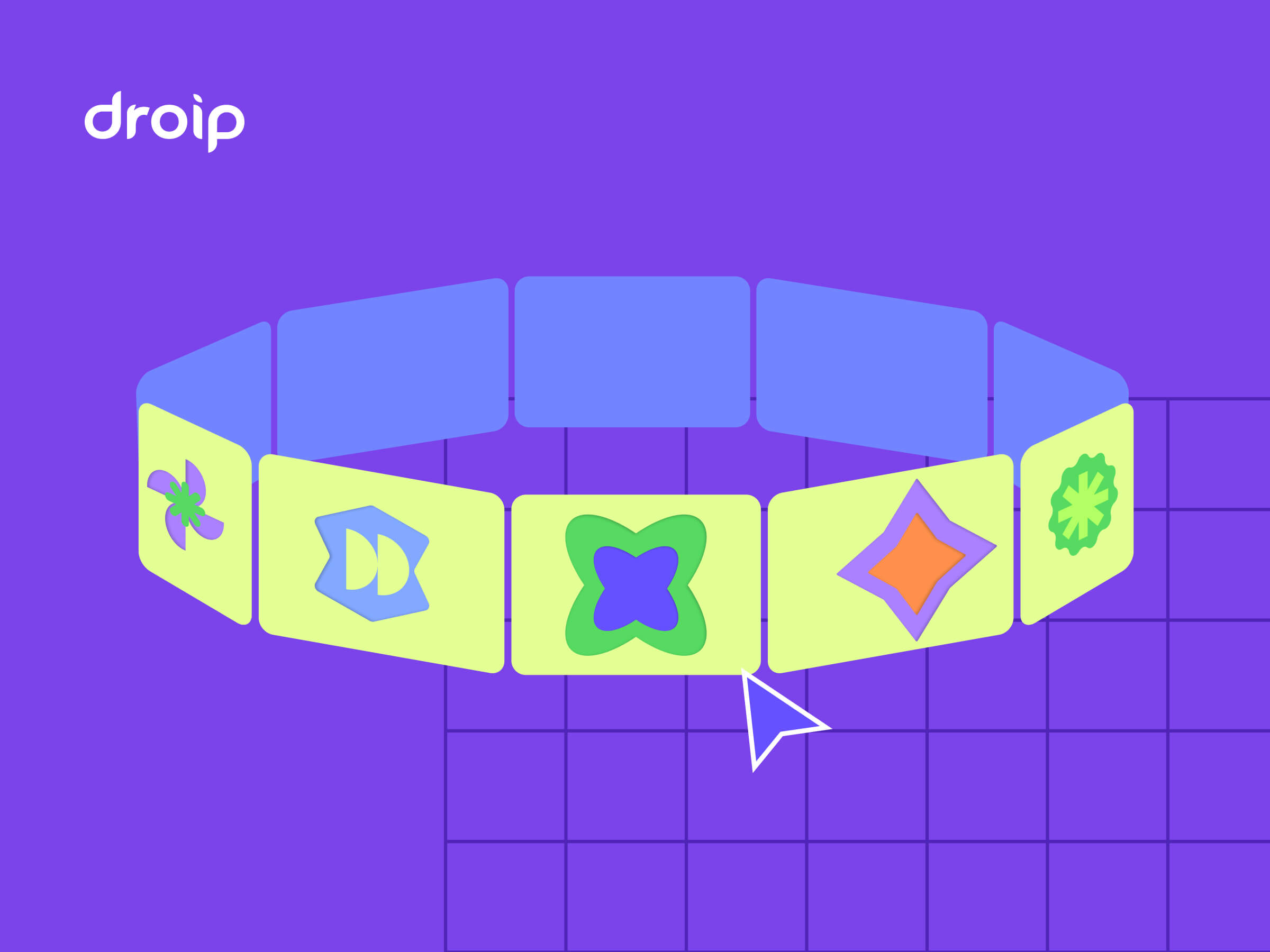
Imagine a hula hoop standing upright in front of you.
Now, place 12 cards evenly around that hoop. As the hoop spins, cards travel around, some face you, some tilt away, and the one at the back hides in perspective.
With Droip’s advanced interactions, you can create this striking 3D effect with just a bit of math.
This is the illusion we’ll create. A dynamic 3D ring of cards with Droip’s advanced transform and animation tools. See it live and get a feel for what you’ll be building.
You can use this 3D Marquee to showcase portfolios, products, or creative content as an example of the advanced interactions now possible in WordPress with a modern WordPress website builder.
Part 1: Planning The Key Pieces
Before we start creating, let’s plan out what we’ll need to make the 3D circular marquee work:
- Stage (the hoop): A parent element that spins, carrying all the cards.
- Cards (the orbiting items): Each card sits at a fixed angle around the circle.
- Perspective: A visual depth setting that makes near cards appear closer and far ones smaller.
- Tilt: A subtle rotation that gives realism to the motion.
- Animation: The continuous rotation that makes the ring orbit infinitely.
Spacing Cards Around the Circle
We’ll have 12 cards around a 360° ring, meaning each card sits 30° apart. Think of it like clock positions:
- Card 0: 0° (front)
- Card 3: 90° (right side)
- Card 6: 180° (back)
- Card 9: 270° (left side)
Each card will be rotated by its angle and pushed outward to form the circular ring.
The 3D Transforms
Every card uses a combination of transforms to position correctly:
rotateY(angle), moveZ(radius)
Here’s what happens:
- rotateY(angle): turns the card to its position around the circle.
- moveZ(radius): moves it outward from the center onto the ring.
That’s all you need to place the cards evenly in a circle.
Why rotate, then move?
If you move Z first and then rotate Y, the translation happens in the element’s original space; rotating afterward will spin that translated offset around the origin and do something different.
The rotateY(angle) followed by moveZ(radius) means “turn the element to the angle, then push it out along its forward direction,” which places it on the circumference.
Part 2: Building the 3D Circular Marquee in the Droip Visual Editor
Now that you know how the structure works, let’s start building everything visually inside Droip.
Step 1: Create the Wrapper and base layout
- Add a Div and rename it to Wrapper.
- Set Width: 100%, Height: 100vh, and choose a nice background (solid or gradient).
- Inside it, add two children:
- Custom Cursor (Optional)
- Banner (the section that holds our 3D Marquee)
Step 2: Create the custom cursor (Optional)
Next, we’ll add a custom cursor. Totally optional, but it gives your build that extra touch of uniqueness and polish.
- Inside the Wrapper, add a Div and rename it Cursor.
- Size: 32×32px, position it to absolute, top: 0, left: 0, z-index: 100.
- Add a Shape element (your cursor visual) inside the Cursor div. Resize the shape element to 32×32px. You can add your preferred cursor shape by simply replacing the SVG.

- For interactions (making this custom shape act like a cursor): Select the Cursor div and click on interaction:
- Trigger: Scroll into view.
- Animation: Cursor Trail.
- Scope: Viewport.
- Smoothing: 75%.
Now your cursor will smoothly follow your movement in preview mode.
Step 3: Create the Banner (base for marquee)
Inside the Wrapper, add another Div and rename it Banner.
Set up the following properties:
- Width: 100vw
- Height: 100vh
- Position: relative
- Z-index: 1
This Banner will serve as the main stage for your 3D Marquee. Later in the tutorial, we’ll add an interaction here for the click-to-scale zoom effect.
Step 4: Create the Container & 3D Transform wrapper
Now it’s time to set up the structure that will hold and control our 3D elements.
Inside the Banner, add a Div and rename it Container. This will act as the main layout holder for the 3D stage.
Configure the Container:
- Width: 100%
- Max-width: 800px
- Margin: auto (to center it on the page)
- Position: relative
- Z-index: 2
Next, inside the Container, add another Div and rename it 3D Transform. This element will define the 3D space where all your cards will orbit.
Set the following properties:
- Width/Height: 100%
- Position: absolute; top: 0; left: 0
- Z-index: 100
Now, in the Effects > Transform panel:
- Enable Preserve 3D: this ensures all child elements (like your cards) exist in a true 3D environment.
- Set Child Perspective to 9000px: this gives the illusion of depth, where closer objects appear larger and farther ones appear smaller.
- Optionally, apply Scale X/Y: 0.8 if you want to reduce the overall stage size slightly.
In short, this step creates the 3D “space” your rotating cards will live in — like setting up the stage before the show begins.
Step 5: Create the 3D Marquee (Orbit Center)
Now we’ll create the core of the carousel, the rotating stage that all your cards will attach to.
Inside the 3D Transform, add a Div and rename it 3D Marquee. This element acts as the orbit center. When it spins, all the cards will revolve around it.
Set up the 3D Marquee as follows:

- Width: 435px. This will be the size of the card
- Height: auto
- Position: relative
- Enable Preserve 3D (so its child elements, the cards, maintain their depth in 3D space).
- Rotate X: -10° – this slightly tilts the ring backward, giving a more natural perspective when viewed from the front.
- Scale: X: 1, Y: 1
In simple terms: this is your spinning hub. When the animation runs, this element will rotate continuously, carrying all the cards with it to create that smooth, orbiting 3D effect.
Step 6: Create the Card Template (One Card Structure)

Next, we’ll build a single card that will serve as the template. Once complete, we’ll duplicate it 11 more times to complete the ring.
1. Create the Front Card
Inside 3D Marquee, add a Div and rename it Front Card.
Configure it:
- Width/Height: 100% (the final position will be controlled via transforms)
- Border-radius: 20px
- Position: absolute
- Enable Preserve 3D in the transforms panel
Note: This is the element where you’ll later apply rotateY(…) translateZ(orbitZ) to position it around the circle.
2. Add the 3D Container
Inside Front Card, add another Div and rename it to Card-3D. This acts as a 3D wrapper so we can rotate and position the card in space without affecting its internal layout.
Settings:
- Width/Height: 100%
- Position: relative
- Z-index: 3
- Enable Preserve 3D
3. Add the Popup (Visible Front Face)
Inside Card-3D, add a Div and rename it Popup. This holds the main content, the image or design that users interact with.
Settings:
- Width/Height: 100%
- Background: White
- Border-radius: 20px
Inside Popup, add an Image element:
- Width/Height: 100%
- Border-radius: 12px
4. Add the Backface

Inside the Popup, add another Div and rename it Backface.
Settings:
- Padding: 12px
- Width/Height: 100%
- Background: #FEDEFF
- Border-radius: 20px
- Position: absolute; top: 0; left: 0; z-index: 1
Transforms: Rotate Y = 180° (so it appears when the card flips) - Disable showing the real backside by toggling backface-visibility
Now you have a complete single card ready to be duplicated and positioned around the orbit. Each card will inherit the 3D rotation and spacing we’ll set in the next step.
Step 7: Duplicate Cards and Position Them Around the Orbit
Now that we have a single card ready, we’ll create all 12 cards for the carousel and place them evenly around the circular orbit.
Duplicate the Card-Template
- Right-click on your Front Card and select Duplicate. This creates a new card that copies all the styles of the original card.
- Duplicate the class holding the transform styles. This gives the new card its own separate class for rotation/position.
- Do this 11 times so you have Card-1 through Card-12. Rename the cards
💡 Tip: Duplicating the card class is important so each card’s transform is independent.
Set Each Card’s Position with 3D Transforms
For each card, set the Transform fields (Rotate Y + Move Z). Use these exact values:
- Front Card: rotateY(0deg), MoveZ(850px)
- Card 1: rotateY( 30deg), MoveZ(850px)
- Card 2: rotateY( 60deg), MoveZ(850px)
- Card 3: rotateY( 90deg), MoveZ(850px)
- Card 4: rotateY(120deg), MoveZ(850px)
- Card 5: rotateY(150deg), MoveZ(850px)
- Card 6: rotateY(180deg), MoveZ(850px)
- Card 7: rotateY(-150deg), MoveZ(850px)
- Card 8: rotateY(-120deg), MoveZ(850px)
- Card 9: rotateY(-90deg), MoveZ(850px)
- Card 10: rotateY(-60deg), MoveZ(850px)
- Card 11: rotateY(-30deg), MoveZ(850px)
At this point, if Preserve 3D and Perspective are correctly set, you should see a ring of cards in 3D space.
Step 8: Animate the Orbit (Rotate the 3D Marquee)
Now that your cards are all in place, let’s bring the marquee to life by making it spin.
- In the Layers panel, select Page, then go to Interactions and select Page Load.
- Choose the 3D Marquee div as your animation target — this is the parent element that holds all the cards.
- Add a Rotate action and set these values:
- Duration: 30s (or any speed you like)
- X: -10°
- Y: 360°
- Loop: Infinite
Hit Preview, and you’ll see your entire 3D ring smoothly spinning in space — just like a rotating carousel!
💡 Tip: The -10° tilt keeps the spin looking natural and adds depth to the orbit, rather than a flat, top-down rotation.
Step 9: Add Click-to-Scale Interaction on the Banner (Zoom Toggle)
Let’s make your 3D Marquee more fun to play with by adding a click-to-zoom effect, so users can zoom in and out of the carousel with a single click.
- Select the Banner. This is the background container holding your 3D Marquee.
- Go to Interactions and create a new one with:
- Trigger: Mouse Click (Tap)
- Target: 3D Transform
The Banner acts as the clickable area. When you click it, the animation targets the 3D Transform div (which contains everything inside the 3D scene).
Now we’ll set up a two-step toggle animation:
Step 1: First Click

Create two responses and name them:
We’re creating both Zoom In/Out and Zoom In/Out (Tab) because desktop and tablet screens behave differently. A zoom value that looks perfect on a wide desktop might push the 3D ring out of view or look oversized on a smaller tablet screen.
So by having two versions, Droip automatically applies the right animation depending on the device, keeping the zoom effect centered and balanced across all viewports.
Zoom In:
- Scale X: 2, Y: 2
- Move Y: -250
Zoom In (Tab):
- Scale X: 1, Y: 1
- Move Y: 0
Step 2: Second Click (Zoom Out)

Duplicate the first set and rename them:
Zoom Out:
- Scale X: 0.8, Y: 0.8
- Move Y: 0
Zoom Out (Tab):
- Scale X: 0.4, Y: 0.4
- Move Y: 0
Now, when you click anywhere on the Banner, the whole 3D scene smoothly zooms in and out, making it feel alive and responsive.
💡 Tip: Adjust the scale and movement values to find your perfect zoom balance for desktop and tablet views.
Final Preview
That’s it! You’ve just built a fully interactive 3D circular marquee inside Droip with no code, no plugins.
It might seem like a lot at first, but once you get the hang of it, you’ll realize how much power Droip gives you.
With this modern WordPress website builder, almost any advanced web interactions are now possible in WordPress, all visually.