Codrops’ “design” has been long overdue for a refresh. I’ve had ideas for a new look floating around for ages, but actually making time to bring them to life has been tough. It’s the classic shoemaker’s shoes problem: I spend my days answering emails, editing articles and (mostly) managing Codrops and the amazing contributions from the community, while the site itself quietly gathers dust 😂
Still, the thought of reimagining Codrops has been sitting in the back of my mind. I’d already been eyeing Anima as a tool that could make the process faster, so I reached out to their team. They were kind enough to support us with this review (thank you so much!) and it’s a true win-win: I get to finally test my idea for Codrops, and you get a good look at how the tool holds up in practice 🤜🤛
So, Anima is a platform made to bridge the gap between design and development. It allows you to take an existing website, either one of your own projects or something live on the web, and bring it into a workspace where the layout and elements can be inspected, edited, and reworked. From there, you can export the result as clean, production-ready code in React, HTML/CSS, or Tailwind. In practice, this means you can quickly prototype new directions, remix existing layouts, or test ideas without starting completely from scratch.
Obviously, you should not use this to copy other people’s work, but rather to prototype your own ideas and remix your projects!
Let me take you along on a little experiment I ran with it.
Getting started
Anima Link to Code was introduced in July this year and promises to take any design or web page and transform it into live editable code. You can generate, preview, and export production ready code in React, TypeScript, Tailwind CSS, or plain HTML and CSS. That means you can start with a familiar environment, test an idea, and immediately see how it holds up in real code rather than staying stuck in the design stage. It also means you can poke around, break things, and try different directions without manually rebuilding the scaffolding each time. That kind of speed is what usually makes or breaks whether I stick with an experiment or abandon it halfway through.
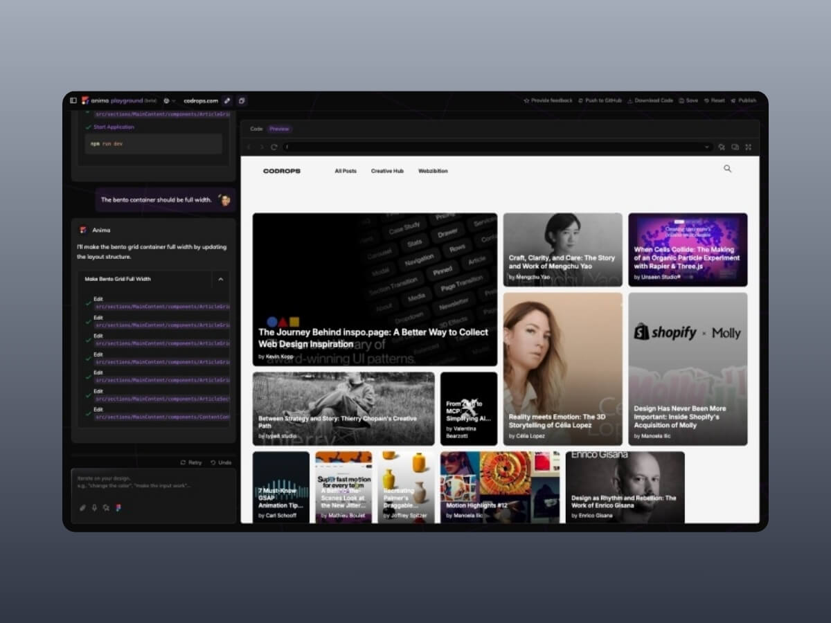
To begin, I decided to use the Codrops homepage as my guinea pig. I have always wondered how it would feel reimagined as a bento style grid. Normally, if I wanted to try that, I would either spend hours rewriting markup and CSS by hand or rely on an AI prompt that would often spiral into unrelated layouts and syntax errors. It would be already a great help if I could envision my idea and play with it bit!
After pasting in the Codrops URL, this is what came out. A React project was generated in seconds.
The first impression was surprisingly positive. The homepage looked recognizable and the layout did not completely collapse. Yes, there was a small glitch where the Webzibition box background was not sized correctly, but overall it was close enough that I felt comfortable moving on. That is already more than I can say for many auto generation tools where the output is so mangled that you do not even know where to start.
Experimenting with a bento grid
Now for the fun part. I typed a simple prompt that said, “Make a bento grid of all these items.” Almost immediately I hit an error. My usual instinct in this situation is to give up since vibe coding often collapses the moment an error shows up, and then it becomes a spiral of debugging someone else’s half generated mess. But let’s try this instead of quitting right away 🙂 The fix worked and I got a quirky but functioning bento grid layout:
The result was not exactly what I had in mind. Some elements felt off balance and the spacing was not ideal. Still, I had something on screen to iterate on, which is already a win compared to starting from scratch. So I pushed further. Could I bring the Creative Hub and Webzibition modules into this grid? A natural language prompt like “Place the Creative Hub box into the bento style container of the articles” felt like a good test.
And yes, it actually worked. The Creative Hub box slipped into the grid container:
The layout was starting to look cramped, so I tried another prompt. I asked Anima to also move the Webzibition box into the same container and to make it span full width. The generation was quick with barely a pause, and suddenly the page turns into this:
This really showed me what it’s good at: iteration is fast. You don’t have to stop, rethink the grid, or rewrite CSS by hand. You just throw an idea in, see what comes back, and keep moving. It feels more like sketching in a notebook than carefully planning a layout. For prototyping, that rhythm is exactly what I want. Really into this type of layout for Codrops!
Looking under the hood
Visuals are only half the story. The bigger question is what kind of code Anima actually produces. I opened the generated React and Tailwind output, fully expecting a sea of meaningless divs and tangled class names.
To my surprise, the code was clean. Semantic elements were present, the structure was logical, and everything was just readable. There was no obvious divitis, and the markup did not feel like something I would want to burn and rewrite from scratch. It even got me thinking about how much simpler maintaining Codrops might be if it were a lean React app with Tailwind instead of living inside the layers of WordPress 😂
There is also a Chrome extension called Web to Code, which lets you capture any page you are browsing and instantly get editable code. With this it’s easy to capture and generate inner pages like dashboards, login screens, or even private areas of a site you are working on could be pulled into a sandbox and played with directly.
Pros and cons
Pros: Fast iteration, surprisingly clean code, easy setup, beginner-friendly, genuinely fun to experiment with.
Cons: Occasional glitches, exported code still needs cleanup, limited customization, not fully production-ready.
Final thoughts
Anima is not magic and it is not perfect. It will not replace deliberate coding, and it should not. But as a tool for quick prototyping, remixing existing designs, or exploring how a site might feel with a new structure, it is genuinely fun and surprisingly capable. The real highlight for me is the speed of iteration: you try an idea, see the result instantly, and either refine it or move on. That rhythm is addictive for creative developers who like to sketch in code rather than commit to heavy rebuilds from scratch.
Verdict: Anima shines as a playground for experimentation and learning. If you’re a designer or developer who enjoys fast iteration, you’ll likely find it inspiring. If you need production-ready results for client work, you’ll still want to polish the output or stick with more mature frameworks. But for curiosity, prototyping, and a spark of creative joy, Anima is worth your time and you might be surprised at how much fun it is to remix the web this way.
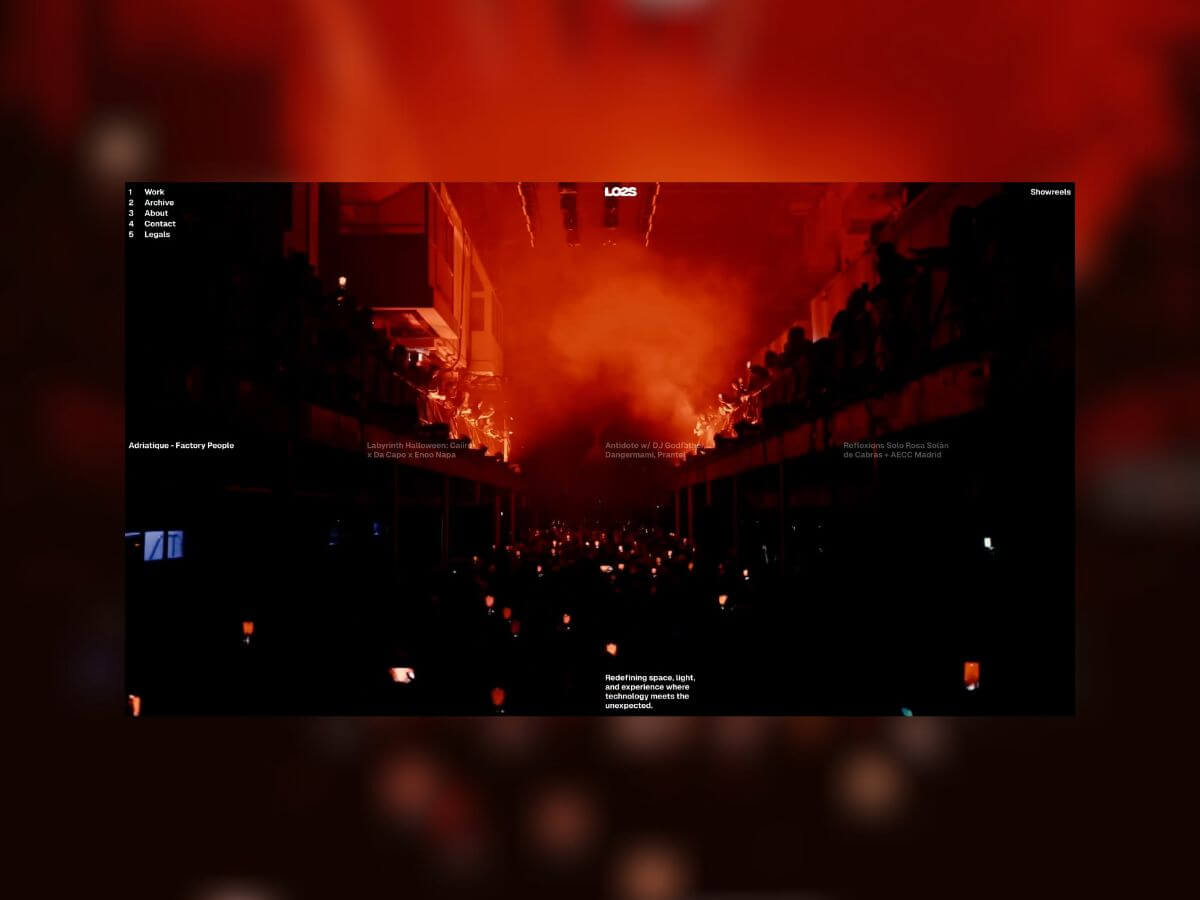
LO2S approached SNP & DashDigital with the ambition to build a website that didn’t just present their services but embodied their fast-paced, movement-driven ethos. They wanted users to feel the energy of their work as they navigated the site. For us, this meant leaning into full-screen video, fluid transitions, and interactive motion as core building blocks. The challenge wasn’t just visual polish, it was making sure these elements stayed performant and seamless under the hood.
Technologies and Tools
We built the site on a fairly standard stack — Next.js (Page Router), GSAP, Strapi, AWS, CloudFront, with one key addition: OGL.
Why OGL?
It’s lightweight compared to three.js.
It gives maximum rendering control.
It’s ideal when you don’t need heavy model support (GLTF/OBJ/FBX).
This was our first time implementing OGL in production. The LO2S site didn’t need complex 3D assets, so OGL was a natural choice for performant, interactive visuals without extra overhead.
Key Features
Immersive Landing Experience A full-screen video serves as the entry point, with a four-grid hover navigation exposing featured projects. This setup made it simple for users to dive directly into the work while keeping the landing visually impactful.
Dual Work Views The Work page offers two ways to explore:
A list view for quick navigation.
A dynamic card layout, where projects animate forward and off-screen. It creates a browsing rhythm that feels closer to a cinematic sequence than a typical index page.
Infinite 3D Gallery with Blur We implemented an infinite gallery using transform3d and vanilla JS instead of WebGL. This kept the build light, while still supporting background blur. Blur often raises performance red flags, but careful optimisation keeps the effect stable across devices.
Interactive Logo Shader We built a custom shader (inspired by Studio 27b) to make the logo feel aligned to the brand essence. On hover, characters shift and blend, creating a sense of connection reminiscent of light patterns at live events.
Technical Refinement Our first text distortion tests looked jagged. We solved this with a custom aastep function for programmatic antialiasing. It analyses texture gradients and smooths pixel transitions, ensuring the typography scales cleanly and looks sharp even under distortion.
Visual & Interactive Elements
Some of the smaller but critical pieces that shaped the experience:
Page transitions tied to the logo for continuity.
Distortion shader applied to text for responsive motion.
Dynamic content modules that adapt layouts in real time.
Animated preloader to set the tone from first load.
Architecture and Structure
Fast content delivery was a non-negotiable requirement. We tackled it in two ways:
CDN Delivery: Media is served via AWS CloudFront, with Strapi configured to push assets to an S3 bucket automatically.
Video optimisation: We provided the client with bash ffmpeg scripts to batch-optimise video files, balancing quality with load speed.
Reflection & Learnings
Every build is an opportunity to refine our process and build strategy. For LO2S, we initially relied on Strapi’s Sharp integration for image cropping, which raised two pain points:
Uploading raw 4K images slowed the pipeline and occasionally failed.
Sharp auto-generated multiple image sizes, many of which were unnecessary.
After the project, we tested imgproxy and found it better suited to our needs:
Works seamlessly with CDNs and caching.
Isolates processing from the main app.
Lets you configure image formats per use case.
Delivered 620+ requests/sec with ~12.8ms latency in benchmarks.
For us, that’s the direction forward, a cleaner, faster, and more reliable image workflow.
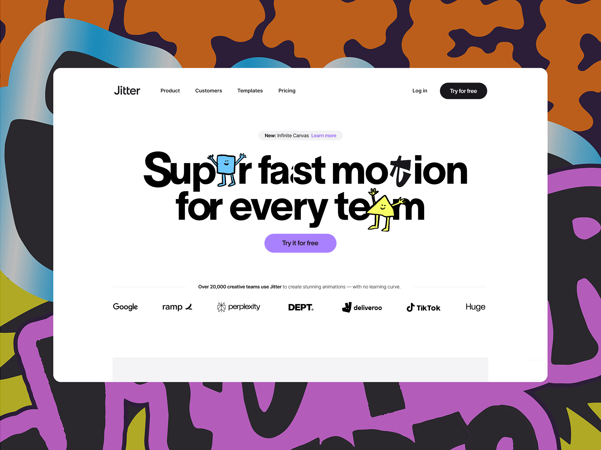
If Jitter isn’t on your radar yet, it’s a motion design tool for creative teams that makes creating animated content, from social media assets and ads to product animations and interface mockups, easy and fun.
Think of it as Figma meets After Effects: intuitive, collaborative, and built for designers who want to bring motion into their workflows without the steep learning curve of traditional tools.
Why We Redesigned Our Website
Our previous site had served us well, but it also remained mostly unchanged since we launched Jitter nearly two years ago. The old website focused heavily on the product’s features, but didn’t really communicate its value and use cases. In 2025, we decided it was time for a full refresh.
The main goal? Not just to highlight what Jitter does, but articulate why it changes the game for motion design.
We’ve had hundreds of conversations with creative professionals, from freelancers and brand designers to agencies and startups, and heard four key benefits mentioned consistently:
Ease of use
Creativity
Speed
Collaboration
These became the pillars of the new site experience.
We also wanted to make room for growth: a more cohesive brand, better storytelling, real-world customer examples, and educational content to help teams get the most out of Jitter.
Another major shift was in our audience. The first version of the website was speaking to every designer, highlighting simplicity and familiarity. But as the product evolved, it became clear that Jitter shines the most when used collaboratively across teams. The new website reflects that focus.
Shaping Our Positioning
We didn’t define our “how, what, and why” in isolation. Throughout 2024, we spoke to dozens of creative teams, studios, and design leaders, and listened closely.
We used this ongoing feedback to shape the way we talk about Jitter ourselves: which problems it solves, where it fits in the design workflow, and why teams love it. The new website is a direct result of that research.
At the same time, we didn’t want Jitter to feel too serious or corporate. Even though it’s built for teams, we aimed to keep the brand light, fun, and relatable. Motion design should be exciting, not intimidating, and we wanted that to come through in the way Jitter sounds and feels.
Designing With Jitter
We also walked the talk, using Jitter to design all animations and prototype every interaction across the new site.
From menu transitions to the way cards animate on scroll, all micro-interactions were designed in Jitter. It gave us speed, clarity, and a single source of truth, and eliminated a lot of the back-and-forth in the handoff process.
Our development partners at Antinomy Studio and Ingamana used Jitter too. They prototyped transitions and UI motion directly in the tool to validate ideas and communicate back to our team. It was great to see developers using motion as a shared language, not a handoff artifact.
Building Together with Antinomy Studio
The development of the new site was handled in collaboration with the talented team at Antinomy Studio.
The biggest technical challenge was the large horizontal scroll experience on the homepage. It needed to feel natural, responsive, and smooth across devices, and maintain high performance without compromising on the visuals.
The site was built using React and GSAP for complex, timeline-based animations and transitions.
“The large horizontal scroll was particularly complicated and required significant responsive changes. Instead of defining overly complex timelines where screen width values would change the logic of the animation in JavaScript, we used progress values as CSS variables. This allowed us to use calc() functions to translate and scale elements, while the GSAP timeline only updates values from 0 to 1. So easy to understand and maintain!”
— Baptiste Briel, Antinomy
We’ve promoted the use of CSS as much as possible for high performances hover effects and transitions. We’ve even used the new linear() easing functions to bring a bouncy feeling to our CSS animations.
There’s a great tool created by Jake Archibald on generating spring-like CSS easing functions that you can paste as CSS variables. It’s so much fun to play with, and it’s also something that the Jitter team has implemented in their software, so it was super easy to review and tweak for both design and engineering teams.
Jitter animations were exported as Lottie files and integrated directly, making the experience dynamic and lightweight. It’s a modern stack that supports our need for speed and flexibility, both in the frontend and behind the scenes.
— Baptiste Briel, Antinomy
What We Learned
This redesign taught us a few valuable lessons:
Start with benefits, not features. Users don’t care what your product does until they understand how it can help them.
Design with your real audience in mind. Jitter for solo designers and Jitter for teams are two different stories. Clarifying our audience helped us craft a stronger, clearer narrative.
Prototyping with Jitter helped us move faster, iterate more confidently, and keep design and development in sync.
We’ve already seen an impact: a sharper brand perception, higher engagement and conversion across all pages, and a new wave of qualified inbound leads from the best brands in the world, including Microsoft, Dropbox, Anthropic, Lyft, Workday, United Airlines, and more. And this is just the beginning.
What’s Next?
We see our new website as a constantly evolving platform. In the coming months, we’ll be adding more:
Case studies and customer stories
Use case pages
Learning resources and motion design tutorials
Playful experiments and interactive demos
Our mission remains the same: to make motion design accessible, collaborative, and fun. Our website is now better equipped to carry that message forward.
Let us know what you think, and if there’s anything you’d love to see next.
Thanks for reading, and stay in motion 🚀
Give Jitter a Try
Get started with Jitter for free and explore 300+ free templates to jumpstart your next project. Once you’re ready to upgrade, get 25% off the first year of paid annual plans with JITTERCODROPS25.
Reform Collective is a digital-first, full-service design and development agency. We’ve been partnering with clients of all sizes for 11 years and going strong! We work with ambitious teams building interesting things. If it doesn’t clash with our ethics and you respect our time, we’re in.
Design
Our previous site was no longer working for us. It didn’t reflect the kind of work we were doing, and more importantly, it created friction. The navigation was convoluted, the structure too deep, and the visual style didn’t align with what we were showing clients in proposals or conversations. We’d share a project we were proud of, and when people landed on the site, they either got confused trying to find it or lost interest navigating a dated UX. It was time to move on.
The redesign was a reset. We stripped the site down to the essentials. Clean layout. Wide spacing. Minimal structure. The goal was to create something that felt open, confident, and easy to move through. We wanted the experience to reflect how we approach client work: intentional, clear, and results-focused — all while telling a strong story.
We also made a conscious decision to pull back on animation. While we still use motion to support interaction, we didn’t want it to take over the experience. Performance and clarity came first.
Sharing Our Work
One of the most deliberate changes we made was how we present our work. Traditional case studies are saturated with summaries, timelines, and process write-ups. We realized that’s not how people consume portfolio content anymore. They don’t read. They scroll. They skim. They decide quickly if you’re worth their time.
So we stopped writing to be read and started designing to be seen.
We removed all the fluff: no intro copy, no strategy breakdowns, no “here’s what we learned.” Just clean visuals, concise project titles, and frictionless browsing. If the work can’t speak for itself, it probably isn’t strong enough to be featured.
This shift wasn’t just aesthetic. It was a strategic choice. We wanted to reduce noise and let the quality of the output stand on its own. The site isn’t there to sell. It’s there to show. And showing means getting people to the work faster, without distractions.
The end result is a portfolio that feels fast, direct, and unapologetically visual. No click tunnels. No over-explaining. Just a clear runway to the work.
The Navigation
We designed the global menu to feel structural. Instead of floating over the site or fading in as a layer, it pushes the entire layout downward, physically moving the page to make room. It’s a deliberate gesture. Spatial, not just visual.
The motion is clean and architectural: a full-width panel slides down from the top, snapping into place with precision. There’s no blur, no parallax, no visual fluff. Just sharp contrast, bold typography, and three primary paths: Our Work, About Us, and Reform Nova. These are anchored by lean sub-labels and a strong call to action.
This isn’t a nav trying to show off. It’s built to orient you quickly, frame the experience, and get out of the way. The choice to displace the page content rather than obscure it reinforces how we think about experience design: create clarity by introducing hierarchy, not noise.
It feels tactile. It feels intentional. And it reflects how we build: structural logic, tight motion, and a clear sense of priority.
The Nerdy Tech Details from Our Lead Engineer
Webby Award Section
I started with an AI prototype in v0 for the wavy lines background. v0 is surprisingly good at interpreting vague instructions. I can literally tell it “make it goopier” and it will spit out code that makes things feel goopier. I ended up with a pretty snazzy prototype. Because it used react-three-fiber, I could basically copy-paste it directly into our code, install dependencies, and be 80% done! Much faster and more interesting than setting up a Three.js scene by hand, in my opinion.
I will say this workflow has its quirks, though. The AI is great at the initial vibe check, but it chokes on specific feedback. It’s pretty hard to describe visual bugs in text, and since the model can’t see the output, it’s basically guessing most of the time. I also noticed it tends to “over-edit,” sometimes refactoring an entire component for a tiny change. I ended up fixing several bugs myself because v0 just couldn’t handle them.
The next part was the mouse follower. I wanted a video that follows the cursor, appearing over the wavy background but under the header text. As it passes behind the text, the text’s color inverts so it remains visible.
The “following the mouse” part was easy! The inversion effect was a bit trickier. My first thought was to use mix-blend-mode paired with backdrop-filter. It seemed like a great idea and should have worked perfectly—or at least, that’s what I’d say if it actually had. I ended up trying all kinds of random approaches to find something that worked across every browser. Major upside: I got to justify all my monitors by putting a different browser on each while coding.
The breakthrough came when I stopped trying to make one element do everything. I split the effect into two perfectly synchronized divs:
The<Inverter>: A ghost div with no content. Its only job is to carry the backdrop-filter: invert(1) that flips the text color.
The<Video>: This holds the actual video. It’s placed in a lower stacking context using z-index: -1, so it slides beneath the text but stays above the page background.
I used GSAP’s quickTo to animate them both in sync. To the user (that’s YOU), it appears as a single element. It feels like a bit of a hack, but it works flawlessly across all browsers.
Here’s the gist of it:
// animate both refs at the same time so they appear as one element
const moveX = gsap.quickTo([videoRef.current, inverter.current], "x", { /* ... */ });
const moveY = gsap.quickTo([videoRef.current, inverter.current], "y", { /* ... */ });

// in the JSX
<Wrapper>
    {/* other content here, ofc */}
    <Video ref={videoRef} {...video?.data} />
    <Inverter ref={inverter} />
</Wrapper>

// and the styles...
const Video = styled(BackgroundVideo, {
    position: "fixed",
    zIndex: -1, // pushed behind the text
    filter: "invert(1) contrast(0.5)",
    /* ... */
});

const Inverter = styled("div", {
    position: "fixed",
    pointerEvents: "none", // for text selection
    backdropFilter: "invert(1) contrast(2)",
    /* ... */
});
The styles here use https://www.restyle.dev/, by the way — it’s a runtime-only CSS library (i.e., no bundler config required), which is pretty cool.
Nova Blocks Section
This feature is a scroll-driven animation where a grid of 3D blocks zooms past the camera. The fun part is that it’s all done with pure CSS transforms—no WebGL or threejs needed.
The setup involves a container with perspective and a bunch of “block” divs, each using transform-style: preserve-3d. Each block contains several child divs rotated into place to form a cube. For performance, I only animate the parent block’s transform, which is more efficient than moving hundreds of individual faces. I used the MDN demo cube for inspiration on this one.
Of course, doing this led me straight into the weird world of browser bugs. (I seem to end up there a lot…)
1. Safari’s Rendering Glitch:
Safari was z-fighting like crazy. It would randomly render faces that should have been occluded by an adjacent cube, which looked terrible. See web-bugs/issues/155416. The fix ended up being twofold:
Manual Culling: As an optimization, I was already rendering only the faces that would be visible based on the cube’s grid quadrant. This is basically manual back-face culling, which helped reduce the number of layers Safari had to compute. It probably improves performance anyway, so… thanks, Safari, I guess.
Forced Stacking: I’m assigning each cube a specific z-index based on its row and column. It feels a bit brute-force, but it tells Safari exactly how to stack things—and it completely eliminated the flicker.
Here’s the gist of the Block.tsx component:
export default function Block({
  vertical,
  horizontal,
  row,
  column,
}: {
  // vertical/horizontal basically represents the 'quadrant' on-screen
  vertical: "top" | "bottom";
  horizontal: "left" | "right";
  row: number;
  column: number;
}) {
  // Explicitly set z-index based on grid position to prevent z-fighting in Safari
  // This was basically trial and error to figure out
  const style =
    vertical === "top" && horizontal === "left"
      ? { zIndex: -row - column }
      : vertical === "bottom" && horizontal === "right"
        ? { zIndex: -1 }
        : horizontal === "left"
          ? { zIndex: -column }
          : { zIndex: -row };

  // Conditionally render only the necessary faces
  return (

      {horizontal === "left" && }
      {horizontal === "right" && }
      {vertical === "top" && }
      {vertical === "bottom" && }

  );
}

const Wrapper = styled("div", {
  transformStyle: "preserve-3d", // the magic property for the cube
  /* ... */
});
2. Firefox’s Pinning Problem
Our site uses CSS Subgrid for global alignment, which is awesome in my opinion because it narrows the gap between design and development. If something in the design is aligned to the grid, it can now be literally aligned to the grid in the code too.
Caveat: I found that in Firefox, position: sticky was completely broken inside a subgrid container. A pinned element would start pinning but never unpin, because its positioning context was being resolved to the wrong grid container.
After I isolated it in a CodePen and reported the bug (web-bugs/issues/152027), the fix was simply to remove subgrid from the sticky element’s parent and apply the grid styles directly.
Running into weird bugs is frustrating, but it’s part of the deal when you’re building cool things. You just have to plan for it in your timeline. And if you find a bug in some strange edge case, I’m a big advocate for taking the time to create a minimal test case and report it. It helps pinpoint exactly what’s going wrong, which leads to a better solution—and it helps make the web better for everyone.
Thanks for reading!
Ready to build something with us? We’re always looking for great companies and individuals to partner with on new projects. Get started →
The Reform Co. Team
P.S. We’re also hiring, feel free to check out our careers page. ❤️
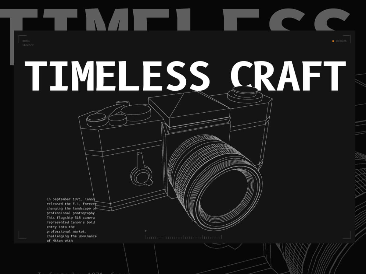
This project primarily serves as a technical demo and learning material. It began when I decided to start learning Blender. I followed a few tutorials, then decided to do a small project using it—so I chose to create the Canon F-1 camera!
After that, I decided to export the project to Three.js to add some cool post-processing shader effects. I wanted to create a sketch effect similar to what I had seen in some repair guides.
After spending a few hours experimenting with it, I decided to integrate it into a fully functional website featuring some cool shaders and 3D effects!
In this article, I’m going to walk through some of the key features of the site and provide a technical breakdown, assuming you already have a basic or beginner-level understanding of Three.js and shaders.
1. The Edge Detection Shader
Three.js includes a built-in edge detection shader called SobelOperatorShader. Basically, it detects edges based on color contrast—it draws a line between two areas with a strong enough difference in color.
To make my effect work the way I want, I need to assign a unique color to each area I want to highlight on my model. This way, Three.js will draw a line around those areas.
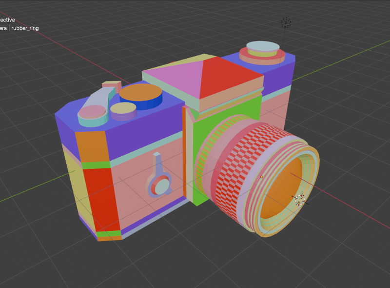
Here’s my model with all the materials applied:
This way, Three.js can accurately detect each area I want to highlight!
As you can see, the lines are not all the same intensity—some are white, while others are light gray. This is because, by default, line intensity depends on contrast: edges with lower contrast appear with lighter lines. To fix this, I manually modified the post-processing shader to make all lines fully white, regardless of contrast.
What I’m doing here is moving all the edge detection logic into the Sobel function. Then, I pass the tDiffuse texture—which is the composer’s render—to this function.
This way, I can modify the output of the edge detection shader before passing it back to the composer:
float G = sobel(t,texel);
G= G > 0.001 ? 1. : 0.;
G represents the intensity of the edge detection. It’s a single value because the lines are monochrome. G ranges from 0 to 1, where 0 means full black (no edge detected) and 1 means full white (strong contrast detected).
As mentioned earlier, this value depends on the contrast. What I’m doing in the second line is forcing G to be 1 if it’s above a certain threshold (I chose 0.001, but you could pick a smaller value if you want).
This way I can get all the edges to have the same intensity.
Here’s how I’m applying the custom fragment shader to the Sobel Operator shader pass:
Next, let’s take a look at the lens parts section.
This is mainly achieved using a Three.js utility called RenderTarget.
A render target is a buffer where the GPU draws pixels for a scene being rendered off-screen. It’s commonly used in effects like post-processing, where the rendered image is processed before being displayed on the screen.
Basically, this allows me to render my scene twice per frame: once with only the highlighted mesh, and once without it.
In the onSelectMesh method, I set the value of this.selectedMeshName to the name of the mesh group that contains the target mesh from the Raycaster (I’m using names to refer to groups of meshes).
This way, in my render loop, I can create two distinct renders:
One render (renderTargetA) with all the meshes except the hovered mesh
Another render (renderTargetB) with only the hovered mesh
As you can see, I’m sending both renders as texture uniforms to the effectSobel shader. The post-processing shader then “merges” these two renders into a single output.
At this point, we have two renders of the scene, and the post-processing shader needs to decide which one to display. Initially, I thought of simply combining them by adding the two textures together, but that didn’t produce the correct result:
What I needed was a way to hide the pixels of one render when they are “covered” by pixels from another render.
To achieve this, I used the distance of each vertex from the camera. This meant I had to go through all the meshes in the model and modify their materials. However, since the mesh colors are important for the edge detection effect, I couldn’t change their colors.
Instead, I used the alpha channel of each individual vertex to set the distance from the camera.
First, the luminance function is a built-in Three.js shader utility imported from the <common> module. It’s recommended to use this function with the Sobel effect to improve edge detection results.
The uColor value represents the initial color of the mesh.
The dist value calculates the distance between the vertex position (passed from the vertex shader via a varying) and the camera, using the built-in cameraPosition variable in Three.js shaders.
Finally, I pass this distance through the alpha channel. Since the alpha value can’t exceed 1, I use a normalized version of the distance.
And here is the updated logic for the postprocessing shader:
Now that the alpha channel of the textures contains the distance to the camera, I can simply compare them and display the render that have the closer vertices to the camera.
3. The Film Roll Effect
Next is this film roll component that moves and twist on scroll.
This effect is achieved using only shaders, the component is a single plane component with a shader material.
All the data is sent to the shader through uniforms:
export default class Film {
  constructor() {
    //...code
  }

  createGeometry() {
    this.geometry = new THREE.PlaneGeometry(
      60,
      2,
      100,
      10
    )
  }

  createMaterial() {
    this.material = new THREE.ShaderMaterial({
      vertexShader,
      fragmentShader,
      side: THREE.DoubleSide,
      transparent: true,
      depthWrite: false,
      blending: THREE.CustomBlending,
      blendEquation: THREE.MaxEquation,
      blendSrc: THREE.SrcAlphaFactor,
      blendDst: THREE.OneMinusSrcAlphaFactor,
      uniforms: {
        uPlaneWidth: new THREE.Uniform(this.geometry.parameters.width),
        uRadius: new THREE.Uniform(2),
        uXZfreq: new THREE.Uniform(3.525),
        uYfreq: new THREE.Uniform(2.155),
        uOffset: new THREE.Uniform(0),
        uAlphaMap: new THREE.Uniform(
          window.preloader.loadTexture(
            "./alpha-map.jpg",
            "film-alpha-map",
            (texture) => {
              texture.wrapS = THREE.RepeatWrapping
              const { width, height } = texture.image
              this.material.uniforms.uAlphaMapResolution.value =
                new THREE.Vector2(width, height)
            }
          )
        ),
        //uImages: new THREE.Uniform(new THREE.Vector4()),
        uImages: new THREE.Uniform(
          window.preloader.loadTexture(
            "/film-texture.png",
            "film-image-texture",
            (tex) => {
              tex.wrapS = THREE.RepeatWrapping
            }
          )
        ),
        uRepeatFactor: new THREE.Uniform(this.repeatFactor),
        uImagesCount: new THREE.Uniform(this.images.length * this.repeatFactor),
        uAlphaMapResolution: new THREE.Uniform(new THREE.Vector2()),
        uFilmColor: new THREE.Uniform(window.colors.orange1),
      },
    })
  }

  createMesh() {
    this.mesh = new THREE.Mesh(this.geometry, this.material)
    this.scene.add(this.mesh)
  }
}
The main vertex shader uniforms are:
uRadius is the radius of the cylinder shape
uXZfreq is the frequency of the twists on the (X,Z) plane
uYfreq is a cylinder height factor
uOffset is the vertical offset of the roll when you scroll up and down
As you can see they are used to modify the initial position attribute to give it the shape of a cylinder. the modified position’s X Y and Z factors are using uOffset in their frequency. this uniform is linked to a Scrolltrigger timeline that will give the twist on scroll effect.
That’s it for the most part! Don’t feel frustrated if you don’t understand everything right away—I often got stuck for days on certain parts and didn’t know every technical detail before I started building.
I learned so much from this project, and I hope you’ll find it just as useful!
Thank you for reading, and thanks to Codrops for featuring me again!
Cryptocurrency has exploded in popularity in recent years, with Bitcoin and Ethereum leading the charge. As a result, many businesses have taken notice and are now looking to get involved in the market. One of the first things you need to do is optimize your website for cryptocurrency SEO.
Here are four strategies for doing just that.
1. Build a strong title tag
Your title tag is the first thing people see when they visit your website. Make sure it’s descriptive and keyword rich, so you can rank well for relevant keywords.
2. Optimize your meta data
Metadata is information about your website that search engines use to determine how to display your page in their results pages. Including relevant keywords in your title, description, and h1 tags will help boost your ranking.
3. Add alt tags and images
Adding alt tags and images to your content can help improve click-through rates (CTRs) and SERP visibility. Plus, it can add an extra layer of protection against Googlebot stealing your content.
4. Monitor traffic trends and make adjustments accordingly
Keep track of monthly traffic trends so you can make changes to your website strategy as needed. If you see a drop in traffic, for example, you may need to adjust your SEO tactics accordingly.
What is Cryptocurrency SEO?
Cryptocurrency SEO is an ever-growing field that employs a variety of strategies in order to optimize a website for search engine results. One of the most important aspects of cryptocurrency SEO is creating SEO targeted content that is both informative and engaging, as this will help draw in potential investors and customers.
Here are some pointers for cryptocurrency SEO-optimizing your website:
1. Write Quality Articles:
One of the most important aspects of cryptocurrency SEO is writing quality content that is both informative and engaging. This will help draw in potential investors and customers.
2. Publish Regularly:
It is important to publish regular content on your website in order to keep it top of mind for search engine results.
3. Include keyword rich titles and descriptions:
When writing your content, make sure to include keyword rich titles and descriptions in order to improve your site’s visibility for cryptocurrency SEO purposes.
4. Optimize Images for Ranking:
In order to improve your website’s rankings for cryptocurrency SEO, ensure that all images are optimized for ranking. This includes uploading high-quality images, using alt tags, and adding keywords throughout the image files.
5. Use In-Page SEO Opportunities:
In addition to optimizing images, make sure to take advantage of in-page SEO opportunities such as keyword placement in header tags, meta descriptions, and title tags. However, if you are having trouble on-page optimising your website and want to set your website apart from the rest of your competitors, then Incrementors New Jersey on-page seo services can assist you in website optimization and can raise the ranking of your website in Google.
6. Research Your Competitors:
It is important to research your competitors in order to learn what works best for them and how you can improve upon it. This will help you stay ahead of the competition and attract more investors and customers.
How does cryptocurrency SEO work?
Cryptocurrency SEO is all about getting your website ranked higher in search engine results pages (SERPs) for keywords related to cryptocurrencies. There are a number of strategies you can employ to optimize your website for these keywords, including using keyword research tools and Google AdWords guidelines.
To get started, you’ll need to understand the basics of cryptocurrency SEO: what keywords to target, how to rank for those keywords, and which advertising channels work best. Once you have a good understanding of the basics, it’s time to start optimizing your website.
One of the most important aspects of cryptocurrency SEO is keyword research. You must identify specific keywords that potential cryptocurrency customers are likely to be searching for. To do this, you’ll need to use keyword analysis tools like Google Trends or Moz Pro. Once you have a list of targeted keywords, it’s time to start developing your strategy for ranking for them.
There are a number of ways to rank higher in SERPs for cryptocurrency-related keywords: through organic search results, paid search campaigns, or social media optimization. It’s important to choose the strategy that works best for your website and campaign goals; some methods may be more effective than others depending on your site’s content and audience.
Once you’ve selected a strategy and implemented it on your website, it’s important to monitor results carefully and make adjustments as needed. Cryptocurrency SEO is an ongoing process; constant tweaks are necessary in order to maintain top rankings and maximize ROI.
What are the benefits of cryptocurrency SEO?
Cryptocurrency SEO can be a great way to improve your website’s organic search engine ranking. Many people are interested in cryptocurrencies and may be searching for information about them on Google. Optimizing your website for cryptocurrency SEO can help increase traffic and leads from these searches.
There are many different ways to optimize your website for cryptocurrency SEO, so it’s important to choose the strategy that will work best for you and your website. Some common strategies include using relevant keywords, creating quality content, and optimizing your site for mobile devices.
Using relevant keywords is the most important aspect of cryptocurrency SEO. Make sure to include keywords in the titles of your articles, in the tags used on your posts, and in the name of your website. Try to use keywords that people would actually search for when looking for information about cryptocurrencies.
Quality content is also important when optimizing your website for cryptocurrency SEO. Make sure that all of the content on your site is high-quality and relevant to potential customers. In addition, make sure that all of the images used on your site are properly tagged and optimized for SEO purposes.
Finally, check to see if your website is mobile-friendly. Mobile users tend to be more likely than desktop users to look for information about cryptocurrencies online. If you have a mobile version of your website, make sure that it’s properly designed and optimized for mobile viewing.
How do you identify the best keywords for your website?
There are a few different ways to identify the best keywords for your website.
Use Google AdWords Keyword Planner: This tool will show you how many people are searching for specific keywords and what their competition is. It also allows you to see trends over time, so you can adjust your campaigns accordingly.
Use Google Trends: Search interest in a keyword over time can give you an idea of which keywords are becoming more popular. However, be aware that this data changes frequently, so it’s always worth checking back regularly.
Conduct Your Own Research: Not all keywords will be related to your business, so it’s important to research which ones might be the most relevant to your niche. You can use online tools like SEMrush or Ahrefs to find related keywords and analyze their competition.
While there aren’t surefire tips for finding the best keywords for your website, these three strategies should help you get started.
What other factors should you consider when optimizing your website for cryptocurrency SEO?
There are a few other factors you should consider when optimizing your website for cryptocurrency SEO. First, make sure your site is well-organized and easy to navigate. Make sure all of your content is easily accessible and search engine friendly. Also, make sure all of your site’s links are optimized properly. Finally, make sure your site features an engaging and user-friendly design that will draw in cryptocurrency investors.
Conclusion
Cryptocurrency SEO is a growing field and with good reason – it can help your website rank higher in google search results for specific keywords. However, like any form of marketing, cryptocurrency SEO requires some planning and knowledge in order to be successful. In this article, I’ll outline the basics of cryptocurrency SEO so that you can start optimizing your website today!


