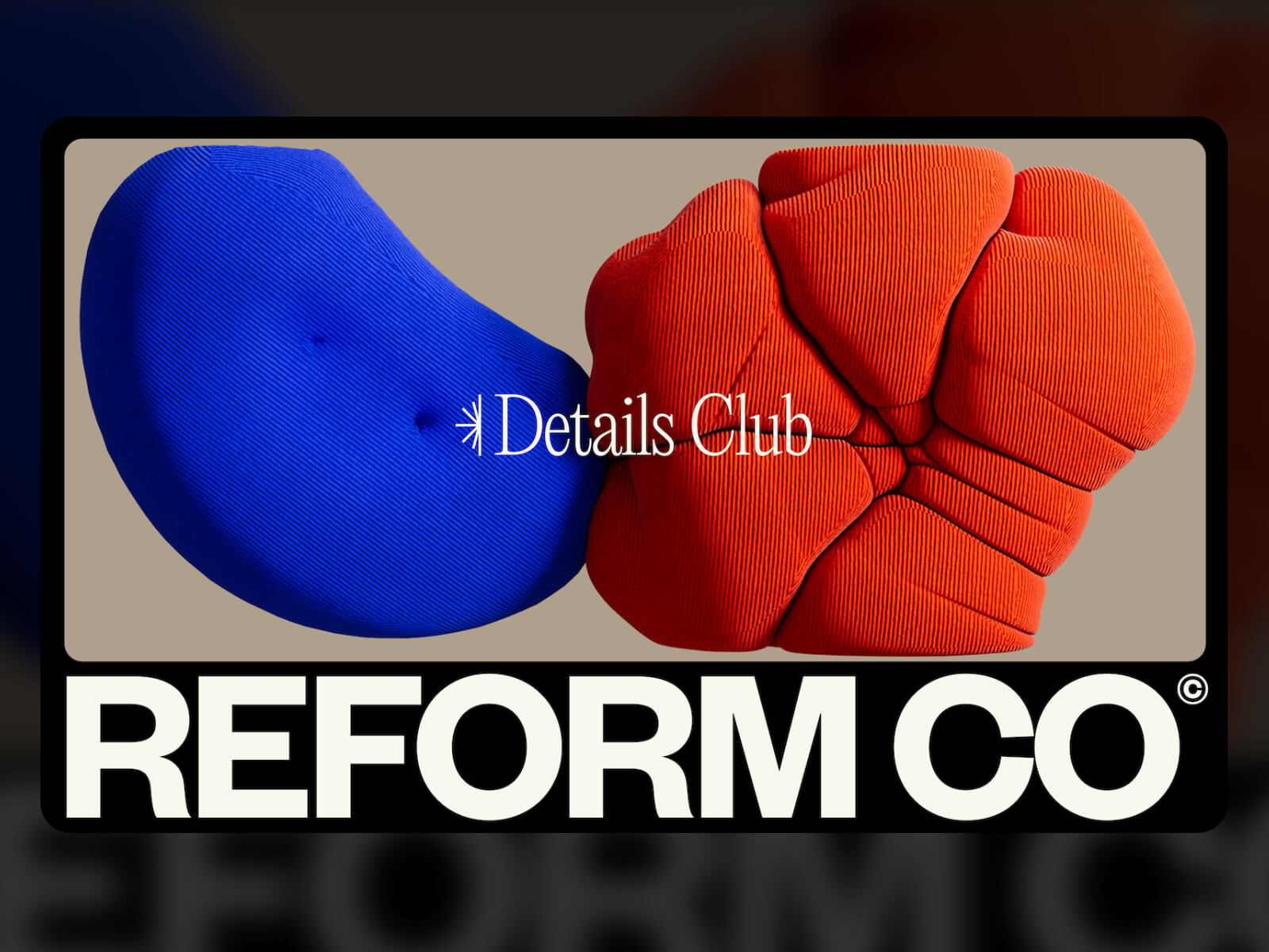

Reform Collective is a digital-first, full-service design and development agency. We’ve been partnering with clients of all sizes for 11 years and going strong! We work with ambitious teams building interesting things. If it doesn’t clash with our ethics and you respect our time, we’re in.
Design
Our previous site was no longer working for us. It didn’t reflect the kind of work we were doing, and more importantly, it created friction. The navigation was convoluted, the structure too deep, and the visual style didn’t align with what we were showing clients in proposals or conversations. We’d share a project we were proud of, and when people landed on the site, they either got confused trying to find it or lost interest navigating a dated UX. It was time to move on.
The redesign was a reset. We stripped the site down to the essentials. Clean layout. Wide spacing. Minimal structure. The goal was to create something that felt open, confident, and easy to move through. We wanted the experience to reflect how we approach client work: intentional, clear, and results-focused — all while telling a strong story.
We also made a conscious decision to pull back on animation. While we still use motion to support interaction, we didn’t want it to take over the experience. Performance and clarity came first.
Sharing Our Work
One of the most deliberate changes we made was how we present our work. Traditional case studies are saturated with summaries, timelines, and process write-ups. We realized that’s not how people consume portfolio content anymore. They don’t read. They scroll. They skim. They decide quickly if you’re worth their time.
So we stopped writing to be read and started designing to be seen.
We removed all the fluff: no intro copy, no strategy breakdowns, no “here’s what we learned.” Just clean visuals, concise project titles, and frictionless browsing. If the work can’t speak for itself, it probably isn’t strong enough to be featured.
This shift wasn’t just aesthetic. It was a strategic choice. We wanted to reduce noise and let the quality of the output stand on its own. The site isn’t there to sell. It’s there to show. And showing means getting people to the work faster, without distractions.
The end result is a portfolio that feels fast, direct, and unapologetically visual. No click tunnels. No over-explaining. Just a clear runway to the work.
The Navigation
We designed the global menu to feel structural. Instead of floating over the site or fading in as a layer, it pushes the entire layout downward, physically moving the page to make room. It’s a deliberate gesture. Spatial, not just visual.
The motion is clean and architectural: a full-width panel slides down from the top, snapping into place with precision. There’s no blur, no parallax, no visual fluff. Just sharp contrast, bold typography, and three primary paths: Our Work, About Us, and Reform Nova. These are anchored by lean sub-labels and a strong call to action.
This isn’t a nav trying to show off. It’s built to orient you quickly, frame the experience, and get out of the way. The choice to displace the page content rather than obscure it reinforces how we think about experience design: create clarity by introducing hierarchy, not noise.
It feels tactile. It feels intentional. And it reflects how we build: structural logic, tight motion, and a clear sense of priority.
The Nerdy Tech Details from Our Lead Engineer
Webby Award Section
I started with an AI prototype in v0 for the wavy lines background. v0 is surprisingly good at interpreting vague instructions. I can literally tell it “make it goopier” and it will spit out code that makes things feel goopier. I ended up with a pretty snazzy prototype. Because it used react-three-fiber, I could basically copy-paste it directly into our code, install dependencies, and be 80% done! Much faster and more interesting than setting up a Three.js scene by hand, in my opinion.
I will say this workflow has its quirks, though. The AI is great at the initial vibe check, but it chokes on specific feedback. It’s pretty hard to describe visual bugs in text, and since the model can’t see the output, it’s basically guessing most of the time. I also noticed it tends to “over-edit,” sometimes refactoring an entire component for a tiny change. I ended up fixing several bugs myself because v0 just couldn’t handle them.
The next part was the mouse follower. I wanted a video that follows the cursor, appearing over the wavy background but under the header text. As it passes behind the text, the text’s color inverts so it remains visible.
The “following the mouse” part was easy! The inversion effect was a bit trickier. My first thought was to use mix-blend-mode paired with backdrop-filter. It seemed like a great idea and should have worked perfectly—or at least, that’s what I’d say if it actually had. I ended up trying all kinds of random approaches to find something that worked across every browser. Major upside: I got to justify all my monitors by putting a different browser on each while coding.
The breakthrough came when I stopped trying to make one element do everything. I split the effect into two perfectly synchronized divs:
- The
<Inverter>: A ghost div with no content. Its only job is to carry thebackdrop-filter: invert(1)that flips the text color. - The
<Video>: This holds the actual video. It’s placed in a lower stacking context usingz-index: -1, so it slides beneath the text but stays above the page background.
I used GSAP’s quickTo to animate them both in sync. To the user (that’s YOU), it appears as a single element. It feels like a bit of a hack, but it works flawlessly across all browsers.
Here’s the gist of it:
// animate both refs at the same time so they appear as one element
const moveX = gsap.quickTo([videoRef.current, inverter.current], "x", { /* ... */ });
const moveY = gsap.quickTo([videoRef.current, inverter.current], "y", { /* ... */ });

// in the JSX
<Wrapper>
    {/* other content here, ofc */}
    <Video ref={videoRef} {...video?.data} />
    <Inverter ref={inverter} />
</Wrapper>

// and the styles...
const Video = styled(BackgroundVideo, {
    position: "fixed",
    zIndex: -1, // pushed behind the text
    filter: "invert(1) contrast(0.5)",
    /* ... */
});

const Inverter = styled("div", {
    position: "fixed",
    pointerEvents: "none", // for text selection
    backdropFilter: "invert(1) contrast(2)",
    /* ... */
});
The styles here use https://www.restyle.dev/, by the way — it’s a runtime-only CSS library (i.e., no bundler config required), which is pretty cool.
Nova Blocks Section
This feature is a scroll-driven animation where a grid of 3D blocks zooms past the camera. The fun part is that it’s all done with pure CSS transforms—no WebGL or threejs needed.
The setup involves a container with perspective and a bunch of “block” divs, each using transform-style: preserve-3d. Each block contains several child divs rotated into place to form a cube. For performance, I only animate the parent block’s transform, which is more efficient than moving hundreds of individual faces. I used the MDN demo cube for inspiration on this one.
Of course, doing this led me straight into the weird world of browser bugs. (I seem to end up there a lot…)
1. Safari’s Rendering Glitch:
Safari was z-fighting like crazy. It would randomly render faces that should have been occluded by an adjacent cube, which looked terrible. See web-bugs/issues/155416. The fix ended up being twofold:
- Manual Culling: As an optimization, I was already rendering only the faces that would be visible based on the cube’s grid quadrant. This is basically manual back-face culling, which helped reduce the number of layers Safari had to compute. It probably improves performance anyway, so… thanks, Safari, I guess.
- Forced Stacking: I’m assigning each cube a specific
z-indexbased on its row and column. It feels a bit brute-force, but it tells Safari exactly how to stack things—and it completely eliminated the flicker.
Here’s the gist of the Block.tsx component:
export default function Block({
  vertical,
  horizontal,
  row,
  column,
}: {
  // vertical/horizontal basically represents the 'quadrant' on-screen
  vertical: "top" | "bottom";
  horizontal: "left" | "right";
  row: number;
  column: number;
}) {
  // Explicitly set z-index based on grid position to prevent z-fighting in Safari
  // This was basically trial and error to figure out
  const style =
    vertical === "top" && horizontal === "left"
      ? { zIndex: -row - column }
      : vertical === "bottom" && horizontal === "right"
        ? { zIndex: -1 }
        : horizontal === "left"
          ? { zIndex: -column }
          : { zIndex: -row };

  // Conditionally render only the necessary faces
  return (

      {horizontal === "left" && }
      {horizontal === "right" && }
      {vertical === "top" && }
      {vertical === "bottom" && }

  );
}

const Wrapper = styled("div", {
  transformStyle: "preserve-3d", // the magic property for the cube
  /* ... */
});
2. Firefox’s Pinning Problem
Our site uses CSS Subgrid for global alignment, which is awesome in my opinion because it narrows the gap between design and development. If something in the design is aligned to the grid, it can now be literally aligned to the grid in the code too.
Caveat: I found that in Firefox,
position: stickywas completely broken inside asubgridcontainer. A pinned element would start pinning but never unpin, because its positioning context was being resolved to the wrong grid container.
After I isolated it in a CodePen and reported the bug (web-bugs/issues/152027), the fix was simply to remove subgrid from the sticky element’s parent and apply the grid styles directly.
Running into weird bugs is frustrating, but it’s part of the deal when you’re building cool things. You just have to plan for it in your timeline. And if you find a bug in some strange edge case, I’m a big advocate for taking the time to create a minimal test case and report it. It helps pinpoint exactly what’s going wrong, which leads to a better solution—and it helps make the web better for everyone.
Thanks for reading!
Ready to build something with us? We’re always looking for great companies and individuals to partner with on new projects. Get started →
The Reform Co. Team
P.S. We’re also hiring, feel free to check out our careers page. ❤️
دیدگاهتان را بنویسید