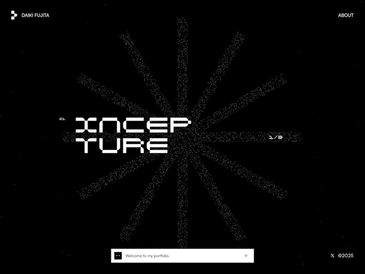
But what if your cards could float in 3D space and orbit around like planets on your WordPress site?
You read that right. Droip, the modern no-code website builder, now makes it possible to design immersive 3D interactions in WordPress without any third-party plugins or coding.
In this tutorial, you’ll build a 3D circular marquee (a rotating ring of cards that tilt, orbit, and feel alive), all inside Droip’s visual editor.
What We’re Building
Imagine a hula hoop standing upright in front of you.
Now, place 12 cards evenly around that hoop. As the hoop spins, cards travel around, some face you, some tilt away, and the one at the back hides in perspective.
This is the illusion we’ll create. A dynamic 3D ring of cards with Droip’s advanced transform and animation tools. See it live and get a feel for what you’ll be building.
You can use this 3D Marquee to showcase portfolios, products, or creative content as an example of the advanced interactions now possible in WordPress with a modern WordPress website builder.
Part 1: Planning The Key Pieces
Before we start creating, let’s plan out what we’ll need to make the 3D circular marquee work:
Stage (the hoop): A parent element that spins, carrying all the cards.
Cards (the orbiting items): Each card sits at a fixed angle around the circle.
Perspective: A visual depth setting that makes near cards appear closer and far ones smaller.
Tilt: A subtle rotation that gives realism to the motion.
Animation: The continuous rotation that makes the ring orbit infinitely.
Spacing Cards Around the Circle
We’ll have 12 cards around a 360° ring, meaning each card sits 30° apart. Think of it like clock positions:
Card 0: 0° (front)
Card 3: 90° (right side)
Card 6: 180° (back)
Card 9: 270° (left side)
Each card will be rotated by its angle and pushed outward to form the circular ring.
The 3D Transforms
Every card uses a combination of transforms to position correctly:
rotateY(angle), moveZ(radius)
Here’s what happens:
rotateY(angle): turns the card to its position around the circle.
moveZ(radius): moves it outward from the center onto the ring.
That’s all you need to place the cards evenly in a circle.
Why rotate, then move?
If you move Z first and then rotate Y, the translation happens in the element’s original space; rotating afterward will spin that translated offset around the origin and do something different.
The rotateY(angle) followed by moveZ(radius) means “turn the element to the angle, then push it out along its forward direction,” which places it on the circumference.
Part 2: Building the 3D Circular Marquee in the Droip Visual Editor
Now that you know how the structure works, let’s start building everything visually inside Droip.
Step 1: Create the Wrapper and base layout
Add a Div and rename it to Wrapper.
Set Width: 100%, Height: 100vh, and choose a nice background (solid or gradient).
Inside it, add two children:
Custom Cursor (Optional)
Banner (the section that holds our 3D Marquee)
Step 2: Create the custom cursor (Optional)
Next, we’ll add a custom cursor. Totally optional, but it gives your build that extra touch of uniqueness and polish.
Inside the Wrapper, add a Div and rename it Cursor.
Size: 32×32px, position it to absolute, top: 0, left: 0, z-index: 100.
Add a Shape element (your cursor visual) inside the Cursor div. Resize the shape element to 32×32px. You can add your preferred cursor shape by simply replacing the SVG.
For interactions (making this custom shape act like a cursor): Select the Cursor div and click on interaction:
Trigger: Scroll into view.
Animation: Cursor Trail.
Scope: Viewport.
Smoothing: 75%.
Now your cursor will smoothly follow your movement in preview mode.
Step 3: Create the Banner (base for marquee)
Inside the Wrapper, add another Div and rename it Banner.
Set up the following properties:
Width: 100vw
Height: 100vh
Position: relative
Z-index: 1
This Banner will serve as the main stage for your 3D Marquee. Later in the tutorial, we’ll add an interaction here for the click-to-scale zoom effect.
Step 4: Create the Container & 3D Transform wrapper
Now it’s time to set up the structure that will hold and control our 3D elements.
Inside the Banner, add a Div and rename it Container. This will act as the main layout holder for the 3D stage.
Configure the Container:
Width: 100%
Max-width: 800px
Margin: auto (to center it on the page)
Position: relative
Z-index: 2
Next, inside the Container, add another Div and rename it 3D Transform. This element will define the 3D space where all your cards will orbit.
Set the following properties:
Width/Height: 100%
Position: absolute; top: 0; left: 0
Z-index: 100
Now, in the Effects > Transform panel:
Enable Preserve 3D: this ensures all child elements (like your cards) exist in a true 3D environment.
Set Child Perspective to 9000px: this gives the illusion of depth, where closer objects appear larger and farther ones appear smaller.
Optionally, apply Scale X/Y: 0.8 if you want to reduce the overall stage size slightly.
In short, this step creates the 3D “space” your rotating cards will live in — like setting up the stage before the show begins.
Step 5: Create the 3D Marquee (Orbit Center)
Now we’ll create the core of the carousel, the rotating stage that all your cards will attach to.
Inside the 3D Transform, add a Div and rename it 3D Marquee. This element acts as the orbit center. When it spins, all the cards will revolve around it.
Set up the 3D Marquee as follows:
Width: 435px. This will be the size of the card
Height: auto
Position: relative
Enable Preserve 3D (so its child elements, the cards, maintain their depth in 3D space).
Rotate X: -10° – this slightly tilts the ring backward, giving a more natural perspective when viewed from the front.
Scale: X: 1, Y: 1
In simple terms: this is your spinning hub. When the animation runs, this element will rotate continuously, carrying all the cards with it to create that smooth, orbiting 3D effect.
Step 6: Create the Card Template (One Card Structure)
Next, we’ll build a single card that will serve as the template. Once complete, we’ll duplicate it 11 more times to complete the ring.
1. Create the Front Card
Inside 3D Marquee, add a Div and rename it Front Card.
Configure it:
Width/Height: 100% (the final position will be controlled via transforms)
Border-radius: 20px
Position: absolute
Enable Preserve 3D in the transforms panel
Note: This is the element where you’ll later apply rotateY(…) translateZ(orbitZ) to position it around the circle.
2. Add the 3D Container
Inside Front Card, add another Div and rename it to Card-3D. This acts as a 3D wrapper so we can rotate and position the card in space without affecting its internal layout.
Settings:
Width/Height: 100%
Position: relative
Z-index: 3
Enable Preserve 3D
3. Add the Popup (Visible Front Face)
Inside Card-3D, add a Div and rename it Popup. This holds the main content, the image or design that users interact with.
Settings:
Width/Height: 100%
Background: White
Border-radius: 20px
Inside Popup, add an Image element:
Width/Height: 100%
Border-radius: 12px
4. Add the Backface
Inside the Popup, add another Div and rename it Backface.
Settings:
Padding: 12px
Width/Height: 100%
Background: #FEDEFF
Border-radius: 20px
Position: absolute; top: 0; left: 0; z-index: 1 Transforms: Rotate Y = 180° (so it appears when the card flips)
Disable showing the real backside by toggling backface-visibility
Now you have a complete single card ready to be duplicated and positioned around the orbit. Each card will inherit the 3D rotation and spacing we’ll set in the next step.
Step 7: Duplicate Cards and Position Them Around the Orbit
Now that we have a single card ready, we’ll create all 12 cards for the carousel and place them evenly around the circular orbit.
Duplicate the Card-Template
Right-click on your Front Card and select Duplicate. This creates a new card that copies all the styles of the original card.
Duplicate the class holding the transform styles. This gives the new card its own separate class for rotation/position.
Do this 11 times so you have Card-1 through Card-12. Rename the cards
💡 Tip: Duplicating the card class is important so each card’s transform is independent.
Set Each Card’s Position with 3D Transforms
For each card, set the Transform fields (Rotate Y + Move Z). Use these exact values:
Front Card: rotateY(0deg), MoveZ(850px)
Card 1: rotateY( 30deg), MoveZ(850px)
Card 2: rotateY( 60deg), MoveZ(850px)
Card 3: rotateY( 90deg), MoveZ(850px)
Card 4: rotateY(120deg), MoveZ(850px)
Card 5: rotateY(150deg), MoveZ(850px)
Card 6: rotateY(180deg), MoveZ(850px)
Card 7: rotateY(-150deg), MoveZ(850px)
Card 8: rotateY(-120deg), MoveZ(850px)
Card 9: rotateY(-90deg), MoveZ(850px)
Card 10: rotateY(-60deg), MoveZ(850px)
Card 11: rotateY(-30deg), MoveZ(850px)
At this point, if Preserve 3D and Perspective are correctly set, you should see a ring of cards in 3D space.
Step 8: Animate the Orbit (Rotate the 3D Marquee)
Now that your cards are all in place, let’s bring the marquee to life by making it spin.
In the Layers panel, select Page, then go to Interactions and select Page Load.
Choose the 3D Marquee div as your animation target — this is the parent element that holds all the cards.
Add a Rotate action and set these values:
Duration: 30s (or any speed you like)
X: -10°
Y: 360°
Loop: Infinite
Hit Preview, and you’ll see your entire 3D ring smoothly spinning in space — just like a rotating carousel!
💡 Tip: The -10° tilt keeps the spin looking natural and adds depth to the orbit, rather than a flat, top-down rotation.
Step 9: Add Click-to-Scale Interaction on the Banner (Zoom Toggle)
Let’s make your 3D Marquee more fun to play with by adding a click-to-zoom effect, so users can zoom in and out of the carousel with a single click.
Select the Banner. This is the background container holding your 3D Marquee.
Go to Interactions and create a new one with:
Trigger: Mouse Click (Tap)
Target: 3D Transform
The Banner acts as the clickable area. When you click it, the animation targets the 3D Transform div (which contains everything inside the 3D scene).
Now we’ll set up a two-step toggle animation:
Step 1: First Click
Create two responses and name them:
We’re creating both Zoom In/Out and Zoom In/Out (Tab) because desktop and tablet screens behave differently. A zoom value that looks perfect on a wide desktop might push the 3D ring out of view or look oversized on a smaller tablet screen.
So by having two versions, Droip automatically applies the right animation depending on the device, keeping the zoom effect centered and balanced across all viewports.
Zoom In:
Scale X: 2, Y: 2
Move Y: -250
Zoom In (Tab):
Scale X: 1, Y: 1
Move Y: 0
Step 2: Second Click (Zoom Out)
Duplicate the first set and rename them:
Zoom Out:
Scale X: 0.8, Y: 0.8
Move Y: 0
Zoom Out (Tab):
Scale X: 0.4, Y: 0.4
Move Y: 0
Now, when you click anywhere on the Banner, the whole 3D scene smoothly zooms in and out, making it feel alive and responsive.
💡 Tip: Adjust the scale and movement values to find your perfect zoom balance for desktop and tablet views.
Final Preview
That’s it! You’ve just built a fully interactive 3D circular marquee inside Droip with no code, no plugins.
It might seem like a lot at first, but once you get the hang of it, you’ll realize how much power Droip gives you.
With this modern WordPress website builder, almost any advanced web interactions are now possible in WordPress, all visually.
NITEX is not just another fashion-tech company. Their mission is to redefine the supply chain for fashion – bringing speed, sustainability, and intelligence to a traditionally rigid process. Their platform spans the entire workflow: design, trend forecasting, material sourcing, production, and logistics. In short, they offer a seamless, end-to-end system for brands who want to move faster and smarter.
When NITEX approached us, the challenge was clear: they needed more than a website. They needed a platform that could translate their vision into an experience that worked for multiple audiences – brands seeking services, investors looking for clarity, factories wanting partnerships, and talent exploring opportunities.
The project took shape over several months, moving from brand definition to UX architecture, UI design, and technical development. The turning point came with the realization that a single, linear site could not balance storytelling with action. To resolve this, we developed a dual-structure model: one path for narrative and inspiration, and another for practical conversion. This idea shaped every design and technical decision moving forward.
Crafting the Hybrid Identity
NITEX’s identity needed to reflect a unique duality: part fashion brand, part technology company. Our approach was to build a system that could flex between editorial elegance and sharp technical clarity.
At the heart of the identity sits the NITEX logo, an angular form created from a forward-leaning N and X. This symbol is more than a mark – it acts as a flexible frame. The hollow center creates a canvas for imagery, data, or color, visualizing collaboration and adaptability.
This angular geometry informed much of the visual language across the site:
Buttons expand or tilt along the logo’s angles when hovered.
The progress bar in navigation and footer fills in the same diagonal form.
Headlines reveal themselves with angled wipes, reinforcing a consistent rhythm.
Typography was kept bold yet minimal, with global sans-serif structures that feel equally at home in high fashion and digital environments. Imagery played an equally important role. We chose photography that conveyed motion and energy, often with candid blur or dynamic framing. To push this further, we incorporated AI-generated visuals, adding intensity and reinforcing the sense of momentum at the core of the NITEX story. The result is a brand system that feels dynamic, flexible, and scalable – capable of stretching from streetwear to luxury contexts while always staying rooted in clarity and adaptability.
Building the Engine
A complex brand and experience required a strong technical foundation. For this, our developers chose tools that balanced performance, flexibility, and scalability:
Frontend: Nuxt
Backend / CMS: Sanity
Animations & Motion: GSAP and the Web Animations API
The heavy reliance on native CSS transitions and the Web Animations API ensured smooth performance even on low-powered devices. GSAP was used to orchestrate more complex transitions while still keeping load times and resource use efficient. A key architectural decision was to give overlays their own URLs. This meant that when users opened deep-dive layers or content modules, those states were addressable, shareable, and SEO-friendly. This approach kept the experience immersive while ensuring that content remained accessible outside the narrative scroll.
Defining the Flow
Several features stand out in the NITEX site for how they balance storytelling with functionality:
Expandable overlays: Each narrative chapter can unfold into deep-dive layers – showing case studies, workflow diagrams, or leadership perspectives without breaking the scroll.
Dynamic conversion flows: Forms adapt to the user’s audience type – brands, investors, talent, or factories – showing tailored fields and next steps.
Calendar integration: Visitors can book demos or design lab visits directly, streamlining the lead process and reinforcing immediacy.
This mix of storytelling modules and smart conversion flows ensured that every audience had a pathway forward, whether to be inspired, informed, or engaged.
Bringing It to Life
NITEX’s brand identity found its fullest expression in the motion and interaction design of the site. The site opens with scroll-based storytelling, each chapter unfolding with smooth transitions. Page transitions maintain energy, using angled wipes and overlays that slide in from the side. These overlays carry their own links, allowing users to dive deep without losing orientation. The angular motion language of the logo carries through:
Buttons expand dynamically on hover.
Rectangular components tilt into angular forms.
The dual-image module sees the N and X frame track the viewport, dynamically revealing new perspectives.
This creates a consistent visual rhythm, where every motion feels connected to the brand’s DNA. The imagery reinforces this, emphasizing speed and creativity through motion blur, candid composition, and AI-driven intensity. Importantly, we kept the overall experience modular and scalable. Each content block is built on a flexible grid with clear typographic hierarchy. This ensures usability while leaving room for surprise – whether it’s an animated reveal, a bold image transition, or a subtle interactive detail.
Under the Hood
From a structural standpoint, the site was designed to scale as NITEX grows. The codebase follows a modular approach, with reusable components that can be repurposed across sections. Sanity’s CMS allows editors to easily add new chapters, forms, or modules without breaking the system.
The split-entry structure – narrative vs. action – was the architectural anchor. This allowed us to keep storytelling immersive without sacrificing usability for users who came with a clear transactional intent.
Looking Back
This project was as much about balance as it was about creativity. Balancing brand storytelling with user conversion. Balancing motion and expressiveness with speed and performance. Balancing multiple audience needs within a single coherent system.
One of the most rewarding aspects was seeing how the dual-experience model solved what initially felt like an unsolvable challenge: how to serve users who want inspiration and those who want action without building two entirely separate sites.
The deep-dive overlays also proved powerful, letting NITEX show rather than just tell their story. They allowed us to layer complexity while keeping the surface experience clean and intuitive.
Looking ahead, the NITEX platform is built to evolve. Future possibilities include investor dashboards with live performance metrics, brand-specific case modules curated by industry, or interactive workflow tools aligned with NITEX’s trend-to-delivery logic. The foundation we built makes all of this possible.
Ultimately, the NITEX project reflects the company’s own values: clarity, adaptability, and speed. For us, it was an opportunity to merge brand design, UX, UI, and development into a single seamless system – one that redefines what a fashion-tech platform can look and feel like.
Codrops’ “design” has been long overdue for a refresh. I’ve had ideas for a new look floating around for ages, but actually making time to bring them to life has been tough. It’s the classic shoemaker’s shoes problem: I spend my days answering emails, editing articles and (mostly) managing Codrops and the amazing contributions from the community, while the site itself quietly gathers dust 😂
Still, the thought of reimagining Codrops has been sitting in the back of my mind. I’d already been eyeing Anima as a tool that could make the process faster, so I reached out to their team. They were kind enough to support us with this review (thank you so much!) and it’s a true win-win: I get to finally test my idea for Codrops, and you get a good look at how the tool holds up in practice 🤜🤛
So, Anima is a platform made to bridge the gap between design and development. It allows you to take an existing website, either one of your own projects or something live on the web, and bring it into a workspace where the layout and elements can be inspected, edited, and reworked. From there, you can export the result as clean, production-ready code in React, HTML/CSS, or Tailwind. In practice, this means you can quickly prototype new directions, remix existing layouts, or test ideas without starting completely from scratch.
Obviously, you should not use this to copy other people’s work, but rather to prototype your own ideas and remix your projects!
Let me take you along on a little experiment I ran with it.
Getting started
Anima Link to Code was introduced in July this year and promises to take any design or web page and transform it into live editable code. You can generate, preview, and export production ready code in React, TypeScript, Tailwind CSS, or plain HTML and CSS. That means you can start with a familiar environment, test an idea, and immediately see how it holds up in real code rather than staying stuck in the design stage. It also means you can poke around, break things, and try different directions without manually rebuilding the scaffolding each time. That kind of speed is what usually makes or breaks whether I stick with an experiment or abandon it halfway through.
To begin, I decided to use the Codrops homepage as my guinea pig. I have always wondered how it would feel reimagined as a bento style grid. Normally, if I wanted to try that, I would either spend hours rewriting markup and CSS by hand or rely on an AI prompt that would often spiral into unrelated layouts and syntax errors. It would be already a great help if I could envision my idea and play with it bit!
After pasting in the Codrops URL, this is what came out. A React project was generated in seconds.
The first impression was surprisingly positive. The homepage looked recognizable and the layout did not completely collapse. Yes, there was a small glitch where the Webzibition box background was not sized correctly, but overall it was close enough that I felt comfortable moving on. That is already more than I can say for many auto generation tools where the output is so mangled that you do not even know where to start.
Experimenting with a bento grid
Now for the fun part. I typed a simple prompt that said, “Make a bento grid of all these items.” Almost immediately I hit an error. My usual instinct in this situation is to give up since vibe coding often collapses the moment an error shows up, and then it becomes a spiral of debugging someone else’s half generated mess. But let’s try this instead of quitting right away 🙂 The fix worked and I got a quirky but functioning bento grid layout:
The result was not exactly what I had in mind. Some elements felt off balance and the spacing was not ideal. Still, I had something on screen to iterate on, which is already a win compared to starting from scratch. So I pushed further. Could I bring the Creative Hub and Webzibition modules into this grid? A natural language prompt like “Place the Creative Hub box into the bento style container of the articles” felt like a good test.
And yes, it actually worked. The Creative Hub box slipped into the grid container:
The layout was starting to look cramped, so I tried another prompt. I asked Anima to also move the Webzibition box into the same container and to make it span full width. The generation was quick with barely a pause, and suddenly the page turns into this:
This really showed me what it’s good at: iteration is fast. You don’t have to stop, rethink the grid, or rewrite CSS by hand. You just throw an idea in, see what comes back, and keep moving. It feels more like sketching in a notebook than carefully planning a layout. For prototyping, that rhythm is exactly what I want. Really into this type of layout for Codrops!
Looking under the hood
Visuals are only half the story. The bigger question is what kind of code Anima actually produces. I opened the generated React and Tailwind output, fully expecting a sea of meaningless divs and tangled class names.
To my surprise, the code was clean. Semantic elements were present, the structure was logical, and everything was just readable. There was no obvious divitis, and the markup did not feel like something I would want to burn and rewrite from scratch. It even got me thinking about how much simpler maintaining Codrops might be if it were a lean React app with Tailwind instead of living inside the layers of WordPress 😂
There is also a Chrome extension called Web to Code, which lets you capture any page you are browsing and instantly get editable code. With this it’s easy to capture and generate inner pages like dashboards, login screens, or even private areas of a site you are working on could be pulled into a sandbox and played with directly.
Pros and cons
Pros: Fast iteration, surprisingly clean code, easy setup, beginner-friendly, genuinely fun to experiment with.
Cons: Occasional glitches, exported code still needs cleanup, limited customization, not fully production-ready.
Final thoughts
Anima is not magic and it is not perfect. It will not replace deliberate coding, and it should not. But as a tool for quick prototyping, remixing existing designs, or exploring how a site might feel with a new structure, it is genuinely fun and surprisingly capable. The real highlight for me is the speed of iteration: you try an idea, see the result instantly, and either refine it or move on. That rhythm is addictive for creative developers who like to sketch in code rather than commit to heavy rebuilds from scratch.
Verdict: Anima shines as a playground for experimentation and learning. If you’re a designer or developer who enjoys fast iteration, you’ll likely find it inspiring. If you need production-ready results for client work, you’ll still want to polish the output or stick with more mature frameworks. But for curiosity, prototyping, and a spark of creative joy, Anima is worth your time and you might be surprised at how much fun it is to remix the web this way.
In this tutorial, we’ll explore how to bring motion and interactivity to your WebGL projects by combining GSAP with custom shaders. Working with the Dev team at Adoratorio Studio, I’ll guide you through four GPU-powered effects, from ripples that react to clicks to dynamic blurs that respond to scroll and drag.
We’ll start by setting up a simple WebGL scene and syncing it with our HTML layout. From there, we’ll move step by step through more advanced interactions, animating shader uniforms, blending textures, and revealing images through masks, until we turn everything into a scrollable, animated carousel.
By the end, you’ll understand how to connect GSAP timelines with shader parameters to create fluid, expressive visuals that react in real time and form the foundation for your own immersive web experiences.
Creating the HTML structure
As a first step, we will set up the page using HTML.
We will create a container without specifying its dimensions, allowing it to extend beyond the page width. Then, we will set the main container’s overflow property to hidden, as the page will be later made interactive through the GSAP Draggable and ScrollTrigger functionalities.
We’ll style all this and then move on to the next step.
Sync between HTML and Canvas
We can now begin integrating Three.js into our project by creating a Stage class responsible for managing all 3D engine logic. Initially, this class will set up a renderer, a scene, and a camera.
We will pass an HTML node as the first parameter, which will act as the container for our canvas. Next, we will update the CSS and the main script to create a full-screen canvas that resizes responsively and renders on every GSAP frame.
Back in our main.js file, we’ll first handle the stage’s resize event. After that, we’ll synchronize the renderer’s requestAnimationFrame (RAF) with GSAP by using gsap.ticker.add, passing the stage’s render function as the callback.
// Update resize with the stage resize
function resize() {
  ...
  stage.resize();
}

// Add render cycle to gsap ticker
gsap.ticker.add(stage.render.bind(stage));

<style>
.content__canvas {
  position: absolute;
  top: 0;
  left: 0;
  width: 100vw;
  height: 100svh;

  z-index: 2;
  pointer-events: none;
}
</style>
It’s now time to load all the images included in the HTML. For each image, we will create a plane and add it to the scene. To achieve this, we’ll update the class by adding two new methods:
setUpPlanes() {
  this.DOMElements.forEach((image) => {
    this.scene.add(this.generatePlane(image));
  });
}

generatePlane(image, ) {
  const loader = new TextureLoader();
  const texture = loader.load(image.src);

  texture.colorSpace = SRGBColorSpace;
  const plane = new Mesh(
    new PlaneGeometry(1, 1),
    new MeshStandardMaterial(),
  );

  return plane;
}
We can then call setUpPlanes() within the constructor of our Stage class. The result should resemble the following, depending on the camera’s z-position or the planes’ placement—both of which can be adjusted to fit our specific needs.
The next step is to position the planes precisely to correspond with the location of their associated images and update their positions on each frame. To achieve this, we will implement a utility function that converts screen space (CSS pixels) into world space, leveraging the Orthographic Camera, which is already aligned with the screen.
render() {
  this.renderer.render(this.scene, this.camera);

  // For each plane and each image update the position of the plane to match the DOM element position on page
  this.DOMElements.forEach((image, index) => {
     this.scene.children[index].position.copy(getWorldPositionFromDOM(image, this.camera, this.renderer));
  });
}
By hiding the original DOM carousel, we can now display only the images as planes within the canvas. Create a simple class extending ShaderMaterial and use it in place of MeshStandardMaterial for the planes.
Click on the images for a ripple and coloring effect
This steps breaks down the creation of an interactive grayscale transition effect, emphasizing the relationship between JavaScript (using GSAP) and GLSL shaders.
Step 1: Instant Color/Grayscale Toggle
Let’s start with the simplest version: clicking the image makes it instantly switch between color and grayscale.
The JavaScript (GSAP)
At this stage, GSAP’s role is to act as a simple “on/off” switch so let’s create a GSAP Observer to monitor the mouse click interaction:
An instant switch is boring. Let’s make the transition a smooth, circular reveal that expands from the center.
The JavaScript (GSAP)
GSAP’s role now changes from a switch to an animator. Instead of gsap.set(), we use gsap.to() to animate uGrayscaleProgress from 0 to 1 (or 1 to 0) over a set duration. This sends a continuous stream of values (0.0, 0.01, 0.02, …) to the shader.
The shader now uses the animated uGrayscaleProgress to define the radius of a circle.
void main() {
  float dist = distance(vUv, vec2(0.5));

  // 2. Create a circular mask.
  float mask = smoothstep(uGrayscaleProgress - 0.1, uGrayscaleProgress, dist);

  // 3. Mix the colors based on the mask's value for each pixel.
  vec3 finalColor = mix(originalColor, grayscaleColor, mask);
  gl_FragColor = vec4(finalColor, 1.0);
}
How smoothstep works here: Pixels where dist is less than uGrayscaleProgress – 0.1 get a mask value of 0. Pixels where dist is greater than uGrayscaleProgress get a value of 1. In between, it’s a smooth transition, creating the soft edge.
Step 3: Originating from the Mouse Click
The effect is much more engaging if it starts from the exact point of the click.
The JavaScript (GSAP)
We need to tell the shader where the click happened.
Raycasting: We use a Raycaster to find the precise (u, v) texture coordinate of the click on the mesh.
uMouse Uniform: We add a uniform vec2 uMouse to our material.
GSAP Timeline: Before the animation starts, we use .set() on our GSAP timeline to update the uMouse uniform with the intersection.uv coordinates.
We simply replace the hardcoded center with our new uMouse uniform.
...
uniform vec2 uMouse; // The (u,v) coordinates from the click
...

void main() {
...

// 1. Calculate distance from the MOUSE CLICK, not the center.
float dist = distance(vUv, uMouse);
}
Important Detail: To ensure the circular reveal always covers the entire plane, even when clicking in a corner, we calculate the maximum possible distance from the click point to any of the four corners (getMaxDistFromCorners) and normalize our dist value with it: dist / maxDist.
This guarantees the animation completes fully.
Step 4: Adding the Final Ripple Effect
The last step is to add the 3D ripple effect that deforms the plane. This requires modifying the vertex shader.
The JavaScript (GSAP)
We need one more animated uniform to control the ripple’s lifecycle.
uRippleProgress Uniform: We add a uniform float uRippleProgress.
GSAP Keyframes: In the same timeline, we animate uRippleProgress from 0 to 1 and back to 0. This makes the wave rise up and then settle back down.
High-Poly Geometry: To see a smooth deformation, the PlaneGeometry in Three.js must be created with many segments (e.g., new PlaneGeometry(1, 1, 50, 50)). This gives the vertex shader more points to manipulate.
generatePlane(image, ) {
  ...
  const plane = new Mesh(
    new PlaneGeometry(1, 1, 50, 50),
    new PlanesMaterial(texture),
  );

  return plane;
}
Vertex Shader: This shader now calculates the wave and moves the vertices.
Fragment Shader: We can use the ripple intensity to add a final touch, like making the wave crests brighter.
varying float vRipple; // Received from vertex shader

void main() {
  // ... (all the color and mask logic from before)
  vec3 color = mix(color1, color2, mask);

  // Add a highlight based on the wave's height
  color += vRipple * 2.0;

  gl_FragColor = vec4(color, diffuse.a);
}
By layering these techniques, we create a rich, interactive effect where JavaScript and GSAP act as the puppet master, telling the shaders what to do, while the shaders handle the heavy lifting of drawing it beautifully and efficiently on the GPU.
Step 5: Reverse effect on previous tile
As a final step, we set up a reverse animation of the current tile when a new tile is clicked. Let’s start by creating the reset animation that reverses the animation of the uniforms:
Now, at each click, we need to set the current tile so that it’s saved in the constructor, allowing us to pass the current material to the reset animation. Let’s modify the onClick function like this and analyze it step by step:
if (this.activeObject && intersection.object !== this.activeObject && this.activeObject.userData.isBw) {
  this.resetMaterial(this.activeObject)

  // Stops timeline if active
  if (this.activeObject.userData.tl?.isActive()) this.activeObject.userData.tl.kill();

  // Cleans timeline
  this.activeObject.userData.tl = null;
}

// Setup active object
this.activeObject = intersection.object;
If this.activeObject exists (initially set to null in the constructor), we proceed to reset it to its initial black and white state
If there’s a current animation on the active tile, we use GSAP’s kill method to avoid conflicts and overlapping animations
We reset userData.tl to null (it will be assigned a new timeline value if the tile is clicked again)
We then set the value of this.activeObject to the object selected via the Raycaster
In this way, we’ll have a double ripple animation: one on the clicked tile, which will be colored, and one on the previously active tile, which will be reset to its original black and white state.
Texture reveal mask effect
In this tutorial, we will create an interactive effect that blends two images on a plane when the user hovers or touches it.
Step 1: Setting Up the Planes
Unlike the previous examples, in this case we need different uniforms for the planes, as we are going to create a mix between a visible front texture and another texture that will be revealed through a mask that “cuts through” the first texture.
Let’s start by modifying the index.html file, adding a data attribute to all images where we’ll specify the underlying texture:
Then, inside our Stage.js, we’ll modify the generatePlane method, which is used to create the planes in WebGL. We’ll start by retrieving the second texture to load via the data attribute, and we’ll pass the plane material the parameters with both textures and the aspect ratio of the images:
Quickly, let’s create a GSAP Observer to monitor the mouse movement, passing two functions:
onMove checks, using the Raycaster, whether a plane is being hit in order to manage the opening of the reveal mask
onHoverEnd is triggered when the cursor leaves the target area, so we’ll use this method to reset the reveal mask’s expansion uniform value back to 0.0
Let’s go into more detail on the onMove function to explain how it works:
In the onMove method, the first step is to normalize the mouse coordinates from -1 to 1 to allow the Raycaster to work with the correct coordinates.
On each frame, the Raycaster is then updated to check if any object in the scene is intersected. If there is an intersection, the code saves the hit object in a variable.
When an intersection occurs, we proceed to work on the animation of the shader uniforms.
Specifically, we use GSAP’s set method to update the mouse position in uMouse, and then animate the uMixFactor variable from 0.0 to 1.0 to open the reveal mask and show the underlying texture.
If the Raycaster doesn’t find any object under the pointer, the hoverOut method is called.
hoverOut() {
    if (!this.intersected) return;

    // Stop any running tweens on the uMixFactor uniform
    gsap.killTweensOf(this.intersected.material.uniforms.uMixFactor);

    // Animate uMixFactor back to 0 smoothly
    gsap.to(this.intersected.material.uniforms.uMixFactor, { value: 0.0, duration: 0.5, ease: 'power3.out });

    // Clear the intersected reference
    this.intersected = null;
  }
This method handles closing the reveal mask once the cursor leaves the plane.
First, we rely on the killAllTweensOf method to prevent conflicts or overlaps between the mask’s opening and closing animations by stopping all ongoing animations on the uMixFactor .
Then, we animate the mask’s closing by setting the uMixFactor uniform back to 0.0 and reset the variable that was tracking the currently highlighted object.
Inside the main() function, it starts by normalizing the UV coordinates and the mouse position relative to the image’s aspect ratio. This correction is applied because we are using non-square images, so the vertical coordinates must be adjusted to keep the mask’s proportions correct and ensure it remains circular. Therefore, the vUv.y and uMouse.y coordinates are modified so they are “scaled” vertically according to the aspect ratio.
At this point, the distance is calculated between the current pixel (correctedUv) and the mouse position (correctedMouse). This distance is a numeric value that indicates how close or far the pixel is from the mouse center on the surface.
We then move on to the actual creation of the mask. The uniform influence must vary from 1 at the cursor’s center to 0 as it moves away from the center. We use the smoothstep function to recreate this effect and obtain a soft, gradual transition between two values, so the effect naturally fades.
The final value for the mix between the two textures, that is the finalMix uniform, is given by the product of the global factor uMixFactor (which is a static numeric value passed to the shader) and this local influence value. So the closer a pixel is to the mouse position, the more its color will be influenced by the second texture, uTextureBack.
The last part is the actual blending: the two colors are mixed using the mix() function, which creates a linear interpolation between the two textures based on the value of finalMix. When finalMix is 0, only the front texture is visible.
When it is 1, only the background texture is visible. Intermediate values create a gradual blend between the two textures.
Click & Hold mask reveal effect
This document breaks down the creation of an interactive effect that transitions an image from color to grayscale. The effect starts from the user’s click, expanding outwards with a ripple distortion.
Step 1: The “Move” (Hover) Effect
In this step, we’ll create an effect where an image transitions to another as the user hovers their mouse over it. The transition will originate from the pointer’s position and expand outwards.
The JavaScript (GSAP Observer for onMove)
GSAP’s Observer plugin is the perfect tool for tracking pointer movements without the boilerplate of traditional event listeners.
Setup Observer: We create an Observer instance that targets our main container and listens for touch and pointer events. We only need the onMove and onHoverEnd callbacks.
onMove(e) Logic: When the pointer moves, we use a Raycaster to determine if it’s over one of our interactive images.
If an object is intersected, we store it in this.intersected.
We then use a GSAP Timeline to animate the shader’s uniforms.
uMouse: We instantly set this vec2 uniform to the pointer’s UV coordinate on the image. This tells the shader where the effect should originate.
uMixFactor: We animate this float uniform from 0 to 1. This uniform will control the blend between the two textures in the shader.
onHoverEnd() Logic:
When the pointer leaves the object, Observer calls this function.
We kill any ongoing animations on uMixFactor to prevent conflicts.
We animate uMixFactor back to 0, reversing the effect.
Code Example: the “Move” effect
This code shows how Observer is configured to handle the hover interaction.
import { gsap } from 'gsap';
import { Observer } from 'gsap/Observer';
import { Raycaster } from 'three';

gsap.registerPlugin(Observer);

export default class Effect {
  constructor(scene, camera) {
    this.scene = scene;
    this.camera = camera;
    this.intersected = null;
    this.raycaster = new Raycaster();

	// 1. Create the Observer
	this.observer = Observer.create({
      target: document.querySelector('.content__carousel'),
      type: 'touch,pointer',
      onMove: e => this.onMove(e),
      onHoverEnd: () => this.hoverOut(), // Called when the pointer leaves the target
    });
  }

  hoverOut() {
    if (!this.intersected) return;

	// 3. Animate the effect out
    gsap.killTweensOf(this.intersected.material.uniforms.uMixFactor);
    gsap.to(this.intersected.material.uniforms.uMixFactor, {
      value: 0.0,
      duration: 0.5,
      ease: 'power3.out'
    });

    this.intersected = null;
  }

  onMove(e) {
	// ... (Raycaster logic to find intersection)
	const [intersection] = this.raycaster.intersectObjects(this.scene.children);

    if (intersection) {
      this.intersected = intersection.object;
      const { material } = intersection.object;

	  // 2. Animate the uniforms on hover
      gsap.timeline()
        .set(material.uniforms.uMouse, { value: intersection.uv }, 0) // Set origin point
        .to(material.uniforms.uMixFactor, { // Animate the blendvalue: 1.0,
          duration: 3,
          ease: 'power3.out'
        }, 0);
    } else {
      this.hoverOut(); // Reset if not hovering over anything
    }
  }
}
The Shader (GLSL)
The fragment shader receives the uniforms animated by GSAP and uses them to draw the effect.
uMouse: Used to calculate the distance of each pixel from the pointer.
uMixFactor: Used as the interpolation value in a mix() function. As it animates from 0 to 1, the shader smoothly blends from textureFront to textureBack.
smoothstep(): We use this function to create a circular mask that expands from the uMouse position. The radius of this circle is controlled by uMixFactor.
uniform sampler2D uTexture; // Front image
uniform sampler2D uTextureBack; // Back image
uniform float uMixFactor; // Animated by GSAP (0 to 1)
uniform vec2 uMouse; // Set by GSAP on move

// ...

void main() {
  // ... (code to correct for aspect ratio)

  // 1. Calculate distance of the current pixel from the mouse
  float distance = length(correctedUv - correctedMouse);

  // 2. Create a circular mask that expands as uMixFactor increases
  float influence = 1.0 - smoothstep(0.0, 0.5, distance);
  float finalMix = uMixFactor * influence;

  // 3. Read colors from both textures
  vec4 textureFront = texture2D(uTexture, vUv);
  vec4 textureBack = texture2D(uTextureBack, vUv);

  // 4. Mix the two textures based on the animated value
  vec4 finalColor = mix(textureFront, textureBack, finalMix);

  gl_FragColor = finalColor;
}
Step 2: The “Click & Hold” Effect
Now, let’s build a more engaging interaction. The effect will start when the user presses down, “charge up” while they hold, and either complete or reverse when they release.
The JavaScript (GSAP)
Observer makes this complex interaction straightforward by providing clear callbacks for each state.
Setup Observer: This time, we configure Observer to use onPress, onMove, and onRelease.
onPress(e):
When the user presses down, we find the intersected object and store it in this.active.
We then call onActiveEnter(), which starts a GSAP timeline for the “charging” animation.
onActiveEnter():
This function defines the multi-stage animation. We use await with a GSAP tween to create a sequence.
First, it animates uGrayscaleProgress to a midpoint (e.g., 0.35) and holds it. This is the “hold” part of the interaction.
If the user continues to hold, a second tween completes the animation, transitioning uGrayscaleProgress to 1.0.
An onComplete callback then resets the state, preparing for the next interaction.
onRelease():
If the user releases the pointer before the animation completes, this function is called.
It calls onActiveLeve(), which kills the “charging” animation and animates uGrayscaleProgress back to 0, effectively reversing the effect.
onMove(e):
This is still used to continuously update the uMouse uniform, so the shader’s noise effect tracks the pointer even during the hold.
Crucially, if the pointer moves off the object, we call onRelease() to cancel the interaction.
Code Example: Click & Hold
This code demonstrates the press, hold, and release logic managed by Observer.
import { gsap } from 'gsap';
import { Observer } from 'gsap/Observer';

// ...

export default class Effect {
  constructor(scene, camera) {
	// ...

    this.active = null; // Currently active (pressed) object
	this.raycaster = new Raycaster();

	// 1. Create the Observer for press, move, and release
	this.observer = Observer.create({
	  target: document.querySelector('.content__carousel'),
	  type: 'touch,pointer',
      onPress: e => this.onPress(e),
      onMove: e => this.onMove(e),
	  onRelease: () => this.onRelease(),
	});

	// Continuously update uTime for the procedural effect
	gsap.ticker.add(() => {
	  if (this.active) {
	    this.active.material.uniforms.uTime.value += 0.1;
	  }
	});
  }

  // 3. The "charging" animation
  async onActiveEnter() {
    gsap.killTweensOf(this.active.material.uniforms.uGrayscaleProgress);

    // First part of the animation (the "hold" phase)
	await gsap.to(this.active.material.uniforms.uGrayscaleProgress, {
      value: 0.35,
      duration: 0.5,
    });

	// Second part, completes after the hold
    gsap.to(this.active.material.uniforms.uGrayscaleProgress, {
      value: 1,
      duration: 0.5,
      delay: 0.12,
      ease: 'power2.in',
      onComplete: () => {/* ... reset state ... */ },
    });
  }

  // 4. Reverses the animation on early release
  onActiveLeve(mesh) {
    gsap.killTweensOf(mesh.material.uniforms.uGrayscaleProgress);
    gsap.to(mesh.material.uniforms.uGrayscaleProgress, {
      value: 0,
      onUpdate: () => {
        mesh.material.uniforms.uTime.value += 0.1;
      },
    });
  }

  // ... (getIntersection logic) ...

  // 2. Handle the initial press
  onPress(e) {
    const intersection = this.getIntersection(e);

    if (intersection) {
      this.active = intersection.object;
      this.onActiveEnter(this.active); // Start the animation
    }
  }

  onRelease() {
    if (this.active) {
      const prevActive = this.active;
      this.active = null;
      this.onActiveLeve(prevActive); // Reverse the animation
    }
  }

  onMove(e) {
	// ... (getIntersection logic) ...

	if (intersection) {
	  // 5. Keep uMouse updated while holding
	  const { material } = intersection.object;
      gsap.set(material.uniforms.uMouse, { value: intersection.uv });
    } else {
      this.onRelease(); // Cancel if pointer leaves
    }
  }
}
The Shader (GLSL)
The fragment shader for this effect is more complex. It uses the animated uniforms to create a distorted, noisy reveal.
uGrayscaleProgress: This is the main driver, animated by GSAP. It controls both the radius of the circular mask and the strength of a “liquid” distortion effect.
uTime: This is continuously updated by gsap.ticker as long as the user is pressing. It’s used to add movement to the noise, making the effect feel alive and dynamic.
noise() function: A standard GLSL noise function generates procedural, organic patterns. We use this to distort both the shape of the circular mask and the image texture coordinates (UVs).
// ... (uniforms and helper functions)

void main() {
  // 1. Generate a noise value that changes over time
  float noisy = (noise(vUv * 25.0 + uTime * 0.5) - 0.5) * 0.05;

  // 2. Create a distortion that pulses using the main progress animation
  float distortionStrength = sin(uGrayscaleProgress * PI) * 0.5;
  vec2 distortedUv = vUv + vec2(noisy) * distortionStrength;

  // 3. Read the texture using the distorted coordinates for a liquid effect
  vec4 diffuse = texture2D(uTexture, distortedUv);
  // ... (grayscale logic)

  // 4. Calculate distance from the mouse, but add noise to it
  float dist = distance(vUv, uMouse);
  float distortedDist = dist + noisy;

  // 5. Create the circular mask using the distorted distance and progress
  float maxDist = getMaxDistFromCorners(uMouse);
  float mask = smoothstep(uGrayscaleProgress - 0.1, uGrayscaleProgress, distortedDist / maxDist);

  // 6. Mix between the original and grayscale colors
  vec3 color = mix(color1, color2, mask);

  gl_FragColor = vec4(color, diffuse.a);
}
This shader combines noise-based distortion, smooth circular masking, and real-time uniform updates to create a liquid, organic transition that radiates from the click position. As GSAP animates the shader’s progress and time values, the effect feels alive and tactile — a perfect example of how animation logic in JavaScript can drive complex visual behavior directly on the GPU.
Dynamic blur effect carousel
Step 1: Create the carousel
In this final demo, we will create an additional implementation, turning the image grid into a scrollable carousel that can be navigated both by dragging and scrolling.
First we will implement the Draggable plugin by registering it and targeting the appropriate <div> with the desired configuration. Make sure to handle boundary constraints and update them accordingly when the window is resized.
We ill also link GSAP Draggable to the scroll functionality using the GSAP ScrollTrigger plugin, allowing us to synchronize both scroll and drag behavior within the same container. Let’s explore this in more detail:
Now that ScrollTrigger is configured on the same container, we can focus on synchronizing the scroll position between both plugins, starting from the ScrollTrigger instance:
onUpdate(e) {
  const x = -maxScroll * e.progress;

  gsap.set(carouselInnerRef, { x });
  draggable.x = x;
  draggable.update();
}
We then move on to the Draggable instance, which will be updated within both its onDrag and onThrowUpdate callbacks using the scrollPos variable. This variable will serve as the final scroll position for both the window and the ScrollTrigger instance.
Vector projects each plane’s 3D position into normalized device coordinates; .project(this.camera) converts to the -1..1 range, then it’s scaled to real screen pixel coordinates.
screenX are the 2D screen-space coordinates.
distance measures how far the plane is from the screen center.
maxDistance is the maximum possible distance from center to corner.
blurAmount computes blur strength based on distance from the center; it’s clamped between 0.0 and 5.0 to avoid extreme values that would harm visual quality or shader performance.
The <strong>uBlurAmount</strong> uniform is animated toward the computed blurAmount. Rounding to the nearest even number (Math.round(blurAmount / 2) * 2) helps avoid overly frequent tiny changes that could cause visually unstable blur.
This GLSL fragment receives a texture (uTexture) and a dynamic value (uBlurAmount) indicating how much the plane should be blurred. Based on this value, the shader applies a multi-pass Kawase blur, an efficient technique that simulates a soft, pleasing blur while staying performant.
Let’s examine the kawaseBlur function, which applies a light blur by sampling 4 points around the current pixel (uv), each offset positively or negatively.
texelSize computes the size of one pixel in UV coordinates so offsets refer to “pixel amounts” regardless of texture resolution.
Four samples are taken in a diagonal cross pattern around uv.
The four colors are averaged (multiplied by 0.25) to return a balanced result.
This function is a light single pass. To achieve a stronger effect, we apply it multiple times.
The multiPassKawaseBlur function does exactly that, progressively increasing blur and then blending the passes:
The first mix blends blur1 and blur2, while the second blends that result with blur3. The resulting finalBlur represents the Kawase-blurred texture, which we finally mix with the base texture passed via the uniform.
Finally, we mix the blurred texture with the original texture based on blurStrength, using another smoothstep from 0 to 1:
Bringing together GSAP’s animation power and the creative freedom of GLSL shaders opens up a whole new layer of interactivity for the web. By animating shader uniforms directly with GSAP, we’re able to blend smooth motion design principles with the raw flexibility of GPU rendering — crafting experiences that feel alive, fluid, and tactile.
From simple grayscale transitions to ripple-based deformations and dynamic blur effects, every step in this tutorial demonstrates how motion and graphics can respond naturally to user input, creating interfaces that invite exploration rather than just observation.
While these techniques push the boundaries of front-end development, they also highlight a growing trend: the convergence of design, code, and real-time rendering.
So, take these examples, remix them, and make them your own — because the most exciting part of working with GSAP and shaders is that the canvas is quite literally infinite.
Ponpon Mania is an animated comic featuring Ponpon, a megalomaniac sheep dreaming of becoming a DJ. We wanted to explore storytelling beyond traditional comics by combining playful interactions, smooth GSAP-powered motion, and dynamic visuals. The goal was to create a comic that feels alive, where readers engage directly with Ponpon’s world while following the narrative. The project evolved over several months, moving from early sketches to interactive prototypes.
About us
We are Justine Soulié (Art Director & Illustrator) and Patrick Heng (Creative Developer), a creative duo passionate about storytelling through visuals and interaction. Justine brings expertise in illustration, art direction, and design, while Patrick focuses on creative development and interactive experiences. Together, we explore ways to make stories more playful, immersive, and engaging.
Art Direction
Our visual direction emphasizes clean layouts, bold colors, and playful details. From the start, we wanted the comic to feel vibrant and approachable while using design to support the story. On the homepage, we aimed to create a simple, welcoming scene that immediately draws the user in, offering many interactive elements to explore and encouraging engagement from the very first moment.
Homepage animations
The comic is mostly black and white, providing a simple and striking visual base. Color appears selectively, especially when Ponpon dreams of being a DJ and is fully immersed in his imagined world, highlighting these key moments and guiding the reader’s attention. Scroll-triggered animations naturally direct focus, while hover effects and clickable elements invite exploration without interrupting the narrative flow.
Chapter navigation
To reinforce Ponpon’s connection to music, we designed the navigation to resemble a music player. Readers move through chapters as if they were albums, with each panel functioning like a song. This structure reflects Ponpon’s DJ aspirations, making the reading experience intuitive, dynamic, and closely tied to the story.
Chapters menu
Technical Approach
Our main goal was to reduce technical friction so we could dedicate our energy to refining the artistic direction, motion design, and animation of the website.
We used WebGL because it gave us full creative freedom over rendering. Even though the comic has a mostly 2D look, we wanted the flexibility to add depth and apply shader-based effects.
Starting from Justine’s illustrator files, every layer and visual element from each panel was exported as an individual image. These assets were then packed into optimized texture atlases using Free TexturePacker.
Atlas example
Once exported, the images were further compressed into GPU-friendly formats to reduce memory usage. Using the data generated by the packer, we reconstructed each scene in WebGL by generating planes at the correct size. Finally, everything was placed in a 3D scene where we applied the necessary shaders and animations to achieve the desired visual effects.
Debug view
Tech Stack & Tools
Design
Adobe Photoshop & Illustrator – illustration and asset preparation
Free TexturePacker – for creating optimized texture atlases from exported assets
Tweakpane – GUI tool for real-time debugging and fine-tuning parameters
Animating using GSAP
GSAP makes it easy to animate both DOM elements and WebGL objects with a unified syntax. Its timeline system brought structure to complex sequences, while combining it with ScrollTrigger streamlined scroll-based animations. We also used SplitText to handle text animations.
Home page
For the homepage, we wanted the very first thing users see to feel playful and full of life. It introduces the three main characters, all animated, and sets the tone for the rest of the experience. Every element reacts subtly to the mouse: the Ponpon mask deforms slightly, balloons collide softly, and clouds drift away in gentle repulsion. These micro-interactions make the scene feel tangible and invite visitors to explore the world of Ponpon Mania with curiosity and delight. We used GSAP timeline to choreograph the intro animation, allowing us to trigger each element in sequence for a smooth and cohesive reveal.
// Simple repulsion we used for the clouds in our render function
const dx = baseX - mouse.x;
const dy = baseY - mouse.y;
const dist = Math.sqrt(dx * dx + dy * dy);

// Repel the cloud if the mouse is near
const radius = 2; // interaction radius
const strength = 1.5; // repulsion force
const repulsion = Math.max(0, 1 - dist / radius) * strength;

// Apply the repulsion with smooth spring motion
const targetX = basePosX + dx * repulsion;
const targetY = basePosY - Math.abs(dy * repulsion) / 2;

velocity.x += (targetX - position.x) * springStrength * deltaTime;
velocity.y += (targetY - position.y) * springStrength * deltaTime;

position.x += velocity.x;
position.y += velocity.y;
Chapter Selection
For the chapter selection, we wanted something simple yet evocative of Ponpon musical universe. Each chapter is presented as an album cover, inviting users to browse through them as if flipping through a record collection. We try to have a smooth and intuitive navigation, users can drag, scroll, or click to explore and each chapter snaps into place for an easy and satisfying selection experience.
Panel Animation
For the panel animations, we wanted each panel to feel alive bringing Justine’s illustrations to life through motion. We spent a lot of time refining every detail so that each scene feels expressive and unique. Using GSAP timelines made it easy to structure and synchronize the different animations, keeping them flexible and reusable. Here’s an example of a GSAP timeline animating a panel, showing how sequences can be chained together smoothly.
// Animate ponpons in sequence with GSAP timelines
const timeline = gsap.timeline({ repeat: -1, repeatDelay: 0.7 });
const uFlash = { value: 0 };
const flashTimeline = gsap.timeline({ paused: true });

function togglePonponGroup(index) {
  ponponsGroups.forEach((g, i) => (g.mesh.visible = i === index));
}

function triggerFlash() {
  const flashes = Math.floor(Math.random() * 2) + 1; // 1–2 flashes
  const duration = 0.4 / flashes;

  flashTimeline.clear();

  for (let i = 0; i < flashes; i++) {
    flashTimeline
      .set(uFlash, { value: 0.6 }, i * duration) // bright flash
      .to(uFlash, { value: 0, duration: duration * 0.9 }, i * duration + duration * 0.1); // fade out
  }

  flashTimeline.play();
}

ponponMeshes.forEach((ponpon, i) => {
  timeline.fromTo(
    ponpon.position,
    { y: ponpon.initialY - 0.2 },  // start slightly below
    {
      y: ponpon.initialY,          // bounce up
      duration: 1,
      ease: "elastic.out",
      onStart: () => {
        togglePonponGroup(i);      // show active group
        triggerFlash();            // trigger flash
      }
    },
    i * 1.6 // stagger delay between ponpons
  );
});
About Page
On the About page, GSAP ScrollTrigger tracks the scroll progress of each section. These values drive the WebGL scenes, controlling rendering, transitions, and camera movement. This ensures the visuals stay perfectly synchronized with the user’s scrolling.
const sectionUniform = { progress: { value: 0 } };

// create a ScrollTrigger for one section
const sectionTrigger = ScrollTrigger.create({
  trigger: ".about-section",
  start: "top bottom",
  end: "bottom top",
  onUpdate: (self) => {
    sectionUniform.progress.value = self.progress; // update uniform
  }
});

// update scene each frame using trigger values
function updateScene() {
  const progress = sectionTrigger.progress;
  const velocity = sectionTrigger.getVelocity();

  // drive camera movement with scroll progress
  camera.position.y = map(progress, 0.75, 1, -0.4, 3.4);
  camera.position.z =
    5 + map(progress, 0, 0.3, -4, 0) +
        map(progress, 0.75, 1, 0, 2) + velocity * 0.01;

  // subtle velocity feedback on ponpon and camera
  ponpon.position.y = ponpon.initialY + velocity * 0.01;
}
Thanks to the SplitText plugin, we can animate each section title line by line as it comes into view while scrolling.
// Split the text into lines for staggered animation
const split = new SplitText(titleDomElement, { type: "lines" });
const lines = split.lines;

// Create a timeline for the text animation
const tl = gsap.timeline({ paused: true });

tl.from(lines, {
  x: "100%",
  skewX: () => Math.random() * 50 - 25,
  rotation: 5,
  opacity: 0,
  duration: 1,
  stagger: 0.06,
  ease: "elastic.out(0.7, 0.7)"
});

// Trigger the timeline when scrolling the section into view
ScrollTrigger.create({
  trigger: ".about-section",
  start: "top 60%",
  end: "bottom top",
  onEnter: () => tl.play(),
  onLeaveBack: () => tl.reverse()
});
Page transitions
For the page transitions, we wanted them to add a sense of playfulness to the experience while keeping navigation snappy and fluid. Each transition was designed to fit the mood of the page so rather than using a single generic effect, we built variations that keep the journey fresh.
Technically, the transitions blend two WebGL scenes together using a custom shader, where the previous and next pages are rendered and mixed in real time. The animation of the blend is driven by GSAP tweens, which lets us precisely control the timing and progress of the shader for smooth, responsive transitions.
Designing Playful Experiences
Ponpon Mania pushed us to think beyond traditional storytelling. It was a joy to work on the narrative and micro-interactions that add playfulness and energy to the comic.
Looking ahead, we plan to create new chapters, expand Ponpon’s story, and introduce small games and interactive experiences within the universe we’ve built. We’re excited to keep exploring Ponpon’s world and share more surprises with readers along the way.
Thank you for reading! We hope you enjoyed discovering the creative journey behind Ponpon Mania and the techniques we used to bring Ponpon’s world to life.
If you want to follow Ponpon, check us out on TikTok or Instagram.
At the beginning of 2025, I finally decided to build myself a new portfolio. I still pretty much liked the one I made back in 2021, but I felt the need to put to good use all the cool stuff I’ve learned these past couple years working with WebGPU. And, besides, half of the projects featured in my case studies had been put offline anyway, so it was about time.
I didn’t really know where I was going at this point, except that:
It would, of course, feature multiple procedurally generated WebGPU scenes. I already had a few concepts to explore in mind, like particles or boids simulation.
I wanted to take care of the design myself. It may seem weird, especially since I was very happy with what Gilles came up designing for my last portfolio, and also because I do suck at design. But this would give me more freedom, and I’ve also always liked building things from scratch on my own.
Last but not least, it had to be fun!
1. The journey
The (tough) design and content process
Don’t do this!
At first, I had no idea what to do design wise. Fonts, colors: there are so many things that could go wrong.
I started with simple light and dark colors, kept the fonts Gilles had chosen for my previous portfolio and started to copy/paste its old text content. It didn’t feel that great, and it wasn’t fun for sure.
The very first design iterations… Still a long way to go!
I definitely needed colors. I could have wasted a few hours (or days) choosing the right pairing, but instead I decided this could be the right opportunity to use this random color palette generator utility I’ve coded a few years ago. I cleaned the code a bit, created a repo, published it to npm and added it to my project. I also slightly changed the tone of the copywriting, and that led me to something still not that great, but a bit more fun.
Slowly getting there
I let it site for a while and started working on other parts of the site, such as integrating the CMS or experimenting with the WebGPU scenes. It’s only after a long iteration process that I’ve finally set up my mind on this kind of old school video games retro vibe mixed with a more cheerful, cartoonish aesthetic, almost Candy Crush-esque. Impactful headings, popping animations, banded gradients… you name it.
Of course, I’ve never gone as far as creating a Figma project (I did select a few reference images as a moodboard though) and just tested a ton of stuff directly with code until I felt it wasn’t that bad anymore. All in all, it was a very long and painful process, and I guess every designer would agree at this point: don’t do this!
A few images from my final moodboard – all credits go to their respective authors.
Do you actually read portfolios content?
Another painful point was to settle on the actual content and overall structure of the site. Do I need detailed case studies pages? Do I need pages at all? Will the users even read all those long blocks of text I will struggle to write?
In the end, I chose to drop the case studies pages. I had a couple of reasons to do so:
Often times the project ends up being put offline for various reasons, and you end up showcasing something the user cannot visit anymore. This is exactly what happened on my previous portfolio.
Most of the client work I’ve been doing those past years has been for agencies, and I’m not always allowed to publicly share them. I have no problem with that, but it slightly reduced the number of projects I could highlight.
From there on, it was a quick decision to just go with a single landing page. I’d put direct links to the projects I could highlight and small videos of all the other projects or personal works I could feature. On top of that, I’d add a few “about” sections mixed with my WebGPU scenes, and that’d be the gist of it.
Speaking of the WebGPU scenes, I really wanted them to be meaningful, not just a technical demonstration of what I could do. But we’ll get to that later.
The final UX twist
After a few months, I felt like I was entering the final stage of development. The page structure was mostly done, all my various sections were there and I was working on the final animations and micro-interactions tweakings.
So I took a step back, and looked back at my initial expectations. I had my WebGPU scenes showcasing my various technical skills. I had handled the design myself, and it wasn’t that bad. But were the flashy colors and animations enough to make it a really fun experience overall?
I think you already know the answer. Something was missing. Except for the random color palette switcher, the UX basically consisted of scroll-driven animations. Most of the 3D scenes interactions were rudimentary. I needed an idea.
The design already had this video game cheerful look. So… What if I turned my whole portfolio into a game? Once again, I started writing down my ideas:
The user would need to interact with the different UI elements to unlock the theme switcher and color palette generator buttons.
Each WebGPU scene could serve as a way to unlock the following content, acting as a very basic “puzzle” game.
Keep track of the user overall progress.
Allow the user to skip the whole game process if they want to.
This means most of the users wouldn’t ever make it to the footer, or use this random palette generator tool I’ve struggled to implement. This might very well be the most riskiest, stupidest decision I’ve made so far. But it would give my portfolio this unique and fun touch I was looking for in the first place, so I went all in.
Of course, it goes without saying it implied a major refactoring of the whole code and I needed to come up with original interaction ideas for the WebGPU scenes, but I like to think it was worth it.
Gamification mechanisms: unlocking content and rewarding message
Are you one of the few that unlocked the color palette generator button?
2. Technical study
Now that you know all the whys, let’s have a look at the hows!
Tech stack
I’ve decided to try Sanity Studio as I’ve never worked with it before and as I knew it would be a relatively small project, it’d be a perfect fit to start using it. Even though I felt like I just scratched its surface, I liked the overall developer experience it provided. On the other hand, I already had a good experience working with Nuxt3 so this was an easy choice.
No need to mention why I chose GSAP and Lenis — everyone knows those are great tools to deliver smooth animated websites.
Of course, the WebGPU scenes had to be done with gpu-curtains, the 3D engine I spent so much time working on these past two years. It was a great way to test it in a real-life scenario and gave me the opportunity to fix a few bugs or add a couple features along the way.
And since I wanted the whole process to be as transparent as possible, I’ve published the whole source code as a monorepo on GitHub.
Animations
I won’t go too deep into how I handled the various animations, simply because I’ve essentially used CSS and a bit of GSAP here and there, mostly for canvas animations, SplitText effects or the videos carousel using ScrollTrigger observer.
The basic scenes
There are a lot of components on the website that needed to draw something onto a <canvas> and react to the theme and/or color palette changes.
Since switching theme from light to dark (or vice versa) also updates the color palette by tweaking the HSV value component of the colors a bit, I’ve just put a setColors() method in there to handle these changes.
The progress handling here is actually a remain of when the WebGPU scenes animations were mostly scroll-driven (before I introduced the game mechanisms), but since a few scenes still used it, I kept it in there.
All the 2D canvas scenes extend that class, including the WebGPU fallback scenes, the theme switcher button or the dynamic favicon generator (did you notice that?).
The WebGPU scenes
One of the very cool features introduced by WebGPU is that you can render to multiple <canvas> elements using only one WebGPU device. I used this to build 4 different scenes (we’ll take a closer look at each of them below), that all extend a WebGPUScene.ts class:
In the real version, this class also handles the creation of a Tweakpane GUI folder (useful for debugging or tweaking values), but for the sake of clarity I removed the related code here.
As you can see, each of these scenes closely monitors its own performance using a custom QualityManager class. We’ll talk about that later, in the performance section.
Okay, now that we have the basic architecture in mind, let’s break down each of the WebGPU scenes!
Since WebGPU is not fully supported yet, I’ve created fallback versions using the 2D canvas API and the Scene class we’ve seen above for each of the following scenes.
Hero scene
The scenes featured in the portfolio somehow respect a kind of complexity order, meaning the more you advance in the portfolio, the more technically involved the scenes become.
In that way, the hero scene is by far the most simple technically speaking, but it had to look particularly striking and engaging to immediately capture the user’s attention. It was thought as some sort of mobile puzzle game splash screen.
Let’s go!
It’s made of a basic, single fullscreen quad. The idea here is to first rotate its UV components each frame, map them to polar coordinates and use that to create colored triangles segments.
// Center UVs at (0.5, 0.5)
var centeredUV = uv - vec2f(0.5);

// Apply rotation using a 2D rotation matrix
let angleOffset = params.time * params.speed; // Rotation angle in radians
let cosA = cos(angleOffset);
let sinA = sin(angleOffset);

// Rotate the centered UVs
centeredUV = vec2<f32>(
  cosA * centeredUV.x - sinA * centeredUV.y,
  sinA * centeredUV.x + cosA * centeredUV.y
);

// Convert to polar coordinates
let angle = atan2(centeredUV.y, centeredUV.x); // Angle in radians
let radius = length(centeredUV);

// Map angle to triangle index
let totalSegments  = params.numTriangles * f32(params.nbColors) * params.fillColorRatio;
let normalizedAngle = (angle + PI) / (2.0 * PI); // Normalize to [0,1]
let triIndex = floor(normalizedAngle * totalSegments); // Get triangle index

// Compute fractional part for blending
let segmentFraction = fract(normalizedAngle * totalSegments); // Value in [0,1] within segment

let isEmpty = (i32(triIndex) % i32(params.fillColorRatio)) == i32(params.fillColorRatio - 1.0);
let colorIndex = i32(triIndex / params.fillColorRatio) % params.nbColors; // Use half as many color indices

let color = select(vec4(params.colors[colorIndex], 1.0), vec4f(0.0), isEmpty);
There’s actually a wavy noise applied to the UV beforehand using concentric circles, but you get the idea.
Interestingly enough, the most difficult part was to achieve the rounded rectangle entering animation while preserving the correct aspect ratio. This was done using this function:
fn roundedRectSDF(uv: vec2f, resolution: vec2f, radiusPx: f32) -> f32 {
    let aspect = resolution.x / resolution.y;

    // Convert pixel values to normalized UV space
    let marginUV = vec2f(radiusPx) / resolution;
    let radiusUV = vec2f(radiusPx) / resolution;

    // Adjust radius X for aspect ratio
    let radius = vec2f(radiusUV.x * aspect, radiusUV.y);

    // Center UV around (0,0) and apply scale (progress)
    var p = uv * 2.0 - 1.0;       // [0,1] → [-1,1]
    p.x *= aspect;                // fix aspect
    p /= max(0.0001, params.showProgress); // apply scaling
    p = abs(p);

    // Half size of the rounded rect
    let halfSize = vec2f(1.0) - marginUV * 2.0 - radiusUV * 2.0;
    let halfSizeScaled = vec2f(halfSize.x * aspect, halfSize.y);

    let d = p - halfSizeScaled;
    let outside = max(d, vec2f(0.0));
    let dist = length(outside) + min(max(d.x, d.y), 0.0) - radius.x * 2.0;

    return dist;
}
Highlighted videos slider scene
Next up is the highlighted videos slider. The original idea came from an old WebGL prototype I had built a few years ago and never used.
Do you spot any similarities?
The idea is to displace the planes vertices to wrap them around a cylinder.
var position: vec3f = attributes.position;

// curve
let angle: f32 = 1.0 / curve.nbItems;

let cosAngle = cos(position.x * PI * angle);
let sinAngle = sin(position.x * PI * angle);

position.z = cosAngle * curve.itemWidth;
position.x = sinAngle;
I obviously used this for the years titles, whereas the videos and trail effects behind them are distorted using a post-processing pass.
While this was originally tied to the vertical scroll values (and I really liked the feeling it produced), I had to update its behavior when I switched to the whole gamification idea, making it an horizontal carousel.
Going at the speed of light!
Thanks to gpu-curtains DOM to WebGPU syncing capabilities, it was relatively easy to set up the videos grid prototype using the Plane class.
The trail effect is done using a compute shader writing to a storage texture. The compute shader only runs when necessary, which means when the slider is moving. I’m sure it could have been done in a thousands different ways, but it was a good excuse to play with compute shaders and storage textures. Here’s the compute shader involved:
I thought I was done here, but while running production build tests I stumbled upon an issue. Unfortunately, preloading all those videos to use as WebGPU textures resulted in a huge initial payload and also significantly affected the CPU load. To mitigate that, I’ve implemented a sequential video preloading where I’d have to wait for each video to have enough data before loading the next one. This gave a huge boost regarding initial load time and CPU overhead.
Sequential videos loading waterfall
Invoices scene
The third WebGPU scene was initially supposed to constitute my own take at 3D boids simulations, using instancing and a compute shader. After a bit of work, I had a bunch of instances that were following my mouse, but the end result was not living up to my expectations. The spheres were sometimes overlapping each other, or disappearing behind the edges of the screen. I kept improving it, adding self-collision, edge detections and attraction/repulsion mechanisms until I was happy enough with the result.
I like to call it the “invoices” scene, because the sphere instances here actually represent all the invoices I actually issued during my freelance career, scaled based on the amounts. Since I’m using google sheets to handle most of my accounting, I’ve made a little script that gathers all my invoices amount in a single, separate private sheet each time I’m updating my accounting sheets. I then fetch and parse that sheet to create the instances. It was a fun little side exercise and turns this scene into an ironically meaningful experiment: each time you click and hold, you kind of help me collect my money.
Give me my money!
The compute shader uses a buffer ping-pong technique: you start with two identically filled buffers (e.g. packed raw data) then at each compute dispatch call, you read the data from the first buffer and update the second one accordingly. Once done, you swap the two buffers before the next call and repeat the process. If you’re familiar with WebGL, this is often done with textures. WebGPU and compute shaders allow us to do so with buffers, which is way more powerful. Here is the complete compute shader code:
struct ParticleB {
  position: vec4f,
  velocity: vec4f,
  rotation: vec4f,
  angularVelocity: vec4f,
  data: vec4f
};

struct ParticleA {
  position: vec4f,
  velocity: vec4f,
  rotation: vec4f,
  angularVelocity: vec4f,
  data: vec4f
};

struct SimParams {
  deltaT: f32,
  mousePosition: vec3f,
  mouseAttraction: f32,
  spheresRepulsion: f32,
  boxReboundFactor: f32,
  boxPlanes: array<vec4f, 6>
};

@group(0) @binding(0) var<uniform> params: SimParams;
@group(0) @binding(1) var<storage, read> particlesA: array<ParticleA>;
@group(0) @binding(2) var<storage, read_write> particlesB: array<ParticleB>;


fn constrainToFrustum(pos: vec3<f32>, ptr_velocity: ptr<function, vec3<f32>>, radius: f32) -> vec3<f32> {
    var correctedPos = pos;

    for (var i = 0u; i < 6u; i++) { // Loop through 6 frustum planes
        let plane = params.boxPlanes[i];
        let dist = dot(plane.xyz, correctedPos) + plane.w;

        if (dist < radius) { // If inside the plane boundary (radius = 1)
            // Move the point inside the frustum
            let correction = plane.xyz * (-dist + radius); // Push inside the frustum

            // Apply the position correction
            correctedPos += correction;

            // Reflect velocity with damping
            let normal = plane.xyz;
            let velocityAlongNormal = dot(*(ptr_velocity), normal);

            if (velocityAlongNormal < 0.0) { // Ensure we only reflect if moving towards the plane
                *(ptr_velocity) -= (1.0 + params.boxReboundFactor) * velocityAlongNormal * normal;
            }
        }
    }
    return correctedPos;
}

fn quaternionFromAngularVelocity(omega: vec3f, dt: f32) -> vec4f {
    let theta = length(omega) * dt;
    if (theta < 1e-5) {
        return vec4(0.0, 0.0, 0.0, 1.0);
    }
    let axis = normalize(omega);
    let halfTheta = 0.5 * theta;
    let sinHalf = sin(halfTheta);
    return vec4(axis * sinHalf, cos(halfTheta));
}

fn quaternionMul(a: vec4f, b: vec4f) -> vec4f {
    return vec4(
        a.w * b.xyz + b.w * a.xyz + cross(a.xyz, b.xyz),
        a.w * b.w - dot(a.xyz, b.xyz)
    );
}

fn integrateQuaternion(q: vec4f, angularVel: vec3f, dt: f32) -> vec4f {
    let omega = vec4(angularVel, 0.0);
    let dq = 0.5 * quaternionMul(q, omega);
    return normalize(q + dq * dt);
}

@compute @workgroup_size(64) fn main(
    @builtin(global_invocation_id) GlobalInvocationID: vec3<u32>
) {
    var index = GlobalInvocationID.x;

    var vPos = particlesA[index].position.xyz;

    var vVel = particlesA[index].velocity.xyz;
    var collision = particlesA[index].velocity.w;

    var vQuat = particlesA[index].rotation;
    var angularVelocity = particlesA[index].angularVelocity.xyz;

    var vData = particlesA[index].data;

    let sphereRadius = vData.x;
    var newCollision = vData.y;


    collision += (newCollision - collision) * 0.2;
    collision = smoothstep(0.0, 1.0, collision);
    newCollision = max(0.0, newCollision - 0.0325);

    let mousePosition: vec3f = params.mousePosition;
    let minDistance: f32 = sphereRadius; // Minimum allowed distance between spheres

    // Compute attraction towards sphere 0
    var directionToCenter = mousePosition - vPos;
    let distanceToCenter = length(directionToCenter);

    // Slow down when close to the attractor
    var dampingFactor = smoothstep(0.0, minDistance, distanceToCenter);

    if (distanceToCenter > minDistance && params.mouseAttraction > 0.0) { // Only attract if outside the minimum distance
        vVel += normalize(directionToCenter) * params.mouseAttraction * dampingFactor;
        vVel *= 0.95;
    }

    // Collision Handling: Packing spheres instead of pushing them away
    var particlesArrayLength = arrayLength(&particlesA);

    for (var i = 0u; i < particlesArrayLength; i++) {
        if (i == index) {
            continue;
        }

        let otherPos = particlesA[i].position.xyz;
        let otherRadius = particlesA[i].data.x;
        let collisionMinDist = sphereRadius + otherRadius;
        let toOther = otherPos - vPos;
        let dist = length(toOther);

        if (dist < collisionMinDist) {
            let pushDir = normalize(toOther);
            let overlap = collisionMinDist - dist;
            let pushStrength = otherRadius / sphereRadius; // radius

            // Push away proportionally to overlap
            vVel -= pushDir * (overlap * params.spheresRepulsion) * pushStrength;
            newCollision = min(1.0, pushStrength * 1.5);

            let r = normalize(cross(pushDir, vVel));
            angularVelocity += r * length(vVel) * 0.1 * pushStrength;
        }
    }

    let projectedVelocity = dot(vVel, directionToCenter); // Velocity component towards mouse

    let mainSphereRadius = 1.0;

    if(distanceToCenter <= (mainSphereRadius + minDistance)) {
        let pushDir = normalize(directionToCenter);
        let overlap = (mainSphereRadius + minDistance) - distanceToCenter;

        // Push away proportionally to overlap
        vVel -= pushDir * (overlap * params.spheresRepulsion) * (2.0 + params.mouseAttraction);

        newCollision = 1.0;

        if(params.mouseAttraction > 0.0) {
            vPos -= pushDir * overlap;
        }

        let r = normalize(cross(pushDir, vVel));
        angularVelocity += r * length(vVel) * 0.05;
    }

    vPos = constrainToFrustum(vPos, &vVel, sphereRadius);

    // Apply velocity update
    vPos += vVel * params.deltaT;

    angularVelocity *= 0.98;
    let updatedQuat = integrateQuaternion(vQuat, angularVelocity, params.deltaT);

    // Write back
    particlesB[index].position = vec4(vPos, 0.0);
    particlesB[index].velocity = vec4(vVel, collision);
    particlesB[index].data = vec4(vData.x, newCollision, vData.z, vData.w);
    particlesB[index].rotation = updatedQuat;
    particlesB[index].angularVelocity = vec4(angularVelocity, 1.0);
}
One of my main inspirations for this scene was this awesome demo by Patrick Schroen. I spent a lot of time looking for the right rendering tricks to use and finally set up my mind on volumetric lighting. The implementation is quite similar to what Maxime Heckel explained in this excellent breakdown article. Funnily enough, I was already deep into my own implementation when he released that piece, and I owe him the idea of using a blue noise texture.
Volumetric lighting debugging
As a side note, during the development phase this was the first scene that required an actual user interaction and it played a pivotal role in my decision to turn my folio into a game.
Open source scene
For the last scene, I wanted to experiment a bit more with particles and curl noise because I’ve always liked how organic and beautiful it can get. I had already published an article using these concepts, so I had to come up with something different. Jaume Sanchez’ Polygon Shredder definitely was a major inspiration here.
Since this experiment was part of my open source commitment section, I had the idea to use my GitHub statistics as a data source for the particles. Each statistic (number of commits, followers, issues closed and so on) is assigned to a color and turned into a bunch of particles. You can even toggle them on and off using the filters in the information pop-up. Once again, this changed a rather technical demo into something more meaningful.
Curl noise and particles are always a good match
While working on the portfolio, I was also exploring new rendering techniques with gpu-curtains such as planar reflections. Traditionally used for mirror effects or floor reflections, it consists of rendering a part of your scene a second time but from a different camera angle and projecting it onto a plane. Having nailed this, I thought it would be a perfect match there and added it to the scene.
Last but not least, and as a reminder of the retro video games vibe, I wanted to add a pixelated mouse trail post-processing effect. I soon realized it would be way too much though, and ended up showing it only when the user is actually drawing a line, making it more subtle.
Using the filters can actually help you unlock features!
Performance and accessibility
On such highly interactive and immersive pages, performance is key. Here are a few tricks I’ve used to try to maintain the most fluid experience across all devices.
Dynamic imports
I’ve used Nuxt dynamic imported components and lazy hydration for almost every non critical components of the page. In the same way, all WebGPU scenes are dynamically loaded only if WebGPU is supported. This significantly decreased the initial page load time.
// pseudo code
import type { WebGPUHeroScene } from "~/scenes/hero/WebGPUHeroScene";
import { CanvasHeroScene } from "~/scenes/hero/CanvasHeroScene";

let scene: WebGPUHeroScene | CanvasHeroScene | null;
const canvas = useTemplateRef("canvas");

const { colors } = usePaletteGenerator();

onMounted(async () => {
  const { $gpuCurtains, $hasWebGPU, $isReducedMotion } = useNuxtApp();

  if ($hasWebGPU && canvas.value) {
    const { WebGPUHeroScene } = await import("~/scenes/hero/WebGPUHeroScene");

    scene = new WebGPUHeroScene({
      gpuCurtains: $gpuCurtains,
      container: canvas.value,
      colors: colors.value,
    });
  } else if (canvas.value) {
    scene = new CanvasHeroScene({
      container: canvas.value,
      isReducedMotion: $isReducedMotion,
      colors: colors.value,
    });
  }
});
I’m not particularly fond of Lighthouse reports but as you can see the test result is quite good (note that it’s running without WebGPU though).
PageSpeed Insights report
Monitoring WebGPU performance in real time
I’ve briefly mentionned it earlier, but each WebGPU scene actually monitors its own performance by keeping track of its FPS rate in real time. To do so, I’ve written 2 separate classes: FPSWatcher, that records the average FPS over a given period of time, and QualityManager, that uses a FPSWatcher to set a current quality rating on a 0 to 10 scale based on the average FPS.
It’s very basic: I just record the elapsed time between two render calls, put that into an array and run a callback every updateDelay milliseconds with the latest FPS average value. It is then used by the QualityManager class, that does all the heavy lifting to assign an accurate current quality score:
import type { FPSWatcherParams } from "./FPSWatcher";
import FPSWatcher from "./FPSWatcher";

export interface QualityManagerParams {
  label?: string;
  updateDelay?: FPSWatcherParams["updateDelay"];
  targetFPS?: number;
  onQualityChange?: (newQuality: number) => void;
}

export class QualityManager {
  label: string;
  fpsWatcher: FPSWatcher;
  targetFPS: number;
  #lastFPS: number | null;
  #active: boolean;
  onQualityChange: (newQuality: number) => void;

  quality: {
    current: number;
    min: number;
    max: number;
  };

  constructor({
    label = "Quality manager",
    updateDelay = 1000,
    targetFPS = 60,
    onQualityChange = (newQuality) => {},
  }: QualityManagerParams = {}) {
    this.label = label;
    this.onQualityChange = onQualityChange;

    this.quality = {
      min: 0,
      max: 10,
      current: 7,
    };

    this.#active = true;

    this.targetFPS = targetFPS;
    this.#lastFPS = null;

    this.fpsWatcher = new FPSWatcher({
      updateDelay,
      onWatch: (averageFPS) => this.onFPSWatcherUpdate(averageFPS),
    });
  }

  get active() {
    return this.#active;
  }

  set active(value: boolean) {
    if (!this.active && value) {
      this.fpsWatcher.restart();
    }

    this.#active = value;
  }

  onFPSWatcherUpdate(averageFPS = 0) {
    const lastFpsRatio = this.#lastFPS
      ? Math.round(averageFPS / this.#lastFPS)
      : 1;
    const fpsRatio = (averageFPS + lastFpsRatio) / this.targetFPS;

    // if fps ratio is over 0.95, we should increase
    // else we decrease
    const boostedFpsRatio = fpsRatio / 0.95;

    // smooth change multiplier avoid huge changes in quality
    // except if we've seen a big change from last FPS values
    const smoothChangeMultiplier = 0.5 * lastFpsRatio;

    // quality difference that should be applied (number with 2 decimals)
    const qualityDiff =
      Math.round((boostedFpsRatio - 1) * 100) * 0.1 * smoothChangeMultiplier;

    if (Math.abs(qualityDiff) > 0.25) {
      const newQuality = Math.min(
        Math.max(
          this.quality.current + Math.round(qualityDiff),
          this.quality.min
        ),
        this.quality.max
      );

      this.setCurrentQuality(newQuality);
    }

    this.#lastFPS = averageFPS;
  }

  setCurrentQuality(newQuality: number) {
    this.quality.current = newQuality;
    this.onQualityChange(this.quality.current);
  }

  update() {
    if (this.active) {
      this.fpsWatcher.update();
    }
  }
}
The most difficult part here is to smoothly handle the quality changes to avoid huge drops or gains in quality. You also don’t want to fall in a loop where for example:
The average FPS are poor, so you degrade your current quality.
You detect a quality loss and therefore decide to switch off an important feature, such as shadow mapping.
Removing the shadow mapping gives you a FPS boost and after the expected delay the current quality is upgraded.
You detect a quality gain, decide to re-enable shadow mapping and soon enough, you’re back to step 1.
Typically, the quality rating is used to update things such as the current pixel ratio of the scene, frame buffers resolutions, number of shadow maps PCF samples, volumetric raymarching steps and so on. In worst case scenarios, it can even disable shadow mapping or post processing effects.
Accessibility
Finally, the site had to respect at least the basic accessibility standards. I’m not an accessibility expert and I may have made a few mistakes here and there, but the key points are that the HTML is semantically correct, it is possible to navigate using the keyboard and the prefers-reduced-motion preference is respected. I achieved that by disabling entirely the gamification concept for these users, removing every CSS and JavaScript animations, and made the scenes fall back to their 2D canvas versions, without being animated at all.
Conclusion
Well, it was a long journey, wasn’t it?
Working on my portfolio these past 6 months has been a truly demanding task, technically but also emotionally. I’m still having a lot of self doubts about the overall design, key UX choices or level of creativity. I also do think that it kind of honestly sums up who I am as a developer but also as a person. In the end, it’s probably what matters most.
I hope that you’ve learnt a few things reading this case study, whether it’d be about technical stuff or my own creative process. Thank you all, and remember: stay fun!
Since 2020, I have been working as a frontend engineer in Japan.
While my main role is in engineering, I also have a strong interest in design, and I have created numerous personal projects that reflect this passion.
I began studying web development independently in 2020, and after working as a freelancer for about four years, I am now employed at a production company (as of 2025). Recently, I’ve also developed an interest in graphic design and 3D modeling. I hope to continue expanding my knowledge across a wide range of fields—not limited to the web.
My strengths lie in creating interactive experiences, particularly in the area of animation. When it comes to design, I excel at producing visuals that are both aesthetically appealing and highly functional.
This website showcases the photographs I have taken so far. I aimed to create a soft, layered visual experience where each image gently overlaps the others.
One of the most distinctive features of the site is the view-mode toggle on the main page. It offers two modes: a refined grid layout and a slider layout. The transition animation between these modes is something I’m particularly proud of, as I believe it turned out beautifully.
I paid close attention to implementing animations that complement—rather than overpower—the photographs, which are the true focus of the site. Thanks to this balanced approach, the project has received recognition and multiple awards from various design platforms. It’s a piece of work that highlights my strengths in design.
This is the website I released as Portfolio Version 7. It became a site defined by bold parallax effects and smooth transitions. There were several challenges in this project, one of which was creating visuals using fluid expressions and generative AI.
The flower image on the homepage was generated with AI, and I explored how to present this image as beautifully as possible. That exploration led me to fluid expression. By blending monochrome and color visuals that appear and disappear within the fluid, I was able to capture both fragility and beauty.
This site embodies many of my creative experiments and challenges.
This site is a commemorative project celebrating the creation of 100 personal works. The name Layrid is a coined word combining layer and grid, reflecting the idea of organizing accumulated works within a structured grid.
Key features include a smooth opening animation, seamless navigation between subpages, and dynamic transitions of the top images. By incorporating bold WebGL-driven transitions within an experience that maintains continuity, I was able to create a striking contrast between stillness and motion.
This is my latest portfolio as of September 2025. For this site, I focused on achieving both clarity and functionality. On the homepage, you can view several of my latest projects at a glance, presented with unique open/close animations and organized for easy exploration.
In addition, the site includes an archive of personal projects as well as a Playground that showcases graphics created purely for fun. Through this site, you can explore the wide range of works I continue to produce and gain a deeper understanding of who I am.
I’m especially proud of the details, such as the subtle click sounds and the color scheme that shifts depending on the time of day.
What I value
Enjoying my work
This doesn’t mean playing around or having fun in a casual sense. We believe that great websites are born when creators approach each project with passion and genuine enjoyment. That’s why we value making the process enjoyable for ourselves first—it forms the foundation for meaningful, high-quality work.
Ensuring smooth communication
Clear and smooth communication allows us to align on direction and create with a strong shared understanding. We make it a point to engage thoughtfully and carefully with both clients and team members, ensuring we move forward without misunderstandings.
Continuing to learn every day
This industry evolves at a rapid pace, with trends constantly shifting. That’s why I make it a priority to keep learning and updating my knowledge every day, never standing still.
Final Thoughts
First of all, I would like to express my heartfelt gratitude to Codrops for giving me this opportunity. Although I’m a developer, I’m also eager to further explore the field of design. I believe that having a well-rounded skill set is essential when working in the web industry. I will continue to grow by strengthening my passions while also improving in areas where I still lack.
I actively share various websites and insights on social media, so please feel free to check them out.
Readymag is a design tool for creating websites on a blank canvas. Grids and templates remain useful, but Readymag also makes room for another approach, one where designers can experiment more freely with composition, storytelling, and visual rhythm. As the web evolves, the free layout model feels increasingly relevant beyond art or experimental work.
Between structure and freedom
Design history often swings between order and freedom. Some seek clarity and repetition, while others chase the chance to break rules for expression and surprise. Web design reflects this tension, shaped from the start by both technical limits and visual experimentation.
Printing technology once dictated strict, grid-based layouts, later formalized by the Swiss school of graphic design. Early web technologies echoed this logic, making grids the default structure for clarity and usability. Yet many have pushed against it. Avant-garde and postmodern designers experimented with chaotic compositions, and on the web, Flash-era sites turned pages into performances.
Today, grid and freedom approaches coexist. Tools like Readymag make it possible to borrow from both as needed, sometimes emphasizing structure, sometimes prioritizing expressiveness through typography, imagery, and motion.
The philosophy and psychology of freedom
If the grid in design symbolizes order, free layout is its breakaway gesture. Beyond altering page composition, it reflects deeper psychological and philosophical drives: the urge to experiment, assert individuality, and search for new meanings. Printing presses produce flawless, identical letters. A handwritten mark is always unique. Free layout works the same way: it allows designers to create something unique and memorable.
Working without the grid means inviting randomness, juxtaposing the incompatible, chasing unexpected solutions. Not all experiments yield finished products, but they often shape new languages. In this sense, free layout isn’t chaos for chaos’s sake—it’s a laboratory where future standards are born.
Freedom also changes the user’s experience. While grids reduce cognitive load, free composition is useful in creating emphasis and rhythm. Psychologists note that attention sharpens when expectations are disrupted. The most engaging designs often draw on both approaches, balancing clarity with moments of surprise.
How does it work in practice
While the philosophy of free layout may sound abstract, tools make it tangible. Each editor or builder imposes its own logic: some enforce rigid structures, others allow almost unlimited freedom. Comparing them shows how this philosophy plays out in practice.
Classic digital design tools like Photoshop were built as a blank canvas: the designer chooses whether or not to use a grid. Interface tools like Figma also offer both modes—you can stick to columns and auto-layout, or position elements freely and experiment with composition.
By contrast, pure web builders follow code logic. They work with containers, sections, and grids. Here the designer acts like an architect, assembling a structure that will display consistently across devices, support responsiveness, and guarantee predictability. Freedom is limited in favor of stability and usability.
Readymag stands apart. Its philosophy is closer to InDesign than to HTML: a blank canvas where elements can be placed however the designer wishes. The power of this approach is in prioritizing storytelling, impression, and experimentation.
Storytelling and creativity
Free layout gives the author a key tool: to direct attention the way a filmmaker frames a shot. Magazine longreads, promo pages, art projects—all of these rely on narrative. The reader needs to be guided through the story, tension built, emphasis placed. A strict grid often hinders this: it imposes uniform rhythm, equalizes blocks, and drains momentum. Free layout, by contrast, enables visual drama—a headline slicing into a photo, text running diagonally, an illustration spilling past the frame. Reading turns into an experience.
The best websites of recent years show this in practice. They use deliberately broken grids: elements that float, shift, and create the sense of a living space. The unconventional arrangement itself becomes part of the story. Users don’t just read or look; they walk through the composition. Chaotic typography or abrupt animation goes beyond simple illustration and becomes a metaphor.
Let’s explore a few examples of how this works in practice (all the websites below were made by Readymag users).
This multimedia longread on the Nagorno-Karabakh conflict traces its history and recent escalation through text and imagery. The design relies on bold typography, layered photographs, and shifting compositions that alternate between grid-like order and free placement. Scrolling becomes a narrative device: sections unfold with rhythm and contrast, guiding the reader while leaving space for visual tension and moments of surprise. The result is a reading experience that balances structure with expressiveness, reflecting the gravity of the subject through form as well as content.
On this website a collection of P.Y.E. sunglasses is presented through an immersive layout. Scrolling triggers rotations, shifts, and lens-like distortions, turning the screen into an expressive, almost performative space. Here, free composition sets the mood and builds a narrative around the product. Yet when it comes to the catalog itself, the design switches back to a clear grid, allowing for easy comparison of models and prices.
Everything.can.be.scanned collects ordinary objects—tickets, pill packs, toys, scraps—and presents them as digital scans. The interface abandons order: items float in cluttered compositions, and the user is invited to drag them around, building their own arrangements. Texts and playful interactions, like catching disappearing shadows, add layers of exploration. Here, free layout is not just an aesthetic choice but the core mechanic, turning randomness into a way of seeing.
Hayal & Hakikat recounts the story of Ottoman-era convicts through archival portraits that appear in sequence as the user scrolls. The repetition of images creates a grid-like rhythm, while interruptions like shifts in placement and sudden pauses break the order and add dramatic tension. The balance of structure and disruption mirrors the subject itself, turning the act of looking into part of the narrative.
The analogy with film and theater is clear. Editing isn’t built from uniform shots: directors speed or slow the rhythm, insert sharp cuts, break continuity for dramatic effect. Theater works the same way—through pauses, sudden light changes, an actor stepping into the audience. On the web, free layout plays that role. It can disrupt the scrolling rhythm, halt attention, force the user to reset expectations. It is a language of emotion rather than information. More than a compositional device, it becomes a narrative tool—shaping story dynamics, heightening drama, setting rhythm. Where the goal is to engage, surprise, and immerse, it often proves stronger than the traditional grid.
The future
Today, freeform layout on the web is still often seen as a niche tool used in art projects and experimental media. But as technology evolves, it’s becoming clear that its philosophy can move beyond experimentation and grow into one of the fundamental languages of the future internet.
A similar shift once happened in print. The transition from letterpress to phototypesetting and then to modern printing technologies expanded what was possible on the page and gave designers more freedom with layouts. The web is going through the same process: early constraints shaped a grid-based logic, but new technologies and tools like Readymag make it much simpler to experiment with custom arrangements when the project calls for it.
User expectations are also changing. A generation raised on games, TikTok, and memes is attuned not to linear order but to flow, interplay, unpredictability. For them, strict grids may feel corporate, even dull. This suggests that in the future, grid-based and freeform layouts will continue to coexist, each used where it works best, and often together in the same design.
This article kicks off our series “Creating Emotionally Meaningful Experiences with AI, Three.js, and Blender.” In it, Andrew invites us into his world and shares a deeply personal journey into creativity, emotion, and the joy of making. It may just shift how we see our own creative potential and the meaning behind what we make.
Introduction
Before I start, I want to give credits to Miffy by Dick Bruna, Denis Wipart, Moon, Southern Shotty, Xianyao Wei, Ning Huang, and Evelyn Hsiao. The characters belong to the Miffy Universe by Dick Bruna. The 3D characters you are seeing are a recreation of his art as a fan piece of his artwork. Denis, Moon, and Southern Shotty were the main inspirations for the scenes. I also want to shoutout to Ning Huang, Xianyao Wei, and Evelyn Hsiao as they helped with scene idea generation concepts and inspiration. For the full list of credits, and the Blender and Figma Files, see the GitHub.
My opinions and writing are entirely my own and are not and should not be a reflection of the credited individuals in this article and should most definitely not be taken as whole/universal truths. We each have our own systems of beliefs, and this article and future articles are reflections of my beliefs. It doesn’t mean I’m right or wrong, that determination is up to you.
This article is part of our series Creating Emotionally Meaningful Experiences with AI, Three.js, and Blender:
Part 1: Developing Creativity & Emotional Design Skills for Beginners Learn how to overcome creative block, copy-and-tweak with confidence, and design projects that truly resonate.
Part 2: Overcoming the AI Emotional Void & Building Creative Safety Explore how to overcome the AI emotional void & the importance of psychological safety for creative work.
Part 3: Finding Meaning: Emotional Regulation & Creative Intuition Developing emotional regulation and pattern matching skills and how to give meaning to your work for beginners.
Who this series is for
If you talk to the talented and famous people today, a lot of them will admit when they first started what they are doing now they thought they were “too dumb” to understand it. If you read the designer/developer spotlights here on Codrops, you’ll see a lot of very famous and talented people claim the same thing, that when they first started, they felt like a fraud or incapable of doing it. And yet, now they are known for what they’re doing, amazing at it, pushing the industry forward, and inspiring others. Here’s Mr. Doob, the legendary creator of Three.js, claiming he was convinced he wasn’t smart enough at first as well as other famous artists (including Danish Mir and crzyzhaa). They don’t say that because they’re lying and want to seem humble. They say it because it’s true. Getting older is realizing how broken people are even if they’re famous and talented and how we fake so many aspects of ourselves as humans. The difference between those you admire and yourself is likely just consistency, time, luck, and emotional management skills which are things I want to discuss in this article.
A lot of people are self-aware of their problems, but not self-aware enough on how to get oneself to fix those problems. That’s why we have therapists and life-coaches: to help provide guidance on how to actually change oneself. The great news is there are ways to develop that without a therapist and life-coach more effectively. You already change and grow yourself naturally over the years, but instead of letting it be passive, you can make it way more active. Of course you’ll never be perfect, but perfection isn’t the goal, growth is.
This series isn’t for the talented people out there, it’s for the people that don’t believe they are talented when they actually are. It’s for those who suffer from psychological blockers like extreme perfectionism that can lead to boredom, unfulfilled dreams, or chronic self-doubt. Talent is less about having natural abilities and more about consistency and having systems in place that make you consistent. That takes emotional work, and hopefully emotional work I can make understandable.
This series is also for those who want to make things emotionally meaningful. While what makes something “meaningful” is highly subjective, I hope to introduce broader patterns and systems that can help develop your own unique natural intuition and insight capabilities. That way, you can emotionally connect with and help others easier. If you’re on the business side, well, with products and services today being so similar, the main differentiator/competitive advantage is no longer the capabilities of a product/service, but how you make people feel. This is especially true now with AI, which has accelerated the need for emotionally meaningful experiences. The societal trends we see today highlight this growing emotional void, e.g. the Gen Z dating crisis, the rise of public vulnerability like “20 things I wish I knew in my 20s” etc. In other words, younger generations want psychological saftey that traditional structures and value systems struggle to support. Learning empathy for marketing purposes sounds insidious, but this is a highly nuanced topic that needs a separate article or, quite honestly, a book. I will cover this portion more in Part 2 and Part 3 and not very much in this article.
For the record, I still doubt myself a lot. There’s a lot of days where I pretend to know what I’m doing, but secretly learn stuff while I’m doing the work. And that’s normal, it’s called imposter syndrome and it’ll probably never go away, but at the very least you shouldn’t feel like an imposter unless you lack integrity. Like at some point though, you are self-aware enough to realize (mostly) what your limitations are and what they aren’t and adjust accordingly. That way you never fake too much confidence and overpromise while underdelivering. If you asked me some React best practices or optimizations I probably couldn’t answer many of them. However, give me a day and I can probably get back to you an answer and how that would change my future and/or existing projects. And honestly that’s what you do on the job all the time.
In other words, it’s not about who you are or what you know at the current moment, it’s about having the systems in place (whether conscious or not) that allow you to feel confident in yourself to tackle a problem with certainty. When you tell someone you can help them with their project, you’re not saying you know exactly how in the moment, but what you are saying is you know you will be capable of figuring it out and can do it within the constraints (e.g., budget/deadline) agreed upon by both parties. The issue here is that many of us lack self-awareness of what our capabilities really are. I hope this series helps in growing that self-awareness.
I will note, though, as you go through this series you may feel highly uncomfortable or even guilty and that’s totally normal. I still feel guilty and uncomfortable every day discovering unflattering truths about myself or when my actions violate my own words. Of course, I hope you feel inspired, but I’m not asking you to change or grow, just keep doing what you’re doing. If you hate yourself before reading this article/series, you won’t magically stop hating yourself after reading this article despite that being my intention. Sometimes the pain of staying the same has to feel worse than the pain of changing before your brain decides to make a decision. That’s nothing to be ashamed about, I went through that. I didn’t choose growth willingly, I was forced into growing. However, it’s best not to wait for pain or use that as an excuse. My recent growth is definitely a blend of choice and being forced, but not entirely forced anymore.
Emotional processing takes time, your logical understanding comes first which makes it seem like you “should” be able to change, but that’s not how change works. Just let it sit, and time will show you what you really value deep down. Maybe it’s now, maybe it’s later, or maybe it’s never. It doesn’t matter. No matter what happens, don’t judge yourself, just seek to understand yourself better.
1. Intro to Emotional Design and Emotional Design Patterns
1.1 What is Creativity and Overcoming Creative Block
To better understand emotional design (which requres one to be creative), let’s take a look at what creativity is.
I often hear people say they aren’t creative or they’re only good at copying things and have difficulties translating their thoughts into things other people can see or use. This is an extremely common feeling even among super talented creatives. There’s a term for it: creative block, which is identified by having difficulties starting/completing projects, inability to generate ideas etc. There’s a lot of causes for it, like if your external environment is dry and dull, or maybe you have extreme perfectionism from bad parenting etc. There are different solutions for each of these problems, but since there are so many causes of creative block, I want to try and provide a more broad solution by discussing what creativity actually is.
Simply put, creativity is the process of copying others and tweaking things. In other words, we all stand on the shoulders of giants. Think of any viral website or project and it’s likely a combination of things you’ve probably seen before, just in a slightly different way. We tend to call it “inspiration,” but behind inspiration is copying. “Copying” has this negative connotation associated with it, when in reality we do that all around us every single day. You see someone’s clothing you admire? You start wearing that brand, copying them too, but slightly adjust the style. Then someone likes your style and copies you and modifiers it slightly and the pattern goes on and on until the style becomes so different you can’t tell.
Copying and tweaking exists everywhere. Slack, Discord, and Microsoft Teams are all similar too. Even life’s creativity of us as humans is about copying our human DNA and tweaking it to create each one of us as unique individuals with distinct characteristics. The list never ends. Everything is a copy of something with tweaks. When you see everything in the world as copies of each other, you learn way faster and you can better identify the differences between those copies and how to create differences between those copies. In a sense, copying is just consistency, e.g., you copy similar actions and routines you do from one day to another. But you don’t want to stay consistent if it’s making you miserable (i.e. consistently harmful actions vs consistently non-harmful actions). That’s where tweaking AKA growth comes in.
I highly recommend watching this video on creativity. Even though I developed my thoughts independently prior to watching this video, someone else already said very similar things to what I’m saying. I’m not even being novel when I thought I was. My novelty is not in my idea, but the way I say/execute that same idea, that’s my “tweaking” part. I essentially “copied” them, even when I didn’t know they existed until after I wrote this article and came back to add this paragraph. I don’t agree with some of their framing, but the underlying idea/concept is the same as what I present in this section. The book Steal Like An Artist also shares similar views as I do, but it is framed differently as well.
In other words, creativity is just about looking at what others are doing and see how you can do it a bit differently. This distinguishment that different domains are inherently “creative” or “not-creative” is outdated. The reason we have this distinguishment is because we like to simplify things, we need to communicate, and economic factors. From a societal perspective, being a lawyer isn’t considered creative, but it is incredibly creative in the sense you have to know when to present evidence, when to hold back, and how to say things to emotionally appeal to a jury etc. That’s all creativity too. Perhaps it’s not “artistic” creativity, but it’s definitely emotional and linguistic creativity. And the cool thing is that you can use these lawyer timing tactics you know about in video game design patterns too!
For the past thousand years, we work to simplify things as humans. That’s why we have biases, stereotypes, and why we like to be lazy. Our natural default as humans is to simplify things (less cognitive load = less resource consumption for our bodies = better survival chances) and that’s why we ended up with “domains” and fields of studies. Today we’re realizing that many fields are more interconnected than we thought. Modern breakthroughs happen when different domains are cross pollinated. That’s how “the Godfather of AI” created the idea that LLMs are based off of, he applied the human brain workings to technology and stated to “be a contrarian” in an interview because people thought what he was doing was dumb. But he wasn’t just a contrarian, he was also a conformist. The contrarian in him was the “tweaking part” but he still built his knowledge using the math and science off other researchers, the “copying” part.
Incredible breakthroughs or paradigm shifts are just people who have spent a significant amount of time tweaking. The term “tweaking” isn’t meant to be reductive/dismissve as you can have very sophisticated and non-obvious tweaking patterns, but the idea is that even huge changes start from copying. Copying and tweaking isn’t meant to be easy or some mechanical process, it’s just an easy way of thinking about creativity. I’m not alone on this, Steve Jobs’s email to himself expresses this similar sentiment as well as many other people we typically see as genius or industry leaders. It doesn’t mean just because you realize this you’re a “good” humble person, but what it does mean is that you are self-aware enough to realize that you are the sum of the world and people around you (the good and the bad). The more you uncover the sources that make you who you are, the more you learn about yourself (AKA increasing your self-awareness). Whether you’re cynical and dislike most people or not, in some odd way that does bring some amount of peace and optimism when you accept that you are the sum of other people.
Tweaking is just like exercise. We know we should exercise, and some do it consistently, some try then give up, and others do it on and off. And we all have different reasons we want to exercise, some do it to attract a romantic partner while others do it to lose weight, feel better, or manage health issues or a combination of multiple reasons. It’s the same reason why we’re creative and push through that “ugly phase” of work, some do it because they’re driven by money, others do it because they want to use their creativity to connect with others etc.
Copying is the foundation of creativity, it’s not something to feel bad about. Whether you believe it or not, copying things means you’re on the right track to becoming more “creative” in the way that people typically interpret that word. If you always copy and never tweak, then it’s like you’re someone who always talks about wanting exercise but never doing it. Just like how you can’t learn the piano by only watching someone play piano, you have to actually practice with a piano. Likewise, with creativity, you actually have to practice being creative by tweaking.
Literally the only thing you have to do is credit others. No one thinks you’re less creative when you credit your inspirations AKA the people/things you copied and tweaked from. If they do, they’re the kind of people who will weaponize transparency and honestly anything against you, and those people always exist. It’s really easy to feel that people will judge you, but that’s just a defensive mechanism when you aren’t confident in yourself and don’t love yourself enough (of course, that’s not the only reason people hide credits, but this is a very common reason). It took me years to overcome this as I used to hide my inspirations to make people think I’m more creative than I am. However, as I developed more self-confidence, I feel no need to hide the people I took inspiration from. If you still hide credits like I used to, don’t feel embarrassed about it. Self-love is a journey in itself and having low self-esteem may not even have been your fault (like if you had abusive parents or were bullied).
So how do you overcome creative block? Simply put, you find fun in the process. Treat your failures like exercises and explorations of curiosity rather than reflections on your own capabilities and self-worth. Instead of thinking, “Wow, I spent 3 hours on that, what a waste of time, I must not be good enough” think, “Wow I’m really proud of myself I spent 3 hours trying something new and failing. I discovered how not to do something which will help me later because I know I have to fail 1000 times before I succeed.” Don’t feed your self-doubt. Treat learning to be creative like any other skill, whether that be learning how to code, piano, or some sport etc. That’s pretty generic advice you’ve probably heard before, but hopefully this section provides the context on where that advice comes from.
There’s also this argument that some are born more creative than others. Sure, but it doesn’t mean you can’t work on it if you want to. And quite honestly we’re all born differently haha, some people are born with taller genetics while others shorter genetics etc. As someone who used to suck at art, I can safely say if you have the right methods, you can develop creative/artistic abilities even if it’s less explicit than other fields.
It is important to note that just because you spend a lot of time tweaking things doesn’t mean you’ll get better outcomes. You can be “more creative” but create things that no one really likes. Like a child who draws a crazy creature, it’s very original, but not many enjoy it beyond the people around them (although even that too can be resonant). Just like exercise, you can do a lot of exercise, but if you do it wrong, you won’t get optimal health benefits/outcomes. However, this is not the point of this section. This section is not to provide a guide on how to practice creatively effectively, rather, it’s about how to overcome creative block. The next sections addresses how to create “well-recieved” projects and practice creativity more “effectively.”
1.2 A note on well-received emotionally resonant projects
Take a look at the following room portfolios in the screenshot below. I included one from the legendary Bruno Simon, Henry Heffernan a very talented developer, and one I made myself (yes, including myself is self-aggrandizing in a way, but my main intention is to show I practice what I preach). They all performed well in terms of publicity in the creative space (some more than others obviously, but that’s not the point). The question is then, why did these stand out across many other room portfolios? I mean at the end of the day look at them, they’re just rooms? Where’s the originality? Snorefest central, thank you next (I’m joking, I love these websites haha).
From left to right, Bruno Simon, Henry Heffernan, and Soo Ah’s room portfolios
Take a look at another set of websites that were emotionally resonant. Where’s the originality here either? They’re all looping worlds with some sort of person on a two-wheeled vehicle.
If you look at all six of these websites and break them down to their basics, it does seem like they all just copied each other. That must mean all I have to do is make my own room portfolio or looping world with a two-wheeled vehicle and people will like it!
Well, no, that’s not how it works. There’s a lot of factors that go into each of these that make them stand out even though, at a base level, you can view them as “unoriginal.” You can obviously tell all of them spend a lot of time tweaking, but they tweaked appropriately to impact the third factor, creating emotional resonance. It’s like music, most modern well-performing songs are based on very popular chord progressions (basically sets of notes in specific orders that people have determined sound pretty good). Just because you select a common chord progression a lot of famous songs use doesn’t mean you’ll make something that takes off in the music industry. Similarly, if you’re writing a book you can use the same “hero’s journey” plotline many famous books use, but have your book not perform well.
You might argue that other factors like luck, timing, and peoples’ reputation/status greatly contributed to their “success” and you’d be 100% right, but those are factors that are largely out of your control or are simply by-products of doing the right tweaking with the right emotional resonance in the first place; so let’s focus on the parts you can control more directly.
Emotional resonance consists of many components so lets break down where the emotional resonance comes from each project. At the end of the day, it’s rooted in human psychology, but instead of getting into the academic terms, let’s focus on the high level concepts. I can’t cover every component, but I’ll try and cover the easier ones to understand.
Bruno Simon’s Room
He’s famous and is a trendsetter. People naturally look up to and admire talented people and give more weight to their creations.
He created a room of high semi-realistic fidelity with cool functionalities. This appeals to developers and inspires them to pick up 3D art and 3D artists to pick up code. Not many people knew you could do something to this level of fidelity in a browser before. The novelty shock created resonance.
He made something personal to him, his own room. It feels like an intimate vulnerable look into his own life and what he values. There’s a ton of objects in there that represent who he is, such as the dog bed suggests he is a dog owner and has a caring side for animals and the streamer setup suggests he’s modern and makes videos. This creates a connection with him as a person and makes a person want to create their own personal sharing through a room portfolio.
Henry Heffernan’s Room
Like Bruno’s, this is super personal. It clearly shows he has a passion for the old-time vibe computers and the nostalgic games on the computer definitely emotionally impacted a lot of people in that way.
It’s very interactive and real and the subtle details like screen flickering and fingerprints shows attention to detail. When we see a screen flicker in real life or fingerprints on our screen we get upset and frustrated, but when it’s done purposefully in his portfolio, it becomes funny, thoughtful, and perhaps a little endearing. Shared frustration through a new medium creates emotional resonance. Here, the details also show that he’d carry that over into other aspects of his creations and technical skill which is also inherently attractive.
Soo Ah’s Room
Cute things basically. Not much else to say here. There are also popular references to League of Legends, BTS, motivational quotes, and Kirby appealing to a wide demographic of gamers, KPOP fans and those into self-help motivational quotes.
The colors are also lavender and pink which are associated with soothing creams/smells/moods, and the rounded corners of the 3D models contribute to the softness. There’s also a dominant wood-vibe which gives it that homey “one-with-nature” vibe.
Joshua’s World
Simple and easy to understand. People immediately know stories about bikers who travel long distances, and he used that concept as a way to share his own journey. All models have a consistent color palette and subtle animations for detail.
The low-poly style is inherently cute.
Sébastien Lempens‘ Portfolio
Uses the Eiffel tower, a reference to Paris, a very romantic city. The idea of exploring a city like Paris inherently touches people’s emotions.
The time takes place during sunset/sunrise, another really emotionally moving time for a lot of people. There’s even a term for this, the “golden hour.”
The wind turbines signify space, and clean energy (or cleanliness in general). We all love clean cities that we can explore and clean signifies safety.
The Ferris wheel resonates playfulness.
Molazone
While this isn’t as widely known (at least to my knowledge), it did win FWA of the month, so it did quite well among judges, but perhaps not so well-known known outside of the creative circle. A large part of it is probably because it was created by a professional studio and team, and that inherently puts it at a disadvantage in terms of emotional resonance. If it was made by a single person or a small team of individuals together rather than having an official studio, it definitely would have performed better on social media. However, I think it’s one of those sites that someone will repost and then get a lot of attention.
In any regard, this resonated with the judges not only for its design consistency and technical complexity but also, like the others, had a huge adventure component to it, like the colosseum, water bridge, and dark forest etc. which are all very common tropes associated with adventure, danger, and mystery all intended to evoke emotional responses.
There is also something they all share in common, and that it’s a 3D website. Since most websites are 2D, seeing 3D in a website inherently has a “wow” factor to it. To a more technical demographic, like gamers, they might not be as impressed, but once they learn it’s a website it typically has a larger impact than if you told them it was a standalone downloadable game. Of course, to people that work in this field, they’ve probably become desensitized to the “wow” factor.
Now you might be reading my analysis and think it applies to your website too, e.g., “I’ve got cute things too like low-poly models, why am I not getting attention?” Well, the difference there is probably the fact that you don’t know how to convey the emotions effectively. It’s a pretty common pattern known as the Dunning Kruger effect. You don’t know what you don’t know so you think yours is as good as theirs. This was me for a long time, and still today in the areas I’m not good at, so I always specifically look for that gap in my knowledge. The answer to find that gap is to that question is to observe more work and try and identify more patterns (more details in Section 1.3).
You might also think this is a post-hoc analysis and I’m making up things. That it’s easy to look at well-received projects in retrospect. That may be partially true, but this is also how we analyze things after finishing completed projects to see what we should continue doing or not. It also informs future design choices. We do this all the time which why many creatives are so consistent, we do a post-hoc analysis to predict future outcomes for future works. In the next section, I do an analysis before anyone has seen the website and I’m confident in that analysis and its outcome.
Try and discover what you don’t know. Maybe your design isn’t consistent or you didn’t know you should round the corners of your 3D models to make it even cuter. Or you rounded the corners too much and it looks chaotic rather than cute. When we learn design/art principles/fundamentals, we’re just learning applied psychology and describing patterns that others have already discovered about our species as humans. So you can learn the fundamentals, but also develop your own awareness of patterns across well-received projects. In a way, you create your own sense, intuition, and set of fundamentals to work from which is honestly pretty cool. I talk about this in the next section.
1.3 How to make things emotionally resonate by focusing on universal human emotions/experiences & develop your creative intuition with exercises (AKA starting a bit reductive and mechanical in order to eventually be intuitive and unique)
While we’re all unique in our own ways, we share some fundamental universal experiences and emotions. Those core feelings are exactly what you want to identify and invoke when working on your projects. We have so many terms for this like “UI design,” “3D artist,” “UX researcher,” but really at the end of the day it’s about your emotions and how you make people feel about your stuff. You’re not a “designer” or a “developer,” you’re a person who creates things that invoke emotions in yourself and others. Even a UX researcher just focuses on how to make a user less frustrated. Frustration is the core emotion of why they do the work they do. Again, as a society we just like to simplify and label things. These job titles artificially constrain you to what you think you are capable of (even if subconsciously). They constrain you to a set of practices within that established “domain” and don’t encourage out-of-domain thinking and cross pollination. Think outside of your domain and more universally.
I breakdown the emotional design components of the demo scenes for this article below to hopefully show that focusing on the core fundamental concepts leads to a lot of shared patterns. I am not focusing on the obvious idea that they’re personalized for Codrops which causes an emotional impact, just broadly applicable design patterns.
There are three key factors I want to point out (there are many others I want to include, but for the sake of simplicity, let’s focus on these). These factors contribute how emotionally impactful something you create would be, for example if it feels completed, full, original and filled with emotional artifacts people will recognize the effort and the thoughtfulness.
Completion – how much percentage of the scene is done. Of course this metric is very subjective. For example, if you’re doing something standalone rather than a full scene, that emotional context is different. Sometimes “less is more.” But let’s keep it simple for now.
Time spent tweaking – how “original” you could probably say it was relative to my amount of copying from references/inspiration.
Universal Emotions – the (broader/high-level) emotions that each scene is intended to invoke.
Notice how all of these scenes are different styles, but the key factors are pretty similar. This suggests that the overall emotional impact of all of these scenes is pretty similar even if that impact is appealing to different audience demographics due to stylistic and theming preferences. In other words, some people might like one style over the other (toonish 2.5D vs stylistic 3D vs realism paper) or the general idea better (like if you like food you’d prefer the sushi shop, or if you prefer adventure you’d like the paper world), but no matter which demographic it appeals to, the appeal is likely equal.
That impact is as follows: enough to be inspirational, but not enough to be as emotionally impactful as more polished projects can. So lets go one by one on these factors for each of these scenes to see why that’s their resulting impact as well as uncover some emotional design patterns.
For the Paper Pirate One
Completion(5/10) – This scene is far from complete. It’s missing quite a few details like clouds, sun rotating, birds moving etc. It could also use better animations on-scroll rather than a slight move left to right. For example, when I enter the scene all the puppet sticks could animate in from the top and bottom respectively or Miffy’s arm could be slightly moving and maybe on click of Miffy, Miffy will jump and take a swing at the Codrops Sea Monster in which the Sea Monster will bounce back with a little bit before returning to fight making the scene much more engaging. Similarly, I could click on Panda Boris and he might tag team jump with Miffy, etc.
Time spent tweaking (5/10) – For this idea, I’ve seen a lot of online puppet shows (albeit with wood) that have very similar concepts which is how I came up with the idea. It’s pretty non-original except instead of using wood I decided to use paper. Even though my original inspiration was from wood puppet shows, I later discovered paper puppet shows already exist too. Now everyone who knows about paper puppet shows thinks I’m unoriginal and probably copied those even when I didn’t (and that’s kind of beautiful at the same time). The characters are just adjusted copies of graphics online with different outfits (Original Miffy art and Boris art here). Both pirate outfits are super common online too. So technically I didn’t do anything special what-so-ever. The most “unique” thing in this scene was the Codrops Sea Monster and that was inspired by Sid from Ice Age.
Universal Emotions (Cute, Playful, Adventure) –
Cute – The characters themselves, overly rounded cutouts, and exaggerated proportions (like the Codrops Sea Monster’s Eyes or the ships sail) = soft and round like plushies or bears, but conveyed through paper.
Playful – These are children’s characters dressing up as pirates which is inherently playful. There’s also the element of using notebook paper, taking something mundane and turning it as a source of joy that feels playful.
Adventure – Adventure isn’t technically a “universal emotion” but it’s an adjective that contains an experience or set of universal human emotions like fear and excitement etc. So you could break it down further into those core emotions if you want to, but for simplicity let’s use this adjective and call it a universal experience. There are many elements of adventure here, the idea of traveling on the open sea, fighting a fantasy monster, and being a pirate likely infers more adventures and treasures etc. It’s also a “safe danger” medium in the sense that you’re never actually going to fight a sea monster like this because it is digital. It’s the same way if you’re around an insect expert who knows which insects are dangerous or not. If you’re usually afraid of the woods because of insects, having that expert near you will make you feel safer and want to go into the woods and feel that adventure and the thrill of “safe danger.”
For the Sushi & Ramen RestaurantOne
Completion(5/10) – Again, this scene is far from complete. There’s not much detail in the restaurant and not much story telling around the shop and Pusheen seems to be just placed there with no real context other than minimal contribution to the cuteness factor. Quite honestly, if Pusheen was by herself it might have more of an emotional impact than the entire scene has collectively because it would be in a different frame of context compared to a whole scene. Also the colors aren’t quite done as they feel a bit rushed like the plant pot and the informational sign upfront just uses white bars rather than something cooler like characters/shapes of food in a more playful way.
Time spent tweaking (5/10) – If you look at the original scene I was inspired from, you can see the idea is pretty much the same, cute animal, slight handpainted shine and colorful mixing. The only difference I did was adapt the characters to a new style and add a bunch of food stuff.
Universal Emotions (Cute, Playful, Craving) –
Cute – Again, very rounded characters, bright colors.
Playful – It’s inherently playful having characters like a rabbit or panda cooking. Especially since they’re kids and the restaurant is in the shape of the Codrops logo, it feels more like engaging in a dress-up pretend activity rather than running a real restaurant.
Craving – Okay, need I say more? FOOD!!!! 😋😋😋😋😋😋That moment when you wanna eat something you love and find delicious, pure euphoria.
For Snow Scene One
Completion(5/10) – Yes, this scene is far from complete as well; missed opportunity to add more tree decorations, have them swaying/bouncing to the music. Could’ve added some cute presents and snow bunnies roaming around etc.
Time spent tweaking (5/10) – Look at the original scene I was inspired by. I didn’t really do anything new and the outfits were copies from official Miffy videos.
Universal Emotions (Cute, Playful, Mischievous) –
Cute – Like the other two, very round-like and using stylized textures rather than realism ones for the wood, stone, tree etc.
Playful – It’s a snowball fight with a snowman and outdoor winter activities.
Mischievous – There’s a “no codrops” sign there, for whatever reason I don’t know, but just the fact is there adds to the rebellious vibe. Most importantly though you can see Miffy throwing snowballs at the house which is mischievous.
Of course, there are a lot of other factors, such as who created the scene, the purpose of the scene, how familiar people are with 3D art/websites, when the website was posted, where it was posted, etc. that all contribute to the emotional impact. However, this section is just focused on getting someone to think about emotional design (i.e., the core of why we do what we do) rather than just metrics (e.g., how many views/likes you’ll get). The moment you start creating things while focusing on the emotion behind the scenes is how you become better at observing and identifying your knowledge gaps. Notice how all three scenes are in three different styles yet all feel cute? Once you identify and internalize what evokes the cuteness emotional feeling, it will apply to whatever you decide to execute with that emotion.
Take a look at the art below. The primary emotion/experience is cute. Think about why, notice the gradients, the color mixing and color palette, the faces on the characters, the use of miniatures to signify smallness, all the round stuff, and the handpainted highlights etc. You’ll see these patterns repeated across cute works in a variety of different styles. It’s all very similar principles just in a different style. You can also see how so many different artists land on very similar styles independently or get inspired from each other ALL the time. It’s just like how two people independently discovered calculus or how programmers copy and tweak open-source code repos. We all share universal human emotions and experiences, they are bound to be repeated. All you have to do is identify those emotional design patterns. It’s not much different from relating to someone who got a paper cut when you get a paper cut. That is a universal emotional pattern just like these art pieces of cuteness.
Guess where else these emotional design patterns exist? You’re absolutely correct! UI designs, typography, in real life, etc.! Take a look at the following, all very roundish again. You intuitively know it your entire life, but hopefully putting it side by side shows how similar everything really is. It’s not magic, it’s observation.
Random images of cute things I found online. They seem disconnected from each other, but they’re all so consistently round and puffy (which are the exact factors that contribute to the universal emotional design pattern)!
You don’t have to be a 3D artist, UX researcher, UI designer, a game developer, a chef, or an animal expert to recognize all these things make you feel cuteness. That universal emotion pattern is consistent across all these “fields”/”domains.”
If this is so “obvious” then why am I not super rich and famous like these other artists? Likewise, why aren’t the creativity and cognitive science researchers rich and famous if they “know” what creativity is? Why not just create a complete project, go viral, and make a lot of money? Well, because we’re humans and we each have our own limitations and personal goals.
For me specifically, I’m a teacher. I can guide someone in a direction, but it doesn’t necessarily mean I’m the “best” at that direction. It’s like saying all high-school math teachers should stop teaching math because they’re not innovative in their math field. I’m just a teacher, not a standout top-tier practitioner. My main source of emotional satisfaction is from inspiring beginner creatives with concept websites rather than spending the extra days/weeks polishing a project for maximum impact among more experienced individuals.
Of course, the opposite is true as well. Just because someone is a standout top-tier practitioner does not mean they feel fulfilled from teaching and can teach well. Someone can be highly creative without being self-aware enough to break down how they developed their creativity in easily digestible pieces of information.
1.4 Applying what we learned with creativity exercises
Talk is cheap, so let’s put the things discussed in this article into practice. If you want, open up a design tool like Figma to follow along. You don’t need to be creative or artistic at all to follow along, which is the whole point of this article.
Emotional design principles + copying and tweaking = “new” art
Take a look at the image directly above, let me walk you through these steps that you can try on your own. We’re basically copying the two existing art works and combining them to make something “new” with emotional design tweaks.
Step 1 – Make a rectangle.
Step 2 – Round the corners to suggest softness [cute emotional design pattern applied]
Step 3 – Make the stroke width thicker to suggest thickness and plumpiness [cute emotional design pattern applied]
Step 4 – Round and bloat the whole entire shape to signify plumpness [cute emotional design pattern applied]
Step 5 – Copy the face from the pink pixel art character and add another box for the straw detail [copy real-life juice boxes and artist].
Step 6 – Thicken the outline just like the body [cute emotional design pattern applied]
Step 7 – Round the straw just like the body [cute emotional design pattern applied]
Step 8 – Add a hole for the straw to make it blend in and copy the diamond stars from Levi’s art [copy real-life juice boxes and artist]
Step 9 – Copy the diamond stars from Levi’s art [copy artist]
In probably a minute or two, you’ve just created a cute juice box character 🥳🥳🥳!!! You should be really proud of yourself and I’m proud of you 😊!! Obviously, it’s nothing that will stand out, but that’s how we all start. You might feel like you just copied those two artists, but that’s exactly what creativity is: copying and tweaking!!! You are ALWAYS the sum of the world around you, so lean into that when you make things. Now you can just copy these principles to any sort of object you want, like a cute rock character! The more you practice, the better your intuition will be and the faster you get at tweaking!
Literally a random rock character made in 10 seconds with the copy and pasted face + diamond stars
So what to do next? Well, just keep practicing. Maybe take four reference images and copy something you like from each of those references to create something “new.” Like you could even copy me and extend it, why not make a rock shaped juice box cute character? WHO’S STOPPING US FROM MAKING A ROCK SHAPED JUICE BOX MWHAHAAHAHAHAHAHAHA 😈😈😈😈. And of course, observe more. Did you take a look at the ghost’s face in the Tea Bag by JZ in the image above? Doesn’t it look very similar to the character we copied from? The mouth is just closer to the eyes and elongated! The face is also missing the blush, but we can keep that for our ghost versions!
Another exercise is practicing medium transfer. The video below is a PowerPoint presentation I made two years ago for a college class. You could recreate something similar on a website! Copy it and tweak it with HTML/CSS/JS. Make a reusable case file component. Of course, you don’t have to use what I did. Just take something from one medium that you like and put it into a different medium. In this case, it went from real-life looking case files -> PowerPoint presentation -> website interaction. Notice the job titles and mediums: FBI agent (real case files), a designer (PowerPoint), and a programmer (website implementation). Be the bridge between mediums. Or should I say, be the medium between the mediums haha.
There’s so many other ways you can use this same exact FBI context, for example:
Case files are secretive, so why not add an easter egg on your website that is secretive?
You could add a secret code, letters you can click on to discover and unscramble to unlock a hidden portion of your website.
Crime’s emotions/experiences are dark, intense, suspicious, and moody, think about what kind of color palette is associated with that.
The last exercise I’ll give is literally just to trial and error random stuff. Don’t even think about what you’re doing. Don’t look at the clock, just take a reference and run with it quickly. Don’t worry about if it’s a “good” reference or anything like that at all. If it ends up being fun then you can continue! Creativity is just as much trial and error as coding or anything else you’re learning. You can see below I googled a random architecture image online and used that to design a graphic using the same exact copy and pasted face from our juice box character, just with added eyebrows. The character shape is from the image, and the “beard” is just the stair railings. Everything is source material if you want it to be.
Just some random copying and tweaking. Let yourself go, remove the pressure of creating something cool. Just make something and have fun when you do it. Stop thinking how good it is or what’s the purpose. The only purpose is to have fun.
You can also seem “deep” and make up stuff in your existing works, like my secret hidden message is “LOVE.” It wasn’t intended at all, but I’ll pretend that it was intentional and I totally didn’t just discover this looking in retrospect! The point isn’t to seem deep to others, but to discover unseen patterns in your own works! This way, when you are inspired by something, your brain will naturally start looking for ways to incorporate actual deep hidden meanings in your works. Look for meanings when there are no meanings, exactly as I did here.
Randomly discovering a secret word (“LOVE”) in my scenes in retrospect for fun.
In closing, don’t just stop at the feeling that you’re feeling. Ask yourself “why” you feel the way that you do and why others feel the way they do. What is it about that thing that makes you and others feel that way? Develop that self-awareness and empathy. You’ll discover so many patterns and the exceptions too, like making cute things with sharp objects instead of rounded ones. Once you understand how to convey emotions, you can bend the rules and emotions you evoke in any way you want to. You’ll eventually tweak so much and end up developing your own style before you even realize it! People will ask you to make something and you can quickly do so even without looking at a reference! Of course, that doesn’t mean give up references, but it does mean you’ve finally developed that ability and intuition.
Analyzing emotions is not meant to take away the innocence of our spontaneous and authentic feelings. If anything, being aware of them make us feel them deeper and warmer. It’s like knowing how your favorite food is made. If anything, it just makes you appreciate your favorite food more.
1.5 Pattern matching outside of art
I hope this article makes it clear that pattern matching is basically just your intuition and exists elsewhere outside of analyzing art. You actually do it every single day whether you realize it or not (e.g., when you’re trying to read/guess other people’s intentions). This article just makes it more explicit by taking a look at the intuitive brain of a creative person.
Bringing your subconscious processes to your conscious brain feels unnatural, but it gets easier over time. It’s just developing self-awareness; like when you were a toddler you weren’t really self-aware, but as you get older, you discover more parts of yourself. Some people never work on self-awareness and they peak emotionally, that’s why you have abusive parents who are 50+ years old. Working on yourself is always a choice.
You can see extreme forms of pattern matching like what we did outside of the art field. For example, this famous YouTuber can quickly identify locations based on just a sky or ground! It seems bizarre, but if you break it down into patterns, it actually makes sense on how someone is capable of doing something that amazing. Like certain countries have certain trees, certain clouds, certain skies, etc. Most people don’t see these patterns. They just think sky = sky, rather than sky = gradient + colors + type of cloud + direction of gradient + certain skies + is it night/time day time + weather assosiated with type of cloud/sky + which countries have certain weathers more likely to produce that kind of cloud/sky. He sees all those patterns that others don’t.
It’s also partly the fact that games like GeoGuessr aren’t updated constantly with new images of places so when you guess on photos that aren’t pure skies, you somewhat memorize intuitvely what kind of skies are matched with what kind of places. In other words, if you look at the same 10,000 images 100 times, then even if you don’t pay attention to the skies in those 10,000 images, your brain already by default picked up subconcious patterns and intuition you can tap into later when you need them.
Pattern matching for him is like “Okay this image has type A trees which means XYZ countries, and it has type B concrete which means XZ countries, and it has type C clouds which means it likely has weather type G which means it’s in the northern hemisphere so it’s likely country Z.” That’s how it works when you make art too! More on emotional pattern matching and similar topics in the future articles!
2. Technical Implementation
This section will just briefly talk about some technical details of this project. I didn’t do many new things in this article compared to the one I wrote here (just make sure to check the ReadMe file on GitHub for the corrections to that article as well). This project is also mainly coded with AI generated code so don’t look at the code for any inspiration there 😅. This section is not beginner friendly and assumes knowledge of Blender and programming concepts.
2.1 Created a Blender Python Script using AI to select all objects and add a second UV Map named “SimpleBake”
For the SimpleBake Blender addon, there’s an option that allows you to use a pre-existing UV Maps named “SimpleBake.” it’s super tedious to manually select each object and create that UV Map so I asked ChatGPT to generate me a script that does it automatically.
import bpy

# Loop through all mesh objects in the scene
for obj in bpy.data.objects:
    if obj.type == 'MESH':
        uv_layers = obj.data.uv_layers

        # Add "SimpleBake" UV map if it doesn't exist
        if "SimpleBake" not in uv_layers:
            new_uv = uv_layers.new(name="SimpleBake")
            print(f"Added 'SimpleBake' UV map to: {obj.name}")
        else:
            new_uv = uv_layers["SimpleBake"]
            print(f"'SimpleBake' UV map already exists in: {obj.name}")

        # Set "SimpleBake" as the active (selected) UV map — but not the render UV map
        uv_layers.active = new_uv  # SELECTED in the UI
2.2 Created a Blender Addon with AI to export curve as JSON or a three.js curve
Basically the title, I created this with Claude AI with three prompts. The first was creating the plugin that could export a curve as points, then asking it to only export the control points not sampled points, and the third prompt was to put it in three.js curve format and update the coordinate system. With better prompting you could probably do it with one prompt.
bl_info = {
    "name": "Curve to Three.js Points Exporter",
    "author": "Claude",
    "version": (1, 0),
    "blender": (3, 0, 0),
    "location": "File > Export > Curve to Three.js Points",
    "description": "Export curve points for Three.js CatmullRomCurve3",
    "warning": "",
    "doc_url": "",
    "category": "Import-Export",
}

import bpy
import bmesh
from bpy.props import StringProperty, IntProperty, BoolProperty
from bpy_extras.io_utils import ExportHelper
from mathutils import Vector
import json
import os

class ExportCurveToThreeJS(bpy.types.Operator, ExportHelper):
    """Export curve points for Three.js CatmullRomCurve3"""
    bl_idname = "export_curve.threejs_points"
    bl_label = "Export Curve to Three.js Points"

    filename_ext = ".json"

    filter_glob: StringProperty(
        default="*.json",
        options={'HIDDEN'},
        maxlen=255,
    )

    # Properties
    sample_count: IntProperty(
        name="Sample Count",
        description="Number of points to sample from the curve",
        default=50,
        min=3,
        max=1000,
    )

    export_format: bpy.props.EnumProperty(
        name="Export Format",
        description="Choose export format",
        items=[
            ('JSON', "JSON", "Export as JSON file"),
            ('JS', "JavaScript", "Export as JavaScript file"),
        ],
        default='JSON',
    )

    point_source: bpy.props.EnumProperty(
        name="Point Source",
        description="Choose what points to export",
        items=[
            ('CONTROL', "Control Points", "Use original curve control points"),
            ('SAMPLED', "Sampled Points", "Sample points along the curve"),
        ],
        default='CONTROL',
    )

    include_tangents: BoolProperty(
        name="Include Tangents",
        description="Export tangent vectors at each point",
        default=False,
    )

    def execute(self, context):
        return self.export_curve(context)

    def export_curve(self, context):
        # Get the active object
        obj = context.active_object

        if not obj:
            self.report({'ERROR'}, "No active object selected")
            return {'CANCELLED'}

        if obj.type != 'CURVE':
            self.report({'ERROR'}, "Selected object is not a curve")
            return {'CANCELLED'}

        # Get curve data
        curve = obj.data

        # Sample points along the curve
        points = []
        tangents = []

        if self.point_source == 'CONTROL':
            # Extract control points directly from curve
            for spline in curve.splines:
                if spline.type == 'NURBS':
                    # NURBS curve - use control points
                    for point in spline.points:
                        # Convert homogeneous coordinates to 3D
                        world_pos = obj.matrix_world @ Vector((point.co[0], point.co[1], point.co[2]))
                        # Convert Blender (Z-up) to Three.js (Y-up): X, Z, -Y
                        points.append([world_pos.x, world_pos.z, -world_pos.y])

                elif spline.type == 'BEZIER':
                    # Bezier curve - use control points
                    for point in spline.bezier_points:
                        world_pos = obj.matrix_world @ point.co
                        # Convert Blender (Z-up) to Three.js (Y-up): X, Z, -Y
                        points.append([world_pos.x, world_pos.z, -world_pos.y])

                elif spline.type == 'POLY':
                    # Poly curve - use points
                    for point in spline.points:
                        world_pos = obj.matrix_world @ Vector((point.co[0], point.co[1], point.co[2]))
                        # Convert Blender (Z-up) to Three.js (Y-up): X, Z, -Y
                        points.append([world_pos.x, world_pos.z, -world_pos.y])
        else:
            # Sample points along the evaluated curve
            depsgraph = context.evaluated_depsgraph_get()
            eval_obj = obj.evaluated_get(depsgraph)
            mesh = eval_obj.to_mesh()

            if not mesh:
                self.report({'ERROR'}, "Could not convert curve to mesh")
                return {'CANCELLED'}

            # Create bmesh from mesh
            bm = bmesh.new()
            bm.from_mesh(mesh)

            # Get vertices (points along the curve)
            if len(bm.verts) == 0:
                self.report({'ERROR'}, "Curve has no vertices")
                bm.free()
                return {'CANCELLED'}

            # Sample evenly distributed points
            for i in range(self.sample_count):
                # Calculate interpolation factor
                t = i / (self.sample_count - 1)
                vert_index = int(t * (len(bm.verts) - 1))

                # Get vertex position
                vert = bm.verts[vert_index]
                world_pos = obj.matrix_world @ vert.co
                # Convert Blender (Z-up) to Three.js (Y-up): X, Z, -Y
                points.append([world_pos.x, world_pos.z, -world_pos.y])

                if self.include_tangents:
                    world_normal = obj.matrix_world.to_3x3() @ vert.normal
                    # Convert normal to Three.js coordinate system
                    tangents.append([world_normal.x, world_normal.z, -world_normal.y])

            bm.free()

        if len(points) == 0:
            self.report({'ERROR'}, "No points found in curve")
            return {'CANCELLED'}

        # Prepare export data
        export_data = {
            "points": points,
            "count": len(points),
            "curve_name": obj.name,
            "blender_version": bpy.app.version_string,
        }

        if self.include_tangents:
            export_data["tangents"] = tangents

        # Export based on format
        if self.export_format == 'JSON':
            self.export_json(export_data)
        else:
            self.export_javascript(export_data)

        self.report({'INFO'}, f"Exported {len(points)} points from curve '{obj.name}'")
        return {'FINISHED'}

    def export_json(self, data):
        """Export as JSON file"""
        with open(self.filepath, 'w') as f:
            json.dump(data, f, indent=2)

    def export_javascript(self, data):
        """Export as JavaScript file with Three.js code"""
        # Change file extension to .js
        filepath = os.path.splitext(self.filepath)[0] + '.js'

        with open(filepath, 'w') as f:
            f.write("// Three.js CatmullRomCurve3 from Blender\n")
            f.write("// Generated by Blender Curve to Three.js Points Exporter\n")
            f.write("// Coordinates converted from Blender (Z-up) to Three.js (Y-up)\n\n")
            f.write("import * as THREE from 'three';\n\n")

            # Write points array
            f.write("const curvePoints = [\n")
            for point in data["points"]:
                f.write(f"  new THREE.Vector3({point[0]:.6f}, {point[1]:.6f}, {point[2]:.6f}),\n")
            f.write("];\n\n")

            # Write curve creation code
            f.write("// Create the CatmullRomCurve3\n")
            f.write("const curve = new THREE.CatmullRomCurve3(curvePoints);\n")
            f.write("curve.closed = false; // Set to true if your curve should be closed\n\n")

            # Write usage example
            f.write("// Usage example:\n")
            f.write("// const points = curve.getPoints(100); // Get 100 points along the curve\n")
            f.write("// const geometry = new THREE.BufferGeometry().setFromPoints(points);\n")
            f.write("// const material = new THREE.LineBasicMaterial({ color: 0xff0000 });\n")
            f.write("// const line = new THREE.Line(geometry, material);\n")
            f.write("// scene.add(line);\n\n")

            f.write("export { curve, curvePoints };\n")


def menu_func_export(self, context):
    self.layout.operator(ExportCurveToThreeJS.bl_idname, text="Curve to Three.js Points")


def register():
    bpy.utils.register_class(ExportCurveToThreeJS)
    bpy.types.TOPBAR_MT_file_export.append(menu_func_export)


def unregister():
    bpy.utils.unregister_class(ExportCurveToThreeJS)
    bpy.types.TOPBAR_MT_file_export.remove(menu_func_export)


if __name__ == "__main__":
    register()
How the addon looks and works! Select the curve object, File > Export > Addon > Choose Control Points and format as JavaScript.
2.3 A boat load of conditional rendering
There were no complex render targets or anything like that for scene transitions, it was just pre-positioned 3D objects toggling its visibility on and off with conditional rendering based on the progress value the camera is along the curve. It’s not really a good practice for more complex scenes like these as it can cause crashes if you conditionally render a ton at a time, but works for a demo on most desktop/laptops at least.
How the models were setup in Blender
2.4 Creating invisible bounding boxes for SVGs with Figma
When I wanted to make sleeping Miffy and Panda Boris for the nighttime ship scene, I did not design them with the same size as their day versions. That means when I replaced the image textures with the night versions, the default UV map no longer looked good with them. While I could adjust the UV or position of the plane with code, it’s easier just to create an invisible bounding box with the same width and height as the day characters in Figma and have the nighttime characters fit within that bounding box.
Sleeping Boris character grouped together with a bounding box.
Final Words
I’m not a programmer, an artist, or a UI designer. I’m someone who creates things.
I’m not a creative. I’m a copier who tweaks things.
I’m not talented. I’m an observer recognizing emotions.
You can call yourself a programmer, an artist, a creative, or whatever you want if the time calls for it, but don’t let these words define you and your capabilities. The only way to stay relevant with AI in the picture is by incorporating cross-domain thinking beyond labels. Become interdisciplinary. It sounds daunting, but if you have the right learning systems in place, you can somewhat learn multiple domains in roughly the same time it would take you to learn one domain with ineffective learning systems (e.g., spending 1000 hours in tutorial hell in one domain vs spending 1000 hours pattern matching across multiple domains). Effective learning systems will show you connections and parallels between fields of study, speeding up your learning process. It’s quite similar to how we identified a core emotional design pattern that shows up in real-life, 3D art, 2D art, and UI designs.
Yes, this article does have elements of survivorship bias, as there are many people who create round things and don’t end up creating cute things that spark emotional resonance because there are way more factors to creating something cute than just making round things, but the purpose was to show a path that many creative people take to become more creative rather than showing every last step of intuition development and every single observation and design choice. In the future articles, I’ll be addressing more components on how to make the “tweaking” phase more effective.
As humans, we like to take complex arguments and simplify them with our pre-existing biases and treat those simplifcations as fundamentally true when they’re just partial truths. Simplifications like those in this article are not truths, they’re building blocks to help guide someone to a specific view (in this case, the view is that creativity is learnable). This article provided a highly reductive and systematic/analytical system for creativity that I hope will naturally lead someone to develop creative intuition and spontaneous insight.
If you look at your life, there are probably so many moments you thought something was too difficult at first until you realized it wasn’t, whether that be getting in a relationship, public speaking, calculus, 3D art, programming, or literally anything you used to be afraid of and now aren’t. Treat creativity just like those things. Just another thing you think is difficult but know you’ll get better at with time.
Anyway, I hope this article unlocked some potential cognitive blockers you have and made you realize that you’ve got hidden skills inside of you. Growth is slow and quite painful at times. Take your time! Or maybe you’re perfectly happy where you’re at and don’t really want to change, which is totally okay as well. Like I said, never judge yourself and I’m not going to judge or pressure you either. You’re special in your own way. Your interpretation of this article, whether you think it’s good or bad, helpful or not helpful, that’s what makes you special.
Don’t judge, just reflect and seek to understand. Time will show you your values.
Hi, I’m Daiki Fujita, a designer based in Tokyo, Japan. In this case study, I’ll walk you through the making of my 2025 portfolio.
Background
This project began with two motivations: reaching my 10-year milestone as a designer, and wanting to create a platform to showcase my work more openly.
When I thought about my roots as a designer, I looked back to my childhood. My family ran a small electronics shop, and I was given a PC at an early age. I remember spending hours drawing with the Paint tool on Windows 95. That sense of joy and excitement—being able to make pictures on a computer—stayed with me. For this site, I wanted to capture that feeling and connect it to the concept of “Abstract & Concrete.”
Overview
In today’s world, where digital technology evolves so quickly and information is consumed in an instant, I wanted to focus on communicating only the essentials. That became the axis of the concept: balancing abstraction and concreteness.
To embody this visually, I kept the design minimal: only two colors, and elements based on points and planes. These became the foundation for three expressive styles—particles, pixel art, and mosaic art—unifying the atmosphere of the site and creating an immersive experience.
For this site, I decided to experiment with Framer, which I had been curious about for some time. The effects and animations were developed as original code components in React.
Design Approach
Particle
To express the idea of “seeing, touching, and feeling” each project, I used particle-based interactions. For every work, I created a key object and transformed it into particles.
These particle elements were built with an originally developed code component. Attributes such as particle count, size, color, position, and the degree and range of mouse pointer interaction can all be adjusted—and many other properties as well—through the GUI. Adding or updating works is designed to be simple—just upload an SVG.
This site is my personal portfolio, and each project featured here is a crystallization of my own work, expressed through the morphing of key objects. In addition, I enhanced the sense of immersion by adding a background effect where a particle-constructed space seems to warp dimensions as you scroll.
2D Graphic Effects
To reinforce the visual identity, I incorporated graphical effects made of planes. These appear during page landings and transitions, giving the site a consistent atmosphere.
Mosaic Effects
For project content, I used a pixel-reveal effect. By gradually visualizing the work, it sparks curiosity and invites viewers to stop and engage more deeply.
Subliminal Elements
The elements that flash randomly for a split second are inorganic in shape. They don’t carry meaning on their own, but they’re meant to raise a question: “In an age where information disappears in an instant, are we really grasping its essence?”
Hidden Details
I didn’t want the site to just feel sleek and stylish. So I added playful touches—like eyes that follow the cursor, or elements that fall asleep if left idle. I’m always sleepy.
The Tech Stack
Frontend: Framer, React
CMS: Framer CMS
Design: Figma, Framer
Closing
Thanks so much for reading!
Creating this portfolio allowed me to reconnect with the same joy and excitement I felt as a kid, drawing on a computer for the first time. I poured that feeling into the site, and if visitors can feel even a little of that joy through this website, I would be truly happy!
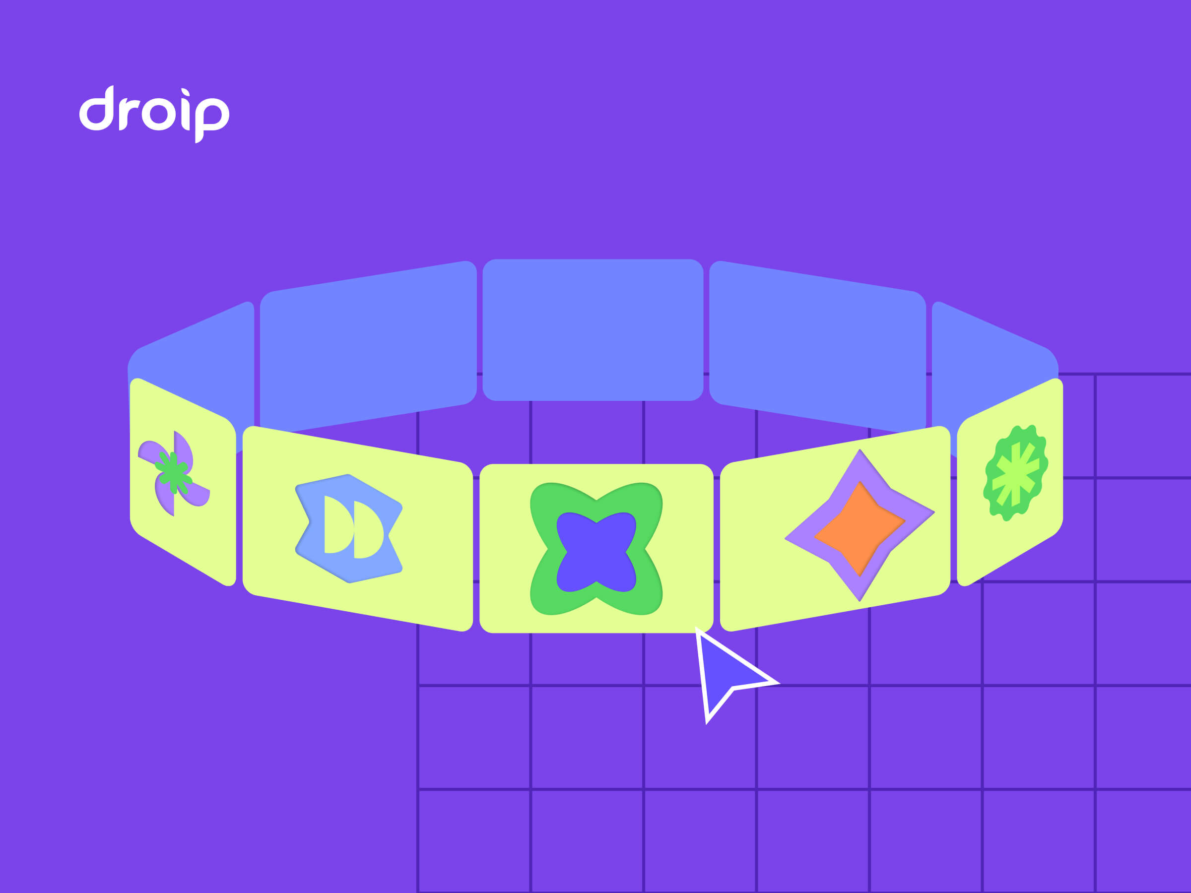


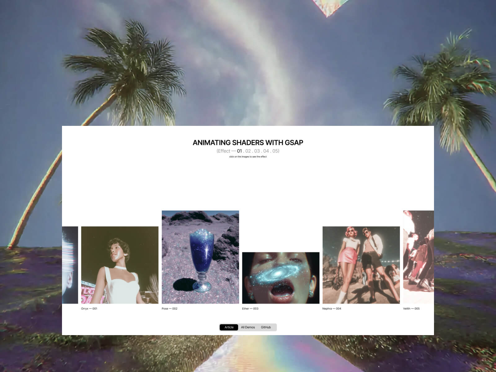


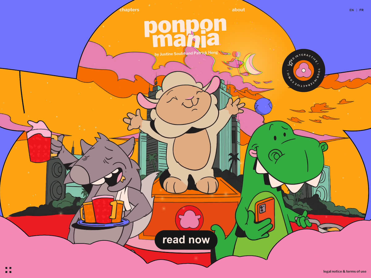

 Ponpon Mania is an animated comic featuring Ponpon, a megalomaniac sheep dreaming of becoming a DJ. We wanted to explore storytelling beyond traditional comics by combining playful interactions, smooth GSAP-powered motion, and dynamic visuals. The goal was to create a comic that feels alive, where readers engage directly with Ponpon’s world while following the narrative. The project evolved over several months, moving from early sketches to interactive prototypes.