دسته: برنامه‌نویسان

  • From SplitText to MorphSVG: 5 Creative Demos Using Free GSAP Plugins

    From SplitText to MorphSVG: 5 Creative Demos Using Free GSAP Plugins


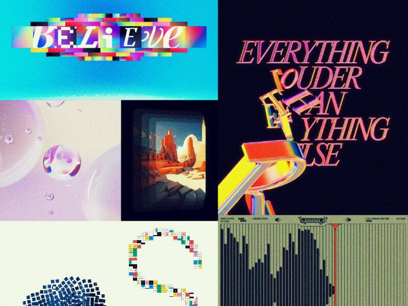
    We assume that by now you’ve all read the wonderful news about GSAP now becoming 100% free, for everyone. Thanks to Webflow’s support, all of the previously paid plugins in GSAP are now accessible to everyone. That’s why today, Osmo, Codrops and GSAP are teaming up to bring you 5 demos, available both as a Webflow cloneable and CodePen. We hope these will provide a fun intro to some cool plugins and spark a few ideas!

    What you’ll learn:

    • SplitText basics: Break text into lines, words, or letters—with the new automatic resizing and built-in masking options!
    • DrawSVG scribbles: Add a playful, randomized underline to links (or anything) on hover using DrawSVG.
    • Physics2D text smash: Combine SplitText + Physics2D so your headline shatters into letters that tumble off the top of the viewport like a roof.
    • Inertia dot grid: Create an interactive, glowing dot matrix that springs and flows with your cursor for a dynamic background effect.
    • MorphSVG toggle: Build a seamless play/pause button that morphs one SVG into another in a single tween.

    Before we dive in, let’s make sure you have the GSAP core included in your project. I will let you know the exact plugins you need per demo! You can use the official GSAP Install Helper if you need the correct npm commands or CDN links. If you’re following this as a Webflow user and you want to build from scratch, Webflow has made it super easy to integrate GSAP into your project. If you want, you can read more here. When using this approach, just make sure to add your custom code somewhere in the before </body> section of the page or project settings.

    Perfect, with that set, let’s start building an interactive SplitText demo!

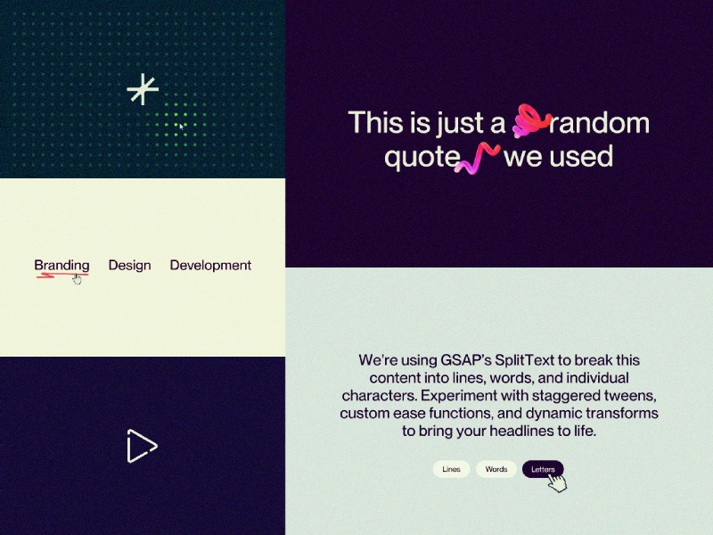
    Interactive SplitText Demo

    Before we dive into code, a couple notes:

    • Plugins needed: GSAP core, SplitText, and (optionally) CustomEase.
      • The CustomEase plugin isn’t required—feel free to swap in any ease or omit it entirely—but we’ll use it here to give our animation a distinctive feel.
    • Demo purpose: We’re building an interactive demo here, with buttons to trigger different reveal styles. If you just want a one-off split-text reveal (e.g. on scroll or on load), you can skip the buttons and wire your tween directly into ScrollTrigger, Click handlers, etc.

    HTML and CSS Setup

    <div class="text-demo-wrap">
      <h1 data-split="heading" class="text-demo-h">
        We’re using GSAP’s SplitText to break this content into lines, words, and individual characters. Experiment with staggered tweens, custom ease functions, and dynamic transforms to bring your headlines to life.
      </h1>
      <div class="text-demo-buttons">
        <button data-split="button" data-split-type="lines" class="text-demo-button"><span>Lines</span></button>
        <button data-split="button" data-split-type="words" class="text-demo-button"><span>Words</span></button>
        <button data-split="button" data-split-type="letters" class="text-demo-button"><span>Letters</span></button>
      </div>
    </div>
    body {
      color: #340824;
      background-color: #d8e1ed;
    }
    
    .text-demo-wrap {
      display: flex;
      flex-direction: column;
      align-items: center;
      gap: 4.5em;
      max-width: 70em;
      margin: 0 auto;
      padding: 0 1.25em;
    }
    
    .text-demo-h {
      font-size: 3.25vw;
      font-weight: 500;
      line-height: 1.15;
      text-align: center;
      margin: 0;
    }
    
    .text-demo-buttons {
      display: flex;
      gap: 1.25em;
    }
    
    .text-demo-button {
      padding: .625em 1.25em;
      font-size: 1.625em;
      border-radius: 100em;
      background: #fff;
      transition: background .15s, color .15s;
    }
    .text-demo-button:hover {
      background: #340824;
      color: #fff;
    }

    1. Register plugins (and optional ease)

    Start by registering SplitText (and CustomEase, if you’d like a bespoke curve).

    gsap.registerPlugin(SplitText, CustomEase);
    
    // Optional: a custom ease
    CustomEase.create("osmo-ease", "0.625, 0.05, 0, 1");

    2. Split your heading into lines, words & letters

    This single call does the heavy lifting: it splits your <h1> into three levels of granularity, wraps each line in a masked container, and keeps everything in sync on resize.

    const heading = document.querySelector('[data-split="heading"]');
    
    SplitText.create(heading, {
      type: "lines, words, chars", // split by lines, words & characters
      mask: "lines", // optional: wraps each line in an overflow-clip <div> for a mask effect later
      linesClass: "line",
      wordsClass: "word",
      charsClass: "letter"
    });

    mask: "lines" wraps each line in its own container so you can do masked reveals without extra markup.

    3. Hook up the buttons

    Since this is a showcase, we’ve added three buttons. One each for “Lines”, “Words” and “Letters”—to let users trigger each style on demand. In a real project you might fire these tweens on scroll, on page load, or when another interaction occurs.

    To keep our code a bit cleaner, we define a config object that maps each split type to its ideal duration and stagger. Because lines, words, and letters have vastly different counts, matching your timing to the number of elements ensures each animation feels tight and responsive.

    If you used the same stagger for letters as you do for lines, animating dozens (or hundreds) of chars would take forever. Tailoring the stagger to the element count keeps the reveal snappy.

    // 1. Define per-type timing
    const config = {
      lines: { duration: 0.8, stagger: 0.08 },
      words: { duration: 0.6, stagger: 0.06 },
      letters: { duration: 0.4, stagger: 0.008 }
    };

    Next, our animate(type) function:

    function animate(type) {
      // 1) Clean up any running tween so clicks “restart” cleanly
      if (currentTween) {
        currentTween.kill();
        gsap.set(currentTargets, { yPercent: 0 });
      }
    
      // 2) Pull the right timing from our config
      const { duration, stagger } = config[type];
    
      // 3) Match the button’s data-split-type to the CSS class
      // Our SplitText call used linesClass="line", wordsClass="word", charsClass="letter"
      const selector = type === "lines" ? ".line"
                     : type === "words" ? ".word"
                                        : ".letter";
    
      // 4) Query the correct elements and animate
      currentTargets = heading.querySelectorAll(selector);
      currentTween = gsap.fromTo(
        currentTargets,
        { yPercent: 110 },
        { yPercent: 0, duration, stagger, ease: "osmo-ease" }
      );
    }

    Notice how type (the button’s data-split-type) directly aligns with our config keys and the class names we set on each slice. This tidy mapping means you can add new types (or swap class names) without rewriting your logic—just update config (and your SplitText options) and the function auto-adapts.

    Finally, tie it all together with event listeners:

    const buttons = document.querySelectorAll('[data-split="button"]');
    
    buttons.forEach(btn =>
      btn.addEventListener("click", () =>
        animate(btn.dataset.splitType)
      )
    );

    4. Putting it all together

    Let’s put all of our JS together in one neat function, and call it as soon as our fonts are loaded. This way we avoid splitting text while a fallback font is visible, and with that, we avoid any unexpected line breaks.

    // JavaScript (ensure GSAP, SplitText & CustomEase are loaded)
    gsap.registerPlugin(SplitText, CustomEase);
    CustomEase.create("osmo-ease", "0.625, 0.05, 0, 1");
    
    function initSplitTextDemo() {
      const heading = document.querySelector('[data-split="heading"]');
      SplitText.create(heading, {
        type: "lines, words, chars",
        mask: "lines",
        linesClass: "line",
        wordsClass: "word",
        charsClass: "letter"
      });
    
      const config = {
        lines: { duration: 0.8, stagger: 0.08 },
        words: { duration: 0.6, stagger: 0.06 },
        letters: { duration: 0.4, stagger: 0.008 }
      };
    
      let currentTween, currentTargets;
    
      function animate(type) {
        if (currentTween) {
          currentTween.kill();
          gsap.set(currentTargets, { yPercent: 0 });
        }
    
        const { duration, stagger } = config[type];
        const selector = type === "lines" ? ".line"
                       : type === "words" ? ".word"
                                          : ".letter";
    
        currentTargets = heading.querySelectorAll(selector);
        currentTween = gsap.fromTo(
          currentTargets,
          { yPercent: 110 },
          { yPercent: 0, duration, stagger, ease: "osmo-ease" }
        );
      }
    
      document.querySelectorAll('[data-split="button"]').forEach(btn =>
        btn.addEventListener("click", () =>
          animate(btn.dataset.splitType)
        )
      );
    }
    
    document.fonts.ready.then(initSplitTextDemo);

    5. Resources & links

    Give it a spin yourself! Find this demo on CodePen and grab the Webflow cloneable below. For a deep dive into every available option, check out the official SplitText docs, and head over to the CustomEase documentation to learn how to craft your own easing curves.

    Webflow Cloneable

    CodePen

    We’ll continue next with the Physics2D Text Smash demo—combining SplitText with another GSAP plugin for a totally different effect.

    Physics2D Text Smash Demo

    If you weren’t aware already, with the recent Webflow × GSAP announcements, SplitText received a major overhaul—packed with powerful new options, accessibility improvements, and a dramatically smaller bundle size. Check out the SplitText docs for all the details.

    Unlike our previous demo (which was more of an interactive playground with buttons), this effect is a lot closer to a real-world application; as you scroll, each heading “breaks” into characters and falls off of your viewport like it’s hit a roof—thanks to ScrollTrigger and Physics2DPlugin.

    Before we dive into code, a couple notes:

    • Plugins needed: GSAP core, SplitText, ScrollTrigger, and Physics2DPlugin.
    • Assets used: We’re using some squiggly, fun, 3D objects from a free pack on wannathis.one. Definitely check out their stuff, they have more fun things!
    • Demo purpose: We’re combining SplitText + Physics2D on scroll so your headings shatter into characters and “fall” off the top of the viewport, as if they hit a ‘roof’.

    HTML & CSS Setup

      <div class="drop-wrapper">
        <div class="drop-section">
          <h1 data-drop-text="" class="drop-heading">
            This is just a
            <span data-drop-img="" class="drop-heading-img is--first"><img loading="lazy" src="https://cdn.prod.website-files.com/681a615bf5a0f1ba3cb1ca38/681a62d0bb34b74d3514ecab_shape-squigle-1.png" alt=""></span>
            random quote
            <span data-drop-img="" class="drop-heading-img is--second"><img loading="lazy" src="https://cdn.prod.website-files.com/681a615bf5a0f1ba3cb1ca38/681a62d0bb34b74d3514ecad_shape-squigle-2.png" alt=""></span>
            we used
          </h1>
        </div>
        <div class="drop-section">
          <h1 data-drop-text="" class="drop-heading">
            See how our window acts like
            <span data-drop-img="" class="drop-heading-img is--third"><img loading="lazy" src="https://cdn.prod.website-files.com/681a615bf5a0f1ba3cb1ca38/681a62d0bb34b74d3514ecaf_shape-squigle-3.png" alt=""></span>
            a roof?
          </h1>
        </div>
        <div class="drop-section">
          <h1 data-drop-text="" class="drop-heading">So much fun!</h1>
        </div>
      </div>
    body {
      color: #efeeec;
      background-color: #340824;
    }
    
    .drop-wrapper {
      width: 100%;
      min-height: 350vh;
    }
    
    .drop-section {
      display: flex;
      justify-content: center;
      align-items: center;
      min-height: 100vh;
      position: relative;
    }
    
    .drop-heading {
      max-width: 40rem;
      margin: 0;
      font-size: 4rem;
      font-weight: 500;
      line-height: 1;
      text-align: center;
    }
    
    .drop-heading-img {
      display: inline-block;
      position: relative;
      width: 1.4em;
      z-index: 2;
    }
    
    .drop-heading-img.is--first {
      transform: rotate(-20deg) translate(.15em, -.2em);
    }
    
    .drop-heading-img.is--second {
      transform: translate(-.15em) rotate(10deg);
    }
    
    .drop-heading-img.is--third {
      transform: translate(-.05em, .1em) rotate(50deg);
      margin: 0 .1em;
    }

    1. Register plugins

    Start by registering all of our necessary plugins

    gsap.registerPlugin(ScrollTrigger, SplitText, Physics2DPlugin);

    2. SplitText setup

    We’re using aria: true here to automatically add an aria-label on the wrapper and hide split spans from screen readers. Since the latest update, aria: true is the default, so you don’t necessarily have to add it here—but we’re highlighting it for the article.

    We split the text as soon as the code runs, so that we can attach a callback to the new onSplit function, but more on that in step 3.

    new SplitText("[data-drop-text]", {
      type: "lines, chars",
      autoSplit: true,  // re-split if the element resizes and it's split by lines
      aria: true, // default now, but worth highlighting!
      linesClass: "line",
    });

    With the recent SplitText update, there’s also a new option called autoSplit—which takes care of resize events, and re-splitting your text.

    An important caveat for the autoSplit option; you should always create your animations in the (also new!) onSplit() callback so that if your text re-splits (when the container resizes or a font loads in), the resulting animations affect the freshly-created line/word/character elements instead of the ones from the previous split. If you’re planning on using a non-responsive font-size or just want to learn more about this (awesome) new feature that takes care of responsive line splitting, check out the documentation here.

    3. Trigger on scroll

    In our onSplit callback, we loop over each line in the heading, inside of a context. This context, which we return at the end, makes sure GSAP can clean up this animation whenever the text re-splits.

    In our loop, we create a ScrollTrigger for each line, and we set once: true, so our animation only fires once. In step 4 we’ll add our animation!

    It’s worth playing around with the start values to really nail the moment where your text visually ‘touches’ the top of the window. For our font, size, and line-height combo, an offset of 10px worked great.

    new SplitText("[data-drop-text]", {
      type: "lines, chars",
      autoSplit: true,
      aria: true,
      linesClass: "line",
      onSplit(self) {
        // use a context to collect up all the animations
        let ctx = gsap.context(() => {
          self.lines.forEach((line) => { // loop around the lines          
            gsap.timeline({
              scrollTrigger: {
                once: true, // only fire once
                trigger: line, // use the line as a trigger
                start: "top top-=10" // adjust the trigger point to your liking
              }
            })
          });
        });
    
        return ctx; // return our animations so GSAP can clean them up when onSplit fires
      }
    });

    4. Drop the letters with Physics2D

    Now, let’s add 2 tweens to our timeline. The first one, using the Physics2D plugin, sends each child element of the line, flying straight down with randomized velocity, angle, and gravity. A second tween makes sure the elements are faded out towards the end.

    new SplitText("[data-drop-text]", {
      type: "lines, chars",
      autoSplit: true,
      aria: true,
      linesClass: "line",
      onSplit(self) {
        // use a context to collect up all the animations
        let ctx = gsap.context(() => {
          self.lines.forEach((line) => { // loop around the lines          
            gsap.timeline({
              scrollTrigger: {
                once: true, // only fire once
                trigger: line, // use the line as a trigger
                start: "top top-=10" // adjust the trigger point to your liking
              }
            })
            .to(line.children, { // target the children
              duration: "random(1.5, 3)", // Use randomized values for a more dynamic animation
              physics2D: {
                velocity: "random(500, 1000)",
                angle: 90,
                gravity: 3000
              },
              rotation: "random(-90, 90)",
              ease: "none"
            })
            .to(line.children,{ // Start fading them out
              autoAlpha: 0,
              duration: 0.2
             }, "-=.2");
          });
        });
    
        return ctx; // return our animations so GSAP can clean them up when onSplit fires
      }
    });

    Tip: use gsap.utils.random()! Giving each char and image a slightly different speed and spin creates a joyful, and more natural feeling to it all.

    5. Putting it all together

    gsap.registerPlugin(ScrollTrigger, SplitText, Physics2DPlugin);
    
    function initDroppingText() {
      new SplitText("[data-drop-text]", {
        type: "lines, chars",
        autoSplit: true,
        aria: true,
        linesClass: "line",
        onSplit(self) {
          // use a context to collect up all the animations
          let ctx = gsap.context(() => {
            self.lines.forEach((line) => {         
              gsap
                .timeline({
                  scrollTrigger: {
                    once: true,
                    trigger: line,
                    start: "top top-=10"
                  }
                })
                .to(line.children, { // target the children
                  duration: "random(1.5, 3)", // Use randomized values for a more dynamic animation
                  physics2D: {
                    velocity: "random(500, 1000)",
                    angle: 90,
                    gravity: 3000
                  },
                  rotation: "random(-90, 90)",
                  ease: "none"
                })
                .to(
                  line.children,
                  {
                    autoAlpha: 0,
                    duration: 0.2
                  },
                  "-=.2"
                );
            });
          });
    
          return ctx; // return our animations so GSAP can clean them up when onSplit fires
        }
      });
    }
    
    document.addEventListener("DOMContentLoaded", initDroppingText);

    6. Resources & links

    Webflow Cloneable

    CodePen

    Next up: an interactive Inertia Dot Grid that springs and flows with your cursor!

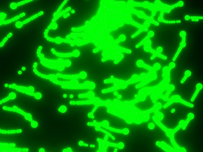
    Glowing Interactive Dot Grid

    InertiaPlugin (formerly ThrowPropsPlugin) allows you to smoothly glide any property to a stop, honoring an initial velocity as well as applying optional restrictions on the end value. It brings real-world momentum to your elements, letting them move with an initial velocity and smoothly slow under configurable resistance. You simply specify a starting velocity and resistance value, and the plugin handles the physics.

    In this demo, we’re using a quick-to-prototype grid of <div> dots that glow as your cursor approaches, spring away on rapid mouse movements, and ripple outward on clicks. While a Canvas or WebGL approach would scale more efficiently for thousands of particles and deliver higher frame-rates, our div-based solution keeps the code simple and accessible—perfect for spotlighting InertiaPlugin’s capabilities.

    Before we dive in:

    • Plugins needed: GSAP core and InertiaPlugin.
    • Demo purpose: Build a responsive grid of dots that glow with proximity and spring away on fast mouse moves or clicks—showcasing how the InertiaPlugin can add playful, physics-based reactions to a layout.

    HTML & CSS Setup

    <div class="dots-wrap">
      <div data-dots-container-init class="dots-container">
        <div class="dot"></div>
      </div>
    </div>
    
    <section class="section-resource">
      <a href="https://osmo.supply/" target="_blank" class="osmo-icon__link">
    	  <svg xmlns="http://www.w3.org/2000/svg" width="100%" viewbox="0 0 160 160" fill="none" class="osmo-icon-svg">
          <path d="M94.8284 53.8578C92.3086 56.3776 88 54.593 88 51.0294V0H72V59.9999C72 66.6273 66.6274 71.9999 60 71.9999H0V87.9999H51.0294C54.5931 87.9999 56.3777 92.3085 53.8579 94.8283L18.3431 130.343L29.6569 141.657L65.1717 106.142C67.684 103.63 71.9745 105.396 72 108.939V160L88.0001 160L88 99.9999C88 93.3725 93.3726 87.9999 100 87.9999H160V71.9999H108.939C105.407 71.9745 103.64 67.7091 106.12 65.1938L106.142 65.1716L141.657 29.6568L130.343 18.3432L94.8284 53.8578Z" fill="currentColor"></path>
        </svg>
      </a>
    </section>
    body {
      overscroll-behavior: none;
      background-color: #08342a;
      color: #efeeec;
    }
    
    .dots-container {
      position: absolute;
      inset: 4em;
      display: flex;
      flex-flow: wrap;
      gap: 2em;
      justify-content: center;
      align-items: center;
      pointer-events: none;
    }
    
    .dot {
      position: relative;
      width: 1em;
      height: 1em;
      border-radius: 50%;
      background-color: #245e51;
      transform-origin: center;
      will-change: transform, background-color;
      transform: translate(0);
      place-self: center;
    }
    
    .section-resource {
      color: #efeeec;
      justify-content: center;
      align-items: center;
      display: flex;
      position: absolute;
      inset: 0;
    }
    
    .osmo-icon-svg {
      width: 10em;
    }
    
    .osmo-icon__link {
      color: currentColor;
      text-decoration: none;
    }

    1. Register plugins

    gsap.registerPlugin(InertiaPlugin);

    2. Build your grid & optional center hole

    First, wrap everything in an initGlowingInteractiveDotsGrid() function and declare your tweakable parameters—colors, glow distance, speed thresholds, shockwave settings, max pointer speed, and whether to carve out a center hole for a logo. We also set up two arrays, dots and dotCenters, to track the elements and their positions.

    function initGlowingInteractiveDotsGrid() {
      const container = document.querySelector('[data-dots-container-init]');
      const colors = { base: "#245E51", active: "#A8FF51" };
      const threshold = 200;
      const speedThreshold = 100;
      const shockRadius = 325;
      const shockPower = 5;
      const maxSpeed = 5000;
      const centerHole = true;
      let dots = [];
      let dotCenters = [];
    
      // buildGrid(), mousemove & click handlers defined next…
    }

    With those in place, buildGrid() figures out how many columns and rows fit based on your container’s em sizing, then optionally carves out a perfectly centered block of 4 or 5 columns/rows (depending on whether the grid dimensions are even or odd) if centerHole is true. That hole gives space for your logo; set centerHole = false to fill every cell.

    Inside buildGrid(), we:

    1. Clear out any existing dots and reset our arrays.
    2. Read the container’s fontSize to get dotPx (in px) and derive gapPx.
    3. Calculate how many columns and rows fit, plus the total cells.
    4. Compute a centered “hole” of 4 or 5 columns/rows if centerHole is true, so you can place a logo or focal element.
    function buildGrid() {
      container.innerHTML = "";
      dots = [];
      dotCenters = [];
    
      const style = getComputedStyle(container);
      const dotPx = parseFloat(style.fontSize);
      const gapPx = dotPx * 2;
      const contW = container.clientWidth;
      const contH = container.clientHeight;
      const cols = Math.floor((contW + gapPx) / (dotPx + gapPx));
      const rows = Math.floor((contH + gapPx) / (dotPx + gapPx));
      const total = cols * rows;
    
      const holeCols = centerHole ? (cols % 2 === 0 ? 4 : 5) : 0;
      const holeRows = centerHole ? (rows % 2 === 0 ? 4 : 5) : 0;
      const startCol = (cols - holeCols) / 2;
      const startRow = (rows - holeRows) / 2;
    
      // …next: loop through each cell to create dots…
    }

    Now loop over every cell index. Inside that loop, we hide any dot in the hole region and initialize the visible ones with GSAP’s set(). Each dot is appended to the container and pushed into our dots array for tracking.

    For each dot:

    • If it falls in the hole region, we hide it.
    • Otherwise, we position it at { x: 0, y: 0 } with the base color and mark it as not yet sprung.
    • Append it to the container and track it in dots.
    // ... add this to the buildGrid() function
    
    for (let i = 0; i < total; i++) {
      const row = Math.floor(i / cols);
      const col = i % cols;
      const isHole =
        centerHole &&
        row >= startRow &&
        row < startRow + holeRows &&
        col >= startCol &&
        col < startCol + holeCols;
    
      const d = document.createElement("div");
      d.classList.add("dot");
    
      if (isHole) {
        d.style.visibility = "hidden";
        d._isHole = true;
      } else {
        gsap.set(d, { x: 0, y: 0, backgroundColor: colors.base });
        d._inertiaApplied = false;
      }
    
      container.appendChild(d);
      dots.push(d);
    }
    
    // ... more code added below

    Finally, once the DOM is updated, measure each visible dot’s center coordinate—including any scroll offset—so we can calculate distances later. Wrapping in requestAnimationFrame ensures the layout is settled.

    // ... add this to the buildGrid() function
    
    requestAnimationFrame(() => {
      dotCenters = dots
        .filter(d => !d._isHole)
        .map(d => {
          const r = d.getBoundingClientRect();
          return {
            el: d,
            x: r.left + window.scrollX + r.width / 2,
            y: r.top + window.scrollY + r.height / 2
          };
        });
    });
    
    // this is the end of the buildGrid() function

    By now, the complete buildGrid() function will look like the following:

    function buildGrid() {
      container.innerHTML = "";
      dots = [];
      dotCenters = [];
    
      const style = getComputedStyle(container);
      const dotPx = parseFloat(style.fontSize);
      const gapPx = dotPx * 2;
      const contW = container.clientWidth;
      const contH = container.clientHeight;
      const cols = Math.floor((contW + gapPx) / (dotPx + gapPx));
      const rows = Math.floor((contH + gapPx) / (dotPx + gapPx));
      const total = cols * rows;
    
      const holeCols = centerHole ? (cols % 2 === 0 ? 4 : 5) : 0;
      const holeRows = centerHole ? (rows % 2 === 0 ? 4 : 5) : 0;
      const startCol = (cols - holeCols) / 2;
      const startRow = (rows - holeRows) / 2;
    
      for (let i = 0; i < total; i++) {
        const row = Math.floor(i / cols);
        const col = i % cols;
        const isHole = centerHole &&
          row >= startRow && row < startRow + holeRows &&
          col >= startCol && col < startCol + holeCols;
    
        const d = document.createElement("div");
        d.classList.add("dot");
    
        if (isHole) {
          d.style.visibility = "hidden";
          d._isHole = true;
        } else {
          gsap.set(d, { x: 0, y: 0, backgroundColor: colors.base });
          d._inertiaApplied = false;
        }
    
        container.appendChild(d);
        dots.push(d);
      }
    
      requestAnimationFrame(() => {
        dotCenters = dots
          .filter(d => !d._isHole)
          .map(d => {
            const r = d.getBoundingClientRect();
            return {
              el: d,
              x: r.left + window.scrollX + r.width / 2,
              y: r.top + window.scrollY + r.height / 2
            };
          });
      });
    }

    At the end of initGlowingInteractiveDotsGrid(), we attach a resize listener and invoke buildGrid() once to kick things off:

    window.addEventListener("resize", buildGrid);
    buildGrid();

    3. Handle mouse move interactions

    As the user moves their cursor, we calculate its velocity by comparing the current e.pageX/e.pageY to the last recorded position over time (dt). We clamp that speed to maxSpeed to avoid runaway values. Then, on the next animation frame, we loop through each dot’s center:

    • Compute its distance to the cursor and derive t = Math.max(0, 1 - dist / threshold).
    • Interpolate its color from colors.base to colors.active.
    • If speed > speedThreshold and the dot is within threshold, mark it _inertiaApplied and fire an inertia tween to push it away before it springs back.

    All this still goes inside of our initGlowingInteractiveDotsGrid() function:

    let lastTime = 0
    let lastX = 0
    let lastY = 0
    
    window.addEventListener("mousemove", e => {
      const now = performance.now()
      const dt = now - lastTime || 16
      let dx = e.pageX - lastX
      let dy = e.pageY - lastY
      let vx = (dx / dt) * 1000
      let vy = (dy / dt) * 1000
      let speed = Math.hypot(vx, vy)
    
      if (speed > maxSpeed) {
        const scale = maxSpeed / speed
        vx = vx * scale
        vy = vy * scale
        speed = maxSpeed
      }
    
      lastTime = now
      lastX = e.pageX
      lastY = e.pageY
    
      requestAnimationFrame(() => {
        dotCenters.forEach(({ el, x, y }) => {
          const dist = Math.hypot(x - e.pageX, y - e.pageY)
          const t = Math.max(0, 1 - dist / threshold)
          const col = gsap.utils.interpolate(colors.base, colors.active, t)
          gsap.set(el, { backgroundColor: col })
    
          if (speed > speedThreshold && dist < threshold && !el._inertiaApplied) {
            el._inertiaApplied = true
            const pushX = (x - e.pageX) + vx * 0.005
            const pushY = (y - e.pageY) + vy * 0.005
    
            gsap.to(el, {
              inertia: { x: pushX, y: pushY, resistance: 750 },
              onComplete() {
                gsap.to(el, {
                  x: 0,
                  y: 0,
                  duration: 1.5,
                  ease: "elastic.out(1, 0.75)"
                })
                el._inertiaApplied = false
              }
            })
          }
        })
      })
    })

    4. Handle click ‘shockwave’ effect

    On each click, we send a radial ‘shockwave’ through the grid. We reuse the same inertia + elastic return logic, but scale the push by a distance-based falloff so that dots closer to the click move further, then all spring back in unison.

    window.addEventListener("click", e => {
      dotCenters.forEach(({ el, x, y }) => {
        const dist = Math.hypot(x - e.pageX, y - e.pageY)
        if (dist < shockRadius && !el._inertiaApplied) {
          el._inertiaApplied = true
          const falloff = Math.max(0, 1 - dist / shockRadius)
          const pushX = (x - e.pageX) * shockPower * falloff
          const pushY = (y - e.pageY) * shockPower * falloff
    
          gsap.to(el, {
            inertia: { x: pushX, y: pushY, resistance: 750 },
            onComplete() {
              gsap.to(el, {
                x: 0,
                y: 0,
                duration: 1.5,
                ease: "elastic.out(1, 0.75)"
              })
              el._inertiaApplied = false
            }
          })
        }
      })
    })

    5. Putting it all together

    By now, all of our pieces live inside one initGlowingInteractiveDotsGrid() function. Here’s an abbreviated view of your final JS setup:

    gsap.registerPlugin(InertiaPlugin);
    
    function initGlowingInteractiveDotsGrid() {
      // buildGrid(): creates and positions dots
      // window.addEventListener("mousemove", …): glow & spring logic
      // window.addEventListener("click", …): shockwave logic
    }
    
    document.addEventListener("DOMContentLoaded", initGlowingInteractiveDotsGrid);

    6. Resources & links

    Webflow Cloneable

    CodePen

    Next up: DrawSVG Scribbles Demo — let’s draw some playful, randomized underlines on hover!

    DrawSVG Scribbles Demo

    GSAP’s DrawSVGPlugin animates the stroke of an SVG path by tweening its stroke-dasharray and stroke-dashoffset, creating a ‘drawing’ effect. You can control start/end percentages, duration, easing, and even stagger multiple paths. In this demo, we’ll attach a randomized scribble underline to each link on hover—perfect for adding a playful touch to your navigation or call-to-actions.

    • Plugins needed: GSAP core and DrawSVGPlugin
    • Demo purpose: On hover, inject a random SVG scribbles beneath your link text and animate it from 0% to 100% draw, then erase it on hover-out.

    HTML & CSS Setup

    <section class="section-resource">
      <a data-draw-line href="#" class="text-draw w-inline-block">
        <p class="text-draw__p">Branding</p>
        <div data-draw-line-box class="text-draw__box"></div>
      </a>
      <a data-draw-line href="#" class="text-draw w-inline-block">
        <p class="text-draw__p">Design</p>
        <div data-draw-line-box class="text-draw__box"></div>
      </a>
      <a data-draw-line href="#" class="text-draw w-inline-block">
        <p class="text-draw__p">Development</p>
        <div data-draw-line-box class="text-draw__box"></div>
      </a>
    </section>
    body {
      background-color: #fefaee;
    }
    .section-resource {
      display: flex;
      justify-content: center;
      align-items: center;
      min-height: 100vh;
      font-size: 1.5vw;
    }
    .text-draw {
      color: #340824;
      cursor: pointer;
      margin: 0 1em;
      font-size: 2em;
      text-decoration: none;
    }
    .text-draw__p {
      margin-bottom: 0;
      font-size: 1.5em;
      font-weight: 500;
      line-height: 1.1;
    }
    .text-draw__box {
      position: relative;
      width: 100%;
      height: .625em;
      color: #e55050;
    }
    .text-draw__box-svg {
      position: absolute;
      top: 0;
      left: 0;
      width: 100%;
      height: 100%;
      overflow: visible !important;
    }

    1. Register the plugin

    gsap.registerPlugin(DrawSVGPlugin);

    2. Prepare your SVG variants

    We define an array of exact SVG scribbles. Each string is a standalone <svg> with its <path>. When we inject it, we run decorateSVG() to ensure it scales to its container and uses currentColor for theming.

    We’ve drawn these scribbles ourselves in figma using the pencil. We recommend drawing (and thus creating the path coordinates) in the order of which you want to draw them.

    const svgVariants = [
        `<svg width="310" height="40" viewBox="0 0 310 40" fill="none" xmlns="http://www.w3.org/2000/svg"><path d="M5 20.9999C26.7762 16.2245 49.5532 11.5572 71.7979 14.6666C84.9553 16.5057 97.0392 21.8432 109.987 24.3888C116.413 25.6523 123.012 25.5143 129.042 22.6388C135.981 19.3303 142.586 15.1422 150.092 13.3333C156.799 11.7168 161.702 14.6225 167.887 16.8333C181.562 21.7212 194.975 22.6234 209.252 21.3888C224.678 20.0548 239.912 17.991 255.42 18.3055C272.027 18.6422 288.409 18.867 305 17.9999" stroke="currentColor" stroke-width="10" stroke-linecap="round"/></svg>`,
        `<svg width="310" height="40" viewBox="0 0 310 40" fill="none" xmlns="http://www.w3.org/2000/svg"><path d="M5 24.2592C26.233 20.2879 47.7083 16.9968 69.135 13.8421C98.0469 9.5853 128.407 4.02322 158.059 5.14674C172.583 5.69708 187.686 8.66104 201.598 11.9696C207.232 13.3093 215.437 14.9471 220.137 18.3619C224.401 21.4596 220.737 25.6575 217.184 27.6168C208.309 32.5097 197.199 34.281 186.698 34.8486C183.159 35.0399 147.197 36.2657 155.105 26.5837C158.11 22.9053 162.993 20.6229 167.764 18.7924C178.386 14.7164 190.115 12.1115 201.624 10.3984C218.367 7.90626 235.528 7.06127 252.521 7.49276C258.455 7.64343 264.389 7.92791 270.295 8.41825C280.321 9.25056 296 10.8932 305 13.0242" stroke="#E55050" stroke-width="10" stroke-linecap="round"/></svg>`,
        `<svg width="310" height="40" viewBox="0 0 310 40" fill="none" xmlns="http://www.w3.org/2000/svg"><path d="M5 29.5014C9.61174 24.4515 12.9521 17.9873 20.9532 17.5292C23.7742 17.3676 27.0987 17.7897 29.6575 19.0014C33.2644 20.7093 35.6481 24.0004 39.4178 25.5014C48.3911 29.0744 55.7503 25.7731 63.3048 21.0292C67.9902 18.0869 73.7668 16.1366 79.3721 17.8903C85.1682 19.7036 88.2173 26.2464 94.4121 27.2514C102.584 28.5771 107.023 25.5064 113.276 20.6125C119.927 15.4067 128.83 12.3333 137.249 15.0014C141.418 16.3225 143.116 18.7528 146.581 21.0014C149.621 22.9736 152.78 23.6197 156.284 24.2514C165.142 25.8479 172.315 17.5185 179.144 13.5014C184.459 10.3746 191.785 8.74853 195.868 14.5292C199.252 19.3205 205.597 22.9057 211.621 22.5014C215.553 22.2374 220.183 17.8356 222.979 15.5569C225.4 13.5845 227.457 11.1105 230.742 10.5292C232.718 10.1794 234.784 12.9691 236.164 14.0014C238.543 15.7801 240.717 18.4775 243.356 19.8903C249.488 23.1729 255.706 21.2551 261.079 18.0014C266.571 14.6754 270.439 11.5202 277.146 13.6125C280.725 14.7289 283.221 17.209 286.393 19.0014C292.321 22.3517 298.255 22.5014 305 22.5014" stroke="#E55050" stroke-width="10" stroke-linecap="round"/></svg>`,
        `<svg width="310" height="40" viewBox="0 0 310 40" fill="none" xmlns="http://www.w3.org/2000/svg"><path d="M17.0039 32.6826C32.2307 32.8412 47.4552 32.8277 62.676 32.8118C67.3044 32.807 96.546 33.0555 104.728 32.0775C113.615 31.0152 104.516 28.3028 102.022 27.2826C89.9573 22.3465 77.3751 19.0254 65.0451 15.0552C57.8987 12.7542 37.2813 8.49399 44.2314 6.10216C50.9667 3.78422 64.2873 5.81914 70.4249 5.96641C105.866 6.81677 141.306 7.58809 176.75 8.59886C217.874 9.77162 258.906 11.0553 300 14.4892" stroke="#E55050" stroke-width="10" stroke-linecap="round"/></svg>`,
        `<svg width="310" height="40" viewBox="0 0 310 40" fill="none" xmlns="http://www.w3.org/2000/svg"><path d="M4.99805 20.9998C65.6267 17.4649 126.268 13.845 187.208 12.8887C226.483 12.2723 265.751 13.2796 304.998 13.9998" stroke="currentColor" stroke-width="10" stroke-linecap="round"/></svg>`,
        `<svg width="310" height="40" viewBox="0 0 310 40" fill="none" xmlns="http://www.w3.org/2000/svg"><path d="M5 29.8857C52.3147 26.9322 99.4329 21.6611 146.503 17.1765C151.753 16.6763 157.115 15.9505 162.415 15.6551C163.28 15.6069 165.074 15.4123 164.383 16.4275C161.704 20.3627 157.134 23.7551 153.95 27.4983C153.209 28.3702 148.194 33.4751 150.669 34.6605C153.638 36.0819 163.621 32.6063 165.039 32.2029C178.55 28.3608 191.49 23.5968 204.869 19.5404C231.903 11.3436 259.347 5.83254 288.793 5.12258C294.094 4.99476 299.722 4.82265 305 5.45025" stroke="#E55050" stroke-width="10" stroke-linecap="round"/></svg>`
      ];
      
    function decorateSVG(svgEl) {  
      svgEl.setAttribute('class', 'text-draw__box-svg');
      svgEl.setAttribute('preserveAspectRatio', 'none');
      svgEl.querySelectorAll('path').forEach(path => {
        path.setAttribute('stroke', 'currentColor');
      });
    }

    3. Set up hover animations

    For each link, we listen for mouseenter and mouseleave. On hover-in, we:

    • Prevent restarting if the previous draw-in tween is still active.
    • Kill any ongoing draw-out tween.
    • Pick the next SVG variant (cycling through the array).
    • Inject it into the box, decorate it, set its initial drawSVG to “0%”, then tween to “100%” in 0.5s with an ease of power2.inOut.

    On hover-out, we tween drawSVG from “100% 100%” to erase it, then clear the SVG when complete.

    let nextIndex = null;
    
    document.querySelectorAll('[data-draw-line]').forEach(container => {
      const box = container.querySelector('[data-draw-line-box]');
      if (!box) return;
      let enterTween = null;
      let leaveTween = null;
    
      container.addEventListener('mouseenter', () => {
        if (enterTween && enterTween.isActive()) return;
        if (leaveTween && leaveTween.isActive()) leaveTween.kill();
    
        if (nextIndex === null) {
          nextIndex = Math.floor(Math.random() * svgVariants.length);
        }
    
        box.innerHTML = svgVariants[nextIndex];
        const svg = box.querySelector('svg');
        if (svg) {
          decorateSVG(svg);
          const path = svg.querySelector('path');
          gsap.set(path, { drawSVG: '0%' });
          enterTween = gsap.to(path, {
            duration: 0.5,
            drawSVG: '100%',
            ease: 'power2.inOut',
            onComplete: () => { enterTween = null; }
          });
        }
    
        nextIndex = (nextIndex + 1) % svgVariants.length;
      });
    
      container.addEventListener('mouseleave', () => {
        const path = box.querySelector('path');
        if (!path) return;
    
        const playOut = () => {
          if (leaveTween && leaveTween.isActive()) return;
          leaveTween = gsap.to(path, {
            duration: 0.5,
            drawSVG: '100% 100%',
            ease: 'power2.inOut',
            onComplete: () => {
              leaveTween = null;
              box.innerHTML = '';
            }
          });
        };
    
        if (enterTween && enterTween.isActive()) {
          enterTween.eventCallback('onComplete', playOut);
        } else {
          playOut();
        }
      });
    });

    4. Initialize on page load

    Wrap the above setup in your initDrawRandomUnderline() function and call it once the DOM is ready:

    function initDrawRandomUnderline() {
      // svgVariants, decorateSVG, and all event listeners…
    }
    
    document.addEventListener('DOMContentLoaded', initDrawRandomUnderline);

    5. Resources & links

    Webflow Cloneable

    CodePen

    And now on to the final demo: MorphSVG Toggle Demo—see how to morph one icon into another in a single tween!

    MorphSVG Toggle Demo

    MorphSVGPlugin lets you fluidly morph one SVG shape into another—even when they have different numbers of points—by intelligently mapping anchor points. You can choose the morphing algorithm (size, position or complexity), control easing, duration, and even add rotation to make the transition feel extra smooth. In this demo, we’re toggling between a play ► and pause ❚❚ icon on button click, then flipping back. Perfect for video players, music apps, or any interactive control.

    We highly recommend diving into the docs for this plugin, as there are a whole bunch of options and possibilities.

    • Plugins needed: GSAP core and MorphSVGPlugin
    • Demo purpose: Build a play/pause button that seamlessly morphs its SVG path on each click.

    HTML & CSS Setup

    <button data-play-pause="toggle" class="play-pause-button">
      <svg xmlns="http://www.w3.org/2000/svg" viewBox="0 0 24 25" class="play-pause-icon">
        <path
          data-play-pause="path"
          d="M3.5 5L3.50049 3.9468C3.50049 3.177 4.33382 2.69588 5.00049 3.08078L20.0005 11.741C20.6672 12.1259 20.6672 13.0882 20.0005 13.4731L17.2388 15.1412L17.0055 15.2759M3.50049 8L3.50049 21.2673C3.50049 22.0371 4.33382 22.5182 5.00049 22.1333L14.1192 16.9423L14.4074 16.7759"
          stroke="currentColor"
          stroke-width="2"
          stroke-miterlimit="16"
          fill="none"
        />
      </svg>
    </button>
    body {
      background-color: #0e100f;
      color: #fffce1;
      display: flex;
      flex-direction: column;
      align-items: center;
      justify-content: center;
      height: 100vh;
      margin: 0;
    }
    
    .play-pause-button {
      background: transparent;
      border: none;
      width: 10rem;
      height: 10rem;
      display: flex;
      align-items: center;
      justify-content: center;
      color: currentColor;
      cursor: pointer;
    }
    
    .play-pause-icon {
      width: 100%;
      height: 100%;
    }

    1. Register the plugin

    gsap.registerPlugin(MorphSVGPlugin);

    2. Define paths & toggle logic

    We store two path definitions: playPath and pausePath, then grab our button and the <path> element inside it. A simple isPlaying boolean tracks state. On each click, we call gsap.to() on the SVG path, passing morphSVG options:

    • type: “rotational” to smoothly rotate points into place
    • map: “complexity” to match by number of anchors for speed
    • shape set to the opposite icon’s path

    Finally, we flip isPlaying so the next click morphs back.

    function initMorphingPlayPauseToggle() {
      const playPath =
        "M3.5 5L3.50049 3.9468C3.50049 3.177 4.33382 2.69588 5.00049 3.08078L20.0005 11.741C20.6672 12.1259 20.6672 13.0882 20.0005 13.4731L17.2388 15.1412L17.0055 15.2759M3.50049 8L3.50049 21.2673C3.50049 22.0371 4.33382 22.5182 5.00049 22.1333L14.1192 16.9423L14.4074 16.7759";
      const pausePath =
        "M15.5004 4.05859V5.0638V5.58691V8.58691V15.5869V19.5869V21.2549M8.5 3.96094V10.3721V17V19L8.5 21";
    
      const buttonToggle = document.querySelector('[data-play-pause="toggle"]');
      const iconPath = buttonToggle.querySelector('[data-play-pause="path"]');
      let isPlaying = false;
    
      buttonToggle.addEventListener("click", () => {
        gsap.to(iconPath, {
          duration: 0.5,
          ease: "power4.inOut",
          morphSVG: {
            type: "rotational",
            map: "complexity",
            shape: isPlaying ? playPath : pausePath
          }
        });
        isPlaying = !isPlaying;
      });
    }
    
    document.addEventListener("DOMContentLoaded", initMorphingPlayPauseToggle);

    4. Resources & links

    • MorphSVGPlugin docs
    • Bonus: We also added a confetti effect on click using the Physics2DPlugin for the below Webflow and CodePen resources!

    Webflow Cloneable

    CodePen

    And that wraps up our MorphSVG Toggle!

    Closing thoughts

    Thank you for making it this far down the page! We know it’s a rather long read, so we hope there’s some inspiring stuff in here for you. Both Dennis and I are super stoked with all the GSAP Plugins being free now, and can’t wait to create more resources with them.

    As a note, we’re fully aware that all the HTML and markup in the article is rather concise, and definitely not up to standard with all best practices for accessibility. To make these resources production-ready, definitely look for guidance on the standards at w3.org! Think of the above ones as your launch-pad. Ready to tweak and make your own.

    Have a lovely rest of your day, or night, wherever you are. Happy animating!

    Access a growing library of resources

    Built by two award-winning creative developers Dennis Snellenberg and Ilja van Eck, our vault gives you access to the techniques, components, code, and tools behind our projects. All neatly packed in a custom-built dashboard. Build, tweak, and make them your own—for Webflow and non-Webflow users.

    Become a member today to unlock our growing set of components and join a community of more than 850 creative developers worldwide!

    Become a member


    Source link

  • Motion Highlights #6 | Codrops

    Motion Highlights #6 | Codrops


    The

    New

    Collective

    🎨✨💻 Stay ahead of the curve with handpicked, high-quality frontend development and design news, picked freshly every single day. No fluff, no filler—just the most relevant insights, inspiring reads, and updates to keep you in the know.

    Prefer a weekly digest in your inbox? No problem, we got you covered. Just subscribe here.


    Source link

  • Integrating Rive into a React Project: Behind the Scenes of Valley Adventures

    Integrating Rive into a React Project: Behind the Scenes of Valley Adventures


    Bringing new tools into a workflow is always exciting—curiosity bumps up against the comfort of familiar methods. But when our longtime client, Chumbi Valley, came to us with their Valley Adventures project, we saw the perfect opportunity to experiment with Rive and craft cartoon-style animations that matched the playful spirit of the brand.

    Rive is a powerful real-time interactive design tool with built-in support for interactivity through State Machines. In this guide, we’ll walk you through how we integrated a .riv file into a React environment and added mouse-responsive animations.

    We’ll also walk through a modernized integration method using Rive’s newer Data Binding feature—our current preferred approach for achieving the same animation with less complexity and greater flexibility.

    Animation Concept & File Preparation

    Valley Adventures is a gamified Chumbi NFT staking program, where magical creatures called Chumbi inhabit an enchanted world. The visual direction leans heavily into fairytale book illustrations—vibrant colors, playful characters, and a whimsical, cartoon-like aesthetic.

    To immediately immerse users in this world, we went with a full-section hero animation on the landing page. We split the animation into two parts:

    • an idle animation that brings the scene to life;
    • a cursor-triggered parallax effect, adding depth and interactivity.

    Several elements animate simultaneously—background layers like rustling leaves and flickering fireflies, along with foreground characters that react to movement. The result is a dynamic, storybook-like experience that invites users to explore.

    The most interesting—and trickiest—part of the integration was tying animations to mouse tracking. Rive provides a built-in way to handle this: by applying constraints with varying strengths to elements within a group that’s linked to Mouse Tracking, which itself responds to the cursor’s position.

    However, we encountered a limitation with this approach: the HTML buttons layered above the Rive asset were blocking the hover state, preventing it from triggering the animation beneath.

    To work around this, we used a more robust method that gave us finer control and avoided those problems altogether. 

    Here’s how we approached it:

    1. Create four separate timelines, each with a single keyframe representing an extreme position of the animation group:
      • Far left
      • Far right
      • Top
      • Bottom
    2. Add two animation layers, each responsible for blending between opposite keyframes:
      • Layer 1 blends the far-left and far-right timelines
      • Layer 2 blends the top and bottom timelines
    3. Tie each layer’s blend amount to a numeric input—one for the X axis, one for the Y axis.

    By adjusting the values of these inputs based on the cursor’s position, you can control how tightly the animation responds on each axis. This approach gives you a smoother, more customizable parallax effect—and prevents unexpected behavior caused by overlapping UI.

    Once the animation is ready, simply export it as a .riv file—and leave the rest of the magic to the devs.

    How We Did It: Integrating a Rive File into a React Project

    Before we dive further, let’s clarify what a .riv file actually is.

    A .riv file is the export format from the Rive editor. It can include:

    • vector graphics,
    • timeline animations,
    • a State Machine with input parameters.

    In our case, we’re using a State Machine with two numeric inputs: Axis_X and Axis_Y. These inputs are tied to how we control animation in Rive, using values from the X and Y axes of the cursor’s position.

    These inputs drive the movement of different elements—like the swaying leaves, fluttering fireflies, and even subtle character reactions—creating a smooth, interactive experience that responds to the user’s mouse.

    Step-by-Step Integration

    Step 1: Install the Rive React runtime

    Install the official package:

    npm install @rive-app/react-canvas

    Step 2: Create an Animation Component

    Create a component called RiveBackground.tsx to handle loading and rendering the animation.

    Step 3: Connect animation

    const { rive, setCanvasRef, setContainerRef } = useRive({
      src: 'https://cdn.rive.app/animations/hero.riv',
      autoplay: true,
      layout: new Layout({ fit: Fit.Cover, alignment: Alignment.Center }),
      onLoad: () => setIsLoaded(true),
      enableRiveAssetCDN: true,
    });
    

    For a better understanding, let’s take a closer look at each prop you’ll typically use when working with Rive in React:

    What each option does:

    Property Description
    src Path to your .riv file — can be local or hosted via CDN
    autoplay Automatically starts the animation once it’s loaded
    layout Controls how the animation fits into the canvas (we’re using Cover and Center)
    onLoad Callback that fires when the animation is ready — useful for setting isLoaded
    enableRiveAssetCDN Allows loading of external assets (like fonts or textures) from Rive’s CDN

    Step 4: Connect State Machine Inputs

    const numX = useStateMachineInput(rive, 'State Machine 1', 'Axis_X', 0);
    const numY = useStateMachineInput(rive, 'State Machine 1', 'Axis_Y', 0);

    This setup connects directly to the input values defined inside the State Machine, allowing us to update them dynamically in response to user interaction.

    • State Machine 1 — the name of your State Machine, exactly as defined in the Rive editor
    • Axis_X and Axis_Y — numeric inputs that control movement based on cursor position
    • 0 — the initial (default) value for each input

    ☝️ Important: Make sure your .riv file includes the exact names: Axis_X, Axis_Y, and State Machine 1. These must match what’s defined in the Rive editor — otherwise, the animation won’t respond as expected.

    Step 5: Handle Mouse Movement

    useEffect(() => {
      if (!numX || !numY) return;
    
      const handleMouseMove = (e: MouseEvent) => {
        const { innerWidth, innerHeight } = window;
        numX.value = (e.clientX / innerWidth) * 100;
        numY.value = 100 - (e.clientY / innerHeight) * 100;
      };
    
      window.addEventListener('mousemove', handleMouseMove);
      return () => window.removeEventListener('mousemove', handleMouseMove);
    }, [numX, numY]);

    What’s happening here:

    • We use clientX and clientY to track the mouse position within the browser window.
    • The values are normalized to a 0–100 range, matching what the animation expects.
    • These normalized values are then passed to the Axis_X and Axis_Y inputs in the Rive State Machine, driving the interactive animation.

    ⚠️ Important: Always remember to remove the event listener when the component unmounts to avoid memory leaks and unwanted behavior. 

    Step 6: Cleanup and Render the Component

    useEffect(() => {
      return () => rive?.cleanup();
    }, [rive]);

    And the render:

    return (
      <div
        ref={setContainerRef}
        className={`rive-container ${className ?? ''} ${isLoaded ? 'show' : 'hide'}`}
      >
        <canvas ref={setCanvasRef} />
      </div>
    );
    • cleanup() — frees up resources when the component unmounts. Always call this to prevent memory leaks.
    • setCanvasRef and setContainerRef — these must be connected to the correct DOM elements in order for Rive to render the animation properly.

    And here’s the complete code:

    import {
      useRive,
      useStateMachineInput,
      Layout,
      Fit,
      Alignment,
    } from '@rive-app/react-canvas';
    import { useEffect, useState } from 'react';
    
    export function RiveBackground({ className }: { className?: string }) {
      const [isLoaded, setIsLoaded] = useState(false);
    
      const { rive, setCanvasRef, setContainerRef } = useRive({
        src: 'https://cdn.rive.app/animations/hero.riv',
        animations: ['State Machine 1','Timeline 1','Timeline 2'
    ],
        autoplay: true,
        layout: new Layout({ fit: Fit.Cover, alignment: Alignment.Center }),
        onLoad: () => setIsLoaded(true),
        enableRiveAssetCDN: true,
      });
    
      const numX = useStateMachineInput(rive, 'State Machine 1', 'Axis_X', 0);
      const numY = useStateMachineInput(rive, 'State Machine 1', 'Axis_Y', 0);
    
      useEffect(() => {
        if (!numX || !numY) return;
    
        const handleMouseMove = (e: MouseEvent) => {
    	if (!numX || !numY) {
            return;
          }
    
          const { innerWidth, innerHeight } = window;
          numX.value = (e.clientX / innerWidth) * 100;
          numY.value = 100 - (e.clientY / innerHeight) * 100;
        };
    
        window.addEventListener('mousemove', handleMouseMove);
        return () => window.removeEventListener('mousemove', handleMouseMove);
      }, [numX, numY]);
    
      useEffect(() => {
        return () => {
          rive?.cleanup();
        };
      }, [rive]);
    
      return (
        <div
          ref={setContainerRef}
          className={`rive-container ${className ?? ''} ${isLoaded ? 'show' : 'hide'}`}
        >
          <canvas ref={setCanvasRef} />
        </div>
      );
    }
    

    Step 7: Use the Component

    Now you can use the RiveBackground like any other component:

    <RiveBackground className="hero-background" />

    Step 8: Preload the WASM File

    To avoid loading the .wasm file at runtime—which can delay the initial render—you can preload it in App.tsx:

    import riveWASMResource from '@rive-app/canvas/rive.wasm';
    
    <link
      rel="preload"
      href={riveWASMResource}
      as="fetch"
      crossOrigin="anonymous"
    />

    This is especially useful if you’re optimizing for first paint or overall performance.

    Simple Parallax: A New Approach with Data Binding

    In the first part of this article, we used a classic approach with a State Machine to create the parallax animation in Rive. We built four separate animations (top, bottom, left, right), controlled them using input variables, and blended their states to create smooth motion. This method made sense at the time, especially before Data Binding support was introduced.

    But now that Data Binding is available in Rive, achieving the same effect is much simpler—just a few steps. Data binding in Rive is a system that connects editor elements to dynamic data and code via view models, enabling reactive, runtime-driven updates and interactions between design and development.

    In this section, we’ll show how to refactor the original Rive file and code using the new approach.

    Updating the Rive File

    1. Remove the old setup:
      • Go to the State Machine.
      • Delete the input variables: top, bottom, left, right.
      • Remove the blending states and their associated animations.
    2. Group the parallax layers:
      • Wrap all the parallax layers into a new group—e.g., ParallaxGroup.
    3. Create binding parameters:
      • Select ParallaxGroup and add:
        • pointerX (Number)
        • pointerY (Number)
    4. Bind coordinates:
      • In the properties panel, set:
        • X → pointerX
        • Y → pointerY

    Now the group will move dynamically based on values passed from JavaScript.

    The Updated JS Code

    Before we dive into the updated JavaScript, let’s quickly define an important concept:

    When using Data Binding in Rive, viewModelInstance refers to the runtime object that links your Rive file’s bindable properties (like pointerX or pointerY) to your app’s logic. In the Rive editor, you assign these properties to elements like positions, scales, or rotations. At runtime, your code accesses and updates them through the viewModelInstance—allowing for real-time, declarative control without needing a State Machine.

    With that in mind, here’s how the new setup replaces the old input-driven logic:

    import { useRive } from '@rive-app/react-canvas';
    import { useEffect, useState } from 'react';
    
    export function ParallaxEffect({ className }: { className?: string }) {
      const [isLoaded, setIsLoaded] = useState(false);
    
      const { rive, setCanvasRef, setContainerRef } = useRive({
        src: 'https://cdn.rive.app/animations/hero.riv',
        autoplay: true,
        autoBind: true,
        onLoad: () => setIsLoaded(true),
      });
    
      useEffect(() => {
        if (!rive) return;
    
        const vmi = rive.viewModelInstance;
        const pointerX = vmi?.number('pointerX');
        const pointerY = vmi?.number('pointerY');
    
        if (!pointerX || !pointerY) return;
    
        const handleMouseMove = (e: MouseEvent) => {
          const { innerWidth, innerHeight } = window;
          const x = (e.clientX / innerWidth) * 100;
          const y = 100 - (e.clientY / innerHeight) * 100;
          pointerX.value = x;
          pointerY.value = y;
        };
    
        window.addEventListener('mousemove', handleMouseMove);
    
        return () => {
          window.removeEventListener('mousemove', handleMouseMove);
          rive.cleanup();
        };
      }, [rive]);
    
      return (
        <div
          ref={setContainerRef}
          className={`rive-container ${className ?? ''} ${isLoaded ? 'show' : 'hide'}`}
        >
          <canvas ref={setCanvasRef} />
        </div>
      );
    }

    The Result

    You get the same parallax effect, but:

    • without input variables or blending;
    • without a State Machine;
    • with simple control via the ViewModel.

    Official Live Example from Rive

    👉 CodeSandbox: Data Binding Parallax

    Conclusion

    Data Binding is a major step forward for interactive Rive animations. Effects like parallax can now be set up faster, more reliably, and with cleaner logic. We strongly recommend this approach for new projects.

    Final Thoughts

    So why did we choose Rive over Lottie for this project?

    • Interactivity: With Lottie, achieving the same level of interactivity would’ve required building a custom logic layer from scratch. With Rive, we got that behavior baked into the file—plug and play.
    • Optimization: Rive gives you more control over each asset inside the .riv file, and the output tends to be lighter overall.

    Our biggest takeaway? Don’t be afraid to experiment with new tools—especially when they feel like the right fit for your project’s concept. Rive matched the playful, interactive vibe of Valley Adventures perfectly, and we’re excited to keep exploring what it can do.


    Source link

  • Full Stack Engineers Don’t Exist! | Stephen Walsh


    Photo by Paul Bill on Unsplash

    There I said it, you might think this is a controversial or unpopular opinion but if you hear me out maybe you’ll agree with me, maybe not, but that’s what makes life worth living. I’ve believed this for a long time now, but it’s time to put a little more thought and time to flesh it out.

    As for the term Developer or Engineer, yes technically they have different scopes but they mostly cover the same disciplines and principles, so I’ll use them interchangeably from here on out.

    To say something doesn’t exist, I should probably first define what people think it is. So Looking across the internet to

    A full-stack developer is a developer or engineer who can build both the front end and the back end of a website. The front end (the parts of a website a user sees and interacts with) and the back end (the behind-the-scenes data storage and processing) require different skill sets. Since full-stack…


    Source link

  • Deploy CoreML Models on the Server with Vapor | by Drew Althage


    Recently, at Sovrn, we had an AI Hackathon where we were encouraged to experiment with anything related to machine learning. The Hackathon yielded some fantastic projects from across the company. Everything from SQL query generators to chatbots that can answer questions about our products and other incredible work. I thought this would be a great opportunity to learn more about Apple’s ML tools and maybe even build something with real business value.

    A few of my colleagues and I teamed up to play with CreateML and CoreML to see if we could integrate some ML functionality into our iOS app. We got a model trained and integrated into our app in several hours, which was pretty amazing. But we quickly realized that we had a few problems to solve before we could actually ship this thing.

    • The model was hefty. It was about 50MB. That’s a lot of space to take up in our app bundle.
    • We wanted to update the model without releasing a new app version.
    • We wanted to use the model in the web browser as well.

    We didn’t have time to solve all of these problems. But the other day I was exploring the Vapor web framework and the thought hit me, “Why not deploy CoreML models on the server?”


    Source link

  • On-Scroll 3D Carousel | Codrops

    On-Scroll 3D Carousel | Codrops


    Recently, I came across some great inspiration for 3D animations. There are so many possibilities, but it can be tricky to find the right balance and not overdo it. Anything 3D on a website looks especially impressive when scrolled, as the motion reveals the magic of 3D to our eyes, even though the screen is flat (still) 🙂

    This one gave me a lot of inspiration for an on-scroll effect:

    And then this awesome reel by Thomas Monavon, too:

    So here’s a small scroll experiment with rotating 3D panels, along with a page transition animation using GSAP:

    You’ve surely heard the news that GSAP is now completely free, which means we can now use those great plugins and share the code with you! In this specific example, I used the rewritten SplitText and SmoothScroller.

    This is just a proof of concept (especially the page transition).

    I really hope you enjoy this and find it inspirational!


    Source link

  • 3 Fundamental Concepts to Fully Understand how the Fetch API Works | by Jay Cruz


    Cyberpunk-inspired scene with a cyborg Pitbull dog playing fetch.
    Generated with DALL-E 3

    Understanding the Fetch API can be challenging, particularly for those new to JavaScript’s unique approach to handling asynchronous operations. Among the many features of modern JavaScript, the Fetch API stands out for its ability to handle network requests elegantly. However, the syntax of chaining .then() methods can seem unusual at first glance. To fully grasp how the Fetch API works, it’s vital to understand three core concepts:

    In programming, synchronous code is executed in sequence. Each statement waits for the previous one to finish before executing. JavaScript, being single-threaded, runs code in a linear fashion. However, certain operations, like network requests, file system tasks, or timers, could block this thread, making the user experience unresponsive.

    Here’s a simple example of synchronous code:

    function doTaskOne() {
    console.log('Task 1 completed');
    }

    function doTaskTwo() {
    console.log('Task 2 completed');
    }

    doTaskOne();
    doTaskTwo();
    // Output:
    // Task 1 completed
    // Task 2 completed


    Source link

  • WebAssembly with Go: Taking Web Apps to the Next Level | by Ege Aytin


    Let’s dive a bit deeper into the heart of our WebAssembly integration by exploring the key segments of our Go-based WASM code.

    involves preparing and specifying our Go code to be compiled for a WebAssembly runtime.

    // go:build wasm
    // +build wasm

    These lines serve as directives to the Go compiler, signaling that the following code is designated for a WebAssembly runtime environment. Specifically:

    • //go:build wasm: A build constraint ensuring the code is compiled only for WASM targets, adhering to modern syntax.
    • // +build wasm: An analogous constraint, utilizing older syntax for compatibility with prior Go versions.

    In essence, these directives guide the compiler to include this code segment only when compiling for a WebAssembly architecture, ensuring an appropriate setup and function within this specific runtime.

    package main

    import (
    "context"
    "encoding/json"
    "syscall/js"

    "google.golang.org/protobuf/encoding/protojson"

    "github.com/Permify/permify/pkg/development"
    )

    var dev *development.Development

    func run() js.Func {
    // The `run` function returns a new JavaScript function
    // that wraps the Go function.
    return js.FuncOf(func(this js.Value, args []js.Value) interface{} {

    // t will be used to store the unmarshaled JSON data.
    // The use of an empty interface{} type means it can hold any type of value.
    var t interface{}

    // Unmarshal JSON from JavaScript function argument (args[0]) to Go's data structure (map).
    // args[0].String() gets the JSON string from the JavaScript argument,
    // which is then converted to bytes and unmarshaled (parsed) into the map `t`.
    err := json.Unmarshal([]byte(args[0].String()), &t)

    // If an error occurs during unmarshaling (parsing) the JSON,
    // it returns an array with the error message "invalid JSON" to JavaScript.
    if err != nil {
    return js.ValueOf([]interface{}{"invalid JSON"})
    }

    // Attempt to assert that the parsed JSON (`t`) is a map with string keys.
    // This step ensures that the unmarshaled JSON is of the expected type (map).
    input, ok := t.(map[string]interface{})

    // If the assertion is false (`ok` is false),
    // it returns an array with the error message "invalid JSON" to JavaScript.
    if !ok {
    return js.ValueOf([]interface{}{"invalid JSON"})
    }

    // Run the main logic of the application with the parsed input.
    // It’s assumed that `dev.Run` processes `input` in some way and returns any errors encountered during that process.
    errors := dev.Run(context.Background(), input)

    // If no errors are present (the length of the `errors` slice is 0),
    // return an empty array to JavaScript to indicate success with no errors.
    if len(errors) == 0 {
    return js.ValueOf([]interface{}{})
    }

    // If there are errors, each error in the `errors` slice is marshaled (converted) to a JSON string.
    // `vs` is a slice that will store each of these JSON error strings.
    vs := make([]interface{}, 0, len(errors))

    // Iterate through each error in the `errors` slice.
    for _, r := range errors {
    // Convert the error `r` to a JSON string and store it in `result`.
    // If an error occurs during this marshaling, it returns an array with that error message to JavaScript.
    result, err := json.Marshal(r)
    if err != nil {
    return js.ValueOf([]interface{}{err.Error()})
    }
    // Add the JSON error string to the `vs` slice.
    vs = append(vs, string(result))
    }

    // Return the `vs` slice (containing all JSON error strings) to JavaScript.
    return js.ValueOf(vs)
    })
    }

    Within the realm of Permify, the run function stands as a cornerstone, executing a crucial bridging operation between JavaScript inputs and Go’s processing capabilities. It orchestrates real-time data interchange in JSON format, safeguarding that Permify’s core functionalities are smoothly and instantaneously accessible via a browser interface.

    Digging into run:

    • JSON Data Interchange: Translating JavaScript inputs into a format utilizable by Go, the function unmarshals JSON, transferring data between JS and Go, assuring that the robust processing capabilities of Go can seamlessly manipulate browser-sourced inputs.
    • Error Handling: Ensuring clarity and user-awareness, it conducts meticulous error-checking during data parsing and processing, returning relevant error messages back to the JavaScript environment to ensure user-friendly interactions.
    • Contextual Processing: By employing dev.Run, it processes the parsed input within a certain context, managing application logic while handling potential errors to assure steady data management and user feedback.
    • Bidirectional Communication: As errors are marshaled back into JSON format and returned to JavaScript, the function ensures a two-way data flow, keeping both environments in synchronized harmony.

    Thus, through adeptly managing data, error-handling, and ensuring a fluid two-way communication channel, run serves as an integral bridge, linking JavaScript and Go to ensure the smooth, real-time operation of Permify within a browser interface. This facilitation of interaction not only heightens user experience but also leverages the respective strengths of JavaScript and Go within the Permify environment.

    // Continuing from the previously discussed code...

    func main() {
    // Instantiate a channel, 'ch', with no buffer, acting as a synchronization point for the goroutine.
    ch := make(chan struct{}, 0)

    // Create a new instance of 'Container' from the 'development' package and assign it to the global variable 'dev'.
    dev = development.NewContainer()

    // Attach the previously defined 'run' function to the global JavaScript object,
    // making it callable from the JavaScript environment.
    js.Global().Set("run", run())

    // Utilize a channel receive expression to halt the 'main' goroutine, preventing the program from terminating.
    <-ch
    }

    1. ch := make(chan struct{}, 0): A synchronization channel is created to coordinate the activity of goroutines (concurrent threads in Go).
    2. dev = development.NewContainer(): Initializes a new container instance from the development package and assigns it to dev.
    3. js.Global().Set("run", run()): Exposes the Go run function to the global JavaScript context, enabling JavaScript to call Go functions.
    4. <-ch: Halts the main goroutine indefinitely, ensuring that the Go WebAssembly module remains active in the JavaScript environment.

    In summary, the code establishes a Go environment running within WebAssembly that exposes specific functionality (run function) to the JavaScript side and keeps itself active and available for function calls from JavaScript.

    Before we delve into Permify’s rich functionalities, it’s paramount to elucidate the steps of converting our Go code into a WASM module, priming it for browser execution.

    For enthusiasts eager to delve deep into the complete Go codebase, don’t hesitate to browse our GitHub repository: Permify Wasm Code.

    Kickstart the transformation of our Go application into a WASM binary with this command:

    GOOS=js GOARCH=wasm go build -o permify.wasm main.go

    This directive cues the Go compiler to churn out a .wasm binary attuned for JavaScript environments, with main.go as the source. The output, permify.wasm, is a concise rendition of our Go capabilities, primed for web deployment.

    In conjunction with the WASM binary, the Go ecosystem offers an indispensable JavaScript piece named wasm_exec.js. It’s pivotal for initializing and facilitating our WASM module within a browser setting. You can typically locate this essential script inside the Go installation, under misc/wasm.

    However, to streamline your journey, we’ve hosted wasm_exec.js right here for direct access: wasm_exec.

    cp "$(go env GOROOT)/misc/wasm/wasm_exec.js" .

    Equipped with these pivotal assets — the WASM binary and its companion JavaScript — the stage is set for its amalgamation into our frontend.

    To kick things off, ensure you have a directory structure that clearly separates your WebAssembly-related code from the rest of your application. Based on your given structure, the loadWasm folder seems to be where all the magic happens:

    loadWasm/

    ├── index.tsx // Your main React component that integrates WASM.
    ├── wasm_exec.js // Provided by Go, bridges the gap between Go's WASM and JS.
    └── wasmTypes.d.ts // TypeScript type declarations for WebAssembly.

    To view the complete structure and delve into the specifics of each file, refer to the Permify Playground on GitHub.

    Inside the wasmTypes.d.ts, global type declarations are made which expand upon the Window interface to acknowledge the new methods brought in by Go’s WebAssembly:

    declare global {
    export interface Window {
    Go: any;
    run: (shape: string) => any[];
    }
    }
    export {};

    This ensures TypeScript recognizes the Go constructor and the run method when called on the global window object.

    In index.tsx, several critical tasks are accomplished:

    • Import Dependencies: First off, we import the required JS and TypeScript declarations:
    import "./wasm_exec.js";
    import "./wasmTypes.d.ts";
    • WebAssembly Initialization: The asynchronous function loadWasm takes care of the entire process:
    async function loadWasm(): Promise<void> {
    const goWasm = new window.Go();
    const result = await WebAssembly.instantiateStreaming(
    fetch("play.wasm"),
    goWasm.importObject
    );
    goWasm.run(result.instance);
    }

    Here, new window.Go() initializes the Go WASM environment. WebAssembly.instantiateStreaming fetches the WASM module, compiles it, and creates an instance. Finally, goWasm.run activates the WASM module.

    • React Component with Loader UI: The LoadWasm component uses the useEffect hook to asynchronously load the WebAssembly when the component mounts:
    export const LoadWasm: React.FC<React.PropsWithChildren<{}>> = (props) => {
    const [isLoading, setIsLoading] = React.useState(true);

    useEffect(() => {
    loadWasm().then(() => {
    setIsLoading(false);
    });
    }, []);

    if (isLoading) {
    return (
    <div className="wasm-loader-background h-screen">
    <div className="center-of-screen">
    <SVG src={toAbsoluteUrl("/media/svg/rocket.svg")} />
    </div>
    </div>
    );
    } else {
    return <React.Fragment>{props.children}</React.Fragment>;
    }
    };

    While loading, SVG rocket is displayed to indicate that initialization is ongoing. This feedback is crucial as users might otherwise be uncertain about what’s transpiring behind the scenes. Once loading completes, children components or content will render.

    Given your Go WASM exposes a method named run, you can invoke it as follows:

    function Run(shape) {
    return new Promise((resolve) => {
    let res = window.run(shape);
    resolve(res);
    });
    }

    This function essentially acts as a bridge, allowing the React frontend to communicate with the Go backend logic encapsulated in the WASM.

    To integrate a button that triggers the WebAssembly function when clicked, follow these steps:

    1. Creating the Button Component

    First, we’ll create a simple React component with a button:

    import React from "react";

    type RunButtonProps = {
    shape: string;
    onResult: (result: any[]) => void;
    };

    function RunButton({ shape, onResult }: RunButtonProps) {
    const handleClick = async () => {
    let result = await Run(shape);
    onResult(result);
    };

    return <button onClick={handleClick}>Run WebAssembly</button>;
    }

    In the code above, the RunButton component accepts two props:

    • shape: The shape argument to pass to the WebAssembly run function.
    • onResult: A callback function that receives the result of the WebAssembly function and can be used to update the state or display the result in the UI.
    1. Integrating the Button in the Main Component

    Now, in your main component (or wherever you’d like to place the button), integrate the RunButton:

    import React, { useState } from "react";
    import RunButton from "./path_to_RunButton_component"; // Replace with the actual path

    function App() {
    const [result, setResult] = useState<any[]>([]);

    // Define the shape content
    const shapeContent = {
    schema: `|-
    entity user {}

    entity account {
    relation owner @user
    relation following @user
    relation follower @user

    attribute public boolean
    action view = (owner or follower) or public
    }

    entity post {
    relation account @account

    attribute restricted boolean

    action view = account.view

    action comment = account.following not restricted
    action like = account.following not restricted
    }`,
    relationships: [
    "account:1#owner@user:kevin",
    "account:2#owner@user:george",
    "account:1#following@user:george",
    "account:2#follower@user:kevin",
    "post:1#account@account:1",
    "post:2#account@account:2",
    ],
    attributes: [
    "account:1$public|boolean:true",
    "account:2$public|boolean:false",
    "post:1$restricted|boolean:false",
    "post:2$restricted|boolean:true",
    ],
    scenarios: [
    {
    name: "Account Viewing Permissions",
    description:
    "Evaluate account viewing permissions for 'kevin' and 'george'.",
    checks: [
    {
    entity: "account:1",
    subject: "user:kevin",
    assertions: {
    view: true,
    },
    },
    ],
    },
    ],
    };

    return (
    <div>
    <RunButton shape={JSON.stringify(shapeContent)} onResult={setResult} />
    <div>
    Results:
    <ul>
    {result.map((item, index) => (
    <li key={index}>{item}</li>
    ))}
    </ul>
    </div>
    </div>
    );
    }

    In this example, App is a component that contains the RunButton. When the button is clicked, the result from the WebAssembly function is displayed in a list below the button.

    Throughout this exploration, the integration of WebAssembly with Go was unfolded, illuminating the pathway toward enhanced web development and optimal user interactions within browsers.

    The journey involved setting up the Go environment, converting Go code to WebAssembly, and executing it within a web context, ultimately giving life to the interactive platform showcased at play.permify.co.

    This platform stands not only as an example but also as a beacon, illustrating the concrete and potent capabilities achievable when intertwining these technological domains.


    Source link

  • Matrix Sentinels: Building Dynamic Particle Trails with TSL

    Matrix Sentinels: Building Dynamic Particle Trails with TSL


    While experimenting with particle systems, I challenged myself to create particles with tails, similar to snakes moving through space. At first, I didn’t have access to TSL, so I tested basic ideas, like using noise derivatives and calculating previous steps for each particle, but none of them worked as expected.

    I spent a long time pondering how to make it work, but all my solutions involved heavy testing with WebGL and GPGPU, which seemed like it would require too much code for a simple proof of concept. That’s when TSL (Three.js Shader Language) came into play. With its Compute Shaders, I was able to compute arrays and feed the results into materials, making it easier to test ideas quickly and efficiently. This allowed me to accomplish the task without much time lost.

    Now, let’s dive into the step-by-step process of building the particle system, from setting up the environment to creating the trails and achieving that fluid movement.

    Step 1: Set Up the Particle System

    First, we’ll define the necessary uniforms that will be used to create and control the particles in the system.

    uniforms = {
        color: uniform( new THREE.Color( 0xffffff ).setRGB( 1, 1, 1 ) ),
        size: uniform( 0.489 ),
    
        uFlowFieldInfluence: uniform( 0.5 ),
        uFlowFieldStrength: uniform( 3.043 ),
        uFlowFieldFrequency: uniform( 0.207 ),
    }

    Next, create the variables that will define the parameters of the particle system. The “tails_count” variable determines how many segments each snake will have, while the “particles_count” defines the total number of segments in the scene. The “story_count” variable represents the number of frames used to store the position data for each segment. Increasing this value will increase the distance between segments, as we will store the position history of each one. The “story_snake” variable holds the history of one snake, while “full_story_length” stores the history for all snakes. These variables will be enough to bring the concept to life.

    tails_count = 7 //  n-1 point tails
    particles_count = this.tails_count * 200 // need % tails_count
    story_count = 5 // story for 1 position
    story_snake = this.tails_count * this.story_count
    full_story_length = ( this.particles_count / this.tails_count ) * this.story_snake

    Next, we need to create the buffers required for the computational shaders. The most important buffer to focus on is the “positionStoryBuffer,” which will store the position history of all segments. To understand how it works, imagine a train: the head of the train sets the direction, and the cars follow in the same path. By saving the position history of the head, we can use that data to determine the position of each car by referencing its position in the history.

    const positionsArray = new Float32Array( this.particles_count * 3 )
    const lifeArray = new Float32Array( this.particles_count )
    
    const positionInitBuffer = instancedArray( positionsArray, 'vec3' );
    const positionBuffer = instancedArray( positionsArray, 'vec3' );
    
    // Tails
    const positionStoryBuffer = instancedArray( new Float32Array( this.particles_count * this.tails_count * this.story_count ), 'vec3' );
    
    const lifeBuffer = instancedArray( lifeArray, 'float' );

    Now, let’s create the particle system with a material. I chose a standard material because it allows us to use an emissiveNode, which will interact with Bloom effects. For each segment, we’ll use a sphere and disable frustum culling to ensure the particles don’t accidentally disappear off the screen.

    const particlesMaterial = new THREE.MeshStandardNodeMaterial( {
        metalness: 1.0,
        roughness: 0
    } );
        
    particlesMaterial.emissiveNode = color(0x00ff00)
    
    const sphereGeometry = new THREE.SphereGeometry( 0.1, 32, 32 );
    
    const particlesMesh = this.particlesMesh = new THREE.InstancedMesh( sphereGeometry, particlesMaterial, this.particles_count );
    particlesMesh.instanceMatrix.setUsage( THREE.DynamicDrawUsage );
    particlesMesh.frustumCulled = false;
    
    this.scene.add( this.particlesMesh )
    

    Step 2: Initialize Particle Positions

    To initialize the positions of the particles, we’ll use a computational shader to reduce CPU usage and speed up page loading. We randomly generate the particle positions, which form a pseudo-cube shape. To keep the particles always visible on screen, we assign them a lifetime after which they disappear and won’t reappear from their starting positions. The “cycleStep” helps us assign each snake its own random positions, ensuring the tails are generated in the same location as the head. Finally, we send this data to the computation process.

    const computeInit = this.computeInit = Fn( () => {
        const position = positionBuffer.element( instanceIndex )
        const positionInit = positionInitBuffer.element( instanceIndex );
        const life = lifeBuffer.element( instanceIndex )
    
        // Position
        position.xyz = vec3(
            hash( instanceIndex.add( uint( Math.random() * 0xffffff ) ) ),
            hash( instanceIndex.add( uint( Math.random() * 0xffffff ) ) ),
            hash( instanceIndex.add( uint( Math.random() * 0xffffff ) ) )
        ).sub( 0.5 ).mul( vec3( 5, 5, 5 ) );
    
        // Copy Init
        positionInit.assign( position )
    
        const cycleStep = uint( float( instanceIndex ).div( this.tails_count ).floor() )
    
        // Life
        const lifeRandom = hash( cycleStep.add( uint( Math.random() * 0xffffff ) ) )
        life.assign( lifeRandom )
    
    } )().compute( this.particles_count );
    
    this.renderer.computeAsync( this.computeInit ).then( () => {
        this.initialCompute = true
    } )
    Initialization of particle position

    Step 3: Compute Position History

    For each frame, we compute the position history for each segment. The key aspect of the “computePositionStory” function is that new positions are recorded only from the head of the snake, and all positions are shifted one step forward using a queue algorithm.

    const computePositionStory = this.computePositionStory = Fn( () => {
        const positionStory = positionStoryBuffer.element( instanceIndex )
    
        const cycleStep = instanceIndex.mod( uint( this.story_snake ) )
        const lastPosition = positionBuffer.element( uint( float( instanceIndex.div( this.story_snake ) ).floor().mul( this.tails_count ) ) )
    
        If( cycleStep.equal( 0 ), () => { // Head
            positionStory.assign( lastPosition )
        } )
    
        positionStoryBuffer.element( instanceIndex.add( 1 ) ).assign( positionStoryBuffer.element( instanceIndex ) )
    
    } )().compute( this.full_story_length );

    Step 4: Update Particle Positions

    Next, we update the positions of all particles, taking into account the recorded history of their positions. First, we use simplex noise to generate the new positions of the particles, allowing our snakes to move smoothly through space. Each particle also has its own lifetime, during which it moves and eventually resets to its original position. The key part of this function is determining which particle is the head and which is the tail. For the head, we generate a new position based on simplex noise, while for the tail, we use positions from the saved history.

    const computeUpdate = this.computeUpdate = Fn( () => {
    
        const position = positionBuffer.element( instanceIndex )
        const positionInit = positionInitBuffer.element( instanceIndex )
    
        const life = lifeBuffer.element( instanceIndex );
    
        const _time = time.mul( 0.2 )
    
        const uFlowFieldInfluence = this.uniforms.uFlowFieldInfluence
        const uFlowFieldStrength = this.uniforms.uFlowFieldStrength
        const uFlowFieldFrequency = this.uniforms.uFlowFieldFrequency
    
        If( life.greaterThanEqual( 1 ), () => {
            life.assign( life.mod( 1 ) )
            position.assign( positionInit )
    
        } ).Else( () => {
            life.addAssign( deltaTime.mul( 0.2 ) )
        } )
    
        // Strength
        const strength = simplexNoise4d( vec4( position.mul( 0.2 ), _time.add( 1 ) ) ).toVar()
        const influence = uFlowFieldInfluence.sub( 0.5 ).mul( -2.0 ).toVar()
        strength.assign( smoothstep( influence, 1.0, strength ) )
    
        // Flow field
        const flowField = vec3(
            simplexNoise4d( vec4( position.mul( uFlowFieldFrequency ).add( 0 ), _time ) ),
            simplexNoise4d( vec4( position.mul( uFlowFieldFrequency ).add( 1.0 ), _time ) ),
            simplexNoise4d( vec4( position.mul( uFlowFieldFrequency ).add( 2.0 ), _time ) )
        ).normalize()
    
        const cycleStep = instanceIndex.mod( uint( this.tails_count ) )
    
        If( cycleStep.equal( 0 ), () => { // Head
            const newPos = position.add( flowField.mul( deltaTime ).mul( uFlowFieldStrength ) /* * strength */ )
            position.assign( newPos )
        } ).Else( () => { // Tail
            const prevTail = positionStoryBuffer.element( instanceIndex.mul( this.story_count ) )
            position.assign( prevTail )
        } )
    
    } )().compute( this.particles_count );

    To display the particle positions, we’ll create a simple function called “positionNode.” This function will not only output the positions but also apply a slight magnification effect to the head of the snake.

    particlesMaterial.positionNode = Fn( () => {
        const position = positionBuffer.element( instanceIndex );
    
        const cycleStep = instanceIndex.mod( uint( this.tails_count ) )
        const finalSize = this.uniforms.size.toVar()
    
        If( cycleStep.equal( 0 ), () => {
            finalSize.addAssign( 0.5 )
        } )
    
        return positionLocal.mul( finalSize ).add( position )
    } )()

    The final element will be to update the calculations on each frame.

    async update( deltaTime ) {
    
        // Compute update
        if( this.initialCompute) {
            await this.renderer.computeAsync( this.computePositionStory )
            await this.renderer.computeAsync( this.computeUpdate )
        }
    }

    Conclusion

    Now, you should be able to easily create position history buffers for other problem-solving tasks, and with TSL, this process becomes quick and efficient. I believe this project has potential for further development, such as transferring position data to model bones. This could enable the creation of beautiful, flying dragons or similar effects in 3D space. For this, a custom bone structure tailored to the project would be needed.


    Source link

  • Motion Highlights #5 | Codrops

    Motion Highlights #5 | Codrops


    The

    New

    Collective

    🎨✨💻 Stay ahead of the curve with handpicked, high-quality frontend development and design news, picked freshly every single day. No fluff, no filler—just the most relevant insights, inspiring reads, and updates to keep you in the know.

    Prefer a weekly digest in your inbox? No problem, we got you covered. Just subscribe here.


    Source link