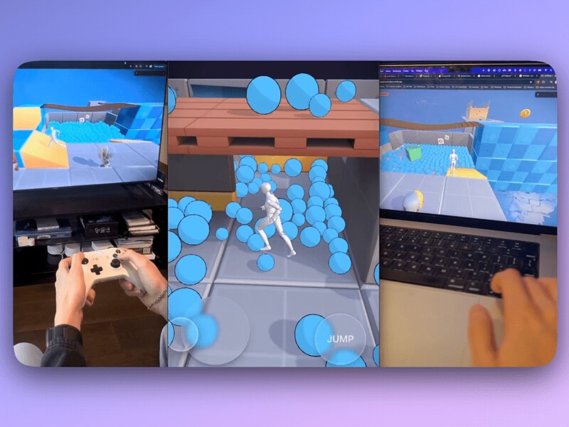
Creating a third-person character controller involves more than just moving an object around a 3D scene. Realistic movement, grounded physics, responsive jumping, and animation blending are essential for a polished feel. This article explores how these elements can be assembled — not through traditional manual coding, but via AI-assisted development using Bolt.new, a browser-based AI-assisted development tool that generates web code from natural language prompts, backed by Claude 3.7 Sonnet and Claude 3.5 Sonnet LLMs. It provides a lightweight environment where developers can focus on describing functionality rather than writing boilerplate.
For this character controller, Bolt handled tasks like setting up physics, integrating animations, and managing input systems, making it easier to test ideas and iterate quickly without switching between tools or writing everything from scratch.
If you’re curious to learn more, check out this article on Codrops, which also explores the platform’s capabilities and showcases another real-world project built entirely with AI.
The final project is powered by React Three Fiber, Three.js, and Rapier, and showcases how a designer or developer can create complex, interactive 3D experiences by guiding AI — focusing on behavior and structure rather than syntax.
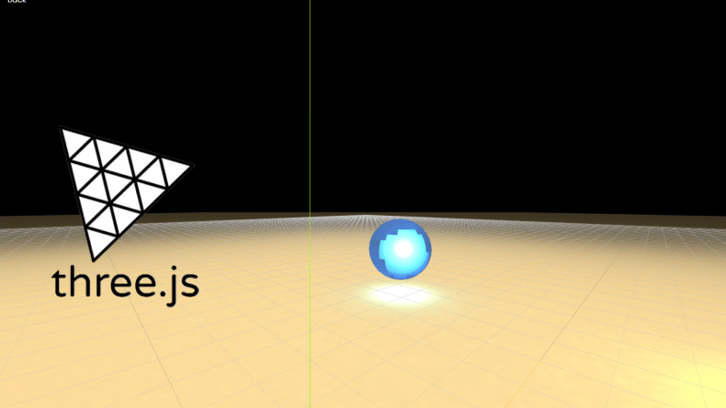
Step 1: Setting Up Physics with a Capsule and Ground
The character controller begins with a simple setup: a capsule collider for the player and a ground plane to interact with. Rapier, a fast and lightweight physics engine built in WebAssembly, handles gravity, rigid body dynamics, and collisions. This forms the foundation for player movement and world interaction.
The capsule shape was chosen for its stability when sliding across surfaces and climbing over small obstacles — a common pattern in real-time games.
Step 2: Real-Time Tuning with a GUI
To enable rapid iteration and balance gameplay feel, a visual GUI was introduced (using Leva.js). This panel exposes parameters such as:
Player movement speed
Jump force
Gravity scale
Follow camera offset
Debug toggles
By integrating this directly into the experience, developers can tune the controller live without needing to edit or recompile code, speeding up testing and design decisions.
Step 3: Ground Detection with Raycasting
A raycast is used to detect whether the player is grounded. This simple yet effective check prevents the character from jumping mid-air or triggering multiple jumps in sequence.
The logic is executed on every frame, casting a ray downward from the base of the capsule collider. When contact is confirmed, the jump input is enabled. This technique also allows smooth transitions between grounded and falling states in the animation system.
Step 4: Integrating a Rigged Character with Animation States
The visual character uses a rigged GLB model via Mixamo, with three key animations: Idle, Run, and Fall. These are integrated as follows:
The GLB character is attached as a child of the capsule collider
The animation state switches dynamically based on velocity and grounded status
Transitions are handled via animation blending for a natural feel
This setup keeps the visuals in sync with physics, while preserving modular control over the physical capsule.
Step 5: World Building and Asset Integration
The environment was arranged in Blender, then exported as a single .glb file and imported into the bolt.new project scene. This approach allows for efficient scene composition while keeping asset management simple.
For web, using .glb keeps geometry and textures bundled together. To maintain performance, it’s recommended to keep textures at 1024×1024 resolution or other square power-of-two sizes (e.g. 256, 512, 2048). This ensures optimal GPU memory usage and faster load times across devices.
Special thanks to KayLousberg for the low-poly 3D kit used for prototyping.
Step 6: Cross-Platform Input Support
The controller was designed to work seamlessly across desktop, mobile, and gamepad platforms — all built using AI-generated logic through Bolt.
Gamepad support was added using the Gamepad API, allowing players to plug in a controller and play with analog input.
On desktop, the controller uses standard keyboard input (WASD or arrow keys) and mouse movement for camera control.
On mobile, AI-generated code enabled an on-screen joystick and jump button, making the game fully touch-compatible.
All input types control the same physics-driven character, ensuring consistent behavior across devices — whether you’re playing on a laptop, touchscreen, or game controller.
This cross-platform support was implemented entirely through natural language prompts, showcasing how AI can translate high-level intent into working input systems.
The Role of AI in the Workflow
What makes this controller unique isn’t the mechanics — it’s the process. Every system was generated by AI through descriptive prompts, allowing the developer to work more like a creative director than a traditional engineer.
AI handled the boilerplate, the physics setup, the animation switching logic — all based on clear creative goals. This opens new doors for prototyping and interactive design, where iteration speed matters more than syntax.
This character controller demo includes:
Capsule collider with physics
Grounded detection via raycast
State-driven animation blending
GUI controls for tuning
Environment interaction with static/dynamic objects
Cross-Platform Input Support
It’s a strong starting point for creating browser-based games, interactive experiences, or prototyping new ideas — all with the help of AI.
Check out the full game built using this setup as a base: 🎮 Demo Game
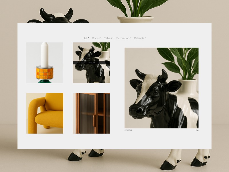
My (design) partner, Gaetan Ferhah, likes to send me his design and motion experiments throughout the week. It’s always fun to see what he’s working on, and it often sparks ideas for my own projects. One day, he sent over a quick concept for making a product grid feel a bit more creative and interactive. 💬 The idea for this tutorial came from that message.
We’ll explore a “grid to preview” hover interaction that transforms product cards into a full preview. As with many animations and interactions, there are usually several ways to approach the implementation—ranging in complexity. It can feel intimidating (or almost impossible) to recreate a designer’s vision from scratch. But I’m a huge fan of simplifying wherever possible and leaning on optical illusions (✨ fake it ’til you make it ✨).
All images are generated with DALL-E (sad, I know.. I wanted everything to be real too 💔)
For this tutorial, I knew I wanted to keep things straightforward and recreate the effect of puzzle pieces shifting into place using a combination of clip-path animation and an image overlay.
Let’s break it down in a few steps:
Layout and Overlay (HTML, CSS)Set up the initial layout and carefully match the position of the preview overlay to the grid.
Build JavaScript structure (JavaScript)Creating some classes to keep us organised, add some interactivity (event listeners).
Clip-Path Creationand Animation (CSS, JS, GSAP)Adding and animating the clip-path, including some calculations on resize—this forms a key part of the puzzle effect.
Moving Product Cards (JS, GSAP)Set up animations to move the product cards towards each other on hover.
Preview Image Scaling (JS, GSAP)Slightly scaling down the preview overlay in response to the inward movement of the other elements.
Adding Images (HTML, JS, GSAP)Enough with the solid colours, let’s add some images and a gallery animation.
Debouncingevents (JS)Debouncing the mouse-enter event to prevent excessive triggering and reduce jitter.
Final tweaks Crossed the t’s and dotted the i’s—small clean-ups and improvements.
Layout and Overlay
At the foundation of every good tutorial is a solid HTML structure. In this step, we’ll create two key elements: the product grid and the overlay for the preview cards. Since both need a similar layout, we’ll place them inside the same container (.products).
Our grid will consist of 8 products (4 columns by 2 rows) with a gutter of 5vw. To keep things simple, I’m only adding the corresponding li elements for the products, but not yet adding any other elements. In the HTML, you’ll notice there are two preview containers: one for the left side and one for the right. If you want to see the preview overlays right away, head to the CodePen and set the opacity of .product-preview to 1.
Why I Opted for Two Containers
At first, I planned to use just one preview container and move it to the opposite side of the hovered card by updating the grid-column-start. That approach worked fine—until I got to testing.
When I hovered over a product card on the left and quickly switched to one on the right, I realised the problem: with only one container, I also had just one timeline controlling everything inside it. That made it basically impossible to manage the “in/out” transition between sides smoothly.
So, I decided to go with two containers—one for the left side and one for the right. This way, I could animate both sides independently and avoid timeline conflicts when switching between them.
See the Pen
Untitled by Gwen Bogaert (@gwen-bo)
on CodePen.
JavaScript Set-up
In this step, we’ll add some classes to keep things structured before adding our event listeners and initiating our timelines. To keep things organised, let’s split it into two classes: ProductGrid and ProductPreview.
ProductGrid will be fairly basic, responsible for handling the split between left and right, and managing top-level event listeners (such as mouseenter and mouseleave on the product cards, and a general resize).
ProductPreview is where the magic happens. ✨ This is where we’ll control everything that happens once a mouse event is triggered (enter or leave). To pass the ‘active’ product, we’ll define a setProduct method, which, in later steps, will act as the starting point for controlling our GSAP animation(s).
Splitting Products (Left – Right)
In the ProductGrid class, we will split all the products into left and right groups. We have 8 products arranged in 4 columns, with each row containing 4 items. We are splitting the product cards into left and right groups based on their column position.
this.ui.products.filter((_, i) => i % 4 === 2 || i % 4 === 3)
The logic relies on the modulo or remainder operator. The line above groups the product cards on the right. We use the index (i) to check if it’s in the 3rd (i % 4 === 2) or 4th (i % 4 === 3) position of the row (remember, indexing starts at 0). The remaining products (with i % 4 === 0 or i % 4 === 1) will be grouped on the left.
Now that we know which products belong to the left and right sides, we will initiate a ProductPreview for both sides and pass along the products array. This will allow us to define productPreviewRight and productPreviewLeft.
To finalize this step, we will define event listeners. For each product, we’ll listen for mouseenter and mouseleave events, and either set or unset the active product (both internally and in the corresponding ProductPreview class). Additionally, we’ll add a resize event listener, which is currently unused but will be set up for future use.
This is where we’re at so far (only changes in JavaScript):
See the Pen
Tutorial – step 2 (JavaScript structure) by Gwen Bogaert (@gwen-bo)
on CodePen.
Clip-path
At the base of our effect lies the clip-path property and the ability to animate it with GSAP. If you’re not familiar with using clip-path to clip content, I highly recommend this article by Sarah Soueidan.
Even though I’ve used clip-path in many of my projects, I often struggle to remember exactly how to define the shape I’m looking for. As before, I’ve once again turned to the wonderful tool Clippy, to get a head start on defining (or exploring) clip-path shapes. For me, it helps demystify which value influences which part of the shape.
Let’s start with the cross (from Clippy) and modify the points to create a more mathematical-looking cross (✚) instead of the religious version (✟).
Feel free to experiment with some of the values, and soon you’ll notice that with small adjustments, we can get much closer to the desired shape! For example, by stretching the horizontal arms completely to the sides (set to 10% and 90% before) and shifting everything more equally towards the center (with a 10% difference from the center — so either 40% or 60%).
And bada bing, bada boom! This clip-path almost immediately creates the illusion that our single preview container is split into four parts — exactly the effect we want to achieve! Now, let’s move on to animating the clip-path to get one step closer to our final result:
Animating Clip-paths
The concept of animating clip-paths is relatively simple, but there are a few key things to keep in mind to ensure a smooth transition. One important consideration is that it’s best to define an equal number of points for both the start and end shapes.
The idea is fairly straightforward: we begin with the clipped parts hidden, and by the end of the animation, we want the clip-path to disappear, revealing the entire preview container (by making the arms of the cross so thin that they’re barely visible or not visible at all). This can be achieved easily with a fromTo animation in GSAP (though it’s also supported in CSS animations).
The Catch
You might think, “That’s it, we’re done!” — but alas, there’s a catch when it comes to using this as our puzzle effect. To make it look realistic, we need to ensure that the shape of the cross aligns with the underlying product grid. And that’s where a bit of JavaScript comes in!
We need to factor in the gutter of our grid (5vw) to calculate the width of the arms of our cross shape. It could’ve been as simple as adding or subtracting (half!) of the gutter to/from the 50%, but… there’s a catch in the catch!
We’re not working with a square, but with a rectangle. Since our values are percentages, subtracting 2.5vw (half of the gutter) from the center wouldn’t give us equal-sized arms. This is because there would still be a difference between the x and y dimensions, even when using the same percentage value. So, let’s take a look at how to fix that:
In the code above (triggered on each resize), we get the width and height of the preview container (which spans 4 product cards — 2 columns and 2 rows). We then calculate what percentage 5vw would be, relative to both the width and height.
To conclude this step, we would have something like:
See the Pen
Tutorial – step 3 (clip path) by Gwen Bogaert (@gwen-bo)
on CodePen.
Moving Product Cards
Another step in the puzzle effect is moving the visible product cards together so they appear to form one piece. This step is fairly simple — we already know how much they need to move (again, gutter divided by 2 = 2.5vw). The only thing we need to figure out is whether a card needs to move up, down, left, or right. And that’s where GSAP comes to the rescue!
We need to define both the vertical (y) and horizontal (x) movement for each element based on its index in the list. Since we only have 4 items, and they need to move inward, we can check whether the index is odd or even to determine the desired value for the horizontal movement. For vertical movement, we can decide whether it should move to the top or bottom depending on the position (top or bottom).
In GSAP, many properties (like x, y, scale, etc.) can accept a function instead of a fixed value. When you pass a function, GSAP calls it for each target element individually.
Horizontal (x): cards with an even index (0, 2) get shifted right by 2.5vw, the other (two) move to the left. Vertical (y): cards with an index lower than 2 (0,1) are located at the top, so need to move down, the other (two) move up.
See the Pen
Tutorial – step 3 (clip path) by Gwen Bogaert (@gwen-bo)
on CodePen.
Preview Image (Scaling)
Cool, we’re slowly getting there! We have our clip-path animating in and out on hover, and the cards are moving inward as well. However, you might notice that the cards and the image no longer have an exact overlap once the cards have been moved. To fix that and make everything more seamless, we’ll apply a slight scale to the preview container.
This is where a bit of extra calculation comes in, because we want it to scale relative to the gutter. So we take into account the height and width of the container.
This calculation determines a scale factor to shrink our preview container inward, matching the cards coming together. First, the rectangle’s width/height (in pixels) is converted into viewport width units (vw) by dividing it by the pixel value of 1vw. Next, the shrink amount (5vw) is subtracted from that width/height. Finally, the result is divided by the original width in vw to calculate the scale factor (which will be slightly below 1). Since we’re working with a rectangle, the scale factor for the x and y axes will be slightly different.
In the codepen below, you’ll see the puzzle effect coming along nicely on each container. Pink are the product cards (not moving), red and blue are the preview containers.
See the Pen
Tutorial – step 4 (moving cards) by Gwen Bogaert (@gwen-bo)
on CodePen.
Adding Pictures
Let’s make our grid a little more fun to look at!
In this step, we’re going to add the product images to our grid, and the product preview images inside the preview container. Once that’s done, we’ll start our image gallery on hover.
The HTML changes are relatively simple. We’ll add an image to each product li element and… not do anything with it. We’ll just leave the image as is.
The rest of the magic will happen inside the preview container. Each container will hold the preview images of the products from the other side (those that will be visible). So, the left container will contain the images of the 4 products on the right, and the right container will contain the images of the 4 products on the left. Here’s an example of one of these:
Once that’s done, we can initialise by querying those images in the constructor of the ProductPreview, sorting them by their dataset.id. This will allow us to easily access the images later via the data-index attribute that each product has. To sum up, at the end of our animate-in timeline, we can call startPreviewGallery, which will handle our gallery effect.
startPreviewGallery(id) {
  const images = this.ui.previewImagesPerID[id]
  const timeline = gsap.timeline({ repeat: -1 })

  // first image is already visible (do not hide)
  gsap.set([...images].slice(1), { opacity: 0 })

  images.forEach((image) => {
    timeline
      .set(images, { opacity: 0 }) // Hide all images
      .set(image, { opacity: 1 }) // Show only this one
      .to(image, { duration: 0, opacity: 1 }, '+=0.5')
  })

  this.galleryTimeline = timeline
}
Debouncing
One thing I’d like to do is debounce hover effects, especially if they are more complex or take longer to complete. To achieve this, we’ll use a simple (and vanilla) JavaScript approach with setTimeout. Each time a hover event is triggered, we’ll set a very short timer that acts as a debouncer, preventing the effect from firing if someone is just “passing by” on their way to the product card on the other side of the grid.
I ended up using a 100ms “cooldown” before triggering the animation, which helped reduce unnecessary animation starts and minimise jitter when interacting with the cards.
productMouseEnter(product, preview) {
  // If another timer (aka hover) was running, cancel it
  if (this.hoverDelay) {
    clearTimeout(this.hoverDelay)
    this.hoverDelay = null
  }

  // Start a new timer
  this.hoverDelay = setTimeout(() => {
    this.activeProduct = product
    preview.setProduct(product)
    this.hoverDelay = null // clear reference
  }, 100)
}

productMouseLeave() {
  // If user leaves before debounce completes
  if (this.hoverDelay) {
    clearTimeout(this.hoverDelay)
    this.hoverDelay = null
  }

  if (this.activeProduct) {
    const preview = this.getProductSide(this.activeProduct)
    preview.setProduct(null)
    this.activeProduct = null
  }
}
Final Tweaks
I can’t believe we’re almost there! Next up, it’s time to piece everything together and add some small tweaks, like experimenting with easings, etc. The final timeline I ended up with (which plays or reverses depending on mouseenter or mouseleave) is:
While this interaction may look cool and visually engaging, it’s important to be mindful of usability and accessibility. In its current form, this effect relies quite heavily on motion and hover interactions, which may not be ideal for all users. Here are a few things that should be considered if you’d be planning on implementing a similar effect:
Motion sensitivity: Be sure to respect the user’s prefers-reduced-motion setting. You can easily check this with a media query and provide a simplified or static alternative for users who prefer minimal motion.
Keyboard navigation: Since this interaction is hover-based, it’s not currently accessible via keyboard. If you’d like to make it more inclusive, consider adding support for focus events and ensuring that all interactive elements can be reached and triggered using a keyboard.
Think of this as a playful, exploratory layer — not a foundation. Use it thoughtfully, and prioritise accessibility where it counts. 💛
Acknowledgements
I am aware that this tutorial assumes an ideal scenario of only 8 products, because what happens if you have more? I didn’t test it out myself, but the important part is that the preview containers feel like an exact overlay of the product grid. If more cards are present, you could try ‘mapping’ the coordinates of the preview container to the 8 products that are completely in view. Or.. go crazy with your own approach if you had another idea. That’s the beauty of it, there’s always many approaches that would lead to the same (visual) outcome. 🪄
Thank you so much for following along! A big thanks to Codrops for giving me the opportunity to contribute. I’m excited to see what you’ll create when inspired by this tutorial! If you have any questions, feel free to drop me a line!
🎨✨💻 Stay ahead of the curve with handpicked, high-quality frontend development and design news, picked freshly every single day. No fluff, no filler—just the most relevant insights, inspiring reads, and updates to keep you in the know.
Prefer a weekly digest in your inbox? No problem, we got you covered. Just subscribe here.
Hi! I’m Rogier de Boevé, an independent creative developer based in Belgium. Over the years, I’ve had the opportunity to collaborate with leading studios and agencies such as Dogstudio, Immersive Garden, North Kingdom, and Reflektor to craft immersive digital experiences for clients ranging from global tech platforms and luxury watchmakers to national broadcasters and iconic consumer brands.
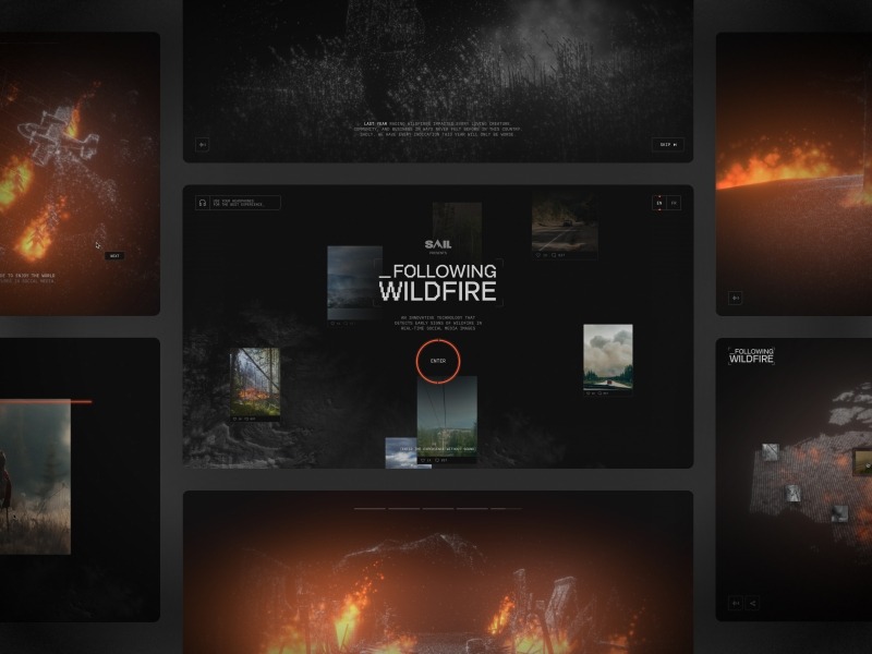
Following Wildfire
Following Wildfire showcases an innovative project that uses artificial intelligence (AI) to detect early signs of wildfires by analyzing real-time images shared on social media. As wildfires become more frequent and devastating, tools like this are becoming essential.
I focused primarily on the storytelling intro animation, which featured five WebGL scenes crafted entirely from particles. The response from the community was incredible as it earned two Webby Awards, a Clio, and was nominated for honors like FWA’s Site of the Year.
Agency: Reflektor Digital
Rogier de Boevé Portfolio (2024)
Unlike client work, where you’re adapting to a brand or working closely with a team, my portfolio was a chance to take full creative control from start to finish. I handled both the design and development, which meant I could follow ideas that matched my artistic vision, without compromise. The result is something that feels fully mine.
I wrote more about the process in a Codrops case study, where I shared some of the technical choices and visual thinking behind it. But what makes this project special to me is that it represents who I am, not just as a creative developer, but also as a digital designer and visual artist.
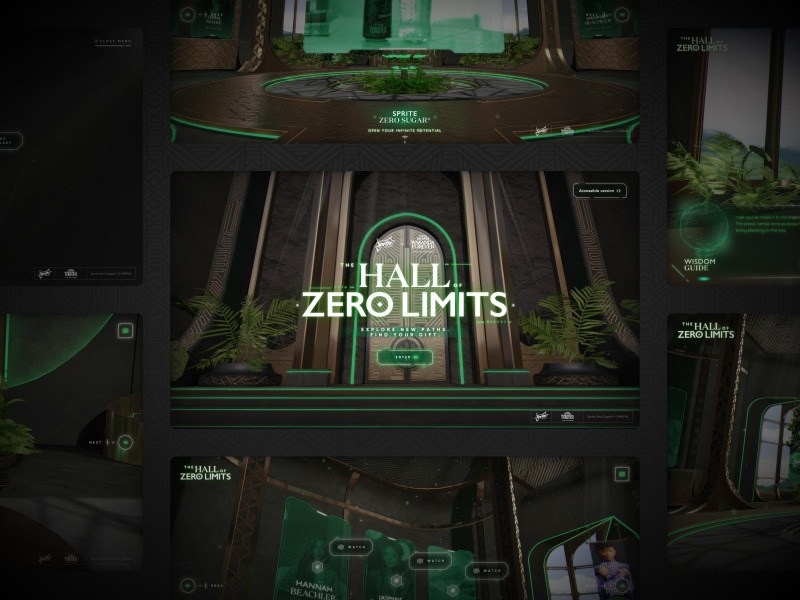
Sprite × Marvel – Hall of Zero Limits
The Hall of Zero Limits is an immersive, exploratory experience built in partnership with Black Panther: Wakanda Forever, to help creators find inspiration.
Working with Dogstudio is always exciting and being part of the Sprite × Marvel collaboration even more so. It was easily one of the most prestigious and ambitious projects I’ve worked on to date. We created a virtual hall where users could explore, discover behind-the-scenes stories, and immerse themselves in the world of Wakanda.
Agency: Dogstudio/DEPT
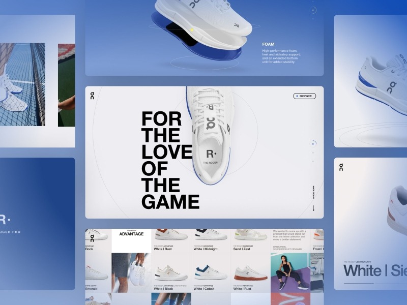
The Roger
Campaign site ‘The Roger’ for On Running. A performance shoe sportswear brand tailored to both casual and athletic needs.
As a massive sports enthusiast and fan of Roger Federer, it was a privilege to be part of this project. I was commissioned by North Kingdom to develop a range of WebGL components promoting On Running’s new collection, The Roger. These included immersive storytelling scenes and a virtual showroom showcasing the entire collection.
Agency: North Kingdom
Philosophy
Don’t approach a technical difficulty as an insurmountable burden, but as a creative challenge that starts with close collaboration.
Make a point to experiment and research a lot before saying “this can’t be done.” Many times, what seems impossible just needs a creative workaround or a fresh perspective. I’ve learned that by sitting down with designers early and hashing out ideas together, often result in finding the smartest approach to bring the concepts to life.
Tools & Tech
I don’t always get to choose which framework I have to work with, so I try to keep up with most of the popular frameworks as much as possible. When I do have the freedom to build from scratch, I often choose Astro.js because it’s simple, flexible, and customisable without imposing too many conventions or adding unnecessary complexity. If I’m just building a prototype and don’t need any content-driven pages, I use Vite, which is also the frontend tooling that Astro uses.
Regardless of the framework, I often use open-source libraries that have a big impact on my work.
Three.js – JavaScript 3D library.
GSAP – Animation toolkit.
Theatre.js – Timeline-based motion library.
Final thoughts
At the end of the day, it’s not about how fancy the code is or whether you’re using the latest framework. It’s about crafting experiences that spark curiosity, interaction, and leave a lasting impression.
Thanks for reading and if you ever want to collaborate, feel free to reach out.
Bolt.new is a browser-based AI web development agent focused on speed and simplicity. It lets anyone prototype, test, and publish web apps instantly—without any dev experience required.
Designed for anyone with an idea, Bolt empowers users to create fully functional websites and apps using just plain language. No coding experience? No problem. By combining real-time feedback with prompt-based development, Bolt turns your words into working code right in the browser. Whether you’re a designer, marketer, educator, or curious first-timer, Bolt.new offers an intuitive, AI-assisted playground where you can build, iterate, and launch at the speed of thought.
Core Features:
Instantly live: Bolt creates your code as you type—no server setup needed.
Web-native: Write in HTML, CSS, and JavaScript; no frameworks required.
Live preview: Real-time output without reloads or delays.
One-click sharing: Publish your project with a single URL.
A Lean Coding Playground
Bolt is a lightweight workspace that allows anyone to become an engineer without knowing how to code. Bolt presents users with a simple, chat-based environment in which you can prompt your agent to create anything you can imagine. Features include:
Split view: Code editor and preview side by side.
Multiple files: Organize HTML, CSS, and JS independently.
ES module support: Structure your scripts cleanly and modularly.
Live interaction testing: Great for animations and frontend logic.
Beyond the Frontend
With integrated AI and full-stack support via WebContainers (from StackBlitz), Bolt.new can handle backend tasks right in the browser.
Full-stack ready: Run Node.js servers, install npm packages, and test APIs—all in-browser.
AI-assisted dev: Use natural-language prompts for setup and changes.
Quick deployment: Push to production with a single click, directly from the editor.
Design-to-Code with Figma
For designers, Bolt.new is more than a dev tool, it’s a creative enabler. By eliminating the need to write code, it opens the door to hands-on prototyping, faster iteration, and tighter collaboration. With just a prompt, designers can bring interfaces to life, experiment with interactivity, and see their ideas in action – without leaving the browser. Whether you’re translating a Figma file into responsive HTML or testing a new UX flow, Bolt gives you the freedom to move from concept to clickable with zero friction.
Key Features:
Bolt.new connects directly with Figma, translating design components into working web code ideal for fast iteration and developer-designer collaboration.
Enable real-time collaboration between teams.
Use it for prototyping, handoff, or production-ready builds.
Trying it Out
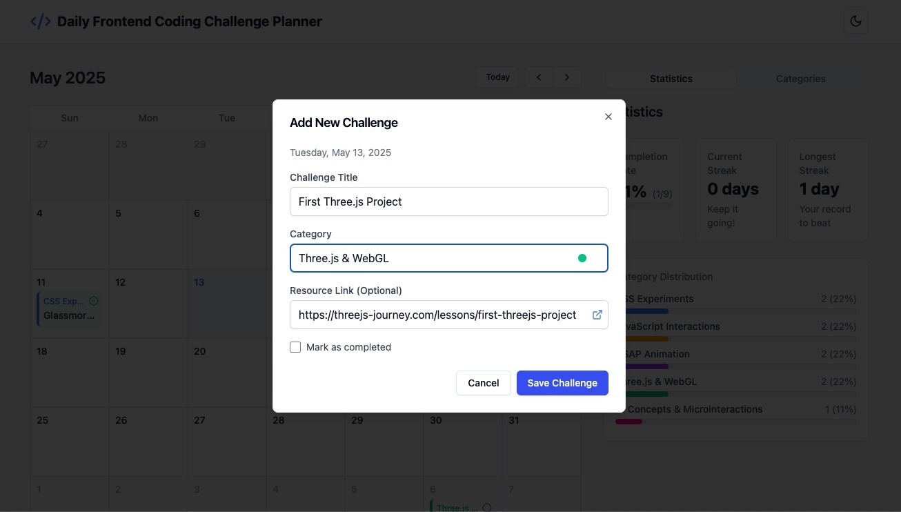
To put Bolt.new to the test, we set out to build a Daily Coding Challenge Planner. Here’s the prompt we used:
Web App Request: Daily Frontend Coding Challenge Planner
I’d like a web app that helps me plan and keep track of one coding challenge each day. The main part of the app should be a calendar that shows the whole month. I want to be able to click on a day and add a challenge to it — only one challenge per day.
Each challenge should have:
A title (what the challenge is)
A category (like “CSS”, “JavaScript”, “React”, etc.)
A way to mark it as “completed” once I finish it
Optionally, a link to a tutorial or resource I’m using
I want to be able to:
Move challenges from one day to another by dragging and dropping them
Add new categories or rename existing ones
Easily delete or edit a challenge if I need to
There should also be a side panel or settings area to manage my list of categories.
The app should:
Look clean and modern
Work well on both computer and mobile
Offer light/dark mode switch
Automatically save data—no login required
This is a tool to help me stay consistent with daily practice and see my progress over time.
Building with Bolt.new
We handed the prompt to Bolt.new and watched it go to work.
Visual feedback while the app was being generated.
The initial result included key features: adding, editing, deleting challenges, and drag-and-drop.
Prompts like “fix dark mode switch” and “add category colors” helped refine the UI.
Integrated shadcn/ui components gave the interface a polished finish.
Screenshots
The Daily Frontend Coding Challenge Planner app, built using just a few promptsAdding a new challenge to the planner
With everything in place, we deployed the app in one click.
We were genuinely impressed by how quickly Bolt.new generated a working app from just a prompt. Minor tweaks were easy, and even a small bug resolved itself with minimal guidance.
Try it yourself—you might be surprised by how much you can build with so little effort.
The future of the web feels more accessible, creative, and immediate—and tools like Bolt.new are helping shape it. In a landscape full of complex tooling and steep learning curves, Bolt.new offers a refreshing alternative: an intelligent, intuitive space where ideas take form instantly.
Bolt lowers the barrier to building for the web. Its prompt-based interface, real-time feedback, and seamless deployment turn what used to be hours of setup into minutes of creativity. With support for full-stack workflows, Figma integration, and AI-assisted editing, Bolt.new isn’t just another code editor, it’s a glimpse into a more accessible, collaborative, and accelerated future for web creation.
Every six months, Shopify releases a new Edition: a broad showcase of tools, updates, and ideas that reflect both the current state of ecommerce and where the platform is headed. But these Editions aren’t just product announcements. They serve as both roadmap and creative statement.
Back in December, we explored the Winter ’25 Edition, which focused on refining the core. With over 150+ updates and a playfully minimalist interface, it was a celebration of the work that often goes unnoticed—performance, reliability, and seamless workflows. “Boring,” but intentionally so, and surprisingly delightful.
The new Summer ’25 Edition takes a different approach. This time, the spotlight is on design: expressive, visual, and accessible to everyone. At the center of it is Horizon, a brand-new first-party theme that reimagines what it means to build a storefront on Shopify.
Horizon offers merchants total creative control without technical barriers. It combines a modular design system with AI-assisted customization, giving anyone the power to create a polished, high-performing store in just a few clicks.
To understand how this theme came to life—and why Shopify sees it as such a turning point—we had the chance to speak with Vanessa Lee, Shopify’s Vice President of Product. What emerged was a clear picture of where store design is heading: more flexible, more intuitive, and more creatively empowering than ever before.
“Design has never mattered more,” Lee told us. “Great design isn’t just about how things look—it’s how you tell your story and build lasting brand loyalty. Horizon democratizes advanced design capabilities so anyone can build a store.”
A Theme That Feels Like a Design System
Horizon isn’t a single template. It’s a foundation for a family of 10 thoughtfully designed presets, each ready to be tailored to a brand’s unique personality. What makes Horizon stand out is not just the aesthetics but the structure that powers it.
Built on Shopify’s new Theme Blocks, Horizon is the first public theme to fully embrace this modular approach. Blocks can be grouped, repositioned, and arranged freely along both vertical and horizontal axes. All of this happens within a visual editor, no code required.
“The biggest frustration was the gap between intention and implementation,” Lee explains. “Merchants had clear visions but often had to compromise due to technical complexity. Horizon changes that by offering true design freedom—no code required.”
AI as a Creative Partner
AI has become a regular presence in creative tools, but Shopify has taken a more collaborative approach. Horizon’s AI features are designed to support creativity, not take it over. They help with layout suggestions, content generation, and even the creation of custom theme blocks based on natural language prompts.
Describe something as simple as “a banner with text and typing animation,” and Horizon can generate a functional block to match your vision. You can also share an inspirational image, and the system will create matching layout elements or content.
What’s important is that merchants retain full editorial control.
“AI should enhance human creativity,” Lee says. “Our tools are collaborative—you stay in control. Whether you’re editing a product description or generating a layout, it’s always your voice guiding the result.”
This mindset is reflected in tools like AI Block Generation and Sidekick, Shopify’s AI assistant that helps merchants shape messaging, refine layout, and bring content ideas to life without friction.
UX Shifts That Change the Game
Alongside its larger innovations, Horizon also delivers a series of small but highly impactful improvements to the store editing experience:
Copy and Paste for Theme Blocks allows merchants to reuse blocks across different sections, saving time and effort.
Block Previews in the Picker let users see what a block will look like before adding it, reducing trial and error.
Drag and Drop Functionality now includes full block groups, nested components, and intuitive repositioning, with settings preserved automatically.
These updates may seem modest, but they target the exact kinds of pain points that slow down design workflows.
“We pay close attention to small moments that add up to big frustrations,” Lee says. “Features like copy/paste or previews seem small—but they transform how merchants work.”
Built with the Community
Horizon is not a top-down product. It was shaped through collaboration with both merchants and developers over the past year. According to Lee, the feedback was clear and consistent. Everyone wanted more flexibility, but not at the cost of simplicity.
“Both merchants and developers want flexibility without complexity,” Lee recalls. “That shaped Theme Blocks—and Horizon wouldn’t exist without that ongoing dialogue.”
The result is a system that feels both sophisticated and intuitive. Developers can work with structure and control, while merchants can express their brand with clarity and ease.
More Than a Theme, a Signal
Each Shopify Edition carries a message. The Winter release was about stability, performance, and quiet confidence. This Summer’s Edition speaks to something more expressive. It’s about unlocking design as a form of commerce strategy.
Horizon sits at the heart of that shift. But it’s just one part of a broader push across Shopify. The Edition also includes updates to Sidekick, the Shop app, POS, payments, and more—each designed to remove barriers and support better brand-building.
“We’re evolving from being a commerce platform to being a creative partner,” Lee says. “With Horizon, we’re helping merchants turn their ideas into reality—without the tech getting in the way.”
Looking ahead, Shopify sees enormous opportunity in using AI not just for store creation, but for proactive optimization, personalization, and guidance that adapts to each merchant’s needs.
“The most exciting breakthroughs happen where AI and human creativity meet,” Lee says. “We’ve only scratched the surface—and that’s incredibly motivating.”
Final Thoughts
Horizon isn’t just a new Shopify theme. It’s a new baseline for what creative freedom should feel like in commerce. It invites anyone—regardless of technical skill—to build a store that feels uniquely theirs.
For those who’ve felt boxed in by rigid templates, or overwhelmed by the need to code, Horizon offers something different. It removes the friction, keeps the power, and brings the joy back into building for the web.
🎨✨💻 Stay ahead of the curve with handpicked, high-quality frontend development and design news, picked freshly every single day. No fluff, no filler—just the most relevant insights, inspiring reads, and updates to keep you in the know.
Prefer a weekly digest in your inbox? No problem, we got you covered. Just subscribe here.
“Aurel’s Grand Theater” is an experimental, unconventional solo portfolio project that invites users to read case
studies, solve mysteries to unlock secret pages, or freely explore the theater – jumping around and even smashing
things!
I had an absolute blast working on it, even though it took much longer than I anticipated. Once I finally settled on a
creative direction, the project took about a year to complete – but reaching that direction took nearly two years on
its own. Throughout the journey, I balanced a full-time job as a lead web developer, freelance gigs, and an unexpected
relocation to the other side of the world. The cherry on top? I went through way
too many artistic iterations. It ‘s my longest solo project to date, but also one of the most fun and creatively
rewarding. It gave me the chance to dive deep into creative coding and design.
This article takes you behind the scenes of the project – covering everything from design to code, including tools,
inspiration, project architecture, design patterns, and even feature breakdowns with code snippets you can adapt for
your own work.
The Creative Process: Behind the Curtain
Genesis
After eight years, my portfolio no longer reflected my skills or creativity. I wanted to create something unconventional – an experience where visitors become active participants rather than passive observers. Most importantly, I wanted it to be something I ‘d genuinely enjoy building. I was wrapping up “ Leap for Mankind” at the time and had a blast working on it, blending storytelling with game and interactive elements. I wanted to create another experimental website that combines game mechanics with a narrative experience.
From the beginning, I envisioned a small character that could freely explore its environment – smashing objects, interacting with surrounding elements, and navigating not just the floor but also vertical spaces by jumping onto tables and chairs. The goal was to transform the portfolio from a passive viewing experience into a fun, interactive one. At the same time, I recognized that some content demands clarity over creativity. For example, case studies require a more traditional format that emphasizes readability.
One of the key challenges, then, was designing a portfolio that could seamlessly transition between an immersive 3D game world and more conventional documentation pages – without disrupting the overall experience.
Building the Foundation
I had a general concept of the website in mind, so I started coding a proof of concept (POC) for the game back in
2022. In this early version, the player could move around, bump into objects, and jump – laying the foundation for the
interactive world I envisioned. Interestingly, much of the core code structure from that POC made it into the final
product. While the technical side was coming together, I still hadn ‘t figured out the artistic direction at that
point.
Early Proof Of Concept
Trials and Errors
As a full-time web developer, I rarely find myself wrestling with artistic direction. Until now, every freelance and
side project I took on began with a clear creative vision that simply needed technical execution.
This time was different. At first, I leaned toward a cartoonish aesthetic with bold outlines, thinking it would
emphasize my creativity. I tried to convince myself it worked, but something felt off – especially when pairing the
visual style with the user interface. The disconnect between my vision and its execution was unfamiliar territory, and
it led me down a long and winding path of creative exploration.
Early artistic direction
I experimented with other styles too, like painterly visuals, which held promise but proved too time-consuming. Each
artistic direction felt either not suitable for me or beyond my practical capabilities as a developer moonlighting as
a designer.
The theater concept – which ultimately became central to the portfolio ‘s identity – arrived surprisingly late. It
wasn ‘t part of the original vision but surfaced only after countless iterations and discarded ideas. In total,
finding an artistic direction that truly resonated took nearly two years – a journey further complicated by a major
relocation across continents, ongoing work and freelance commitments, and personal responsibilities.
The extended timeline wasn ‘t due to technical complexity, but to an unexpected battle with creative identity. What
began as a straightforward portfolio refresh evolved into a deeper exploration of how to merge professional
presentation with personal expression – pushing me far beyond code and into the world of creative direction.
Tools & Inspiration: The Heart of Creation
After numerous iterations and abandoned concepts, I finally arrived at a creative direction that resonated with my
vision. Rather than detailing every artistic detour, I ‘ll focus on the tools and direction that ultimately led to the
final product.
Design Stack
Below is the stack I use to design my 3D projects:
UI/UX & Visual Design
Figma
: When I first started, everything was laid out in a Photoshop file. Over the years, I tried various design tools,
but I ‘ve been using Figma consistently since 2018 – and I ‘ve been really satisfied with it ever since.
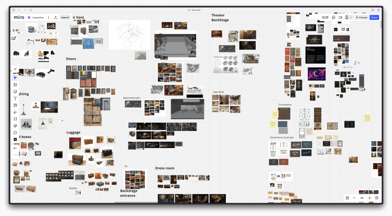
Miro
: reat for moodboarding and early ideation. It helps me visually organize thoughts and explore concepts during the
initial phase.
3D Modeling & Texturing
Blender
: My favorite tool for 3D modeling. It ‘s incredibly powerful and flexible, though it does have a steep learning
curve at first. Still, it ‘s well worth the effort for the level of creative control it offers.
Adobe Substance 3D Painter
: The gold standard in my workflow for texture painting. It’s expensive, but the quality and precision it delivers
make it indispensable.
Image Editing
Krita
: I only need light photo editing, and Krita handles that perfectly without locking me into Adobe ‘s ecosystem – a
practical and efficient alternative.
Drawing Inspiration from Storytellers
While I drew inspiration from many sources, the most influential were Studio Ghibli and the mystical world of Harry
Potter. Ghibli ‘s meticulous attention to environmental detail shaped my understanding of atmosphere, while the
enchanting realism of the Harry Potter universe helped define the mood I wanted to evoke. I also browsed platforms
like ArtStation and Pinterest for broader visual inspiration, while sites like Behance, FWA, and Awwwards influenced
the more granular aspects of UX/UI design.
Initially, I organized these references on an InVision board. However, when the platform shut down mid-project, I had
to migrate everything to Miro – an unexpected transition and symbolic disruption that echoed the broader delays in the
project.
Mood board of Aurel’s Grand Theater
Designing the Theater
The theater concept emerged as the perfect metaphor for a portfolio: a space where different works could be presented
as “performances,” while maintaining a cohesive environment. It also aligned beautifully with the nostalgic,
pre-digital vibe inspired by many of my visual references.
Environment design is a specialized discipline I wasn ‘t very familiar with initially. To create a theater that felt
visually engaging and believable, I studied techniques from the FZD School
. These approaches were invaluable in conceptualizing spaces that truly feel alive: places where you can sense people
living their lives, working, and interacting with the environment.
To make the environment feel genuinely inhabited, I incorporated details that suggest human presence: scattered props,
tools, theater posters, food items, pamphlets, and even bits of miscellaneous junk throughout the space. These
seemingly minor elements were crucial in transforming the static 3D model into a setting rich with history, mood, and
character.
The 3D Modeling Process
Optimizing for Web Performance
Creating 3D environments for the web comes with unique challenges that differ significantly from video modelling. When
scenes need to be rendered in real-time by a browser, every polygon matters.
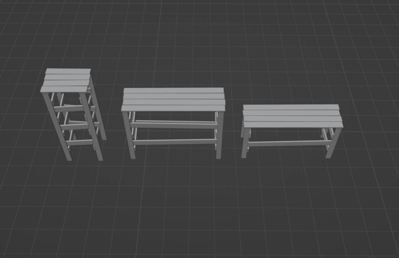
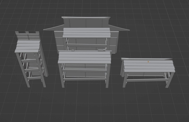
To address this, I adopted a strict low-poly approach and focused heavily on building reusable modular components.
These elements could be instantiated throughout the environment without duplicating unnecessary geometry or textures.
While the final result is still relatively heavy, this modular system allowed me to construct more complex and
detailed scenes while maintaining reasonable download sizes and rendering performance, which wouldn ‘t have been
possible without this approach.
Scaffolds models
Scaffolds models merged with the tower, hanok house and walls props
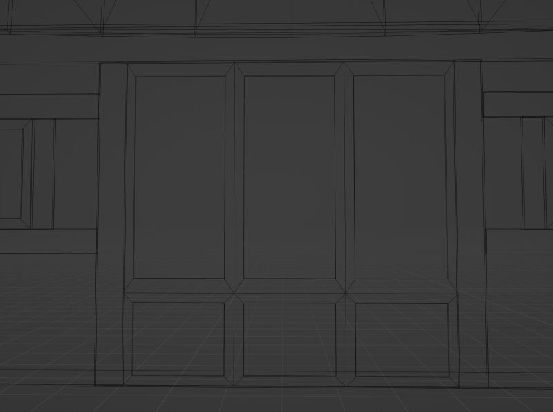
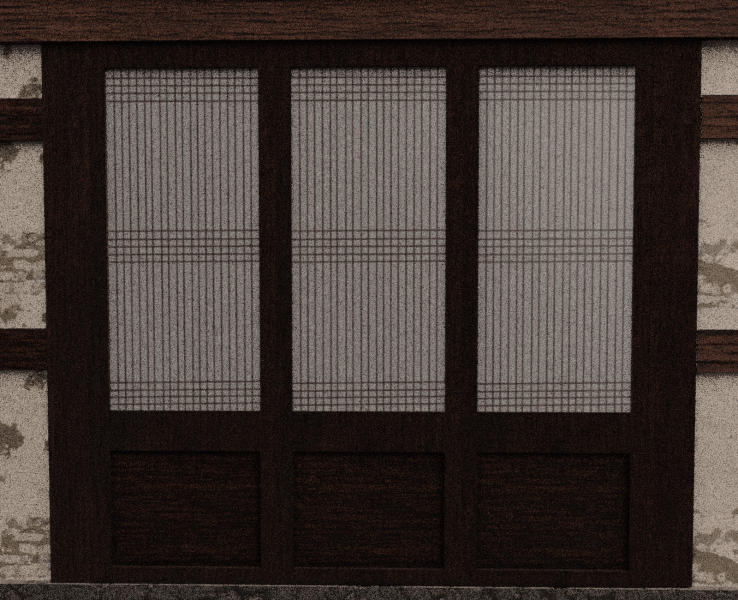
Texture Over Geometry
Rather than modeling intricate details that would increase polygon counts, I leveraged textures to suggest complexity.
Adobe Substance 3D became my primary tool for creating rich material surfaces that could convey detail without
overloading the renderer. This approach was particularly effective for elements like the traditional Hanok windows
with their intricate wooden lattice patterns. Instead of modeling each panel, which would have been
performance-prohibitive, I painted the details into textures and applied them to simple geometric forms.
Hanok model’s verticesHanok model painted using 3d Substance Painter
Frameworks & Patterns: Behind the Scenes of Development
Tech Stack
This is a comprehensive overview of the technology stack I used for Aurel’s Grand Theater website, leveraging my
existing expertise while incorporating specialized tools for animation and 3D effects.
Core Framework
Vue.js
: While I previously worked with React, Vue has been my primary framework since 2018. Beyond simply enjoying and
loving this framework, it makes sense for me to maintain consistency between the tools I use at work and on my side
projects. I also use Vite and Pinia.
Animation & Interaction
GSAP
: A cornerstone of my development toolkit for nearly a decade, primarily utilized on this project for:
ScrollTrigger functionality
MotionPath animations
Timeline and tweens
As a personal challenge, I created my own text-splitting functionality for this project (since it wasn ‘t client
work), but I highly recommend GSAP ‘s SplitText for most use cases.
Lenis
: My go-to library for smooth scrolling. It integrates beautifully with scroll animations, especially when working
with Three.js.
3D Graphics & Physics
Three.js
: My favorite 3D framework and a key part of my toolkit since 2015. I enjoy using it to bring interactive 3D
elements to the web.
Cannon.js
: Powers the site ‘s physics simulations. While I considered alternatives like Rapier, I stuck with Cannon.js since
it was already integrated into my 2022 proof-of-concept. Replacing it would have introduced unnecessary delays.
Styling
Queso
: A headless CSS framework developed at MamboMambo (my workplace). I chose it for its comprehensive starter
components and seamless integration with my workflow. Despite being in beta, it ‘s already reliable and flexible.
This tech stack strikes a balance between familiar tools and specialized libraries that enable the visual and
interactive elements that define the site’s experience.
Architecture
I follow Clean Code principles and other industry best practices, including aiming to keep my files small,
independent, reusable, concise, and testable.
I’ve also adopted the component folder architecture developed at my workplace. Instead of placing Vue
files directly inside the ./components
directory, each component resides in its own folder. This folder contains the Vue
file along with related types, unit tests, supporting files, and any child components.
Although initially designed for Vue
components, I ‘ve found this structure works equally well for organizing logic with Typescript
files, utilities
, directives
, and more. It ‘s a clean, consistent system that improves code readability, maintainability, and scalability.
This structured approach helps me manage the code base efficiently and maintain clear separation of concerns
throughout the codebase, making both development and future maintenance significantly more straightforward.
Design Patterns
Singleton
Singletons play a key role in this type of project architecture, enabling efficient code reuse without incurring
performance penalties.
import Experience from "@/three/Experience/Experience";
import type { Scene } from "@/types/three.types";

let instance: SingletonExample | null = null;

export default class SingletonExample {
  private scene: Scene;
  private experience: Experience;

  constructor() {
    if (instance) {
      return instance;
    }
    instance = this;

    this.experience = new Experience();
    this.scene = this.experience.scene;
  }

  init() {
    // initialize the singleton
  }

  someMethod() {
    // some method
  }

  update() {
    // update the singleton
  }

  update10fps() {
    // Optional: update methods capped at 10FPS
  }

  destroySingleton() {
    // clean up three.js + destroy the singleton
  }
}
Split Responsibility Architecture
As shown earlier in the project architecture section, I deliberately separated physics management from model handling
to produce smaller, more maintainable files.
World Management Files:
These files are responsible for initializing factories and managing meshes within the main loop. They may also include
functions specific to individual world items.
Here’s an example of one such file:
// src/three/Experience/Theater/mockFileModel/mockFileModel.ts
import Experience from "@/three/Experience/Theater/Experience/Experience";

import type {
  List,
  LoadModel
} from "@/types/experience/experience.types";
import type { Scene } from "@/types/three.types";
import type Physics from "@/three/Experience/Theater/Physics/Physics";
import type { Resources } from "@/three/Experience/Utils/Ressources/Resources";
import type { MaterialGenerator } from "@/types/experience/materialGeneratorType";


let instance: mockWorldFile | null = null;
export default class mockWorldFile {
  private experience: Experience;
  private list: List;
  private physics: Physics;
  private resources: Resources;
  private scene: Scene;
  private materialGenerator: MaterialGenerator;
  public loadModel: LoadModel;
  constructor() {
    //    Singleton
    if (instance) {
      return instance;
    }

    instance = this;

    this.experience = new Experience();
    this.scene = this.experience.scene;
    this.resources = this.experience.resources;
    this.physics = this.experience.physics;

    // factories
    this.materialGenerator = this.experience.materialGenerator;
    this.loadModel = this.experience.loadModel;

     // Most of the material are init in a file called sharedMaterials
    const bakedMaterial = this.experience.world.sharedMaterials.bakedMaterial;
    // physics infos such as position, rotation, scale, weight etc.
    const paintBucketPhysics = this.physics.items.paintBucket;

    // Array of objects of models. This will be used to update it's position, rotation, scale, etc.
    this.list = {
      paintBucket: [],
      ...
    };

    // get the resource file
    const resourcePaintBucket = this.resources.items.paintBucketWhite;

     //Reusable code to add models with physics to the scene. I will talk about that later.
    this.loadModel.setModels(
      resourcePaintBucket.scene,
      paintBucketPhysics,
      "paintBucketWhite",
      bakedMaterial,
      true,
      true,
      false,
      false,
      false,
      this.list.paintBucket,
      this.physics.mock,
      "metalBowlFalling",
    );
  }

  otherMethod() {
    ...
  }

  destroySingleton() {
    ...
  }
}
Physics Management Files
These files trigger the factories to apply physics to meshes, store the resulting physics bodies, and update mesh
positions on each frame.
// src/three/Experience/Theater/pathTo/mockFilePhysics
import Experience from "@/three/Experience/Theater/Experience/Experience";

import additionalShape from "./additionalShape.json";

import type {
  PhysicsResources,
  TrackName,
  List,
  modelsList
} from "@/types/experience/experience.types";
import type { cannonObject } from "@/types/three.types";
import type PhysicsGenerator from "../Factories/PhysicsGenerator/PhysicsGenerator";
import type UpdateLocation from "../Utils/UpdateLocation/UpdateLocation";
import type UpdatePositionMesh from "../Utils/UpdatePositionMesh/UpdatePositionMesh";
import type AudioGenerator from "../Utils/AudioGenerator/AudioGenerator";

let instance: MockFilePhysics | null = null;

export default class MockFilePhysics {
  private experience: Experience;
  private list: List;
  private physicsGenerator: PhysicsGenerator;
  private updateLocation: UpdateLocation;
  private modelsList: modelsList;
  private updatePositionMesh: UpdatePositionMesh;
  private audioGenerator: AudioGenerator;

  constructor() {
    //    Singleton
    if (instance) {
      return instance;
    }
    instance = this;

    this.experience = new Experience();
    this.debug = this.experience.debug;
    this.physicsGenerator = this.experience.physicsGenerator;
    this.updateLocation = this.experience.updateLocation;
    this.updatePositionMesh = this.experience.updatePositionMesh;
    this.audioGenerator = this.experience.audioGenerator;

    // Array of objects of physics. This will be used to update the model's position, rotation, scale etc.
    this.list = {
      paintBucket: [],
    };
  }

  setModelsList() {
    //When the load progress reaches a certain percentage, we can set the models list, avoiding some potential bugs or unnecessary conditional logic. Please note that the method update is never run until the scene is fully ready.
    this.modelsList = this.experience.world.constructionToolsModel.list;
  }

  addNewItem(
    element: PhysicsResources,
    listName: string,
    trackName: TrackName,
    sleepSpeedLimit: number | null = null,
  ) {

    // factory to add physics, I will talk about that later
    const itemWithPhysics = this.physicsGenerator.createItemPhysics(
      element,
      null,
      true,
      true,
      trackName,
      sleepSpeedLimit,
    );

    // Additional optional shapes to the item if needed
    switch (listName) {
      case "broom":
        this.physicsGenerator.addMultipleAdditionalShapesToItem(
          itemWithPhysics,
          additionalShape.broomHandle,
        );
        break;

    }

    this.list[listName].push(itemWithPhysics);
  }

  // this methods is called everyfame.
  update() {
    // reusable code to update the position of the mesh
    this.updatePositionMesh.updatePositionMesh(
      this.modelsList["paintBucket"],
      this.list["paintBucket"],
    );
  }


  destroySingleton() {
    ...
  }
}
Since the logic for updating mesh positions is consistent across the project, I created reusable code that can be
applied in nearly all physics-related files.
// src/three/Experience/Utils/UpdatePositionMesh/UpdatePositionMesh.ts

export default class UpdatePositionMesh {
  updatePositionMesh(meshList: MeshList, physicList: PhysicList) {
    for (let index = 0; index < physicList.length; index++) {
      const physic = physicList[index];
      const model = meshList[index].model;

      model.position.set(
        physic.position.x,
        physic.position.y,
        physic.position.z
      );
      model.quaternion.set(
        physic.quaternion.x,
        physic.quaternion.y,
        physic.quaternion.z,
        physic.quaternion.w
      );
    }
  }
}
Factory Patterns
To avoid redundant code, I built a system around reusable code. While the project includes multiple factories, these
two are the most essential:
Model Factory
: LoadModel
With few exceptions, all models—whether instanced or regular, with or without physics—are added through this factory.
// src/three/Experience/factories/LoadModel/LoadModel.ts
import * as THREE from "three";
import Experience from "@/three/Experience/Theater/Experience/Experience";

import type {
  PhysicsResources,
  TrackName,
  List,
  modelListPath,
  PhysicsListPath
} from "@/types/experience/experience.type";
import type { loadModelMaterial } from "./types";
import type { Material, Scene, Mesh } from "@/types/Three.types";
import type Progress from "@/three/Experience/Utils/Progress/Progress";
import type AddPhysicsToModel from "@/three/Experience/factories/AddPhysicsToModel/AddPhysicsToModel";

let instance: LoadModel | null = null;


export default class LoadModel {
  public experience: Experience;
  public progress: Progress;
  public mesh: Mesh;
  public addPhysicsToModel: AddPhysicsToModel;
  public scene: Scene;


  constructor() {
    if (instance) {
      return instance;
    }
    instance = this;

    this.experience = new Experience();
    this.scene = this.experience.scene;
    this.progress = this.experience.progress;
    this.addPhysicsToModel = this.experience.addPhysicsToModel;
  }


  async setModels(
    model: Model,
    list: PhysicsResources[],
    physicsList: string,
    bakedMaterial: LoadModelMaterial,
    isCastShadow: boolean = false,
    isReceiveShadow: boolean = false,
    isIntancedModel: boolean = false,
    isDoubleSided: boolean = false,
    modelListPath: ModelListPath,
    physicsListPath: PhysicsListPath,
    trackName: TrackName = null,
    sleepSpeedLimit: number | null = null,
  ) {
    const loadedModel = isIntancedModel
      ? await this.addInstancedModel(
          model,
          bakedMaterial,
          true,
          true,
          isDoubleSided,
          isCastShadow,
          isReceiveShadow,
          list.length,
        )
        : await this.addModel(
            model,
            bakedMaterial,
            true,
            true,
            isDoubleSided,
            isCastShadow,
            isReceiveShadow,
          );


    this.addPhysicsToModel.loopListThenAddModelToSceneThenToPhysics(
      list,
      modelListPath,
      physicsListPath,
      physicsList,
      loadedModel,
      isIntancedModel,
      trackName,
      sleepSpeedLimit,
    );
  }


  addModel = (
    model: Model,
    material: Material,
    isTransparent: boolean = false,
    isFrustumCulled: boolean = true,
    isDoubleSided: boolean = false,
    isCastShadow: boolean = false,
    isReceiveShadow: boolean = false,
    isClone: boolean = true,
  ) => {
    model.traverse((child: THREE.Object3D) => {
      !isFrustumCulled ? (child.frustumCulled = false) : null;
      if (child instanceof THREE.Mesh) {
        child.castShadow = isCastShadow;
        child.receiveShadow = isReceiveShadow;

        material
          && (child.material = this.setMaterialOrCloneMaterial(
              isClone,
              material,
            ))


        child.material.transparent = isTransparent;
        isDoubleSided ? (child.material.side = THREE.DoubleSide) : null;
        isReceiveShadow ? child.geometry.computeVertexNormals() : null; // https://discourse.threejs.org/t/gltf-model-shadows-not-receiving-with-gltfmeshstandardsgmaterial/24112/9
      }
    });

    this.progress.addLoadedModel(); // Update the number of items loaded
    return { model: model };
  };


  setMaterialOrCloneMaterial(isClone: boolean, material: Material) {
    return isClone ? material.clone() : material;
  }


  addInstancedModel = () => {
   ...
  };

  // other methods


  destroySingleton() {
    ...
  }
}
Physics Factory: PhysicsGenerator
This factory has a single responsibility: creative physics properties for meshes.
// src/three/Experience/Utils/PhysicsGenerator/PhysicsGenerator.ts
import Experience from "@/three/Experience/Theater/Experience/Experience";
import * as CANNON from "cannon-es";

import CannonUtils from "@/utils/cannonUtils.js";

import type {
  Quaternion,
  PhysicsItemPosition,
  PhysicsItemType,
  PhysicsResources,
  TrackName,
  CannonObject,
} from "@/types/experience/experience.types";

import type { Scene, ConvexGeometry } from "@/types/three.types";
import type Progress from "@/three/Experience/Utils/Progress/Progress";
import type AudioGenerator from "@/three/Experience/Utils/AudioGenerator/AudioGenerator";
import type Physics from "@/three/Experience/Theater/Physics/Physics";
import type { physicsShape } from "./PhysicsGenerator.types"

let instance: PhysicsGenerator | null = null;

export default class PhysicsGenerator {
  public experience: Experience;
  public physics: Physics;
  public currentScene: string | null = null;
  public progress: Progress;
  public audioGenerator: AudioGenerator;

  constructor() {
    //    Singleton
    if (instance) {
      return instance;
    }
    instance = this;

    this.experience = new Experience();
    this.resources = this.experience.resources;
    this.audioGenerator = this.experience.audioGenerator;
    this.physics = this.experience.physics;
    this.progress = this.experience.progress;

    this.currentScene = this.experience.currentScene;
  }


  //#region add physics to an object

  createItemPhysics(
    source: PhysicsResources, // object containing physics info such as mass, shape, position....
    convex?: ConvexGeometry | null = null,
    allowSleep?: boolean = true,
    isBodyToAdd?: boolean = true,
    trackName?: TrackName = null,
    sleepSpeedLimit?: number | null = null
  ) {
    const setSpeedLimit = sleepSpeedLimit ?? 0.15;

    // For this project I needed to detect if the user was in the Mont-Saint-Michel, Leap For Mankind, About or Archives scene.
    const localCurrentScene = source.locations[this.currentScene]
      ? this.currentScene
      : "about";

    switch (source.type as physicsShape) {
      case "box": {
        const boxShape = new CANNON.Box(new CANNON.Vec3(...source.shape));
        const boxBody = new CANNON.Body({
          mass: source.mass,
          position: new CANNON.Vec3(
            source.locations[localCurrentScene].position.x,
            source.locations[localCurrentScene].position.y,
            source.locations[localCurrentScene].position.z
          ),
          allowSleep: allowSleep,
          shape: boxShape,
          material: source.material
            ? source.material
            : this.physics.physics.defaultMaterial,
          sleepSpeedLimit: setSpeedLimit,
        });

        source.locations[localCurrentScene].quaternion
          && (boxBody.quaternion.y =
              source.locations[localCurrentScene].quaternion.y);

        this.physics.physics.addBody(boxBody);
        this.updatedLoadedItem();

        // Add optional SFX that will be played if the item collides with another physics item
        trackName
          && this.audioGenerator.addEventListenersToObject(boxBody, TrackName);

        return boxBody;
      }

      // Then it's basicly the same logic for all other cases
      case "sphere": {
        ...
      }

      case "cylinder": {
       ...
      }

      case "plane": {
       ...
      }

      case "trigger": {
      ...
      }

      case "torus": {
        ...
      }

      case "trimesh": {
       ...
      }

      case "polyhedron": {
        ...
      }

      default:
        ...
        break;
    }
  }

  updatedLoadedItem() {
    this.progress.addLoadedPhysicsItem(); // Update the number of item loaded (physics only)
  }

  //#endregion add physics to an object

  // other

  destroySingleton() {
    ...
  }
}
FPS Capping
With over 100 models and approximately 150 physics items loaded in the main scene, Aurel’s Grand Theater required
performance-driven coding from the outset.
I were to rebuild the project today, I would leverage GPU computing much more intensively. However, when I started the
proof of concept in 2022, GPU computing for the web was still relatively new and not fully mature—at least, that was
my perception at the time. Rather than recoding everything, I worked with what I had, which also presented a great
personal challenge. In addition to using low-poly models and employing classic optimization techniques, I extensively
used instanced meshes for all small, reusable items—even those with physics. I also relied on many other
under-the-hood techniques to keep the performance as smooth as possible on this CPU-intensive website.
One particularly helpful approach I implemented was adaptive frame rates. By capping the FPS to different levels (60,
30, or 10), depending on whether the logic required rendering at those rates, I optimized performance. After all, some
logic doesn ‘t require rendering every frame. This is a simple yet effective technique that can easily be incorporated
into your own project.
Now, let ‘s take a look at the file responsible for managing time in the project.
// src/three/Experience/Utils/Time/Time.ts
import * as THREE from "three";
import EventEmitter from "@/three/Experience/Utils/EventEmitter/EventEmitter";

let instance: Time | null = null;
let animationFrameId: number | null = null;
const clock = new THREE.Clock();

export default class Time extends EventEmitter {
  private lastTick60FPS: number = 0;
  private lastTick30FPS: number = 0;
  private lastTick10FPS: number = 0;

  private accumulator60FPS: number = 0;
  private accumulator30FPS: number = 0;
  private accumulator10FPS: number = 0;

  public start: number = 0;
  public current: number = 0;
  public elapsed: number = 0;
  public delta: number = 0;
  public delta60FPS: number = 0;
  public delta30FPS: number = 0;
  public delta10FPS: number = 0;

  constructor() {
    if (instance) {
      return instance;
    }
    super();
    instance = this;
  }

  tick() {
    const currentTime: number = clock.getElapsedTime() * 1000;

    this.delta = currentTime - this.current;
    this.current = currentTime;

    // Accumulate the time that has passed
    this.accumulator60FPS += this.delta;
    this.accumulator30FPS += this.delta;
    this.accumulator10FPS += this.delta;

    // Trigger uncapped tick event using the project's EventEmitter class
    this.trigger("tick");

    // Trigger 60FPS tick event
    if (this.accumulator60FPS >= 1000 / 60) {
      this.delta60FPS = currentTime - this.lastTick60FPS;
      this.lastTick60FPS = currentTime;

      // Same logic as "this.trigger("tick")" but for 60FPS
      this.trigger("tick60FPS");
      this.accumulator60FPS -= 1000 / 60;
    }

    // Trigger 30FPS tick event
    if (this.accumulator30FPS >= 1000 / 30) {
      this.delta30FPS = currentTime - this.lastTick30FPS;
      this.lastTick30FPS = currentTime;

      this.trigger("tick30FPS");
      this.accumulator30FPS -= 1000 / 30;
    }

    // Trigger 10FPS tick event
    if (this.accumulator10FPS >= 1000 / 10) {
      this.delta10FPS = currentTime - this.lastTick10FPS;
      this.lastTick10FPS = currentTime;

      this.trigger("tick10FPS");
      this.accumulator10FPS -= 1000 / 10;
    }

    animationFrameId = window.requestAnimationFrame(() => {
      this.tick();
    });
  }
}
Then, in the Experience.ts
file, we simply place the methods according to the required FPS.
constructor() {
   if (instance) {
      return instance;
    }

    ...

    this.time = new Time();

    ...


    //  The game loops (here called tick) are updated when the EventEmitter class is triggered.
    this.time.on("tick", () => {
      this.update();
    });
    this.time.on("tick60FPS", () => {
      this.update60();
    });
    this.time.on("tick30FPS", () => {
      this.update30();
    });
    this.time.on("tick10FPS", () => {
      this.update10();
    });
    }


  update() {
    this.renderer.update();
  }

  update60() {
    this.camera.update60FPS();
    this.world.update60FPS();
    this.physics.update60FPS();
  }

  update30() {
    this.physics.update30FPS();
    this.world.update30FPS();
  }

  update10() {
    this.physics.update10FPS();
    this.world.update10FPS();
  }
Inspired by techniques from the film industry, the transitions between the 3D game and the more traditionally
structured pages, such as the Case Studies, About, and Credits pages, were carefully designed to feel seamless and
cinematic.
The first-time visit animation provides context and immerses users into the website experience. Meanwhile, the other
page transitions play a crucial role in ensuring a smooth shift between the game and the more conventional layout of
the Case Studies and About page, preserving immersion while naturally guiding users from one experience to the next.
Without these transitions, it would feel like abruptly jumping between two entirely different worlds.
I’ll do a deep dive into the code for the animation when the user returns from the basement level. It’s a bit simpler
than the other cinematic transitions but the underlying logic is the same, which makes it easier for you to adapt it
to another project.
The init
method, called from another file, initiates the creation of the animation. At first, we set the path for the
animation, then the timeline.
init() {
    this.camera = this.experience.camera.instance;
    this.initPath();
 }

initPath() {
  // create the path for the camera
  const pathPoints = new CatmullRomCurve3([
    new Vector3(CAMERA_POSITION_SEAT[0], CAMERA_POSITION_SEAT[1], 15),
    new Vector3(5.12, 4, 8.18),
    new Vector3(...RETURNING_PLAYER_CAMERA_FINAL_POSITION),
  ]);

  // init the timeline
  this.initTimeline(pathPoints);
}

initTimeline(path: CatmullRomCurve3) {
 ...
}
The timeline animation is split into two: a) The camera moves vertically from the basement to the theater, above the
seats.
...

initTimeline(path: CatmullRomCurve3) {
    // get the points
    const pathPoints = path.getPoints(30);

    // create the gsap timeline
    this.timelineAnimation
      // set the initial position
      .set(this.camera.position, {
        x: CAMERA_POSITION_SEAT[0],
        y: CAMERA_POSITION_SEAT[1] - 3,
        z: 15,
      })
      .add(() => {
        this.camera.lookAt(3.5, 1, 0);
      })
      //   Start the animation! In this case the camera is moving from the basement to above the seat
      .to(this.camera.position, {
        x: CAMERA_POSITION_SEAT[0],
        y: CAMERA_POSITION_SEAT[1],
        z: 15,
        duration: 3,
        ease: "elastic.out(0.1,0.1)",
      })
      .to(
        this.camera.position,
        {
		      ...
        },
      )
      ...
  }
b) The camera follows a path while smoothly transitioning its view to the final location.
 .to(
    this.camera.position,
    {
      // then we use motion path to move the camera to the player behind the raccoon
      motionPath: {
        path: pathPoints,
        curviness: 0,
        autoRotate: false,
      },
      ease: "power1.inOut",
      duration: DURATION_RETURNING_FORWARD,
      onUpdate: function () {
        const progress = this.progress();

        // wait until progress reaches a certain point to rotate to the camera at the player LookAt
        if (
          progress >=
            1 -
              DURATION_LOOKAT_RETURNING_FORWARD /
                DURATION_RETURNING_FORWARD &&
          !this.lookAtTransitionStarted
        ) {
	         this.lookAtTransitionStarted = true;

           // Create a new Vector3 to store the current look direction
           const currentLookAt = new Vector3();

            // Get the current camera's forward direction (where it's looking)
            instance!.camera.getWorldDirection(currentLookAt);

            // Extend the look direction by 100 units and add the camera's position
            // This creates a point in space that the camera is currently looking at
            currentLookAt.multiplyScalar(100).add(instance!.camera.position);

            // smooth lookAt animation
	          createSmoothLookAtTransition(
	            currentLookAt,
	            new Vector3(...RETURNING_PLAYER_CAMERA_FINAL_LOOKAT),
	            DURATION_LOOKAT_RETURNING_FORWARD,
	            this.camera
	          );
        }
      },
    },
  )
  .add(() => {
    // animation is completed, you can add some code here
  });
As you noticed, I used a utility function called smoothLookAtTransition
since I needed this functionality in multiple places.
With everything ready, the animation sequence is run when playAnimation()
is triggered.
playAnimation() {
    // first set the position of the player
    this.setPositionPlayer();
    // then play the animation
    this.timelineAnimation.play();
  }

  setPositionPlayer() {
   // an simple utils to update the position of the player when the user land in the scene, return or switch scene.
    setPlayerPosition(this.experience, {
      position: PLAYER_POSITION_RETURNING,
      quaternion: RETURNING_PLAYER_QUATERNION,
      rotation: RETURNING_PLAYER_ROTATION,
    });
  }
Scroll-Triggered Animations: Showcasing Books on About Pages
While the game is fun and filled with details, the case studies and about pages are crucial to the overall experience,
even though they follow a more standardized format. These pages still have their own unique appeal. They are filled
with subtle details and animations, particularly scroll-triggered effects such as split text animations when
paragraphs enter the viewport, along with fade-out effects on SVGs and other assets. These animations create a vibe
that mirrors the mysterious yet intriguing atmosphere of the game, inviting visitors to keep scrolling and exploring.
While I can’t cover every animation in detail, I ‘d like to share the technical approach behind the book animations
featured on the about page. This effect blends DOM scroll event tracking with a Three.js scene, creating a seamless
interaction between the user ‘s scrolling behavior and the 3D-rendered books. As visitors scroll down the page, the
books transition elegantly and respond dynamically to their movement.
Before we dive into the Three.js
file, let ‘s look into the Vue
component.
//src/components/BookGallery/BookGallery.vue
<template>
  <!-- the ID is used in the three.js file -->
  <div class="book-gallery" id="bookGallery" ref="bookGallery"></div>
</template>

<script setup lang="ts">
import { onBeforeUnmount, onMounted, onUnmounted, ref } from "vue";

import gsap from "gsap";
import { ScrollTrigger } from "gsap/ScrollTrigger";

import type { BookGalleryProps } from "./types";

gsap.registerPlugin(ScrollTrigger);

const props = withDefaults(defineProps<BookGalleryProps>(), {});

const bookGallery = ref<HTMLBaseElement | null>(null);

const setupScrollTriggers = () => {
 ...
};

const triggerAnimation = (index: number) => {
  ...
};

onMounted(() => {
  setupScrollTriggers();
});

onUnmounted(() => {
  ...
});
</script>

<style lang="scss" scoped>
.book-gallery {
  position: relative;
  height: 400svh; // 1000svh * 4 books
}
</style>
Thresholds are defined for each book to determine which one will be active – that is, the book that will face the
camera.
// src/three/Experience/Basement/World/Books/Books.ts

import * as THREE from "three";
import Experience from "@/three/Experience/Basement/Experience/Experience";

import { SCROLL_RATIO } from "@/constant/scroll";

import { gsap } from "gsap";

import type { Book } from "./books.types";
import type { Material, Scene, Texture, ThreeGroup } from "@/types/three.types";
import type { Sizes } from "@/three/Experience/Utils/Sizes/types";
import type LoadModel from "@/three/Experience/factories/LoadModel/LoadModel";
import type MaterialGenerator from "@/three/Experience/factories/MaterialGenerator/BasicMaterialGenerator";
import type Resources from "@/three/Experience/Utils/Ressources/Resources";

const GSAP_EASE = "power2.out";
const GSAP_DURATION = 1;
const NB_OF_VIEWPORTS_BOOK_SECTION = 5;

let instance: Books | null = null;

export default class Books {
  public scene: Scene;
  public experience: Experience;
  public resources: Resources;
  public loadModel: LoadModel;
  public sizes: Sizes;

  public materialGenerator: MaterialGenerator;
  public resourceDiffuse: Texture;
  public resourceNormal: Texture;
  public bakedMaterial: Material;

  public startingPostionY: number;
  public originalPosition: Book[];
  public activeIndex: number = 0;
  public isAnimationRunning: boolean = false;

  public bookGalleryElement: HTMLElement | null = null;
  public bookSectionHeight: number;
  public booksGroup: ThreeGroup;


  constructor() {
    if (instance) {
      return instance;
    }
    instance = this;

    this.experience = new Experience();
    this.scene = this.experience.sceneSecondary; // I am using a second scene for the books, so it's not affected by the primary scene (basement in the background)
    this.sizes = this.experience.sizes;

    this.resources = this.experience.resources;
    this.materialGenerator = this.experience.materialGenerator;

    this.init();
  }

  init() {
    ...
  }

  initModels() {
   ...
  }

  findPosition() {
   ...
  }

  setBookSectionHeight() {
   ...
  }

  initBooks() {
   ...
  }

  initBook() {
   ...
  }

  createAnimation() {
    ...
  }

  toggleIsAnimationRunning() {
    ...
  }

  ...

  destroySingleton() {
    ...
  }
}
When the file is initialized, we set up the textures and positions of the books.
init() {
  this.initModels();
  this.findPosition();
  this.setBookSectionHeight();
  this.initBooks();
}

initModels() {
  this.originalPosition = [
      {
      name: "book1",
      meshName: null, // the name of the mesh from Blender will dynamically be written here
      position: { x: 0, y: -0, z: 20 },
      rotation: { x: 0, y: Math.PI / 2.2, z: 0 }, // some rotation on y axis so it looks more natural when the books are pilled
    },
    {
      name: "book2",
      meshName: null,
      position: { x: 0, y: -0.25, z: 20 },
      rotation: { x: 0, y: Math.PI / 1.8, z: 0 },
    },
    {
      name: "book3",
      meshName: null,
      position: { x: 0, y: -0.52, z: 20 },
      rotation: { x: 0, y: Math.PI / 2, z: 0 },
    },
    {
      name: "book4",
      meshName: null,
      position: { x: 0, y: -0.73, z: 20 },
      rotation: { x: 0, y: Math.PI / 2.3, z: 0 },
    },
  ];

  this.resourceDiffuse = this.resources.items.bookDiffuse;
  this.resourceNormal = this.resources.items.bookNormal;

    // a reusable class to set the material and normal map
  this.bakedMaterial = this.materialGenerator.setStandardMaterialAndNormal(
    this.resourceDiffuse,
    this.resourceNormal
  );
}

//#region position of the books

// Finds the initial position of the book gallery in the DOM
findPosition() {
  this.bookGalleryElement = document.getElementById("bookGallery");

  if (this.bookGalleryElement) {
    const rect = this.bookGalleryElement.getBoundingClientRect();
    this.startingPostionY = (rect.top + window.scrollY) / 200;
  }
}

//  Sets the height of the book section based on viewport and scroll ratio
setBookSectionHeight() {
  this.bookSectionHeight =
    this.sizes.height * NB_OF_VIEWPORTS_BOOK_SECTION * SCROLL_RATIO;
}

//#endregion position of the books
Each book mesh is created and added to the scene as a THREE.Group
.
Each time a book enters
or reenters
its thresholds, the triggers from the Vue
file run the animation createAnimation
in this file, which rotates the active book in front of the camera and stacks the other books into a pile.
The game is the main attraction of the website. The entire concept began back in 2022, when I set out to build a small
mini-game where you could jump on tables and smash things and it was my favorite part to work on.
Beyond being fun to develop, the interactive physics elements make the experience more engaging, adding a whole new
layer of excitement and exploration that simply isn’t possible in a flat, static environment.
While I can ‘t possibly cover all the physics-related elements, one of my favorites is the rope system near the menu.
It’s a subtle detail, but it was one of the first things I coded when I started leaning into a more theatrical,
artistic direction.
The ropes were also built with performance in mind—optimized to look and behave convincingly without dragging down the
framerate.
This is the base file for the meshes:
// src/three/Experience/Theater/World/Theater/Rope/RopeModel.ts

import * as THREE from "three";
import Experience from "@/three/Experience/Theater/Experience/Experience";
import RopeMaterialGenerator from "@/three/Experience/Factories/MaterialGenerator/RopeMaterialGenerator";

import ropesLocation from "./ropesLocation.json";

import type { Location, List } from "@/types/experience/experience.types";
import type { Scene, Resources, Physics, RopeMesh, CurveQuad } from "@/types/three.types";

let instance: RopeModel | null = null;

export default class RopeModel {
  public scene: Scene;
  public experience: Experience;
  public resources: Resources;
  public physics: Physics;
  public material: Material;
  public list: List;
  public ropeMaterialGenerator: RopeMaterialGenerator;

  public ropeLength: number = 20;
  public ropeRadius: number = 0.02;
  public ropeRadiusSegments: number = 8;

  constructor() {
    //    Singleton
    if (instance) {
      return instance;
    }
    instance = this;

    this.experience = new Experience();
    this.scene = this.experience.scene;
    this.resources = this.experience.resources;
    this.physics = this.experience.physics;
    this.ropeMaterialGenerator = new RopeMaterialGenerator();

    this.ropeLength = this.experience.physics.rope.numberOfSpheres || 20;
    this.ropeRadius = 0.02;
    this.ropeRadiusSegments = 8;

    this.list = {
      rope: [],
    };

    this.initRope();
  }

  initRope() {
   ...
  }

  createRope() {
    ...
  }

  setArrayOfVertor3() {
    ...
  }

  setYValues() {
    ...
  }

  setMaterial() {
    ...
  }

  addRopeToScene() {
    ...
  }

  //#region update at 60FPS
  update() {
   ...
  }

  updateLineGeometry() {
   ...
  }
  //#endregion update at 60FPS

  destroySingleton() {
    ...
  }
}
Mesh creation is initiated inside the constructor.
// src/three/Experience/Theater/World/Theater/Rope/RopeModel.ts

 constructor() {
	...
    this.initRope();
  }

  initRope() {
    // Generate the material that will be used for all ropes
    this.setMaterial();

    // Create a rope at each location specified in the ropesLocation configuration
    ropesLocation.forEach((location) => {
      this.createRope(location);
    });
  }

  createRope(location: Location) {
    // Generate the curve that defines the rope's path
    const curveQuad = this.setArrayOfVertor3();
    this.setYValues(curveQuad);

    const tube = new THREE.TubeGeometry(
      curveQuad,
      this.ropeLength,
      this.ropeRadius,
      this.ropeRadiusSegments,
      false
    );

    const rope = new THREE.Mesh(tube, this.material);

    rope.geometry.attributes.position.needsUpdate = true;

    // Add the rope to the scene and set up its physics. I'll explain it later.
    this.addRopeToScene(rope, location);
  }

  setArrayOfVertor3() {
    const arrayLimit = this.ropeLength;
    const setArrayOfVertor3 = [];
    // Create points in a vertical line, spaced 1 unit apart
    for (let index = 0; index < arrayLimit; index++) {
      setArrayOfVertor3.push(new THREE.Vector3(10, 9 - index, 0));
      if (index + 1 === arrayLimit) {
        return new THREE.CatmullRomCurve3(
          setArrayOfVertor3,
          false,
          "catmullrom",
          0.1
        );
      }
    }
  }

  setYValues(curve: CurveQuad) {
    // Set each point's Y value to its index, creating a vertical line
    for (let i = 0; i < curve.points.length; i++) {
      curve.points[i].y = i;
    }
  }

  setMaterial(){
	  ...
  }
Since the rope texture is used in multiple places, I use a factory pattern for efficiency.
...

setMaterial() {
    this.material = this.ropeMaterialGenerator.generateRopeMaterial(
      "rope",
      0x3a301d, // Brown color
      1.68, // Normal Repeat
      0.902, // Normal Intensity
      21.718, // Noise Strength
      1.57, // UV Rotation
      9.14, // UV Height
      this.resources.items.ropeDiffuse, // Diffuse texture map
      this.resources.items.ropeNormal // Normal map for surface detail
    );
  }
// src/three/Experience/Shaders/Rope/vertex.glsl

uniform float uNoiseStrength;      // Controls the intensity of noise effect
uniform float uNormalIntensity;    // Controls the strength of normal mapping
uniform float uNormalRepeat;       // Controls the tiling of normal map
uniform vec3 uLightColor;          // Color of the light source
uniform float uShadowStrength;     // Intensity of shadow effect
uniform vec3 uLightPosition;       // Position of the light source
uniform float uvRotate;            // Rotation angle for UV coordinates
uniform float uvHeight;            // Height scaling for UV coordinates
uniform bool isShadowBothSides;    // Flag for double-sided shadow rendering


varying float vNoiseStrength;      // Passes noise strength to fragment shader
varying float vNormalIntensity;    // Passes normal intensity to fragment shader
varying float vNormalRepeat;       // Passes normal repeat to fragment shader
varying vec2 vUv;                  // UV coordinates for texture mapping
varying vec3 vColorPrimary;        // Primary color for the material
varying vec3 viewPos;              // Position in view space
varying vec3 vLightColor;          // Light color passed to fragment shader
varying vec3 worldPos;             // Position in world space
varying float vShadowStrength;     // Shadow strength passed to fragment shader
varying vec3 vLightPosition;       // Light position passed to fragment shader

// Helper function to create a 2D rotation matrix
mat2 rotate(float angle) {
    return mat2(cos(angle), -sin(angle), sin(angle), cos(angle));
}

void main() {
    // Calculate rotation angle and its sine/cosine components
    float angle = 1.0 * uvRotate;
    float s = sin(angle);
    float c = cos(angle);

    // Create rotation matrix for UV coordinates
    mat2 rotationMatrix = mat2(c, s, -s, c);

    // Define pivot point for UV rotation
    vec2 pivot = vec2(0.5, 0.5);

    // Transform vertex position to clip space
    gl_Position = projectionMatrix * viewMatrix * modelMatrix * vec4(position, 1.0);

    // Apply rotation and height scaling to UV coordinates
    vUv = rotationMatrix * (uv - pivot) + pivot;
    vUv.y *= uvHeight;

    // Pass various parameters to fragment shader
    vNormalRepeat = uNormalRepeat;
    vNormalIntensity = uNormalIntensity;
    viewPos = vec3(0.0, 0.0, 0.0);  // Initialize view position
    vNoiseStrength = uNoiseStrength;
    vLightColor = uLightColor;
    vShadowStrength = uShadowStrength;
    vLightPosition = uLightPosition;
}
Once the material is created and added to the mesh, the addRopeToScene
function adds the rope to the scene, then calls the addPhysicsToRope
function from the physics file.
// src/three/Experience/Theater/World/Theater/Rope/RopeModel.ts
  addRopeToScene(mesh: Mesh, location: Location) {
    this.list.rope.push(mesh); //Add the rope to an array, which will be used by the physics file to update the mesh
    this.scene.add(mesh);
    this.physics.rope.addPhysicsToRope(location); // same as src/three/Experience/Theater/Physics/Theater/Rope/Rope.addPhysicsToRope(location)
  }
Let ‘s now focus on the physics file.
// src/three/Experience/Theater/Physics/Theater/Rope/Rope.ts

import * as CANNON from "cannon-es";

import Experience from "@/three/Experience/Theater/Experience/Experience";

import type { Location } from "@/types/experience.types";
import type Physics from "@/three/Experience/Theater/Physics/Physics";
import type { Scene, SphereBody } from "@/types/three.types";

let instance: Rope | null = null;

const SIZE_SPHERE = 0.05;
const ANGULAR_DAMPING = 1;
const DISTANCE_BETWEEN_SPHERES = SIZE_SPHERE * 5;
const DISTANCE_BETWEEN_SPHERES_BOTTOM = 2.3;
const DISTANCE_BETWEEN_SPHERES_TOP = 6;
const LINEAR_DAMPING = 0.5;
const NUMBER_OF_SPHERES = 20;

export default class Rope {
  public experience: Experience;
  public physics: Physics;
  public scene: Scene;
  public list: list[];

  constructor() {
    //    Singleton
    if (instance) {
      return instance;
    }
    instance = this;

    this.experience = new Experience();
    this.scene = this.experience.scene;
    this.physics = this.experience.physics;

    this.list = {
      rope: [],
    };
  }

  //#region add physics
  addPhysicsToRope() {
   ...
  }

  setRopePhysics() {
    ...
  }

  setMassRope() {
   ...
  }

  setDistanceBetweenSpheres() {
    ...
  }

  setDistanceBetweenConstraints() {
   ...
  }

  addConstraints() {
    ...
  }
  //#endregion add physics

  //#region update at 60FPS
  update() {
    ...
  }

  loopRopeWithPhysics() {
    ...
  }

  updatePoints() {
    ...
  }
  //#endregion update at 60FPS

  destroySingleton() {
    ...
  }
}
The rope’s physics is created from the mesh file using the methods addPhysicsToRope
, called using this.physics.rope.addPhysicsToRope(location);.
addPhysicsToRope(location: Location) {
  this.setRopePhysics(location);
}

setRopePhysics(location: Location) {
  const sphereShape = new CANNON.Sphere(SIZE_SPHERE);
  const rope = [];

  let lastBody = null;
  for (let index = 0; index < NUMBER_OF_SPHERES; index++) {
    // Create physics body for each sphere in the rope. The spheres will be what collide with the player
    const spherebody = new CANNON.Body({ mass: this.setMassRope(index) });

    spherebody.addShape(sphereShape);
    spherebody.position.set(
      location.x,
      location.y - index * DISTANCE_BETWEEN_SPHERES,
      location.z
    );
    this.physics.physics.addBody(spherebody);
    rope.push(spherebody);
    spherebody.linearDamping = LINEAR_DAMPING;
    spherebody.angularDamping = ANGULAR_DAMPING;

    // Create constraints between consecutive spheres
    lastBody !== null
      ? this.addConstraints(spherebody, lastBody, index)
      : null;

    lastBody = spherebody;

    if (index + 1 === NUMBER_OF_SPHERES) {
      this.list.rope.push(rope);
    }
  }
}

setMassRope(index: number) {
  return index === 0 ? 0 : 2; // first sphere is fixed (mass 0)
}

setDistanceBetweenSpheres(index: number, locationY: number) {
  return locationY - DISTANCE_BETWEEN_SPHERES * index;
}

setDistanceBetweenConstraints(index: number) {
// since the user only interact the spheres are the bottom, so the distance between the spheres is gradualy increasing from the bottom to the top//Since the user only interacts with the spheres that are at the bottom, the distance between the spheres is gradually increasing from the bottom to the top
  if (index <= 2) {
    return DISTANCE_BETWEEN_SPHERES * DISTANCE_BETWEEN_SPHERES_TOP;
  }
  if (index > 2 && index <= 8) {
    return DISTANCE_BETWEEN_SPHERES * DISTANCE_BETWEEN_SPHERES_BOTTOM;
  }
  return DISTANCE_BETWEEN_SPHERES;
}

addConstraints(
  sphereBody: CANNON.Body,
  lastBody: CANNON.Body,
  index: number
) {
  this.physics.physics.addConstraint(
    new CANNON.DistanceConstraint(
      sphereBody,
      lastBody,
      this.setDistanceBetweenConstraints(index)
    )
  );
}
When configuring physics parameters, strategy is key. Although users won ‘t consciously notice during gameplay, they
can only interact with the lower portion of the rope. Therefore, I concentrated more physics detail where it matters –
by adding more spheres to the bottom of the rope.
Since the user only interacts with the bottom of the rope, the density of the physics sphere is higher at the bottom
of the rope than at the top of the rope.
Rope meshes are then updated every frame from the physics file.
 //#region update at 60FPS
 update() {
  this.loopRopeWithPhysics();
}

loopRopeWithPhysics() {
  for (let index = 0; index < this.list.rope.length; index++) {
    this.updatePoints(this.list.rope[index], index);
  }
}

updatePoints(element: CANNON.Body[], indexParent: number) {
  element.forEach((item: CANNON.Body, index: number) => {
    // Update the mesh with the location of each of the physics spheres
    this.experience.world.rope.list.rope[
      indexParent
    ].geometry.parameters.path.points[index].copy(item.position);
  });
}
//#endregion update at 60FPS
Animations in the DOM – ticket tearing particles
While the website heavily relies on Three.js to create an immersive experience, many elements remain DOM-based. One of
my goals for this portfolio was to combine both worlds: the rich, interactive 3D environments and the efficiency of
traditional DOM elements. Furthermore, I genuinely enjoy coding DOM-based micro-interactions, so skipping out on them
wasn ‘t an option!
One of my favorite DOM animations is the ticket-tearing effect, especially the particles flying away. It ‘s subtle,
but adds a bit of charm. The effect is not only fun to watch but also relatively easy to adapt to other projects.
First, let ‘s look at the structure of the components.
TicketBase.vue
is a fairly simple file with minimal styling. It handles the tearing animation and a few basic functions. Everything
else related to the ticket such as the style is handled by other components passed through slots.
To make things clearer, I ‘ve cleaned up my TicketBase.vue
file a bit to highlight how the particle effect works.
The createParticles
function creates a few new <div>
elements, which act as the little particles. These divs are then appended to either the main part of the ticket or the
torn part.
const createParticles = (containerSelector: HTMLElement, direction: string) => {
  const numParticles = 5;
  for (let i = 0; i < numParticles; i++) {
    const particle = document.createElement("div");
    particle.className = "particle";

    // Calculate left position based on index and add small random offset
    const baseLeft = (i / numParticles) * 100;
    const randomOffset = (Math.random() - 0.5) * 10;
    particle.style.left = `calc(${baseLeft}% + ${randomOffset}%)`;

    // Assign unique animation properties
    const duration = Math.random() * 0.3 + 0.1;
    const translateY = (i / numParticles) * -20 - 2;
    const scale = Math.random() * 0.5 + 0.5;
    const delay = ((numParticles - i - 1) / numParticles) * 0;

    particle.style.animation = `flyAway ${duration}s ${delay}s ease-in forwards`;
    particle.style.setProperty("--translateY", `${translateY}px`);
    particle.style.setProperty("--scale", scale.toString());

    if (direction === "bottom") {
      particle.style.animation = `flyAwayBottom ${duration}s ${delay}s ease-in forwards`;
    }

    containerSelector.appendChild(particle);

    // Remove particle after animation ends
    particle.addEventListener("animationend", () => {
      particle.remove();
    });
  }
};
The particles are animated using a CSS keyframes animation called flyAway
or flyAwayBottom
.
There are so many features, details easter eggs and animation I wanted to cover in this article, but it’s simply not
possible to go through everything as it would be too much and many deserve their own tutorial.
That said, here are some of my favorites to code. They definitely deserve a spot in this article.
Some features I had a blast working on: radial blur, cursor trail, particles, 404 page, paws/bird animation,
navigation animation, collision animation.
Reflections on Aurel’s Grand Theater
Even though it took longer than I originally anticipated, Aurel ‘s Grand Theater was an incredibly fun and rewarding
project to work on. Because it wasn ‘t a client project, it offered a rare opportunity to freely experiment, explore
new ideas, and push myself outside my comfort zone, without the usual constraints of budgets or deadlines.
Looking back, there are definitely things I ‘d approach differently if I were to start again. I ‘d spend more time
defining the art direction upfront, lean more heavily into GPU, and perhaps implement Rapier. But despite these
reflections, I had an amazing time building this project and I ‘m satisfied with the final result.
While recognition was never the goal, I ‘m deeply honored that the site was acknowledged. It received FWA of the Day,
Awwwards Site of the Day and Developer Award, as well as GSAP’s Site of the Week and Site of the Month.
I ‘m truly grateful for the recognition, and I hope this behind-the-scenes look and shared code snippets inspire you
in your own creative coding journey.
Hi! I’m Ning, a Digital Designer based in Taipei, Taiwan. I’m currently working at Block Studio, where I focus on web and motion design. I’m no expert in code, but thanks to AI tools, I’ve been able to bring my interactive ideas to life—especially in personal projects, where I love stretching the limits of motion and visual storytelling on the web.
AI has made it possible for m to build things I wouldn’t be able to code on my own—especially when it comes to motion-heavy, visually expressive sites. This approach lets me stay hands-on with both design and development, even as a solo creator.
Feature Work
Since my studio work is still under wraps, I’m sharing personal projects that have been key to my creative growth. These are where I get to play, test ideas, and keep the spark alive.
A vibrant mini-guide to vegetarian spots in Taipei—my hometown and a surprisingly veggie-friendly city. This project recently received an Honorable Mention from Awwwards. I created it to share my personal recommendations and spark curiosity among international visitors.
The site features a playful and energetic identity paired with a clean, modern visual style. I brought in playful motion details to give the site a lively and memorable rhythm—from animated stickers and rhythmic scroll-based animations to a custom “reset” effect inspired by the bubbling fizz of a drink. I wanted the stickers to reset with a sense of drama and fun, and this bubbly motion gave the interaction a unique, fluid quality that I was especially proud of.
I used Bricks Builder, a WordPress-based No-code platform, for layout, and Claude AI/Cursor to generate custom code. In the past, I’d search for websites with similar motions to guide engineers. Now, with AI, I can just describe what I imagine and shape it bit by bit—no more being stuck hunting for the perfect reference.
Rather than replacing creativity, I see AI as a way to amplify it—like having a lens that helps me bring emotions to the screen. This workflow has enabled me to complete projects independently, break creative constraints, and explore more freely. It’s also deepened my understanding of development, making it an invaluable learning experience. All my personal projects follow this approach.
Generated Art Gallery is a minimalist photography gallery showcasing images I created with Midjourney. The visual tone is hazy and poetic, with a subtle undercurrent of unease—reflecting my complex feelings toward AI technology: beautiful, surreal, yet not entirely comforting.
AI lets me build entire projects on my own, which feels incredibly rewarding—but also strangely lonely at times. In this journey, I often find myself creating everything alone, a quiet act of creation that resonates with both achievement and isolation.
The design itself features clean, restrained typography, with cursor interactions and scroll animations using distorted shader effects to evoke a dreamlike, otherworldly atmosphere. Each generated landscape tells a story of beauty intertwined with a sense of solitude and quiet tension, as if the world is both vast and silently distant.
My first fully self-developed and designed website—this portfolio marks where it all began. Clean layouts, bold entry animations, and Flip-style transitions give the site a distinct cadence and clarity. It laid the foundation for my approach to motion-driven structure in digital design, a core element of my work that continues to shape how I create engaging, dynamic experiences today.
Concepts and explorations
Thanks to my background in industrial design, I’ve had the chance to explore more 3D resources early on. Outside of personal projects, I often tinker with experimental concepts using tools like Spline and Cinema 4D—just to see what happens. I’d love to bring more of these playful explorations into the web one day.
Background
After graduating with a degree in Industrial Design, I started my career at a digital product company. But it didn’t take long for me to feel restless—I craved work that was visually bold, creative, and full of impact. I decided to change my path and focus on web design. Last year, I joined Block Studio, which is one of Taiwan’s leading creative studios. I’m lucky to work alongside an amazing team of designers, which has pushed me to grow quickly. In a short time, I’ve had the chance to lead exciting projects and confirm what I had only suspected before: this is where my passion and strength truly lie.
Design Philosophy
I don’t believe in rigid design rules. To me, design is a language—and having something you genuinely want to say is essential. Growing up in Asia, where children are often taught to be obedient and quiet, I wasn’t naturally outspoken either. Design became my voice. Through visuals and motion, I can say things that feel bold, loud, and clear—even if I can’t always find the right words.
Tools and Techniques
I like to think of myself as a mad scientist when it comes to tools. One of my favorite hobbies is finding ways to boost efficiency—whether it’s speeding up workflows or making the tedious parts of design feel fun. This gives me more space to focus on the creative side of things. I use Vibe Coding to build websites, and I also write custom Figma plugins to automate UI kit creation and manage Variables more easily.
Inspiration
A lot of my inspiration comes from literature and music. There’s something about the way words and sounds create atmosphere that really fires up my imagination. When I work, I like to listen to music that matches the vibe of the design—it helps me stay in the zone and lets the visual tone flow more instinctively.
Future Goals
As a digital designer still early in my journey, my main goal is to keep learning and evolving. At the same time, I’m eager to channel my creative energy into more non-commercial collaborations, working alongside other designers and developers to explore new ideas without boundaries.
Final Thoughts
I hope you enjoyed the work I shared! For me, the best part of this journey has been chasing what truly excites me—and having the guts to just go for it. I’m a big believer in sharing and connecting as ways to stay creatively charged, so if you ever want to collab, swap ideas, or simply say hi, find me on Instagram!
Big love and thanks to Codrops and Manoela for having me—it’s such a joy to be part of a platform that’s bursting with creativity and good energy. I’ve been endlessly inspired by the work shared here, and it means a lot to contribute my little piece to it.
Hey everyone, I’m Andrew! I love cute things (especially pandas 🐼), teaching, and creating things that make people happy. I’m probably a better 3D artist than a developer, but honestly labels don’t really mean much to me. I’m just someone that creates something at the end of the day no matter what tools I use or call myself. By the way, for my spotlight photo, here are the credits for the bubbles and font.
At the moment, I’m very passionate about Blender and programming (specifically with Three.js). In maybe a few years I want to make a 3D animated movie and hopefully contribute to extending Three.js’ and Blender’s capabilities rather than just using them. Way down in the future I plan to train to become a therapist, but I don’t think I’ll ever give up 3D art or programming completely. It was actually my original intention to become a therapist after graduating college, but due to societal pressure I stuck to a tech degree. I think my heavy interest in therapy has really shaped my relationship with technology including things like artificial intelligence (AI) and it’s something I’ll talk about later in this post. Before becoming a therapist though I’d love to start a teaching thing beyond YouTube related to the creative technology field.
It’s such an honor to be featured here next to some of the most amazing people in this field and feels a bit surreal. I can think of 100s of other people that should be on here instead of me, but I guess I’ll use my post as an acknowledgement to all the hidden gems (or maybe not so hidden haha) out there. Shout out to all of you out there!
I often like to say “It’s not perfect, but it’s cool.” So I wanted to share a video I made 9 years ago which I hope represents that phrase! Well, to be honest, it’s probably not perfect and not cool, but let’s pretend for a moment it is cool. I still laugh every time I watch it haha. Maybe because it reminds me of a simpler time. I don’t know, it’s not even that funny haha. Some things are hard to articulate. It was the first thing I ever posted on social media when I was 14 years old which I deleted out of embarrassment within a month. I revisit it often to remind myself why I do what I do; fun and happiness. It also reminds me how far I’ve come. I hope when you look back on your life, you realize how much you’ve changed and grown in amazing ways. I also hope you haven’t forgotten the reason why you started too, whatever it may be. Just make sure you never lose your inner child! Anyway, thank you for taking the time to read my post today, it really means a lot to me. Reach out anytime if you need someone to chat with!
Some of my absolute fav projects 🥰
All of my favorite projects (or at least versions of them) are public tutorials on YouTube and open-sourced (credits and resources listed on read me file on GitHub)! I want others to be able to make the things I do so they can make more people happy too! Most of my projects are in the realm of cuteness because I am literally addicted to cute things.
These are indie/hobby projects, not professional big brand projects like the other developers and designers on here which is why the 2D UI is underdeveloped for all of them haha. The UIs definitely don’t look great, but it gets the job done.
From a technical standpoint they’re not too complicated like other websites you’ve seen, although my priority is not technical complexity. We all give different weights to different things and a lot of people find more interest in technical complexity. I’m one of the people who leans to the emotional side more. Obviously you can have both, these are not mutually exclusive things, but you know what I mean haha.
Anyway, some of the public ones are derviations of the original projects to respect an NDA or personal privacy choices, but I still love the derivations as well! All public versions use a made-up name for privacy reasons. I hope you find them cute and/or enjoyable as well 😊.
I love Minecraft, it was one of the first games I downloaded when I got my own Kindle Fire device a long time ago. I still distinctly remember every moment of how excited I was from the sleepless night to jumping on the futton to play in the morning. It was one of the happiest moments of my life.
I know a lot of other people love Minecraft too so that’s why I added “educational” in the title so people would know there was a course associated with it. When I was stumbling across Minecraft builds I came across a really awesome one by Foxel MC who allowed me to use it as inspiration for my own portfolio. Huge shout out to Foxel. It was soooo pretty I could not put it in the browser.
I don’t know who started the trend with rooms, but they’ve existed in the Blender community for a really long time and then I saw others do it for their portfolios in Three.js. A friend wanted me to do one for them but didn’t want public attention so I made a public derivation of it for my YouTube channel. Of course I had to make it super cute. Cute vibes only.
Just like room portfolios, isometric rooms were really common so I had to do a version of that too haha. These were a little more professional looking but still got cute vibes. I always make the joke that life is too boring to have one personality and also because there’s this concept of “working hard and playing hard” and a “professional self” and “personal self,” I thought it’d be cool to resemble that on a website. The dark room resembles the more professional, elegant, clean self whereas the lighter room resembles the more laid back and chill personal self.
When I first found Codrops I couldn’t believe it was real. It’s like everything I was ever looking for. Because it had nearly every UI effect I wanted I kind of decided just to stick with 3D and if I ever needed to know how to do something with 2D I could just come to Codrops. I didn’t know about many resources like Codrops because beyond YouTube I typically don’t use social media, although I’ve been getting into it more recently. Since Codrops helped so many people including myself, I thought it’d be cool to make a tribute to Codrops with a small project! You can read the article for more details, but since Codrops is legendary, I eventually ended up on a theme that hopefully honored that status inspired by The Lord of The Rings.
Another one I did with a friend for her portfolio and made a derivation for my YouTube channel. Heavily inspired by Crossy Road and Bruno Simon’s portfolio. I thought it would be a really cool, simple, and cute project for those new to Three.js and Blender due to the low poly style and simplified gameplay mechanics. Especially the fact that just with beginner modeling techniques you can make so many different blocky worlds from cities to ancient villages. It’s also a really easy project to extend, like you can have multiplayer, create paths to new areas and load new areas, or have NPCs you can interact with, etc.
As generic and as cliche as it sounds I always had a passion for creating things. Origami, drawing comics, making video skits, doing magic tricks, piano, cello, VFX, etc. I wasn’t good at anything I did, but I loved bouncing around here and there trying new things because it made me really happy to play or revisit the things I created and it often made others happy too. I did, however, give up most of them when they got difficult. My journey into this field isn’t really much different from that other than I finally decided to commit myself to something instead of bouncing around everywhere. Three.js, Blender, and traditional web development were the only hobbies I didn’t give up when it got too difficult and I guess that’s why it’s kind of my career now 😅.
I was really bored in the summer of 2020 and I got curious on how to build a website. So I bought a few on sale Udemy courses on web development for around $15 dollars each. During my few weeks of self-motivated learning I probably made every common beginner mistake. I just copied stuff, didn’t understand what I was doing, never tried and failed, never applied my knowledge, etc. Although I did spend all those weeks just copying code, boy was I proud of having something up on my screen. Anyway, after a few weeks I gave up because it was so hard.
Then during the end of my Spring semester in 2021, I was also really bored again so I googled something like “super cool top ten amazing websites” or something similar and that’s when I saw Bruno Simon’s portfolio on some listing website and ultimately discovered his Three.js Journey course which I bought. At the time, I didn’t understand anything in the course and just copy and pasted code because I didn’t know JavaScript at all. I gave up again because I felt like it was too difficult. But later in that year somehow I stumbled upon Awwwards and I saw some insanely cool websites there too. Something ignited me to actually finally sit down and trial and error with HTML/CSS/JS, Blender, and Three.js.
I think a huge part of it was seeing all my close friends getting internships or were at Ivy League universities and I kind of felt like the odd one out not doing anything “productive” with my life and the fact I didn’t go to a top university. I also had extreme social anxiety, had to manage some chronic health issues, and had no clue what I wanted to do as career so I thought I needed at least one thing going for me, so the fact that I found Awwward’s sites cool was what I latched on to. This time I used every generic life advice possible when it comes to learning, e.g., “Don’t just copy, apply what you know,” “One of the best ways to learn and interalize something is to teach it,” “Do a little bit each day (or most days).” etc.
The advice to teach something is exactly why I started my YouTube channel. I thought that I might as well pretend to teach someone and to potentially help others because this stuff is extremely tough and I couldn’t find any resources at the time.
One of my first videos was how to click on an object with a Three.js raycaster and use GSAP to move the camera to that new position. It took me over 4 weeks trying to figure out how to do it. Especially since I didn’t know JavaScript I was just tweaking random things until they worked somehow. The movement was janky and there were a ton of bugs, but I made that video anyway. I later permanently deleted it and I wish I hadn’t, but at least I still have the thumbnail of the video saved in Figma. Despite this project being a total failure, this is one of my most memorable projects because eventually I realized that spending four weeks doing something the “wrong way” (i.e., not learning JavaScript) made me realize I must’ve been really passionate about it.
One of my first videos’ thumbnail in 2021, clicking on objects and moving the camera to the new position with GSAP.
I was also interested in the fancy effects on Awwwards and back at the time there weren’t many videos on making those fancy website animations and I didn’t even know what terms to search up to find it. Like I distinctly remembering making 4-5 posts on forums like StackOverflow trying to figure out what the magnetic DOM element effect was called. I think it was eventually a Reddit user that told me it was typically called a magnetic effect. I looked it up and I found a resource on CodePen I think, but I didn’t know how it worked. So I sat there and broke it down and googled things until I understood the math behind it and how it worked and then I made a video on it. You can see uploaded date was February 2022. For context I didn’t even know what a JavaScript object was at that time, I just copied the syntax to access items in an object because it worked. You can see in that video I mixed the [“x”] way to access something as well as the “.x” notations. I genuinely thought they were different things. Also in the video I did [x] and said “okay this should work” because I genuinely believe it would have worked. I paused the recording, googled why it wasn’t working, and realized I was missing quotes.
You might be wondering how could I possibly teach something effectively when I didn’t even know what half the code does? I’ll answer that in more detail in a future section.
I later discovered Codrops I think sometime mid 2022 and that’s when I realized that there was no point on making tutorials for these effects because every effect I wanted to create seemed to exist on Codrops already give or take a slight variation or a concept that can be applied from one specific effect to a different one. Of course that’s not 100% true as there are always new techniques to discover, but that’s what I felt at the time which is why I didn’t make any more 2D UI tutorials after my first three videos.
Yeah, but basically up until now that’s been my journey. Periods of disciplined self-learning and then weeks if not months where I didn’t touch Blender or Three.js or even any programming. It was about a year ago (so early 2024) where I really got passionate about Blender and Three.js because I actually realized I was somewhat decent and I was seeing way more cool stuff being done with Blender and Three.js. Those cool things made me really happy, and the things I made made me really happy even if no one else liked it. The good thing is that a lot of things I made made a lot of others happy too and that made me really happy.
I also kind of had to choose a path because I graduated college in December 2023. Prior to graduation, I’ve thought about going for big tech jobs and grinding Leetcode (which I did do for quite sometime) or going to tech city like San Fransisco, California to create a startup and I definitely made a lot of attempts to do so, but Blender and Three.js was calling to me a lot stronger so I gave up those other endeavours.
Since early 2024, I was always doing something with code or Blender at least a few days in every normal week. That’s when I started to do more research and discovered way more resources. It seems like now every time I spend some time researching (like clicking on people’s names) I find another super talented person with thousands of followers that I never even knew about but is apparently some absolute god at what they do. The really awesome thing about that is that I feel like I’m finding gold mine after gold mine and things never get boring ever.
My current Three.js and Blender career
In terms of finances, beyond some small freelance clients and consulting/tutoring sessions, my career hasn’t been going great with Three.js and Blender. And to be completely honest a part of me hopes this post will help that, but my main intention is to show the people out there that are like me that you don’t really need to be anything special to impact others, you can just be yourself. I never expected to get the attention I’m getting now, and I’m very very grateful for it and still bewildered in a lot of ways.
So on one hand my career is going really really well in terms of publicity, but when it comes to finances it’s not doing so hot. Like they say kids, don’t believe everything you see on the internet! In any case, I think a large part of it is me not understanding how to price my work at all. I mainly price based on how much I like someone and all of the people I’ve worked with so far are so amazing and kind so I really don’t want to charge much if anything because I really love what I do. I wish some of the people I work with are rude to me so I can charge more. If you’re reading this please email/DM me some tips haha. I’d really appreciate it.
I’m by no means special yet I still have some impact no matter how small it is. You can literally go on Twitter/X and see hundreds of people on there that are more talented than I am. Regardless, I’m still going to learn and grow over time and get better and I hope you continue to grow and get better as well.
If you’re struggling with trying to turn your passion into your career, I’m right there next to you haha. If you’re like me, you probably see your friends buying houses and getting married and you’re single and not even financially stable yet (I’m not in a terrible position by any means, but definitely not close to a full-time job). And then you go on social media and see all the people who’ve successfully turned their passion into their career and that makes you feel inspired, but also makes you hate yourself even more when you fail. But honestly, don’t beat yourself up, be happy for them, and focus on your own journey. We all have our own paths. Give your dream a shot, and if it doesn’t seem practical then pivot. That’s kind of where I’m at. You got this, just believe in yourself! Besides, failure is where growth happens (more on this later). I know that’s really cliché, but sometimes it helps to hear the same thing over and over again.
You know I lied to a lot of my friends about how my career (in the financial aspect) is going. Part of it is to protect my pride and my ego and to not let others down when they expected big things from me, but I’ve slowly realized that putting up a facade of confidence is emotionally taxing. The other part though is you don’t want your friends to pity you and feel awkward whenever you give them stuff. It’s like if your friend makes $100,000 dollars a year and you make $10,000 dollars a year and you get them a gift card to their favorite restaurant. And maybe another part is about putting on a brave face so others don’t worry about you like how a parent has to be brave for their children. In any case, luckily my friends don’t read Codrops so they’ll never know I lied to them. Please don’t tell my friends I lied to them. But for the most part I’m honest about it now.
My Teaching Philsophy and Learning Methodology
Teaching is about creating intrinsic motivation not just transfering knowledge
I’ve been teaching for a while now, through all four years of college, when I was younger, and my YouTube channel. It wasn’t something I “wanted” to do, it kind of was just something I did. It was never a passion, it was more of just something that brought me emotional fulfilment. Like watching a movie for example. Today I don’t even know if it’s a passion or not, but it’s become a part of my identity and I love doing it. I think teaching is just a natural extension of being really passionate about something (like making cool things) and wanting to share it.
To me, the largest portion of teaching is not actually being able to transfer knowledge, rather, it’s to create new neural pathways in learners allowing people to remove their cognitive blockers and make things understandable conceptually and intuitively. It might seem odd that, somehow, I can teach how to make a magnetic button effect when I didn’t even know what JavaScript objects were. The thing is I wasn’t teaching knowledge transfer, I was teaching a way of thinking, making connections, and creating intrinsic motivation in those that watched it by being introduced to something cool. In other words, being a teacher isn’t about just about being a “distributor of facts,” it’s also about being a catalyst for fun and enjoyment. It’s like how you can’t teach a 1 year old baby how to do calculus. At a certain point you can’t transfer knowledge to students, not because they can’t understand it, rather because they don’t know how to understand it. Some things have to be discovered. As a teacher you need to facilitate that discovery behavior.
Sometimes in my videos I might accidentally do some bad practices. I think some viewers see that and they point it out or I eventually discover it on my own later down the road and make a fix. I am aware of my own potential teaching of bad practices, but my videos aren’t for transferring 100% accurate knowledge, it’s to provide an intrinsic motivator to “just start” no matter if you fail or not. I don’t know what counts as being an “expert” at something but I definitely don’t feel like an expert. Yet, despite not being an expert, people often say I’m good at teaching. It made me realize that teaching is not just about transferring knowledge.
They say that the best teacher’s aren’t always the experts, sometimes the best teachers are the ones one step ahead because they know what it’s like to be a beginner. And there has been a lot of times where teachers have told students something and they later discovered that it was wrong or a really bad way to solve something. Many teachers I’ve had in my lifetime admit when they don’t know something. There has been several famous doctors, programmers, scientists, etc. on YouTube who had to go back and later correct something they said in an earlier video. Simply put, you don’t need to be an expert or perfect to be a good teacher.
There are a lot of teachers out there that are probably geniunely what we know as “experts” and often they still teach bad practices they have internalized. As long as you make sure your students aren’t interalizing everything you say as the ultimate truth, I don’t think there is anything inherently wrong with teaching even if you know you might be teaching bad practices. Just make sure to encourage exploration and curiosity. No one likes to admit that they might be potentially teaching bad practices, but often us teachers do it whether we are aware of it or not. As a teacher you spend most of your day teaching things you already know; that time you spent teaching limits your growth. To grow as a teacher you want and need to have your students think differently from you and challenge you.
As you gain more experience, you’ll actually see how many YouTube tutorials, paid online courses, or college classes etc. have bad practices in them. Several people I looked up to in the past, I now watch their videos and often see several bad practices or methods that are glossed over. But the thing is, at that time I was starting out, none of that mattered to me. It motivated me to “just start” and figure out things on my own. It made me realize what was possible and that if someone else can do it, maybe I can too.
I think a lot of bad practices are temporal. In other words, there has been many times in human history where a “good” practice ended up being “bad” or outdated as we gained more knowledge. That’s why we have so many breakthroughs still. I’d like to imagine the world is built on a bunch of “bad” practices where some “bad” ones are deemed as “good” because of the constraints of our current knowledge.
Have you ever watched a video and didn’t understand a thing and then you see the reviews and comments saying how good the teacher is? It might just mean that teacher didn’t do a good job of removing your cognitive blocker. Yet you might doubt if you’re smart or good enough to learn the topic. The teacher enabled others to make the connections or create an intrinsic motivation but didn’t successfully for you despite you having enough perquisite knowledge. Of course, a large part of that is based on the individual, but as teachers, we can structure explanations and create analogies to induce fun which helps override these self-limiting beliefs in learners.
The best teachers are those that make their classrooms fun because they provide intrinsic motivators for their students. Students find it fun and enjoy to learn things by themselves not because they have external motivators like candy or test scores. When you’re intrinsically motivated, e.g., you love what you do, then learning becomes natural and even if things frustrate you, you’ll have the willpower to power through it because you enjoy it and forget about time passing. You’ll have the curiosity to explore new avenues and question established norms. After all, they always say in college or in school that the vast majority of learning is done outside of the classroom and lectures.
I see myself as an emotional support animal rather than a teacher. The vast majority of why someone fails to learn something is because they don’t believe in themselves, they think they’re too dumb, there’s a huge fear of failure/rejection, there’s no clear path, or they perceive it as too hard, etc. These are all cognitive blockers people internalize and sometimes aren’t even self-aware of. The only thing I do is make others feel like they can do something and have fun doing it. In other words, intrinsic motivations make all those cognitive blockers fade away into the background.
Being a generalist/multi-specialist is becoming increasingly more important
Intrinsic motivation and the lack of cognitive blockers is exactly what got me where I did today. When I saw Bruno’s course he had Blender and Three.js in it. I didn’t know they were supposed to be separate things until I started talking around and realized that a lot of Blender users don’t know about Three.js and vice versa. Each side views the other side as some completely separate foreign concept. This in itself is a cognitive blocker and a hindrance to learning. If Bruno’s course only had Three.js in it, I would have probably discovered Blender later and find it extremely foreign and difficult and give up trying to learn something new. The fact that they were introduced to me at the same time, I saw them as connected concepts.
It’s like a chef who wants to make a nice plate of noodles. Chefs need to know how to create their own noodles from scratch, prepare ingredients, cut vegetables, season meat, cook their own noodles, and decorate their plates so it looks nice. How and why is that any different from creating a website with 3D stuff? The website is like the plate of noodles. If you need 3D objects, why not learn how to model? Why are these seen as separate?
I believe specialization was the norm for society for a really long time because that was the fastest way to grow the economy and progress for all of humanity. As we are starting to hit a slowing down of knowledge growth, generalist knowledge is becoming more and more important because they can make connections across domains potentially leading to novel insights and contexts. That doesn’t mean specialization is wrong or outdated as we definitely still need specialists, it just means there is an increasing value of being a generalist. In any case, I really believe with the increased democratization of knowledge online, being a multi-specialist will soon become less and less rare. After all, the professor who wrote the paper on neural networks, the things AI large language models are built off of today, studied the human brain which is a completely different field and applied it to technology. That is hallmark of making connections that others don’t see.
Being a generalist/multi-specialist is another way to distinguish oneself from Artifical Intelligence (AI). AI isn’t very good at thinking across domains itself, it trains itself on data that was written or fed to it by people. In other words, something novel from AI is rare. It’s always just a combination of the contexts that it was provided by people. As a human we can synthesize across multiple contexts. AI fails to generate its own context while we can generate our own context. Even AI models that can detect things like cancer from body scans better than humans—the scientists are the ones who still provided the AI model the body scans (aka context) for the AI model to train on. What if we changed the context? What would we find? The only way to change the context is to make cross domain connections. Until we get to the singularity (when AI can completely think for itself and grow itself at an uncontrollable rate), I feel like we’ll be okay for that reason alone.
I feel like all job titles like “designer” and “developer” are just societal constructs we use to communicate. Labels are great for communication, thinking paradigms, and setting clear expectations, but the bad thing about labels is that it subconsciously limits the way we think and believe we are capable of. These labels are by definition cognitive blockers. The way I see it is that, “designer” and “developer” are left over labels from the era of specialization priotization in human history. In 100 years, the terms will probably still exist, but they’d likely be more descriptors of work rather than a job title. Even now we’re already seeing a trend where your credibility it not based on how many years of experience you have or your job title, it’s based on what you can do. That trend doesn’t seem to be slowing down at all.
You can use your job title as something to be proud of and part of your identity, but don’t let it limit the way you think about your own capabilities. It might be happening at a subconcious level and you don’t even realize it. One clear example of this today is the education system, at least here in the United States. You go through Kindergarten to 12th grade and you typically start at 5 years old, so by the time you’re out you’re 18. For each grade, you’re given a set of guidelines you should know at that age and that teachers follow. “Grades” are one of the worst ideas to ever exist when it comes to academic development but they exist because that’s what our resources supported at the time they were created. These “grades” based on your year stem from economic systems. Of course, there is some science backed by research as well, like adolescent years etc., but science talks about generalities and is constantly changing and proving itself wrong over and over again. I firmly believe grades are a clear example of a cognitive blocker. Unfortunately, there is no clear solution to getting rid of them at the moment due to limited resources and technological capabilities, but I believe we will discover something eventually to fix this educational system. Once the educational system is updated, I’m sure the research related to how we learn as kids and adults will be updated too. We just don’t know it yet because it takes time to get there.
I remember when I was a kid in school I was like oh, I’m not supposed to know that other stuff so I won’t try, it’s not in my grade level. I’m already doing well so why bother doing anything else if I don’t need to in order to get an A. It wasn’t a conscious choice, but looking back on it I really remember my feelings and realize it was deeply rooted into me and held my growth back significantly. The moment I realized how pointless “grades” were, not just in primary education but also college is when I started to believe in myself and learn a lot faster.
Have you ever wondered why many olympic athletes always say “I’m the best, I’m the best.” It’s not because they actually believe they are the best, it’s in that moment they believe that they are indeed the best in order to potentially be the best. If you always think you’re bad at stuff, then you’ll never try. If you believe you’re the best at something you’ll try and maybe you’ll eventually become the best at it, at least for a certain portion of time in history. This isn’t about being arrogant, it’s about believing in oneself and your own potential. Arrogance is when you say “I’m the best,” but make no active change and look down upon others. When I solve a problem sometimes I get really excited and say “I’m a genius.” Do I actually believe that? Absolutley not, clearly I’m far from being a genius, but it makes me believe in myself by giving my internal validation an intrinsic motivational happiness to keep going and doing more. Grades and years in education systems are no different. Basically what grades do to kids is have them say “No, I’m not good enough yet to learn X because I’m only in X grade level” or “I’m good compared to my peers in my grade, so there’s no need to do anything else.” What we want kids to say is, “I’m good at this, I’m going to try more stuff because I think I can do it.”
If you always say “I’m a designer, I’m a designer” then you’ll never try programming and believe that you can’t and vice versa. When I created things I never constrained myself to labels. It wasn’t until I got my job did I realize how prominent these labels were and how damaging they are. Of course we all have our preferences, but at the same time it is important to be aware of our subconscious. Is it actually your preference or is it because you don’t believe in yourself? I have many viewers who are not programmers nor designers nor artists who watch my videos and started getting into Blender and programming and they’ve grown and succeeded in many ways. If they started with labels like they would at a traditional job, they might’ve never believed in themselves that they could do “other” things. It’s the same thing that happened to me with Bruno’s course like I mentioned earlier.
Every tool you use, whether that be Figma, Blender or code are all means to an end to create something that makes someone else happy. Don’t view them as completely seperate foreign concepts and you’ll see a lot of connections and parallels between them that will accelerate your learning and the belief you have in yourself. I always like to say that in 3D software like Blender, you move a camera up using hotkeys and your mouse, in code, you set a value with text like camera.position.y = 5, and in real life you just move your camera up with your arm. Once you make a connection like this, it becomes so much faster to grasp concepts you thought were separate.
Anyway, I didn’t watch 95% of Bruno’s course before I started trying my own stuff with Three.js and Blender, honestly I still haven’t watched the vast majority of the lessons. But what it gave me was a passion and that is worth more than any amount of money or any video lesson could provide. I might be a teacher by definition, but to me I’m just someone who shares something I’m passionate about and letting others see if they share my passion.
Summary of my teaching/learning methdology
For simplication, the way I teach is exactly the way I learn. These aren’t mutually exclusive steps, but they are things I always tend to do with my brain or when I teach.
Make something conceptually and intuitively easy to understand – you don’t need to know how something works in detail before you understand the general idea of how it works. Find different analogies and different connections. Read or watch a bunch of random resources until it clicks. Ask AI for help. Try explaining it to a napkin. Doesn’t matter what you do. Once you intuitvely understand it, that’s the first step in overcoming cognitive blockers giving you the confidence to dive into it. It’s also kind of at this point you can determine if it’s something or not you want to learn. For teachers, you want to find out how you can make things click for your students.
Make something fun, cool, and enjoyable – how can you make the thing you’re learning enjoyable and become passionate about it? This is your intrinsic motivator. For teachers, that means you want to find out how to facilitate intrinsic motivators in your students.
Knowledge transfer – that means narrow down, double down, and try and fail over and over again. For teachers, that means share the details, fill in the gaps, provide a structure, but don’t be too rigid, encourage curiosity and new ways of thinking.
Many professors, teachers, and educators spend a lot of their time structuring quizzes, exams, and homework assignments to prevent cheating. Instead of worrying about students who cheat and trying to combat cheating, all that energy can be focused on how to provide a passion or develop intrinsic motivations in their students. When someone finds it fun to learn, they want to learn and aren’t going to be cheating anymore.
A lot of fellow teachers will argue with me and say it’s “not their job,” other than to “transfer knowledge” because it takes more work to make things fun and intuitive, but I fundamentally disagree. I argue trying to combat cheating takes just as much emotional bandwidth and time. Not only that, when you make things fun and intuitive you increase the likelihood of your students challenging you in novel ways, facilitating your own growth, they like you more, and you reduce the chance of repetitive questions and other bad behaviors.
I know teachers are often in horrible conditions and are abused, but if you’re a teacher you might as well try to go beyond just transferring knowledge. Additionally, once you get the hang of it, it won’t require much more effort than you think. It’s like riding a bike, it’s difficult at first but once you get the hang of it, it becomes second nature. It’s not exactly like that, but very close to it.
How I benchmark my teaching effectiveness
There is no greater honor than having the people that used to look up to you pass you. It means you taught and supported others well. That’s why people have kids, every parent (well maybe not every parent, but most parents) wants their kid to be better than they were and to make a difference in the world. It’s no different from anyone passionate about something. You want the people who admire you or learn from you to pass you so they can contribute to and progress humanity’s growth faster than if you are/were by yourself. That is the only real benchmark to how successful you were as a teacher. I can’t think of any other benchmark to determine how good of a teacher someone is beyond that. The faster your students pass you, discover something new you haven’t thought about, or can do something you can’t do, the better the teacher you are.
I benchmark how good I am of a teacher based on how fast people who watch me learn things that took me weeks if not months to learn. If it took me four weeks to make a Crossy Road chicken in Blender and someone watching me takes 1 week I’d be really happy with myself (of course there’s a lot of other factors determining learning speed not just my teaching, but the point stands). The goal of my YouTube channel is to have people not watch my videos anymore which is why I made several videos on learning how to learn. I want people to know how to learn on their own and be independent. I’m shooting myself in the foot financially, but I know there will always be new learners, so I’m not afraid of becoming irrelevant and even if I do end up becoming irrelevant, I can adapt and pivot to the variety of other things I’m passionate about.
It’s normal to feel threatened by those younger than you, but at the end of the day there will always be someone better than you at something whether they are younger, older, or around the same age. At some point you have to accept your own limitations. It doesn’t mean stop growing or hate yourself, it just means you will always have your portion of the world you can influence no matter how large or how small it is. I am living proof of that. I’m not the best artist or the best programmer yet some people still look up to me and like me. Shining a light on someone else doesn’t diminish the light shining on you. People might look at the lights shining on others because they’re brighter and more noticeable, but it doesn’t mean it takes away from how bright yours is and the fact that you can actively work to make your light brighter. At a certain point you might even get exhausted of looking at a bright shining light all the time and decide to dim it or point it at someone else to let others shine.
When you die, people will pass you, life will move on, and there’s nothing you can do about it. This happens when you’re alive too. When you’re 50, there will be a 20 year old that discovers a breakthrough in science that you’ve been trying to solve your entire life. When you’re 20, there will be a 12 year old who can solve complex algorithmic math problems that you struggle with even with years of practice. Everyone knows that life isn’t fair, it’s about what you make of the situation you’re in. You will always have your piece of the world that can bring you personal fulfilment.
As educators and teachers, our goal is to have the younger generations surpass us as quickly as possible. It’s the same exact goal of being a parent. And if you do it right, all the people that pass you who used to learn from you will try and help you pass them, and the cycle continues on forever.
Many times I have a viewer who discovers a new way of doing something and tells me and that grows me as well. I’m not afraid of being passed or copied because I know I won’t run out of ideas and each of those ideas are not able to be “passed.” I also know I will always have my portion of the world that fufills me.
In many ways, my view is naive and idealistic, but if you always view the world everyone else does, then it’s really hard to change anything. Change starts by thinking of something differently, no matter how stupid it sounds. Sometimes it might be stupid, sometimes it might not be. That’s a risk I’m willing to take. Besides, we all view the world differently and want it to be a certain way and get frustrated or upset when it doesn’t. I don’t think my view is necessarily any different in that sense.
My advice and knowledge I would give to a younger version of myself
As a 23 year old, this is all the advice I’d give to a younger version of myself. I want to say that everyone’s path and journey is different and everyone has different things that work for them. In other words, the advice I say here might not apply nor be good for you. I encourage you not to take it directly at face value, but to read and think about it critically rather than believe everything I say. Don’t think I’m some wise profound guru because I’m not. I’m just a human.
I like to make tutorials related to Three.js and Blender. This is my attempt at making a tutorial for life. And the previous two sentences were my attempt at making a funny joke.
It’s not about how many followers you have, how many likes you get, or how many awards you win, it’s about how you make people feel and how you feel about yourself. That’s where you’ll find the most unexpected growth and the most satisfying/heartwarming/genuine connections and relationships.
It’s normal to want to be externally validated, after all we’re humans and we all want external validation sometimes and the external validation might lead to a lot of other opportunities. But at a certain point it doesn’t really compare to internal validation and self-love. Why is it there are rich people that hate their lives or people will millions of followers that that still hate themselves and the people around them? The answer is because no amount of external validation solves all your problems.
I’m sure Bruno Simon and others like him could create an incredible project once a month and win an FWA of the day award every month. But many choose not to because at a certain point, awards don’t add to your happiness all that much and it doesn’t really add to the people that want to work with you either. There’s a lot of design agencies out there that win multiple awards that still struggle to get clients.
Awards are a great initial goal to motivate you and gain opportunities, but they should come as a byproduct of your intrinsic motivation, not your main goal. In other words, create something because it makes you happy or someone else happy as your main goal, and then submit your work for an award as a secondary goal just to see if you win something. I don’t think anyone who got a Nobel Prize has their primary goal of getting a Nobel prize, their goal was to do something new and do something they’re passionate about and they naturally got recognized. Pushing the boundaries of the internet and telling stories is no different, go with the intent of creating something novel, and awards come as a natural secondary outcome.
Just scrolling through my X/Twitter feed or any social media I see thousands of people who could win multiple awards and become famous if they submitted their work to award platforms, but they don’t because they don’t know awards exist or they have different goals. It’s not that awards can’t or shouldn’t be a goal as everyone is motivated by different things, but if awards are your only goal then you’re doomed for fluctuating happiness/self-esteem and a never ending feeling of everlasting competition, envy, and jealousy with the rest of the world.
The only real competition is the one you have with yourself. There will always be external factors that you can’t control whether that be other people or the fact a hurricane destroyed your house. Focus on the competition with yourself and find your intrinsic motivator that makes you feel like you have a reason for existing.
There’s this really heartwarming video I saw on YouTube about a woman working at a fast food restaurant for 54 years before retiring. When I first watched that video I was somewhat bewildered at how someone could do that and felt like she probably wasn’t smart and lacked ambition due to my ignorance and arrogance. As I got more mature, I realized that she was way smarter that I was and probably had a bigger impact on the world I ever had or might ever have, and now she’s someone I look up to. It’s funny how we change.
Her name is Connie and she had things I never had and I didn’t even realize it at the time. First, she had a community that loved her and felt excited to meet her every time they would go to the restaurant. You can imagine how many car ride conversations parents had with their kids or friends would have with each other, “Hey I wonder if Connie is there today and how she’s doing! She’s always so bubbly haha.” Second, she had happiness. I asked myself how could someone work at fast food for so long and remain so happy. That’s when I discovered intrinsic motivation and questioned every career choice I ever made up until that moment. It wasn’t an instant thing. It took me three months (and a lot of more self-reflecting on my experiences) before I figured out why she was so happy.
She’s so happy because she has the opportunity every time she worked to make people smile and feel happy. That’s when it hit me why I even work. If my work day in, day out, is causing me anxiety or making no one happy that I’m doing for “status” or “money” or external awards, then maybe I should recalibrate my choices or at the very minimum my brain and the way I view the world. I think part of me was always more intrinsically motivated than anything, but this is finally when I became self-aware of it and how to articulate it.
In September 2024, I quit my first full time job out of college as a creative technologist due to stress causing my health issues to flare up. I canceled my lease in Texas, sold, donated, or threw away everything I bought, and moved in with a family member in Pennsylvania. In October 2024, I was still inspired by Connie and had free time being unemployed, so I got a job in retail picking up groceries and bagging them at Walmart for online orders. I was privileged enough to never have to work retail ever in my life, but I was surprised how much I grew working in retail last year.
While I was working in retail at Walmart I grew exponentially in several ways:
I learned how to approach and talk with people of many different cultures and gain confidence in myself.
I learned a lot of social skills like watching one of my coworkers make a joke about a “easter egg hunt” when a customer told her the store was confusing and he laughed really loudly. I probably would’ve just awkwardly laugh, but now that’s a joke I can use whenever someone is looking for something.
I unlearned a lot of my biases, where I would immediately judge someone by how they looked, but the moment I interacted with them they were completely different than what my initial assumption was.
I unlearned my insecurity of my appearance as I have a lot of skin issues I’m self-conscious and insecure about. In reality, no one treated me any differently while I was working there.
When I had to go around the store to pick up groceries, I was planning on how to optimize my route and map out the store. I later realized they give you a device that already plans out the shortest optimized route for all your pickups and if you can’t find an item at the certain location and there’s another location it will reoptimize your route and place that item in a different order. This is like the Traveling Salesman LeetCode dynamic programming algorithm question, but in REAL LIFE. Literally mind blowing and crazy cool! I was so surprised, intrigued, and fascinated at the same time.
I learned about hazard chemical procedures and what to do when I encounter different kinds of hazardous materials and liquids. Great surivial skill for a zombie apocalypse.
I got to see the operations and systems working together in the back of a Walmart and see new machines I’ve never seen before.
I discovered 100s of new products that I never knew existed which was extremely fascinating. It was like creativity was everywhere in everything. I made a mental log out of some of the coolest ones that informed my future projects.
The best part of all of it, was just like Connie, every time I worked I had the opportunity to make many people smile simply by helping them find something or get something off the shelf. Some of the reactions I recieved made my heart warm up and my entire day bright. It’s something I save in my memory books and told my friends and brother. It made me feel like I had a reason to still be alive. It also made me realize I didn’t need to be special to make a difference in the world, I could just be myself.
While I was working in tech as a creative technologist:
I learned SvelteKit.
I learned more React concepts.
I learned the differences between Squash and Rebase merging in Git and Github.
I learned Bash Scripting fundamentals.
I learned about project management tools, client management, and agency processes.
I learned basic Swift UI programming and state management principles.
I learned AI prompting skills to tailor AI as a tutor that would act in a specific way.
I learned how to make complex animated Figma prototypes with lots of interactions.
When I compare these two jobs, it’s clear that one job grew my technical skills whereas one job grew me as a person emotionally/socially and everything I learned while working as a creative technologist I could have learned on my own online. This isn’t about romanticizing a job or me in denial justifying leaving my job, it’s geniunely how I feel looking back on these days.
The time I worked at Walmart was really amazing. I was excited to go to work every single day because I knew I could make several people smile that day. At my tech job I could make people happy too, but it wasn’t everyday and a lot of client/agency relationships felt transactional rather than geniune and it’s not something I’d tell my friends about at the end of the day compared to Walmart. I did end up quitting my job at Walmart because I hadn’t fully healed and to recalibrate what I wanted for my career now that I experienced a lot more of what life has to offer and discovered new things about myself.
After I quit working at Walmart, I decided I still loved Three.js and Blender more than anything and it’s something I could see myself doing for a really long time. These were two things I knew could bring joy just like I felt at Walmart. So I restarted some self-learning and as per usual made YouTube videos for my projects to help myself learn, help others follow my steps, and get feedback if I messed up something. I got some freelance clients and are tutoring some students, but not really enough to sustain my chronic health issues because I’m trying to limit as much work as possible to heal my health and destress. I’m taking a huge financial hit, but at the moment it seems like I have no other choice. My savings are running out though so either I get/accept more clients, charge more, something magical happens, or I have to get a job again. I’m afraid that if I do those things my health conditions will flare up again due to increased stress, but hey I guess that’s how life works, always about those tough decisions. I said earlier I wasn’t in a bad situation, and I’m not by any means, but this is some additional nuance I didn’t mention.
The good news though, is now I know what to look for in a job, emotional fulfilment with genuine relationships and getting the opportunity to teach and never stop learning. I want to be able to create cool stuff that makes people happy. As long as I can pay my medical bills and have some savings I don’t really care how much I get paid. Freelancing and tutoring is kind of like that. A lot of people I’ve worked with end up as genuine mutually supportive friendships that aren’t just purely transactional which I’m really happy about. Unfortunately for me, freelancing and tutoring is not a good idea to live off of for the long-term, at least the way it is now—but it could change! Anyway this must be an example of “money can’t buy happiness.” It does buy happiness to some degree, but at a certain point no amount of money is going to make up for loneliness and the pain of deteriorating health.
The Ten Framework says to do it anyway and be yourself.
There’s this thing I made up called the “ten framework” that helps me do the things I’m afraid I’m doing. The idea is a lot more nuanced than what I’m writing here, but it’s the idea that no matter what you do, ten people will always feel a certain way about you no matter what. I often hear that a lot of creatives are scared to post their work on social media, and I was like that too for a really long time. At that time of creating an X/Twitter account I wasn’t scared surprisingly, until I got more and more into social media I learned some insecurties along the way that I had to unlearn later down the road. The way I did that is with the ten framework. The idea you can always guarentee good, neurtal, and bad outcomes so you should just do it anyway.
Let’s say you you make a post on social media sharing your work and 120 people see it. The ten framework guarentees the following:
Positive Outcomes:
10 people will be inspired by your work.
10 people will think you’re really cool.
10 people will offer encouragement and support.
10 people will feel connected to you.
10 people will feel really excited and find it fun and enjoyable.
Neutral Outcomes:
10 people that follow you won’t even see your post or will scroll past it.
10 people will think it’s just an update and forget about it 15 seconds after reading it.
Negative Outcomes:
10 people will think you just want attention.
10 people will think you’re a narcissist.
10 people will think you’re showing off and bragging.
10 people will think you’re dumb.
10 people will think you’re lame.
The ten framework is not intended to provide a realistic outcome, its intention is to help manage fears and overcome inaction. It also puts into perspective how you can adjust your approach such that, it’s not a 50/50 split, and more people view you positively rather than negatively. If you firmly believe you only have good intentions but only get negative outcomes, then you found one path towards growth. By recognizing the bad outcomes first, you mentally prepare yourself when or if they even happen. This framework is a simplified management system of fear, it’s not intended to be realistic statistically or emotionally as negative things still hurt whether you know about them in advance or not. Simply put, this framework’s only intention is to help navigate complex thoughts and manage fear.
It should be noted that “positive” and “negative” are highly subjective and sometimes negative reactions/outcomes are actually valid constructive criticisms you should use to learn from. Similarly, bad and good intentions are also subjective. If you ask an abusive parent who beats their kid if they have good intentions they’ll often say “yes.”
Adding on an example, the people who scam others are specifically prying on the idea that at least 10 people out of 100 people will believe they are genuine and that’s how scammers make their money. So if people with bad intentions don’t care, then you shouldn’t either. The likely case is if you’re worrying about being perceived a certain way, you’re likely not that way to begin with. It takes a while to internalize, but it’ll happen eventually overtime. Besides, we all have to do things we don’t want to do for the sake of survival sometimes.
Simply put, the people with bad intentions continue doing bad things without fear and the people with good intentions hold themselves back fearing judgement. Therefore, do it anyway. Below are some more examples of applying the ten framework. I simplified it to only one positive and one negative thing and omitted neutral reactions, but hopefully it gets the point across.
If you’re old:
10 people will think you’re outdated.
10 people will admire your wisdom and experience.
If you’re young:
10 people will think you’re naive and ignorant.
10 people will admire your enthusiasim and lack of cynicism.
If you’re an introvert:
10 people will think you’re anti-social or have social anxiety.
10 people will think you’re a good listener and calming to be around.
If you’re an extrovert:
10 people will think you’re too loud and attention seeking.
10 people will admire your confidence and ability to connect with others.
If you’re a CEO of a large company:
10 people will think you manipulated a lot of people and played sinister games to get to the top.
10 people will admire your ambition and dedication to your work.
If you have a super cute panda illustration as your profile picture:
10 people will think you lack professionalism and question your ability to engage in deep work.
10 people will enjoy that you never lost your inner child.
If you like pineapple on pizza:
10 people will think you’re a psychopath destroying traditional pizza culture.
10 people will embrace your merging of cultures and open-mindness to new combinations.
If you have social anxiety:
10 people will think you’re weird and need to grow up.
10 people will find you endearing and safe to be around even if it’s a bit awkward.
If you like pop music:
10 people will find you basic and generic.
10 people will find you super relatable, connect with you, and ask you what your favorite pop song is.
If you’re a developer:
10 people will think you’re super logical and lacking in emotional awareness.
10 people will admire your intelligence.
If you’re a designer:
10 people will think you’re not too technically advanced and need more guidance for technology.
10 people will admire your creativity, expressiveness, and the desire to make things beautiful and meaningful.
If you’re a soldier:
10 people will think you’re mentally unstable and lack hygine.
10 people will admire your courage and honor you.
If you make a joke about sterotypes on races/cultures:
10 people will think you’re racist.
10 people will laugh and admire your awareness to poke fun at sterotype absudrities.
If you’re a doctor:
10 people will think you will take advantage of them, prescribe medications they don’t need just to charge them and their insurance companies more.
10 people will admire your dedication to helping others and think you’re really smart.
If you’re being yourself:
10 people will think you have a hidden agenda and you’re being fake.
10 people will admire your way of living and feel inspired to embrace themselves like you do.
The point is, the ten framework exists for anything, your gender, your age, your job title, your race, etc., it doesn’t matter. Just by virtue of you existing, you will have people that like you and people that don’t like you based on things you choose or didn’t even choose for yourself. And you can combine multiple aspects of yourself, like what if you’re an old asian guy? What if you’re a young asian woman? The more you mix, the more you can identify multiple perspectives of how others perceive you. As you get older you’ll realize that “red flags” or arguments likely stem from incompatibilities rather than one person being “illogical” or a “bad person.” You can imagine the ten framework as a language to understand those incompatibilities.
We choose to weigh our fear proportionally to our own perceptions. Some people fear posting on social media more than public speaking and vice versa. The ten framework suggests that the fear should be equal across all the things that make you who you are if you live truly as yourself and fully authentically.
Find where you fit in the ten framework and realize others perceptions of you are often reflections of themselves and their belief systems not you. But again, don’t confuse this with valid constructive criticism from others. The whole point of labeling out multiple perspectives is to force oneself to be more open-minded. Embrace the contradictions of life. It’s like the same way how you can be happy and sad at the same time. You’ll often discover that a lot of things aren’t personal.
I’ll give an example of this of myself when I was extremely socially anxious. My friend wanted us to join a group to get to know people and I was so scared I told him he can join them and I’ll wait somewhere else. He got frustrated and curious with me and asked, “What’s the worst thing that would happen?” I got frustrated back without visibly showing it and just said something like “I know nothing realistically, but I just can’t. It’s totally okay if you want too though.” He eventually gave up pushing me and we never joined that group.
My issue was because I was so deeply insecure about how I would appear (and I knew that logically), but it was so deeply internalized into me that I wasn’t self-aware enough to realize I had a problem I needed to change. I projected my insecurity onto my friend and the group of people who I judged thinking they would judge me back. My frustration onto my friend wasn’t personal even if it seemed that way to him. It was a reflection of my own self-consciousness and low self-esteem.
Now looking back, I realized the problem was me and the fact that research shows people with low self-esteem tend to perceive others more negatively whether that be others’ actions or intentions. I perceived my friend as a “pusher” who “doesn’t understand” and the group of people as “judgemental” when in reality I was judgemental and stubborn. My own insecurity hurt our relationship, albeit not by much, but it did damage the moment.
I should note that even if you are self-aware of a problem you have, you shouldn’t feel bad about yourself for it because it may not even be your fault. Like if you were abused as a kid, it wouldn’t be surprising for you to develop severe social anxiety that lasts way into your adult years. That’s how it worked for me, I didn’t get rid of my social anxiety (or lessen it severely) until I turned 21 years old, though it’s still an ongoing struggle.
The proudest moment in my life so far was when I graduated college during the graduation ceremony. It wasn’t because I completed the degree, rather it was the first time in my entire life where I was on a public stage (even briefly) and had absolutely no anxiety, no nervousness, no sweating, no heartbeating, no flushed face, no sweating, just pure happiness. A moment where I didn’t care what anyone else thought of me. When I lifted that panda to the camera I think that was the moment I really discovered what true self-love and self-confidence was. It just felt different.
Feeling what I did at that moment, I realized how much self-love and self-confidence advice/content I’ve seen online are more of masking techniques rather than actual growth techniques. It gives you a way to perceive yourself as growing and perhaps you do feel more confident in some regard but when it comes to difficult siutations you lose all self-control. Of course, different things work for different people, but research also highlights the gap between perceived growth and actual growth as well. The two are correlated, but also have gaps if you dive into the science.
That panda isn’t just a random stuffed animal, it was a gift to me from my Masters’ advisor who helped me overcome my social anxiety. If it wasn’t for my advisor and the friends I made in college who loved be no matter how much I hated myself, I probably wouldn’t have gotten over my severe social anxiety until much later if at all.
Anyway, to conclude this section, as humans, we have a natural tendency to hold onto partial truths and turn that into whole truths. That our truth and the way we live must be right, and then we use biases to fill in the gaps rather than logic. It’s not bad to have biases and we all have them, we do it for survival reasons at a evolutionary psychological level. It also reduces our cognitive load to save our energy. The point of the ten framework is to help go against this natural tendency in times you might need it.
So do the things that make you afraid and adapt and grow from it. Do it anyway and be yourself.
Try your best to internalize life advice.
I like to see life advice in four stages and I try and get to the fourth stage as quickly as possible with introspection and self-reflection. I feel like all of us have heard all the generic life advice out there, maybe in different forms, but all with the same general meaning e.g., “don’t worry about things you can’t change.” A lot of these are easier said than done, but hold some sort of universal partial truth. The really cool thing is that you can actively work at it to make these come second nature.
There’s a reason why older people are generally more chill than younger people. It’s because they have so many more years to self-reflect on their experiences and their brain just naturally adapts to it overtime. Everytime a person worries about something they can’t change, the brain naturally realizes it doesn’t do anything except cause stress and anxiety. Over time, it becomes easier to not worry about things you can’t change because your brain starts internalizing it. “Be yourself” is another common life advice that normally takes decades to internalize. It’s generally why younger people tend to feel more pressured to change themselves in order to “fit in” compared to older people because their brains haven’t adapted yet.
The great news is, you don’t have to be old to internalize life advice. You can actively choose to look at your current experiences from different viewpoints and reflect on how and why you feel the way you do and if there are any other explanations for how else you could be feeling in that moment and why others react in different ways. This speeds up your internalization process.
For example, if you dislike something, try and find why other people like that something. See if you can find one thing you like about that something. There has to be some truth to it. For example, I hated eating collard greens, but over time I retrained my brain on focusing the good aspect of them (they are good for your health) and now when I eat them they don’t taste that bad and I’ll eat them happily. It doesn’t mean it’s my first choice of vegetable, but instead of dreading over it, I’m totally okay with it now and in the end a lot happier.
The stronger your emotional response to something, that likely means the stronger you should reflect in that exact moment. It doesn’t mean change what you think, but it means taking a pause and managing your emotions before you do anything you’ll regret later down the road as you get more mature and end up reflecting on it later anyway.
I like to see life advice in four stages and the ultimate goal is to get to the fourth stage:
You don’t know life advice at all.
You heard of life advice and you can recite it.
You understand life advice and feel it here and there. For example “don’t worry about things you can’t change.” Maybe you’re worrying about something you can’t change, and then you stop, and then you worry again, and it’s going back and forth between worrying and not worrying.
You internalize life advice and it comes second nature to you. For example, everytime you worry about something you can’t change you catch yourself worrying and can just simply stop worrying.
A lot of people say life advice like “don’t worry about things you can’t change” or “do the things that make you afraid” but there’s a huge difference between stage 3 and stage 4. You’ll notice the difference when it happens. It doesn’t mean you’ll always, for example, not worry about things you can’t change in stage 4, but you will most definitely be happier and relaxed, and maybe even unphased. You will find yourself dwelling less and being able to adapt and act much more quickly.
One way to get to stage 4 is to add a temporal component to your thought process. If you ask every old person for life advice or if they had any regrets it’s very likely going to me about “wasting so much time worrying about something [they] couldn’t change.” If every old person says the same thing, and you’re my age, and you realize that others around my age are worrying about things we can’t change, then it’s easy to take a different path and actively seek not to worry about things you can’t change. You can think of worrying about things you can’t change as a “bad practice” that eventually you’ll unlearn overtime naturally, but you can help speed up that process.
In recent years there’s been an explosion of relatability content online. Whether that be comedy skits about stereotypes, people being vulnerable on the internet about their struggles, videos about the dark sides of people, or personal growth motivational videos. While these messages/values have been around forever in different forms even before the internet, it’s definitely become the mainstream media trend and almost a natural recipe for going viral.
While I really like this type of content as it normalizes and destigmatizes mental health and other taboo topics and helps a lot of people, the biggest dark pattern I see arising from this content is that it’s very easy to get into a cycle of constant validation without ever having a clear resolution so you keep watching more it without actually working on yourself. Very few of them tell you to internalize life advice. They just give you life advice in different ways with the same core underlying message.
I know before I actually committed to learning Three.js and Blender, I spent probably hundreds of hours of watching motivational content that repeated the same advice over and over again in different ways thinking I was doing something with my life, but I never was getting anywhere. It was only until I hit stage 4 with the “just do something” generic life advice did my learning growth really accelerate.
You know when you watch a movie and you feel really good after and you wish life could just be that way, but in a few hours all your stressors come back and you lose that feeling? Internalizing life advice helps keep that good feeling lasting longer in good times and appear in the quiet, insignificant, and/or bad moments of your life. In other words, internalizing good life advice causes a lingering good feeling where you just overall feel better even if some days are worse than others. There’s this weird feeling of just being grateful of things more often. Of course, the downside of internalization is you can also internalize bad things as well, so be aware of that. You got this!
Don’t be like Scar from the Lion King Movie. You will be backstabbed, betrayed, and hurt in brutal ways even if not intentional, but keep your heart open or the ending won’t be a happy one.
In Mufasa: The Lion King, there’s a story about a two lion cubs (Taka) that saves another cub (Mufasa) when they were young. Taka was beyond happy as now he finally had a brother. They grew up and loved each other, but later Mufasa ends up being better than Taka in everyway. He gains the affection of Taka’s crush and becomes king of an amazing place. Taka didn’t do anything wrong nor did Mufasa, both of them were being themselves. But Taka turned dark, and he had every valid reason to. In Taka’s eyes, the crush of his dreams was stolen by a person he saved. Had he not saved Mufasa he might’ve gotten to be with his crush. Although the reality of the situation is, had he not saved Mufasa, he probably never would have even met her. No one can predict life, yet we feel like we can and shape our emotions that way. We like to imagine if we did something differently in the past it would make things better for us now. But does that also mean every good thing happening to us at the moment is also the result of bad choices? No one really knows. We can only learn and grow. In the sequel, Taka’s (now named Scar) resentment fostered so deeply in him over the years that he finally snapped and it ended in his death.
I know what its like to be Scar and I’ve talked to a lot of people just like Scar. I had an abusive childhood and was abused by a former company I worked at. In fact, this abuse is the reason I struggle so hard today as all that constant stress led to the development of my current health issues. All of my health issues have “no known cause” and “no known cure.” but constant stress is a listed trigger in all of them and highly correlated. No one in my medical history even has these conditions. As much as I want to dwell in resentment, I choose not to because I don’t want to end up like Scar. And if I turned cynical and closed my heart, I wouldn’t be here able to write this message out to all of you.
So as much as you want to be like Scar and you have every reason to feel hurt and want revenge, keep your heart open and believe you’ll find the people who love you for you and support you unconditionally as I did. Your health and future is important.
It doesn’t mean you should ignore accountability, as you can hold others accountable, but hold yourself back when you think of getting revenge. A lot of people end up like Scar, becoming the enemy that they initially despised. Be different. Don’t be like Scar. Abusers want you to snap and break. They abuse you until you break, and when you snap they use that to justify their abuse and call you the abuser. Don’t give your abusers that opportunity.
People often say a person’s true character comes out when there’s pain involved and that’s true. If you follow a person driving below the speed limit on a normal day you might not care, but let’s say you really need to use the restroom, you’re going to start getting angry at the driver ahead of you even when normally you wouldn’t care. The more pain one is in, the more selfish we become as humans. The stronger the pain, the more tempting it is to cave in. You can manage the temptation over time.
Another way to put it is to take 100 people who say “Always be kind.” On any normal day maybe 100/100 of those people are always kind. Turn pain levels to 4/10, only 60/100 people would remain kind. Turn pain levels to 6/10, only 20/100 would remain kind. Change pain levels to 10/10 maybe 1/100 would remain kind. The point is, you can gauge your emotional growth relative to what pain level you can sustain without violating your own ethics, values, and humanity.
One of my heroes is Johnny Kim, he had an abusive childhood but is now a NASA Astronaut and was formerly a Doctor and part of SEAL among many other things. Everytime I linger in my resentment towards my abusers I think of Johnny. Johnny doesn’t seem like he’s wallowing in resentment, he seems to always be moving forward. Another channel I like to watch is Special Books by Special Kids. Every single person featured on here is one of my heroes. They go through some of the worst things life and society has to offer and yet they’re still going strong. In a world of judgements, it makes me feel like I finally found home, a safe place to be. It doesn’t mean just because some people have “worse” problems than you, you shouldn’t feel the way you feel, it just means sometimes viewing others’ emotional resilience help builds your own.
At a certain point pain makes you cynical and you close off, but beyond that level of pain is just pure empathy and a choice to be happy. They say no pain no gain and where it’s painful that’s when growth happens and that’s true, but this is about pain and general worldviews. I like to think of pain’s cause and effect in a few stages:
Mild pain – something you might even be able to joke about and get over quickly.
Moderate pain – takes a few weeks to months to get over.
Severe pain – you turn cynical and closed-off and it affects your interactions subconciously or conciously. You may or may not permanenty be a cynic or at least have more emotional shields than you used to and are more guarded with your social interactions.
Extremely brutal pain – you develop an incredibly strong willpower, emotional awareness, and empathy. Or you just become a super evil villain like those in movies. Villains in movies almost always have some sort of extremely brutal pain that turned them from good to evil.
When you’re at a higher stage of pain, the lower stages tend to fade away. It’s like if you’re fighting for your life in the hospital and then someone burns down your house. Your house burning down is the least of your worries.
Now whenever someone tries to abuse me or take advantage of me I just act even more myself and talk about cute things. I’ve been abused so much I don’t even care anymore, I’m leaving my heart open. Part of it is you eventually realize how repetitive abusive patterns are. The more you know, the less you’re afraid of. When we close off it’s because we don’t know if we’ll be hurt again so we might as well protect ourselves, so learn how to identify abusive behaviors more clearly and it’ll be easier not to turn cynical.
You shouldn’t be scared of AI because the future isn’t just AI, it’s also empathy.
It seems like there’s a lot of anxiety around AI and what it means for the future. And that’s understandable of course, though honestly I’m not really scared at all. I think AI is only a fraction of the bigger picture. Everything I have seen on AI so far seems to be operating from business/professional integration frameworks, contexts, and mindsets. Those are great worldviews for pragmatism and short-term/long-term goals, but they’re actually only part of the human condition, not the full picture.
If you take a step back, cut out all the noise, and look at all of humanity as a whole, what has happened so far? We had two world wars before we realized world wars were bad. We didn’t have food safety checks before we realized that was bad. We punished people with torture before we realized torture was bad. We had racist laws and segregation before we realized racism was bad. We had sexist laws before we realized sexism was bad. We had social media before we realized too much social media was bad. We had soda before we realized soda was bad. The point is, AI is just like anything else, it’s an extension of human growth towards a more collective empathy around the world. If you think about it, technology used to be a headache to use, but overtime we try to make it more human-centered, which is grounded in empathy.
Simply put every societal issue aka societal “bad practice” led to reminding us of our humanity and care for each other:
Sexisim led us to realizing that no matter our sex or gender we are all human at the end of the day.
Racisim led us to realizing that no matter our race we are all human at the end of the day.
Not having food labels led us to realizing that we’re all human at the end of the day and we are what we eat, so it’s important to label foods with nutirtion facts.
AI will remind us what it means to be a human like our emotions and redefine what effort means and the discussions around how effort translates into meaning.
This is also why in my teaching methodology section I said the world is built on “bad” practices and they’re temporal rather than set in stone. You can accept “good” practices in the temporal time that you exist in, but it doesn’t mean you can’t question it. But like all things in history, us humans, we learn from our bad practices. When I was a beginner I had several bad practices and even now when people view me as an “expert” or “professional” I still have bad practices. That’s why I know even if I become a leader by my job title, I want people to challenge me as much as possible in my worldviews and perspectives.
Even if AI takes over the world and deems humans irrelevant, then we band together as humans and fight back. There is no stronger collective empathy. Maybe AI will replace many jobs and people will come together to create laws to keep AI in check which is also empathy. I strongly believe AI has to hurt our society badly before we learn how to be more empathetic when it comes to AI. Even when you prompt AI you are engaging a lot of empathetic skills. Yes there are prompting documentations, but a lot of the methodologies are intuitively known based in psychology and empathic human reasoning.
Us humans as a society and as individuals needed to do what was bad before we figured out what was good. I have said a lot of bad things and done a lot of bad things in my life that I certainly regret, but those bad things made me realize what was wrong with myself. I have hurt people in the past and I will hurt people in the future whether I intend to or not so the only thing I can do is learn from it. Any person who says they haven’t done anything bad in the past (whether that be something they said or did) that they hide now is either lying, not self-aware of it, or an alien.
Whether you’re religious or not and whether the world is ending or not, I’d like to imagine every single thing in this world exists to make the human society more empathetic. All the good and as sad as it is, especially all of the bad. I know that’s an oversimplification and maybe even dismissive look at history, but that’s the only way I can think of human history as a larger picture. I really really understand it sounds dismissive especially because of how terrible these things were, and still to this day I probably still get 2-3 racial slurs or actions towards me each year just by existing as an Asian myself in the United States, but I really do believe it’s about a larger picture.
If you think about it, a lot of things in life are cyclical, your emotions, the weather, the economy, and if you’re a teacher you see the same question asked over and over again by different students. But each one of these has a path to it despite it seemingly cyclical. When you cycle through your emotions you learn to become more emotionally resilient overtime. When you answer the same question over and over again with every new set of students, you might initially be frustrated but eventually you gain an appreciation for the circle of life and can’t help but laugh a little bit. A lot of cycles have a ending or a direction/path it’s going towards.
It doesn’t mean you should have an existential crisis and question why you exist and not do anything with your life. Rather, it means you can find personal fulfilment in the small things you do for others every single day and that really goes a long way. The more you develop your awareness, the more you will realize how many people are not really feeling as good as they appear on the surface. After all, social anxiety and loneliness are still pervasive issues despite us all having technology that supposedly makes us more connected to each other. Additionally, when you’re more empathetic you can tap into so many different worlds that other people exist in and make connections that others can’t. Empathy is a peak cornerstone of creativity.
Empathy is a skill that will remain relevant forever, and if you have that, then AI becomes a lot less scary because you have something that is irreplaceable and is much more powerful than AI.
The foundation of the human condition is survival. Understanding what it means to survive is a huge factor in emotional growth (e.g., developing empathy and emotional resilience). Emotional growth methods like context switching, the butterfly effect, and perspective taking are all grounded in survival.
If you really want to oversimplify everything, you can boil everything down to survival. The good, the bad, it’s all about survival at its core. For example, love and empathy. We want others to love us so we feel wanted and loved. We also fall in love with others, it’s to form communities, and supportive communities are inherently based in survival. We support each other because we understand each others’ pain through empathy. If you have a support system you’re more likely to survive or bounce from hardships quicker. Another example are robbers, they do it to survive whether you think it’s ethically wrong or right. Greed, envy, jealousy, these are all ingrained survival mechanisms just like love. We get greedy for money because more money means a higher chance of survival. We get jealous when someone else gets attention because that means they get support we could have gotten instead. When we criticize someone it’s because we think their way of living threatens survival in some way even if it just brings us mild discomfort. It doesn’t mean what we’re feeling is always “right” or true but survival is why it exists.
Once you understand the basis of survival you can engage in context switching which is the idea that our emotions and values are based on the contexts in which we exist in. Context switching is not much different conceptually from the context we provide to AI. Most people focus on AI contexts but very few people focus on human contexts and the parallels it has with AI contexts. Many people push user-centered design and an emphasis on empathy but few describe what empathy looks like in action. Context switching is one aspect of empathy in action. It happens intuitively but can be written out.
As I list the following things about a person, take note how you feel about the person I’m describing as I change the context. This context switching exercise doesn’t have to be about a person, I’m just using a person as an example.
Robber.
Robber who steals from the elderly.
Robber who steals from the rich.
Robber who steals from the rich people who own companies with child labor.
Robber who steals from a gas station.
Robber who steals from a gas station because he can’t afford food for his kids.
Robber who steals from a gas station because he can’t afford food for his kids who have health issues and was denied healthcare coverage by his insurance company.
Robber who steals money from banks.
Robber who steals money out of tip jars at restaurants.
Robber who steals money out of tip jars on children’s lemonade stands.
Robber who steals money out of tip jars regardless where they are and from banks.
Robber who steals food.
Robber who steals food from small family-run restaurants that are barely breaking even.
Robber who steals food from Walmart.
Robber who steals purses from old women.
Robber who steals purses from old women that facilitated human trafficking when they were younger.
Robber who steals from another robber.
Robber who steals from another robber who steals for his starving children.
Robinhood, a robber who steals from the rich and gives to the poor.
Robber who isn’t a real robber, just wears a robber costume for acting, cosplaying, and Halloween.
Robber who steals your mom’s wallet.
Robber who steals your dad’s wallet.
Robber who steals your wallet.
Robber who steals your wallet, but later in the day you win 20 million dollars (USD) from the lottery.
For each of the contexts you likely feel different things, some more similar than others. Your moral compass is recalibrating related to the context. This is the idea of context switching. I purposely omitted details such as if the robber had a weapon when he was robbing and if he was aggressive when doing it or if he later felt bad about robbing and returned what he stole. That allows one to identify the perceptions and biases we have given on the limited context provided in itself. Like what if you like your mom better than your dad? Maybe reading it in a context of a robbery is a bit jarring in which case you feel similar, but maybe in a less intense context you feel and care more for your mom who you like more. Even if you’re one of the few that think robbing is always good or always bad no matter the context, you are still aware of the contexts in which other people experience their worldviews and thus can contribute to the discussion more effectively and constructively.
Perspective taking is as I explained above with the ten framework, the idea of listing out all possible interpretations/perspectives. You can apply perspective taking to all the contexts I listed about the robbers and then context switching to all the perspectives and so on so forth.
The butterfly effect is the idea that if you do something small now, it might have huge outcomes later down the road.
Let’s take these three emotional growth methods and combine them to a life scenario.
Imagine a woman telling her husband she has a really important interview tomorrow. The husband offers to do laundry and take care of dishes and cook for her tomorrow. The day comes and he forgets to do laundry and breaks his promise. As a result, she has nothing to wear, dresses sloppily out of panic, shows up to the interview late, and the compounding frustration from her husband causes her to bomb the interview. She goes home and gets extremely upset with him. He starts getting angry at her because he hates his job and starts projecting his anger back onto her. This was the last straw, now both of them hate each other and they end up divorcing each other.
In this example, most people likely think the guy is the bigger issue, and in this context I’d probably agree. But we know we are the products of our lives. What if I added on the fact that the wife made the husband feel guilty about something he did 5 years ago and gas lit him into making the promise to do the laundry rather than him actually wanting to do it. What if he gave her financial support when she decided to quit her previous job but never thanked him. What if she decided to quit her old job and find a new one because her old boss was toxic towards her? What if that old boss was toxic because he was insecure about his appearance? He was insecure about his appearance as an adult because he was bullied as a kid for it in high school. What if the kids in high school never bullied the toxic boss? Would he still be toxic? What if those bullies in high school had parents to tell them that bullying was bad? What about those parents’ parents? What if the toxic boss had parents who helped him work through his insecurity?
As I add more information with a temporal component, you’ll notice the butterfly effect in this scenario as well as yourself taking multiple perspectives and you’ll realize the context switches how you feel. You’ll also notice how many aspects are grounded in survival. The anxiety of needing a job for money, putting pressure on the interview, divorcing each other to get rid of the negative emotions which distract from growth etc.
If I apply the ten framework: I know 10 people reading the scenario will side with the man, 10 will side with the woman, 10 people will think that it’s partially both their faults, 10 people will think I’m making it way deeper than it has to be, (among many other valid and possible interpretations and perspectives on the scenario). A perfectly valid interpretation could also be if that boss had parents who helped him emotionally he wouldn’t have ended up as a toxic boss, then the woman would have stayed at that job happily and she never would have argued with her ex-husband and they would still be married. In this perspective, the boss’ parents are at fault, not the man, the woman, or the boss.
When we prompt AI we give it a context like a role or instructions and we are also subconsciously imagining the context in which a person lives in to create a certain output that we want. The thing is we do all those things every day with our lives, not just with AI. The degree to which you are aware of doing it is directly related to how you feel and how you feel determines how much you do it.
Let’s say you’re driving in traffic to go home to relax and it frustrates you. Then you think about how you got 5 red lights in a row. Then you realize if you left 10 minutes earlier you would have likely gotten 5 green lights instead. Then you realize you left 10 minutes later because you decided to watch a video you could’ve watched later and so on so forth. At a certain point it becomes humorous and you being in traffic no longer bothers you anymore.
What about your toxic boss? Instead of being toxic back to them or ignoring them, see if you can identify the context of why they are toxic and help them work through it. Sometimes being toxic back or ignoring someone takes just as much emotional energy than to emotionally detach, think about why they are being toxic, and help them until they no longer are toxic anymore. Like if your boss is insecure about how he looks which makes him toxic, compliment him on other aspects of himself to make him more confident with himself and take his focus away on his appearance. Maybe compliment his looks sometimes if it’s appropriate. Once he becomes more confident in himself, he’ll be less toxic. We learn our insecurities, and developing confidence is about unlearning them. If no one ever bullied your toxic boss about his looks, he might’ve never been insecure and toxic. Of course, not everyone can change and you should prioritize your health, but as you understand more contexts it’ll be easier to not let things affect you.
I’m not saying to tolerate bad behavior or invalidate the way that you feel. The suggestion is you can reframe your brain with cognitive effort to feel better about yourself and the world around you including AI. This is the hallmark of emotional intelligence. To be honest I don’t really like the term “emotional intelligence,” but that is what the concept is labeled as. In any case, like I said in my ten framework section, a lot of things aren’t personal. I firmly believe the more judgmental someone is, the less they understand. And when I say judgemental, I’m referring to judgements followed by strong emotional reactions or behaviors.
Being able to identify human contexts allows us to identify the exact problems technology aims to solve, including AI.
If you take a problem in your life or anyone else’s, and you think about the context in why that problem occurs, you’ll be able to find gaps in which technology like AI can solve. You can take intuitive realizations and articulate them for others. Our relationship with any sort of technology or any problem at all is grounded in the human contexts in which we live in. Once you accurately understand the human context, you can identify the problems and solutions within that human context whether that be on individual, community, or global scale.
For example:
People are hurt when their creativity/art is labeled as an “AI creation” from other people. How do we fix this?
People are frustrated with how much content there is online and feel paralyzed where and how to start learning something. Use AI to filter out the noise and generate personalized learning plans. This is a start-up idea I’ve seen over and over again.
People have different user interface preferences. Use AI to generate different layouts, color schemes, images to create different vibes for user interfaces. Another start-up idea I’ve seen.
People need emotional support, but therapy is too expensive. Use AI as a support companion whether as a chat bot or a journal aggregator etc.
People feel empty when they use AI 3D models for their work even if it speeds up their workflow. Think about how to make technology feel meaningful. Why is it that programmers don’t care about using AI generated code as much as artists care about using AI 3D models?
People feel connected to motivational and inspirational videos but when they find out it was made by AI they lose that connection and feel disappointed. Why is that?
People don’t trust technology companies like they don’t trust the government. How can we make things more transparent?
People complain about how so many start-ups and businesses just use “AI” with no real innovation, that they’re just “wrappers” around the OpenAI model. Seasoned developers realize this and see many AI start-ups fail because of that, buying into hype but no foundational knowledge.
People are complaining how no one wants to work anymore. Companies are afraid their developers will just use AI for coding. Professors are scared their students will just use AI for homework assignments.
People are afraid their kids can’t learn everything and give up because every new generation has to learn more and more. Like in the 1800s if you knew algebra as an adult you were considered smart, and today you have to know algebra in middle schools. How can we use AI to personalize tutoring services and learning plans?
In many regards these “problems” are obvious to many. But these are necessary to identify clearly if we want to fail as quickly as possible and learn from it. For each of these problems, we can dive deep into the human context and take perspectives which ultimately develops our empathy. I said earlier that the bigger picture of AI is like racism or sexism. We need to know what’s bad about AI before we grow from it. AI has to hurt us in order to help us, and in many ways it has already hurt and helped us. Identifying the problems we have now and maybe even making bigger problems with technology and AI is exactly how we will normalize AI into our everyday lives in a more empathetic way.
If I told you someone was going to rob you randomly during your day in the next month, you would probably prepare for it. AI will rob you too. So get ready to fight and be brave. Remember, bravery is not the absence of fear, but doing something anyway despite that fear.
I think what companies are discovering now is if you only focus on business contexts (surviving, appearance management, finances), you might not be able to fully capture the human context (meaning and resonance). So companies should focus on human contexts and then the business context in that order. A lot of companies think in business contexts first (because they want to survive) than the human context second, but convince themselves they do human contexts first. As services and products get closer and closer to each other, I feel like the human context is going to become an increasingly important differentiator while the business context is mainly about sustaining equal/similar services/products.
I make this distinction because there are a lot of companies out there with similar value statements on their websites, but some companies adhere to their values more closely than others. If you write your values purely from a business context, then you haven’t grown in the human context. Business contexts aren’t inherently unethical or selfish, it’s mainly about survival. And again, feeling the need to survive naturally makes us more selfish. The human context though is more about thriving rather than just surviving.
In fact, a large portion of this post was focused on the human context without me explicitly stating it. We can often perceive ourselves a certain way, but when it comes to a tough situation we aren’t the person we thought we were and we later regret it, or we justify it with our own defensive narratives, refuse to change, and aren’t self-aware of that occurring. If you can imagine who you say you are and present yourself as is your business context, what you actually do when time gets tough is your human context. It is much easier to have people perceive you a certain way (which is good enough for survival) rather than trust you fully with their deepest fears and insecurities which lead to genuine connections (human). We have a natural tendency to think about how we are perceived first (in order to survive) and sometimes we forget who we actually are. That is why personal growth remains so difficult for so many people. As mentioned earlier, this is very much like companies, a lot of companies focus on the business context and not the human context and they convince themselves that they focus on the human context. The analogy might be a bit confusing and of course you might not want deep personal relationships with everyone you meet, but hopefully it helps paint the picture more clearly.
And quite honestly, I think if we take a look at the bigger picture again, society in itself up to this point has been in survival mode (business context) rather than thriving mode (human context). We’re in that transitioning period in society where we’re starting to find what really matters. In a way, human society as a whole has always been in the business context, and we’re finally discovering the human context collectively. All the trends we see today e.g., mental health destigmatization, authenticity in professional workplaces rather than facades, canceling people on Twitter/X who have said bad things in the past, AI generated art upsetting artists, etc. are about discovering what truly matters. Racism, sexism, yes those reminded us of our humanity too when we fought against them, but those were about getting rid of outdated psychological survival mechanisms. Racism at its foundation was from our survival psychology, if we see someone with a different skin color we get afraid they’ll be different from us and harm us.
We’re in a transitionary period today that is not only about unlearning those survival mechanisms (e.g., racism) that we so deeply held, but also about discovering a way to thrive beyond. If I remember accurately, I think most psychologists believe that our psychology has not updated nearly as quickly as our societal systems/structures have. Now we’re finally catching up in the psychological department. It’s unfortunate I’ll be dead before I get to see us completely catch up, but hey I’m still grateful to be living and to see and be a part of it.
I said in the previous section everything is based in survival (if you wanted to oversimplify things), which I still agree with as all the trends I highlighted today are still about survival at the core simplified level (e.g., AI angering artists because artists livelihoods and sources of income are at stake); again this is more about framing a way of thinking for discussion rather than a hardcore truth. To put it another way, let’s say you’re in a small country that’s an island and you only eat clams your entire life, that’s all you ever know, then someone takes you to a big country and you discover a buffet that not only has clams, but clams in 10 different styles and flavors among fish, crab legs, bread, butter, pizza, sushi (😋) and hundreds of other amazing dishes. In your old life, you thought you were at your peak and you didn’t realize there were more foods, heck, you didn’t even know there were other countries out there. And quite honestly you were happy, satisfied, and never questioned your old life eating only clams, but once you discovered something new you felt things you probably never felt before. If you were taken back to your old country, things would never feel the same even though you were satisfied before (unless you hit your head and get amnesia or we discover a way to isolate/reconstruct parts of our brains, which is totally possible, but let’s keep things simple for the sake of the analogy haha). We as humans are finally discovering that there is more beyond survival (business context), a new way to feel and thrive together (human context). In the future we’re going to be feeling emotions that would probably need new words to describe the complexity of it. Honestly, even if we learn how to reconstruct our brains and upload knowledge directly to our neurons instead of taking the time to learn it manually, we’re definitely going to be feeling different things!
Of course “business” and “human” contexts are also constructs I made up in the sense they aren’t mutually exclusive and highly interdependent, but for communication purposes it’s important to be able to identify our human behaviors with words to help facilitate understanding.
Everything is about discovery.
I compared AI to a societal bad practice like racism or too much social media and how we as a society discovered that it was bad. However it goes even deeper than that. Everything we do as humans is about discovering and understanding something about ourselves and the world around us not just “bad practices.”
When we create a piece of beautiful art, we discover that we can think a certain way and feel proud of ourselves, like “wow I made that thing that made a lot of people happy.”
When we argue with someone and think they’re the bad ones and later down the road realize that we were the ones in the wrong, we discover how to be a better person in a relationship.
When we cry when watching a movie, we discover what resonates with us.
When AI steals our jobs, we suffer but at the same time learn how to be resilient and find new avenues that AI can’t do as well as we can as humans.
When we design interfaces we discovered design principles. Design principles are just discoveries of what clicks with us as humans.
When we spend 4 days debugging code that can’t run only to find out it was a typo we discover that we have the grit to debug for 4 days and that next time you should check for typos first.
When we spend 6 hours designing UI concepts all of which look terrible until we finally get something that looks decent, we discover that failing and trial and error will always be part of the process. We learn to embrace that portion of creativity so it becomes easier over time.
When we turn 60 years old and we look back on our 20s, we discover how much time we wasted worrying about things we couldn’t change, so now we tell people in their 20s to not worry about things they can’t change.
When you ask out your crush and they reject you, you discover that they don’t like you back. Maybe they will in the future, maybe not, either way you discovered you have the confidence to ask out your crush.
When we become famous or gain influence, we realize how people’s expectations of us change and how we have to compartmentalize certain aspects of ourselves in order to paint the picture others expect of us. We discover that we lose a part of ourselves and feel emotionally drained.
When we’re babies literally the first thing we do before we are born is try and understand our mother’s voice even if we aren’t self-aware yet.
The human experience is different for everyone, but in a lot of ways it’s universal. After all, we are all human. If you view everything through the lens of discovery, it becomes much easier to not beat yourself up. All your successes and failures are about discovering something. And if you really think about it, discovering new things is all about surival like I mentioned earlier. The more you know about yourself and the world around you, the better you are at surviving. So be curious and when you fail just say “I might’ve failed, but I’m discovering something and that’s pretty cool!”
Things I’m still afraid of, but it’s kind of funny
Despite everything I said previously, I’m still a lost confused 23 year old adult guy who is still insecure and afraid about the following things listed below. Again, knowing something and maybe even feeling a little bit of it from time to time is different from internalizing things where it becomes second nature. I’ve internalized a lot of what I’ve said, but there are many aspects where I need more time to internalize them and I’m okay with that. Fears and insecurities exist to push us forward and better ourselves. Fears are things to work on. No one will ever be perfect as long as they live, but it doesn’t mean we can’t grow.
I’m afraid if I don’t retweet someone’s post, leave a comment or a like they’re going to dislike me.
I’m afraid if I don’t respond quickly to someone’s message they’re gonna to hate me.
I’m afraid if I don’t comment on someone’s post but comment on another person’s post they’re going to hate me so sometimes I just don’t comment at all when I want to.
I’m afraid of what people think about me when they look at me especially because of my skin issues that make me look weird.
I’m afraid people will think I lack ambition and clarity in my life.
I’m afraid of public speaking and have a quivering voice when presenting.
I’m afraid my health is going to get worse and worse over the years because in the past year I developed 3 new autoimmune skin conditions.
I’m afraid when I reveal this side of me on this Codrops post everyone I know will see through my facade of confidence.
Some people call me talented and smart, yet most of my day is spent faking my expertise and confidence, learning while doing, copying code I don’t understand, watching and reading several tutorials and applying what I learn while failing, adjusting the same 3D model multiple times until it looks right, doing trial and error for hours and reverse engineering things until it clicks and I finally understand it. Sometimes I make things that I think are beautiful and no one likes it, other times I make things I think aren’t so beautiful and others love it.
Yet, despite everything I’m afraid of, I am happy because I choose to be happy and somehow in the spotlight giving advice, surrounded by people who look up to me, support me, and love me unconditionally.
It’s funny how life works.
Final Comments
If I apply the ten framework to this entire post:
10 people will feel inspired, empathetic, and want to support me.
10 people will think I want attention, pity, and that I’m making things deeper than they are.
I have applied the ten framework to everything I do, so I am aware of the perspectives. And I could apply the ten framework to me saying I applied the ten framework and so on so forth indefinitely. Fortunately or maybe unfortunately, relatability is the best connector but also the best manipulation technique.
I’m not asking you to trust me, like me, or support me. I’m not asking for pity or attention and there might be some things in this post I want to change or disagree with later down the road as I gain more life experience. I don’t want you to follow my path, I want you to forge and follow your own path while looking at others’ paths. I’m asking you to love yourself, believe in yourself, be yourself and be the change you want to see in the world no matter how small your portion of the world is. Open your mind, get rid of self-limiting beliefs, and try and make connections between things you think are not related. Be a conformist and a contrarian both at the same time. Most importantly, open your heart, and find the people who will support you unconditionally. That’s why we exist as humans. To help others, to be understood, and to understand others and the world around us. Whether you hate your job or not, at the end of the day you’re doing something that helps someone else.
It is a fact that there are way more good things happening in the world than bad things on any given day. People holding doors for each other, cars waiting for pedestrians to cross the road, or the grandpa that gifts his granddaughter an amazing doll house for her birthday. Can you imagine that every single day you’re alive there’s a grandpa out there gifting his granddaughter an amazing doll house for her birthday? Isn’t that so cool? We humans have a natural tendency to have a negative bias and focus on negative things. You can train your brain to focus on the good things and be overall happier. When you see someone do something bad, try not to judge them, just view it as part of their growth journey, the same way you view yourself when you did something bad in the past and grew from it. And if you’ve got time, see if you can help them. Sometimes you can help someone without them even knowing that was your intention.
Everyone says life is a game. That you need to “play the game” to get “ahead.” I think that’s true to some degree and I do believe life is a game but not with the somewhat negative/pessimistic traditional connotation. Games are made to make you feel something emotionally. Life isn’t really much different. Life makes you feel things, so learn about those things and feelings, just like learning a game. You’ll never be fully ready for what the game throws at you; sometimes, it’s about a leap of faith. In games you can fail over and over again until you beat it, life is the same way. So expect to fail over and over again in your life whether that be your relationships, your career, or cutting an apple with a spoon. As I mentioned earlier, we have failed as a society over and over again, but that’s how we grew and got to where we are today. Lastly and most importantly, have fun, just like a game. That’s the core of my entire philosophy and I hope some of the things I shared in this post helps you as you navigate through this game of life.
In closing, I want to say it’s such an honor to be on here. Thank you so much Codrops for giving people like me a voice and a platform to share cool stuff 🥰! And to you, the reader, thank you for reading the ramblings of a lost confused 23 year old guy. It means a lot to me even if I never meet you or know you read it. I imagine it from time to time and it gives me a reason to keep myself alive.
I might not know where I’m heading or if I’ll be okay or not, but I’m not going to complain. I’m going to keep growing and moving forward, and I hope you do too. Like Dory from Finding Nemo says, “Just keep swimming.”
WOOOOOOOOOOOOOOOOOOO LIFE IS SOO COOL AND AWESOMEEEEE 😎😎😎🔥🔥🔥!!!
If you ever need someone to talk to, never hesitate to reach out to me or anyone else.