KODE Immersive fuses AR, VR, real-time 3D, and spatial computing to craft high-impact, interactive experiences. It’s not just a platform – it’s a portal. Designed to ignite emotion, shatter expectations, and redefine digital engagement.
Our challenge? To bring this pioneering vision to life, not just by explaining what KODE Immersive is, but by making visitors experience what it’s like to be inside it.
Background
Our relationship with KODE began in 2022 when we extended their brand identity and reimagined their digital home. What started as a brand refresh quickly evolved into a creative partnership rooted in shared values and a mutual obsession with crafted brand experience and beautiful design.
In late 2024, KODE approached us with a new venture. This time, they were diving headfirst into emerging technologies (AI, WebXR, and real-time 3D) to expand their service offering. We knew immediately, this was the kind of project you dream about. It was a timely opportunity and got us excited to push boundaries.
The Brief
The brief was as open as it gets. Beyond a few core objectives (namely, budget and timeline), there were no strict constraints. We received a three-slide deck: a name, a positioning statement, three brand pillars (CREATE, IDEATE, DELIVER), and a few straplines.
No case studies. No visual identity. Just a bold vision.
And that freedom became our greatest asset. We built everything from scratch, visual language, tone, interactions, while staying mindful of budget and speed. Our approach: move fast, iterate often, and push boundaries.
To pull it off, we adopted a phased R&D process. We teamed up with the brilliant Francesco Michelini (who previously helped build the Malvah website). Francesco lives and breathes WebGL. He once spent a week refining a mechanic we had already agreed to abandon, just because he couldn’t accept defeat. That kind of drive made him the perfect collaborator.
Our Process
We used KODE Immersive as a live testing ground for our refined four-phase process, aimed at delivering the best creative solutions while avoiding unnecessary feedback loops. Here’s how it shaped the final outcome.
01 Discover
We kicked things off with an in-depth strategy session where we unpacked the brief, explored concepts, discussed competitors, and mapped out technical possibilities. Style tiles helped form the foundation of our visual language.
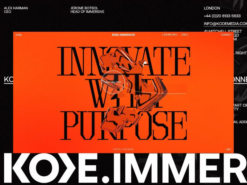
Typography was the key differentiator. We knew the right typeface would communicate innovation and intent. After multiple rounds, we landed on Brut by Off-Type – an unconventional mono-inspired form that struck just the right balance of structure and tension.
Colour took cues from the parent brand, but we flipped the hierarchy. Orange became the dominant tone, with bold black moments layered throughout. Familiar, yet distinctive.
Iconography evolved from KODE’s chevron mark. We repurposed it as a modular, dynamic system to guide interactions and reflect the brand’s three core pillars.
02 Create
This phase became interesting, since the experience would rely heavily on user interaction, this phase was driven more by prototyping than traditional design. We worked in tight, iterative loops with the client, across design, 3D, and development to test feasibility early and often. It became an it was extremely organic process and ideal to reach the deadline while stretching limitations.
From the start, we knew we didn’t just want users to interact—we wanted them to feel immersed. To lose track of time by being emotionally and mentally engaged.
We developed a range of 3D concepts in Cinema 4D and funnelled them through R&D cycles. The process required a lot of iterating and relooking creative solutions, but was always collaborative – and ultimately, essential for innovation.
03 Craft
This is where the magic happens.
Our craft is what we consider our special sauce at Malvah – this is where we like to push, refine, and design with intent and clarity. It’s hard not to get lost in the sauce. Massive respect for Francesco during this phase as it is the most intense in terms of iterations, from shader logic to ambient lighting to the haptic quality of cursor interactions, and every component was built to feel immersive yet effortless. Luckily, Francesco is an actual living wizard and provided us with testing environments where we could craft all these elements seamlessly.
Still, something was missing! The high-fidelity 3D was clashing with the flat backgrounds. The fix? A subtle layer of pixel distortion and soft noise texture. Minimal, but transformative. Suddenly, the whole experience felt unified – like everything belonged as one unified, harmonious experience.
04 Deliver
By final QA, most of the heavy lifting was done. We stress-tested performance across browsers, devices, and connection speeds. We refined micro-interactions and polished details based on early user feedback.
Tech Stack
Nerd stuff alert.
From the outset, this was always going to be a Three.js and WebGL project – not for the novelty, but for the storytelling power. Real-time 3D let us turn a static brand into a living, breathing experience. We used Cinema 4D for concepting and prototyping, from early ideation through to final modelling and meta-cap creation.
One of the most impactful performance optimisations came through the use of BatchedMesh, which enabled us to draw multiple meshes sharing the same material in a single draw call. Since draw calls are among the most expensive operations in WebGL, this dramatically improved efficiency, reducing calls from 40 or 50 down to just one. You’ll see this in action in both the hero section and the footer, where we also implemented the Rapier physics engine for dynamic interaction.
The real breakthrough, however, was moving the rendering of our most resource-intensive canvases to an OffscreenCanvas, with all related logic handled inside a WebWorker. This shift happened later in the project and required significant reworking, but the gains in performance and responsiveness were undeniable. It was a technically ambitious move, but one that paid off.
Features
The site follows a continuous scroll narrative—a careful dance between interactivity, emotion, and information. With the primary goal to provoke curiosity and invite deep engagement, rom top to bottom, here’s a rundown of our favourite features.
Chevron
We land on the hero of the brand, the logo-mark. The chevron is the anchor, both literally and metaphorically. The driving force behind the iconography that would funnel through the experience. We wanted the entry point to set the tone, bold, dynamic, and intuitive for the user to explore.
Shifting Text
One of those happy accidents. Inspired by a line that didn’t make the final copy, we developed a mechanic where text splits and shifts as the cursor moves. A metaphor for deconstruction and reformation – fluid, dynamic, alive.
Icons
A playful space to explore, discover, and interact. Designed to echo the brand’s chevron and embody its core pillars.
Menu
One of our favourite elements. It subverts the typical UX pattern by growing from the base and transforming into the footer as users scroll; a small disruption that makes a big impact.
SFX
Sound is often the unsung hero. We follow the 80/20 rule here, also known as the Pareto Principle —just the right amount to amplify emotion without overwhelming the experience. From section transitions to hover feedback, the layered soundscape adds depth and atmosphere. The transition from the landing section to the services has the user feeling as if they are entering a new realm.
We worked with Martin Leitner from Sounds Good to curate the sound elements in aiding the experience and bringing the interaction with the 3D elements to life. This was such a great experience, and Martin’s enthusiasm helped drive the process and the team’s excitement.
Easter Egg
We always planned for an easter egg, we just didn’t know what it was until it revealed itself.
A sketch mechanic, pulled from KODE’s visual identity, was integrated into the cursor. Users can draw on the screen to reveal a hidden layer; a playful nod to the analogue-digital duality of the brand.
Early testers were missing it entirely. So we added a subtle auto-activation trigger at just the right moment. Problem solved.
Reflections
This project reminded us that the best results often emerge from ambiguity. No case studies. No visual assets. No roadmap. Just vision and trust.
While we’re proud of what we’ve delivered, we’ve only scratched the surface. Phase Two will introduce interactive case studies and deeper storytelling. We’re especially excited to explore a z-axis scroll journey through each service, bringing dimension and discovery to the next level.For now, KODE Immersive is live.
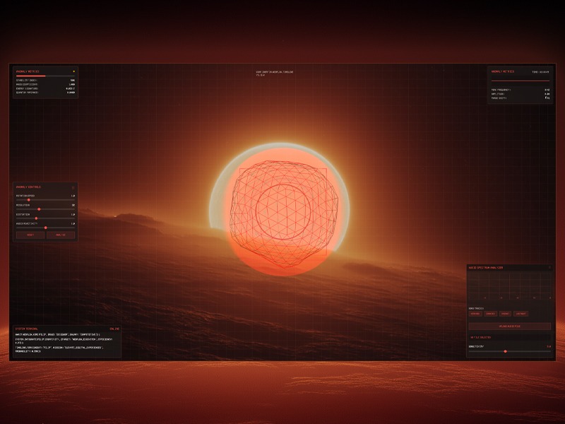
Sound is vibration, vision is vibration you can see. I’m always chasing the moment those waves overlap. For a recent Webflow & GSAP community challenge focusing on GSAP Draggable and Inertia Plugin, I decided to push the idea further by building a futuristic audio-reactive visualizer. The concept was to create a sci-fi “anomaly detector” interface that reacts to music in real time, blending moody visuals with sound.
The concept began with a simple image in my mind: a glowing orange-to-white sphere sitting alone in a dark void, the core that would later pulse with the music. To solidify the idea, I ran this prompt through Midjourney: “Glowing orange and white gradient sphere, soft blurry layers, smooth distortion, dark black background, subtle film-grain, retro-analog vibe, cinematic lighting.” After a few iterations I picked the frame that felt right, gave it a quick color pass in Photoshop, and used that clean, luminous orb as the visual foundation for the entire audio-reactive build.
Midjourney explorations
The project was originally built as an entry for the Webflow × GSAP Community Challenge (Week 2: “Draggable & Inertia”), which encouraged the use of GSAP’s dragging and inertia capabilities. This context influenced the features: I made the on-screen control panels draggable with momentum, and even gave the 3D orb a subtle inertia-driven movement when “flung”. In this article, I’ll walk you through the entire process – from setting up the Three.js scene and analyzing audio with the Web Audio API, to creating custom shaders and adding GSAP animations and interactivity. By the end, you’ll see how code, visuals, and sound come together to create an immersive audio visualizer.
Setting Up the Three.js Scene
To build the 3D portion, I used Three.js to create a scene containing a dynamic sphere (the “anomaly”) and other visual elements.
We start with the usual Three.js setup: a scene, a camera, and a renderer. I went with a perspective camera to get a nice 3D view of our orb and placed it a bit back so the object is fully in frame.
An OrbitControls is used to allow basic click-and-drag orbiting around the object (with some damping for smoothness). Here’s a simplified snippet of the initial setup:
// Initialize Three.js scene, camera, renderer
const scene = new THREE.Scene();
const camera = new THREE.PerspectiveCamera(75, window.innerWidth/window.innerHeight, 0.1, 100);
camera.position.set(0, 0, 10);  // camera back a bit from origin

const renderer = new THREE.WebGLRenderer({ antialias: true });
renderer.setSize(window.innerWidth, window.innerHeight);
document.body.appendChild(renderer.domElement);

// Add OrbitControls for camera rotation
const controls = new THREE.OrbitControls(camera, renderer.domElement);
controls.enableDamping = true;
controls.dampingFactor = 0.1;
controls.rotateSpeed = 0.5;
controls.enableZoom = false; // lock zoom for a more fixed view
Next, I created the anomaly object. This is the main feature: a spiky wireframe sphere that reacts to audio. Three.js provides shapes like SphereGeometry or IcosahedronGeometry that we can use for a sphere. I chose an icosahedron geometry because it gives an interesting multi sided look and allows easy control of detail (via a subdivision level). The anomaly is actually composed of two overlapping parts:
Outer wireframe sphere: An IcosahedronGeometry with a custom ShaderMaterial that draws it as a glowing wireframe. This part will distort based on music (imagine it “vibrating” and morphing with the beat).
Inner glow sphere: A slightly larger SphereGeometry drawn with a semi-transparent, emissive shader (using the backside of the geometry) to create a halo or aura around the wireframe. This gives the orb a warm glow effect, like an energy field.
I also added in some extra visuals: a field of tiny particles floating in the background (for a depth effect, like dust or sparks) and a subtle grid overlay in the UI (more on the UI later). The scene’s background is set to a dark color, and I layered a background image (the edited Midjourney visual) behind the canvas to create the mysterious-alien landscape horizon. This combination of 3D objects and 2D backdrop creates the illusion of a holographic display over a planetary surface.
Integrating the Web Audio API for Music Analysis
With the 3D scene in place, the next step was making it respond to music. This is where the Web Audio API comes in. I allowed the user to either upload an audio file or pick one of the four provided tracks. When the audio plays, we tap into the audio stream and analyze its frequencies in real-time using an AnalyserNode. The AnalyserNode gives us access to frequency data. This is a snapshot of the audio spectrum (bass, mids, treble levels, etc.) at any given moment, which we can use to drive animations.
To set this up, I created an AudioContext and an AnalyserNode, and connected an audio source to it. If you’re using an <audio> element for playback, you can create a MediaElementSource from it and pipe that into the analyser. For example:
// Create AudioContext and Analyser
const audioContext = new (window.AudioContext || window.webkitAudioContext)();
const analyser = audioContext.createAnalyser();
analyser.fftSize = 2048;                  // Use an FFT size of 2048 for analysis
analyser.smoothingTimeConstant = 0.8;     // Smooth out the frequencies a bit

// Connect an audio element source to the analyser
const audioElement = document.getElementById('audio-player');  // <audio> element
const source = audioContext.createMediaElementSource(audioElement);
source.connect(analyser);
analyser.connect(audioContext.destination);  // connect to output so sound plays
Here we set fftSize to 2048, which means the analyser will break the audio into 1024 frequency bins (frequencyBinCount is half of fftSize). We also set a smoothingTimeConstant to make the data less jumpy frame-to-frame. Now, as the audio plays, we can repeatedly query the analyser for data. The method analyser.getByteFrequencyData(array) fills an array with the current frequency magnitudes (0–255) across the spectrum. Similarly, getByteTimeDomainData gives waveform amplitude data. In our animation loop, I call analyser.getByteFrequencyData() on each frame to get fresh data:
const frequencyData = new Uint8Array(analyser.frequencyBinCount);

function animate() {
  requestAnimationFrame(animate);

  // ... update Three.js controls, etc.
  if (analyser) {
    analyser.getByteFrequencyData(frequencyData);
    // Compute an average volume level from frequency data
    let sum = 0;
    for (let i = 0; i < frequencyData.length; i++) {
      sum += frequencyData[i];
    }
    const average = sum / frequencyData.length;
    let audioLevel = average / 255;  // normalize to 0.0–1.0
    // Apply a sensitivity scaling (from a UI slider)
    audioLevel *= (sensitivity / 5.0);
    // Now audioLevel represents the intensity of the music (0 = silence, ~1 = very loud)
  }

  // ... (use audioLevel to update visuals)
  renderer.render(scene, camera);
}
In my case, I also identified a “peak frequency” (the frequency bin with the highest amplitude at a given moment) and some other metrics just for fun, which I display on the UI (e.g. showing the dominant frequency in Hz, amplitude, etc., as “Anomaly Metrics”). But the key takeaway is the audioLevel – a value representing overall music intensity – which we’ll use to drive the 3D visual changes.
Syncing Audio with Visuals: Once we have audioLevel, we can inject it into our Three.js world. I passed this value into the shaders as a uniform every frame, and also used it to tweak some high-level motion (like rotation speed). Additionally, GSAP animations were triggered by play/pause events (for example, a slight camera zoom when music starts, which we’ll cover next). The result is that the visuals move in time with the music:louder or more intense moments in the audio make the anomaly glow brighter and distort more, while quiet moments cause it to settle down.
Creating the Audio-Reactive Shaders
To achieve the dynamic look for the anomaly, I used custom GLSL shaders in the material. Three.js lets us write our own shaders via THREE.ShaderMaterial, which is perfect for this because it gives fine-grained control over vertex positions and fragment colors. This might sound difficult if you’re new to shaders, but conceptually we did two major things in the shader:
Vertex Distortion with Noise: We displace the vertices of the sphere mesh over time to make it wobble and spike. I included a 3D noise function (Simplex noise) in the vertex shader – it produces a smooth pseudo-random value for any 3D coordinate. For each vertex, I calculate a noise value based on its position (plus a time factor to animate it). Then I move the vertex along its normal by an amount proportional to that noise. We also multiply this by our audioLevel and a user-controlled distortion factor. Essentially, when the music is intense (high audioLevel), the sphere gets spikier and more chaotic; when the music is soft or paused, the sphere is almost smooth.
Fresnel Glow in Fragment Shader: To make the wireframe edges glow and fade realistically, I used a fresnel effect in the fragment shader. This effect makes surfaces more luminous at glancing angles. We calculate it by taking the dot product of the view direction and the vertex normal – it results in a value that’s small on edges (grazing angles) and larger on faces directly facing the camera. By inverting and exponentiating this, we get a nice glow on the outline of the sphere that intensifies at the edges. I modulated the fresnel intensity with the audioLevel as well, so the glow pulsates with the beat.
Let’s look at a simplified version of the shader code for the outer wireframe sphere material:
const outerMaterial = new THREE.ShaderMaterial({
  uniforms: {
    time:      { value: 0 },
    audioLevel:{ value: 0 },            // this will be updated each frame
    distortion:{ value: 1.0 },
    color:     { value: new THREE.Color(0xff4e42) }  // a reddish-orange base color
  },
  wireframe: true,
  transparent: true,
  vertexShader: `
    uniform float time;
    uniform float audioLevel;
    uniform float distortion;
    // (noise function omitted for brevity)

    void main() {
      // Start with the original position
      vec3 pos = position;
      // Calculate procedural noise value for this vertex (using its position and time)
      float noise = snoise(pos * 0.5 + vec3(0.0, 0.0, time * 0.3));
      // Displace vertex along its normal
      pos += normal * noise * distortion * (1.0 + audioLevel);
      // Standard transformation
      gl_Position = projectionMatrix * modelViewMatrix * vec4(pos, 1.0);
    }
  `,
  fragmentShader: `
    uniform vec3 color;
    uniform float audioLevel;
    varying vec3 vNormal;
    varying vec3 vPosition;

    void main() {
      // Calculate fresnel (view-angle dependent) term
      vec3 viewDir = normalize(cameraPosition - vPosition);
      float fresnel = 1.0 - max(0.0, dot(viewDir, vNormal));
      fresnel = pow(fresnel, 2.0 + audioLevel * 2.0);
      // Make the fragment color brighter on edges (fresnel) and pulse it slightly with time
      float pulse = 0.8 + 0.2 * sin(time * 2.0);
      vec3 emissiveColor = color * fresnel * pulse * (1.0 + audioLevel * 0.8);
      // Alpha fade out a bit when audio is high (to make spikes more ethereal)
      float alpha = fresnel * (0.7 - audioLevel * 0.3);
      gl_FragColor = vec4(emissiveColor, alpha);
    }
  `
});
In this shader, snoise is a Simplex noise function (not shown above) producing values ~-1 to 1. The vertex shader uses it to offset each vertex (pos += normal * noise * …). We multiply the noise by (1.0 + audioLevel) so that when audioLevel rises, the displacement increases. The distortion uniform is controlled by a slider in the UI, so the user can manually dial the overall spikiness. The fragment shader calculates a fresnel factor to make the wireframe edges glow. Notice how audioLevel factors into the power and into the final color intensity – louder audio makes the fresnel exponent higher (sharper glow) and also increases brightness a bit. We also included a gentle pulsing (sin(time)) independent of audio, just to give a constant breathing motion.
For the inner glow sphere, we used a separate ShaderMaterial: it’s basically a sphere drawn with side: THREE.BackSide (so we see the inner surface) and Additive Blending to give a blooming halo. Its fragment shader also uses a fresnel term, but with a much lower alpha so it appears as a soft haze around the orb. The inner sphere’s size is slightly larger (I used about 1.2× the radius of the outer sphere) so that the glow extends beyond the wireframe. When combined, the outer and inner shaders create the effect of a translucent, energy-filled orb whose surface ripples with music.
To tie it all together, every frame in the render loop I update the shader uniforms with the current time and audio level:
// in the animation loop:
outerMaterial.uniforms.time.value = elapsedTime;
outerMaterial.uniforms.audioLevel.value = audioLevel;
outerMaterial.uniforms.distortion.value = currentDistortion;
glowMaterial.uniforms.time.value = elapsedTime;
glowMaterial.uniforms.audioLevel.value = audioLevel;
The result is a 3D object that truly feels alive with the music, it oscillates, pulses, and glows in sync with whatever track is playing. Even the one you add.
Animations and Interactions with GSAP
With the visuals reacting to sound, I added GSAP to handle smooth animations and user interactions. GSAP is great for creating timeline sequences and tweening properties with easing, and it also comes with plugins that were perfect for this project: Draggable for click-and-drag UI, and InertiaPlugin for momentum. Best of all, every GSAP plugin is now completely free to use. Below are the key ways I used GSAP in the project:
Intro Animation & Camera Movement: When the user selects a track and hits play, I trigger a brief “activation” sequence. This involves some text appearing in the “terminal” and a slight camera zoom-in toward the orb to signal that the system is online. The camera movement was done with a simple GSAP tween of the camera’s position. For example, I defined a default camera position and a slightly closer “zoomed” position. On play, I use gsap.to() to interpolate the camera position to the zoomed-in coordinates, and on pause/stop I tween it back out. GSAP makes this kind of 3D property animation straightforward:
const defaultCameraPos = { x: 0, y: 0, z: 10 };
const zoomedCameraPos = { x: 0, y: 0, z: 7 }; // move camera closer on zoom

function zoomCameraForAudio(zoomIn) {
  const target = zoomIn ? zoomedCameraPos : defaultCameraPos;
  gsap.to(camera.position, {
    x: target.x,
    y: target.y,
    z: target.z,
    duration: 1.5,
    ease: "power2.inOut"
  });
}

// When audio starts:
zoomCameraForAudio(true);
// When audio ends or is stopped:
zoomCameraForAudio(false);
This smooth zoom adds drama when the music kicks in, drawing the viewer into the scene. The power2.inOut easing gives it a nice gentle start and stop. I also used GSAP timelines for any other scripted sequences (like fading out the “Analyzing…” overlay text after a few seconds, etc.), since GSAP’s timeline control is very handy for orchestrating arranging multiple animations in order.
Draggable UI Panels: The interface has a few UI components overlaying the 3D canvas – e.g. an “Anomaly Controls” panel (with sliders for rotation speed, distortion amount, etc.), an “Audio Spectrum Analyzer” panel (showing a bar graph of frequencies and track selection buttons), and a “System Terminal” readout (displaying log messages like a console). To make the experience playful, I made these panels draggable. Using GSAP’s Draggable plugin, I simply turned each .panel element into a draggable object:
Draggable.create(".panel", {
  type: "x,y",
  bounds: "body",         // confine dragging within the viewport
  inertia: true,          // enable momentum after release
  edgeResistance: 0.65,   // a bit of resistance at the edges
  onDragStart: () => { /* bring panel to front, etc. */ },
  onDragEnd: function() {
    // Optionally, log the velocity or other info for fun
    console.log("Panel thrown with velocity:", this.getVelocity());
  }
});
Setting inertia: true means when the user releases a panel, it will continue moving in the direction they tossed it, gradually slowing to a stop (thanks to InertiaPlugin). This little touch makes the UI feel more tactile and real – you can flick the panels around and they slide with some “weight.” According to GSAP’s docs, Draggable will automatically handle the physics when inertia is enabled , so it was plug-and-play. I also constrained dragging within the body bounds so panels don’t get lost off-screen. Each panel has a clickable header (a drag handle area), set via the handle option, to restrict where a user can grab it. Under the hood, InertiaPlugin calculates the velocity of the drag and creates a tween that smoothly decelerates the element after you let go, mimicking friction.
Interactive Orb Drag (Bonus): As a creative experiment, I even made the 3D anomaly orb itself draggable. This was a bit more involved since it’s not a DOM element, but I implemented it by raycasting for clicks on the 3D object and then rotating the object based on mouse movement. I applied a similar inertia effect manually: when you “throw” the orb, it keeps spinning and slowly comes to rest. This wasn’t using GSAP’s Draggable directly (since that works in screen space), but I did use the InertiaPlugin concept by capturing the drag velocity and then using an inertial decay on that velocity each frame. It added a fun way to interact with the visualizer – you can nudge the orb and see it respond physically. For example, if you drag and release quickly, the orb will continue rotating with momentum. This kind of custom 3D dragging is outside the scope of a basic tutorial, but it shows how you can combine your own logic with GSAP’s physics concepts to enrich interactions.
GSAP Draggable and Inertia in action
In summary, GSAP handles all the non-audio animations: the camera moves, panel drags, and little transitions in the UI. The combination of sound-reactive shader animations (running every frame based on audio data) and event-based GSAP tweens (triggered on user actions or certain times) gives a layered result where everything feels responsive and alive.
UI and Atmosphere
Finally, a few words about the surrounding UI/atmosphere which glue the experience together. The visualizer’s style was inspired by sci-fi control panels, so I leaned into that:
Control Panels and Readouts: I built the overlay UI with HTML/CSS, keeping it minimalistic (just semi-transparent dark panels with light text and a few sliders/buttons). Key controls include rotation speed (how fast the orb spins), resolution (tessellation level of the icosahedron mesh), distortion amount, audio reactivity (scaling of audio impact), and sensitivity (which adjusts how the audio’s volume is interpreted). Changing these in real-time immediately affects the Three.js scene – for example, dragging the “Resolution” slider rebuilds the icosahedron geometry with more or fewer triangles, which is a cool way to see the orb go from coarse to finely subdivided. The “Audio Spectrum Analyzer” panel displays a classic bar graph of frequencies (drawn on a canvas using the analyser data) so you have a 2D visualization accompanying the 3D one. There’s also a console-style terminal readout that logs events (like “AUDIO ANALYSIS SYSTEM INITIALIZED” or the velocity of drags in a playful GSAP log format) to reinforce the concept of a high-tech system at work.
Design elements: To boost the sci-fi feel, I added a subtle grid overlay across the whole screen. This was done with pure CSS – a pair of repeating linear gradients forming horizontal and vertical lines (1px thin, very transparent) over a transparent background . It’s barely noticeable but gives a technical texture, especially against the glow of the orb. I also added some drifting ambient particles (tiny dots) floating slowly in the background, implemented as simple divs animated with JavaScript. They move in pseudo-random orbits.
Soundtrack: I curated three atmospheric and moody tracks, along with one of my own unreleased tracks, under my music alias LXSTNGHT. The track was produced in Ableton, and it’s unfinished. The end result is an experience where design, code, and music production collide in real time.
Bringing all these elements together, the final result is an interactive art piece: you load a track, the “Audio ARK” system comes online with a flurry of text feedback, the ambient music starts playing, and the orb begins to pulse and mutate in sync with the sound. You can tweak controls or toss around panels (or the orb itself) to explore different visuals.
The combination of Three.js (for rendering and shader effects), Web Audio API (for sound analysis), and GSAP (for polished interactions) showcases how creative coding tools can merge to produce an immersive experience that engages multiple senses.
Hi, I’m Xor. As a graphics programmer, my job is essentially to make pixels prettier using math formulas. I work on
video effects like lighting, reflections, post-processing, and more for games and animated backgrounds in software.
For fun, I like to unwind by writing compact little shader programs that fit in a “tweet” (280 characters or less).
You may have seen some of these posted on X/Twitter. The process of shrinking code while maintaining its functionality
is called “code golfing.”
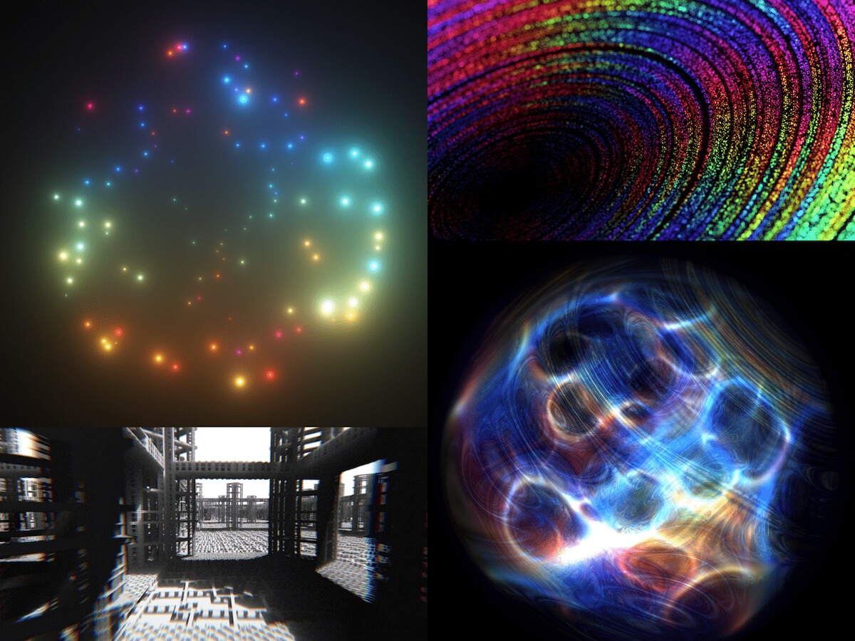
Here’s an animated galaxy I wrote in just 197 characters of GLSL code:
This little piece of code runs in real time for every pixel on the screen and generates a unique output color using
some fancy math and logic. I build these demos using a tool called Twigl.app
, an online shader editor designed for sharing mini-shaders. It makes exporting videos super easy, and in its
“geekiest” mode, it also takes care of the generic header code and shortens built-in variable names.
I even managed to fit a voxel DDA raytracer with edge detection into just 190 characters:
Today, I’d like to explain why I make these, share my creation process, and show you how you can try it yourself if
you’re interested. Let’s start with the “why.”
Motivation
Why do I write these? Well, there are several factors. Since I like lists, I’ll go ahead and present them in order of
relevance:
Curiosity and Passion
: Sometimes I get struck by a new idea and just want to play around with it. I like Twigl because it helps lower my
expectations and lets me start doodling. There’s less room for overplanning, and it’s super easy to jump in.
Learning and Discovery
: Working within constraints forces me to think through problems differently. By optimizing for code size, I often
find ways to simplify or approximate. It doesn’t always lead to more performant code (but often it does) and I’ve
learned how to squeeze the most out of every byte. Having very little code makes it easier to experiment with
formulas and variations without getting overwhelmed.
Challenge
: Writing tiny code is both challenging and stimulating. It keeps my brain sharp, and I’m constantly developing new
skills. It’s basically become a game for me. I’ve accidentally learned a ton of math while trying to solve these
technical problems.
Community
: I’ve connected with so many interesting people through this process—artists, designers, math folks, game devs,
engineers, tech enthusiasts, and more. Sharing my work has led to some exciting encounters. (More on some notable
people later!)
So, in short, it’s fun, thought-provoking, and engaging, and it’s a great way to spark interest in graphics
programming. Now, what even is a shader?
Shader Introduction
In case you haven’t heard of shaders before, they are programs that run on the GPU (Graphics Processing Unit) instead
of the CPU (Central Processing Unit). CPUs excel at complicated or branching operations, which are computed
sequentially, one at a time (I’m simplifying here). GPUs are designed to process billions or trillions of predictable
operations per second in parallel. This sounds like a lot, but a 4K screen at 60 frames per second outputs nearly 500M
pixels per second. Each pixel could have 100s or 1,000s of operations, not to mention anything else the GPU might be
used for.
There are several different types of shaders: vertex shaders, fragment shaders, compute shaders, and more, but these
tweet shaders are specifically fragment shaders, also known as “pixel shaders,” because they run on every pixel. In
essence, fragment shaders take the input fragment coordinates and output a color and opacity (or alpha). Fragment
coordinates give you the position of the center of each pixel on screen, so (0.5, 0.5) is the bottom-left (or
top-left). One pixel to the right is (1.5, 0.5), and so on to (width – 0.5, height – 0.5). The coordinates variable is
called “FC” in Twigl. The output color, “o”, has 4 RGBA components: red, green, blue, and alpha, each ranging from 0.0
to 1.0.
(1.0, 1.0, 1.0, 1.0)
is pure white, (0.0, 0.0, 0.0, 1.0)
is opaque black, and (1.0, 0.0, 0.0, 1.0)
is pure red in the RGBA color format. From here, you can already make simple color gradients:
o = vec4(0.0, FC.y/100.0, 0.0, 1.0)
;
Remember, this is run on every pixel, so each pixel will have a unique Fragment Coordinate. That formula makes a
simple gradient that starts black at the bottom of the screen (FC.y = 0.0), and the green output value reaches 1.0
when FC.y reaches 100.0.
So you have an output color “o”, the input fragment coordinates “FC”, and four “uniform” inputs which are shared among
all pixels: “r” is the shader screen resolution in pixels, “t” is the time in seconds, and also the less commonly used
mouse position “m” and the backbuffer texture “b”. And that’s the core of it! From there, it’s a lot of math and logic
to control the output colors and generate cool images.
I’m going to skip ahead a bit, but if you’re interested in learning more, try starting here
!
My Process
People often ask me whether I write my shaders in a compact form from the start or if I write them expanded and then
reduce the code afterward. The answer is the former. I’ve practiced code golfing so much that I find it easier to
prototype ideas in compact form, and I tend not to get lost in tiny shaders. Code golfing shaders requires finding the
right balance between code size, render performance, artistic appeal, design, and mathematical function. It’s a
delicate balance that definitely challenges both sides of my brain. I’ve learned a ton about math, art, and design
through writing these!
To start one, you need an idea. When writing the “Milky” stars shader, I knew I wanted to create some kind of galaxy, so that was my initial spark.
My shaders typically start with centering and scaling so that they look good at various resolutions and aspect ratios. For the stars, I looped through 100 point lights revolving around the center. I love glowing effects, and they are pretty easy to create. You just need to know the distance from the current pixel to the light source and use the inverse for the pixel brightness (close pixels are brighter, far pixels are darker).
I played around with the positions of the particles using some trigonometry and gave the disk a slight skew. For the coloring, I love to use some sine waves with a phase shift for the RGB channels. Sine waves are also useful for picking pseudo-random numbers, so that’s how I select the colors for each star. Using the sine formula, you can get palettes like these:
I ended up with a slight alteration of the one second from the left. It has a nice range of temperatures and brightness. I also added some variation to the star brightness, which made the image much more interesting to look at.
Next, I applied some tonemapping with the hyperbolic tangent function for size. Tonemapping prevents the harsh overexposure and hue shifts that happen when a color channel hits its maximum brightness value (left is original, right is with tonemapping):
Any good shader that has High Dynamic Range lighting should apply some tonemapping, and tweet shaders are no
exception! Finally, I played with animation. It could have revolved or twisted, but in the end, I liked the
contraction effect most. I also created a loop so that new stars faded in when the old stars reached the center. You
can read about my design process in more detail here
!
Code Golfing
As you can imagine, there are hundreds of little techniques that I have developed (and continue to discover) in the
process of shrinking the code down, but I can give you the abridged version! My generalized code-golfing process can
be listed like so:
Reduce names:
It may be challenging initially, but you can get used to single-letter variables and function names. You may
sometimes forget what variables are for, but this is actually helpful for code golfing. It forces you to reread your
code, and you’ll often find better ways to write it when doing so. Like anything else, your memory will improve with
practice, and over time you will establish some standards (for me: p = position, c = color, O = frag output, I =
input, etc.).
Reduce numbers:
This is pretty self-explanatory. 1.0 == 1.
, 1000.0 == 1e3
. Don’t forget that with vector constructors, you can use any data type as an input, and it gets converted (“cast”)
to the new type: vec4(1.0, 1.0, 1.0, 1.0) == vec4(1)
. If you’re multiplying by 10.0
, you could instead divide by .1
.
Minimize initializations:
If you have two floats, “x” and “y”, try to initialize them together like so: float x = 0., y = 1.;
Look for opportunities to share data types. If you have a color vec3 and a vec4, make them both vec4s. Avoid
float/int conversions.
Avoid ifs:
If statements in GLSL take up a bit of space, especially if you need an else if
. Try using a ternary instead. For example: if (x>y) O = vec4(1,0,0,1); else O = vec4(0,1,0,1);
becomes O = x>y ? vec4(1,0,0,1) : vec4(0,1,0,1);
. Much shorter, and there’s a lot you can do with it. You can even set multiple variables between ?
and :
.
for(;;) > while(): for
and while
use the same number of characters, but for
has a spot for initializing (before the first semicolon) and a spot for the final step after each iteration (after
the last semicolon). These are free slots that can be used for lines that would otherwise have to end with a
semicolon. Also, avoid using break
, and use the condition spot instead! You can also remove the brackets if each line ends with a comma (so it doesn’t
work with nested for
-loops).
Beyond that, I use some function substitutions to reduce the code further. More on that over here
!
I’ve put together a ShaderToy demo
with some additional variables, formatting, and comments for clarity. Every shader is different and requires using
different techniques, approximations, and concepts, but that is precisely what makes it so fun for me! I’m still
learning new stuff nearly every day!
Questions and Answers
Here are some questions I was asked on X.
Do you have a favorite “trick” or “technique”? If so, what is it?
How did you develop the intuition for related maths?
It takes lots of time and patience. I had to push through many times when I thought a topic was over my head. If you
take it in small pieces, take breaks, and sleep on it, you can learn a lot! I wrote about some of the conceptualization techniques
that I’ve picked up over the years. That might save you some time!
Do you start writing the shader in code-golfing mode, or is it a process until you reach the most optimized code? Which is the best editor for normal shaders and for code-golfing shaders?
Yes, I write in code-golfing mode because I’ve developed an intuition for it, and it feels faster to prototype at this
point. I still have to refine the code when I find a look that I like, though. I’m a big fan of Twigl.app, but
ShaderToy is great too. ShaderToy is best for its community and wealth of knowledge. I try to use it when explaining
my tweet shaders.
How did you start writing cool shaders, and what did you use to learn it?
Well, I’ll explain more about my background later, but it started with an interest in game development. Shaders have
tons of applications in video game graphics—that’s what sparked my curiosity to learn.
Do you have regrets related to sacrificing readability?
Nope. I’m more concerned with size optimizations that lead to slower code, but I don’t mind the unreadable code. To
me, that’s part of the magic of it.
What’s your background that got you to the point where you could effectively learn the material?
It’s story time…
My Story
Growing up, I was interested in video games, especially those with “fancy” 3D graphics. When I was around 10, my friend showed me a tool called GameMaker. I tinkered around with it and learned some of the basics of drag ‘n’ drop programming, variables, and conditionals.
Over time, I started experimenting with 3D graphics in GM, even though it was (and still is) primarily a 2D game engine. It was enough to learn the basics of how 3D rendering works and the render pipeline. Later, GameMaker introduced this thing called “shaders,” which allowed developers to create more advanced effects. At the time, there weren’t many resources available, so it took a while for me to pick it up. I started posting my shaders on the GameMaker forums and got some helpful feedback from the community (shoutout to “xygthop3” for his helpful examples)!
Game development was a great place to learn about shaders because you have performance constraints (you don’t want a game to stutter), and you learn a lot about the entire rendering process in that context. In 2014, I started posting my earliest shader tutorials, sharing techniques as I learned them. The early tutorials weren’t great, but I’m glad I wrote them. In 2015, I started exploring ShaderToy, and that’s where my skills really developed.
There were so many great examples to learn from, and it was a good place to get feedback on my ideas. In 2021, I launched a new introductory tutorial series for GameMaker with GLSL 1.00. Now I post more generalized tutorials on all kinds of graphics topics, ranging from math to art to design to code and more. This is definitely my best series yet, and they continue to get better. If you are interested in video games and graphics, I highly recommend starting with GameMaker or Godot. They are relatively easy to learn while still powerful enough to teach you the ropes. If software or web dev is more your thing, you can’t go wrong with ShaderToy or compute.toys.
Here are some of the great people who have helped me, directly or indirectly, along the way:
xygthop3 – This guy’s free shader examples were probably the greatest help along the way. His examples were a pivotal point in my understanding of a variety of graphics techniques, so thanks, Michael!
Inigo Quilez – Inigo is the author of ShaderToy and the king of raymarching. His Signed Distance Field functions are still foundational to this day. An absolute legend!
Fabrice Neyret – Fabrice is probably the best shader code golfer there is, and many shaders are inspired by his work. He has taught me so many techniques over the years.
Yonatan “zozuar” – Another major inspiration for me. Yonatan’s work convinced me to try code golfing for real on Twitter, and his brain is amazing.
I’m sure there are many others whose names are eluding me at the moment, but I want to thank the entire shader
community for their feedback and encouragement.
Arsenal
I’ll wrap this up with a few of my favorite tweet shaders so far:
I’m Bimo Tri, a multidisciplinary designer and creative developer based in Indonesia. I run a small independent studio called Studio•Bämo.J®, working between Jakarta and Bali — or pretty much anywhere I can find a fast internet connection.
My focus is on building expressive digital experiences, mostly portfolio sites and brand platforms for creatives, studios, and design-forward brands. With roots in both design and development, I enjoy blending visual precision with motion and interactivity to create work that feels both thoughtful and visceral. I care deeply about craft, story, and making things that resonate beyond just visuals.
Saisei is a visionary architecture firm based in Tokyo, Japan, focused on sustainability, culture, and timeless design. I designed and developed the site to reflect their philosophy merging traditional Japanese aesthetics with clean, contemporary digital design.
Achievements
This project was a major milestone in my career. It brought home my first Awwwards Site of the Day and earned recognition from several other platforms. The positive feedback from the design community affirmed my approach to cultural storytelling through digital mediums.
Personal notes
Saisei remains one of my favorite works. I’ve always been drawn to the tension between heritage and modernity, and this project gave me the space to explore that deeply. The recognition it received made the process even more meaningful.
Nagara is a concept project developed in collaboration with my buddy Felixander Yuan, created as part of the #DareToShare24 design challenge by @bentenwordring.
It reimagines a luxury watch brand that fuses the precision of Swiss watchmaking with the cultural depth of the Majapahit Empire. Each timepiece acts as a tribute not just to technical craftsmanship, but to historical richness and aesthetic symbolism rooted in Indonesian heritage.
Challenges
One of the biggest hurdles was exploring AI-generated imagery and motion assets. Using tools like Midjourney and Kling, it took numerous iterations to dial in a visual direction that felt both on-brand and high-end. Getting the product visuals — especially the watches — to look authentic and aligned with the brand’s narrative was far more challenging than anticipated.
Achievements
The final result was a fully animated concept site that we were genuinely proud of. Yuan did an amazing job bringing the dev and motion to life. Beyond that, the project ended up winning the monthly challenge, earning recognition and some cool prizes — a nice bonus on top of the creative satisfaction.
Personal notes
This one felt personal. The month’s theme was “Luxury” — a space I naturally gravitate toward — and we were allowed to team up for the final challenge. I chose to work with Yuan, someone I’ve respected and known for a while. The entire process felt like a return to roots — storytelling, culture, and collaboration — wrapped inside a luxury narrative.
Horizon Studio is a conceptual architecture firm based in Los Angeles, created to explore the intersection of art, design, and technology. Inspired by my love for architecture and interior design, the site showcases sleek, avant-garde visuals with a focus on sustainability. I used Midjourney for the visual assets and GPT to shape the narrative, crafting an experience that feels modern and immersive.
Achievements
The site received an Honorable Mention from Awwwards — a validating moment for me as it was one of my earliest forays into the architecture space. The feedback highlighted the strength of the design direction and the site’s overall atmosphere.
Personal notes
This was the first project where I went all in with generative AI — every asset was made using prompts, and honestly, it was pretty sloppy at first. But through experimentation, I managed to create a cohesive visual style that looked like it came from one photographer. It reminded me how fun it is to dive into the unknown and just explore.
REZN-8 is a typographic and layout exploration rooted in Swiss design principles. It started as a poster experiment and evolved into a full website — my first time building a motion-heavy site entirely with code. It was all about translating static design into something dynamic, expressive, and functional in a digital format.
Challenges
Turning the poster into a functional site was already a challenge, but learning JavaScript on the fly to bring motion into the experience pushed me even further.
The biggest challenge, though, was researching and presenting accurate information about the legendary designers featured. Some had very little online presence, so I had to dive deep into design history to get the details right.
Personal notes
REZN-8 holds a special place in my heart. It completely changed how I see layout, grids, and type — it was the project that shifted my design brain forever. Shoutout to Chris Do and TheFutur’s Typography 01 course, which sparked the whole thing.
I didn’t start out as a designer, at least not in the traditional sense. My early work was in a marketing agency where I handled everything from FB ad graphics to SEO landing pages and WordPress articles. It wasn’t glamorous, but it gave me a foundation in how digital systems work.
Then I stumbled across Webflow — and everything changed. I got completely hooked on web design, especially sites with rich motion and interaction.
That moment pushed me to quit the agency world and start my own studio. Since then, I’ve been building expressive, story-driven websites for creatives and design-forward brands, blending design, motion, and development into something that feels personal and intentional.
Design Philosophy
I’ve always leaned toward minimal design paired with bold, heavy type. To me, you don’t need a lot to make something striking, just the right balance of restraint and intention. If the typography is solid and the layout is thoughtful, even the simplest design can carry emotional weight. I focus on clarity, rhythm, and a strong visual pulse — letting motion, space, and type do the heavy lifting.
Tools and Techniques
Figma for most of the design work
Webflow for front-end development and CMS integration
GSAP for all things motion and interaction
Cursor for dev support (because I wouldn’t call myself a “real dev,” but I make it work)
Inspiration
I pull inspiration from a lot of places — music, films, anime — especially the ones that are crafted with insane attention to detail. I’ve always admired how much intention goes into those worlds. There’s so much to steal from them — not just visually, but conceptually and emotionally. I’m also inspired by work that feels personal, raw, and beautifully uncompromising.
Future Goals
My main goal is to keep attracting work that aligns with the way I see and do things. I’m not chasing volume — I just want to keep collaborating with people who value design, story, and craft as much as I do. I’m also interested in exploring more personal projects, maybe even merging design with philosophy, fitness, or writing — things that feel more like extensions of who I am, not just what I do.
Final Thoughts
Learn from the past, embrace the present moment, and look into the future. You only live once, do what makes you happy and what feels right for you.
Contact Info
I’m mostly active on LinkedIn, X (Twitter), and occasionally Instagram.
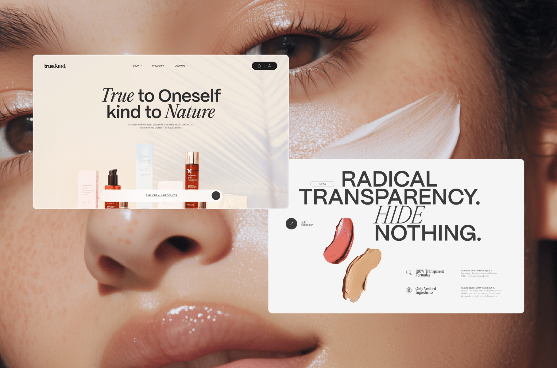
TrueKind approached us with a clear but ambitious goal: they wanted a skincare website that stood out—not just in the Indian skincare space, but globally.
The challenge? Most skincare websites (especially local ones) lean heavily commercial. They emphasize offers, discounts, and aggressive product pushes. But TrueKind wanted something gentler, more thoughtful, and centered on one message: honest skincare.
From the very first conversation, I knew this would require a delicate balance. We wanted to create a site that was visually fresh and a little unconventional, but not so experimental that it alienated everyday customers.
We set aside around 1–2 months for the design phase, allowing time for multiple iterations and careful refinement. One of the best parts of this project was the incredibly trusting, supportive client team—working with people who are genuinely open to creativity makes all the difference.
Crafting the Visual Direction
Every project I work on begins with listening. Before touching any design tools, I immersed myself in the client’s vision, mood, and tone.
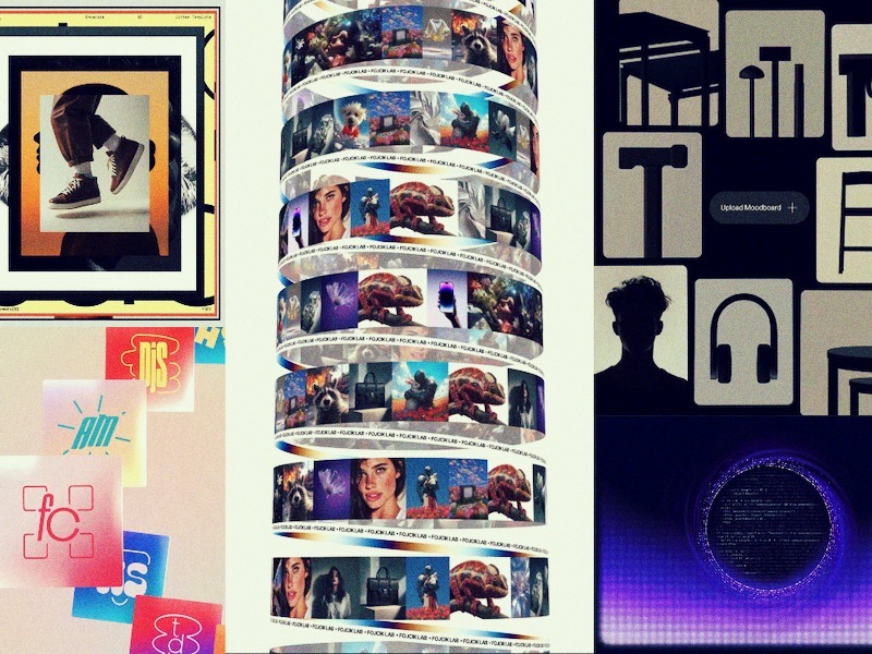
I created a moodboard to align with their aesthetic, making sure the images I pulled weren’t just random “nice” visuals. This is something I see many younger designers overlook: it’s not just about curating pretty pictures; it’s about curating pictures that match the brand’s energy, saturation, color language, and atmosphere.
🌟 When building moodboards, don’t be afraid to tweak image properties. Adjust exposure, warmth, contrast, and saturation until they feel cohesive. You’re not just grabbing references—you’re crafting a controlled atmosphere.
For the typefaces, I leaned on my go-to foundry, Pangram Pangram. Their fonts are beautifully made and (for personal projects) wonderfully accessible. For TrueKind, we selected PP Mori (for a modern, clean backbone) and Editorial Neue (to bring in an elegant, editorial touch).
Even though the client wanted something unconventional, I knew we had to keep the animation and interaction design balanced. Too much movement can be overwhelming. So, we built the visual experience primarily around typography—letting type choices and layouts carry the creative weight.
On Working Before AI Image Tools
This project dates back to around 2021, before the surge of AI image generation tools. So when it came to placeholders and visual exploration, I often turned to Behance or similar platforms to source reference imagery that fit the vibe.
Of course, for the final launch, we didn’t want any copyright issues—so we conducted a professional photoshoot in Worli, Mumbai, capturing clean, fresh product imagery. For the Awwwards showcase, we’ve swapped in AI-generated images purely for display purposes.
Iteration and Evolution
Here’s a personal moment of honesty: The first version I designed? I wasn’t thrilled with it.
It lacked the polish, elegance, and depth I knew the brand deserved. But instead of settling, I went back, refined, iterated, and kept pushing. That’s something I’d tell any designer reading this:
🌟 Don’t be afraid to walk away from your early drafts. You can feel when something’s not hitting the mark—trust that instinct, and give yourself room to improve.
Animation & Interaction Design
I’m a sucker for scroll-based animations. Smooth scrolling, layered reveals, subtle movement—these elements can elevate a static design a hundredfold if used thoughtfully.
For TrueKind, I didn’t want unnecessary flash. The scroll interactions enhance the content flow without overpowering it. The text reveals, section transitions, and layered elements were designed to add just enough dynamism to keep the user engaged while still respecting the calm, honest tone of the brand.
Bringing in Reksa: Development Insights
At a certain point, I knew I needed help to fully do justice to the design. That’s when I reached out to Reksa—a developer I deeply admire, not just for his technical skill but for his meticulous creative eye.
Handing over a design like this isn’t always easy. But with Reksa, it felt seamless. He understood the nuances, respected the design intention, and delivered 1000%.
In the dev section below, Reksa will walk you through the stack, architecture, key challenges, and how he brought the design to life with care and precision.
Tech Stack & Challenges
Nuxt.js 3 for the frontend: This project was built with Nuxt.js 3 as the frontend framework. It’s my main tech stack and a powerful choice, especially for creative websites. I find Nuxt.js offers far more flexibility than other frameworks.
SCSS for styling: While many developers prefer CSS frameworks, I lean toward vanilla CSS as my primary approach. SCSS is used here mainly for class scoping and maintainability, but the overall syntax remains vanilla. Writing custom CSS makes the most sense for my needs—especially in creative development, where unique layouts and their connection to animation/motion often demand full styling control.
Vercel for hosting: It provides a simple, plug-and-play experience for hosting Nuxt.js 3 projects.
Prismic as CMS: I use Prismic as the headless CMS. It’s my go-to for most projects—straightforward and well-suited to this project’s needs.
GSAP for animations: For smooth motion experiences, GSAP is unmatched. Its exceptional plugins—like SplitText and DrawSVG—allow me to craft fantastic animations that elevate the design.
Lenis for smooth scrolling: To enhance the motion and animation quality, implementing smooth scroll is a must. It ensures that animations flow beautifully in sync with the scroll timeline.
The key challenges for this project were implementing the “floating” layout and ensuring it remained responsive across all screen sizes. Abhishek’s design was beautifully unique, though that uniqueness also posed its own set of difficulties. To bring it to life, I had to carefully apply techniques like position: absolute in CSS to achieve the right structure and layering.
My favorite part of developing this project was the page transitions and micro-interactions.
The page transition to the product view uses a solid color from the product background, expands it to full screen, and then switches the page seamlessly. Meanwhile, micro-interactions—like SVG draw motions, button hovers, and click animations—add small but impactful details. These make the site feel more alive and engaging for users.
Awards & Recognition
We’re incredibly happy that the project received such a positive response. Some of the awards and recognitions include:
Awwwards – Site of the Day & Developer Award
Awwwards – E-commerce Honors (Nominee)
FWA – FWA of the Day
CSSDA – Website of the Day
GSAP – Site of the Day
Muz.li – Picks Honor
Made With GSAP – Showcase Feature
Reflections
This project was a joy. Not just because of the outcome, but because of the process: working with thoughtful clients, collaborating with talented partners, and building something that felt true to its mission.
There was, however, an interesting twist. While the final site looked and felt fresh and unconventional, over time, the client gradually shifted toward simpler, more familiar designs—closer to what everyday users are used to.
And here’s a reflection for all creatives:
🌟 Creative websites are a feast for the eyes, but they don’t always convert perfectly. As designers, we thrive on bold, experimental ideas. But businesses often need to balance creativity with practicality. And that’s okay.
This project left a lasting impression—not just on the client, but on us as creators. It reminded me why we do this work: not just to make things look good, but to tell stories, evoke feelings, and bring meaningful ideas into the world.
Final Thoughts
If you’re a young creative reading this: Keep learning, keep experimenting, and keep collaborating. It’s not about chasing perfection—it’s about chasing truth in your work.
And when you find a team that shares that vision? That’s where the magic happens.
Hey, I’m Robin, a Creative Developer since 2015, based in Paris and a former HETIC student.
I’ve worked at agencies like 84.Paris and Upperquad, and I’ve also freelanced with many others, picking up a few web awards along the way. I created Wind Waker.js and started a YouTube channel where I teach WebGL tutorials.
What really excites me about development is having an idea in mind and being able to see it come to life visually, tweaking it again and again until I find the right solution to achieve the result I want.
When I was a kid, I was a huge fan of a GameCube video game called Zelda: The Wind Waker. It was a vibrant, colorful game where you sailed a boat to explore the world, with a really cool pirate vibe! I wanted to challenge myself, so I decided to try recreating it in Three.js to see how far I could go.
Luckily for me, a brilliant creative coder named Nathan Gordon had already written an article back in 2016 about recreating the game’s water. That gave me a solid foundation to start from.
After a lot of effort, I managed to create something I was really proud of, including six islands with LOD (Level of Detail) logic, dynamic day/night and weather cycles, fake physics with objects floating on water, a mini-game similar to Temple Run, and a treasure hunt where you search for the Triforce.
I faced many challenges along the way, and if you’re curious about how I tackled them, I made two videos explaining everything:
The project received a lot of positive feedback, and I’m truly grateful I got the chance to pay tribute to this incredible Nintendo game.
McDonald’s Switzerland – The Golden Slide Game
Last December, I had the opportunity to create a mobile video game for McDonald’s Switzerland with the Swipe Back team.
The 3D designer provided us with some really fun, toon-style assets, which made the game look both playful and professional—especially exciting for me, as it was my first time working on a real game project.
I worked alongside David Ronai, just the two of us as developers, and it was quite a challenge! The game featured weekly quests, unlockable cosmetics, real-world rewards for top players, and a full server-side backend (which David handled).
David also had this wild idea: to build the game using TSL, a new language in the Three.js ecosystem that automatically converts your JS shaders to WebGPU. I learned it during the project and used it to create the 3D game. At the time, documentation was sparse and the tech was very fresh, but it promised much better performance than WebGL. Despite the challenge, we made it work, and the result was amazing—WebGPU ran incredibly smoothly on Android.
With all the 3D assets we had, we needed to optimize carefully. One of the key techniques we used was Batched Mesh, combining all obstacles into a single mesh, which didn’t require TSL but helped a lot with performance.
The website is no longer available since it was part of a Christmas event, but I captured a video of the project that you can check out here.
Last year, I worked on a 3D project where users could create their own salt crystal using different ingredients, all as part of a campaign for a new Issey Miyake perfume. It was a really fun experience, and the main technical challenge was achieving a beautiful refraction shader effect.
I handled the front-end development alone and used React Three Fiber for the first time, a WebGL framework based on Three.js that lets you build 3D scenes using React-style components.
The library was super helpful for setting things up quickly. As I got deeper into the project, however, I ran into a few minor issues, but I managed to solve them with some custom code. I’d definitely recommend React Three Fiber if you already know a lot about WebGL/Three.js and enjoy working in the React ecosystem.
This project was awarded Site of the Day (SOTD) on FWA.
I’ve included my portfolio as the final case study. Even though it’s an older project and not always up to date, it still means a lot to me.
I started working on it during a break right after the pandemic. I had a very vague idea at first, so I began designing and programming at the same time. It was a curious way of working because I was never quite sure how it would turn out. With lots of back and forth, trial and error, and restarts, I really enjoyed that creative, spontaneous process—and I’d definitely recommend it if you’re working on a personal project!
This project received a Site of the Day (SOTD) award on both Awwwards and FWA.
About me
I’m a Creative Web Developer with 10 years of experience, based in Paris.
I studied at a French school called HETIC, where I learned a wide range of web-related skills including design, project management, marketing, and programming. In 2015, I had the chance to do a six-month internship at UNIT9. This is where I discovered WebGL for the first time, and I immediately fell in love with it.
My very first project involved building a VR version of a horror movie on the web using Three.js, and I found it absolutely fascinating.
After that, I worked at several agencies: first at 84.Paris in France, then for a year and a half at Upperquad in San Francisco. At these agencies, I learned a lot from other developers about creative development, clean code architecture, and fine-tuning animations. I contributed to multiple award-winning websites (Awwwards, FWA), and in 2021, I finally decided to start freelancing.
I won my first award solo with my portfolio, and since then I’ve worked with clients around the world, occasionally winning more awards along the way.
As a front-end developer, I’ve always enjoyed pushing the limits of web animation. I love experimenting with different effects and sharing them with the team to inspire new ideas. I don’t have a specific workflow, because I work with many agencies all over the world and always have to adapt to new frameworks, workflows, and structures. So I wouldn’t recommend any specific workflow—just try different ones and pick the one that fits best for your project!
Current learning & challenges
Currently, I’m learning TSL, a Three.js-based approach that compiles your Three.js code to WebGPU (with a WebGL fallback) for even better performance! For my current and future challenges, I would love to create a 3D web development course!
Final Thoughts
Thank you Codrops for inviting me, I’ve always been a fan of the amazing web animation tutorials.
If you have a project in mind, don’t give up on it! Try to find some free time to at least give it a shot. Stay creative!
Hey! Jorge Toloza again, Co-Founder and Creative Director at DDS Studio. In this tutorial, we’re going to build a visually rich, infinitely scrolling grid where images move with a parallax effect based on scroll and drag interactions.
We’ll use GSAP for buttery-smooth animations, add a sprinkle of math to achieve infinite tiling, and bring it all together with dynamic visibility animations and a staggered intro reveal.
Let’s get started!
Setting Up the HTML Container
To start, we only need a single container to hold all the tiled image elements. Since we’ll be generating and positioning each tile dynamically with JavaScript, there’s no need for any static markup inside. This keeps our HTML clean and scalable as we duplicate tiles for infinite scrolling.
<div id="images"></div>
Basic Styling for the Grid Items
Now that we have our container, let’s give it the foundational styles it needs to hold and animate a large set of tiles.
We’ll use absolute positioning for each tile so we can freely place them anywhere in the grid. The outer container (#images) is set to relative so that all child .item elements are positioned correctly inside it. Each image fills its tile, and we’ll use will-change: transform to optimize animation performance.
To control the visual layout of our grid, we’ll use design data exported directly from Figma. This gives us pixel-perfect placement while keeping layout logic separate from our code.
I created a quick layout in Figma using rectangles to represent tile positions and dimensions. Then I exported that data into a JSON file, giving us a simple array of objects containing x, y, w, and h values for each tile.
With the layout data defined, the next step is to dynamically generate our tile grid in the DOM and enable it to scroll infinitely in both directions.
This involves three main steps:
Compute the scaled tile dimensions based on the viewport and the original Figma layout’s aspect ratio.
Duplicate the grid in both the X and Y axes so that as one tile set moves out of view, another seamlessly takes its place.
Store metadata for each tile, such as its original position and a random easing value, which we’ll use to vary the parallax animation slightly for a more organic effect.
The infinite scroll illusion is achieved by duplicating the entire tile set horizontally and vertically. This 2×2 tiling approach ensures there’s always a full set of tiles ready to slide into view as the user scrolls or drags.
onResize() {
  // Get current viewport dimensions
  this.winW = window.innerWidth;
  this.winH = window.innerHeight;

  // Scale tile size to match viewport width while keeping original aspect ratio
  this.tileSize = {
    w: this.winW,
    h: this.winW * (this.originalSize.h / this.originalSize.w),
  };

  // Reset scroll state
  this.scroll.current = { x: 0, y: 0 };
  this.scroll.target = { x: 0, y: 0 };
  this.scroll.last = { x: 0, y: 0 };

  // Clear existing tiles from container
  this.$container.innerHTML = '';

  // Scale item positions and sizes based on new tile size
  const baseItems = this.data.map((d, i) => {
    const scaleX = this.tileSize.w / this.originalSize.w;
    const scaleY = this.tileSize.h / this.originalSize.h;
    const source = this.sources[i % this.sources.length];
    return {
      src: source.src,
      caption: source.caption,
      x: d.x * scaleX,
      y: d.y * scaleY,
      w: d.w * scaleX,
      h: d.h * scaleY,
    };
  });

  this.items = [];

  // Offsets to duplicate the grid in X and Y for seamless looping (2x2 tiling)
  const repsX = [0, this.tileSize.w];
  const repsY = [0, this.tileSize.h];

  baseItems.forEach((base) => {
    repsX.forEach((offsetX) => {
      repsY.forEach((offsetY) => {
        // Create item DOM structure
        const el = document.createElement('div');
        el.classList.add('item');
        el.style.width = `${base.w}px`;

        const wrapper = document.createElement('div');
        wrapper.classList.add('item-wrapper');
        el.appendChild(wrapper);

        const itemImage = document.createElement('div');
        itemImage.classList.add('item-image');
        itemImage.style.width = `${base.w}px`;
        itemImage.style.height = `${base.h}px`;
        wrapper.appendChild(itemImage);

        const img = new Image();
        img.src = `./img/${base.src}`;
        itemImage.appendChild(img);

        const caption = document.createElement('small');
        caption.innerHTML = base.caption;

        // Split caption into lines for staggered animation
        const split = new SplitText(caption, {
          type: 'lines',
          mask: 'lines',
          linesClass: 'line'
        });
        split.lines.forEach((line, i) => {
          line.style.transitionDelay = `${i * 0.15}s`;
          line.parentElement.style.transitionDelay = `${i * 0.15}s`;
        });

        wrapper.appendChild(caption);
        this.$container.appendChild(el);

        // Observe caption visibility for animation triggering
        this.observer.observe(caption);

        // Store item metadata including offset, easing, and bounding box
        this.items.push({
          el,
          container: itemImage,
          wrapper,
          img,
          x: base.x + offsetX,
          y: base.y + offsetY,
          w: base.w,
          h: base.h,
          extraX: 0,
          extraY: 0,
          rect: el.getBoundingClientRect(),
          ease: Math.random() * 0.5 + 0.5, // Random parallax easing for organic movement
        });
      });
    });
  });

  // Double the tile area to account for 2x2 duplication
  this.tileSize.w *= 2;
  this.tileSize.h *= 2;

  // Set initial scroll position slightly off-center for visual balance
  this.scroll.current.x = this.scroll.target.x = this.scroll.last.x = -this.winW * 0.1;
  this.scroll.current.y = this.scroll.target.y = this.scroll.last.y = -this.winH * 0.1;
}
Key Concepts
Scaling the layout ensures that your Figma-defined design adapts to any screen size without distortion.
2×2 duplication ensures seamless continuity when the user scrolls in any direction.
Random easing values create slight variation in tile movement, making the parallax effect feel more natural.
extraX and extraY values will later be used to shift tiles back into view once they scroll offscreen.
SplitText animation is used to break each caption (<small>) into individual lines, enabling line-by-line animation.
Adding Interactive Scroll and Drag Events
To bring the infinite grid to life, we need to connect it to user input. This includes:
Scrolling with the mouse wheel or trackpad
Dragging with a pointer (mouse or touch)
Smooth motion between input updates using linear interpolation (lerp)
Rather than instantly snapping to new positions, we interpolate between the current and target scroll values, which creates fluid, natural transitions.
Scroll and Drag Tracking
We capture two types of user interaction:
1) Wheel Events Wheel input updates a target scroll position. We multiply the deltas by a damping factor to control sensitivity.
In the render loop, we interpolate between the current and target scroll values using a lerp function. This creates smooth, decaying motion rather than abrupt changes.
The scroll.ease value controls how fast the scroll position catches up to the target—smaller values result in slower, smoother motion.
Animating Item Visibility with IntersectionObserver
To enhance the visual hierarchy and focus, we’ll highlight only the tiles that are currently within the viewport. This creates a dynamic effect where captions appear and styling changes as tiles enter view.
We’ll use the IntersectionObserver API to detect when each tile becomes visible and toggle a CSS class accordingly.
this.observer = new IntersectionObserver(entries => {
  entries.forEach(entry => {
    entry.target.classList.toggle('visible', entry.isIntersecting);
  });
});
// …and after appending each wrapper:
this.observer.observe(wrapper);
Creating an Intro Animation with GSAP
To finish the experience with a strong visual entry, we’ll animate all currently visible tiles from the center of the screen into their natural grid positions. This creates a polished, attention-grabbing introduction and adds a sense of depth and intentionality to the layout.
We’ll use GSAP for this animation, utilizing gsap.set() to position elements instantly, and gsap.to() with staggered timing to animate them into place.
Selecting Visible Tiles for Animation
First, we filter all tile elements to include only those currently visible in the viewport. This avoids animating offscreen elements and keeps the intro lightweight and focused:
x: 0, y: 0 restores the original position set via CSS transforms.
expo.inOut provides a dramatic but smooth easing curve.
stagger creates a cascading effect, enhancing visual rhythm
Wrapping Up
What we’ve built is a scrollable, draggable image grid with a parallax effect, visibility animations, and a smooth GSAP-powered intro. It’s a flexible base you can adapt for creative galleries, interactive backgrounds, or experimental interfaces.
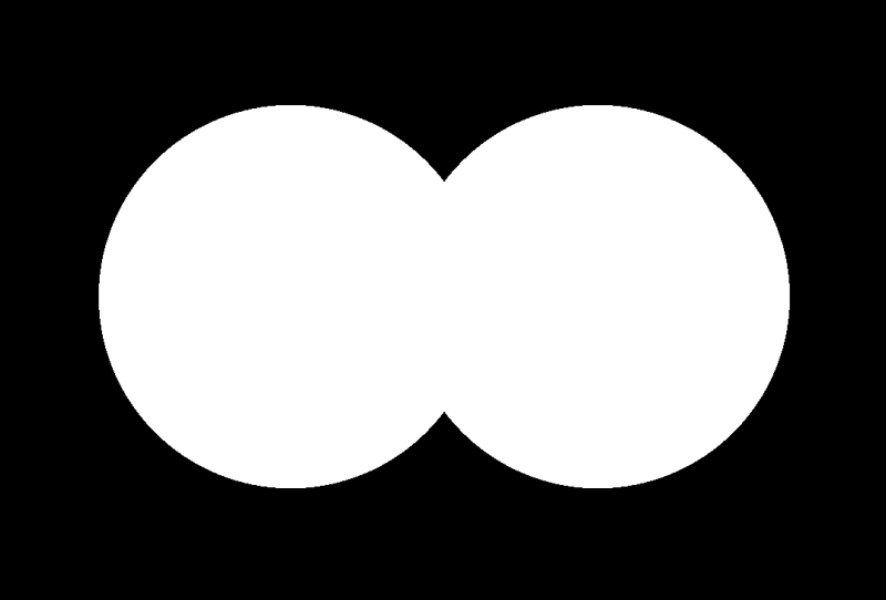
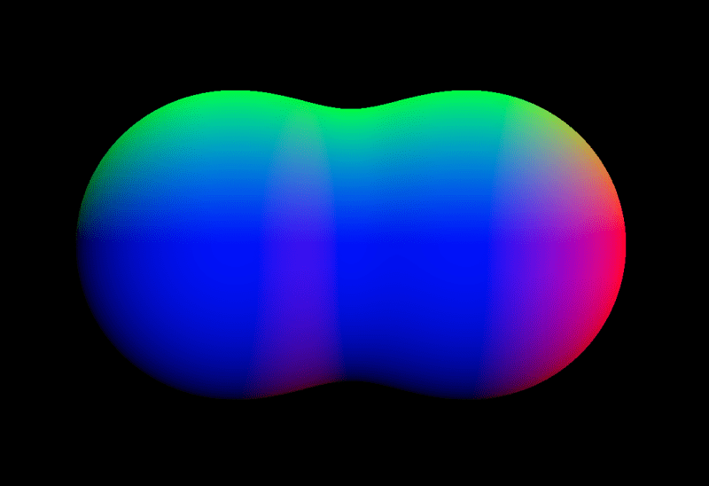
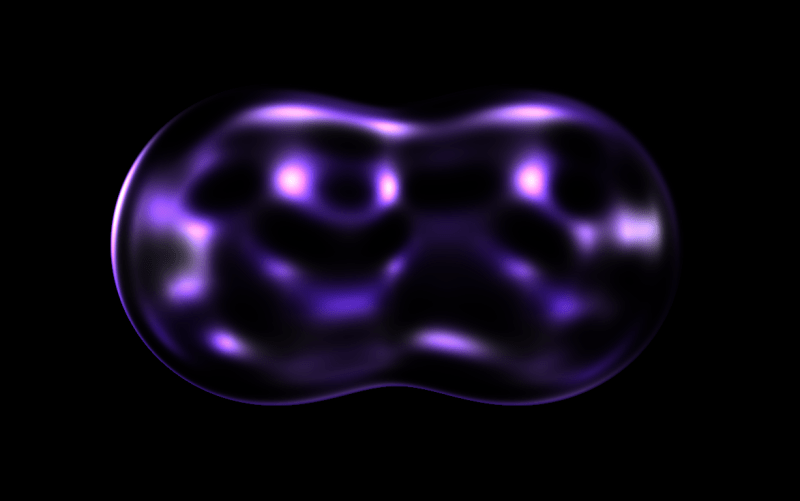
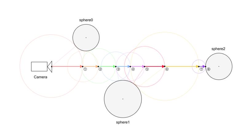
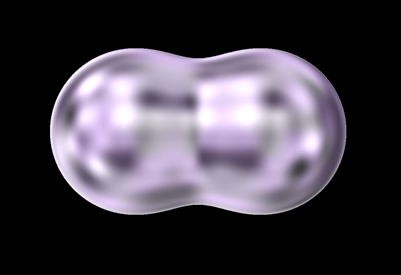
Fragment shaders allow us to create smooth, organic visuals that are difficult to achieve with standard polygon-based rendering in WebGL. One powerful example is the metaball effect, where multiple objects blend and deform seamlessly. This can be implemented using a technique called ray marching, directly within a fragment shader.
In this tutorial, we’ll walk you through how to create droplet-like, bubble spheres using Three.js and GLSL—an effect that responds interactively to your mouse movements. But first, take a look at the demo video below to see the final result in action.
Overview
Let’s take a look at the overall structure of the demo and review the steps we’ll follow to build it.
We arrange spheres along the mouse trail to create a stretchy, elastic motion.
Let’s get started!
1. Setup
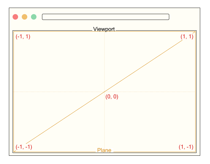
We render a single fullscreen plane that covers the entire viewport.
// Output.ts

const planeGeometry = new THREE.PlaneGeometry(2.0, 2.0);
const planeMaterial = new THREE.RawShaderMaterial({
    vertexShader: base_vert,
    fragmentShader: output_frag,
    uniforms: this.uniforms,
});
const plane = new THREE.Mesh(planeGeometry, planeMaterial);
this.scene.add(plane);
We define a uniform variable named uResolution to pass the canvas size to the shader, where Common.width and Common.height represent the width and height of the canvas in pixels. This uniform will be used to normalize coordinates based on the screen resolution.
The vertex shader receives the position attribute.
Since the xy components of position originally range from -1 to 1, we convert them to a range from 0 to 1 and output them as a texture coordinate called vTexCoord. This is passed to the fragment shader and used to calculate colors or effects based on the position on the screen.
The fragment shader receives the interpolated texture coordinate vTexCoord and the uniform variable uResolution representing the canvas size. Here, we temporarily use vTexCoord to output color for testing.
Now we’re all set to start drawing in the fragment shader! Next, let’s move on to actually rendering the spheres.
2. Ray Marching
2.1. What is Ray Marching?
As mentioned at the beginning, we will use a method called ray marching to render spheres. Ray marching proceeds in the following steps:
Define the scene
Set the camera (viewing) direction
Cast rays
Evaluate the distance from the current ray position to the nearest object in the scene.
Move the ray forward by that distance
Check for a hit
For example, let’s consider a scene with three spheres. These spheres are expressed using SDFs (Signed Distance Functions), which will be explained in detail later.
First, we determine the camera direction. Once the direction is set, we cast a ray in that direction.
Next, we evaluate the distance to all objects from the current ray position, and take the minimum of these distances.
After obtaining this distance, we move the ray forward by that amount.
We repeat this process until either the ray gets close enough to an object—closer than a small threshold—or the maximum number of steps is reached. If the distance is below the threshold, we consider it a “hit” and shade the corresponding pixel.
For example, in the figure above, a hit is detected on the 8th ray marching step.
If the maximum number of steps were set to 7, the 7th step would not have hit anything yet. But since the limit is reached, the loop ends and no hit is detected.
Therefore, nothing would be rendered at that position. If parts of an object appear to be missing in the final image, it may be due to an insufficient number of steps. However, be aware that increasing the step count will also increase the computational load.
To better understand this process, try running this demo to see how it works in practice.
2.2. Signed Distance Function
In the previous section, we briefly mentioned the SDF (Signed Distance Function). Let’s take a moment to understand what it is.
An SDF is a function that returns the distance from a point to a particular shape. The key characteristic is that it returns a positive or negative value depending on whether the point is outside or inside the shape.
For example, here is the distance function for a sphere:
Here, p is a vector representing the position relative to the origin, and s is the radius of the sphere.
This function calculates how far the point p is from the surface of a sphere centered at the origin with radius s.
If the result is positive, the point is outside the sphere.
If negative, it is inside the sphere.
If the result is zero, the point is on the surface—this is considered a hit point (in practice, we detect a hit when the distance is less than a small threshold).
In this demo, we use a sphere’s distance function, but many other shapes have their own distance functions as well.
After that, inside the map function, two spheres are defined and their distances calculated using sdSphere. The variable d is initially set to a large value and updated with the min function to keep track of the shortest distance to the surface.
Then we run a ray marching loop, which updates the ray position by computing the distance to the nearest object at each step. The loop ends either after a fixed number of iterations or when the distance becomes smaller than a threshold (dist < EPS):
for ( int i = 0; i < ITR; ++ i ) {
	dist = map(ray);
	ray += rayDirection * dist;
	if ( dist < EPS ) break ;
}
Finally, we determine the output color. We use black as the default color (background), and render a white pixel only if a hit is detected:
vec3 color = vec3(0.0);

if ( dist < EPS ) {
	color = vec3(1.0);
}
We’ve successfully rendered two overlapping spheres using ray marching!
2.4. Normals
Although we successfully rendered spheres in the previous section, the scene still looks flat and lacks depth. This is because we haven’t applied any shading or visual effects that respond to surface orientation.
While we won’t implement full shading in this demo, we’ll still compute surface normals, as they’re essential for adding surface detail and other visual effects.
At first glance, this may seem hard to understand. Put simply, this computes the gradient of the distance function, which corresponds to the normal vector.
If you’ve studied vector calculus, this might be easy to understand. For many others, though, it may seem a bit difficult.
However, for those who are interested in how it works, we’ll now walk through the explanation in more detail.
The gradient of a scalar function 𝑓(𝑥,𝑦,𝑧) is simply a vector composed of its partial derivatives. It points in the direction of the greatest rate of increase of the function:
To compute this gradient numerically, we can use the central difference method. For example:
We apply the same idea for the 𝑦 and 𝑧 components. Note: The factor 2𝜀 is omitted in the code since we normalize the result using normalize().
Next, let us consider a signed distance function 𝑓(𝑥,𝑦,𝑧), which returns the shortest distance from any point in space to the surface of an object. By definition, 𝑓(𝑥,𝑦,𝑧)=0 on the surface of the object.
Assume that 𝑓 is smooth (i.e., differentiable) in the region of interest. When the point (𝑥,𝑦,𝑧) undergoes a small displacement Δ𝒓=(Δ𝑥,Δ𝑦,Δ𝑧), the change in the function value Δ𝑓 can be approximated using the first-order Taylor expansion:
Here,∇𝑓 is the gradient vector of 𝑓, and Δ𝒓 is an arbitrary small displacement vector.
Now, since 𝑓=0 on the surface and remains constant as we move along the surface (i.e., tangentially), the function value does not change, so Δ𝑓=0. Therefore:
This means that the gradient vector is perpendicular to any tangent vector Δ𝒓 on the surface. In other words, the gradient vector ∇𝑓 points in the direction of the surface normal.
Thus, the gradient of a signed distance function gives the surface normal direction at any point on the surface.
2.5. Visualizing Normals with Color
To verify that the surface normals are being calculated correctly, we can visualize them using color.
if ( dist < EPS ) {
	vec3 normal = generateNormal(ray);
	color = normal;
}
Note that within the if block, ray refers to a point on the surface of the object. So by passing ray to generateNormal, we can obtain the surface normal at the point of intersection.
When we render the scene, you’ll notice that the surface of the sphere is shaded in red, green, and blue based on the orientation of the normal vectors. This is because we’re mapping the 𝑥, 𝑦, and 𝑧 components of the normal vector to the RGB color channels respectively.
This is a common and intuitive way to debug normal vectors visually, helping us ensure they are computed correctly.
When combining two spheres with the standard min() function, a hard edge forms where the shapes intersect, resulting in an unnatural boundary. To avoid this, we can use a blending function called smoothMin, which softens the transition by merging the distance values smoothly.
This function creates a smooth, continuous connection between shapes—producing a metaball-like effect where the forms appear to merge organically.
The parameter k controls the smoothness of the blend. A higher k value results in a sharper transition (closer to min()), while a lower k produces smoother, more gradual merging.
For more details, please refer to the following two articles:
So far, we’ve covered how to calculate normals and how to smoothly blend objects.
Next, let’s tune the surface appearance to make things feel more realistic.
In this demo, we’re aiming to create droplet-like metaballs. So how can we achieve that kind of look? The key idea here is to use noise to distort the surface.
To create the droplet-like texture, we’re using value noise. If you’re unfamiliar with these noise techniques, the following articles provide helpful explanations:
3D value noise is generated by interpolating random values placed at the eight vertices of a cube. The process involves three stages of linear interpolation:
Bottom face interpolation: First, we interpolate between the four corner values on the bottom face of the cube
Top face interpolation: Similarly, we interpolate between the four corner values on the top face
Final z-axis interpolation: Finally, we interpolate between the results from the bottom and top faces along the z-axis
This triple interpolation process is called trilinear interpolation.
The following code demonstrates the trilinear interpolation process for 3D value noise:
By sampling this noise using the reflection vector as coordinates, we can create a realistic water droplet-like texture. Note that we are using the surface normal obtained earlier to compute this reflection vector. To add time-based variation, we generate noise at positions offset by uTime:
It’s starting to look quite like a water droplet! However, it still appears a bit murky. To improve this, let’s add the following post-processing step:
🎨✨💻 Stay ahead of the curve with handpicked, high-quality frontend development and design news, picked freshly every single day. No fluff, no filler—just the most relevant insights, inspiring reads, and updates to keep you in the know.
Prefer a weekly digest in your inbox? No problem, we got you covered. Just subscribe here.