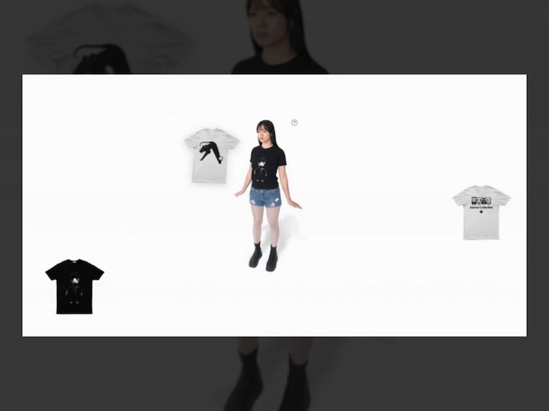
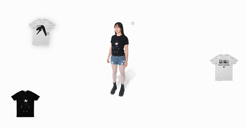
I recently helped my friends with their brand, www.laughwithtic.com, and wanted to create something distinctive for their pre-launch. My design drew inspiration from classic dress-up games, focusing on a playful, interactive element.Initially, we featured a Rat character as the main model. Users could simply drag-and-drop a selection of t-shirts onto the rat. This approach was effective and added a fresh element to the site.
Evolving the Design: From Rat to Human
A few weeks later, I saw a video by @samdape on X, showcasing a similar UI layout, but enhanced with a real human character at an angle. This immediately inspired me to redesign our pre-launch experience, transitioning to a human model in that dynamic pose.
To further enhance the interaction, I integrated several subtle refinements. A slight shadow behind the character adds depth. When a T-shirt is dragged, it subtly skews and shakes, making the interaction feel more tactile. Perhaps the most engaging detail is how the model raises her hand as you drag a t-shirt nearby, signaling readiness for the change. These small touches contribute to an experience that feels immersive and unexpected. This entire system is built with vanilla JS, HTML, and CSS, operating on the simple principle of changing PNG images based on drag-and-drop collisions.
The Tech Behind the Interaction
The core of this experience is a vanilla JavaScript-driven drag-and-drop mechanism, designed to allow users to visually try different t-shirts on a central model.
Here’s a breakdown of its key phases:
Initiation: When a user clicks or touches a t-shirt, it becomes the active element. Its zIndex is raised, and a grabbed CSS class is applied for immediate visual feedback.
Dragging: The active t-shirt’s position continuously updates to follow the cursor.
Skewing Effect: Horizontal dragging applies CSS classes that subtly skew the t-shirt, adding a dynamic feel. These classes are removed if movement pauses.
Model Readiness: The system constantly checks for collision with the model. If the t-shirt hovers over the model, the model’s image changes to a “ready” version (e.g., raising a hand), providing clear feedback.
Dropping: Upon release, collision with the model is checked.
On Model: If dropped on the model, the model’s image updates to wear the new t-shirt. The dragged t-shirt then resets to its original layout position.
Off Model: If dropped elsewhere, the t-shirt animates back to its initial position. The model reverts to its default state if it was in a “ready” pose.
Image Preloading: All t-shirt and model images (including hover states) are preloaded on page load using a dedicated function, ensuring smooth visual transitions without flickers.
This combination of event handling, CSS for nuanced visual effects, and dynamic image swapping creates an engaging and interactive try-on experience. You can check out the full website at www.laughwithtic.com.
I hope you find the interaction both fun and inspiring!
Rendering text in WebGL opens up a whole new world of unique visual effects and creative possibilities that are often
impossible to achieve with traditional HTML, CSS and JavaScript alone. By the end of this tutorial, we’ll have created
WebGL-rendered text elements that perfectly mimic the underlying HTML structure. Since we’ll be taking an HTML-first
approach, it will be responsive, SEO-friendly and accessible. We’ll be doing every step manually so you’ll gain a
solid understanding of the principles behind merging HTML and WebGL, and text-specific stuff like how to translate CSS
styles into the 3D world.
We’ll be creating the below demo:
We’ll start off with a standard styled HTML setup. Then we’ll recreate the text elements we have inside a 3D world.
From there, we’ll position, scale and make the text responsive with the 3D space. Next, we’ll replicate the “mask
reveal effect” in WebGL. And finally, we’ll apply some scroll-driven post processing effects to the scene.
Below are the core steps we’ll follow to achieve the final result:
Create the text as a HTML element and style it regularly using CSS
Create a 3D world and recreate the text element within it
Merge the 3D and 2D world, so that we can style the 3D text by using our viewport’s dimensions
Sync the key properties like position, size and font — from the HTML element to the WebGL text element
Hide the original HTML element
Be left with only the 3D text, fully styled and positioned in sync with the hidden HTML structure
Apply animations and post-processing to enhance our 3D scene
Necessities and Prerequisites
We’ll be using the Three.js library to create the 3D world, so you should already be familiar with its basics. For the
creation of text meshes, we’ll be using the troika-three-text
library, but you don’t have to be familiar with the library beforehand. If you’ve used HTML, CSS and JavaScript, know the basics of Three.JS,
you’re good to go.
Let’s get started.
1. Creating the Regular HTML and Making it Responsive
Before diving into the WebGL and Three.js implementation, we first need to create the HTML structure that we’ll later
mimic in the 3D world. I’ve set up a very simple page with some quick responsive content — you can find the setup content
in the demo repository under index.html
and styles.css
.
HTML
:
<div class="content">
<div class="container">
<section class="section__heading">
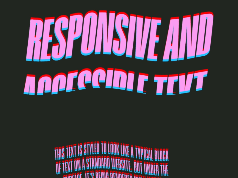
<h3 data-animation="webgl-text" class="text__2">THREE.JS</h3>
<h2 data-animation="webgl-text" class="text__1">
RESPONSIVE AND ACCESSIBLE TEXT
</h2>
</section>
<section class="section__main__content">
<p data-animation="webgl-text" class="text__2">
THIS TEXT IS STYLED TO LOOK LIKE A TYPICAL BLOCK OF TEXT ON A STANDARD
WEBSITE. BUT UNDER THE SURFACE, IT'S BEING RENDERED WITH WEBGL INSTEAD
OF TRADITIONAL HTML.
</p>
<p data-animation="webgl-text" class="text__2">
THIS OPENS THE DOOR TO CUSTOM SHADER EFFECTS AND INTERACTIONS THAT GO
BEYOND WHAT'S POSSIBLE WITH TRADITIONAL HTML.
</p>
<p data-animation="webgl-text" class="text__2">
WE KEEP THE UNDERYLING HTML STRUCTURE PRESENT IN THE DOM. RATHER THAN
CREATING MESHES DIRECTLY IN THREE.JS, THE SCENE IS BUILT BY READING FROM
THE EXISTING HTML CONTENT. THIS WAY, SCREEN READERS, SEARCH ENGINES, AND
OTHER TOOLS CAN STILL INTERPRET THE PAGE AS EXPECTED.
</p>
</section>
<section class="section__footer">
<p data-animation="webgl-text" class="text__3">
NOW GO CRAZY WITH THE SHADERS :)
</p>
</section>
</div>
</div>
The <canvas>
element is set to cover the entire screen, fixed in place behind the main content. We want a full screen canvas
covering the entire screen behind our main content at all times.
All text elements intended for WebGL rendering are marked with data-animation=”webgl-text” for clarity and easy
selection when we begin scripting.
The purpose of this setup is to function as the “placeholder” that we can mimic in our 3D implementation. So, it’s
important to position and style your text at this stage
to ensure it matches the final sizing and positioning that you want to achieve. All text formatting properties like
font-size, letter-spacing, line-height etc. are the properties you want to focus on, because we’ll later read these
computed styles directly from the DOM during the WebGL phase. Color is optional here, as we can handle text coloring
later with shaders inside WebGL.
That’s it for the HTML and CSS setup! It’s all we need for the foundation to move onto our JavaScript and WebGL
implementation.
2. Initial 3D World Setup
Let’s move onto the JavaScript and WebGL implementation. I’ll be using TypeScript, but you can easily follow along
with vanilla JavaScript if you prefer. I’m assuming you’re already familiar with the basics of Three.js, so I’ll focus
on explaining the high-level setup rather than covering every detail.
Below is the starter TypeScript and Three.JS base that I’ll be using for this demo.
// main.ts

import Commons from "./classes/Commons";
import * as THREE from "three";

/**
 * Main entry-point.
 * Creates Commons and Scenes
 * Starts the update loop
 * Eventually creates Postprocessing and Texts.
  */
class App {
  private commons!: Commons;

  scene!: THREE.Scene;

  constructor() {
    document.addEventListener("DOMContentLoaded", async () => {
      await document.fonts.ready; // Important to wait for fonts to load when animating any texts.

      this.commons = Commons.getInstance();
      this.commons.init();

      this.createScene();

      this.addEventListeners();

      this.update();
    });
  }

  private createScene() {
    this.scene = new THREE.Scene();
  }

  /**
   * The main loop handler of the App
   * The update function to be called on each frame of the browser.
   * Calls update on all other parts of the app
   */
  private update() {
    this.commons.update();

    this.commons.renderer.render(this.scene, this.commons.camera);

    window.requestAnimationFrame(this.update.bind(this));
  }

  private addEventListeners() {
    window.addEventListener("resize", this.onResize.bind(this));
  }

  private onResize() {
    this.commons.onResize();
  }
}

export default new App();
// Commons.ts

import { PerspectiveCamera, WebGLRenderer, Clock } from "three";

import Lenis from "lenis";

export interface Screen {
  width: number;
  height: number;
  aspect: number;
}

export interface Sizes {
  screen: Screen;
  pixelRatio: number
}

/**
 * Singleton class for Common stuff.
 * Camera
 * Renderer
 * Lenis
 * Time
 */
export default class Commons {
  private constructor() {}

  private static instance: Commons;

  lenis!: Lenis;
  camera!: PerspectiveCamera;
  renderer!: WebGLRenderer;

  private time: Clock = new Clock();
  elapsedTime!: number;

  sizes: Sizes = {
    screen: {
      width: window.innerWidth,
      height: window.innerHeight,
      aspect: window.innerWidth / window.innerHeight,
    },
    pixelRatio: this.getPixelRatio(),
  };

  private distanceFromCamera: number = 1000;

  /**
   * Function to be called to either create Commons Singleton instance, or to return existing one.
   * TODO AFTER: Call instances init() function.
   * @returns Commons Singleton Instance.
   */
  static getInstance() {
    if (this.instance) return this.instance;

    this.instance = new Commons();
    return this.instance;
  }

  /**
   * Initializes all-things Commons. To be called after instance is set.
   */
  init() {
    this.createLenis();
    this.createCamera();
    this.createRenderer();
  }

  /**
   * Creating Lenis instance.
   * Sets autoRaf to true so we don't have to manually update Lenis on every frame.
   * Resets possible saved scroll position.
   */
  private createLenis() {
    this.lenis = new Lenis({ autoRaf: true, duration: 2 });
  }

  private createCamera() {
    this.camera = new PerspectiveCamera(
      70,
      this.sizes.screen.aspect,
      200,
      2000
    );
    this.camera.position.z = this.distanceFromCamera;
    this.camera.updateProjectionMatrix();
  }

  /**
   * createRenderer(): Creates the common WebGLRenderer to be used.
   */
  private createRenderer() {
    this.renderer = new WebGLRenderer({
      alpha: true, // Sets scene background to transparent, so our body background defines the background color
    });

    this.renderer.setSize(this.sizes.screen.width, this.sizes.screen.height);

    this.renderer.setPixelRatio(this.sizes.pixelRatio);

	  // Creating canvas element and appending to body element.
    document.body.appendChild(this.renderer.domElement);
  }

  /**
   * Single source of truth to get pixelRatio.
   */
  getPixelRatio() {
    return Math.min(window.devicePixelRatio, 2);
  }

  /**
   * Resize handler function is called from the entry-point (main.ts)
   * Updates the Common screen dimensions.
   * Updates the renderer.
   * Updates the camera.
   */
  onResize() {
    this.sizes.screen = {
      width: window.innerWidth,
      height: window.innerHeight,
      aspect: window.innerWidth / window.innerHeight,
    };
    this.sizes.pixelRatio = this.getPixelRatio();

    this.renderer.setSize(this.sizes.screen.width, this.sizes.screen.height);
    this.renderer.setPixelRatio(this.sizes.pixelRatio);

    this.onResizeCamera();
  }

  /**
   * Handler function that is called from onResize handler.
   * Updates the perspective camera with the new adjusted screen dimensions
   */
  private onResizeCamera() {
    this.camera.aspect = this.sizes.screen.aspect;
    this.camera.updateProjectionMatrix();
  }

  /**
   * Update function to be called from entry-point (main.ts)
   */
  update() {
    this.elapsedTime = this.time.getElapsedTime();
  }
}
A Note About Smooth Scroll
When syncing HTML and WebGL worlds, you should use a custom scroll
. This is because the native scroll in browsers updates the scroll position at irregular intervals and does not thus
guarantee frame-perfect updates with our requestAnimationFrame loop and our WebGL world, causing a jittery and unsynchronized movement
.
By integrating a custom scroll (Lenis in this case), we ensure our scroll updates perfectly match the frame updates of
our WebGL world.
Right now we are seeing an empty 3D world, continuously being rendered.
We’re only missing one thing to get something visible in our 3D world: the creation of the text elements. So let’s
move onto creating our WebGLText class next.
3. Creating WebGLText Class and Texts Meshes
For the creation of the text meshes, we’ll be using troika-three-text
library.
npm i troika-three-text
We’ll now create a reusable WebGLText
class
. This will handle turning each HTML element into a 3D text mesh, using Troika and our Three.js scene.
Here’s the basic setup:
// WebGLText.ts

import Commons from "./Commons";
import * as THREE from "three";

// @ts-ignore
import { Text } from "troika-three-text";

interface Props {
  scene: THREE.Scene;
  element: HTMLElement;
}

export default class WebGLText {
  commons: Commons;

  scene: THREE.Scene;
  element: HTMLElement;

  computedStyle: CSSStyleDeclaration;
  font!: string; // Path to our .ttf font file.
  bounds!: DOMRect;
  color!: THREE.Color;
  material!: THREE.ShaderMaterial;
  mesh!: Text;

  // We assign the correct font bard on our element's font weight from here
  weightToFontMap: Record<string, string> = {
    "900": "/fonts/Humane-Black.ttf",
    "800": "/fonts/Humane-ExtraBold.ttf",
    "700": "/fonts/Humane-Bold.ttf",
    "600": "/fonts/Humane-SemiBold.ttf",
    "500": "/fonts/Humane-Medium.ttf",
    "400": "/fonts/Humane-Regular.ttf",
    "300": "/fonts/Humane-Light.ttf",
    "200": "/fonts/Humane-ExtraLight.ttf",
    "100": "/fonts/Humane-Thin.ttf",
  };

  private y: number = 0; // Scroll-adjusted bounds.top

  private isVisible: boolean = false;

  constructor({ scene, element }: Props) {
    this.commons = Commons.getInstance();

    this.scene = scene;
    this.element = element;

    this.computedStyle = window.getComputedStyle(this.element); // Saving initial computed style.
  }
}
We have access to the Text class
from Troika, which allows us to create text meshes elements and apply styling to it using familiar properties like
fontSize, letterSpacing, and font. I’ll cover everything you need to style your text responsively in this tutorial,
but I implore you to take a look at the full documentation and its possibilities here
.
Troika doesn’t ship with TypeScript definitions out of the box, so if you’re using TS, you can quickly get around this
by creating a type declaration file in the root of your project. It’s not pretty, but it gets the job done while
keeping TypeScript happy.
Let’s start by creating new methods called createFont(), createColor() and createMesh().
createFont()
: Selects the appropriate .ttf file based on the DOM element’s font-weight. If a match isn’t found, we fall back to
the regular weight. Adjust the mapping to match your own font files and multiple font families if needed.
createColor()
: Converts the computed CSS color into a THREE.Color instance:
// WebGLText.ts

private createColor() {
    this.color = new THREE.Color(this.computedStyle.color);
}
createMesh():
Instantiates the text mesh and sets some basic properties. Copies the text’s inner text and sets it onto the mesh.
Adds the mesh to our Three.JS scene. We anchor the text from the left-center to match typical HTML layout
expectations.
// WebGLText.ts
private createMesh() {
  this.mesh = new Text();

  this.mesh.text = this.element.innerText; // Copying HTML content over to the mesh
  this.mesh.font = this.font;

  // Anchor the text to the left-center (instead of center-center)
  this.mesh.anchorX = "0%";
  this.mesh.anchorY = "50%";

  this.mesh.color = this.color;

  this.scene.add(this.mesh);
}
⚠️ When copying text contents over to the Mesh, avoid using innerHTML or textContent and use innerText instead as it
gives the most layout-accurate and consistent results.
setStaticValues
(): Let’s also create a baby setStaticValues() method which will set the critical properties of our text mesh based on
the computedStyle.
We sets values like font size based on computed CSS. We’ll expand this more as we sync more styles down the line.
We want to call all these methods in the constructor like this:
Finally, let’s update our App class (main.ts), and hook this all up by scanning for DOM elements with a
data-animation=”webgl-text” attribute — creating a WebGLText instance for each one:
// main.ts

texts!: Array<WebGLText>;

// ...

private createWebGLTexts() {
  const texts = document.querySelectorAll('[data-animation="webgl-text"]');

  if (texts) {
    this.texts = Array.from(texts).map((el) => {
      const newEl = new WebGLText({
        element: el as HTMLElement,
        scene: this.scene,
      });

      return newEl;
    });
  }
}
Make sure to call this method in the constructor on initialization. This will populate our scene with styled text
meshes based on our DOM content.
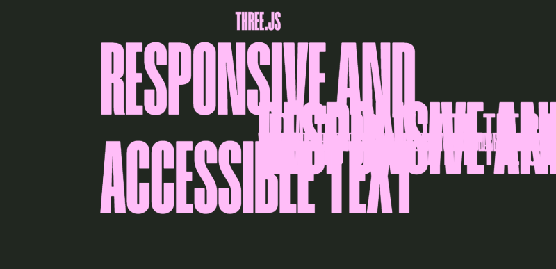
That’s all we need to have our text meshes visible, it’s not the prettiest sight to behold, but at least we got
everything working:
Next Challenge: Screen vs. 3D Space Mismatch
Even though we copy the font size directly from the DOM, the scale looks different in 3D. That’s because WebGL units don’t map 1:1 with screen pixels
, and they operate in different coordinate systems. This mismatch will become even more obvious if we start
positioning and animating elements.
To get true visual parity between our DOM elements and WebGL text, we need to bridge the gap between screen space and
3D space. Let’s tackle that next so our text sizes and positions actually match with what we see in the browser.
4. Syncing Dimensions
The major problem when syncing HTML and WebGL dimensions is that things between them aren’t exactly pixel-perfect.
This is because the DOM and WebGL don’t “speak the same units” by default.
Web browsers work in screen pixels.
WebGL uses arbitrary units
Our goal is simple:
💡 Make one unit in the WebGL scene equal one pixel on the screen.
To achieve this, we’ll adjust the camera’s field of view (FOV) so that visible area through the camera exactly matches
the dimensions of the browser window in pixels.
So, we’ll create a syncDimensions()
function under our Commons class, which calculates our camera’s field of view such that 1 unit in the WebGL scene
corresponds to 1 pixel on the screen — at a given distance from the camera.
 // Commons.ts
/**
  * Helper function that is called upon creation and resize
  * Updates the camera's fov according to the new dimensions such that the window's pixels match with that of WebGL scene
  */
private syncDimensions() {
  this.camera.fov =
    2 *
    Math.atan(this.sizes.screen.height / 2 / this.distanceFromCamera) *
    (180 / Math.PI);
}
This function will be called once when we create the camera, and every time that the screen is resized.
Let’s break down what’s actually going on here using the image below:
We know:
The height of the screen
The distance from camera (Z)
The FOV of the camera is the vertical angle (fov y in the image)
So our main goal is to set how wide (vertical angle) we see according to our screen height.
Because the Z (distance from camera) and half of the screen height forms a right triangle
(distance + height), we can solve for the angle using some basic trigonometry, and compute the FOV using the inverse
tangent ( atan
) of this triangle.
Step-by-step Breakdown of the Formula
this.sizes.screen.height / 2
→ This gives us half the screen’s pixel height — the opposite side of our triangle.
this.distanceFromCamera
→ This is the adjacent side of the triangle — the distance from the camera to the 3D scene.
Math.atan(opposite / adjacent)
→ Calculates half of the vertical FOV (in radians).
*2
→ Since atan only gives half of the angle, we multiply it by 2 to get the full FOV.
* (180 / Math.PI)
→ Converts the angle from radians to degrees (Three.js expects degrees for PerspectiveCamera’s fov)
That’s all we need to sync our dimensions, and this setup ensures that 1 unit in WebGL = 1 pixel on screen.
Let’s move back to the text implementation.
5. Setting Text Properties and Positioning
Now that we’ve synced the WebGL scene to our screen’s pixel dimensions, we can start mapping HTML styles to our 3D
text.
If everything’s wired up correctly, you should see that the font size of the WebGL-rendered text matches the size of
the underlying HTML, although the positioning is still off.
Let’s sync more styling properties and positioning.
Before we can position the 3D text, we need to get the DOM element’s position and size. We’ll create a new method in
the WebGLText class called createBounds() ,
and use the browser’s built-in getBoundingClientRect() method:
Next, we’ll pull important typographic properties from the DOM (computed style) and pass them to the 3D mesh, so that
it behaves like our native HTML text. (Again, you can see the full documentation and possible properties of troika here
). Below I’ve included the most important ones.
  // WebGLText.ts

private setStaticValues() {
  const { fontSize, letterSpacing, lineHeight, whiteSpace, textAlign } =
    this.computedStyle;

  const fontSizeNum = window.parseFloat(fontSize);

  this.mesh.fontSize = fontSizeNum;

  this.mesh.textAlign = textAlign;

  // Troika defines letter spacing in em's, so we convert to them
  this.mesh.letterSpacing = parseFloat(letterSpacing) / fontSizeNum;

  // Same with line height
  this.mesh.lineHeight = parseFloat(lineHeight) / fontSizeNum;

  // Important to define maxWidth for the mesh, so that our text doesn't overflow
  this.mesh.maxWidth = this.bounds.width;

  // Match whiteSpace behavior (e.g., 'pre', 'nowrap')
  this.mesh.whiteSpace = whiteSpace;
}
Troika accepts some of the properties in local em units, so we have to convert pixels into em’s by dividing the pixel
values by the font size.
Also, it’s important to set a maximum width (in pixels) to constrain the mesh’s layout — this prevents text from
overflowing and ensures proper text wrapping.
And finally, let’s create an update()
function to be called on each frame that consistently positions our mesh according to the underlying DOM position.
And now, the texts will perfectly follow DOM counterparts
, even as the user scrolls.
Let’s finalize our base text class implementation before diving into effects:
Resizing
We need to ensure that our WebGL text updates correctly on window resize events. This means recreating the computedStyle, bounds, and static values
whenever the window size changes.
Once everything is working responsively and perfectly synced with the DOM, we can finally hide the original HTML text by setting it transparent
— but we’ll keep it in place so it’s still selectable and accessible to the user.
// WebGLText.ts

this.createFont();
this.createColor();
this.createBounds();
this.createMesh();
this.setStaticValues();

this.element.style.color = "transparent"; // Hide DOM element
We should now have our perfectly responsive text meshes, and the user only sees the rendered WebGL text, while the DOM
element remains fully intact for accessibility.
Let’s add some effects!
6. Adding a Custom shader and Replicating Mask Reveal Animations
Troika also lets us use custom shader materials for meshes, giving us the flexibility to create complex effects beyond
just setting colors.
The vertex shader passes the texture coordinates (uv) to the fragment shader for the text rendering.
Shader File Imports using Vite
To handle shader files more easily, we can use the vite-plugin-glsl
plugin together with Vite to directly import shader files like .frag and .vert in code:
Let’s now create our custom ShaderMaterial and apply it to our mesh:
// WebGLText.ts

// Importing shaders
import fragmentShader from "../../shaders/text/text.frag";
import vertexShader from "../../shaders/text/text.vert";

//...

this.createFont();
this.createColor();
this.createBounds();
this.createMaterial(); // Creating material
this.createMesh();
this.setStaticValues();

//...

private createMaterial() {
   this.material = new THREE.ShaderMaterial({
     fragmentShader,
     vertexShader
       uniforms: {
       uColor: new THREE.Uniform(this.color), // Passing our color to the shader
     },
   });
 }
In the createMaterial()
method, we define the ShaderMaterial
using the imported shaders and pass in the uColor uniform, which allows us to dynamically control the color of the
text based on our DOM-element.
And now, instead of setting the color directly on the default mesh material, we apply our new custom material:
  // WebGLText.ts

private createMesh() {
  this.mesh = new Text();

  this.mesh.text = this.element.innerText; // Always use innerText (not innerHTML or textContent).
  this.mesh.font = this.font;

  this.mesh.anchorX = "0%";
  this.mesh.anchorY = "50%";

  this.mesh.material = this.material; //Using custom material instead of color
}
At this point, we are using our custom shader material, but so far, nothing in our output has changed. Let’s now setup
show and hide animations using our custom shader, and replicate the mask reveal effect.
Setting up Reveal Animations
We’ll create an animation that uses a progress uniform (uProgress) to control the visibility and reveal progress of
the text. The animation will be controlled using the motion library.
First, we must install motion
and import its animate
and inView
functions to our WebGLText class.
npm i motion
// WebGLText.ts

import { inView, animate } from "motion";
Now, let’s configure our class so that when the text steps into view, the show() function is called
, and when it steps away, the hide() function is called
. These methods also control the current visibility variable this.isVisible
. These functions will control the uProgress variable, and animate it between 0 and 1.
For this, we also must setup an addEventListeners() function:
 // WebGLText.ts

/**
  * Inits visibility tracking using motion's inView function.
  * Show is called when the element steps into view, and hide is called when the element steps out of view
  */
private addEventListeners() {
  inView(this.element, () => {
    this.show();

    return () => this.hide();
  });
}

show() {
  this.isVisible = true;

  animate(
    this.material.uniforms.uProgress,
    { value: 1 },
    { duration: 1.8, ease: [0.25, 1, 0.5, 1] }
  );
}

hide() {
  animate(
    this.material.uniforms.uProgress,
    { value: 0 },
    { duration: 1.8, onComplete: () => (this.isVisible = false) }
  );
}
Just make sure to call addEventListeners() in your constructor after setting up the class.
Updating the Shader Material for Animation
We’ll also add two additional uniform variables in our material for the animations:
uProgress
: Controls the reveal progress (from 0 to 1).
uHeight
: Used by the vertex shader to calculate vertical position offset.
Updated createMaterial()
method:
 // WebGLText.ts

private createMaterial() {
  this.material = new THREE.ShaderMaterial({
    fragmentShader,
    vertexShader,
    uniforms: {
      uProgress: new THREE.Uniform(0),
      uHeight: new THREE.Uniform(this.bounds.height),
      uColor: new THREE.Uniform(this.color),
    },
  });
}
Since the uHeight is dependent on bounds, we also want to update the uniform variable upon resizing:
We now have the text class instance automatically calling show() and hide(), and animating the uProgress according to
the visibility of our underlying DOM-element.
For performance, you might want to update the update() method to only calculate a new position when the mesh is
visible:
Creating a mask reveal effect with custom shaders in WebGL is surprisingly simple when we break it down into two
separate movements: one happening in the fragment shader and the other in the vertex shader. You might’ve seen this
effect happen in WebGL on the page of Zajno
, for example.
Instead of overcomplicating the concept with complex masks or thinking about “lifting it up” behind a window (as we do
in traditional HTML), we can think of it as two distinct actions that work together.
Fragment Shader
: We clip the text vertically, revealing it gradually from top to bottom.
Vertex Shader
: We translate the text’s position from the bottom to the top by its height.
Together these two movements create the illusion of the text lifting itself up from behind a mask.
Let’s update our fragment shader code:
//text.frag

uniform float uProgress; // Our progress value between 0 and 1

uniform vec3 uColor;
varying vec2 vUv;

void main() {
  // Calculate the reveal threshold (bottom to top reveal)
  float reveal = 1.0 - vUv.y;

  // Discard fragments above the reveal threshold based on progress
  if (reveal > uProgress) discard;

  // Apply the color to the visible parts of the text
  gl_FragColor = vec4(uColor, 1.0);
}
When uProgress is 0, the mesh is fully clipped out, and nothing is visible
When uProgress increases towards 1, the mesh reveals itself from top to bottom.
For the vertex shader, we can simply pass the new uniform called uHeight, which stands for the height of our
DOM-element (this.bounds.height), and translate the output vertically according to it and uProgress.
//text.vert

uniform float uProgress;
uniform float uHeight; // Total height of the mesh passed in from JS

varying vec2 vUv;

void main() {
  vUv = uv;

  vec3 transformedPosition = position;

  // Push the mesh upward as it reveals
  transformedPosition.y -= uHeight * (1.0 - uProgress);

  gl_Position = projectionMatrix * modelViewMatrix * vec4(transformedPosition, 1.0);
}
uHeight
: Total height of the DOM-element (and mesh), passed in from JS.
When uProgress
is 0
, the mesh is fully pushed down.
As uProgress
reaches 1
, it resolves to its natural position.
Now, we should have a beautifully on-scroll animating scene, where the texts reveal themselves as in regular HTML when
they scroll into view.
To spice things up, let’s add some scroll-velocity based post processing effects to our scene as the final step!
7. Adding Post-processing
Now that we’ve built our animated WebGL text with custom shaders and scroll-triggered reveals, we can push the visuals
further with post-processing
.
Post-processing allows us to apply full-screen visual effects after the scene has been rendered. This is done by
passing the final image through a series of custom shader passes.
So, in this final section, we’ll:
Set up a PostProcessing class using Three.js’s EffectComposer
Add a custom RGB shift and wave distortion effect
Drive the distortion strength dynamically using the scroll velocity from our Lenis custom scroll instance
Creating a PostProcessing class with EffectComposer
Let’s create a PostProcessing class that will be intialized from our entry-point, and which will handle everything
regarding postprocessing using Three.JS’s EffectComposer. Read more about the EffectComposer class here from Three.js’s documentation
. We’ll also create new fragment and vertex shaders for the postprocessing class to use.
// PostProcessing.ts

import {
  EffectComposer,
  RenderPass,
  ShaderPass,
} from "three/examples/jsm/Addons.js";
import Commons from "./Commons";
import * as THREE from "three";

// Importing postprocessing shaders
import fragmentShader from "../../shaders/postprocessing/postprocessing.frag";
import vertexShader from "../../shaders/postprocessing/postprocessing.vert";

interface Props {
  scene: THREE.Scene;
}

export default class PostProcessing {
  // Scene and utility references
  private commons: Commons;
  private scene: THREE.Scene;

  private composer!: EffectComposer;

  private renderPass!: RenderPass;
  private shiftPass!: ShaderPass;

  constructor({ scene }: Props) {
    this.commons = Commons.getInstance();

    this.scene = scene;

    this.createComposer();
    this.createPasses();
  }

  private createComposer() {
    this.composer = new EffectComposer(this.commons.renderer);
    this.composer.setPixelRatio(this.commons.sizes.pixelRatio);
    this.composer.setSize(
      this.commons.sizes.screen.width,
      this.commons.sizes.screen.height
    );
  }

  private createPasses() {
    // Creating Render Pass (final output) first.
    this.renderPass = new RenderPass(this.scene, this.commons.camera);
    this.composer.addPass(this.renderPass);

    // Creating Post-processing shader for wave and RGB-shift effect.
    const shiftShader = {
      uniforms: {
        tDiffuse: { value: null },      // Default input from previous pass
        uVelocity: { value: 0 },        // Scroll velocity input
        uTime: { value: 0 },            // Elapsed time for animated distortion
      },
      vertexShader,
      fragmentShader,
    };

    this.shiftPass = new ShaderPass(shiftShader);
    this.composer.addPass(this.shiftPass);
  }

  /**
   * Resize handler for EffectComposer, called from entry-point.
   */
  onResize() {
    this.composer.setPixelRatio(this.commons.sizes.pixelRatio);
    this.composer.setSize(
      this.commons.sizes.screen.width,
      this.commons.sizes.screen.height
    );
  }

  update() {
    this.shiftPass.uniforms.uTime.value = this.commons.elapsedTime;

    this.composer.render();
  }
}
Since we don’t have our postprocessing shaders created yet, make sure you create placeholder postprocessing.frag and
postprocessing.vert shaders so the imports don’t fail.
Constructor:
Initializes the class by storing the provided scene, grabbing the shared Commons instance, and then calling createComposer()
and createPasses()
.
createComposer():
Sets up the EffectComposer with the correct pixel ratio and canvas size:
EffectComposer wraps the WebGL renderer and allows chaining of multiple render passes.
Sized according to current viewport dimensions and pixel ratio
createPasses():
This method sets up all rendering passes applied to the scene.
RenderPass
: The first pass that simply renders the scene with the main camera as regular.
ShaderPass (shiftPass)
: A custom full-screen shader pass that we’ll create and which will create the RGB shift and wavy distortion
effects.
update():
Method called on every frame. Updates the uTime uniform so we can animate effects over time, and renders the final
post-processed image using composer.render()
Initializing Post-processing
To wire the post-processing system into our existing app, we update our main.ts:
  //main.ts
private postProcessing!: PostProcessing;

//....

constructor() {
  document.addEventListener("DOMContentLoaded", async () => {
    await document.fonts.ready;

    this.commons = Commons.getInstance();
    this.commons.init();

    this.createScene();
    this.createWebGLTexts();
    this.createPostProcessing(); // Creating post-processing
    this.addEventListeners();

    this.update();
  });
}

// ...

private createPostProcessing() {
  this.postProcessing = new PostProcessing({ scene: this.scene });
}

// ...

private update() {
  this.commons.update();

  if (this.texts) {
    this.texts.forEach((el) => el.update());
  }

  // Don't need line below as we're rendering everything using EffectComposer.
  // this.commons.renderer.render(this.scene, this.commons.camera);

  this.postProcessing.update(); // Post-processing class handles rendering of output from now on


  window.requestAnimationFrame(this.update.bind(this));
}


private onResize() {
  this.commons.onResize();

  if (this.texts) {
    this.texts.forEach((el) => el.onResize());
  }

  this.postProcessing.onResize(); // Resize post-processing
}
So in the new update() function, instead of rendering directly from there, we now hand off rendering responsibility to
the PostProcessing class.
Creating Post-processing Shader and Wiring Scroll Velocity
We want to modify the PostProcessing class further, so that we update the postprocessing fragment shader with the
current scroll velocity from Lenis.
For this, I’m adding a new property lerpedVelocity and lerpFactor, which control the smoothed out velocity. The raw
velocity values from lenis can be spiky and sudden, especially with fast scrolling or scroll jumps. If we pass that
raw value directly into a shader, it can cause a really jittery output.
private lerpedVelocity = 0; // Smoothed scroll velocity for post-processing.
private lerpFactor = 0.05; // Controls how quickly lerpedVelocity follows the real velocity

// ...

update() {
    this.shiftPass.uniforms.uTime.value = this.commons.elapsedTime;

  // Reading current velocity form lenis instance.
  const targetVelocity = this.commons.lenis.velocity;

  // We use the lerped velocity as the actual velocity for the shader, just for a smoother experience.
  this.lerpedVelocity +=
    (targetVelocity - this.lerpedVelocity) * this.lerpFactor;

  this.shiftPass.uniforms.uVelocity.value = this.lerpedVelocity;

  this.composer.render();
}
Post-processing Shaders
For the vertex shader, we can keep all things default, we pass the texture coordinates to the fragment shader.
The red channel is offset slightly based on the velocity, creating the RGB shift effect.
// Applying the RGB shift to the wave-distorted coordinates
float r = texture2D(tDiffuse, vec2(waveUv.x, waveUv.y + uVelocity * 0.0005)).r;
vec2 gb = texture2D(tDiffuse, waveUv).gb;

gl_FragColor = vec4(r, gb, r);
This will create a subtle color separation in the final image that shifts according to our scroll velocity.
Finally, we combine red, green, blue, and alpha into the output color.
8. Final Result
And there you have it! We’ve created a responsive text scene, with scroll-triggered mask reveal animations and
wavy/rgb shifted post-processing.
This setup provides a solid, modular foundation for building more advanced WebGL text effects. If you’re curious to explore further, consider adding particles, fluid simulations, audio reactivity, or more complex materials and shaders. If you’re interested in breakdowns of any of these, feel free to reach out on X.
🎨✨💻 Stay ahead of the curve with handpicked, high-quality frontend development and design news, picked freshly every single day. No fluff, no filler—just the most relevant insights, inspiring reads, and updates to keep you in the know.
Prefer a weekly digest in your inbox? No problem, we got you covered. Just subscribe here.
In this post, we’ll take a closer look at the dithering-shader project: a minimal, real-time ordered dithering effect built using GLSL and the Post Processing library.
Rather than just creating a one-off visual effect, the goal was to build something clean, composable, and extendable: a drop-in shader pass that brings pixel-based texture into modern WebGL pipelines.
What It Does
This shader applies ordered dithering as a postprocessing effect. It transforms smooth gradients into stylized, binary (or quantized) pixel patterns, simulating the visual language of early bitmap displays, dot matrix printers, and 8-bit games.
It supports:
Dynamic resolution via pixelSize
Optional grayscale mode
Composability with bloom, blur, or other passes
Easy integration via postprocessing‘s Effect class
Fragment Shader
Our dithering shader implementation consists of two main components:
1. The Core Shader
The heart of the effect lies in the GLSL fragment shader that implements ordered dithering:
bool getValue(float brightness, vec2 pos) {

// Early return for extreme values
if (brightness > 16.0 / 17.0) return false;
if (brightness < 1.0 / 17.0) return true;

// Calculate position in 4x4 dither matrix
vec2 pixel = floor(mod(pos.xy / gridSize, 4.0));
int x = int(pixel.x);
int y = int(pixel.y);

// 4x4 Bayer matrix threshold map
// ... threshold comparisons based on matrix position

}
The getValue function is the core of the dithering algorithm. It:
Takes brightness and position: Uses the pixel’s luminance value and screen position
Maps to dither matrix: Calculates which cell of the 4×4 Bayer matrix the pixel belongs to
Applies threshold: Compares the brightness against a predetermined threshold for that matrix position
Returns binary decision: Whether the pixel should be black or colored
Key Shader Features
gridSize: Controls the size of the dithering pattern
pixelSizeRatio: Adds pixelation effect for enhanced retro feel
grayscaleOnly: Converts the image to grayscale before dithering
invertColor: Inverts the final colors for different aesthetic effects
The shader combines dithering with optional pixelation, creating a compound retro effect that’s perfect for game-like visuals.
Creating a Custom Postprocessing Effect
The shader is wrapped using the Effect base class from the postprocessing library. This abstracts away the boilerplate of managing framebuffers and passes, allowing the shader to be dropped into a scene with minimal setup.
export class DitheringEffect extends Effect {
  uniforms: Map<string, THREE.Uniform<number | THREE.Vector2>>;

  constructor({
    time = 0,
    resolution = new THREE.Vector2(1, 1),
    gridSize = 4.0,
    luminanceMethod = 0,
    invertColor = false,
    pixelSizeRatio = 1,
    grayscaleOnly = false
  }: DitheringEffectOptions = {}) {
    const uniforms = new Map<string, THREE.Uniform<number | THREE.Vector2>>([
      ["time", new THREE.Uniform(time)],
      ["resolution", new THREE.Uniform(resolution)],
      ["gridSize", new THREE.Uniform(gridSize)],
      ["luminanceMethod", new THREE.Uniform(luminanceMethod)],
      ["invertColor", new THREE.Uniform(invertColor ? 1 : 0)],
      ["ditheringEnabled", new THREE.Uniform(1)],
      ["pixelSizeRatio", new THREE.Uniform(pixelSizeRatio)],
      ["grayscaleOnly", new THREE.Uniform(grayscaleOnly ? 1 : 0)]
    ]);

    super("DitheringEffect", ditheringShader, { uniforms });
    this.uniforms = uniforms;
  }

 ...

}
Optional: Integrating with React Three Fiber
Once defined, the effect is registered and applied using @react-three/postprocessing. Here’s a minimal usage example with bloom and dithering:
<Canvas>
  {/* ... your scene ... */}
  <EffectComposer>
    <Bloom intensity={0.5} />
    <Dithering pixelSize={2} grayscale />
  </EffectComposer>
</Canvas>
You can also tweak pixelSize dynamically to scale the effect with resolution, or toggle grayscale mode based on UI controls or scene context.
Extending the Shader
This shader is intentionally kept simple, a foundation rather than a full system. It’s easy to customize or extend. Here are some ideas you can try:
Add color quantization: convert color.rgb to indexed palettes
Pack depth-based dither layers for fake shadows
Animate the pattern for VHS-like shimmer
Interactive pixelation: use mouse proximity to affect u_pixelSize
Why Not Use a Texture?
Some dithering shaders rely on threshold maps or pre-baked noise textures. This one doesn’t. The matrix pattern is deterministic and screen-space based, which means:
No texture loading required
Fully procedural
Clean pixel alignment
It’s not meant for photorealism. It’s for styling and flattening. Think more zine than render farm.
Final Thoughts
This project started as a side experiment to explore what it would look like to bring tactile, stylized “non-photorealism” back into postprocessing workflows. But I found it had broader use cases, especially in cases where design direction favors abstraction or controlled distortion.
If you’re building UIs, games, or interactive 3D scenes where “perfect” isn’t the goal, maybe a little pixel grit is exactly what you need.
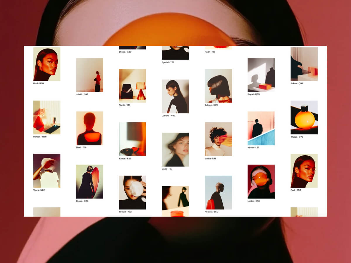
You’ve probably seen this kind of scroll effect before, even if it doesn’t have a name yet. (Honestly, we need a dictionary for all these weird and wonderful web interactions. If you’ve got a talent for naming things…do it. Seriously. The internet is waiting.)
Imagine a grid of images. As you scroll, the columns don’t move uniformly but instead, the center columns react faster, while those on the edges trail behind slightly. It feels soft, elastic, and physical, almost like scrolling with weight, or elasticity.
You can see this amazing effect on sites like yzavoku.com (and I’m sure there’s a lot more!).
So what better excuse to use the now-free GSAP ScrollSmoother? We can recreate it easily, with great performance and full control. Let’s have a look!
What We’re Building
We’ll take CSS grid based layout and add some magic:
Inertia-based scrolling using ScrollSmoother
Per-column lag, calculated dynamically based on distance from the center
A layout that adapts to column changes
HTML Structure
Let’s set up the markup with figures in a grid:
<div class="grid">
  <figure class="grid__item">
    <div class="grid__item-img" style="background-image: url(assets/1.webp)"></div>
    <figcaption class="grid__item-caption">Zorith - L91</figcaption>
  </figure>
  <!-- Repeat for more items -->
</div>
Inside the grid, we have many .grid__item figures, each with a background image and a label. These will be dynamically grouped into columns by JavaScript, based on how many columns CSS defines.
In our JavaScript then, we’ll change the DOM structure by inserting .grid__column wrappers around groups of items, one per colum, so we can control their motion individually. Why are we doing this? It’s a bit lighter to move columns rather then each individual item.
This method groups your grid items into arrays, one for each visual column, using the actual number of columns calculated from the CSS.
3. Create Column Wrappers and Assign Lag
const buildGrid = (columns, numColumns) => {

  const fragment = document.createDocumentFragment(); // Efficient DOM batch insertion
  const mid = (numColumns - 1) / 2; // Center index (can be fractional)
  const columnContainers = [];

  // Loop over each column
  columns.forEach((column, i) => {
    const distance = Math.abs(i - mid); // Distance from center column
    const lag = baseLag + distance * lagScale; // Lag based on distance from center

    const columnContainer = document.createElement('div'); // New column wrapper
    columnContainer.className = 'grid__column';

    // Append items to column container
    column.forEach((item) => columnContainer.appendChild(item));

    fragment.appendChild(columnContainer); // Add to fragment
    columnContainers.push({ element: columnContainer, lag }); // Save for lag effect setup
  });

  grid.appendChild(fragment); // Add all columns to DOM at once
  return columnContainers;
};
The lag value increases the further a column is from the center, creating that elastic “catch up” feel during scroll.
4. Apply Lag Effects to Each Column
const applyLagEffects = (columnContainers) => {
  columnContainers.forEach(({ element, lag }) => {
    smoother.effects(element, { speed: 1, lag }); // Apply individual lag per column
  });
};
ScrollSmoother handles all the heavy lifting, we just pass the desired lag.
5. Handle Layout on Resize
// Rebuild the layout only if the number of columns has changed on window resize
window.addEventListener('resize', () => {
  const newColumnCount = getColumnCount();
  if (newColumnCount !== currentColumnCount) {
    init();
  }
});
This ensures our layout stays correct across breakpoints and column count changes (handled via CSS).
Now, there’s lots of ways to build upon this and add more jazz!
For example, you could:
add scroll-triggered opacity or scale animations
use scroll velocity to control effects (see demo 2)
adapt this pattern for horizontal scroll layouts
Exploring Variations
Once you have the core concept in place, there are four demo variations you can explore. Each one shows how different lag values and scroll-based interactions can influence the experience.
You can adjust which columns respond faster, or play with subtle scaling and transforms based on scroll velocity. Even small changes can shift the rhythm and tone of the layout in interesting ways. And don’t forget: changing the look of the grid itself, like the image ratio or gaps, will give this a whole different feel!
Now it’s your turn. Tweak it, break it, rebuild it, and make something cool.
I really hope you enjoy this effect! Thanks for checking by 🙂
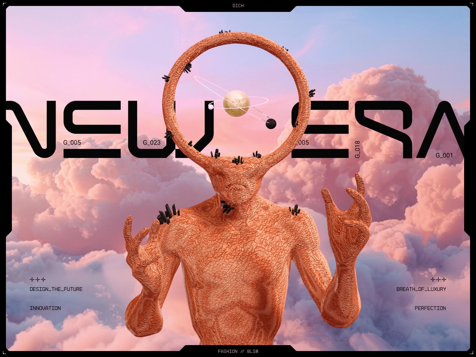
I hadn’t planned on creating a fashion interface. I just needed a reboot. At the time, I was leading art direction at the studio, juggling multiple projects, and emotionally, I was simply exhausted. I joined an Awwwards Masterclass to rediscover the joy of playing with design. I wanted to learn Webflow. I wanted to explore GSAP. But more than that, I wanted to create something unapologetically weird and beautiful.
That seed grew into DICH™, Design Independent Creative House. What started as a design playground became a statement.
We began with light. Not darkness. No glitch, no noise. Just a breath of fresh air.
Designing the Unfuturistic Future
We made a conscious decision: no dark mode. No glitch filters. Most futuristic UIs feel cold. We wanted warmth, softness, a vision of the future that is poetic, not synthetic.
Each section had its own visual temperature. Soft gradients, air, pastel dust. Typography was crucial. The T-12 font had those strange numeric ligatures that felt alien but elegant. Video, color, typography — all speaking the same language.
Each color palette tells a chapter of DICH — sunlit, strange, alive.
We built moodboards, UX pillars, and rhythm plans. That process, taught in the Masterclass, changed how we approached layout. It wasn’t about grids. It was about flow.
Building the Entry Ritual (Preloader)
The preloader wasn’t just an aesthetic flex. It solved three key problems:
Our media-heavy site needed time to load
Browsers block autoplaying audio without user interaction
We wanted to introduce mood and rhythm before the scroll even began
It was animated in After Effects and exported to Lottie, then embedded into Webflow and animated using GSAP.
The Enter button also triggered sound. It was our “permission point” for browser playback.
Live coordinate HUD under the cursor — perfectly suited to our site’s theme, so we decided to include it.
document.addEventListener('DOMContentLoaded', function () {
  if (window.innerWidth <= 768) return;
  const xCoord = document.getElementById('x-coordinate');
  const yCoord = document.getElementById('y-coordinate');
  let mouseX = 0;
  let mouseY = 0;
  let lastX = -1;
  let lastY = -1;
  let ticking = false;
  function formatNumber(num) {
    return num.toString().padStart(4, '0');
  }
  function updateCoordinates() {
    if (mouseX !== lastX || mouseY !== lastY) {
      xCoord.textContent = formatNumber(mouseX % 10000);
      yCoord.textContent = formatNumber(mouseY % 10000);
      lastX = mouseX;
      lastY = mouseY;
    }
    ticking = false;
  }
  document.addEventListener('mousemove', (event) => {
    mouseX = event.clientX;
    mouseY = event.clientY;
    if (!ticking) {
      ticking = true;
      requestAnimationFrame(updateCoordinates);
    }
  });
});
Stones That Scroll
We placed a 3D stone (also from Blender) into Spline, gave it orbital motion, and connected it to scroll using Webflow Interactions.
It felt like motion with gravity — guided, yet organic.
Pixel Tracer
With coordinate tracking already in place, we easily applied it to our section and later enhanced it with a pixel tracer inspired by Jean Mazouni’s displacement effect.
Unicorn Everywhere
The cursor wasn’t just a pointer, it became a vibe.
We used Unicorn Studio to create custom cursor trails and animations that followed the user like echoes of intent. Three variations in total:
One for the landing screen — minimal, hypnotic.
One for the project case study — denser, electric.
One for transitions — barely-there glimmer, like a memory.
Each version added tension and curiosity. It wasn’t flashy for the sake of it — it gave rhythm to hovering, a pulse to the interaction. Suddenly, the cursor wasn’t just a tool. It was part of the interface’s voice.
Footer Letters with Physics
Our footer was a personal moment. We wanted the word “DICH” to be hidden inside animated lines and revealed on hover using canvas and brightness sampling.
This one took the longest. We tried Perlin noise, sine curves, and springs, but none worked as we’d hoped or produced results that were sufficiently readable — until we found an old Domestika course that showed getImageData() logic.
Every visual block was lazy-loaded using IntersectionObserver
Safari compatibility issues — reworked unsupported animations for Safari and added fallbacks for AVIF images (even lighter than WebP) to maximize optimization.
Heavy sections only rendered after the preloader finished
We treated the error page like a runway — not a dead-end, but an invitation. Instead of a sad emoji or a bland “page not found,” you get a full-screen glitch-dream: warped typography, soft scans, and a single message that flickers like a memory.
Technically, it was simple — a standalone Webflow page. But visually, it extended the DICH world: same typographic tension, same surreal softness. We even debated adding background audio, but silence won — it made the page feel like a moment suspended in time.
What We Learned
File formats matter more than you think
Glitches aren’t as magical as thoughtful motion
GSAP is our best friend
Webflow is powerful when paired with code
You don’t need a big plan to make something that matters
Closing
I almost gave up. More than once. But every time the team cracked a bug, designed a transition, or made a visual more strange — it reminded me why we build.
DICH™ was a challenge, a love letter, and a reset. And now it’s yours to explore.
I’ve always been interested in finding simple ways to bring more depth into web interfaces, not just through visuals, but through interaction and space.
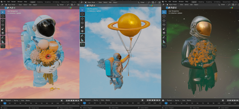
In this demo, I explored how flat UI cards can become interactive 3D scenes using GLB models, Three.js, and Webflow. Each card starts as a basic layout but reveals a small, self-contained environment built with real-time rendering and subtle motion.
It’s a lightweight approach to adding spatial storytelling to familiar components, using tools many designers already work with.
Welcome to My Creative World
I’m always drawn to visuals that mix the futuristic with the familiar — space-inspired forms, minimal layouts, and everyday elements seen from a different angle.
Most of my projects start this way: by reimagining ordinary ideas through a more immersive or atmospheric lens.
It All Started with a Moodboard
This one began with a simple inspiration board:
From that board, I picked a few of my favorite visuals and ran them through an AI tool that converts images into GLB 3D models.
The results were surprisingly good! Abstract, textured, and full of character.
The Concept: Flat to Deep
When I saw the output from the AI-generated GLB models, I started thinking about how we perceive depth in UI design, not just visually, but interactively.
That led to a simple idea: what if flat cards could reveal a hidden spatial layer? Not through animation alone, but through actual 3D geometry, lighting, and camera movement.
I designed three UI cards, each styled with minimal HTML and CSS in Webflow. On interaction, they load a unique GLB model into a Three.js scene directly within the card container. Each model is lit, framed, and animated to create the feeling of a self-contained 3D space.
Building the Web Experience
The layout was built in Webflow using a simple flexbox structure with three cards inside a wrapper. Each card contains a div that serves as the mounting point for a 3D object.
The GLB models are rendered using Three.js, which is integrated into the project with custom JavaScript. Each scene is initialized and handled separately, giving each card its own interactive 3D space while keeping the layout lightweight and modular.
Scene Design with Blender
Each GLB model was prepared in Blender, where I added a surrounding sphere to create a sense of depth and atmosphere. This simple shape helps simulate background contrast and encloses the object in a self-contained space.
Lighting played an important role; especially with reflective materials like glass or metal. Highlights and soft shadows were used to create that subtle, futuristic glow.
The result is that each 3D model feels like it lives inside its own ambient environment, even when rendered in a small card.
Bringing It Together with Three.js
Once the models were exported from Blender as .glb files, I used Three.js to render them inside each card. Each card container acts as its own 3D scene, initialized through a custom JavaScript function.
The setup involves creating a basic scene with a perspective camera, ambient and directional lighting, and a WebGL renderer. I used GLTFLoader to load each .glb file and OrbitControls to enable subtle rotation. Zooming and panning are disabled to keep the interaction focused and controlled.
Each model is loaded into a separate container, making it modular and easy to manage. The camera is offset slightly for a more dynamic starting view, and the background is kept dark to help the lighting pop.
Here’s the full JavaScript used to load and render the models:
// Import required libraries
import * as THREE from 'three';
import { OrbitControls } from 'three/addons/controls/OrbitControls.js';
import { GLTFLoader } from 'three/addons/loaders/GLTFLoader.js';
import gsap from 'gsap';

/**
 * This function initializes a Three.js scene inside a given container
 * and loads a .glb model into it.
 */
function createScene(containerSelector, glbPath) {
  const container = document.querySelector(containerSelector);

  // 1. Create a scene
  const scene = new THREE.Scene();
  scene.background = new THREE.Color(0x202020); // dark background

  // 2. Set up the camera with perspective
  const camera = new THREE.PerspectiveCamera(
    45, // Field of view
    container.clientWidth / container.clientHeight, // Aspect ratio
    0.1, // Near clipping plane
    100  // Far clipping plane
  );
  camera.position.set(2, 0, 0); // Offset to the side for better viewing

  // 3. Create a renderer and append it to the container
  const renderer = new THREE.WebGLRenderer({ antialias: true });
  renderer.setSize(container.clientWidth, container.clientHeight);
  container.appendChild(renderer.domElement);

  // 4. Add lighting
  const light = new THREE.DirectionalLight(0xffffff, 4);
  light.position.set(30, -10, 20);
  scene.add(light);

  const ambientLight = new THREE.AmbientLight(0x404040); // soft light
  scene.add(ambientLight);

  // 5. Set up OrbitControls to allow rotation
  const controls = new OrbitControls(camera, renderer.domElement);
  controls.enableZoom = false; // no zooming
  controls.enablePan = false;  // no dragging
  controls.minPolarAngle = Math.PI / 2; // lock vertical angle
  controls.maxPolarAngle = Math.PI / 2;
  controls.enableDamping = true; // smooth movement

  // 6. Load the GLB model
  const loader = new GLTFLoader();
  loader.load(
    glbPath,
    (gltf) => {
      scene.add(gltf.scene); // Add model to the scene
    },
    (xhr) => {
      console.log(`${containerSelector}: ${(xhr.loaded / xhr.total) * 100}% loaded`);
    },
    (error) => {
      console.error(`Error loading ${glbPath}`, error);
    }
  );

  // 7. Make it responsive
  window.addEventListener("resize", () => {
    camera.aspect = container.clientWidth / container.clientHeight;
    camera.updateProjectionMatrix();
    renderer.setSize(container.clientWidth, container.clientHeight);
  });

  // 8. Animate the scene
  function animate() {
    requestAnimationFrame(animate);
    controls.update(); // updates rotation smoothly
    renderer.render(scene, camera);
  }

  animate(); // start the animation loop
}

// 9. Initialize scenes for each card (replace with your URLs)
createScene(".div",  "https://yourdomain.com/models/yourmodel.glb");
createScene(".div2", "https://yourdomain.com/models/yourmodel2.glb");
createScene(".div3", "https://yourdomain.com/models/yourmodel3.glb");
This script is added via a <script type="module"> tag, either in the Webflow page settings or as an embedded code block. Each call to createScene() initializes a new card, linking it to its corresponding .glb file.
How This Works in Practice
In Webflow, create three containers with the classes .div, .div2, and .div3. Each one will act as a canvas for a different 3D scene.
Embed the JavaScript module shown above by placing it just before the closing </body> tag in your Webflow project, or by using an Embed block with <script type="module">.
Once the page loads, each container initializes its own Three.js scene and loads the corresponding GLB model. The result: flat UI cards become interactive, scrollable 3D objects — all directly inside Webflow.
This approach is lightweight, clean, and performance-conscious, while still giving you the flexibility to work with real 3D content.
Important Note for Webflow Users
This setup works in Webflow, but only if you structure it correctly.
To make it work, you’ll need to:
Host your Three.js code externally using a bundler like Vite, Parcel, or Webpack
Or bundle the JavaScript manually and embed it as a <script type="module"> in your exported site
Keep in mind: Webflow’s Designer does not support ES module imports (import) directly. Pasting the code into an Embed block won’t work unless it’s already built and hosted elsewhere.
You’ll need to export your Webflow project or host the script externally, then link it via your project settings.
Final Thoughts
Thanks for following along with this project. What started as a simple moodboard turned into a small experiment in mixing UI design with real-time 3D.
Taking flat cards and turning them into interactive scenes was a fun way to explore how much depth you can add with just a few tools: Webflow, Three.js, and GLB models.
If this gave you an idea or made you want to try something similar, that’s what matters most. Keep experimenting, keep learning, and keep building.
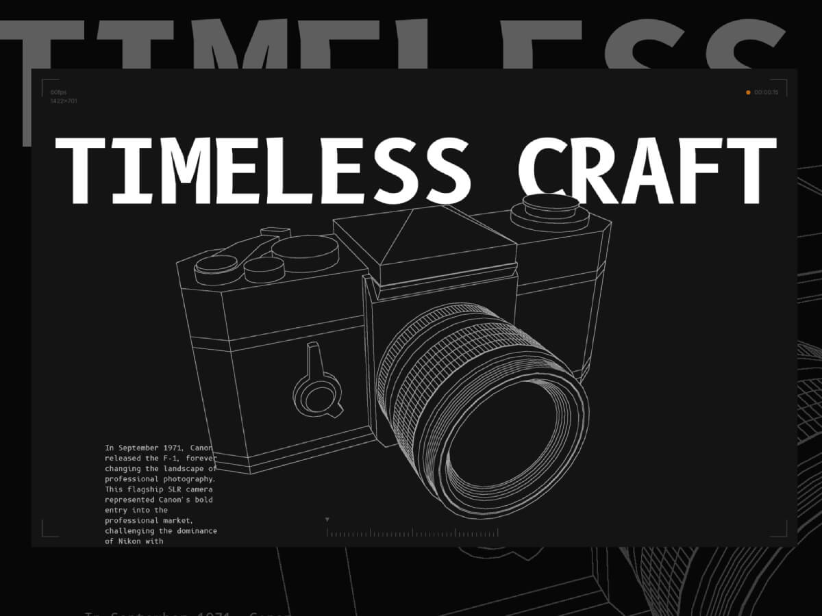
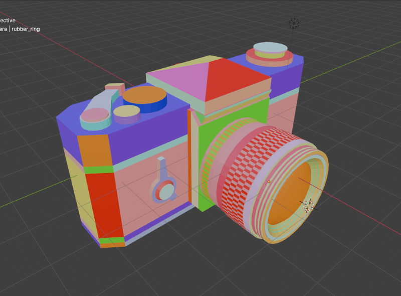
This project primarily serves as a technical demo and learning material. It began when I decided to start learning Blender. I followed a few tutorials, then decided to do a small project using it—so I chose to create the Canon F-1 camera!
After that, I decided to export the project to Three.js to add some cool post-processing shader effects. I wanted to create a sketch effect similar to what I had seen in some repair guides.
After spending a few hours experimenting with it, I decided to integrate it into a fully functional website featuring some cool shaders and 3D effects!
In this article, I’m going to walk through some of the key features of the site and provide a technical breakdown, assuming you already have a basic or beginner-level understanding of Three.js and shaders.
1. The Edge Detection Shader
Three.js includes a built-in edge detection shader called SobelOperatorShader. Basically, it detects edges based on color contrast—it draws a line between two areas with a strong enough difference in color.
To make my effect work the way I want, I need to assign a unique color to each area I want to highlight on my model. This way, Three.js will draw a line around those areas.
Here’s my model with all the materials applied:
This way, Three.js can accurately detect each area I want to highlight!
As you can see, the lines are not all the same intensity—some are white, while others are light gray. This is because, by default, line intensity depends on contrast: edges with lower contrast appear with lighter lines. To fix this, I manually modified the post-processing shader to make all lines fully white, regardless of contrast.
What I’m doing here is moving all the edge detection logic into the Sobel function. Then, I pass the tDiffuse texture—which is the composer’s render—to this function.
This way, I can modify the output of the edge detection shader before passing it back to the composer:
float G = sobel(t,texel);
G= G > 0.001 ? 1. : 0.;
G represents the intensity of the edge detection. It’s a single value because the lines are monochrome. G ranges from 0 to 1, where 0 means full black (no edge detected) and 1 means full white (strong contrast detected).
As mentioned earlier, this value depends on the contrast. What I’m doing in the second line is forcing G to be 1 if it’s above a certain threshold (I chose 0.001, but you could pick a smaller value if you want).
This way I can get all the edges to have the same intensity.
Here’s how I’m applying the custom fragment shader to the Sobel Operator shader pass:
Next, let’s take a look at the lens parts section.
This is mainly achieved using a Three.js utility called RenderTarget.
A render target is a buffer where the GPU draws pixels for a scene being rendered off-screen. It’s commonly used in effects like post-processing, where the rendered image is processed before being displayed on the screen.
Basically, this allows me to render my scene twice per frame: once with only the highlighted mesh, and once without it.
In the onSelectMesh method, I set the value of this.selectedMeshName to the name of the mesh group that contains the target mesh from the Raycaster (I’m using names to refer to groups of meshes).
This way, in my render loop, I can create two distinct renders:
One render (renderTargetA) with all the meshes except the hovered mesh
Another render (renderTargetB) with only the hovered mesh
As you can see, I’m sending both renders as texture uniforms to the effectSobel shader. The post-processing shader then “merges” these two renders into a single output.
At this point, we have two renders of the scene, and the post-processing shader needs to decide which one to display. Initially, I thought of simply combining them by adding the two textures together, but that didn’t produce the correct result:
What I needed was a way to hide the pixels of one render when they are “covered” by pixels from another render.
To achieve this, I used the distance of each vertex from the camera. This meant I had to go through all the meshes in the model and modify their materials. However, since the mesh colors are important for the edge detection effect, I couldn’t change their colors.
Instead, I used the alpha channel of each individual vertex to set the distance from the camera.
First, the luminance function is a built-in Three.js shader utility imported from the <common> module. It’s recommended to use this function with the Sobel effect to improve edge detection results.
The uColor value represents the initial color of the mesh.
The dist value calculates the distance between the vertex position (passed from the vertex shader via a varying) and the camera, using the built-in cameraPosition variable in Three.js shaders.
Finally, I pass this distance through the alpha channel. Since the alpha value can’t exceed 1, I use a normalized version of the distance.
And here is the updated logic for the postprocessing shader:
Now that the alpha channel of the textures contains the distance to the camera, I can simply compare them and display the render that have the closer vertices to the camera.
3. The Film Roll Effect
Next is this film roll component that moves and twist on scroll.
This effect is achieved using only shaders, the component is a single plane component with a shader material.
All the data is sent to the shader through uniforms:
export default class Film {
  constructor() {
    //...code
  }

  createGeometry() {
    this.geometry = new THREE.PlaneGeometry(
      60,
      2,
      100,
      10
    )
  }

  createMaterial() {
    this.material = new THREE.ShaderMaterial({
      vertexShader,
      fragmentShader,
      side: THREE.DoubleSide,
      transparent: true,
      depthWrite: false,
      blending: THREE.CustomBlending,
      blendEquation: THREE.MaxEquation,
      blendSrc: THREE.SrcAlphaFactor,
      blendDst: THREE.OneMinusSrcAlphaFactor,
      uniforms: {
        uPlaneWidth: new THREE.Uniform(this.geometry.parameters.width),
        uRadius: new THREE.Uniform(2),
        uXZfreq: new THREE.Uniform(3.525),
        uYfreq: new THREE.Uniform(2.155),
        uOffset: new THREE.Uniform(0),
        uAlphaMap: new THREE.Uniform(
          window.preloader.loadTexture(
            "./alpha-map.jpg",
            "film-alpha-map",
            (texture) => {
              texture.wrapS = THREE.RepeatWrapping
              const { width, height } = texture.image
              this.material.uniforms.uAlphaMapResolution.value =
                new THREE.Vector2(width, height)
            }
          )
        ),
        //uImages: new THREE.Uniform(new THREE.Vector4()),
        uImages: new THREE.Uniform(
          window.preloader.loadTexture(
            "/film-texture.png",
            "film-image-texture",
            (tex) => {
              tex.wrapS = THREE.RepeatWrapping
            }
          )
        ),
        uRepeatFactor: new THREE.Uniform(this.repeatFactor),
        uImagesCount: new THREE.Uniform(this.images.length * this.repeatFactor),
        uAlphaMapResolution: new THREE.Uniform(new THREE.Vector2()),
        uFilmColor: new THREE.Uniform(window.colors.orange1),
      },
    })
  }

  createMesh() {
    this.mesh = new THREE.Mesh(this.geometry, this.material)
    this.scene.add(this.mesh)
  }
}
The main vertex shader uniforms are:
uRadius is the radius of the cylinder shape
uXZfreq is the frequency of the twists on the (X,Z) plane
uYfreq is a cylinder height factor
uOffset is the vertical offset of the roll when you scroll up and down
As you can see they are used to modify the initial position attribute to give it the shape of a cylinder. the modified position’s X Y and Z factors are using uOffset in their frequency. this uniform is linked to a Scrolltrigger timeline that will give the twist on scroll effect.
That’s it for the most part! Don’t feel frustrated if you don’t understand everything right away—I often got stuck for days on certain parts and didn’t know every technical detail before I started building.
I learned so much from this project, and I hope you’ll find it just as useful!
Thank you for reading, and thanks to Codrops for featuring me again!
Hi, my alias is “MisterPrada,” and I’d like to share a short story about how I came to the decision to become a creative developer.
Background
I’m just about to turn 30, and over the years I’ve come to many realizations that I’d like to share as echoes of my journey. I’ve been consciously programming for about 14 years, and I’ve been using Windows since childhood—battling the infamous “blue screen of death.”
From a young age, I knew who I wanted to be—a programmer. In my childhood, nothing was more exciting than a computer. However, my academic skills weren’t strong enough to get into university easily. I was never particularly gifted in any subject; my grades were average or worse.
Somehow, I managed to get accepted into a university for an engineering program related to programming. I tried hard, but nothing worked—I ended up copying others just to pass exams. After some time, I realized it was time to get serious. I had no special talents, no head start—just the need for hard work. I wrote my first function, my first loop over a two-dimensional array, my first structure, my first doubly linked list—and I realized I liked it. I really, really liked the fact that I was starting to make progress.
I didn’t stop copying completely, but I began writing my own programs. We studied C++, C#, Assembly, databases, and lots of things I couldn’t yet apply in real life. So I bought a book on PHP, JS, and MySQL and realized I could build websites using WordPress and other popular CMS platforms at the time like Joomla, Drupal, etc. And you know what? That made money—and it was insanely cool. I just took on any work I could find. Since I had spent all of university copying code, I found it really easy to understand and adapt other people’s code.
Years passed, and I was building simple websites—tweaking templates downloaded from torrents, grabbing CSS styles from random websites, and so on. Something like these:
Eventually, I realized that my growth had stalled and I needed to act fast. I started reading various books, trying to improve my skills and learn new, trending technologies. This mostly broadened my technical horizons—I understood more, copied more, and tried harder to boost my self-esteem.
At one point, I felt confident, thinking I was pretty good and could handle anything. But then something happened during the final year of university. A classmate told me he had gone for an interview at a major company, and they asked him to implement a binary tree. I was shocked—I had no idea what a binary tree was, how to build one, or why I was even supposed to know it.
Honestly, it hit me hard. I started questioning everything—was I even a real programmer? Maybe I was third, fourth, or even fifth-rate at best, especially with my modest PHP/JS skill set…
No matter how tough things got, I never felt like this wasn’t for me. I never thought of quitting or doing something else. I just accepted that I wasn’t the best, not the smartest, and unlikely to be in Steve Jobs’ dream dev team. And you know what? Something strange happened.
One day, while playing my favorite game, World of Warcraft, I decided I wanted to become a cheater. And it wasn’t just a casual thought or curiosity—it became a full-blown obsession. I was just a regular programmer with average web development knowledge, yet I decided to write a cheat, dive into hacking, and understand how it all worked.
For a whole year, I obsessively studied the C++ source code of the game—despite not really using C++ at all. I explored how the server worked, dug into Assembly, network traffic, data packets, and hex code. I read books on cybersecurity and anything even remotely related. It felt like an endless world of discovery. I could spend months trying to understand things that didn’t make sense to me at first—occasionally achieving small victories, but victories nonetheless.
I started building a toolkit of tools like IDA Pro, xDbg, and even something as simple as https://hexed.it/, which let me quickly modify binary files.
After achieving real success—writing my first memory manipulation programs for protected software—I realized that what really makes a difference is a mix of luck, hard work, and a genuine passion for what you’re doing. And I had both of those things.
That became a kind of guiding principle for my further development. Sure, I’m not the most talented or naturally gifted, but I began to understand that even without full knowledge, with persistence and effort, you can achieve goals that seem impossible at first—or even at second or third glance.
Getting to Work
I got a job at an outsourcing company, and honestly, I felt confident thanks to my freelance commercial experience. At work, I handled whatever tasks the client needed—it didn’t matter whether I already knew how to do it or not. My goals were simple: learn more and earn money. What did I work on? Pretty much everything, except I always thought of myself as more of a logic guy, and frontend wasn’t really my thing. It was easier for me to deploy and configure a server than to write 10 lines of CSS.
So I focused mostly on backend logic, building systems, and I’d often hand off frontend tasks to others. Still, I was always afraid of losing touch with those skills, so I made an effort to study Vue, React, Angular, and various frontend libraries—just to understand the logic behind it.
I read a lot of books, mostly on JavaScript, DevOps, and hacking. At work, I grew horizontally, gaining experience based on the clients’ needs. In my personal time, I was deeply interested in hacking and reverse engineering—not because of any grand ambition, but simply because I loved it. I saw myself in it, because I was good at it. I definitely had some luck—I could click randomly through code and somehow land on exactly what I needed. It’s comforting to know that not everything is hopeless.
Years went by, and as backend developers and DevOps engineers, we often felt invisible. Over time, the huge amount of backend code I wrote stopped bringing the same satisfaction. There were more systems, more interfaces, and less recognition—because no one really sees what you do behind the scenes. So why not switch to frontend? Well, I just hate CSS. And building simple landing pages or generic websites with nothing unique? That’s just not interesting. I need something bold and impressive—something that grabs me the way watching *Dune* does. Game development? Too complex, and I never had the desire to make games.
But then, at work, I was given a task to create a WebAR experience for a client. It required at least some basic 3D knowledge, which I didn’t have. So I dove in blindly and started building the app using 8thWall. That’s when I discovered A-Frame, which was super easy and incredibly fun—seeing results so different from anything I had done before. When A-Frame became limiting, I started using Three.js directly on commercial projects. I had zero understanding of vector math, zero 3D modeling experience (like in Blender), but I still managed to build something. Some things worked, some didn’t—but in the end, the client was happy.
WebAR experience
After creating dozens of such projects and nearly a hundred backend projects, I eventually grew tired of both. Out of boredom, I started reading books on Linux Bash, Kubernetes, WebAssembly, Security, and code quality—good and bad.
All of this only expanded my technical perspective. I didn’t become a hero or some programming guru, but I felt like I was standing alone at the summit of my own mountain. There was this strange emptiness—an aimless desire to keep learning, and yet I kept doing it day after day. Some topics I studied still haven’t revealed their meaning to me, while others only made sense years later, or proved useful when I passed that knowledge on to others.
Over the years, I became a team lead—not because I was naturally suited for it, but because there was simply no one else. I took on responsibility, began teaching others what to do, even though I wasn’t always sure what was right or wrong—I just shared my logic and experience.
Alongside trends, I had to learn CI/CD and Docker to solve tasks more efficiently—tasks that used to be handled differently. And you know what? I really learned something from this period: that most tools are quite similar, and you don’t need to master all of them to solve real business problems. In my mind, they became just that—tools.
All you need is to read the documentation, run a few basic examples, and you’re good to go. I’m simply not one of those people who wants to stick to one technology for life and squeeze value out of it forever. That’s not me. For over 5 years, I built 70–80 websites using just WordPress and Laravel—covering everything from custom themes and templating systems to multisites and even deep dives into the WordPress core. I worked with some truly awful legacy code that I wouldn’t wish on anyone.
Eventually, I decided to move on. The developers I worked with came and went, and that cycle never ended—it’s still ongoing to this day. Then came my “day X.” I was given a project I couldn’t turn down. It involved GLSL shaders. I had to create a WebAR scene with a glass beverage placed on a table. The challenge was that it was a glass cup, and around version 130 of Three.js, this couldn’t be done using a simple material. The client provided ready-made code written in Three.js with custom shaders. I looked at it and saw nothing but math—math I couldn’t understand. It was way too complex. The developer who created it had written a shader for glass, water, ice, and other elements. My task was to integrate this scene into WebAR. I was lucky enough to get a call with the developer who built it, and I asked what seemed like a straightforward question at the time:
(Me) – How did you manage to create such effects using pure math? Can you actually visualize it all in your head? (Shader Developer) – Yeah, it looks complicated, but if you start writing shaders, borrowing small snippets from elsewhere and understanding how different effects work, eventually you start to look at that mathematical code and visualize those parts in your head.
His answer blew me away. I realized—this guy is brilliant. And I honestly hadn’t seen anyone cooler. I barely understood anything about what he’d done—it was all incredibly hard to grasp. Back then, I didn’t have ChatGPT or anything like it to help. I started searching for books on the subject, but there were barely any. It was like this secret world where everyone knew everything but never shared. And if they did, it was in dry, unreadable math-heavy documentation that someone like me just couldn’t digest. At that point, I thought maybe I was simply too weak to write anything like that, and I went back to what I was doing before.
The Beginning of the Creative Developer Journey
About a year later, I came across this website, which struck me with its minimalistic and stylish design—totally my vibe. Without hesitation, I bought the course by Bruno Simon, not even digging into the details. If he said he’d teach shaders, I was all in. My obsession was so intense that I completed the course in just two weeks, diving into every single detail. Thanks to my background, most of the lessons were just a pleasant refresher—but the shader sections truly changed my life.
So, I finished the course. What now? I didn’t yet have real-world projects that matched the new skills I had gained, so I decided to just start coding and releasing my own work. I spent a long time thinking about what my first project should be. Being a huge fan of the Naruto universe, I chose to dedicate my first creative project to my favorite character—Itachi.
I already had some very basic skills in Blender, and of course, there was no way I could create a model like that myself. Luckily, I stumbled upon one on Sketchfab and managed to download it (haha). I built the project almost the way I envisioned it, though I lacked the experience for some finer details. Still, I did everything I could at the time. God rays were already available in the Three.js examples, so creating a project like that was pretty straightforward. And man, it was so cool—the feeling of being able to build something immersive was just amazing.
Next, I decided to create something in honor of my all-time favorite game, which I’ve been playing for over 15 years—World of Warcraft.
In this project, the real challenge for me was linking the portal shader to sound, as well as creating particle motion along Bézier curves. But by this point, I already had ChatGPT—and my capabilities skyrocketed. This is my favorite non-commercial project. Still, copying and modifying something isn’t the same as creating it from scratch.
The shaders I used here were pieced together from different sources—I borrowed some from Bruno Simon’s projects, and in other cases, I reverse-engineered other projects just to figure out what I could replicate instead of truly engaging my own thinking. It was like always taking the path of least resistance. Ironically, reverse engineering a Webpack-compiled site often takes more time than simply understanding the problem yourself. But that was my default mode—copy, modify, move on.
For this particular project, it wasn’t a big deal, but I’ve had projects in the past that got flagged for copyright issues. I knew everything lived on the frontend and could be broken down and analyzed bit by bit—especially shaders. You might not know this, but in Safari on a MacBook, you can use developer tools to view all the shaders used on a site and even modify them in real time. Naturally, I used every trick I knew to reach my goals.
That shader developer’s comment—about being able to read math and visualize it—kept echoing in my mind. After Bruno’s course, I started to believe he might have been right. I was beginning to understand fragments of shader code, even if not all of it. I ended up watching every single video on the YouTube channel “The Art Of Code“.
After watching those videos, I started to notice my growth in writing shaders. I began to see, understand, and even visualize what I was writing. So I decided to create a fragment shader based on my own experience:
Along my shader-writing journey, I came across someone everyone in the shader world knows—Inigo Quilez. Man, what an absolute legend. There’s this overwhelming feeling that you’ll never reach his level. His understanding of mathematics and computer graphics is just on another planet compared to mine. For a long time, that thought really got to me—20 years ago, he was creating things I still can’t do today, despite programming for so long. But looking back, I realized something: some of the people I once admired, I’ve actually surpassed in some ways—not because I aimed to, but simply by moving forward every day. And I came to believe that if I keep going, maybe I’ll reach my own peak—one where my ideas can be truly useful to others.
So here I am, moving forward, and creating what I believe is a beautiful shader of the aurora.
I realized that I could now create shaders based on models made in Blender—and do it with a full understanding of what’s going on. I was finally capable of building something entirely on my own.
So what’s next? I dove back into Three.js and began trying to apply everything I had learned to create something new. You can find a list of those projects here.
Public Projects
I bought and completed all the courses by Simon Dev. By then, the shader course wasn’t anything groundbreaking for me anymore, but the math course was something I really needed. I wanted to deepen my understanding of how to apply math in practice. I also played through this game, which demonstrates how vector math works—highly recommended for anyone struggling with the concept. It really opened my eyes to things I hadn’t understood before.
I became obsessed with making sure I didn’t miss anything shared by the people who helped shape my knowledge. I watched 100% of the videos on his YouTube channel and those of other creators who were important to me in this field. And to this day, I keep learning, studying other developers’ techniques, and growing in the field of computer graphics.
Interesting Projects
I really enjoy working with particles—and I also love motion blur. I came up with an approach where each particle blurs in the direction of its movement based on its velocity. I left some empty space on the plane where the particle is drawn so the blur effect wouldn’t get cut off.
Using particles and distance-based blur effects in commercial projects.
After watching Dune, I decided to play around with sound.
I really enjoy playing with light sources.
Or even creating custom light sources using TSL.
I consider this project my most underrated one. I’m a huge fan of the Predator and Alien universes. I did borrow the plasma shader from CodePen, but honestly, that’s not the most important detail here. At the time I made this project, Three.js had just introduced a new material property called AlphaHash, which allowed me to create an awesome laser effect. It really looks great. Maybe no one notices such small details, but for me, it was an achievement to come up with that solution right as the new version of Three.js was released. That’s where my luck comes in—I had no idea how I’d implement the laser at the start of the project and thought, “Oh well, I’ll figure something out.” And luckily, the engine developers delivered exactly what I needed just in time.
You may have already noticed that I don’t build full frontend solutions with lots of interfaces and traditional layout work—that just doesn’t interest me, so I don’t do it. In commercial development, I focus on solving niche problems—problems other developers won’t spend hours watching videos to figure out. I create concepts that later get integrated into projects. You might have already seen some 3D scenes or visual effects I’ve built—without even knowing it. A lot of development happens through two, three, or even four layers of hands. That’s why, sometimes, creating something for Coca-Cola is more realistic than making a simple online store for a local business.
And what have I learned from this journey?
Never give up. Be like Naruto—better to fail 100 times than never try at all.
I’m not a saint of a developer—I forget things just like you, I use ChatGPT, I get lazy, and sometimes, in trying to do more than I’m capable of, I give in to the temptation of borrowing code. And yes, that has sometimes ended badly for me.
I assure you, even top developers—the ones who seem untouchably brilliant—also borrow or adapt code. I’ve reverse-engineered projects and clearly seen others use code they didn’t write, even while they rake in thousands of views and win awwwards. Meanwhile, the original authors stay invisible. That’s why I now try to focus more on creating things that are truly mine, to grow the ability to create rather than just consume. And to you, I say—do whatever helps you get better. The takeaway for me is this: share what you’ve made today, because tomorrow it might be irrelevant. And believe me, if someone really wants what you’ve built, they’ll take it anyway—and you won’t even know.
Even if your job makes you build projects that don’t excite you, don’t assume it’s someone else’s job to teach you. You have to sit down, start learning on your own, and work toward what truly inspires you.
Don’t be afraid to forget things—remembering something isn’t the same as learning it from scratch, especially with ChatGPT around.
See new technologies as tools to reach your goals. Don’t fear them—use everything, including AI, as long as it helps you move forward. Making mistakes is the most normal thing that can happen to you.
Nothing is impossible—it’s just a matter of time you personally need to spend to understand something that currently feels incomprehensible.
When using ChatGPT, think critically and read what it outputs. Don’t blindly copy and paste code—I’ve done that, and it cost me a lot of time. If I had just thought it through, I could’ve solved it in five minutes.
If new technologies seem absurd to you, maybe you’re starting to age—or refusing to accept change. Try to shake yourself up and think critically. If you don’t do it, someone else will—and they’ll leave you behind.
Hard work and determination beat talent (Inigo Quilez is still out of reach for now), but the price is your time.
In the pursuit of your own achievements, don’t forget about your family, loved ones, and friends—otherwise your 30s will fly by even faster than mine did.
The more techniques you learn in digital art, the more you’ll want to understand math and physics—and many things you once found boring may suddenly gain new meaning and purpose.
Ideas that you create yourself may become more valuable to you than everything you’ve ever studied.
Programming books are often so huge that you don’t even want to buy them—but you don’t have to read them cover to cover. Learn to filter information. Don’t worry about skipping something—if you miss it, GPT can explain it later. So feel free to skip the chapters you don’t need right now or won’t retain anyway.
In the past, it was important to know what a certain technology could do and how to use it by memory or with references. Today, it’s enough to simply know what’s possible—documentation and ChatGPT can help you figure out the rest. Don’t memorize things that will be irrelevant or replaced by new tech in a few days.
Start gradually learning TSL—the node-based system will make it easier to create materials designed by artists in Blender. (Year 2025)
Don’t be afraid to dig into the core to read or even modify something. The people who build the tools you use are just people too, and they write readable code. Take Three.js, for example—when you dive into the material declarations, the hierarchy becomes much clearer, something that wasn’t obvious to me when I first started learning Three.js. Or with TSL—even though the documentation is still weak, looking at function declarations often reveals helpful comments that make it easier to understand how to use different features.
To be honest, I didn’t really want to write about myself—but Manoela pushed me, so I decided to help. And you know, helping people often comes back around as luck 🍀—and that always comes in handy later!
Alright, I won’t bore you any longer—just take a look at my cat ♥️
Two weeks. No 3D Visuals. No panic. We built the OXI ONE MKII website using nothing but structure and type. All to meet the deadline for the product launch and its debut in Berlin.
Creating a website for the launch of a new flagship product is already a high-stakes task; doing it in under 14 days, with no flawless renders, raises the bar even higher. When OXI Instruments approached us, the ONE MKII was entering its final development stage. The product was set to premiere in Berlin, and the website had to be live by that time, no extensions, no room for delay. At the same time, there was no finalized imagery, no video, and no product renders ready for use.
We had to
Build a bold, functional website without relying on visual assets
Reflect the character and philosophy of the ONE MKII — modular, live, expressive
Craft a structure that would be clear to musicians and intuitive across devices
Work in parallel with the OXI team, adjusting to changes and updates in real time
This wasn’t just about speed. It was about designing clarity under pressure, with a strict editorial mindset, where every word, margin, and interaction had to work harder than usual. These are the kinds of things you’d never guess as an outside observer or a potential customer. But constraints like these are truly a test of resilience.
The Approach
If you’ve seen other websites we’ve launched with various teams, you’ll notice they often include 3D graphics or other rich visual layers. This project, however, was a rare exception.
It was crucial to make the right call early on and to hit expectations spot-on during the concept stage. A couple of wrong turns wouldn’t be fatal, but too many missteps could easily lead to missing the deadline and delivering an underwhelming result.
We focused on typography, photography, and rhythm. Fortunately, we were able to shape the art direction for the photos in parallel with the design process. Big thanks to Candace Janee (OXI project manager) who coordinated between me, the photographers, and everyone involved to quickly arrange compositions, lighting setups, and other details for the shoot.
Another layer of complexity was planning the broader interface and future platform in tandem with this launch. While we were only releasing two core pages at this stage, we knew the site would eventually evolve into a full eCommerce platform. Every design choice had to consider the long game from homepage and support pages to product detail layouts and checkout flows. That also meant thinking ahead about how systems like Webflow, WordPress, WooCommerce, and email automation would integrate down the line.
Typography
With no graphics to lean on, typography had to carry more weight than usual not just in terms of legibility, but in how it communicates tone, energy, and brand attitude. We opted for a bold, editorial rhythm. Headlines drive momentum across the layout, while smaller supporting text helps guide the eye without clutter.
We selected both typefaces from the same designer, Wei Huang, a type designer from Australia. Work Sans for headlines and body copy, and Fragment Mono for supporting labels and detailed descriptions.The two fonts complement each other well and are completely free to use, which allowed us to rely on Google Fonts without worrying about file formats or load sizes.
CMS System
Even though we were only launching two pages initially, the CMS was built with a full content ecosystem in mind. Product specs, updates, videos, and future campaigns all had a place in the structure. Instead of hardcoding static blocks, we built flexible content types that could evolve alongside the product line.
The idea was simple: avoid rework later. The CMS wasn’t just a backend; it was the foundation of a scalable platform. Whether we were thinking of Webflow’s CMS collections or potential integrations with WordPress and WooCommerce, the goal was to create a system that was clean, extensible, and future-ready.
Sketches. Early explorations.
I really enjoy the concept phase. It’s the moment where different directions emerge and key patterns begin to form. Whether it’s alignment, a unique sense of ornamentation, asymmetry, or something else entirely. This stage is where the visual language starts to take shape.
Here’s a look at some of the early concepts we explored. The OXI website could’ve turned out very differently.
OXI Instruments Concept #1
OXI Instruments Concept #2
We settled on a dark version of the design partly due to the founder’s preference, and partly because the brand’s core colors (which were off-limits for changes) worked well with it. Additionally, cutting out the device from photos made it easier to integrate visuals into the layout and mask any imperfections.
Rhythm & Layout
When planning the rhythm and design, it’s important not to go overboard with creativity. As designers, we often want to add that “wow” factor but sometimes, the business just doesn’t need it.
The target audience, people in the music world, already get their visual overload during performances by their favorite artists. But when they’re shopping for a new device, they’re not looking for spectacle. They want to see the product. The details. The specs. Everything that matters.
All of it needs to be delivered clearly and accessibly. We chose the simplest approach: alternating between center-aligned and left-aligned sections, giving us the flexibility to structure the layout intuitively. Photography helps break up the technical content, and icons quickly draw attention to key features. People don’t read, they scan. We designed with that in mind.
A few shots highlighting some of my favorite sections.
Result
The results were genuinely rewarding. The team felt a boost in motivation, and the brand’s audience and fans immediately noticed the shift highlighting how the update pushed OXI into a more professional direction.
According to my information, the pre-orders for the device sold out in less than a week. It’s always a great feeling when you’re proud of the outcome, the team is happy, and the audience responds positively. That’s what matters most.
Looking Ahead / Part Two
This was just the beginning. The second part of the project (a full eCommerce experience) is currently in the works. The core will expand, but the principles will remain the same.
I hope you’ll find the full relaunch of OXI Instruments just as exciting. Stay tuned on updates.