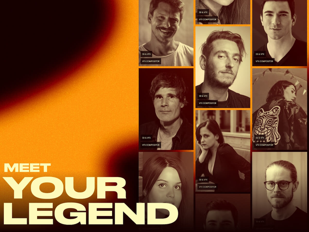
We partnered with Meet Your Legend to bring their groundbreaking vision to life — a mentorship platform that seamlessly blends branding, UI/UX, full-stack development, and immersive digital animation.
Meet Your Legend isn’t just another online learning platform. It’s a bridge between generations of creatives. Focused on VFX, animation, and video game production, it connects aspiring talent — whether students, freelancers, or in-house studio professionals — with the industry’s most accomplished mentors. These are the legends behind the scenes: lead animators, FX supervisors, creative directors, and technical wizards who’ve shaped some of the biggest productions in modern entertainment.
Our goal? To create a vivid digital identity and interactive platform that captures three core qualities:
The energy of creativity
The precision of industry-level expertise
The dynamism of motion graphics and storytelling
At the heart of everything was a single driving idea: movement. Not just visual movement — but career momentum, the transfer of knowledge, and the emotional propulsion behind creativity itself.
We built the brand identity around the letter “M” — stylized with an elongated tail that represents momentum, legacy, and forward motion. This tail forms a graphic throughline across the platform. Mentor names, modules, and animations plug into it, creating a modular and adaptable system that evolves with the content and contributors.
From the visual system to the narrative structure, we wanted every interaction to feel alive — dynamic, immersive, and unapologetically aspirational.
The Concept
The site’s architecture is built around a narrative arc, not just a navigation system.
Users aren’t dropped into a menu or a generic homepage. Instead, they’re invited into a story. From the moment the site loads, there’s a sense of atmosphere and anticipation — an introduction to the platform’s mission, mood, and voice before unveiling the core offering: the mentors themselves, or as the platform calls them, “The Legends.”
Each element of the experience is structured with intention. We carefully designed the content flow to evoke a sense of reverence, curiosity, and inspiration. Think of it as a cinematic trailer for a mentorship journey.
We weren’t just explaining the brand — we were immersing visitors in it.
Typography & Color System
The typography system plays a crucial role in reinforcing the platform’s dual personality: technical sophistication meets expressive creativity.
We paired two distinct sans-serif fonts:
– A light-weight, technical font to convey structure, clarity, and approachability — ideal for body text and interface elements
– A bold, expressive typeface that commands attention — perfect for mentor names, quotes, calls to action, and narrative highlights
The contrast between these two fonts helps create rhythm, pacing, and emotional depth across the experience.
The color palette is deliberately cinematic and memorable:
Flash orange signals energy, creative fire, and boldness. It’s the spark — the invitation to engage.
A range of neutrals — beige, brown, and warm grays — offer a sense of balance, maturity, and professionalism. These tones ground the experience and create contrast for vibrant elements.
Together, the system is both modern and timeless — a tribute to craft, not trend.
Technology Stack
We brought the platform to life with a modern and modular tech stack designed for both performance and storytelling:
WordPress (headless CMS) for scalable, easy-to-manage content that supports a dynamic editorial workflow
GSAP (GreenSock Animation Platform) for fluid, timeline-based animations across scroll and interactions
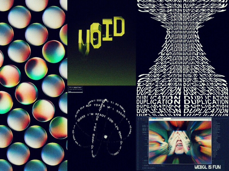
Three.js / WebGL for high-performance visual effects, shaders, and real-time graphical experiences
Custom booking system powered by Make, Google Calendar, Whereby, and Stripe — enabling seamless scheduling, video sessions, and payments
This stack allowed us to deliver a responsive, cinematic experience without compromising speed or maintainability.
Loader Experience
Even the loading screen is part of the story.
We designed a cinematic prelude using the “M” tail as a narrative element. This loader animation doesn’t just fill time — it sets the stage. Meanwhile, key phrases from the creative world — terms like motion 2D & 3D, vfx, cgi, and motion capture — animate in and out of view, building excitement and immersing users in the language of the craft.
It’s a sensory preview of what’s to come, priming the visitor for an experience rooted in industry and artistry.
Title Reveal Effects
Typography becomes motion.
To bring the brand’s kinetic DNA to life, we implemented a custom mask-reveal effect for major headlines. Each title glides into view with trailing motion, echoing the flowing “M” mark. This creates a feeling of elegance, control, and continuity — like a shot dissolving in a film edit.
These transitions do more than delight — they reinforce the platform’s identity, delivering brand through movement.
Menu Interaction
We didn’t want the menu to feel like a utility. We wanted it to feel like a scene transition.
The menu unfolds within the iconic M-shape — its structure serving as both interface and metaphor. As users open it, they reveal layers: content categories, mentor profiles, and stories. Every motion is deliberate, reminiscent of opening a timeline in an editing suite or peeling back layers in a 3D model.
It’s tactile, immersive, and true to the world the platform celebrates.
Gradient & WebGL Shader
A major visual motif was the idea of “burning film” — inspired by analog processes but expressed through modern code.
To bring this to life, we created a custom WebGL shader, incorporating a reactive orange gradient from the brand palette. As users move their mouse or scroll, the shader responds in real-time, adding a subtle but powerful VFX-style distortion to the screen.
This isn’t just decoration. It’s a living texture — a symbol of the heat, friction, and passion that fuel creative careers.
Scroll-Based Storytelling
The homepage isn’t static. It’s a stage for narrative progression.
We designed the flow as a scroll-driven experience where content and story unfold in sync. From an opening slider that introduces the brand, to immersive sections that highlight individual mentors and their work, each moment is carefully choreographed.
Users aren’t just reading — they’re experiencing a sequence, like scenes in a movie or levels in a game. It’s structured, emotional, and deeply human.
Who We Are
We are a digital studio at the intersection of design, storytelling, and interaction. Our approach is rooted in concept and craft. We build digital experiences that are not only visually compelling but emotionally resonant.
From bold brands to immersive websites, we design with movement in mind — movement of pixels, of emotion, and of purpose.
Because we believe great design doesn’t just look good — it moves you.
Designing visuals that respond to real-time data or user input usually means switching between multiple tools — one for animation, another for logic, and yet another for implementation. This back-and-forth can slow down iteration, make small changes cumbersome, and create a disconnect between design and behavior.
If you’ve spent any time with Rive, you know it’s built to close that gap. It lets you design, animate, and add interaction all in one place — and with features like state machines and data binding, you can make your animations respond directly to variables and user actions.
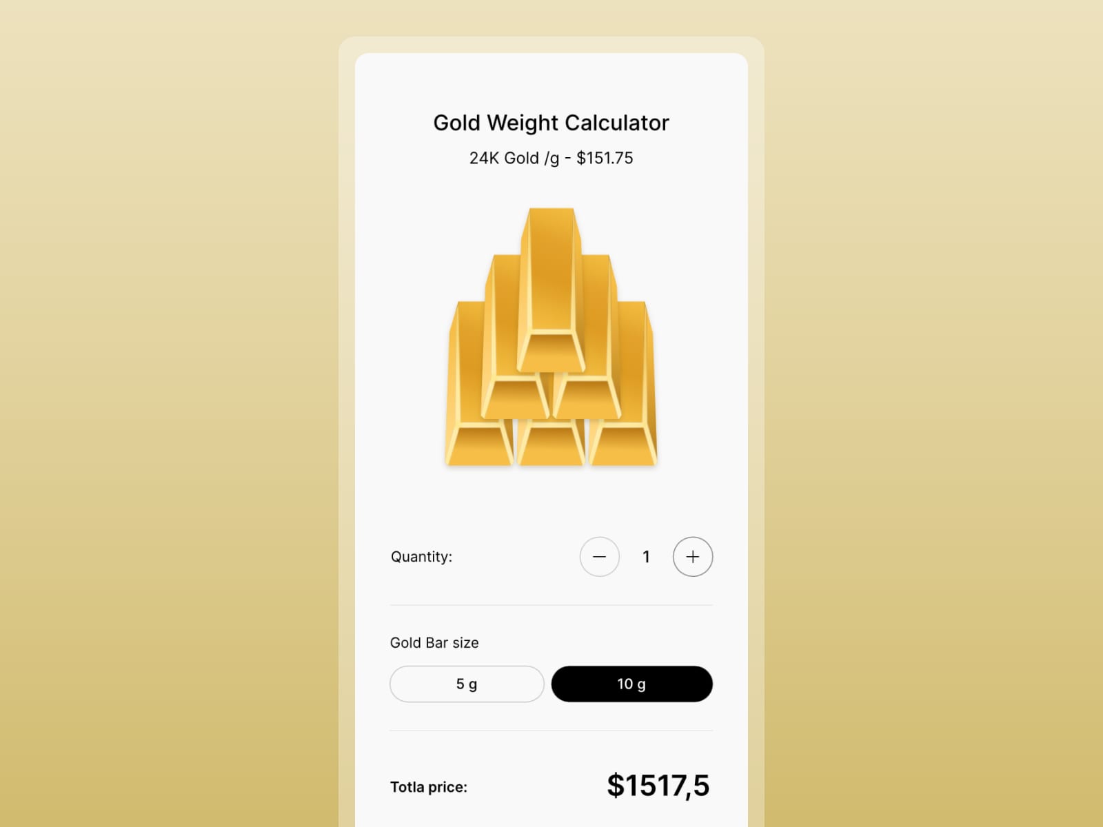
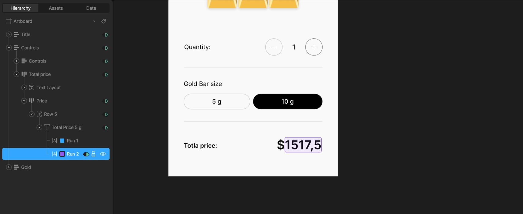
To demonstrate how we use data binding in Rive, we built a small interactive project — a gold calculator. The task was simple: calculate the price of 5g and 10g gold bars, from 1 to 6 bars, using external data for the current gold price per gram. The gold price can be dynamic, typically coming from market data, but in this case we used a manually set value.
Let’s break down how the calculator is built, step by step, starting with the layout and structure of the file.
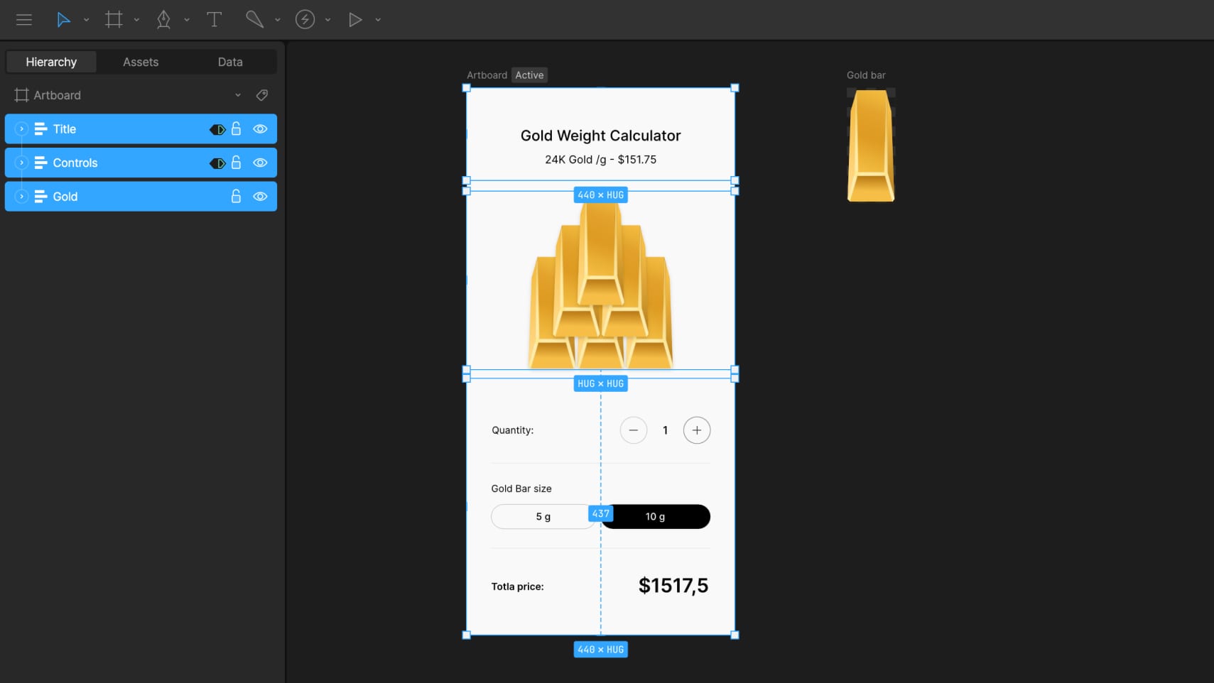
1. File Structure
The layout is built for mobile, using a 440×900 px artboard. It’s structured around three layout groups:
Title with gold price per gram
Controls for choosing gold bar amount and weight
Gold bar illustration
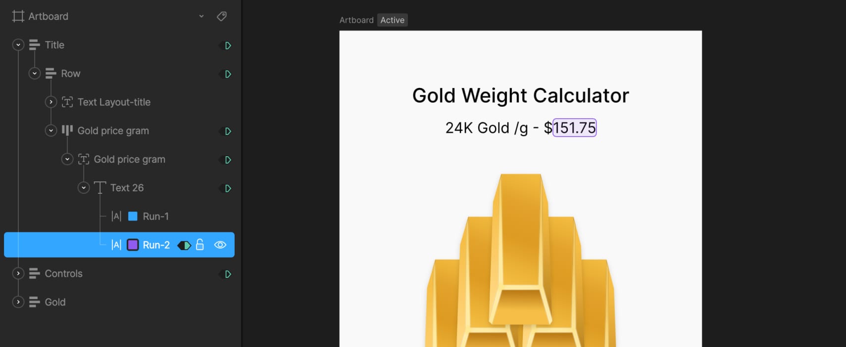
The title section includes a text layout made of two text runs: one holds static text like the label, while the other is dynamic and connected to external data using data binding. This allows the gold price to update in real time when the data changes.
In the controls section, we added plus and minus buttons to set the number of gold bars. These are simple layouts with icons inside. Below them, there are two buttons to switch between 5g and 10g options. They’re styled as rounded layouts with text inside.
In the state machine, two timelines define the tab states: one for when the 10g button is active, using a solid black background and white text, and another for 5g, with reversed styles. Switching between these two updates the active tab visually.
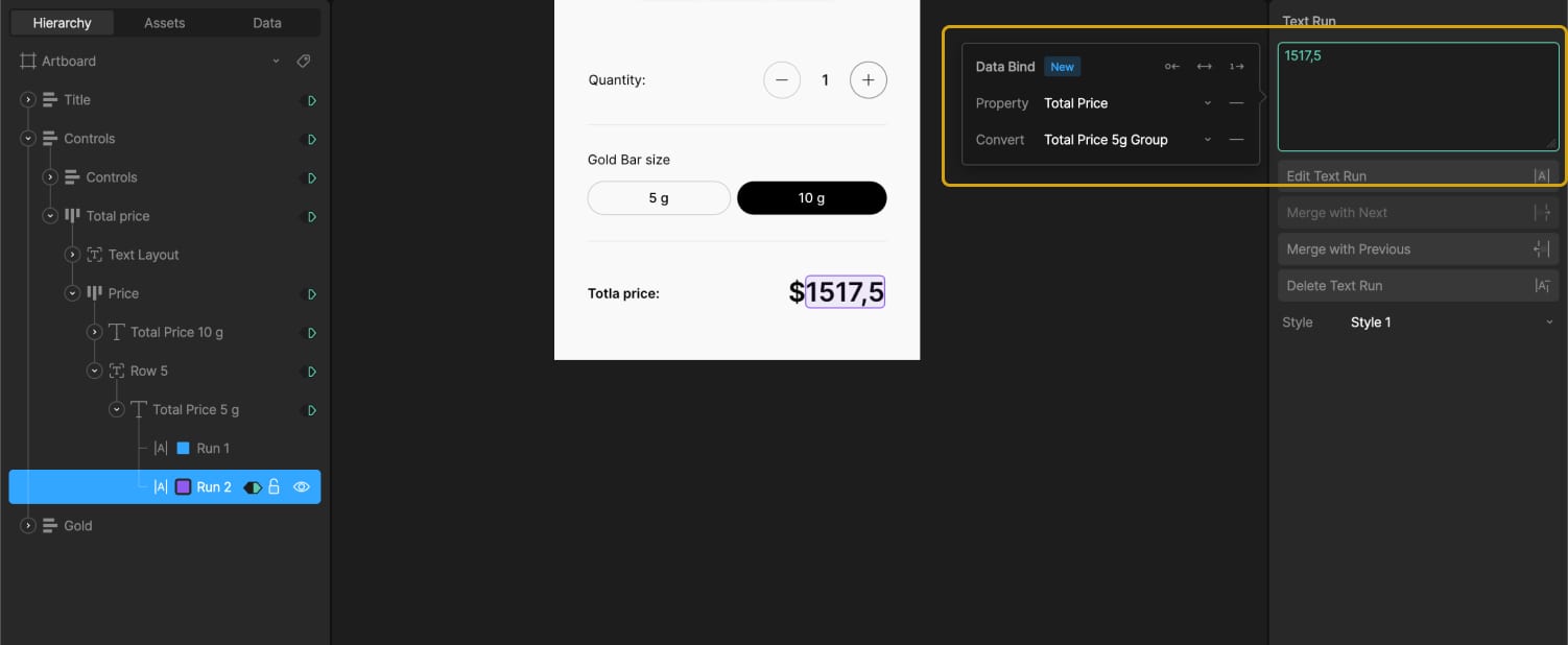
The total price section also uses two text runs — one for the currency icon and one for the total value. This value changes based on the selected weight and quantity, and is driven by data binding.
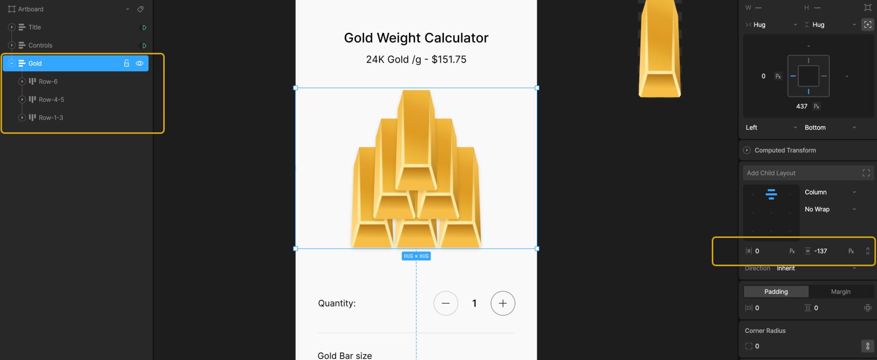
2. Gold Bar Illustration
The illustration is built using a nested artboard with a single vector gold bar. Inside the calculator layout, we duplicated this artboard to show anywhere from 1 to 6 bars depending on the user’s selection.
Since there are two weight options, we made the gold bar resize visually — wider for 10g and narrower for 5g. To do that, we used N-Slices so that the edges stay intact and only the middle stretches. The sliced group sits inside a fixed-size layout, and the artboard is set to Hug its contents, which lets it resize automatically.
Created two timelines to control bar size: one where the width is 88px for 10g, and another at 74px for 5g. The switch between them is controlled by a number variable called Size-gram gold, where 5g is represented by 0 and 10g by 1 with 1 set as the default value.
In the state machine, we connected this variable to the two timelines (the 10g timeline set as the default)— when it’s set to 0, the layout switches to 5g; when it’s 1, it switches to 10g. This makes the size update based on user selection without any manual switching. To keep the transition smooth, a 150ms animation duration is added.
3. Visualizing 1–6 Gold Bars
To show different quantities of gold bars in the main calculator layout, we created a tiered structure using three stacked layout groups with a vertical gap -137. Each tier is offset vertically to form a simple pyramid arrangement, with everything positioned in the bottom-left corner of the screen.
The first tier contains three duplicated nested artboards of a single gold bar. Each of these is wrapped in a Hug layout, which allows them to resize correctly based on the weight. The second tier includes two gold bars and an empty layout. This empty layout is used for spacing — it creates a visual shift when we need to display exactly four bars. The top tier has just one gold bar centered.
All three tiers are bottom-centered, which keeps the pyramid shape consistent as bars are added or removed.
To control how many bars are visible, we created 6 timelines in Animate mode — one for each quantity from 1 to 6. To hide or show each gold bar, two techniques are used: adjusting the opacity of the nested artboard (100% to show, 0% to hide) and modifying the layout that wraps it. When a bar is hidden, the layout is set to a fixed width of 0px; when visible, it uses Hug settings to restore its size automatically.
Each timeline has its own combination of these settings depending on which bars should appear. For example, in the timeline with 4 bars, we needed to prevent the fourth bar from jumping to the center of the row. To keep it properly spaced, we assigned a fixed width of 80px to the empty layout used for shifting. On the other timelines, that same layout is hidden by setting its width to 0px.
This system makes it easy to switch between quantities while preserving the visual structure.
4. State Machine and Data Binding Setup
With the visuals and layouts ready, we moved on to setting up the logic with data binding and state transitions.
4.1 External Gold Price
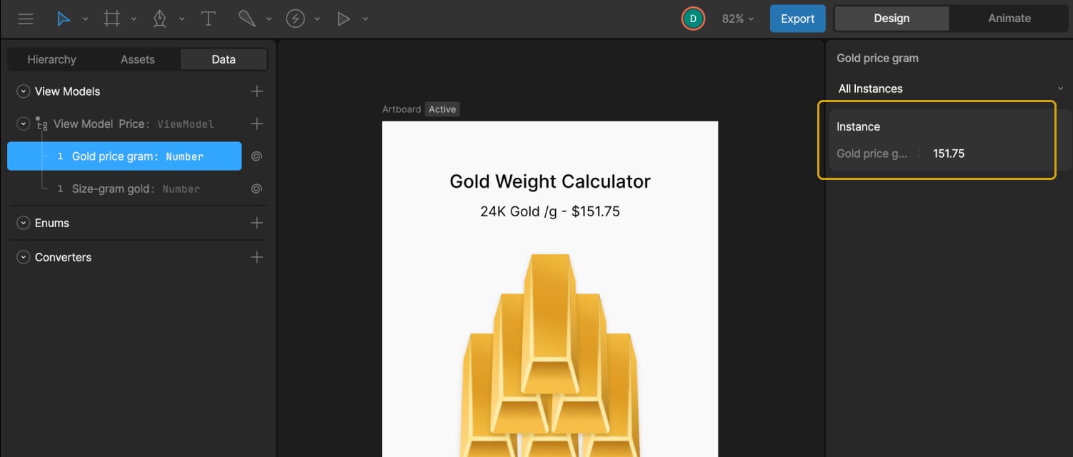
First, we created a number variable called Gold price gram. This value can be updated externally — for example, connected to a trading database — so the calculator always shows the current market price of gold. In our case, we used a static value of 151.75, which can also be updated manually by the user.
To display this in the UI, we bound Text Run 2 in the title layout to this variable. A converter in the Strings tab called “Convert to String Price” is then created and applied to that text run. This converter formats the number correctly for display and will be reused later.
4.2 Gold Bar Size Control
We already had a number variable called Size-gram gold, which controls the weight of the gold bar used in the nested artboard illustration.
In the Listeners panel, two listeners are created. The first is set to target the 5g tab, uses a Pointer Down action, and assigns Size-gram gold = 0. The second targets the 10g tab, also with a Pointer Down action, and assigns Size-gram gold = 1.
Next, two timelines (one for each tab state) are brought into the state machine. The 10g timeline is used as the default state, with transitions added: one from 10g to 5g when Size-gram gold = 0, and one back to 10g when Size-gram gold = 1. Each transition has a duration of 100ms to keep the switching smooth.
4.3 Gold Bar Quantity
Next, added another number variable, Quantity-gold, to track the number of selected bars. The default value is set to 1. In the Converters under Numeric, two “Calculate” converters are created — one that adds “+1” and one that subtracts “-1”.
In the Listeners panel, the plus button is assigned an action: Quantity-gold = Quantity-gold, using the “+1” converter. This way, clicking the plus button increases the count by 1. The same is done for the minus button, assigning Quantity-gold = Quantity-gold and attaching the “-1” converter. Clicking the minus button decreases the count by 1.
Inside the state machine, six timelines are connected to represent bar counts from 1 to 6. Each transition uses the Quantity-gold value to trigger the correct timeline.
By default, the plus button would keep increasing the value endlessly, but the goal is to limit the max to six bars. On the timeline where six gold bars are active, the plus button is disabled by setting its click area scale to 0 and lowering its opacity to create a “disabled” visual state. On all other timelines, those properties are returned to their active values.
The same logic is applied to the minus button to prevent values lower than one. On the timeline with one bar, the button is disabled, and on all others, it returns to its active state.
Almost there!
4.4 Total Price Logic
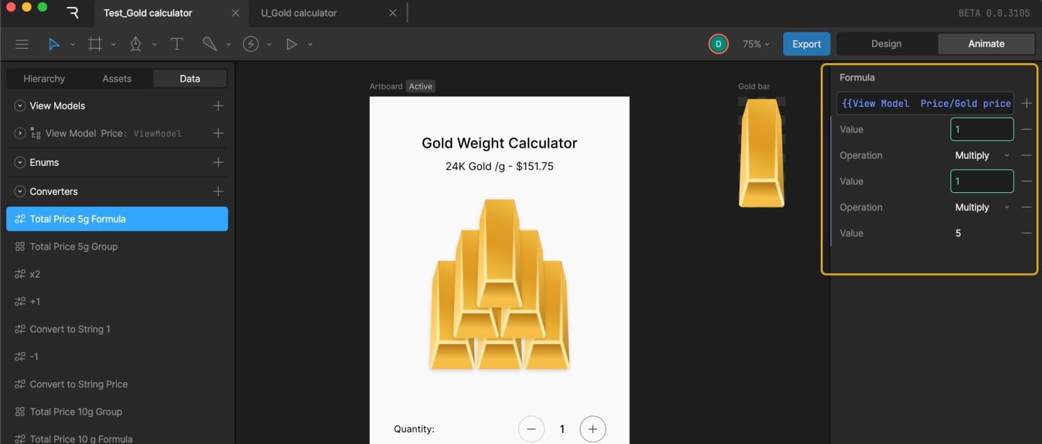
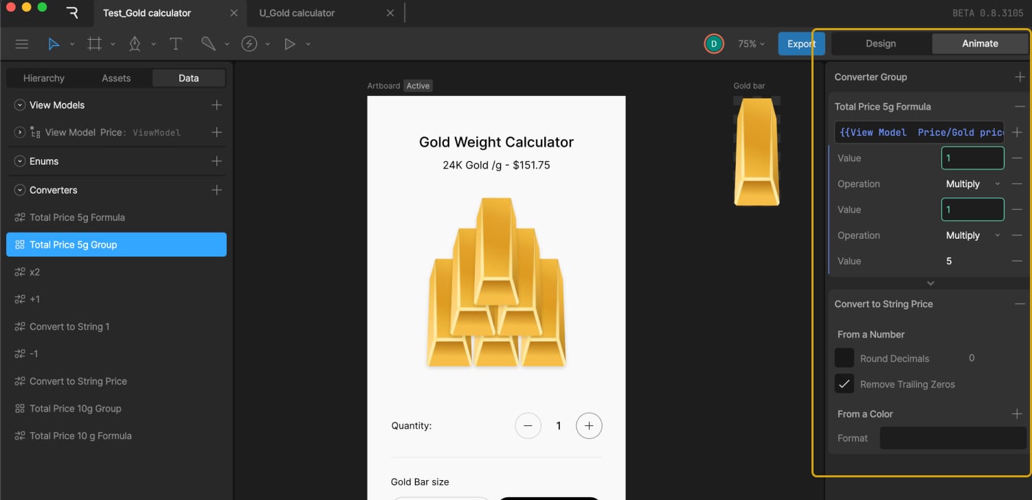
For the 5g bar price, we calculated it using this formula:
Total Price = Gold price gram + Quantity-gold * 5
In Converters → Numeric, a Formula converter was created and named Total Price 5g Formula to calculate the total price. In the example, it looked like:
{{View Model Price/Gold price gram}}*{{View Model Price/Quanity-gold}}*5.0
Since we needed to display this number as text, the Total Price number variable was also converted into a string. For that, we used an existing converter called “Convert to String Price.”
To use both converters together, a Group of converters was created and named Total Price 5g Group, which included the Total Price 5g Formula converter followed by the Convert to String Price converter.
Then, the text for the price variable was data bound by adding the Total Price variable in the Property field and selecting Total Price 5g Group in the Convert field.
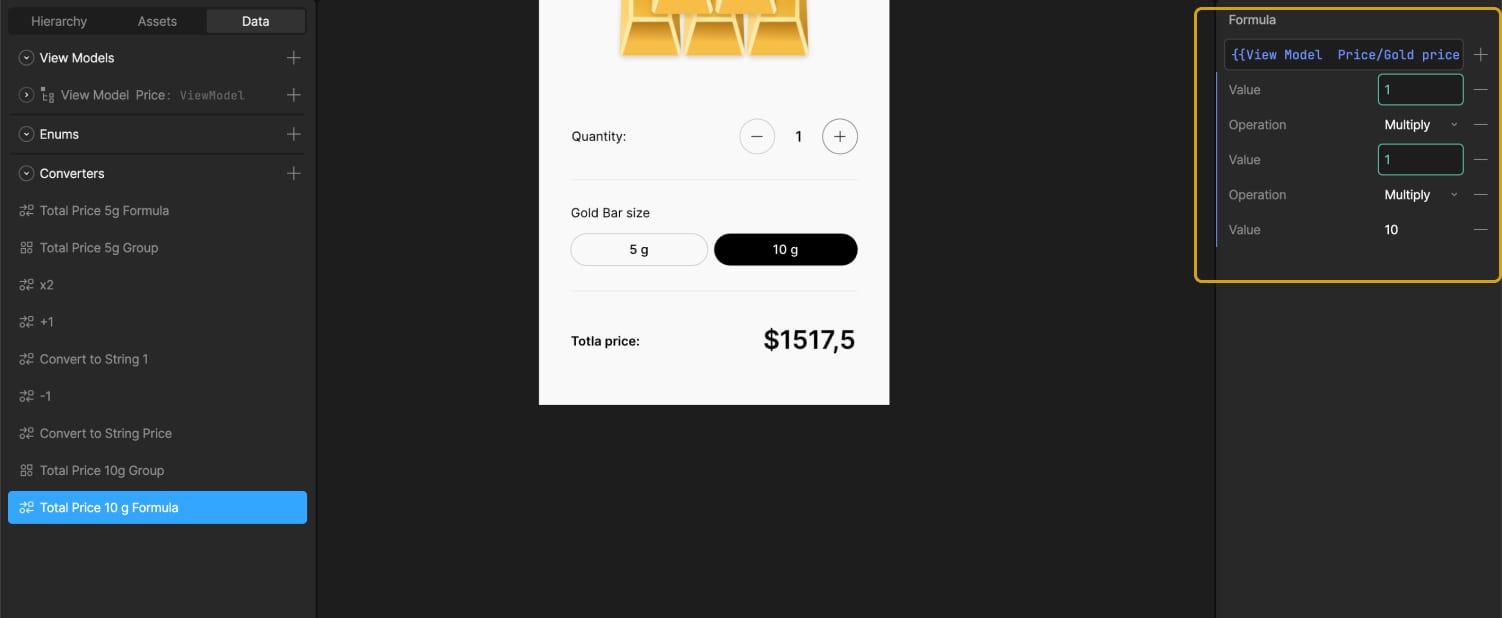
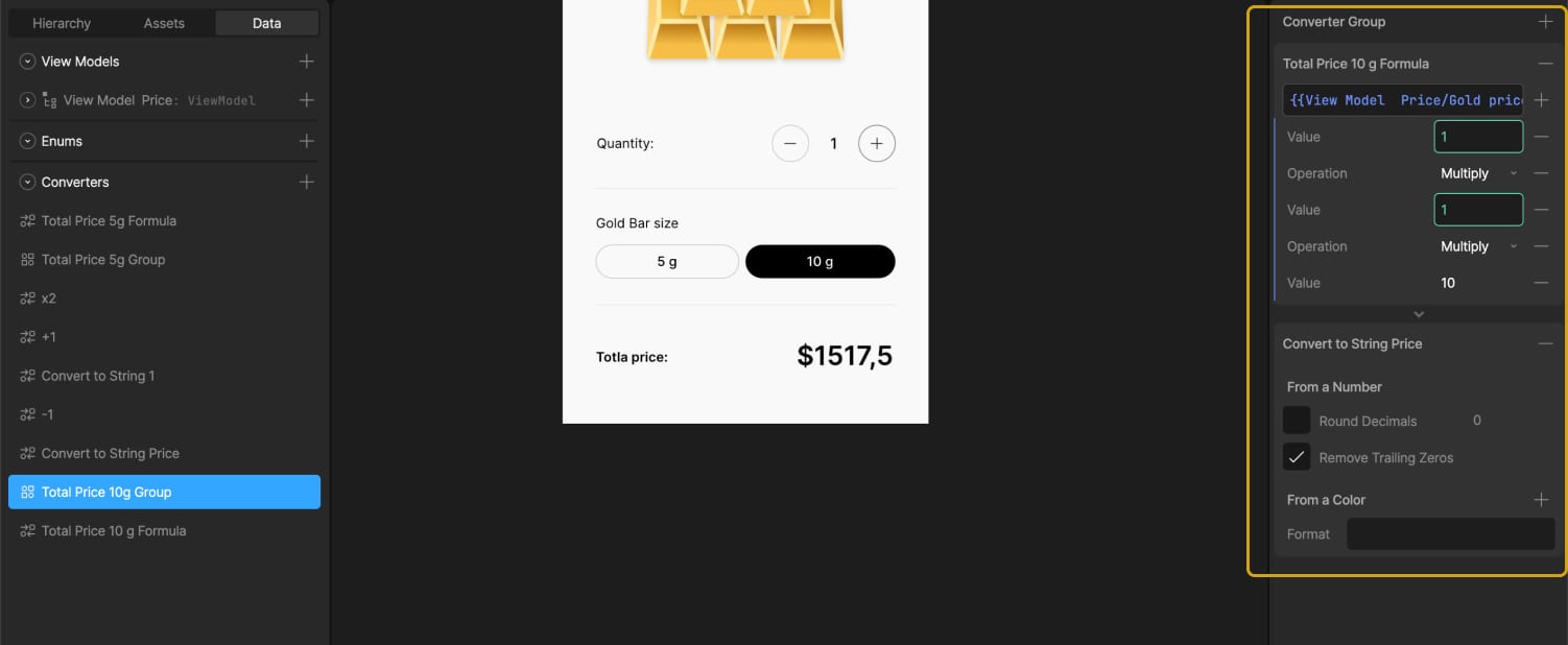
To handle the 10g case, which is double the price, two options are explored — either creating a new converter that multiplies by 10 or multiplying the existing result by 2.
Eventually, a second text element is added along with a new group of converters specifically for 10g. This includes a new formula:
Total Price = Gold price gram + Quantity-gold * 10
A formula converter and a group with both that formula and the string converter are created and named “Total Price 10g Group.”
Using timelines where the 5g and 10g buttons are in their active states, we adjusted the transparency of the text elements. This way, the total price connected to the 5g converters group is visible when the 5g button is selected, and the price from the 10g converters group appears when the 10g button is selected.
It works perfectly.
After this setup, the Gold price gram variable can be connected to live external data, allowing the gold price in the calculator to reflect the current market value in real time.
Wrapping Up
This gold calculator project is a simple example, but it shows how data binding in Rive can be used to connect visual design with real-time logic — without needing to jump between separate tools or write custom code. By combining state machines, variables, and converters, you can build interfaces that are not only animated but also smart and responsive.
Whether you’re working on a product UI, a prototype, or a standalone interactive graphic, Rive gives you a way to bring together motion and behavior in a single space. If you’re already experimenting with Rive, data binding opens up a whole new layer of possibilities to explore.
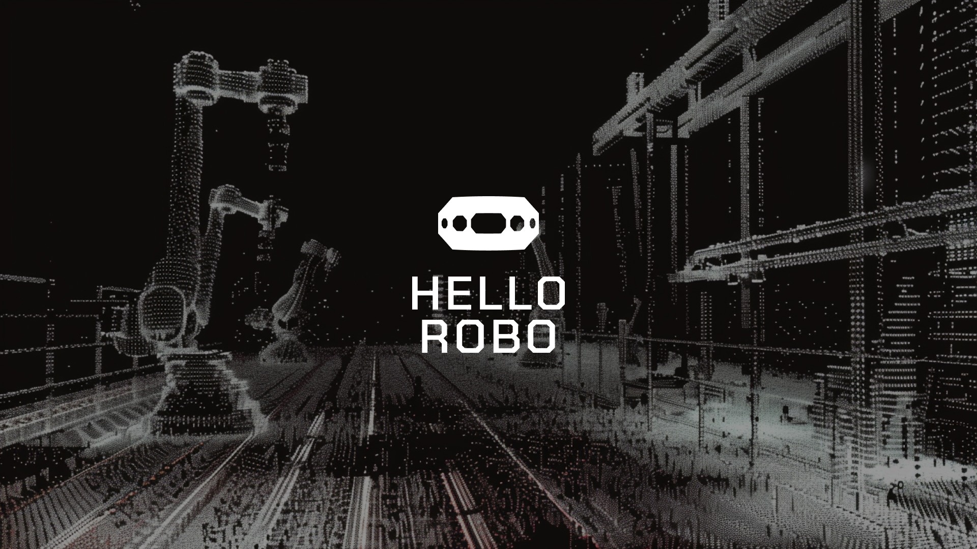
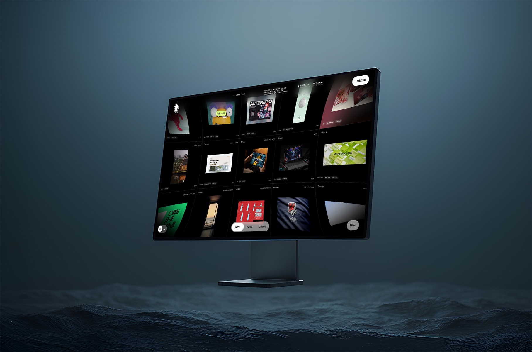
Hello Robo is a New York based digital product design agency that turns complex technology into intuitive, usable interfaces. We work with forward-thinking teams to create market-ready digital products that are easy to use and hard to ignore.
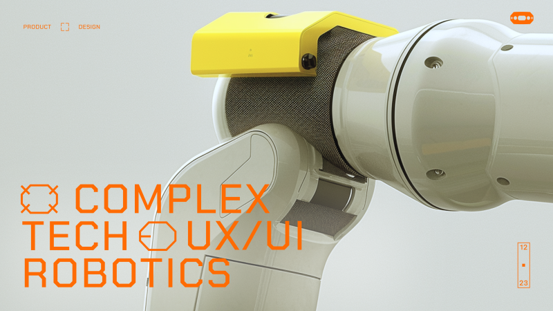
Earlier this year, the design team at Hello Robo decided to update our brand and website site to speak the language of our current clients — AI, space, aviation, and robotics — after realizing the old, “startup-y” look sold us short.
The new design and copy showcase our ability to tame complex systems with clear thinking and precise interfaces, signaling to deep-tech teams that we understand their world and can make their products make sense.
We wanted our site to do only 2 things but well:
Have the design language to appeal to our existing and new target clients
Most of our work is not allowed to be shared. Our second goal was to let design, motion and interaction give our visitors a sense of what we are great at.
Research
Before we sketching a single screen, our design lead on this project Daria Krauskopf, did what we do before we starting any project at Hello Robo. She decided to talk with our customers. We asked every existing client two questions:
What do you think we do?
What’s one thing you think we’re absolutely great at?
The replies were almost word-for-word:
“You do excellent product design—not crazy, unachievable vision design, and not MVPs either. You’re absolutely great at taking complex, technical systems and turning them into beautiful interfaces that our users actually love to use.”
That became the foundation for how we approached the new site.
Design & Art Direction
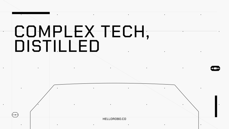
We love robots—and robotics inspires everything we do. For the new site, we moved away from soft colors and rounded corners and leaned into a more hi-tech visual language: dark backgrounds, thin lines, sharper shapes. Daria wanted the design to feel more precise, more engineered—something that would resonate with the kind of clients we work with in aviation, robotics, and defense. Every visual choice was about clarity, control, and intention.
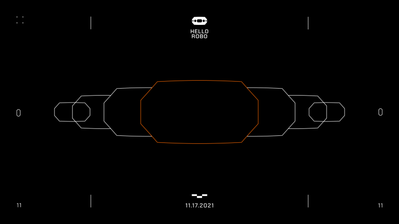
A few boards from Hello Robo new brand, reimagined by our design Hanna Shpak
Animation and Interaction
All of our interface work is rooted in interaction and motion—because real-world products aren’t static. They always change and respond to users input and actions. We wanted the site to reflect that. Not with flashy effects or distracting transitions, but with just enough subtle animation to guide, respond, and feel alive. Everything moves with purpose—quiet, responsive, and smooth.
Case Studies
We didn’t want our case studies to be just a scroll of pretty images. Each one is built as a story—showing not just what we made, but how it worked and why it mattered. We walk through key features, the thinking behind UX decisions, and the problems we solved for each client. It’s less about showing off visuals, and more about showing how we think.
Final words
In the end, we got what we set out to build: a clearer visual and verbal language that reflects who we are and who we work with. The site feels more aligned with the complexity and ambition of our clients—and with the way we approach design: thoughtful, precise, and grounded in real product work. It’s not trying to impress with noise. It’s built to resonate with the kind of teams who care about clarity, systems, and getting things right.
Hi, I’m Ivan—a Dubai-based designer focused on fintech products and branding. I run Moonsight, where we craft thoughtful digital experiences and sharp visual identities for financial companies around the world.
Background
My path into design wasn’t a childhood calling—I wasn’t drawing wireframes at age ten or dreaming of Helvetica (can you imagine XD). I just knew I didn’t want the typical office life. I wanted freedom, movement, and a way to create things that felt useful. Design turned out to be the sweet spot between independence and impact.
So I studied design at university by day, and took on agency work by night—what you might call the full-stack student hustle. That rhythm—study, work, repeat—taught me discipline. I also kept learning on the side, exploring tools, trends, and techniques to sharpen my craft.
Eventually, I found myself gravitating toward fintech.
Why fintech? Because it’s real. It’s personal. Everyone interacts with money. And when you build something that helps them feel more in control of it—you’re not just improving UX, you’re improving lives.
You’re designing trust. That’s a responsibility I take seriously.
From there, I explored both sides of the industry: in-house roles at product companies, and fast-paced agency work. Later, I shifted into consultancy—partnering with fintechs across Europe, the Gulf, and Asia. That chapter taught me a lot—not just about design, but about people, culture, and how different teams think about trust and money.
All of that led me to start Moonsight—a space where I could bring all those experiences together. Today, we partner with fintechs and financial companies to create sharp, useful, brand-led digital experiences. And while I still stay hands-on, I’m also building a team that’s just as obsessed with clarity, thoughtfulness, and execution as I am.
Featured Work
Monetto
A game-changer in the world of freelancing. Designed to simplify and elevate the financial journey for freelancers, Monetto is more than just an app – it’s a holistic solution that empowers creatives like me to manage their finances with confidence.
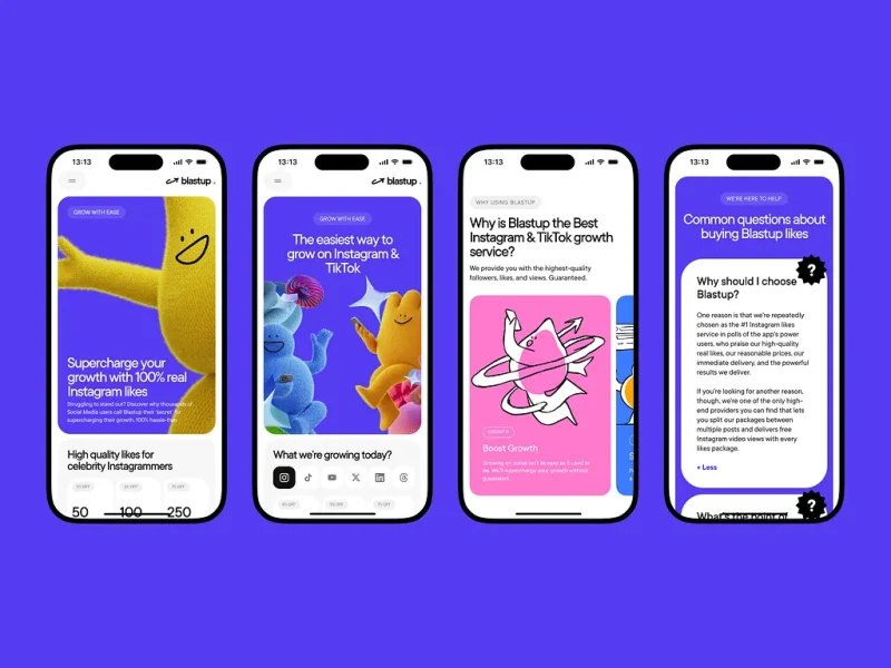
BlastUp
Blastup’s mission is simple—help users grow their social media presence, fast. We crafted a bold, dynamic identity that reflects Blastup’s energetic and friendly personality as well is their website.
Alinma Bank
This project for Alinma Bank involved a comprehensive redesign across all brand touchpoints: the logo, physical cards, website, and mobile app. The goal was to modernize and streamline the visual identity while maintaining the bank’s core values.
Coinly
Coinly is more than just a banking app — it’s a full-fledged financial literacy ecosystem for kids, designed to empower the next generation with money skills that grow with them. Built around an engaging coin mascot and a colorful 3D world, Coinly blends gamification, interactive storytelling, and real financial tools.
Design Philosophy
Design should be highly functional and intuitive, solving both business and user problems while delivering an engaging experience that users want to return to.
Design is clarity. And clarity builds trust.
Especially in fintech—where most of my projects happen—you don’t have the luxury of vague. Your design has to work, first and foremost. It has to feel smart, trustworthy, smooth. When people trust your interface, they trust your product. And when they trust your product, they’re more likely to use it again. That’s where design really proves its value.
My job is to make things useful first, beautiful second. But ideally, both at once.
The way I approach projects is structured but adaptable.
I start with full immersion—understanding the business, the audience, and the problem we’re solving. From there, I look for a unique angle, something that gives the product or brand a distinct voice. Then I push that idea as far as I can—visually, functionally, and emotionally.
And no, I don’t believe in reinventing everything 🙂
Use the patterns that work. But when something feels off or underwhelming, be bold enough to rethink it. That’s where the real creative work lives—not in chaos, but in considered evolution.
I don’t want to be known for a style. I want to be known for range.
For every project, I try to find a distinct visual language. That means experimenting—pulling in 3D, motion, illustration—whatever it takes to bring the concept to life.
And I rarely do it alone.
I collaborate closely with animators, developers, motion designers, illustrators—the kind of people who not only support the vision, but expand it. When everyone brings their strengths to the table, the result is always richer, sharper, more memorable.
What matters most is that the end result has presence. That it feels alive, intentional, and built with care.
And I care deeply about how work is presented. Every project—client or personal—is framed with context, rationale, and craft. Because good design solves problems, but great design tells a story.
Process In Bits
My process is structured, but not rigid. Usually, it looks something like this:
Polish and present Clear storytelling. Clean handoff. Confident rationale.
Understand the business What’s broken? What’s needed? What are we really solving?
Understand the user What do they expect? What’s familiar to them? What do they fear?
Build and iterate Fast feedback loops with clients and the team
One benchmark I use: if I don’t understand what I designed, how can I expect a user to?
For me, good design starts with intention. Every screen, every button, every microinteraction—there should be a reason it exists. So when a feature’s built, I walk through it in my head as if I’ve never seen it before. What would I click? What would I expect next? Can I explain what each part does without second-guessing?
After working on financial interfaces for so long, you start to internalize these flows—you almost know them by muscle memory. But that doesn’t mean you skip the test. You still go through each stage. You still assume nothing.
Sometimes, the best insights come from a teammate asking, “Wait, what does this do?” That’s your cue to look closer.
And when it comes to working with clients?
I walk clients through every stage—from moodboards to microinteractions—so there are no surprises and no last-minute pivots.
It’s about mutual trust: they trust my process, and I trust their vision.
This structure helps me manage expectations, prevent scope drift, and deliver thoughtful work—on time, without the drama.
What keeps me inspired? Looking outside the bubble.
I don’t have a list of designers I religiously follow. What inspires me is great work—wherever it lives. Sometimes it’s a slick piece of web design, sometimes a brutalist poster on the street, art style from a video game, or the typography on a jazz record sleeve.
Music plays a huge role in my creative life—I sing a bit, and I think that kind of rhythm and structure naturally finds its way into how I build interfaces.
I’m also a huge gamer, and I’m fascinated by how game mechanics influence user behavior. There’s a lot designers can learn from how games guide, reward, and surprise users.
Sometimes I’ll see a cool effect, a character design, or even just a motion detail and immediately think:
That could be the anchor for a whole experience
Not necessarily for the project I’m working on in the moment, but something I’d love to build around later. So I sort, I collect, I sketch.
I’m often looking for inspiration for one project, but bookmarking ideas for two or three others. It’s not just moodboarding—it’s pattern recognition, and planting seeds for future concepts.
Inspiration can come from anywhere—but only if you keep your eyes open.
What’s Next
Right now, I’m fully focused on building Moonsight into a studio known for bold, strategic fintech design—especially across the MENA region.
On my personal radar:
Master 3D
Launch my own product
Speak at more design events
Make Moonsight’s design Conference in Dubai happen
Join awwwards jury panel
Do more meaningful work
Mostly? Just grow. As a designer, a founder, and a creative
Parting Thoughts
If I could give one piece of advice to younger designers, it would be this:
Find what excites you. Stay obsessed with it. And don’t waste time comparing yourself to others.
We’re overexposed to each other’s work these days. It’s easy to feel behind.
But your only competition is yourself a year ago. That’s where growth lives.
This industry moves fast. But if you move with intent, your work will always find its place.
When building the basement studio site, we wanted to add 3D characters without compromising performance. We used instancing to render all the characters simultaneously. This post introduces instances and how to use them with React Three Fiber.
Introduction
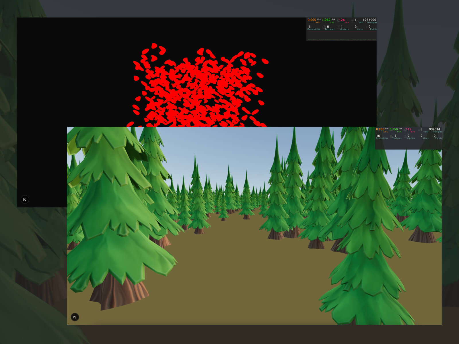
Instancing is a performance optimization that lets you render many objects that share the same geometry and material simultaneously. If you have to render a forest, you’d need tons of trees, rocks, and grass. If they share the same base mesh and material, you can render all of them in a single draw call.
A draw call is a command from the CPU to the GPU to draw something, like a mesh. Each unique geometry or material usually needs its own call. Too many draw calls hurt performance. Instancing reduces that by batching many copies into one.
Basic instancing
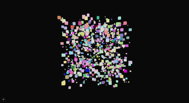
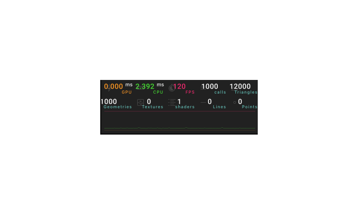
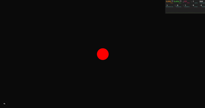
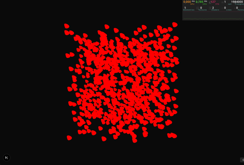
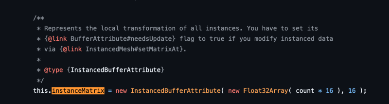
As an example, let’s start by rendering a thousand boxes in a traditional way, and let’s loop over an array and generate some random boxes:
If we add a performance monitor to it, we’ll notice that the number of “calls” matches our boxCount.
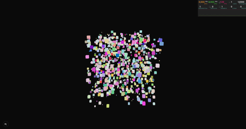
A quick way to implement instances in our project is to use drei/instances.
The Instances component acts as a provider; it needs a geometry and materials as children that will be used each time we add an instance to our scene.
The Instance component will place one of those instances in a particular position/rotation/scale. Every Instance will be rendered simultaneously, using the geometry and material configured on the provider.
What is happening here? We are sending the geometry of our box and the material just once to the GPU, and ordering that it should reuse the same data a thousand times, so all boxes are drawn simultaneously.
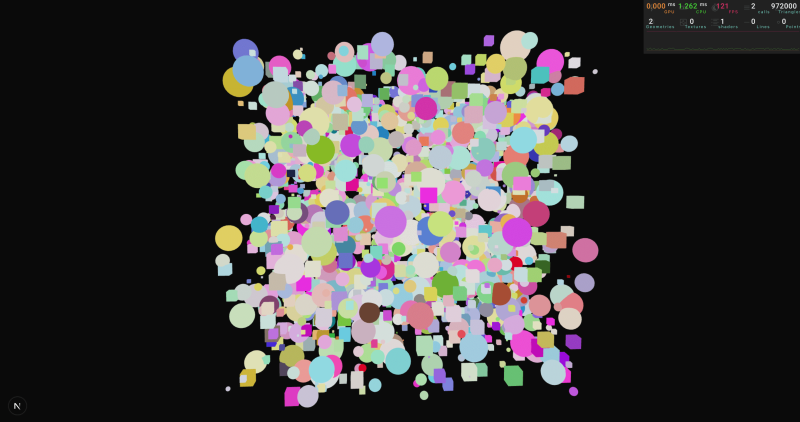
Notice that we can have multiple colors even though they use the same material because Three.js supports this. However, other properties, like the map, should be the same because all instances share the exact same material.
We’ll see how we can hack Three.js to support multiple maps later in the article.
Having multiple sets of instances
If we are rendering a forest, we may need different instances, one for trees, another for rocks, and one for grass. However, the example from before only supports one instance in its provider. How can we handle that?
The creteInstnace() function from drei allows us to create multiple instances. It returns two React components, the first one a provider that will set up our instance, the second, a component that we can use to position one instance in our scene.
Until now, all the examples have used Three.js’ built-in materials to add our meshes to the scene, but sometimes we need to create our own materials. How can we add support for instances to our shaders?
The code runs successfully, but all spheres are in the same place, even though we added different positions.
This is happening because when we calculated the position of each vertex in the vertexShader, we returned the same position for all vertices, all these attributes are the same for all spheres, so they end up in the same spot:
We managed to render all the blobs in different positions, but since the uniforms are shared across all instances, they all end up having the same animation.
To solve this issue, we need a way to provide custom information for each instance. We actually did this before, when we used the instanceMatrix to move each instance to its corresponding location. Let’s debug the magic behind instanceMatrix, so we can learn how we can create own instanced attributes.
Taking a look at the implementation of instancedMatrix we can see that it is using something called InstancedAttribute:
import { useGLTF } from "@react-three/drei"
import * as THREE from "three"
import { GLTF } from "three/examples/jsm/Addons.js"
// I always like to type the models so that they are safer to work with
interface TreeGltf extends GLTF {
nodes: {
tree_low001_StylizedTree_0: THREE.Mesh<
THREE.BufferGeometry,
THREE.MeshStandardMaterial
>
}
}
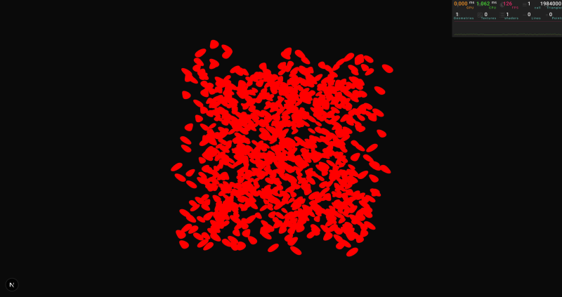
function Scene() {
// Load the model
const { nodes } = useGLTF(
"/stylized_pine_tree_tree.glb"
) as unknown as TreeGltf
return (
<group>
{/* add one tree to our scene */ }
<mesh
scale={0.02}
geometry={nodes.tree_low001_StylizedTree_0.geometry}
material={nodes.tree_low001_StylizedTree_0.material}
/>
</group>
)
}
(I added lights and a ground in a separate file.)
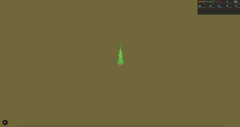
Now that we have one tree, let’s apply instancing.
Our entire forest is being rendered in only three draw calls: one for the skybox, another one for the ground plane, and a third one with all the trees.
To make things more interesting, we can vary the height and rotation of each tree:
There are some topics that I didn’t cover in this article, but I think they are worth mentioning:
Batched Meshes: Now, we can render one geometry multiple times, but using a batched mesh will allow you to render different geometries at the same time, sharing the same material. This way, you are not limited to rendering one tree geometry; you can vary the shape of each one.
Skeletons: They are not currently supported with instancing, to create the latest basement.studio site we managed to hack our own implementation, I invite you to read our implementation there.
Morphing with batched mesh: Morphing is supported with instances but not with batched meshes. If you want to implement it yourself, I’d suggest you read these notes.
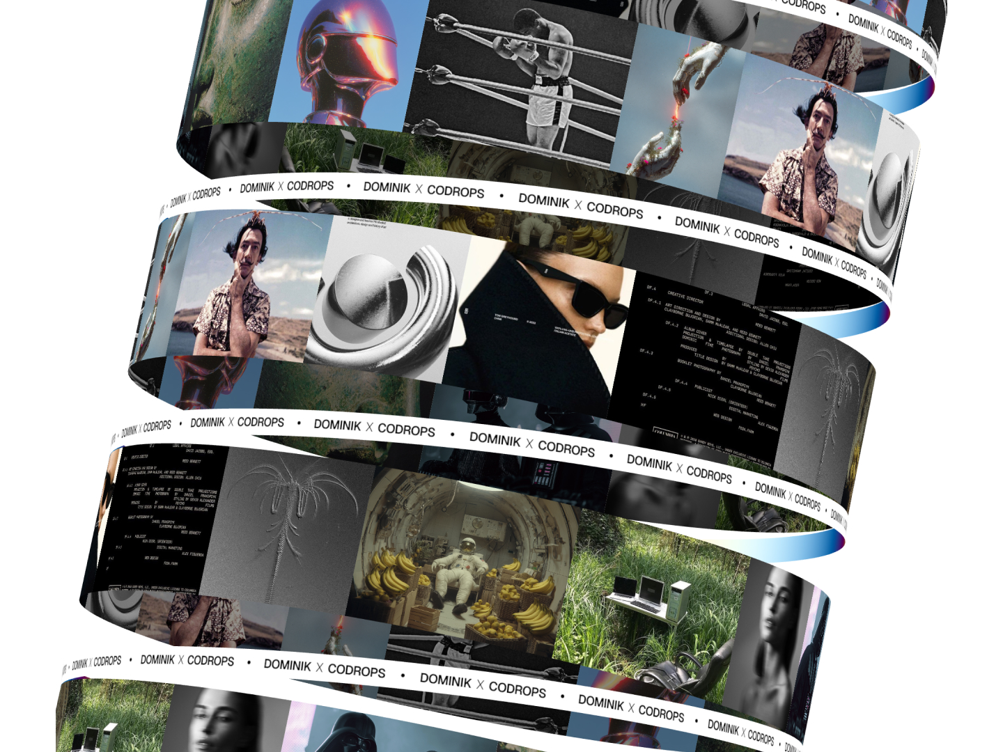
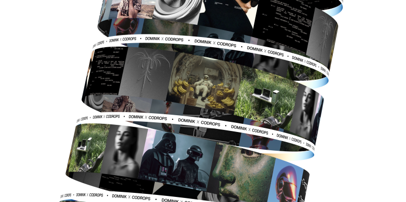
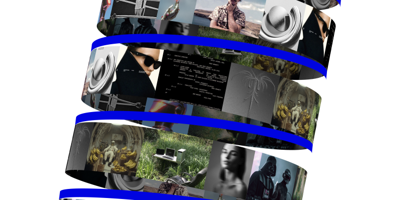
For the past few months, I’ve been exploring different kinetic motion designs with text and images. The style looks very intriguing, so I decided to create some really cool organic animations using images and React Three Fiber.
In this article, we’ll learn how to create the following animation using Canvas2D and React Three Fiber.
Setting Up the View & Camera
The camera’s field of view (FOV) plays a huge role in this project. Let’s keep it very low so it looks like an orthographic camera. You can experiment with different perspectives later. I prefer using a perspective camera over an orthographic one because we can always try different FOVs. For more detailed implementation check source code.
4. Add some rotation – Let’s rotate things a bit! First, I’ll hard-code the rotation of our banners to make them more curved and fit nicely with the Billboard component. We’ll also make the radius a bit bigger.
page.jsx
'use client';

import styles from './page.module.scss';
import Billboard from '@/components/webgl/Billboard/Billboard';
import Banner from '@/components/webgl/Banner/Banner';
import { View } from '@/webgl/View';
import { PerspectiveCamera } from '@react-three/drei';

const COUNT = 10;
const GAP = 3.2;

export default function Home() {
    return (
        <div className={styles.page}>
            <View className={styles.view} orbit={false}>
            <PerspectiveCamera makeDefault fov={7} position={[0, 0, 70]} near={0.01} far={100000} />
                <group>
                    {Array.from({ length: COUNT }).map((_, index) => [
                        <Billboard
                        key={`billboard-${index}`}
                        radius={5}
                        position={[0, (index - (Math.ceil(COUNT / 2) - 1)) * GAP, 0]}
                        rotation={[0, index * Math.PI * 0.5, 0]} // <-- rotation of the billboard
                        />,
                        <Banner
                        key={`banner-${index}`}
                        radius={5}
                        rotation={[0, 0, 0.085]} // <-- rotation of the banner
                        position={[0, (index - (Math.ceil(COUNT / 2) - 1)) * GAP - GAP * 0.5, 0]}
                        />,
                    ])}
                </group>
            </View>
        </div>
    );
}
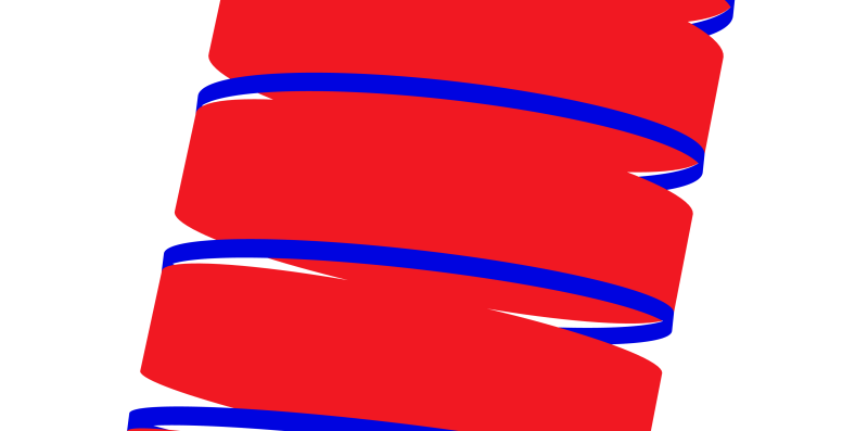
5. Tilt the whole thing – Now let’s rotate our entire group to make it look like the Leaning Tower of Pisa.
page.jsx
'use client';

import styles from './page.module.scss';
import Billboard from '@/components/webgl/Billboard/Billboard';
import Banner from '@/components/webgl/Banner/Banner';
import { View } from '@/webgl/View';
import { PerspectiveCamera } from '@react-three/drei';

const COUNT = 10;
const GAP = 3.2;

export default function Home() {
    return (
        <div className={styles.page}>
            <View className={styles.view} orbit={false}>
            <PerspectiveCamera makeDefault fov={7} position={[0, 0, 70]} near={0.01} far={100000} />
                <group rotation={[-0.15, 0, -0.2]}> // <-- rotate the group
                    {Array.from({ length: COUNT }).map((_, index) => [
                        <Billboard
                        key={`billboard-${index}`}
                        radius={5}
                        position={[0, (index - (Math.ceil(COUNT / 2) - 1)) * GAP, 0]}
                        rotation={[0, index * Math.PI * 0.5, 0]}
                        />,
                        <Banner
                        key={`banner-${index}`}
                        radius={5}
                        rotation={[0, 0, 0.085]}
                        position={[0, (index - (Math.ceil(COUNT / 2) - 1)) * GAP - GAP * 0.5, 0]}
                        />,
                    ])}
                </group>
            </View>
        </div>
    );
}
6. Perfect! – Our 3D shapes are all set up. Now we can add our images to them.
Creating a Texture from Our Images Using Canvas
Here’s the cool part: we’ll put all our images onto a canvas, then use that canvas as a texture on our Billboard shape.
To make this easier, I created some helper functions that simplify the whole process.
getCanvasTexture.js
import * as THREE from 'three';

/**
* Preloads an image and calculates its dimensions
*/
async function preloadImage(imageUrl, axis, canvasHeight, canvasWidth) {
    const img = new Image();

    img.crossOrigin = 'anonymous';

    await new Promise((resolve, reject) => {
        img.onload = () => resolve();
        img.onerror = () => reject(new Error(`Failed to load image: ${imageUrl}`));
        img.src = imageUrl;
    });

    const aspectRatio = img.naturalWidth / img.naturalHeight;

    let calculatedWidth;
    let calculatedHeight;

    if (axis === 'x') {
        // Horizontal layout: scale to fit canvasHeight
        calculatedHeight = canvasHeight;
        calculatedWidth = canvasHeight * aspectRatio;
        } else {
        // Vertical layout: scale to fit canvasWidth
        calculatedWidth = canvasWidth;
        calculatedHeight = canvasWidth / aspectRatio;
    }

    return { img, width: calculatedWidth, height: calculatedHeight };
}

function calculateCanvasDimensions(imageData, axis, gap, canvasHeight, canvasWidth) {
    if (axis === 'x') {
        const totalWidth = imageData.reduce(
        (sum, data, index) => sum + data.width + (index > 0 ? gap : 0), 0);

        return { totalWidth, totalHeight: canvasHeight };
    } else {
        const totalHeight = imageData.reduce(
        (sum, data, index) => sum + data.height + (index > 0 ? gap : 0), 0);

        return { totalWidth: canvasWidth, totalHeight };
    }
}

function setupCanvas(canvasElement, context, dimensions) {
    const { totalWidth, totalHeight } = dimensions;
    const devicePixelRatio = Math.min(window.devicePixelRatio || 1, 2);

    canvasElement.width = totalWidth * devicePixelRatio;
    canvasElement.height = totalHeight * devicePixelRatio;

    if (devicePixelRatio !== 1) context.scale(devicePixelRatio, devicePixelRatio);

    context.fillStyle = '#ffffff';
    context.fillRect(0, 0, totalWidth, totalHeight);
}

function drawImages(context, imageData, axis, gap) {
    let currentX = 0;
    let currentY = 0;

    context.save();

    for (const data of imageData) {
        context.drawImage(data.img, currentX, currentY, data.width, data.height);

        if (axis === 'x') currentX += data.width + gap;
        else currentY += data.height + gap;
    }

    context.restore();
}

function createTextureResult(canvasElement, dimensions) {
    const texture = new THREE.CanvasTexture(canvasElement);
    texture.needsUpdate = true;
    texture.wrapS = THREE.RepeatWrapping;
    texture.wrapT = THREE.ClampToEdgeWrapping;
    texture.generateMipmaps = false;
    texture.minFilter = THREE.LinearFilter;
    texture.magFilter = THREE.LinearFilter;

    return {
        texture,
        dimensions: {
            width: dimensions.totalWidth,
            height: dimensions.totalHeight,
            aspectRatio: dimensions.totalWidth / dimensions.totalHeight,
        },
    };
}

export async function getCanvasTexture({
    images,
    gap = 10,
    canvasHeight = 512,
    canvasWidth = 512,
    canvas,
    ctx,
    axis = 'x',
}) {
    if (!images.length) throw new Error('No images');

    // Create canvas and context if not provided
    const canvasElement = canvas || document.createElement('canvas');
    const context = ctx || canvasElement.getContext('2d');

    if (!context) throw new Error('No context');

    // Preload all images in parallel
    const imageData = await Promise.all(
        images.map((image) => preloadImage(image.url, axis, canvasHeight, canvasWidth))
    );

    // Calculate total canvas dimensions
    const dimensions = calculateCanvasDimensions(imageData, axis, gap, canvasHeight, canvasWidth);

    // Setup canvas
    setupCanvas(canvasElement, context, dimensions);

    // Draw all images
    drawImages(context, imageData, axis, gap);

    // Create and return texture result
    return createTextureResult(canvasElement, dimensions)
}
Then we can also create a useCollageTexture hook that we can easily use in our components.
Now let’s use our useCollageTexture hook on our page. We’ll create some simple loading logic. It takes a second to fetch all the images and put them onto the canvas. Then we’ll pass our texture and dimensions of canvas into the Billboard component.
page.jsx
'use client';

import styles from './page.module.scss';
import Billboard from '@/components/webgl/Billboard/Billboard';
import Banner from '@/components/webgl/Banner/Banner';
import Loader from '@/components/ui/modules/Loader/Loader';
import images from '@/data/images';
import { View } from '@/webgl/View';
import { PerspectiveCamera } from '@react-three/drei';
import { useCollageTexture } from '@/hooks/useCollageTexture';

const COUNT = 10;
const GAP = 3.2;

export default function Home() {
    const { texture, dimensions, isLoading } = useCollageTexture(images); // <-- getting the texture and dimensions from the useCollageTexture hook

    if (isLoading) return <Loader />; // <-- showing the loader when the texture is loading

    return (
        <div className={styles.page}>
            <View className={styles.view} orbit={false}>
                <PerspectiveCamera makeDefault fov={7} position={[0, 0, 100]} near={0.01} far={100000} />
                <group rotation={[-0.15, 0, -0.2]}>
                    {Array.from({ length: COUNT }).map((_, index) => [
                        <Billboard
                            key={`billboard-${index}`}
                            radius={5}
                            rotation={[0, index * Math.PI * 0.5, 0]}
                            position={[0, (index - (Math.ceil(COUNT / 2) - 1)) * GAP, 0]}
                            texture={texture} // <--passing the texture to the billboard
                            dimensions={dimensions} // <--passing the dimensions to the billboard
                        />,
                        <Banner
                            key={`banner-${index}`}
                            radius={5.035}
                            rotation={[0, 0, 0.085]}
                            position={[
                                0,
                                (index - (Math.ceil(COUNT / 2) - 1)) * GAP - GAP * 0.5,
                                0,
                            ]}
                        />,
                    ])}
                </group>
            </View>
        </div>
    );
}
Inside the Billboard component, we need to properly map this texture to make sure everything fits correctly. The width of our canvas will match the circumference of the cylinder, and we’ll center the y position of the texture. This way, all the images keep their resolution and don’t get squished or stretched.
Now let’s animate them using the useFrame hook. The trick to animating these images is to just move the X offset of the texture. This gives us the effect of a rotating mesh, when really we’re just moving the texture offset.
I think it would look even better if we made the back of the images a little darker. To do this, I created MeshImageMaterial – it’s just an extension of MeshBasicMaterial that makes our backface a bit darker.
MeshImageMaterial.js
import * as THREE from 'three';
import { extend } from '@react-three/fiber';

export class MeshImageMaterial extends THREE.MeshBasicMaterial {
    constructor(parameters = {}) {
        super(parameters);
        this.setValues(parameters);
    }

    onBeforeCompile = (shader) => {
        shader.fragmentShader = shader.fragmentShader.replace(
            '#include <color_fragment>',
            /* glsl */ `#include <color_fragment>
            if (!gl_FrontFacing) {
            vec3 blackCol = vec3(0.0);
            diffuseColor.rgb = mix(diffuseColor.rgb, blackCol, 0.7);
            }
            `
        );
    };
}

extend({ MeshImageMaterial });
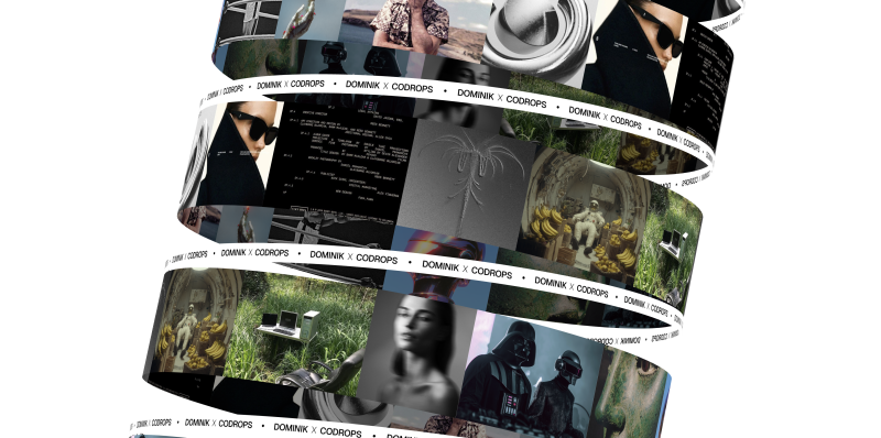
And now we have our images moving around cylinders. Next, we’ll focus on banners (or marquees, whatever you prefer).
Adding Texture to the Banner
The last thing we need to fix is our Banner component. I wrapped it with this texture. Feel free to take it and edit it however you want, but remember to keep the proper dimensions of the texture.
We simply import our texture using the useTexture hook, map it onto our material, and animate the texture offset just like we did in our Billboard component.
Billboard.jsx
'use client';

import * as THREE from 'three';
import bannerTexture from '@/assets/images/banner.jpg';
import { useTexture } from '@react-three/drei';
import { useFrame } from '@react-three/fiber';
import { useRef } from 'react';

function Banner({ radius = 1.6, ...props }) {
    const ref = useRef(null);

    const texture = useTexture(bannerTexture.src);
    texture.wrapS = texture.wrapT = THREE.RepeatWrapping;

    useFrame((state, delta) => {
        if (!ref.current) return;
        const material = ref.current.material;
        if (material.map) material.map.offset.x += delta / 30;
    });

    return (
        <mesh ref={ref} {...props}>
            <cylinderGeometry
                args={[radius, radius, radius * 0.07, radius * 80, radius * 10, true]}
            />
            <meshBasicMaterial
                map={texture}
                map-anisotropy={16}
                map-repeat={[15, 1]}
                side={THREE.DoubleSide}
                toneMapped={false}
                backfaceRepeatX={3}
            />
        </mesh>
    );
}

export default Banner;
Nice! Now we have something cool, but I think it would look even cooler if we replaced the backface with something different. Maybe a gradient? For this, I created another extension of MeshBasicMaterial called MeshBannerMaterial. As you probably guessed, we just put a gradient on the backface. That’s it! Let’s use it in our Banner component.
We replace the MeshBasicMaterial with MeshBannerMaterial and now it looks like this!
MeshBannerMaterial.js
import * as THREE from 'three';
import { extend } from '@react-three/fiber';

export class MeshBannerMaterial extends THREE.MeshBasicMaterial {
    constructor(parameters = {}) {
        super(parameters);
        this.setValues(parameters);

        this.backfaceRepeatX = 1.0;

        if (parameters.backfaceRepeatX !== undefined)

        this.backfaceRepeatX = parameters.backfaceRepeatX;
    }

    onBeforeCompile = (shader) => {
        shader.uniforms.repeatX = { value: this.backfaceRepeatX * 0.1 };
        shader.fragmentShader = shader.fragmentShader
        .replace(
            '#include <common>',
            /* glsl */ `#include <common>
            uniform float repeatX;

            vec3 pal( in float t, in vec3 a, in vec3 b, in vec3 c, in vec3 d ) {
                return a + b*cos( 6.28318*(c*t+d) );
            }
            `
        )
        .replace(
            '#include <color_fragment>',
            /* glsl */ `#include <color_fragment>
            if (!gl_FrontFacing) {
            diffuseColor.rgb = pal(vMapUv.x * repeatX, vec3(0.5,0.5,0.5),vec3(0.5,0.5,0.5),vec3(1.0,1.0,1.0),vec3(0.0,0.10,0.20) );
            }
            `
        );
    };
}

extend({ MeshBannerMaterial });
Banner.jsx
'use client';

import * as THREE from 'three';
import bannerTexture from '@/assets/images/banner.jpg';
import { useTexture } from '@react-three/drei';
import { useFrame } from '@react-three/fiber';
import { useRef } from 'react';
import '@/webgl/materials/MeshBannerMaterial';

function Banner({ radius = 1.6, ...props }) {
const ref = useRef(null);

const texture = useTexture(bannerTexture.src);

texture.wrapS = texture.wrapT = THREE.RepeatWrapping;

useFrame((state, delta) => {
    if (!ref.current) return;

    const material = ref.current.material;

    if (material.map) material.map.offset.x += delta / 30;
});

return (
    <mesh ref={ref} {...props}>
        <cylinderGeometry
            args={[radius, radius, radius * 0.07, radius * 80, radius * 10, true]}
        />
        <meshBannerMaterial
            map={texture}
            map-anisotropy={16}
            map-repeat={[15, 1]}
            side={THREE.DoubleSide}
            toneMapped={false}
            backfaceRepeatX={3}
        />
    </mesh>
);
}

export default Banner;
You can experiment with this method in lots of ways. For example, I created 2 more examples with shapes I made in Blender, and mapped canvas textures on them. You can check them out here:
Final Words
Check out the final versions of all demos:
I hope you enjoyed this tutorial and learned something new!
Feel free to check out the source code for more details!
In today’s oversaturated landscape of production service companies vying for attention, Bloom Paris TV approached our studio with an extraordinarily bold ambition: to distinguish themselves through an uncompromising combination of refined style and substantive expertise. Strategically positioned in the cultural and creative heart of Paris, Bloom offers international productions comprehensive and seamless on-the-ground support throughout France — meticulously handling everything from complex technical logistics to complex administrative workflows and regulatory requirements.
But what truly sets Bloom apart is that they don’t merely facilitate shoots — they orchestrate them with exceptional precision, artistic vision, and unwavering reliability. In an industry where every minute counts, their discerning clients demand speed without sacrificing quality, complete trust in execution, and uncompromising excellence at every touchpoint. Bloom consistently delivers all three elements — seemingly effortlessly and with characteristic French sophistication.
Our mission became crystal clear: design and develop a digital experience that authentically reflects the remarkable sharpness of their creative eye, the methodical structure of their production process, and the sophisticated elegance of their flawless execution across every project they undertake.
The Concept
We approached the website design with one unambiguous and defining intention: make an immediate, memorable impact upon first impression.
Operating in a fast-paced industry where critical decisions are often made in mere seconds, we recognized that the digital experience needed to be simultaneously bold, fluid, and instantaneously engaging. Our strategic approach centered on minimalism with deliberate intent — methodically stripping away all superfluous elements while preserving only the absolute essentials, then thoughtfully amplifying Bloom’s distinctive core identity throughout the interface.
At the conceptual heart of Bloom’s sophisticated logo lies a deceptively simple dot — subtle in appearance yet powerful in significance. We strategically extended this symbolic element across the entire user interface: integrating it within interactive buttons, intuitive navigation elements, typographic superscripts, and responsive interaction states. This visual motif evolved into the unifying thread throughout the experience, functioning as a recurring punctuation mark that guides users through a clean, cinematic narrative journey.
Typography & Color System
After careful consideration, we selected a commanding, contemporary sans-serif typeface specifically chosen to convey professional confidence and exceptional clarity. This distinctive font effectively anchors the entire site within a precisely calibrated, almost editorial layout structure — creating a harmonious balance between the dynamically asymmetric grid system and the meticulously structured, authoritative tone of voice that characterizes Bloom’s communication style.
The carefully curated color palette features a sophisticated high-contrast dialogue between rich soft black and warm, inviting light grey, consciously avoiding the harshness of traditional monochrome combinations. A strategically placed vibrant yellow accent punctuates key interactive elements throughout the interface — subtly referencing cinematic film titles and professional cue markers, while simultaneously introducing a welcome sense of warmth, energy and approachability to the otherwise restrained interface design.
Technology Stack
Beneath the visually striking surface, the site is meticulously constructed with a powerful combination of technologies:
WordPress implemented as a robust, infinitely customizable content management system, providing Bloom with comprehensive control over their content strategy and presentation
GSAP for implementing buttery-smooth, cinematically-inspired animations and seamless page transitions throughout the experience
Custom-developed SVG masking techniques meticulously crafted to achieve elegantly seamless panel-based transitions between content sections
A fully responsive, thoroughly performance-optimized front-end architecture that ensures consistent excellence across all devices and connection speeds
Loader & Page Transitions
From the earliest conceptual discussions, we were determined to ensure that every transition moment within the experience would feel authentically cinematic and emotionally resonant.
Each individual page opens with a dynamically animated panel that dramatically reveals the upcoming section title with a sweeping, theatrical gesture. This carefully choreographed visual sequence not only significantly enhances user orientation within the site architecture, but deliberately sets the sophisticated tone for a fluid, immersive journey through Bloom’s professional world.
The distinctive homepage loader was specifically designed to create instant emotional resonance and connection: a fullscreen mask elegantly opens to dramatically reveal Bloom’s captivating showreel — creating an unforgettable first impression that immediately communicates their production capabilities. Thoughtfully combined with an interactive progress indicator, this element transforms into an engaging interactive curtain, gracefully inviting users to step into Bloom’s compelling narrative universe.
Project Grid & Hover States
Throughout the portfolio section, Bloom’s impressive projects are presented within a sophisticated asymmetric editorial grid structure, deliberately breaking the predictable monotony of conventional layouts while thoughtfully echoing the dynamic rhythm of visual storytelling. Individual content sizes and positions shift intuitively throughout the composition, creating intentional moments of both contemplative pause and energetic flow.
During user interaction, the signature dot elegantly reappears as an intuitive focus indicator, while a smoothly animated marquee title gracefully glides over the preview image — simultaneously drawing attention and adding perceptual depth to the experience. This carefully considered combination creates a remarkably tactile, multi-layered effect that meaningfully rewards user interaction without overwhelming the visual hierarchy or distracting from the exceptional quality of Bloom’s project portfolio.
Footer
Thoughtfully designed as a final memorable touchpoint rather than an afterthought, the site’s footer functions as much more than a mere sign-off — it serves as an compelling invitation to further engagement.
The footer section artfully reprises elements from the initial showreel presentation, elegantly contained within a precisely masked frame that maintains consistent visual language throughout the experience. Both functionally informative and poetically expressive, this distinctive footer ensures that Bloom’s powerful brand experience lingers in the user’s memory — even long after the final scroll action concludes their immediate journey.
Who We Are
We proudly define ourselves as a specialized digital design studio operating at the fascinating intersection of compelling narrative, intuitive interaction design, and cutting-edge technology implementation. We fundamentally believe in the transformative power of crafting digital interfaces that move with deliberate intention and purpose, thoughtfully combining minimalist aesthetic principles with boldly distinctive creative identity expressions.
With each project we undertake, we consistently strive to create memorable digital experiences that communicate with exceptional clarity, move with captivating beauty, and feel genuinely alive and responsive to human interaction.
Interactive web animations have become essential for modern websites, but choosing the right implementation approach can be challenging. CSS, Video and JavaScript are the familiar methods and each certainly has its place in a developer’s toolkit. When you need your site to have unique custom interactions (while remaining light and performant, of course), that’s where Rive shines.
Rive animations, whether vector or raster, look crisp at any size, are lightweight (often smaller than equivalent Lottie files), and can respond to user interactions and real-time data through a straightforward JavaScript API.
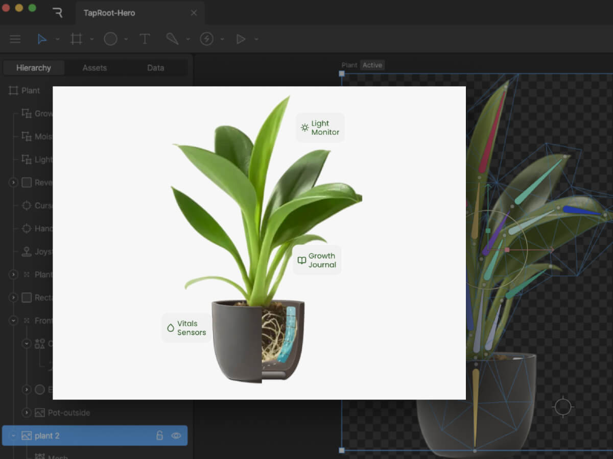
This tutorial will walk you through Rive’s workflow and implementation process using three practical examples. We’ll build them step-by-step using a fictional smart plant care company called “TapRoot” as our case study, so you can see exactly how Rive fits into a real development process and decide if it’s right for your next project.
There are countless ways to use Rive, but we’ll focus on these three patterns:
Animated Hero Images create an immediate emotional connection and brand personality
Interactive CTAs increase conversion rates by providing clear, satisfying feedback
Flexible Layouts combine elements into an experience that works at any size
Each pattern builds on the previous one, teaching you progressively more sophisticated Rive techniques while solving real-world UX challenges.
Pattern 1: The Living Hero Image
The Static Starting Point
A static hero section for TapRoot could feature a photo of their smart plant pot with overlay text. It show’s the product, but we can do better.
Creating the Rive Animation
Let’s create an animated version that transforms this simple scene into a revealing experience that literally shows what makes TapRoot “smarter than it looks.” The animation features:
Gently swaying leaves: Constant, subtle motion brings a sense of life to the page.
Interior-reveal effect: Hovering over the pot reveals the hidden root system and embedded sensors
Product Feature Callouts: Key features are highlighted with interactive callouts
Although Rive is vector-based, you can also import JPG, PNG, and PSD files. With an embedded image, a mesh can be constructed and a series of bones can be bound to it. Animating the bones gives the subtle motion of the leaves moving. We’ll loop it at a slow speed so the motion is noticeable, but not distracting.
Adding Interactivity
Next we’ll add a hover animation that reveals the inside of the pot. By clipping the image of the front of the pot to a rectangle, we can resize the shape to reveal the layers underneath. Using a joystick allows us to have an animation follow the cursor when it’s in within the hit area of the pot and snap back to normal when the cursor leaves the area.
Feature Callouts
With a nested artboard, it is easy to build a single layout to create multiple versions of an element. In this case, a feature callout has an updated icon, title, and short description for three separate features.
The Result
What was once a simple product photo is now an interactive revelation of TapRoot’s hidden intelligence. The animation embodies the brand message—”smarter than it looks”—by literally revealing the sophisticated technology beneath a beautifully minimal exterior.
Pattern 2: The Conversion-Boosting Interactive CTA
Beyond the Basic Button
Most CTAs are afterthoughts—a colored rectangle with text. But your CTA is often the most important element on your page. Let’s make it irresistible.
Idle State: Clean, minimal button with an occasional “shine” animation
Hover State: Fingerprint icon begins to follow the cursor
Click State: An animated “tap” of the button
Pattern 3: Flexible Layout
Next we can combine the elements into a responsive animated layout that works on any device size. Rive’s layout features familiar row and column arrangements and lets you determine how your animated elements fit within areas as they resize.
The web is becoming more interactive and alive. By understanding how to implement Rive animations—from X-ray reveals to root network interactions—you’re adding tools that create experiences users remember and share.
The difference between a good website and a great one often comes down to these subtle details: the satisfying feedback of a button click, the smooth transition between themes, the curiosity sparked by hidden technology. These micro-interactions connect with users on an emotional level while providing genuine functional value.
From the outset, we knew we wanted something that subverted any conventional agency website formulas. Instead,
inspired by the unseen energy that drives creativity, connection and transformation, we arrived at the idea of invisible forces
. Could we take the powerful yet intangible elements that shape our world—motion, emotion, intuition, and
inspiration—and manifest them in a digital space?
We were excited about creating something that included many custom interactions and a very experiential feel. However,
our concern was picking a set of tools that would allow most of our developers to contribute to and maintain the site
after launch.
We chose to start from a Next / React base, as we often do at Phantom. React also has the advantage of being
compatible with the excellent React Three Fiber library, which we used to seamlessly bridge the gap between our DOM
components and the WebGL contexts used across the site. For styles, we are using our very own CSS components
as well as SASS.
For interactive behaviours and animation, we chose to use GSAP for two main reasons. Firstly, it contains a lot of
plugins we know and love, such as SplitText, CustomEase and ScrollTrigger. Secondly, GSAP allows us to use a single
animation framework across DOM and WebGL components.
We could go on and on talking about the details behind every single animation and micro-interaction on the site, but
for this piece we have chosen to focus our attention on two of the most unique components of our site: the homepage
grid and the scrollable employee face particle carousel.
The Homepage Grid
It took us a very long time to get this view to perform and feel just how we wanted it to. In this article, we will focus on the interactive part. For more info on how we made things performant, head to our previous article: Welcome back to Phantomland
Grid View
The project’s grid view is integrated into the homepage by incorporating a primitive Three.js object into a React
Three Fiber scene.
We initially wanted to write all the code for the grid using React Three Fiber but realised that, due to the
complexity of our grid component, a vanilla Three.js
class would be easier to maintain.
One of the key elements that gives our grid its iconic feel is our post-processing distortion effect. We implemented
this feature by creating a custom shader pass within our post-processing pipeline:
When the grid transitions in and out on the site, the distortion intensity changes to make the transition feel
natural. This animation is done through a simple tween in our DistortionShader
class:
We also added a vignette effect to our post-processing shader to darken the corners of the viewport, focusing the
user’s attention toward the center of the screen.
In order to make our home view as smooth as possible, we also spent a fair amount of time crafting the
micro-interactions and transitions of the grid.
Ambient mouse offset
When the user moves their cursor around the grid, the grid moves slightly in the opposite direction, creating a very
subtle ambient floating effect. This was simply achieved by calculating the mouse position on the grid and moving the
grid mesh accordingly:
getAmbientCursorOffset() {
  // Get the pointer coordinates in UV space ( 0 - 1 ) range
  const uv = this.navigation.pointerUv;
  const offset = uv.subScalar(0.5).multiplyScalar(0.2);
  return offset;
}

update() {
  ...
  // Apply cursor offset to grid position
  const cursorOffset = getAmbientCursorOffset();
  this.mesh.position.x += cursorOffset.x;
  this.mesh.position.y += cursorOffset.y;
}
Drag Zoom
When the grid is dragged around, a zoom-out effect occurs and the camera seems to pan away from the grid. We created
this effect by detecting when the user starts and stops dragging their cursor, then using that to trigger a GSAP
animation with a custom ease for extra control.
Last but not least, when the user drags across the grid and releases their cursor, the grid slides through with a
certain amount of inertia.
drag(offset: Vector2) {
  this.dragAction = offset;

  // Gradually increase velocity with drag time and distance
  this.velocity.lerp(offset, 0.8);
}

// Every frame
update() {
  // positionOffset is later used to move the grid mesh
  if(this.isDragAction) {
    // if the user is dragging their cursor, add the drag value to offset
    this.positionOffset.add(this.dragAction.clone());
  } else {
    // if the user is not dragging, add the velocity to the offset
    this.positionOffset.add(this.velocity);
  }

  this.dragAction.set(0, 0);
  // Attenuate velocity with time
  this.velocity.lerp(new Vector2(), 0.1);
}
Face Particles
The second major component we want to highlight is our employee face carousel, which presents team members through a
dynamic 3D particle system. Built with React Three Fiber’s BufferGeometry
and custom GLSL shaders, this implementation leverages custom shader materials for lightweight performance and
flexibility, allowing us to generate entire 3D face representations using only a 2D colour photograph and its
corresponding depth map—no 3D models required.
Core Concept: Depth-Driven Particle Generation
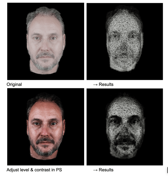
The foundation of our face particle system lies in converting 2D imagery into volumetric 3D representations. We’ve
kept things efficient, with each face using only two optimized 256×256 WebP images (under 15KB each).
To capture the images, each member of the Phantom team was 3D scanned using RealityScan
from Unreal Engine on iPhone, creating a 3D model of their face.
These scans were cleaned up and then rendered from Cinema4D with a position and colour pass.
The position pass was converted into a greyscale depth map in Photoshop, and this—along with the colour pass—was
retouched where needed, cropped, and then exported from Photoshop to share with the dev team.
Each face is constructed from approximately 78,400 particles (280×280 grid), where each particle’s position and
appearance is determined by sampling data from our two source textures.
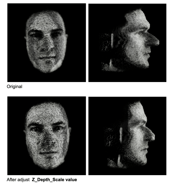
The depth map provides normalized values (0–1) that directly translate to Z-depth positioning. A value of 0 represents
the furthest point (background), while 1 represents the closest point (typically the nose tip).
/* vertex shader */

// sample depth and color data for each particle
vec3 depthTexture1 = texture2D(depthMap1, vIndex.xy).xyz;

// convert depth to Z-position
float zDepth = (1. - depthValue.z);
pos.z = (zDepth * 2.0 - 1.0) * zScale;
Dynamic Particle Scaling Through Colour Analysis
One of the key methods that brings our faces to life is utilizing colour data to influence particle scale. In our
vertex shader, rather than using uniform particle sizes, we analyze the colour density of each pixel so that brighter,
more colourful areas of the face (like eyes, lips, or well-lit cheeks) generate larger, more prominent particles,
while darker areas (shadows, hair) create smaller, subtler particles. The result is a more organic, lifelike
representation that emphasizes facial features naturally.
/* vertex shader */

vec3 colorTexture1 = texture2D(colorMap1, vIndex.xy).xyz;

// calculate color density
float density = (mainColorTexture.x + mainColorTexture.y + mainColorTexture.z) / 3.;

// map density to particle scale
float pScale = mix(pScaleMin, pScaleMax, density);
The calibration below demonstrates the influence of colour (contrast, brightness, etc.) on the final 3D particle formation.
Ambient Noise Animation
To prevent static appearances and maintain visual interest, we apply continuous noise-based animation to all
particles. This ambient animation system uses curl noise to create subtle, flowing movement across the entire
face structure.
To add visual interest during transitions, we further inject additional noise that’s strongest at the midpoint of the
transition. This creates a subtle “disturbance” effect where particles temporarily deviate from their target
positions, making transitions feel more dynamic and organic.
To enhance the three-dimensional perception, we implemented a custom depth of field effect directly in our shader
material. It calculates view-space distance for each particle and modulates both opacity and size based on proximity
to a configurable focus plane.
One of the challenges we faced was achieving visual consistency across different team members’ photos. Each photograph
was captured under slightly different conditions—varying lighting, camera distances, and facial proportions.
Therefore, we went through each face to calibrate multiple scaling factors:
Depth scale calibration
to ensure no nose protrudes too aggressively
Colour density balancing
to maintain consistent particle size relationships
Focus plane optimization
to prevent excessive blur on any individual face
Our face particle system demonstrates how simple yet careful technical implementation can create fun visual
experiences from minimal assets. By combining lightweight WebP textures, custom shader materials, and animations,
we’ve created a system that transforms simple 2D portraits into interactive 3D figures.