One of the best ways to learn is by recreating an interaction you’ve seen out in the wild and building it from scratch. It pushes you to notice the small details, understand the logic behind the animation, and strengthen your problem-solving skills along the way.
So today we’ll dive into rebuilding the smooth, draggable product grid from the Palmer website, originally crafted by Uncommon with Kevin Masselink, Alexis Sejourné, and Dylan Brouwer. The goal is to understand how this kind of interaction works under the hood and code the basics from scratch.
Along the way, you’ll learn how to structure a flexible grid, implement draggable navigation, and add smooth scroll-based movement. We’ll also explore how to animate products as they enter or leave the viewport, and finish with a polished product detail transition using Flip and SplitText for dynamic text reveals.
Let’s get started!
Grid Setup
The Markup
Let’s not try to be original and, as always, start with the basics. Before we get into the animations, we need a clear structure to work with — something simple, predictable, and easy to build upon.
What we have here is a .container that fills the viewport, inside of which sits a .grid divided into vertical columns. Each column stacks multiple .product elements, and every product wraps around an image. It’s a minimal setup, but it lays the foundation for the draggable, animated experience we’re about to create.
The Style
Now that we’ve got the structure, let’s add some styling to make the grid usable. We’ll keep things straightforward and use Flexbox instead of CSS Grid, since Flexbox makes it easier to handle vertical offsets for alternating columns. This approach keeps the layout flexible and ready for animation.
Okay, setup’s out of the way — now let’s jump into the fun part.
When developing interactive experiences, it helps to break things down into smaller parts. That way, each piece can be handled step by step without feeling overwhelming.
First, the grid isn’t centered by default, so we’ll fix that with a small utility function. This makes sure the grid always sits neatly in the middle of the screen, no matter the viewport size.
In the original Palmer reference, the experience starts with products appearing one by one in a slightly random order. After that reveal, the whole grid smoothly zooms into place.
To keep things simple, we’ll start with both the container and the products scaled down to 0.5 and the products fully transparent. Then we animate them back to full size and opacity, adding a random stagger so the images pop in at slightly different times.
The result is a dynamic but lightweight introduction that sets the tone for the rest of the interaction.
When you click on a product, an overlay opens and displays the product’s details. During this transition, the product’s image animates smoothly from its position in the grid to its position inside the overlay.
We build a simple overlay with minimal structure and styling and add an empty <div> that will contain the product image.
To achieve this effect, we use GSAP’s Flip plugin. This plugin makes it easy to animate elements between two states by calculating the differences in position, size, scale, and other properties, then animating them seamlessly.
We capture the state of the product image, move it into the details thumbnail container, and then animate the transition from the captured state to its new position and size.
I hope you enjoyed following along and picked up some useful techniques. Of course, there’s always room for further refinement—like experimenting with different easing functions or timing—but the core ideas are all here.
With this approach, you now have a handy toolkit for building smooth, draggable product grids or even simple image galleries. It’s something you can adapt and reuse in your own projects, and a good reminder of how much can be achieved with GSAP and its plugins when used thoughtfully.
A huge thanks to Codrops and to Manoela for giving me the opportunity to share this first article here 🙏 I’m really looking forward to hearing your feedback and thoughts!
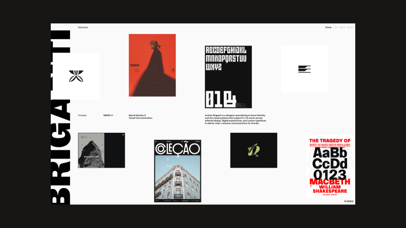
My name is Andrés Briganti, and I’m an independent graphic designer based in Buenos Aires, Argentina. I collaborate with brands, institutions, and individuals from around the world.
While my focus is on visual identity, my work spans over various fields of design visual communication, from physical to digital, from posters to wristwatches. My approach is refined and intentional, with the goal to distill abstract or complex ideas into distinctive visual forms.
Selected Projects
Personal Site
My most recent, and most visible, digital project is my portfolio website. After years of iterations and a stalled launch, the concept matured into a more cohesive direction. Earlier this year, I teamed up with Joyco Studio to bring it to life. The result has been well received and earned an FWA Site of the Day.
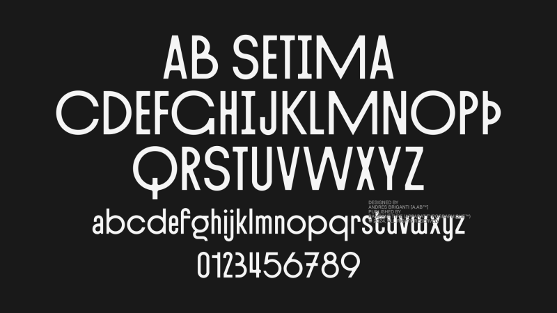
AB Setima
A few years ago, I began taking my interest in type design more seriously. I was even part of the team that designed the Geist typeface for Vercel while working at basement.studio.
My latest exploration in this field is AB Setima, a sans-serif display typeface that blends Art Deco geometry with a modern sensibility. It has refined proportions and tapered inner angles in contrast with sharp outer ones. The typeface includes variants and discretionary ligatures, offering some flexibility in composition.
Designed with restaurant identities, hotel graphics, and event communications in mind, AB Setima delivers a sense of distinction with some edge to it.
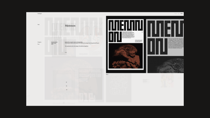
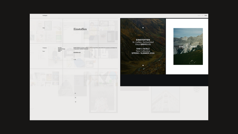
Einstoffen
During 2023, I led the rebrand and visual language refinement for Einstoffen, a Swiss brand founded in 2008 that creates distinctive eyewear and fashion for independent-minded individuals. The project focused on sharpening the brand’s visual identity to better reflect its bold, self-assured spirit and evolving product offering.
Various Identities
A selection of brand visual identities I’ve created over the years.
Previously, I’ve worked as Lead Brand Designer for digital studios and as Design Director for fashion and lifestyle brands. Today, I split my time between my independent practice, where I focus on visual exploration, and Rampant Studio, a collaborative creative bureau I’m building as Creative Director.
Design Philisophy
I believe in design that is both conceptually grounded and thoughtfully constructed, work that distills complex ideas into clear, enduring visual forms. My process balances strategic thinking with formal expression, creating identities and systems that are purposeful, distinctive, and built to last. I aim for clarity over noise, and visual languages that reflect the true character of the brands they serve.
Final Thoughts
I believe a designer’s greatest asset is the ability to connect the dots across the span of human experience and culture. A lack of interest in history, culture, and seemingly unrelated subjects leads to work that is shallow and short-lived. It’s curiosity – not specific skills or tools – that truly sets us apart.
Contact
I’m always happy to connect, share ideas, and explore new projects. Drop me a line anytime.
I’m a 32-year-old freelance developer based in Antwerp, Belgium, with a degree in Multimedia Technology and over a decade of experience crafting digital experiences. Early in my career, I took a bold step and moved to New York City to join the creative agency Your Majesty as a front-end developer — a launchpad that allowed me to work on high-profile projects for global brands like BMW and Spotify.
After a year in the U.S., I returned home to be closer to family and friends and continued refining my skills with renowned agencies such as Build in Amsterdam, Hello Monday, Watson DG, Exo Ape, and Studio 28K. Over the years, I’ve had the privilege of collaborating with top-tier creative teams on projects for clients including Amazon, Apple, Disney+, Mammut, Sony, WeTransfer, and more.
Today, as an independent developer, I partner with agencies around the world to deliver design and motion-driven digital experiences. Outside of work, you’ll often find me trail running, playing golf, or exploring the outdoors through my passion for landscape and nature photography.
WRK Timepieces is renowned for its commitment to crafting luxury timepieces. Their artisans craft each piece with exceptional care, combining traditional craftsmanship with cutting-edge innovation. Utilizing premium materials such as titanium and DLC (Diamond-Like Carbon), WRK Timepieces produces watches that embody precision engineering and timeless elegance. For their website, I worked with 28K Studio and their amazing team of designers.
I developed a product page for WRK’s latest timepiece, using immersive 3D scroll-triggered animations to reveal features like the precision-engineered movement, Flying Tourbillon, and Double-wishbone System. The fluid, interactive sequences let users explore the watch in rich detail from every angle, while a seamless scrolling flow highlights its design, materials, and craftsmanship in a premium, minimalist style true to the WRK brand.
Built with Vue/Nuxt, SCSS, TypeScript, GSAP, Storyblok for content, and Vercel for fast, reliable hosting.
Mammut is a Swiss premium outdoor brand known for its high-performance gear and apparel, combining innovative design with over 160 years of alpine heritage to equip adventurers for the most demanding environments.
From concept to launch, Build in Amsterdam collaborated closely with Mammut to create their new digital flagship store, united by a shared vision for quality. We set a fresh creative direction for lifestyle and product photography, shifting toward a more emotional shopping experience.
The mobile-first design system meets WCAG 2.1 accessibility standards, ensuring usability for all. To highlight the story behind every product, we designed editorial modules that encourage deeper exploration without overshadowing commerce.
Built with Next.js for responsive, high-performance interfaces, the platform integrates Contentful as a headless CMS, Algolia for lightning-fast search, and a custom PIM for real-time product data.
Exo Ape is a digital design studio that plants the flag at the intersection of technology, digital branding and content creation. For over a decade their team has had the privilege of working with global brands and inspiring startups to tell brand-led stories and shape digital identities.
I’ve collaborated with the Exo Ape team on numerous projects and had the privilege of contributing to their new studio website. Their focus consistently lies in strong design and bringing sites to life through engaging motion design. Working closely with Rob Smittenaar, I developed a robust foundation using Vue/Nuxt and created a backend-for-frontend API layer that streamlined data usage within the frontend app.
The project uses Vue/Nuxt for a dynamic frontend, SCSS for modular styling, and GSAP for smooth animations and transitions. Content is managed with Storyblok, and the site is hosted on Vercel for fast, reliable delivery.
Celebrating a century of cinema – In honor of Columbia Pictures’ 100th anniversary, I worked with Sony Pictures, Exo Ape and Watson DG to create a century-filled digital experience and quiz. Through this, we took visitors on a journey, not only through entertainment history, but also through a personalized path of self-discovery helping fans uncover the films and television shows that have shaped them the most.
In order to create a uniquely individual experience, we implemented a strategic backend development to keep the journey original, dynamic, and varied for every user – no matter how many times they return. This, along with a diverse mix of visuals and questions, created a fresh and engaging experience for everyone. The assets and questions are sourced from an extensive database of films, TV shows, and actors.
Each run through the quiz presents the visitor with eight interactive questions that gradually change based on their responses. The creative team developed a design system featuring five interactive mechanics — Circles, This or That, Slider, Rotator, and Drag and Drop — to present quiz questions in an engaging way, encouraging users to select answers through fun, dynamic interactions.
With titles, genres, and visuals from a hundred years of film and television, we were able to tailor the experience around each answer. For example, if the quiz finds that the user leans toward horror, more questions will be horror-themed. If they lean toward 80s films, more options will tap into nostalgia.
After diving into Columbia’s 100 years and completing the quiz, visitors were presented with a personalized shareable through an automated asset generator. This asset — accompanied with a range of social sharing options — played an important role in maintaining engagement and enthusiasm throughout the campaign and beyond.
The project’s frontend was built with Vue/Nuxt, SCSS, and GSAP for dynamic interfaces, modular styling, and smooth animations. The backend uses Node, Express, and Canvas to generate the shareable asset.
Every two years, General Electric surveys the world’s leading innovators to explore the future of innovation. The findings are presented in the Global Innovation Barometer, a biannual campaign created in collaboration with Little Red Robot.
The creative team developed a futuristic visual system for the campaign, based on a modern abstract 3D design style. Photography and live-action video were combined with 3D animations and illustrations to create a rich visual experience.
The project was built using Vue for a reactive and component-driven frontend, combined with Stylus for efficient and scalable styling. For smooth, performant animations, GSAP was integrated to handle complex transitions and scroll-triggered effects, enhancing the overall user experience.
Extra: Photography Portfolio 2.0 sneak peek
I’m excited to share that I’m currently collaborating with Barend Eijkenduijn and Clay Boan on the next version of my photography portfolio. This upcoming Version 2.0 will be more than just a refreshed collection of my work — it will also include a fully integrated print shop. Through this new platform, you’ll be able to browse my photographs, select your favorites, and customize your prints with a range of options, including various sizes, paper types, and framing styles. Our goal is to create a seamless and enjoyable experience, making it easier than ever to bring a piece of my photography into your home or workspace. We’re working towards an official launch by the end of this year, and I can’t wait to share it with you.
Final Thoughts
As a developer, I believe that curiosity and consistency are essential to growing in this field — but so is making time to explore, experiment, and create personal passion projects. Sharing that work can open unexpected doors.
Many thanks to Codrops and Manoela for this opportunity — it’s a real honor. Codrops has long been one of my favorite resources, and it’s played a big role in my own learning journey.
This tutorial walks through creating an interactive animation: starting in Blender by designing a button and simulating a cloth-like object that drops onto a surface and settles with a soft bounce.
After baking the cloth simulation, the animation is exported and brought into a Three.js project, where it becomes an interactive scene that can be replayed on click.
By the end, you’ll have a user-triggered animation that blends Blender’s physics simulations with Three.js rendering and interactivity.
Let’s dive in!
Step 1: Create a Cube and Add Subdivisions
Start a New Project: Open Blender and delete the default cube (select it and press X, then confirm).
Add a Cube: Press Shift + A > Mesh > Cube to create a new cube.
Enter Edit Mode: Select the cube, then press Tab to switch to Edit Mode.
Subdivide the Cube: Press Ctrl + R to add a loop cut, hover over the cube, and scroll your mouse wheel to increase the number of cuts.
Apply Subdivision: With the cube still selected in Object Mode, go to the Modifiers panel (wrench icon), and click Add Modifier > Subdivision Surface. Set the Levels to 2 or 3 for a smoother result, then click Apply.
Step 2: Add Cloth Physics and Adjust Settings
Select the Cube: Ensure your subdivided cube is selected in Object Mode.
Add Cloth Physics: Go to the Physics tab in the Properties panel. Click Cloth to enable cloth simulation.
Pin the Edges (Optional): If you want parts of the cube to stay fixed (e.g., the top), switch to Edit Mode, select the vertices you want to pin, go back to the Physics tab, and under Cloth > Shape, click Pin to assign those vertices to a vertex group.
Adjust Key Parameters:
Quality Steps: Set to 10-15 for smoother simulation (higher values increase accuracy but slow down computation).
Mass: Set to around 0.2-0.5 kg for a lighter, more flexible cloth.
Pressure: Under Cloth > Pressure, enable it and set a positive value (e.g., 2-5) to simulate inflation. This will make the cloth expand as if air is pushing it outward.
Stiffness: Adjust Tension and Compression (e.g., 10-15) to control how stiff or loose the cloth feels.
Test the Simulation: Press the Spacebar to play the animation and see the cloth inflate. Tweak settings as needed.
Step 3: Add a Ground Plane with a Collision
Create a Ground Plane: Press Shift + A > Mesh > Plane. Scale it up by pressing S and dragging (e.g., scale it to 5-10x) so it’s large enough for the cloth to interact with.
Position the Plane: Move the plane below the cube by pressing G > Z > -5 (or adjust as needed).
Enable Collision: Select the plane, go to the Physics tab, and click Collision. Leave the default settings.
Run the Simulation: Press the Spacebar again to see the cloth inflate and settle onto the ground plane.
Step 4: Adjust Materials and Textures
Select the Cube: In Object Mode, select the cloth (cube) object.
Add a Material: Go to the Material tab, click New to create a material, and name it.
Set Base Color/UV Map: In the Base Color slot, choose a fabric-like color (e.g., red or blue) or connect an image texture by clicking the yellow dot next to Base Color and selecting Image Texture. Load a texture file if you have one.
Adjust Roughness and Specular: Set Roughness to 0.1-0.3 for a soft fabric look.
Apply to Ground (Optional): Repeat the process for the plane, using a simple gray or textured material for contrast.
Step 5: Export as MDD and Generate Shape Keys for Three.js
To use the cloth animation in a Three.js project, we’ll export the physics simulation as an MDD file using the NewTek MDD plugin, then re-import it to create Shape Keys. Follow these steps:
Enable the NewTek MDD Plugin:
Go to Edit > Preferences > Add-ons.
Search for “NewTek” or “MDD” and enable the “Import-Export: NewTek MDD format” add-on by checking the box. Close the Preferences window.
Apply All Modifiers and All Transform:
In Object Mode, select the cloth object.
Go to the Modifiers panel (wrench icon). For each modifier (e.g., Subdivision Surface, Cloth), click the dropdown and select Apply. This “freezes” the mesh with its current shape and physics data.
Ensure no unapplied deformations (e.g., scale) remain: Press Ctrl + A > All Transforms to apply location, rotation, and scale.
Export as MDD:
With the cloth object selected, go to File > Export > Lightwave Point Cache (.mdd).
In the export settings (bottom left):
Set FPS (frames per second) to match your project (e.g., 24, 30, or 60).
Set the Start/End Frame of your animation.
Choose a save location (e.g., “inflation.mdd”) and click Export MDD.
Import the MDD:
Go to File > Import > Lightwave Point Cache (.mdd), and load the “inflation.mdd” file.
In the Physics and Modifiers panel, remove any cloth simulation-related options, as we now have shape keys.
Step 6: Export the Cloth Simulation Object as GLB
After importing the MDD, select the cube with the animation data.
Export as glTF 2.0 (.glb/.gltf): Go to File > Export > glTF 2.0 (.glb/.gltf).
Check Shape Keys and Animation
Under the Data section, check Shape Keys to include the morph targets generated from the animation.
Check Animations to export the animation data tied to the Shape Keys.
Export: Choose a save location (e.g., “inflation.glb”) and click Export glTF 2.0. This file is now ready for use in Three.js.
Step 7: Implement the Cloth Animation in Three.js
In this step, we’ll use Three.js with React (via @react-three/fiber) to load and animate the cloth inflation effect from the inflation.glb file exported in Step 6. Below is the code with explanations:
Set Up Imports and File Path:
Import necessary libraries: THREE for core Three.js functionality, useRef, useState, useEffect from React for state and lifecycle management, and utilities from @react-three/fiber and @react-three/drei for rendering and controls.
Import GLTFLoader from Three.js to load the .glb file.
Define the model path: const modelPath = ‘/inflation.glb’; points to the exported file (adjust the path based on your project structure).
Create the Model Component:
Define the Model component to handle loading and animating the .glb file.
Use state variables: model for the loaded 3D object, loading to track progress, and error for handling issues.
Use useRef to store the AnimationMixer (mixerRef) and animation actions (actionsRef) for controlling playback.
Load the Model with Animations:
In a useEffect hook, instantiate GLTFLoader and load inflation.glb.
On success (gltf callback):
Extract the scene (gltf.scene) and create an AnimationMixer to manage animations.
For each animation clip in gltf.animations:
Set duration to 6 seconds (clip.duration = 6).
Create an AnimationAction (mixer.clipAction(clip)).
Configure the action: clampWhenFinished = true stops at the last frame, loop = THREE.LoopOnce plays once, and setDuration(6) enforces the 6-second duration.
Reset and play the action immediately, storing it in actionsRef.current.
Update state with the loaded model and set loading to false.
Log loading progress with the xhr callback.
Handle errors in the error callback, updating error state.
Clean up the mixer on component unmount.
Animate the Model:
Use useFrame to update the mixer each frame with mixerRef.current.update(delta), advancing the animation based on time.
Add interactivity:
handleClick: Resets and replays all animations on click.
onPointerOver/onPointerOut: Changes the cursor to indicate clickability.
Render the Model:
Return null if still loading, an error occurs, or no model is loaded.
Return a <primitive> element with the loaded model, enabling shadows and attaching event handlers.
Create a Reflective Ground:
Define MetalGround as a mesh with a plane geometry (args={[100, 100]}).
Apply MeshReflectorMaterial with properties like metalness=0.5, roughness=0.2, and color=”#202020″ for a metallic, reflective look. Adjust blur, strength, and resolution as needed.
Set Up the Scene:
In the App component, create a <Canvas> with a camera positioned at [0, 15, 15] and a 50-degree FOV.
Add a directionalLight at [0, 15, 0] with shadows enabled.
Include an Environment preset (“studio”) for lighting, a Model at [0, 5, 0], ContactShadows for realism, and the MetalGround rotated and positioned below.
Add OrbitControls for interactive camera movement.
And that’s it! Starting from a cloth simulation in Blender, we turned it into a button that drops into place and reacts with a bit of bounce inside a Three.js scene.
This workflow shows how Blender’s physics simulations can be exported and combined with Three.js to create interactive, real-time experiences on the web.
Hi! My name is Clarisse and I’m a freelance web designer at Okey Studio, currently based in Toulouse, France. Together with Adrien Quéchon, a web developer, we co-founded Okey Studio in 2021 — an independent digital studio specializing in the creation of unique, fully custom websites. We particularly love creating creative and original sites where we can play with ideas, interactions, and visuals, while still meeting our clients’ goals. We put a lot of heart into crafting personalized user experiences, always aligned with the needs and vision of those we work with.
What I especially enjoy is the diversity of sectors we collaborate with: it pushes us to stay curious, constantly test new visual languages, explore unexpected ideas, and challenge our habits.
This is the promotional website for Cyclops Club, a New York-based studio offering video production and editing services to optimize your multimedia content. Created within Okey Studio, the site immerses visitors in a quirky, dynamic, and fun universe.
Challenges: We wanted to incorporate nods to the video world (timelines, icons, progress bars, time indicators, REC mode…), as well as GIFs and Easter eggs. The challenge was to maintain a professional tone while keeping it fun — so we had to find the right balance between all these elements.
Personal note: This was one of those projects where you really feel creative freedom, and above all, where we genuinely had fun. Marvin trusted us 200%, which allowed us to push the graphic boundaries quite far while staying consistent with the brand image and goals. We enjoyed hiding little easter eggs and GIFs throughout the site. The nicest was embracing this funny tone while maintaining a professional and controlled foundation.
Virtual Gallery is a personal project we created internally at Okey Studio. The site honors photographers who generously share their photos online. It celebrates their talent through a small virtual photo gallery — like an exhibition space, but in a digital form. We wanted to create a smooth and enjoyable browsing experience through a selection of stunning photos, featuring carefully crafted scrolling and an immersive feel.
Challenges: The biggest challenge was probably selecting the photos. I sorted the images by colors and moods to maintain a consistent aesthetic throughout the site.
Personal notes: Since this is a personal project, it was naturally harder to set boundaries. No client, no deadline… so you want to keep going, keep testing, keep redoing. You have to learn to set limits for yourself and accept that it’s “finished” at some point. But it was also a true creative bubble, a playground and experimental space — the kind of project that reconnects you to the simple joy of designing without constraints.
This is the showcase website for Inertia Studios, a London-based creative studio pushing the boundaries of CGI, design, and futuristic aesthetics. Their ambition: create visual experiences that grab you, stop you, and make you feel something real.
Created within Okey Studio, the site adopts a rather sober aesthetic: micro-interactions, smooth transitions, subtle hover effects, large capitals, and solid and well-paced typographic blocks, for a sharp and impactful look — without feeling cold. A true balance between rigor, minimalism, and boldness. I really love the work of Inertia Studios — collaborating on their website redesign was a pure pleasure.
Challenges: Inertia has a strong brand image and an international client portfolio, so it was essential to remain highly professional and perfectly legible. The main challenge was to maintain a “classic” structure in terms of usability (clear information, intuitive navigation) while avoiding boredom by injecting modernity and visual tension.
Karo is an art and clothing brand based in New York, founded by Anya Karolyn. The studio defines itself as: non-traditional, a unification of artwork, fashion, music and video. Anya reached out to Okey Studio to redesign her e-commerce website. I imagined a more artistic, unconventional, and bold version, fully rooted in her aesthetic. The design adopts a brutalist approach, featuring chrome elements — a color and material that Anya particularly loves — as well as touches of electric blue; both emblematic of her visual identity. We loved transcribing the world of Studio Karo through interactive web animations where users become part of the experience.
Challenges: The challenge was definitely to find the right balance between an artistic, highly personal design — with a strong visual aesthetic — and a smooth, intuitive e-commerce experience. The site needed to both reflect Karo’s unique world while allowing users to navigate easily and shop without any friction.
Personal note: I loved working on this project — Anya and I were truly on the same wavelength from the start. She gave me complete trust, and we immediately understood each other about her desires, her objectives, and the creative direction to take. It was a super creative project where I could bring some different, sometimes bolder ideas — and she absolutely loved it. A smooth, inspiring, and freeing collaboration!
Henri Heymans
Henri is a web developer who contacted me to work on the web design for his first portfolio. His goal was clear: to stand out from other developers and try to win a Site of the Day (SOTD) on Awwwards. The site, now updated (2025), is unfortunately no longer online — but I kept a video and visual captures of it.
It featured a brutalist style on a black background. The design played with very large typographic compositions, scale variations, and a horizontal scroll that paced the navigation. The central element of the site was a 3D liquid metal sphere in negative, located on the homepage. It responded to cursor movements, creating a hypnotic effect that anchored the experience in a living material.
Personal note: This was a project where I could explore a bold design with a strong graphic stance. Henri wanted a site that grabs attention — and we had fun creating a showcase unlike any other.
This is my personal website, designed as a creative showcase that reflects both my style and personality. I wanted it to be minimalist in structure, yet fun and human, giving a more intimate glimpse of who I am.
In the loader, Adrien had fun animating the logo with a pixel effect we love — we especially enjoy these kinds of little details. When you arrive on the page, the central feature is a distortion effect applied to the main text, creating a lively and interactive texture.
Since I get bored quickly and like almost every color, I added a “Change the mood” button that lets you modify both the page’s color palette and the welcome GIF in the Hero section. This gives the site an evolving vibe and highlights visual diversity, while adding a playful touch.
It’s not a classic portfolio: no detailed project pages, but rather a personal space where I can present my work in a way that suits me, test ideas, and evolve the site as I please.
Challenges: The real challenge was setting boundaries for myself. When you create for yourself, anything is possible, and I tend to like and try many things. I had to decide: “Okay, this is the direction I choose,” and stick to it until the end.
Thanks to Cédric, videographer, for his awesome work on the video for my showreel.
Background
I studied graphic design in Toulouse, with a final year specializing in web design. I quickly developed a taste for web design and interactive experiences. Right after graduating, I had the opportunity to work directly on web projects as a freelancer — and I decided to fully embark on this adventure.
In 2021, together with Adrien Quéchon, we founded Okey Studio to offer a complete service: custom design and development, hand in hand.
One of the highlights was our very first Site of the Day on Awwwards: after spending my student years admiring other designers’ work on that site, seeing our own work featured there was a true achievement.
Design Philosophy
For me, creating a website means telling a visual story that reflects a brand’s personality. I believe in custom-made solutions, the importance of details, and the idea that a site must be beautiful, functional, high-performing, and designed to stand out, regardless of its complexity.
Tools and Techniques
I use Figma for design and conception, and I love working closely with Adrien on the development side to enhance interactions and brainstorm animation ideas together. I do a lot of creative research and exploration before each project. It’s also essential for me to fully immerse myself in the world of the client or brand I’m working with.
Inspiration
Online, I like to browse sites like Awwwards, CSS Design Awards, FWA, Dribbble, Pinterest, etc. (nothing very original). But I also draw a lot of inspiration from real life: through travel, as well as music, books, and films.
Future Goals
I’d like to keep creating websites that are both creative and tailor-made, with more projects where I have true artistic freedom, or at least plenty of space to propose original ideas. I really enjoy having fun in what I do! And I want to continue refining my work and improving.
Together with Adrien, we would also like to start working on the Okey Studio website — a site that truly reflects who we are and showcases our work and projects. It’s an exciting challenge, but we’ll need to find the time, as projects like this can quickly become a real playground!
Final Thoughts
It’s always a bit tricky to give advice or share a personal message, but I’d simply say: enjoy what you do, have fun, and put your heart into it — it usually comes across in the project 🫶
Thank you so much for reading, and a big thanks to Codrops and Manoela for inviting me to share a glimpse of my world and work.
You can find my contact info on my website clarissemichard.com I also share all my latest projects on social media:
When two creatives collaborate, the design process becomes a shared stage — each bringing their own strengths, perspectives, and instincts. This project united designer/art director Artem Shcherban and 3D/motion designer Andrew Moskvin to help New York–based scenographer and costume designer Christian Fleming completely reimagine how his work is presented.
What began as a portfolio refresh evolved into a cohesive visual system: a rigorously minimal print catalog, a single-page website concept, and a cinematic 3D visualization. Together, Artem and Andrew shaped an experience that distilled Christian’s theatrical sensibility into clear, atmospheric design across both physical and digital formats.
From here, Artem picks up the story, walking us through how he approached the portfolio’s structure, the visual rules it would live by, and the thinking that shaped both its print and on-screen presence.
Starting the Design Conversation
Christian Fleming is a prominent designer and director based in New York City who works with theaters around the world creating visual spaces for performances. He approached me with a challenge: to update and rethink his portfolio, to make it easy to send out to theater directors and curators. Specifically the print format.
Christian had a pretty clear understanding of what he wanted to show and how it should look: rigid Scandinavian minimalism, extreme clarity of composition, a minimum of elements and a presentation that would be understandable to absolutely anyone – regardless of age, profession or context.
It was important to create a system that would:
be updated regularly (approximately every 3 weeks),
adapt to new projects,
and at the same time remain visually and semantically stable.
There also needed to be an “About Christian” section in the structure, but this too had to fit within a strict framework of visual language.
Designing a Flexible Visual System
I started by carefully analyzing how Christian works. His primary language is visual. He thinks in images, light, texture and composition. So it was important to retain a sense of air and rhythm, but build a clear modular structure that he could confidently work with on his own.
We came up with a simple adaptive system:
it easily adapts to images of different formats,
scalable for everything from PDFs to presentations,
and can be used both digitally and offline.
In the first stages, we tried several structures. However, Christian still felt that there was something missing in the layout – the visuals and logic were in conflict. We discussed which designs he wanted to show openly and which he didn’t. Some works had global reviews and important weight, but could not be shown in all details.
The solution was to divide them into two meaningful blocks:
“Selected Projects”, with full submission, and “Archival Projects”, with a focus on awards, reviews, and context. This approach preserved both structure and tone. The layout became balanced – and Christian immediately responded to this.
After gathering the structure and understanding how it would work, we began creating the design itself and populating it with content. It was important from the start to train Kristan to add content on his own, as there was a lot of project and they change quite often.
One of the key pluses of our work is versatility. Not only could the final file be emailed, but it could also be used as a print publication. This gave Christian the opportunity to give physical copies at meetings, premieres and professional events where tactility and attention to detail are important.
Christian liked the first result, both in the way the system was laid out and the way I approached the task. Then I suggested: let’s update the website as well.
Translating the Portfolio to a Single-Page Site
This phase proved to be the most interesting, and the most challenging.
Although the website looks simple, it took almost 3 months to build. From the very beginning, Christian and I tried to understand why he needed to update the site and how it should work together with the already established portfolio system.
The main challenge was to show the visual side of his projects. Not just text or logos, but the atmosphere, the light, the costumes, the feeling of the scene.
One of the restrictions that Christian set was the requirement to make the site as concise as possible, without a large number of pages, or better to limit it to one, and without unnecessary transitions. It had to be simple, clear and intuitive, but still user-friendly and quite informative. This was a real challenge, given the amount of content that needed to be posted.
Designing with Stage Logic
One of the key constraints that started the work on the site was Christian’s wish: no multiple pages. Everything had to be compact, coherent, clear and yet rich. This posed a special challenge. It was necessary to accommodate a fairly large amount of information without overloading the perception.
I proposed a solution built on a theatrical metaphor: as in a stage blackout, the screen darkens and a new space appears. Each project becomes its own scene, with the user as a spectator — never leaving their seat, never clicking through menus. Navigation flows in smooth, seamless transitions, keeping attention focused and the emotional rhythm intact.
Christian liked the idea, but immediately faced a new challenge: how to fit everything important on one screen:
a short text about him,
social media links and a resume,
the job title and description,
and, if necessary, reviews.
At the same time, the main visual content – photos and videos – had to remain in the center of attention and not overlap with the interface.
Solving the Composition Puzzle
We explored several layouts — from centered titles and multi-level disclosures to diagonal structures and thumbnail navigation. Some looked promising, but they lacked the sense of theatrical rhythm we wanted. The layouts felt crowded, with too much design and not enough air.
The breakthrough came when we shifted focus from pure visuals to structural logic. We reduced each project view to four key elements: minimal information about Christian, the production title with the director’s name, a review (when available), and a button to select the project. Giving each element its own space created a layout that was both clear and flexible, without overloading the screen.
Refining Through Iteration
As with the book, the site went through several iterations:
In the first prototype, the central layout quickly proved unworkable – long play titles and director names didn’t fit on the screen, especially in the mobile version. We were losing scalability and not using all the available space.
In the second version, we moved the information blocks upwards – this gave us a logical hierarchy and allowed us not to burden the center of the screen. The visual focus remained on the photos, and the text did not interfere with the perception of the scenography.
In the third round, the idea of “titles” appeared – a clear typographic structure, where titles are highlighted only by boldness, without changing the lettering. This was in keeping with the overall minimalist aesthetic, and Christian specifically mentioned that he didn’t want to use more than one font or style unless necessary.
We also decided to stylistically separate the reviews from the main description. We italicized them and put them just below. This made it clear what belonged to the author and what was a response to the author’s work.
Bringing Theatrical Flow to Navigation
The last open issue was navigation between projects. I proposed two scenarios:
Navigating with arrows, as if the viewer were leafing through the play scene by scene.
A clickable menu with a list of works for those who want to go directly.
Christian was concerned about the question: wouldn’t the user lose their bearings if they didn’t see the list all the time? We discussed this and came to the conclusion that most visitors don’t come to the site to “look for the right job”. They come to feel the atmosphere and “experience” its theater. So the basic scenario is a consistent browsing experience, like moving through a play. The menu is available, but not in the way – it should not break the effect of involvement.
What We Learned About Theatrical Design
We didn’t build just a website. We built an experience. It is not a digital storefront, but a space that reflects the way Christian works. He is an artist who thinks in the rhythm of the stage, and it was essential not to break that rhythm.
The result is a place where the viewer isn’t distracted; they inhabit it. Navigation, structure, and interface quietly support this experience. Much of that comes from Christian’s clear and thoughtful feedback, which shaped the process at every step. This project is a reminder that even work which appears simple is defined by countless small decisions, each influencing not only how it functions but also the mood it creates from the very beginning.
Extending the Design from Screen to Print
Once the site was complete, a new question emerged: how should this work be presented in the most meaningful way?
The digital format was only part of the answer. We also envisioned a printed edition — something that could be mailed or handed over in person as a physical object. In the theater world, where visual presence and tactility carry as much weight as the idea itself, this felt essential.
We developed a set of layouts, but bringing the catalog to life as intended proved slow. Christian’s schedule with his theater work left little time to finalize the print production. We needed an alternative that could convey not only the design but also the atmosphere and weight of the finished book.
Turning the Book into a Cinematic Object
At this stage, 3D and motion designer Andrew Moskvin joined the project. We shared the brief with him — not just to present the catalog, but to embed it within the theatrical aesthetic, preserving the play of light, texture, air, and mood that defined the website.
Andrew was immediately enthusiastic. After a quick call, he dove into the process. I assembled all the pages of the print version we had, and together we discussed storyboards, perspectives, atmosphere, possible scenes, and materials that could deepen the experience. The goal was more than simply showing the layout — we wanted cinematic shots where every fold of fabric and every spot of light served a single dramaturgy.
The result exceeded expectations. Andrew didn’t just recreate the printed version; he brought it to life. His work was subtle and precise, with a deep respect for context. He captured not only the mood but also the intent behind each spread, giving the book weight, materiality, and presence — the kind we imagined holding in our hands and leafing through in person.
Andrew will share his development process below.
Breaking Down the 3D Process
The Concept
At the very start, I wanted my work to blend fluently in the ideas that were already made. Christian Fleming is a scenographer and costume designer, so the visual system needed to reflect his world. Since the project was deeply rooted in the theatrical aesthetic, my 3D work had to naturally blend into that atmosphere. Artem’s direction played a key role in shaping the unique look envisioned by Christian Fleming — rich with stage-like presence, bold compositions, and intentional use of space. My task was to ensure that the 3D elements not only supported this world, but also felt like an organic extension of it — capturing the same mood, lighting nuances, and visual rhythm that define a theatrical setting.
The Tools
For the entire 3D pipeline, I worked in:
Cinema 4D for modeling and scene setup
Redshift for rendering
After Effects for compositing
Photoshop for color correcting static images
Modeling the Book
The book was modeled entirely from scratch. Me and Artem discussed the form and proportions, and after several iterations, we finalized the design direction. I focused on the small details that bring realism: the curvature of the hardcover spine, beveled edges, the separation between the cover and pages, and the layered structure of the paper block. I also modeled the cloth texture wrapping the spine, giving the book a tactile, fabric-like look. The geometry was built to hold up in close-up shots and fit the theatrical lighting.
Lighting with a Theatrical Eye
Lighting was one of the most important parts of this process. I wanted the scenes to feel theatrical — as if the objects were placed on a stage under carefully controlled spotlights. Using a combination of area lights and spotlights in Redshift, I shaped the lighting to create soft gradients and shadows on the surfaces. The setup was designed to emphasize the geometry without flattening it, always preserving depth and direction. A subtle backlight highlight played a key role in defining the edges and enhancing the overall form.
I think I spent more time on lighting than on modeling, since lighting has always been more experimental for me — even in product scenes.
One small but impactful trick I always use is setting up a separate HDRI map just for reflections. I disable its contribution to diffuse lighting by setting the diffuse value to 0, while keeping reflections at 1. This allows the reflections to pop more without affecting the overall lighting of the scene. It’s a simple setup, but it gives you way more control over how materials respond — especially in stylized or highly art-directed environments.
Building the Materials
When I was creating the materials, I noticed that Artem had used a checkerboard texture for the cover. So I thought — why not take that idea further and implement it directly into the material? I added a subtle bump using a checker texture on the sides and front part of the book.
I also experimented quite a bit with displacement. Initially, I had the idea to make the title metallic, but it felt too predictable. So instead, I went with a white title featuring embossed details, while keeping the checker bump texture underneath.
This actually ties back to the modeling process — for the displacement to work properly, the geometry had to be evenly dense and ready for subdivision.
I created a mask in Photoshop and applied a procedural Gaussian blur using a Smart Object. Without the blur, the displacement looked harsh and unrefined — even a slight blur made a noticeable difference.
The main challenge with using white, as always, was avoiding blown-out highlights. I had to carefully balance the lighting and tweak the material settings to make the title clean and visible without overexposing it.
One of the more unusual challenges in this project was animating the page slide and making the pages differ. I didn’t want the pages to feel too repetitive, but I also didn’t want to create dozens of individual materials for each page. To find a balance, I created two different materials for two pages and made them random inside of the cloner. It was a bit of a workaround — mostly due to limitations inside the Shader switch node — but it worked well enough to create the illusion of variety without significantly increasing the complexity of the setup.
There’s a really useful node in Redshift called Color User Data — especially when working with the MoGraph system to trigger object index values. One of the strangest (and probably least intuitive) things I did in this setup was using a Change Range node to remap those index values properly according to the number of textures I had. With that in place, I built a system that used an index to mix between all the textures inside a Shader Switch node. This allowed me to get true variation across the pages without manually assigning materials to each one.
You might’ve noticed that the pages look a bit too bright for a real-world scenario — and that was actually a deliberate choice. I often use a trick that helps me art-direct material brightness independently of the scene’s lighting. The key node here is Color Correct Node.
Inside it, there’s a parameter called Level. If you set it higher than 1, it increases the overall brightness of the texture output — without affecting shadows or highlights too aggressively. This also works in reverse: if your texture has areas that are too bright (like pure white), lowering the Level value below 1 will tone it down without needing to modify the source texture.
It’s a simple trick, but incredibly useful when you want fine control over how materials react in stylized or theatrical lighting setups.
The red cloth material I used throughout the scene is another interesting part of the project. I wanted it to have a strong tactile feel — something that looks thick, textured, and physically present. To achieve that, I relied heavily on geometry. I used a Redshift Object Tag with Subdivision (under the Geometry tab) enabled to add more detail where it was needed. This helped the cloth catch light properly and hold up in close-up shots.
For the translucent look, I originally experimented with Subsurface Scattering, but it didn’t give me the control I wanted. So instead, I used an Opacity setup driven by a Ramp and Change Range nodes. That gave me just enough falloff and variation to fake the look of light passing through thinner areas of the fabric — and in the end, it worked surprisingly well.
Animating the Pages
This was by far the most experimental part of the project for me. The amount of improvisation — and the complete lack of confidence in what the next frame would be — made the process both fun and flexible.
What you’re about to see might look a bit chaotic, so let me quickly walk you through how it all started.
The simulation started with a subject — in our case, a page. It had to have the proper form, and by that I mean the right typology. Specifically, it needed to consist only of horizontal segments; otherwise, it would bend unevenly under the forces present in the scene. (And yes, I did try versions with even polygons — it got messy.)
I set up all the pages in a Cloner so I could easily adjust any parameters I needed, and added a bit of randomness using a Random Effector.
In the video, you can see a plane on the side that connects to the pages — that was actually the first idea I had when thinking about how to run the simulation. The plane has a Connect tag that links all the pages to it, so when it rotates, they all follow along.
I won’t go into all the force settings — most of them were experimental, and animations like this always require a bit of creative adjustment.
The main force was wind. The pages did want to slide just from the plane with the Connect tag, but I needed to give them an extra push from underneath — that’s where wind came in handy.
I also used a Field Force to move the pages mid-air, from the center outward to the other side.
Probably the most important part was how I triggered the “Mix Animation.” I used a Vertex Map tag on the Cloner to paint a map using a Field, which then drove the Mix Animation parameter in the Cloth tag. This setup made the pages activate one by one, creating a natural, finger-like sliding motion as seen in Video.
Postprocessing
I didn’t go too heavy on post-processing, but there’s one plugin I have to mention — Deep Glow. It gives amazing results. By tweaking the threshold, you can make it react only to the brightest areas, which creates a super clean, glowing effect.
The Final Theatrical Ecosystem
In the end, Christian was delighted with the outcome. Together we had built more than a portfolio — we had created a cohesive theatrical ecosystem. It moved fluidly from digital performance to printed object, from live stage to interface, and from emotion to technology.
The experience is pared back to its essence: no superfluous effects, no unnecessary clicks, nothing to pull focus. What remains is what matters most — the work itself, framed in a way that stays quietly behind the scenes yet comes fully alive in the viewer’s hands and on their screen.
Blackbird was a fun, experimental site that I used as a way to get familiar with WebGL inside of Solid.js. It went through the story of how the SR-71 was built in super technical detail. The wireframe effect covered here helped visualize the technology beneath the surface of the SR-71 while keeping the polished metal exterior visible that matched the sites aesthetic.
Here is how the effect looks like on the Blackbird site:
In this tutorial, we’ll rebuild that effect from scratch: rendering a model twice, once as a solid and once as a wireframe, then blending the two together in a shader for a smooth, animated transition. The end result is a flexible technique you can use for technical reveals, holograms, or any moment where you want to show both the structure and the surface of a 3D object.
There are three things at work here: material properties, render targets, and a black-to-white shader gradient. Let’s get into it!
But First, a Little About Solid.js
Solid.js isn’t a framework name you hear often, I’ve switched my personal work to it for the ridiculously minimal developer experience and because JSX remains the greatest thing since sliced bread. You absolutely don’t need to use the Solid.js part of this demo, you could strip it out and use vanilla JS all the same. But who knows, you may enjoy it 🙂
TLDR: Full-stack JSX without all of the opinions of Next and Nuxt, plus it’s like 8kb gzipped, wild.
The technical version: Written in JSX, but doesn’t use a virtual DOM, so a “reactive” (think useState()) doesn’t re-render an entire component, just one DOM node. Also runs isomorphically, so "use client" is a thing of the past.
Setting Up Our Scene
We don’t need anything wild for the effect: a Mesh, Camera, Renderer, and Scene will do. I use a base Stage class (for theatrical-ish naming) to control when things get initialized.
A Global Object for Tracking Window Dimensions
window.innerWidth and window.innerHeight trigger document reflow when you use them (more about document reflow here). So I keep them in one object, only updating it when necessary and reading from the object, instead of using window and causing reflow. Notice these are all set to 0 and not actual values by default. window gets evaluated as undefined when using SSR, so we want to wait to set this until our app is mounted, GL class is initialized, and window is defined to avoid everybody’s favorite error: Cannot read properties of undefined (reading ‘window’).
Before we can render anything, we need a small framework to handle our scene setup, rendering loop, and resizing logic. Instead of scattering this across multiple files, we’ll wrap it in a Stage class that initializes the camera, renderer, and scene in one place. This makes it easier to keep our WebGL lifecycle organized, especially once we start adding more complex objects and effects.
// src/gl/stage.js

import { WebGLRenderer, Scene, PerspectiveCamera } from 'three';
import { viewport, resizeViewport } from './viewport';

class Stage {
  init(element) {
    resizeViewport() // Set the initial viewport dimensions, helps to avoid using window inside of viewport.js for SSR-friendliness

    this.camera = new PerspectiveCamera(45, viewport.aspectRatio, 0.1, 1000);
    this.camera.position.set(0, 0, 2); // back the camera up 2 units so it isn't on top of the meshes we make later, you won't see them otherwise.

    this.renderer = new WebGLRenderer();
    this.renderer.setSize(viewport.width, viewport.height);
    element.appendChild(this.renderer.domElement); // attach the renderer to the dom so our canvas shows up

    this.renderer.setPixelRatio(viewport.devicePixelRatio); // Renders higher pixel ratios for screens that require it.

    this.scene = new Scene();
  }

  render() {
    this.renderer.render(this.scene, this.camera);
    requestAnimationFrame(this.render.bind(this));
// All of the scenes child classes with a render method will have it called automatically
    this.scene.children.forEach((child) => {
      if (child.render && typeof child.render === 'function') {
        child.render();
      }
    });
  }

  resize() {
    this.renderer.setSize(viewport.width, viewport.height);
    this.camera.aspect = viewport.aspectRatio;
    this.camera.updateProjectionMatrix();

// All of the scenes child classes with a resize method will have it called automatically
    this.scene.children.forEach((child) => {
      if (child.resize && typeof child.resize === 'function') {
        child.resize();
      }
    });
  }
}

export default new Stage();
And a Fancy Mesh to Go With It
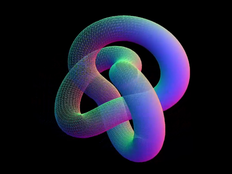
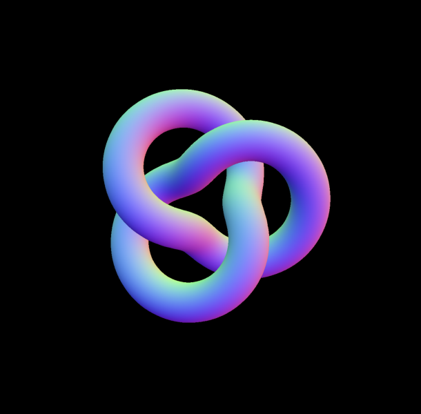
With our stage ready, we can give it something interesting to render. A torus knot is perfect for this: it has plenty of curves and detail to show off both the wireframe and solid passes. We’ll start with a simple MeshNormalMaterial in wireframe mode so we can clearly see its structure before moving on to the blended shader version.
// src/gl/torus.js

import { Mesh, MeshBasicMaterial, TorusKnotGeometry } from 'three';

export default class Torus extends Mesh {
  constructor() {
    super();

    this.geometry = new TorusKnotGeometry(1, 0.285, 300, 26);
    this.material = new MeshNormalMaterial({
      color: 0xffff00,
      wireframe: true,
    });

    this.position.set(0, 0, -8); // Back up the mesh from the camera so its visible
  }
}
A quick note on lights
For simplicity we’re using MeshNormalMaterial so we don’t have to mess with lights. The original effect on Blackbird had six lights, waaay too many. The GPU on my M1 Max was choked to 30fps trying to render the complex models and realtime six-point lighting. But reducing this to just 2 lights (which visually looked identical) ran at 120fps no problem. Three.js isn’t like Blender where you can plop in 14 lights and torture your beefy computer with the render for 12 hours while you sleep. The lights in WebGL have consequences 🫠
Now, the Solid JSX Components to House It All
// src/components/GlCanvas.tsx

import { onMount, onCleanup } from 'solid-js';
import Stage from '~/gl/stage';

export default function GlCanvas() {
// let is used instead of refs, these aren't reactive
  let el;
  let gl;
  let observer;

  onMount(() => {
    if(!el) return
    gl = Stage;

    gl.init(el);
    gl.render();


    observer = new ResizeObserver((entry) => gl.resize());
    observer.observe(el); // use ResizeObserver instead of the window resize event.
    // It is debounced AND fires once when initialized, no need to call resize() onMount
  });

  onCleanup(() => {
    if (observer) {
      observer.disconnect();
    }
  });


  return (
    <div
      ref={el}
      style={{
        position: 'fixed',
        inset: 0,
        height: '100lvh',
        width: '100vw',
      }}

    />
  );
}
let is used to declare a ref, there is no formal useRef() function in Solid. Signals are the only reactive method. Read more on refs in Solid.
Then slap that component into app.tsx:
// src/app.tsx

import { Router } from '@solidjs/router';
import { FileRoutes } from '@solidjs/start/router';
import { Suspense } from 'solid-js';
import GlCanvas from './components/GlCanvas';

export default function App() {
  return (
    <Router
      root={(props) => (
        <Suspense>
          {props.children}
          <GlCanvas />
        </Suspense>
      )}
    >
      <FileRoutes />
    </Router>
  );
}
Each 3D piece I use is tied to a specific element on the page (usually for timeline and scrolling), so I create an individual component to control each class. This helps me keep organized when I have 5 or 6 WebGL moments on one page.
// src/components/WireframeDemo.tsx

import { createEffect, createSignal, onMount } from 'solid-js'
import Stage from '~/gl/stage';
import Torus from '~/gl/torus';

export default function WireframeDemo() {
  let el;
  const [element, setElement] = createSignal(null);
  const [actor, setActor] = createSignal(null);

  createEffect(() => {
    setElement(el);
    if (!element()) return;

    setActor(new Torus()); // Stage is initialized when the page initially mounts,
    // so it's not available until the next tick.
    // A signal forces this update to the next tick,
    // after Stage is available.

    Stage.scene.add(actor());
  });

  return <div ref={el} />;
}
createEffect() instead of onMount(): this automatically tracks dependencies (element, and actor in this case) and fires the function when they change, no more useEffect() with dependency arrays 🙃. Read more on createEffect in Solid.
Then a minimal route to put the component on:
// src/routes/index.tsx

import WireframeDemo from '~/components/WiframeDemo';

export default function Home() {
  return (
    <main>
      <WireframeDemo />
    </main>
  );
}
Now you’ll see this:
Switching a Material to Wireframe
I loved wireframe styling for the Blackbird site! It fit the prototype feel of the story, fully textured models felt too clean, wireframes are a bit “dirtier” and unpolished. You can wireframe just about any material in Three.js with this:
But we want to do this dynamically on only part of our model, not on the entire thing.
Enter render targets.
The Fun Part: Render Targets
Render Targets are a super deep topic but they boil down to this: Whatever you see on screen is a frame for your GPU to render, in WebGL you can export that frame and re-use it as a texture on another mesh, you are creating a “target” for your rendered output, a render target.
Since we’re going to need two of these targets, we can make a single class and re-use it.
// src/gl/render-target.js

import { WebGLRenderTarget } from 'three';
import { viewport } from '../viewport';
import Torus from '../torus';
import Stage from '../stage';

export default class RenderTarget extends WebGLRenderTarget {
  constructor() {
    super();

    this.width = viewport.width * viewport.devicePixelRatio;
    this.height = viewport.height * viewport.devicePixelRatio;
  }

  resize() {
    const w = viewport.width * viewport.devicePixelRatio;
    const h = viewport.height * viewport.devicePixelRatio;

    this.setSize(w, h)
  }
}
This is just an output for a texture, nothing more.
Now we can make the class that will consume these outputs. It’s a lot of classes, I know, but splitting up individual units like this helps me keep track of where stuff happens. 800 line spaghetti mega-classes are the stuff of nightmares when debugging WebGL.
// src/gl/targeted-torus.js

import {
  Mesh,
  MeshNormalMaterial,
  PerspectiveCamera,
  PlaneGeometry,
} from 'three';
import Torus from './torus';
import { viewport } from './viewport';
import RenderTarget from './render-target';
import Stage from './stage';

export default class TargetedTorus extends Mesh {
  targetSolid = new RenderTarget();
  targetWireframe = new RenderTarget();

  scene = new Torus(); // The shape we created earlier
  camera = new PerspectiveCamera(45, viewport.aspectRatio, 0.1, 1000);

  constructor() {
    super();

    this.geometry = new PlaneGeometry(1, 1);
    this.material = new MeshNormalMaterial();
  }

  resize() {
    this.targetSolid.resize();
    this.targetWireframe.resize();

    this.camera.aspect = viewport.aspectRatio;
    this.camera.updateProjectionMatrix();
  }
}
Now, switch our WireframeDemo.tsx component to use the TargetedTorus class, instead of Torus:
// src/components/WireframeDemo.tsx

import { createEffect, createSignal, onMount } from 'solid-js';
import Stage from '~/gl/stage';
import TargetedTorus from '~/gl/targeted-torus';

export default function WireframeDemo() {
  let el;
  const [element, setElement] = createSignal(null);
  const [actor, setActor] = createSignal(null);

  createEffect(() => {
    setElement(el);
    if (!element()) return;

    setActor(new TargetedTorus()); // << change me

    Stage.scene.add(actor());
  });

  return <div ref={el} data-gl="wireframe" />;
}
“Now all I see is a blue square Nathan, it feel like we’re going backwards, show me the cool shape again”.
Shhhhh, It’s by design I swear!
From MeshNormalMaterial to ShaderMaterial
We can now take our Torus rendered output and smack it onto the blue plane as a texture using ShaderMaterial. MeshNormalMaterial doesn’t let us use a texture, and we’ll need shaders soon anyway. Inside of targeted-torus.js remove the MeshNormalMaterial and switch this in:
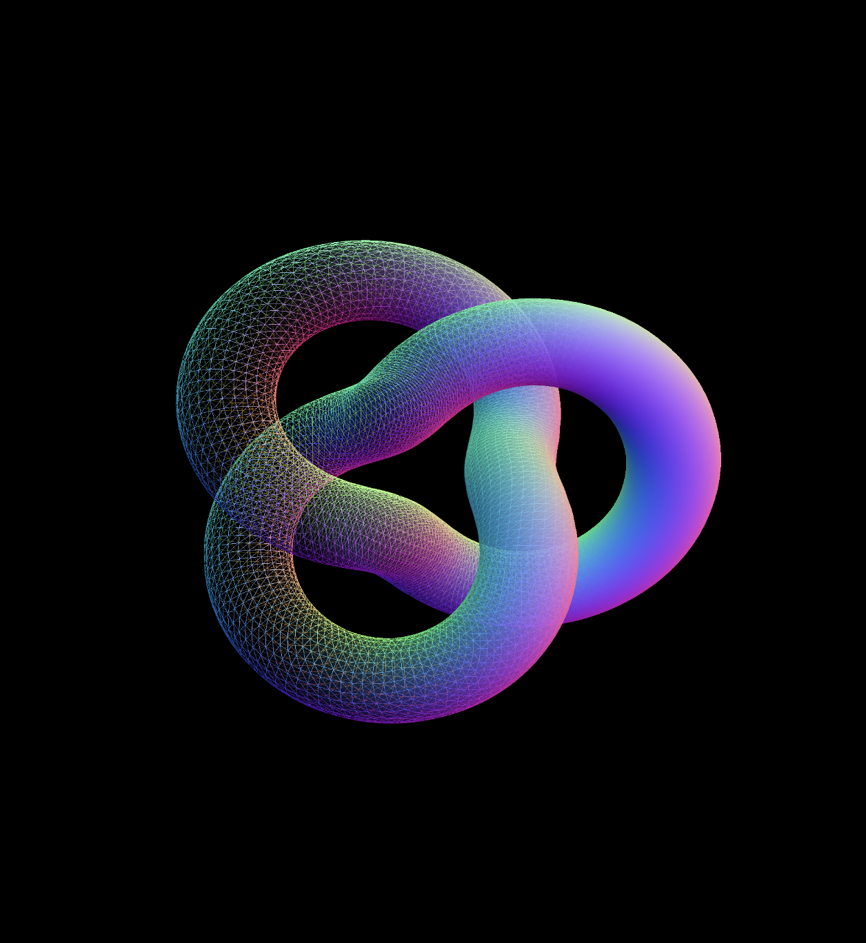
THE TORUS IS BACK. We’ve passed our image texture into the shader and its outputting our original render.
Mixing Wireframe and Solid Materials with Shaders
Shaders were black magic to me before this project. It was my first time using them in production and I’m used to frontend where you think in boxes. Shaders are coordinates 0 to 1, which I find far harder to understand. But, I’d used Photoshop and After Effects with layers plenty of times. These applications do a lot of the same work shaders can: GPU computing. This made it far easier. Starting out by picturing or drawing what I wanted, thinking how I might do it in Photoshop, then asking myself how I could do it with shaders. Photoshop or AE into shaders is far less mentally taxing when you don’t have a deep foundation in shaders.
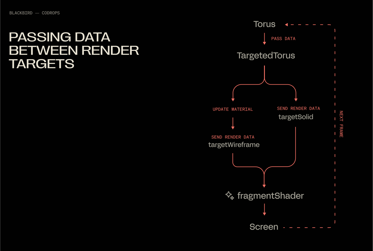
Populating Both Render Targets
At the moment, we are only saving data to the solidTarget render target via normals. We will update our render loop, so that our shader has them both this and wireframeTarget available simultaneously.
With this, you end up with a flow that under the hood looks like this:
Fading Between Two Textures
Our fragment shader will get a little update, 2 additions:
smoothstep creates a linear ramp between 2 values. UVs only go from 0 to 1, so in this case we use .15 and .65 as the limits (they look make the effect more obvious than 0 and 1). Then we use the x value of the uvs to define which value gets fed into smoothstep.
vec4 mixed = mix(wireframe_texture, solid_texture, blend); mix does exactly what it says, mixes 2 values together at a ratio determined by blend. .5 being a perfectly even split.
Congratulations, you’ve officially spent a measurable portion of your day blending two materials together. It was worth it though, wasn’t it? At the very least, I hope this saved you some of the mental gymnastics orchestrating a pair of render targets.
Hey there. My name is Julie Marting, and I’m a Paris-based designer. Focusing on concept, interactivity, and 3D, I’ve been working on these subjects at Hervé Studio for a few years now, with occasional freelance projects when something cool comes my way.
The types of projects I work on revolve around interactive and immersive experiences. From a landing page with interactive elements to a virtual immersive exhibition, or interactive user journeys within applications, my goal is to enhance the user experience by evoking emotions that encourage them to explore or use a service.
Featured work
Madbox
Madbox is a mobile game publisher creating fun, small games with simple gameplay that anyone can enjoy. Our mission was to create a website that reflected their image: playful, innovative, full of references and surprises that delight users, and also one that would make people want to join their team. (And obviously, with a mobile first approach.)
If you are curious, you will be intrigued by the hot-air balloon traveling through the hero section: it takes you on a test to see if you would be a good fit to join the Madbox team.
Personal Notes
This was the first project I worked on when I joined Hervé in 2021, and it’s still one of my favorites. We had so much fun coming up with concepts, interactions, animations, and easter eggs to add to this joyful design. It was a pleasure working with the clients, and a great collaboration with the developers, who were very proactive in making the experience as good as possible.
Fruitz is a French dating app that uses fruits to categorize what you’re looking for: one-night stands, casual matches, serious relationships… While the service is only available through the app, the clients still wanted a playful and interactive landing page for curious visitors. That’s where our adventure began!
To echo the tags and labels used on dating apps, we chose to explore an artistic direction centered around stickers. This also allowed us to highlight the puns that Fruitz loves to use in its communication campaigns.
Personal Notes
This project was a great opportunity to develop a new style for Fruitz’s communication, based on their brand guidelines but with some freedom to explore playful new visuals. It’s also always interesting to come up with a concept for a simple landing page with limited content. It has to catch the eye and delight users, without being “too much”.
For the Vivatech event, the LVMH group needed to create a virtual showcase of its brands’ latest innovations. On this occasion, I teamed up with Cosmic Shelter to create “The Showroom”, an immersive experience where you can discover the stories and the technological advances of the best Maisons, through an imaginary world.
Personal Notes
Aside from the art direction, which I really enjoyed, I found it very interesting to work as a freelancer for another digital agency. Although we share similar processes and methods, everyone works differently, so it’s always instructive to exchange ideas. Working as a freelancer on a specific part of a project (in this case, 3D art direction) and working as a designer within a studio with multiple roles on the same project are two very different experiences, both of which are incredibly enriching to explore.
365, A Year Of Cartier
Every year, Cartier publishes a magazine showcasing their key actions over the past 12 months. For two years in a row, they asked us at Hervé Studio to create a digital version of the magazine.
The goal was to bring together 29 articles across 6 chapters around a central navigation system, ensuring that users wouldn’t miss anything, and especially the 6 immersive articles we developed further.
Personal Notes
The challenge on this project was the tight deadline in relation to the complexity of the experiments and the creative intentions we wanted to bring to them. We were a small team, so we had to stay organized and work quickly, but in the end it was a real pleasure to see all these experiments come to life.
For the end-of-year celebrations, Lacoste wanted to promote the customization feature of their polo shirts. We were asked at Hervé Studio to design a short video highlighting this feature and its various possibilities.
Personal notes
This really cool project, despite its short deadline, was a great opportunity to explore the physics effects in Cinema 4D, which I wasn’t very familiar with. It was important to develop a storytelling approach around the creation of a unique polo, and I’m proud of the result we managed to achieve for this two-week project.
Background & Career highlights
As interactive design is a recent and niche field, I began my studies in graphic design without knowing it even existed. It was at Gobelins that I discovered and fell in love with this specialty, and I went on to enroll in a master’s degree in interactive design. The main strength of this school was the sandwich course, which allowed me to start my first job at a very young age. After working for a bespoke industrial design studio, a ready-to-wear brand, and a digital agency, I finally joined Hervé Studio over four years ago.
We were a small team with a human spirit, which gave me the opportunity to quickly take on responsibilities for projects of various sizes.
We’ve grown and evolved, winning over new clients and new types of projects. We were eventually invited to give a talk at the Paris Design Meetup organized by Algolia and Jitter, and later at the OFFF Vienna festival. There, we shared our experience on the following topic: “WebGL for Interactivity: From Concept to Production”. The idea was to demystify the use of this technology, highlight the possibilities it opens up for designers, and explain our workflow and collaboration with developers to move forward together on a shared project.
Talk at the OFFF Vienna Festival with the co-founders of Hervé Studio: Romain Briaux and Vincent Jouty
Design Philosophy
I am convinced that in this overwhelming world, design can bring us meaning and calm. In my approach, I see it as a way to transport people into a world beyond the ordinary. Immersing users, capturing their attention, and offering them a moment of escape while conveying a message is what I aspire to.
Injecting meaning into projects is a leitmotif. It’s obviously not enough to create something beautiful; it’s about creating something tailor-made that holds meaning for users, clients, and ourselves.
Interactive design enables us to place the user at the center of the experience, making them an active participant rather than just a reader of information or a potential consumer. Moreover, interactive design can sometimes evoke emotions and create lasting memories. For these reasons, this specialty feels like a powerful medium for expression and exchange, because that’s what it’s all about.
Tools & Technics
A pencil and some paper: inherent to creation
Figma: to gather and create
Cinema 4D + Octane render: to let the magic happen
But I would say the best tool is communication, within the team and with developers, to understand how we can work better together, which techniques to use, and how to achieve a smoother workflow and a stunning result.
Inspiration
We’re lucky to have many platforms to find inspiration today, but I would say my main source of inspiration comes from life itself, everything that crosses our path at any given moment. Staying open to what surrounds us, observing, and focusing our attention on things that catch our eye or raise questions. It can be visual (static or moving), a sensation, a feeling, a moment, an action, a concept, a sentence, an idea, anything we’re sensitive to.
And if we get inspired by something and need to take some notes or sketch it, no matter how accurate the result is, the important thing is to catch the inspiration and explore all around. This is why I like to do some photography in my spare time, or other accessible crafts like painting on objects, nude drawing sessions, or creating little jewels out of nowhere. These activities are very invigorating and allow us to take a break from our hectic lives.
Future goals
My main goal is to finally start working on my portfolio. Like many designers, I’ve always postponed this moment, relying on platforms like Behance to showcase my projects. But there comes a time when it’s important to have an online presence, a professional storefront that evolves with us over time.
Final Thoughts
Don’t pay too much attention to negative minds. Believe in yourself, stick to what you like, explore and try without worrying about rules or expectations. Make mistakes and don’t blame yourself for them. On the contrary, failures can sometimes lead to good surprises, or at least valuable lessons. Above all, listen to yourself and find the right balance between creating and taking time to breathe. Enjoying yourself is essential.
Contact
Thank you very much for your reading, and feel free to reach out if interested in anything, I would be happy to discuss!
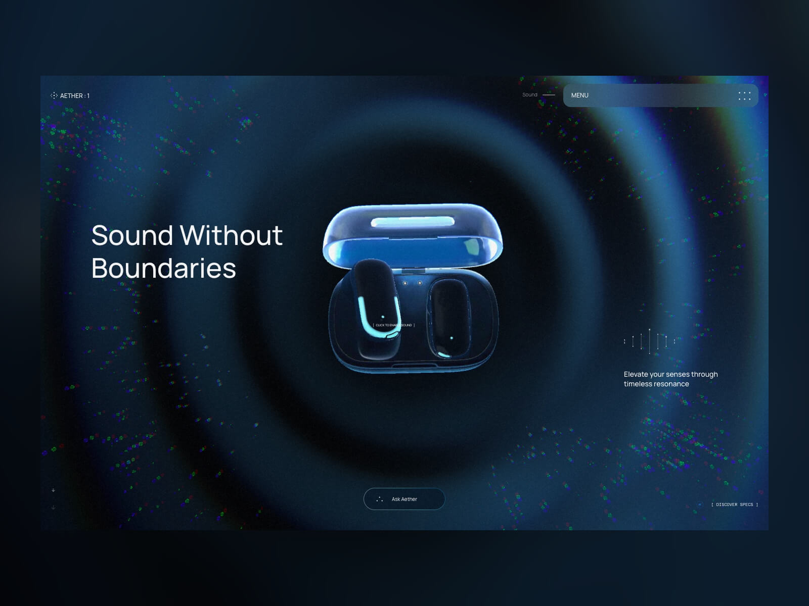
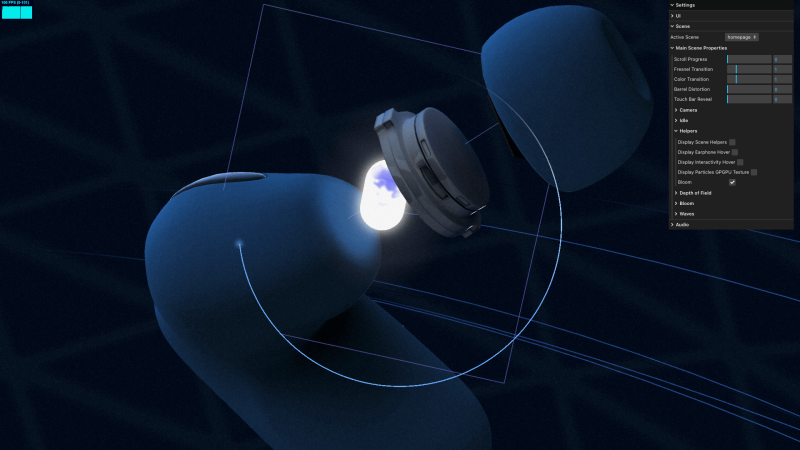
Aether 1 began as an internal experiment at OFF+BRAND: Could we craft a product‑launch site so immersive that visitors would feel the sound?
The earbuds themselves are fictional, but every pixel of the experience is real – an end‑to‑end sandbox where our brand, 3D, and engineering teams pushed WebGL, AI‑assisted tooling, and narrative design far beyond a typical product page.
This technical case study is the living playbook of that exploration. Inside you’ll find:
3D creation workflow – how we sculpted, animated, and optimised the earphones and their charging case.
Interactive WebGL architecture – the particle flow‑fields, infinite scroll, audio‑reactive shaders, and custom controllers that make the site feel alive.
Performance tricks – GPU‑friendly materials, faux depth‑of‑field, selective bloom, and other tactics that kept the project running at 60 FPS on mobile hardware.
Tool stack & takeaways – what worked, what didn’t, and why every lesson here can translate to your own projects.
Whether you’re a developer, designer, or producer, the next sections unpack the decisions, experiments, and hard‑won optimizations that helped us prove that “sound without boundaries” can exist on the web.
1. 3D Creation Workflow
By Celia Lopez
3D creation of the headphone and case
For the headphone shape, we needed to create one from scratch. To help ourselves quickly sketch out the ideas we had in mind, we used Midjourney. Thanks to references from the internet and the help of AI, we agreed on an artistic direction.
Size reference and headphone creation
To ensure the size matched a real-life reference, we used Apple headphones and iterated until we found something interesting. We used Figma to present all the iterations to the team, exporting three images – front, side, and back – each time to help them better visualize the object.
Same for the case.
Storyboard
For the storyboard, we first sketched our ideas and tried to match each specific scene with a 3D visualization.
We iterated for a while before finalizing the still frames for each part. Some parts were too tricky to represent in 3D, so we adjusted the workflow accordingly.
Motion
So that everyone agrees on the flow, look, and feel, we created a full-motion version of it.
Unwrapping and renaming
To prepare the scene for a developer, we needed to spend some time unwrapping the UVs, cleaning the file, and renaming the elements. We used C4D exclusively for unwrapping since the shapes weren’t too complex. It’s also very important to rename all parts and organize the file so the developer can easily recognize which object is which. (In the example below, we show the technique – not the full workflow or a perfect unwrap.)
Fluid flow baked
Almost all the animations were baked from C4D to Blender and exported as .glb files.
Timing
We decided to start with an infinite scroll and a looped experience. When the user releases the scroll, seven anchors subtly and automatically guide the progression. To make it easier for the developer to divide the baked animation, we used specific timing for each step — 200 keyframes between each anchor.
AO baking
Because the headphones were rotating, we couldn’t bake the lighting. We only baked the Ambient Occlusion shadows to enhance realism. For that, after unwrapping the objects, we combined all the different parts of the headphones into a single object, applied a single texture with the Ambient Occlusion, and baked it in Redshift. Same for the case.
Normal map baked
For the Play‑Stade touchpad only, we needed a normal map, so we exported it. However, since the AO was already baked, the UVs had to remain the same.
Camera path and target
In order to ensure a smooth flow during the web experience, it was crucial to use a single camera. However, since we have different focal points, we needed two separate circular paths with different centers and sizes, along with a null object to serve as a target reference throughout the flow.
2. WebGL Features and Interactive Architecture
By Adrian Gubrica
GPGPU particles
Particles are a great way to add an extra layer of detail to 3D scenes, as was the case with Aether 1. To complement the calming motion of the audio waves, a flow‑field simulation was used — a technique known for producing believable and natural movement in particle systems. With the right settings, the resulting motion can also be incredibly relaxing to watch.
To calculate the flow fields, noise algorithms — specifically Simplex4D — were used. Since these can be highly performance-intensive on the CPU, a GPGPU technique (essentially the WebGL equivalent of a compute shader) was implemented to run the simulation efficiently on the GPU. The results were stored and updated across two textures, enabling smooth and high-performance motion.
Smooth scene transitions
To create a seamless transition between scenes, I developed a custom controller to manage when each scene should or shouldn’t render. I also implemented a manual way of controlling their scroll state, allowing me, for example, to display the last position of a scene without physically scrolling there. By combining this with a custom transition function that primarily uses GSAP to animate values, I was able to create both forward and backward animations to the target scene.
It is important to note that all scenes and transitions are displayed within a “post‑processing scene,” which consists of an orthographic camera and a full‑screen plane. In the fragment shader, I merge all the renders together.
This transition technique became especially tricky when transitioning at the end of each scroll in the main scene to create an infinite loop. To achieve this, I created two instances of the main scene (A and B) and swapped between them whenever a transition occurred.
Custom scroll controller for infinite scrolling
As mentioned earlier, the main scene features an infinite loop at both the start and end of the scroll, which triggers a transition back to the beginning or end of the scene. This behavior is enhanced with some resistance during the backward movement and other subtle effects. Achieving this required careful manual tweaking of the Lenis library.
My initial idea was to use Lenis’ infinite: true property, which at first seemed like a quick solution – especially for returning to the starting scroll position. However, this approach required manually listening to the scroll velocity and predicting whether the scroll would pass a certain threshold to stop it at the right moment and trigger the transition. While possible, it quickly proved unreliable, often leading to unpredictable behavior like broken scroll states, unintended transitions, or a confused browser scroll history.
Because of these issues, I decided to remove the infinite: true property and handle the scroll transitions manually. By combining Lenis.scrollTo(), Lenis.stop(), and Lenis.start(), I was able to recreate the same looping effect at the end of each scroll with greater control and reliability. An added benefit was being able to retain Lenis’s default easing at the beginning and end of the scroll, which contributed a smooth and polished feel.
Cursor with fluid simulation pass
Fluid simulation triggered by mouse or touch movement has become a major trend on immersive websites in recent years. But beyond just being trendy, it consistently enhances the visual appeal and adds a satisfying layer of interactivity to the user experience.
In my implementation, I used the fluid simulation as a blue overlay that follows the pointer movement. It also served as a mask for the Fresnel pass (explained in more detail below) and was used to create a dynamic displacement and RGB shift effect in the final render.
Because fluid simulations can be performance‑intensive – requiring multiple passes to calculate realistic behavior – I downscaled it to just 7.5 percent of the screen resolution. This optimization still produced a visually compelling effect while maintaining smooth overall performance.
Fresnel pass on the earphones
In the first half of the main scene’s scroll progression, users can see the inner parts of the earphones when hovering over them, adding a nice interactive touch to the scene. I achieved this effect by using the fluid simulation pass as a mask on the earphones’ material.
However, implementing this wasn’t straightforward at first, since the earphones and the fluid simulation use different coordinate systems. My initial idea was to create a separate render pass for the earphones and apply the fluid mask in that specific pass. But this approach would have been costly and introduced unnecessary complexity to the post‑processing pipeline.
After some experimentation, I realized I could use the camera’s view position as a kind of screen‑space UV projection onto the material. This allowed me to accurately sample the fluid texture directly in the earphones’ material – exactly what I needed to make the effect work without additional rendering overhead.
Audio reactivity
Since the project is a presentation of earphones, some scene parameters needed to become audio‑reactive. I used one of the background audio’s frequency channels – the one that produced the most noticeable “jumps,” as the rest of the track had a very stable tone – which served as the input to drive various effects. This included modifying the pace and shape of the wave animations, influencing the strength of the particles’ flow field, and shaping the touchpad’s visualizer.
The background audio itself was also processed using the Web Audio API, specifically a low‑pass filter. This filter was triggered when the user hovered over the earphones in the first section of the main scene, as well as during the scene transitions at the start and end. The low‑pass effect helped amplify the impact of the animations, creating a subtle sensation of time slowing down.
Animation and empties
Most of the animations were baked directly into the .glb file and controlled via the scroll progress using THREE.js’s AnimationMixer. This included the camera movement as well as the earphone animations.
This workflow proved to be highly effective when collaborating with another 3D artist, as it gave them control over multiple aspects of the experience – such as timing, motion, and transitions – while allowing me to focus solely on the real‑time interactions and logic.
Speaking of real‑time actions, I extended the scene by adding multiple empties, animating their position and scale values to act as drivers for various interactive events – such as triggering interactive points or adjusting input strength during scroll. This approach made it easy to fine‑tune these events directly in Blender’s timeline and align them precisely with other baked animations.
3. Optimization Techniques
Visual expectations were set very high for this project, making it clear from the start that performance optimization would be a major challenge. Because of this, I closely monitored performance metrics throughout development, constantly looking for opportunities to save resources wherever possible. This often led to unexpected yet effective solutions to problems that initially seemed too demanding or impractical for our goals. Some of these optimizations have already been mentioned – such as using GPGPU techniques for particle simulation and significantly reducing the resolution of the cursor’s fluid simulation. However, there were several other key optimizations that played a crucial role in maintaining solid performance:
Artificial depth of field
One of that was using depth of field during the close‑up view on the headphones. Depth of field is usually used as a post‑processing layer using some kind of convolution to simulate progressive blurring of the rendered scene. I considered this as a good‑to‑have from the beginning in case we will be left with some additional fps, but not as a realistic option.
However, after implementing the particles simulation, which used smoothstep function in the particle’s fragment shader to draw the blue circle, I was wondering if it might not be enough to simply modify its values to make it look like it’s blurred. After few little tweaks, the particles became blurry.
The only problem left was that the blur was not progressive like in a real camera, meaning it was not getting blurry according to the focus point of the camera. So I decided to try the camera’s view position to get some kind of depth value, which surprisingly did the job well.
I applied the same smoothstep technique to the rotating tube in the background, but now without the progressive effect since it was almost at a constant distance most of the time.
Voilà. Depth of field for almost free (not perfect, but does the job well).
Artificial bloom
Bloom was also part of the post‑processing stack – typically a costly effect due to the additional render pass it requires. This becomes even more demanding when using selective bloom, which I needed to make the core of the earphones glow. In that case, the render pass is effectively doubled to isolate and blend only specific elements.
To work around this performance hit, I replaced the bloom effect with a simple plane using a pre‑generated bloom texture that matched the shape of the earphone core. The plane was set to always face the camera (a billboard technique), creating the illusion of bloom without the computational overhead.
Surprisingly, this approach worked very well. With a bit of fine‑tuning – especially adjusting the depth write settings – I was even able to avoid visible overlaps with nearby geometry, maintaining a clean and convincing look.
Custom performant glass material
A major part of the earphones’ visual appeal came from the glossy surface on the back. However, achieving realistic reflections in WebGL is always challenging – and often expensive – especially when using double‑sided materials.
To tackle this, I used a strategy I often rely on: combining a MeshStandardMaterial for the base physical lighting model with a glass matcap texture, injected via the onBeforeCompile callback. This setup provided a good balance between realism and performance.
To enhance the effect further, I added Fresnel lighting on the edges and introduced a slight opacity, which together helped create a convincing glass‑like surface. The final result closely matched the visual concept provided for the project – without the heavy cost of real‑time reflections or more complex materials.
Simplified raycasting
Raycasting on high‑polygon meshes can be slow and inefficient. To optimise this, I used invisible low‑poly proxy meshes for the points of interest – such as the earphone shapes and their interactive areas.
This approach significantly reduced the performance cost of raycasting while giving me much more flexibility. I could freely adjust the size and position of the raycastable zones without affecting the visual mesh, allowing me to fine‑tune the interactions for the best possible user experience.
Mobile performance
Thanks to the optimisation techniques mentioned above, the experience maintains a solid 60 FPS – even on older devices like the iPhone SE (2020).
Three.js: For a project of this scale, Three.js was the clear choice. Its built‑in materials, loaders, and utilities made it ideal for building highly interactive WebGL scenes. It was especially useful when setting up the GPGPU particle simulation, which is supported via a dedicated addon provided by the Three.js ecosystem.
lil‑gui: Commonly used alongside Three.js, was instrumental in creating a debug environment during development. It also allowed designers to interactively tweak and fine‑tune various parameters of the experience without needing to dive into the code.
GSAP: Most linear animations were handled with GSAP and its timeline system. It proved particularly useful when manually syncing animations to the scroll progress provided by Lenis, offering precise control over timing and transitions.
Lenis: As mentioned earlier, Lenis provided a smooth and reliable foundation for scroll behavior. Its syncTouch parameter helped manage DOM shifting on mobile devices, which can be a common challenge in scroll‑based experiences.
5. Results and Takeaways
Aether 1 successfully demonstrated how brand narrative, advanced WebGL interactions, and rigorous 3D workflows can blend into a single, performant, and emotionally engaging web experience.
By baking key animations, using empties for event triggers, and leaning on tools like Three.js, GSAP, and Lenis, the team was able to iterate quickly without sacrificing polish. Meanwhile, the 3D pipeline- from Midjourney concept sketches through C4D unwrapping and Blender export ensured the visual fidelity stayed aligned with the brand vision.
Most importantly, every technique outlined here is transferable. Whether you are considering audio‑reactive visuals, infinite scroll adventures, or simply trying to squeeze extra frames per second out of a heavy scene, the solutions documented above show that thoughtful planning and a willingness to experiment can push WebGL far beyond typical product‑page expectations.
6. Author Contributions
General – Ross Anderson 3D – Celia Lopez WebGL – Adrian Gubrica
7. Site credits
Art Direction – Ross Anderson Design – Gilles Tossoukpe 3D – Celia Lopez WebGL – Adrian Gubrica AI Integration – Federico Valla Motion – Jason Kearley Front End / Webflow – Youness Benammou