I’m Oliver Muñoz, the founder of Uncommon, a digital studio based in Melbourne. These days, I focus less on fine pixels myself and more on leading teams across time zones to do their best work.
After more than a decade freelancing, I decided I wanted to spend more time with my family and less in front of the computer. My first son was about to be born, and I knew I had to make a choice: keep designing every detail myself, or step into leadership and create more space to be present at home. That decision to delegate and trust others was the moment I gave creative leadership a real go.
This story is not about pixels, code, or prototypes; it is about what it takes to lead creatives across time zones and cultures toward a shared vision that wins awards.
Origins of leadership
I always wanted to lead by example, but during my agency years, the opportunity never quite came. It could be because I was freelancing, maybe it was my craft, or perhaps it was the fact that I was an immigrant. At times, I felt I had to work double to get half as far.
One pivotal moment came after contracting for a global agency for twelve months. The design director offered me a full-time role as a Senior Designer, but I only agreed on the condition that she would mentor me into a Design Lead role within six months. She could not commit, so I declined on the spot. That was when I realised leadership was not something I would be handed; I had to create the opportunity myself.
Building a global team
At Uncommon, I believe in bringing in the right experts for each project, no matter where they are in the world. The foundation is always the same: communication, collaboration and clarity. Those three pillars do not just apply to us internally; they extend to our clients and their teams as well.
We rely on all the usual communication tools, but with one rule: every project discussion must live in the dedicated Slack channel. That way time zones do not become bottlenecks; someone in Europe can wake up and skim through everything discussed in Australia the previous day without losing context.
The other challenge is culture. Many of my team members do not speak English as their first language (mine is Español/Spanish), so sometimes feedback can come across as blunt or even harsh when literally translated. Part of my job as a leader is to read between the lines and make sure nothing gets lost or misinterpreted in translation.
Every project begins with a strategy workshop with the client. Because of geography, not everyone can join live, so we document everything and share it back with the team. From there, each creative gets space to explore, research and design independently. A few days later, we regroup online, share progress and spark new ideas off each other’s work.
I encourage the team to seek inspiration outside the obvious. If we are designing a healthcare booking system, do not just look at other healthcare apps; look at how airlines handle complex flows, or how Airbnb structures information. Borrow what works and apply it in unexpected places.
Inevitably, different perspectives lead to different opinions. When we hit a deadlock, I return to the brief and the workshop findings to guide us. Often, it comes down to cultural context; the way something works in the U.S. is not necessarily right for Australia. Luckily, I tend to choose collaborators who are already a few steps ahead of the brief, so real deadlocks are rare.
Remote leadership means I cannot control the environment in which my team works. Distractions happen. Sometimes it is tempting to accept the first idea for a small component and move on. When that happens, I ask the team to park the safe option and keep searching for something more inventive. It is not always popular in the moment; people can get frustrated with me, but when the work earns recognition from peers or even industries outside our own, the team sees the value in going the extra mile.
I have also learned I do not need to have all the answers. Initially, I attempted to solve everything on my own. Now, when in doubt, I let the team debate and find their way forward. They are the experts. My job is to steer, not dictate. Sometimes the best leadership move is simply to pause, take a breath, and let go.
Leading for outcomes
Awards were never the goal. They are a pat on the back, not the finish line. At the end of the day, an award is just the result of votes from people you have probably never met. What matters more is that the work solved the client’s problem in a way that surprised them and us.
That said, awards do have a practical benefit. Clients discover us through those platforms, and it helps attract the kind of people who value craft. So while they are not everything, they have become part of our strategy for growth.
I do not see myself as a director with a rigid script, but more as a coach who sets the stage for others to shine. Part of my job is to recognise strengths, knowing who will thrive on a marketing website versus who will excel in product design, and put people in the right role.
My non-negotiables are openness and empathy. I need to stay open to better ideas than my own, and I need to understand when life outside of work affects someone’s pace.
Humility, to me, means surrounding myself with people who are better than I am. If I am consistently producing more or better work than my team, then I have hired the wrong people. The best sign that I am doing my job well is being the worst designer in the room.
Every project brings challenges, distance, culture, and deadlines, but the hardest moments are usually about trust. Trusting the team to explore without me hovering, trusting myself to step back and let them solve problems. The lesson I keep coming back to is that leadership is less about control and more about creating the conditions for trust to grow.
Inspiration and advice
Early in my career, after a failed internship, the Creative Director pulled me aside and said, “I have been to your country, eaten your food, talked to the locals. You need to embrace who you are and where you come from; that is how you will succeed.” That advice has stuck with me. Play to your strengths. Do not try to be something you are not.
For anyone leading a globally distributed team, my advice is simple: have cultural context. Your experiences are not the same as your team’s. Take time for casual, human conversations that are not about deadlines. Asking about someone’s cat or weekend can go further than you think.
Looking ahead, I hope leadership becomes more relaxed, more human. Less about the suit, more about the fun. We all need to remember why we started doing this in the first place.
Closing
This project proved to me that creativity does not live in a single city or time zone. It thrives when people from different backgrounds rally around a shared vision. Leadership, in this context, is about orchestrating that energy, not controlling it.
I am not here to sell a course or a product. But if you would like to follow along as I keep exploring what it means to lead and create in a global, digital-first world, you can find me on LinkedIn or Instagram. I share the wins, the lessons, and sometimes even the doubts, because that is all part of the journey.
After a series of commercial projects that were more practical than playful, I decided to use my portfolio site as a space to experiment with new ideas. My goals were clear: one, it had to be interactive and contain 3D elements. Two, it needed to capture your attention. Three, it had to perform well across different devices.
How did the idea for my site come about? Everyday moments. In the toilet, to be exact. My curious 20-month-old barged in when I was using the toilet one day and gleefully unleashed a long trail of toilet paper across the floor. The scene was chaotic, funny and oddly delightful to watch. As the mess grew, so did the idea: this kind of playful, almost mischievous, interaction with an object could be reimagined as a digital experience.
Of course, toilet paper wasn’t quite the right fit for the aesthetic, so the idea pivoted to duct tape. Duct tape was cooler and more in tune with the energy the project needed. With the concept locked in, the process moved to sketching, designing and coding.
Design Principles
With duct tape unraveling across the screen, things could easily feel chaotic and visually heavy. To balance that energy, the interface was kept intentionally simple and clean. The goal was to let the visuals take center stage while giving users plenty of white space to wander and play.
There’s also a layer of interaction woven into the experience. Animations respond to user actions, creating a sense of movement and interactivity. Hidden touches, like the option to rewind, orbit around elements, or a blinking dot that signals unseen projects.
Hitting spacebar rewinds the roll so that it can draw a new path again.
Hitting the tab key unlocks an orbit view, allowing the scene to be explored from different angles.
Building the Experience
Building an immersive, interactive portfolio is one thing. Making it perform smoothly across devices is another. Nearly 70% of the effort went into refining the experience and squeezing out every drop of performance. The result is a site that feels playful on the surface, but under the hood, it’s powered by a series of systems built to keep things fast, responsive, and accessible.
01. Real-time path drawing
The core magic lies in real-time path drawing. Mouse or touch movements are captured and projected into 3D space through raycasting. Points are smoothed with Catmull-Rom curves to create flowing paths that feel natural as they unfold. Geometry is generated on the fly, giving each user a unique drawing that can be rewound, replayed, or explored from different angles.
02. BVH raycasting
To keep those interactions fast, BVH raycasting steps in. Instead of testing every triangle in a scene, the system checks larger bounding boxes first, reducing thousands of calculations to just a few. Normally reserved for game engines, this optimization brings complex geometry into the browser at smooth 60fps.
// First, we make our geometry "smart" by adding BVH acceleration
useEffect(() => {
  if (planeRef.current && !bvhGenerated.current) {
    const plane = planeRef.current

    // Step 1: Create a BVH tree structure for the plane
    const generator = new StaticGeometryGenerator(plane)
    const geometry = generator.generate()

    // Step 2: Build the acceleration structure
    geometry.boundsTree = new MeshBVH(geometry)

    // Step 3: Replace the old geometry with the BVH-enabled version
    if (plane.geometry) {
      plane.geometry.dispose() // Clean up old geometry
    }
    plane.geometry = geometry

    // Step 4: Enable fast raycasting
    plane.raycast = acceleratedRaycast

    bvhGenerated.current = true
  }
}, [])
03. LOD + dynamic device detection
The system detects the capabilities of each device, GPU power, available memory, even CPU cores, and adapts quality settings on the fly. High-end machines get the full experience, while mobile devices enjoy a leaner version that still feels fluid and engaging.
const [isLowResMode, setIsLowResMode] = useState(false)
const [isVeryLowResMode, setIsVeryLowResMode] = useState(false)

// Detect low-end devices and enable low-res mode
useEffect(() => {
  const detectLowEndDevice = () => {
    const isMobile = /Android|webOS|iPhone|iPad|iPod|BlackBerry|IEMobile|Opera Mini/i.test(navigator.userAgent)
    const isLowMemory = (navigator as any).deviceMemory && (navigator as any).deviceMemory < 4
    const isLowCores = (navigator as any).hardwareConcurrency && (navigator as any).hardwareConcurrency < 4
    const isSlowGPU = /(Intel|AMD|Mali|PowerVR|Adreno)/i.test(navigator.userAgent) && !/(RTX|GTX|Radeon RX)/i.test(navigator.userAgent)

    const canvas = document.createElement('canvas')
    const gl = canvas.getContext('webgl') || canvas.getContext('experimental-webgl') as WebGLRenderingContext | null
    let isLowEndGPU = false
    let isVeryLowEndGPU = false

    if (gl) {
      const debugInfo = gl.getExtension('WEBGL_debug_renderer_info')
      if (debugInfo) {
        const renderer = gl.getParameter(debugInfo.UNMASKED_RENDERER_WEBGL)
        isLowEndGPU = /(Mali-4|Mali-T|PowerVR|Adreno 3|Adreno 4|Intel HD|Intel UHD)/i.test(renderer)
        isVeryLowEndGPU = /(Mali-4|Mali-T6|Mali-T7|PowerVR G6|Adreno 3|Adreno 4|Intel HD 4000|Intel HD 3000|Intel UHD 600)/i.test(renderer)
      }
    }

    const isVeryLowMemory = (navigator as any).deviceMemory && (navigator as any).deviceMemory < 2
    const isVeryLowCores = (navigator as any).hardwareConcurrency && (navigator as any).hardwareConcurrency < 2

    const shouldEnableVeryLowRes = isVeryLowMemory || isVeryLowCores || isVeryLowEndGPU

    if (shouldEnableVeryLowRes) {
      setIsVeryLowResMode(true)
      setIsLowResMode(true)
    } else if (isMobile || isLowMemory || isLowCores || isSlowGPU || isLowEndGPU) {
      setIsLowResMode(true)
    }
  }

  detectLowEndDevice()
}, [])
04. Keep-alive frame system + throttled geometry updates
To ensures smooth performance without draining batteries or overloading CPUs. Frames render only when needed, then hold a steady rhythm after interaction to keep everything responsive. It’s this balance between playfulness and precision that makes the site feel effortless for the user.
The Creator
Lax Space is a combination of my name, Lax, and a Space dedicated to creativity. It’s both a portfolio and a playground, a hub where design and code meet in a fun, playful and stress-free way.
Originally from Singapore, I embarked on creative work there before relocating to Japan. My aims were simple: explore new ideas, learn from different perspectives and challenge old ways of thinking. Being surrounded by some of the most inspiring creators from Japan and beyond has pushed my work further creatively and technologically.
Design and code form part of my toolkit, and blending them together makes it possible to craft experiences that balance function with aesthetics. Every project is a chance to try something new, experiment and push the boundaries of digital design.
I am keen to connecting with other creatives. If something at Lax Space piques your interest, let’s chat!
In the vast field of digital art, few creators manage to transform the familiar into something quietly unsettling as convincingly as Kakeru Taira. Working primarily in Blender, the self-taught Japanese artist has gained international attention for his meticulously crafted liminal spaces — laundromats, apartments, train stations, bookstores — places that feel both intimately real and strangely out of reach.
What makes his work remarkable is not only its technical precision but also the atmosphere it carries. These environments are steeped in silence and suggestion, capturing the in-between quality of spaces that are usually overlooked. They can feel nostalgic, eerie, or comforting, depending on the viewer — and that ambiguity is intentional. Taira resists defining his own works, believing that each person should encounter them freely, bringing their own memories, feelings, and interpretations.
For our community of designers and developers, his work offers both inspiration and insight: into craft, persistence, and the power of detail. In this conversation, I spoke with Taira about his journey into 3D, the challenges of mastering Blender, his thoughts on liminal spaces, and his perspective on where CGI art is headed.
For readers who may be discovering your work for the first time, how would you like to introduce yourself?
Nice to meet you. My name is Kakeru Taira. I use Blender to create CG works with the theme of “discomfort” and “eerieness” that lurk in everyday life. By adding a slight sense of distortion and unease to spaces that we would normally overlook, I aim to create works that stimulate the imagination of the viewer.
If someone only saw one of your works to understand who you are, which would you choose and why?
“An apartment where a man in his early twenties likely lives alone”
This work is set in a small apartment, a typical Japanese setting.
I think even first-time viewers will enjoy my work, as it captures the atmosphere of Japanese living spaces, the clutter of objects, and the sense that something is lurking.
You began with illustration before discovering Blender. What shifted in your way of thinking about space and composition when you moved into 3D?
When I was drawing illustrations, I didn’t draw backgrounds or spaces, and instead focused mainly on female characters. My main concern was “how to make a person look attractive” within a single picture.
However, since moving to 3DCG, I often don’t have a clear protagonist character. As a result, it has become necessary to draw the eye to the space itself and let the overall composition speak for the atmosphere.
As a result, I now spend more time on elements that I hadn’t previously paid much attention to, such as “where to place objects” and “what kind of atmosphere to create with lighting.” I think the “elements to make a person look impressive” that I developed when drawing characters has now evolved into “a perspective that makes the space speak like a person.”
When you spend long hours building a scene, how do you keep perspective on the overall atmosphere while working on small details?
When I work, I am always conscious of whether the scene feels “pleasant” when viewed from the camera’s point of view. In my work, I place particular emphasis on arranging objects so that the viewer’s gaze converges toward the center, and on symmetry to create a balance between the left and right sides, in order to tighten up the overall scene.
Your scenes often feel uncanny because of subtle details. Which kind of detail do you think has the greatest impact on atmosphere, even if most viewers might overlook it?
In my works, I believe that elements such as the overall color, camera shake, and the “converging lines that converge at the center of the screen” created by the placement of objects have a particularly large influence on the atmosphere.
Color dominates the impression of the entire space, while camera shake expresses the tension and desperation of the characters and the situation. By placing objects so that the viewer’s eyes naturally converge at the center, I devise a way for them to intuitively sense the overall atmosphere and eeriness of the scene, even if they are looking absentmindedly.
Many of your works depict ordinary Japanese places. In your opinion, what makes these overlooked everyday spaces such powerful subjects for digital art?
My works are set in ordinary Japanese spaces that are usually overlooked and no one pays any attention to them. It is precisely because they are overlooked that with just a little modification they have the power to create a different atmosphere and an extraordinary impression. I believe that by bringing out the subtle incongruity and atmosphere that lurks in the everyday through light, color and the placement of objects, it is possible to create a strong and memorable expression even in ordinary places.
People outside Japan often feel nostalgia in your works, even if they’ve never experienced those locations. Why do you think these atmospheres can feel universally familiar?
I believe the reason why people outside of Japan feel a sense of nostalgia when they see my works, even in places they’ve never been to, is largely due to the concept of “liminal space,” which has become a hot topic online. One thing my works have in common with liminal space is that, despite the fact that they are spaces where people are meant to come and go and be used, no people are visible on screen. At the same time, however, traces of people’s past, such as the scrapes on the floor and the presence of placed objects, float about, evoking a faint sense of life amid the silence.
I believe that this “coexistence of absence and traces” stimulates memories that lie deep within the hearts of people of all countries. Even in places that have never been visited, an atmosphere that everyone has experienced at least once is evoked—a universal feeling that perhaps connects to nostalgia and familiarity.
You’ve said you don’t want to define your works, leaving each viewer free to imagine. Why do you feel that openness is especially important in today’s fast, online culture?
I believe that prioritizing speed alone would limit the expression I truly want to do, putting the cart before the horse. Of course, I want my work to reach as many people as possible, but I think what’s more important is to “first give form to the video I truly want to make.”
On top of that, by leaving room for viewers to freely interpret it, I believe my work will not be bound by the times or trends, and will continue to have new meanings for each person. That’s why I feel there is value in being intentionally open, even in today’s fast-paced online culture.
Working for weeks on a single piece requires persistence. What do you tell yourself in the moments when motivation is low?
I love my own work, so my biggest motivation is the desire to see the finished product as soon as possible. Sometimes my motivation drops along the way, but each time that happens I tell myself that it will be interesting once it’s finished, and that I’ll be its first audience, and that helps me move forward.
Creating something is a difficult process, but imagining the finished product naturally lifts my spirits, and I think that’s what allows me to persevere.
Recently, you’ve shared works where you used Adobe Firefly to generate textures and experiment with new elements. How do you see AI fitting into your creative workflow alongside Blender?
For me, using AI feels “similar to outsourcing”. For example, I leave detailed work that CG artists aren’t necessarily good at, such as creating textures for product packaging, to AI, as if I were asking a specialized artist. This allows me to focus on core aspects like composition and spatial design, which improves the overall finish and speed of the work.
By combining modeling in Blender with assistance from AI, I can utilize the strengths of each to advance production, which is of great significance to my current workflow.
Note: At Kakeru’s request, we’d like to clarify that Adobe Firefly’s learning data is based solely on Adobe Stock and copyright-free content. The tool was developed with copyright considerations in mind to ensure safe use. He asked us to share this so readers can better understand how Firefly is positioned in his workflow.
You’ve mentioned that AI can speed up some tasks, like texture creation. In your view, which parts of your process should be efficient, and which should remain slow and deliberate?
I can’t leave the core parts, such as designing the composition or developing the entire work, to AI, as these are the most important elements that reflect my own sense and narrative. On the other hand, I feel that processes such as creating textures and considering variations can be made more efficient by using AI.
In other words, I value drawing the line between “taking my time carefully to decide the direction and atmosphere of the work” and “having AI help with repetitive tasks and auxiliary parts.” I believe that by being conscious of the balance between efficiency and deliberation, I can take advantage of the convenience of AI while also protecting the originality of my own expression.
Some artists worry AI reduces originality. How do you approach using AI in a way that still keeps your signature atmosphere intact?
I use AI solely as a “tool to assist my creation,” and I always make sure to come up with the core story and atmosphere of my work myself. If I become too dependent on AI, I won’t be able to truly say that my work is my own. Ultimately, humans are the main actors, and AI merely exists to make work more efficient and provide opportunities to draw out new ideas.
For this reason, during the production process, I am always conscious of “at what stage and to what extent should I borrow the power of AI?” By prioritizing my own sense and expression while incorporating the strengths of AI in moderation, I believe I can expand the possibilities of new expression while retaining my own unique atmosphere in my work.
Outside of Blender, are there experiences — in film, architecture, music, or daily routines — that you feel shape the way you design your environments?
I am particularly drawn to the works of directors Yasujiro Ozu and Stanley Kubrick, where you can sense their passion for backgrounds and spatial design. Both directors have a very unique way of perceiving space, and even cutting out a portion of the screen has a sense of tension and beauty that makes it stand out as a “picture.” I have been greatly influenced by their approach, and in my own creations I aim to create “spaces that can be appreciated like a painting,” rather than just backgrounds.
By incorporating the awareness of space I have learned from film works into my own CG expressions, I hope to be able to create a mysterious sense of depth and atmosphere even in everyday scenes.
If you were giving advice to someone just starting with Blender, what would you say that goes beyond technical skill — about patience, mindset, or approach?
One of Blender’s biggest strengths is that, unlike other CG software, it is free to start using. There are countless tutorials on YouTube, so you can learn at your own pace without spending money on training or learning. And the more you create, the more models you accumulate as your own assets, which can be motivating when you look back and see how much you’ve grown.
Furthermore, when continuing your learning journey, it is important to adopt a patient and persistent attitude. At first, things may not go as planned, but the process of trial and error itself is valuable experience. Once you have completed a project, I also recommend sharing it on social media. Due to the influence of algorithms, it is difficult to predict which works will gain attention on social media today. Even a small challenge can catch the eye of many people and lead to unexpected connections or recognition. I hope that this content will be of some assistance to your creative endeavors.
Step Into Kakeru’s Spaces
Thank you, Kakeru, for sharing your journey and insights with us!
Your ability to turn everyday spaces into something quietly profound reminds us of the power of detail, patience, and imagination in creative work. For those curious to experience his atmospheres firsthand, we invite you to explore Kakeru Taira’s works — they are pieces of digital art that blur the line between the familiar and the uncanny, and that might just stir memories you didn’t know you carried.
LO2S approached SNP & DashDigital with the ambition to build a website that didn’t just present their services but embodied their fast-paced, movement-driven ethos. They wanted users to feel the energy of their work as they navigated the site. For us, this meant leaning into full-screen video, fluid transitions, and interactive motion as core building blocks. The challenge wasn’t just visual polish, it was making sure these elements stayed performant and seamless under the hood.
Technologies and Tools
We built the site on a fairly standard stack — Next.js (Page Router), GSAP, Strapi, AWS, CloudFront, with one key addition: OGL.
Why OGL?
It’s lightweight compared to three.js.
It gives maximum rendering control.
It’s ideal when you don’t need heavy model support (GLTF/OBJ/FBX).
This was our first time implementing OGL in production. The LO2S site didn’t need complex 3D assets, so OGL was a natural choice for performant, interactive visuals without extra overhead.
Key Features
Immersive Landing Experience A full-screen video serves as the entry point, with a four-grid hover navigation exposing featured projects. This setup made it simple for users to dive directly into the work while keeping the landing visually impactful.
Dual Work Views The Work page offers two ways to explore:
A list view for quick navigation.
A dynamic card layout, where projects animate forward and off-screen. It creates a browsing rhythm that feels closer to a cinematic sequence than a typical index page.
Infinite 3D Gallery with Blur We implemented an infinite gallery using transform3d and vanilla JS instead of WebGL. This kept the build light, while still supporting background blur. Blur often raises performance red flags, but careful optimisation keeps the effect stable across devices.
Interactive Logo Shader We built a custom shader (inspired by Studio 27b) to make the logo feel aligned to the brand essence. On hover, characters shift and blend, creating a sense of connection reminiscent of light patterns at live events.
Technical Refinement Our first text distortion tests looked jagged. We solved this with a custom aastep function for programmatic antialiasing. It analyses texture gradients and smooths pixel transitions, ensuring the typography scales cleanly and looks sharp even under distortion.
Visual & Interactive Elements
Some of the smaller but critical pieces that shaped the experience:
Page transitions tied to the logo for continuity.
Distortion shader applied to text for responsive motion.
Dynamic content modules that adapt layouts in real time.
Animated preloader to set the tone from first load.
Architecture and Structure
Fast content delivery was a non-negotiable requirement. We tackled it in two ways:
CDN Delivery: Media is served via AWS CloudFront, with Strapi configured to push assets to an S3 bucket automatically.
Video optimisation: We provided the client with bash ffmpeg scripts to batch-optimise video files, balancing quality with load speed.
Reflection & Learnings
Every build is an opportunity to refine our process and build strategy. For LO2S, we initially relied on Strapi’s Sharp integration for image cropping, which raised two pain points:
Uploading raw 4K images slowed the pipeline and occasionally failed.
Sharp auto-generated multiple image sizes, many of which were unnecessary.
After the project, we tested imgproxy and found it better suited to our needs:
Works seamlessly with CDNs and caching.
Isolates processing from the main app.
Lets you configure image formats per use case.
Delivered 620+ requests/sec with ~12.8ms latency in benchmarks.
For us, that’s the direction forward, a cleaner, faster, and more reliable image workflow.
I’ve always been interested in data visualization using Three.js / R3F, and I thought a weather web app would be the perfect place to start. One of my favorite open-source libraries, @react-three/drei, already has a bunch of great tools like clouds, sky, and stars that fit perfectly into visualizing the weather in 3D.
This tutorial explores how to transform API data into a 3D experience, where we add a little flair and fun to weather visualization.
The Technology Stack
Our weather world is built on a foundation of some of my favorite technologies:
Weather Components
The heart of our visualization lies in conditionally showing a realistic sun, moon, and/or clouds based on the weather
results from your city or a city you search for, particles that simulate rain or snow, day/night logic, and some fun
lighting effects during a thunderstorm. We’ll start by building these weather components and then move on to displaying
them based on the results of the WeatherAPI call.
Sun + Moon Implementation
Let’s start simple: we’ll create a sun and moon component that’s just a sphere with a realistic texture wrapped
around it. We’ll also give it a little rotation and some lighting.
// Sun.js and Moon.js Component, a texture wrapped sphere
import React, { useRef } from 'react';
import { useFrame, useLoader } from '@react-three/fiber';
import { Sphere } from '@react-three/drei';
import * as THREE from 'three';

const Sun = () => {
  const sunRef = useRef();

  const sunTexture = useLoader(THREE.TextureLoader, '/textures/sun_2k.jpg');

  useFrame((state) => {
    if (sunRef.current) {
      sunRef.current.rotation.y = state.clock.getElapsedTime() * 0.1;
    }
  });

  const sunMaterial = new THREE.MeshBasicMaterial({
    map: sunTexture,
  });

  return (
    <group position={[0, 4.5, 0]}>
      <Sphere ref={sunRef} args={[2, 32, 32]} material={sunMaterial} />

      {/* Sun lighting */}
      <pointLight position={[0, 0, 0]} intensity={2.5} color="#FFD700" distance={25} />
    </group>
  );
};

export default Sun;
I grabbed the CC0 texture from here. The moon component is essentially the same; I used this image. The pointLight intensity is low because most of our lighting will come from the sky.
Rain: Instanced Cylinders
Next, let’s create a rain particle effect. To keep things performant, we’re going to use instancedMesh instead of creating a separate mesh component for each rain particle. We’ll render a single geometry (<cylinderGeometry>) multiple times with different transformations (position, rotation, scale). Also, instead of creating a new THREE.Object3D for each particle in every frame, we’ll reuse a single dummy object. This saves memory and prevents the overhead of creating and garbage-collecting a large number of temporary objects within the animation loop. We’ll also use the useMemo hook to create and initialize the particles array only once when the component mounts.
When a particle reaches a negative Y-axis level, it’s immediately recycled to the top of the scene with a new random horizontal position, creating the illusion of continuous rainfall without constantly creating new objects.
Snow: Physics-Based Tumbling
We’ll use the same basic template for the snow effect, but instead of the particles falling straight down, we’ll give them some drift.
The horizontal drift uses Math.sin(state.clock.elapsedTime + i), where state.clock.elapsedTime provides a continuously increasing time value and i offsets each particle’s timing. This creates a natural swaying motion in which each snowflake follows its own path. The rotation updates apply small increments to both the X and Y axes, creating the tumbling effect.
Storm System: Multi-Component Weather Events
When a storm rolls in, I wanted to simulate dark, brooding clouds and flashes of lightning. This effect requires combining multiple weather effects simultaneously. We’ll import our rain component, add some clouds, and implement a lightning effect with a pointLight that simulates flashes of lightning coming from inside the clouds.
The lightning system uses a simple ref-based cooldown mechanism to prevent constant flashing. When lightning triggers, it creates a single bright flash with random positioning. The system uses setTimeout to reset the light intensity after 400ms, creating a realistic lightning effect without complex multi-stage sequences.
Clouds: Drei Cloud
For weather types like cloudy, partly cloudy, overcast, foggy, rainy, snowy, and misty, we’ll pull in our clouds component. I wanted the storm component to have its own clouds because storms should have darker clouds than the conditions above. The clouds component will simply display Drei clouds, and we’ll pull it all together with the sun or moon component in the next section.
Now that we’ve built our weather components, we need a system to decide which ones to display based on real weather data. The WeatherAPI.com service provides detailed current conditions that we’ll transform into our 3D scene parameters. The API gives us condition text like “Partly cloudy,” “Thunderstorm,” or “Light snow,” but we need to convert these into our component types.
// weatherService.js - Fetching real weather data
const response = await axios.get(
  `${WEATHER_API_BASE}/forecast.json?key=${API_KEY}&q=${location}&days=3&aqi=no&alerts=no&tz=${Intl.DateTimeFormat().resolvedOptions().timeZone}`,
  { timeout: 10000 }
);
The API request includes time zone information so we can accurately determine day or night for our Sun/Moon system. The days=3 parameter grabs forecast data for our portal feature, while aqi=no&alerts=no keeps the payload lean by excluding data we don’t need.
Converting API Conditions to Component Types
The heart of our system is a simple parsing function that maps hundreds of possible weather descriptions to our manageable set of visual components:
// weatherService.js - Converting weather text to renderable types
export const getWeatherConditionType = (condition) => {
  const conditionLower = condition.toLowerCase();

  if (conditionLower.includes('sunny') || conditionLower.includes('clear')) {
    return 'sunny';
  }
  if (conditionLower.includes('thunder') || conditionLower.includes('storm')) {
    return 'stormy';
  }
  if (conditionLower.includes('cloud') || conditionLower.includes('overcast')) {
    return 'cloudy';
  }
  if (conditionLower.includes('rain') || conditionLower.includes('drizzle')) {
    return 'rainy';
  }
  if (conditionLower.includes('snow') || conditionLower.includes('blizzard')) {
    return 'snowy';
  }
  // ... additional fog and mist conditions
  return 'cloudy';
};
This string-matching approach handles edge cases gracefully—whether the API returns “Light rain,” “Heavy rain,” or “Patchy light drizzle,” they all map to our rainy type and trigger the appropriate 3D effects. This way, we can reuse our main components without needing a separate component for each weather condition.
Conditional Component Rendering
The magic happens in our WeatherVisualization component, where the parsed weather type determines exactly which 3D components to render:
// WeatherVisualization.js - Bringing weather data to life
const renderWeatherEffect = () => {
  if (weatherType === 'sunny') {
    if (partlyCloudy) {
      return (
        <>
          {isNight ? <Moon /> : <Sun />}
          <Clouds intensity={0.5} speed={0.1} />
        </>
      );
    }
    return isNight ? <Moon /> : <Sun />;
  } else if (weatherType === 'rainy') {
    return (
      <>
        <Clouds intensity={0.8} speed={0.15} />
        <Rain count={800} />
      </>
    );
  } else if (weatherType === 'stormy') {
    return <Storm />; // Includes its own clouds, rain, and lightning
  }
  // ... additional weather types
};
This conditional system ensures we only load the particle systems we actually need. A sunny day renders just our Sun component, while a storm loads our complete Storm system with heavy rain, dark clouds, and lightning effects. Each weather type gets its own combination of the components we built earlier, creating distinct visual experiences that match the real weather conditions.
Dynamic Time-of-Day System
Weather isn’t just about conditions—it’s also about timing. Our weather components need to know whether to show the sun or moon, and we need to configure Drei’s Sky component to render the appropriate atmospheric colors for the current time of day. Fortunately, our WeatherAPI response already includes the local time for any location, so we can extract that to drive our day/night logic.
The API provides local time in a simple format that we can parse to determine the current period:
// Scene3D.js - Parsing time from weather API data
const getTimeOfDay = () => {
  if (!weatherData?.location?.localtime) return 'day';
  const localTime = weatherData.location.localtime;
  const currentHour = new Date(localTime).getHours();

  if (currentHour >= 19 || currentHour <= 6) return 'night';
  if (currentHour >= 6 && currentHour < 8) return 'dawn';
  if (currentHour >= 17 && currentHour < 19) return 'dusk';
  return 'day';
};
This gives us four distinct time periods, each with different lighting and sky configurations. Now we can use these periods to configure Drei’s Sky component, which handles atmospheric scattering and generates realistic sky colors.
Dynamic Sky Configuration
Drei’s Sky component is fantastic because it simulates actual atmospheric physics—we just need to adjust atmospheric parameters for each time period:
// Scene3D.js - Time-responsive Sky configuration
{timeOfDay !== 'night' && (
  <Sky
    sunPosition={(() => {
      if (timeOfDay === 'dawn') {
        return [100, -5, 100]; // Sun below horizon for darker dawn colors
      } else if (timeOfDay === 'dusk') {
        return [-100, -5, 100]; // Sun below horizon for sunset colors
      } else { // day
        return [100, 20, 100]; // High sun position for bright daylight
      }
    })()}
    inclination={(() => {
      if (timeOfDay === 'dawn' || timeOfDay === 'dusk') {
        return 0.6; // Medium inclination for transitional periods
      } else { // day
        return 0.9; // High inclination for clear daytime sky
      }
    })()}
    turbidity={(() => {
      if (timeOfDay === 'dawn' || timeOfDay === 'dusk') {
        return 8; // Higher turbidity creates warm sunrise/sunset colors
      } else { // day
        return 2; // Lower turbidity for clear blue sky
      }
    })()}
  />
)}
The magic happens in the positioning. During dawn and dusk, we place the sun just below the horizon (-5 Y position) so Drei’s Sky component generates those warm orange and pink colors we associate with sunrise and sunset. The turbidity parameter controls atmospheric scattering, with higher values creating more dramatic color effects during transitional periods.
Nighttime: Simple Black Background + Stars
For nighttime, I made a deliberate choice to skip Drei’s Sky component entirely and use a simple black background instead. The Sky component can be computationally expensive, and for nighttime scenes, a pure black backdrop actually looks better and performs significantly faster. We complement this with Drei’s Stars component for that authentic nighttime atmosphere:
Drei’s Stars component creates 5,000 individual stars scattered across a 100-unit sphere with realistic depth variation. The saturation={0} keeps them properly desaturated for authentic nighttime visibility, while the gentle speed={1} creates subtle movement that simulates the natural motion of celestial bodies. Stars only appear during nighttime hours (7 PM to 6 AM) and automatically disappear at dawn, creating a smooth transition back to Drei’s daytime Sky component.
This approach gives us four distinct atmospheric moods—bright daylight, warm dawn colors, golden dusk tones, and star-filled nights—all driven automatically by the real local time from our weather data.
Forecast Portals: Windows Into Tomorrow’s Weather
Like any good weather app, we don’t want to just show current conditions but also what’s coming next. Our API returns a three-day forecast that we transform into three interactive portals hovering in the 3D scene, each one showing a preview of that day’s weather conditions. Click on a portal and you’re transported into that day’s atmospheric environment.
Building Portals with MeshPortalMaterial
The portals use Drei’s MeshPortalMaterial, which renders a complete 3D scene to a texture that gets mapped onto a plane. Each portal becomes a window into its own weather world:
The roundedPlaneGeometry from the maath library gives our portals those smooth, organic edges instead of sharp rectangles. The [2, 2.5, 0.15] parameters create a 2×2.5 unit portal with 0.15 radius corners, providing enough rounding to look visually appealing.
Interactive States and Animations
Portals respond to user interaction with smooth state transitions. The system tracks two primary states: inactive and fullscreen:
// ForecastPortals.js - State management and blend animations
const ForecastPortal = ({ position, dayData, isActive, isFullscreen, onEnter }) => {
  const materialRef = useRef();

  useFrame(() => {
    if (materialRef.current) {
      // Smooth blend animation - only inactive (0) or fullscreen (1)
      const targetBlend = isFullscreen ? 1 : 0;
      materialRef.current.blend = THREE.MathUtils.lerp(
        materialRef.current.blend || 0,
        targetBlend,
        0.1
      );
    }
  });

  // Portal content and UI elements hidden in fullscreen mode
  return (
    <group position={position}>
      <mesh onClick={onEnter}>
        <roundedPlaneGeometry args={[2, 2.5, 0.15]} />
        <MeshPortalMaterial ref={materialRef}>
          <PortalScene />
        </MeshPortalMaterial>
      </mesh>

      {!isFullscreen && (
        <>
          {/* Temperature and condition text only show in preview mode */}
          <Text position={[-0.8, 1.0, 0.1]} fontSize={0.18} color="#FFFFFF">
            {formatDay(dayData.date, index)}
          </Text>
        </>
      )}
    </group>
  );
};
The blend property controls how much the portal takes over your view. At 0 (inactive), you see the portal as a framed window into the weather scene. At 1 (fullscreen), you’re completely transported inside that day’s weather environment. The THREE.MathUtils.lerp function creates smooth transitions between these two states when clicking in and out of portals.
Fullscreen Portal Experience
When you click a portal, it fills your entire view with that day’s weather. Instead of looking at tomorrow’s weather through a window, you’re standing inside it:
In fullscreen mode, the portal weather data drives the entire scene: the Sky component, lighting, and all weather effects now represent that forecasted day. You can orbit around inside tomorrow’s storm or bask in the gentle sunlight of the day after. When you exit (click outside the portal), the system smoothly transitions back to the current weather conditions.
The key insight is that each portal runs our same WeatherVisualization component but with forecast data instead of current conditions. The portalMode={true} prop optimizes the components for smaller render targets—fewer particles, simpler clouds, but the same conditional logic we built earlier.
Now that we’ve introduced portals, we need to update our weather components to support this optimization. Going back to our conditional rendering examples, we add the portalMode prop:
And our Clouds component is updated to render fewer, simpler clouds in portal mode:
// Clouds.js - Portal optimization
const Clouds = ({ intensity = 0.7, speed = 0.1, portalMode = false }) => {
  if (portalMode) {
    return (
      <DreiClouds material={THREE.MeshLambertMaterial}>
        {/* Only 2 centered clouds for portal preview */}
        <Cloud segments={40} bounds={[8, 3, 3]} volume={8} position={[0, 4, -2]} />
        <Cloud segments={35} bounds={[6, 2.5, 2.5]} volume={6} position={[2, 3, -3]} />
      </DreiClouds>
    );
  }
  // Full cloud system for main scene (6+ detailed clouds)
  return <group>{/* ... full cloud configuration ... */}</group>;
};
This dramatically reduces both particle counts (87.5% fewer rain particles) and cloud complexity (a 67% reduction from 6 detailed clouds to 2 centered clouds), ensuring smooth performance when multiple portals show weather effects simultaneously.
Integration with Scene3D
The portals are positioned and managed in our main Scene3D component, where they complement the current weather visualization:
// Scene3D.js - Portal integration
<>
  {/* Current weather in the main scene */}
  <WeatherVisualization
    weatherData={weatherData}
    isLoading={isLoading}
  />

  {/* Three-day forecast portals */}
  <ForecastPortals
    weatherData={weatherData}
    isLoading={isLoading}
    onPortalStateChange={handlePortalStateChange}
  />
</>
When you click a portal, the entire scene transitions to fullscreen mode, showing that day’s weather in complete detail. The portal system tracks active states and handles smooth transitions between preview and immersive modes, creating a seamless way to explore future weather conditions alongside the current atmospheric environment.
The portals transform static forecast numbers into explorable 3D environments. Instead of reading “Tomorrow: 75°, Partly Cloudy,” you see and feel the gentle drift of cumulus clouds with warm sunlight filtering through.
Adding Cinematic Lens Flares
Our Sun component looks great, but to really make it feel cinematic, I wanted to implement a subtle lens flare effect. For this, I’m using the R3F-Ultimate-Lens-Flare library (shoutout to Anderson Mancini), which I installed manually by following the repository’s instructions. While lens flares typically work best with distant sun objects rather than our close-up approach, I still think it adds a nice cinematic touch to the scene.
The lens flare system needs to be smart about when to appear. Just like our weather components, it should only show when it makes meteorological sense:
The key parameters create a realistic lens flare effect: glareSize and flareSize both at 1.68 give prominent but not overwhelming flares, while ghostScale={0.03} adds subtle lens reflection artifacts. The haloScale={3.88} creates that large atmospheric glow around the sun.
The lens flare connects to our weather system through a visibility function that determines when the sun should be visible:
// weatherService.js - When should we show lens flares?
export const shouldShowSun = (weatherData) => {
  if (!weatherData?.current?.condition) return true;
  const condition = weatherData.current.condition.text.toLowerCase();

  // Hide lens flare when weather obscures the sun
  if (condition.includes('overcast') ||
      condition.includes('rain') ||
      condition.includes('storm') ||
      condition.includes('snow')) {
    return false;
  }

  return true; // Show for clear, sunny, partly cloudy conditions
};

// Scene3D.js - Combining weather and time conditions
const showLensFlare = useMemo(() => {
  if (isNight || !weatherData) return false;
  return shouldShowSun(weatherData);
}, [isNight, weatherData]);
This creates realistic behavior where lens flares only appear during daytime clear weather. During storms, the sun (and its lens flare) is hidden by clouds, just like in real life.
Performance Optimizations
Since we’re rendering thousands of particles, multiple cloud systems, and interactive portals—sometimes simultaneously—it can get expensive. As mentioned above, all our particle systems use instanced rendering to draw thousands of raindrops or snowflakes in single GPU calls. Conditional rendering ensures we only load the weather effects we actually need: no rain particles during sunny weather, no lens flares during storms. However, there’s still a lot of room for optimization. The most significant improvement comes from our portal system’s adaptive rendering. We already discussed decreasing the number of clouds in portals above, but when multiple forecast portals show precipitation simultaneously, we dramatically reduce particle counts.
This prevents the less-than-ideal scenario of rendering 4 × 800 = 3,200 rain particles when all portals show rain. Instead, we get 800 + (3 × 100) = 1,100 total particles while maintaining the visual effect.
API Reliability and Caching
Beyond 3D performance, we need the app to work reliably even when the weather API is slow, down, or rate-limited. The system implements smart caching and graceful degradation to keep the experience smooth.
Intelligent Caching
Rather than hitting the API for every request, we cache weather responses for 10 minutes:
This gives users instant responses for recently searched locations and keeps the app responsive during API slowdowns.
Rate Limiting and Fallback
When users exceed our 15 requests per hour limit, the system smoothly switches to demo data instead of showing errors:
// weatherService.js - Graceful degradation
if (error.response?.status === 429) {
  console.log('Too many requests');
  return getDemoWeatherData(location);
}
The demo data includes time-aware day/night detection, so even the fallback experience shows proper lighting and sky colors based on the user’s local time.
Future Enhancements
There’s plenty of room to expand this weather world. Adding accurate moon phases would bring another layer of realism to nighttime scenes—right now our moon is perpetually full. Wind effects could animate vegetation or create drifting fog patterns, using the wind speed data we’re already fetching but not yet visualizing. Performance-wise, the current optimizations handle most scenarios well, but there’s still room for improvement, especially when all forecast portals show precipitation simultaneously.
Conclusion
Building this 3D weather visualization combined React Three Fiber with real-time meteorological data to create something beyond a traditional weather app. By leveraging Drei’s ready-made components alongside custom particle systems, we’ve transformed API responses into explorable atmospheric environments.
The technical foundation combines several key approaches:
Instanced rendering for particle systems that maintain 60fps while simulating thousands of raindrops
Conditional component loading that only renders the weather effects currently needed
Portal-based scene composition using MeshPortalMaterial for forecast previews
Time-aware atmospheric rendering with Drei’s Sky component responding to local sunrise and sunset
Smart caching and fallback systems that keep the experience responsive during API limitations
This was something I always wanted to build, and I had a ton of fun bringing it to life!
This summer I created my Personal Project Platform. It wasn’t exactly intentional. When I realised where my process was going, I was already some way along.
Speaking of process, I’m a big fan. When you’re ready to surrender, you’ll find yourself in places you wouldn’t expect. Anyway, two paths came together when I discovered I was working on my Personal Project Platform. Let’s talk about the first one.
Path 1: A Necessary Happy Place
As a designer, or as a human being for that matter, not every day is full of inspiration. Especially when the design-and-AI landscape changes as fast as it does now, it’s sometimes hard to see the big picture.
As a remedy, I started building a moodboard that would serve as my Happy Place. Whenever I came across a reference that made me smile, I put it there. It had sections for my dream office; quotes and thoughts that resonated with me; and random image fragments that, together, felt like me ~ or at least a designer version of me. I started adding my own scribbles, notes and thoughts about purpose: why am I still doing this? What am I looking for as a designer?
One evening in December 2022, I had a drink with a designer friend. We were making random things just for fun. At work, I had shifted into more of a managerial role, and I missed designing.
Then I thought: why not throw it online? So I created an Instagram account and posted my first Processing sketch.
The more I made, the more I wanted to make. Over time, this habit became part of me. Sketches became interactive, but it bothered me they only ran locally ~ I was the only one who could interact with them. I also started sharing quick tutorials, and was amazed by how many positive responses I got from people who felt inspired to make something of their own.
Where the Two Paths Meet
Meanwhile, my “Happy Place” notes grew longer and more intentional. I wanted more people to interact with my sketches. Since I was doing it all for fun, why not share the source code? Why not collect my resources for others to use?
Slowly it became an idea for a platform: one where the intentional and the unexpected coexist, showing new designers ~ especially with AI replacing all the fun ~ that learning a craft, practising, and training your creative muscle still matter.
Now I just had to build it.
I started with just a few basic components in Figma.
Building the Platform
Since we’re on Codrops, let’s talk code. I have a background in PHP and JavaScript ~ old-school, before ES6 or TypeScript, let alone Vue or React. I wanted to use this project to learn something new.
After some research, I decided on Nuxt.js. From what I read, it’s easier to set up than Next.js. And since my platform isn’t likely to scale any time soon, I think it does the job. I had also played with Prismic CMS a few years back. Lightweight, not too many features, but fine for me. So I watched some Nuxt.js+Prismic tutorials, and off I went.
The Hero
I knew I wanted interactive components. Something that gave visitors an immediate sense of my work. Let’s start with the hero.
Finding beauty in friction
With your mouse you draw objects onto the canvas, plain and simple. I wanted the objects to have a link with nature ~ something that grows, can flourish ~ as you would do when you take on lots of personal projects.
In my first sketch the flowers scaled from small to big, literally growing. But then I thought: how many times had I got stuck on a sketch, frustrated over an idea that just wouldn’t work out? So I decided linear growth wouldn’t be honest. Most of the time when I work on my projects my head is all over the place. Things should scale randomly, they don’t even need to match in width and height. I like it like this, it mirrors the tension between control and chaos in my work. Below you’ll find the bit where this is happening.
/**
 * Get a portion of the next image
 */
 public getPortion(): p5.Image {
   // Fetch original
   const original = this.getNext();
   if (! original) return null;

   // Source
   const ow = original.width;
   const oh = original.height;
   const sx = Math.random() * ow;
   const sy = Math.random() * oh;

   // Remaining part
   const loW = ow - sx;
   const loH = oh - sy;

   let sw = Math.round(loW * Math.random()) + 10;
   let sh = Math.round(loH * Math.random()) + 10;

   // Destination
   const dx = 0;
   const dy = 0;
   const dw = sw;
   const dh = sh;

   // Create new image
   const copy = this.p.createImage(dw, dh);
   copy.copy(original, sx, sy, sw, sh, dx, dy, dw, dh);

   return copy;
 }

 public getRandomSizedPortion(): p5.Image {
   // Get portion
   const img = this.getPortion();
   if (! img) return null;

   // Random size
   const maxSize = this.p.width * .1;
   img.resize(this.p.random(10,maxSize), this.p.random(10,maxSize));

   return img;
 }
The Footer
To balance the hero, I also made the footer interactive. I used an older sketch as a base, adding depth and texture to make it feel a little like an abstract ocean.
For me, it brings a sense of calm and focus ~ with subtle vertical movement and a tone that changes as you move the mouse along the x-axis. The snippet below should give you an idea of how it works, but the original sketch is available to download on the platform. So if you’re curious, go ahead and play.
/**
 * Calculate all data
 */
 public update() {

   // Animation settings
   let duration: number = 128;
   let progress: number = this.p.frameCount % duration;
   if(progress == 0) this.iteration++;

   // Rows and height
   let numRowsDrawn: number = this.numRows + 1 + this.iteration;
   let colW: number = this.p.width / this.numCols;
   let rowH: number = this.p.height / this.numRows;

   let count = 0;
   // Loop through rows
   for (let y: number = this.iteration; y<numRowsDrawn; y++) {

     // Calculate y position (start at the bottom)
     let targetY: number = this.p.height - (y+1) * rowH + this.iteration * rowH;

     // Where are we in the progress
     let posY: number = this.p.map(progress, 0, duration, targetY, targetY+rowH);
     // Mouse influence
     const smoothing = 0.06;
     this.currentMouseX += (this.p.mouseX - this.currentMouseX) * smoothing;
     const mouseInfluence: number = this.p.map(this.currentMouseX, 0, this.p.width, .8, -.3);

     // What is the influence based on the y position
     let yInfluence: number = this.p.map(posY / this.numRows, 0, rowH, 1, this.numRows+1) * mouseInfluence;
     // Double columns each row
     let extraCols: number = Math.exp(yInfluence * Math.LN2);
     // Size and position
     let currentW: number = colW + extraCols * colW;

     // Loop through columns
     for (let x:number = 0; x<this.numCols; x++) {
       // Calculate x position
       let posX: number = x * currentW - (extraCols * yInfluence + 1) * colW;

       // Don't draw things out of screen x-axis
       if(posX > this.p.width) continue;
       if(posX + currentW < 0) continue;

       // Draw
       this.display(x, y, posX, posY, currentW, rowH);
       count++;
      }
    }
  }
The Masonry Grid
I’ve always liked inspiration websites where a lot is going on. You get all sorts of images and videos that are strong on their own, but gain new purpose in a different context. That’s what I wanted for my case overview.
Since I don’t aim for any particular graphical style, I like that it feels more like a collection of references. This is why I decided to go for a masonry grid. I didn’t want to use a plugin, so I built this little CSS/JavaScript thingy where I use CSS Grid rows to distribute the images, and JavaScript to calculate how many rows it should span, depending on the aspect ratio that is set in the CMS. I think there is still room for improvement, but to be honest, I ran low on patience on this one. I decided it does the job for now. Maybe I will get back to it someday to refactor. Below is the snippet where most of the work happens.
function applyMasonry() {
   // Fetch grid and items
   const grid = document.querySelector('.masonry-grid');
   const items = grid?.querySelectorAll('.masonry-item');

   // Make sure they’re both loaded
   if (!grid || !items) return

   // Get properties from CSS
   const rowHeight = parseInt(getComputedStyle(grid).getPropertyValue('grid-auto-rows'))
   const gap = parseInt(getComputedStyle(grid).getPropertyValue('gap') || 0)

   items.forEach(item => {

     // Fetch media and info container separately
     const media = item.querySelector('.masonry-item__image-container')
     const info = item.querySelector('.masonry-item__info-container')

     if (!media || !info) return

     // Combine them to item height
     const mediaHeight = media.getBoundingClientRect().height
     const infoHeight = info.getBoundingClientRect().height
     const itemHeight = mediaHeight + infoHeight

     // Calculate how many rows to span
     const rowSpan = Math.ceil((itemHeight + gap) / (rowHeight + gap))

     // Apply row span
     item.style.gridRowEnd = `span ${rowSpan}`;
     item.style.opacity = 1;
   })
 }
Resources & Code
Since I truly want to encourage people to start their own journey with personal projects, I want to share resources and code examples to get them started.
Of course with the launch of this platform I had to do this retrospectively for more than 20 projects, so in future I’ll probably share more process and behind-the-scenes. Who knows. Anyway, this component gives me a space for anything that might be useful to people who are interested.
Two Weeks Without a Laptop
Then the summer holiday arrived. France. Four days of Disneyland chaos, followed by some peace near the ocean. Days were simple: beach, pool, playgrounds. In between, I picked up a Bon Iver notebook I’d bought back home.
At the time, the platform had a temporary wordmark with my initials “mvds”. But I felt I could spend a little more time and attention crafting something beautiful. So every day I doodled my initials in all sorts of forms. By the end of the holiday I had a pretty good idea of what my logomark should become. Back home, with two more weeks before I needed to get back to work, I started digitising my sketches and tweaking anchor points until I got it right. (Then tweaked a little more, you know how it goes.) This resulted in a logomark I’m quite proud of. So I figured it needed a place on the platform.
P5.js vs Three.js
For the launch of my logomark on Instagram, I created a Processing sketch that placed the logo in a pixelated 3D scene, rotating. I liked that it almost became a sculpture or building of sorts. Now I only needed to build a web version.
Because my Hero and Footer components were both p5.js, this was my first choice. But it was slow ~ I mean like really slow. No matter how I tried to optimise it, the 3D workload killed the performance. I had only worked with Three.js once a few years back, but I remembered it handled 3D pretty well. Not sure you’re going to have the best performing website by using multiple libraries, but since it’s all just for fun, I decided to give it a go. With the Three.js version I could add far more detail to the structure, and it still performed flawlessly compared to the p5.js version. Below you’ll see me looping through all the voxels.
let instanceId: number = 0;

// Loop using voxel resolution (detail), not image resolution
for (let z: number = 0; z < detail; z++) {
  for (let y: number = 0; y < detail; y++) {
    const flippedY: number = detail - 1 - y;

    for (let x: number = 0; x < detail; x++) {
      // Sample image using normalized coordinates
      const sampleX: number = Math.floor((x / detail) * imgDetail);
      const sampleY: number = Math.floor((flippedY / detail) * imgDetail);
      const sampleZ: number = Math.floor((z / detail) * imgDetail);

      const brightness1: number = getBrightnessAt(imgData, imgDetail, sampleX, sampleY);
      const brightness2: number = getBrightnessAt(imgData, imgDetail, sampleZ, sampleY);

      if (brightness1 < 100 && brightness2 < 100 && instanceId < maxInstances) {
        dummy.position.set(
          x * cellSize - (detail * cellSize) / 2,
          y * cellSize - (detail * cellSize) / 2,
          z * cellSize - (detail * cellSize) / 2
          );
        dummy.updateMatrix();
        mesh.setMatrixAt(instanceId, dummy.matrix);
        instanceId++;
      }
    }
  }
}
Wrapping Up
This platform isn’t finished ~ that’s the point. It’s a space to interact with my coded tools, for sketches to be shared for further exploration and for process itself to stay visible. If you’re a designer or coder, I hope it nudges you to start or continue your own side projects. That’s how creativity stays alive. Thank you for reading.
When the team at Droip first introduced their amazing builder, we received an overwhelming amount of positive feedback from our readers and community. That’s why we’re especially excited to welcome the Droip team back—this time to walk us through how to actually use their tool and bring Figma designs to life in WordPress.
Even though WordPress has powered the web for years, turning a modern Figma design into a WordPress site still feels like a struggle.
Outdated page builders, rigid layouts, and endless back-and-forth with developers, only to end up with a site that never quite matches the design.
Droip is a no-code website builder that takes a fresh approach to WordPress building, giving you full creative control without all the usual roadblocks.
What makes it especially exciting for Figma users is the instant Figma-to-Droip handoff. Instead of handing off your design for a rebuild, you can literally copy from Figma and paste it into Droip. Your structure, layers, and layout come through intact, ready to be edited, extended, and published.
In this guide, I’ll show you exactly how to prep your Figma file and go from a static mockup to a live WordPress site in minutes using a powerful no-code WordPress Builder.
What is Droip?
Making quite a buzz already for bringing the design freedom of Figma and the power of true no-code in WordPress, Droip is a relatively new, no-code WordPress website builder.
It’s not another rigid page builder that forces you into pre-made blocks or bloated layouts. Instead, Droip gives you full visual control over your site, from pixel-perfect spacing to responsive breakpoints, interactions, and dynamic content.
Here’s what makes it different:
Designer-first approach: Work visually like you do in Figma or Webflow.
Seamless Figma integration: Copy your layout from Figma and paste it directly into Droip. Your structure, layers, and hierarchy carry over intact.
Scalable design system: Use global style variables for fonts, colors, and spacing, so your site remains consistent and easy to update.
Dynamic content management: Droip’s Content Manager lets you create custom content types and bind repeated content (like recipes, products, or portfolios) directly to your design.
Lightweight & clean code output: Unlike traditional builders, Droip produces clean code, keeping your WordPress site performant and SEO-friendly.
In short, Droip lets you design a site that works exactly how you envisioned it, without relying on developers or pre-made templates.
Part 1: Prep Your Figma File
Good imports start with good Figma files.
Think of this step like designing with a builder in mind. You’ll thank yourself later.
Step 1: Use Auto Layout Frames for Everything
Don’t just drop elements freely on the canvas; wrap them in Frames with Auto Layout. Auto Layout helps Droip understand how your elements are structured. It improves spacing, alignment, and responsiveness.
So the better your hierarchy, the cleaner your import.
Wrap pages in a frame, set the max width (1320px is my go-to).
Place all design elements inside this Frame.
If you’re using grids, make sure they’re real grids, not just eyeballed. Set proper dimensions in Figma.
Step 2: Containers with Min/Max Constraints
When needed, give Frames min/max width and height constraints. This makes responsive scaling inside Droip way more predictable.
Step 3: Use Proper Elements Nesting & Naming
Droip reads your file hierarchically, so how you nest and name elements in Figma directly affects how your layout behaves once imported.
I recommend using Auto Layout Frames for all structural elements and naming the frames properly.
Buttons with icons: Wrap the button and its icon inside an Auto Layout Frame and name it Button.
Form fields with labels: Wrap each label and input combo in an Auto Layout Frame and name it ‘Input’.
Sections with content: Wrap headings, text, and images inside an Auto Layout Frame, and give it a clear name like Section_Hero or Section_Features.
Pro tip: Never leave elements floating outside frames. This ensures spacing, alignment, and responsiveness are preserved, and Droip can interpret your layout accurately.
Step 4: Use Supported Element Names
Droip reads your Figma layers and tries to understand what’s what, and naming plays a big role here.
If you use certain keywords, Droip will instantly recognize elements like buttons, forms, or inputs and map them correctly during import.
For example: name a button layer “Button” (or “button” / “BUTTON”), and Droip knows to treat it as an actual button element rather than just a styled rectangle. The same goes for inputs, textareas, sections, and containers.
Here are the supported names you can use:
Button: Button, button, BUTTON
Form: Form, form, FORM
Input: Input, input, INPUT
Textarea: Textarea, textarea, TEXTAREA
Section: Section, section, SECTION
Container: Container, container, CONTAINER
Step 5: Flatten Decorative Elements
Icons, illustrations, or complex vector shapes can get messy when imported as-is. To avoid errors, right-click and Flatten them in Figma. This keeps your file lightweight and makes the import into Droip cleaner and faster.
Step 6: Final Clean-Up
Before you hit export, give your file one last polish:
Delete any empty or hidden layers.
Double-check spacing and alignment.
Make sure everything lives inside a neat Auto Layout Frame.
A little housekeeping here saves a lot of time later. Once your file is tidy, you’re all set to import it into Droip.
Prepping Droip Before You Import
So you’ve cleaned up your Figma file, nested your elements properly, and named things clearly.
But before you hit copy–paste, there are a few things to set up in Droip that will save you a ton of time later. Think of this as laying the groundwork for a scalable, maintainable design system inside your site.
Install the Fonts You Used in Figma
If your design relies on a specific font, you’ll want Droip to have it too.
Google Fonts: These are easy, just select from Droip’s font library.
Custom Fonts: If you used a custom font, upload and install it in Droip before importing. Otherwise, your site may fall back to a default font, and all that careful typography work will go to waste.
Create Global Style Variables (Fonts, Sizes, Colors)
Droip gives you a Variables system (like tokens in design systems) that makes your site easier to scale.
Set up font variables (Heading, Body, Caption).
Define color variables for your brand palette (Primary, Secondary, Accent, Background, Text).
Add spacing and sizing variables if your design uses consistent paddings or margins.
When you paste your design into Droip, link your imported elements to these variables. This way, if your brand color ever changes, you update it once in variables and everything updates across the site.
Prepare for Dynamic Content
If your design includes repeated content like recipes, team members, or product cards, you don’t want to hard-code those. Droip’s Content Manager lets you create Collections that act like databases for your dynamic data.
Here’s the flow:
In Droip, create a Collection (e.g., “Recipes” with fields like Title, Date, Image, Ingredients, Description, etc.).
Once your design is imported, bind the elements (like the recipe card in your design) to those fields.
Part 2: Importing Your Figma Design into Droip
Okay, so your Figma file is clean, your fonts and variables are set up in Droip, and you’re ready to bring your design to life. The import process is actually surprisingly simple, but there are a few details you’ll want to pay attention to along the way.
If you don’t have a design ready, no worries. I’ve prepared a sample Figma file that you can import into Droip. Grab the Sample Figma Fileand follow along as we go from design to live WordPress site.
Step 1: Install the Figma to Droip Plugin
First things first, you’ll need the Figma to Droip plugin that makes this whole workflow possible.
Open Figma
Head to the Resources tab in the top toolbar
Search for “Figma to Droip”
Click Install
That’s it, you’ll now see it in your Plugins list, ready to use whenever you need it.
Step 2: Select and Generate Your Design
Now let’s get your layout ready for the jump.
In Figma, select the Frame you want to export.
Right-click > Plugins > Figma to Droip.
The plugin panel will open, and click Generate.
Once it’s done processing, hit Copy.
Make sure you’re selecting a final, polished version of your frame. Clean Auto Layout, proper nesting, and consistent naming will all pay off here.
Step 3: Paste into Droip
Here’s where the magic happens.
Open Droip and create a new page.
Click anywhere on the canvas or workspace.
Paste (Cmd + V on Mac, Ctrl + V on Windows).
Droip will instantly import your design, keeping the layout structure, spacing, styles, groupings, and hierarchy from Figma.
Not only that, Droip automatically converts your Figma layout into a responsive structure. That means your design isn’t just pasted in as a static frame, it adapts across breakpoints right away, even the custom ones.
Best of all, Droip outputs clean, lightweight code under the hood, so your WordPress site stays fast, secure, and SEO-friendly as well.
And just like that, your static design is now editable in WordPress.
Step 4: Refine Inside Droip
The foundation is there, now all you need to do is just add the finishing touches.
After pasting, you’ll want to refine your site and hook it into Droip’s powerful features:
Link to variables: Assign your imported fonts, colors, and sizes to the global style variables you created earlier. This makes your site scalable and future-proof.
Dynamic content: Replace static sections with collections from the Content Manager (think recipes, portfolios, products).
Interactions & animations: Add hover effects, transitions, and scroll-based behaviors, the kind of micro-interactions that bring your design to life.
Media: Swap out placeholder assets for final images, videos, or icons.
Step 5: Set Global Header & Footer
After import, you’ll want your header and footer to stay consistent across every page. The easiest way is to turn them into Global Components.
Select your header in the Layers panel > Right-click > Create Symbol.
Open the Insert Panel > Go to Symbols > Assign it as your Global Header.
Repeat the same steps for your footer.
Now, whenever you edit your header or footer, those changes will automatically sync across your entire site.
Step 6: Preview & Publish
Almost there.
Hit Preview to test responsiveness, check spacing, and see your interactions in action.
When everything feels right, click Publish, and your page is live.
And that’s it. In just a few steps, your Figma design moves from a static mockup to a living, breathing WordPress site.
Wrapping Up: From Figma to WordPress Instantly
What used to take weeks of handoff, revisions, and compromises can now happen in minutes. You still keep all the freedom to refine, extend, and scale, but without the friction of developer bottlenecks or outdated page builders.
So if you’ve ever wanted to skip the “translation gap” between design and development, this is your fastest way to turn Figma designs into live WordPress websites using a no-code WordPress Builder.
Have you ever landed on a website and thought, “Wow, this is absolutely beautiful”? You know that feeling when every little animation flows perfectly, when clicking a button feels satisfying, when the whole experience just feels premium.
That’s exactly what happened to me a few years ago, and it changed everything.
The Moment Everything Clicked
I was browsing the web when I stumbled across one of those websites. You know the type where every micro-animation has been crafted with care, where every transition feels intentional. It wasn’t just pretty; it made me feel something.
That’s when I got hooked on web design.
But here’s the thing: I wanted to create websites like that too. I wanted to capture that same magic, those same emotions. So I started doing what any curious designer does. I began collecting inspiration.
Spotting a Gap
At first, I used the usual inspiration websites. They’re fantastic for discovering beautiful sites and getting that creative spark. But I noticed something: they showed you the whole website, which is great for overall inspiration.
The thing is, sometimes I’d get obsessed with just one specific detail. Maybe it was a button animation, or how an accordion opened, or a really smooth page transition. I’d bookmark the entire site, but then later I’d spend ages trying to find that one perfect element again.
I started thinking there might be room for something more specific. Something where you could find inspiration at the component level, not just the full-site level.
Starting Small
So I started building my own library. Whenever I saw something cool (a smooth page transition, an elegant pricing section, a cool navigation animation) I’d record it and save it with really specific tags like “card,” “hero section,” or “page transition.”
Early versions of my local library I had on Eagle
Real, useful categories that actually helped me find what I needed later. I did this for years. It became my secret weapon for client projects and personal work.
From Personal Tool to Public Resource
After a few years of building this personal collection, I had a thought: “If this helps me so much, maybe other designers and developers could use it too.”
That’s when I decided I should share this with the world. But I didn’t want to just dump my library online and call it a day. It was really important to me that people could filter stuff easily, that it would be intuitive, and that it would work well on both mobile and desktop. I wanted it to look good and actually be useful.
Early version of inspo.page, filters where not sticky at the bottom
The idea behind inspo.page is simple: instead of broad categories, I built three specific filter systems:
What – All the different components and layouts. Looking for card designs? Different types of lists? Different types of modals? It’s all here.
Where – Sections of websites. Need inspiration for a hero section? A pricing page? Social proof section? Filter by where it appears on a website.
Motion – Everything related to movement. Page transitions, parallax effects, hover animations.
Demo using the filters
The magic happens when you combine these filters. Want to see card animations specifically for pricing sections? Or parallax effects used for presenting services? Just stack the filters and get exactly what you’re looking for.
The Technical Side
On the technical side, I’m using Astro and Sanity. Because I’m sometimes lazy and I really wanted a project that’s future-proof, I wanted to make it as simple as possible for me to curate inspiration.
That’s why I came up with this automation system where I just hit record and that’s it. It automatically grabs the URL, creates different video versions, compresses everything, hosts it to Bunny.net, and then sends it to the CMS so I just have to tag it and publish.
Tagging system inside Sanity
I really wanted to find a system that makes it as easy as possible for me to do what I want to do because I knew if there was too much resistance, I’d eventually stop doing it.
The Hardest Part
You’d probably think the hardest part was all the technical stuff like setting up automations and managing video uploads. But honestly, that was the easy part.
The real challenge was figuring out how to organize everything so people could actually find what they’re looking for.
I must have redesigned the entire tagging system at least 10 times. Every time I thought I had it figured out, I’d realize it was either way too complicated or way too vague. Too many specific tags and people get overwhelmed scrolling through endless options. Too few broad categories and everything just gets lumped together uselessly.
It’s this weird balancing act. You need enough categories to be helpful, but not so many that people give up before they even start filtering. And the categories have to make sense to everyone, not just me.
I think I’ve got a system now that works pretty well, but it might change in the future. If users tell me there’s a better way to organize things, I’m really all ears because honestly, it’s a difficult problem to solve. Even though I have something that seems to work now, there might be a much better approach out there.
The Human Touch in an AI World
Here’s something I think about a lot: AI can build a decent-looking website in minutes now. Seriously, it’s pretty impressive.
But there’s still something missing. AI can handle layouts and basic styling, but it can’t nail the human stuff yet. Things like the timing of a hover effect, the weight of a transition, or knowing exactly how a micro-interaction should feel. That’s pure taste and intuition.
Those tiny details are what make websites feel alive instead of just functional. And in a world where anyone can generate a website in 5 minutes, those details are becoming more valuable than ever.
That’s exactly where inspo.page comes in. It helps you find inspiration for the things that separate good websites from unforgettable ones.
What’s Next
Every week, I’m adding more inspiration to the platform. I’m not trying to build the biggest collection out there, just something genuinely useful. If I can help a few designers and developers find that perfect animation a little bit faster, then I’m happy.
Want to check it out? Head over to inspo.page and see if you can find your next favorite interaction. You can filter by specific components (like cards, buttons, modals, etc.), website sections (hero, pricing, etc.), or motion patterns (parallax, page transitions, you name it).
And if you stumble across a website with some really nice animations or micro-interactions, feel free to share it using the feedback button (top right) on the site. I’m always on the lookout for inspiration pieces that have that special touch. Can’t promise I’ll add everything, but I definitely check out what people send.
Hope you find something that sparks your next great design!
Hi, I’m Mengchu Yao from Taiwan, and I am currently based in Tokyo, Japan, where I work as a web designer at baqemono.inc.
I’m truly grateful to be able to pursue my design career in a cross-cultural environment. The life here allows me to appreciate small things and encourages me to stay curious and open minded.
We created the website for AI model Inc., a company that leverages AI models and virtual personalities to offer digital transformation (DX) services. The site was created to showcase their AI video generation solutions.
Personal notes
This website design is centered around the concept of “natural and elegant AI-generated visuals”. One of the key challenges was to present a large number of dynamic, immersive visual elements and interactions within a single-page layout. We spent a lot of time finding the right balance between animation and delivering messages, ensuring that every motion looks beautiful and meaningful at the same time
This was also time that I sketched the animation for almost every section myself, working closely with developers to fine-tune the motion expressions. The process was both challenging and fascinating, which is why it was rewarding and significant for my growth.
We created the official website for “Vlag yokohama,” a new members-only creative lounge and workspace located on the top (42nd) floor of the THE YOKOHAMA FRONT at Yokohama Station.
Personal notes
This project was a rare opportunity that allowed me to explore and be creative while using the brand guidelines as a foundation, in response to the request “to use the Yokohama cityscape as the backbone of visuals while incorporating elements that evoke the feeling of wind and motion.”
One thoughtful touch was the main visual on the homepage. It automatically changes during the time of day: morning, afternoon, and evening, which represents Yokohama’s ambiances and gives a subtle delight to the browsing experience.
We created a brand-new corporate website for Angelux Co., Ltd., a company founded in 1987 that specializes in beauty salons and spas operations, with product development and sales in cosmetics.
Personal notes
This project began with the client’s request to clearly distinguish between the service website and the corporate site, and to position the latter as a recruitment platform that authentically reflects the people behind the brand.
To embody Angelux’s strong emphasis on craftsmanship, we featured actual treatment scenes in the main visual. The overall design blends a sense of classic professionalism with a soft modern aesthetic, creating a calm and reassuring atmosphere. This approach not only helps build trust in the company but also effectively appeals to potential talent interested in joining Angelux.
The visual design incorporated elements reminiscent of high-quality cosmetics that conveys the clean beauty and clarity of skincare.
We redesigned the official website for Infodio Inc., a company that specializes in advanced technologies such as AI-OCR and Natural Language Processing (NLP), and offers high-speed, automated transcription products and services.
Personal notes
The original website failed to effectively communicate “AI as core”, and often mislead the client’s applicants. To resolve the issue, our strategy was to emphesize the products. The revamp successfully gives the true essence of the brand and attracts the right potential talents with clear messaging.
For the visuals, we started from scratch. It was challenging but also the most fun part. As the products were the focal point of the design, the key was to show both the authenticity and visual appeal.
Background
After getting my master’s degree in Information Design, I joined the Tokyo-based digital design studio, baqemono.inc., I have had the opportunity to lead several challenging and creatively fulfilling projects from the early stages of my career.
These experiences have shaped me tremendously and deepened my passion for this field. Throughout this journey, the studio’s founder has remained the designer I admire the most — a constant source of inspiration whose presence reminds me to approach every project with both respect and enthusiasm.
Design Philosophy
A strong concept is your north star
I believe every design should be built upon a clear and compelling core idea. Whenever I begin a project, I always ask myself: “What am I designing for?”
Structure comes first
Before diving into visuals, I make sure I spend enough time on wireframes and the overall structure. If the content and hierarchy aren’t clearly defined at the start, the rest of the bits and pieces become noises that cloud judgment. A solid framework helps me stay focused and gives me room to refine the details.
Listen to the discomfort in your gut
Whenever I feel that something’s “not quite right”, I always know I’d have to come back to take another look because these subtle feelings often point to something important. I believe that as designers we should be honest with ourselves, take a pause to examine, and revise. Each small tweak is a step closer to your truth.
You have to genuinely love it
I also believe that every designer should love his/her own work so the work will bring its impact. This isn’t just about aesthetics — it’s about fully owning the concept, the details, and the final outcome.
Teamwork is everything
No project is ever completed by me alone — it’s always the result of a team effort. I deeply respect every member involved, and I constantly ask myself: “What can I do to make the collaboration smoother for everyone?”
Tools and Techniques
Photoshop
Figma
After Effects
Eagle
Future goals
My main goal for the year is to start building my portfolio website. I’ve been mainly sharing my work on social media, but as I’ve gained more hands-on experience and creative outputs over time, I realized that it’s important to have a dedicated space that fully reflects who I am as a designer today.
Recently, I started to make some changes in my daily routine, such as better sleeping hours and becoming a morning person to be more focused and productive for my work. My mind is clearer, and my body feels great, just as if I’m preparing myself for the next chapter of my creative journey.
Final Thoughts
Giving someone advice is always a little tricky for me, but one phrase that has resonated deeply with me throughout my journey is: “Go slow to go fast”. Finding your own balance between creating and resting while continuing to stay passionate about life is, to me, the most important thing of all.
Thank you so much for taking the time to read this. I hope you enjoyed the works and thoughts I’ve shared!
A heartfelt thanks as well to Codrops and Manoela for inviting me to be part of this Designer Spotlight. Ever since I stepped into the world of web design, Codrops has been a constant source of inspiration, showing me so many amazing works and creators. I’m truly honored and grateful to be featured among them.
Contact
I’m always excited to connect with people to share ideas and explore new opportunities together. If anything here speaks to you, feel free to reach out — I’d love to chat more and hear your thoughts! I also share updates on my latest projects from time to time on social media, so feel free to drop by and say hi 😊
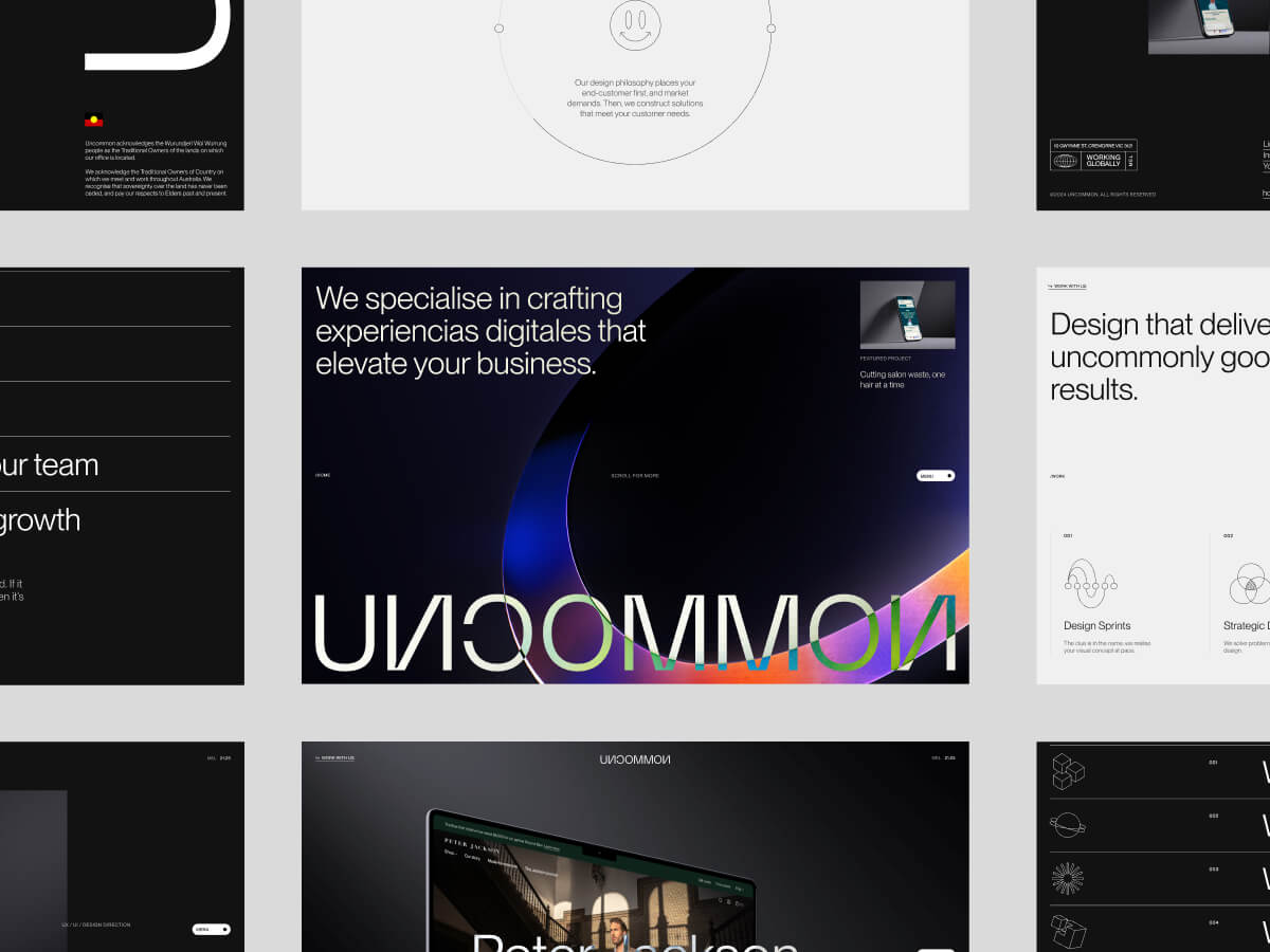


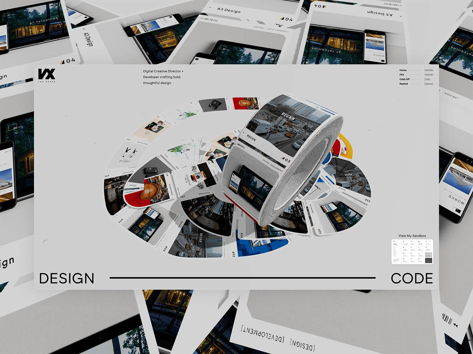


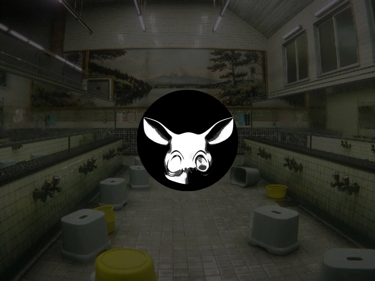


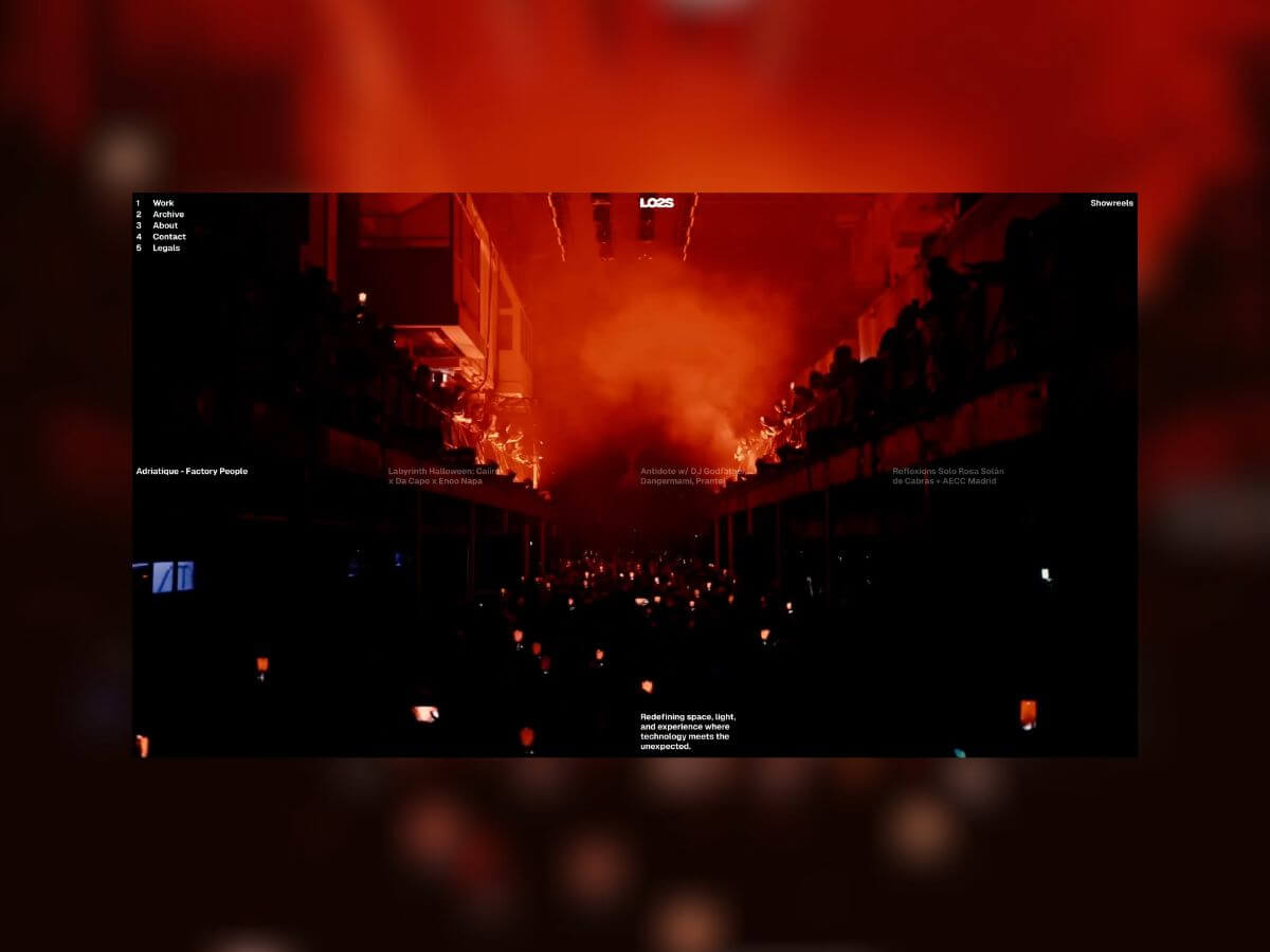


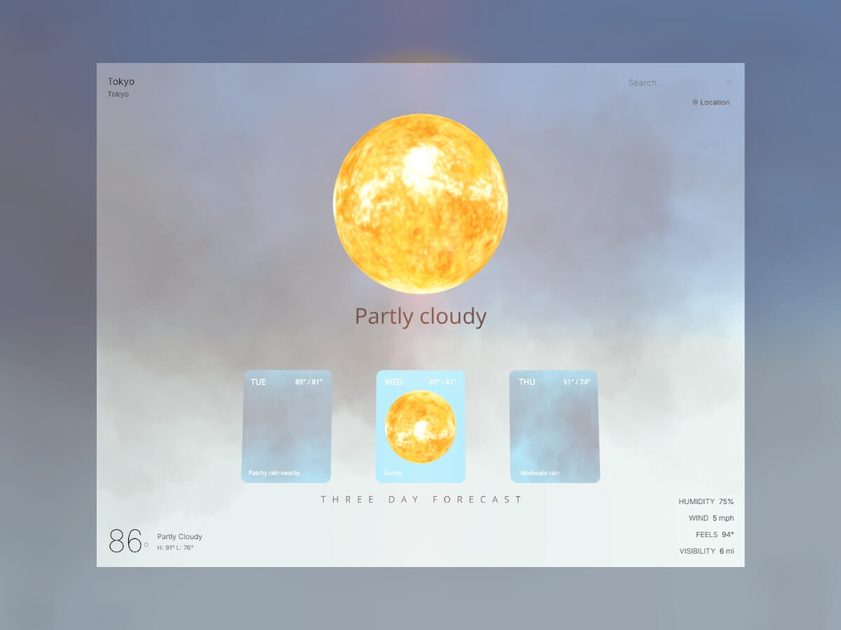


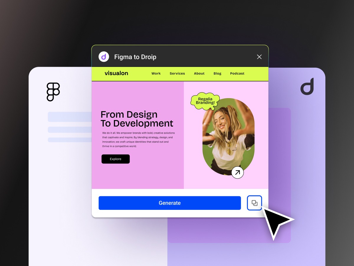


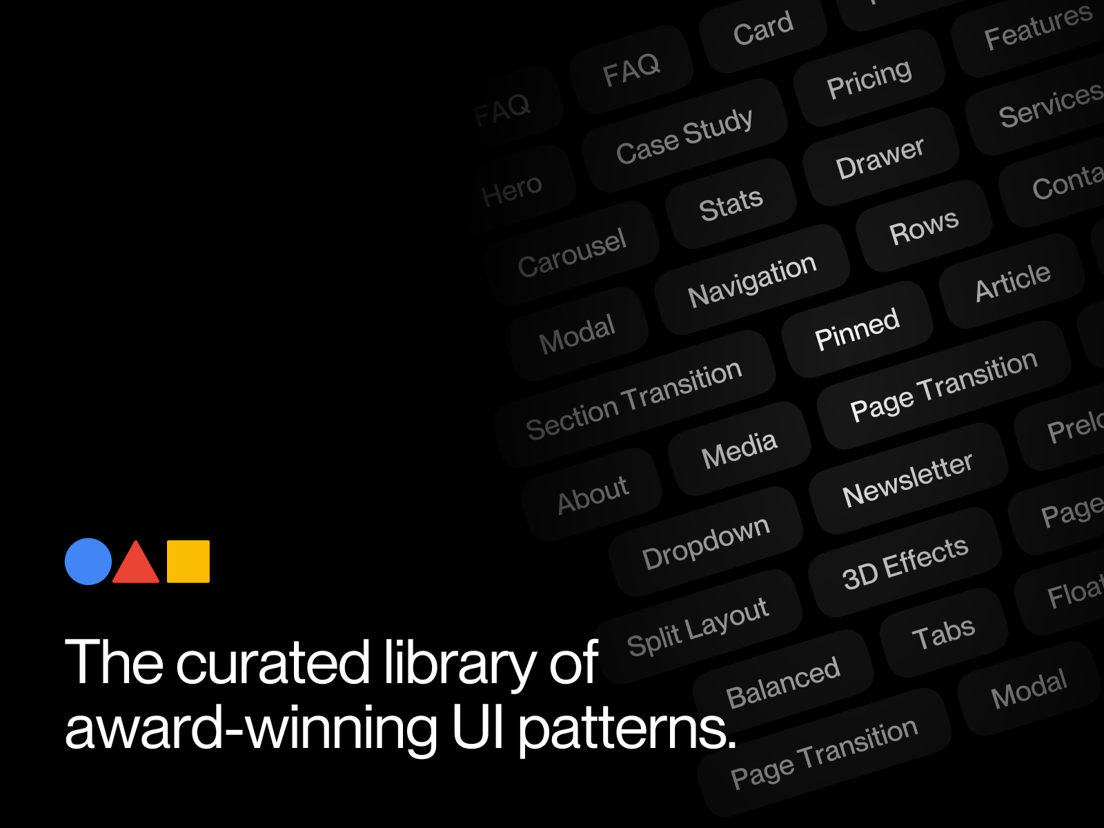


