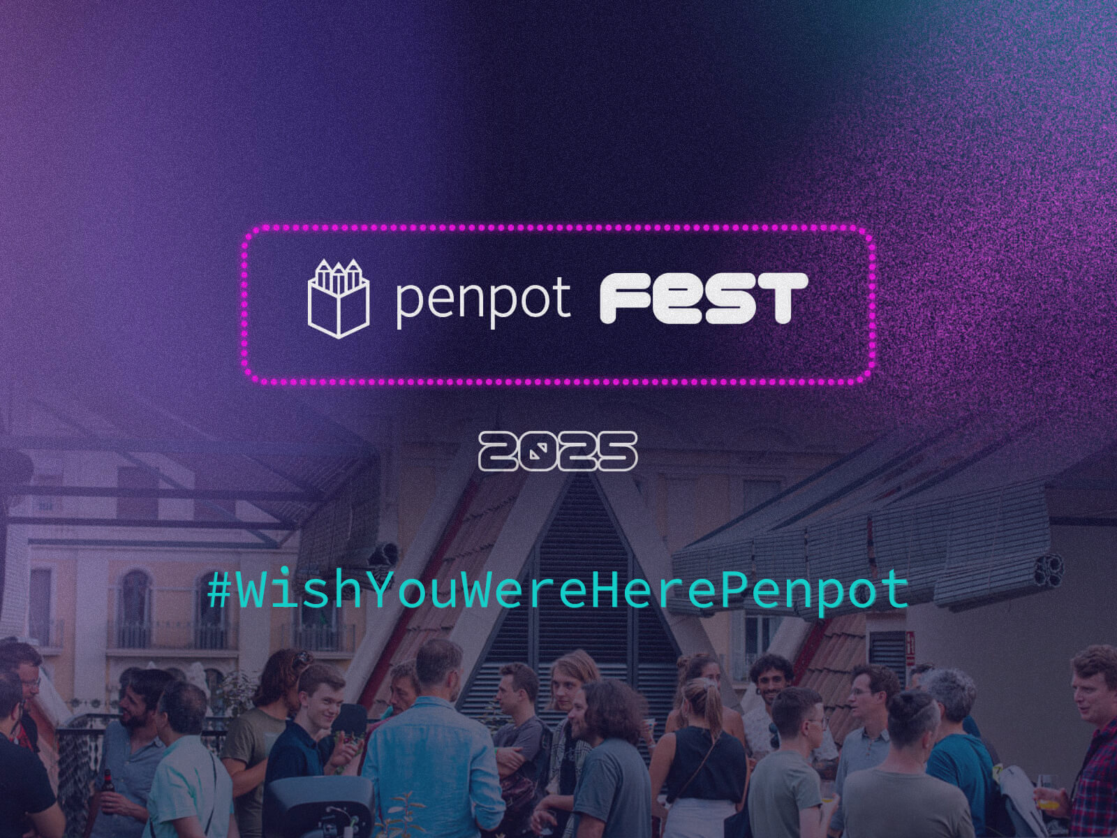
Happening from October 8–10, 2025, Penpot Fest is where designers, developers, and open-source enthusiasts gather to explore one big idea: Better, together.
Over three days, you’ll dive into:
8 thought-provoking keynotes
1 lively panel discussion
3 hands-on workshops
Full meals, drinks, swag, and a welcome party
A breathtaking venue and space to connect, collaborate, and be inspired
With confirmed speakers like Glòria Langreo (GitHub), Francesco Siddi (Blender), and Laura Kalbag (Penpot), you’ll be learning from some of the brightest minds in the design-dev world.
And this year, we’re kicking it off with something extra special…
The Contest: “Wish You Were Here”
We’re giving away a free ticket to Penpot Fest 2025, and entering is as easy as sharing a thought.
Here’s the idea: We want to hear your “I wish…” — your vision, your frustration, your funny or heartfelt take on the future of design tools, team workflows, or dev collaboration.
It can be:
“I wish design tools spoke dev.”
“I wish handoff wasn’t a hand grenade.”
“I wish design files didn’t feel like final bosses.”
Serious or silly — it’s all valid.
How to Enter
Post your “I wish…” message on one of the following networks: X (Twitter), LinkedIn, Instagram, Bluesky, Mastodon, or Facebook
Include the hashtag#WishYouWereHerePenpot
Tag @PenpotApp so we can find your entry!
Get creative: write it, design it, animate it, sing it — whatever helps your wish stand out.
Key Dates
Contest opens: August 4, 2025
Last day to enter: September 4, 2025
Why This Matters
This campaign isn’t just about scoring a free ticket (though that’s awesome). It’s about surfacing what our community really needs — and giving space for those wishes to be heard.
Penpot is built by people who listen. Who believe collaboration between design and code should be open, joyful, and seamless. This is your chance to share what you want from that future — and maybe even help shape it.
A look back at Penpot Fest 2023: hands-on workshops, design & code talks, open source energy, delicious local food, and great company under the sunny Barcelona skies.
Ready to Join Us in Madrid?
We want to hear your voice. Your “I wish…” could make someone laugh, inspire a toolmaker, or land you in Madrid this fall with the Penpot crew.
So what are you waiting for?
Post your “I wish…” with #WishYouWereHerePenpot and tag @PenpotApp by September 4th for a chance to win a free ticket to Penpot Fest 2025!
“Move fast and break things” has graduated from a startup mantra to an industry-wide gospel. We’re told to ship now and ask questions later, to launch minimum viable products and iterate indefinitely. But in the race to be first, we risk forgetting what it means to be good. What if the relentless pursuit of ‘now’ comes with higher reputational consequences than we realise?
I have worked for a lot of other businesses before. Contract, Industry, Agency, you name it… over the last 17 years I’ve seen the decisions that get made, many of them mistakes, from junior level through to senior leadership. Often I would find myself wondering, ‘is this how it has to be?’.
Businesses I worked for would cut corners everywhere, and I don’t mean slightly under-deliver to preserve margin, I mean a perpetual ethos of poor performance was not just accepted, but cultivated through indifference and a lack of accountability.
Motivated by this behaviour, I wanted to start something with integrity, something a bit more human, something where value is determined by quality-delivered, not just cash-extracted.
Although I am introverted by nature, and generally more interested in craft than networking – I’ve been fortunate enough to build partnerships with some of the largest companies and brands in the world.
The projects we work on are usually for brands with a substantial audience, which require a holistic approach to design and development. We are particularly proud of our work in the entertainment sector, which we recently decided was a logical niche for us.
Our Ethos
Our guiding philosophy is simple:
Designed with purpose, built to perform.
In the entertainment space, a digital touchpoint is more than just a website or an app, it’s a gateway to an experience. It has to handle crushing traffic spikes for ticket or merchandise drops, convey the energy of an event (usually using highly visual, large content formats like video/audio), be just as performant on mobile as it is on desktop, and function flawlessly under pressure.
In this context, creativity without a clear purpose is just noise. A beautiful design that collapses under load isn’t just a failure; it’s a broken promise to thousands of fans. This is why we are laser-focused on creativity and performance being complimentary forces, rather than adversaries.
To design with purpose is to understand that every choice must be anchored in strategy. It means we don’t just ask “what does it look like?” but “what is it for?”. A critical part of our ethos involves avoiding common industry pitfalls.
I don’t know how loud this needs to be for people to hear me, but you should never build platform first.
If you’re advising clients that they need a WordPress website because that’s the only tool you know, you’re doing something wrong. The same is true of any solution that you deliver.
There is a right way and 17 wrong ways to do everything.
This is why we build for performance by treating speed, stability, and scalability as core features, not afterthoughts. It’s about architecting systems that are as resilient as they are beautiful. Working with the correct tech stack on every project is important. The user experience is only as good as the infrastructure that supports it.
That said, experiential design is an incredibly important craft, and at the front edge of this are libraries like GSAP, Lenis, and of course WebGL/Three.js. Over the last few years, we’ve been increasing the amount of these features across our work, thankfully to much delight.
liquidGL
Recently we launched a library you might like to try called liquidGL, an attempt to bring Apple’s new Liquid Glass aesthetic to the web. It’s a lot trickier in the browser, and there are still some things to work out in BETA, but it’s available now on GitHub and of course, it’s open source.
particlesGL
In addition to liquidGL, we recently launched particlesGL, a library for creating truly unique particle effects in the browser, complete with 6 core demos and support for all media formats including 3D models, video, audio, images and text. Available on GitHub and free for personal use.
glitchGL
Following on from particlesGL is glitchGL, a library for creating pixelation, CRT and glitch effects in the browser. With more than 30 custom properties and a configurable global interaction system, which can be applied to multiple elements. Also available on GitHub and free for personal use.
We post mainly on LinkedIn, so if you’re interested in libraries like these, give us a follow so you don’t miss new releases and updates.
The result is a suite of market-specific solutions that consistently deliver: web, game development, mobile app, and e-commerce; all made possible because we know the culture and the owners, not just the brief. This is why I would encourage other creatives to niche down into an industry they understand, and to see their clients as partners rather than targets – you might think this cynicism is rare but I can assure you it is not.
Quality relationships take time, but they’re the foundation of quality work.
OFFLIMITS
Sometimes the best choices you make on a project are the ones that no one sees.
For OFFLIMITS Festival, the UAE’s first open format music festival featuring Ed Sheeran, Kaiser Chiefs, OneRepublic, and more, one of the most critical aspects was the ability to serve large content formats performantly, at scale.
Whilst Webflow was the right platform for the core requirements, we decided to forgo several of Webflow’s own features, including their forms setup and asset handling. We opted to use Cloudflare R2 to serve videos and audio, giving us granular control over caching policies and delivery. One of many hidden changes which were invisible to users, but critical to performance. Taking time for proper decisions, even boring ones, is what separates experiences that deliver from those that merely look nice.
PRIMAL™
PRIMAL™ started as a sample pack library focused on raw high quality sounds. When they wanted to expand into audio plugins, we spent eighteen months developing custom audio plugins and architecting a comprehensive ecosystem from scratch, because comprehensive solutions create lasting value.
The result is something we’re particularly proud of, with automatic account creation, login, subscription creation, and license generation happening from a single click. This may sound simple on the surface, but it required months of careful planning and development across JUCE/C++, Stripe, Clerk, React, Cloudflare, and Mailchimp.
More information on this repositioning will be available late 2025.
The Integrated Pipeline
Our philosophy of Quality Over Speed only works if your team is structured to support it. Common approaches separate concerns like design and development. In large teams this is seen as somewhat essential, a project moves along a conveyor belt, handed off from one silo to the next.
Having a holistic approach allows you to create deeply connected digital ecosystems.
When the same team that designs the brand identity also builds the mobile app and architects the backend, you get a level of coherence that simply isn’t possible otherwise. This leads to better outcomes: lower operational costs for our clients, less patchwork for us, higher conversion rates, and a superior customer experience that feels seamless and intentional.
Final Thoughts
Choosing craft over haste is not an indulgence, it’s a strategic decision we make every day.
It’s not that we are perfect, we’re not. It’s that we’d rather aim for perfection and miss, than fail to even try and settle for ‘good enough’. In a digital landscape saturated with forgettable experiences, perfectionism is what cuts through the noise.
It’s what turns a user into a fan and a brand into a legacy.
Our work has been fortunate enough to win awards, but the real validation comes from seeing our clients thrive on the back of the extra care and attention to detail that goes into a Quality Over Speed mindset. By building platforms that are purposeful, performant, and deeply integrated, we deliver lasting value.
The goal isn’t just to launch something, it’s to launch something right.
User experience relies on small, thoughtful details that fit well into the overall design without overpowering the user. This balance can be tricky, especially with technologies like WebGL. While they can create amazing visuals, they can also become too complicated and distracting if not handled carefully.
One subtle but effective technique is the Bayer Dithering Pattern. For example, JetBrains’ recent Junie campaign page uses this approach to craft an immersive and engaging atmosphere that remains visually balanced and accessible.
In this tutorial, I’ll introduce you to the Bayer Dithering Pattern. I’ll explain what it is, how it works, and how you can apply it to your own web projects to enhance visual depth without overpowering the user experience.
Bayer Dithering
The Bayer pattern is a type of ordered dithering, which lets you simulate gradients and depth using a fixed matrix.
If we scale this matrix appropriately, we can target specific values and create basic patterns.
Here’s a simple example:
// 2×2 Bayer matrix pattern: returns a value in [0, 1)
float Bayer2(vec2 a)
{
    a = floor(a);                // Use integer cell coordinates
    return fract(a.x / 2.0 + a.y * a.y * 0.75);
    // Equivalent lookup table:
    // (0,0) → 0.0,  (1,0) → 0.5
    // (0,1) → 0.75, (1,1) → 0.25
}
Let’s walk through an example of how this can be used:
// 1. Base mask: left half is a black-to-white gradient
float mask = uv.y;

// 2. Right half: apply ordered dithering
if (uv.x > 0.5) {
    float dither = Bayer2(fragCoord);
    mask += dither - 0.5;
    mask  = step(0.5, mask); // binary threshold
}

// 3. Output the result
fragColor = vec4(vec3(mask), 1.0);
So with just a small matrix, we get four distinct dithering values—essentially for free.
See the Pen
Bayer2x2 by zavalit (@zavalit)
on CodePen.
Creating a Background Effect
This is still pretty basic—nothing too exciting UX-wise yet. Let’s take it further by creating a grid on our UV map. We’ll define the size of a “pixel” and the size of the matrix that determines whether each “pixel” is on or off using Bayer ordering.
You’ll see a rendered UV grid with blue dots for pixels and white (and subsequent blocks of the same size) for the Bayer matrix.
See the Pen
Pixel & Cell UV by zavalit (@zavalit)
on CodePen.
Recursive Bayer Matrices
Bayer’s genius was a recursively generated mask that keeps noise high-frequency and code low-complexity. So now let’s try it out, and apply also larger dithering matrix:
This gives us a nice visual transition from a basic UV grid to Bayer matrices of increasing complexity (2×2, 4×4, 8×8, 16×16).
See the Pen
Bayer Ranges Animation by zavalit (@zavalit)
on CodePen.
As you see, the 8×8 and 16×16 patterns are quite similar—beyond 8×8, the perceptual gain becomes minimal. So we’ll stick with Bayer8 for the next step.
Now, we’ll apply Bayer8 to a UV map modulated by fbm noise to make the result feel more organic—just as we promised.
See the Pen
Bayer fbm noise by zavalit (@zavalit)
on CodePen.
Adding Interactivity
Here’s where things get exciting: real-time interactivity that background videos can’t replicate. Let’s run a ripple effect around clicked points using the dithering pattern. We’ll iterate over all active clicks and compute a wave:
See the Pen
Untitled by zavalit (@zavalit)
on CodePen.
Final Thoughts
Because the entire Bayer-dither background is generated in a single GPU pass, it renders in under 0.2 ms even at 4K, ships in ~3 KB (+ Three.js in this case), and consumes zero network bandwidth after load. SVG can’t touch that once you have thousands of nodes, and autoplay video is two orders of magnitude heavier on bandwidth, CPU and battery. In short: this is the probably one of the lightest fully-interactive background effect you can build on the open web today.
For months, Eduard Bodak has been sharing glimpses of his visually rich new website. Now, he’s pulling back the curtain to walk us through how three of its most striking animations were built. In this behind-the-scenes look, he shares the reasoning, technical decisions, and lessons learned—from performance trade-offs to working with CSS variables and a custom JavaScript architecture.
Overview
In this breakdown, I’ll walk you through three of the core GSAP animations on my site: flipping 3D cards that animate on scroll, an interactive card that reacts to mouse movement on the pricing page, and a circular layout of cards that subtly rotates as you scroll. I’ll share how I built each one, why I made certain decisions, and what I learned along the way.
Overview of the animations we’re handling here
I’m using Locomotive Scroll V5 in this project to handle scroll progress and viewport detection. Since it already offers built-in progress tracking via data attributes and CSS variables, I chose to use that directly for triggering animations. ScrollTrigger offers a lot of similar functionality in a more integrated way, but for this build, I wanted to keep everything centered around Locomotive’s scroll system to avoid overlap between two scroll-handling libraries.
Personally, I love the simplicity of Locomotive Scroll. You can just add data attributes to specify the trigger offset of the element within the viewport. You can also get a CSS variable --progress on the element through data attributes. This variable represents the current progress of the element and ranges between 0 and 1. This alone can animate a lot with just CSS.
I used this project to shift my focus toward more animations and visual details. It taught me a lot about GSAP, CSS, and how to adjust animations based on what feels right. I’ve always wanted to build sites that spark a little emotion when people visit them.
Note that this setup was tailored to the specific needs of the project, but in cases where scroll behavior, animations, and state management need to be tightly integrated, GSAP’s ScrollTrigger and ScrollSmoother can offer a more unified foundation.
Now, let’s take a closer look at the three animations in action!
Flipping 3D cards on scroll
I split the animation into two parts. The first is about the cards escaping on scroll. The second is about them coming back and flipping back.
While I’m using Locomotive Scroll, I need data-scroll to enable viewport detection on an element. data-scroll-offset specifies the trigger offset of the element within the viewport. It takes two values: one for the offset when the element enters the viewport, and a second for the offset when the element leaves the viewport. The same can be built with GSAP’s ScrollTrigger, just inside the JS.
data-scroll-event-progress="progressHero" will trigger the custom event I defined here. This event allows you to retrieve the current progress of the element, which ranges between 0 and 1.
Inside the JS we can add an EventListener based on the custom event we defined. Getting the progress from it and transfer it to the GSAP timeline.
this.element is here our section we defined before, so it’s data-hero-animation.
Building now the timeline method inside the class. Getting the current timeline progress. Killing the old timeline and clearing any GSAP-applied inline styles (like transforms, opacity, etc.) to avoid residue.
Using requestAnimationFrame() to avoid layout thrashing. Initializes a new, paused GSAP timeline. While we are using Locomotive Scroll it’s important that we pause the timeline, so the progress of Locomotive can handle the animation.
Figuring out relative positioning per card. targetY moves each card down so it ends near the bottom of the container. yOffsets and rotationZValues give each card a unique vertical offset and rotation.
The actual GSAP timeline. Cards slide left or right based on their index (x). Rotate on Z slightly to look scattered. Slide downward (y) to target position. Shrink and tilt (scale, rotateX) for a 3D feel. index * 0.012: adds a subtle stagger between cards.
That’s our timeline for desktop. We can now set up GSAP’s matchMedia() to use it. We can also create different timelines based on the viewport. For example, to adjust the animation on mobile, where such an immersive effect wouldn’t work as well. Even for users who prefer reduced motion, the animation could simply move the cards slightly down and fade them out, as you can see on the live site.
Add this to our init() method to initialize the class when we call it.
init() {
 this.setupBreakpoints();
}
We can also add a div with a background color on top of the card and animate its opacity on scroll so it smoothly disappears.
When you look closely, the cards are floating a bit. To achieve that, we can add a repeating animation to the cards. It’s important to animate yPercent here, because we already animated y earlier, so there won’t be any conflicts.
gsap.utils.random(1.5, 2.5) comes in handy to make each floating animation a bit different, so it looks more natural. repeatRefresh: true lets the duration refresh on every repeat.
Part 02
We basically have the same structure as before. Only now we’re using a sticky container. The service_container has height: 350vh, and the service_sticky has min-height: 100vh. That’s our space to play the animation.
In the JS, we can use the progressService event as before to get our Locomotive Scroll progress. We just have another timeline here. I’m using keyframes to really fine-tune the animation.
const position = 2 - index - 1 changes the position, so cards start spread out: right, center, left. With that we can use those arrays [12, 0, -12] in the right order.
There’s the same setupBreakpoints() method as before, so we actually just need to change the timeline animation and can use the same setup as before, only in a new JS class.
We can add the same floating animation we used in part 01, and then we have the disappearing/appearing card effect.
Part 2.1
Another micro detail in that animation is the small progress preview of the three cards in the top right.
We add data-scroll-css-progress to the previous section to get a CSS variable --progress ranging from 0 to 1, which can be used for dynamic CSS effects. This data attribute comes from Locomotive Scroll.
Using CSS calc() with min() and max() to trigger animations at specific progress points. In this case, the first animation starts at 0% and finishes at 33%, the second starts at 33% and finishes at 66%, and the last starts at 66% and finishes at 100%.
On a closer look, you can see a small slide-in animation of the card before the mouse movement takes effect. This is built in GSAP using the onComplete() callback in the timeline. this.card refers to the element with data-price-card.
I’m using an elastic easing that I got from GSAPs Ease Visualizer. The timeline plays when the page loads and triggers the mouse movement animation once complete.
In our initAnimation() method, we can use GSAP’s matchMedia() to enable the mouse movement only when hover and mouse input are available.
this.mm = gsap.matchMedia();

initAnimation() {
 this.mm.add("(hover: hover) and (pointer: fine) and (prefers-reduced-motion: no-preference)", () => {
  gsap.ticker.add(this.mouseMovement);

  return () => {
   gsap.ticker.remove(this.mouseMovement);
  };
 });

 this.mm.add("(hover: none) and (pointer: coarse) and (prefers-reduced-motion: no-preference)", () => {
  ...
 });
}
By using the media queries hover: hover and pointer: fine, we target only devices that support a mouse and hover. With prefers-reduced-motion: no-preference, we add this animation only when reduced motion is not enabled, making it more accessible. For touch devices or smartphones, we can use hover: none and pointer: coarse to apply a different animation.
I’m using gsap.ticker to run the method this.mouseMovement, which contains the logic for handling the rotation animation.
I originally started with one of the free resources from Osmo (mouse follower) and built this mouse movement animation on top of it. I simplified it to only use the mouse’s x position, which was all I needed.
I also added calculations for how much the card can rotate on the y-axis, and it rotates the z-axis accordingly. That’s how we get this mouse movement animation.
When building these animations, there are always some edge cases I didn’t consider before. For example, what happens when I move my mouse outside the window? Or if I hover over a link or button, should the rotation animation still play?
I added behavior so that when the mouse moves outside, the card rotates back to its original position. The same behavior applies when the mouse leaves the hero section or hovers over navigation elements.
I added a state flag this.isHovering. At the start of mouseMovement(), we check if this.isHovering is false, and if so, return early. The onMouseLeave method rotates the card back to its original position.
We can adjust it further by adding another animation for mobile, since there’s no mouse movement there. Or a subtle reflection effect on the card like in the video. This is done by duplicating the card, adding an overlay with a gradient and backdrop-filter, and animating it similarly to the original card, but with opposite values.
Cards in a circular position that slightly rotate on scroll
First, we build the base of the circularly positioned cards in CSS.
At first, we add all 24 cards, then remove the ones we don’t want to show later because we don’t see them. In the CSS, the .wheel uses a grid display, so we apply grid-area: 1 / 1 to stack the cards. We later add an overlay before the wheel with the same grid-area. By using em we can use a fluid font-size to adjust the size pretty smooth on resizing the viewport.
We can remove the card from 8 to 19 as we don’t see them behind the overlay. It should look like this now.
By adding the data attributes and setup for viewport detection from Locomotive Scroll, which we used in previous modules, we can simply add our GSAP timeline for the rotation animation.
There are probably smarter ways to build these animations than I used. But since this is my first site after changing my direction and GSAP, Locomotive Scroll V5, Swup.js, and CSS animations, I’m pretty happy with the result. This project became a personal playground for learning, it really shows that you learn best by building what you imagine. I don’t know how many times I refactored my code along the way, but it gave me a good understanding of creating accessible animations.
I also did a lot of other animations on the site, mostly using CSS animations combined with JavaScript for the logic behind them.
There are also so many great resources out there to learn GSAP and CSS.
Where I learned the most:
It’s all about how you use it. You can copy and paste, which is fast but doesn’t help you learn much. Or you can build on it your own way and make it yours, that’s at least what helped me learn the most in the end.
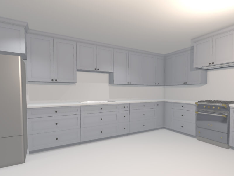
Back in November 2024, I shared a post on X about a tool I was building to help visualize kitchen remodels. The response from the Three.js community was overwhelmingly positive. The demo showed how procedural rendering techniques—often used in games—can be applied to real-world use cases like designing and rendering an entire kitchen in under 60 seconds.
In this article, I’ll walk through the process and thinking behind building this kind of procedural 3D kitchen design tool using vanilla Three.js and TypeScript—from drawing walls and defining cabinet segments to auto-generating full kitchen layouts. Along the way, I’ll share key technical choices, lessons learned, and ideas for where this could evolve next.
Have been wanting to redesign my parents’ kitchen for a while now
…so I built them a little 3D kitchen design-tool with @threejs, so they can quickly prototype floorplans/ideas
Here’s me designing a full kitchen remodel in ~60s 🙂
You can try out an interactive demo of the latest version here: https://kitchen-designer-demo.vercel.app/. (Tip: Press the “/” key to toggle between 2D and 3D views.)
Designing Room Layouts with Walls
Example of user drawing a simple room shape using the built-in wall module.
To initiate our project, we begin with the wall drawing module. At a high level, this is akin to Figma’s pen tool, where the user can add one line segment at a time until a closed—or open-ended—polygon is complete on an infinite 2D canvas. In our build, each line segment represents a single wall as a 2D plane from coordinate A to coordinate B, while the complete polygon outlines the perimeter envelope of a room.
We begin by capturing the [X, Z] coordinates (with Y oriented upwards) of the user’s initial click on the infinite floor plane. This 2D point is obtained via Three.js’s built-in raycaster for intersection detection, establishing Point A.
As the user hovers the cursor over a new spot on the floor, we apply the same intersection logic to determine a temporary Point B. During this movement, a preview line segment appears, connecting the fixed Point A to the dynamic Point B for visual feedback.
Upon the user’s second click to confirm Point B, we append the line segment (defined by Points A and B) to an array of segments. The former Point B instantly becomes the new Point A, allowing us to continue the drawing process with additional line segments.
Here is a simplified code snippet demonstrating a basic 2D pen-draw tool using Three.js:
import * as THREE from 'three';

const scene = new THREE.Scene();
const camera = new THREE.PerspectiveCamera(75, window.innerWidth / window.innerHeight, 0.1, 1000);
camera.position.set(0, 5, 10); // Position camera above the floor looking down
camera.lookAt(0, 0, 0);

const renderer = new THREE.WebGLRenderer();
renderer.setSize(window.innerWidth, window.innerHeight);
document.body.appendChild(renderer.domElement);

// Create an infinite floor plane for raycasting
const floorGeometry = new THREE.PlaneGeometry(100, 100);
const floorMaterial = new THREE.MeshBasicMaterial({ color: 0xcccccc, side: THREE.DoubleSide });
const floor = new THREE.Mesh(floorGeometry, floorMaterial);
floor.rotation.x = -Math.PI / 2; // Lay flat on XZ plane
scene.add(floor);

const raycaster = new THREE.Raycaster();
const mouse = new THREE.Vector2();
let points: THREE.Vector3[] = []; // i.e. wall endpoints
let tempLine: THREE.Line | null = null;
const walls: THREE.Line[] = [];

function getFloorIntersection(event: MouseEvent): THREE.Vector3 | null {
  mouse.x = (event.clientX / window.innerWidth) * 2 - 1;
  mouse.y = -(event.clientY / window.innerHeight) * 2 + 1;
  raycaster.setFromCamera(mouse, camera);
  const intersects = raycaster.intersectObject(floor);
  if (intersects.length > 0) {
    // Round to simplify coordinates (optional for cleaner drawing)
    const point = intersects[0].point;
    point.x = Math.round(point.x);
    point.z = Math.round(point.z);
    point.y = 0; // Ensure on floor plane
    return point;
  }
  return null;
}

// Update temporary line preview
function onMouseMove(event: MouseEvent) {
  const point = getFloorIntersection(event);
  if (point && points.length > 0) {
    // Remove old temp line if exists
    if (tempLine) {
      scene.remove(tempLine);
      tempLine = null;
    }
    // Create new temp line from last point to current hover
    const geometry = new THREE.BufferGeometry().setFromPoints([points[points.length - 1], point]);
    const material = new THREE.LineBasicMaterial({ color: 0x0000ff }); // Blue for temp
    tempLine = new THREE.Line(geometry, material);
    scene.add(tempLine);
  }
}

// Add a new point and draw permanent wall segment
function onMouseDown(event: MouseEvent) {
  if (event.button !== 0) return; // Left click only
  const point = getFloorIntersection(event);
  if (point) {
    points.push(point);
    if (points.length > 1) {
      // Draw permanent wall line from previous to current point
      const geometry = new THREE.BufferGeometry().setFromPoints([points[points.length - 2], points[points.length - 1]]);
      const material = new THREE.LineBasicMaterial({ color: 0xff0000 }); // Red for permanent
      const wall = new THREE.Line(geometry, material);
      scene.add(wall);
      walls.push(wall);
    }
    // Remove temp line after click
    if (tempLine) {
      scene.remove(tempLine);
      tempLine = null;
    }
  }
}

// Add event listeners
window.addEventListener('mousemove', onMouseMove);
window.addEventListener('mousedown', onMouseDown);

// Animation loop
function animate() {
  requestAnimationFrame(animate);
  renderer.render(scene, camera);
}
animate();
The above code snippet is a very basic 2D pen tool, and yet this information is enough to generate an entire room instance. For reference: not only does each line segment represent a wall (2D plane), but the set of accumulated points can also be used to auto-generate the room’s floor mesh, and likewise the ceiling mesh (the inverse of the floor mesh).
In order to view the planes representing the walls in 3D, one can transform each THREE.Line into a custom Wall class object, which contains both a line (for orthogonal 2D “floor plan” view) and a 2D inward-facing plane (for perspective 3D “room” view). To build this class:
class Wall extends THREE.Group {
  constructor(length: number, height: number = 96, thickness: number = 4) {
    super();

    // 2D line for top view, along the x-axis
    const lineGeometry = new THREE.BufferGeometry().setFromPoints([
      new THREE.Vector3(0, 0, 0),
      new THREE.Vector3(length, 0, 0),
    ]);
    const lineMaterial = new THREE.LineBasicMaterial({ color: 0xff0000 });
    const line = new THREE.Line(lineGeometry, lineMaterial);
    this.add(line);

    // 3D wall as a box for thickness
    const wallGeometry = new THREE.BoxGeometry(length, height, thickness);
    const wallMaterial = new THREE.MeshBasicMaterial({ color: 0xaaaaaa, side: THREE.DoubleSide });
    const wall = new THREE.Mesh(wallGeometry, wallMaterial);
    wall.position.set(length / 2, height / 2, 0);
    this.add(wall);
  }
}
We can now update the wall draw module to utilize this newly created Wall object:
// Update our variables
let tempWall: Wall | null = null;
const walls: Wall[] = [];

// Replace line creation in onMouseDown with
if (points.length > 1) {
  const start = points[points.length - 2];
  const end = points[points.length - 1];
  const direction = end.clone().sub(start);
  const length = direction.length();
  const wall = new Wall(length);
  wall.position.copy(start);
  wall.rotation.y = Math.atan2(direction.z, direction.x); // Align along direction (assuming CCW for inward facing)
  scene.add(wall);
  walls.push(wall);
}
Upon adding the floor and ceiling meshes, we can further transform our wall module into a room generation module. To recap what we have just created: by adding walls one by one, we have given the user the ability to create full rooms with walls, floors, and ceilings—all of which can be adjusted later in the scene.
User dragging out the wall in 3D perspective camera-view.
Generating Cabinets with Procedural Modeling
Our cabinet-related logic can consist of countertops, base cabinets, and wall cabinets.
Rather than taking several minutes to add the cabinets on a case-by-case basis—for example, like with IKEA’s 3D kitchen builder—it’s possible to add all the cabinets at once via a single user action. One method to employ here is to allow the user to draw high-level cabinet line segments, in the same manner as the wall draw module.
In this module, each cabinet segment will transform into a linear row of base and wall cabinets, along with a parametrically generated countertop mesh on top of the base cabinets. As the user creates the segments, we can automatically populate this line segment with pre-made 3D cabinet meshes in meshing software like Blender. Ultimately, each cabinet’s width, depth, and height parameters will be fixed, while the width of the last cabinet can be dynamic to fill the remaining space. We use a cabinet filler piece mesh here—a regular plank, with its scale-X parameter stretched or compressed as needed.
Creating the Cabinet Line Segments
User can make a half-peninsula shape by dragging the cabinetry line segments alongside the walls, then in free-space.
Here we will construct a dedicated cabinet module, with the aforementioned cabinet line segment logic. This process is very similar to the wall drawing mechanism, where users can draw straight lines on the floor plane using mouse clicks to define both start and end points. Unlike walls, which can be represented by simple thin lines, cabinet line segments need to account for a standard depth of 24 inches to represent the base cabinets’ footprint. These segments do not require closing-polygon logic, as they can be standalone rows or L-shapes, as is common in most kitchen layouts.
We can further improve the user experience by incorporating snapping functionality, where the endpoints of a cabinet line segment automatically align to nearby wall endpoints or wall intersections, if within a certain threshold (e.g., 4 inches). This ensures cabinets fit snugly against walls without requiring manual precision. For simplicity, we’ll outline the snapping logic in code but focus on the core drawing functionality.
We can start by defining the CabinetSegment class. Like the walls, this should be its own class, as we will later add the auto-populating 3D cabinet models.
class CabinetSegment extends THREE.Group {
  public length: number;

  constructor(length: number, height: number = 96, depth: number = 24, color: number = 0xff0000) {
    super();
    this.length = length;
    const geometry = new THREE.BoxGeometry(length, height, depth);
    const material = new THREE.MeshBasicMaterial({ color, wireframe: true });
    const box = new THREE.Mesh(geometry, material);
    box.position.set(length / 2, height / 2, depth / 2); // Shift so depth spans 0 to depth (inward)
    this.add(box);
  }
}
Once we have the cabinet segment, we can use it in a manner very similar to the wall line segments:
let cabinetPoints: THREE.Vector3[] = [];
let tempCabinet: CabinetSegment | null = null;
const cabinetSegments: CabinetSegment[] = [];
const CABINET_DEPTH = 24; // everything in inches
const CABINET_SEGMENT_HEIGHT = 96; // i.e. both wall & base cabinets -> group should extend to ceiling
const SNAPPING_DISTANCE = 4;

function getSnappedPoint(point: THREE.Vector3): THREE.Vector3 {
  // Simple snapping: check against existing wall points (wallPoints array from wall module)
  for (const wallPoint of wallPoints) {
    if (point.distanceTo(wallPoint) < SNAPPING_DISTANCE) return wallPoint;
  }
  return point;
}

// Update temporary cabinet preview
function onMouseMoveCabinet(event: MouseEvent) {
  const point = getFloorIntersection(event);
  if (point && cabinetPoints.length > 0) {
    const snappedPoint = getSnappedPoint(point);
    if (tempCabinet) {
      scene.remove(tempCabinet);
      tempCabinet = null;
    }
    const start = cabinetPoints[cabinetPoints.length - 1];
    const direction = snappedPoint.clone().sub(start);
    const length = direction.length();
    if (length > 0) {
      tempCabinet = new CabinetSegment(length, CABINET_SEGMENT_HEIGHT, CABINET_DEPTH, 0x0000ff); // Blue for temp
      tempCabinet.position.copy(start);
      tempCabinet.rotation.y = Math.atan2(direction.z, direction.x);
      scene.add(tempCabinet);
    }
  }
}

// Add a new point and draw permanent cabinet segment
function onMouseDownCabinet(event: MouseEvent) {
  if (event.button !== 0) return;
  const point = getFloorIntersection(event);
  if (point) {
    const snappedPoint = getSnappedPoint(point);
    cabinetPoints.push(snappedPoint);
    if (cabinetPoints.length > 1) {
      const start = cabinetPoints[cabinetPoints.length - 2];
      const end = cabinetPoints[cabinetPoints.length - 1];
      const direction = end.clone().sub(start);
      const length = direction.length();
      if (length > 0) {
        const segment = new CabinetSegment(length, CABINET_SEGMENT_HEIGHT, CABINET_DEPTH, 0xff0000); // Red for permanent
        segment.position.copy(start);
        segment.rotation.y = Math.atan2(direction.z, direction.x);
        scene.add(segment);
        cabinetSegments.push(segment);
      }
    }
    if (tempCabinet) {
      scene.remove(tempCabinet);
      tempCabinet = null;
    }
  }
}

// Add separate event listeners for cabinet mode (e.g., toggled via UI button)
window.addEventListener('mousemove', onMouseMoveCabinet);
window.addEventListener('mousedown', onMouseDownCabinet);
Auto-Populating the Line Segments with Live Cabinet Models
Here we fill 2 line-segments with 3D cabinet models (base & wall), and countertop meshes.
Once the cabinet line segments are defined, we can procedurally populate them with detailed components. This involves dividing each segment vertically into three layers: base cabinets at the bottom, countertops in the middle, and wall cabinets above. For the base and wall cabinets, we’ll use an optimization function to divide the segment’s length into standard widths (preferring 30-inch cabinets), with any remainder filled using the filler piece mentioned above. Countertops are even simpler—they form a single continuous slab stretching the full length of the segment.
The base cabinets are set to 24 inches deep and 34.5 inches high. Countertops add 1.5 inches in height and extend to 25.5 inches deep (including a 1.5-inch overhang). Wall cabinets start at 54 inches high (18 inches above the countertop), measure 12 inches deep, and are 30 inches tall. After generating these placeholder bounding boxes, we can replace them with preloaded 3D models from Blender using a loading function (e.g., via GLTFLoader).
To handle individual cabinets, we’ll create a simple Cabinet class that manages the placeholder and model loading.
import { GLTFLoader } from 'three/examples/jsm/loaders/GLTFLoader.js';

const loader = new GLTFLoader();

class Cabinet extends THREE.Group {
  constructor(width: number, height: number, depth: number, modelPath: string, color: number) {
    super();

    // Placeholder box
    const geometry = new THREE.BoxGeometry(width, height, depth);
    const material = new THREE.MeshBasicMaterial({ color });
    const placeholder = new THREE.Mesh(geometry, material);
    this.add(placeholder);


    // Load and replace with model async

    // Case: Non-standard width -> use filler piece
    if (width < DEFAULT_MODEL_WIDTH) {
      loader.load(FILLER_PIECE_FALLBACK_PATH, (gltf) => {
        const model = gltf.scene;
        model.scale.set(
          width / FILLER_PIECE_WIDTH,
          height / FILLER_PIECE_HEIGHT,
          depth / FILLER_PIECE_DEPTH,
        );
        this.add(model);
        this.remove(placeholder);
      });
    }

    loader.load(modelPath, (gltf) => {
      const model = gltf.scene;
      model.scale.set(width / DEFAULT_MODEL_WIDTH, 1, 1); // Scale width
      this.add(model);
      this.remove(placeholder);
    });
  }
}
Then, we can add a populate method to the existing CabinetSegment class:
function splitIntoCabinets(width: number): number[] {
  const cabinets = [];
  // Preferred width
  while (width >= DEFAULT_MODEL_WIDTH) {
    cabinets.push(DEFAULT_MODEL_WIDTH);
    width -= DEFAULT_MODEL_WIDTH;
  }
  if (width > 0) {
    cabinets.push(width); // Custom empty slot
  }
  return cabinets;
}

class CabinetSegment extends THREE.Group {
  // ... (existing constructor and properties)

  populate() {
    // Remove placeholder line and box
    while (this.children.length > 0) {
      this.remove(this.children[0]);
    }

    let offset = 0;
    const widths = splitIntoCabinets(this.length);

    // Base cabinets
    widths.forEach((width) => {
      const baseCab = new Cabinet(width, BASE_HEIGHT, BASE_DEPTH, 'models/base_cabinet.glb', 0x8b4513);
      baseCab.position.set(offset + width / 2, BASE_HEIGHT / 2, BASE_DEPTH / 2);
      this.add(baseCab);
      offset += width;
    });

    // Countertop (single slab, no model)
    const counterGeometry = new THREE.BoxGeometry(this.length, COUNTER_HEIGHT, COUNTER_DEPTH);
    const counterMaterial = new THREE.MeshBasicMaterial({ color: 0xa9a9a9 });
    const counter = new THREE.Mesh(counterGeometry, counterMaterial);
    counter.position.set(this.length / 2, BASE_HEIGHT + COUNTER_HEIGHT / 2, COUNTER_DEPTH / 2);
    this.add(counter);

    // Wall cabinets
    offset = 0;
    widths.forEach((width) => {
      const wallCab = new Cabinet(width, WALL_HEIGHT, WALL_DEPTH, 'models/wall_cabinet.glb', 0x4b0082);
      wallCab.position.set(offset + width / 2, WALL_START_Y + WALL_HEIGHT / 2, WALL_DEPTH / 2);
      this.add(wallCab);
      offset += width;
    });
  }
}

// Call for each cabinetSegment after drawing
cabinetSegments.forEach((segment) => segment.populate());
Further Improvements & Optimizations
We can further improve the scene with appliances, varying-height cabinets, crown molding, etc.
At this point, we should have the foundational elements of room and cabinet creation logic fully in place. In order to take this project from a rudimentary segment-drawing app into the practical realm—along with dynamic cabinets, multiple realistic material options, and varying real appliance meshes—we can further enhance the user experience through several targeted refinements:
We can implement a detection mechanism to determine if a cabinet line segment is in contact with a wall line segment.
For cabinet rows that run parallel to walls, we can automatically incorporate a backsplash in the space between the wall cabinets and the countertop surface.
For cabinet segments not adjacent to walls, we can remove the upper wall cabinets and extend the countertop by an additional 15 inches, aligning with standard practices for kitchen islands or peninsulas.
We can introduce drag-and-drop functionality for appliances, each with predefined widths, allowing users to position them along the line segment. This integration will instruct our cabinet-splitting algorithm to exclude those areas from dynamic cabinet generation.
Additionally, we can give users more flexibility by enabling the swapping of one appliance with another, applying different textures to our 3D models, and adjusting default dimensions—such as wall cabinet depth or countertop overhang—to suit specific preferences.
All these core components lead us to a comprehensive, interactive application that enables the rapid rendering of a complete kitchen: cabinets, countertops, and appliances, in a fully interactive, user-driven experience.
The aim of this project is to demonstrate that complex 3D tasks can be distilled down to simple user actions. It is fully possible to take the high-dimensional complexity of 3D tooling—with seemingly limitless controls—and encode these complexities into low-dimensional, easily adjustable parameters. Whether the developer chooses to expose these parameters to the user or an LLM, the end result is that historically complicated 3D processes can become simple, and thus the entire contents of a 3D scene can be fully transformed with only a few parameters.
If you find this type of development interesting, have any great ideas, or would love to contribute to the evolution of this product, I strongly welcome you to reach out to me via email. I firmly believe that only recently has it become possible to build home design software that is so wickedly fast and intuitive that any person—regardless of architectural merit—will be able to design their own single-family home in less than 5 minutes via a web app, while fully adhering to local zoning, architectural, and design requirements. All the infrastructure necessary to accomplish this already exists; all it takes is a team of crazy, ambitious developers looking to change the standard of architectural home design.
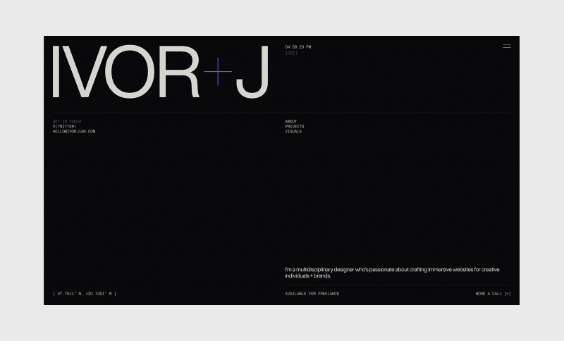
Hi! I’m Ivor Jian, a multidisciplinary designer and creative developer from Washington, USA. I create websites that blend Swiss-inspired precision with a clean, utilitarian style. My goal is to craft projects that evoke emotion through quality and tasteful animation.
As my design career continues to develop, I’m constantly learning and expanding my horizons. Below are some projects I’m proud to share from the early stages of my creative journey.
Featured projects
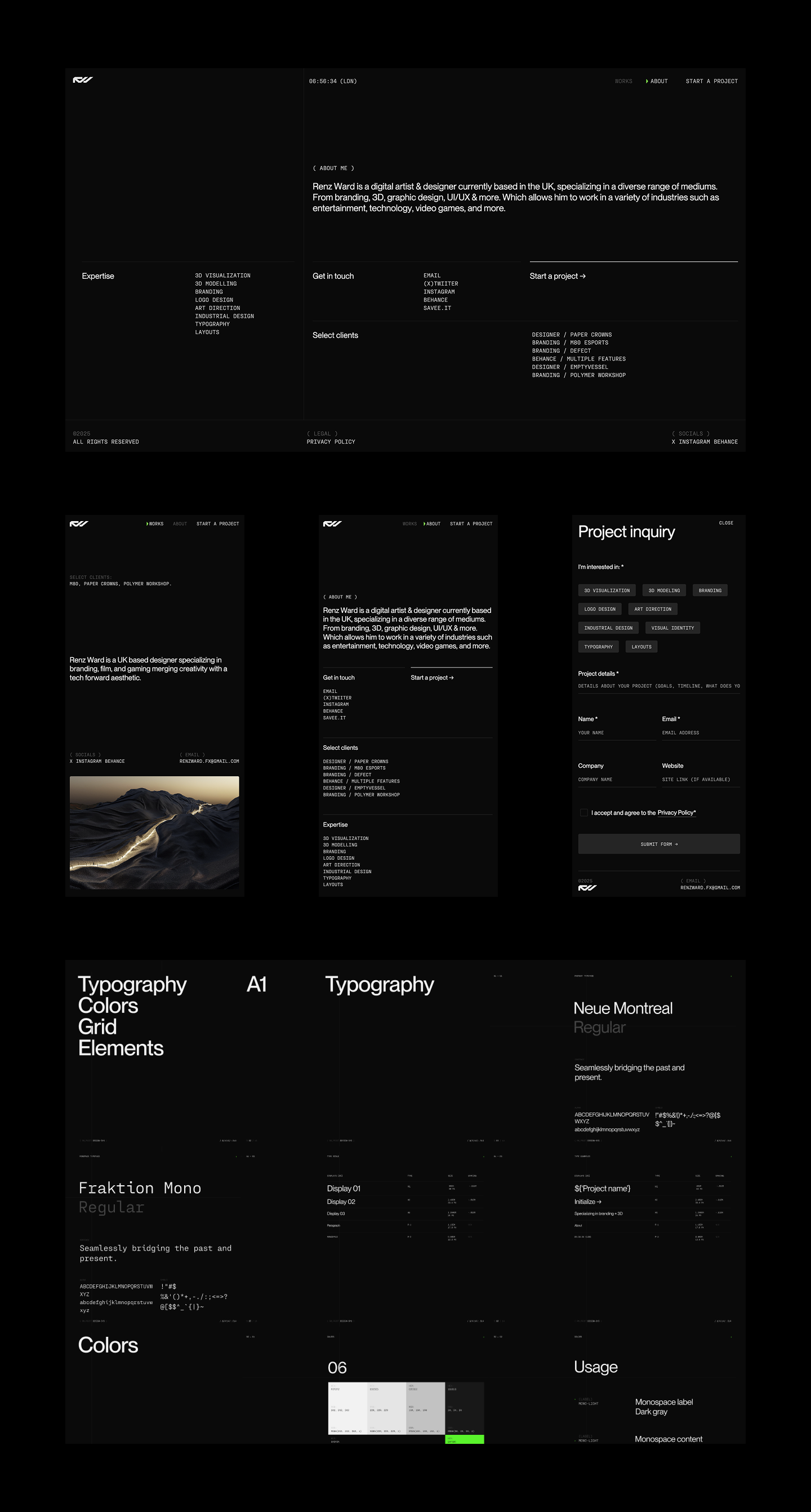
Renz Ward
A portfolio website for a UK-based designer who specializes in a technically forward aesthetic. From concept to completion, we collaborated on the visual direction, motion design, and intricate site details. The site features a grid-focused layout and animations that align with the designer’s visual identity.
The biggest challenge was syncing the dial animation with the project scroll and indicator. I’m not ashamed to say I relied heavily on Perplexity to help with this interaction. The result is a technical yet sophisticated website that I’m proud to share. The site currently has limited content, as Renz is still wrapping up projects. I plan to submit it to CSSDA and Awwwards once it’s complete.
My portfolio website is always a work in progress, but I’m happy to share its current iteration. I wanted the details and typography to reflect who I am, both personally and as a designer. This includes the typography, animations, and fine details throughout the site.
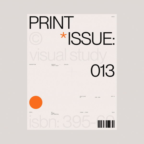
This is my first passion project, and it received an honorable mention on CSSDA. As a fan of interior design and architecture, I wanted to create a minimal and experimental website to explore interactions and showcase AI-generated architecture. My focus was to deliver a clear and refined experience with clean micro-interactions and smooth page transitions. The images were generated in Midjourney.
I originally wanted to use real publications but was concerned about legal issues. The biggest challenge was making the individual showcases cohesive, as there is a lot of variation in the generated images. To achieve the best results, I used real publication images as references.
A redesign concept of the Polestar brand. Their design language was right up my alley, so I took on the challenge of creating a bespoke web experience while staying aligned with their core visual identity.
Visual explorations
I enjoy exploring and creating random designs just for the sake of it. This helps me expand my horizons as a designer and can potentially lead to new opportunities.
About me
I’m a 22-year-old self-taught freelance designer and developer. I started doing graphic design at 13, which I believe gave me a strong foundation when I fully shifted to web design about two years ago. Without a formal education in building websites, I’ve had the freedom to explore ideas and learn by doing. This has helped me discover the kind of work I want to pursue and shape my design style. I started gaining some traction on X/Twitter after consistently posting my designs at the start of 2025, and I’ve met so many talented and wonderful people since beginning my journey there.
My approach to design
I don’t follow a strict set of principles or a fixed approach to design. I usually start by looking for inspiration before diving into a project. That said, I tend to favor a 12-column grid and clean, modern Swiss typefaces. I always iterate, exploring as many options as possible before choosing one direction to refine.
Favorite tools
My favorite tools are Webflow for development, GSAP for web animations, Perplexity for brainstorming and problem-solving, and Figma for design. This tool stack covers everything I need at the moment.
Inspiration
I love browsing beautiful visuals and websites to continually refine my taste. For design inspiration, my favorite resources are Savee and Searchsystem for their curated aesthetics of clean and technical design. When it comes to websites, I look to Awwwards and various agency sites with distinct, well-crafted brand identities. I also have favorite designers and developers whose work I admire and learn from by studying their craft; among them are Dennis Snellenberg, Ilja Van Eck, Oliver Larose, and Niklas Rosen.
Future goals
I want to keep learning and creating meaningful projects by collaborating with creative individuals and brands that align with my style of websites. I focus on combining clean typography with interactions that make a site shine with a modern and technical touch. I plan to become an award-winning designer and developer through persistence and a genuine love for great design.
Final thoughts
Thank you so much for reading about my thoughts and latest projects! I’m by no means a top-notch designer or developer yet, but I hope you enjoyed the visuals and got to know a bit about me. Consistently share your work—it might just change your life.
Keep learning, exploring, and iterating. Feel free to reach out to me on X/Twitter if you want to chat or have a project in mind. ♥️
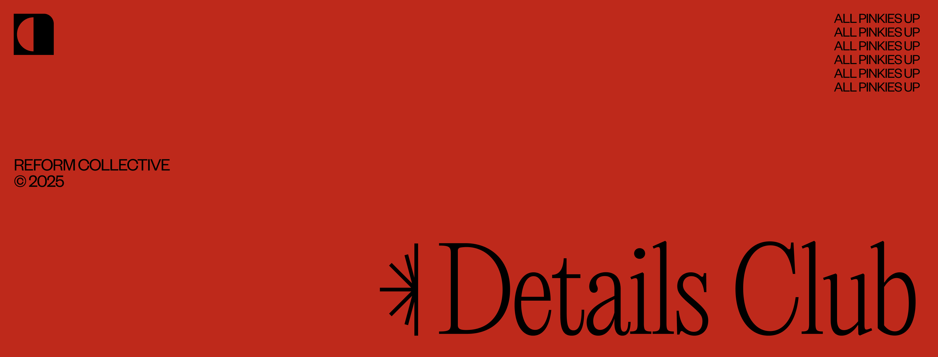
Reform Collective is a digital-first, full-service design and development agency. We’ve been partnering with clients of all sizes for 11 years and going strong! We work with ambitious teams building interesting things. If it doesn’t clash with our ethics and you respect our time, we’re in.
Design
Our previous site was no longer working for us. It didn’t reflect the kind of work we were doing, and more importantly, it created friction. The navigation was convoluted, the structure too deep, and the visual style didn’t align with what we were showing clients in proposals or conversations. We’d share a project we were proud of, and when people landed on the site, they either got confused trying to find it or lost interest navigating a dated UX. It was time to move on.
The redesign was a reset. We stripped the site down to the essentials. Clean layout. Wide spacing. Minimal structure. The goal was to create something that felt open, confident, and easy to move through. We wanted the experience to reflect how we approach client work: intentional, clear, and results-focused — all while telling a strong story.
We also made a conscious decision to pull back on animation. While we still use motion to support interaction, we didn’t want it to take over the experience. Performance and clarity came first.
Sharing Our Work
One of the most deliberate changes we made was how we present our work. Traditional case studies are saturated with summaries, timelines, and process write-ups. We realized that’s not how people consume portfolio content anymore. They don’t read. They scroll. They skim. They decide quickly if you’re worth their time.
So we stopped writing to be read and started designing to be seen.
We removed all the fluff: no intro copy, no strategy breakdowns, no “here’s what we learned.” Just clean visuals, concise project titles, and frictionless browsing. If the work can’t speak for itself, it probably isn’t strong enough to be featured.
This shift wasn’t just aesthetic. It was a strategic choice. We wanted to reduce noise and let the quality of the output stand on its own. The site isn’t there to sell. It’s there to show. And showing means getting people to the work faster, without distractions.
The end result is a portfolio that feels fast, direct, and unapologetically visual. No click tunnels. No over-explaining. Just a clear runway to the work.
The Navigation
We designed the global menu to feel structural. Instead of floating over the site or fading in as a layer, it pushes the entire layout downward, physically moving the page to make room. It’s a deliberate gesture. Spatial, not just visual.
The motion is clean and architectural: a full-width panel slides down from the top, snapping into place with precision. There’s no blur, no parallax, no visual fluff. Just sharp contrast, bold typography, and three primary paths: Our Work, About Us, and Reform Nova. These are anchored by lean sub-labels and a strong call to action.
This isn’t a nav trying to show off. It’s built to orient you quickly, frame the experience, and get out of the way. The choice to displace the page content rather than obscure it reinforces how we think about experience design: create clarity by introducing hierarchy, not noise.
It feels tactile. It feels intentional. And it reflects how we build: structural logic, tight motion, and a clear sense of priority.
The Nerdy Tech Details from Our Lead Engineer
Webby Award Section
I started with an AI prototype in v0 for the wavy lines background. v0 is surprisingly good at interpreting vague instructions. I can literally tell it “make it goopier” and it will spit out code that makes things feel goopier. I ended up with a pretty snazzy prototype. Because it used react-three-fiber, I could basically copy-paste it directly into our code, install dependencies, and be 80% done! Much faster and more interesting than setting up a Three.js scene by hand, in my opinion.
I will say this workflow has its quirks, though. The AI is great at the initial vibe check, but it chokes on specific feedback. It’s pretty hard to describe visual bugs in text, and since the model can’t see the output, it’s basically guessing most of the time. I also noticed it tends to “over-edit,” sometimes refactoring an entire component for a tiny change. I ended up fixing several bugs myself because v0 just couldn’t handle them.
The next part was the mouse follower. I wanted a video that follows the cursor, appearing over the wavy background but under the header text. As it passes behind the text, the text’s color inverts so it remains visible.
The “following the mouse” part was easy! The inversion effect was a bit trickier. My first thought was to use mix-blend-mode paired with backdrop-filter. It seemed like a great idea and should have worked perfectly—or at least, that’s what I’d say if it actually had. I ended up trying all kinds of random approaches to find something that worked across every browser. Major upside: I got to justify all my monitors by putting a different browser on each while coding.
The breakthrough came when I stopped trying to make one element do everything. I split the effect into two perfectly synchronized divs:
The<Inverter>: A ghost div with no content. Its only job is to carry the backdrop-filter: invert(1) that flips the text color.
The<Video>: This holds the actual video. It’s placed in a lower stacking context using z-index: -1, so it slides beneath the text but stays above the page background.
I used GSAP’s quickTo to animate them both in sync. To the user (that’s YOU), it appears as a single element. It feels like a bit of a hack, but it works flawlessly across all browsers.
Here’s the gist of it:
// animate both refs at the same time so they appear as one element
const moveX = gsap.quickTo([videoRef.current, inverter.current], "x", { /* ... */ });
const moveY = gsap.quickTo([videoRef.current, inverter.current], "y", { /* ... */ });

// in the JSX
<Wrapper>
    {/* other content here, ofc */}
    <Video ref={videoRef} {...video?.data} />
    <Inverter ref={inverter} />
</Wrapper>

// and the styles...
const Video = styled(BackgroundVideo, {
    position: "fixed",
    zIndex: -1, // pushed behind the text
    filter: "invert(1) contrast(0.5)",
    /* ... */
});

const Inverter = styled("div", {
    position: "fixed",
    pointerEvents: "none", // for text selection
    backdropFilter: "invert(1) contrast(2)",
    /* ... */
});
The styles here use https://www.restyle.dev/, by the way — it’s a runtime-only CSS library (i.e., no bundler config required), which is pretty cool.
Nova Blocks Section
This feature is a scroll-driven animation where a grid of 3D blocks zooms past the camera. The fun part is that it’s all done with pure CSS transforms—no WebGL or threejs needed.
The setup involves a container with perspective and a bunch of “block” divs, each using transform-style: preserve-3d. Each block contains several child divs rotated into place to form a cube. For performance, I only animate the parent block’s transform, which is more efficient than moving hundreds of individual faces. I used the MDN demo cube for inspiration on this one.
Of course, doing this led me straight into the weird world of browser bugs. (I seem to end up there a lot…)
1. Safari’s Rendering Glitch:
Safari was z-fighting like crazy. It would randomly render faces that should have been occluded by an adjacent cube, which looked terrible. See web-bugs/issues/155416. The fix ended up being twofold:
Manual Culling: As an optimization, I was already rendering only the faces that would be visible based on the cube’s grid quadrant. This is basically manual back-face culling, which helped reduce the number of layers Safari had to compute. It probably improves performance anyway, so… thanks, Safari, I guess.
Forced Stacking: I’m assigning each cube a specific z-index based on its row and column. It feels a bit brute-force, but it tells Safari exactly how to stack things—and it completely eliminated the flicker.
Here’s the gist of the Block.tsx component:
export default function Block({
  vertical,
  horizontal,
  row,
  column,
}: {
  // vertical/horizontal basically represents the 'quadrant' on-screen
  vertical: "top" | "bottom";
  horizontal: "left" | "right";
  row: number;
  column: number;
}) {
  // Explicitly set z-index based on grid position to prevent z-fighting in Safari
  // This was basically trial and error to figure out
  const style =
    vertical === "top" && horizontal === "left"
      ? { zIndex: -row - column }
      : vertical === "bottom" && horizontal === "right"
        ? { zIndex: -1 }
        : horizontal === "left"
          ? { zIndex: -column }
          : { zIndex: -row };

  // Conditionally render only the necessary faces
  return (

      {horizontal === "left" && }
      {horizontal === "right" && }
      {vertical === "top" && }
      {vertical === "bottom" && }

  );
}

const Wrapper = styled("div", {
  transformStyle: "preserve-3d", // the magic property for the cube
  /* ... */
});
2. Firefox’s Pinning Problem
Our site uses CSS Subgrid for global alignment, which is awesome in my opinion because it narrows the gap between design and development. If something in the design is aligned to the grid, it can now be literally aligned to the grid in the code too.
Caveat: I found that in Firefox, position: sticky was completely broken inside a subgrid container. A pinned element would start pinning but never unpin, because its positioning context was being resolved to the wrong grid container.
After I isolated it in a CodePen and reported the bug (web-bugs/issues/152027), the fix was simply to remove subgrid from the sticky element’s parent and apply the grid styles directly.
Running into weird bugs is frustrating, but it’s part of the deal when you’re building cool things. You just have to plan for it in your timeline. And if you find a bug in some strange edge case, I’m a big advocate for taking the time to create a minimal test case and report it. It helps pinpoint exactly what’s going wrong, which leads to a better solution—and it helps make the web better for everyone.
Thanks for reading!
Ready to build something with us? We’re always looking for great companies and individuals to partner with on new projects. Get started →
The Reform Co. Team
P.S. We’re also hiring, feel free to check out our careers page. ❤️
When Flash was taken from us all those years ago, it felt like losing a creative home — suddenly, there were no tools left for building truly interactive experiences on the web. In its place, the web flattened into a static world of HTML and CSS.
But those days are finally behind us. We’re picking up where we left off nearly two decades ago, and the web is alive again with rich, immersive experiences — thanks in large part to powerful tools like Three.js.
I’ve been working with images, video, and interactive projects for 15 years, using things like Processing, p5.js, OpenFrameworks, and TouchDesigner. Last year, I added Three.js to the mix as a creative tool, and I’ve been loving the learning process. That ongoing exploration leads to little experiments like the one I’m sharing in this tutorial.
Project Structure
The structure of our script is going to be simple: one function to preload assets, and another one to build the scene.
Since we’ll be working with 3D text, the first thing we need to do is load a font in .json format — the kind that works with Three.js.
To convert a .ttf font into that format, you can use the Facetype.js tool, which generates a .typeface.json file.
const Resources = {
	font: null
};

function preload() {

	const _font_loader = new FontLoader();
	_font_loader.load( "../static/font/Times New Roman_Regular.json", ( font ) => {

		Resources.font = font;
		init();

	} );

}

function init() {

}

window.onload = preload;
Scene setup & Environment
A classic Three.js scene — the only thing to keep in mind is that we’re working with Three Shader Language (TSL), which means our renderer needs to be a WebGPURenderer.
const scene = new THREE.Scene();
const camera = new THREE.PerspectiveCamera(75, window.innerWidth / window.innerHeight, 0.1, 1000);
const renderer = new THREE.WebGPURenderer({ antialias: true });

document.body.appendChild(renderer.domElement);

renderer.setSize(window.innerWidth, window.innerHeight);
camera.position.z = 5;

scene.add(camera);
Next, we’ll set up the scene environment to get some lighting going.
To keep things simple and avoid loading more assets, we’ll use the default RoomEnvironment that “comes” with Three.js. We’ll also add a DirectionalLight to the scene.
By default, the origin of the text sits at (0, 0), but we want it centered. To do that, we need to compute its BoundingBox and manually apply a translation to the geometry:
Now that we have the mesh and material ready, we can move on to the function that lets us blow everything up 💥
Three Shader Language
I really love TSL — it’s closed the gap between ideas and execution, in a context that’s not always the friendliest… shaders.
The effect we’re going to implement deforms the geometry’s vertices based on the pointer’s position, and uses spring physics to animate those deformations in a dynamic way.
But before we get to that, let’s grab a few attributes we’ll need to make everything work properly:
//  Original position of each vertex — we’ll use it as a reference
//  so unaffected vertices can "return" to their original spot
const initial_position = storage( text_geo.attributes.position, "vec3", count );

//  Normal of each vertex — we’ll use this to know which direction to "push" in
const normal_at = storage( text_geo.attributes.normal, "vec3", count );

//  Number of vertices in the geometry
const count = text_geo.attributes.position.count;
Next, we’ll create a storage buffer to hold the simulation data — and we’ll also write a function. But not a regular JavaScript function — this one’s a compute function, written in the context of TSL.
It runs on the GPU and we’ll use it to set up the initial values for our buffers, getting everything ready for the simulation.
// In this buffer we’ll store the modified positions of each vertex —
// in other words, their current state in the simulation.
const   position_storage_at = storage(new THREE.StorageBufferAttribute(count,3),"vec3",count);

const compute_init = Fn( ()=>{

	position_storage_at.element( instanceIndex ).assign( initial_position.element( instanceIndex ) );

} )().compute( count );

// Run the function on the GPU. This runs compute_init once per vertex.
renderer.computeAsync( compute_init );
Now we’re going to create another one of these functions — but unlike the previous one, this one will run inside the animation loop, since it’s responsible for updating the simulation on every frame.
This function runs on the GPU and needs to receive values from the outside — like the pointer position, for example.
To send that kind of data to the GPU, we use what’s called uniforms. They work like bridges between our “regular” code and the code that runs inside the GPU shader.
With this, we can calculate the distance between the pointer position and each vertex of the geometry.
Then we clamp that value so the deformation only affects vertices within a certain radius. To do that, we use the step function — it acts like a threshold, and lets us apply the effect only when the distance is below a defined value.
Finally, we use the vertex normal as a direction to push it outward.
const compute_update = Fn(() => {

    // Original position of the vertex — also its resting position
    const base_position = initial_position.element(instanceIndex);

    // The vertex normal tells us which direction to push
    const normal = normal_at.element(instanceIndex);

    // Current position of the vertex — we’ll update this every frame
    const current_position = position_storage_at.element(instanceIndex);

    // Calculate distance between the pointer and the base position of the vertex
    const distance = length(u_input_pos.sub(base_position));

    // Limit the effect's range: it only applies if distance is less than 0.5
    const pointer_influence = step(distance, 0.5).mul(1.0);

    // Compute the new displaced position along the normal.
    // Where pointer_influence is 0, there’ll be no deformation.
    const disorted_pos = base_position.add(normal.mul(pointer_influence));

    // Assign the new position to update the vertex
    current_position.assign(disorted_pos);

})().compute(count);
To make this work, we’re missing two key steps: we need to assign the buffer with the modified positions to the material, and we need to make sure the renderer runs the compute function on every frame inside the animation loop.
// Assign the buffer with the modified positions to the material
mesh.material.positionNode = position_storage_at.toAttribute();

// Animation loop
function animate() {
	// Run the compute function
	renderer.computeAsync(compute_update_0);

	// Render the scene
	renderer.renderAsync(scene, camera);
}
Right now the function doesn’t produce anything too exciting — the geometry moves around in a kinda clunky way. We’re about to bring in springs, and things will get much better.
// Spring — how much force we apply to reach the target value
velocity += (target_value - current_value) * spring;

// Friction controls the damping, so the movement doesn’t oscillate endlessly
velocity *= friction;

current_value += velocity;
But before that, we need to store one more value per vertex, the velocity, so let’s create another storage buffer.
const position_storage_at = storage(new THREE.StorageBufferAttribute(count, 3), "vec3", count);

// New buffer for velocity
const velocity_storage_at = storage(new THREE.StorageBufferAttribute(count, 3), "vec3", count);

const compute_init = Fn(() => {

    position_storage_at.element(instanceIndex).assign(initial_position.element(instanceIndex));

    // We initialize it too
    velocity_storage_at.element(instanceIndex).assign(vec3(0.0, 0.0, 0.0));

})().compute(count);
Now we’ve got everything we need — time to start fine-tuning.
We’re going to add two things. First, we’ll use the TSL function mx_noise_vec3 to generate some noise for each vertex. That way, we can tweak the direction a bit so things don’t feel so stiff.
We’re also going to rotate the vertices using another TSL function — surprise, it’s called rotate.
Here’s what our updated compute_update function looks like:
const compute_update = Fn(() => {

    const base_position = initial_position.element(instanceIndex);
    const current_position = position_storage_at.element(instanceIndex);
    const current_velocity = velocity_storage_at.element(instanceIndex);

    const normal = normal_at.element(instanceIndex);

    // NEW: Add noise so the direction in which the vertices "explode" isn’t too perfectly aligned with the normal
    const noise = mx_noise_vec3(current_position.mul(0.5).add(vec3(0.0, time, 0.0)), 1.0).mul(u_noise_amp);

    const distance = length(u_input_pos.sub(base_position));
    const pointer_influence = step(distance, 0.5).mul(1.5);

    const disorted_pos = base_position.add(noise.mul(normal.mul(pointer_influence)));

    // NEW: Rotate the vertices to give the animation a more chaotic feel
    disorted_pos.assign(rotate(disorted_pos, vec3(normal.mul(distance)).mul(pointer_influence)));

    disorted_pos.assign(mix(base_position, disorted_pos, u_input_pos_press));

    current_velocity.addAssign(disorted_pos.sub(current_position).mul(u_spring));
    current_position.addAssign(current_velocity);
    current_velocity.assign(current_velocity.mul(u_friction));

})().compute(count);
Now that the motion feels right, it’s time to tweak the material colors a bit and add some post-processing to the scene.
We’re going to work on the emissive color — meaning it won’t be affected by lights, and it’ll always look bright and explosive. Especially once we throw some bloom on top. (Yes, bloom everything.)
We’ll start from a base color (whichever you like), passed in as a uniform. To make sure each vertex gets a slightly different color, we’ll offset its hue a bit using values from the buffers — in this case, the velocity buffer.
The hue function takes a color and a value to shift its hue, kind of like how offsetHSL works in THREE.Color.
// Base emissive color
const emissive_color = color(new THREE.Color("0000ff"));

const vel_at = velocity_storage_at.toAttribute();
const hue_rotated = vel_at.mul(Math.PI*10.0);

// Multiply by the length of the velocity buffer — this means the more movement,
// the more the vertex color will shift
const emission_factor = length(vel_at).mul(10.0);

// Assign the color to the emissive node and boost it as much as you want
mesh.material.emissiveNode = hue(emissive_color, hue_rotated).mul(emission_factor).mul(5.0);
Finally! Lets change scene background color and add Fog:
scene.fog = new THREE.Fog(new THREE.Color("#41444c"),0.0,8.5);
scene.background = scene.fog.color;
Now, let’s spice up the scene with a bit of post-processing — one of those things that got way easier to implement thanks to TSL.
We’re going to include three effects: ambient occlusion, bloom, and noise. I always like adding some noise to what I do — it helps break up the flatness of the pixels a bit.
I won’t go too deep into this part — I grabbed the AO setup from the Three.js examples.
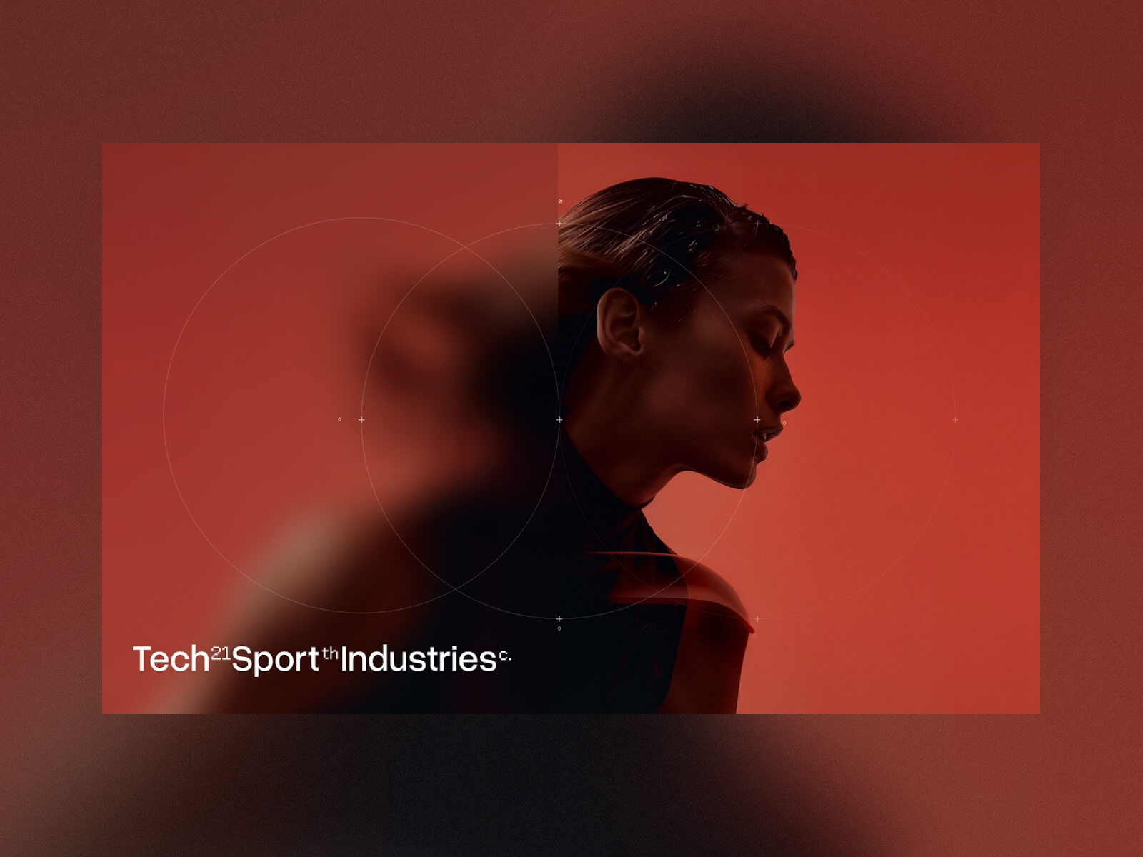
21 TSI isn’t your typical sports holding company. Overseeing a portfolio of brands in the sports equipment space, the team set out to break from the mold of the standard corporate website. Instead, they envisioned a digital experience that would reflect their DNA—where innovation, design, and technology converge into a rich, immersive journey.
The result is a site that goes beyond static content, inviting users to explore through motion, interactivity, and meticulously crafted visuals. Developed through a close collaboration between type8 Studio and DEPARTMENT Maison de Création, the project pushes creative and technical boundaries to deliver a seamless, engaging experience.
Concept & Art Direction
The creative direction led by Paul Barbin played a crucial role in shaping the website’s identity. The design embraces a minimalist yet bold aesthetic—strictly monochromatic, anchored by a precise and structured typographic system. The layout is intentionally clean, but the experience stays dynamic thanks to well-orchestrated WebGL animations and subtle interactions.
Grid & Style
The definition of the grid played a fundamental role in structuring and clarifying the brand’s message. More than just a layout tool, the grid became a strategic framework—guiding content organization, enhancing readability, and ensuring visual consistency across all touchpoints.
We chose an approach inspired by the Swiss style, also known as the International Typographic Style, celebrated for its clarity, precision, and restraint. This choice reflects our commitment to clear, direct, and functional communication, with a strong focus on user experience. The grid allows each message to be delivered with intention, striking a subtle balance between aesthetics and efficiency.
A unique aspect of the project was the integration of AI-generated imagery. These visuals were thoughtfully curated and refined to align with the brand’s futuristic and enigmatic identity, further reinforcing the immersive nature of the website.
Interaction & Motion Design
The experience of 21 TSI is deeply rooted in movement. The site feels alive—constantly shifting and morphing in response to user interactions. Every detail works together to evoke a sense of fluidity:
WebGL animations add depth and dimension, making the site feel tactile and immersive.
Cursor distortion effects introduce a subtle layer of interactivity, letting users influence their journey through motion.
Scroll-based animations strike a careful balance between engagement and clarity, ensuring motion enhances the experience without overwhelming it.
This dynamic approach creates a browsing experience that feels both organic and responsive—keeping users engaged without ever overwhelming them.
Technical Implementation & Motion Design
For this project, we chose a technology stack designed to deliver high performance and smooth interactions, all while maintaining the flexibility needed for creative exploration:
OGL: A lightweight alternative to Three.js, used for WebGL-powered animations and visual effects.
Anime.js: Handles motion design elements and precise animation timing.
Locomotive Scroll: Enables smooth, controlled scroll behavior throughout the site.
Eleventy (11ty): A static site generator that ensures fast load times and efficient content management.
Netlify: Provides seamless deployment and version control, keeping the development workflow agile.
One of the key technical challenges was optimizing performance across devices while preserving the same fluid motion experience. Carefully balancing GPU-intensive WebGL elements with lightweight animations made seamless performance possible.
Challenges & Solutions
One of the primary challenges was ensuring that the high level of interactivity didn’t compromise usability. The team worked extensively to refine transitions so they felt natural, while keeping navigation intuitive. Balancing visual complexity with performance was equally critical—avoiding unnecessary elements while preserving a rich, engaging experience.
Another challenge was the use of AI-generated visuals. While they introduced unique artistic possibilities, these assets required careful curation and refinement to align with the creative vision. Ensuring coherence between the AI-generated content and the designed elements was a meticulous process.
Conclusion
The 21 TSI website is a deep exploration of digital storytelling through design and interactivity. It captures the intersection of technology and aesthetics, offering an experience that goes well beyond a traditional corporate presence.
The project was recognized with multiple awards, including Website of the Day on CSS Design Awards, FWA of the Day, and Awwwards, reinforcing its impact in the digital design space.
This collaboration between type8 Studio and Paul Barbin of DEPARTMENT Maison de Création showcases how thoughtful design, innovative technology, and a strong artistic vision can come together to craft a truly immersive web experience.