برچسب: WordPress

  • How to Build an Immersive 3D Circular Carousel in WordPress Using Droip

    How to Build an Immersive 3D Circular Carousel in WordPress Using Droip


    A flat carousel is nice. 

    But what if your cards could float in 3D space and orbit around like planets on your WordPress site?

    You read that right. Droip, the modern no-code website builder, now makes it possible to design immersive 3D interactions in WordPress without any third-party plugins or coding.

    In this tutorial, you’ll build a 3D circular marquee (a rotating ring of cards that tilt, orbit, and feel alive), all inside Droip’s visual editor.

    What We’re Building 

    Imagine a hula hoop standing upright in front of you. 

    Now, place 12 cards evenly around that hoop. As the hoop spins, cards travel around, some face you, some tilt away, and the one at the back hides in perspective. 

    With Droip’s advanced interactions, you can create this striking 3D effect with just a bit of math.

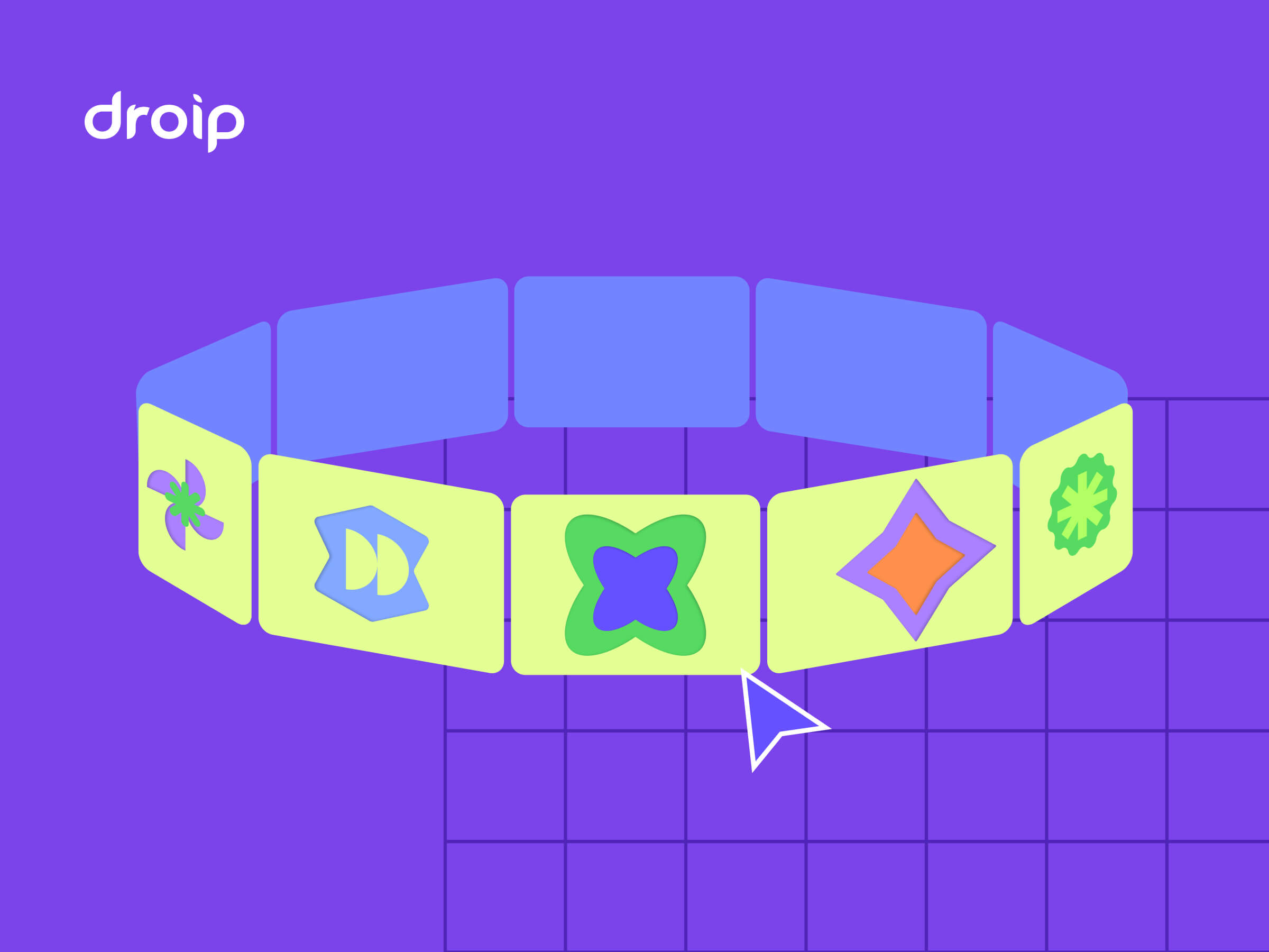
    This is the illusion we’ll create. A dynamic 3D ring of cards with Droip’s advanced transform and animation tools. See it live and get a feel for what you’ll be building.

    You can use this 3D Marquee to showcase portfolios, products, or creative content as an example of the advanced interactions now possible in WordPress with a modern WordPress website builder.

    Part 1: Planning The Key Pieces

    Before we start creating, let’s plan out what we’ll need to make the 3D circular marquee work:

    • Stage (the hoop): A parent element that spins, carrying all the cards.
    • Cards (the orbiting items): Each card sits at a fixed angle around the circle.
    • Perspective: A visual depth setting that makes near cards appear closer and far ones smaller.
    • Tilt: A subtle rotation that gives realism to the motion.
    • Animation: The continuous rotation that makes the ring orbit infinitely.

    Spacing Cards Around the Circle

    We’ll have 12 cards around a 360° ring, meaning each card sits 30° apart. Think of it like clock positions:

    • Card 0: 0° (front)
    • Card 3: 90° (right side)
    • Card 6: 180° (back)
    • Card 9: 270° (left side)

    Each card will be rotated by its angle and pushed outward to form the circular ring.

    The 3D Transforms

    Every card uses a combination of transforms to position correctly:

    rotateY(angle), moveZ(radius)

    Here’s what happens:

    • rotateY(angle): turns the card to its position around the circle.
    • moveZ(radius): moves it outward from the center onto the ring.

    That’s all you need to place the cards evenly in a circle. 

    Why rotate, then move?

    If you move Z first and then rotate Y, the translation happens in the element’s original space; rotating afterward will spin that translated offset around the origin and do something different. 

    The rotateY(angle) followed by moveZ(radius) means “turn the element to the angle, then push it out along its forward direction,” which places it on the circumference.

    Part 2: Building the 3D Circular Marquee in the Droip Visual Editor

    Now that you know how the structure works, let’s start building everything visually inside Droip.

    Step 1: Create the Wrapper and base layout

    1. Add a Div and rename it to Wrapper.
    2. Set Width: 100%, Height: 100vh, and choose a nice background (solid or gradient).
    3. Inside it, add two children:
      • Custom Cursor (Optional)
      • Banner (the section that holds our 3D Marquee)

    Step 2: Create the custom cursor (Optional)

    Next, we’ll add a custom cursor. Totally optional, but it gives your build that extra touch of uniqueness and polish.

    1. Inside the Wrapper, add a Div and rename it Cursor.
    2. Size: 32×32px, position it to absolute, top: 0, left: 0, z-index: 100.
    3. Add a Shape element (your cursor visual) inside the Cursor div. Resize the shape element to 32×32px. You can add your preferred cursor shape by simply replacing the SVG. 
    1. For interactions (making this custom shape act like a cursor): Select the Cursor div and click on interaction:
    • Trigger: Scroll into view.
    • Animation: Cursor Trail.
    • Scope: Viewport.
    • Smoothing: 75%.

    Now your cursor will smoothly follow your movement in preview mode.

    Step 3: Create the Banner (base for marquee) 

    Inside the Wrapper, add another Div and rename it Banner.

    Set up the following properties:

    • Width: 100vw
    • Height: 100vh
    • Position: relative
    • Z-index: 1

    This Banner will serve as the main stage for your 3D Marquee. Later in the tutorial, we’ll add an interaction here for the click-to-scale zoom effect.

    Step 4: Create the Container & 3D Transform wrapper

    Now it’s time to set up the structure that will hold and control our 3D elements.

    Inside the Banner, add a Div and rename it Container. This will act as the main layout holder for the 3D stage.

    Configure the Container:

    • Width: 100%
    • Max-width: 800px
    • Margin: auto (to center it on the page)
    • Position: relative
    • Z-index: 2

    Next, inside the Container, add another Div and rename it 3D Transform. This element will define the 3D space where all your cards will orbit.

    Set the following properties:

    • Width/Height: 100%
    • Position: absolute; top: 0; left: 0
    • Z-index: 100

    Now, in the Effects > Transform panel:

    • Enable Preserve 3D: this ensures all child elements (like your cards) exist in a true 3D environment.
    • Set Child Perspective to 9000px: this gives the illusion of depth, where closer objects appear larger and farther ones appear smaller.
    • Optionally, apply Scale X/Y: 0.8 if you want to reduce the overall stage size slightly.

    In short, this step creates the 3D “space” your rotating cards will live in — like setting up the stage before the show begins.

    Step 5: Create the 3D Marquee (Orbit Center)

    Now we’ll create the core of the carousel,  the rotating stage that all your cards will attach to.

    Inside the 3D Transform, add a Div and rename it 3D Marquee. This element acts as the orbit center. When it spins, all the cards will revolve around it.

    Set up the 3D Marquee as follows:

    • Width: 435px. This will be the size of the card
    • Height: auto
    • Position: relative
    • Enable Preserve 3D (so its child elements, the cards, maintain their depth in 3D space).
    • Rotate X: -10° – this slightly tilts the ring backward, giving a more natural perspective when viewed from the front.
    • Scale: X: 1, Y: 1

    In simple terms: this is your spinning hub. When the animation runs, this element will rotate continuously, carrying all the cards with it to create that smooth, orbiting 3D effect.

    Step 6: Create the Card Template (One Card Structure)

    Next, we’ll build a single card that will serve as the template. Once complete, we’ll duplicate it 11 more times to complete the ring.

    1. Create the Front Card

    Inside 3D Marquee, add a Div and rename it Front Card.

    Configure it:

    • Width/Height: 100% (the final position will be controlled via transforms)
    • Border-radius: 20px
    • Position: absolute
    • Enable Preserve 3D in the transforms panel

    Note: This is the element where you’ll later apply rotateY(…) translateZ(orbitZ) to position it around the circle.

    2. Add the 3D Container

    Inside Front Card, add another Div and rename it to Card-3D. This acts as a 3D wrapper so we can rotate and position the card in space without affecting its internal layout.

    Settings:

    • Width/Height: 100%
    • Position: relative
    • Z-index: 3
    • Enable Preserve 3D

    3. Add the Popup (Visible Front Face)

    Inside Card-3D, add a Div and rename it Popup. This holds the main content, the image or design that users interact with.

    Settings:

    • Width/Height: 100%
    • Background: White
    • Border-radius: 20px

    Inside Popup, add an Image element:

    • Width/Height: 100%
    • Border-radius: 12px

    4. Add the Backface

    Inside the Popup, add another Div and rename it Backface.

    Settings:

    • Padding: 12px
    • Width/Height: 100%
    • Background: #FEDEFF 
    • Border-radius: 20px
    • Position: absolute; top: 0; left: 0; z-index: 1
      Transforms: Rotate Y = 180° (so it appears when the card flips)
    • Disable showing the real backside by toggling backface-visibility

    Now you have a complete single card ready to be duplicated and positioned around the orbit. Each card will inherit the 3D rotation and spacing we’ll set in the next step.

    Step 7: Duplicate Cards and Position Them Around the Orbit

    Now that we have a single card ready, we’ll create all 12 cards for the carousel and place them evenly around the circular orbit.

    Duplicate the Card-Template

    • Right-click on your Front Card and select Duplicate. This creates a new card that copies all the styles of the original card.
    • Duplicate the class holding the transform styles. This gives the new card its own separate class for rotation/position.
    • Do this 11 times so you have Card-1 through Card-12. Rename the cards

    💡 Tip: Duplicating the card class is important so each card’s transform is independent.

    Set Each Card’s Position with 3D Transforms

    For each card, set the Transform fields (Rotate Y + Move Z). Use these exact values:

    1. Front Card: rotateY(0deg), MoveZ(850px)
    2. Card 1: rotateY( 30deg), MoveZ(850px)
    3. Card 2: rotateY( 60deg), MoveZ(850px)
    4. Card 3: rotateY( 90deg), MoveZ(850px)
    5. Card 4: rotateY(120deg), MoveZ(850px)
    6. Card 5: rotateY(150deg), MoveZ(850px)
    7. Card 6: rotateY(180deg), MoveZ(850px)
    8. Card 7: rotateY(-150deg), MoveZ(850px)
    9. Card 8: rotateY(-120deg), MoveZ(850px)
    10. Card 9: rotateY(-90deg), MoveZ(850px)
    11. Card 10: rotateY(-60deg), MoveZ(850px)
    12. Card 11: rotateY(-30deg), MoveZ(850px)

    At this point, if Preserve 3D and Perspective are correctly set, you should see a ring of cards in 3D space.

    Step 8: Animate the Orbit (Rotate the 3D Marquee)

    Now that your cards are all in place, let’s bring the marquee to life by making it spin.

    1. In the Layers panel, select Page, then go to Interactions and select Page Load.
    2. Choose the 3D Marquee div as your animation target — this is the parent element that holds all the cards.
    3. Add a Rotate action and set these values:
    • Duration: 30s (or any speed you like)
    • X: -10°
    • Y: 360°
    • Loop: Infinite

    Hit Preview, and you’ll see your entire 3D ring smoothly spinning in space — just like a rotating carousel!

    💡 Tip: The -10° tilt keeps the spin looking natural and adds depth to the orbit, rather than a flat, top-down rotation.

    Step 9: Add Click-to-Scale Interaction on the Banner (Zoom Toggle)

    Let’s make your 3D Marquee more fun to play with by adding a click-to-zoom effect, so users can zoom in and out of the carousel with a single click.

    1. Select the Banner. This is the background container holding your 3D Marquee.
    2. Go to Interactions and create a new one with:
      • Trigger: Mouse Click (Tap)
      • Target: 3D Transform

    The Banner acts as the clickable area. When you click it, the animation targets the 3D Transform div (which contains everything inside the 3D scene).

    Now we’ll set up a two-step toggle animation:

    Step 1: First Click 

    Create two responses and name them:

    We’re creating both Zoom In/Out and Zoom In/Out (Tab) because desktop and tablet screens behave differently. A zoom value that looks perfect on a wide desktop might push the 3D ring out of view or look oversized on a smaller tablet screen.

    So by having two versions, Droip automatically applies the right animation depending on the device, keeping the zoom effect centered and balanced across all viewports.

    Zoom In:

    • Scale X: 2, Y: 2
    • Move Y: -250

    Zoom In (Tab):

    • Scale X: 1, Y: 1
    • Move Y: 0

    Step 2: Second Click (Zoom Out)

    Duplicate the first set and rename them:

    Zoom Out:

    • Scale X: 0.8, Y: 0.8
    • Move Y: 0

    Zoom Out (Tab):

    • Scale X: 0.4, Y: 0.4
    • Move Y: 0

    Now, when you click anywhere on the Banner, the whole 3D scene smoothly zooms in and out, making it feel alive and responsive.

    💡 Tip: Adjust the scale and movement values to find your perfect zoom balance for desktop and tablet views.

    Final Preview

    That’s it! You’ve just built a fully interactive 3D circular marquee inside Droip with no code, no plugins. 

    It might seem like a lot at first, but once you get the hang of it, you’ll realize how much power Droip gives you. 

    With this modern WordPress website builder, almost any advanced web interactions are now possible in WordPress, all visually. 


    Source link

  • From Figma to WordPress in Minutes with Droip

    From Figma to WordPress in Minutes with Droip


    When the team at Droip first introduced their amazing builder, we received an overwhelming amount of positive feedback from our readers and community. That’s why we’re especially excited to welcome the Droip team back—this time to walk us through how to actually use their tool and bring Figma designs to life in WordPress.

    Even though WordPress has powered the web for years, turning a modern Figma design into a WordPress site still feels like a struggle. 

    Outdated page builders, rigid layouts, and endless back-and-forth with developers, only to end up with a site that never quite matches the design.

    That gap is exactly what Droip is here to close.

    Droip is a no-code website builder that takes a fresh approach to WordPress building, giving you full creative control without all the usual roadblocks.

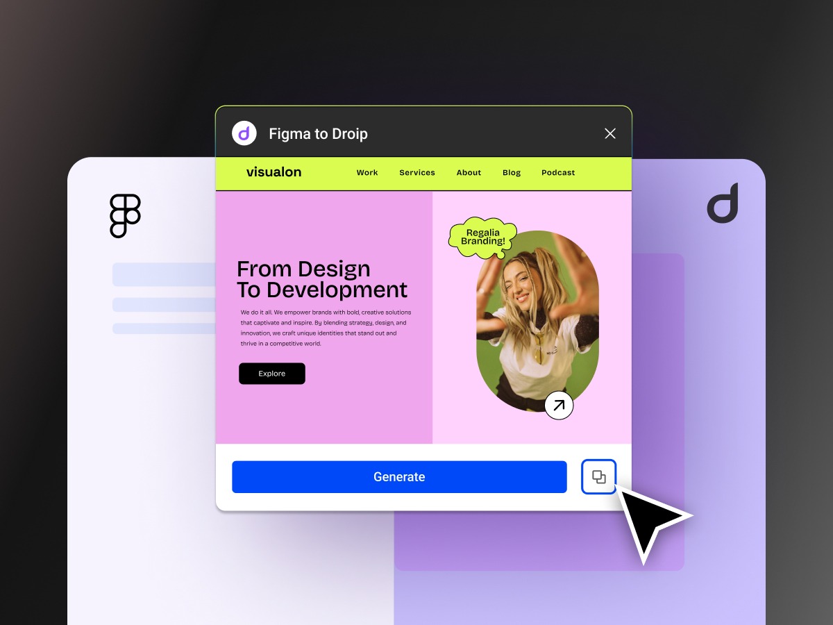
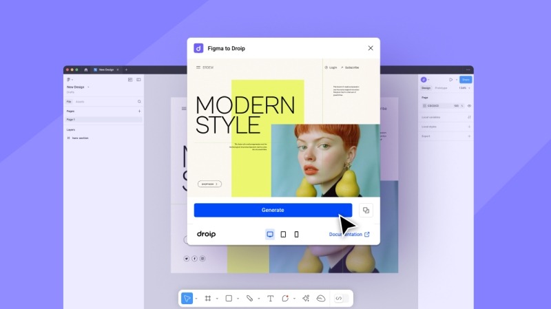
    What makes it especially exciting for Figma users is the instant Figma-to-Droip handoff. Instead of handing off your design for a rebuild, you can literally copy from Figma and paste it into Droip. Your structure, layers, and layout come through intact, ready to be edited, extended, and published.

    In this guide, I’ll show you exactly how to prep your Figma file and go from a static mockup to a live WordPress site in minutes using a powerful no-code WordPress Builder.

    What is Droip?

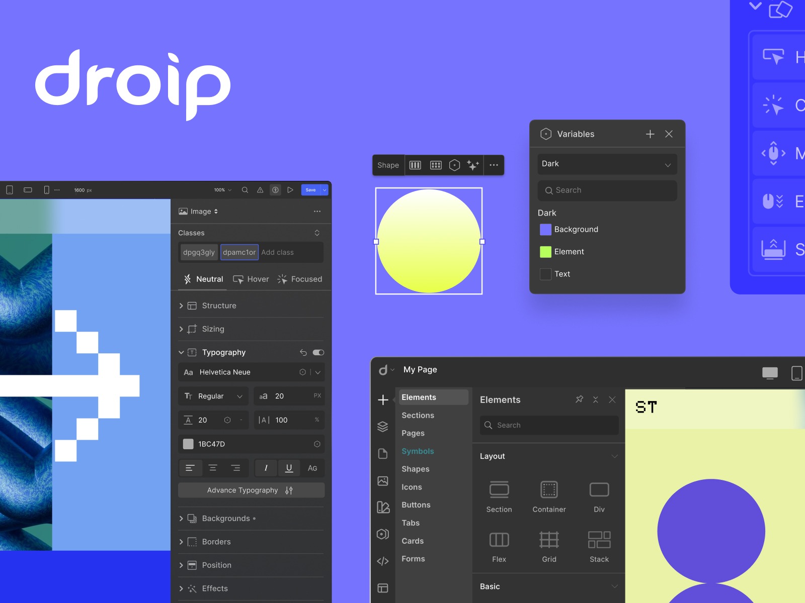
    Making quite a buzz already for bringing the design freedom of Figma and the power of true no-code in WordPress, Droip is a relatively new, no-code WordPress website builder. 

    It’s not another rigid page builder that forces you into pre-made blocks or bloated layouts. Instead, Droip gives you full visual control over your site, from pixel-perfect spacing to responsive breakpoints, interactions, and dynamic content.

    Here’s what makes it different:

    • Designer-first approach: Work visually like you do in Figma or Webflow.
    • Seamless Figma integration: Copy your layout from Figma and paste it directly into Droip. Your structure, layers, and hierarchy carry over intact.
    • Scalable design system: Use global style variables for fonts, colors, and spacing, so your site remains consistent and easy to update.
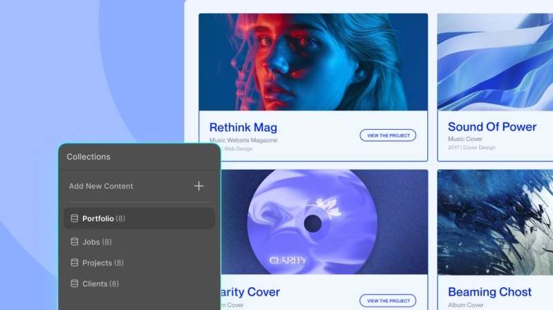
    • Dynamic content management: Droip’s Content Manager lets you create custom content types and bind repeated content (like recipes, products, or portfolios) directly to your design.
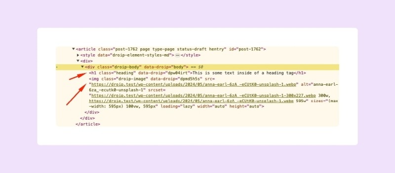
    • Lightweight & clean code output: Unlike traditional builders, Droip produces clean code, keeping your WordPress site performant and SEO-friendly.

    In short, Droip lets you design a site that works exactly how you envisioned it, without relying on developers or pre-made templates.

    Part 1: Prep Your Figma File

    Good imports start with good Figma files. 

    Think of this step like designing with a builder in mind. You’ll thank yourself later.

    Step 1: Use Auto Layout Frames for Everything

    Don’t just drop elements freely on the canvas; wrap them in Frames with Auto Layout. Auto Layout helps Droip understand how your elements are structured. It improves spacing, alignment, and responsiveness.

    So the better your hierarchy, the cleaner your import. 

    • Wrap pages in a frame, set the max width (1320px is my go-to).
    • Place all design elements inside this Frame.
    • If you’re using grids, make sure they’re real grids, not just eyeballed. Set proper dimensions in Figma.

    Step 2: Containers with Min/Max Constraints

    When needed, give Frames min/max width and height constraints. This makes responsive scaling inside Droip way more predictable.

    Step 3: Use Proper Elements Nesting & Naming 

    Droip reads your file hierarchically, so how you nest and name elements in Figma directly affects how your layout behaves once imported.

    I recommend using Auto Layout Frames for all structural elements and naming the frames properly. 

    • Buttons with icons: Wrap the button and its icon inside an Auto Layout Frame and name it Button.
    • Form fields with labels: Wrap each label and input combo in an Auto Layout Frame and name it ‘Input’.
    • Sections with content: Wrap headings, text, and images inside an Auto Layout Frame, and give it a clear name like Section_Hero or Section_Features.

    Pro tip: Never leave elements floating outside frames. This ensures spacing, alignment, and responsiveness are preserved, and Droip can interpret your layout accurately.

    Step 4: Use Supported Element Names

    Droip reads your Figma layers and tries to understand what’s what, and naming plays a big role here. 

    If you use certain keywords, Droip will instantly recognize elements like buttons, forms, or inputs and map them correctly during import.

    For example: name a button layer “Button” (or “button” / “BUTTON”), and Droip knows to treat it as an actual button element rather than just a styled rectangle. The same goes for inputs, textareas, sections, and containers.

    Here are the supported names you can use:

    • Button: Button, button, BUTTON
    • Form: Form, form, FORM
    • Input: Input, input, INPUT
    • Textarea: Textarea, textarea, TEXTAREA
    • Section: Section, section, SECTION
    • Container: Container, container, CONTAINER

    Step 5: Flatten Decorative Elements

    Icons, illustrations, or complex vector shapes can get messy when imported as-is. To avoid errors, right-click and Flatten them in Figma. This keeps your file lightweight and makes the import into Droip cleaner and faster.

    Step 6: Final Clean-Up

    Before you hit export, give your file one last polish:

    • Delete any empty or hidden layers.
    • Double-check spacing and alignment.
    • Make sure everything lives inside a neat Auto Layout Frame.

    A little housekeeping here saves a lot of time later. Once your file is tidy, you’re all set to import it into Droip.

    Prepping Droip Before You Import

    So you’ve cleaned up your Figma file, nested your elements properly, and named things clearly. 

    But before you hit copy–paste, there are a few things to set up in Droip that will save you a ton of time later. Think of this as laying the groundwork for a scalable, maintainable design system inside your site.

    Install the Fonts You Used in Figma

    If your design relies on a specific font, you’ll want Droip to have it too.

    • Google Fonts: These are easy, just select from Droip’s font library.
    • Custom Fonts: If you used a custom font, upload and install it in Droip before importing. Otherwise, your site may fall back to a default font, and all that careful typography work will go to waste.

    Create Global Style Variables (Fonts, Sizes, Colors)

    Droip gives you a Variables system (like tokens in design systems) that makes your site easier to scale.

    • Set up font variables (Heading, Body, Caption).
    • Define color variables for your brand palette (Primary, Secondary, Accent, Background, Text).
    • Add spacing and sizing variables if your design uses consistent paddings or margins.

    When you paste your design into Droip, link your imported elements to these variables. This way, if your brand color ever changes, you update it once in variables and everything updates across the site.

    Prepare for Dynamic Content

    If your design includes repeated content like recipes, team members, or product cards, you don’t want to hard-code those. Droip’s Content Manager lets you create Collections that act like databases for your dynamic data.

    Here’s the flow:

    • In Droip, create a Collection (e.g., “Recipes” with fields like Title, Date, Image, Ingredients, Description, etc.).
    • Once your design is imported, bind the elements (like the recipe card in your design) to those fields.

    Part 2: Importing Your Figma Design into Droip

    Okay, so your Figma file is clean, your fonts and variables are set up in Droip, and you’re ready to bring your design to life. The import process is actually surprisingly simple, but there are a few details you’ll want to pay attention to along the way.

    If you don’t have a design ready, no worries. I’ve prepared a sample Figma file that you can import into Droip. Grab the Sample Figma File and follow along as we go from design to live WordPress site.

    Step 1: Install the Figma to Droip Plugin

    First things first, you’ll need the Figma to Droip plugin that makes this whole workflow possible.

    • Open Figma
    • Head to the Resources tab in the top toolbar
    • Search for “Figma to Droip”
    • Click Install

    That’s it, you’ll now see it in your Plugins list, ready to use whenever you need it.

    Step 2: Select and Generate Your Design

    Now let’s get your layout ready for the jump.

    • In Figma, select the Frame you want to export.
    • Right-click > Plugins > Figma to Droip.
    • The plugin panel will open, and click Generate.
    • Once it’s done processing, hit Copy.

    Make sure you’re selecting a final, polished version of your frame. Clean Auto Layout, proper nesting, and consistent naming will all pay off here.

    Step 3: Paste into Droip

    Here’s where the magic happens.

    • Open Droip and create a new page.
    • Click anywhere on the canvas or workspace.
    • Paste (Cmd + V on Mac, Ctrl + V on Windows).

    Droip will instantly import your design, keeping the layout structure, spacing, styles, groupings, and hierarchy from Figma. 

    Not only that, Droip automatically converts your Figma layout into a responsive structure. That means your design isn’t just pasted in as a static frame, it adapts across breakpoints right away, even the custom ones. 

    Best of all, Droip outputs clean, lightweight code under the hood, so your WordPress site stays fast, secure, and SEO-friendly as well.

    And just like that, your static design is now editable in WordPress.

    Step 4: Refine Inside Droip

    The foundation is there, now all you need to do is just add the finishing touches. 

    After pasting, you’ll want to refine your site and hook it into Droip’s powerful features:

    • Link to variables: Assign your imported fonts, colors, and sizes to the global style variables you created earlier. This makes your site scalable and future-proof.
    • Dynamic content: Replace static sections with collections from the Content Manager (think recipes, portfolios, products).
    • Interactions & animations: Add hover effects, transitions, and scroll-based behaviors, the kind of micro-interactions that bring your design to life.
    • Media: Swap out placeholder assets for final images, videos, or icons.

    Step 5: Set Global Header & Footer 

    After import, you’ll want your header and footer to stay consistent across every page. The easiest way is to turn them into Global Components.

    • Select your header in the Layers panel > Right-click > Create Symbol.
    • Open the Insert Panel > Go to Symbols > Assign it as your Global Header.
    • Repeat the same steps for your footer.

    Now, whenever you edit your header or footer, those changes will automatically sync across your entire site.

    Step 6: Preview & Publish

    Almost there.

    • Hit Preview to test responsiveness, check spacing, and see your interactions in action.
    • When everything feels right, click Publish, and your page is live.

    And that’s it. In just a few steps, your Figma design moves from a static mockup to a living, breathing WordPress site.

    Wrapping Up: From Figma to WordPress Instantly

    What used to take weeks of handoff, revisions, and compromises can now happen in minutes. You still keep all the freedom to refine, extend, and scale, but without the friction of developer bottlenecks or outdated page builders.

    So if you’ve ever wanted to skip the “translation gap” between design and development, this is your fastest way to turn Figma designs into live WordPress websites using a no-code WordPress Builder.

    Get started with Droip and try it yourself!


    Source link

  • Droip: The Next Big Revolution in WordPress – Redefining No-Code Web Building

    Droip: The Next Big Revolution in WordPress – Redefining No-Code Web Building


    Let’s be real—building a WordPress site with traditional page builders can feel like assembling IKEA furniture with missing pieces.

    You install a page builder only to find out it doesn’t do half the things you need. So you pile on plugins to fill the gaps, and they end up conflicting with one another.

    Your site slows down, SEO takes a hit, and suddenly, you’re knee-deep in subscription fees, support tickets, and messy workarounds.

    It’s 2025. We deserve better. 

    That era of outdated page builders and plugin-heavy setups is over.

    Today’s web demands speed, flexibility, and full creative control—minus the bloat and the added costs. That’s where Droip comes in. A new kind of builder made for modern creators. 

    But what makes it unique? Let’s break it down.

    All-in-One Web Building Ecosystem 

    Droip is a full-fledged, no-code ecosystem that lets you build smarter.

    Whether it’s SEO, forms, popups, dynamic content, or even image editing, Droip handles it natively.

    Because it’s all native, your site stays lean, fast, and conflict-free. Oh, and your wallet? It stays happy too.

    What that means for you:

    • No surprise costs or upgrade traps.
    • Faster load times and better performance.
    • One support team, one solution.
    • Scales with your business—whether you’re a solo creator or running a full agency.

    Pricing: It’s transparent, with no hidden upsells. Check the Pricing page for the details.

    To learn how Droip works, watch a quick video overview of Droip in action. 

    Modern UI With Maximum Control

    Let’s start with the UI. 

    The moment you open the editor, everything feels intuitive.

    It’s sleek. It’s modern. It’s not that stiff, clunky layout you’ve seen in other WordPress builders. 

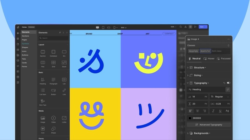
    Instead, the editor gives you an interface that feels familiar, like the modern major web builders you already know, but packs the kind of power only Droip can deliver.

    Everything’s exactly where you expect it to be. 

    The menu panels are clean and concise. Element settings are instantly accessible.

    The UX flows effortlessly from dragging elements to switching panels, it’s all frictionless.

    And yes, it also has both dark and light modes for your comfort.

    Overall, it provides a clean, smooth workspace designed to help you move fast and build without barriers.

    Design Freedom For Everyone

    When it comes to design, Droip hands you the keys to total design freedom.

    Whether you’re starting from scratch or using predesigned layouts, you have all the flexibility and options.

    A Growing Collection of Stunning Templates

    Start with Droip’s growing collection of stunning templates, from sleek portfolios to bold business sites. They’re professionally designed, fully customizable, and included in your subscription (no sneaky extra fees)!  

    Pre-Made Sections, Pages, and Components

    Mix and match ready-made sections, pages, and components like contact forms, testimonials, cards, and more. It’s like having a design toolkit at your fingertips. Just drag, drop, customize if needed, and you’re all set.

    Turn Figma Designs into Fully Editable Pages—In Seconds

    Imagine dragging in your Figma mockup and watching it become a live, editable page in seconds. If you have got your site designed in Figma, you can just copy and paste it into Droip—yes, literally. 

    The builder instantly converts it into a fully editable, auto-responsive page with a single click. And the best part? It automatically adapts to all breakpoints, including any custom ones you define.

    Want to Start from Scratch? Go for It!

    If you’re the “I want full control” type, Droip’s intuitive drag-and-drop canvas is all yours. Build pixel-perfect layouts, experiment, and make it yours.

    Droip was built with the atomic approach to give you granular control over every aspect of your website. With deep element editing, you can adjust every detail, from typography to layouts, to fit your exact vision.

    Native Dynamic Content. No ACF Required.

    Managing dynamic content in WordPress usually means extra plugins like ACF. Not anymore.

    Droip lets you create, manage, and style dynamic content like listings, directories, and portfolios right out of the box. 

    Connect your content, customize it visually, and even set dynamic SEO for every item’s detail page. All built-in and all visual.

    A Smarter Media Manager That Works Like a Design Tool

    Droip’s media manager is not just for organizing images.

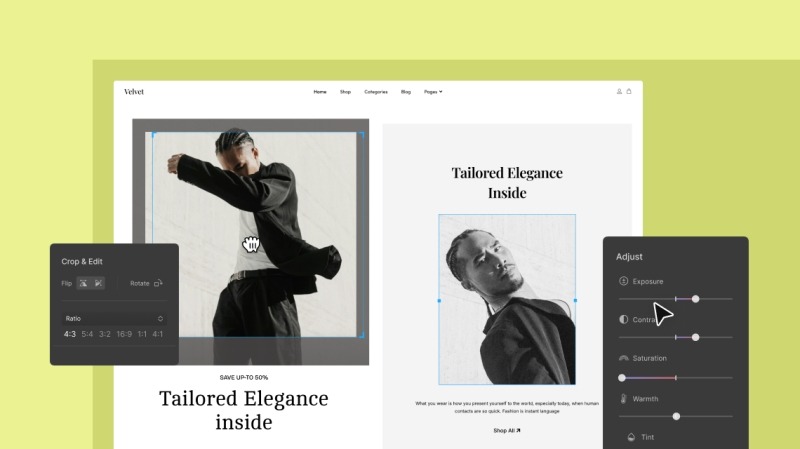
    You can crop, resize, add filters, or create custom text paths all inside Droip’s powerful native media manager.

    Image Editing Tools

    One of the standout features of Droip’s media manager is its advanced image editing capabilities. 

    Edit your images directly within Droip, from basic cropping and resizing to applying advanced filters, without relying on third-party tools. 

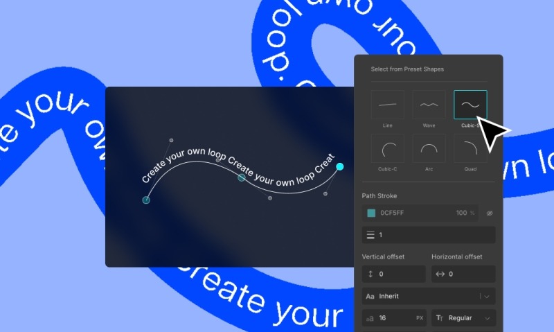
    Text Path Creation

    Another innovative feature is the ability to create text paths. This allows you to design text that follows any path or shape for that extra creative edge.

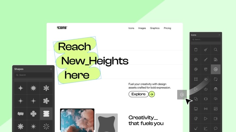
    Extensive Icons & Shapes library

    Droip has an extensive library of shapes so you can do more than ever. 

    You can leverage an array of distinctive shapes, customize them to create unique visuals, and effortlessly add them to any part of your website.

    Plus, it also houses a vast collection of high-quality icons, all ready to be refined to perfection.

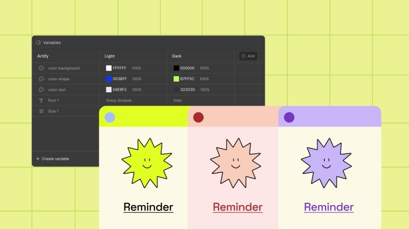
    Instant Global Styling Sync with Variables 

    Most builders make global styling difficult with scattered controls. But this WordPress builder has a dedicated feature called Variables that allows you to save and apply reusable styles across your entire site. 

    The system is centralized and features a real-time preview, meaning you can update your design in seconds. Say you want to tweak your brand’s primary color. Change it once, and Droip updates every button, heading, and section styled with that variable instantly.

    You can also create multiple styling modes, such as light and dark themes, and switch between them with a single click—perfect for seasonal refreshers or theme updates.

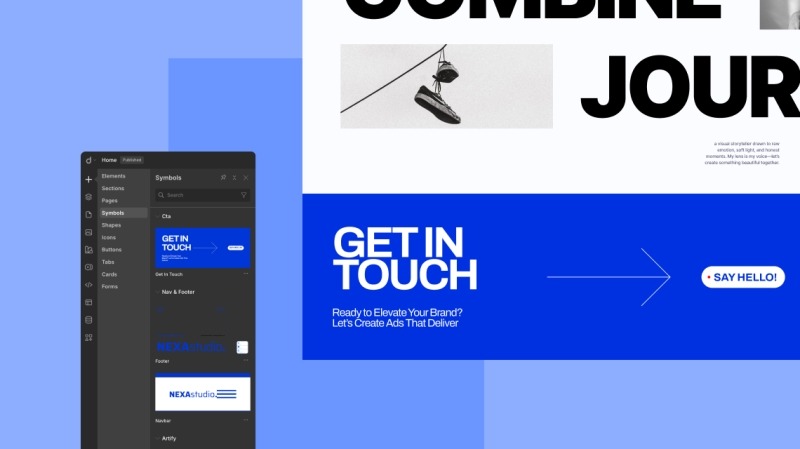
    Reusable Components with Symbols

    Droip also comes with a feature called Symbols, which lets you turn any element along with all of its nested children into a reusable component.

    That means if you build something once like a button, a pricing card, or even an entire section, you can reuse it throughout the site

    You can even set your global header and footer as Symbols, which makes keeping everything consistent across your site way easier.

    Immersive Interactions and Animations

    If you have been settling for basic motion, a few hover effects, maybe a fade-in or two, it’s time to achieve more. 

    Droip has rich interactions and animation capabilities. You can create immersive, responsive experiences that feel polished and purposeful—not just flashy. From hover effects to scroll-based reveals, you’re free to build any web interactions.

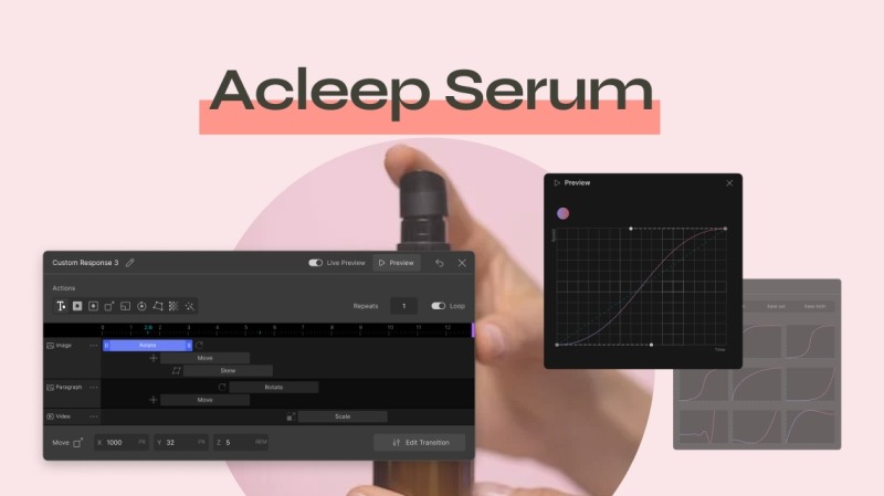
    And when you’re ready to go beyond simple effects, it has an interaction timeline that gives you a visual playground to choreograph complex, multi-step animations with ease. Paired with the custom timing editor, you can shape how your animation flows down to the finest detail.

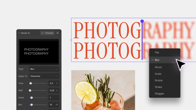
    Text Animations

    It also approaches Text Animations with the same depth and flexibility. You can choose your trigger, select transition styles, and animate at the character, word, or element level. 

    You can fine-tune every movement, like speed, direction, intensity, delay, and duration, until it’s just right.

    Multiple Backgrounds & Effects

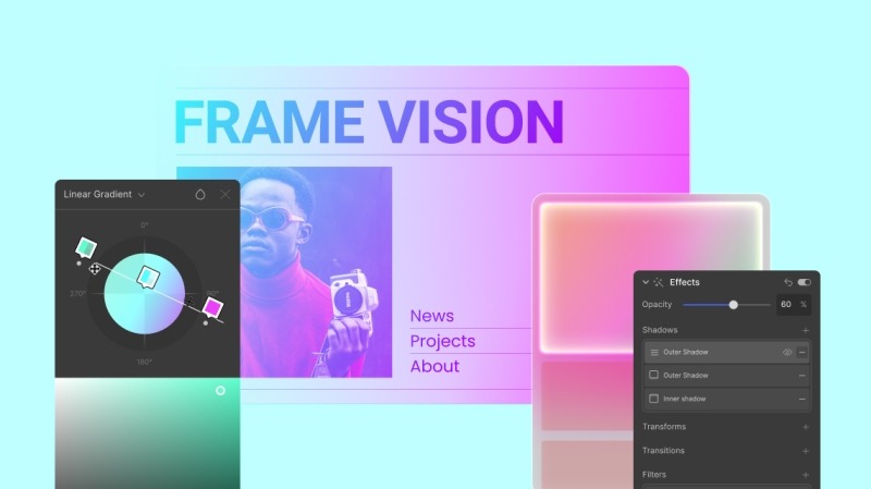
    Droip offers robust options for layering multiple backgrounds and shadow effects. 

    You can layer multiple backgrounds from solid colors to gradients (linear, radial, conic) or images for dynamic, vibrant designs. 

    Combine that with shadow effects for added depth and dimension, and you can create a truly unique visual experience without being limited by pre-set templates.

    Droip Apps for Seamless Integrations

    Droip has a convenient approach when it comes to connecting integrations. 

    You can directly install and connect third-party integrations without leaving the builder and automate workflows by integrating essential tools like analytics, email marketing, and customer support.

    Native Pop-up Builder

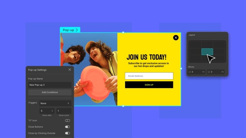
    The built-in popup builder also checks all the right boxes, giving you full control over both design and behavior. 

    Design your pop-ups visually, set visibility conditions, and choose custom triggers, whether it’s a click, scroll, or exit intent. You can position them exactly where you want on the screen.

    But that’s not all. You can also customize the appearance with smooth transitions, whether it’s a subtle notification or a full-screen takeover.

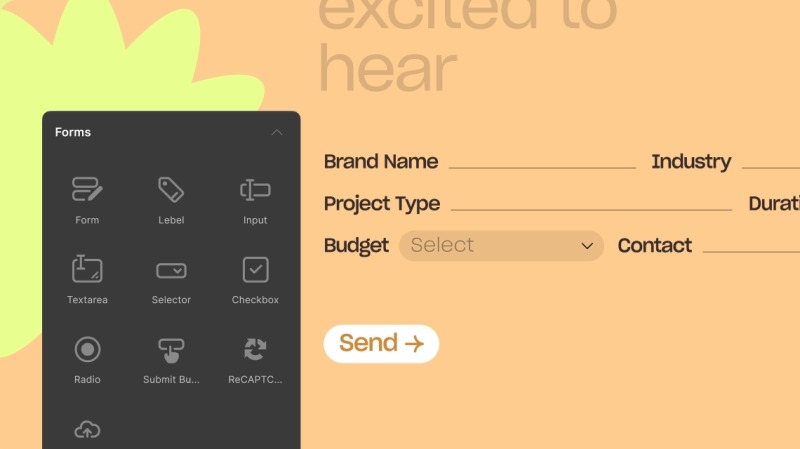
    Form Builder with Built-in Form Data Manager

    Creating forms elsewhere can be a hassle, requiring multiple tools to manage both form design and data collection.

    But with this no-code website builder, you can practically design any web form and then access and manage form data with the built-in Form Data Manager. 

    Whether you’re collecting leads, registrations, or feedback, Droip combines form creation and data management in one place.

    Unlimited Breakpoints for Responsiveness 

    Many builders limit your ability to adjust responsiveness across devices, leaving you with only a few pre-set breakpoints.

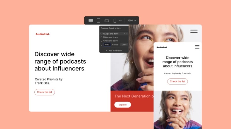
    Here, however, you can define unlimited breakpoints and fine-tune responsiveness for every screen size, ensuring your design adapts perfectly.

    AI-Powered Website Creation

    Droip also has AI features to assist and accelerate your entire workflow. 

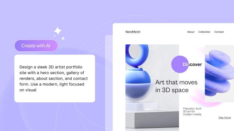
    You can instantly generate page structures and layouts, all with a single prompt. It intelligently understands your content and automatically creates optimal layouts, which are neatly structured and easily accessible in the Layers Panel. 

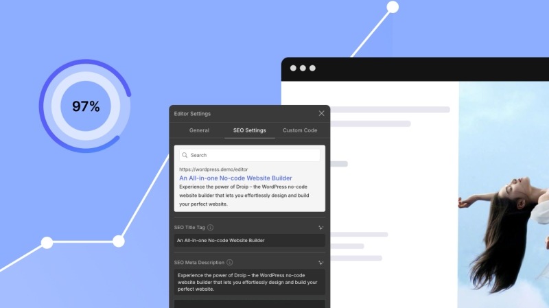
    And if you need help crafting the perfect copy, it can do that too. It even generates meta titles and descriptions, saving you time while ensuring your site stays optimized for search engines.

    Role Manager

    Another essential feature for managing your website is the Role Manager.

    With the Role Manager in Droip, you can control what users can access and edit within the Droip Editor.

    Whether you’re working solo or collaborating with a team, Droip lets you customize who has access to what in a pretty straightforward way.

    Accessibility Built-in

    Accessibility is often left to external plugins in other platforms. But Droip bakes it right into the experience.

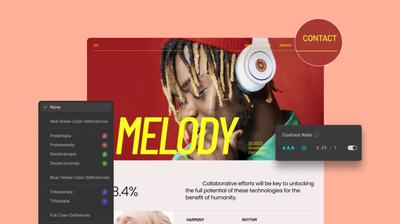
    From increasing text size and reducing motion to enabling larger cursors and magnifying content, the builder offers a wide range of built-in tools to offer an inclusive website creation experience. It also includes support for various visual impairments, like color blindness. 

    It also has a built-in color contrast checker to ensure that your text is readable and your color choices meet accessibility standards. 

    Dynamic and AI-Powered SEO

    For SEO, you get the basics: meta titles, descriptions, and Open Graph tags, all easily editable for every page. Even better, you can generate SEO metadata automatically with AI, saving you time.

    But when working with dynamic content, Droip takes SEO a step further. 

    You can set dynamic SEO, so you don’t have to write SEO data for every single dynamic detail page. Whether it’s a product catalog or course listings, dynamic SEO optimizes the individual detail pages automatically, saving you from manual updates.

    No Performance Compromise

    With so many powerful features built into the platform, you might wonder if performance takes a hit. 

    But no.

    While other traditional WordPress page builders produce bloated code or excessive scripts, Droip delivers clean, minimal markup so even the most complex site loads fast and smooth.

    Automatic Page Audit for Quality Control

    Most platforms leave quality control up to you.

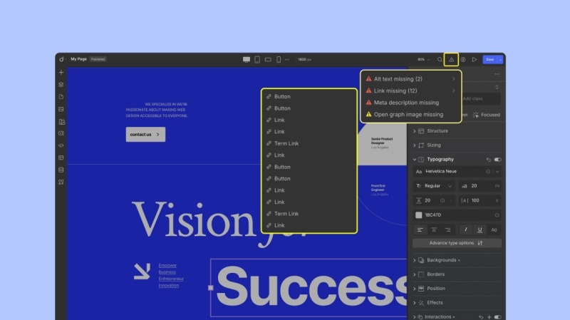
    But Droip has a Page Audit feature that automatically catches issues before they become problems. 

    Whether it’s missing alt text, links, or class names, you’ll get a clear report so you can publish with confidence.

    Final Verdict

    With its packed feature set, slick UI, and native performance, it’s clear that Droip is a complete powerhouse solution at an unbeatable price.

    It’s sleek, it’s powerful, and it’s exactly what WordPress has been waiting for. 

    Where other builders hit their limits, Droip puts you in the driver’s seat, giving you the freedom and tools to craft extraordinary websites.

    So, if you’re still patching plugins together and wasting your money, it’s time to try Droip to feel the difference.


    Source link