
Every project begins with a spark of curiosity. It often emerges from exploring techniques outside the web and imagining how they might translate into interactive experiences. In this case, inspiration came from a dive into particle simulations.
The Concept
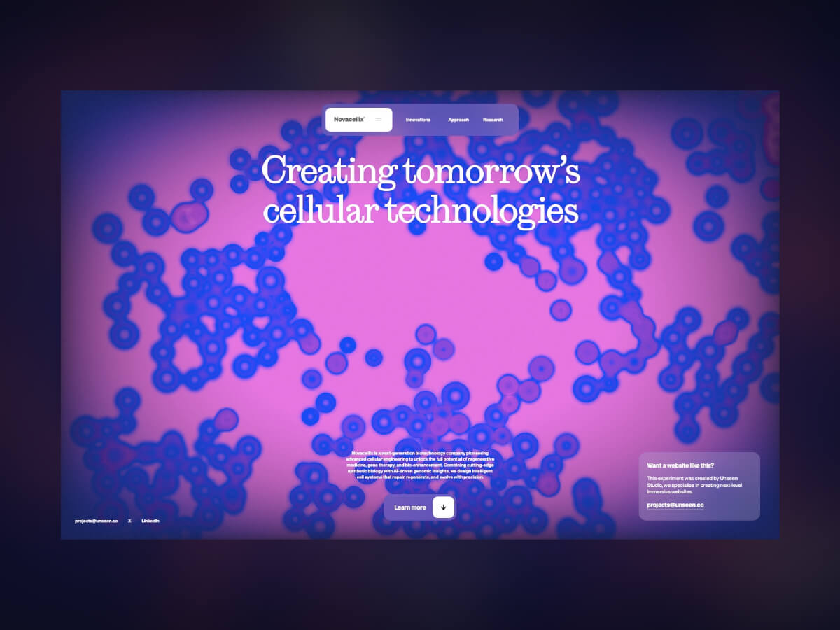
The core idea for this project came after watching a tutorial on creating cell-like particles using the xParticles plugin for Cinema 4D. The team often draws inspiration from 3D motion design techniques, and the question frequently arises in the studio: “Wouldn’t this be cool if it were interactive?” That’s where the idea was born.
After building our own set up in C4D based on the example, we created a general motion prototype to demonstrate the interaction. The result was a kind of repelling effect, where the cells displaced according to the cursor’s position. To create the demo, we added a simple sphere and gave it a collider tag so that the particles would be pushed away as the sphere moved through the simulation, emulating the mouse movement. An easy way to add realistic movement is to add a vibrate tag to the collider, and play around with the movement levels and frequency until it looks good.
Art Direction
With the base particle and interaction demo sorted, we rendered out the sequence and moved in After Effects to start playing around with the look and feel. We knew we wanted to give the particles a unique quality, one that felt more stylised as opposed to ultra realistic or scientific. After some exploration we landed on a lo-fi gradient mapped look, which felt like an interesting direction to move forward with. We achieved this by layer up a few effects:
- Effect > Generate > 4 Colour Gradient: Add this to a new shape layer. This black and white gradient will act as a mask to control the blur intensities.
- Effect > Blur > Camera Blur: Add this to a new adjustment layer. This general blur will smooth out the particles.
- Effect > Blur > Compound Blur: Add this to the same adjustment layer as above. Set the blur layer to use the same shape layer we applied to the 4 colour gradient as its mask, make sure it is set to “Effects & Mask” mode in the drop down.
- Effect > Color Correction > Colorama: Add this as a new adjustment layer. This is where the fun starts! You can add custom gradients into the output cycle and play around with the phase shift to customise the look according to your preference.
Next, we designed a simple UI to match the futuristic cell-based visual direction. A concept we felt would work well for a bio-tech company – so created a simple brand with key messaging to fit and voila! That’s the concept phase complete.
(Hot tip: If you’re doing an interaction concept in 3d software like C4D, create a plane with a cursor texture on and parent it to your main interaction component – in the case, the sphere collider. Render that out as a sequence so that it matches up perfectly with your simulation – you can then layer it over text, etc, and UI in After Effects)
Technical Approach and Tools
As this was a simple one page static site without need of a backend, we used our in-house boilerplate using Astro with Vite and Three.js. For the physics, we went with Rapier as it handles collision detection efficiently and is compatible with Three.js. That was our main requirement, since we didn’t need simulations or soft-body calculations.
For the Cellular Technology project, we specifically wanted to show how you can achieve a satisfying result without overcrowding the screen with tons of features or components. Our key focus was the visuals and interactivity – to make this satisfying for the user, it needed to feel smooth and seamless. A fluid-like simulation is a good way to achieve this. At Unseen, we often implement this effect as an added interaction component. For this project, we wanted to take a slightly different approach that would still achieve a similar result.
Based on the concept from our designers, there were a couple of directions for the implementation to consider. To keep the experience optimised, even at a large scale, having the GPU handle the majority of the calculations is usually the best approach. For this, we’d need the effect to be in a shader, and use more complicated implementations such as packing algorithms and custom voronoi-like patterns. However, after testing the Rapier library, we realised that simple rigid body object collision would suffice in re-creating the concept in real-time.
Physics Implementation
To do so, we needed to create a separate physics world next to our 3D rendered world, as the Rapier library only handles the physics calculations, and the graphics are left for the implementation of the developer’s choosing.
Here’s a snippet from the part were we create the rigid bodies:
for (let i = 0; i < this.numberOfBodies; i++) {
  const x = Math.random() * this.bounds.x - this.bounds.x * 0.5
  const y = Math.random() * this.bounds.y - this.bounds.y * 0.5
  const z = Math.random() * (this.bounds.z * 0.95) - (this.bounds.z * 0.95) * 0.5

  const bodyDesc = RAPIER.RigidBodyDesc.dynamic().setTranslation(x, y, z)
  bodyDesc.setGravityScale(0.0) // Disable gravity
  bodyDesc.setLinearDamping(0.7)
  const body = this.physicsWorld.createRigidBody(bodyDesc)

  const radius = MathUtils.mapLinear(Math.random(), 0.0, 1.0, this._cellSizeRange[0], this._cellSizeRange[1])
  const colliderDesc = RAPIER.ColliderDesc.ball(radius)
  const collider = this.physicsWorld.createCollider(colliderDesc, body)
  collider.setRestitution(0.1) // bounciness 0 = no bounce, 1 = full bounce

  this.bodies.push(body)
  this.colliders.push(collider)
}
The meshes that represent the bodies are created separately, and on each tick, their transforms get updated by those from the physics engine.
// update mesh positions
for (let i = 0; i < this.numberOfBodies; i++) {
  const body = this.bodies[i]
  const position = body.translation()

  const collider = this.colliders[i]
  const radius = collider.shape.radius

  this._dummy.position.set(position.x, position.y, position.z)
  this._dummy.scale.setScalar(radius)
  this._dummy.updateMatrix()

  this.mesh.setMatrixAt(i, this._dummy.matrix)
}

this.mesh.instanceMatrix.needsUpdate = true
With performance in mind, we first decided to try the 2D version of the Rapier library, however it soon became clear that with cells distributed only in one plane, the visual was not convincing enough. The performance impact of additional calculations in the Z plane was justified by the improved result.
Building the Visual with Post Processing
Evidently, the post processing effects play a big role in this project. By far the most important is the blur, which makes the cells go from clear simple rings to a fluid, gooey mass. We implemented the Kawase blur, which is similar to Gaussian blur, but uses box blurring instead of the Gaussian function and is more performant at higher levels of blur. We applied it to only some parts of the screen to keep visual interest.
This already brought the implementation closer to the concept. Another vital part of the experience is the color-grading, where we mapped the colours to the luminosity of elements in the scene. We couldn’t resist adding our typical fluid simulation, so the colours get slightly offset based on the fluid movement.
if (uFluidEnabled) {
    fluidColor = texture2D(tFluid, screenCoords);

    fluid = pow(luminance(abs(fluidColor.rgb)), 1.2);
    fluid *= 0.28;
}

vec3 color1 = uColor1 - fluid * 0.08;
vec3 color2 = uColor2 - fluid * 0.08;
vec3 color3 = uColor3 - fluid * 0.08;
vec3 color4 = uColor4 - fluid * 0.08;

if (uEnabled) {
    // apply a color grade
    color = getColorRampColor(brightness, uStops.x, uStops.y, uStops.z, uStops.w, color1, color2, color3, color4);
}

color += color * fluid * 1.5;
color = clamp(color, 0.0, 1.0);

color += color * fluidColor.rgb * 0.09;

gl_FragColor = vec4(color, 1.0);
Performance Optimisation
With the computational power required for the physics engine increasing quickly due to the number of calculations required, we aimed to make the experience as optimised as possible. The first step was to find the minimum number of cells without affecting the visual too much, i.e. without making the cells too sparse. To do so, we minimised the area in which the cells get created and made the cells slightly larger.
Another important step was to make sure no calculation is redundant, meaning each calculation must be justified by a result visible on the screen. To make sure of that, we limited the area in which cells get created to only just cover the screen, regardless of the screen size. This basically means that all cells in the scene are visible in the camera. Usually this approach involves a slightly more complex derivation of the bounding area, based on the camera field of view and distance from the object, however, for this project, we used an orthographic camera, which simplifies the calculations.
this.camera._width = this.camera.right - this.camera.left
this.camera._height = this.camera.top - this.camera.bottom

// .....

this.bounds = {
  x: (this.camera._width / this.options.cameraZoom) * 0.5,
  y: (this.camera._height / this.options.cameraZoom) * 0.5,
  z: 0.5
}
We’ve also exposed some of the settings on the live demo so you can adjust colours yourself here.
Thanks for reading our break down of this experiment! If you have any questions don’t hesitate to write to us @uns__nstudio.