But what if your cards could float in 3D space and orbit around like planets on your WordPress site?
You read that right. Droip, the modern no-code website builder, now makes it possible to design immersive 3D interactions in WordPress without any third-party plugins or coding.
In this tutorial, you’ll build a 3D circular marquee (a rotating ring of cards that tilt, orbit, and feel alive), all inside Droip’s visual editor.
What We’re Building
Imagine a hula hoop standing upright in front of you.
Now, place 12 cards evenly around that hoop. As the hoop spins, cards travel around, some face you, some tilt away, and the one at the back hides in perspective.
This is the illusion we’ll create. A dynamic 3D ring of cards with Droip’s advanced transform and animation tools. See it live and get a feel for what you’ll be building.
You can use this 3D Marquee to showcase portfolios, products, or creative content as an example of the advanced interactions now possible in WordPress with a modern WordPress website builder.
Part 1: Planning The Key Pieces
Before we start creating, let’s plan out what we’ll need to make the 3D circular marquee work:
Stage (the hoop): A parent element that spins, carrying all the cards.
Cards (the orbiting items): Each card sits at a fixed angle around the circle.
Perspective: A visual depth setting that makes near cards appear closer and far ones smaller.
Tilt: A subtle rotation that gives realism to the motion.
Animation: The continuous rotation that makes the ring orbit infinitely.
Spacing Cards Around the Circle
We’ll have 12 cards around a 360° ring, meaning each card sits 30° apart. Think of it like clock positions:
Card 0: 0° (front)
Card 3: 90° (right side)
Card 6: 180° (back)
Card 9: 270° (left side)
Each card will be rotated by its angle and pushed outward to form the circular ring.
The 3D Transforms
Every card uses a combination of transforms to position correctly:
rotateY(angle), moveZ(radius)
Here’s what happens:
rotateY(angle): turns the card to its position around the circle.
moveZ(radius): moves it outward from the center onto the ring.
That’s all you need to place the cards evenly in a circle.
Why rotate, then move?
If you move Z first and then rotate Y, the translation happens in the element’s original space; rotating afterward will spin that translated offset around the origin and do something different.
The rotateY(angle) followed by moveZ(radius) means “turn the element to the angle, then push it out along its forward direction,” which places it on the circumference.
Part 2: Building the 3D Circular Marquee in the Droip Visual Editor
Now that you know how the structure works, let’s start building everything visually inside Droip.
Step 1: Create the Wrapper and base layout
Add a Div and rename it to Wrapper.
Set Width: 100%, Height: 100vh, and choose a nice background (solid or gradient).
Inside it, add two children:
Custom Cursor (Optional)
Banner (the section that holds our 3D Marquee)
Step 2: Create the custom cursor (Optional)
Next, we’ll add a custom cursor. Totally optional, but it gives your build that extra touch of uniqueness and polish.
Inside the Wrapper, add a Div and rename it Cursor.
Size: 32×32px, position it to absolute, top: 0, left: 0, z-index: 100.
Add a Shape element (your cursor visual) inside the Cursor div. Resize the shape element to 32×32px. You can add your preferred cursor shape by simply replacing the SVG.
For interactions (making this custom shape act like a cursor): Select the Cursor div and click on interaction:
Trigger: Scroll into view.
Animation: Cursor Trail.
Scope: Viewport.
Smoothing: 75%.
Now your cursor will smoothly follow your movement in preview mode.
Step 3: Create the Banner (base for marquee)
Inside the Wrapper, add another Div and rename it Banner.
Set up the following properties:
Width: 100vw
Height: 100vh
Position: relative
Z-index: 1
This Banner will serve as the main stage for your 3D Marquee. Later in the tutorial, we’ll add an interaction here for the click-to-scale zoom effect.
Step 4: Create the Container & 3D Transform wrapper
Now it’s time to set up the structure that will hold and control our 3D elements.
Inside the Banner, add a Div and rename it Container. This will act as the main layout holder for the 3D stage.
Configure the Container:
Width: 100%
Max-width: 800px
Margin: auto (to center it on the page)
Position: relative
Z-index: 2
Next, inside the Container, add another Div and rename it 3D Transform. This element will define the 3D space where all your cards will orbit.
Set the following properties:
Width/Height: 100%
Position: absolute; top: 0; left: 0
Z-index: 100
Now, in the Effects > Transform panel:
Enable Preserve 3D: this ensures all child elements (like your cards) exist in a true 3D environment.
Set Child Perspective to 9000px: this gives the illusion of depth, where closer objects appear larger and farther ones appear smaller.
Optionally, apply Scale X/Y: 0.8 if you want to reduce the overall stage size slightly.
In short, this step creates the 3D “space” your rotating cards will live in — like setting up the stage before the show begins.
Step 5: Create the 3D Marquee (Orbit Center)
Now we’ll create the core of the carousel, the rotating stage that all your cards will attach to.
Inside the 3D Transform, add a Div and rename it 3D Marquee. This element acts as the orbit center. When it spins, all the cards will revolve around it.
Set up the 3D Marquee as follows:
Width: 435px. This will be the size of the card
Height: auto
Position: relative
Enable Preserve 3D (so its child elements, the cards, maintain their depth in 3D space).
Rotate X: -10° – this slightly tilts the ring backward, giving a more natural perspective when viewed from the front.
Scale: X: 1, Y: 1
In simple terms: this is your spinning hub. When the animation runs, this element will rotate continuously, carrying all the cards with it to create that smooth, orbiting 3D effect.
Step 6: Create the Card Template (One Card Structure)
Next, we’ll build a single card that will serve as the template. Once complete, we’ll duplicate it 11 more times to complete the ring.
1. Create the Front Card
Inside 3D Marquee, add a Div and rename it Front Card.
Configure it:
Width/Height: 100% (the final position will be controlled via transforms)
Border-radius: 20px
Position: absolute
Enable Preserve 3D in the transforms panel
Note: This is the element where you’ll later apply rotateY(…) translateZ(orbitZ) to position it around the circle.
2. Add the 3D Container
Inside Front Card, add another Div and rename it to Card-3D. This acts as a 3D wrapper so we can rotate and position the card in space without affecting its internal layout.
Settings:
Width/Height: 100%
Position: relative
Z-index: 3
Enable Preserve 3D
3. Add the Popup (Visible Front Face)
Inside Card-3D, add a Div and rename it Popup. This holds the main content, the image or design that users interact with.
Settings:
Width/Height: 100%
Background: White
Border-radius: 20px
Inside Popup, add an Image element:
Width/Height: 100%
Border-radius: 12px
4. Add the Backface
Inside the Popup, add another Div and rename it Backface.
Settings:
Padding: 12px
Width/Height: 100%
Background: #FEDEFF
Border-radius: 20px
Position: absolute; top: 0; left: 0; z-index: 1 Transforms: Rotate Y = 180° (so it appears when the card flips)
Disable showing the real backside by toggling backface-visibility
Now you have a complete single card ready to be duplicated and positioned around the orbit. Each card will inherit the 3D rotation and spacing we’ll set in the next step.
Step 7: Duplicate Cards and Position Them Around the Orbit
Now that we have a single card ready, we’ll create all 12 cards for the carousel and place them evenly around the circular orbit.
Duplicate the Card-Template
Right-click on your Front Card and select Duplicate. This creates a new card that copies all the styles of the original card.
Duplicate the class holding the transform styles. This gives the new card its own separate class for rotation/position.
Do this 11 times so you have Card-1 through Card-12. Rename the cards
💡 Tip: Duplicating the card class is important so each card’s transform is independent.
Set Each Card’s Position with 3D Transforms
For each card, set the Transform fields (Rotate Y + Move Z). Use these exact values:
Front Card: rotateY(0deg), MoveZ(850px)
Card 1: rotateY( 30deg), MoveZ(850px)
Card 2: rotateY( 60deg), MoveZ(850px)
Card 3: rotateY( 90deg), MoveZ(850px)
Card 4: rotateY(120deg), MoveZ(850px)
Card 5: rotateY(150deg), MoveZ(850px)
Card 6: rotateY(180deg), MoveZ(850px)
Card 7: rotateY(-150deg), MoveZ(850px)
Card 8: rotateY(-120deg), MoveZ(850px)
Card 9: rotateY(-90deg), MoveZ(850px)
Card 10: rotateY(-60deg), MoveZ(850px)
Card 11: rotateY(-30deg), MoveZ(850px)
At this point, if Preserve 3D and Perspective are correctly set, you should see a ring of cards in 3D space.
Step 8: Animate the Orbit (Rotate the 3D Marquee)
Now that your cards are all in place, let’s bring the marquee to life by making it spin.
In the Layers panel, select Page, then go to Interactions and select Page Load.
Choose the 3D Marquee div as your animation target — this is the parent element that holds all the cards.
Add a Rotate action and set these values:
Duration: 30s (or any speed you like)
X: -10°
Y: 360°
Loop: Infinite
Hit Preview, and you’ll see your entire 3D ring smoothly spinning in space — just like a rotating carousel!
💡 Tip: The -10° tilt keeps the spin looking natural and adds depth to the orbit, rather than a flat, top-down rotation.
Step 9: Add Click-to-Scale Interaction on the Banner (Zoom Toggle)
Let’s make your 3D Marquee more fun to play with by adding a click-to-zoom effect, so users can zoom in and out of the carousel with a single click.
Select the Banner. This is the background container holding your 3D Marquee.
Go to Interactions and create a new one with:
Trigger: Mouse Click (Tap)
Target: 3D Transform
The Banner acts as the clickable area. When you click it, the animation targets the 3D Transform div (which contains everything inside the 3D scene).
Now we’ll set up a two-step toggle animation:
Step 1: First Click
Create two responses and name them:
We’re creating both Zoom In/Out and Zoom In/Out (Tab) because desktop and tablet screens behave differently. A zoom value that looks perfect on a wide desktop might push the 3D ring out of view or look oversized on a smaller tablet screen.
So by having two versions, Droip automatically applies the right animation depending on the device, keeping the zoom effect centered and balanced across all viewports.
Zoom In:
Scale X: 2, Y: 2
Move Y: -250
Zoom In (Tab):
Scale X: 1, Y: 1
Move Y: 0
Step 2: Second Click (Zoom Out)
Duplicate the first set and rename them:
Zoom Out:
Scale X: 0.8, Y: 0.8
Move Y: 0
Zoom Out (Tab):
Scale X: 0.4, Y: 0.4
Move Y: 0
Now, when you click anywhere on the Banner, the whole 3D scene smoothly zooms in and out, making it feel alive and responsive.
💡 Tip: Adjust the scale and movement values to find your perfect zoom balance for desktop and tablet views.
Final Preview
That’s it! You’ve just built a fully interactive 3D circular marquee inside Droip with no code, no plugins.
It might seem like a lot at first, but once you get the hang of it, you’ll realize how much power Droip gives you.
With this modern WordPress website builder, almost any advanced web interactions are now possible in WordPress, all visually.
Revise PowerShell basics with a simple script that opens a browser for each specified URL. We’re gonna cover how to declare variables, define arrays, concatenate strings and run CMD commands.
Table of Contents
Just a second! 🫷 If you are here, it means that you are a software developer.
So, you know that storage, networking, and domain management have a cost .
If you want to support this blog, please ensure that you have disabled the adblocker for this site. I configured Google AdSense to show as few ADS as possible – I don’t want to bother you with lots of ads, but I still need to add some to pay for the resources for my site.
Thank you for your understanding. – Davide
Say that your project is already deployed on multiple environments: dev, UAT, and production; now you want to open the same page from all the environments.
You could do it manually, by composing the URL on a notepad. Or you could create a PowerShell script that opens them for you.
In this article, I’m going to share with you a simple script to open multiple browsers with predefined URLs. First of all, I’ll show you the completed script, then I’ll break it down to understand what’s going on and to brush up on some basic syntax for PowerShell.
Understanding the problem: the full script
I have a website deployed on 3 environments: dev, UAT, and production, and I want to open all of them under the same page, in this case under “/Image?w=60”.
So, here’s the script that opens 3 instances of my default browser, each with the URL of one of the environments:
In fact, to declare an array you must simply separate each string with ,.
Foreach loops in PowerShell
Among the other loops (while, do-while, for), the foreach loop is probably the most used.
Even here, it’s really simple:
foreach($baseUrl in $baseUrls)
{

}
As we’ve already seen before, there is no type declaration for the current item.
Just like C#, the keyword used in the body of the loop definition is in.
foreach (var item in collection)
{
// In C# we use the `var` keyword to declare the variable}
String concatenation in PowerShell
The $fullUrl variable is the concatenation of 2 string variables: $baseUrl and $path.
$fullUrl = "$($baseUrl)$($path)";
We can see that to declare this new string we must wrap it between "...".
More important, every variable that must be interpolated is wrapped in a $() block.
How to run a command with PowerShell
The key part of this script is for sure this line:
Invoke-Expression "cmd.exe /C start $($fullUrl)"
The Invoke-Expression cmdlet evaluates and runs the specified string in your local machine.
The command cmd.exe /C start $($fullUrl) just tells the CMD to open the link stored in the $fullUrl variable with the default browser.
Wrapping up
We learned how to open multiple browser instances with PowerShell. As you can understand, this was just an excuse to revise some basic concepts of PowerShell.
I think that many of us are too focused on our main language (C#, Java, JavaScript, and so on) that we forget to learn something different that may help us with our day-to-day job.
Language details may impact application performance. In this article we’ll see some of the C# tips that brought me to improve my application. Singleton creation, StringBuilder and more!
Table of Contents
Just a second! 🫷 If you are here, it means that you are a software developer.
So, you know that storage, networking, and domain management have a cost .
If you want to support this blog, please ensure that you have disabled the adblocker for this site. I configured Google AdSense to show as few ADS as possible – I don’t want to bother you with lots of ads, but I still need to add some to pay for the resources for my site.
Thank you for your understanding. – Davide
In this second article, I’m going to share some more tips that brought me to improve the performance of an API from 14sec to less than 3 seconds: an improvement of 82%.
In the previous article, we’ve seen some general, language-agnostic ways to approach this kind of problem, and what you can try (and avoid) to do to achieve a similar result.
In this article, we’re going to see some .NET-related tips that can help to improve your APIs performance.
WarmUp your application using Postman to create Singleton dependencies
In my application, we use (of course) dependency injection. Almost all the dependencies are marked ad Singleton: this means that every dependency is created at the start-up of the application and is then shared through all the lifespan of the application.
Pss: if you want to know the difference between Singleton, Transient, and Scoped lifetimes with real examples, check out this article!
It makes sense, right? But have a closer look at the timing in this picture:
The blue line is the whole HTTP call, and the black line is the API Action.
There are almost 2 seconds of nothing! Why?
Well, as explained in the article “Reducing initial request latency by pre-building services in a startup task in ASP.NET Core” by Andrew Lock, singletons are created during the first request, not at the real start-up of the application. And, given that all the dependencies in this application are singletons, the first 2 seconds are being used to create those instances.
While Andrew explains how to create a Startup task to warm up the dependencies, I opted for a quick-and-dirty option: create a Warmup endpoint and call it before any call in Postman.
[HttpGet, Route("warmup")]public ActionResult<string> WarmUp()
{
var obj = new {
status = "ready" };
return Ok(obj);
}
It is important to expose that endpoint under a controller that uses DI: as we’ve seen before, dependencies are created during the first request they’re needed; so, if you create an empty controller with only the WarmUp method, you won’t build any dependency and you’ll never see improvements. My suggestion is to place the WarmUp method under a controller that requires one of the root services: in this way, you’ll create the services and all their dependencies.
To call the WarmUp endpoint before every request, I’ve created this simple script:
pm.sendRequest("https://localhost:44326/api/warmup", function (err, response) {
  console.log("ok")
})
So, if you paste it in Postman, into the Pre-requests Script tab, it executes this call before the main HTTP call and warms up your application.
This tip will not speed up your application but gives your a more precise value for the timings.
Improve language-specific details
Understanding how C# works and what functionalities it offers is crucial to get well working applications.
There’s plenty of articles around the Internet that tell you some nice tips and trick to improve .NET performance; here I’ll list some of my favorite tips an why you should care about them.
Choose the correct data type
There’s a lot you can do, like choosing the right data type: if you are storing a player’s age, is int the right choice? Remember that int.MinValue is -2147483648 and int.MaxValue is -2147483648.
You could use byte: its range is [0,255], so it’s perfectly fine to use it.
To have an idea of what data type to choose, here’s a short recap with the Min value, the Max value, and the number of bytes occupied by that data type:
Data type
Min value
Max Value
# of bytes
byte
0
255
1
short
-32768
32767
2
ushort
0
65535
2
int
-2147483648
2147483647
4
uint
0
4294967295
4
So, just by choosing the right data type, you’ll improve memory usage and then the overall performance.
It will not bring incredible results, but it’s a good idea to think well of what you need and why you should use a particular data type.
StringBuilder instead of string concatenation
Strings are immutable, in C#. This means that every time you concatenate 2 strings, you are actually creating a third one that will contain the result.
So, have a look at this snippet of code:
string result = "<table>";
for (int i = 0; i < 19000; i++)
{
    result += "<tr><td>"+i+"</td><td>Number:"+i+"</td></tr>";
}

result += "</table>";

Console.WriteLine(result);
This loop took 2784 milliseconds.
That’s where the StringBuilder class comes in handy: you avoid all the concatenation and store all the substrings in the StringBuilder object:
StringBuilder result = new StringBuilder();

result.Append("<table>");
for (int i = 0; i < 19000; i++)
{
    result.Append("<tr><td>");
    result.Append(i);
    result.Append("</td><td>Number:");
    result.Append(i);
    result.Append("</td></tr>");
}

result.Append("</table>");

Console.WriteLine(result.ToString());
Using StringBuilder instead of string concatenation I got the exact same result as the example above but in 58 milliseconds.
So, just by using the StringBuilder, you can speed up that part by 98%.
Don’t return await if it’s the only operation in that method
Every time you mark a method as async, behind the scenes .NET creates a state machine that keeps track of the execution of each method.
So, have a look at this program where every method returns the result from another one. Pay attention to the many return await statements;
Here’s just a small part of the result of the decompilation of that code. It’s a looooong listing: don’t focus on the details, just have a look at the general structure:
If you are interested in the full example, here you can find the gist with both the original and the decompiled file.
Every method marked as async “creates” a class that implements the IAsyncStateMachine interface and implements the MoveNext method.
So, to improve performance, we have to get rid of lots of this stuff: we can do it by simply removing await calls when there is only one awaited method and you do nothing after calling that method.
Notice that I removed both async and await keywords in the IsArticleAvailable and IsPathAvailable method.
So, as you can see in this Gist, the only state machines are the ones for the Main method and for the IsResourceAvailable method.
As usual, the more we improve memory usage, the better our applications will work.
Other stuff
There’s a lot more that you can improve. Look for articles that explain the correct usage of LINQ and why you should prefer HttpClientFactory over HttpClient.
Run operations in parallel – but pay attention to the parallelism
Let’s recap a bit what problem I needed to solve: I needed to get some details for a list of sports matches:
As you see, I perform the same set of operations for every match. Working on them in parallel improved a bit the final result.
Honestly, I was expecting a better improvement. Parallel calculation is not the silver bullet. And you should know how to implement it.
And I still don’t know.
After many attempts, I’ve created this class that centralizes the usage or parallel operations, so that if I find a better way to implement it, I just need to update a single class.
Feel free to copy it or suggest improvements.
publicstaticclassParallelHelper{
publicstatic IEnumerable<Out> PerformInParallel<In, Out>(IEnumerable<In> items, Func<In, Out> fn, int maxDegreeOfParallelism = 10)
{
var options = new ParallelOptions { MaxDegreeOfParallelism = maxDegreeOfParallelism };
ConcurrentBag<Out> cb = new ConcurrentBag<Out>();
Parallel.ForEach(items, options, item =>
{
cb.Add(fn(item));
});
return cb.ToList();
}
publicstatic IEnumerable<Out> PerformInParallel<In, Out>(IEnumerable<IEnumerable<In>> batches, Func<In, Out> fn, int maxDegreeOfParallelism = 10)
{
var options = new ParallelOptions { MaxDegreeOfParallelism = maxDegreeOfParallelism };
ConcurrentBag<Out> cb = new ConcurrentBag<Out>();
foreach (var batch in batches)
{
Parallel.ForEach(batch, options, item =>
{
cb.Add(fn(item));
});
}
return cb.ToList();
}
publicstatic IEnumerable<Out> PerformInParallel<In, Out>(IEnumerable<IEnumerable<In>> batches, Func<IEnumerable<In>, IEnumerable<Out>> fn, int maxDegreeOfParallelism = 10)
{
var options = new ParallelOptions { MaxDegreeOfParallelism = maxDegreeOfParallelism };
ConcurrentBag<Out> cb = new ConcurrentBag<Out>();
Parallel.ForEach(batches, options, batch =>
{
var resultValues = fn(batch).ToList();
foreach (var result in resultValues)
{
cb.Add(result);
}
});
return cb.ToList();
}
}
The first method performs the operation specified in the Func on every item passed in the IEnumerable parameter: then it aggregates the result in the ConcurrentBag object (it’s a thread-safe collection) and then returns the final result.
The other methods do a similar thing but to a list of lists: this is useful when splitting the calculation into batches and performing each of these batches in sequence.
But, why the MaxDegreeOfParallelism? Well, resources are not infinite; you can’t perform the same heavy operation on 200000 items at the same time, even more, if many requests arrive simultaneously. You have to reduce the number of items processed in parallel.
In the picture above you can see the parallel execution of the search for assets: every call begins at the same moment, so the final timing is a lot better than if I had performed all the operations in sequence.
Move to .NET 5
As reported by the official documentation, there has been a huge improvement in performance in the latest version of .NET.
Those improvements are mainly about the usage of Garbage Collector, JIT optimization, and usage of strings and Regex-s.
As you already know, the main bottlenecks are because of external dependencies (aka API calls). So, nothing that an update of the whole framework could impact.
But, just to try it, I moved my application from .NET Core 3.1 to .NET 5: the porting was incredibly easy. But, as I was expecting, I did not get any significant improvement.
So, since the application was a dependency of a wider system, I rolled it back to .NET 3.1.
Ask, discuss, communicate
The last tip is one of the most simple yet effective ones: talk with your colleagues, keep track of what worked and what didn’t, and communicate with other developers and managers.
Even if a question is silly, ask. Maybe you’ll find some tip that gives you the best idea.
Have a call with your colleagues, share your code and let them help you: even a simple trick, a tool they can suggest, an article that solves one of your problems, can be the key to the success.
Don’t expect any silver bullet: you’ll improve your application with small steps.
Wrapping up
We’ve seen how I managed to improve the performance of an API endpoint passing from 14 seconds to 3.
In this article you’ve seen some .NET-related tips to improve the performance of your applications: nothing fancy, but those little steps might help you reach the desired result.
Of course, there is more: if you are want to know how compression algorithms and hosting models affect your applications, check out this article!
If you have more tips, feel free to share them in the comments session!
Code coverage is a good indicator of the health of your projects. We’ll see how to show Cobertura reports associated to your builds on Azure DevOps and how to display the progress on Dashboard.
Table of Contents
Just a second! 🫷 If you are here, it means that you are a software developer.
So, you know that storage, networking, and domain management have a cost .
If you want to support this blog, please ensure that you have disabled the adblocker for this site. I configured Google AdSense to show as few ADS as possible – I don’t want to bother you with lots of ads, but I still need to add some to pay for the resources for my site.
Thank you for your understanding. – Davide
Code coverage is a good indicator of the health of your project: the more your project is covered by tests, the lesser are the probabilities that you have easy-to-find bugs in it.
Even though 100% of code coverage is a good result, it is not enough: you have to check if your tests are meaningful and bring value to the project; it really doesn’t make any sense to cover each line of your production code with tests valid only for the happy path; you also have to cover the edge cases!
But, even if it’s not enough, having an idea of the code coverage on your project is a good practice: it helps you understanding where you should write more tests and, eventually, help you removing some bugs.
In a previous article, we’ve seen how to use Coverlet and Cobertura to view the code coverage report on Visual Studio (of course, for .NET projects).
In this article, we’re gonna see how to show that report on Azure DevOps: by using a specific command (or, even better, a set of flags) on your YAML pipeline definition, we are going to display that report for every build we run on Azure DevOps. This simple addition will help you see the status of a specific build and, if it’s the case, update the code to add more tests.
Then, in the second part of this article, we’re gonna see how to view the coverage history on your Azure DevOps dashboard, by using a plugin called Code Coverage Protector.
But first, let’s start with the YAML pipelines!
Coverlet – the NuGet package for code coverage
As already explained in my previous article, the very first thing to do to add code coverage calculation is to install a NuGet package called Coverlet. This package must be installed in every test project in your Solution.
So, running a simple dotnet add package coverlet.msbuild on your test projects is enough!
Create YAML tasks to add code coverage
Once we have Coverlet installed, it’s time to add the code coverage evaluation to the CI pipeline.
We need to add two steps to our YAML file: one for collecting the code coverage on test projects, and one for actually publishing it.
Run tests and collect code coverage results
Since we are working with .NET Core applications, we need to use a DotNetCoreCLI@2 task to run dotnet test. But we need to specify some attributes: in the arguments field, add /p:CollectCoverage=true to tell the task to collect code coverage results, and /p:CoverletOutputFormat=cobertura to specify which kind of code coverage format we want to receive as output.
You can see the code coverage preview directly in the log panel of the executing build. The ASCII table tells you the code coverage percentage for each module, specifying the lines, branches, and methods covered by tests for every module.
Another interesting thing to notice is that this task generates two files: a trx file, that contains the test results info (which tests passed, which ones failed, and other info), and a coverage.cobertura.xml, that is the file we will use in the next step to publish the coverage results.
Publish code coverage results
Now that we have the coverage.cobertura.xml file, the last thing to do is to publish it.
Create a task of type PublishCodeCoverageResults@1, specify that the result format is Cobertura, and then specify the location of the file to be published.
So, here, we simply build the solution, run the tests and publish both test and code coverage results.
Where can we see the results?
If we go to the build execution details, we can see the tests and coverage results under the Tests and coverage section.
By clicking on the Code Coverage tab, we can jump to the full report, where we can see how many lines and branches we have covered.
And then, when we click on a class (in this case, CodeCoverage.MyArray), you can navigate to the class details to see which lines have been covered by tests.
Code Coverage Protector: an Azure DevOps plugin
Now what? We should keep track of the code coverage percentage over time. But open every Build execution to see the progress is not a good idea, isn’t it? We should find another way to see the progress.
A really useful plugin to manage this use case is Code Coverage Protector, developed by Dave Smits: among other things, it allows you to display the status of code coverage directly on your Azure DevOps Dashboards.
Once you have installed it, you can add one or more of its widgets to your project’s Dashboard, define which Build pipeline it must refer to, select which metric must be taken into consideration (line, branch, class, and so on), and set up a few other options (like the size of the widget).
So, now, with just one look you can see the progress of your project.
Wrapping up
In this article, we’ve seen how to publish code coverage reports for .NET applications on Azure DevOps. We’ve used Cobertura and Coverlet to generate the reports, some YAML configurations to show them in the related build panel, and Code Coverage Protector to show the progress in your Azure DevOps dashboard.
If you want to do one further step, you could use Code Coverage Protector as a build step to make your builds fail if the current Code Coverage percentage is less than the one from the previous builds.
In this tutorial, we’ll explore how to bring motion and interactivity to your WebGL projects by combining GSAP with custom shaders. Working with the Dev team at Adoratorio Studio, I’ll guide you through four GPU-powered effects, from ripples that react to clicks to dynamic blurs that respond to scroll and drag.
We’ll start by setting up a simple WebGL scene and syncing it with our HTML layout. From there, we’ll move step by step through more advanced interactions, animating shader uniforms, blending textures, and revealing images through masks, until we turn everything into a scrollable, animated carousel.
By the end, you’ll understand how to connect GSAP timelines with shader parameters to create fluid, expressive visuals that react in real time and form the foundation for your own immersive web experiences.
Creating the HTML structure
As a first step, we will set up the page using HTML.
We will create a container without specifying its dimensions, allowing it to extend beyond the page width. Then, we will set the main container’s overflow property to hidden, as the page will be later made interactive through the GSAP Draggable and ScrollTrigger functionalities.
We’ll style all this and then move on to the next step.
Sync between HTML and Canvas
We can now begin integrating Three.js into our project by creating a Stage class responsible for managing all 3D engine logic. Initially, this class will set up a renderer, a scene, and a camera.
We will pass an HTML node as the first parameter, which will act as the container for our canvas. Next, we will update the CSS and the main script to create a full-screen canvas that resizes responsively and renders on every GSAP frame.
Back in our main.js file, we’ll first handle the stage’s resize event. After that, we’ll synchronize the renderer’s requestAnimationFrame (RAF) with GSAP by using gsap.ticker.add, passing the stage’s render function as the callback.
// Update resize with the stage resize
function resize() {
  ...
  stage.resize();
}

// Add render cycle to gsap ticker
gsap.ticker.add(stage.render.bind(stage));

<style>
.content__canvas {
  position: absolute;
  top: 0;
  left: 0;
  width: 100vw;
  height: 100svh;

  z-index: 2;
  pointer-events: none;
}
</style>
It’s now time to load all the images included in the HTML. For each image, we will create a plane and add it to the scene. To achieve this, we’ll update the class by adding two new methods:
setUpPlanes() {
  this.DOMElements.forEach((image) => {
    this.scene.add(this.generatePlane(image));
  });
}

generatePlane(image, ) {
  const loader = new TextureLoader();
  const texture = loader.load(image.src);

  texture.colorSpace = SRGBColorSpace;
  const plane = new Mesh(
    new PlaneGeometry(1, 1),
    new MeshStandardMaterial(),
  );

  return plane;
}
We can then call setUpPlanes() within the constructor of our Stage class. The result should resemble the following, depending on the camera’s z-position or the planes’ placement—both of which can be adjusted to fit our specific needs.
The next step is to position the planes precisely to correspond with the location of their associated images and update their positions on each frame. To achieve this, we will implement a utility function that converts screen space (CSS pixels) into world space, leveraging the Orthographic Camera, which is already aligned with the screen.
render() {
  this.renderer.render(this.scene, this.camera);

  // For each plane and each image update the position of the plane to match the DOM element position on page
  this.DOMElements.forEach((image, index) => {
     this.scene.children[index].position.copy(getWorldPositionFromDOM(image, this.camera, this.renderer));
  });
}
By hiding the original DOM carousel, we can now display only the images as planes within the canvas. Create a simple class extending ShaderMaterial and use it in place of MeshStandardMaterial for the planes.
Click on the images for a ripple and coloring effect
This steps breaks down the creation of an interactive grayscale transition effect, emphasizing the relationship between JavaScript (using GSAP) and GLSL shaders.
Step 1: Instant Color/Grayscale Toggle
Let’s start with the simplest version: clicking the image makes it instantly switch between color and grayscale.
The JavaScript (GSAP)
At this stage, GSAP’s role is to act as a simple “on/off” switch so let’s create a GSAP Observer to monitor the mouse click interaction:
An instant switch is boring. Let’s make the transition a smooth, circular reveal that expands from the center.
The JavaScript (GSAP)
GSAP’s role now changes from a switch to an animator. Instead of gsap.set(), we use gsap.to() to animate uGrayscaleProgress from 0 to 1 (or 1 to 0) over a set duration. This sends a continuous stream of values (0.0, 0.01, 0.02, …) to the shader.
The shader now uses the animated uGrayscaleProgress to define the radius of a circle.
void main() {
  float dist = distance(vUv, vec2(0.5));

  // 2. Create a circular mask.
  float mask = smoothstep(uGrayscaleProgress - 0.1, uGrayscaleProgress, dist);

  // 3. Mix the colors based on the mask's value for each pixel.
  vec3 finalColor = mix(originalColor, grayscaleColor, mask);
  gl_FragColor = vec4(finalColor, 1.0);
}
How smoothstep works here: Pixels where dist is less than uGrayscaleProgress – 0.1 get a mask value of 0. Pixels where dist is greater than uGrayscaleProgress get a value of 1. In between, it’s a smooth transition, creating the soft edge.
Step 3: Originating from the Mouse Click
The effect is much more engaging if it starts from the exact point of the click.
The JavaScript (GSAP)
We need to tell the shader where the click happened.
Raycasting: We use a Raycaster to find the precise (u, v) texture coordinate of the click on the mesh.
uMouse Uniform: We add a uniform vec2 uMouse to our material.
GSAP Timeline: Before the animation starts, we use .set() on our GSAP timeline to update the uMouse uniform with the intersection.uv coordinates.
We simply replace the hardcoded center with our new uMouse uniform.
...
uniform vec2 uMouse; // The (u,v) coordinates from the click
...

void main() {
...

// 1. Calculate distance from the MOUSE CLICK, not the center.
float dist = distance(vUv, uMouse);
}
Important Detail: To ensure the circular reveal always covers the entire plane, even when clicking in a corner, we calculate the maximum possible distance from the click point to any of the four corners (getMaxDistFromCorners) and normalize our dist value with it: dist / maxDist.
This guarantees the animation completes fully.
Step 4: Adding the Final Ripple Effect
The last step is to add the 3D ripple effect that deforms the plane. This requires modifying the vertex shader.
The JavaScript (GSAP)
We need one more animated uniform to control the ripple’s lifecycle.
uRippleProgress Uniform: We add a uniform float uRippleProgress.
GSAP Keyframes: In the same timeline, we animate uRippleProgress from 0 to 1 and back to 0. This makes the wave rise up and then settle back down.
High-Poly Geometry: To see a smooth deformation, the PlaneGeometry in Three.js must be created with many segments (e.g., new PlaneGeometry(1, 1, 50, 50)). This gives the vertex shader more points to manipulate.
generatePlane(image, ) {
  ...
  const plane = new Mesh(
    new PlaneGeometry(1, 1, 50, 50),
    new PlanesMaterial(texture),
  );

  return plane;
}
Vertex Shader: This shader now calculates the wave and moves the vertices.
Fragment Shader: We can use the ripple intensity to add a final touch, like making the wave crests brighter.
varying float vRipple; // Received from vertex shader

void main() {
  // ... (all the color and mask logic from before)
  vec3 color = mix(color1, color2, mask);

  // Add a highlight based on the wave's height
  color += vRipple * 2.0;

  gl_FragColor = vec4(color, diffuse.a);
}
By layering these techniques, we create a rich, interactive effect where JavaScript and GSAP act as the puppet master, telling the shaders what to do, while the shaders handle the heavy lifting of drawing it beautifully and efficiently on the GPU.
Step 5: Reverse effect on previous tile
As a final step, we set up a reverse animation of the current tile when a new tile is clicked. Let’s start by creating the reset animation that reverses the animation of the uniforms:
Now, at each click, we need to set the current tile so that it’s saved in the constructor, allowing us to pass the current material to the reset animation. Let’s modify the onClick function like this and analyze it step by step:
if (this.activeObject && intersection.object !== this.activeObject && this.activeObject.userData.isBw) {
  this.resetMaterial(this.activeObject)

  // Stops timeline if active
  if (this.activeObject.userData.tl?.isActive()) this.activeObject.userData.tl.kill();

  // Cleans timeline
  this.activeObject.userData.tl = null;
}

// Setup active object
this.activeObject = intersection.object;
If this.activeObject exists (initially set to null in the constructor), we proceed to reset it to its initial black and white state
If there’s a current animation on the active tile, we use GSAP’s kill method to avoid conflicts and overlapping animations
We reset userData.tl to null (it will be assigned a new timeline value if the tile is clicked again)
We then set the value of this.activeObject to the object selected via the Raycaster
In this way, we’ll have a double ripple animation: one on the clicked tile, which will be colored, and one on the previously active tile, which will be reset to its original black and white state.
Texture reveal mask effect
In this tutorial, we will create an interactive effect that blends two images on a plane when the user hovers or touches it.
Step 1: Setting Up the Planes
Unlike the previous examples, in this case we need different uniforms for the planes, as we are going to create a mix between a visible front texture and another texture that will be revealed through a mask that “cuts through” the first texture.
Let’s start by modifying the index.html file, adding a data attribute to all images where we’ll specify the underlying texture:
Then, inside our Stage.js, we’ll modify the generatePlane method, which is used to create the planes in WebGL. We’ll start by retrieving the second texture to load via the data attribute, and we’ll pass the plane material the parameters with both textures and the aspect ratio of the images:
Quickly, let’s create a GSAP Observer to monitor the mouse movement, passing two functions:
onMove checks, using the Raycaster, whether a plane is being hit in order to manage the opening of the reveal mask
onHoverEnd is triggered when the cursor leaves the target area, so we’ll use this method to reset the reveal mask’s expansion uniform value back to 0.0
Let’s go into more detail on the onMove function to explain how it works:
In the onMove method, the first step is to normalize the mouse coordinates from -1 to 1 to allow the Raycaster to work with the correct coordinates.
On each frame, the Raycaster is then updated to check if any object in the scene is intersected. If there is an intersection, the code saves the hit object in a variable.
When an intersection occurs, we proceed to work on the animation of the shader uniforms.
Specifically, we use GSAP’s set method to update the mouse position in uMouse, and then animate the uMixFactor variable from 0.0 to 1.0 to open the reveal mask and show the underlying texture.
If the Raycaster doesn’t find any object under the pointer, the hoverOut method is called.
hoverOut() {
    if (!this.intersected) return;

    // Stop any running tweens on the uMixFactor uniform
    gsap.killTweensOf(this.intersected.material.uniforms.uMixFactor);

    // Animate uMixFactor back to 0 smoothly
    gsap.to(this.intersected.material.uniforms.uMixFactor, { value: 0.0, duration: 0.5, ease: 'power3.out });

    // Clear the intersected reference
    this.intersected = null;
  }
This method handles closing the reveal mask once the cursor leaves the plane.
First, we rely on the killAllTweensOf method to prevent conflicts or overlaps between the mask’s opening and closing animations by stopping all ongoing animations on the uMixFactor .
Then, we animate the mask’s closing by setting the uMixFactor uniform back to 0.0 and reset the variable that was tracking the currently highlighted object.
Inside the main() function, it starts by normalizing the UV coordinates and the mouse position relative to the image’s aspect ratio. This correction is applied because we are using non-square images, so the vertical coordinates must be adjusted to keep the mask’s proportions correct and ensure it remains circular. Therefore, the vUv.y and uMouse.y coordinates are modified so they are “scaled” vertically according to the aspect ratio.
At this point, the distance is calculated between the current pixel (correctedUv) and the mouse position (correctedMouse). This distance is a numeric value that indicates how close or far the pixel is from the mouse center on the surface.
We then move on to the actual creation of the mask. The uniform influence must vary from 1 at the cursor’s center to 0 as it moves away from the center. We use the smoothstep function to recreate this effect and obtain a soft, gradual transition between two values, so the effect naturally fades.
The final value for the mix between the two textures, that is the finalMix uniform, is given by the product of the global factor uMixFactor (which is a static numeric value passed to the shader) and this local influence value. So the closer a pixel is to the mouse position, the more its color will be influenced by the second texture, uTextureBack.
The last part is the actual blending: the two colors are mixed using the mix() function, which creates a linear interpolation between the two textures based on the value of finalMix. When finalMix is 0, only the front texture is visible.
When it is 1, only the background texture is visible. Intermediate values create a gradual blend between the two textures.
Click & Hold mask reveal effect
This document breaks down the creation of an interactive effect that transitions an image from color to grayscale. The effect starts from the user’s click, expanding outwards with a ripple distortion.
Step 1: The “Move” (Hover) Effect
In this step, we’ll create an effect where an image transitions to another as the user hovers their mouse over it. The transition will originate from the pointer’s position and expand outwards.
The JavaScript (GSAP Observer for onMove)
GSAP’s Observer plugin is the perfect tool for tracking pointer movements without the boilerplate of traditional event listeners.
Setup Observer: We create an Observer instance that targets our main container and listens for touch and pointer events. We only need the onMove and onHoverEnd callbacks.
onMove(e) Logic: When the pointer moves, we use a Raycaster to determine if it’s over one of our interactive images.
If an object is intersected, we store it in this.intersected.
We then use a GSAP Timeline to animate the shader’s uniforms.
uMouse: We instantly set this vec2 uniform to the pointer’s UV coordinate on the image. This tells the shader where the effect should originate.
uMixFactor: We animate this float uniform from 0 to 1. This uniform will control the blend between the two textures in the shader.
onHoverEnd() Logic:
When the pointer leaves the object, Observer calls this function.
We kill any ongoing animations on uMixFactor to prevent conflicts.
We animate uMixFactor back to 0, reversing the effect.
Code Example: the “Move” effect
This code shows how Observer is configured to handle the hover interaction.
import { gsap } from 'gsap';
import { Observer } from 'gsap/Observer';
import { Raycaster } from 'three';

gsap.registerPlugin(Observer);

export default class Effect {
  constructor(scene, camera) {
    this.scene = scene;
    this.camera = camera;
    this.intersected = null;
    this.raycaster = new Raycaster();

	// 1. Create the Observer
	this.observer = Observer.create({
      target: document.querySelector('.content__carousel'),
      type: 'touch,pointer',
      onMove: e => this.onMove(e),
      onHoverEnd: () => this.hoverOut(), // Called when the pointer leaves the target
    });
  }

  hoverOut() {
    if (!this.intersected) return;

	// 3. Animate the effect out
    gsap.killTweensOf(this.intersected.material.uniforms.uMixFactor);
    gsap.to(this.intersected.material.uniforms.uMixFactor, {
      value: 0.0,
      duration: 0.5,
      ease: 'power3.out'
    });

    this.intersected = null;
  }

  onMove(e) {
	// ... (Raycaster logic to find intersection)
	const [intersection] = this.raycaster.intersectObjects(this.scene.children);

    if (intersection) {
      this.intersected = intersection.object;
      const { material } = intersection.object;

	  // 2. Animate the uniforms on hover
      gsap.timeline()
        .set(material.uniforms.uMouse, { value: intersection.uv }, 0) // Set origin point
        .to(material.uniforms.uMixFactor, { // Animate the blendvalue: 1.0,
          duration: 3,
          ease: 'power3.out'
        }, 0);
    } else {
      this.hoverOut(); // Reset if not hovering over anything
    }
  }
}
The Shader (GLSL)
The fragment shader receives the uniforms animated by GSAP and uses them to draw the effect.
uMouse: Used to calculate the distance of each pixel from the pointer.
uMixFactor: Used as the interpolation value in a mix() function. As it animates from 0 to 1, the shader smoothly blends from textureFront to textureBack.
smoothstep(): We use this function to create a circular mask that expands from the uMouse position. The radius of this circle is controlled by uMixFactor.
uniform sampler2D uTexture; // Front image
uniform sampler2D uTextureBack; // Back image
uniform float uMixFactor; // Animated by GSAP (0 to 1)
uniform vec2 uMouse; // Set by GSAP on move

// ...

void main() {
  // ... (code to correct for aspect ratio)

  // 1. Calculate distance of the current pixel from the mouse
  float distance = length(correctedUv - correctedMouse);

  // 2. Create a circular mask that expands as uMixFactor increases
  float influence = 1.0 - smoothstep(0.0, 0.5, distance);
  float finalMix = uMixFactor * influence;

  // 3. Read colors from both textures
  vec4 textureFront = texture2D(uTexture, vUv);
  vec4 textureBack = texture2D(uTextureBack, vUv);

  // 4. Mix the two textures based on the animated value
  vec4 finalColor = mix(textureFront, textureBack, finalMix);

  gl_FragColor = finalColor;
}
Step 2: The “Click & Hold” Effect
Now, let’s build a more engaging interaction. The effect will start when the user presses down, “charge up” while they hold, and either complete or reverse when they release.
The JavaScript (GSAP)
Observer makes this complex interaction straightforward by providing clear callbacks for each state.
Setup Observer: This time, we configure Observer to use onPress, onMove, and onRelease.
onPress(e):
When the user presses down, we find the intersected object and store it in this.active.
We then call onActiveEnter(), which starts a GSAP timeline for the “charging” animation.
onActiveEnter():
This function defines the multi-stage animation. We use await with a GSAP tween to create a sequence.
First, it animates uGrayscaleProgress to a midpoint (e.g., 0.35) and holds it. This is the “hold” part of the interaction.
If the user continues to hold, a second tween completes the animation, transitioning uGrayscaleProgress to 1.0.
An onComplete callback then resets the state, preparing for the next interaction.
onRelease():
If the user releases the pointer before the animation completes, this function is called.
It calls onActiveLeve(), which kills the “charging” animation and animates uGrayscaleProgress back to 0, effectively reversing the effect.
onMove(e):
This is still used to continuously update the uMouse uniform, so the shader’s noise effect tracks the pointer even during the hold.
Crucially, if the pointer moves off the object, we call onRelease() to cancel the interaction.
Code Example: Click & Hold
This code demonstrates the press, hold, and release logic managed by Observer.
import { gsap } from 'gsap';
import { Observer } from 'gsap/Observer';

// ...

export default class Effect {
  constructor(scene, camera) {
	// ...

    this.active = null; // Currently active (pressed) object
	this.raycaster = new Raycaster();

	// 1. Create the Observer for press, move, and release
	this.observer = Observer.create({
	  target: document.querySelector('.content__carousel'),
	  type: 'touch,pointer',
      onPress: e => this.onPress(e),
      onMove: e => this.onMove(e),
	  onRelease: () => this.onRelease(),
	});

	// Continuously update uTime for the procedural effect
	gsap.ticker.add(() => {
	  if (this.active) {
	    this.active.material.uniforms.uTime.value += 0.1;
	  }
	});
  }

  // 3. The "charging" animation
  async onActiveEnter() {
    gsap.killTweensOf(this.active.material.uniforms.uGrayscaleProgress);

    // First part of the animation (the "hold" phase)
	await gsap.to(this.active.material.uniforms.uGrayscaleProgress, {
      value: 0.35,
      duration: 0.5,
    });

	// Second part, completes after the hold
    gsap.to(this.active.material.uniforms.uGrayscaleProgress, {
      value: 1,
      duration: 0.5,
      delay: 0.12,
      ease: 'power2.in',
      onComplete: () => {/* ... reset state ... */ },
    });
  }

  // 4. Reverses the animation on early release
  onActiveLeve(mesh) {
    gsap.killTweensOf(mesh.material.uniforms.uGrayscaleProgress);
    gsap.to(mesh.material.uniforms.uGrayscaleProgress, {
      value: 0,
      onUpdate: () => {
        mesh.material.uniforms.uTime.value += 0.1;
      },
    });
  }

  // ... (getIntersection logic) ...

  // 2. Handle the initial press
  onPress(e) {
    const intersection = this.getIntersection(e);

    if (intersection) {
      this.active = intersection.object;
      this.onActiveEnter(this.active); // Start the animation
    }
  }

  onRelease() {
    if (this.active) {
      const prevActive = this.active;
      this.active = null;
      this.onActiveLeve(prevActive); // Reverse the animation
    }
  }

  onMove(e) {
	// ... (getIntersection logic) ...

	if (intersection) {
	  // 5. Keep uMouse updated while holding
	  const { material } = intersection.object;
      gsap.set(material.uniforms.uMouse, { value: intersection.uv });
    } else {
      this.onRelease(); // Cancel if pointer leaves
    }
  }
}
The Shader (GLSL)
The fragment shader for this effect is more complex. It uses the animated uniforms to create a distorted, noisy reveal.
uGrayscaleProgress: This is the main driver, animated by GSAP. It controls both the radius of the circular mask and the strength of a “liquid” distortion effect.
uTime: This is continuously updated by gsap.ticker as long as the user is pressing. It’s used to add movement to the noise, making the effect feel alive and dynamic.
noise() function: A standard GLSL noise function generates procedural, organic patterns. We use this to distort both the shape of the circular mask and the image texture coordinates (UVs).
// ... (uniforms and helper functions)

void main() {
  // 1. Generate a noise value that changes over time
  float noisy = (noise(vUv * 25.0 + uTime * 0.5) - 0.5) * 0.05;

  // 2. Create a distortion that pulses using the main progress animation
  float distortionStrength = sin(uGrayscaleProgress * PI) * 0.5;
  vec2 distortedUv = vUv + vec2(noisy) * distortionStrength;

  // 3. Read the texture using the distorted coordinates for a liquid effect
  vec4 diffuse = texture2D(uTexture, distortedUv);
  // ... (grayscale logic)

  // 4. Calculate distance from the mouse, but add noise to it
  float dist = distance(vUv, uMouse);
  float distortedDist = dist + noisy;

  // 5. Create the circular mask using the distorted distance and progress
  float maxDist = getMaxDistFromCorners(uMouse);
  float mask = smoothstep(uGrayscaleProgress - 0.1, uGrayscaleProgress, distortedDist / maxDist);

  // 6. Mix between the original and grayscale colors
  vec3 color = mix(color1, color2, mask);

  gl_FragColor = vec4(color, diffuse.a);
}
This shader combines noise-based distortion, smooth circular masking, and real-time uniform updates to create a liquid, organic transition that radiates from the click position. As GSAP animates the shader’s progress and time values, the effect feels alive and tactile — a perfect example of how animation logic in JavaScript can drive complex visual behavior directly on the GPU.
Dynamic blur effect carousel
Step 1: Create the carousel
In this final demo, we will create an additional implementation, turning the image grid into a scrollable carousel that can be navigated both by dragging and scrolling.
First we will implement the Draggable plugin by registering it and targeting the appropriate <div> with the desired configuration. Make sure to handle boundary constraints and update them accordingly when the window is resized.
We ill also link GSAP Draggable to the scroll functionality using the GSAP ScrollTrigger plugin, allowing us to synchronize both scroll and drag behavior within the same container. Let’s explore this in more detail:
Now that ScrollTrigger is configured on the same container, we can focus on synchronizing the scroll position between both plugins, starting from the ScrollTrigger instance:
onUpdate(e) {
  const x = -maxScroll * e.progress;

  gsap.set(carouselInnerRef, { x });
  draggable.x = x;
  draggable.update();
}
We then move on to the Draggable instance, which will be updated within both its onDrag and onThrowUpdate callbacks using the scrollPos variable. This variable will serve as the final scroll position for both the window and the ScrollTrigger instance.
Vector projects each plane’s 3D position into normalized device coordinates; .project(this.camera) converts to the -1..1 range, then it’s scaled to real screen pixel coordinates.
screenX are the 2D screen-space coordinates.
distance measures how far the plane is from the screen center.
maxDistance is the maximum possible distance from center to corner.
blurAmount computes blur strength based on distance from the center; it’s clamped between 0.0 and 5.0 to avoid extreme values that would harm visual quality or shader performance.
The <strong>uBlurAmount</strong> uniform is animated toward the computed blurAmount. Rounding to the nearest even number (Math.round(blurAmount / 2) * 2) helps avoid overly frequent tiny changes that could cause visually unstable blur.
This GLSL fragment receives a texture (uTexture) and a dynamic value (uBlurAmount) indicating how much the plane should be blurred. Based on this value, the shader applies a multi-pass Kawase blur, an efficient technique that simulates a soft, pleasing blur while staying performant.
Let’s examine the kawaseBlur function, which applies a light blur by sampling 4 points around the current pixel (uv), each offset positively or negatively.
texelSize computes the size of one pixel in UV coordinates so offsets refer to “pixel amounts” regardless of texture resolution.
Four samples are taken in a diagonal cross pattern around uv.
The four colors are averaged (multiplied by 0.25) to return a balanced result.
This function is a light single pass. To achieve a stronger effect, we apply it multiple times.
The multiPassKawaseBlur function does exactly that, progressively increasing blur and then blending the passes:
The first mix blends blur1 and blur2, while the second blends that result with blur3. The resulting finalBlur represents the Kawase-blurred texture, which we finally mix with the base texture passed via the uniform.
Finally, we mix the blurred texture with the original texture based on blurStrength, using another smoothstep from 0 to 1:
Bringing together GSAP’s animation power and the creative freedom of GLSL shaders opens up a whole new layer of interactivity for the web. By animating shader uniforms directly with GSAP, we’re able to blend smooth motion design principles with the raw flexibility of GPU rendering — crafting experiences that feel alive, fluid, and tactile.
From simple grayscale transitions to ripple-based deformations and dynamic blur effects, every step in this tutorial demonstrates how motion and graphics can respond naturally to user input, creating interfaces that invite exploration rather than just observation.
While these techniques push the boundaries of front-end development, they also highlight a growing trend: the convergence of design, code, and real-time rendering.
So, take these examples, remix them, and make them your own — because the most exciting part of working with GSAP and shaders is that the canvas is quite literally infinite.
Ponpon Mania is an animated comic featuring Ponpon, a megalomaniac sheep dreaming of becoming a DJ. We wanted to explore storytelling beyond traditional comics by combining playful interactions, smooth GSAP-powered motion, and dynamic visuals. The goal was to create a comic that feels alive, where readers engage directly with Ponpon’s world while following the narrative. The project evolved over several months, moving from early sketches to interactive prototypes.
About us
We are Justine Soulié (Art Director & Illustrator) and Patrick Heng (Creative Developer), a creative duo passionate about storytelling through visuals and interaction. Justine brings expertise in illustration, art direction, and design, while Patrick focuses on creative development and interactive experiences. Together, we explore ways to make stories more playful, immersive, and engaging.
Art Direction
Our visual direction emphasizes clean layouts, bold colors, and playful details. From the start, we wanted the comic to feel vibrant and approachable while using design to support the story. On the homepage, we aimed to create a simple, welcoming scene that immediately draws the user in, offering many interactive elements to explore and encouraging engagement from the very first moment.
Homepage animations
The comic is mostly black and white, providing a simple and striking visual base. Color appears selectively, especially when Ponpon dreams of being a DJ and is fully immersed in his imagined world, highlighting these key moments and guiding the reader’s attention. Scroll-triggered animations naturally direct focus, while hover effects and clickable elements invite exploration without interrupting the narrative flow.
Chapter navigation
To reinforce Ponpon’s connection to music, we designed the navigation to resemble a music player. Readers move through chapters as if they were albums, with each panel functioning like a song. This structure reflects Ponpon’s DJ aspirations, making the reading experience intuitive, dynamic, and closely tied to the story.
Chapters menu
Technical Approach
Our main goal was to reduce technical friction so we could dedicate our energy to refining the artistic direction, motion design, and animation of the website.
We used WebGL because it gave us full creative freedom over rendering. Even though the comic has a mostly 2D look, we wanted the flexibility to add depth and apply shader-based effects.
Starting from Justine’s illustrator files, every layer and visual element from each panel was exported as an individual image. These assets were then packed into optimized texture atlases using Free TexturePacker.
Atlas example
Once exported, the images were further compressed into GPU-friendly formats to reduce memory usage. Using the data generated by the packer, we reconstructed each scene in WebGL by generating planes at the correct size. Finally, everything was placed in a 3D scene where we applied the necessary shaders and animations to achieve the desired visual effects.
Debug view
Tech Stack & Tools
Design
Adobe Photoshop & Illustrator – illustration and asset preparation
Free TexturePacker – for creating optimized texture atlases from exported assets
Tweakpane – GUI tool for real-time debugging and fine-tuning parameters
Animating using GSAP
GSAP makes it easy to animate both DOM elements and WebGL objects with a unified syntax. Its timeline system brought structure to complex sequences, while combining it with ScrollTrigger streamlined scroll-based animations. We also used SplitText to handle text animations.
Home page
For the homepage, we wanted the very first thing users see to feel playful and full of life. It introduces the three main characters, all animated, and sets the tone for the rest of the experience. Every element reacts subtly to the mouse: the Ponpon mask deforms slightly, balloons collide softly, and clouds drift away in gentle repulsion. These micro-interactions make the scene feel tangible and invite visitors to explore the world of Ponpon Mania with curiosity and delight. We used GSAP timeline to choreograph the intro animation, allowing us to trigger each element in sequence for a smooth and cohesive reveal.
// Simple repulsion we used for the clouds in our render function
const dx = baseX - mouse.x;
const dy = baseY - mouse.y;
const dist = Math.sqrt(dx * dx + dy * dy);

// Repel the cloud if the mouse is near
const radius = 2; // interaction radius
const strength = 1.5; // repulsion force
const repulsion = Math.max(0, 1 - dist / radius) * strength;

// Apply the repulsion with smooth spring motion
const targetX = basePosX + dx * repulsion;
const targetY = basePosY - Math.abs(dy * repulsion) / 2;

velocity.x += (targetX - position.x) * springStrength * deltaTime;
velocity.y += (targetY - position.y) * springStrength * deltaTime;

position.x += velocity.x;
position.y += velocity.y;
Chapter Selection
For the chapter selection, we wanted something simple yet evocative of Ponpon musical universe. Each chapter is presented as an album cover, inviting users to browse through them as if flipping through a record collection. We try to have a smooth and intuitive navigation, users can drag, scroll, or click to explore and each chapter snaps into place for an easy and satisfying selection experience.
Panel Animation
For the panel animations, we wanted each panel to feel alive bringing Justine’s illustrations to life through motion. We spent a lot of time refining every detail so that each scene feels expressive and unique. Using GSAP timelines made it easy to structure and synchronize the different animations, keeping them flexible and reusable. Here’s an example of a GSAP timeline animating a panel, showing how sequences can be chained together smoothly.
// Animate ponpons in sequence with GSAP timelines
const timeline = gsap.timeline({ repeat: -1, repeatDelay: 0.7 });
const uFlash = { value: 0 };
const flashTimeline = gsap.timeline({ paused: true });

function togglePonponGroup(index) {
  ponponsGroups.forEach((g, i) => (g.mesh.visible = i === index));
}

function triggerFlash() {
  const flashes = Math.floor(Math.random() * 2) + 1; // 1–2 flashes
  const duration = 0.4 / flashes;

  flashTimeline.clear();

  for (let i = 0; i < flashes; i++) {
    flashTimeline
      .set(uFlash, { value: 0.6 }, i * duration) // bright flash
      .to(uFlash, { value: 0, duration: duration * 0.9 }, i * duration + duration * 0.1); // fade out
  }

  flashTimeline.play();
}

ponponMeshes.forEach((ponpon, i) => {
  timeline.fromTo(
    ponpon.position,
    { y: ponpon.initialY - 0.2 },  // start slightly below
    {
      y: ponpon.initialY,          // bounce up
      duration: 1,
      ease: "elastic.out",
      onStart: () => {
        togglePonponGroup(i);      // show active group
        triggerFlash();            // trigger flash
      }
    },
    i * 1.6 // stagger delay between ponpons
  );
});
About Page
On the About page, GSAP ScrollTrigger tracks the scroll progress of each section. These values drive the WebGL scenes, controlling rendering, transitions, and camera movement. This ensures the visuals stay perfectly synchronized with the user’s scrolling.
const sectionUniform = { progress: { value: 0 } };

// create a ScrollTrigger for one section
const sectionTrigger = ScrollTrigger.create({
  trigger: ".about-section",
  start: "top bottom",
  end: "bottom top",
  onUpdate: (self) => {
    sectionUniform.progress.value = self.progress; // update uniform
  }
});

// update scene each frame using trigger values
function updateScene() {
  const progress = sectionTrigger.progress;
  const velocity = sectionTrigger.getVelocity();

  // drive camera movement with scroll progress
  camera.position.y = map(progress, 0.75, 1, -0.4, 3.4);
  camera.position.z =
    5 + map(progress, 0, 0.3, -4, 0) +
        map(progress, 0.75, 1, 0, 2) + velocity * 0.01;

  // subtle velocity feedback on ponpon and camera
  ponpon.position.y = ponpon.initialY + velocity * 0.01;
}
Thanks to the SplitText plugin, we can animate each section title line by line as it comes into view while scrolling.
// Split the text into lines for staggered animation
const split = new SplitText(titleDomElement, { type: "lines" });
const lines = split.lines;

// Create a timeline for the text animation
const tl = gsap.timeline({ paused: true });

tl.from(lines, {
  x: "100%",
  skewX: () => Math.random() * 50 - 25,
  rotation: 5,
  opacity: 0,
  duration: 1,
  stagger: 0.06,
  ease: "elastic.out(0.7, 0.7)"
});

// Trigger the timeline when scrolling the section into view
ScrollTrigger.create({
  trigger: ".about-section",
  start: "top 60%",
  end: "bottom top",
  onEnter: () => tl.play(),
  onLeaveBack: () => tl.reverse()
});
Page transitions
For the page transitions, we wanted them to add a sense of playfulness to the experience while keeping navigation snappy and fluid. Each transition was designed to fit the mood of the page so rather than using a single generic effect, we built variations that keep the journey fresh.
Technically, the transitions blend two WebGL scenes together using a custom shader, where the previous and next pages are rendered and mixed in real time. The animation of the blend is driven by GSAP tweens, which lets us precisely control the timing and progress of the shader for smooth, responsive transitions.
Designing Playful Experiences
Ponpon Mania pushed us to think beyond traditional storytelling. It was a joy to work on the narrative and micro-interactions that add playfulness and energy to the comic.
Looking ahead, we plan to create new chapters, expand Ponpon’s story, and introduce small games and interactive experiences within the universe we’ve built. We’re excited to keep exploring Ponpon’s world and share more surprises with readers along the way.
Thank you for reading! We hope you enjoyed discovering the creative journey behind Ponpon Mania and the techniques we used to bring Ponpon’s world to life.
If you want to follow Ponpon, check us out on TikTok or Instagram.
At the beginning of 2025, I finally decided to build myself a new portfolio. I still pretty much liked the one I made back in 2021, but I felt the need to put to good use all the cool stuff I’ve learned these past couple years working with WebGPU. And, besides, half of the projects featured in my case studies had been put offline anyway, so it was about time.
I didn’t really know where I was going at this point, except that:
It would, of course, feature multiple procedurally generated WebGPU scenes. I already had a few concepts to explore in mind, like particles or boids simulation.
I wanted to take care of the design myself. It may seem weird, especially since I was very happy with what Gilles came up designing for my last portfolio, and also because I do suck at design. But this would give me more freedom, and I’ve also always liked building things from scratch on my own.
Last but not least, it had to be fun!
1. The journey
The (tough) design and content process
Don’t do this!
At first, I had no idea what to do design wise. Fonts, colors: there are so many things that could go wrong.
I started with simple light and dark colors, kept the fonts Gilles had chosen for my previous portfolio and started to copy/paste its old text content. It didn’t feel that great, and it wasn’t fun for sure.
The very first design iterations… Still a long way to go!
I definitely needed colors. I could have wasted a few hours (or days) choosing the right pairing, but instead I decided this could be the right opportunity to use this random color palette generator utility I’ve coded a few years ago. I cleaned the code a bit, created a repo, published it to npm and added it to my project. I also slightly changed the tone of the copywriting, and that led me to something still not that great, but a bit more fun.
Slowly getting there
I let it site for a while and started working on other parts of the site, such as integrating the CMS or experimenting with the WebGPU scenes. It’s only after a long iteration process that I’ve finally set up my mind on this kind of old school video games retro vibe mixed with a more cheerful, cartoonish aesthetic, almost Candy Crush-esque. Impactful headings, popping animations, banded gradients… you name it.
Of course, I’ve never gone as far as creating a Figma project (I did select a few reference images as a moodboard though) and just tested a ton of stuff directly with code until I felt it wasn’t that bad anymore. All in all, it was a very long and painful process, and I guess every designer would agree at this point: don’t do this!
A few images from my final moodboard – all credits go to their respective authors.
Do you actually read portfolios content?
Another painful point was to settle on the actual content and overall structure of the site. Do I need detailed case studies pages? Do I need pages at all? Will the users even read all those long blocks of text I will struggle to write?
In the end, I chose to drop the case studies pages. I had a couple of reasons to do so:
Often times the project ends up being put offline for various reasons, and you end up showcasing something the user cannot visit anymore. This is exactly what happened on my previous portfolio.
Most of the client work I’ve been doing those past years has been for agencies, and I’m not always allowed to publicly share them. I have no problem with that, but it slightly reduced the number of projects I could highlight.
From there on, it was a quick decision to just go with a single landing page. I’d put direct links to the projects I could highlight and small videos of all the other projects or personal works I could feature. On top of that, I’d add a few “about” sections mixed with my WebGPU scenes, and that’d be the gist of it.
Speaking of the WebGPU scenes, I really wanted them to be meaningful, not just a technical demonstration of what I could do. But we’ll get to that later.
The final UX twist
After a few months, I felt like I was entering the final stage of development. The page structure was mostly done, all my various sections were there and I was working on the final animations and micro-interactions tweakings.
So I took a step back, and looked back at my initial expectations. I had my WebGPU scenes showcasing my various technical skills. I had handled the design myself, and it wasn’t that bad. But were the flashy colors and animations enough to make it a really fun experience overall?
I think you already know the answer. Something was missing. Except for the random color palette switcher, the UX basically consisted of scroll-driven animations. Most of the 3D scenes interactions were rudimentary. I needed an idea.
The design already had this video game cheerful look. So… What if I turned my whole portfolio into a game? Once again, I started writing down my ideas:
The user would need to interact with the different UI elements to unlock the theme switcher and color palette generator buttons.
Each WebGPU scene could serve as a way to unlock the following content, acting as a very basic “puzzle” game.
Keep track of the user overall progress.
Allow the user to skip the whole game process if they want to.
This means most of the users wouldn’t ever make it to the footer, or use this random palette generator tool I’ve struggled to implement. This might very well be the most riskiest, stupidest decision I’ve made so far. But it would give my portfolio this unique and fun touch I was looking for in the first place, so I went all in.
Of course, it goes without saying it implied a major refactoring of the whole code and I needed to come up with original interaction ideas for the WebGPU scenes, but I like to think it was worth it.
Gamification mechanisms: unlocking content and rewarding message
Are you one of the few that unlocked the color palette generator button?
2. Technical study
Now that you know all the whys, let’s have a look at the hows!
Tech stack
I’ve decided to try Sanity Studio as I’ve never worked with it before and as I knew it would be a relatively small project, it’d be a perfect fit to start using it. Even though I felt like I just scratched its surface, I liked the overall developer experience it provided. On the other hand, I already had a good experience working with Nuxt3 so this was an easy choice.
No need to mention why I chose GSAP and Lenis — everyone knows those are great tools to deliver smooth animated websites.
Of course, the WebGPU scenes had to be done with gpu-curtains, the 3D engine I spent so much time working on these past two years. It was a great way to test it in a real-life scenario and gave me the opportunity to fix a few bugs or add a couple features along the way.
And since I wanted the whole process to be as transparent as possible, I’ve published the whole source code as a monorepo on GitHub.
Animations
I won’t go too deep into how I handled the various animations, simply because I’ve essentially used CSS and a bit of GSAP here and there, mostly for canvas animations, SplitText effects or the videos carousel using ScrollTrigger observer.
The basic scenes
There are a lot of components on the website that needed to draw something onto a <canvas> and react to the theme and/or color palette changes.
Since switching theme from light to dark (or vice versa) also updates the color palette by tweaking the HSV value component of the colors a bit, I’ve just put a setColors() method in there to handle these changes.
The progress handling here is actually a remain of when the WebGPU scenes animations were mostly scroll-driven (before I introduced the game mechanisms), but since a few scenes still used it, I kept it in there.
All the 2D canvas scenes extend that class, including the WebGPU fallback scenes, the theme switcher button or the dynamic favicon generator (did you notice that?).
The WebGPU scenes
One of the very cool features introduced by WebGPU is that you can render to multiple <canvas> elements using only one WebGPU device. I used this to build 4 different scenes (we’ll take a closer look at each of them below), that all extend a WebGPUScene.ts class:
In the real version, this class also handles the creation of a Tweakpane GUI folder (useful for debugging or tweaking values), but for the sake of clarity I removed the related code here.
As you can see, each of these scenes closely monitors its own performance using a custom QualityManager class. We’ll talk about that later, in the performance section.
Okay, now that we have the basic architecture in mind, let’s break down each of the WebGPU scenes!
Since WebGPU is not fully supported yet, I’ve created fallback versions using the 2D canvas API and the Scene class we’ve seen above for each of the following scenes.
Hero scene
The scenes featured in the portfolio somehow respect a kind of complexity order, meaning the more you advance in the portfolio, the more technically involved the scenes become.
In that way, the hero scene is by far the most simple technically speaking, but it had to look particularly striking and engaging to immediately capture the user’s attention. It was thought as some sort of mobile puzzle game splash screen.
Let’s go!
It’s made of a basic, single fullscreen quad. The idea here is to first rotate its UV components each frame, map them to polar coordinates and use that to create colored triangles segments.
// Center UVs at (0.5, 0.5)
var centeredUV = uv - vec2f(0.5);

// Apply rotation using a 2D rotation matrix
let angleOffset = params.time * params.speed; // Rotation angle in radians
let cosA = cos(angleOffset);
let sinA = sin(angleOffset);

// Rotate the centered UVs
centeredUV = vec2<f32>(
  cosA * centeredUV.x - sinA * centeredUV.y,
  sinA * centeredUV.x + cosA * centeredUV.y
);

// Convert to polar coordinates
let angle = atan2(centeredUV.y, centeredUV.x); // Angle in radians
let radius = length(centeredUV);

// Map angle to triangle index
let totalSegments  = params.numTriangles * f32(params.nbColors) * params.fillColorRatio;
let normalizedAngle = (angle + PI) / (2.0 * PI); // Normalize to [0,1]
let triIndex = floor(normalizedAngle * totalSegments); // Get triangle index

// Compute fractional part for blending
let segmentFraction = fract(normalizedAngle * totalSegments); // Value in [0,1] within segment

let isEmpty = (i32(triIndex) % i32(params.fillColorRatio)) == i32(params.fillColorRatio - 1.0);
let colorIndex = i32(triIndex / params.fillColorRatio) % params.nbColors; // Use half as many color indices

let color = select(vec4(params.colors[colorIndex], 1.0), vec4f(0.0), isEmpty);
There’s actually a wavy noise applied to the UV beforehand using concentric circles, but you get the idea.
Interestingly enough, the most difficult part was to achieve the rounded rectangle entering animation while preserving the correct aspect ratio. This was done using this function:
fn roundedRectSDF(uv: vec2f, resolution: vec2f, radiusPx: f32) -> f32 {
    let aspect = resolution.x / resolution.y;

    // Convert pixel values to normalized UV space
    let marginUV = vec2f(radiusPx) / resolution;
    let radiusUV = vec2f(radiusPx) / resolution;

    // Adjust radius X for aspect ratio
    let radius = vec2f(radiusUV.x * aspect, radiusUV.y);

    // Center UV around (0,0) and apply scale (progress)
    var p = uv * 2.0 - 1.0;       // [0,1] → [-1,1]
    p.x *= aspect;                // fix aspect
    p /= max(0.0001, params.showProgress); // apply scaling
    p = abs(p);

    // Half size of the rounded rect
    let halfSize = vec2f(1.0) - marginUV * 2.0 - radiusUV * 2.0;
    let halfSizeScaled = vec2f(halfSize.x * aspect, halfSize.y);

    let d = p - halfSizeScaled;
    let outside = max(d, vec2f(0.0));
    let dist = length(outside) + min(max(d.x, d.y), 0.0) - radius.x * 2.0;

    return dist;
}
Highlighted videos slider scene
Next up is the highlighted videos slider. The original idea came from an old WebGL prototype I had built a few years ago and never used.
Do you spot any similarities?
The idea is to displace the planes vertices to wrap them around a cylinder.
var position: vec3f = attributes.position;

// curve
let angle: f32 = 1.0 / curve.nbItems;

let cosAngle = cos(position.x * PI * angle);
let sinAngle = sin(position.x * PI * angle);

position.z = cosAngle * curve.itemWidth;
position.x = sinAngle;
I obviously used this for the years titles, whereas the videos and trail effects behind them are distorted using a post-processing pass.
While this was originally tied to the vertical scroll values (and I really liked the feeling it produced), I had to update its behavior when I switched to the whole gamification idea, making it an horizontal carousel.
Going at the speed of light!
Thanks to gpu-curtains DOM to WebGPU syncing capabilities, it was relatively easy to set up the videos grid prototype using the Plane class.
The trail effect is done using a compute shader writing to a storage texture. The compute shader only runs when necessary, which means when the slider is moving. I’m sure it could have been done in a thousands different ways, but it was a good excuse to play with compute shaders and storage textures. Here’s the compute shader involved:
I thought I was done here, but while running production build tests I stumbled upon an issue. Unfortunately, preloading all those videos to use as WebGPU textures resulted in a huge initial payload and also significantly affected the CPU load. To mitigate that, I’ve implemented a sequential video preloading where I’d have to wait for each video to have enough data before loading the next one. This gave a huge boost regarding initial load time and CPU overhead.
Sequential videos loading waterfall
Invoices scene
The third WebGPU scene was initially supposed to constitute my own take at 3D boids simulations, using instancing and a compute shader. After a bit of work, I had a bunch of instances that were following my mouse, but the end result was not living up to my expectations. The spheres were sometimes overlapping each other, or disappearing behind the edges of the screen. I kept improving it, adding self-collision, edge detections and attraction/repulsion mechanisms until I was happy enough with the result.
I like to call it the “invoices” scene, because the sphere instances here actually represent all the invoices I actually issued during my freelance career, scaled based on the amounts. Since I’m using google sheets to handle most of my accounting, I’ve made a little script that gathers all my invoices amount in a single, separate private sheet each time I’m updating my accounting sheets. I then fetch and parse that sheet to create the instances. It was a fun little side exercise and turns this scene into an ironically meaningful experiment: each time you click and hold, you kind of help me collect my money.
Give me my money!
The compute shader uses a buffer ping-pong technique: you start with two identically filled buffers (e.g. packed raw data) then at each compute dispatch call, you read the data from the first buffer and update the second one accordingly. Once done, you swap the two buffers before the next call and repeat the process. If you’re familiar with WebGL, this is often done with textures. WebGPU and compute shaders allow us to do so with buffers, which is way more powerful. Here is the complete compute shader code:
struct ParticleB {
  position: vec4f,
  velocity: vec4f,
  rotation: vec4f,
  angularVelocity: vec4f,
  data: vec4f
};

struct ParticleA {
  position: vec4f,
  velocity: vec4f,
  rotation: vec4f,
  angularVelocity: vec4f,
  data: vec4f
};

struct SimParams {
  deltaT: f32,
  mousePosition: vec3f,
  mouseAttraction: f32,
  spheresRepulsion: f32,
  boxReboundFactor: f32,
  boxPlanes: array<vec4f, 6>
};

@group(0) @binding(0) var<uniform> params: SimParams;
@group(0) @binding(1) var<storage, read> particlesA: array<ParticleA>;
@group(0) @binding(2) var<storage, read_write> particlesB: array<ParticleB>;


fn constrainToFrustum(pos: vec3<f32>, ptr_velocity: ptr<function, vec3<f32>>, radius: f32) -> vec3<f32> {
    var correctedPos = pos;

    for (var i = 0u; i < 6u; i++) { // Loop through 6 frustum planes
        let plane = params.boxPlanes[i];
        let dist = dot(plane.xyz, correctedPos) + plane.w;

        if (dist < radius) { // If inside the plane boundary (radius = 1)
            // Move the point inside the frustum
            let correction = plane.xyz * (-dist + radius); // Push inside the frustum

            // Apply the position correction
            correctedPos += correction;

            // Reflect velocity with damping
            let normal = plane.xyz;
            let velocityAlongNormal = dot(*(ptr_velocity), normal);

            if (velocityAlongNormal < 0.0) { // Ensure we only reflect if moving towards the plane
                *(ptr_velocity) -= (1.0 + params.boxReboundFactor) * velocityAlongNormal * normal;
            }
        }
    }
    return correctedPos;
}

fn quaternionFromAngularVelocity(omega: vec3f, dt: f32) -> vec4f {
    let theta = length(omega) * dt;
    if (theta < 1e-5) {
        return vec4(0.0, 0.0, 0.0, 1.0);
    }
    let axis = normalize(omega);
    let halfTheta = 0.5 * theta;
    let sinHalf = sin(halfTheta);
    return vec4(axis * sinHalf, cos(halfTheta));
}

fn quaternionMul(a: vec4f, b: vec4f) -> vec4f {
    return vec4(
        a.w * b.xyz + b.w * a.xyz + cross(a.xyz, b.xyz),
        a.w * b.w - dot(a.xyz, b.xyz)
    );
}

fn integrateQuaternion(q: vec4f, angularVel: vec3f, dt: f32) -> vec4f {
    let omega = vec4(angularVel, 0.0);
    let dq = 0.5 * quaternionMul(q, omega);
    return normalize(q + dq * dt);
}

@compute @workgroup_size(64) fn main(
    @builtin(global_invocation_id) GlobalInvocationID: vec3<u32>
) {
    var index = GlobalInvocationID.x;

    var vPos = particlesA[index].position.xyz;

    var vVel = particlesA[index].velocity.xyz;
    var collision = particlesA[index].velocity.w;

    var vQuat = particlesA[index].rotation;
    var angularVelocity = particlesA[index].angularVelocity.xyz;

    var vData = particlesA[index].data;

    let sphereRadius = vData.x;
    var newCollision = vData.y;


    collision += (newCollision - collision) * 0.2;
    collision = smoothstep(0.0, 1.0, collision);
    newCollision = max(0.0, newCollision - 0.0325);

    let mousePosition: vec3f = params.mousePosition;
    let minDistance: f32 = sphereRadius; // Minimum allowed distance between spheres

    // Compute attraction towards sphere 0
    var directionToCenter = mousePosition - vPos;
    let distanceToCenter = length(directionToCenter);

    // Slow down when close to the attractor
    var dampingFactor = smoothstep(0.0, minDistance, distanceToCenter);

    if (distanceToCenter > minDistance && params.mouseAttraction > 0.0) { // Only attract if outside the minimum distance
        vVel += normalize(directionToCenter) * params.mouseAttraction * dampingFactor;
        vVel *= 0.95;
    }

    // Collision Handling: Packing spheres instead of pushing them away
    var particlesArrayLength = arrayLength(&particlesA);

    for (var i = 0u; i < particlesArrayLength; i++) {
        if (i == index) {
            continue;
        }

        let otherPos = particlesA[i].position.xyz;
        let otherRadius = particlesA[i].data.x;
        let collisionMinDist = sphereRadius + otherRadius;
        let toOther = otherPos - vPos;
        let dist = length(toOther);

        if (dist < collisionMinDist) {
            let pushDir = normalize(toOther);
            let overlap = collisionMinDist - dist;
            let pushStrength = otherRadius / sphereRadius; // radius

            // Push away proportionally to overlap
            vVel -= pushDir * (overlap * params.spheresRepulsion) * pushStrength;
            newCollision = min(1.0, pushStrength * 1.5);

            let r = normalize(cross(pushDir, vVel));
            angularVelocity += r * length(vVel) * 0.1 * pushStrength;
        }
    }

    let projectedVelocity = dot(vVel, directionToCenter); // Velocity component towards mouse

    let mainSphereRadius = 1.0;

    if(distanceToCenter <= (mainSphereRadius + minDistance)) {
        let pushDir = normalize(directionToCenter);
        let overlap = (mainSphereRadius + minDistance) - distanceToCenter;

        // Push away proportionally to overlap
        vVel -= pushDir * (overlap * params.spheresRepulsion) * (2.0 + params.mouseAttraction);

        newCollision = 1.0;

        if(params.mouseAttraction > 0.0) {
            vPos -= pushDir * overlap;
        }

        let r = normalize(cross(pushDir, vVel));
        angularVelocity += r * length(vVel) * 0.05;
    }

    vPos = constrainToFrustum(vPos, &vVel, sphereRadius);

    // Apply velocity update
    vPos += vVel * params.deltaT;

    angularVelocity *= 0.98;
    let updatedQuat = integrateQuaternion(vQuat, angularVelocity, params.deltaT);

    // Write back
    particlesB[index].position = vec4(vPos, 0.0);
    particlesB[index].velocity = vec4(vVel, collision);
    particlesB[index].data = vec4(vData.x, newCollision, vData.z, vData.w);
    particlesB[index].rotation = updatedQuat;
    particlesB[index].angularVelocity = vec4(angularVelocity, 1.0);
}
One of my main inspirations for this scene was this awesome demo by Patrick Schroen. I spent a lot of time looking for the right rendering tricks to use and finally set up my mind on volumetric lighting. The implementation is quite similar to what Maxime Heckel explained in this excellent breakdown article. Funnily enough, I was already deep into my own implementation when he released that piece, and I owe him the idea of using a blue noise texture.
Volumetric lighting debugging
As a side note, during the development phase this was the first scene that required an actual user interaction and it played a pivotal role in my decision to turn my folio into a game.
Open source scene
For the last scene, I wanted to experiment a bit more with particles and curl noise because I’ve always liked how organic and beautiful it can get. I had already published an article using these concepts, so I had to come up with something different. Jaume Sanchez’ Polygon Shredder definitely was a major inspiration here.
Since this experiment was part of my open source commitment section, I had the idea to use my GitHub statistics as a data source for the particles. Each statistic (number of commits, followers, issues closed and so on) is assigned to a color and turned into a bunch of particles. You can even toggle them on and off using the filters in the information pop-up. Once again, this changed a rather technical demo into something more meaningful.
Curl noise and particles are always a good match
While working on the portfolio, I was also exploring new rendering techniques with gpu-curtains such as planar reflections. Traditionally used for mirror effects or floor reflections, it consists of rendering a part of your scene a second time but from a different camera angle and projecting it onto a plane. Having nailed this, I thought it would be a perfect match there and added it to the scene.
Last but not least, and as a reminder of the retro video games vibe, I wanted to add a pixelated mouse trail post-processing effect. I soon realized it would be way too much though, and ended up showing it only when the user is actually drawing a line, making it more subtle.
Using the filters can actually help you unlock features!
Performance and accessibility
On such highly interactive and immersive pages, performance is key. Here are a few tricks I’ve used to try to maintain the most fluid experience across all devices.
Dynamic imports
I’ve used Nuxt dynamic imported components and lazy hydration for almost every non critical components of the page. In the same way, all WebGPU scenes are dynamically loaded only if WebGPU is supported. This significantly decreased the initial page load time.
// pseudo code
import type { WebGPUHeroScene } from "~/scenes/hero/WebGPUHeroScene";
import { CanvasHeroScene } from "~/scenes/hero/CanvasHeroScene";

let scene: WebGPUHeroScene | CanvasHeroScene | null;
const canvas = useTemplateRef("canvas");

const { colors } = usePaletteGenerator();

onMounted(async () => {
  const { $gpuCurtains, $hasWebGPU, $isReducedMotion } = useNuxtApp();

  if ($hasWebGPU && canvas.value) {
    const { WebGPUHeroScene } = await import("~/scenes/hero/WebGPUHeroScene");

    scene = new WebGPUHeroScene({
      gpuCurtains: $gpuCurtains,
      container: canvas.value,
      colors: colors.value,
    });
  } else if (canvas.value) {
    scene = new CanvasHeroScene({
      container: canvas.value,
      isReducedMotion: $isReducedMotion,
      colors: colors.value,
    });
  }
});
I’m not particularly fond of Lighthouse reports but as you can see the test result is quite good (note that it’s running without WebGPU though).
PageSpeed Insights report
Monitoring WebGPU performance in real time
I’ve briefly mentionned it earlier, but each WebGPU scene actually monitors its own performance by keeping track of its FPS rate in real time. To do so, I’ve written 2 separate classes: FPSWatcher, that records the average FPS over a given period of time, and QualityManager, that uses a FPSWatcher to set a current quality rating on a 0 to 10 scale based on the average FPS.
It’s very basic: I just record the elapsed time between two render calls, put that into an array and run a callback every updateDelay milliseconds with the latest FPS average value. It is then used by the QualityManager class, that does all the heavy lifting to assign an accurate current quality score:
import type { FPSWatcherParams } from "./FPSWatcher";
import FPSWatcher from "./FPSWatcher";

export interface QualityManagerParams {
  label?: string;
  updateDelay?: FPSWatcherParams["updateDelay"];
  targetFPS?: number;
  onQualityChange?: (newQuality: number) => void;
}

export class QualityManager {
  label: string;
  fpsWatcher: FPSWatcher;
  targetFPS: number;
  #lastFPS: number | null;
  #active: boolean;
  onQualityChange: (newQuality: number) => void;

  quality: {
    current: number;
    min: number;
    max: number;
  };

  constructor({
    label = "Quality manager",
    updateDelay = 1000,
    targetFPS = 60,
    onQualityChange = (newQuality) => {},
  }: QualityManagerParams = {}) {
    this.label = label;
    this.onQualityChange = onQualityChange;

    this.quality = {
      min: 0,
      max: 10,
      current: 7,
    };

    this.#active = true;

    this.targetFPS = targetFPS;
    this.#lastFPS = null;

    this.fpsWatcher = new FPSWatcher({
      updateDelay,
      onWatch: (averageFPS) => this.onFPSWatcherUpdate(averageFPS),
    });
  }

  get active() {
    return this.#active;
  }

  set active(value: boolean) {
    if (!this.active && value) {
      this.fpsWatcher.restart();
    }

    this.#active = value;
  }

  onFPSWatcherUpdate(averageFPS = 0) {
    const lastFpsRatio = this.#lastFPS
      ? Math.round(averageFPS / this.#lastFPS)
      : 1;
    const fpsRatio = (averageFPS + lastFpsRatio) / this.targetFPS;

    // if fps ratio is over 0.95, we should increase
    // else we decrease
    const boostedFpsRatio = fpsRatio / 0.95;

    // smooth change multiplier avoid huge changes in quality
    // except if we've seen a big change from last FPS values
    const smoothChangeMultiplier = 0.5 * lastFpsRatio;

    // quality difference that should be applied (number with 2 decimals)
    const qualityDiff =
      Math.round((boostedFpsRatio - 1) * 100) * 0.1 * smoothChangeMultiplier;

    if (Math.abs(qualityDiff) > 0.25) {
      const newQuality = Math.min(
        Math.max(
          this.quality.current + Math.round(qualityDiff),
          this.quality.min
        ),
        this.quality.max
      );

      this.setCurrentQuality(newQuality);
    }

    this.#lastFPS = averageFPS;
  }

  setCurrentQuality(newQuality: number) {
    this.quality.current = newQuality;
    this.onQualityChange(this.quality.current);
  }

  update() {
    if (this.active) {
      this.fpsWatcher.update();
    }
  }
}
The most difficult part here is to smoothly handle the quality changes to avoid huge drops or gains in quality. You also don’t want to fall in a loop where for example:
The average FPS are poor, so you degrade your current quality.
You detect a quality loss and therefore decide to switch off an important feature, such as shadow mapping.
Removing the shadow mapping gives you a FPS boost and after the expected delay the current quality is upgraded.
You detect a quality gain, decide to re-enable shadow mapping and soon enough, you’re back to step 1.
Typically, the quality rating is used to update things such as the current pixel ratio of the scene, frame buffers resolutions, number of shadow maps PCF samples, volumetric raymarching steps and so on. In worst case scenarios, it can even disable shadow mapping or post processing effects.
Accessibility
Finally, the site had to respect at least the basic accessibility standards. I’m not an accessibility expert and I may have made a few mistakes here and there, but the key points are that the HTML is semantically correct, it is possible to navigate using the keyboard and the prefers-reduced-motion preference is respected. I achieved that by disabling entirely the gamification concept for these users, removing every CSS and JavaScript animations, and made the scenes fall back to their 2D canvas versions, without being animated at all.
Conclusion
Well, it was a long journey, wasn’t it?
Working on my portfolio these past 6 months has been a truly demanding task, technically but also emotionally. I’m still having a lot of self doubts about the overall design, key UX choices or level of creativity. I also do think that it kind of honestly sums up who I am as a developer but also as a person. In the end, it’s probably what matters most.
I hope that you’ve learnt a few things reading this case study, whether it’d be about technical stuff or my own creative process. Thank you all, and remember: stay fun!
Knowing the Assembly Version of the API you’ve deployed on an environment may be helpful for many reasons. We’re gonna see why, how to retrieve it, and how to expose it with Endpoint Routing (bye-bye Controllers and Actions!)
Table of Contents
Just a second! 🫷 If you are here, it means that you are a software developer.
So, you know that storage, networking, and domain management have a cost .
If you want to support this blog, please ensure that you have disabled the adblocker for this site. I configured Google AdSense to show as few ADS as possible – I don’t want to bother you with lots of ads, but I still need to add some to pay for the resources for my site.
Thank you for your understanding. – Davide
Sometimes it can be useful to show the version of the running Assembly in one .NET Core API endpoint: for example, when you want to know which version of your code is running in an environment, or to expose a simple endpoint that acts as a “minimal” health check.
In this article, we’re going to see how to retrieve the assembly version at runtime using C#, then we will expose it under the root endpoint of a .NET Core API without creating an API Controller, and lastly we’ll see how to set the Assembly version with Visual Studio.
How to get Assembly version
To get the Assembly version, everything we need is this snippet:
The first step is to get the info about the running assembly:
Assembly assembly = Assembly.GetEntryAssembly();
The Assembly class is part of the System.Reflection namespace, so you have to declare the corresponding using statement.
The AssemblyInformationalVersionAttribute attribute comes from the same namespace, and contains some info for the assembly manifest. You can get that info with the second line of the snippet:
Next, we need to expose that value using .NET Core API.
Since we’re exposing only that value, we might not want to create a new Controller with a single Action: in this case, endpoint routing is the best choice!
In the Startup.cs file, under the Configure method, we can define how the HTTP request pipeline is configured.
By default, for ASP.NET Core APIs, you’ll see a section that allows the engine to map the Controllers to the endpoints:
In this section, we can configure some other endpoints.
The easiest way is to map a single path to an endpoint and specify the returned content. We can do it by using the MapGet method, which accepts a string for the path pattern and an async Delegate for the execution:
In this way, we will receive the message Hi there every time we call the root of our API (because of the first parameter, /), and it happens only when we use the GET HTTP Verb, because of the MapGet method.
Putting all together
Now that we have all in place, we can join the two parts and return the Assembly version on the root of our API.
You could just return the string as it is returned from the versionAttribute.InformationalVersion property we’ve seen before. Or you could wrap it into an object.
If you don’t want to specify a class for it, you can use an ExpandoObject instance and create new properties on the fly. Then, you have to serialize it into a string, and return it in the HTTP Response:
endpoints.MapGet("/", async context =>
{
// get assembly version Assembly assembly = Assembly.GetEntryAssembly();
AssemblyInformationalVersionAttribute versionAttribute = assembly.GetCustomAttribute<AssemblyInformationalVersionAttribute>();
string assemblyVersion = versionAttribute.InformationalVersion;
// create the dynamic objectdynamic result = new ExpandoObject();
result.version = assemblyVersion;
// serialize the objectstring versionAsText = JsonSerializer.Serialize(result);
// return it as a stringawait context.Response.WriteAsync(versionAsText);
});
That’s it!
Of course, if you want only the version as a string without the dynamic object, you can simplify the MapGet method in this way:
endpoints.MapGet("/", async context =>
{
    var version = Assembly.GetEntryAssembly().GetCustomAttribute<AssemblyInformationalVersionAttribute>().InformationalVersion;
    await context.Response.WriteAsync(version);
});
But, for this example, let’s stay with the full object.
Let’s try it: update Assembly version and retrieve it from API
After tidying up the code, the UseEndpoints section will have this form:
WithAssemblyVersionOnRoot is an extension method I created to wrap that logic and make the UseEndpoints method cleaner. If you want to learn how to create extension methods with C#, and what are some gotchas, head to this article!
To see the result, open Visual Studio, select the API project and click alt + Enter to navigate to the Project properties. Here, under the Package tag, define the version in the Package version section.
In this screen, you can set the value of the package that will be built.
To double-check that the version is correct, head to the bin folder and locate the exe related to your project: right-click on it, go to properties and to the details tab. Here you can see the details of that exe:
Noticed the Product version? That’s exactly what we’ve set up on Visual Studio.
So, now it’s time to run the application.
Get back to Visual Studio, run the application, and navigate to the root of the API.
Finally, we can enjoy the result!
Quite simple, isn’t it?
Wrapping up
In this article, we’ve seen how to expose on a specific route the version of the assembly running at a specified URL.
This is useful to help you understand which version is currently running in an environment without accessing the CD pipelines to see which version has been deployed.
Also, you can use this information as a kind of health check, since the data exposed are static and do not depend on any input or database status: the simplest match for getting info about the readiness of your application.
What other info would you add to the exposed object? Let me know in the comment section 👇
Just a second! 🫷 If you are here, it means that you are a software developer.
So, you know that storage, networking, and domain management have a cost .
If you want to support this blog, please ensure that you have disabled the adblocker for this site. I configured Google AdSense to show as few ADS as possible – I don’t want to bother you with lots of ads, but I still need to add some to pay for the resources for my site.
Thank you for your understanding. – Davide
One of the fundamentals of clean code is: use meaningful names.
But choosing meaningful names takes time!
Time spent finding good names is time saved trying to figure out what you meant.
How to approach it? Good names do not come on the first try!
My suggestion is: at first, write down the code as it comes.
publicstaticstring Get(string input)
{
char[] arr = newchar[input.Length];
int i = input.Length - 1;
foreach (var e in input)
{
arr[i] = e;
i--;
}
returnnew String(arr);
}
And then, when you have almost everything clear, choose better names for
Probably, you’ll never reach perfection. Sad, but true.
You might want to add some tests to your code, right? RIGHT??
A good moment to choose better names is while writing test: at that moment your tests act as Clients to your production code, so if you find that the name of the method does not fully represent its meaning, or the parameter names are misleading, this is a good moment to improve them.
And don’t forget about private variables and methods!
So, what is “a good name”?
A good name should express:
its meaning (what a method does?)
its scope (for items in loops, even var i = 0 is acceptable, if the scope is small)
what it represents (originalString is, of course, the original string)
👉 Let’s discuss it on Twitter or on the comment section below!
Do you need the index of the current item in a foreach loop with C#? Here you’ll see two approaches.
Table of Contents
Just a second! 🫷 If you are here, it means that you are a software developer.
So, you know that storage, networking, and domain management have a cost .
If you want to support this blog, please ensure that you have disabled the adblocker for this site. I configured Google AdSense to show as few ADS as possible – I don’t want to bother you with lots of ads, but I still need to add some to pay for the resources for my site.
Thank you for your understanding. – Davide
Sometimes, when looping over a collection of elements in C#, you need not only the items itself, but also its position in the collection.
How to get the index of the current element in a foreach loop?
The easiest way is to store and update the index in a separate variable
List<string> myFriends = new List<string> {
"Emma", "Rupert", "Daniel", "Maggie", "Alan"};
int index = 0;
foreach (var friend in myFriends)
{
Console.WriteLine($"Friend {index}: {friend}");
index++;
}
This works fine, nothing to add.
But, if you want something a little more elegant and compact, you can use the Select method from LINQ:
there is a tight bond between the current item in the loop and the index
I find it cleaner and easier to read
Or… You can just replace it with a simple for loop!
What about performance?
I’ve done a simple benchmark (see here), and it resulted that for lists with less than 1000 items, the first solution is faster, and for lists with 10000 items, using LINQ is way faster than using an external index.
Size (#items)
With simple index (ms)
With LINQ (ms)
100
96
128
1000
1225
1017
10000
5523
786
This happens with .NET 5.
Update 2021-06-09: the previous benchmark was wrong!!😐
The times listed in the previous table were misleading: I calculated those durations using a StopWatch and calling it in different methods.
But, when performing a more precise benchmark using Benchmark.NET, the results are totally different.
With .NET Core 3.1.14 I get the following results:
Method
array
Mean
Error
WithIndex
Int32[10000]
269,386.4 ns
6,168.76 ns
WithLinq
Int32[10000]
396,421.3 ns
7,778.64 ns
WithIndex
Int32[1000]
25,438.3 ns
504.03 ns
WithLinq
Int32[1000]
39,981.3 ns
1,578.48 ns
WithIndex
Int32[100]
2,440.8 ns
48.34 ns
WithLinq
Int32[100]
3,687.7 ns
73.60 ns
WithIndex
Int32[10]
185.6 ns
3.52 ns
WithLinq
Int32[10]
369.5 ns
9.51 ns
While with .NET 5 I get these results:
Method
array
Mean
Error
WithIndex
Int32[10000]
134,431.02 ns
2,181.244 ns
WithLinq
Int32[10000]
273,691.68 ns
5,334.833 ns
WithIndex
Int32[1000]
12,961.69 ns
233.351 ns
WithLinq
Int32[1000]
26,023.63 ns
495.341 ns
WithIndex
Int32[100]
1,088.25 ns
21.485 ns
WithLinq
Int32[100]
2,299.12 ns
21.901 ns
WithIndex
Int32[10]
48.01 ns
0.748 ns
WithLinq
Int32[10]
228.66 ns
4.531 ns
As you can see, actually using LINQ is slower than using a simple index. While in .NET Core 3 the results were quite similar, with .NET 5 there was a huge improvement both cases, but now using a simple index is two times faster than using LINQ.
SORRY FOR THAT MISLEADING INFO! Thank you, Ben, for pointing it out in the comments section! 🙏
Below you can see the code I used for this benchmark. I you want to get started with Benchmark.NET, look at the documentation or to my article Enum.HasFlag performance with BenchmarkDotNet
We’ve discovered that there are many ways to use indexes tightly bound with items. If you look at performance, go for the simplest ways (for loop or foreach with simple index). If you want a more concise code, go for LINQ.
Anything else to add?
👉 Let’s discuss it on Twitter or on the comment section below!
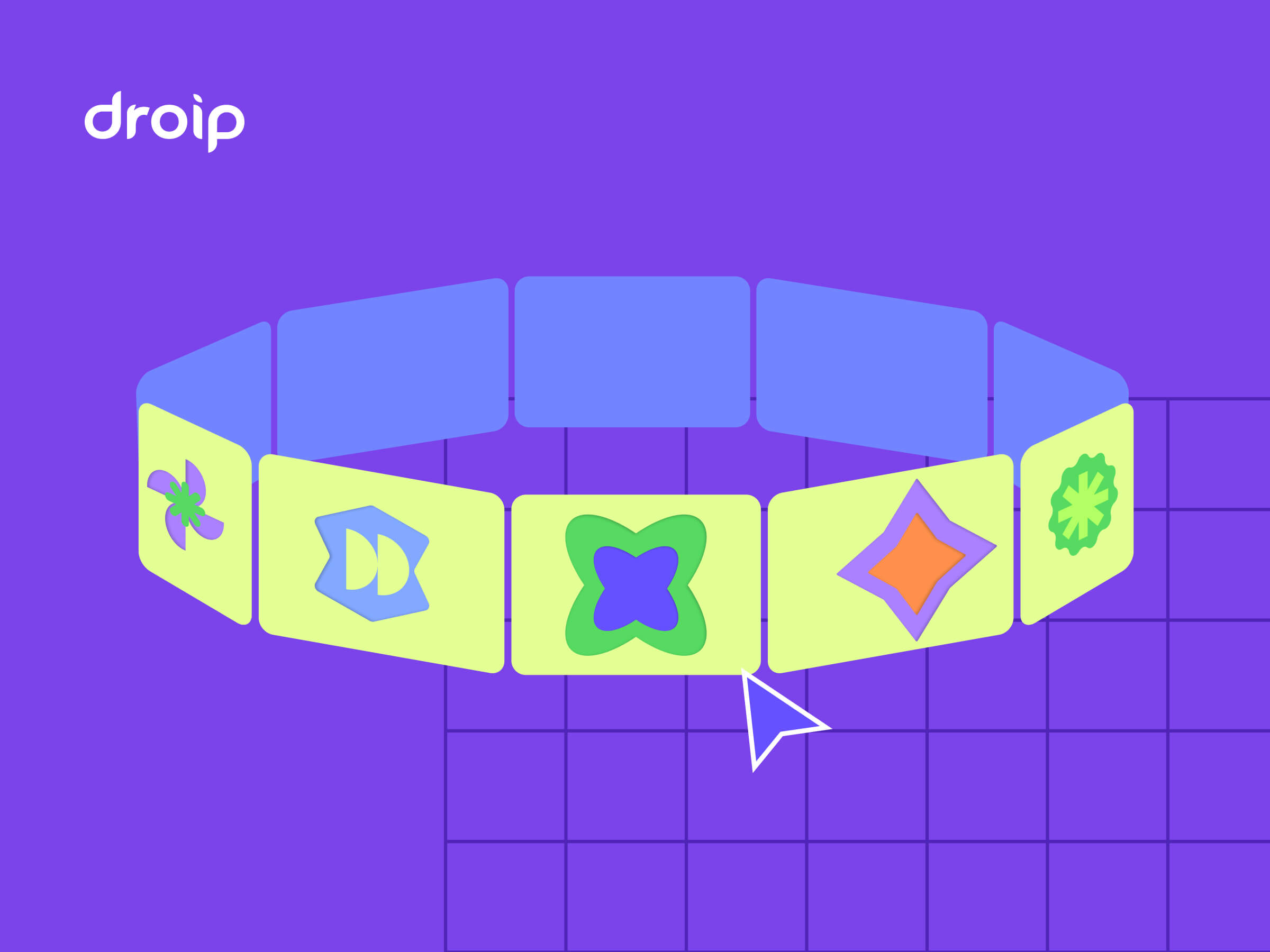


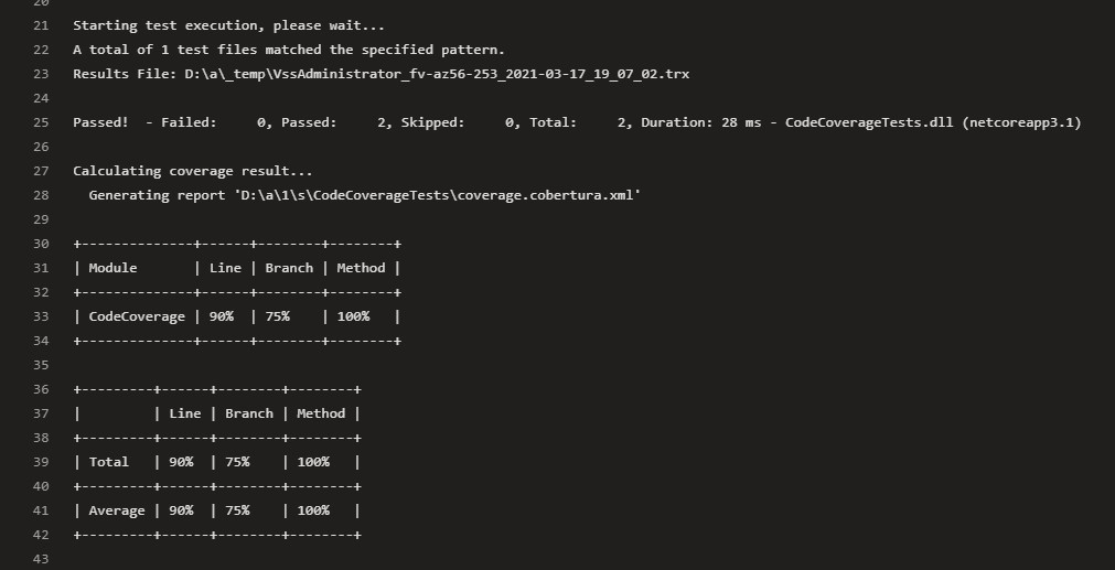
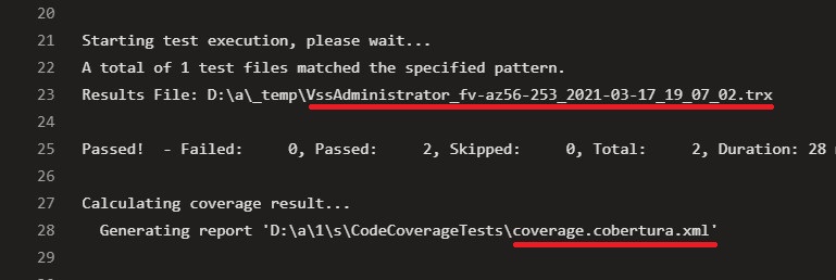
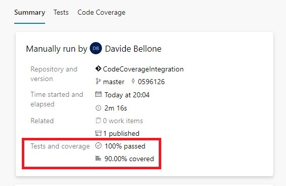
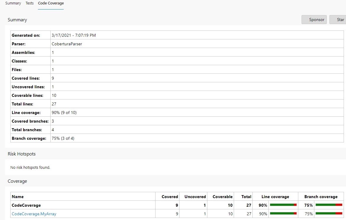
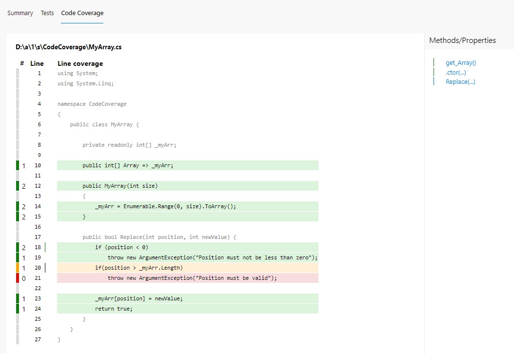
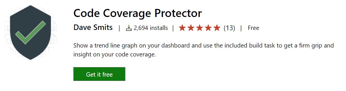
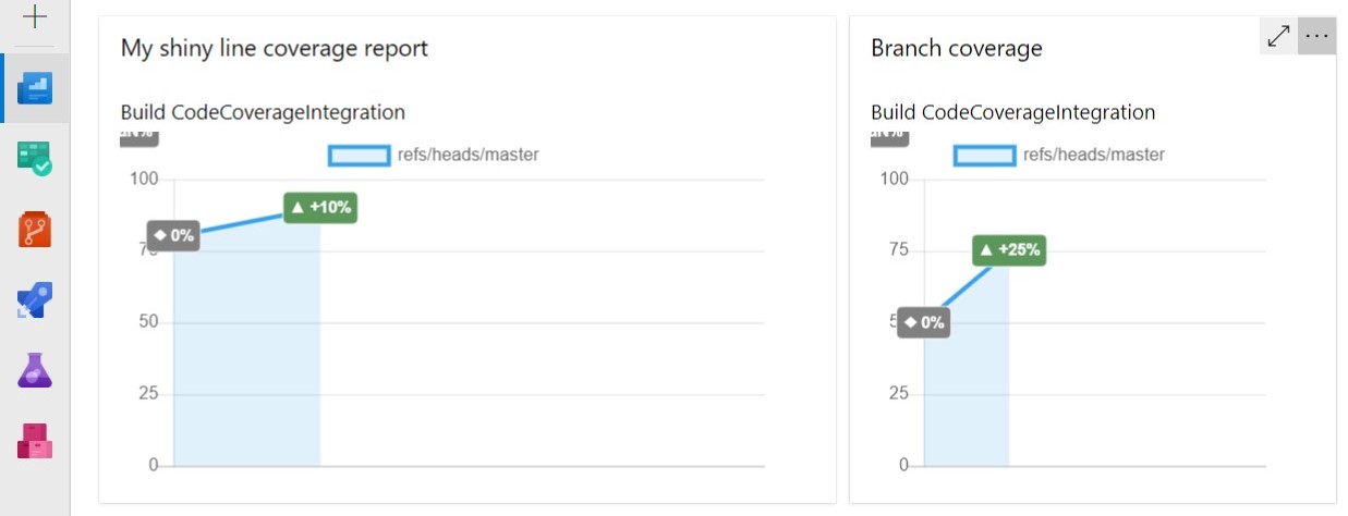
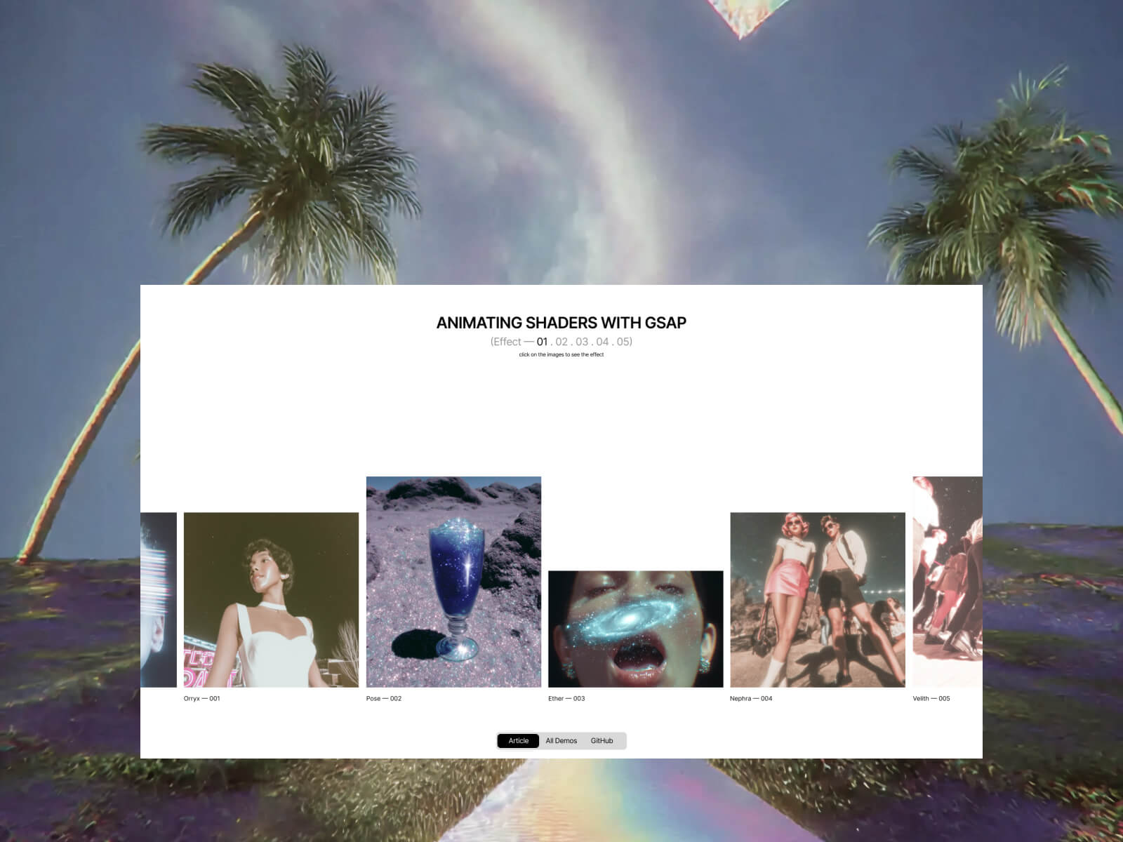


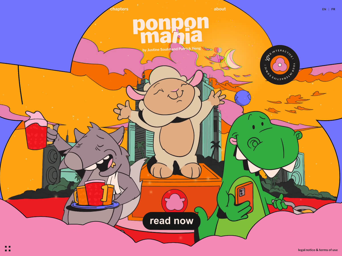

 Ponpon Mania is an animated comic featuring Ponpon, a megalomaniac sheep dreaming of becoming a DJ. We wanted to explore storytelling beyond traditional comics by combining playful interactions, smooth GSAP-powered motion, and dynamic visuals. The goal was to create a comic that feels alive, where readers engage directly with Ponpon’s world while following the narrative. The project evolved over several months, moving from early sketches to interactive prototypes.