Revise PowerShell basics with a simple script that opens a browser for each specified URL. We’re gonna cover how to declare variables, define arrays, concatenate strings and run CMD commands.
Table of Contents
Just a second! 🫷 If you are here, it means that you are a software developer.
So, you know that storage, networking, and domain management have a cost .
If you want to support this blog, please ensure that you have disabled the adblocker for this site. I configured Google AdSense to show as few ADS as possible – I don’t want to bother you with lots of ads, but I still need to add some to pay for the resources for my site.
Thank you for your understanding. – Davide
Say that your project is already deployed on multiple environments: dev, UAT, and production; now you want to open the same page from all the environments.
You could do it manually, by composing the URL on a notepad. Or you could create a PowerShell script that opens them for you.
In this article, I’m going to share with you a simple script to open multiple browsers with predefined URLs. First of all, I’ll show you the completed script, then I’ll break it down to understand what’s going on and to brush up on some basic syntax for PowerShell.
Understanding the problem: the full script
I have a website deployed on 3 environments: dev, UAT, and production, and I want to open all of them under the same page, in this case under “/Image?w=60”.
So, here’s the script that opens 3 instances of my default browser, each with the URL of one of the environments:
In fact, to declare an array you must simply separate each string with ,.
Foreach loops in PowerShell
Among the other loops (while, do-while, for), the foreach loop is probably the most used.
Even here, it’s really simple:
foreach($baseUrl in $baseUrls)
{

}
As we’ve already seen before, there is no type declaration for the current item.
Just like C#, the keyword used in the body of the loop definition is in.
foreach (var item in collection)
{
// In C# we use the `var` keyword to declare the variable}
String concatenation in PowerShell
The $fullUrl variable is the concatenation of 2 string variables: $baseUrl and $path.
$fullUrl = "$($baseUrl)$($path)";
We can see that to declare this new string we must wrap it between "...".
More important, every variable that must be interpolated is wrapped in a $() block.
How to run a command with PowerShell
The key part of this script is for sure this line:
Invoke-Expression "cmd.exe /C start $($fullUrl)"
The Invoke-Expression cmdlet evaluates and runs the specified string in your local machine.
The command cmd.exe /C start $($fullUrl) just tells the CMD to open the link stored in the $fullUrl variable with the default browser.
Wrapping up
We learned how to open multiple browser instances with PowerShell. As you can understand, this was just an excuse to revise some basic concepts of PowerShell.
I think that many of us are too focused on our main language (C#, Java, JavaScript, and so on) that we forget to learn something different that may help us with our day-to-day job.
Language details may impact application performance. In this article we’ll see some of the C# tips that brought me to improve my application. Singleton creation, StringBuilder and more!
Table of Contents
Just a second! 🫷 If you are here, it means that you are a software developer.
So, you know that storage, networking, and domain management have a cost .
If you want to support this blog, please ensure that you have disabled the adblocker for this site. I configured Google AdSense to show as few ADS as possible – I don’t want to bother you with lots of ads, but I still need to add some to pay for the resources for my site.
Thank you for your understanding. – Davide
In this second article, I’m going to share some more tips that brought me to improve the performance of an API from 14sec to less than 3 seconds: an improvement of 82%.
In the previous article, we’ve seen some general, language-agnostic ways to approach this kind of problem, and what you can try (and avoid) to do to achieve a similar result.
In this article, we’re going to see some .NET-related tips that can help to improve your APIs performance.
WarmUp your application using Postman to create Singleton dependencies
In my application, we use (of course) dependency injection. Almost all the dependencies are marked ad Singleton: this means that every dependency is created at the start-up of the application and is then shared through all the lifespan of the application.
Pss: if you want to know the difference between Singleton, Transient, and Scoped lifetimes with real examples, check out this article!
It makes sense, right? But have a closer look at the timing in this picture:
The blue line is the whole HTTP call, and the black line is the API Action.
There are almost 2 seconds of nothing! Why?
Well, as explained in the article “Reducing initial request latency by pre-building services in a startup task in ASP.NET Core” by Andrew Lock, singletons are created during the first request, not at the real start-up of the application. And, given that all the dependencies in this application are singletons, the first 2 seconds are being used to create those instances.
While Andrew explains how to create a Startup task to warm up the dependencies, I opted for a quick-and-dirty option: create a Warmup endpoint and call it before any call in Postman.
[HttpGet, Route("warmup")]public ActionResult<string> WarmUp()
{
var obj = new {
status = "ready" };
return Ok(obj);
}
It is important to expose that endpoint under a controller that uses DI: as we’ve seen before, dependencies are created during the first request they’re needed; so, if you create an empty controller with only the WarmUp method, you won’t build any dependency and you’ll never see improvements. My suggestion is to place the WarmUp method under a controller that requires one of the root services: in this way, you’ll create the services and all their dependencies.
To call the WarmUp endpoint before every request, I’ve created this simple script:
pm.sendRequest("https://localhost:44326/api/warmup", function (err, response) {
  console.log("ok")
})
So, if you paste it in Postman, into the Pre-requests Script tab, it executes this call before the main HTTP call and warms up your application.
This tip will not speed up your application but gives your a more precise value for the timings.
Improve language-specific details
Understanding how C# works and what functionalities it offers is crucial to get well working applications.
There’s plenty of articles around the Internet that tell you some nice tips and trick to improve .NET performance; here I’ll list some of my favorite tips an why you should care about them.
Choose the correct data type
There’s a lot you can do, like choosing the right data type: if you are storing a player’s age, is int the right choice? Remember that int.MinValue is -2147483648 and int.MaxValue is -2147483648.
You could use byte: its range is [0,255], so it’s perfectly fine to use it.
To have an idea of what data type to choose, here’s a short recap with the Min value, the Max value, and the number of bytes occupied by that data type:
Data type
Min value
Max Value
# of bytes
byte
0
255
1
short
-32768
32767
2
ushort
0
65535
2
int
-2147483648
2147483647
4
uint
0
4294967295
4
So, just by choosing the right data type, you’ll improve memory usage and then the overall performance.
It will not bring incredible results, but it’s a good idea to think well of what you need and why you should use a particular data type.
StringBuilder instead of string concatenation
Strings are immutable, in C#. This means that every time you concatenate 2 strings, you are actually creating a third one that will contain the result.
So, have a look at this snippet of code:
string result = "<table>";
for (int i = 0; i < 19000; i++)
{
    result += "<tr><td>"+i+"</td><td>Number:"+i+"</td></tr>";
}

result += "</table>";

Console.WriteLine(result);
This loop took 2784 milliseconds.
That’s where the StringBuilder class comes in handy: you avoid all the concatenation and store all the substrings in the StringBuilder object:
StringBuilder result = new StringBuilder();

result.Append("<table>");
for (int i = 0; i < 19000; i++)
{
    result.Append("<tr><td>");
    result.Append(i);
    result.Append("</td><td>Number:");
    result.Append(i);
    result.Append("</td></tr>");
}

result.Append("</table>");

Console.WriteLine(result.ToString());
Using StringBuilder instead of string concatenation I got the exact same result as the example above but in 58 milliseconds.
So, just by using the StringBuilder, you can speed up that part by 98%.
Don’t return await if it’s the only operation in that method
Every time you mark a method as async, behind the scenes .NET creates a state machine that keeps track of the execution of each method.
So, have a look at this program where every method returns the result from another one. Pay attention to the many return await statements;
Here’s just a small part of the result of the decompilation of that code. It’s a looooong listing: don’t focus on the details, just have a look at the general structure:
If you are interested in the full example, here you can find the gist with both the original and the decompiled file.
Every method marked as async “creates” a class that implements the IAsyncStateMachine interface and implements the MoveNext method.
So, to improve performance, we have to get rid of lots of this stuff: we can do it by simply removing await calls when there is only one awaited method and you do nothing after calling that method.
Notice that I removed both async and await keywords in the IsArticleAvailable and IsPathAvailable method.
So, as you can see in this Gist, the only state machines are the ones for the Main method and for the IsResourceAvailable method.
As usual, the more we improve memory usage, the better our applications will work.
Other stuff
There’s a lot more that you can improve. Look for articles that explain the correct usage of LINQ and why you should prefer HttpClientFactory over HttpClient.
Run operations in parallel – but pay attention to the parallelism
Let’s recap a bit what problem I needed to solve: I needed to get some details for a list of sports matches:
As you see, I perform the same set of operations for every match. Working on them in parallel improved a bit the final result.
Honestly, I was expecting a better improvement. Parallel calculation is not the silver bullet. And you should know how to implement it.
And I still don’t know.
After many attempts, I’ve created this class that centralizes the usage or parallel operations, so that if I find a better way to implement it, I just need to update a single class.
Feel free to copy it or suggest improvements.
publicstaticclassParallelHelper{
publicstatic IEnumerable<Out> PerformInParallel<In, Out>(IEnumerable<In> items, Func<In, Out> fn, int maxDegreeOfParallelism = 10)
{
var options = new ParallelOptions { MaxDegreeOfParallelism = maxDegreeOfParallelism };
ConcurrentBag<Out> cb = new ConcurrentBag<Out>();
Parallel.ForEach(items, options, item =>
{
cb.Add(fn(item));
});
return cb.ToList();
}
publicstatic IEnumerable<Out> PerformInParallel<In, Out>(IEnumerable<IEnumerable<In>> batches, Func<In, Out> fn, int maxDegreeOfParallelism = 10)
{
var options = new ParallelOptions { MaxDegreeOfParallelism = maxDegreeOfParallelism };
ConcurrentBag<Out> cb = new ConcurrentBag<Out>();
foreach (var batch in batches)
{
Parallel.ForEach(batch, options, item =>
{
cb.Add(fn(item));
});
}
return cb.ToList();
}
publicstatic IEnumerable<Out> PerformInParallel<In, Out>(IEnumerable<IEnumerable<In>> batches, Func<IEnumerable<In>, IEnumerable<Out>> fn, int maxDegreeOfParallelism = 10)
{
var options = new ParallelOptions { MaxDegreeOfParallelism = maxDegreeOfParallelism };
ConcurrentBag<Out> cb = new ConcurrentBag<Out>();
Parallel.ForEach(batches, options, batch =>
{
var resultValues = fn(batch).ToList();
foreach (var result in resultValues)
{
cb.Add(result);
}
});
return cb.ToList();
}
}
The first method performs the operation specified in the Func on every item passed in the IEnumerable parameter: then it aggregates the result in the ConcurrentBag object (it’s a thread-safe collection) and then returns the final result.
The other methods do a similar thing but to a list of lists: this is useful when splitting the calculation into batches and performing each of these batches in sequence.
But, why the MaxDegreeOfParallelism? Well, resources are not infinite; you can’t perform the same heavy operation on 200000 items at the same time, even more, if many requests arrive simultaneously. You have to reduce the number of items processed in parallel.
In the picture above you can see the parallel execution of the search for assets: every call begins at the same moment, so the final timing is a lot better than if I had performed all the operations in sequence.
Move to .NET 5
As reported by the official documentation, there has been a huge improvement in performance in the latest version of .NET.
Those improvements are mainly about the usage of Garbage Collector, JIT optimization, and usage of strings and Regex-s.
As you already know, the main bottlenecks are because of external dependencies (aka API calls). So, nothing that an update of the whole framework could impact.
But, just to try it, I moved my application from .NET Core 3.1 to .NET 5: the porting was incredibly easy. But, as I was expecting, I did not get any significant improvement.
So, since the application was a dependency of a wider system, I rolled it back to .NET 3.1.
Ask, discuss, communicate
The last tip is one of the most simple yet effective ones: talk with your colleagues, keep track of what worked and what didn’t, and communicate with other developers and managers.
Even if a question is silly, ask. Maybe you’ll find some tip that gives you the best idea.
Have a call with your colleagues, share your code and let them help you: even a simple trick, a tool they can suggest, an article that solves one of your problems, can be the key to the success.
Don’t expect any silver bullet: you’ll improve your application with small steps.
Wrapping up
We’ve seen how I managed to improve the performance of an API endpoint passing from 14 seconds to 3.
In this article you’ve seen some .NET-related tips to improve the performance of your applications: nothing fancy, but those little steps might help you reach the desired result.
Of course, there is more: if you are want to know how compression algorithms and hosting models affect your applications, check out this article!
If you have more tips, feel free to share them in the comments session!
At the beginning of 2025, I finally decided to build myself a new portfolio. I still pretty much liked the one I made back in 2021, but I felt the need to put to good use all the cool stuff I’ve learned these past couple years working with WebGPU. And, besides, half of the projects featured in my case studies had been put offline anyway, so it was about time.
I didn’t really know where I was going at this point, except that:
It would, of course, feature multiple procedurally generated WebGPU scenes. I already had a few concepts to explore in mind, like particles or boids simulation.
I wanted to take care of the design myself. It may seem weird, especially since I was very happy with what Gilles came up designing for my last portfolio, and also because I do suck at design. But this would give me more freedom, and I’ve also always liked building things from scratch on my own.
Last but not least, it had to be fun!
1. The journey
The (tough) design and content process
Don’t do this!
At first, I had no idea what to do design wise. Fonts, colors: there are so many things that could go wrong.
I started with simple light and dark colors, kept the fonts Gilles had chosen for my previous portfolio and started to copy/paste its old text content. It didn’t feel that great, and it wasn’t fun for sure.
The very first design iterations… Still a long way to go!
I definitely needed colors. I could have wasted a few hours (or days) choosing the right pairing, but instead I decided this could be the right opportunity to use this random color palette generator utility I’ve coded a few years ago. I cleaned the code a bit, created a repo, published it to npm and added it to my project. I also slightly changed the tone of the copywriting, and that led me to something still not that great, but a bit more fun.
Slowly getting there
I let it site for a while and started working on other parts of the site, such as integrating the CMS or experimenting with the WebGPU scenes. It’s only after a long iteration process that I’ve finally set up my mind on this kind of old school video games retro vibe mixed with a more cheerful, cartoonish aesthetic, almost Candy Crush-esque. Impactful headings, popping animations, banded gradients… you name it.
Of course, I’ve never gone as far as creating a Figma project (I did select a few reference images as a moodboard though) and just tested a ton of stuff directly with code until I felt it wasn’t that bad anymore. All in all, it was a very long and painful process, and I guess every designer would agree at this point: don’t do this!
A few images from my final moodboard – all credits go to their respective authors.
Do you actually read portfolios content?
Another painful point was to settle on the actual content and overall structure of the site. Do I need detailed case studies pages? Do I need pages at all? Will the users even read all those long blocks of text I will struggle to write?
In the end, I chose to drop the case studies pages. I had a couple of reasons to do so:
Often times the project ends up being put offline for various reasons, and you end up showcasing something the user cannot visit anymore. This is exactly what happened on my previous portfolio.
Most of the client work I’ve been doing those past years has been for agencies, and I’m not always allowed to publicly share them. I have no problem with that, but it slightly reduced the number of projects I could highlight.
From there on, it was a quick decision to just go with a single landing page. I’d put direct links to the projects I could highlight and small videos of all the other projects or personal works I could feature. On top of that, I’d add a few “about” sections mixed with my WebGPU scenes, and that’d be the gist of it.
Speaking of the WebGPU scenes, I really wanted them to be meaningful, not just a technical demonstration of what I could do. But we’ll get to that later.
The final UX twist
After a few months, I felt like I was entering the final stage of development. The page structure was mostly done, all my various sections were there and I was working on the final animations and micro-interactions tweakings.
So I took a step back, and looked back at my initial expectations. I had my WebGPU scenes showcasing my various technical skills. I had handled the design myself, and it wasn’t that bad. But were the flashy colors and animations enough to make it a really fun experience overall?
I think you already know the answer. Something was missing. Except for the random color palette switcher, the UX basically consisted of scroll-driven animations. Most of the 3D scenes interactions were rudimentary. I needed an idea.
The design already had this video game cheerful look. So… What if I turned my whole portfolio into a game? Once again, I started writing down my ideas:
The user would need to interact with the different UI elements to unlock the theme switcher and color palette generator buttons.
Each WebGPU scene could serve as a way to unlock the following content, acting as a very basic “puzzle” game.
Keep track of the user overall progress.
Allow the user to skip the whole game process if they want to.
This means most of the users wouldn’t ever make it to the footer, or use this random palette generator tool I’ve struggled to implement. This might very well be the most riskiest, stupidest decision I’ve made so far. But it would give my portfolio this unique and fun touch I was looking for in the first place, so I went all in.
Of course, it goes without saying it implied a major refactoring of the whole code and I needed to come up with original interaction ideas for the WebGPU scenes, but I like to think it was worth it.
Gamification mechanisms: unlocking content and rewarding message
Are you one of the few that unlocked the color palette generator button?
2. Technical study
Now that you know all the whys, let’s have a look at the hows!
Tech stack
I’ve decided to try Sanity Studio as I’ve never worked with it before and as I knew it would be a relatively small project, it’d be a perfect fit to start using it. Even though I felt like I just scratched its surface, I liked the overall developer experience it provided. On the other hand, I already had a good experience working with Nuxt3 so this was an easy choice.
No need to mention why I chose GSAP and Lenis — everyone knows those are great tools to deliver smooth animated websites.
Of course, the WebGPU scenes had to be done with gpu-curtains, the 3D engine I spent so much time working on these past two years. It was a great way to test it in a real-life scenario and gave me the opportunity to fix a few bugs or add a couple features along the way.
And since I wanted the whole process to be as transparent as possible, I’ve published the whole source code as a monorepo on GitHub.
Animations
I won’t go too deep into how I handled the various animations, simply because I’ve essentially used CSS and a bit of GSAP here and there, mostly for canvas animations, SplitText effects or the videos carousel using ScrollTrigger observer.
The basic scenes
There are a lot of components on the website that needed to draw something onto a <canvas> and react to the theme and/or color palette changes.
Since switching theme from light to dark (or vice versa) also updates the color palette by tweaking the HSV value component of the colors a bit, I’ve just put a setColors() method in there to handle these changes.
The progress handling here is actually a remain of when the WebGPU scenes animations were mostly scroll-driven (before I introduced the game mechanisms), but since a few scenes still used it, I kept it in there.
All the 2D canvas scenes extend that class, including the WebGPU fallback scenes, the theme switcher button or the dynamic favicon generator (did you notice that?).
The WebGPU scenes
One of the very cool features introduced by WebGPU is that you can render to multiple <canvas> elements using only one WebGPU device. I used this to build 4 different scenes (we’ll take a closer look at each of them below), that all extend a WebGPUScene.ts class:
In the real version, this class also handles the creation of a Tweakpane GUI folder (useful for debugging or tweaking values), but for the sake of clarity I removed the related code here.
As you can see, each of these scenes closely monitors its own performance using a custom QualityManager class. We’ll talk about that later, in the performance section.
Okay, now that we have the basic architecture in mind, let’s break down each of the WebGPU scenes!
Since WebGPU is not fully supported yet, I’ve created fallback versions using the 2D canvas API and the Scene class we’ve seen above for each of the following scenes.
Hero scene
The scenes featured in the portfolio somehow respect a kind of complexity order, meaning the more you advance in the portfolio, the more technically involved the scenes become.
In that way, the hero scene is by far the most simple technically speaking, but it had to look particularly striking and engaging to immediately capture the user’s attention. It was thought as some sort of mobile puzzle game splash screen.
Let’s go!
It’s made of a basic, single fullscreen quad. The idea here is to first rotate its UV components each frame, map them to polar coordinates and use that to create colored triangles segments.
// Center UVs at (0.5, 0.5)
var centeredUV = uv - vec2f(0.5);

// Apply rotation using a 2D rotation matrix
let angleOffset = params.time * params.speed; // Rotation angle in radians
let cosA = cos(angleOffset);
let sinA = sin(angleOffset);

// Rotate the centered UVs
centeredUV = vec2<f32>(
  cosA * centeredUV.x - sinA * centeredUV.y,
  sinA * centeredUV.x + cosA * centeredUV.y
);

// Convert to polar coordinates
let angle = atan2(centeredUV.y, centeredUV.x); // Angle in radians
let radius = length(centeredUV);

// Map angle to triangle index
let totalSegments  = params.numTriangles * f32(params.nbColors) * params.fillColorRatio;
let normalizedAngle = (angle + PI) / (2.0 * PI); // Normalize to [0,1]
let triIndex = floor(normalizedAngle * totalSegments); // Get triangle index

// Compute fractional part for blending
let segmentFraction = fract(normalizedAngle * totalSegments); // Value in [0,1] within segment

let isEmpty = (i32(triIndex) % i32(params.fillColorRatio)) == i32(params.fillColorRatio - 1.0);
let colorIndex = i32(triIndex / params.fillColorRatio) % params.nbColors; // Use half as many color indices

let color = select(vec4(params.colors[colorIndex], 1.0), vec4f(0.0), isEmpty);
There’s actually a wavy noise applied to the UV beforehand using concentric circles, but you get the idea.
Interestingly enough, the most difficult part was to achieve the rounded rectangle entering animation while preserving the correct aspect ratio. This was done using this function:
fn roundedRectSDF(uv: vec2f, resolution: vec2f, radiusPx: f32) -> f32 {
    let aspect = resolution.x / resolution.y;

    // Convert pixel values to normalized UV space
    let marginUV = vec2f(radiusPx) / resolution;
    let radiusUV = vec2f(radiusPx) / resolution;

    // Adjust radius X for aspect ratio
    let radius = vec2f(radiusUV.x * aspect, radiusUV.y);

    // Center UV around (0,0) and apply scale (progress)
    var p = uv * 2.0 - 1.0;       // [0,1] → [-1,1]
    p.x *= aspect;                // fix aspect
    p /= max(0.0001, params.showProgress); // apply scaling
    p = abs(p);

    // Half size of the rounded rect
    let halfSize = vec2f(1.0) - marginUV * 2.0 - radiusUV * 2.0;
    let halfSizeScaled = vec2f(halfSize.x * aspect, halfSize.y);

    let d = p - halfSizeScaled;
    let outside = max(d, vec2f(0.0));
    let dist = length(outside) + min(max(d.x, d.y), 0.0) - radius.x * 2.0;

    return dist;
}
Highlighted videos slider scene
Next up is the highlighted videos slider. The original idea came from an old WebGL prototype I had built a few years ago and never used.
Do you spot any similarities?
The idea is to displace the planes vertices to wrap them around a cylinder.
var position: vec3f = attributes.position;

// curve
let angle: f32 = 1.0 / curve.nbItems;

let cosAngle = cos(position.x * PI * angle);
let sinAngle = sin(position.x * PI * angle);

position.z = cosAngle * curve.itemWidth;
position.x = sinAngle;
I obviously used this for the years titles, whereas the videos and trail effects behind them are distorted using a post-processing pass.
While this was originally tied to the vertical scroll values (and I really liked the feeling it produced), I had to update its behavior when I switched to the whole gamification idea, making it an horizontal carousel.
Going at the speed of light!
Thanks to gpu-curtains DOM to WebGPU syncing capabilities, it was relatively easy to set up the videos grid prototype using the Plane class.
The trail effect is done using a compute shader writing to a storage texture. The compute shader only runs when necessary, which means when the slider is moving. I’m sure it could have been done in a thousands different ways, but it was a good excuse to play with compute shaders and storage textures. Here’s the compute shader involved:
I thought I was done here, but while running production build tests I stumbled upon an issue. Unfortunately, preloading all those videos to use as WebGPU textures resulted in a huge initial payload and also significantly affected the CPU load. To mitigate that, I’ve implemented a sequential video preloading where I’d have to wait for each video to have enough data before loading the next one. This gave a huge boost regarding initial load time and CPU overhead.
Sequential videos loading waterfall
Invoices scene
The third WebGPU scene was initially supposed to constitute my own take at 3D boids simulations, using instancing and a compute shader. After a bit of work, I had a bunch of instances that were following my mouse, but the end result was not living up to my expectations. The spheres were sometimes overlapping each other, or disappearing behind the edges of the screen. I kept improving it, adding self-collision, edge detections and attraction/repulsion mechanisms until I was happy enough with the result.
I like to call it the “invoices” scene, because the sphere instances here actually represent all the invoices I actually issued during my freelance career, scaled based on the amounts. Since I’m using google sheets to handle most of my accounting, I’ve made a little script that gathers all my invoices amount in a single, separate private sheet each time I’m updating my accounting sheets. I then fetch and parse that sheet to create the instances. It was a fun little side exercise and turns this scene into an ironically meaningful experiment: each time you click and hold, you kind of help me collect my money.
Give me my money!
The compute shader uses a buffer ping-pong technique: you start with two identically filled buffers (e.g. packed raw data) then at each compute dispatch call, you read the data from the first buffer and update the second one accordingly. Once done, you swap the two buffers before the next call and repeat the process. If you’re familiar with WebGL, this is often done with textures. WebGPU and compute shaders allow us to do so with buffers, which is way more powerful. Here is the complete compute shader code:
struct ParticleB {
  position: vec4f,
  velocity: vec4f,
  rotation: vec4f,
  angularVelocity: vec4f,
  data: vec4f
};

struct ParticleA {
  position: vec4f,
  velocity: vec4f,
  rotation: vec4f,
  angularVelocity: vec4f,
  data: vec4f
};

struct SimParams {
  deltaT: f32,
  mousePosition: vec3f,
  mouseAttraction: f32,
  spheresRepulsion: f32,
  boxReboundFactor: f32,
  boxPlanes: array<vec4f, 6>
};

@group(0) @binding(0) var<uniform> params: SimParams;
@group(0) @binding(1) var<storage, read> particlesA: array<ParticleA>;
@group(0) @binding(2) var<storage, read_write> particlesB: array<ParticleB>;


fn constrainToFrustum(pos: vec3<f32>, ptr_velocity: ptr<function, vec3<f32>>, radius: f32) -> vec3<f32> {
    var correctedPos = pos;

    for (var i = 0u; i < 6u; i++) { // Loop through 6 frustum planes
        let plane = params.boxPlanes[i];
        let dist = dot(plane.xyz, correctedPos) + plane.w;

        if (dist < radius) { // If inside the plane boundary (radius = 1)
            // Move the point inside the frustum
            let correction = plane.xyz * (-dist + radius); // Push inside the frustum

            // Apply the position correction
            correctedPos += correction;

            // Reflect velocity with damping
            let normal = plane.xyz;
            let velocityAlongNormal = dot(*(ptr_velocity), normal);

            if (velocityAlongNormal < 0.0) { // Ensure we only reflect if moving towards the plane
                *(ptr_velocity) -= (1.0 + params.boxReboundFactor) * velocityAlongNormal * normal;
            }
        }
    }
    return correctedPos;
}

fn quaternionFromAngularVelocity(omega: vec3f, dt: f32) -> vec4f {
    let theta = length(omega) * dt;
    if (theta < 1e-5) {
        return vec4(0.0, 0.0, 0.0, 1.0);
    }
    let axis = normalize(omega);
    let halfTheta = 0.5 * theta;
    let sinHalf = sin(halfTheta);
    return vec4(axis * sinHalf, cos(halfTheta));
}

fn quaternionMul(a: vec4f, b: vec4f) -> vec4f {
    return vec4(
        a.w * b.xyz + b.w * a.xyz + cross(a.xyz, b.xyz),
        a.w * b.w - dot(a.xyz, b.xyz)
    );
}

fn integrateQuaternion(q: vec4f, angularVel: vec3f, dt: f32) -> vec4f {
    let omega = vec4(angularVel, 0.0);
    let dq = 0.5 * quaternionMul(q, omega);
    return normalize(q + dq * dt);
}

@compute @workgroup_size(64) fn main(
    @builtin(global_invocation_id) GlobalInvocationID: vec3<u32>
) {
    var index = GlobalInvocationID.x;

    var vPos = particlesA[index].position.xyz;

    var vVel = particlesA[index].velocity.xyz;
    var collision = particlesA[index].velocity.w;

    var vQuat = particlesA[index].rotation;
    var angularVelocity = particlesA[index].angularVelocity.xyz;

    var vData = particlesA[index].data;

    let sphereRadius = vData.x;
    var newCollision = vData.y;


    collision += (newCollision - collision) * 0.2;
    collision = smoothstep(0.0, 1.0, collision);
    newCollision = max(0.0, newCollision - 0.0325);

    let mousePosition: vec3f = params.mousePosition;
    let minDistance: f32 = sphereRadius; // Minimum allowed distance between spheres

    // Compute attraction towards sphere 0
    var directionToCenter = mousePosition - vPos;
    let distanceToCenter = length(directionToCenter);

    // Slow down when close to the attractor
    var dampingFactor = smoothstep(0.0, minDistance, distanceToCenter);

    if (distanceToCenter > minDistance && params.mouseAttraction > 0.0) { // Only attract if outside the minimum distance
        vVel += normalize(directionToCenter) * params.mouseAttraction * dampingFactor;
        vVel *= 0.95;
    }

    // Collision Handling: Packing spheres instead of pushing them away
    var particlesArrayLength = arrayLength(&particlesA);

    for (var i = 0u; i < particlesArrayLength; i++) {
        if (i == index) {
            continue;
        }

        let otherPos = particlesA[i].position.xyz;
        let otherRadius = particlesA[i].data.x;
        let collisionMinDist = sphereRadius + otherRadius;
        let toOther = otherPos - vPos;
        let dist = length(toOther);

        if (dist < collisionMinDist) {
            let pushDir = normalize(toOther);
            let overlap = collisionMinDist - dist;
            let pushStrength = otherRadius / sphereRadius; // radius

            // Push away proportionally to overlap
            vVel -= pushDir * (overlap * params.spheresRepulsion) * pushStrength;
            newCollision = min(1.0, pushStrength * 1.5);

            let r = normalize(cross(pushDir, vVel));
            angularVelocity += r * length(vVel) * 0.1 * pushStrength;
        }
    }

    let projectedVelocity = dot(vVel, directionToCenter); // Velocity component towards mouse

    let mainSphereRadius = 1.0;

    if(distanceToCenter <= (mainSphereRadius + minDistance)) {
        let pushDir = normalize(directionToCenter);
        let overlap = (mainSphereRadius + minDistance) - distanceToCenter;

        // Push away proportionally to overlap
        vVel -= pushDir * (overlap * params.spheresRepulsion) * (2.0 + params.mouseAttraction);

        newCollision = 1.0;

        if(params.mouseAttraction > 0.0) {
            vPos -= pushDir * overlap;
        }

        let r = normalize(cross(pushDir, vVel));
        angularVelocity += r * length(vVel) * 0.05;
    }

    vPos = constrainToFrustum(vPos, &vVel, sphereRadius);

    // Apply velocity update
    vPos += vVel * params.deltaT;

    angularVelocity *= 0.98;
    let updatedQuat = integrateQuaternion(vQuat, angularVelocity, params.deltaT);

    // Write back
    particlesB[index].position = vec4(vPos, 0.0);
    particlesB[index].velocity = vec4(vVel, collision);
    particlesB[index].data = vec4(vData.x, newCollision, vData.z, vData.w);
    particlesB[index].rotation = updatedQuat;
    particlesB[index].angularVelocity = vec4(angularVelocity, 1.0);
}
One of my main inspirations for this scene was this awesome demo by Patrick Schroen. I spent a lot of time looking for the right rendering tricks to use and finally set up my mind on volumetric lighting. The implementation is quite similar to what Maxime Heckel explained in this excellent breakdown article. Funnily enough, I was already deep into my own implementation when he released that piece, and I owe him the idea of using a blue noise texture.
Volumetric lighting debugging
As a side note, during the development phase this was the first scene that required an actual user interaction and it played a pivotal role in my decision to turn my folio into a game.
Open source scene
For the last scene, I wanted to experiment a bit more with particles and curl noise because I’ve always liked how organic and beautiful it can get. I had already published an article using these concepts, so I had to come up with something different. Jaume Sanchez’ Polygon Shredder definitely was a major inspiration here.
Since this experiment was part of my open source commitment section, I had the idea to use my GitHub statistics as a data source for the particles. Each statistic (number of commits, followers, issues closed and so on) is assigned to a color and turned into a bunch of particles. You can even toggle them on and off using the filters in the information pop-up. Once again, this changed a rather technical demo into something more meaningful.
Curl noise and particles are always a good match
While working on the portfolio, I was also exploring new rendering techniques with gpu-curtains such as planar reflections. Traditionally used for mirror effects or floor reflections, it consists of rendering a part of your scene a second time but from a different camera angle and projecting it onto a plane. Having nailed this, I thought it would be a perfect match there and added it to the scene.
Last but not least, and as a reminder of the retro video games vibe, I wanted to add a pixelated mouse trail post-processing effect. I soon realized it would be way too much though, and ended up showing it only when the user is actually drawing a line, making it more subtle.
Using the filters can actually help you unlock features!
Performance and accessibility
On such highly interactive and immersive pages, performance is key. Here are a few tricks I’ve used to try to maintain the most fluid experience across all devices.
Dynamic imports
I’ve used Nuxt dynamic imported components and lazy hydration for almost every non critical components of the page. In the same way, all WebGPU scenes are dynamically loaded only if WebGPU is supported. This significantly decreased the initial page load time.
// pseudo code
import type { WebGPUHeroScene } from "~/scenes/hero/WebGPUHeroScene";
import { CanvasHeroScene } from "~/scenes/hero/CanvasHeroScene";

let scene: WebGPUHeroScene | CanvasHeroScene | null;
const canvas = useTemplateRef("canvas");

const { colors } = usePaletteGenerator();

onMounted(async () => {
  const { $gpuCurtains, $hasWebGPU, $isReducedMotion } = useNuxtApp();

  if ($hasWebGPU && canvas.value) {
    const { WebGPUHeroScene } = await import("~/scenes/hero/WebGPUHeroScene");

    scene = new WebGPUHeroScene({
      gpuCurtains: $gpuCurtains,
      container: canvas.value,
      colors: colors.value,
    });
  } else if (canvas.value) {
    scene = new CanvasHeroScene({
      container: canvas.value,
      isReducedMotion: $isReducedMotion,
      colors: colors.value,
    });
  }
});
I’m not particularly fond of Lighthouse reports but as you can see the test result is quite good (note that it’s running without WebGPU though).
PageSpeed Insights report
Monitoring WebGPU performance in real time
I’ve briefly mentionned it earlier, but each WebGPU scene actually monitors its own performance by keeping track of its FPS rate in real time. To do so, I’ve written 2 separate classes: FPSWatcher, that records the average FPS over a given period of time, and QualityManager, that uses a FPSWatcher to set a current quality rating on a 0 to 10 scale based on the average FPS.
It’s very basic: I just record the elapsed time between two render calls, put that into an array and run a callback every updateDelay milliseconds with the latest FPS average value. It is then used by the QualityManager class, that does all the heavy lifting to assign an accurate current quality score:
import type { FPSWatcherParams } from "./FPSWatcher";
import FPSWatcher from "./FPSWatcher";

export interface QualityManagerParams {
  label?: string;
  updateDelay?: FPSWatcherParams["updateDelay"];
  targetFPS?: number;
  onQualityChange?: (newQuality: number) => void;
}

export class QualityManager {
  label: string;
  fpsWatcher: FPSWatcher;
  targetFPS: number;
  #lastFPS: number | null;
  #active: boolean;
  onQualityChange: (newQuality: number) => void;

  quality: {
    current: number;
    min: number;
    max: number;
  };

  constructor({
    label = "Quality manager",
    updateDelay = 1000,
    targetFPS = 60,
    onQualityChange = (newQuality) => {},
  }: QualityManagerParams = {}) {
    this.label = label;
    this.onQualityChange = onQualityChange;

    this.quality = {
      min: 0,
      max: 10,
      current: 7,
    };

    this.#active = true;

    this.targetFPS = targetFPS;
    this.#lastFPS = null;

    this.fpsWatcher = new FPSWatcher({
      updateDelay,
      onWatch: (averageFPS) => this.onFPSWatcherUpdate(averageFPS),
    });
  }

  get active() {
    return this.#active;
  }

  set active(value: boolean) {
    if (!this.active && value) {
      this.fpsWatcher.restart();
    }

    this.#active = value;
  }

  onFPSWatcherUpdate(averageFPS = 0) {
    const lastFpsRatio = this.#lastFPS
      ? Math.round(averageFPS / this.#lastFPS)
      : 1;
    const fpsRatio = (averageFPS + lastFpsRatio) / this.targetFPS;

    // if fps ratio is over 0.95, we should increase
    // else we decrease
    const boostedFpsRatio = fpsRatio / 0.95;

    // smooth change multiplier avoid huge changes in quality
    // except if we've seen a big change from last FPS values
    const smoothChangeMultiplier = 0.5 * lastFpsRatio;

    // quality difference that should be applied (number with 2 decimals)
    const qualityDiff =
      Math.round((boostedFpsRatio - 1) * 100) * 0.1 * smoothChangeMultiplier;

    if (Math.abs(qualityDiff) > 0.25) {
      const newQuality = Math.min(
        Math.max(
          this.quality.current + Math.round(qualityDiff),
          this.quality.min
        ),
        this.quality.max
      );

      this.setCurrentQuality(newQuality);
    }

    this.#lastFPS = averageFPS;
  }

  setCurrentQuality(newQuality: number) {
    this.quality.current = newQuality;
    this.onQualityChange(this.quality.current);
  }

  update() {
    if (this.active) {
      this.fpsWatcher.update();
    }
  }
}
The most difficult part here is to smoothly handle the quality changes to avoid huge drops or gains in quality. You also don’t want to fall in a loop where for example:
The average FPS are poor, so you degrade your current quality.
You detect a quality loss and therefore decide to switch off an important feature, such as shadow mapping.
Removing the shadow mapping gives you a FPS boost and after the expected delay the current quality is upgraded.
You detect a quality gain, decide to re-enable shadow mapping and soon enough, you’re back to step 1.
Typically, the quality rating is used to update things such as the current pixel ratio of the scene, frame buffers resolutions, number of shadow maps PCF samples, volumetric raymarching steps and so on. In worst case scenarios, it can even disable shadow mapping or post processing effects.
Accessibility
Finally, the site had to respect at least the basic accessibility standards. I’m not an accessibility expert and I may have made a few mistakes here and there, but the key points are that the HTML is semantically correct, it is possible to navigate using the keyboard and the prefers-reduced-motion preference is respected. I achieved that by disabling entirely the gamification concept for these users, removing every CSS and JavaScript animations, and made the scenes fall back to their 2D canvas versions, without being animated at all.
Conclusion
Well, it was a long journey, wasn’t it?
Working on my portfolio these past 6 months has been a truly demanding task, technically but also emotionally. I’m still having a lot of self doubts about the overall design, key UX choices or level of creativity. I also do think that it kind of honestly sums up who I am as a developer but also as a person. In the end, it’s probably what matters most.
I hope that you’ve learnt a few things reading this case study, whether it’d be about technical stuff or my own creative process. Thank you all, and remember: stay fun!
Do you need the index of the current item in a foreach loop with C#? Here you’ll see two approaches.
Table of Contents
Just a second! 🫷 If you are here, it means that you are a software developer.
So, you know that storage, networking, and domain management have a cost .
If you want to support this blog, please ensure that you have disabled the adblocker for this site. I configured Google AdSense to show as few ADS as possible – I don’t want to bother you with lots of ads, but I still need to add some to pay for the resources for my site.
Thank you for your understanding. – Davide
Sometimes, when looping over a collection of elements in C#, you need not only the items itself, but also its position in the collection.
How to get the index of the current element in a foreach loop?
The easiest way is to store and update the index in a separate variable
List<string> myFriends = new List<string> {
"Emma", "Rupert", "Daniel", "Maggie", "Alan"};
int index = 0;
foreach (var friend in myFriends)
{
Console.WriteLine($"Friend {index}: {friend}");
index++;
}
This works fine, nothing to add.
But, if you want something a little more elegant and compact, you can use the Select method from LINQ:
there is a tight bond between the current item in the loop and the index
I find it cleaner and easier to read
Or… You can just replace it with a simple for loop!
What about performance?
I’ve done a simple benchmark (see here), and it resulted that for lists with less than 1000 items, the first solution is faster, and for lists with 10000 items, using LINQ is way faster than using an external index.
Size (#items)
With simple index (ms)
With LINQ (ms)
100
96
128
1000
1225
1017
10000
5523
786
This happens with .NET 5.
Update 2021-06-09: the previous benchmark was wrong!!😐
The times listed in the previous table were misleading: I calculated those durations using a StopWatch and calling it in different methods.
But, when performing a more precise benchmark using Benchmark.NET, the results are totally different.
With .NET Core 3.1.14 I get the following results:
Method
array
Mean
Error
WithIndex
Int32[10000]
269,386.4 ns
6,168.76 ns
WithLinq
Int32[10000]
396,421.3 ns
7,778.64 ns
WithIndex
Int32[1000]
25,438.3 ns
504.03 ns
WithLinq
Int32[1000]
39,981.3 ns
1,578.48 ns
WithIndex
Int32[100]
2,440.8 ns
48.34 ns
WithLinq
Int32[100]
3,687.7 ns
73.60 ns
WithIndex
Int32[10]
185.6 ns
3.52 ns
WithLinq
Int32[10]
369.5 ns
9.51 ns
While with .NET 5 I get these results:
Method
array
Mean
Error
WithIndex
Int32[10000]
134,431.02 ns
2,181.244 ns
WithLinq
Int32[10000]
273,691.68 ns
5,334.833 ns
WithIndex
Int32[1000]
12,961.69 ns
233.351 ns
WithLinq
Int32[1000]
26,023.63 ns
495.341 ns
WithIndex
Int32[100]
1,088.25 ns
21.485 ns
WithLinq
Int32[100]
2,299.12 ns
21.901 ns
WithIndex
Int32[10]
48.01 ns
0.748 ns
WithLinq
Int32[10]
228.66 ns
4.531 ns
As you can see, actually using LINQ is slower than using a simple index. While in .NET Core 3 the results were quite similar, with .NET 5 there was a huge improvement both cases, but now using a simple index is two times faster than using LINQ.
SORRY FOR THAT MISLEADING INFO! Thank you, Ben, for pointing it out in the comments section! 🙏
Below you can see the code I used for this benchmark. I you want to get started with Benchmark.NET, look at the documentation or to my article Enum.HasFlag performance with BenchmarkDotNet
We’ve discovered that there are many ways to use indexes tightly bound with items. If you look at performance, go for the simplest ways (for loop or foreach with simple index). If you want a more concise code, go for LINQ.
Anything else to add?
👉 Let’s discuss it on Twitter or on the comment section below!
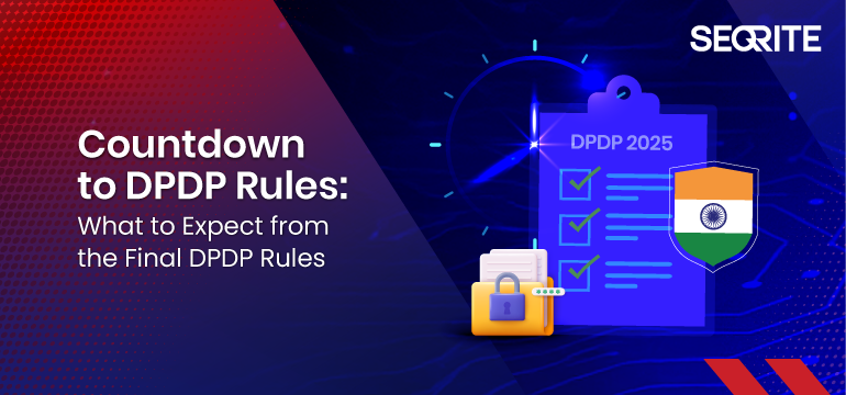
The wait is almost over. The final Digital Personal Data Protection (DPDP) Rules are just days away, marking the next big step after the enactment of the DPDPA in 2023. With only a few days left, organizations must gear up to align with new obligations on data protection, governance, and accountability.
Are you prepared to meet the requirements and avoid costly penalties? These rules will act as the operational backbone of the law, providing clarity on implementation, enforcement, and compliance.
With businesses, regulators, and citizens alike watching closely, the release of these rules will reshape India’s digital economy and data protection landscape. Here’s what to expect as the countdown begins.
While the DPDPA, 2023 laid down the broad principles of personal data protection—such as consent, purpose limitation, and user rights—the rules will answer the “how” questions:
How should organizations obtain and manage consent?
How will data principals exercise their rights?
What will compliance look like for startups vs. large enterprises?
How will penalties be calculated and enforced?
In short, the rules will turn principles into practice.
Key Areas to Watch in the Final Rules
Consent & Notice Requirements
Expect detailed procedures for how organisations must obtain consent, including the form, language, and accessibility of consent notices. The government may also clarify rules around “deemed consent”, which has raised debate among privacy experts.
Data Principal Rights
The rules will operationalise rights like data access, correction, erasure, and grievance redressal. Clear timelines for fulfilling these requests will likely be specified, adding compliance pressure on businesses.
Obligations for Data Fiduciaries
Significant data fiduciaries (LDFs) will have enhanced responsibilities—such as mandatory Data Protection Officers (DPOs), regular audits, and risk assessments. The criteria for what qualifies as an LDF will be closely watched.
Cross-Border Data Transfer
The government may publish its “whitelist” of countries where Indian personal data can be transferred. This will be crucial for IT/ITES, cloud, and fintech industries that rely heavily on global operations.
Children’s Data Protection
Rules around parental consent, restrictions on profiling, and targeted advertising for children may tighten, impacting edtech, gaming, and social platforms.
Enforcement & Penalties
The rules are expected to detail the functioning of the Data Protection Board of India (DPBI), including hearings, fines, and appeals procedures. This will define how strictly the law is enforced.
Transition & Implementation Timelines
Perhaps most critical will be the phased rollout plan. Businesses anxiously await to know how much time they will get to comply, and whether specific provisions will be delayed for startups and SMEs.
What Businesses Should Do Now
Even before the DPDP rules are published, organizations should start preparing:
Map personal data flows across systems and vendors.
Review consent management practices and plan for user-friendly updates.
Establish governance frameworks—DPO roles, audit readiness, and escalation processes.
Evaluate cross-border dependencies to anticipate transfer restrictions.
Train employees in privacy responsibilities and incident handling.
Early movers will reduce compliance risks and gain customer trust in an era when data is a competitive differentiator.
The Bigger Picture
The DPDP Rules will set the tone for India’s privacy-first digital future. For businesses, this is more than just a compliance exercise—it’s a chance to demonstrate accountability, build trust, and strengthen their brand in a data-conscious marketplace.
As the countdown begins, one thing is clear: organisations that prepare proactively will be better positioned to adapt, comply, and thrive in the new regulatory environment.
Stay ahead of DPDP compliance with Seqrite. Prepare your organization now with Seqrite’s end-to-end data privacy and compliance solutions.
This summer I created my Personal Project Platform. It wasn’t exactly intentional. When I realised where my process was going, I was already some way along.
Speaking of process, I’m a big fan. When you’re ready to surrender, you’ll find yourself in places you wouldn’t expect. Anyway, two paths came together when I discovered I was working on my Personal Project Platform. Let’s talk about the first one.
Path 1: A Necessary Happy Place
As a designer, or as a human being for that matter, not every day is full of inspiration. Especially when the design-and-AI landscape changes as fast as it does now, it’s sometimes hard to see the big picture.
As a remedy, I started building a moodboard that would serve as my Happy Place. Whenever I came across a reference that made me smile, I put it there. It had sections for my dream office; quotes and thoughts that resonated with me; and random image fragments that, together, felt like me ~ or at least a designer version of me. I started adding my own scribbles, notes and thoughts about purpose: why am I still doing this? What am I looking for as a designer?
One evening in December 2022, I had a drink with a designer friend. We were making random things just for fun. At work, I had shifted into more of a managerial role, and I missed designing.
Then I thought: why not throw it online? So I created an Instagram account and posted my first Processing sketch.
The more I made, the more I wanted to make. Over time, this habit became part of me. Sketches became interactive, but it bothered me they only ran locally ~ I was the only one who could interact with them. I also started sharing quick tutorials, and was amazed by how many positive responses I got from people who felt inspired to make something of their own.
Where the Two Paths Meet
Meanwhile, my “Happy Place” notes grew longer and more intentional. I wanted more people to interact with my sketches. Since I was doing it all for fun, why not share the source code? Why not collect my resources for others to use?
Slowly it became an idea for a platform: one where the intentional and the unexpected coexist, showing new designers ~ especially with AI replacing all the fun ~ that learning a craft, practising, and training your creative muscle still matter.
Now I just had to build it.
I started with just a few basic components in Figma.
Building the Platform
Since we’re on Codrops, let’s talk code. I have a background in PHP and JavaScript ~ old-school, before ES6 or TypeScript, let alone Vue or React. I wanted to use this project to learn something new.
After some research, I decided on Nuxt.js. From what I read, it’s easier to set up than Next.js. And since my platform isn’t likely to scale any time soon, I think it does the job. I had also played with Prismic CMS a few years back. Lightweight, not too many features, but fine for me. So I watched some Nuxt.js+Prismic tutorials, and off I went.
The Hero
I knew I wanted interactive components. Something that gave visitors an immediate sense of my work. Let’s start with the hero.
Finding beauty in friction
With your mouse you draw objects onto the canvas, plain and simple. I wanted the objects to have a link with nature ~ something that grows, can flourish ~ as you would do when you take on lots of personal projects.
In my first sketch the flowers scaled from small to big, literally growing. But then I thought: how many times had I got stuck on a sketch, frustrated over an idea that just wouldn’t work out? So I decided linear growth wouldn’t be honest. Most of the time when I work on my projects my head is all over the place. Things should scale randomly, they don’t even need to match in width and height. I like it like this, it mirrors the tension between control and chaos in my work. Below you’ll find the bit where this is happening.
/**
 * Get a portion of the next image
 */
 public getPortion(): p5.Image {
   // Fetch original
   const original = this.getNext();
   if (! original) return null;

   // Source
   const ow = original.width;
   const oh = original.height;
   const sx = Math.random() * ow;
   const sy = Math.random() * oh;

   // Remaining part
   const loW = ow - sx;
   const loH = oh - sy;

   let sw = Math.round(loW * Math.random()) + 10;
   let sh = Math.round(loH * Math.random()) + 10;

   // Destination
   const dx = 0;
   const dy = 0;
   const dw = sw;
   const dh = sh;

   // Create new image
   const copy = this.p.createImage(dw, dh);
   copy.copy(original, sx, sy, sw, sh, dx, dy, dw, dh);

   return copy;
 }

 public getRandomSizedPortion(): p5.Image {
   // Get portion
   const img = this.getPortion();
   if (! img) return null;

   // Random size
   const maxSize = this.p.width * .1;
   img.resize(this.p.random(10,maxSize), this.p.random(10,maxSize));

   return img;
 }
The Footer
To balance the hero, I also made the footer interactive. I used an older sketch as a base, adding depth and texture to make it feel a little like an abstract ocean.
For me, it brings a sense of calm and focus ~ with subtle vertical movement and a tone that changes as you move the mouse along the x-axis. The snippet below should give you an idea of how it works, but the original sketch is available to download on the platform. So if you’re curious, go ahead and play.
/**
 * Calculate all data
 */
 public update() {

   // Animation settings
   let duration: number = 128;
   let progress: number = this.p.frameCount % duration;
   if(progress == 0) this.iteration++;

   // Rows and height
   let numRowsDrawn: number = this.numRows + 1 + this.iteration;
   let colW: number = this.p.width / this.numCols;
   let rowH: number = this.p.height / this.numRows;

   let count = 0;
   // Loop through rows
   for (let y: number = this.iteration; y<numRowsDrawn; y++) {

     // Calculate y position (start at the bottom)
     let targetY: number = this.p.height - (y+1) * rowH + this.iteration * rowH;

     // Where are we in the progress
     let posY: number = this.p.map(progress, 0, duration, targetY, targetY+rowH);
     // Mouse influence
     const smoothing = 0.06;
     this.currentMouseX += (this.p.mouseX - this.currentMouseX) * smoothing;
     const mouseInfluence: number = this.p.map(this.currentMouseX, 0, this.p.width, .8, -.3);

     // What is the influence based on the y position
     let yInfluence: number = this.p.map(posY / this.numRows, 0, rowH, 1, this.numRows+1) * mouseInfluence;
     // Double columns each row
     let extraCols: number = Math.exp(yInfluence * Math.LN2);
     // Size and position
     let currentW: number = colW + extraCols * colW;

     // Loop through columns
     for (let x:number = 0; x<this.numCols; x++) {
       // Calculate x position
       let posX: number = x * currentW - (extraCols * yInfluence + 1) * colW;

       // Don't draw things out of screen x-axis
       if(posX > this.p.width) continue;
       if(posX + currentW < 0) continue;

       // Draw
       this.display(x, y, posX, posY, currentW, rowH);
       count++;
      }
    }
  }
The Masonry Grid
I’ve always liked inspiration websites where a lot is going on. You get all sorts of images and videos that are strong on their own, but gain new purpose in a different context. That’s what I wanted for my case overview.
Since I don’t aim for any particular graphical style, I like that it feels more like a collection of references. This is why I decided to go for a masonry grid. I didn’t want to use a plugin, so I built this little CSS/JavaScript thingy where I use CSS Grid rows to distribute the images, and JavaScript to calculate how many rows it should span, depending on the aspect ratio that is set in the CMS. I think there is still room for improvement, but to be honest, I ran low on patience on this one. I decided it does the job for now. Maybe I will get back to it someday to refactor. Below is the snippet where most of the work happens.
function applyMasonry() {
   // Fetch grid and items
   const grid = document.querySelector('.masonry-grid');
   const items = grid?.querySelectorAll('.masonry-item');

   // Make sure they’re both loaded
   if (!grid || !items) return

   // Get properties from CSS
   const rowHeight = parseInt(getComputedStyle(grid).getPropertyValue('grid-auto-rows'))
   const gap = parseInt(getComputedStyle(grid).getPropertyValue('gap') || 0)

   items.forEach(item => {

     // Fetch media and info container separately
     const media = item.querySelector('.masonry-item__image-container')
     const info = item.querySelector('.masonry-item__info-container')

     if (!media || !info) return

     // Combine them to item height
     const mediaHeight = media.getBoundingClientRect().height
     const infoHeight = info.getBoundingClientRect().height
     const itemHeight = mediaHeight + infoHeight

     // Calculate how many rows to span
     const rowSpan = Math.ceil((itemHeight + gap) / (rowHeight + gap))

     // Apply row span
     item.style.gridRowEnd = `span ${rowSpan}`;
     item.style.opacity = 1;
   })
 }
Resources & Code
Since I truly want to encourage people to start their own journey with personal projects, I want to share resources and code examples to get them started.
Of course with the launch of this platform I had to do this retrospectively for more than 20 projects, so in future I’ll probably share more process and behind-the-scenes. Who knows. Anyway, this component gives me a space for anything that might be useful to people who are interested.
Two Weeks Without a Laptop
Then the summer holiday arrived. France. Four days of Disneyland chaos, followed by some peace near the ocean. Days were simple: beach, pool, playgrounds. In between, I picked up a Bon Iver notebook I’d bought back home.
At the time, the platform had a temporary wordmark with my initials “mvds”. But I felt I could spend a little more time and attention crafting something beautiful. So every day I doodled my initials in all sorts of forms. By the end of the holiday I had a pretty good idea of what my logomark should become. Back home, with two more weeks before I needed to get back to work, I started digitising my sketches and tweaking anchor points until I got it right. (Then tweaked a little more, you know how it goes.) This resulted in a logomark I’m quite proud of. So I figured it needed a place on the platform.
P5.js vs Three.js
For the launch of my logomark on Instagram, I created a Processing sketch that placed the logo in a pixelated 3D scene, rotating. I liked that it almost became a sculpture or building of sorts. Now I only needed to build a web version.
Because my Hero and Footer components were both p5.js, this was my first choice. But it was slow ~ I mean like really slow. No matter how I tried to optimise it, the 3D workload killed the performance. I had only worked with Three.js once a few years back, but I remembered it handled 3D pretty well. Not sure you’re going to have the best performing website by using multiple libraries, but since it’s all just for fun, I decided to give it a go. With the Three.js version I could add far more detail to the structure, and it still performed flawlessly compared to the p5.js version. Below you’ll see me looping through all the voxels.
let instanceId: number = 0;

// Loop using voxel resolution (detail), not image resolution
for (let z: number = 0; z < detail; z++) {
  for (let y: number = 0; y < detail; y++) {
    const flippedY: number = detail - 1 - y;

    for (let x: number = 0; x < detail; x++) {
      // Sample image using normalized coordinates
      const sampleX: number = Math.floor((x / detail) * imgDetail);
      const sampleY: number = Math.floor((flippedY / detail) * imgDetail);
      const sampleZ: number = Math.floor((z / detail) * imgDetail);

      const brightness1: number = getBrightnessAt(imgData, imgDetail, sampleX, sampleY);
      const brightness2: number = getBrightnessAt(imgData, imgDetail, sampleZ, sampleY);

      if (brightness1 < 100 && brightness2 < 100 && instanceId < maxInstances) {
        dummy.position.set(
          x * cellSize - (detail * cellSize) / 2,
          y * cellSize - (detail * cellSize) / 2,
          z * cellSize - (detail * cellSize) / 2
          );
        dummy.updateMatrix();
        mesh.setMatrixAt(instanceId, dummy.matrix);
        instanceId++;
      }
    }
  }
}
Wrapping Up
This platform isn’t finished ~ that’s the point. It’s a space to interact with my coded tools, for sketches to be shared for further exploration and for process itself to stay visible. If you’re a designer or coder, I hope it nudges you to start or continue your own side projects. That’s how creativity stays alive. Thank you for reading.
Have you ever landed on a website and thought, “Wow, this is absolutely beautiful”? You know that feeling when every little animation flows perfectly, when clicking a button feels satisfying, when the whole experience just feels premium.
That’s exactly what happened to me a few years ago, and it changed everything.
The Moment Everything Clicked
I was browsing the web when I stumbled across one of those websites. You know the type where every micro-animation has been crafted with care, where every transition feels intentional. It wasn’t just pretty; it made me feel something.
That’s when I got hooked on web design.
But here’s the thing: I wanted to create websites like that too. I wanted to capture that same magic, those same emotions. So I started doing what any curious designer does. I began collecting inspiration.
Spotting a Gap
At first, I used the usual inspiration websites. They’re fantastic for discovering beautiful sites and getting that creative spark. But I noticed something: they showed you the whole website, which is great for overall inspiration.
The thing is, sometimes I’d get obsessed with just one specific detail. Maybe it was a button animation, or how an accordion opened, or a really smooth page transition. I’d bookmark the entire site, but then later I’d spend ages trying to find that one perfect element again.
I started thinking there might be room for something more specific. Something where you could find inspiration at the component level, not just the full-site level.
Starting Small
So I started building my own library. Whenever I saw something cool (a smooth page transition, an elegant pricing section, a cool navigation animation) I’d record it and save it with really specific tags like “card,” “hero section,” or “page transition.”
Early versions of my local library I had on Eagle
Real, useful categories that actually helped me find what I needed later. I did this for years. It became my secret weapon for client projects and personal work.
From Personal Tool to Public Resource
After a few years of building this personal collection, I had a thought: “If this helps me so much, maybe other designers and developers could use it too.”
That’s when I decided I should share this with the world. But I didn’t want to just dump my library online and call it a day. It was really important to me that people could filter stuff easily, that it would be intuitive, and that it would work well on both mobile and desktop. I wanted it to look good and actually be useful.
Early version of inspo.page, filters where not sticky at the bottom
The idea behind inspo.page is simple: instead of broad categories, I built three specific filter systems:
What – All the different components and layouts. Looking for card designs? Different types of lists? Different types of modals? It’s all here.
Where – Sections of websites. Need inspiration for a hero section? A pricing page? Social proof section? Filter by where it appears on a website.
Motion – Everything related to movement. Page transitions, parallax effects, hover animations.
Demo using the filters
The magic happens when you combine these filters. Want to see card animations specifically for pricing sections? Or parallax effects used for presenting services? Just stack the filters and get exactly what you’re looking for.
The Technical Side
On the technical side, I’m using Astro and Sanity. Because I’m sometimes lazy and I really wanted a project that’s future-proof, I wanted to make it as simple as possible for me to curate inspiration.
That’s why I came up with this automation system where I just hit record and that’s it. It automatically grabs the URL, creates different video versions, compresses everything, hosts it to Bunny.net, and then sends it to the CMS so I just have to tag it and publish.
Tagging system inside Sanity
I really wanted to find a system that makes it as easy as possible for me to do what I want to do because I knew if there was too much resistance, I’d eventually stop doing it.
The Hardest Part
You’d probably think the hardest part was all the technical stuff like setting up automations and managing video uploads. But honestly, that was the easy part.
The real challenge was figuring out how to organize everything so people could actually find what they’re looking for.
I must have redesigned the entire tagging system at least 10 times. Every time I thought I had it figured out, I’d realize it was either way too complicated or way too vague. Too many specific tags and people get overwhelmed scrolling through endless options. Too few broad categories and everything just gets lumped together uselessly.
It’s this weird balancing act. You need enough categories to be helpful, but not so many that people give up before they even start filtering. And the categories have to make sense to everyone, not just me.
I think I’ve got a system now that works pretty well, but it might change in the future. If users tell me there’s a better way to organize things, I’m really all ears because honestly, it’s a difficult problem to solve. Even though I have something that seems to work now, there might be a much better approach out there.
The Human Touch in an AI World
Here’s something I think about a lot: AI can build a decent-looking website in minutes now. Seriously, it’s pretty impressive.
But there’s still something missing. AI can handle layouts and basic styling, but it can’t nail the human stuff yet. Things like the timing of a hover effect, the weight of a transition, or knowing exactly how a micro-interaction should feel. That’s pure taste and intuition.
Those tiny details are what make websites feel alive instead of just functional. And in a world where anyone can generate a website in 5 minutes, those details are becoming more valuable than ever.
That’s exactly where inspo.page comes in. It helps you find inspiration for the things that separate good websites from unforgettable ones.
What’s Next
Every week, I’m adding more inspiration to the platform. I’m not trying to build the biggest collection out there, just something genuinely useful. If I can help a few designers and developers find that perfect animation a little bit faster, then I’m happy.
Want to check it out? Head over to inspo.page and see if you can find your next favorite interaction. You can filter by specific components (like cards, buttons, modals, etc.), website sections (hero, pricing, etc.), or motion patterns (parallax, page transitions, you name it).
And if you stumble across a website with some really nice animations or micro-interactions, feel free to share it using the feedback button (top right) on the site. I’m always on the lookout for inspiration pieces that have that special touch. Can’t promise I’ll add everything, but I definitely check out what people send.
Hope you find something that sparks your next great design!
Just a second! 🫷 If you are here, it means that you are a software developer.
So, you know that storage, networking, and domain management have a cost .
If you want to support this blog, please ensure that you have disabled the adblocker for this site. I configured Google AdSense to show as few ADS as possible – I don’t want to bother you with lots of ads, but I still need to add some to pay for the resources for my site.
Thank you for your understanding. – Davide
As I always say, naming things is hard. We’ve already talked about this in a previous article.
By creating a simple and coherent dictionary, your classes will have better names because you are representing the same idea with the same name. This improves code readability and searchability. Also, by simply looking at the names of your classes you can grasp the meaning of them.
Say that we have 3 objects that perform similar operations: they download some content from external sources.
It’s as simple as that! Just a small change can drastically improve the readability and usability of your code!
So, consider also this small kind of issue when reviewing PRs.
Conclusion
A common dictionary helps to understand the code without misunderstandings. Of course, this tip does not refer only to class names, but to variables too. Avoid using synonyms for objects (eg: video and clip). Instead of synonyms, use more specific names (YouTubeVideo instead of Video).
Any other ideas?
👉 Let’s discuss it on Twitter or on the comment section below!
Just a second! 🫷 If you are here, it means that you are a software developer.
So, you know that storage, networking, and domain management have a cost .
If you want to support this blog, please ensure that you have disabled the adblocker for this site. I configured Google AdSense to show as few ADS as possible – I don’t want to bother you with lots of ads, but I still need to add some to pay for the resources for my site.
Thank you for your understanding. – Davide
What if you wanted to see if a remote website is up and running?
Probably, the first thing that may come to your mind is to use a common C# class: HttpClient. But it may cause you some trouble.
There is another way to ping an endpoint: using the Ping class.
Why not using HttpClient
Say that you need to know if the host at code4it.dev is live. With HttpClient you might use something like this:
async Task Main()
{
var url = "https://code4it.dev";
var isUp = await IsWebsiteUp_Get(url);
Console.WriteLine("The website is {0}", isUp ? "up" : "down");
}
privateasync Task<bool> IsWebsiteUp_Get(string url)
{
var httpClient = new HttpClient(); // yes, I know, I should use HttpClientFactory!var httpResponse = await httpClient.GetAsync(url);
return httpResponse.IsSuccessStatusCode;
}
There are some possible issues with this approach: what if there is no resource available in the root? You will have to define a specific path. And what happens if the defined resource is under authentication? IsWebsiteUp_Get will always return false. Even when the site is correctly up.
Also, it is possible that the endpoint does not accept HttpGet requests. So, we can use HttpHead instead:
privateasync Task<bool> IsWebsiteUp_Head(string url)
{
var httpClient = new HttpClient();
HttpRequestMessage request = new HttpRequestMessage
{
RequestUri = new Uri(url),
Method = HttpMethod.Head // Not GET, but HEAD };
var result = await httpClient.SendAsync(request);
return result.IsSuccessStatusCode;
}
We have the same issues described before, but at least we are not bound to a specific HTTP verb.
By the way, we need to find another way.
How to use Ping
By using the Ping class, we can get rid of those checks and evaluate the status of the Host, not of a specific resource.
privateasync Task<bool> IsWebsiteUp_Ping(string url)
{
Ping ping = new Ping();
var hostName = new Uri(url).Host;
PingReply result = await ping.SendPingAsync(hostName);
return result.Status == IPStatus.Success;
}
The Ping class comes in the System.Net.NetworkInformation namespace, and allows you to perform the same operations of the ping command you usually send via command line.
Conclusion
We’ve seen why you should use Ping instead of HttpClient to perform a ping-like operation.
Hi, I’m Mengchu Yao from Taiwan, and I am currently based in Tokyo, Japan, where I work as a web designer at baqemono.inc.
I’m truly grateful to be able to pursue my design career in a cross-cultural environment. The life here allows me to appreciate small things and encourages me to stay curious and open minded.
We created the website for AI model Inc., a company that leverages AI models and virtual personalities to offer digital transformation (DX) services. The site was created to showcase their AI video generation solutions.
Personal notes
This website design is centered around the concept of “natural and elegant AI-generated visuals”. One of the key challenges was to present a large number of dynamic, immersive visual elements and interactions within a single-page layout. We spent a lot of time finding the right balance between animation and delivering messages, ensuring that every motion looks beautiful and meaningful at the same time
This was also time that I sketched the animation for almost every section myself, working closely with developers to fine-tune the motion expressions. The process was both challenging and fascinating, which is why it was rewarding and significant for my growth.
We created the official website for “Vlag yokohama,” a new members-only creative lounge and workspace located on the top (42nd) floor of the THE YOKOHAMA FRONT at Yokohama Station.
Personal notes
This project was a rare opportunity that allowed me to explore and be creative while using the brand guidelines as a foundation, in response to the request “to use the Yokohama cityscape as the backbone of visuals while incorporating elements that evoke the feeling of wind and motion.”
One thoughtful touch was the main visual on the homepage. It automatically changes during the time of day: morning, afternoon, and evening, which represents Yokohama’s ambiances and gives a subtle delight to the browsing experience.
We created a brand-new corporate website for Angelux Co., Ltd., a company founded in 1987 that specializes in beauty salons and spas operations, with product development and sales in cosmetics.
Personal notes
This project began with the client’s request to clearly distinguish between the service website and the corporate site, and to position the latter as a recruitment platform that authentically reflects the people behind the brand.
To embody Angelux’s strong emphasis on craftsmanship, we featured actual treatment scenes in the main visual. The overall design blends a sense of classic professionalism with a soft modern aesthetic, creating a calm and reassuring atmosphere. This approach not only helps build trust in the company but also effectively appeals to potential talent interested in joining Angelux.
The visual design incorporated elements reminiscent of high-quality cosmetics that conveys the clean beauty and clarity of skincare.
We redesigned the official website for Infodio Inc., a company that specializes in advanced technologies such as AI-OCR and Natural Language Processing (NLP), and offers high-speed, automated transcription products and services.
Personal notes
The original website failed to effectively communicate “AI as core”, and often mislead the client’s applicants. To resolve the issue, our strategy was to emphesize the products. The revamp successfully gives the true essence of the brand and attracts the right potential talents with clear messaging.
For the visuals, we started from scratch. It was challenging but also the most fun part. As the products were the focal point of the design, the key was to show both the authenticity and visual appeal.
Background
After getting my master’s degree in Information Design, I joined the Tokyo-based digital design studio, baqemono.inc., I have had the opportunity to lead several challenging and creatively fulfilling projects from the early stages of my career.
These experiences have shaped me tremendously and deepened my passion for this field. Throughout this journey, the studio’s founder has remained the designer I admire the most — a constant source of inspiration whose presence reminds me to approach every project with both respect and enthusiasm.
Design Philosophy
A strong concept is your north star
I believe every design should be built upon a clear and compelling core idea. Whenever I begin a project, I always ask myself: “What am I designing for?”
Structure comes first
Before diving into visuals, I make sure I spend enough time on wireframes and the overall structure. If the content and hierarchy aren’t clearly defined at the start, the rest of the bits and pieces become noises that cloud judgment. A solid framework helps me stay focused and gives me room to refine the details.
Listen to the discomfort in your gut
Whenever I feel that something’s “not quite right”, I always know I’d have to come back to take another look because these subtle feelings often point to something important. I believe that as designers we should be honest with ourselves, take a pause to examine, and revise. Each small tweak is a step closer to your truth.
You have to genuinely love it
I also believe that every designer should love his/her own work so the work will bring its impact. This isn’t just about aesthetics — it’s about fully owning the concept, the details, and the final outcome.
Teamwork is everything
No project is ever completed by me alone — it’s always the result of a team effort. I deeply respect every member involved, and I constantly ask myself: “What can I do to make the collaboration smoother for everyone?”
Tools and Techniques
Photoshop
Figma
After Effects
Eagle
Future goals
My main goal for the year is to start building my portfolio website. I’ve been mainly sharing my work on social media, but as I’ve gained more hands-on experience and creative outputs over time, I realized that it’s important to have a dedicated space that fully reflects who I am as a designer today.
Recently, I started to make some changes in my daily routine, such as better sleeping hours and becoming a morning person to be more focused and productive for my work. My mind is clearer, and my body feels great, just as if I’m preparing myself for the next chapter of my creative journey.
Final Thoughts
Giving someone advice is always a little tricky for me, but one phrase that has resonated deeply with me throughout my journey is: “Go slow to go fast”. Finding your own balance between creating and resting while continuing to stay passionate about life is, to me, the most important thing of all.
Thank you so much for taking the time to read this. I hope you enjoyed the works and thoughts I’ve shared!
A heartfelt thanks as well to Codrops and Manoela for inviting me to be part of this Designer Spotlight. Ever since I stepped into the world of web design, Codrops has been a constant source of inspiration, showing me so many amazing works and creators. I’m truly honored and grateful to be featured among them.
Contact
I’m always excited to connect with people to share ideas and explore new opportunities together. If anything here speaks to you, feel free to reach out — I’d love to chat more and hear your thoughts! I also share updates on my latest projects from time to time on social media, so feel free to drop by and say hi 😊