Just a second! 🫷 If you are here, it means that you are a software developer.
So, you know that storage, networking, and domain management have a cost .
If you want to support this blog, please ensure that you have disabled the adblocker for this site. I configured Google AdSense to show as few ADS as possible – I don’t want to bother you with lots of ads, but I still need to add some to pay for the resources for my site.
Thank you for your understanding. – Davide
You already know it: using meaningful names for variables, methods, and classes allows you to write more readable and maintainable code.
It may happen that a good name for your business entity matches one of the reserved keywords in C#.
What to do, now?
There are tons of reserved keywords in C#. Some of these are
int
interface
else
null
short
event
params
Some of these names may be a good fit for describing your domain objects or your variables.
Talking about variables, have a look at this example:
var eventList = GetFootballEvents();
foreach(vareventin eventList)
{
// do something}
That snippet will not work, since event is a reserved keyword.
You can solve this issue in 3 ways.
You can use a synonym, such as action:
var eventList = GetFootballEvents();
foreach(var action in eventList)
{
// do something}
But, you know, it doesn’t fully match the original meaning.
You can use the my prefix, like this:
var eventList = GetFootballEvents();
foreach(var myEvent in eventList)
{
// do something}
But… does it make sense? Is it really your event?
The third way is by using the @ prefix:
var eventList = GetFootballEvents();
foreach(var @event in eventList)
{
// do something}
That way, the code is still readable (even though, I admit, that @ is a bit weird to see around the code).
Of course, the same works for every keyword, like @int, @class, @public, and so on
Further readings
If you are interested in a list of reserved keywords in C#, have a look at this article:
LINQ is a set of methods that help developers perform operations on sets of items. There are tons of methods – do you know which is the one for you?
Table of Contents
Just a second! 🫷 If you are here, it means that you are a software developer.
So, you know that storage, networking, and domain management have a cost .
If you want to support this blog, please ensure that you have disabled the adblocker for this site. I configured Google AdSense to show as few ADS as possible – I don’t want to bother you with lots of ads, but I still need to add some to pay for the resources for my site.
Thank you for your understanding. – Davide
LINQ is one of the most loved functionalities by C# developers. It allows you to perform calculations and projections over a collection of items, making your code easy to build and, even more, easy to understand.
As of C# 11, there are tens of methods and overloads you can choose from. Some of them seem similar, but there are some differences that might not be obvious to C# beginners.
In this article, we’re gonna learn the differences between couples of methods, so that you can choose the best one that fits your needs.
First vs FirstOrDefault
Both First and FirstOrDefault allow you to get the first item of a collection that matches some requisites passed as a parameter, usually with a Lambda expression:
int[] numbers = newint[] { -2, 1, 6, 12 };
var mod3OrDefault = numbers.FirstOrDefault(n => n % 3 == 0);
var mod3 = numbers.First(n => n % 3 == 0);
Using FirstOrDefault you get the first item that matches the condition. If no items are found you’ll get the default value for that type. The default value depends on the data type:
Data type
Default value
int
0
string
null
bool
false
object
null
To know the default value for a specific type, just run default(string).
So, coming back to FirstOrDefault, we have these two possible outcomes:
On the other hand, First throws an InvalidOperationException with the message “Sequence contains no matching element” if no items in the collection match the filter criterion:
While First returns the first item that satisfies the condition, even if there are more than two or more, Single ensures that no more than one item matches that condition.
If there are two or more items that passing the filter, an InvalidOperationException is thrown with the message “Sequence contains more than one matching element”.
int[] numbers = newint[] { -2, 1, 6, 12 };
numbers.First(n => n % 3 == 0); // 6numbers.Single(n => n % 3 == 0); // throws exception because both 6 and 12 are accepted values
Both methods have their corresponding -OrDefault counterpart: SingleOrDefault returns the default value if no items are valid.
int[] numbers = newint[] { -2, 1, 6, 12 };
numbers.SingleOrDefault(n => n % 4 == 0); // 12numbers.SingleOrDefault(n => n % 7 == 0); // 0, because no items are %7numbers.SingleOrDefault(n => n % 3 == 0); // throws exception
Any vs Count
Both Any and Count give you indications about the presence or absence of items for which the specified predicate returns True.
In this article, we learned the differences between couples of LINQ methods.
Each of them has a purpose, and you should use the right one for each case.
❓ A question for you: talking about performance, which is more efficient: First or Single? And what about Count() == 0 vs Any()? Drop a message below if you know the answer! 📩
I hope you enjoyed this article! Let’s keep in touch on Twitter or on LinkedIn, if you want! 🤜🤛
For months, Eduard Bodak has been sharing glimpses of his visually rich new website. Now, he’s pulling back the curtain to walk us through how three of its most striking animations were built. In this behind-the-scenes look, he shares the reasoning, technical decisions, and lessons learned—from performance trade-offs to working with CSS variables and a custom JavaScript architecture.
Overview
In this breakdown, I’ll walk you through three of the core GSAP animations on my site: flipping 3D cards that animate on scroll, an interactive card that reacts to mouse movement on the pricing page, and a circular layout of cards that subtly rotates as you scroll. I’ll share how I built each one, why I made certain decisions, and what I learned along the way.
Overview of the animations we’re handling here
I’m using Locomotive Scroll V5 in this project to handle scroll progress and viewport detection. Since it already offers built-in progress tracking via data attributes and CSS variables, I chose to use that directly for triggering animations. ScrollTrigger offers a lot of similar functionality in a more integrated way, but for this build, I wanted to keep everything centered around Locomotive’s scroll system to avoid overlap between two scroll-handling libraries.
Personally, I love the simplicity of Locomotive Scroll. You can just add data attributes to specify the trigger offset of the element within the viewport. You can also get a CSS variable --progress on the element through data attributes. This variable represents the current progress of the element and ranges between 0 and 1. This alone can animate a lot with just CSS.
I used this project to shift my focus toward more animations and visual details. It taught me a lot about GSAP, CSS, and how to adjust animations based on what feels right. I’ve always wanted to build sites that spark a little emotion when people visit them.
Note that this setup was tailored to the specific needs of the project, but in cases where scroll behavior, animations, and state management need to be tightly integrated, GSAP’s ScrollTrigger and ScrollSmoother can offer a more unified foundation.
Now, let’s take a closer look at the three animations in action!
Flipping 3D cards on scroll
I split the animation into two parts. The first is about the cards escaping on scroll. The second is about them coming back and flipping back.
While I’m using Locomotive Scroll, I need data-scroll to enable viewport detection on an element. data-scroll-offset specifies the trigger offset of the element within the viewport. It takes two values: one for the offset when the element enters the viewport, and a second for the offset when the element leaves the viewport. The same can be built with GSAP’s ScrollTrigger, just inside the JS.
data-scroll-event-progress="progressHero" will trigger the custom event I defined here. This event allows you to retrieve the current progress of the element, which ranges between 0 and 1.
Inside the JS we can add an EventListener based on the custom event we defined. Getting the progress from it and transfer it to the GSAP timeline.
this.element is here our section we defined before, so it’s data-hero-animation.
Building now the timeline method inside the class. Getting the current timeline progress. Killing the old timeline and clearing any GSAP-applied inline styles (like transforms, opacity, etc.) to avoid residue.
Using requestAnimationFrame() to avoid layout thrashing. Initializes a new, paused GSAP timeline. While we are using Locomotive Scroll it’s important that we pause the timeline, so the progress of Locomotive can handle the animation.
Figuring out relative positioning per card. targetY moves each card down so it ends near the bottom of the container. yOffsets and rotationZValues give each card a unique vertical offset and rotation.
The actual GSAP timeline. Cards slide left or right based on their index (x). Rotate on Z slightly to look scattered. Slide downward (y) to target position. Shrink and tilt (scale, rotateX) for a 3D feel. index * 0.012: adds a subtle stagger between cards.
That’s our timeline for desktop. We can now set up GSAP’s matchMedia() to use it. We can also create different timelines based on the viewport. For example, to adjust the animation on mobile, where such an immersive effect wouldn’t work as well. Even for users who prefer reduced motion, the animation could simply move the cards slightly down and fade them out, as you can see on the live site.
Add this to our init() method to initialize the class when we call it.
init() {
 this.setupBreakpoints();
}
We can also add a div with a background color on top of the card and animate its opacity on scroll so it smoothly disappears.
When you look closely, the cards are floating a bit. To achieve that, we can add a repeating animation to the cards. It’s important to animate yPercent here, because we already animated y earlier, so there won’t be any conflicts.
gsap.utils.random(1.5, 2.5) comes in handy to make each floating animation a bit different, so it looks more natural. repeatRefresh: true lets the duration refresh on every repeat.
Part 02
We basically have the same structure as before. Only now we’re using a sticky container. The service_container has height: 350vh, and the service_sticky has min-height: 100vh. That’s our space to play the animation.
In the JS, we can use the progressService event as before to get our Locomotive Scroll progress. We just have another timeline here. I’m using keyframes to really fine-tune the animation.
const position = 2 - index - 1 changes the position, so cards start spread out: right, center, left. With that we can use those arrays [12, 0, -12] in the right order.
There’s the same setupBreakpoints() method as before, so we actually just need to change the timeline animation and can use the same setup as before, only in a new JS class.
We can add the same floating animation we used in part 01, and then we have the disappearing/appearing card effect.
Part 2.1
Another micro detail in that animation is the small progress preview of the three cards in the top right.
We add data-scroll-css-progress to the previous section to get a CSS variable --progress ranging from 0 to 1, which can be used for dynamic CSS effects. This data attribute comes from Locomotive Scroll.
Using CSS calc() with min() and max() to trigger animations at specific progress points. In this case, the first animation starts at 0% and finishes at 33%, the second starts at 33% and finishes at 66%, and the last starts at 66% and finishes at 100%.
On a closer look, you can see a small slide-in animation of the card before the mouse movement takes effect. This is built in GSAP using the onComplete() callback in the timeline. this.card refers to the element with data-price-card.
I’m using an elastic easing that I got from GSAPs Ease Visualizer. The timeline plays when the page loads and triggers the mouse movement animation once complete.
In our initAnimation() method, we can use GSAP’s matchMedia() to enable the mouse movement only when hover and mouse input are available.
this.mm = gsap.matchMedia();

initAnimation() {
 this.mm.add("(hover: hover) and (pointer: fine) and (prefers-reduced-motion: no-preference)", () => {
  gsap.ticker.add(this.mouseMovement);

  return () => {
   gsap.ticker.remove(this.mouseMovement);
  };
 });

 this.mm.add("(hover: none) and (pointer: coarse) and (prefers-reduced-motion: no-preference)", () => {
  ...
 });
}
By using the media queries hover: hover and pointer: fine, we target only devices that support a mouse and hover. With prefers-reduced-motion: no-preference, we add this animation only when reduced motion is not enabled, making it more accessible. For touch devices or smartphones, we can use hover: none and pointer: coarse to apply a different animation.
I’m using gsap.ticker to run the method this.mouseMovement, which contains the logic for handling the rotation animation.
I originally started with one of the free resources from Osmo (mouse follower) and built this mouse movement animation on top of it. I simplified it to only use the mouse’s x position, which was all I needed.
I also added calculations for how much the card can rotate on the y-axis, and it rotates the z-axis accordingly. That’s how we get this mouse movement animation.
When building these animations, there are always some edge cases I didn’t consider before. For example, what happens when I move my mouse outside the window? Or if I hover over a link or button, should the rotation animation still play?
I added behavior so that when the mouse moves outside, the card rotates back to its original position. The same behavior applies when the mouse leaves the hero section or hovers over navigation elements.
I added a state flag this.isHovering. At the start of mouseMovement(), we check if this.isHovering is false, and if so, return early. The onMouseLeave method rotates the card back to its original position.
We can adjust it further by adding another animation for mobile, since there’s no mouse movement there. Or a subtle reflection effect on the card like in the video. This is done by duplicating the card, adding an overlay with a gradient and backdrop-filter, and animating it similarly to the original card, but with opposite values.
Cards in a circular position that slightly rotate on scroll
First, we build the base of the circularly positioned cards in CSS.
At first, we add all 24 cards, then remove the ones we don’t want to show later because we don’t see them. In the CSS, the .wheel uses a grid display, so we apply grid-area: 1 / 1 to stack the cards. We later add an overlay before the wheel with the same grid-area. By using em we can use a fluid font-size to adjust the size pretty smooth on resizing the viewport.
We can remove the card from 8 to 19 as we don’t see them behind the overlay. It should look like this now.
By adding the data attributes and setup for viewport detection from Locomotive Scroll, which we used in previous modules, we can simply add our GSAP timeline for the rotation animation.
There are probably smarter ways to build these animations than I used. But since this is my first site after changing my direction and GSAP, Locomotive Scroll V5, Swup.js, and CSS animations, I’m pretty happy with the result. This project became a personal playground for learning, it really shows that you learn best by building what you imagine. I don’t know how many times I refactored my code along the way, but it gave me a good understanding of creating accessible animations.
I also did a lot of other animations on the site, mostly using CSS animations combined with JavaScript for the logic behind them.
There are also so many great resources out there to learn GSAP and CSS.
Where I learned the most:
It’s all about how you use it. You can copy and paste, which is fast but doesn’t help you learn much. Or you can build on it your own way and make it yours, that’s at least what helped me learn the most in the end.
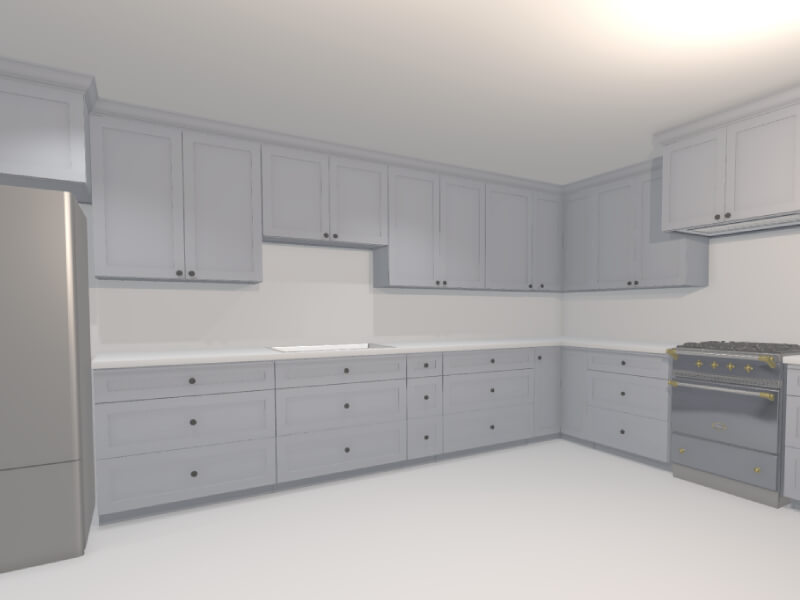
Back in November 2024, I shared a post on X about a tool I was building to help visualize kitchen remodels. The response from the Three.js community was overwhelmingly positive. The demo showed how procedural rendering techniques—often used in games—can be applied to real-world use cases like designing and rendering an entire kitchen in under 60 seconds.
In this article, I’ll walk through the process and thinking behind building this kind of procedural 3D kitchen design tool using vanilla Three.js and TypeScript—from drawing walls and defining cabinet segments to auto-generating full kitchen layouts. Along the way, I’ll share key technical choices, lessons learned, and ideas for where this could evolve next.
Have been wanting to redesign my parents’ kitchen for a while now
…so I built them a little 3D kitchen design-tool with @threejs, so they can quickly prototype floorplans/ideas
Here’s me designing a full kitchen remodel in ~60s 🙂
You can try out an interactive demo of the latest version here: https://kitchen-designer-demo.vercel.app/. (Tip: Press the “/” key to toggle between 2D and 3D views.)
Designing Room Layouts with Walls
Example of user drawing a simple room shape using the built-in wall module.
To initiate our project, we begin with the wall drawing module. At a high level, this is akin to Figma’s pen tool, where the user can add one line segment at a time until a closed—or open-ended—polygon is complete on an infinite 2D canvas. In our build, each line segment represents a single wall as a 2D plane from coordinate A to coordinate B, while the complete polygon outlines the perimeter envelope of a room.
We begin by capturing the [X, Z] coordinates (with Y oriented upwards) of the user’s initial click on the infinite floor plane. This 2D point is obtained via Three.js’s built-in raycaster for intersection detection, establishing Point A.
As the user hovers the cursor over a new spot on the floor, we apply the same intersection logic to determine a temporary Point B. During this movement, a preview line segment appears, connecting the fixed Point A to the dynamic Point B for visual feedback.
Upon the user’s second click to confirm Point B, we append the line segment (defined by Points A and B) to an array of segments. The former Point B instantly becomes the new Point A, allowing us to continue the drawing process with additional line segments.
Here is a simplified code snippet demonstrating a basic 2D pen-draw tool using Three.js:
import * as THREE from 'three';

const scene = new THREE.Scene();
const camera = new THREE.PerspectiveCamera(75, window.innerWidth / window.innerHeight, 0.1, 1000);
camera.position.set(0, 5, 10); // Position camera above the floor looking down
camera.lookAt(0, 0, 0);

const renderer = new THREE.WebGLRenderer();
renderer.setSize(window.innerWidth, window.innerHeight);
document.body.appendChild(renderer.domElement);

// Create an infinite floor plane for raycasting
const floorGeometry = new THREE.PlaneGeometry(100, 100);
const floorMaterial = new THREE.MeshBasicMaterial({ color: 0xcccccc, side: THREE.DoubleSide });
const floor = new THREE.Mesh(floorGeometry, floorMaterial);
floor.rotation.x = -Math.PI / 2; // Lay flat on XZ plane
scene.add(floor);

const raycaster = new THREE.Raycaster();
const mouse = new THREE.Vector2();
let points: THREE.Vector3[] = []; // i.e. wall endpoints
let tempLine: THREE.Line | null = null;
const walls: THREE.Line[] = [];

function getFloorIntersection(event: MouseEvent): THREE.Vector3 | null {
  mouse.x = (event.clientX / window.innerWidth) * 2 - 1;
  mouse.y = -(event.clientY / window.innerHeight) * 2 + 1;
  raycaster.setFromCamera(mouse, camera);
  const intersects = raycaster.intersectObject(floor);
  if (intersects.length > 0) {
    // Round to simplify coordinates (optional for cleaner drawing)
    const point = intersects[0].point;
    point.x = Math.round(point.x);
    point.z = Math.round(point.z);
    point.y = 0; // Ensure on floor plane
    return point;
  }
  return null;
}

// Update temporary line preview
function onMouseMove(event: MouseEvent) {
  const point = getFloorIntersection(event);
  if (point && points.length > 0) {
    // Remove old temp line if exists
    if (tempLine) {
      scene.remove(tempLine);
      tempLine = null;
    }
    // Create new temp line from last point to current hover
    const geometry = new THREE.BufferGeometry().setFromPoints([points[points.length - 1], point]);
    const material = new THREE.LineBasicMaterial({ color: 0x0000ff }); // Blue for temp
    tempLine = new THREE.Line(geometry, material);
    scene.add(tempLine);
  }
}

// Add a new point and draw permanent wall segment
function onMouseDown(event: MouseEvent) {
  if (event.button !== 0) return; // Left click only
  const point = getFloorIntersection(event);
  if (point) {
    points.push(point);
    if (points.length > 1) {
      // Draw permanent wall line from previous to current point
      const geometry = new THREE.BufferGeometry().setFromPoints([points[points.length - 2], points[points.length - 1]]);
      const material = new THREE.LineBasicMaterial({ color: 0xff0000 }); // Red for permanent
      const wall = new THREE.Line(geometry, material);
      scene.add(wall);
      walls.push(wall);
    }
    // Remove temp line after click
    if (tempLine) {
      scene.remove(tempLine);
      tempLine = null;
    }
  }
}

// Add event listeners
window.addEventListener('mousemove', onMouseMove);
window.addEventListener('mousedown', onMouseDown);

// Animation loop
function animate() {
  requestAnimationFrame(animate);
  renderer.render(scene, camera);
}
animate();
The above code snippet is a very basic 2D pen tool, and yet this information is enough to generate an entire room instance. For reference: not only does each line segment represent a wall (2D plane), but the set of accumulated points can also be used to auto-generate the room’s floor mesh, and likewise the ceiling mesh (the inverse of the floor mesh).
In order to view the planes representing the walls in 3D, one can transform each THREE.Line into a custom Wall class object, which contains both a line (for orthogonal 2D “floor plan” view) and a 2D inward-facing plane (for perspective 3D “room” view). To build this class:
class Wall extends THREE.Group {
  constructor(length: number, height: number = 96, thickness: number = 4) {
    super();

    // 2D line for top view, along the x-axis
    const lineGeometry = new THREE.BufferGeometry().setFromPoints([
      new THREE.Vector3(0, 0, 0),
      new THREE.Vector3(length, 0, 0),
    ]);
    const lineMaterial = new THREE.LineBasicMaterial({ color: 0xff0000 });
    const line = new THREE.Line(lineGeometry, lineMaterial);
    this.add(line);

    // 3D wall as a box for thickness
    const wallGeometry = new THREE.BoxGeometry(length, height, thickness);
    const wallMaterial = new THREE.MeshBasicMaterial({ color: 0xaaaaaa, side: THREE.DoubleSide });
    const wall = new THREE.Mesh(wallGeometry, wallMaterial);
    wall.position.set(length / 2, height / 2, 0);
    this.add(wall);
  }
}
We can now update the wall draw module to utilize this newly created Wall object:
// Update our variables
let tempWall: Wall | null = null;
const walls: Wall[] = [];

// Replace line creation in onMouseDown with
if (points.length > 1) {
  const start = points[points.length - 2];
  const end = points[points.length - 1];
  const direction = end.clone().sub(start);
  const length = direction.length();
  const wall = new Wall(length);
  wall.position.copy(start);
  wall.rotation.y = Math.atan2(direction.z, direction.x); // Align along direction (assuming CCW for inward facing)
  scene.add(wall);
  walls.push(wall);
}
Upon adding the floor and ceiling meshes, we can further transform our wall module into a room generation module. To recap what we have just created: by adding walls one by one, we have given the user the ability to create full rooms with walls, floors, and ceilings—all of which can be adjusted later in the scene.
User dragging out the wall in 3D perspective camera-view.
Generating Cabinets with Procedural Modeling
Our cabinet-related logic can consist of countertops, base cabinets, and wall cabinets.
Rather than taking several minutes to add the cabinets on a case-by-case basis—for example, like with IKEA’s 3D kitchen builder—it’s possible to add all the cabinets at once via a single user action. One method to employ here is to allow the user to draw high-level cabinet line segments, in the same manner as the wall draw module.
In this module, each cabinet segment will transform into a linear row of base and wall cabinets, along with a parametrically generated countertop mesh on top of the base cabinets. As the user creates the segments, we can automatically populate this line segment with pre-made 3D cabinet meshes in meshing software like Blender. Ultimately, each cabinet’s width, depth, and height parameters will be fixed, while the width of the last cabinet can be dynamic to fill the remaining space. We use a cabinet filler piece mesh here—a regular plank, with its scale-X parameter stretched or compressed as needed.
Creating the Cabinet Line Segments
User can make a half-peninsula shape by dragging the cabinetry line segments alongside the walls, then in free-space.
Here we will construct a dedicated cabinet module, with the aforementioned cabinet line segment logic. This process is very similar to the wall drawing mechanism, where users can draw straight lines on the floor plane using mouse clicks to define both start and end points. Unlike walls, which can be represented by simple thin lines, cabinet line segments need to account for a standard depth of 24 inches to represent the base cabinets’ footprint. These segments do not require closing-polygon logic, as they can be standalone rows or L-shapes, as is common in most kitchen layouts.
We can further improve the user experience by incorporating snapping functionality, where the endpoints of a cabinet line segment automatically align to nearby wall endpoints or wall intersections, if within a certain threshold (e.g., 4 inches). This ensures cabinets fit snugly against walls without requiring manual precision. For simplicity, we’ll outline the snapping logic in code but focus on the core drawing functionality.
We can start by defining the CabinetSegment class. Like the walls, this should be its own class, as we will later add the auto-populating 3D cabinet models.
class CabinetSegment extends THREE.Group {
  public length: number;

  constructor(length: number, height: number = 96, depth: number = 24, color: number = 0xff0000) {
    super();
    this.length = length;
    const geometry = new THREE.BoxGeometry(length, height, depth);
    const material = new THREE.MeshBasicMaterial({ color, wireframe: true });
    const box = new THREE.Mesh(geometry, material);
    box.position.set(length / 2, height / 2, depth / 2); // Shift so depth spans 0 to depth (inward)
    this.add(box);
  }
}
Once we have the cabinet segment, we can use it in a manner very similar to the wall line segments:
let cabinetPoints: THREE.Vector3[] = [];
let tempCabinet: CabinetSegment | null = null;
const cabinetSegments: CabinetSegment[] = [];
const CABINET_DEPTH = 24; // everything in inches
const CABINET_SEGMENT_HEIGHT = 96; // i.e. both wall & base cabinets -> group should extend to ceiling
const SNAPPING_DISTANCE = 4;

function getSnappedPoint(point: THREE.Vector3): THREE.Vector3 {
  // Simple snapping: check against existing wall points (wallPoints array from wall module)
  for (const wallPoint of wallPoints) {
    if (point.distanceTo(wallPoint) < SNAPPING_DISTANCE) return wallPoint;
  }
  return point;
}

// Update temporary cabinet preview
function onMouseMoveCabinet(event: MouseEvent) {
  const point = getFloorIntersection(event);
  if (point && cabinetPoints.length > 0) {
    const snappedPoint = getSnappedPoint(point);
    if (tempCabinet) {
      scene.remove(tempCabinet);
      tempCabinet = null;
    }
    const start = cabinetPoints[cabinetPoints.length - 1];
    const direction = snappedPoint.clone().sub(start);
    const length = direction.length();
    if (length > 0) {
      tempCabinet = new CabinetSegment(length, CABINET_SEGMENT_HEIGHT, CABINET_DEPTH, 0x0000ff); // Blue for temp
      tempCabinet.position.copy(start);
      tempCabinet.rotation.y = Math.atan2(direction.z, direction.x);
      scene.add(tempCabinet);
    }
  }
}

// Add a new point and draw permanent cabinet segment
function onMouseDownCabinet(event: MouseEvent) {
  if (event.button !== 0) return;
  const point = getFloorIntersection(event);
  if (point) {
    const snappedPoint = getSnappedPoint(point);
    cabinetPoints.push(snappedPoint);
    if (cabinetPoints.length > 1) {
      const start = cabinetPoints[cabinetPoints.length - 2];
      const end = cabinetPoints[cabinetPoints.length - 1];
      const direction = end.clone().sub(start);
      const length = direction.length();
      if (length > 0) {
        const segment = new CabinetSegment(length, CABINET_SEGMENT_HEIGHT, CABINET_DEPTH, 0xff0000); // Red for permanent
        segment.position.copy(start);
        segment.rotation.y = Math.atan2(direction.z, direction.x);
        scene.add(segment);
        cabinetSegments.push(segment);
      }
    }
    if (tempCabinet) {
      scene.remove(tempCabinet);
      tempCabinet = null;
    }
  }
}

// Add separate event listeners for cabinet mode (e.g., toggled via UI button)
window.addEventListener('mousemove', onMouseMoveCabinet);
window.addEventListener('mousedown', onMouseDownCabinet);
Auto-Populating the Line Segments with Live Cabinet Models
Here we fill 2 line-segments with 3D cabinet models (base & wall), and countertop meshes.
Once the cabinet line segments are defined, we can procedurally populate them with detailed components. This involves dividing each segment vertically into three layers: base cabinets at the bottom, countertops in the middle, and wall cabinets above. For the base and wall cabinets, we’ll use an optimization function to divide the segment’s length into standard widths (preferring 30-inch cabinets), with any remainder filled using the filler piece mentioned above. Countertops are even simpler—they form a single continuous slab stretching the full length of the segment.
The base cabinets are set to 24 inches deep and 34.5 inches high. Countertops add 1.5 inches in height and extend to 25.5 inches deep (including a 1.5-inch overhang). Wall cabinets start at 54 inches high (18 inches above the countertop), measure 12 inches deep, and are 30 inches tall. After generating these placeholder bounding boxes, we can replace them with preloaded 3D models from Blender using a loading function (e.g., via GLTFLoader).
To handle individual cabinets, we’ll create a simple Cabinet class that manages the placeholder and model loading.
import { GLTFLoader } from 'three/examples/jsm/loaders/GLTFLoader.js';

const loader = new GLTFLoader();

class Cabinet extends THREE.Group {
  constructor(width: number, height: number, depth: number, modelPath: string, color: number) {
    super();

    // Placeholder box
    const geometry = new THREE.BoxGeometry(width, height, depth);
    const material = new THREE.MeshBasicMaterial({ color });
    const placeholder = new THREE.Mesh(geometry, material);
    this.add(placeholder);


    // Load and replace with model async

    // Case: Non-standard width -> use filler piece
    if (width < DEFAULT_MODEL_WIDTH) {
      loader.load(FILLER_PIECE_FALLBACK_PATH, (gltf) => {
        const model = gltf.scene;
        model.scale.set(
          width / FILLER_PIECE_WIDTH,
          height / FILLER_PIECE_HEIGHT,
          depth / FILLER_PIECE_DEPTH,
        );
        this.add(model);
        this.remove(placeholder);
      });
    }

    loader.load(modelPath, (gltf) => {
      const model = gltf.scene;
      model.scale.set(width / DEFAULT_MODEL_WIDTH, 1, 1); // Scale width
      this.add(model);
      this.remove(placeholder);
    });
  }
}
Then, we can add a populate method to the existing CabinetSegment class:
function splitIntoCabinets(width: number): number[] {
  const cabinets = [];
  // Preferred width
  while (width >= DEFAULT_MODEL_WIDTH) {
    cabinets.push(DEFAULT_MODEL_WIDTH);
    width -= DEFAULT_MODEL_WIDTH;
  }
  if (width > 0) {
    cabinets.push(width); // Custom empty slot
  }
  return cabinets;
}

class CabinetSegment extends THREE.Group {
  // ... (existing constructor and properties)

  populate() {
    // Remove placeholder line and box
    while (this.children.length > 0) {
      this.remove(this.children[0]);
    }

    let offset = 0;
    const widths = splitIntoCabinets(this.length);

    // Base cabinets
    widths.forEach((width) => {
      const baseCab = new Cabinet(width, BASE_HEIGHT, BASE_DEPTH, 'models/base_cabinet.glb', 0x8b4513);
      baseCab.position.set(offset + width / 2, BASE_HEIGHT / 2, BASE_DEPTH / 2);
      this.add(baseCab);
      offset += width;
    });

    // Countertop (single slab, no model)
    const counterGeometry = new THREE.BoxGeometry(this.length, COUNTER_HEIGHT, COUNTER_DEPTH);
    const counterMaterial = new THREE.MeshBasicMaterial({ color: 0xa9a9a9 });
    const counter = new THREE.Mesh(counterGeometry, counterMaterial);
    counter.position.set(this.length / 2, BASE_HEIGHT + COUNTER_HEIGHT / 2, COUNTER_DEPTH / 2);
    this.add(counter);

    // Wall cabinets
    offset = 0;
    widths.forEach((width) => {
      const wallCab = new Cabinet(width, WALL_HEIGHT, WALL_DEPTH, 'models/wall_cabinet.glb', 0x4b0082);
      wallCab.position.set(offset + width / 2, WALL_START_Y + WALL_HEIGHT / 2, WALL_DEPTH / 2);
      this.add(wallCab);
      offset += width;
    });
  }
}

// Call for each cabinetSegment after drawing
cabinetSegments.forEach((segment) => segment.populate());
Further Improvements & Optimizations
We can further improve the scene with appliances, varying-height cabinets, crown molding, etc.
At this point, we should have the foundational elements of room and cabinet creation logic fully in place. In order to take this project from a rudimentary segment-drawing app into the practical realm—along with dynamic cabinets, multiple realistic material options, and varying real appliance meshes—we can further enhance the user experience through several targeted refinements:
We can implement a detection mechanism to determine if a cabinet line segment is in contact with a wall line segment.
For cabinet rows that run parallel to walls, we can automatically incorporate a backsplash in the space between the wall cabinets and the countertop surface.
For cabinet segments not adjacent to walls, we can remove the upper wall cabinets and extend the countertop by an additional 15 inches, aligning with standard practices for kitchen islands or peninsulas.
We can introduce drag-and-drop functionality for appliances, each with predefined widths, allowing users to position them along the line segment. This integration will instruct our cabinet-splitting algorithm to exclude those areas from dynamic cabinet generation.
Additionally, we can give users more flexibility by enabling the swapping of one appliance with another, applying different textures to our 3D models, and adjusting default dimensions—such as wall cabinet depth or countertop overhang—to suit specific preferences.
All these core components lead us to a comprehensive, interactive application that enables the rapid rendering of a complete kitchen: cabinets, countertops, and appliances, in a fully interactive, user-driven experience.
The aim of this project is to demonstrate that complex 3D tasks can be distilled down to simple user actions. It is fully possible to take the high-dimensional complexity of 3D tooling—with seemingly limitless controls—and encode these complexities into low-dimensional, easily adjustable parameters. Whether the developer chooses to expose these parameters to the user or an LLM, the end result is that historically complicated 3D processes can become simple, and thus the entire contents of a 3D scene can be fully transformed with only a few parameters.
If you find this type of development interesting, have any great ideas, or would love to contribute to the evolution of this product, I strongly welcome you to reach out to me via email. I firmly believe that only recently has it become possible to build home design software that is so wickedly fast and intuitive that any person—regardless of architectural merit—will be able to design their own single-family home in less than 5 minutes via a web app, while fully adhering to local zoning, architectural, and design requirements. All the infrastructure necessary to accomplish this already exists; all it takes is a team of crazy, ambitious developers looking to change the standard of architectural home design.
In the ever-evolving landscape of cyber threats, organizations are no longer asking if they’ll be targeted but when. Traditional cybersecurity measures, such as firewalls, antivirus software, and access control, remain essential. But they’re often reactive, responding only after a threat has emerged. In contrast, threat intelligence enables organizations to get ahead of the curve by proactively identifying and preparing for risks before they strike.
What is Threat Intelligence?
At its core, threat intelligence is the process of gathering, analyzing, and applying information about existing and potential attacks. This includes data on threat actors, tactics and techniques, malware variants, phishing infrastructure, and known vulnerabilities.
The value of threat intelligence lies not just in raw data, but in its context—how relevant it is to your environment, and how quickly you can act on it.
Why Organizations Need Threat Intelligence
Cyber Threats Are Evolving Rapidly
New ransomware variants, phishing techniques, and zero-day vulnerabilities emerge daily. Threat intelligence helps organizations stay informed about these developments in real time, allowing them to adjust their defenses accordingly.
Contextual Awareness Improves Response
When a security event occurs, knowing whether it’s a one-off anomaly or part of a broader attack campaign is crucial. Threat intelligence provides this clarity, helping teams prioritize incidents that pose real risk over false alarms.
It Powers Proactive Defense
With actionable intelligence, organizations can proactively patch vulnerabilities, block malicious domains, and tighten controls on specific threat vectors—preventing breaches before they occur.
Supports Compliance and Risk Management
Many data protection regulations require businesses to demonstrate risk-based security practices. Threat intelligence can support compliance with frameworks like ISO 27001, GDPR, and India’s DPDP Act by providing documented risk assessments and preventive actions.
Essential for Incident Detection and Response
Modern SIEMs, SOAR platforms, and XDR solutions rely heavily on enriched threat feeds to detect threats early and respond faster. Without real-time intelligence, these systems are less effective and may overlook critical indicators of compromise.
Types of Threat Intelligence
Strategic Intelligence: High-level trends and risks to inform business decisions.
Tactical Intelligence: Insights into attacker tools, techniques, and procedures (TTPs).
Operational Intelligence: Real-time data on active threats, attack infrastructure, and malware campaigns.
Technical Intelligence: Specific IOCs (indicators of compromise) like IP addresses, hashes, or malicious URLs.
Each type plays a unique role in creating a layered defense posture.
Challenges in Implementing Threat Intelligence
Despite its benefits, threat intelligence can be overwhelming. The sheer volume of data, lack of context, and integration issues often dilute its impact. To be effective, organizations need:
Curated, relevant intelligence feeds
Automated ingestion into security tools
Clear mapping to business assets and risks
Skilled analysts to interpret and act on the data
The Way Forward: Intelligence-Led Security
Security teams must shift from passive monitoring to intelligence-led security operations. This means treating threat intelligence as a core input for every security decision, such as prioritizing vulnerabilities, hardening cloud environments, or responding to an incident.
In a world where attackers collaborate, automate, and innovate, defenders need every edge. Threat intelligence provides that edge.
Ready to Build an Intelligence-Driven Defense?
Seqrite Threat Intelligence helps enterprises gain real-time visibility into global and India—specific emerging threats. Backed by over 10 million endpoint signals and advanced malware analysis, it’s designed to supercharge your SOC, SIEM, or XDR. Explore Seqrite Threat Intelligence to strengthen your cybersecurity strategy.
Just a second! 🫷 If you are here, it means that you are a software developer.
So, you know that storage, networking, and domain management have a cost .
If you want to support this blog, please ensure that you have disabled the adblocker for this site. I configured Google AdSense to show as few ADS as possible – I don’t want to bother you with lots of ads, but I still need to add some to pay for the resources for my site.
Thank you for your understanding. – Davide
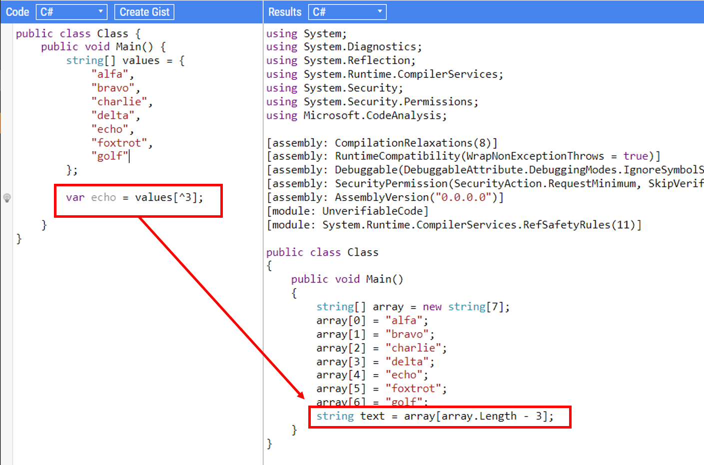
Say that you have an array of N items and you need to access an element counting from the end of the collection.
Usually, we tend to use the Length property of the array, and then subtract the number corresponding to the position we want to reach:
Yes, that’s just syntactic sugar, but it can help make your code more readable. In fact, if you have a look at the IL code generated by both examples, they are perfectly identical. IL is quite difficult to read and understand, but you can acknowledge that both syntaxes are equivalent by looking at the decompiled C# code:
Performance is not affected by this operator, so it’s just a matter of readability.
Clearly, you still have to take care of array bounds – if you access values[^55] you’ll get an IndexOutOfRangeException.
Using ^ is a nice trick that many C# developers don’t know. There are some special characters that can help us but are often not used. Like the @ operator!
21 TSI isn’t your typical sports holding company. Overseeing a portfolio of brands in the sports equipment space, the team set out to break from the mold of the standard corporate website. Instead, they envisioned a digital experience that would reflect their DNA—where innovation, design, and technology converge into a rich, immersive journey.
The result is a site that goes beyond static content, inviting users to explore through motion, interactivity, and meticulously crafted visuals. Developed through a close collaboration between type8 Studio and DEPARTMENT Maison de Création, the project pushes creative and technical boundaries to deliver a seamless, engaging experience.
Concept & Art Direction
The creative direction led by Paul Barbin played a crucial role in shaping the website’s identity. The design embraces a minimalist yet bold aesthetic—strictly monochromatic, anchored by a precise and structured typographic system. The layout is intentionally clean, but the experience stays dynamic thanks to well-orchestrated WebGL animations and subtle interactions.
Grid & Style
The definition of the grid played a fundamental role in structuring and clarifying the brand’s message. More than just a layout tool, the grid became a strategic framework—guiding content organization, enhancing readability, and ensuring visual consistency across all touchpoints.
We chose an approach inspired by the Swiss style, also known as the International Typographic Style, celebrated for its clarity, precision, and restraint. This choice reflects our commitment to clear, direct, and functional communication, with a strong focus on user experience. The grid allows each message to be delivered with intention, striking a subtle balance between aesthetics and efficiency.
A unique aspect of the project was the integration of AI-generated imagery. These visuals were thoughtfully curated and refined to align with the brand’s futuristic and enigmatic identity, further reinforcing the immersive nature of the website.
Interaction & Motion Design
The experience of 21 TSI is deeply rooted in movement. The site feels alive—constantly shifting and morphing in response to user interactions. Every detail works together to evoke a sense of fluidity:
WebGL animations add depth and dimension, making the site feel tactile and immersive.
Cursor distortion effects introduce a subtle layer of interactivity, letting users influence their journey through motion.
Scroll-based animations strike a careful balance between engagement and clarity, ensuring motion enhances the experience without overwhelming it.
This dynamic approach creates a browsing experience that feels both organic and responsive—keeping users engaged without ever overwhelming them.
Technical Implementation & Motion Design
For this project, we chose a technology stack designed to deliver high performance and smooth interactions, all while maintaining the flexibility needed for creative exploration:
OGL: A lightweight alternative to Three.js, used for WebGL-powered animations and visual effects.
Anime.js: Handles motion design elements and precise animation timing.
Locomotive Scroll: Enables smooth, controlled scroll behavior throughout the site.
Eleventy (11ty): A static site generator that ensures fast load times and efficient content management.
Netlify: Provides seamless deployment and version control, keeping the development workflow agile.
One of the key technical challenges was optimizing performance across devices while preserving the same fluid motion experience. Carefully balancing GPU-intensive WebGL elements with lightweight animations made seamless performance possible.
Challenges & Solutions
One of the primary challenges was ensuring that the high level of interactivity didn’t compromise usability. The team worked extensively to refine transitions so they felt natural, while keeping navigation intuitive. Balancing visual complexity with performance was equally critical—avoiding unnecessary elements while preserving a rich, engaging experience.
Another challenge was the use of AI-generated visuals. While they introduced unique artistic possibilities, these assets required careful curation and refinement to align with the creative vision. Ensuring coherence between the AI-generated content and the designed elements was a meticulous process.
Conclusion
The 21 TSI website is a deep exploration of digital storytelling through design and interactivity. It captures the intersection of technology and aesthetics, offering an experience that goes well beyond a traditional corporate presence.
The project was recognized with multiple awards, including Website of the Day on CSS Design Awards, FWA of the Day, and Awwwards, reinforcing its impact in the digital design space.
This collaboration between type8 Studio and Paul Barbin of DEPARTMENT Maison de Création showcases how thoughtful design, innovative technology, and a strong artistic vision can come together to craft a truly immersive web experience.
We partnered with Meet Your Legend to bring their groundbreaking vision to life — a mentorship platform that seamlessly blends branding, UI/UX, full-stack development, and immersive digital animation.
Meet Your Legend isn’t just another online learning platform. It’s a bridge between generations of creatives. Focused on VFX, animation, and video game production, it connects aspiring talent — whether students, freelancers, or in-house studio professionals — with the industry’s most accomplished mentors. These are the legends behind the scenes: lead animators, FX supervisors, creative directors, and technical wizards who’ve shaped some of the biggest productions in modern entertainment.
Our goal? To create a vivid digital identity and interactive platform that captures three core qualities:
The energy of creativity
The precision of industry-level expertise
The dynamism of motion graphics and storytelling
At the heart of everything was a single driving idea: movement. Not just visual movement — but career momentum, the transfer of knowledge, and the emotional propulsion behind creativity itself.
We built the brand identity around the letter “M” — stylized with an elongated tail that represents momentum, legacy, and forward motion. This tail forms a graphic throughline across the platform. Mentor names, modules, and animations plug into it, creating a modular and adaptable system that evolves with the content and contributors.
From the visual system to the narrative structure, we wanted every interaction to feel alive — dynamic, immersive, and unapologetically aspirational.
The Concept
The site’s architecture is built around a narrative arc, not just a navigation system.
Users aren’t dropped into a menu or a generic homepage. Instead, they’re invited into a story. From the moment the site loads, there’s a sense of atmosphere and anticipation — an introduction to the platform’s mission, mood, and voice before unveiling the core offering: the mentors themselves, or as the platform calls them, “The Legends.”
Each element of the experience is structured with intention. We carefully designed the content flow to evoke a sense of reverence, curiosity, and inspiration. Think of it as a cinematic trailer for a mentorship journey.
We weren’t just explaining the brand — we were immersing visitors in it.
Typography & Color System
The typography system plays a crucial role in reinforcing the platform’s dual personality: technical sophistication meets expressive creativity.
We paired two distinct sans-serif fonts:
– A light-weight, technical font to convey structure, clarity, and approachability — ideal for body text and interface elements
– A bold, expressive typeface that commands attention — perfect for mentor names, quotes, calls to action, and narrative highlights
The contrast between these two fonts helps create rhythm, pacing, and emotional depth across the experience.
The color palette is deliberately cinematic and memorable:
Flash orange signals energy, creative fire, and boldness. It’s the spark — the invitation to engage.
A range of neutrals — beige, brown, and warm grays — offer a sense of balance, maturity, and professionalism. These tones ground the experience and create contrast for vibrant elements.
Together, the system is both modern and timeless — a tribute to craft, not trend.
Technology Stack
We brought the platform to life with a modern and modular tech stack designed for both performance and storytelling:
WordPress (headless CMS) for scalable, easy-to-manage content that supports a dynamic editorial workflow
GSAP (GreenSock Animation Platform) for fluid, timeline-based animations across scroll and interactions
Three.js / WebGL for high-performance visual effects, shaders, and real-time graphical experiences
Custom booking system powered by Make, Google Calendar, Whereby, and Stripe — enabling seamless scheduling, video sessions, and payments
This stack allowed us to deliver a responsive, cinematic experience without compromising speed or maintainability.
Loader Experience
Even the loading screen is part of the story.
We designed a cinematic prelude using the “M” tail as a narrative element. This loader animation doesn’t just fill time — it sets the stage. Meanwhile, key phrases from the creative world — terms like motion 2D & 3D, vfx, cgi, and motion capture — animate in and out of view, building excitement and immersing users in the language of the craft.
It’s a sensory preview of what’s to come, priming the visitor for an experience rooted in industry and artistry.
Title Reveal Effects
Typography becomes motion.
To bring the brand’s kinetic DNA to life, we implemented a custom mask-reveal effect for major headlines. Each title glides into view with trailing motion, echoing the flowing “M” mark. This creates a feeling of elegance, control, and continuity — like a shot dissolving in a film edit.
These transitions do more than delight — they reinforce the platform’s identity, delivering brand through movement.
Menu Interaction
We didn’t want the menu to feel like a utility. We wanted it to feel like a scene transition.
The menu unfolds within the iconic M-shape — its structure serving as both interface and metaphor. As users open it, they reveal layers: content categories, mentor profiles, and stories. Every motion is deliberate, reminiscent of opening a timeline in an editing suite or peeling back layers in a 3D model.
It’s tactile, immersive, and true to the world the platform celebrates.
Gradient & WebGL Shader
A major visual motif was the idea of “burning film” — inspired by analog processes but expressed through modern code.
To bring this to life, we created a custom WebGL shader, incorporating a reactive orange gradient from the brand palette. As users move their mouse or scroll, the shader responds in real-time, adding a subtle but powerful VFX-style distortion to the screen.
This isn’t just decoration. It’s a living texture — a symbol of the heat, friction, and passion that fuel creative careers.
Scroll-Based Storytelling
The homepage isn’t static. It’s a stage for narrative progression.
We designed the flow as a scroll-driven experience where content and story unfold in sync. From an opening slider that introduces the brand, to immersive sections that highlight individual mentors and their work, each moment is carefully choreographed.
Users aren’t just reading — they’re experiencing a sequence, like scenes in a movie or levels in a game. It’s structured, emotional, and deeply human.
Who We Are
We are a digital studio at the intersection of design, storytelling, and interaction. Our approach is rooted in concept and craft. We build digital experiences that are not only visually compelling but emotionally resonant.
From bold brands to immersive websites, we design with movement in mind — movement of pixels, of emotion, and of purpose.
Because we believe great design doesn’t just look good — it moves you.
In today’s fast-evolving threat landscape, enterprises often focus heavily on external cyberattacks, overlooking one of the most potent and damaging risks: insider threats. Whether it’s a malicious employee, a careless contractor, or a compromised user account, insider threats strike from within the perimeter, making them harder to detect, contain, and mitigate.
As organizations become more hybrid, decentralized, and cloud-driven, moving away from implicit trust is more urgent than ever. Zero Trust Network Access (ZTNA) is emerging as a critical solution, silently transforming how businesses do insider threat mitigation.
Understanding the Insider Threat Landscape
Insider threats are not always malicious. They can stem from:
Disgruntled or rogue employees intentionally leaking data
Well-meaning staff misconfiguring systems or falling for phishing emails
Contractors or third-party vendors with excessive access
Compromised user credentials obtained via social engineering
According to multiple cybersecurity studies, insider incidents now account for over 30% of all breaches, and their average cost rises yearly.
The real challenge? Traditional security models operate on implicit trust. Once inside the network, users often have wide, unchecked access, which creates fertile ground for lateral movement, privilege abuse, and data exfiltration.
ZTNA in Action: Redefining Trust, Access, and Visibility
Zero Trust Network Access challenges the outdated notion of “trust but verify.” Instead, it enforces “never trust, always verify”—even for users already inside the network.
ZTNA provides access based on identity, device posture, role, and context, ensuring that every access request is continuously validated. This approach is a game-changer for insider threat mitigation.
Granular Access Control
ZTNA enforces least privilege access, meaning users only get access to the specific applications or data they need—nothing more. Even if an insider intends to exfiltrate data, their reach is limited.
For example, a finance team member can access their accounting software, but cannot see HR or R&D files, no matter how hard they try.
Micro-Segmentation for Blast Radius Reduction
ZTNA divides the network into isolated micro-segments. This restricts lateral movement, so even if an insider compromises one segment, they cannot hop across systems undetected.
This segmentation acts like watertight compartments in a ship, containing the damage and preventing full-scale breaches.
Device and Risk Posture Awareness
ZTNA solutions assess device health before granting access. Access can be denied or limited if an employee logs in from an outdated or jailbroken device. This becomes crucial when insider risks stem from compromised endpoints.
Continuous Monitoring and Behavioral Analytics
ZTNA enables real-time visibility into who accessed what, from where, and for how long. Any deviation from expected behavior can trigger alerts or require re-authentication. For instance:
A user downloading an unusually high volume of files
Repeated access attempts outside business hours
Use of shadow IT apps or unauthorized tools
With continuous risk scoring and adaptive access, suspicious insider behavior can be curtailed before damage is done.
Real-World Relevance: Insider Threats in Indian Enterprises
As Indian organizations ramp up their digital transformation and cloud adoption, they face new risks tied to employee churn, contractor access, and remote work culture. In addition to the growing compliance pressure from laws like the Digital Personal Data Protection (DPDP) Act, it has become clear that relying on static access controls is no longer an option.
ZTNA’s dynamic, context-aware model perfectly fits this reality, offering a more resilient and regulation-ready access framework.
How Seqrite ZTNA Helps with Insider Threat Mitigation
Seqrite ZTNA is built to offer secure, identity-based access for modern Indian enterprises. It goes beyond authentication to deliver:
Role-based, micro-segmented access to specific apps and data
Granular control policies based on risk level, device posture, and location
Centralized visibility and detailed audit logs for every user action
Seamless experience for users, without the complexity of traditional solutions
Whether you’re securing remote teams, contractors, or sensitive internal workflows, Seqrite ZTNA gives you the tools to limit, monitor, and respond to insider threats—without slowing down productivity.
Final Thoughts
Insider threats aren’t hypothetical—they’re already inside your network. And as organizations become more distributed, the threat surface only widens. Traditional access models offer little defense for insider threat mitigation.
ZTNA isn’t just about external threats; it’s a silent guardian against internal risks. Enforcing continuous validation, granular access, and real-time visibility transforms your weakest points into strongholds.