Senders and Receivers handle errors on Azure Service Bus differently. We’ll see how to catch them, what they mean and how to fix them. We’ll also introduce Dead Letters.
Table of Contents
Just a second! 🫷 If you are here, it means that you are a software developer.
So, you know that storage, networking, and domain management have a cost .
If you want to support this blog, please ensure that you have disabled the adblocker for this site. I configured Google AdSense to show as few ADS as possible – I don’t want to bother you with lots of ads, but I still need to add some to pay for the resources for my site.
Thank you for your understanding. – Davide
In this article, we are gonna see which kind of errors you may get on Azure Service Bus and how to fix them. We will look at simpler errors, the ones you get if configurations on your code are wrong, or you’ve not declared the modules properly; then we will have a quick look at Dead Letters and what they represent.
This is the last part of the series about Azure Service Bus. In the previous parts, we’ve seen
For this article, we’re going to introduce some errors in the code we used in the previous examples.
Just to recap the context, our system receives orders for some pizzas via HTTP APIs, processes them by putting some messages on a Topic on Azure Service Bus. Then, a different application that is listening for notifications on the Topic, reads the message and performs some dummy operations.
Common exceptions with .NET SDK
To introduce the exceptions, we’d better keep at hand the code we used in the previous examples.
Let’s recall that a connection string has a form like this:
To send a message in the Queue, remember that we have 3 main steps:
create a new ServiceBusClient instance using the connection string
create a new ServiceBusSender specifying the name of the queue or topic (in our case, the Topic)
send the message by calling the SendMessageAsync method
awaitusing (ServiceBusClient client = new ServiceBusClient(ConnectionString))
{
ServiceBusSender sender = client.CreateSender(TopicName);
foreach (var order in validOrders)
{
/// Create Bus Message ServiceBusMessage serializedContents = CreateServiceBusMessage(order);
// Send the message on the Busawait sender.SendMessageAsync(serializedContents);
}
}
To receive messages from a Topic, we need the following steps:
create a new ServiceBusClient instance as we did before
create a new ServiceBusProcessor instance by specifying the name of the Topic and of the Subscription
Of course, I recommend reading the previous articles to get a full understanding of the examples.
Now it’s time to introduce some errors and see what happens.
No such host is known
When the connection string is invalid because the host name is wrong, you get an Azure.Messaging.ServiceBus.ServiceBusException exception with this message: No such host is known. ErrorCode: HostNotFound.
What is the host? It’s the first part of the connection string. For example, in a connection string like
So we can easily understand why this error happens: that host name does not exist (or, more probably, there’s a typo).
A curious fact about this exception: it is thrown later than I expected. I was expecting it to be thrown when initializing the ServiceBusClient instance, but it is actually thrown only when a message is being sent using SendMessageAsync.
You can perform all the operations you want without receiving any error until you really access the resources on the Bus.
Put token failed: The messaging entity X could not be found
Another message you may receive is Put token failed. status-code: 404, status-description: The messaging entity ‘X’ could not be found.
The reason is pretty straightforward: the resource you are trying to use does not exist: by resource I mean Queue, Topic, and Subscription.
Again, that exception is thrown only when interacting directly with Azure Service Bus.
Put token failed: the token has an invalid signature
If the connection string is not valid because of invalid SharedAccessKeyName or SharedAccessKey, you will get an exception of type System.UnauthorizedAccessException with the following message: Put token failed. status-code: 401, status-description: InvalidSignature: The token has an invalid signature.
The best way to fix it is to head to the Azure portal and copy again the credentials, as I explained in the introductory article.
Cannot begin processing without ProcessErrorAsync handler set.
Let’s recall a statement from my first article about Azure Service Bus:
The PizzaItemErrorHandler, however, must be at least declared, even if empty: you will get an exception if you forget about it.
That’s odd, but that’s true: you have to define handlers both for manage success and failure.
If you don’t, and you only declare the ProcessMessageAsync handler, like in this example:
and acts as a catch block for the receivers: all the errors we’ve thrown in the first part of the article can be handled here. Of course, we are not directly receiving an instance of Exception, but we can access it by navigating the arg object.
As an example, let’s update again the host part of the connection string. When running the application, we can see that the error is caught in the PizzaItemErrorHandler method, and the arg argument contains many fields that we can use to handle the error. One of them is Exception, which wraps the Exception types we’ve already seen.
This means that in this method you have to define your error handling, add logs, and whatever may help your application managing errors.
The same handler can be used to manage errors that occur while performing operations on a message: if an exception is thrown when processing an incoming message, you have two choices: handle it in the ProcessMessageAsync handler, in a try-catch block, or leave the error handling on the ProcessErrorAsync handler.
In the above picture, I’ve simulated an error while processing an incoming message by throwing a new DivideByZeroException. As a result, the PizzaItemErrorHandler method is called, and the arg argument contains info about the thrown exception.
I personally prefer separating the two error handling situations: in the ProcessMessageAsync method I handle errors that occur in the business logic, when operating on an already received message; in the ProcessErrorAsync method I handle error coming from the infrastructure, like errors in the connection string, invalid credentials and so on.
Dead Letters: when messages become stale
When talking about queues, you’ll often come across the term dead letter. What does it mean?
Dead letters are unprocessed messages: messages die when a message cannot be processed for a certain period of time. You can ignore that message because it has become obsolete or, anyway, it cannot be processed – maybe because it is malformed.
Messages like these are moved to a specific queue called Dead Letter Queue (DLQ): messages are moved here to avoid making the normal queue full of messages that will never be processed.
You can see which messages are present in the DLQ to try to understand the reason they failed and put them again into the main queue.
in the above picture, you can see how the DLQ can be navigated using Service Bus Explorer: you can see all the messages in the DLQ, update them (not only the content, but even the associated metadata), and put them again into the main Queue to be processed.
Wrapping up
In this article, we’ve seen some of the errors you can meet when working with Azure Service Bus and .NET.
We’ve seen the most common Exceptions, how to manage them both on the Sender and the Receiver side: on the Receiver you must handle them in the ProcessErrorAsync handler.
Finally, we’ve seen what is a Dead Letter, and how you can recover messages moved to the DLQ.
This is the last part of this series about Azure Service Bus and .NET: there’s a lot more to talk about, like dive deeper into DLQ and understanding Retry Patterns.
Debugging our .NET applications can be cumbersome. With the DebuggerDisplay attribute we can simplify it by displaying custom messages.
Table of Contents
Just a second! 🫷 If you are here, it means that you are a software developer.
So, you know that storage, networking, and domain management have a cost .
If you want to support this blog, please ensure that you have disabled the adblocker for this site. I configured Google AdSense to show as few ADS as possible – I don’t want to bother you with lots of ads, but I still need to add some to pay for the resources for my site.
Thank you for your understanding. – Davide
Picture this: you are debugging a .NET application, and you need to retrieve a list of objects. To make sure that the items are as you expect, you need to look at the content of each item.
For example, you are retrieving a list of Movies – an object with dozens of fields – and you are interested only in the Title and VoteAverage fields. How to view them while debugging?
There are several options: you could override ToString, or use a projection and debug the transformed list. Or you could use the DebuggerDisplay attribute to define custom messages that will be displayed on Visual Studio. Let’s see what we can do with this powerful – yet ignored – attribute!
Simplify debugging by overriding ToString
Let’s start with the definition of the Movie object:
This is quite a small object, but yet it can become cumbersome to view the content of each object while debugging.
As you can see, to view the content of the items you have to open them one by one. When there are only 3 items like in this example, it still can be fine. But when working with tens of items, that’s not a good idea.
Notice what is the default text displayed by Visual Studio: does it ring you a bell?
By default, the debugger shows you the ToString() of every object. So an idea is to override that method to view the desired fields.
This override allows us to see the items in a much better way:
So, yes, this could be a way to achieve this result.
Using LINQ
Another way to achieve the same result is by using LINQ. Almost every C# developer has
already used it, so I won’t explain what it is and what you can do with LINQ.
By the way, one of the most used methods is Select: it takes a list of items and, by applying a function, returns the result of that function applied to each item in the list.
So, we can create a list of strings that holds the info relevant to us, and then use the debugger to view the content of that list.
The fields to be displayed are wrapped in { and }: it’s "{Title}", not "Title";
The names must match with the ones of the fields;
You are viewing the ToString() representation of each displayed field (notice the VoteAverage field, which is a double);
When debugging, you don’t see the names of the displayed fields;
You can write whatever you want, not only the fields name (see the hyphen between the fields)
The 5th point brings us to another example: adding custom text to the display attribute:
[DebuggerDisplay("Title: {Title} - Average Vote: {VoteAverage}")]
So we can customize the content as we want.
What if you rename a field? Since the value of the attribute is a simple string, it will not notice any update, so you’ll miss that field (it does not match any object field, so it gets used as a simple text).
To avoid this issue you can simply use string concatenation and the nameof expression:
You can get rid of quotes by adding nq to the string: add that modifier to every string you want to escape, and it will remove the quotes (in fact, nq stands for no-quotes).
In this way, we achieve the same result, and we have the help of the Intellisense in case our expression is not valid.
Why not overriding ToString or using LINQ?
Ok, DebuggerDisplay is neat and whatever. But why can’t we use LINQ, or override ToString?
That’s because of the side effect of those two approaches.
By overriding the ToString method you are changing its behavior all over the application. This means that, if somewhere you print on console that object (like in Console.WriteLine(movie)), the result will be the one defined in the ToString method.
By using the LINQ approach you are performing “useless” operations: every time you run the application, even without the debugger attached, you will perform the transformation on every object in the collection.This is fine if your collection has 3 elements, but it can cause performance issues on huge collections.
That’s why you should use the DebuggerDisplay attribute: it has no side effects on your application, both talking about results and performance – it will only be used when debugging.
In this article, we’ve seen how the DebuggerDisplay attribute provided by .NET is useful to perform smarter and easier debugging sessions.
With this Attribute, you can display custom messages to watch the state of an object, and even see the state of nested fields.
We’ve seen that you can customize the message in several ways, like by calling ToUpper on the string result. We’ve also seen that for complex messages you should consider creating a new internal field whose sole purpose is to be used during debugging sessions.
After a series of commercial projects that were more practical than playful, I decided to use my portfolio site as a space to experiment with new ideas. My goals were clear: one, it had to be interactive and contain 3D elements. Two, it needed to capture your attention. Three, it had to perform well across different devices.
How did the idea for my site come about? Everyday moments. In the toilet, to be exact. My curious 20-month-old barged in when I was using the toilet one day and gleefully unleashed a long trail of toilet paper across the floor. The scene was chaotic, funny and oddly delightful to watch. As the mess grew, so did the idea: this kind of playful, almost mischievous, interaction with an object could be reimagined as a digital experience.
Of course, toilet paper wasn’t quite the right fit for the aesthetic, so the idea pivoted to duct tape. Duct tape was cooler and more in tune with the energy the project needed. With the concept locked in, the process moved to sketching, designing and coding.
Design Principles
With duct tape unraveling across the screen, things could easily feel chaotic and visually heavy. To balance that energy, the interface was kept intentionally simple and clean. The goal was to let the visuals take center stage while giving users plenty of white space to wander and play.
There’s also a layer of interaction woven into the experience. Animations respond to user actions, creating a sense of movement and interactivity. Hidden touches, like the option to rewind, orbit around elements, or a blinking dot that signals unseen projects.
Hitting spacebar rewinds the roll so that it can draw a new path again.
Hitting the tab key unlocks an orbit view, allowing the scene to be explored from different angles.
Building the Experience
Building an immersive, interactive portfolio is one thing. Making it perform smoothly across devices is another. Nearly 70% of the effort went into refining the experience and squeezing out every drop of performance. The result is a site that feels playful on the surface, but under the hood, it’s powered by a series of systems built to keep things fast, responsive, and accessible.
01. Real-time path drawing
The core magic lies in real-time path drawing. Mouse or touch movements are captured and projected into 3D space through raycasting. Points are smoothed with Catmull-Rom curves to create flowing paths that feel natural as they unfold. Geometry is generated on the fly, giving each user a unique drawing that can be rewound, replayed, or explored from different angles.
02. BVH raycasting
To keep those interactions fast, BVH raycasting steps in. Instead of testing every triangle in a scene, the system checks larger bounding boxes first, reducing thousands of calculations to just a few. Normally reserved for game engines, this optimization brings complex geometry into the browser at smooth 60fps.
// First, we make our geometry "smart" by adding BVH acceleration
useEffect(() => {
  if (planeRef.current && !bvhGenerated.current) {
    const plane = planeRef.current

    // Step 1: Create a BVH tree structure for the plane
    const generator = new StaticGeometryGenerator(plane)
    const geometry = generator.generate()

    // Step 2: Build the acceleration structure
    geometry.boundsTree = new MeshBVH(geometry)

    // Step 3: Replace the old geometry with the BVH-enabled version
    if (plane.geometry) {
      plane.geometry.dispose() // Clean up old geometry
    }
    plane.geometry = geometry

    // Step 4: Enable fast raycasting
    plane.raycast = acceleratedRaycast

    bvhGenerated.current = true
  }
}, [])
03. LOD + dynamic device detection
The system detects the capabilities of each device, GPU power, available memory, even CPU cores, and adapts quality settings on the fly. High-end machines get the full experience, while mobile devices enjoy a leaner version that still feels fluid and engaging.
const [isLowResMode, setIsLowResMode] = useState(false)
const [isVeryLowResMode, setIsVeryLowResMode] = useState(false)

// Detect low-end devices and enable low-res mode
useEffect(() => {
  const detectLowEndDevice = () => {
    const isMobile = /Android|webOS|iPhone|iPad|iPod|BlackBerry|IEMobile|Opera Mini/i.test(navigator.userAgent)
    const isLowMemory = (navigator as any).deviceMemory && (navigator as any).deviceMemory < 4
    const isLowCores = (navigator as any).hardwareConcurrency && (navigator as any).hardwareConcurrency < 4
    const isSlowGPU = /(Intel|AMD|Mali|PowerVR|Adreno)/i.test(navigator.userAgent) && !/(RTX|GTX|Radeon RX)/i.test(navigator.userAgent)

    const canvas = document.createElement('canvas')
    const gl = canvas.getContext('webgl') || canvas.getContext('experimental-webgl') as WebGLRenderingContext | null
    let isLowEndGPU = false
    let isVeryLowEndGPU = false

    if (gl) {
      const debugInfo = gl.getExtension('WEBGL_debug_renderer_info')
      if (debugInfo) {
        const renderer = gl.getParameter(debugInfo.UNMASKED_RENDERER_WEBGL)
        isLowEndGPU = /(Mali-4|Mali-T|PowerVR|Adreno 3|Adreno 4|Intel HD|Intel UHD)/i.test(renderer)
        isVeryLowEndGPU = /(Mali-4|Mali-T6|Mali-T7|PowerVR G6|Adreno 3|Adreno 4|Intel HD 4000|Intel HD 3000|Intel UHD 600)/i.test(renderer)
      }
    }

    const isVeryLowMemory = (navigator as any).deviceMemory && (navigator as any).deviceMemory < 2
    const isVeryLowCores = (navigator as any).hardwareConcurrency && (navigator as any).hardwareConcurrency < 2

    const shouldEnableVeryLowRes = isVeryLowMemory || isVeryLowCores || isVeryLowEndGPU

    if (shouldEnableVeryLowRes) {
      setIsVeryLowResMode(true)
      setIsLowResMode(true)
    } else if (isMobile || isLowMemory || isLowCores || isSlowGPU || isLowEndGPU) {
      setIsLowResMode(true)
    }
  }

  detectLowEndDevice()
}, [])
04. Keep-alive frame system + throttled geometry updates
To ensures smooth performance without draining batteries or overloading CPUs. Frames render only when needed, then hold a steady rhythm after interaction to keep everything responsive. It’s this balance between playfulness and precision that makes the site feel effortless for the user.
The Creator
Lax Space is a combination of my name, Lax, and a Space dedicated to creativity. It’s both a portfolio and a playground, a hub where design and code meet in a fun, playful and stress-free way.
Originally from Singapore, I embarked on creative work there before relocating to Japan. My aims were simple: explore new ideas, learn from different perspectives and challenge old ways of thinking. Being surrounded by some of the most inspiring creators from Japan and beyond has pushed my work further creatively and technologically.
Design and code form part of my toolkit, and blending them together makes it possible to craft experiences that balance function with aesthetics. Every project is a chance to try something new, experiment and push the boundaries of digital design.
I am keen to connecting with other creatives. If something at Lax Space piques your interest, let’s chat!
Just a second! 🫷 If you are here, it means that you are a software developer.
So, you know that storage, networking, and domain management have a cost .
If you want to support this blog, please ensure that you have disabled the adblocker for this site. I configured Google AdSense to show as few ADS as possible – I don’t want to bother you with lots of ads, but I still need to add some to pay for the resources for my site.
Thank you for your understanding. – Davide
One of the most common issues we face when developing applications is handling dates, times, and time zones.
Let’s say that we need the date for January 1st, 2020, exactly 30 minutes after midnight. We would be tempted to do something like:
var plainDate = new DateTime(2020, 1, 1, 0, 30, 0);
It makes sense. And plainDate.ToString() returns 2020/1/1 0:30:00, which is correct.
But, as I explained in a previous article, while ToString does not care about time zone, when you use ToUniversalTime and ToLocalTime, the results differ, according to your time zone.
Let’s use a real example. Please, note that I live in UTC+1, so pay attention to what happens to the hour!
var plainDate = new DateTime(2020, 1, 1, 0, 30, 0);
Console.WriteLine(plainDate); // 2020-01-01 00:30:00Console.WriteLine(plainDate.ToUniversalTime()); // 2019-12-31 23:30:00Console.WriteLine(plainDate.ToLocalTime()); // 2020-01-01 01:30:00
This means that ToUniversalTime considers plainDate as Local, so, in my case, it subtracts 1 hour.
On the contrary, ToLocalTime considers plainDate as UTC, so it adds one hour.
So what to do?
Always specify the DateTimeKind parameter when creating DateTimes__. This helps the application understanding which kind of date is it managing.
var specificDate = new DateTime(2020, 1, 1, 0, 30, 0, DateTimeKind.Utc);
Console.WriteLine(specificDate); //2020-01-01 00:30:00Console.WriteLine(specificDate.ToUniversalTime()); //2020-01-01 00:30:00Console.WriteLine(specificDate.ToLocalTime()); //2020-01-01 00:30:00
As you see, it’s always the same date.
Ah, right! DateTimeKind has only 3 possible values:
publicenum DateTimeKind
{
Unspecified,
Utc,
Local
}
So, my suggestion is to always specify the DateTimeKind parameter when creating a new DateTime.
You should not add the caching logic in the same component used for retrieving data from external sources: you’d better use the Decorator Pattern. We’ll see how to use it, what benefits it brings to your application, and how to use Scrutor to add it to your .NET projects.
Table of Contents
Just a second! 🫷 If you are here, it means that you are a software developer.
So, you know that storage, networking, and domain management have a cost .
If you want to support this blog, please ensure that you have disabled the adblocker for this site. I configured Google AdSense to show as few ADS as possible – I don’t want to bother you with lots of ads, but I still need to add some to pay for the resources for my site.
Thank you for your understanding. – Davide
When fetching external resources – like performing a GET on some remote APIs – you often need to cache the result. Even a simple caching mechanism can boost the performance of your application: the fewer actual calls to the external system, the faster the response time of the overall application.
We should not add the caching layer directly to the classes that get the data we want to cache, because it will make our code less extensible and testable. On the contrary, we might want to decorate those classes with a specific caching layer.
In this article, we will see how we can use the Decorator Pattern to add a cache layer to our repositories (external APIs, database access, or whatever else) by using Scrutor, a NuGet package that allows you to decorate services.
Before understanding what is the Decorator Pattern and how we can use it to add a cache layer, let me explain the context of our simple application.
We are exposing an API with only a single endpoint, GetBySlug, which returns some data about the RSS item with the specified slug if present on my blog.
That interface is implemented by the RssFeedReader class, which uses the SyndicationFeed class (that comes from the System.ServiceModel.Syndication namespace) to get the correct item from my RSS feed:
publicclassRssFeedReader : IRssFeedReader
{
public RssItem GetItem(string slug)
{
var url = "https://www.code4it.dev/rss.xml";
using var reader = XmlReader.Create(url);
var feed = SyndicationFeed.Load(reader);
SyndicationItem item = feed.Items.FirstOrDefault(item => item.Id.EndsWith(slug));
if (item == null)
returnnull;
returnnew RssItem
{
Title = item.Title.Text,
Url = item.Links.First().Uri.AbsoluteUri,
Source = "RSS feed" };
}
}
When we run the application and try to find an article I published, we retrieve the data directly from the RSS feed (as you can see from the value of Source).
The application is quite easy, right?
Let’s translate it into a simple diagram:
The sequence diagram is simple as well- it’s almost obvious!
Now it’s time to see what is the Decorator pattern, and how we can apply it to our situation.
Introducing the Decorator pattern
The Decorator pattern is a design pattern that allows you to add behavior to a class at runtime, without modifying that class. Since the caller works with interfaces and ignores the type of the concrete class, it’s easy to “trick” it into believing it is using the simple class: all we have to do is to add a new class that implements the expected interface, make it call the original class, and add new functionalities to that.
Quite confusing, uh?
To make it easier to understand, I’ll show you a simplified version of the pattern:
In short, the Client needs to use an IService. Instead of passing a BaseService to it (as usual, via Dependency Injection), we pass the Client an instance of DecoratedService (which implements IService as well). DecoratedService contains a reference to another IService (this time, the actual type is BaseService), and calls it to perform the doSomething operation. But DecoratedService not only calls IService.doSomething(), but enriches its behavior with new capabilities (like caching, logging, and so on).
In this way, our services are focused on a single aspect (Single Responsibility Principle) and can be extended with new functionalities (Open-close Principle).
Enough theory! There are plenty of online resources about the Decorator pattern, so now let’s see how the pattern can help us adding a cache layer.
Ah, I forgot to mention that the original pattern defines another object between IService and DecoratedService, but it’s useless for the purpose of this article, so we are fine anyway.
Implementing the Decorator with Scrutor
Have you noticed that we almost have all our pieces already in place?
If we compare the Decorator pattern objects with our application’s classes can notice that:
Client corresponds to our RssInfoController controller: it’s the one that calls our services
IService corresponds to IRssFeedReader: it’s the interface consumed by the Client
BaseService corresponds to RssFeedReader: it’s the class that implements the operations from its interface, and that we want to decorate.
So, we need a class that decorates RssFeedReader. Let’s call it CachedFeedReader: it checks if the searched item has already been processed, and, if not, calls the decorated class to perform the base operation.
There are a few points you have to notice in the previous snippet:
this class implements the IRssFeedReader interface;
we are passing an instance of IRssFeedReader in the constructor, which is the class that we are decorating;
we are performing other operations both before and after calling the base operation (so, calling _rssFeedReader.GetItem(slug));
we are setting the value of the Source property to Cache if the object is already in cache – its value is RSS feed the first time we retrieve this item;
Open your project and install it via UI or using the command line by running dotnet add package Scrutor.
Now head to the ConfigureServices method and use the Decorate extension method to decorate a specific interface with a new service:
services.AddSingleton<IRssFeedReader, RssFeedReader>(); // this one was already presentservices.Decorate<IRssFeedReader, CachedFeedReader>(); // add a new decorator to IRssFeedReader
… and that’s it! You don’t have to update any other classes; everything is transparent for the clients.
If we run the application again, we can see that the first call to the endpoint returns the data from the RSS Feed, and all the followings return data from the cache.
We can now update our class diagram to add the new CachedFeedReader class
And, of course, the sequence diagram changed a bit too.
Benefits of the Decorator pattern
Using the Decorator pattern brings many benefits.
Every component is focused on only one thing: we are separating responsibilities across different components so that every single component does only one thing and does it well. RssFeedReader fetches RSS data, CachedFeedReader defines caching mechanisms.
Every component is easily testable: we can test our caching strategy by mocking the IRssFeedReader dependency, without the worrying of the concrete classes called by the RssFeedReader class. On the contrary, if we put cache and RSS fetching functionalities in the RssFeedReader class, we would have many troubles testing our caching strategies, since we cannot mock the XmlReader.Create and SyndicationFeed.Load methods.
We can easily add new decorators: say that we want to log the duration of every call. Instead of putting the logging in the RssFeedReader class or in the CachedFeedReader class, we can simply create a new class that implements IRssFeedReader and add it to the list of decorators.
An example of Decorator outside the programming world? The following video from YouTube, where you can see that each cup (component) has only one responsibility, and can be easily decorated with many other cups.
In this article, we’ve seen that the Decorator pattern allows us to write better code by focusing each component on a single task and by making them easy to compose and extend.
We’ve done it thanks to Scrutor, a NuGet package that allows you to decorate services with just a simple configuration.
I’ve always been interested in data visualization using Three.js / R3F, and I thought a weather web app would be the perfect place to start. One of my favorite open-source libraries, @react-three/drei, already has a bunch of great tools like clouds, sky, and stars that fit perfectly into visualizing the weather in 3D.
This tutorial explores how to transform API data into a 3D experience, where we add a little flair and fun to weather visualization.
The Technology Stack
Our weather world is built on a foundation of some of my favorite technologies:
Weather Components
The heart of our visualization lies in conditionally showing a realistic sun, moon, and/or clouds based on the weather
results from your city or a city you search for, particles that simulate rain or snow, day/night logic, and some fun
lighting effects during a thunderstorm. We’ll start by building these weather components and then move on to displaying
them based on the results of the WeatherAPI call.
Sun + Moon Implementation
Let’s start simple: we’ll create a sun and moon component that’s just a sphere with a realistic texture wrapped
around it. We’ll also give it a little rotation and some lighting.
// Sun.js and Moon.js Component, a texture wrapped sphere
import React, { useRef } from 'react';
import { useFrame, useLoader } from '@react-three/fiber';
import { Sphere } from '@react-three/drei';
import * as THREE from 'three';

const Sun = () => {
  const sunRef = useRef();

  const sunTexture = useLoader(THREE.TextureLoader, '/textures/sun_2k.jpg');

  useFrame((state) => {
    if (sunRef.current) {
      sunRef.current.rotation.y = state.clock.getElapsedTime() * 0.1;
    }
  });

  const sunMaterial = new THREE.MeshBasicMaterial({
    map: sunTexture,
  });

  return (
    <group position={[0, 4.5, 0]}>
      <Sphere ref={sunRef} args={[2, 32, 32]} material={sunMaterial} />

      {/* Sun lighting */}
      <pointLight position={[0, 0, 0]} intensity={2.5} color="#FFD700" distance={25} />
    </group>
  );
};

export default Sun;
I grabbed the CC0 texture from here. The moon component is essentially the same; I used this image. The pointLight intensity is low because most of our lighting will come from the sky.
Rain: Instanced Cylinders
Next, let’s create a rain particle effect. To keep things performant, we’re going to use instancedMesh instead of creating a separate mesh component for each rain particle. We’ll render a single geometry (<cylinderGeometry>) multiple times with different transformations (position, rotation, scale). Also, instead of creating a new THREE.Object3D for each particle in every frame, we’ll reuse a single dummy object. This saves memory and prevents the overhead of creating and garbage-collecting a large number of temporary objects within the animation loop. We’ll also use the useMemo hook to create and initialize the particles array only once when the component mounts.
When a particle reaches a negative Y-axis level, it’s immediately recycled to the top of the scene with a new random horizontal position, creating the illusion of continuous rainfall without constantly creating new objects.
Snow: Physics-Based Tumbling
We’ll use the same basic template for the snow effect, but instead of the particles falling straight down, we’ll give them some drift.
The horizontal drift uses Math.sin(state.clock.elapsedTime + i), where state.clock.elapsedTime provides a continuously increasing time value and i offsets each particle’s timing. This creates a natural swaying motion in which each snowflake follows its own path. The rotation updates apply small increments to both the X and Y axes, creating the tumbling effect.
Storm System: Multi-Component Weather Events
When a storm rolls in, I wanted to simulate dark, brooding clouds and flashes of lightning. This effect requires combining multiple weather effects simultaneously. We’ll import our rain component, add some clouds, and implement a lightning effect with a pointLight that simulates flashes of lightning coming from inside the clouds.
The lightning system uses a simple ref-based cooldown mechanism to prevent constant flashing. When lightning triggers, it creates a single bright flash with random positioning. The system uses setTimeout to reset the light intensity after 400ms, creating a realistic lightning effect without complex multi-stage sequences.
Clouds: Drei Cloud
For weather types like cloudy, partly cloudy, overcast, foggy, rainy, snowy, and misty, we’ll pull in our clouds component. I wanted the storm component to have its own clouds because storms should have darker clouds than the conditions above. The clouds component will simply display Drei clouds, and we’ll pull it all together with the sun or moon component in the next section.
Now that we’ve built our weather components, we need a system to decide which ones to display based on real weather data. The WeatherAPI.com service provides detailed current conditions that we’ll transform into our 3D scene parameters. The API gives us condition text like “Partly cloudy,” “Thunderstorm,” or “Light snow,” but we need to convert these into our component types.
// weatherService.js - Fetching real weather data
const response = await axios.get(
  `${WEATHER_API_BASE}/forecast.json?key=${API_KEY}&q=${location}&days=3&aqi=no&alerts=no&tz=${Intl.DateTimeFormat().resolvedOptions().timeZone}`,
  { timeout: 10000 }
);
The API request includes time zone information so we can accurately determine day or night for our Sun/Moon system. The days=3 parameter grabs forecast data for our portal feature, while aqi=no&alerts=no keeps the payload lean by excluding data we don’t need.
Converting API Conditions to Component Types
The heart of our system is a simple parsing function that maps hundreds of possible weather descriptions to our manageable set of visual components:
// weatherService.js - Converting weather text to renderable types
export const getWeatherConditionType = (condition) => {
  const conditionLower = condition.toLowerCase();

  if (conditionLower.includes('sunny') || conditionLower.includes('clear')) {
    return 'sunny';
  }
  if (conditionLower.includes('thunder') || conditionLower.includes('storm')) {
    return 'stormy';
  }
  if (conditionLower.includes('cloud') || conditionLower.includes('overcast')) {
    return 'cloudy';
  }
  if (conditionLower.includes('rain') || conditionLower.includes('drizzle')) {
    return 'rainy';
  }
  if (conditionLower.includes('snow') || conditionLower.includes('blizzard')) {
    return 'snowy';
  }
  // ... additional fog and mist conditions
  return 'cloudy';
};
This string-matching approach handles edge cases gracefully—whether the API returns “Light rain,” “Heavy rain,” or “Patchy light drizzle,” they all map to our rainy type and trigger the appropriate 3D effects. This way, we can reuse our main components without needing a separate component for each weather condition.
Conditional Component Rendering
The magic happens in our WeatherVisualization component, where the parsed weather type determines exactly which 3D components to render:
// WeatherVisualization.js - Bringing weather data to life
const renderWeatherEffect = () => {
  if (weatherType === 'sunny') {
    if (partlyCloudy) {
      return (
        <>
          {isNight ? <Moon /> : <Sun />}
          <Clouds intensity={0.5} speed={0.1} />
        </>
      );
    }
    return isNight ? <Moon /> : <Sun />;
  } else if (weatherType === 'rainy') {
    return (
      <>
        <Clouds intensity={0.8} speed={0.15} />
        <Rain count={800} />
      </>
    );
  } else if (weatherType === 'stormy') {
    return <Storm />; // Includes its own clouds, rain, and lightning
  }
  // ... additional weather types
};
This conditional system ensures we only load the particle systems we actually need. A sunny day renders just our Sun component, while a storm loads our complete Storm system with heavy rain, dark clouds, and lightning effects. Each weather type gets its own combination of the components we built earlier, creating distinct visual experiences that match the real weather conditions.
Dynamic Time-of-Day System
Weather isn’t just about conditions—it’s also about timing. Our weather components need to know whether to show the sun or moon, and we need to configure Drei’s Sky component to render the appropriate atmospheric colors for the current time of day. Fortunately, our WeatherAPI response already includes the local time for any location, so we can extract that to drive our day/night logic.
The API provides local time in a simple format that we can parse to determine the current period:
// Scene3D.js - Parsing time from weather API data
const getTimeOfDay = () => {
  if (!weatherData?.location?.localtime) return 'day';
  const localTime = weatherData.location.localtime;
  const currentHour = new Date(localTime).getHours();

  if (currentHour >= 19 || currentHour <= 6) return 'night';
  if (currentHour >= 6 && currentHour < 8) return 'dawn';
  if (currentHour >= 17 && currentHour < 19) return 'dusk';
  return 'day';
};
This gives us four distinct time periods, each with different lighting and sky configurations. Now we can use these periods to configure Drei’s Sky component, which handles atmospheric scattering and generates realistic sky colors.
Dynamic Sky Configuration
Drei’s Sky component is fantastic because it simulates actual atmospheric physics—we just need to adjust atmospheric parameters for each time period:
// Scene3D.js - Time-responsive Sky configuration
{timeOfDay !== 'night' && (
  <Sky
    sunPosition={(() => {
      if (timeOfDay === 'dawn') {
        return [100, -5, 100]; // Sun below horizon for darker dawn colors
      } else if (timeOfDay === 'dusk') {
        return [-100, -5, 100]; // Sun below horizon for sunset colors
      } else { // day
        return [100, 20, 100]; // High sun position for bright daylight
      }
    })()}
    inclination={(() => {
      if (timeOfDay === 'dawn' || timeOfDay === 'dusk') {
        return 0.6; // Medium inclination for transitional periods
      } else { // day
        return 0.9; // High inclination for clear daytime sky
      }
    })()}
    turbidity={(() => {
      if (timeOfDay === 'dawn' || timeOfDay === 'dusk') {
        return 8; // Higher turbidity creates warm sunrise/sunset colors
      } else { // day
        return 2; // Lower turbidity for clear blue sky
      }
    })()}
  />
)}
The magic happens in the positioning. During dawn and dusk, we place the sun just below the horizon (-5 Y position) so Drei’s Sky component generates those warm orange and pink colors we associate with sunrise and sunset. The turbidity parameter controls atmospheric scattering, with higher values creating more dramatic color effects during transitional periods.
Nighttime: Simple Black Background + Stars
For nighttime, I made a deliberate choice to skip Drei’s Sky component entirely and use a simple black background instead. The Sky component can be computationally expensive, and for nighttime scenes, a pure black backdrop actually looks better and performs significantly faster. We complement this with Drei’s Stars component for that authentic nighttime atmosphere:
Drei’s Stars component creates 5,000 individual stars scattered across a 100-unit sphere with realistic depth variation. The saturation={0} keeps them properly desaturated for authentic nighttime visibility, while the gentle speed={1} creates subtle movement that simulates the natural motion of celestial bodies. Stars only appear during nighttime hours (7 PM to 6 AM) and automatically disappear at dawn, creating a smooth transition back to Drei’s daytime Sky component.
This approach gives us four distinct atmospheric moods—bright daylight, warm dawn colors, golden dusk tones, and star-filled nights—all driven automatically by the real local time from our weather data.
Forecast Portals: Windows Into Tomorrow’s Weather
Like any good weather app, we don’t want to just show current conditions but also what’s coming next. Our API returns a three-day forecast that we transform into three interactive portals hovering in the 3D scene, each one showing a preview of that day’s weather conditions. Click on a portal and you’re transported into that day’s atmospheric environment.
Building Portals with MeshPortalMaterial
The portals use Drei’s MeshPortalMaterial, which renders a complete 3D scene to a texture that gets mapped onto a plane. Each portal becomes a window into its own weather world:
The roundedPlaneGeometry from the maath library gives our portals those smooth, organic edges instead of sharp rectangles. The [2, 2.5, 0.15] parameters create a 2×2.5 unit portal with 0.15 radius corners, providing enough rounding to look visually appealing.
Interactive States and Animations
Portals respond to user interaction with smooth state transitions. The system tracks two primary states: inactive and fullscreen:
// ForecastPortals.js - State management and blend animations
const ForecastPortal = ({ position, dayData, isActive, isFullscreen, onEnter }) => {
  const materialRef = useRef();

  useFrame(() => {
    if (materialRef.current) {
      // Smooth blend animation - only inactive (0) or fullscreen (1)
      const targetBlend = isFullscreen ? 1 : 0;
      materialRef.current.blend = THREE.MathUtils.lerp(
        materialRef.current.blend || 0,
        targetBlend,
        0.1
      );
    }
  });

  // Portal content and UI elements hidden in fullscreen mode
  return (
    <group position={position}>
      <mesh onClick={onEnter}>
        <roundedPlaneGeometry args={[2, 2.5, 0.15]} />
        <MeshPortalMaterial ref={materialRef}>
          <PortalScene />
        </MeshPortalMaterial>
      </mesh>

      {!isFullscreen && (
        <>
          {/* Temperature and condition text only show in preview mode */}
          <Text position={[-0.8, 1.0, 0.1]} fontSize={0.18} color="#FFFFFF">
            {formatDay(dayData.date, index)}
          </Text>
        </>
      )}
    </group>
  );
};
The blend property controls how much the portal takes over your view. At 0 (inactive), you see the portal as a framed window into the weather scene. At 1 (fullscreen), you’re completely transported inside that day’s weather environment. The THREE.MathUtils.lerp function creates smooth transitions between these two states when clicking in and out of portals.
Fullscreen Portal Experience
When you click a portal, it fills your entire view with that day’s weather. Instead of looking at tomorrow’s weather through a window, you’re standing inside it:
In fullscreen mode, the portal weather data drives the entire scene: the Sky component, lighting, and all weather effects now represent that forecasted day. You can orbit around inside tomorrow’s storm or bask in the gentle sunlight of the day after. When you exit (click outside the portal), the system smoothly transitions back to the current weather conditions.
The key insight is that each portal runs our same WeatherVisualization component but with forecast data instead of current conditions. The portalMode={true} prop optimizes the components for smaller render targets—fewer particles, simpler clouds, but the same conditional logic we built earlier.
Now that we’ve introduced portals, we need to update our weather components to support this optimization. Going back to our conditional rendering examples, we add the portalMode prop:
And our Clouds component is updated to render fewer, simpler clouds in portal mode:
// Clouds.js - Portal optimization
const Clouds = ({ intensity = 0.7, speed = 0.1, portalMode = false }) => {
  if (portalMode) {
    return (
      <DreiClouds material={THREE.MeshLambertMaterial}>
        {/* Only 2 centered clouds for portal preview */}
        <Cloud segments={40} bounds={[8, 3, 3]} volume={8} position={[0, 4, -2]} />
        <Cloud segments={35} bounds={[6, 2.5, 2.5]} volume={6} position={[2, 3, -3]} />
      </DreiClouds>
    );
  }
  // Full cloud system for main scene (6+ detailed clouds)
  return <group>{/* ... full cloud configuration ... */}</group>;
};
This dramatically reduces both particle counts (87.5% fewer rain particles) and cloud complexity (a 67% reduction from 6 detailed clouds to 2 centered clouds), ensuring smooth performance when multiple portals show weather effects simultaneously.
Integration with Scene3D
The portals are positioned and managed in our main Scene3D component, where they complement the current weather visualization:
// Scene3D.js - Portal integration
<>
  {/* Current weather in the main scene */}
  <WeatherVisualization
    weatherData={weatherData}
    isLoading={isLoading}
  />

  {/* Three-day forecast portals */}
  <ForecastPortals
    weatherData={weatherData}
    isLoading={isLoading}
    onPortalStateChange={handlePortalStateChange}
  />
</>
When you click a portal, the entire scene transitions to fullscreen mode, showing that day’s weather in complete detail. The portal system tracks active states and handles smooth transitions between preview and immersive modes, creating a seamless way to explore future weather conditions alongside the current atmospheric environment.
The portals transform static forecast numbers into explorable 3D environments. Instead of reading “Tomorrow: 75°, Partly Cloudy,” you see and feel the gentle drift of cumulus clouds with warm sunlight filtering through.
Adding Cinematic Lens Flares
Our Sun component looks great, but to really make it feel cinematic, I wanted to implement a subtle lens flare effect. For this, I’m using the R3F-Ultimate-Lens-Flare library (shoutout to Anderson Mancini), which I installed manually by following the repository’s instructions. While lens flares typically work best with distant sun objects rather than our close-up approach, I still think it adds a nice cinematic touch to the scene.
The lens flare system needs to be smart about when to appear. Just like our weather components, it should only show when it makes meteorological sense:
The key parameters create a realistic lens flare effect: glareSize and flareSize both at 1.68 give prominent but not overwhelming flares, while ghostScale={0.03} adds subtle lens reflection artifacts. The haloScale={3.88} creates that large atmospheric glow around the sun.
The lens flare connects to our weather system through a visibility function that determines when the sun should be visible:
// weatherService.js - When should we show lens flares?
export const shouldShowSun = (weatherData) => {
  if (!weatherData?.current?.condition) return true;
  const condition = weatherData.current.condition.text.toLowerCase();

  // Hide lens flare when weather obscures the sun
  if (condition.includes('overcast') ||
      condition.includes('rain') ||
      condition.includes('storm') ||
      condition.includes('snow')) {
    return false;
  }

  return true; // Show for clear, sunny, partly cloudy conditions
};

// Scene3D.js - Combining weather and time conditions
const showLensFlare = useMemo(() => {
  if (isNight || !weatherData) return false;
  return shouldShowSun(weatherData);
}, [isNight, weatherData]);
This creates realistic behavior where lens flares only appear during daytime clear weather. During storms, the sun (and its lens flare) is hidden by clouds, just like in real life.
Performance Optimizations
Since we’re rendering thousands of particles, multiple cloud systems, and interactive portals—sometimes simultaneously—it can get expensive. As mentioned above, all our particle systems use instanced rendering to draw thousands of raindrops or snowflakes in single GPU calls. Conditional rendering ensures we only load the weather effects we actually need: no rain particles during sunny weather, no lens flares during storms. However, there’s still a lot of room for optimization. The most significant improvement comes from our portal system’s adaptive rendering. We already discussed decreasing the number of clouds in portals above, but when multiple forecast portals show precipitation simultaneously, we dramatically reduce particle counts.
This prevents the less-than-ideal scenario of rendering 4 × 800 = 3,200 rain particles when all portals show rain. Instead, we get 800 + (3 × 100) = 1,100 total particles while maintaining the visual effect.
API Reliability and Caching
Beyond 3D performance, we need the app to work reliably even when the weather API is slow, down, or rate-limited. The system implements smart caching and graceful degradation to keep the experience smooth.
Intelligent Caching
Rather than hitting the API for every request, we cache weather responses for 10 minutes:
This gives users instant responses for recently searched locations and keeps the app responsive during API slowdowns.
Rate Limiting and Fallback
When users exceed our 15 requests per hour limit, the system smoothly switches to demo data instead of showing errors:
// weatherService.js - Graceful degradation
if (error.response?.status === 429) {
  console.log('Too many requests');
  return getDemoWeatherData(location);
}
The demo data includes time-aware day/night detection, so even the fallback experience shows proper lighting and sky colors based on the user’s local time.
Future Enhancements
There’s plenty of room to expand this weather world. Adding accurate moon phases would bring another layer of realism to nighttime scenes—right now our moon is perpetually full. Wind effects could animate vegetation or create drifting fog patterns, using the wind speed data we’re already fetching but not yet visualizing. Performance-wise, the current optimizations handle most scenarios well, but there’s still room for improvement, especially when all forecast portals show precipitation simultaneously.
Conclusion
Building this 3D weather visualization combined React Three Fiber with real-time meteorological data to create something beyond a traditional weather app. By leveraging Drei’s ready-made components alongside custom particle systems, we’ve transformed API responses into explorable atmospheric environments.
The technical foundation combines several key approaches:
Instanced rendering for particle systems that maintain 60fps while simulating thousands of raindrops
Conditional component loading that only renders the weather effects currently needed
Portal-based scene composition using MeshPortalMaterial for forecast previews
Time-aware atmospheric rendering with Drei’s Sky component responding to local sunrise and sunset
Smart caching and fallback systems that keep the experience responsive during API limitations
This was something I always wanted to build, and I had a ton of fun bringing it to life!
When the team at Droip first introduced their amazing builder, we received an overwhelming amount of positive feedback from our readers and community. That’s why we’re especially excited to welcome the Droip team back—this time to walk us through how to actually use their tool and bring Figma designs to life in WordPress.
Even though WordPress has powered the web for years, turning a modern Figma design into a WordPress site still feels like a struggle.
Outdated page builders, rigid layouts, and endless back-and-forth with developers, only to end up with a site that never quite matches the design.
Droip is a no-code website builder that takes a fresh approach to WordPress building, giving you full creative control without all the usual roadblocks.
What makes it especially exciting for Figma users is the instant Figma-to-Droip handoff. Instead of handing off your design for a rebuild, you can literally copy from Figma and paste it into Droip. Your structure, layers, and layout come through intact, ready to be edited, extended, and published.
In this guide, I’ll show you exactly how to prep your Figma file and go from a static mockup to a live WordPress site in minutes using a powerful no-code WordPress Builder.
What is Droip?
Making quite a buzz already for bringing the design freedom of Figma and the power of true no-code in WordPress, Droip is a relatively new, no-code WordPress website builder.
It’s not another rigid page builder that forces you into pre-made blocks or bloated layouts. Instead, Droip gives you full visual control over your site, from pixel-perfect spacing to responsive breakpoints, interactions, and dynamic content.
Here’s what makes it different:
Designer-first approach: Work visually like you do in Figma or Webflow.
Seamless Figma integration: Copy your layout from Figma and paste it directly into Droip. Your structure, layers, and hierarchy carry over intact.
Scalable design system: Use global style variables for fonts, colors, and spacing, so your site remains consistent and easy to update.
Dynamic content management: Droip’s Content Manager lets you create custom content types and bind repeated content (like recipes, products, or portfolios) directly to your design.
Lightweight & clean code output: Unlike traditional builders, Droip produces clean code, keeping your WordPress site performant and SEO-friendly.
In short, Droip lets you design a site that works exactly how you envisioned it, without relying on developers or pre-made templates.
Part 1: Prep Your Figma File
Good imports start with good Figma files.
Think of this step like designing with a builder in mind. You’ll thank yourself later.
Step 1: Use Auto Layout Frames for Everything
Don’t just drop elements freely on the canvas; wrap them in Frames with Auto Layout. Auto Layout helps Droip understand how your elements are structured. It improves spacing, alignment, and responsiveness.
So the better your hierarchy, the cleaner your import.
Wrap pages in a frame, set the max width (1320px is my go-to).
Place all design elements inside this Frame.
If you’re using grids, make sure they’re real grids, not just eyeballed. Set proper dimensions in Figma.
Step 2: Containers with Min/Max Constraints
When needed, give Frames min/max width and height constraints. This makes responsive scaling inside Droip way more predictable.
Step 3: Use Proper Elements Nesting & Naming
Droip reads your file hierarchically, so how you nest and name elements in Figma directly affects how your layout behaves once imported.
I recommend using Auto Layout Frames for all structural elements and naming the frames properly.
Buttons with icons: Wrap the button and its icon inside an Auto Layout Frame and name it Button.
Form fields with labels: Wrap each label and input combo in an Auto Layout Frame and name it ‘Input’.
Sections with content: Wrap headings, text, and images inside an Auto Layout Frame, and give it a clear name like Section_Hero or Section_Features.
Pro tip: Never leave elements floating outside frames. This ensures spacing, alignment, and responsiveness are preserved, and Droip can interpret your layout accurately.
Step 4: Use Supported Element Names
Droip reads your Figma layers and tries to understand what’s what, and naming plays a big role here.
If you use certain keywords, Droip will instantly recognize elements like buttons, forms, or inputs and map them correctly during import.
For example: name a button layer “Button” (or “button” / “BUTTON”), and Droip knows to treat it as an actual button element rather than just a styled rectangle. The same goes for inputs, textareas, sections, and containers.
Here are the supported names you can use:
Button: Button, button, BUTTON
Form: Form, form, FORM
Input: Input, input, INPUT
Textarea: Textarea, textarea, TEXTAREA
Section: Section, section, SECTION
Container: Container, container, CONTAINER
Step 5: Flatten Decorative Elements
Icons, illustrations, or complex vector shapes can get messy when imported as-is. To avoid errors, right-click and Flatten them in Figma. This keeps your file lightweight and makes the import into Droip cleaner and faster.
Step 6: Final Clean-Up
Before you hit export, give your file one last polish:
Delete any empty or hidden layers.
Double-check spacing and alignment.
Make sure everything lives inside a neat Auto Layout Frame.
A little housekeeping here saves a lot of time later. Once your file is tidy, you’re all set to import it into Droip.
Prepping Droip Before You Import
So you’ve cleaned up your Figma file, nested your elements properly, and named things clearly.
But before you hit copy–paste, there are a few things to set up in Droip that will save you a ton of time later. Think of this as laying the groundwork for a scalable, maintainable design system inside your site.
Install the Fonts You Used in Figma
If your design relies on a specific font, you’ll want Droip to have it too.
Google Fonts: These are easy, just select from Droip’s font library.
Custom Fonts: If you used a custom font, upload and install it in Droip before importing. Otherwise, your site may fall back to a default font, and all that careful typography work will go to waste.
Create Global Style Variables (Fonts, Sizes, Colors)
Droip gives you a Variables system (like tokens in design systems) that makes your site easier to scale.
Set up font variables (Heading, Body, Caption).
Define color variables for your brand palette (Primary, Secondary, Accent, Background, Text).
Add spacing and sizing variables if your design uses consistent paddings or margins.
When you paste your design into Droip, link your imported elements to these variables. This way, if your brand color ever changes, you update it once in variables and everything updates across the site.
Prepare for Dynamic Content
If your design includes repeated content like recipes, team members, or product cards, you don’t want to hard-code those. Droip’s Content Manager lets you create Collections that act like databases for your dynamic data.
Here’s the flow:
In Droip, create a Collection (e.g., “Recipes” with fields like Title, Date, Image, Ingredients, Description, etc.).
Once your design is imported, bind the elements (like the recipe card in your design) to those fields.
Part 2: Importing Your Figma Design into Droip
Okay, so your Figma file is clean, your fonts and variables are set up in Droip, and you’re ready to bring your design to life. The import process is actually surprisingly simple, but there are a few details you’ll want to pay attention to along the way.
If you don’t have a design ready, no worries. I’ve prepared a sample Figma file that you can import into Droip. Grab the Sample Figma Fileand follow along as we go from design to live WordPress site.
Step 1: Install the Figma to Droip Plugin
First things first, you’ll need the Figma to Droip plugin that makes this whole workflow possible.
Open Figma
Head to the Resources tab in the top toolbar
Search for “Figma to Droip”
Click Install
That’s it, you’ll now see it in your Plugins list, ready to use whenever you need it.
Step 2: Select and Generate Your Design
Now let’s get your layout ready for the jump.
In Figma, select the Frame you want to export.
Right-click > Plugins > Figma to Droip.
The plugin panel will open, and click Generate.
Once it’s done processing, hit Copy.
Make sure you’re selecting a final, polished version of your frame. Clean Auto Layout, proper nesting, and consistent naming will all pay off here.
Step 3: Paste into Droip
Here’s where the magic happens.
Open Droip and create a new page.
Click anywhere on the canvas or workspace.
Paste (Cmd + V on Mac, Ctrl + V on Windows).
Droip will instantly import your design, keeping the layout structure, spacing, styles, groupings, and hierarchy from Figma.
Not only that, Droip automatically converts your Figma layout into a responsive structure. That means your design isn’t just pasted in as a static frame, it adapts across breakpoints right away, even the custom ones.
Best of all, Droip outputs clean, lightweight code under the hood, so your WordPress site stays fast, secure, and SEO-friendly as well.
And just like that, your static design is now editable in WordPress.
Step 4: Refine Inside Droip
The foundation is there, now all you need to do is just add the finishing touches.
After pasting, you’ll want to refine your site and hook it into Droip’s powerful features:
Link to variables: Assign your imported fonts, colors, and sizes to the global style variables you created earlier. This makes your site scalable and future-proof.
Dynamic content: Replace static sections with collections from the Content Manager (think recipes, portfolios, products).
Interactions & animations: Add hover effects, transitions, and scroll-based behaviors, the kind of micro-interactions that bring your design to life.
Media: Swap out placeholder assets for final images, videos, or icons.
Step 5: Set Global Header & Footer
After import, you’ll want your header and footer to stay consistent across every page. The easiest way is to turn them into Global Components.
Select your header in the Layers panel > Right-click > Create Symbol.
Open the Insert Panel > Go to Symbols > Assign it as your Global Header.
Repeat the same steps for your footer.
Now, whenever you edit your header or footer, those changes will automatically sync across your entire site.
Step 6: Preview & Publish
Almost there.
Hit Preview to test responsiveness, check spacing, and see your interactions in action.
When everything feels right, click Publish, and your page is live.
And that’s it. In just a few steps, your Figma design moves from a static mockup to a living, breathing WordPress site.
Wrapping Up: From Figma to WordPress Instantly
What used to take weeks of handoff, revisions, and compromises can now happen in minutes. You still keep all the freedom to refine, extend, and scale, but without the friction of developer bottlenecks or outdated page builders.
So if you’ve ever wanted to skip the “translation gap” between design and development, this is your fastest way to turn Figma designs into live WordPress websites using a no-code WordPress Builder.
Mocking IHttpClientFactory is hard, but luckily we can use some advanced features of Moq to write better tests.
Table of Contents
Just a second! 🫷 If you are here, it means that you are a software developer.
So, you know that storage, networking, and domain management have a cost .
If you want to support this blog, please ensure that you have disabled the adblocker for this site. I configured Google AdSense to show as few ADS as possible – I don’t want to bother you with lots of ads, but I still need to add some to pay for the resources for my site.
Thank you for your understanding. – Davide
When working on any .NET application, one of the most common things you’ll see is using dependency injection to inject an IHttpClientFactory instance into the constructor of a service. And, of course, you should test that service. To write good unit tests, it is a good practice to mock the dependencies to have full control over their behavior. A well-known library to mock dependencies is Moq; integrating it is pretty simple: if you have to mock a dependency of type IMyService, you can create mocks of it by using Mock<IMyService>.
But here comes a problem: mocking IHttpClientFactory is not that simple: just using Mock<IHttpClientFactory> is not enough.
In this article, we will learn how to mock IHttpClientFactory dependencies, how to define the behavior for HTTP calls, and finally, we will deep dive into the advanced features of Moq that allow us to mock that dependency. Let’s go!
Introducing the issue
To fully understand the problem, we need a concrete example.
The following class implements a service with a method that, given an input string, sends it to a remote client using a DELETE HTTP call:
The key point to notice is that we are injecting an instance of IHttpClientFactory; we are also creating a new HttpClient every time it’s needed by using _httpClientFactory.CreateClient("ext_service").
As you may know, you should not instantiate new HttpClient objects every time to avoid the risk of socket exhaustion (see links below).
There is a huge problem with this approach: it’s not easy to test it. You cannot simply mock the IHttpClientFactory dependency, but you have to manually handle the HttpClient and keep track of its internals.
Of course, we will not use real IHttpClientFactory instances: we don’t want our application to perform real HTTP calls. We need to mock that dependency.
Think of mocked dependencies as movies stunt doubles: you don’t want your main stars to get hurt while performing action scenes. In the same way, you don’t want your application to perform actual operations when running tests.
We will use Moq to test the method and check that the HTTP call is correctly adding the objectName variable in the query string.
How to create mocks of IHttpClientFactory with Moq
Let’s begin with the full code for the creation of mocked IHttpClientFactorys:
var handlerMock = new Mock<HttpMessageHandler>(MockBehavior.Strict);

HttpResponseMessage result = new HttpResponseMessage();

handlerMock
    .Protected()
    .Setup<Task<HttpResponseMessage>>(
        "SendAsync",
        ItExpr.IsAny<HttpRequestMessage>(),
        ItExpr.IsAny<CancellationToken>()
    )
    .ReturnsAsync(result)
    .Verifiable();

var httpClient = new HttpClient(handlerMock.Object) {
        BaseAddress = new Uri("https://www.code4it.dev/")
    };

var mockHttpClientFactory = new Mock<IHttpClientFactory>();

mockHttpClientFactory.Setup(_ => _.CreateClient("ext_service")).Returns(httpClient);

service = new MyExternalService(mockHttpClientFactory.Object);
A lot of stuff is going on, right?
Let’s break it down to fully understand what all those statements mean.
Mocking HttpMessageHandler
The first instruction we meet is
var handlerMock = new Mock<HttpMessageHandler>(MockBehavior.Strict);
What does it mean?
HttpMessageHandler is the fundamental part of every HTTP request in .NET: it performs a SendAsync call to the specified endpoint with all the info defined in a HttpRequestMessage object passed as a parameter.
Since we are interested in what happens to the HttpMessageHandler, we need to mock it and store the result in a variable.
Have you noticed that MockBehavior.Strict? This is an optional parameter that makes the mock throw an exception when it doesn’t have a corresponding setup. To try it, remove that argument to the constructor and comment out the handlerMock.Setup() part: when you’ll run the tests, you’ll receive an error of type Moq.MockException.
Next step: defining the behavior of the mocked HttpMessageHandler
Defining the behavior of HttpMessageHandler
Now we have to define what happens when we use the handlerMock object in any HTTP operation:
HttpResponseMessage result = new HttpResponseMessage();

handlerMock
    .Protected()
    .Setup<Task<HttpResponseMessage>>(
        "SendAsync",
        ItExpr.IsAny<HttpRequestMessage>(),
        ItExpr.IsAny<CancellationToken>()
    )
    .ReturnsAsync(result)
    .Verifiable();
The first thing we meet is that Protected(). Why?
To fully understand why we need it, and what is the meaning of the next operations, we need to have a look at the definition of HttpMessageHandler:
// Summary: A base type for HTTP message handlers.publicabstractclassHttpMessageHandler : IDisposable
{
/// Other stuff here...// Summary: Send an HTTP request as an asynchronous operation.protectedinternalabstract Task<HttpResponseMessage> SendAsync(
HttpRequestMessage request,
CancellationToken cancellationToken);
}
From this snippet, we can see that we have a method, SendAsync, which accepts an HttpRequestMessage object and a CancellationToken, and which is the one that deals with HTTP requests. But this method is protected. Therefore we need to use Protected() to access the protected methods of the HttpMessageHandler class, and we must set them up by using the method name and the parameters in the Setup method.
Two details to notice, then:
We specify the method to set up by using its name as a string: “SendAsync”
To say that we don’t care about the actual values of the parameters, we use ItExpr instead of It because we are dealing with the setup of a protected member.
If SendAsync was a public method, we would have done something like this:
But, since it is a protected method, we need to use the way I listed before.
Then, we define that the call to SendAsync returns an object of type HttpResponseMessage: here we don’t care about the content of the response, so we can leave it in this way without further customizations.
Creating HttpClient
Now that we have defined the behavior of the HttpMessageHandler object, we can pass it to the HttpClient constructor to create a new instance of HttpClient that acts as we need.
var httpClient = new HttpClient(handlerMock.Object) {
        BaseAddress = new Uri("https://www.code4it.dev/")
    };
Here I’ve set up the value of the BaseAddress property to a valid URI to avoid null references when performing the HTTP call. You can use even non-existing URLs: the important thing is that the URL must be well-formed.
Configuring the IHttpClientFactory instance
We are finally ready to create the IHttpClientFactory!
var mockHttpClientFactory = new Mock<IHttpClientFactory>();

mockHttpClientFactory.Setup(_ => _.CreateClient("ext_service")).Returns(httpClient);

var service = new MyExternalService(mockHttpClientFactory.Object);
So, we create the Mock of IHttpClientFactory and define the instance of HttpClient that will be returned when calling CreateClient("ext_service"). Finally, we’re passing the instance of IHttpClientFactory to the constructor of MyExternalService.
How to verify the calls performed by IHttpClientFactory
Now, suppose that in our test we’ve performed the operation under test.
How can we check if the HttpClient actually called an endpoint with “my-name” in the query string? As before, let’s look at the whole code, and then let’s analyze every part of it.
// verify that the query string contains "my-name"handlerMock.Protected()
.Verify(
"SendAsync",
Times.Exactly(1), // we expected a single external request ItExpr.Is<HttpRequestMessage>(req =>
req.RequestUri.Query.Contains("my-name")// Query string contains my-name ),
ItExpr.IsAny<CancellationToken>()
);
Accessing the protected instance
As we’ve already seen, the object that performs the HTTP operation is the HttpMessageHandler, which here we’ve mocked and stored in the handlerMock variable.
Then we need to verify what happened when calling the SendAsync method, which is a protected method; thus we use Protected to access that member.
Again, we are accessing a protected member, so we need to use ItExpr instead of It.
The Is<HttpRequestMessage> method accepts a function Func<HttpRequestMessage, bool> that we can use to determine if a property of the HttpRequestMessage under test – in our case, we named that variable as req – matches the specified predicate. If so, the test passes.
Refactoring the code
Imagine having to repeat that code for every test method in your class – what a mess!
So we can refactor it: first of all, we can move the HttpMessageHandler mock to the SetUp method:
[SetUp]publicvoid Setup()
{
this.handlerMock = new Mock<HttpMessageHandler>(MockBehavior.Strict);
HttpResponseMessage result = new HttpResponseMessage();
this.handlerMock
.Protected()
.Setup<Task<HttpResponseMessage>>(
"SendAsync",
ItExpr.IsAny<HttpRequestMessage>(),
ItExpr.IsAny<CancellationToken>()
)
.Returns(Task.FromResult(result))
.Verifiable()
;
var httpClient = new HttpClient(handlerMock.Object) {
BaseAddress = new Uri("https://www.code4it.dev/")
};
var mockHttpClientFactory = new Mock<IHttpClientFactory>();
mockHttpClientFactory.Setup(_ => _.CreateClient("ext_service")).Returns(httpClient);
this.service = new MyExternalService(mockHttpClientFactory.Object);
}
and keep a reference to handlerMock and service in some private members.
Then, we can move the assertion part to a different method, maybe to an extension method:
publicstaticvoid Verify(this Mock<HttpMessageHandler> mock, Func<HttpRequestMessage, bool> match)
{
mock.Protected().Verify(
"SendAsync",
Times.Exactly(1), // we expected a single external request ItExpr.Is<HttpRequestMessage>(req => match(req)
),
ItExpr.IsAny<CancellationToken>()
);
}
So that our test can be simplified to just a bunch of lines:
[Test]publicasync Task Method_Should_ReturnSomething_When_Condition()
{
//Arrange occurs in the SetUp phase//Actawait service.DeleteObject("my-name");
//Assert handlerMock.Verify(r => r.RequestUri.Query.Contains("my-name"));
}
In this article, we’ve seen how tricky it can be to test services that rely on IHttpClientFactory instances. Luckily, we can rely on tools like Moq to mock the dependencies and have full control over the behavior of those dependencies.
Mocking IHttpClientFactory is hard, I know. But here we’ve found a way to overcome those difficulties and make our tests easy to write and to understand.
There are lots of NuGet packages out there that help us mock that dependency: do you use any of them? What is your favourite, and why?
Serilog is a famous logger for .NET projects. In this article, we will learn how to integrate it in a .NET API project and output the logs on a Console.
Table of Contents
Just a second! 🫷 If you are here, it means that you are a software developer.
So, you know that storage, networking, and domain management have a cost .
If you want to support this blog, please ensure that you have disabled the adblocker for this site. I configured Google AdSense to show as few ADS as possible – I don’t want to bother you with lots of ads, but I still need to add some to pay for the resources for my site.
Thank you for your understanding. – Davide
Having meaningful logs is crucial for any application: without logs, we would not be able to see if errors occur, what’s the status of the application, if there are strange behaviors that should worry us, and so on.
To define a good logging strategy, we need two parts, equally important: adding logs to our code and analyzing the data produced by our logs.
In this article, we will see how to add Serilog, a popular logger library, to our .NET projects: we will learn how to configure it to print the logs on a Console.
Why logging on console
I can guess what you’re thinking:
why should we write logs on Console? We should store them somewhere, to analyze them!
And… you’d be right!
But still, printing logs on Console can be useful in many ways.
First of all, by printing on Console you can check that the logging is actually working, and you haven’t missed a configuration.
Then, writing on Console is great when debugging locally: just spin up your application, run the code you need, and check what happened on the logs; in this way you can understand the internal state of the application, which warnings and errors occurred, and more.
Lastly, because of an odd strategy that I’ve seen implemented in many projects: print the logs on console, add an agent that reads them and stores them in memory, and then send all the logs to the destination platform at once; in this way, you’ll perform fewer HTTP requests against those platforms, making you save money and avoiding reaching the connection limit of the destination platform.
Now that we have good reasons to log on Console, well… let’s do it!
Adding Serilog on Program class
For this article, we will add Serilog logs to a simple .NET API project.
Create a new API project – you know, the one with the WeatherForecast controller.
Then, navigate to the Program class: by default, it should look like this:
There are no references to any logger, and, of course, to Serilog.
So the first thing to do is to install it: via NuGet install Serilog.AspNetCore and Serilog.Extensions.Logging. The first one allows you to add Serilog to an ASP.NET project, while the second one allows you to use the native .NET logger in the code with all the capabilities provided by Serilog.
Then, we need to add the logger to our project:
public class Program
{
    public static void Main(string[] args)
    {
+        Log.Logger = new LoggerConfiguration()
+                .CreateLogger();

        CreateHostBuilder(args).Build().Run();
    }

    public static IHostBuilder CreateHostBuilder(string[] args) =>
        Host.CreateDefaultBuilder(args)
+        .UseSerilog((hostingContext, loggerConfiguration) =>
+                    loggerConfiguration.ReadFrom.Configuration(hostingContext.Configuration))
            .ConfigureWebHostDefaults(webBuilder =>
            {
                webBuilder.UseStartup<Startup>();
            });
}
There are two snippets to understand:
Log.Logger = new LoggerConfiguration().CreateLogger();
creates a new logger with the specified configurations (in our case, we use the default values), and then assigns the newly created logger to the globally-shared logger Log.Logger.
Log.Logger lives in the Serilog namespace, so you have to add it to the using list.
This snippet defines where to get the Serilog configurations (in this case, from the same place used by the hosting context), and then sets Serilog as the logging provider.
Inject the logger into constructors
Since we have bound the Serilog logger to the one native on .NET – the one coming from Microsoft.Extensions.Logging – we can use the native logger everywhere in the project.
Add a dependency to ILogger<T> in your constructor, where T is the name of the class itself:
So that you can use the different levels of logging and the Structured Data (see links below) to add more info:
_logger.LogInformation("Getting random items. There are {AvailableItems} possible values", Summaries.Count());
_logger.LogWarning("This is a warning");
try{
thrownew ArgumentException();
}
catch (Exception ex)
{
_logger.LogError(ex, "And this is an error");
}
Update the AppSettings file
But that’s not enough. We aren’t saying that our logs should be printed on Console. To do that, we must update the appsettings.json file and add some new configurations.
The first thing to notice is the root of the JSON section: Serilog. This value is the default when defining the configuration values for Serilog (remember the loggerConfiguration.ReadFrom.Configuration(hostingContext.Configuration)? It binds the settings automagically!)
The Using section defines the types of Sinks that will be used. A Sink is just the destination of the logs. So, just download the Serilog.Sinks.Console NuGet package and add that value to the Using array to use the Console as a Sink.
Then, we have the MinimumLevel object: it defines the minimum levels of logs that will be taken into consideration. Here the default value is Verbose, but you’ll probably want it to be Warning in your production environment: is this way, all the logs with a level lower than Warning will be ignored.
Lastly, we have the WriteTo section, which defines the exact configurations of the sinks. Notice the Async value: we need this value because writing logs is an asynchronous operation – logs must be printed in real-time. So, after you’ve installed the Serilog.Sinks.Async NuGet package, you must add the Async value to that object. And then you can configure the different Sinks: here I’m adding some simple JSON Formatters to the Console Sink.
Run the application
We’re finally ready to run our application.
Just run it with the usual IIS profile and… nothing happens! Where is the Console??
With IIS you cannot see any Console, since it simply does not exist – if the application runs as a web application, we don’t need the Console.
So, you have to change the running profile and select the name of your application (in my case, SerilogLoggingOnConsole).
Then you can run the application, navigate to an endpoint, and see the logs!
But I don’t like how logs are displayed, too many details!
Let me add a theme: in the AppSettings file, I can add a theme configuration:
This makes Serilog show the logs with a different shape:
So, just by updating the AppSettings file, you can fine-tune the behavior and the output of the logger. In this way, you can customize Release builds to update the AppSettings file and define custom properties for every deploy environment.
Further reading
If you want to learn more about the different topics discussed in this article:
Every project begins with a spark of curiosity. It often emerges from exploring techniques outside the web and imagining how they might translate into interactive experiences. In this case, inspiration came from a dive into particle simulations.
The Concept
The core idea for this project came after watching a tutorial on creating cell-like particles using the xParticles plugin for Cinema 4D. The team often draws inspiration from 3D motion design techniques, and the question frequently arises in the studio: “Wouldn’t this be cool if it were interactive?” That’s where the idea was born.
After building our own set up in C4D based on the example, we created a general motion prototype to demonstrate the interaction. The result was a kind of repelling effect, where the cells displaced according to the cursor’s position. To create the demo, we added a simple sphere and gave it a collider tag so that the particles would be pushed away as the sphere moved through the simulation, emulating the mouse movement. An easy way to add realistic movement is to add a vibrate tag to the collider, and play around with the movement levels and frequency until it looks good.
Art Direction
With the base particle and interaction demo sorted, we rendered out the sequence and moved in After Effects to start playing around with the look and feel. We knew we wanted to give the particles a unique quality, one that felt more stylised as opposed to ultra realistic or scientific. After some exploration we landed on a lo-fi gradient mapped look, which felt like an interesting direction to move forward with. We achieved this by layer up a few effects:
Effect > Generate > 4 Colour Gradient: Add this to a new shape layer. This black and white gradient will act as a mask to control the blur intensities.
Effect > Blur > Camera Blur: Add this to a new adjustment layer. This general blur will smooth out the particles.
Effect > Blur > Compound Blur: Add this to the same adjustment layer as above. Set the blur layer to use the same shape layer we applied to the 4 colour gradient as its mask, make sure it is set to “Effects & Mask” mode in the drop down.
Effect > Color Correction > Colorama: Add this as a new adjustment layer. This is where the fun starts! You can add custom gradients into the output cycle and play around with the phase shift to customise the look according to your preference.
Next, we designed a simple UI to match the futuristic cell-based visual direction. A concept we felt would work well for a bio-tech company – so created a simple brand with key messaging to fit and voila! That’s the concept phase complete.
(Hot tip: If you’re doing an interaction concept in 3d software like C4D, create a plane with a cursor texture on and parent it to your main interaction component – in the case, the sphere collider. Render that out as a sequence so that it matches up perfectly with your simulation – you can then layer it over text, etc, and UI in After Effects)
Technical Approach and Tools
As this was a simple one page static site without need of a backend, we used our in-house boilerplate using Astro with Vite and Three.js. For the physics, we went with Rapier as it handles collision detection efficiently and is compatible with Three.js. That was our main requirement, since we didn’t need simulations or soft-body calculations.
For the Cellular Technology project, we specifically wanted to show how you can achieve a satisfying result without overcrowding the screen with tons of features or components. Our key focus was the visuals and interactivity – to make this satisfying for the user, it needed to feel smooth and seamless. A fluid-like simulation is a good way to achieve this. At Unseen, we often implement this effect as an added interaction component. For this project, we wanted to take a slightly different approach that would still achieve a similar result.
Based on the concept from our designers, there were a couple of directions for the implementation to consider. To keep the experience optimised, even at a large scale, having the GPU handle the majority of the calculations is usually the best approach. For this, we’d need the effect to be in a shader, and use more complicated implementations such as packing algorithms and custom voronoi-like patterns. However, after testing the Rapier library, we realised that simple rigid body object collision would suffice in re-creating the concept in real-time.
Physics Implementation
To do so, we needed to create a separate physics world next to our 3D rendered world, as the Rapier library only handles the physics calculations, and the graphics are left for the implementation of the developer’s choosing.
Here’s a snippet from the part were we create the rigid bodies:
for (let i = 0; i < this.numberOfBodies; i++) {
  const x = Math.random() * this.bounds.x - this.bounds.x * 0.5
  const y = Math.random() * this.bounds.y - this.bounds.y * 0.5
  const z = Math.random() * (this.bounds.z * 0.95) - (this.bounds.z * 0.95) * 0.5

  const bodyDesc = RAPIER.RigidBodyDesc.dynamic().setTranslation(x, y, z)
  bodyDesc.setGravityScale(0.0) // Disable gravity
  bodyDesc.setLinearDamping(0.7)
  const body = this.physicsWorld.createRigidBody(bodyDesc)

  const radius = MathUtils.mapLinear(Math.random(), 0.0, 1.0, this._cellSizeRange[0], this._cellSizeRange[1])
  const colliderDesc = RAPIER.ColliderDesc.ball(radius)
  const collider = this.physicsWorld.createCollider(colliderDesc, body)
  collider.setRestitution(0.1) // bounciness 0 = no bounce, 1 = full bounce

  this.bodies.push(body)
  this.colliders.push(collider)
}
The meshes that represent the bodies are created separately, and on each tick, their transforms get updated by those from the physics engine.
// update mesh positions
for (let i = 0; i < this.numberOfBodies; i++) {
  const body = this.bodies[i]
  const position = body.translation()

  const collider = this.colliders[i]
  const radius = collider.shape.radius

  this._dummy.position.set(position.x, position.y, position.z)
  this._dummy.scale.setScalar(radius)
  this._dummy.updateMatrix()

  this.mesh.setMatrixAt(i, this._dummy.matrix)
}

this.mesh.instanceMatrix.needsUpdate = true
With performance in mind, we first decided to try the 2D version of the Rapier library, however it soon became clear that with cells distributed only in one plane, the visual was not convincing enough. The performance impact of additional calculations in the Z plane was justified by the improved result.
Building the Visual with Post Processing
Evidently, the post processing effects play a big role in this project. By far the most important is the blur, which makes the cells go from clear simple rings to a fluid, gooey mass. We implemented the Kawase blur, which is similar to Gaussian blur, but uses box blurring instead of the Gaussian function and is more performant at higher levels of blur. We applied it to only some parts of the screen to keep visual interest.
This already brought the implementation closer to the concept. Another vital part of the experience is the color-grading, where we mapped the colours to the luminosity of elements in the scene. We couldn’t resist adding our typical fluid simulation, so the colours get slightly offset based on the fluid movement.
if (uFluidEnabled) {
    fluidColor = texture2D(tFluid, screenCoords);

    fluid = pow(luminance(abs(fluidColor.rgb)), 1.2);
    fluid *= 0.28;
}

vec3 color1 = uColor1 - fluid * 0.08;
vec3 color2 = uColor2 - fluid * 0.08;
vec3 color3 = uColor3 - fluid * 0.08;
vec3 color4 = uColor4 - fluid * 0.08;

if (uEnabled) {
    // apply a color grade
    color = getColorRampColor(brightness, uStops.x, uStops.y, uStops.z, uStops.w, color1, color2, color3, color4);
}

color += color * fluid * 1.5;
color = clamp(color, 0.0, 1.0);

color += color * fluidColor.rgb * 0.09;

gl_FragColor = vec4(color, 1.0);
Performance Optimisation
With the computational power required for the physics engine increasing quickly due to the number of calculations required, we aimed to make the experience as optimised as possible. The first step was to find the minimum number of cells without affecting the visual too much, i.e. without making the cells too sparse. To do so, we minimised the area in which the cells get created and made the cells slightly larger.
Another important step was to make sure no calculation is redundant, meaning each calculation must be justified by a result visible on the screen. To make sure of that, we limited the area in which cells get created to only just cover the screen, regardless of the screen size. This basically means that all cells in the scene are visible in the camera. Usually this approach involves a slightly more complex derivation of the bounding area, based on the camera field of view and distance from the object, however, for this project, we used an orthographic camera, which simplifies the calculations.
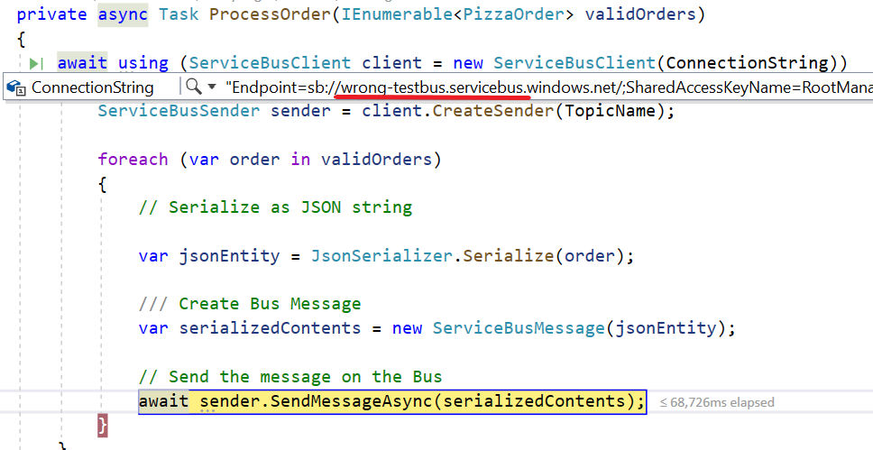
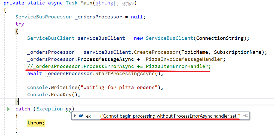
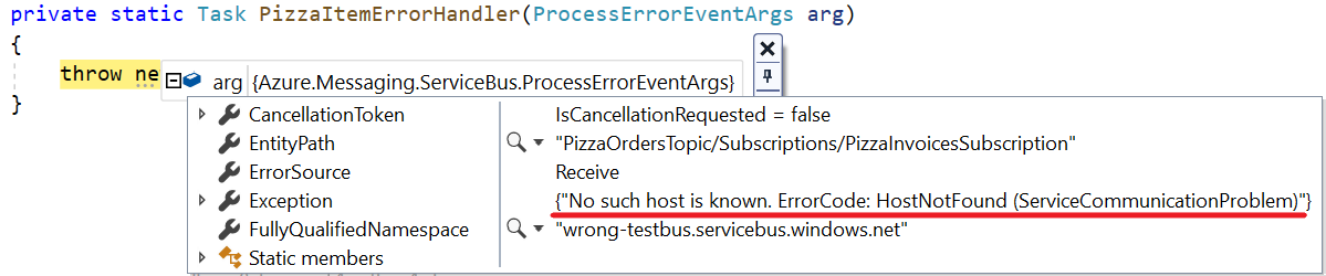
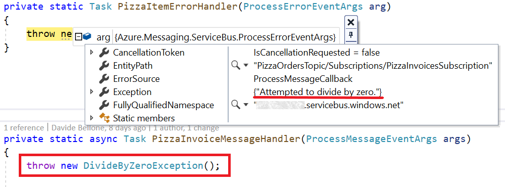
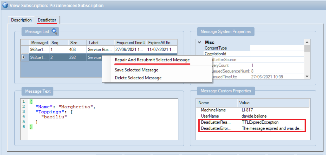
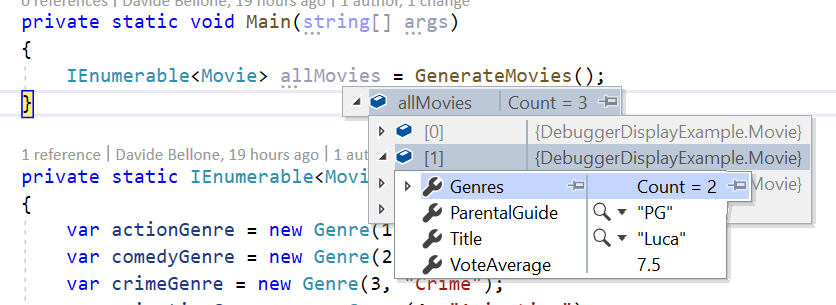
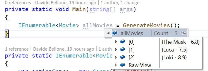
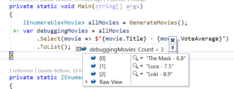
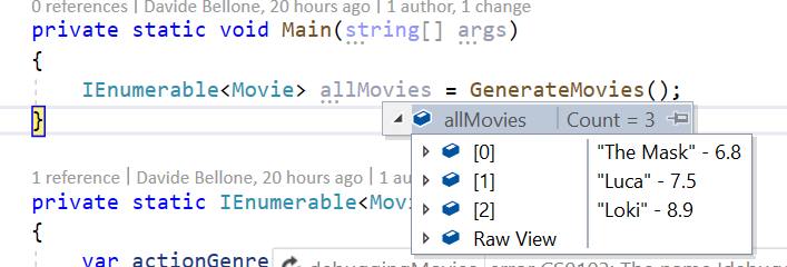
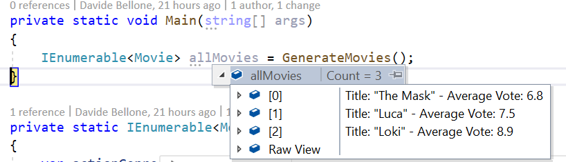
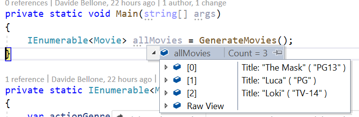
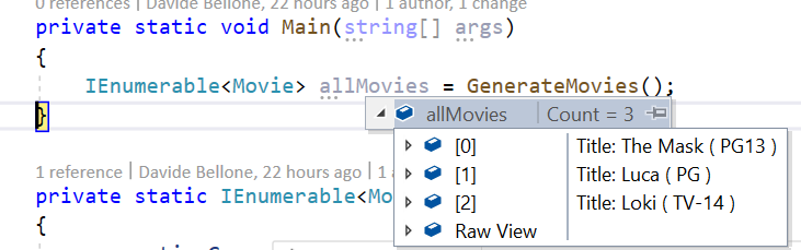
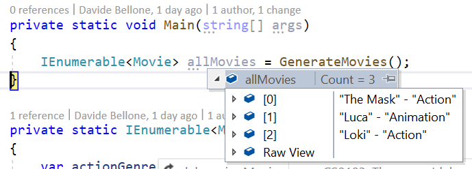
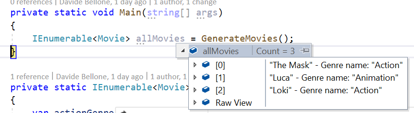


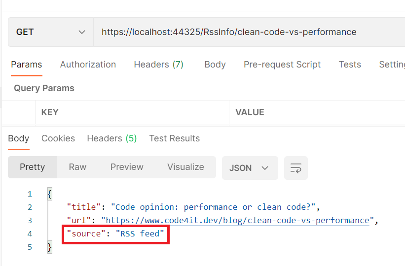
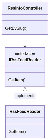
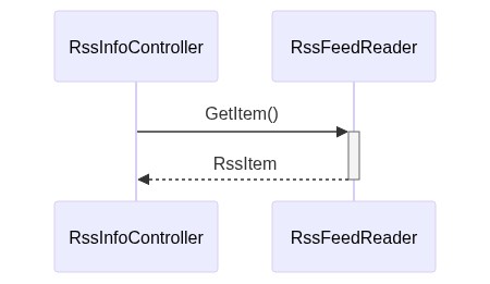
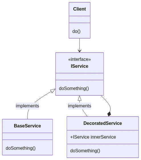
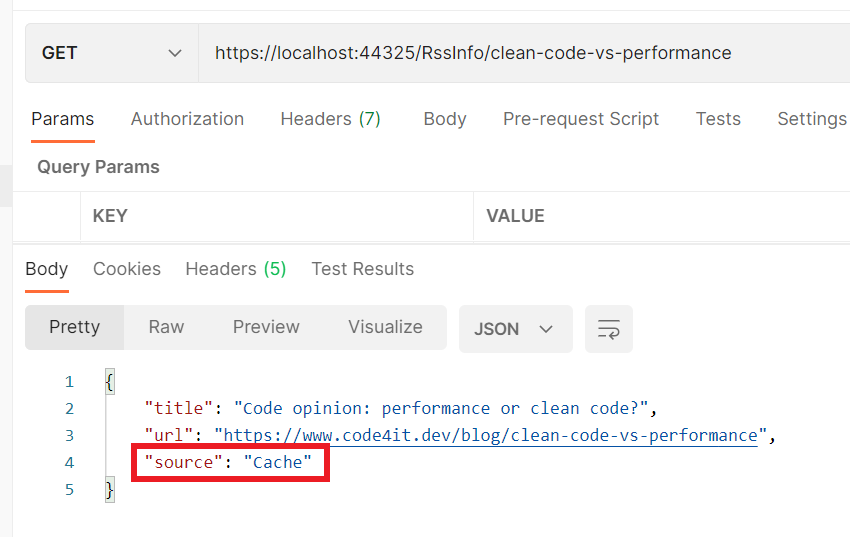
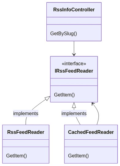
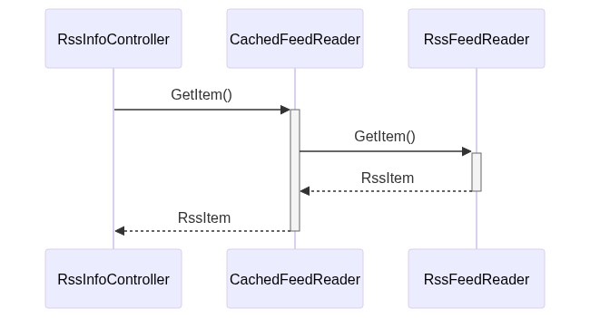


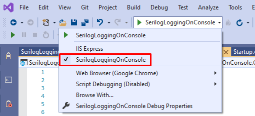
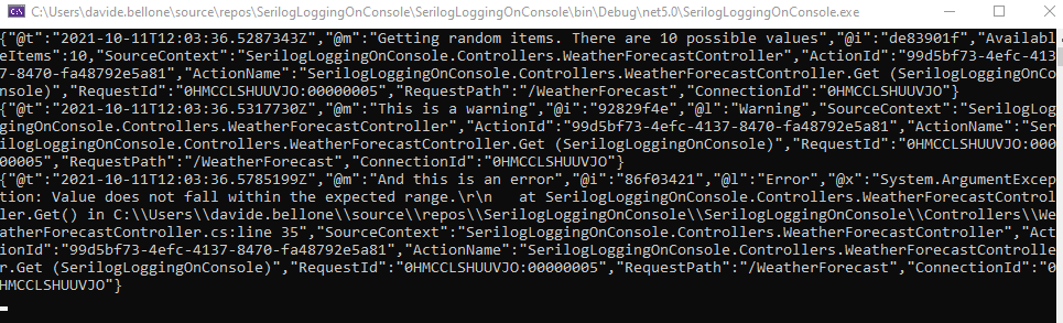
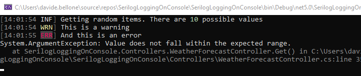


